Fixing a slow site iteratively

Site performance is potentially the most important metric. The better the performance, the better chance that users stay on a page, read content, make purchases, or just about whatever they need to do. A 2017 study by Akamai says as much when it found that even a 100ms delay in page load can decrease conversions by 7% and lose 1% of their sales for every 100ms it takes for their site to load which, at the time of the study, was equivalent to $1.6 billion if the site slowed down by just one second. Google’s industry benchmarks from 2018 also provide a striking breakdown of how each second of loading affects bounce rates.

Source: Google/SOASTA Research, 2018.

On the flip side, Firefox made their webpages load 2.2 seconds faster on average and it drove 60 million more Firefox downloads per year. Speed is also something Google considers when ranking your website placement on mobile. Having a slow site might leave you on page 452 of search results, regardless of any other metric.

With all of this in mind, I thought improving the speed of my own version of a slow site would be a fun exercise. The code for the site is available on GitHub for reference.

This is a very basic site made with simple HTML, CSS, and JavaScript. I’ve intentionally tried to keep this as simple as possible, meaning the reason it is slow has nothing to do with the complexity of the site itself, or because of some framework it uses. About the most complex part are some social media buttons for people to share the page.

Here’s the thing: performance is more than a one-off task. It’s inherently tied to everything we build and develop. So, while it’s tempting to solve everything in one fell swoop, the best approach to improving performance might be an iterative one. Determine if there’s any low-hanging fruit, and figure out what might be bigger or long-term efforts. In other words, incremental improvements are a great way to score performance wins. Again, every millisecond counts.

In that spirit, what we’re looking at in this article is focused more on the incremental wins and less on providing an exhaustive list or checklist of performance strategies.

Lighthouse

We’re going to be working with Lighthouse. Many of you may already be super familiar with it. It’s even been covered a bunch right here on CSS-Tricks. It’s is a Google service that audit things performance, accessibility, SEO, and best practices. I’m going to audit the performance of my slow site before and after the things we tackle in this article. The Lighthouse reports can be accessed directly in Chrome’s DevTools.

Go ahead, briefly look at the things that Lighthouse says are wrong with the website. It’s good to know what needs to be solved before diving right in.

On the bright side, we’re one-third of the way to our goal!

We can totally fix this, so let’s get started!

Improvement #1: Redirects

Before we do anything else, let’s see what happens when we first hit the website. It gets redirected. The site used to be at one URL and now it lives at another. That means any link that references the old URL is going to redirect to the new URL.

Redirects are often pretty light in terms of the latency that they add to a website, but they are an easy first thing to check, and they can generally be removed with little effort.

We can try to remove them by updating wherever we use the previous URL of the site, and point it to the updated URL so users are taken there directly instead of redirected. Using a network request inspector, I’m going to see if there’s anything we can remove via the Network panel in DevTools. We could also use a tool, like Postman if we need to, but we’ll limit our work to DevTools as much as possible for the sake of simplicity.

First, let’s see if there are any HTTP or HTML redirects. I like using Fiddler, and when I inspect the network requests I see that there are indeed some old URLs and redirects floating around.

It looks like the first request we hit is https://anonrobot.github.io/redirect-to-slow-site/ before it HTML redirects to https://anonrobot.github.io/slow-site/. We can repoint all our redirect-to-slow-site URLs to the updated URL. In DevTools, the Network inspector helps us see what the first webpage is doing too. From my view in Fiddler it looks like this:

This tell us that the site is using an HTML redirect to the next site. I’m going to update my referenced URL to the new site to help decrease latency that adds drag to the initial page load.

Improvement #2: The Critical Render Path

Next, I’m going to profile the sit with the Performance panel in DevTools. I am most interested in unblocking the site from rendering content as fast as it can. This is the process of turning HTML, CSS and JavaScript into a fully fleshed out, interactive website.

It begins with retrieving the HTML from the server and converting this into the Document Object Model (DOM). We’ll run any inline JavaScript as we see it, or download it if it’s an external asset as we go line-by-line parsing the HTML. We’ll also build the CSS into the CSS Object Model (CSSOM). The CSSOM and the DOM combine to make the render tree. From there, we run the layout which places everything on the screen in the correct place before finally running paint.

This process can be “blocked” if it has to wait for resources to load before it runs. That’s what we call the Critical Render Path, and the things that block the path are critical resources.

The most common critical resources are:

  • A <script> tag that is in the <head> and doesn’t contain an async, or defer, or module attribute.
  • A <link rel="stylesheet"> that doesn’t have the disabled attribute to inform the browser to not download the CSS and doesn’t have a media attribute that matches the user’s device.

There’s a few more types of resources that might block the Critical Render Path, like fonts, but the two above are by far the most common. These resources block rendering because the browser thinks the page is “unfinished” and has no idea what resources it needs or has. For all the browser knows, the site could download something that expects the browser to do even more work, like styling or color changes; hence, the site is incomplete to the browser, so it assumes the worst and blocks rendering.

An example CSS file that wouldn’t block rendering would be:

<link href="printing.css" rel="stylesheet" media="print">

The "media="print" attribute only downloads the stylesheet when the user prints the webpage (because perhaps you want to style things differently in print), meaning the file itself isn’t blocking anything from rendering before it.

As Chris likes to say, a front-end developer is aware. And being aware of what a page needs to download before rendering begins is vitally important for improving performance audit scores.

Improvement #3: Unblock parsing

Blocking the render path is one thing we can immediately speed up, and we can also block parsing if we aren’t careful with our JavaScript. Parsing is what makes HTML elements part of the DOM, and whenever we encounter JavaScript that needs to run now, we block that HTML parsing from happening.

Some of the JavaScript in my slow webpage doesn’t need to block parsing. In other words, we can download the scripts asynchronously and continue parsing the HTML into the DOM without delay.

The <async> tag is what allows the browser to download the JavaScript asset asynchronously. The <defer> tag only runs the JavaScript once the page construction is complete.

There’s a trade off here between inlining JavaScript (so running it doesn’t require a network request) versus placing it into it’s own JavaScript file (for modularity and code-reuse). Feel free to make your own judgement call here as the best route is going to depend on the use case. The actual performance of applying CSS and JavaScript to a webpage will be the same whether it’s an external asset or inlined, once it has arrived. The only thing we are removing when we inline is the network request time to get the external assets (which sometimes makes a big difference).

The main thing we’re aiming for is to do as little as we can. We want to defer loading assets and make those assets as small as possible at the same time. All of this will translate into a better performance outcome.

My slow site is chaining multiple critical requests, where the browser has to read the next line of HTML, wait, then read the next on to check for another asset, then wait. The size of the assets, when they get downloaded, and whether they block are all going to play hugely into how fast our webpage can load.

I approached this by profiling the site in the DevTools Performance panel, which is simply records the way the site loads over time. I briefly scanned my HTML and what it was downloading, then added <async> to any external JavaScript script that was blocking things (like the social media <script>, which isn’t necessary to load before rendering).

Profiling the slow site reveals what assets are loading, how big they are, where they are located, and how much time it takes to load them.

It’s interesting that Chrome has a browser limit where it can only deal with six inflight HTTP connections per domain name, and will wait for an asset to return before requesting another once those six are in-flight. That makes requesting multiple critical assets even worse for HTML parsing. Allowing the browser to continue parsing will speed up the time it takes to show something to the user, and improve our performance audit.

Improvement #4: Reduce the payload size

The total size of a site is a huge determining factor as to how fast it will load. According to web.dev, sites should aim to be below 1,600 KB interactive under 10 seconds. Large payloads are strongly correlated with long times to load. You can even consider a large payload as an expense to the end user, as large downloads may require larger data plans that cost more money.

At this exact point in time, my slow site is a whopping 9,701 KB — more than six times the ideal size. Let’s trim that down.

Identifying unused dependencies

At the beginning of my development, I thought I might need certain assets or frameworks. I downloaded them onto my page and now can’t even remember which ones are actually being used. I definitely have some assets that are doing nothing but wasting time and space.

Using the Network inspector in DevTools (or a tool you feel comfortable with), we can see some things that can definitely be removed from the site without changing its underlying behavior. I found a lot of value in the Coverage panel in DevTools because it will show just how much code is being used after everything’s downloaded.

As we’ve already discussed, there is always a fine balance when it comes to inlining CSS and JavaScript versus using an external asset. But, at this very moment, it certainly appears that the site is downloading far too much than it really needs.

Another quick way to trim things down is to find whether any of the assets the site is trying to load 404s. Those requests can definitely be removed without any negative impact to the site since they aren’t loading anyway. Here’s what Fiddler shows me:

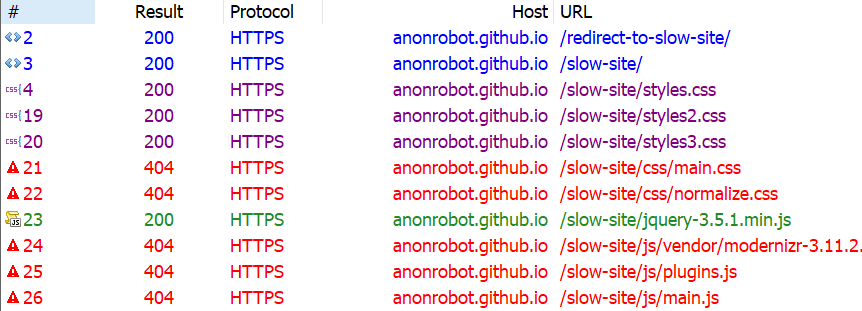
Looking again at the Coverage report, we know there are things that are downloaded but have a significant amount of unused code still making its way to the page. In other words, these assets are doing something, but are also ready to do things we don’t even need them to do. That includes React, jQuery and Vue, so those can be removed from my slow site with no real impact.

Why so many JavaScript libraries? Well, we know there are real-life scenarios where we reach for something because it meets our requirements; but then those requirements change and we need to reach for something else. Again, we’ve got to be aware as front-end developers, and continually keeping an eye on what resources are relevant to site is part of that overall awareness.

Compressing, minifying and caching assets

Just because we need to serve an asset doesn’t mean we have to serve it as its full size, or even re-serve that asset the next time the user visits the site. We can compress our assets, minify our styles and scripts, and cache things responsibly so we’re serving what the user needs in the most efficient way possible.

  • Compressing means we optimize a file, such as an image, to its smallest size without impacting its visual quality. For example, gzip is a common compression algorithm that makes assets smaller.
  • Minification improves the size of text-based assets, like external script files, by removing cruft from the code, like comments and whitespace, for the sake of sending fewer bytes over the wire.
  • Caching allows us to store an asset in the browser’s memory for an amount of time so that it is immediately available for users on subsequent page loads. So, load it once, enjoy it many times.

Let’s look at three different types of assets and how to crunch them with these tactics.

Text-based assets

These include text files, like HTML, CSS and JavaScript. We want to do everything in our power to make these as lightweight as possible, so we compress, minify, and cache them where possible.

At a very high level, gzip works by finding common, repeated parts in the content, stores these sequences once, then removes them from the source text. It keeps a dictionary-like look-up so it can quickly reference the saved pieces and place them back in place where they belong, in a process known as gunzipping. Check out this gzipped examples a file containing poetry.

The text in-between the curly braces is text that has been matched multiple times and is removed from the source text by gzip to make the file smaller. There are still unique parts of the string that gzip is unable to abstract to its dictionary, but things like { a }, for example, can be removed from wherever it appears and can be added back once it is received. (View the full example)

We’re doing this to make any text-based downloads as small as we can. We are already making use of gzip. I checked using this tool by GIDNetwork. It shows that the slow site’s content is 59.9% compressed. That probably means there are more opportunities to make things even smaller.

I decided to consolidate the multiple CSS files into one single file called styles.css. This way, we’re limiting the number of network requests necessary. Besides, if we crack open the three files, each one contained such a tiny amount of CSS that the three network requests are simply unjustified.

And, while doing this, it gave me the opportunity to remove unnecessary CSS selectors that weren’t being applied in the DOM anywhere, again reducing the number of bytes sent to the user.

Ilya Grigorik wrote an excellent article with strategies for compressing text-based assets.

Images

We are also able to optimize the images on the slow site. As reports consistently show, images are the most common asset request. In fact, the median data transfer for images is 948.1 KB for desktops and 902 KB for mobile devices from 2016 to 2021. That already more than half of the ideal 1,600KB size for an entire page load.

My slow site doesn’t serve that many images, but the images it does serve can be smaller. I ran the images through an online tool called Squoosh, and achieved a 40% savings (18.6 KB to 11.2 KB). That’s a win! Of course, this is something you can do either before upload using a desktop application, like ImageOptim, or even as part of your build process.

I couldn’t see any visual differences between the original images and the optimized versions (which is great!) and I was even able to reduce the size further by resizing the actual file, reducing the quality of the image, and even changing the color palette. But those are things I did in image editing software. Ideally, that’s something you or a designer would do when initially making the assets.

Caching

We’ve touched on minification and compression and what we can do to try and use these to our advantage. The final thing we can check is caching.

I have been requesting the slow site over and over and, so far, I can see it always looks like it’s requested fresh every time without any caching whatsoever. I looked through the HTML and saw caching was disabling here:

<meta http-equiv="Cache-Control" content="no-cache, no-store, must-revalidate">

I removed that line, so browser caching should now be able to take place, helping serve the content even faster.

Improvement #5: Use a CDN

Another big improvement we can make on any website is serving as much as you can from a Content Delivery Network (CDN). David Attard has a super thorough piece on how to add and leverage a CDN. The traditional path of delivering content is to hit the server, request data, and wait for it to return. But if the user is requesting data from way across the other side of the world from where your data is served, well, that adds time. Making the bytes travel further in the response from the server can add up to large losses of speed, even if everything else is lightning quick.

A CDN is a set of distributed servers around the world that are capable of intelligently delivering content closer to the user because it has multiple locations it choose to serve it from.

Source: “Adding and Leveraging a CDN on Your Website”

We discussed earlier how I was making the user download jQuery when it doesn’t actually make use of the downloaded code, and we removed it. One easy fix here, if I did actually need jQuery, is to request the asset from a CDN. Why?

  • A user may have already downloaded the asset from visiting another site, so we can serve a cached response for the CDN. 75.49% of the top one million sites still use jQuery, after all.
  • It doesn’t have to travel as far from the user requesting the data.

We can do something as simple as grabbing jQuery from Google’s CDN, which they make available for anyone to reference in their own sites:

<head>
  <script src="https://ajax.googleapis.com/ajax/libs/jquery/3.5.1/jquery.min.js"></script>
</head>

That serves jQuery significantly faster than a standard request from my server, that’s for sure.

Are things better?

If you have implemented along with me so far, or just read, it’s time to re-profile and see if any improvements has been made on what we’ve done so far.

Recall where we started:

This image has an empty alt attribute; its file name is image-1024x468.png

After our changes:


I hope this has been a helpful and encourages you to search for incremental performance wins on your own site. By optimally requesting assets, deferring some assets from loading, and reducing the overall size of the site size will get a functional, fully interactive site in front of the user as fast as possible.

Want to keep the conversation going? I share my writing on Twitter if you want to see more or connect.


The post Fixing a slow site iteratively appeared first on CSS-Tricks.

You can support CSS-Tricks by being an MVP Supporter.

What Is Huffman Coding?

Huffman Coding: Why Do I Care?

Have you ever wanted to know:

  • How do we compress something, without losing any data?
  • Why do some things compress better than others?
  • How does GZIP work?

In 5 Minutes or Less

Suppose we want to compress a string (Huffman coding can be used with any data, but strings make good examples).

How to Enable GZIP Compression in WordPress (3 Ways)

Do you want to enable GZIP compression in WordPress? GZIP compression makes your website faster by compressing the data and delivering it to the user’s browsers much quicker.

A faster website improves user experience and brings in more sales and conversions for your business.

In this article, we’ll show you exactly how to easily enable GZIP compression in WordPress.

Enabling GZIP compression in WordPress

What is GZIP Compression?

GZIP compression is a technology that compresses data files before it is sent to users’ browsers. This reduces the file download time which makes your website faster.

Once the compressed data arrives, all modern browsers automatically unzip the compressed files and display them. GZIP compression doesn’t change how your website looks or functions.

It just makes your website load faster.

GZIP is supported by all popular web browsers, server software, and all best WordPress hosting companies.

How does GZIP compression work?

Gzip compression uses compression algorithms that work on website files like HTML, CSS, JavaScript, and more. When a user requests a page from your website, the algorithm sends the output back in a compressed format.

Depending on data size, the compression can reduce file sizes by up to 70%.

This is why most website speed test tools like Google Pagespeed Insights highly recommend enabling gzip compression. These tools will also show a warning if gzip compression is not enabled onn your website.

Pagespeed Insights

Note: By default, Gzip compression does not compress images or videos. For that you’ll need to optimize images for web on your WordPress site.

Why You Need to Enable GZIP Compression in WordPress?

Plain raw data takes longer to download which affects your page load speed. If several users arrive at the same time, then it will further slow down your WordPress website.

Using GZIP compression allows you to efficiently transfer data, boost page load times, and reduce the load on your website hosting. It is an essential step in improving your website speed and performance.

Now, you might think that GZIP sounds very technical and complicated. However, there are many WordPress plugins that make it super easy to add GZIP compression on your WordPress website.

In some cases, you may even have GZIP already enabled by your WordPress hosting company.

Bluehost an officially recommended WordPress hosting provider automatically enables GZIP compression on all new WordPress sites.

To test if GZIP is enabled on your site, simply go to this GZIP tester and enter the URL of your site. If GZIP is working on your site, you will see a ‘GZIP Is Enabled’ message.

Using a GZIP test tool to see that GZIP is enabled on the specifed website

If you need to add GZIP compression by yourself, then you can use any of the following methods to do so:

Enabling GZIP Compression with WPRocket

WP Rocket is the best caching plugin for WordPress. It is incredibly easy to use and turns on all the essential speed optimization features out of the box, including GZIP compression.

First, you need to install and activate the WP Rocket plugin. For more details, see our step by step guide on how to install a WordPress plugin.

Upon activation, your license key should be automatically activated for you. You can check this by going to the Settings » WP Rocket page in your WordPress admin.

You should see a message letting you know that WP Rocket is active and working.

The message showing that WP Rocket is active and working on your site

WP Rocket automatically enables GZIP compression for you if you’re using an Apache server. Most WordPress web hosting providers use Apache for their servers. You don’t need to take any additional steps.

For a breakdown of all WP Rocket features, check out our guide on installing and setting up WPRocket.

Enabling GZIP Compression with WP Super Cache

WP Super Cache is a free WordPress caching plugin. It is also a great way to enable GZIP compression on your WordPress site.

First, you need to install and activate the WP Super Cache plugin. For more details, see our step by step guide on how to install a WordPress plugin.

Upon activation, go to the Settings » WP Super Cache page » Advanced in your WordPress dashboard. Then, simply check the box ‘Compress pages so they’re served more quickly to visitors’ box.

Check the box to compress pages

You then need to scroll down the page and click the ‘Update Status’ button to save your changes. WP Super Cache will now enable gZip compression on your WordPress website.

Enabling GZIP Compression with W3 Total Cache

W3 Total Cache is another great WordPress caching plugin. It’s not quite so beginner-friendly as WP Rocket, but there’s a free version. This makes it a good option if the costs of creating a WordPress site are adding up.

First, you need to install and activate the W3 Total Cache plugin. For more details, see our step by step guide on how to install a WordPress plugin.

Upon activation, GZIP compression will be automatically enabled on your website. You can check or change this by going to the Performance » General Settings page in your WordPress dashboard.

Scroll down this page to Browser Cache and make sure there is a check in the Enable box:

Make sure the browser cache box is checked

Don’t forget to click the ‘Save all changes’ button if you make any changes.

Checking that GZIP is Enabled on Your Website

After enabling GZIP, you may notice that your website pages load a bit faster. However, if you want to check that GZIP is running, you can simply use a GZIP checker tool.

Using a GZIP test tool to see that GZIP is enabled on the specifed website

We hope this article helped you learn how to enable GZIP compression in WordPress. You may also want to see our ultimate guide to speeding up WordPress, and check out our 27 proven tips on how to increase your website traffic.

If you liked this article, then please subscribe to our YouTube Channel for WordPress video tutorials. You can also find us on Twitter and Facebook.

The post How to Enable GZIP Compression in WordPress (3 Ways) appeared first on WPBeginner.

4 Web Design Hacks You Can Use to Enhance Your Website on a Budget

web design hacks

Image credit

Having a functional, usable, and super fast website doesn’t have to cost an arm and a leg.

As a web designer, you can use a few pieces of code or some minor tweaks to ensure a much faster and better appealing web design.

Without having to fork out thousands of dollars to a designer, and without having to change the underlying infrastructure of your website, here are four simple web design hacks that can enhance your website today:

  1. Use HTML5 DOM Storage (Instead of Cookies) to Ensure a Faster Website 

local storage

Image Credit

Depending on how big a website/web page is, it “costs” quite a bit of data and bandwidth to load that website when you rely only on cookies. When this website is loaded repeatedly for a lot of users, depending on the server it is hosted on, the result can be a slower website (due to increased strain on available server resources) and increased hosting costs.

Often, this is because of how cookies are used: cookies are generally only necessary when there is a need for client-server communication between a user’s browser and your server.

If there’s no need for a user’s browser to interact with your server before the user experience is fulfilled, you should consider using DOM storage instead of cookies.

DOM Storage can take the following forms:

  • sessionStorage in which data is stored in a user’s browser for the current session
  • localStorage in which data is stored in a user’s browser without an expiration date

You generally want to focus on localStorage. With this, data is stored in the user’s browser and won’t be deleted even if they close their current browsing session. This will reduce server connection requests and make your website a lot faster for the user.

So how does this work? Assuming you want to store the “name” value in a user’s browser, for example, you will have:

// Store 
localStorage.name = “Firstname Lastname”; 

To retrieve the value:

// Retrieve 
document.getElementById(“result”).innerHTML = localStorage.name;

To remove the value:

localStorage.removeItem(“lastname”);

What if you want to check if localStorage is available? You can use:

function supports_html5_storage() {
try {
return ‘localStorage’ in window && window[‘localStorage’] !== null;
} catch (e) {
return false;
}
}

  1. Achieve Better Image Styling by Using the <Picture> Element

Image credit

In a world that is heavily reliant on images — research shows that our brains process images a lot faster than text — being able to effectively manipulate images is one of the key advantages you can have as a web designer; and this goes beyond looking for the best photo editing app out there today.

Being able to properly style images is a web design super power for a few key reasons:

  • It makes your web design a lot faster since you’re able to control when and how images should load.
  • It gives you a lot of flexibility when it comes to which image/version of your design users should see depending on their device.
  • It allows you to serve different images/image formats for different browser types.
  • It allows you to save money you’d have otherwise spent creating different design versions with different image elements.

So how do you go about achieving this? By effectively leveraging the HTML <picture> tag.

Here’s an example code:

<picture>
<source media=”(min-width: 600px)” srcset=”img001.jpg”>
<source media=”(min-width: 250px)” srcset=”img123.jpg”>
<img src=”img234.jpg” alt=”Header” style=”width:auto;”>
</picture>

In essence, the above code involves three images; the original “img234.jpg” which is displayed. Under certain conditions, however, other images could be served. For example, the code says “img001.jpg” should be served for devices with a minimum width of 600px, “img123.jpg” should be served for devices with a minimum width of 250px. You could add more lines of code to specify more possibilities.

Some sub-elements and attributes that can be used for this tag include:

  • The <source> subelement to specify media resources.
  • The <img> subelement to define an image.
  • The srcset attribute that is used to specify different images that could be loaded depending on the size of the viewport; you use this when dealing with a set of images as opposed to just one image (in which case you use the src attribute).
  • The media attribute that the user agent evaluates for every source element.
  1. Enable GZIP Compression via .htaccess to Boost Site Speed

Image credit

No matter how well-designed a website is, it won’t make much of a difference if the website is slow.

This is why it is important to make sure you enable proper compression to minimize the number of files that have to be loaded and as a result get a website speed boost. The best way to do this is via GZIP compression.

You can enable GZIP compression by adding the following code to a web server’s .htaccess file:

<ifModule mod_gzip.c>
mod_gzip_on Yes
mod_gzip_dechunk Yes

mod_gzip_item_include file .(html?|txt|css|js|php|pl)$
mod_gzip_item_include handler ^cgi-script$
mod_gzip_item_include mime ^text/.*

mod_gzip_item_include mime ^application/x-javascript.*
mod_gzip_item_exclude mime ^image/.*
mod_gzip_item_exclude rspheader ^Content-Encoding:.*gzip.*
</ifModule>

If your web server doesn’t have .htaccess, there are also instrunctions for NGINXApache, and Litespeed.

  1. Combine Fonts to Spice Up Your Design

Typography is generally believed to be the most important part of a design, so the fonts you use will go a long way to influence how your design is perceived.

So much has been written about selecting fonts, so I won’t be covering that again in this article. One hack I’d like to recommend you give a shot, however, is combining multiple fonts.

You can combine two, three, or more fonts to make your web design look a lot more appealing. Fonts can be combined in a logo, layout, or the actual web design itself, combining fonts can go a long way to make your website look different.

That said, there are a few rules you might want to stick to if you want to get results from combining fonts. These include:

  • Choosing fonts from the same superfamily. This is especially important if you’re a beginner designer or not familiar with how to pair fonts.
  • If you’re not sure where to start, you might want to start by pairing a serif font with sans serif and see how that looks.
  • Consider the flow of content on your web design when combining fonts — since fonts influence content readability, you want to make sure that the fonts you use match the attribute of the message that will be displayed and as a result flows.
  • You also want to make sure that the fonts you pair contrast with each other — this is one of the reasons why pairing serif and sans serif might be a good place to start. Contrast can be achieved through size, style, spacing, and weight.

Read More at 4 Web Design Hacks You Can Use to Enhance Your Website on a Budget

Real-World Effectiveness of Brotli

Harry Roberts:

The numbers so far show that the difference between no compression and Gzip are vast, whereas the difference between Gzip and Brotli are far more modest. This suggests that while the nothing to Gzip gains will be noticeable, the upgrade from Gzip to Brotli might perhaps be less impressive.

The rub?

Gzip made files 72% smaller than not compressing them at all, but Brotli only saved us an additional 5.7% over that. In terms of FCP, Gzip gave us a 23% improvement when compared to using nothing at all, but Brotli only gained us an extra 3.5% on top of that.

So Brotli is just like spicy gzip.

Still, I’ll take a handful of points by flipping a switch in Cloudflare.

Direct Link to ArticlePermalink

The post Real-World Effectiveness of Brotli appeared first on CSS-Tricks.

Compressing Your Big Data: Tips and Tricks

The growth of big data has created a demand for ever-increasing processing power and efficient storage. DigitalGlobe’s databases, for example, expand by roughly 100TBs a day and cost an estimated $500K a month to store.

Compressing big data can help address these demands by reducing the amount of storage and bandwidth required for data sets. Compression can also remove irrelevant or redundant data, making analysis and processing easier and faster.

The Serif Tax

Fonts are vector. Vector art with more points makes for larger files than vector art with fewer points. Custom fonts are downloaded. So, fonts with less points in their vector art are smaller. That's the theory anyway. Shall we see if there is any merit to it?

The vector points on the letters of Lorem Ipsum text shown on Open Sans and Garamond. It's not incredibly dramatic, but there are more points on Garamond
Open Sans (top) and Garamond (bottom)

Let's take two fonts off of Google Fonts: Open Sans and EB Garamond. The number of points isn't a dramatic difference, but the seriffed Garamond does have more of them, particularly in looking at the serif areas.

It's not just serifs, but any complication. Consider Bleeding Cowboys, a masterpiece of a font and a favorite of pawn shops and coffee carts alike where I live in the high desert:

Let's stick to our more practical comparison.

We get some hint at the size cost by downloading the files. If we download the default "Latin" set, and compare the regular weight of both:

OpenSans-Regular.ttf 96 KB
EBGaramond-Regular.ttf 545 KB

I'm not 100% sure if that's apples-to-apples there, as I'm not exactly a font file expert. Maybe EB Garamond has a whole ton of extra characters or something? I dunno. Also, we don't really use .ttf files on the web where file size actually matters, so let's toss them through Font Squirrel's generator. That should tell us whether we're actually dealing with more glyphs here.

A screenshot of the results from running the fonts through Font Squirrel, showing 3,095 glyphs for Garamond and 938 glyphs for Open Sans.

It reports slightly different sizes than the Finder did and confirms that, yes, Garamond has way more glyphs than Open Sans.

In an attempt to compare sizes with a font file with the same number of available characters, I did a custom subset of just upper, lower, punctuation, and numbers (things that both of them will have), before outputting them as .woff2 files instead of .ttf.

A screenshot of the selected types of glyphs to export.

After that...

opensans-regular-webfont.woff2 10 KB
ebgaramond-regular-webfont.woff2 21 KB

I didn't serve them over a network with GZIP or brotli or anything, but my understanding is that WOFF2 is already compressed, so it's not super relevant.

Roughly two-to-one when comparing the file size of these two pretty popular fonts? Seems somewhat significant to me. I'm not above picking a font, assuming it works with the brand and whatnot because of size.

What made me think of this is a blog post about a font called Ping. Check out this "human hand" drawing principle it's made from:

Whoa! A single stroke? Unfortunately, I don't think actual fonts can be make from strokes, so the number-of-points savings can't come from that. I purchased the "ExtraLight" variation and the points are like this:

Still pretty lean on points.

The TTF is 244 KB, so not the sub-100 of Open Sans, but again I'm not sure how meaningful that is without a matching subset and all that. Either way, I wasn't able to do that as it's against the terms of Ping to convert it.

The post The Serif Tax appeared first on CSS-Tricks.

Hummingbird + Uptime + Expanded Compatibility = Power & Control

Hummingbird has now crossed a staggering one million downloads quickly become everyone’s favorite speed and performance plugin for WordPress. And we’re not just improving your sites speed and performance (with all the built-in cache options you can handle, GZIP compression, asset optimization, and free site scans), we’ve integrated it with the Hub’s world-class WordPress site […]