This is the second part of our series about Sysdig. Whereas our previous blog post focused on capturing data with the sysdig command-line utility, this tutorial will show how you can use Csysdig, the ncurses based GUI that ships with Sysdig. It's worth mentioning that Csysdig goes beyond what most monitoring tools provide in terms of functionalities, by giving you the ability to perform various actions directly from its interface. As an example, you can start a shell inside of a container, display logs, kill a container and many more.
Prerequisites
As a prerequisite, we assume you followed our first tutorial on Sysdig. If so, both Sysdig and Csysdig should be installed on your system. Also, a capture file called monitoring-wordpress.scap should already exist.
This project implements a multiple timer application. It was written in
Python 3.8.2
wxPython 4.1.0
Feel free to experiment. Here are some possible enhancements:
Add the ability to run a program when the timer expires. With a little scripting you could, for example, schedule the sending of an email.
Add the option to auto-restart a timer after it has alarmed.
Autosave timers on close and reload them on restart.
Add a taskbar icon with pop-up summary of timers on mouse over.
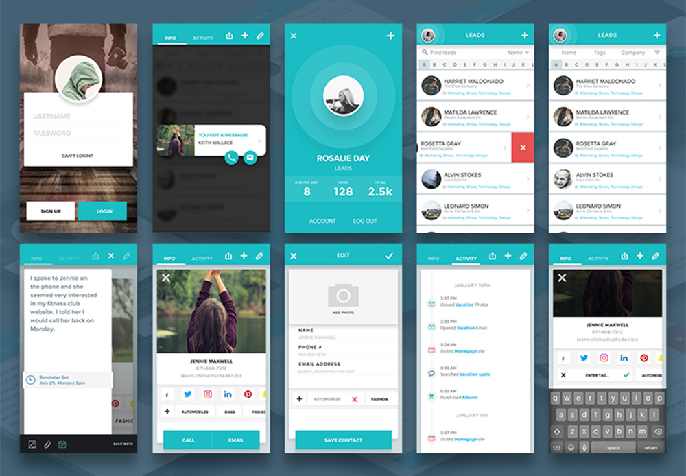
The Files:
Timer.pyw
This file contains the mainline GUI code. It displays a list of custom timer entries and three control buttons. The three buttons allow the user to:
create a new timer
start all existing timers
stop all existing timers
Timer entries are displayed one per line. Each timer contains the following controls:
a button which will run/stop the timer
a button that will stop and reset the timer (countdown only)
a button that will delete a timer
a checkbox to enable a popup message when the timer expires
display of the time remaining
description of the timer
TimerEntry.py
This is a custom control that is subclassed from a wx.BoxSizer. The fields mentioned above are arranged horizontally in this sizer.
A timer entry object can delete all of the controls within it, however, it is up to the parent object to delete the actual timer entry object. I decided that the easiest way to do this was to pass the TimerEntry constructor the address of a delete method from the parent object.
Countdown timers are updated once per second by subtracting one second from the time remaining. Absolute timers, however, must recalculate the time remaining on every timer event otherwise, if you put the computer to sleep then wake it up the time remaining would not account for the sleep period.
TimerDialog.py
This is a custom control that is subclassed from wx.Dialog. This control displays a GUI where the user can select a timer type (absolute or countdown), and specify timer values and a description. For absolute timers, the values entered represent an absolute date/time at which the alarm is to sound. Countdown timers represent a time span after which the alarm will sound. The dialog offers three closing options:
Create - creates the timer but does not start it
Create & Run - creates the timer and automatically starts it
Cancel - does not create a timer
GetMutex.py
This module is used to ensure that only one copy of Timer.pyw can run at a time. It does this by creating a mutex which uses the app name (Timer.pyw) as the mutex prefix. If you want to be able to run multiple copies you can remove the lines:
from GetMutex import *
if (single := GetMutex()).AlreadyRunning():
    wx.MessageBox(__file__ + " is already running", __file__, wx.OK)
    sys.exit()
alarm.wav
This is the wav file that will be played whenever a timer expires. If you do not like the one provided just copy a wav file of your choice to a file of the same name.
I've had some time over the summer to work with Magic. One of the more important features I have implemented, is to make it more easy to use, and especially in regards to referential integrity columns. Watch the video below for an explanation.
This allows you to generate your Angular frontend in 1 second, spend some few hours editing the automatically generated frontend, and have an actual working Angular frontend CRUD app, in roughly half a day. I believe this might be especially interesting for more "raw" database access to your backend's database, in particular for cases where you need to some sort of "advanced GUI" to modify your data, in cases where something goes wrong with your app's data for some reasons. As in, making Magic become your app's secondary app, for editing data items in your database. As a simplified version of something like PHP MyAdmin.
Visual Design Language: The Building Blocks Of Design
Visual Design Language: The Building Blocks Of Design
Gleb Kuznetsov
“Design is not just what it looks like and feels like. Design is how it works.”
— Steve Jobs
Like written words are to language, fonts, colors, shapes and icons are to visual design. An effective visual design language not only acts as a communication framework for all stakeholders on a product development team, but unites a brand and its customers to ensure that a company’s brand identity matches a customer’s brand perception.
We use language as a tool for communication with other people. Writers use words to communicate with their readers, while designers use visual language to communicate with their users. Fonts, colors, shapes, visual elements such as icons — those are elements of design language. Effective design language streamlines communication.
While working at Fantasy in 2016, my team was tasked with designing the interface for Huawei’s mobile OS (EMUI 5 interface). I personally was responsible for the visual design language for this OS. Surprisingly, the company didn’t have its own language at initiation; instead, they relied on a customized version of Android that was plagued by inconsistency and lacked a coherent vision. This was largely due to the existence of multiple teams and multiple functional roles with different skillsets and perspectives all grasping at straws to invent a way to communicate. UX designers, interaction designers, visual designers and graphic designers had all worked on the OS in the past, all using their own best efforts to communicate.
Without a uniform system of communication, not only was the user experience jumbled and confusing, it was extremely difficult to integrate changes into a final design. It was a true Tower of Babel.
By unifying the project teams under one shared language, a project can move forward with clarity, cohesion and speed.
Consistency
Digital design has few physical constraints compared to industrial disciplines. This gives designers a lot of power to experiment and propose a variety of solutions to any given challenge. However, this can easily lead to disjointed user experiences.
To achieve consistency in design, it’s vital to define reusable and cross-platform components and styling options. Consistent design makes it much easier to ship products on a multitude of platforms and devices, which is especially crucial for companies like Huawei.
Brand Recall
When they interact with a product that has a strong visual language, users tend to remember it better. Unfortunately, a majority of products available on the market have generic designs. It is too easy to confuse one product with another when they share the same visual styles.
Creating a strong visual identity is a goal that design teams should state when working on visual design. This is the personality of a digital product! The colors, typefaces, photos, illustrations, animations are all part of a brand, and they should be designed in a way that helps people remember the product. When an authentic design language is followed consistently, it creates recognizability for the brand.
Clarity
We put a strong focus on clarity — we wanted to make our GUI clean, not cluttered. By following a minimalist approach, we minimized the number of elements that users have on every screen and created a highly-focused experience.
Minimalist design helps to focus user attention on important elements of your design. EMUI 5.0 Concept by Fantasy (Design concept of EMUI 5 interface) (Large preview)
A Way To Innovate
With so much competition in the phone market, companies invest significant resources to make people try their products. Companies invest in innovation and try to break new ground to attract users and peak their interest. Visual design is often the fastest and cheapest way for a product to innovate.
How Do We Create A Design Language?
For me and my teams, the process of creating a design language, we follow the same rubric we would create any complete consumer product: research-ideate-design-validate- implement. This is how we ensure that the language will work for our target audience.
Research
Often, the VDL is the most important, cornerstone product we create. And like every product you design, research should always be the first. When we started this Huawei project, it was important to understand the opportunities for our design. Jeshua Nanthakumar, a lead UX designer on this project, and his UX research team analyzed all mobile OS available on the market and identified the full range of challenges typically faced by users.
The UI Audit
As I’ve mentioned above, achieving consistency was one of the goals of creating a shared design language. It’s essential to standardize the visual design. That’s why even before starting work on a visual language, we decided to conduct a UI audit. Our goal was to understand the anatomy of the Android OS.
We broke down the whole mobile OS into atomic elements—colors, shapes, shadows, lines, transitions. By decomposing the design, our team was able to see how individual pieces work together and form a greater whole. At the end of UI audit, we had all the elements that make up the digital product (buttons, navigation bars, icons, etc.) grouped into distinct categories.
Understand How Users Perceive The Brand
When working on visual language, it’s essential to have a clear understanding of who you’re designing for and how they perceive your brand. Ideally, brand identity (the way the brand wants to be perceived by users) should match with the brand image (the way users actually perceive the brand). Designers have a direct impact on brand identity. Aesthetic styles, language & tone, iconography, and illustrations — all these are elements of brand identity.
Our goal was to create an innovative design language that feels customized for its audience. To understand how your users perceive the Huawei brand, our team invested in user research. We knew that design language should successfully meet the needs of both Eastern and Western design sensibilities, so we categorized large groups of users and created summaries based on the available information about our target groups. Every summary about our audience had the following information blocks — demographics, what they care about, and their expectations. Here is an example of the summary of the group of North American customers:
Huawei’s core audience lives both Urban and Suburban environments;
They are driven by business, social status, and personal organization;
Age range 30-64;
Average income: USD $75.000 per annum
They care about:
Being organized and ordered
Efficiency and productivity to enable them to enjoy their own time
Their expectations
Contributing to something bigger than themselves
Maximizing life and living for happiness
With the idea that design should match the audience’s lifestyle and be extremely refined, we evaluated every design decision in accordance with the needs of our target segments. This understanding will give you a reason for your visual direction.
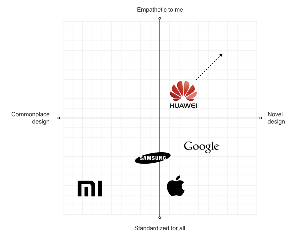
Analyze Major Competitors
To identify strategic design opportunities, our team conducted the competitors’ analysis. We’ve identified four major competitors who had strong design languages and focussed on identifying their strengths and weaknesses. For example, when we evaluated Apple iOS, we’ve mentioned the following strengths of the language — scalable across devices, great focus on standardization, unique identity — and the following weakness — inconsistency with iconography, overuse of blur effects.
Four major competitors of Huawei at the time of our analysis. Every brand represented a large part of the market and had its own robust visual language. (Large preview)
This analysis helped us to identify four major directions that brands followed when they create products:
Empathetic to me (design tailored for the needs of the target audience; design that demonstrates real empathy with the human and truly reflects the audience)
Novel design (design that uses innovative visual styles and interaction patterns)
Commonplace design (design that utilizes conservative style elements)
Standardized for all (heavy standardized design)
We put every brand on the plot with those four directions.
Identifying opportunities for Huawei visual language (Large preview)
This process helped us to identify the opportunities for Huawei language:
Scalable Design Language
The language should scale across devices and across third-party developer apps as well.
Unique Design DNA
The language should be unique and distinct from the major competitors.
Be Bold Yet Timeless
The language should be long-lasting.
Define Requirements For Visual Hierarchy
When UX researchers analyzed typical user complaints, they found that the location of key interactive elements was one of the most common problems that many mobile users mentioned. In 2016 mobile screens become larger and larger, but the location of key functional elements in Android remained the same — the top area of the screen. As a result, users had to stretch their fingers or change their grip in order to interact with the elements.
Thumb Zone: how easy it is for our thumbs to tap areas on a phone’s screen. (Image credit: Luke W) (Large preview)
Today a bottom-area navigation is an industry-standard, but back in 2016, the situation was a bit different. We’ve reached the Huawei engineering team with this insight and asked about the technical feasibility of moving controls to the bottom area of the screen — this area is more comfortable for user interaction. The engineering team confirmed that it was possible to move the elements, and we helped define the new default location for functional elements.
Functional controls are located at the bottom of the screen — in the easy-to-reach area. (Design concept of EMUI 5 interface by Fantasy) (Large preview)
Ideation: Defining A Design Vision
Creating A Philosophy Of Design
Imagine that you need to design a language that will be integrated into products that will be used by people all over the world. The natural language we use in interpersonal communications cannot be separated from a culture because it has a close relation to the attitude or behavior of speakers of the languages. The digital language is absolutely the same — it should look natural for customers in the Americas, Europe, Asia, Africa, and Oceania.
The success of any visual design highly relates to how people perceive it. Many factors are influencing human perception, and the significant part goes to psychology. To create a sophisticated design, you need to consider the meaning of shapes and the impact which they have on users’ minds.
Creating a philosophy of design is extremely challenging, and you cannot do it alone. That’s why I worked with Abigail Brody, a former Apple creative director who joined Huawei in September 2015 as Chief UX design and VP of Huawei Devices. At Apple, Abigail was responsible for iOS design. She was the one who described the methodology of visual language to me.
Together we spend a lot of time trying to find the direction for visual design, and we’ve decided to use the philosophy of organic design as a foundation for our design language. Organic design is centered around using nature as the biggest inspiration.
Organic Design was pioneered by Frank Lloyd Wright who believed in creating harmony between people and nature. (Image credit: museiitaliani) (Large preview)
According to this philosophy, design should help to achieve harmony between people and nature. When we worked on our visual language, we focused on incorporating natural forms (smooth curves and organic forms) in our visual design. As a result, all visual elements, such as buttons, icons, and shapes, had an organic design aesthetic.
Round shapes are one of the things that make organic objects different from non-organic. (Large preview)
Using Motion Design To Create A Distinct Visual Identity
There is no doubt about the importance of the role that motion plays in mobile design. For many product motion serves a purely-functional role—it provides feedback for user action and connects different states of the mobile app together. The well-crafted motion also makes things more attractive, and as we know, attractive things work better (the aesthetic-usability effect says that people are more tolerant of minor usability issues when they find an interface visually appealing).
Our team put high stakes on the motion. Our ultimate goal was to use motion to breathe life into our products — make the interface feel alive and dynamic. We wrote a motion design manifesto with solid design principles. Every animated effect and transition that we wanted to introduce in our design was measured in accordance with the functional and emotional benefits it delivers to end-users.
We know that early impressions of a product design are especially important. And for that very reason our key focus was on creating magical moments — surprise and delight users while they interact with the OS.
This video demonstrates the visual effects we used in EMUI.
Design And Testing: Build, Test, Iterate
Baking Meaning Into Every Design Element/Design Decision
Just like we have rules for using words in sentences in a natural language, we should have rules for using visual elements in visual language. Strong semantics is what makes visual communication efficient.
When a team works on a visual language, it should take two rules into account:
There are no random visual elements in a visual language. Every element serves a purpose.
There should be no isolated units in visual language. Every unit in a visual language should be a part of a greater whole.
The animated effect behind the user avatar is used to convey a sense of active call. The animation is both meaningful and pleasurable. (Design concept of EMUI 5 interface) (Large preview)
Experimentation And Design Review
It’s impossible to create a great design from the first attempt. Design is an iterative process, and whenever our team created a new visual solution, they evaluated it by comparing it with previous solutions. The comparison was visual—the screens were laid side by side on a board, so everyone could see the parts that require additional polishing. Team members gather together on informal design reviews where they discuss the pros and cons of individual solutions.
Design review in progress at Fantasy Interactive (Large preview)
Pattern Libraries, Style Guides And Design Principles
Pattern libraries (reusable building blocks such as UI bars), style guides, and design principles (principles that allow developers to propagate design language in their own apps) are essential elements of design language. They are the foundation of the design system — a shared resource that teams use when they create interfaces. The fact that we’ve conducted a UI audit during the research phase helped us to categorize the visual design elements. We’ve established a toolbox for everyone who worked on the project. So, when a new member joins a team, all they need is the toolbox, and they are set to maintain consistency.
The Huawei EMUI project was an extremely important project for the Huawei Corporation. It was essential to ensure that the language we’ve defined work for the users. And the only way to get this understanding is to test our design as soon as possible.
We’ve followed a simple but effective technique — build, measure, learn. By following this approach, the design team didn’t postpone the testing design until the release. We’ve incorporated visual language into functional prototypes and tested them both inside our group (dogfooding) and outside (with real users). The feedback collected during the testing allowed us to understand what worked/doesn’t work for users.
Sharing the results of testing with product teams at Fantasy Interactive (Large preview)
Implementation
If you have had a chance to use the Huawei EMUI 5 interface, you are probably thinking to yourself, “Um, that doesn’t look exactly like Gleb said!” And that’s true.
It is a sad reality that almost no design team is responsible for the implementation of this solution. Unfortunately, a lot of solutions we proposed to the engineering team weren’t implemented properly, or at all. As a result, the design language we’ve created and the design language the end-user saw in Huawei products end up as two different animals. But this is purely my opinion. In 2018, Huawei surpassed Apple in smartphone sales. The UI was a critical element to user confidence.
Based on my experience, the challenge of implementation is common for large-scale corporations. When designers who created the language aren’t invited into the process of implementing this language into the product, the final results will always be compromised. What usually happens is the engineering team follows a path of least resistance — they adjust the design solutions to the technical constraints they face when they start.
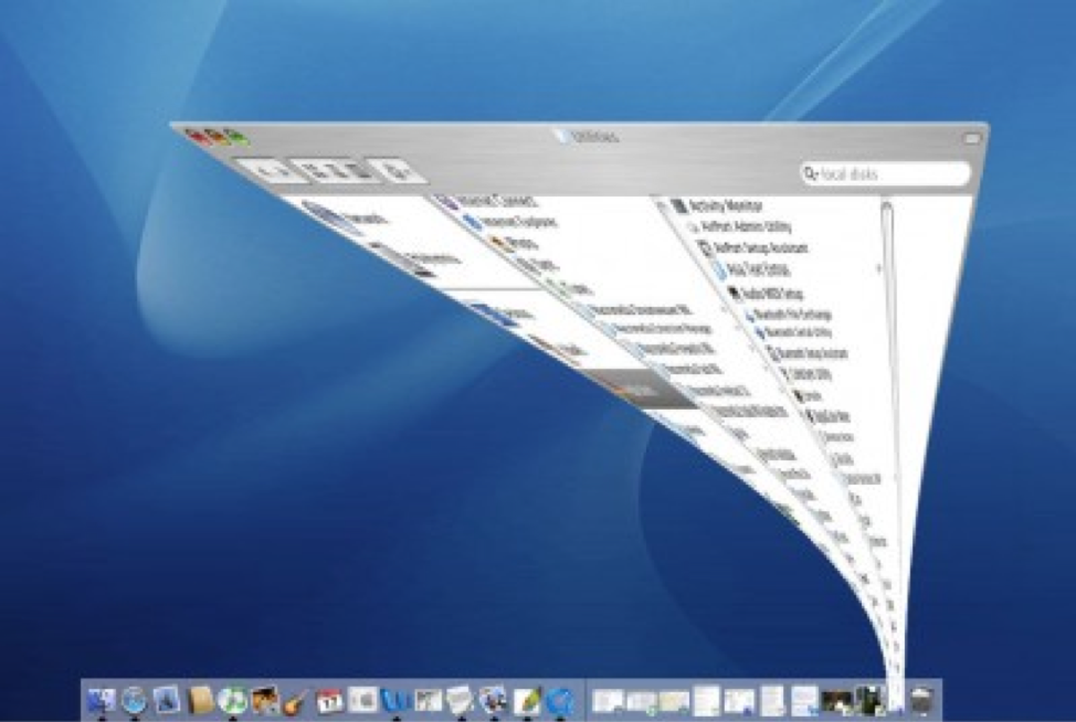
Every company needs a top-manager who cares about design and is ready to fight for it. It’s a well-known fact that when the original minimize animation in macOS that was proposed by the Apple motion design team, the engineering team said that it was impossible to implement that. At that time, Steve Jobs insisted that this animation is a must-have for MacOS. As a result, this animation became not only the most memorable transition for first-time users but also one of the things that contribute to good UX in MacOS.
The instantly memorable window animation of the Mac OS (Large preview)
A Robust Visual Design Language Is The Heart Of Good UX
Visual language can have a dramatic impact on user experience. It’s able not only to reduce friction by making UI more predictable but also to create delight. By pairing great form with excellent function, we will have an excellent user experience.
Visual language is a by-product of product design, and it requires a similar design process. It’s iterative and requires validation at every step along the way. When you build a visual language, you establish a new ecosystem for designers, and this ecosystem creates harmony between different teams involved in product development.
In addition to a GUI, Python and REST APIs, it is now possible to access your Zatocaches from command line. Learn from this article how to quickly check, set, and delete keys in this way. It's particularly useful for remote SSH connections to Zato environments.
Prerequisites
This functionality will be released in Zato 3.2 (June 2020). Right now, if you would like to use it, Zato needs to be installed from the source.
When you’re looking for the right database, it’s easy to forget the part that will most affect your experience in practice: the user interface.
For new developers, an intuitive and "discoverable" GUI can be just as important as documentation. One diagram is worth a thousand stack overflow threads, as they say.
Using CSCS Scripting Language For Cross-Platform Development
Using CSCS Scripting Language For Cross-Platform Development
Vassili Kaplan
Our goal is not to build a platform; it’s to be cross all of them.
— Mark Zuckerberg
CSCS (Customized Scripting in C#) is an open-source scripting language implemented in C#. Syntactically it’s very similar to JavaScript, but it also has some similarities with Python. Some of these similarities are the keywords in the well-known if…elif…else construct, and also have the same variable scope definition as in Python (e.g. a variable defined inside of an if block or inside a loop will be also visible outside).
As opposed to JavaScript and Python, variables and functions in CSCS are case-insensitive. The primary goal of CSCS is to let the developer write as little code as possible. Also, the same code is used for both iOS and Android development. Additionally, CSCS can be used for Windows, Mac, and Unity development.
Note: You can read more about how Microsoft uses CSCS in their Maquette product (based on Unity) over here.
CSCS can be added to your project by embedding its C# source code into a Visual Studio Xamarin project. Unlike most other languages, you have full ownership of the CSCS source code and can easily add or modify its functionality. I’ll be sharing an example of this later on in the article.
Also, we are going to learn how to get started with CSCS and use some more advanced features that have been covered in other articles. Among these features, we are going to access a Web Service via Web Requests with JSON string parsing, and we’ll also be using SQLite on iOS and Android.
The easiest way to get started is to download a sample of a project using CSCS and start playing with the start.cscs file. This is what we’ll be doing in the next section: creating an iOS/Android app with basic GUI and events.
"Hello, World!" In CSCS
Let’s start with a relatively simple example of CSCS code that constructs a screen with a few widgets:
The image below shows the resulting user interface on an iPhone as well as an Android device after clicking on the “Hello” button and not typing anything in the “Text Edit” field:
“Hello, World!” on iPhone (left) and Android (right) (Large preview)
Let’s briefly go over the code above. It starts with the AutoScale() function call, and what that does is to tell the parser that the widget sizes are relative to the screen size, i.e. they will be auto-resized (the widget will look bigger on bigger screens and smaller on smaller screens). This setting could be also overridden per widget.
Note that there is no need to create a special handler on a button click. If you define a function with name widgetName_click(), it will be used as a handler when the user clicks on a widget called widgetName (it doesn’t have to be a button, it can actually be any widget). That’s why the function buttonHi_click() will be triggered as soon as the user clicks on the button.
You may have noticed that the GUI is constructed completely in code. This is done by supplying a relative widget location when adding it. The general format of a location command is the following:
The widget width and height will be relative to the screen size if the AutoScale() CSCS command was previously run. Also, the initial value (in case of a button) is the text shown on it. This can be changed anytime by invoking SetText(widgetName, newText).
Using Visual Studio Code To Debug CSCS
We can also use Visual Studio Code to debug CSCS scripts. If you want to develop apps for both Android and iOS, you need to use a Mac. After installing Visual Studio Code, install the CSCS Debugger and REPL extension.
In order to use the extension, add this line of code anywhere in your start.cscs CSCS script:
StartDebugger();
The following image below shows how you can use Visual Studio Code to debug and change the functionality of the “Hello, World!” app that we developed in the previous section. In the upcoming example, we’ll be adding a label and a button on the fly to the existing layout.
To do this, we just select the code to be executed by the parser and press Ctrl + 8. As a result, a label and a button will be added at the center of the screen. We also add a button handler that will update the new label with the current time on each button click.
Changing Layout on the fly with Visual Studio Code (Large preview)
Using SQLite In CSCS
SQLite is an ACID (Atomicity, Consistency, Isolation, Durability) type of a relational database, and was developed by Richard Hipp (the first version was released in 2000). In difference to other relational databases, like Microsoft SQL Server or Oracle Database, it’s embedded. (Embedded not only into the device, but also into the end program.) It’s included in the program as a very compact library, which is less than 500 KB in size. But two apps (released by the same developer) can read the same SQLite DB if the DB file path is known to both apps.
The advantage of SQLite is that it can be used without an extra installation on an iOS or an Android device. The disadvantage is that it obviously cannot hold as much data as a “normal” DB and also that it’s weakly typed (i.e. you can insert a string instead of an integer — it will then be converted to an integer or 0 on failure). On the other hand, the latter can be also seen as an advantage as well.
SQLite can be easily used from CSCS without extra import statements. Here’s a table that will help you get an overview of the main SQLite functions used in CSCS:
Command
Description
SQLInit(DBName)
Initializes a database or sets a database to be used with consequent DB statements.
SQLDBExists(DBName)
Checks whether the DB has been initialized. Also sets the database to be used with consequent DB statements.
SQLQuery(query)
Executes an SQL query (a select statement). Returns a table with records.
SQLNonQuery(nonQuery)
Executes an SQL non-query, e.g. an update, create or delete statement. Returns number of records affected.
SQLInsert(tableName, columnList, data)
Inserts passed table of data of records to the specified DB table. The columnList argument has the following structure: colName1,colName2,…,colNameN
Table 1: SQLite commands in CSCS
This is how the SQLInit() and SQLDBExists() functions are typically used:
DBName = "myDB.db1";

if (!SQLDBExists(DBName)) {
  create = "CREATE TABLE [Data] (Symbol ntext, Low real,
    High real, Close real, Volume real,
    Stamp text DEFAULT CURRENT_TIMESTAMP)";
  SQLNonQuery(create);
}


SQLInit(DBName);
We are going to see more examples of how you can select and insert data into an SQLite database later on. I’ll show you an example of how to write stock data that has been extracted from a Web Service into a local SQLite database.
Adding Custom Functionality To CSCS
In this section, we are going to see how you can extend the CSCS functionality. As an example, we are going to see the existing implementation of the CSCS Sleep function below.
To add custom functionality, all you need to do is create a new class by deriving from the ParserFunction class, overriding its Evaluate() method, and registering this class with the parser. Here’s a short version (without error checking):
class SleepFunction : ParserFunction
{
  protected override Variable Evaluate(ParsingScript script)
  {
    List  args = script.GetFunctionArgs();
    int sleepms = Utils.GetSafeInt(args, 0);
    Thread.Sleep(sleepms);

    return Variable.EmptyInstance;
  }
}
Registration of a class with the parser can be done anywhere in the initialization stage via the following command:
ParserFunction.RegisterFunction("Sleep", new SleepFunction());
That’s it! Now the Evaluate() method of the SleepFunction class will be invoked as soon as a “Sleep” token is extracted by the parser.
Note that CSCS is case insensitive (except the core control flow statements: if, elif, else, for, while, function, include, new, class, return, try, throw, catch, break, continue). This means that you can type either “sleep(100)” or “Sleep(100)” — both calls will suspend the executing thread for 100 milliseconds.
Processing JSON In CSCS
JSON (JavaScript Object Notation) is a lightweight data interchange format, consisting of attribute-value pairs and array-type pairs. It was developed by Douglas Crockford in the early 2000s (around same time when SQLite appeared as well).
In this section, we are going to learn how to parse JSON using CSCS.
The CSCS function to parse a JSON string is GetVariableFromJSON(jsonText). This function returns a hash table in which the keys are the attributes from the JSON string.
In the next section, we are going to see another example of parsing a JSON string from a Web Service.
An Example Of An App With SQLite, Web Requests And JSON
For an app using SQLite, a Web Service and JSON parsing, we are going to use Alpha Vantage Web Service. You can get an API Key for free but the free version allows accessing their web service no more than 5 times per minute.
Using Alpha Vantage, you can extract various financial data sets — including stock prices. This is what we are going to do in our sample app.
The image below shows how the Stocks apps looks on an iOS and on an Android device.
Extracting Stocks from Alpha Vantage Web Service on iOS (left) and Android (right) (Large preview)
The last two parameters are functions to invoke on completion of the web request. For example, in case of a failure, the following CSCS function will be called:
function OnFailure(object, errorCode, text)
{
  SetText(labelError, text);
  lockGui(false);
}
As a result, the user will get an error message as shown below:
But, if all is good, we are going to parse the JSON string and insert its contents into the SQLite DB.
function OnSuccess(object, errorCode, text)
{
  jsonFromText  = GetVariableFromJSON(text);
  metaData      = jsonFromText[0];
  result        = jsonFromText[1];

  symbol        = metaData["2. Symbol"];
  lastRefreshed = metaData["3. Last Refreshed"];
  allDates      = result.keys;

  dateData   = result[allDates[0]];
  high       = Round(dateData["2. high"],  2);
  low        = Round(dateData["3. low"],   2);
  close      = Round(dateData["4. close"], 2);
  volume     = dateData["5. volume"];
  stockData  = {symbol, low, high, close, volume};
  SQLInsert("Data","Symbol,Low,High,Close,Volume",stockData);

  if (++loadedStocks >= totalStocks) {
    getDataFromDB();
  } else {
    getData(stocks[loadedStocks]);
  }
}
In order to understand how we access different fields in the hash table above, let’s take a look at the actual string received from the Alpha Vantage web request:
As you can see, we get the latest date as the first element of the allDates array that consists all of the extracted dates.
Conclusion
Adding CSCS to your project is easy. All you need to do is simply embed the source code of CSCS as a module to your project — just like it’s done in a sample Xamarin project.
Do you use and extend CSCS scripting language in your projects? Leave a comment below — I’d be happy to hear from you!
Further Reading
If you want to explore the CSCS language a bit more, here are some of the articles I’ve written about on the topic:
Hi. I am attempting to make a GUI program as a personal project in C++ using visual studio. This is what the program does: If you run the program at 2:30pm, the program will check off a box that says "you are in hour two" (because the hour of the day in which you decide to run the program is in the 2th hour). If you run the program at 7:20am, the program will check off a box that says "you are in hour 7" (because the hour of the day in which you decide to run the program is in the 7th hour). Lastly, it has a label at the top of the window will show the current local time.
I know need to make 12 check boxes to represent each hour of the day. I also need to disable the check boxes so that the user can not change the check boxes. Also, the computer needs to check off the box based off of the local time. Lastly, I want a button that will refresh the check boxes based off of the new time and refreshes the label that shows the current local time(ex: If the user opens the app at 8:00pm the check box that says "you are in hour 8" will be checked off. If the user leaves the GUI program on for an hour, the refresh button should check off "you are in hour 9" because by then it will be 9:00pm. Then it should change the label to the new local time).
I don't know some of the syntax in C++ to do set and disable the check buttons. If anyone knows the how to do this, I will greatly appreciate the help.
Here is my code so far:
public:
        MyForm(void)
        {
            InitializeComponent();

            //Shows current time in label 2
            DateTime datetime = DateTime::Now;
            this->label2->Text = datetime.ToString("hh:mm");

            checkBox1->Enabled = false; //disables checkbox for hour 1
            checkBox2->Enabled = false; //disables checkbox for hour 2
            checkBox3->Enabled = false; //disables checkbox for hour 3
            checkBox4->Enabled = false; //disables checkbox for hour 4
            checkBox5->Enabled = false; //disables checkbox for hour 5
            checkBox6->Enabled = false; //disables checkbox for hour 6
            checkBox7->Enabled = false; //disables checkbox for hour 7
            checkBox8->Enabled = false; //disables checkbox for hour 8
            checkBox9->Enabled = false; //disables checkbox for hour 9
            checkBox10->Enabled = false; //disables checkbox for hour 10
            checkBox11->Enabled = false;//disables checkbox for hour 11
            checkBox12->Enabled = false; //disables checkbox for hour 12
            //
            //TODO: Add the constructor code here
            //
        }
//_______________________________________________________________
/*Here is what I have done for hour 1. If I can get this to work then I can do the same for the other check boxes.*/

private: System::Void checkBox1_CheckedChanged(System::Object^ sender, System::EventArgs^ e) {
    //Controls time for binary clock
    time_t currentTime;
    struct tm* localTime;

    time(&tTime);                   // Get the current time
    localTime = localtime(&tTime);  // Convert the current time to the local time

    int Hour = localTime->tm_hour % 12; //Must mod time by 12 to get standard time

    if (Hour = 1) {

        checkBox1->Checked = true; //checks off box
    }
}
//__________________________________________________________
/*This part of the code is for the refresh button. Right now, all it does is updates
the current time in label 2 but does not update the check boxes to reflect the time*/

private: System::Void button1_Click(System::Object^ sender, System::EventArgs^ e) {
    DateTime datetime = DateTime::Now;
    this->label2->Text = datetime.ToString("hh:mm");
}
Hi. I wanted to create a GUI application with C++ as a personal project. I am using that because I have done a lot of GUI personal projects in Java but never in C++, so I want to try using a new coding language I learned. I don't know a lot about GUI with C++ (only header files and some library components of C++) so I decided to look up some information on how to do this in C++.
However, when I go to look up information about non-editable radio buttons in C++ and more, I don't get a lot of information. Is it because no one really uses C++ for making graphic user interface? If they do use C++ for GUI sometimes then can someone send me a link that shows the library functions for the GUI components, how to use these functions and some source code that has an example of how to use it?
I know that some IDE's allow you to click and drag buttons, but I want to try and write this code from scratch. Also, I am using Codelite for this project and (as far I know) I don't think it will allow you to click and drag buttons.
Web pages can consist of the number of web elements or GUI elements like radio buttons, text boxes, drop-downs, inputs, etc. Web locators in the context of Selenium automation testing are used to perform different actions on the web elements of a page. Which makes it no surprise that as a new Selenium user, the first thing we aim to learn is Selenium Locators.
These locators are the bread and butter of any Selenium automation testing framework, no matter the type of testing you are doing, ranging from unit testing to end-to-end, automated, cross-browser testing. There are many types of locators used, such as CSS Selector, XPath, Link, Text, ID, etc. So far, you get eight types of locators in Selenium. This number, however, is going to change in the new Selenium 4 release. Wondering why?
Here's a lineup of the most highly rated web UI tools.
At least a dozen brand new UI test automation tools have surfaced in the last few years. Since every tool has its own focus and strategy, it can be hard to know where to start. Looking for more guidance? Check out the top new UI testing tools below.
As any UI tester could contest, UI testing is relatively straightforward, as long as nothing in your GUI changes, but the problem is...things change all the time. Depending on the solution you’ve chosen for UI testing, changing conditions can either be a revolutionary experience with self-healing and AI locators, or an abysmal failure of convoluted manual workflows.
PostgreSQL graphical user interface (GUI) tools help these open source database users to manage, manipulate, and visualize their data. In this post, we discuss the top 5 GUI tools for administering your PostgreSQL deployments. PostgreSQL is the fourth most popular database management system in the world and is heavily used in all sizes of applications. The traditional method to work with databases is using the command-line interface (CLI) tool, however, this interface presents a number of issues:
It requires a big learning curve to get the best out of the DBMS
Console display may not be something of your like, and it only gives very little information at a time
It is difficult to browse databases and tables, check indexes, and monitor databases through the console
Many still prefer CLIs over GUIs, but this set is ever so shrinking. I believe anyone who comes to programming after 2010 will tell you GUI tools increase their productivity over a CLI solution.
The digital and technological landscape is constantly changing — new products and technologies are popping up every day. Designers have to keep track of what is trending and where creative opportunities are. A great designer has the vision to analyze new technology, identify its potential, and use it to design better products or services.
Among the various technologies that we have today, there’s one that gets a lot of attention: Augmented Reality. Companies like Apple and Google realize the potential of AR and invest significant amounts of resources into this technology. But when it comes to creating an AR experience, many designers find themselves in unfamiliar territory. Does AR require a different kind of UX and design process?
As for me, I’m a big fan of learning-by-doing, and I was lucky enough to work on the Airbus mobile app as well as the Rokid AR glasses OS product design. I’ve established a few practical rules that will help designers to get started creating compelling AR experiences. The rules work both for mobile augmented reality (MAR) and AR glasses experiences.
Rokid Glasses motion design exploration by Gleb Kuznetsov
Glossary
Let’s quickly define the key terms that we will use in the article:
Mobile Augmented Reality (MAR) is delivering augmented reality experienced on mobile devices (smartphones and tablets);
AR Glasses are a wearable smart display with a see-through viewing an augmented reality experience.
1. Get Buy-In From Stakeholders
Similar to any other project you work for, it is vital that you get support from stakeholders as early in the process as is possible. Despite being buzzed about for years, many stakeholders have never used AR products. As a result, they can question the technology just because they don’t understand the value it delivers. Our objective is to get an agreement from them.
“Why do we want to use AR? What problem does it solve?” are questions that stakeholders ask when they evaluate the design. It’s vital to connect your design decisions to the goals and objectives of the business. Before reaching stakeholders, you need to evaluate your product for AR potential. Here are three areas where AR can bring a lot of value:
Business Goals Understand the business goals you're trying to solve for using AR. Stakeholders always appreciate connecting design solutions to the goals of the business. A lot of time business will respond to quantifiable numbers. Thus, be ready to provide an explanation off how your design is intended to help the company make more money or save more money.
Helpfulness For Users AR will provide a better user experience and make the user journey a lot easier. Stakeholders appreciate technologies that improve the main use of the app. Think about the specific value that AR brings to users.
Creativity AR is excellent when it comes to creating a more memorable experience and improving the design language of a product. Businesses often have a specific image they are trying to portrait, and product design has to reflect this.
Only when you have a clear answer to the question “Why is this better with AR?”, you will need to share your thoughts with stakeholders. Invest your time in preparing a presentation. Seeing is believing, and you’ll have better chances of buy-in from management when you show a demo for them. The demo should make it clear what are you proposing.
2. Discovery And Ideation
Explore And Use Solutions From Other Fields
No matter what product you design, you have to spend enough time researching the subject. When it comes to designing for AR, look for innovations and successful examples with similar solutions from other industries. For example, when my team was designing audio output for AR glasses, we learned a lot from headphones and speakers on mobile phones.
Design User Journey Using “As A User I Want” Technique
One of the fundamental things you should remember when designing AR experiences is that AR exists outside of the phone or glasses. AR technology is just a medium that people use to receive information. The tasks that users want to accomplish using this technology are what is really important.
“How to define a key feature set and be sure it will be valuable for our users?” is a crucial question you need to answer before designing your product. Since the core idea of user-centered design is to keep the user in the center, your design must be based on the understanding of users, their goals and contexts of use. In other words, we need to embrace the user journey.
When I work on a new project, I use a simple technique “As a [type of user], I want [goal] because [reason].” I put myself in the user's shoes and think about what will be valuable for them. This technique is handy during brainstorming sessions. Used together with storyboarding, it allows you to explore various scenarios of interaction.
In the article “Designing Tomorrow Today: the Airbus iflyA380 App,” I’ve described in detail the process that my team followed when we created the app. The critical element of the design process was getting into the passenger’s mind, looking for insights into what the best user experience would be before, during and after their flight.
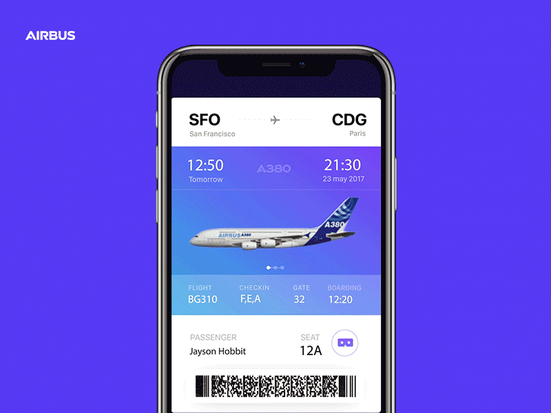
To understand what travelers like and dislike about the travel experience, we held a lot of brainstorming sessions together with Airbus. Those sessions revealed a lot of valuable insights. For example, we found that visiting the cabin (from home) before flying on the A380 was one of the common things users want to do. The app uses augmented reality so people can explore the cabin and virtually visit the upper deck, the cockpit, the lounges — wherever they want to go — even before boarding the plane.
App also accompanies passengers from the beginning to the end of their journey — basically, everything a traveler wants to do with the trip is wrapped up in a single app. Finding your seat is one of the features we implemented. This feature uses AR to show your seat in a plane. As a frequent traveler, I love that feature; you don’t need to search for the place at the time when you enter the cabin, you can do it beforehand — from the comfort of your couch. Users can access this feature right from the boarding pass — by tapping on ‘glass’ icon.
IFLY A380 app users can access the AR feature by tapping on the ‘glass’ icon. (Large preview)
Narrow Down Use Cases
It might be tempting to use AR to solve a few different problems for users. But in many cases, it’s better to resist this temptation. Why? Because by adding too many features in your product, you make it not only more complex but also more expensive. This rule is even more critical for AR experience that generally requires more effort. It’s always better to start with simple but well-designed AR experience rather than multiple complex but loose designed AR experiences.
Here are two simple rules to follow:
Prioritize the problems and focus on the critical ones.
Use storyboarding to understand exactly how users will interact with your app.
Remember to be realistic. Being realistic means that you need to strike a balance between creativity and technical capabilities.
Use Prototypes To Assess Ideas
When we design traditional apps, we often use static sketches to assess ideas. But this approach won’t work for AR apps.
Thus, we need to interact with a prototype to get this understanding. That’s why it’s essential to get to prototyping state as soon as possible.
It’s important to mention that when I say ‘prototyping state’ I don’t mean a state when you create a polished high-fidelity prototype of your product that looks and work as a real product. What I mean is using a technique of rapid prototyping and building a prototype that helps you experience the interaction. You need to make prototypes really fast — remember that the goal of rapid prototyping is in evaluating your ideas, not in demonstrating your skills as a visual designer.
3. Design
Similar to any other product you design, when you work on AR product, your ultimate goal is to create intuitive, engaging, and clean interface. But it can be challenging since the interface in AR apps accounts both for input and output.
Physical Environment
AR is inherently an environmental medium. That’s why the first step in designing AR experience is defining where the user will be using your app. It’s vital to select the environment up front. And when I say ‘environment’, I mean a physical environment where the user will experience the app — it could be indoors or outdoors.
Here are three crucial moments that you should consider:
How much space users need to experience AR? Users should have a clear understanding of the amount of space they’ll need for your app. Help users understand the ideal conditions for using the app before they start the experience.
Anticipate that people will use your app in environments that aren’t optimal for AR. Most physical environments can have limitations. For example, your app is AR table tennis game but your users might not have a large horizontal surface. In this case, you might want to use a virtual table generated based on your device orientation.
Light estimation is essential. Your app should analyze the environment automatically and provide contextual guidance if the environment is not good enough. If the environment is too dark or too bright for your app, tell the user that they should find a better place to use your app. ARCore and ARKit have a built-in system for light estimation.
When my team designed Airbus i380 mobile AR experience, we took the available physical space into account. Also, we’ve considered the other aspects of interaction, such as the speed at which the user should make decisions. For instance, the user who wants to find her seat during the boarding won’t have too much time.
We sketched the environment (in our case, it was a plane inside and outside) and put AR objects in our sketch. By making our ideas tangible, we got an understanding of how the user will want to interact with our app and how our app will adapt to the constraints of the environment.
AR Realism And AR Objects Aesthetics
After you define the environment and required properties, you will need to design AR objects. One of the goals behind creating AR experience is to blend virtual with real. The objects you design should fit into the environment — people should believe that AR objects are real. That’s why it’s important to render digital content in context with the highest levels of realism.
Here are a few rules to follow:
Focus on the level of details and design 3D assets with lifelike textures. I recommend using multi-layer texture model such as PBR (Physically Based Rendering model). Most AR development tools support it, and this is the most cost-effective solution to achieve an advanced degree of detail for your AR objects.
Get the lighting right. Lighting is a very crucial factor for creating realism — the wrong light instantly breaks the immersion. Use dynamic lighting, reflect environmental lighting conditions on virtual objects, cast object shadows, and reflections on real-world surfaces to create more realistic objects. Also, your app should react to real-world changing of lighting.
Minimize the size of textures. Mobile devices are generally less powerful than desktops. Thus, to let your scene load faster, don’t make textures too large. Strive to use 2k resolution at most.
Add visual noise to AR textures. Flat-colored surfaces will look fake to the user's eye. Textures will appear more lifelike when you introduce rips, pattern disruptions, and other forms of visual noise.
Prevent flickering. Update the scene 60 times per second to prevent flickering of AR objects.
Design For Safety And Comfort
AR usually accompanied by the word ‘immersive.’ Creating immersive experience is a great goal, but AR immersion can be dangerous — people can be so immersed in smartphones/glasses, so they forget what is happening around them, and this can cause problems. Users might not notice hazards around them and bump into objects. This phenomenon is known as cognitive tunneling. And it caused a lot of physical traumas.
Avoid users from doing anything uncomfortable — for example, physically demanding actions or rapid/expansive motion.
Keep the user safe. Avoid situations when users have to walk backward.
Avoid long play AR sessions. Users can get fatigued using AR for extended periods. Design stop points and in-app notifications that they should take a break. For instance, if you design an AR game, let users pause or save their progress.
Placement For Virtual Objects
There are two ways of placing virtual objects — on the screen or in the world. Depending on the needs of your project and device capabilities, you can follow either the first or second approach. Generally, virtual elements should be placed in world space if they suppose to act like real objects (e.g., a virtual statue in AR space), and should be placed as an on-screen overlay if they intended to be UI controls or information messages (e.g., notification).
‘Should every object in AR space be 3D?’ is a common question among designers who work on AR experiences. The answer is no. Not everything in the AR space should be 3D. In fact, in some cases like in-app notifications, it's preferable to use flat 2D objects because they will be less visually distracting.
Phone vibrations are frequently used to send feedback in mobile apps. But using the same approach in AR can cause a lot of problems — haptic feedback introduces extra noise and makes the experience less enjoyable (especially for AR Glasses users). In most cases, it’s better to use sound effect for feedback.
Make A Clear Transition Into AR
Both for MAR and AR glass experiences, you should let users know they’re about to transition into AR. Design a transition state. For the ifly380 app, we used an animated transition — a simple animated effect that user sees when taps on the AR mode icon.
Trim all the fat.
Devote as much of the screen as possible to viewing the physical world and your app's virtual objects:
Reduce the total number of interactable elements on the screen available for the user at one moment of time.
Avoid placing visible UI controls and text messages in your viewport unless they are necessary for the interaction. A visually clean UI lends itself seamlessly to the immersive experience you’re building.
Prevent distractions. Limit the number of times when objects appear on the user screen out of the blue. Anything that appears out of the blue instantly kills realism and make the user focus on the object.
AR Object Manipulation And Delineating Boundaries Between The ‘Augment’ And The ‘Reality’
When it comes to designing a mechanism of interaction with virtual objects, favor direct manipulation for virtual objects — the user should be able to touch an object on the screen and interact with it using standard, familiar gestures, rather than interact with separate visible UI controls.
Also, users should have a clear understanding of what elements they can interact with and what elements are static. Make it easy for users to spot interactive objects and then interact with them by providing visual signifiers for interactive objects. Use glowing outlines or other visual highlights to let users know what’s interactive.
Scan object effect for outdoor MAR by Gleb Kuznetsov. (Large preview)
When the user interacts with an object, you need to communicate that the object is selected visually. Design a selection state — use either highlight the entire object or space underneath it to give the user a clear indication that it’s selected.
Last but not least, follows the rules of physics for objects. Just like real objects, AR objects should react to the real-world environment.
Design For Freedom Of Camera
AR invites movement and motion from the user. One of the significant challenges when designing or AR is giving users the ability to control the camera. When you give users the ability to control the view, they will swing device around in an attempt to find the points of interest. And not all apps are designed to help the user to control the viewfinder.
The first three ways are common for mobile AR while the last one is common for AR glasses.
In some cases, MAR users want to rotate the device for ease of use. Don’t interrupt the camera with rotation animation.
Consider Accessibility When Designing AR
As with any other product we design, our goal is to make augmented reality technology accessible for people. Here are a few general recommendations on how to address real-world accessibility issues:
Blind users. Visual information is not accessible to blind users. To make AR accessible for blind users, you might want to use audio or haptic feedback to deliver navigation instructions and other important information.
Deaf or hard-hearing users. For AR experience that requires voice interaction, you can use visual signals as an input method (also known as speechreading). The app can learn to analyze lip movement and translate this data in commands.
If you're interested in learning more practical tips on how to create accessible AR apps, consider watching the video talk by Leah Findlater:
Encourage Users To Move
If your experience demands exploration, remind users they can move around. Many users have never experienced a 360-degree virtual environment before, and you need to motivate them to change the position of their device. You can use an interactive object to do that. For example, during I/0 2018, Google used an animated fox for Google Maps that guided users to the target destination.
This AR experience uses an animated bird to guide users. (Large preview)
Remember That Animation Is A Designer’s Best Friend
Animation can be multipurpose. First, you can use a combination of visual cues and animation to teach users. For example, the animation of a moving phone around will make it clear what users have to do to initialize the app.
Well-designed animated effects help to create a connection between the user and the product — they make the object feel tangible. Even a simple object such as loading indicator can build a bridge of trust between users and the device.
A critical moment about animation — after discovering the elements of design and finding design solutions for the animation base, it’s essential to spend enough time on creating a proper animated effect. It took lots of iterations to finish a loading animation that you see above. You have to test every animation to be sure it works for your design and be ready to adjust color, positioning, etc. to give the best effect.
Prototype On The Actual Device
In the interview for Rokid team, Jeshua Nanthakumar mentioned that the most effective AR prototypes are always physical. That’s because when you prototype on the actual device, from the beginning, you make design work well on hardware and software that people actually use. When it comes to unique displays like on the Rokid Glasses, this methodology is especially important. By doing that you’ll ensure your design is implementable.
Motion design language exploration for AR Glasses Rokid by Gleb Kuznetsov. (Large preview)
My team was responsible for designing the AR motion design language and loading animation for AR glasses. We decided to use a 3D sphere that will be rotated during the loading and will have nice reflections on its edges. The design of the animated effect took two weeks of hard work of motion designers and it looked gorgeous on high-res monitors of our design team, but the final result wasn’t good enough because the animation caused motion sickness.
Motion sickness often caused by the discrepancies between the motion perceived from the screen of AR Glasses and the actual movement of the user's head. But in our case, the root cause of the motion sickness was different — since we put a lot of attention in polishing details like shapes, reflections, etc. unintentionally we made users focus on those details while the sphere was moving.
As a result, the motion happened in the periphery, and since humans are more sensitive to the moving objects in the periphery this caused motion sickness. We solved this problem by simplifying the animation. But it’s critical to mention that we won’t be able to find this problem without testing on the actual device.
If we compare the actual procedure of testing of AR apps with traditional GUI apps, it will be evident that testing AR apps require more manual interactions. A person who conducts testing should determine whether the app provides the correct output based on the current context.
Here are a few tips that I have for conducting efficient usability testing sessions:
Prepare a physical environment to test in. Try to create real-world conditions for your app — test it with various physical objects, in different scenes with different lighting. But the environment might not be limited to scene and lighting.
Don’t try to test everything all at once. Use a technique of chunking. Breaking down a complex flow into smaller pieces and testing them separately is always beneficial.
Always record your testing session. Record everything that you see in the AR glass. A session record will be beneficial during discussions with your team.
Testing for motion sickness.
Share your testing results with developers. Try to mitigate the gap between design and development. Make sure your engineering team knows what problem you face.
Conclusion
Similar to any other new technology, AR comes with many unknowns. Designers who work on AR projects have a role of explorers — they experiment and try various approaches in order to find the one that works best for their product and delivers the value for people who will use it.
Personally, I believe that it’s always great to explore new mediums and find new original ways of solving old problems. We are still at the beginning stages of the new technological revolution — the exciting time when technologies like AR will be an expected part of our daily routines — and it’s our opportunity to create a solid foundation for the future generation of designers.
I’ve been working with Java for about 14 years now, and the last two years I’ve also worked with Node.js and Golang to build some middleware AI platforms at my startup. Nevertheless, I often push myself in learning other technologies as well. I’ve been learning Python these past few weeks. I was inspired by its concise syntax and the prominent feature that supports almost anything. You can use Python for any GUI and/or web development, operating system shell, data processing and analysis (data science), etc. Someone said that you can build the world with Python. Mmmmm, sounds interesting.
Since I believe that the best way to grasp the knowledge is to write what I’ve learned, I’m gonna try here to write everything I know so far about Python. I have read different books and websites, so here I’m trying to summarize within six parts everything I gotten from these different resources. Hopefully, you'll find this article useful, especially for those of you who are trying to learn Python in a crash course.
Providing users of your application with feedback regarding long running operations used to require utilizing pull based solutions such as polling. In modern web applications, however, utilizing push based data streaming solutions to provide such feedback is the norm. But what options do we have if we’re building modern cloud native OSGi applications and we wish to implement such monitoring solutions?
In this article, I will show you how implementations of some of the latest OSGi specifications — i.e. OSGI R7 Push Stream, OSGi R7 HTTP Whiteboard, and OSGi R7 JAX-RS Whiteboard —can be applied, along with Server Sent Events, to implement such push based data streaming solutions. So, instead of having a background JavaScript worker slamming the server with requests for status every few seconds, we’ll have the server push data updates and have them displayed onto our GUI.
We face different challenges when testing voice apps than when we test GUI apps. For instance, GUI apps limit the number of possible interactions a user might do. Voice, on the other hand, allows a much richer and complex set of spoken interactions, increasing the difficulty of testing. Additionally, the backend behind voice apps includes several components not owned by developers. These AI-powered elements are constantly learning and evolving by gathering insights from the myriad of interactions they receive. This is why they get constant updates and improvements, which requires us to keep up on our side by doing continuous verification to be sure nothing has broken, and that our app continues to deliver great voice experiences to our users.
We are witnessing a notable increase in the complexity of voice applications as a result of the effort companies do to provide enriched experiences that allow users to solve real and day-to-day problems. In this scenario, testing voice apps is a must.
You can find plenty of free mockups online, but most cater to Photoshop users. In recent years Sketch has grown rapidly with tons of plugins and free tutorials to help beginners move into this alternative UI design software.
This also means you’ll find tons of awesome Sketch freebies online ranging from complete mockups to detailed UI kits. And in this post, I’ve curated my top 10 picks for the best freebie UI kits for any Sketch user.
All the Mobile UI Kits You Could Ask For
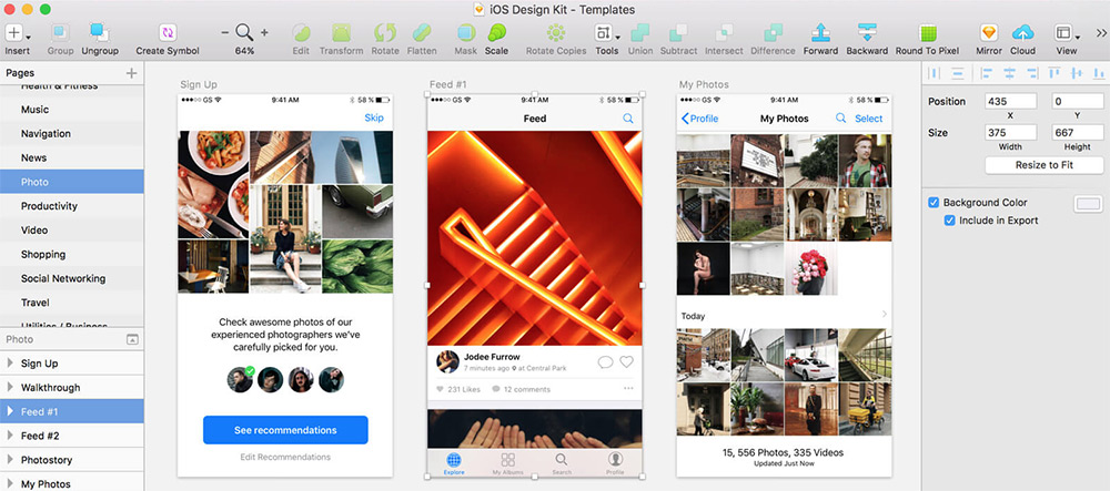
iOS Design Kit
Every new release of iOS prompts an updated GUI kit and this freebie is by far the most comprehensive one to date.
It covers all the major elements for iPhone and iPad apps with free kits for most design software. You’ll find PSDs for Photoshop too, but you can download just the Sketch files with the same iOS-styled vector elements.
These elements all come in @1x size, but since they’re vectors you can easily resize them without any quality loss.
Google Now UI
One of Google’s lesser-known projects is the Google Now prediction app. Designer Manu Akash created a variation of the Google Now UI as a Sketch freebie.
This kit features a lot of the main application pages but also uses styles from the material design library. It’s a great freebie to keep saved if you want to design Android apps while following Google’s design styles.
Blog Kit
Free blogging platforms like Medium have changed the face of writing on the web. And this free blog UI kit shows what’s possible with a great mobile application UI following that same tactic.
Designer Thomas Budiman created this blog/writing kit for Sketch with a focus on mobile app design. It spans many different types of interfaces like gallery pages, article archives, and signup/login forms for new users.
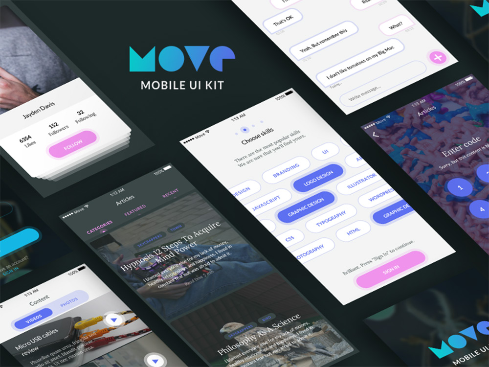
Move Mobile UI Kit
Move UI is a free mobile app mockup pack created by Czech designer Volodymyr Kurbatov. This pack doesn’t focus specifically on elements, but rather on screen designs and interfaces for different situations.
But in these interfaces you’ll find all the common mobile elements like buttons, input fields, tabs, post archives, slideshows, and pretty much everything else you might use for a custom mobile application.
This freebie is hosted on Gumroad so it works through their checkout system, but notice it’s a whopping $0, so it won’t cost you anything to download.
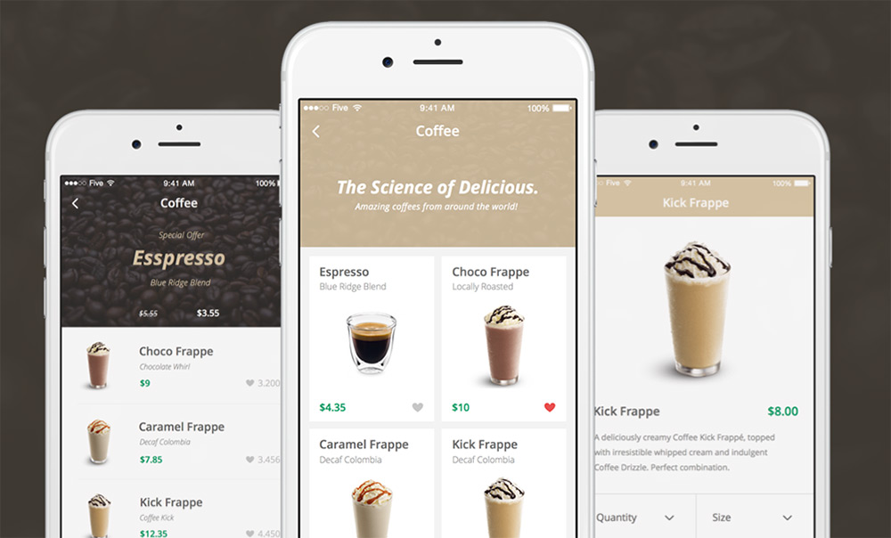
Coffee Shop iOS Kit
For a very unique eCommerce-style UI kit check out this coffee shop freebie designed in Sketch. It mimics an iOS application for a local coffee shop with over 50 screens covering the shop menu, checkout, and product pages(among many others).
The coolest thing about this freebie is the ease of use. You can take this design and customize it however you want to create any type of mobile eCommerce interface.
Each element is a scalable vector and the text is all based on free Google Webfonts.
Social Leads App
Social media is a huge part of today’s web and this freebie offers a really cool start for mobile designers.
The interface kit comes with a handful of screens showcasing a social marketing application. The screens feature user lists, login fields, profile pages, and photo upload/edit screens for interactivity.
Many of these elements can be expanded to a full website layout so don’t feel constrained to a mobile design. This UI kit also follows the material design language so it’s best suited for Android or Google-type interfaces.
Bootstrap UI Kit
The Bootstrap library is hugely popular amongst designers and it’s the fastest way to get a new project online. You can always start by coding the layout first, but it’s usually easier to work with a mockup like this BS3 UI kit.
This is totally free to download in both AI and Sketch format. Each element perfectly matches with the Bootstrap 3 kit, and it uses Glyphicons, just like Bootstrap.
If you’re designing with Bootstrap, then you’ll absolutely want a copy of this freebie.
And if you’re eager to move into Bootstrap 4 then check out this Sketch freebie of the BS4 grid system. It’s not a complete BS4 kit since that version is still in Alpha release, but hopefully we’ll see more of those freebies in the next couple years.
Harmony UI Kit
This mobile map UI kit features all the pin drops, location arrows, and search features you’d expect from a geolocation app. The Harmony UI Kit by Dawid Młynarz is one of the newer Sketch freebies on this list first being released in mid-2017.
It comes with a dozen mobile app screens of map interfaces and search features for finding directions on a phone.
The UI kit is totally free but it’s also hosted on Gumroad so the download process can feel a little weird.
Tinder iOS UI Kit
Here’s another niche mobile UI kit based on the Tinder interface. This freebie was created by Gilberto De La Garza and released for free on Sketch App Sources.
It comes packed with 15 different views for profiles, user lists, dating info, and photo pages. This interface kit mimics the Tinder application, but you can pick out smaller elements from this UI kit and use them on your own.
Sketch is perfect for iOS app design because it lets you resize elements without any quality loss. That’s why kits like this Tinder freebie are so valuable for newer designers just learning the ropes of UI work.
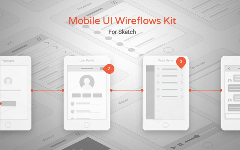
Mobile Wireframes
Digital wireframing is a huge part of any interface project. The process of wireframing and even prototyping helps you map the interface with clarity before designing the colors, textures, and typography.
This mobile wireframe freebie is an excellent place to start. It’s built specifically for Sketch and comes with 57 different mobile interface screens you can pair together.
All of these screens include vector elements that you can also arrange to your liking. A really fantastic UI kit for pre-design work and basic prototyping.
A lot of beginner tutorials start with “Hello World” examples. There are plenty of websites that use a calculator application as a kind of “Hello World” for GUI beginners. Calculators are a good way to learn because they have a set of widgets that you need to lay out in an orderly fashion. They also require a certain amount of logic to make them work correctly. For this calculator, let’s focus on being able to do the following:
Addition
Subtraction
Multiplication
Division
I think that supporting these four functions is a great starting place and also give you plenty of room for enhancing the application on your own.


