What is a Web Safe Font + 19 Best Web Safe Fonts (Beginner’s Guide)

Are you wondering what a web-safe font is and what the best web-safe fonts are to use for WordPress?

Imagine pouring weeks or months into designing a beautiful website. You’ve checked all the boxes, paying attention to details like choosing the right website theme and even building out the important web pages for your business.

The only problem? Your perfectly crafted site is marred by unreadable characters or awkward text breaks.

In this article, we cover what a web-safe font is and the best ones to choose from.

what-are-web-safe-fonts-in-post

What Are Web Safe Fonts and Why Are They Important?

Web-safe fonts are already installed on most operating systems, like Microsoft Windows or Apple MacOS. Using a web-safe font stack gives you the best chance of ensuring your text appears as intended, and helps keep your website looking consistent for everyone.

If you use a font that the user’s browser or OS does not support, it will default to whatever the browser or site’s HTML / CSS declares. Which can make your content appear much differently and affect users in a lot of different ways.

Here are a few reasons why web-safe fonts are important:

  • Font choice is a reflection of your brand: For example, a romantic font like calligraphy wouldn’t reflect well if you run a non-profit website.
  • Font affects user experience: Web-safe fonts mean readers can see your font as intended. For example, if you make a WordPress website with a font only supported by the latest version of Windows 10, many of your users will see something else.
  • Font affects sales: Yes, you read that right. Your font choices can affect how many sales you make. Customers who feel comfortable on a site, whether through social proof or simply through reliable fonts, can build consumer trust. This ultimately leads to more sales and money in your pocket.

Here’s the most important thing to remember with web-safe fonts:

“90% of Internet users use a browser that supports @font-face. Not having a font stack that includes Web-safe fonts and a generic font family means that we aren’t controlling how our web design degrades for at least 10% of the Internet’s users. The time and effort required to use a simple CSS font stack that includes Web-safe fonts is very small, so there’s little reason not to continue doing it.”

William Craig – WebFX CEO & Co-Founder

Now, let’s move on to how we chose our list of the best web-safe fonts.

How We Chose the Best Fonts for Websites

With over 650,000 different fonts available online, it can be difficult to choose the right one for you. So that’s why our expert design team has gone ahead and put the most popular web-safe fonts to the test so that you don’t have to do all the research yourself.

With our list, we made sure they met these specific criteria:

  1. Readability: Fonts designed for different parts of the site. For example, big, bold fonts for headers and clean, simple fonts for the main body.
  2. Legibility: Fonts where each letter is easy to tell apart and distinguishable from one another. This improves your site’s reading experience and accessibility.
  3. Comfort/Familiarity: Fonts that feel familiar and comfortable to readers. While creative fonts are helpful, using unusual fonts might make visitors uneasy. For the most part, we stuck to the ones people were most comfortable with so that you can keep your website professional.
  4. Variety of Styles: We chose fonts that cover different styles like bold, geometric, or classic. Just like any other part of web design, your font should match your brand persona.
  5. Font Weight: Some web fonts aren’t automatically included in website tools like WordPress or page builders. This can slow down your site and make fonts look different across browsers. To help with this, we included at least one lightweight font in each category. For more tips, check out our ultimate guide to boost WordPress speed and performance.

With that said, let’s jump into the best web-safe fonts to choose from for your WordPress site.

Font NameMain TraitsBest For
Proxima NovaSleek, contemporary, subtle elegance, easy to readBlogs, professional portfolios, media companies
LatoWelcoming, approachable, balanced designMobile apps, retail stores, eCommerce websites
InterTall lowercase for readability, smooth curves for displayHome pages, digital products, ebooks
RobotoTech-inspired, friendly, wide open charactersSoftware companies, app developers, technology blogs
Alternate GothCondensed, bold, strong presence, sturdy strokesHome page headlines, thank you pages

19 Best Web Safe Fonts to Choose From

1. Proxima Nova

WPBeginner header

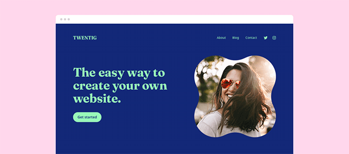
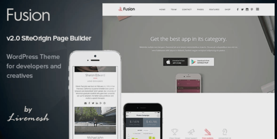
Proxima Nova is one of the most popular fonts out there. It’s the main typeface for large digital media companies like NBC News, Mashable, BuzzFeed, Wires, and, of course, WPBeginner.

Since launching WPBeginner in 2009, Proxima Nova has been a core part of our identity across branding, website, and internal projects.

It has a sleek, contemporary look with rounded edges and a subtle elegance. The letterforms are easy to read and are best known for their professionalism with a hint of friendly touch.

At WPBeginner, we don’t want an overly flashy font since we want our content to speak for itself. Proxima Nova does just that.

Best For: Blogs, professional portfolios, and media companies

2. Lato

WPForms lato

Lato was originally made for corporate clients, but it has now been repurposed and used all over the web.

It’s used on websites like Merriam-Webster, WebMD, Goodreads, and even one of our other brands like WPForms!

This web font gives off a welcoming and approachable vibe thanks to the balance it strikes between sturdy design and gentle curves.

This font matches the use case of WPForms extremely well since the plugin is known for its ease of use due to its drag-and-drop builder and intuitive interface.

Best For: Mobile apps, retail stores, eCommerce websites
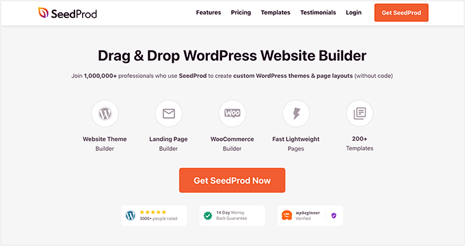
3. Inter

Seedprod Inter font

Inter is a sans-serif font, which means it does not have the small decorative strokes at the ends of characters that serif fonts have.

The smaller “text” versions of this font have tall letters to help make lowercase text easier to read. On the flip side, the larger “display” versions have smooth curves and fine details, which saves space.

SeedProd, the best page builder plugin, uses the Inter font style, which represents what the software is all about. The font exudes ease of use yet is practical, which is exactly what the page builder is.

Best For: Home pages, digital products, ebooks

4. Roboto

MonsterInsights Website

In an increasingly AI and machine-learning-driven world, the demand for typefaces such as Roboto is growing. While Roboto carries a tech-inspired, machine-like appearance, the wide-open characters provide a nice, friendly touch.

Notice how MonsterInsights uses the Roboto font to match the analytical persona of their brand. Many other popular websites use Roboto, such as Vice.com, Flipkart, and YouTube.

Given that it started off as the default font for Android devices, Roboto naturally complements tech-related websites, including software companies, app developers, and technology blogs.

Best For: Tech websites

5. Alternate Goth

blog tyrant alternate gothic

Alternate Goth, famously used in the YouTube logo, is a sans-serif typeface. It features condensed and bold letterforms, which are suitable for headlines and subtitles.

At Blog Tyrant, they use Alternate Goth for headlines only. It creates a sense of strong presence combined with contemporary design due to its sturdy strokes and heavy weight.

Best For: Home page headlines, thank you pages
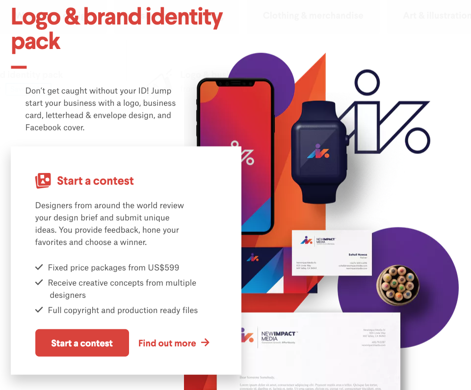
6. Montserrat

contra

Inspired by posts, signs, and painted windows from a historic neighborhood in Buenos Aires, Monsterrat has become increasingly popular, used on over 17 million websites.

The large spacing and openness of the typeface make it easy to read, even in small text sizes. That said, it also shines when used in all caps in headlines due to the simplicity of the letter. Overall, we find that Montserrat is a versatile web-safe font that creates a feeling of trust.

It’s best to use Montserrat for any business that wants to portray a more friendly and casual tone. For example, agencies, software companies, and online stores that rely heavily on customer service would benefit from Montserrat.

Notice how this Contra website in the image above uses Montserrat, which adds to the playfulness of the overall brand persona.

Best For: Agencies, software companies, online stores, digital products

7. Lora

urban dictionary lora font

Lora is a contemporary serif font that is available in Google Fonts. The main driving point of Lora is its unique brush strokes at each character’s end, giving more of an artistic vibe than other serifs.

That’s why it’s used in many entertainment websites like Urban Dictionary and The Kitchn. When adding Lora to your website, it’ll convey the mood of an art essay or modern-day store.

Lora is a great font choice for logos, titles, navigation menus, and paragraph texts. That’s because it has a clear and balanced design, making it easy to read, whether the font is big or small. The Lora brush strokes can help make logos stand out, drawing more attention in the process.

Best For: News and entertainment websites

8. Gill Sans

gill sans

Gill Sans is a modern sans serif font known for its efficient and clean-cut look. While it may not be the best choice for lengthy paragraphs due to its minimal contrast between letters and tight spacing, it excels as a visually appealing headline font or advertising.

Many of the most recognizable companies adopt Gill Sans as their typefaces, such as Toy Story, Tommy Hilfiger, BBC News, Tokyo Stock Exchange, and Phillips.

Best of all, it’s compatible across all operating systems, including macOS, iOS, and Windows-powered devices.

Best For: Advertising and header text

9. Merriweather

Harvard merriweather font

Merriweather is a Google Font designed to make reading easier on digital screens, which is why websites like Goodreads, Coursera, and Harvard.edu all use it for their paragraphs and body text.

The Merriweather typeface on the Harvard website looks sleek and clean, which highlights the professionalism that needs to be upheld with such a reputable institution.

Based on our experience, this font is well-suited for designs text-dense designs, similar to what you’ll see in magazines or RSS feeds. Its tall letterforms maintain readability across various screen sizes without taking up too much horizontal space. The typeface has a traditional and sets an overall formal and elegant tone.

Best For: Magazines, non-profit or educational websites

10. Neue Helvetica

Neue Helvetica

Neue Helvetica is used on over 218,000 websites like eBay, Yahoo, and Facebook. This typeface has a tall x-height, making it easier to read at a distance. As a result, it could be an advantage in helping your website be more mobile-friendly.

Also, there is tight spacing between letters, which saves space on the page.

Best For: Professionals, such as portfolio websites or service-based businesses

11. Garamond

Garamond

Originally developed in the 16th century, Garamond typefaces are known for their refined and elegant appearances.

Unlike many of the other fonts, these have low constant between thick and thin strokes and have slightly slanted serifs. They’re great for websites looking for a high-end, luxurious look.

Best For: Product descriptions, headlines for premium brands

12. Arial

Arial font

With over 604,000 sites already using Arial, there is no denying that Arial is a web-safe font that just works. Amazon, Facebook, and Google are just a few of the popular websites that use Arial.

It was originally designed by Monotype designers for IBM prints to boost readability. While it’s not the most eye-catching font there, it gets the job done.

The Arial font doesn’t have any decorative stokes and comes with a consistent thickness throughout the typeface to create a balanced and uniform look.

Best For: All types of websites and WordPress blogs. It’s also used in digital products such as reports, presentations, ebooks, etc.

13. Spectral

Spectral font

Spectral is one of the newer Google fonts on this list, but it deserves a spot based on how beautifully it handles long-form content on the web.

What we appreciate about this font is how it feels much less heavy-handed than many of its siblings. For example, you can see the lowercase f or r has a curve at the ends.

In general, Spectral is designed for text-rich, screen-first environments that make it easy for long-form reading.

Best For: Blogs

14. League Gothic

League Gothic

League Gothic is a condensed sans-serif typeface known for its bold and modern appearance. It was designed by The League of Moveable Type, a digital type foundry known for its high-quality open-source fonts.

League Gothic features tall letterforms with uniform stroke widths, squared-off edges, and a bold weight. In other words, if you’re looking to make a statement, this is for you.

Popular sites like The Blaze, Chron.com, and Fox Sports use it.

Best For: Headlines, titles, logos, graphics

15. Black Jack

black jack font

Black Jack is a casual script typeface designed for informal and friendly designs. It has a casual and natural feel to it, thanks to the handwritten style letters not always connecting.

Given its human touch, this font would be a great addition for an agency or service provider that provides white-glove service.

Best For: Agencies and service providers

16. Brush Script Mt

brush script mt

Brush Script Mt is an Adobe font, which can be described as informal, peppy, and unapologetically confident. It mimics the look of handwriting created with a brush or calligraphy pen. Specifically, this font features fluid and flowing letterforms with varying thicknesses and slants.

If you want any text on your site to look informal with a personalized touch, then this might be a great font to use. For example, you can use this in the signature of your About page or author profile page from the founder.

Best For: About pages or logos

17. Bodoni Poster

bodoni poster

Bodoni Poster is a modern serif design used for site headings, high-end fashion branding, and logos. It uses thick and thin strokes for extreme contrast.

This makes it ideal for creating bold and eye-catching designs with a dramatic impact. This might be great for any type of bold-facing business, like a car dealership, restaurant, or hair salon, and any brand with a large personality.

Best for: Local businesses

18. Baskerville

baskerville

Made in the 18th century, Baskerville features sharper serif, a contrasting style of thick and thin strokes, and a more upright stance.

Its refined look creates a more authoritative presence. This is ideal for websites looking for an intellectually focused aesthetic, such as an IT website.

Best For: Publications, universities, and IT websites

19. Georgia

Georgia

Georgia was made specifically to excel on screens with its bolder strokes and larger style font. It looks like a standard Times New Roman font, except it’s more visually appealing to the eye.

Best For: Blog articles and new sites

Frequently Asked Questions About Fonts

What are Google Fonts?

Google Fonts is a free service that offers hundreds of typography, available to download or link to. If you want your website or blog to stand out, you can skip the default fonts that scream ‘template’ and choose your own family of Google web-safe fonts instead.

What are Adobe Fonts (formerly Typekit)?

Adobe Fonts (formerly Typekit) is a paid service that allows you to access over 25,000 fonts. Whether you’re designing a logo or a graphic for your Woocommerce store or simply want to add a unique typography font to your blog, they have you covered. All fonts are included when you sign up for the Creative Cloud subscription.

How do web-safe fonts affect SEO?

Web-safe fonts don’t directly affect your search engine rankings. However, they impact the user experience. Fonts that are accessible to readers load immediately and are easy to read. This leads to lower bounce rates and longer website visits, which is favorable for SEO.

We hope this article helps you discover the best web-safe fonts to use for your WordPress website. You may want to check out our ultimate guide on how to choose the best web design software or our expert list of the must-have WordPress plugins for business websites.

If you liked this article, then please subscribe to our YouTube Channel for WordPress video tutorials. You can also find us on Twitter and Facebook.

The post What is a Web Safe Font + 19 Best Web Safe Fonts (Beginner’s Guide) first appeared on WPBeginner.

Collective #742


Collective 742 item image

Readability

A new series of articles by the Google Fonts team where you’ll learn about the qualities of type and typography that make reading easier.

Read it


Collective 742 item image

WebGL Rain

Ash Thornton shares Unseen Studio’s first experiment, refracting WebGL rain drops!

Check it out


Collective 742 item image

Basement Foundry

The type foundry by basement.studio where they offer their amazing, ever-evolving typefaces. And what a great site!

Check it out


Collective 742 item image

A Performance Maturity Matrix

The year’s Web Performance Calendar starts with an article by Brian Louis Ramirez on a systematic approach to improving performance using a “performance maturity matrix”.

Read it


Collective #730


Penpot

Penpot is the first Open Source design and prototyping platform meant for cross-domain teams.

Check it out


What’s New With Forms in 2022?

Browsers are constantly adding new HTML, JavaScript and CSS features. Here are some useful additions to working with forms that you might have missed./p>
Read it


Token CSS

Token CSS is a new tool that seamlessly integrates Design Tokens into your development workflow.

Check it out


MVP.css

MVP.css has no classes, no framework. A minimalist stylesheet for HTML elements.

Check it out


Coroot

A monitoring and troubleshooting tool for microservice architectures.

Check it out


How to Disable Google Fonts on Your WordPress Website

Are you looking to disable Google Fonts in WordPress?

Loading too many third-party fonts can slow down your website. Visitors with a slow internet connection will have a better user experience if you use just a few system fonts. Plus, using Google Fonts can potentially make your site GDPR non-compliant, and no one wants that.

In this article, we’ll show you how to disable Google Fonts on your WordPress website.

How to Disable Google Fonts on Your WordPress Website

Why Disable Google Fonts on Your WordPress Website?

The typography you choose for your WordPress website plays an important role in its design and brand identity. That’s why many website owners customize their typography by using Google Fonts.

However, loading too many fonts will have a negative impact on WordPress performance. That’s why we recommend you choose just two fonts and use them across your website.

Alternatively, you can disable Google Fonts entirely and simply use the system fonts that come with user’s computer. They look great and load much faster, especially for users with a slow connection.

That’s why we decided to disable Google Fonts when we redesigned the WPBeginner website. We wanted to make it easy for everyone to learn WordPress and grow their online presence, even if your internet connection isn’t the best.

Disabling Google Fonts may not be the right decision for all business websites or blogs. However, if you have visitors from areas with poor internet quality, then this is one way you can provide a better user experience.

Also, there are privacy issues with Google Fonts that may make your website non-compliant with laws like GDPR. Disabling Google Fonts lowers the risk your site will be caught in violation of any international privacy laws.

With that being said, let’s take a look at how to disable Google Fonts in WordPress.

Disabling Google Fonts in WordPress With a Plugin

The first thing you need to do is install and activate the Disable and Remove Google Fonts plugin. For more details, see our step-by-step guide on how to install a WordPress plugin.

Upon activation, the plugin will automatically disable all Google Fonts used by your theme and plugins. It doesn’t need to be configured.

Now WordPress will automatically use a default font in place of any Google Fonts that were being used. You should carefully check your website to make sure you are happy with the fonts that are now being used.

If you would like to choose different fonts, then see our guide on how to change fonts in your WordPress theme.

Disabling Google Fonts in OptinMonster

OptinMonster is the best lead-generation plugin for WordPress, and over 1.2 million websites use the software to grow their email list, increase sales, and get more leads.

However, OptinMonster uses Google Fonts by default. Luckily, it’s easy to disable them.

Disabling Google Fonts in Individual OptinMonster Campaigns

First, you should visit the OptinMonster website and log in to your Campaign Dashboard. After that, you need to click on a campaign and then click the Edit Campaign button.

The OptinMonster Campaign Dashboard

This will open the OptinMonster Campaign Builder.

Next, you need to click the Settings icon at the bottom left corner of the footer bar.

Click the OptinMonster Settings Button

In the sidebar panel, you need to select the Advanced tab.

Now you can scroll down to the ‘Display Settings’ section and toggle ‘Enable web fonts?’ to the off position.

Toggle the Enable Web Fonts Toggle Off

Once you click the ‘Save’ button at the top of the screen, third-party fonts will be disabled for that campaign.

You will need to repeat these steps for each other campaign you want to remove Google Fonts from.

Disabling Google Fonts For All OptinMonster Campaigns

If you are comfortable with adding JavaScript code snippets to your site, then you can disable Google Fonts on all OptinMonster campaigns at once.

To disable Google Fonts in every campaign, you need to add this snippet in your website’s header or footer:

<script type="text/javascript">
	document.addEventListener('om.Scripts.init', function(event) {
	event.detail.Scripts.enabled.fonts.googleFonts = false;
});
</script>

If you want to disable all web fonts, including Google Fonts and FontAwesome, then you should add this code snippet:

<script type="text/javascript">
	document.addEventListener('om.Scripts.init', function(event) {
	event.detail.Scripts.enabled.fonts = false;
});
</script>

The easiest way to add those code snippets is with WPCode, the most powerful code snippet plugin available for WordPress. It lets you easily add custom code to any area of your site, and best of all, it’s free.

First, you need to install and activate the free WPCode plugin. For more details, see our step-by-step guide on how to install a WordPress plugin.

Once activated, you need to go to Code Snippets » Headers & Footer.

Simply paste the code snippet in the Header field and then click the ‘Save Changes’ button.

Adding a JavaScript Snippet Using WPCode

We hope this tutorial helped you learn how to disable Google Fonts on your WordPress website. You may also want to see our ultimate WordPress security guide, or check out our list of ways to make money online blogging with WordPress.

If you liked this article, then please subscribe to our YouTube Channel for WordPress video tutorials. You can also find us on Twitter and Facebook.

The post How to Disable Google Fonts on Your WordPress Website first appeared on WPBeginner.

16 Best WordPress Typography Plugins to Improve Your Design

Are you looking for WordPress typography plugins to improve your website design?

Your font choice plays an essential role in your web design. Improving your website typography makes your site easier to read and offers visitors a better experience.

In this article, we’ll show you some of the best WordPress typography plugins you can use with your WordPress site.

16 best WordPress typography plugins to improve your design

Why is Typography Important for Your WordPress Site?

Your website typography is a very important part of your overall design. Choosing beautiful and easy to read fonts will increase your website engagement and boost the time your users spend on your site.

Many of the best WordPress themes come with access to Google Fonts and allow you to tweak the typography to suit your needs.

There are built-in settings within the post and page editor that give you more control over your fonts and layouts.

However, there’s a lot more you can do with your typography, like add subtitles, use drop caps, include footnotes, let users resize fonts, and much more.

By choosing the right WordPress plugins, you can improve the typography on your WordPress website without writing any code.

Having said that, let’s take a look at some of the best WordPress typography plugins that you can try on your website.

1. Google Fonts for WordPress

Fonts Plugin

Google Fonts for WordPress has a library of over 1,455 stylish fonts that you can use on your WordPress site. It comes with a live preview for each font to help you select the font for your headings and content.

The plugin has Adobe Fonts integration and also supports thousands of Google Fonts. You can also upload custom fonts and change font size, color, weight, and line height in the plugin settings.

For more details, see our guide on how to add custom fonts in WordPress.

Deal: If you want to get the premium version of the plugin, then make sure to use our Google Fonts for WordPress coupon for a 20% discount.

2. wp-Typography

wp-Typography

wp-Typography is a free WordPress typography plugin. It gives you more control over special characters like hyphens, ellipses, trademark symbols, fractions, and more.

The plugin supports over 70 different languages and can help to provide an improved reading experience for your visitors.

3. Zeno Font Resizer

Zeno Font Resizer

Zeno Font Resizer gives your visitors the option to change the font size on your website with a couple of clicks. This can improve your user experience for those who prefer larger text.

The plugin makes it easy to add a font resize option to your WordPress sidebar. It also uses jQuery, so your visitors can adjust the font without the page reloading.

4. Page Title Splitter

Page Title Splitter

Page Title Splitter is a unique plugin that lets you split longer post titles into two lines. This lets you use longer and more descriptive post titles while making sure they’re still readable.

This works for all posts, pages, and custom post type titles. It gives you complete control over the layout of your title on desktop and mobile devices.

5. Secondary Title

Secondary Title

Secondary Title is a simple plugin that lets you add subtitles to your posts and pages. This is common with popular websites like Buzzfeed, Medium, Mashable, and more.

Adding secondary titles, or subtitles, lets you explain your title and gives you a better chance to hook your readers and encourage them to read your content.

For more details, see our guide on how to add subtitles for posts and pages in WordPress.

6. Toolkit for Block Theme

Toolkit for Block Theme

Toolkit for Block Theme is a WordPress block editor plugin to customize your theme design and styles. It lets you change fonts, integrate Google Fonts, and use additional global styles to make a perfect website for your business.

It gives you the option to host Google Fonts locally, so you can import any font family and use it on your website. The plugin has several other options for WordPress block themes.

7. Editor Plus

Editor Plus

Editor Plus is an advanced WordPress customization plugin. It comes with typography controls and a panel to manage your font properties.

The plugin lets you change the font weight, font style, font size, letter spacing, line height, and color. You can also control the font display on different screen sizes and devices easily.

8. Text Hover

Text Hover

Text Hover is a plugin that lets you add a text hover box to your content and make your site more interactive.

This can be helpful when displaying phrases, definitions, explanations, acronyms, and more. It helps to give your readers more context when reading your articles.

9. Custom Adobe Fonts

Custom Adobe Fonts

Custom Adobe Fonts lets you add popular Adobe (formerly Typekit) fonts to your website.

The plugin works with the most popular page builders, so you have a larger font library to choose from when customizing your site.

10. Font Awesome

Font Awesome

Font Awesome lets you add icon fonts to your website. Icon fonts are simple pictograms you can use to improve your buttons, feature boxes, navigation menus, and more.

For more details, see our guide on how to easily add icon fonts to your WordPress theme.

11. Use Any Font

Use Any Font

Use Any Font lets you upload custom fonts to WordPress. This is great if you have custom fonts downloaded to your computer that you want to use.

You can also use fonts from the font library, which has over 23,000 different fonts to choose from.

12. Styleguide

Styleguide

Styleguide lets you customize your theme’s fonts and colors in your WordPress theme customizer.

This lets you change the appearance of your fonts without having to add custom CSS to your website. It’s compatible with most WordPress themes.

13. OMGF

OMGF

OMGF is a plugin that will optimize your Google Fonts. It lets you host your fonts locally to speed up loading times.

The plugin helps to minimize DNS requests, reduces layout shifts, and leverages browser caching to improve performance. It’s very beginner friendly and runs quietly in the background.

14. SeedProd

SeedProd WordPress Website Builder

SeedProd is the best WordPress theme and website builder on the market. It comes with ready-made template kits that you can use to launch your website in just a few clicks.

SeedProd is also the best WordPress page builder. With this plugin, you can create custom pages and have complete control over the appearance of your fonts.

You can even use the dynamic text feature to create animated headlines to attract your visitors. Plus, you get access to the entire Google Fonts library to use on your website.

15. Thrive Themes

ThriveThemes

Thrive Themes has a popular WordPress website builder and offers a powerful suite of tools to grow your online business. It’s a 1-stop solution for beginners to set up a business website and add growth tools all at once.

Moreover, it comes with a quiz builder, an A/B testing tool, a testimonial plugin, and more. All their tools work with your WordPress theme seamlessly.

Thrive Builder lets you customize font styling, font size, and font color within the website builder settings. You can also integrate any custom font plugin with Thrive Themes to add more fonts to your WordPress site.

Thrive Builder lets you change the default source to import fonts, and you can add new fonts of your choice easily.

16. WP Rocket

WP Rocket

WP Rocket is the best WordPress caching plugin in the market. It’s very beginner friendly and helps you speed up WordPress.

There’s a unique caching option that will optimize your Google Fonts with a single click. If you run a website speed test, this is one of the most common speed issues users report.

For more details, see our guide on how to install and set up WP Rocket in WordPress.

We hope this article helped you find the best WordPress typography plugins for your website. You may also want to see our expert picks of the best virtual business phone number apps and our guide on how to get a free email domain.

If you liked this article, then please subscribe to our YouTube Channel for WordPress video tutorials. You can also find us on Twitter and Facebook.

The post 16 Best WordPress Typography Plugins to Improve Your Design first appeared on WPBeginner.

A New Way To Reduce Font Loading Impact: CSS Font Descriptors

Font loading has long been a bugbear of web performance, and there really are no good choices here. If you want to use web fonts your choices are basically Flash of Invisible Text (aka FOIT) where the text is hidden until the font downloads or Flash of Unstyled Text (FOUT) where you use the fallback system font initially and then upgrade it to the web font when it downloads. Neither option has really “won out” because neither is really satisfactory, to be honest.

Wasn’t font-display Supposed To Solve This?

The font-display property for @font-face gave that choice to the web developer whereas previously the browser decided that (IE and Edge favored FOUT in the past, whereas the other browsers favored FOIT). However, beyond that it didn’t really solve the problem.

A number of sites moved to font-display: swap when this first came out, and Google Fonts even made it the default in 2019. The thinking here was that it was better for performance to display the text as quickly as you can, even if it’s in the fallback font, and then to swap the font in when it finally downloads.

I was supportive of this back then too, but am increasingly finding myself frustrated by the “hydration effect” when the web font downloads and characters expand (or contract) due to differences between the fonts. Smashing Magazine, like most publishers, makes use of web fonts and the below screenshot shows the difference between the initial render (with the fallback fonts), and the final render (with the web fonts):

Now, when put side by side, the web fonts are considerably nicer and do fit with the Smashing Magazine brand. But we also see there is quite some difference in the text layout with the two fonts. The fonts are very different sizes and, because of this, the screen content shifts around. In this age of Core Web Vitals and Cumulative Layout Shifts being (quite rightly!) recognized as detrimental to users, font-display: swap is a poor choice because of that.

I’ve reverted back to font-display: block on sites I look after as I really do find the text shift quite jarring and annoying. While it’s true that block won’t stop shifts (the font is still rendered in invisible text), it at least makes them less noticeable to the user. I’ve also optimized by font-loading by preloading fonts that I’ve made as small as possible by self-hosting subsetted fonts — so visitors often saw the fallback fonts for only a small period of time. To me, the “block period” of swap was too short and I’d honestly prefer to wait a tiny bit longer to get the initial render correct.

Using font-display: optional Can Solve FOIT And FOUT — At A Cost

The other option is to use font-display: optional. This option basically makes web fonts optional, or to put differently, if the font isn’t there by the time the page needs it, then it's up to the browser to never swap it. With this option, we avoid both FOIT and FOUT by basically only using fonts that have already been downloaded.

If the web font isn’t available then, we fall back to the fallback font, but the next page navigation (or a reload of this page) will use the font — as it should have finished downloading by then. However, if the web font is that unimportant to the site, then it might be a good idea to just remove it completely — which is even better for web performance!

First impressions count and to have that initial load without web fonts altogether seems a little bit too much. I also think — with absolutely no evidence to back this up by the way! — that it will give people the impression, perhaps subconsciously, that something is “off” about the website and may impact how people use the website.

So, all font options have their drawbacks, including the option to not use web fonts at all, or using system fonts (which is limiting — but perhaps not as limiting as many think!).

Making Your Fallback Font More Closely Match Your Font

The holy grail of web font loading has been to make the fallback font closer to the actual web font to reduce the noticeable shift as much as possible, so that using swap is less impactful. While we never will be able to avoid the shifts altogether, we can do better than in the screenshot above. The Font Style Matcher app by Monica Dinculescu is often cited in font loading articles and gives a fantastic glimpse of what should be possible here. It helpfully allows you to overlay the same text in two different fonts to see how different they are, and adjust the font settings to get them more closely aligned:

Unfortunately, the issue with the font style matching is that we can’t have these CSS styles apply only to the fallback fonts, so we need to use JavaScript and the FontFace.load API to apply (or revert) these style differences when the web font loads.

The amount of code isn’t huge, but it still feels like a little bit more effort than it should be. Though there are other advantages and possibilities to using the JavaScript API for this as explained by Zach Leatherman in this fantastic talk from way back in 2019 — you can reduce reflows and handle data-server mode and prefers-reduced-motion though that (note however that both have since been exposed to CSS since that talk).

It’s also trickier to handle cached fonts we already have, not to mention differences in various fallback styles. Here on Smashing Magazine, we try a number of fallbacks to make the best use of the system fonts different users and operating systems have installed:

font-family: Mija,-apple-system,Arial,BlinkMacSystemFont,roboto slab,droid serif,segoe ui,Ubuntu,Cantarell,Georgia,serif;

Knowing which font is used, or having separate adjustments for each and ensuring they are applied correctly can quickly become quite complex.

A Better Solution Is Coming

So, that’s a brief catch-up on where things stand as of today. However, there is some smoke starting to appear on the horizon.

Excited for the CSS "size-adjust" descriptor for fonts: reduce layout shifts by matching up a fallback font and primary web font through a scale factor for glyphs (percentage).

See https://t.co/mdRW2BMg6A by @cramforce for a demo (Chrome Canary/FF Nightly with flags) pic.twitter.com/hEg1HfUJlT

— Addy Osmani (@addyosmani) May 22, 2021

As I mentioned earlier, the main issue with applying the fallback styling differences was in adding, and then removing them. What if we could tell the browser that these differences are only for the fallback fonts?

That’s exactly what a new set of font descriptors being proposed as part of the CSS Fonts Module Level 5 do. These are applied to the @font-face declarations where the individual font is defined.

Simon Hearne has written about this proposed update to the font-face descriptors specification which includes four new descriptors: ascent-override, descent-override, line-gap-override and advance-override (since dropped). You can play with the F-mods playground that Simon has created to load your custom and fallback fonts, then play with the overrides to get a perfect match.

As Simon writes, the combination of these four descriptors allowed us to override the layout of the fallback font to match the web font, but they only really modify vertical spacing and positioning. So for character and letter-spacing, we’ll need to provide additional CSS.

But things seem to be changing yet again. Most recently, advance-override was dropped in favor of the upcoming size-adjust descriptor which allows us to reduce layout shifts by matching up a fallback font and primary web font through a scale factor for glyphs (percentage).

How does it work? Let’s say you have the following CSS:

@font-face {
  font-family: 'Lato';
  src: url('/static/fonts/Lato.woff2') format('woff2');
  font-weight: 400;
}

h1 {
    font-family: Lato, Lato-fallback, Arial;
}

Then what you would do is create a @font-face for the Arial fallback font and apply adjustor descriptors to it. You’ll get the following CSS snippet then:

@font-face {
  font-family: 'Lato';
  src: url('/static/fonts/Lato.woff2') format('woff2');
  font-weight: 400;
}

@font-face {
    font-family: "Lato-fallback";
    size-adjust: 97.38%;
    ascent-override: 99%;
    src: local("Arial");
}

h1 {
    font-family: Lato, Lato-fallback, sans-serif;
}

This means that when the Lato-fallback is used initially (as Arial is a local font and can be used straight away without any additional download) then the size-adjust and ascent-override settings allow you to get this closer to the Lato font. It is an extra @font-face declaration to write, but certainly a lot easier than the hoops we had to jump through before!

Overall, there are four main @font-face descriptors included in this spec: size-adjust, ascent-override, descent-override, and line-gap-override with a few others still being considered for subscript, superscript, and other use cases.

Malte Ubl created a very useful tool to automatically calculate these settings given two fonts and a browser that supports these new settings (more on this in a moment!). As Malte points out, computers are good at that sort of thing! Ideally, we could also expose these settings for common fonts to web developers, e.g. maybe give these hints in font collections like Google Fonts? That would certainly help increase adoption.

Now different operating systems may have slightly different font settings and getting these exactly right is basically an impossible task, but that’s not the aim. The aim is to close the gap so using font-display: swap is no longer such a jarring experience, but we don’t need to go to the extremes of optional or no web fonts.

When Can We Start Using This?

Three of these settings have already been shipped in Chrome since version 87, though the key size-adjust descriptor is not yet available in any stable browser. However, Chrome Canary has it, as does Firefox behind a flag so this is not some abstract, far away concept, but something that could land very soon.

At the moment, the spec has all sorts of disclaimers and warnings that it’s not ready for real-time yet, but it certainly feels like it’s getting there. As always, there is a balance between us, designers and developers, testing it and giving feedback, and discouraging the use of it, so the implementation doesn’t get stuck because too many people end up using an earlier draft.

Chrome has stated their intent to make size-adjust available in Chrome 92 due for release on July 20th presumably indicating it’s almost there.

So, not quite ready yet, but looks like it’s coming in the very near future. In the meantime, have a play with the demo in Chrome Canary and see if it can go a bit closer to addressing your font loading woes and the CLS impact they cause.

Some Typography Blog Posts I’ve Bookmarked and Read Lately

  • Font-size: An Unexpectedly Complex CSS Property — From Manish Goregaokar in 2017. Of many oddities, I found the one where font: medium monospace renders at 13px where font: medium sans-serif renders at 16px particularly weird.
  • The good line-height — Since CSS supports unitless line-height, you probably shouldn’t be setting a hard number anyway.
  • Time to Say Goodbye to Google Fonts — Simon Wicki doesn’t mean don’t use them, they mean self-host them. Browsers are starting to isolate cache on a per-domain basis so that old argument that you buy speed because “users probably already have it cached” doesn’t hold up. I expected to hear about stuff like having more control over font loading, but this is just about the cache.
  • My Favorite Typefaces of 2020 — John Boardley’s picks for the past year. Have you seen these “color fonts”? They are so cool. Check out LiebeHeide, it looks like real pen-on-paper.
  • How to avoid layout shifts caused by web fonts — We’ve got CLS (Cumulative Layout Shift) now and it’s such an important performance metric that will soon start affecting SEO. And because we have CSS control over font loading via font-display, that means if we set things up such that font loading shifts the page, that’s bad. I like Simon Hearne’s suggestion that we tweak both our custom font and fallback font to match perfectly. I think perfect fallback fonts are one of the best CSS tricks.
  • How to pick a Typeface for User Interface and App Design? — Oliver Schöndorfer makes the case for “functional text” which is everything that isn’t body text (e.g. paragraphs of text) or display text (e.g. headers). “Clarity is key.”


The post Some Typography Blog Posts I’ve Bookmarked and Read Lately appeared first on CSS-Tricks.

You can support CSS-Tricks by being an MVP Supporter.

Collective #639


Radicle

A peer-to-peer stack for building software together. Without central servers and censorship.

Check it out


Mannequin.js

Mannequin.js is a simple library of an articulated mannequin figure. The shape of the figure and its movements are done purely in JavaScript. The graphics is implemented in Three.js.

Check it out


Cssfox

A place to showcase websites, receive web design awards, find inspiration for a web design project and interact with people that have similar interests.

Check it out


Advent of Code 2020

A new edition of the great coding Advent calendar: Advent of Code is an Advent calendar of small programming puzzles for a variety of skill sets and skill levels that can be solved in any programming language you like.

Check it out


Exophysics

Explore the physics of other universes with this particle simulator that was built in ~500 lines of self-contained HTML/JS/WebGL2.

Check it out


An ex-Googler’s guide to dev tools

After leaving Google, many engineers miss the developer tools. Here’s one ex-Googler’s guide to navigating the dev tools landscape outside of Google, finding the ones that fill the gaps you’re feeling, and introducing these to your new team.

Read it


Arokite

Preview your business cards in a 3D scene you can customize, save and export.

Check it out


The post Collective #639 appeared first on Codrops.

ACF Blocks Provides Assortment of Blocks Built from Advanced Custom Fields Pro

Over the weekend, Munir Kamal released version 2.0 of his ACF Blocks plugin, a project that creates a suite of blocks for the editor. The plugin offers 18 custom blocks in its free version and 15 more in the pro upgrade. It is built on top of Advanced Custom Fields Pro (ACF Pro).

The latest update of the plugin added support for typography, including options for using various Google Fonts for in-block text. Kamal also included base styling options for design features like margin and padding for every block in the plugin.

With ACF Pro as a hard dependency, it limits the audience of ACF Blocks. In large part, this plugin will be useful for agencies and freelancers who need to quickly build features for clients within their budget. For that purpose, the plugin does a solid job.

The tight coupling with ACF Pro hurts the user experience for the plugin. However, the ideas behind ACF Blocks and its custom options make up for the shortcomings of relying on its dependent parent plugin. Decoupling the two is unlikely, but it would make for a smoother experience and open the plugin to a wider audience.

Kamal took inspiration for the plugin from ACF and its pro version. He described the process of building blocks with the framework “super easy,” even for an intermediate-level developer. “It has been such an amazing WordPress framework for years to create custom fields,” he said. “And when [Elliot Condon] announced the block creation feature in ACF, that quickly triggered me to build this collection of ready-to-use ACF Blocks.”

The biggest technical limitation is that Kamal cannot build nested blocks, which is a current limitation of ACF. “I have already discussed it with [Condon], and he is already working on bringing that functionality hopefully soon,” he said. “Once that comes to ACF, we may create more amazing and powerful Gutenberg Blocks.”

Watch a short walkthrough of how the plugin works:

Useful Assortment of Blocks

While primarily testing the free version of ACF Blocks, I found that it has several useful blocks that could immediately address common needs for end-users. With 18 free blocks available, users have plenty to work with before deciding whether they want to move along the upgrade path to the pro version.

One of the best blocks in the collection is the Photo Collage block. It is ACF Blocks’ answer to the core Gallery block. The grid options for this block alone make this plugin worth checking out. The block offers between 2 and 15 grid layouts, depending on the grid option the user selects.

Screenshot of the Photo Collage block from the ACF Blocks plugin in the WordPress editor.
Setting the grid for the Photo Collage block.

My second favorite of the assortment is the Testimonial block. Coupled with the typography options, which are available for all blocks, you can have a lot of fun designing a testimonial section.

Screenshot of the Testimonial block from the ACF Blocks plugin in the WordPress editor.
Tinkering with Google Fonts in the Testimonial block.

This is a small sampling of what the plugin can do. The Price List block can help restaurant sites set up their menu. The Pricing Box block, particularly when nested into the core Columns block, makes it easy to set up a pricing section with multiple product options. And, the Team block makes it simple to create profile sections on a company’s team/about page.

The following blocks are available in the free version (with several more in the pro version):

  1. Scrollable Image Block
  2. Tab Block
  3. Toggle Block
  4. Accordion Block
  5. Image Slider Block
  6. Social Sharing Block
  7. Photo Collage Block
  8. Posts Block
  9. Testimonial Block
  10. Team Block
  11. Multi Buttons Block
  12. Pricing Box Block
  13. Price List Block
  14. Start Rating Block
  15. Progress Bar Block
  16. Counter Number Block
  17. Click to tweet Block
  18. Business Hours Block

Kamal’s favorite blocks from the overall suite are Image Hotspot, which allows users to set an image background with “pointers” to pop up content; Before After Image, which lets users compare two images using a sliding bar; and Photo Collage, the plugin’s grid-based gallery block. The first two are available only in the pro version of the plugin. The plugin creator said he thinks all the blocks are useful but these were the most fun to build.

Room for Improvement

ACF Blocks is a nice concept. It gets a lot of things right. However, there are minor issues that dampen the experience of working with its blocks. These issues are not insurmountable, and I expect Kamal will address them in upcoming versions based on familiarity with his past work and drive toward building great products for users.

The most immediate issue and likely the simplest to fix is the plugin’s styles for left and right margins on every block. The plugin resets these margins to 0 by default. Depending on the active theme on a site, this could shift the blocks to the edge of the screen instead of the content area on the front end. Some themes use left/right margins to align content. This is not an issue with only ACF Blocks. It is prevalent among plugins with front-end output.

One quick solution for the margin issue is to wrap any of the plugin’s blocks within the core Group block. This will put margins back under the theme’s control.

Editing block content happens in the block options panel instead of directly in the block. I am unsure if this is a limitation of using the ACF Pro framework or a design decision on Kamal’s part. It feels odd to jump between editing content in the content area to editing content in the sidebar.

One example of my confusion with block content was with the Photo Collage block. I clicked on the block, hoping to have the media library appear for uploading. Nothing happened. I clicked again because, well, maybe I did not get a good click in that first time. Nothing happened. I eventually found the image upload button under the block’s option panel on the right.

Setting block options can feel a little sluggish at times with the block output in the editor not reflecting changes immediately. This is primarily because ACF Blocks relies on the server-side rendering capabilities of ACF Pro. It is unlikely this can be addressed in the blocks plugin. Some users may find the delayed rendering to be tedious when editing multiple options.

Final Thoughts

Kamal has put together a useful set of blocks that will help many end-users build sections of content they cannot create out of the box. Between the free and pro versions, there is a total of 33 blocks. The creator is committed to adding more blocks over time based on user feedback. In the immediate future, he plans to keep hacking away at bug fixes and improving the code.

I still feel like how ACF Pro works is a hindrance to how good this plugin could be if built from scratch. With that said, the framework helped make Kamal’s plugin a reality. ACF Blocks is a showcase in what is possible via ACF Pro, which should inspire other developers who are looking for solutions built on top of one of the most widely-used frameworks in the WordPress ecosystem.

Kamal understands that some ACF Pro users may try their hands at creating similar blocks but feels like his team’s knowledge and dedication to offering support are the most important parts of the equation. “ACF Blocks saves time and effort for creating blocks yourself for the most common web design elements,” he said.

Note: this plugin review and feedback were requested by the plugin author. Read our post about honest feedback based on genuine experiences for more information on how reviews are handled.

Dark mode and variable fonts

Not so long ago, we wrote about dark mode in CSS and I’ve been thinking about how white text on a black background is pretty much always harder to read than black text on a white background. After thinking about this for a while, I realized that we can fix that problem by making the text thinner in dark mode using variable fonts!

Here’s an example of the problem where I’m using the typeface Yanone Kaffeesatz from Google Fonts. Notice that the section with white text on a black background looks heavier than the section with black text on a white background.

Oddly enough, these two bits of text are actually using the same font-weight value of 400. But to my eye, the white text looks extra bold on a black background.

Stare at this example for a while. This is just how white text looks on a darker background; it’s how our eyes perceive shapes and color. And this might not be a big issue in some cases but reading light text on a dark background is always way more difficult for readers. And if we don’t take care designing text in a dark mode context, then it can feel as if the text is vibrating as we read it.

How do we fix this?

Well, this is where variable fonts come in! We can use a lighter font weight to make the text easier to read whenever dark mode is active:

body {
  font-weight: 400;
}

@media (prefers-color-scheme: dark) {
  body {
    font-weight: 350;
  }
}

Here’s how that looks with this new example:

This is better! The two variants now look a lot more balanced to me.

Again, it’s only a small difference, but all great designs consist of micro adjustments like this. And I reckon that, if you’re already using variable fonts and loading all these weights, then you should definitely adjust the text so it’s easier to read.

This effect is easier to spot if we compare the differences between longer paragraphs of text. Here we go, this time in Literata:

Notice that the text on the right feels bolder, but it just isn’t. It’s simply an optical allusion — both examples above have a font-weight of 500.

So to fix this issue we can do the same as the example above:

body {
  font-weight: 500;
}

@media (prefers-color-scheme: dark) {
  body {
    font-weight: 400;
  }
}

Again, it’s a slight change but it’s important because at these sizes every typographic improvement we make helps the reading experience.

Oh and here’s a quick Google fonts tip!

Google Fonts lets you add a font to your website by adding a <link> in the <head> of the document, like this:

<head>
  <link href="https://fonts.googleapis.com/css2?family=Rosario:wght@515&display=swap" rel="stylesheet"> 
</head>

That’s using the Rosario typeface and adding a font-weight of 515 — that’s the bit in the code above that says wght@515. Even if this happens to be a variable font, only this font weight will be downloaded. If we try to do something like this though…

body {
  font-weight: 400;
}

…nothing will happen! In fact, the font won’t load at all. Instead, we need to declare which range of font-weight values we want by doing the following:

<link href="https://fonts.googleapis.com/css2?family=Yanone+Kaffeesatz:wght@300..500&display=swap" rel="stylesheet">

This @300..500 bit in the code above is what tells Google Fonts to download a font file with all the weights between 300 and 500. Alternatively, adding a ; between each weight will then only download weights 300 and 500 – so, for example, you can’t pick weight 301:

<link href="https://fonts.googleapis.com/css2?family=Yanone+Kaffeesatz:wght@300;500&display=swap" rel="stylesheet">

It took me a few minutes to figure out what was going wrong and why the font wasn’t loading at all, so hopefully the Google Fonts team can make that a bit clearer with the embed codes in the future. Perhaps there should be an option or a toggle somewhere to select a range or specific weights (or maybe I just didn’t see it).

Either way, I think all this is why variable fonts can be so gosh darn helpful; they allow us to adjust text in ways that we’ve never been able to do before. So, yay for variable fonts!

The post Dark mode and variable fonts appeared first on CSS-Tricks.

14 Best Adobe Font Pairings For Websites

Adobe Fonts is one of the few resources for web safe fonts available. Other than Google Fonts, which are free, there are not many other places you can find such a large library of fonts for use on websites. While Adobe Fonts does require paying a monthly fee to use, it is also included with most Creative Cloud plans, for which most designers will already have an account. Because this invaluable resource has thousands of available fonts, it can be difficult to rummage through all of them to come up with the best Adobe font pairings for website projects. So we’ve put together fourteen of our favorites for you in an effort to save you some time.

In the Adobe font pairings below, you will find clean, legible web fonts that are actually being pulled in directly from Adobe fonts onto the page, the same as you would on a website. These are not images. So you can see exactly how they will display on a website. The titles of each of the Adobe font pairings are clickable links to the font pages themselves, for ease of access and bookmarking to use yourself.

We hope you enjoy these 14 best Adobe font pairings we’ve suggested, and find them useful in your upcoming projects.

UNLIMITED DOWNLOADS: 400,000+ Fonts & Design Assets

Starting at only $16.50 per month!


Orpheus (Bold) + Proxima Nova

Orpheus Makes A Great Headline

Paired with Proxima Nova for the body text. Lorem ipsum dolor sit amet, consectetur adipiscing elit. Curabitur faucibus ut quam sed tempor. Mauris tincidunt, risus sit amet commodo pellentesque, arcu mi dapibus odio, id eleifend lectus nibh sed est. Ut tristique dui at nisl egestas congue. Curabitur in eros eget tortor mollis tempor. Duis nec euismod orci, sed congue dolor. Curabitur finibus ex et condimentum dictum. Quisque libero turpis, viverra mattis Best Adobe Font Pairings hendrerit venenatis, ultrices eget augue.

URW Din (Bold) + Neue Haas Grotesk (Light)

URW Din Makes A Great Headline

Paired with Neue Haas Grotesk for the body text. Lorem ipsum dolor sit amet, consectetur adipiscing elit. Curabitur faucibus ut quam sed tempor. Mauris tincidunt, risus sit amet commodo pellentesque, arcu mi dapibus odio, id eleifend lectus nibh sed est. Ut tristique dui at nisl egestas congue. Curabitur in eros eget tortor mollis tempor. Duis nec euismod orci, sed congue dolor. Curabitur finibus ex et condimentum dictum. Quisque libero turpis, viverra mattis hendrerit venenatis, ultrices eget augue.

Lust + FF Tisa

Lust Makes A Great Headline

Paired with FF Tisa for the body text. Lorem ipsum dolor sit amet, consectetur adipiscing elit. Curabitur faucibus ut quam sed tempor. Mauris tincidunt, risus sit amet commodo pellentesque, arcu mi dapibus odio, id eleifend lectus nibh sed est. Ut tristique dui at nisl egestas congue. Curabitur in eros eget tortor mollis tempor. Duis nec euismod orci, sed congue dolor. Curabitur finibus ex et condimentum dictum. Quisque libero turpis, viverra mattis hendrerit venenatis, ultrices eget augue.

Aktiv Grotesk (XBold) + Aktiv Grotesk Ext

Aktiv Grotesk Makes A Great Headline

Paired with Aktiv Grotesk Ext for the body text. Lorem ipsum dolor sit amet, consectetur adipiscing elit. Curabitur faucibus ut quam sed tempor. Mauris tincidunt, risus sit amet commodo pellentesque, arcu mi dapibus odio, id eleifend lectus nibh sed est. Ut tristique dui at nisl egestas congue. Curabitur in eros eget tortor mollis tempor. Duis nec euismod orci, sed congue dolor. Curabitur finibus ex et condimentum dictum. Quisque libero turpis, viverra mattis hendrerit venenatis, ultrices eget augue.

Big Caslon (Black) + Neue Haas Grotesk (Light)

Big Caslon Makes A Great Headline

Paired with Neue Haas Grotesk for the body text. Lorem ipsum dolor sit amet, consectetur adipiscing elit. Curabitur faucibus ut quam sed tempor. Mauris tincidunt, risus sit amet commodo pellentesque, arcu mi dapibus odio, id eleifend lectus nibh sed est. Ut tristique dui at nisl egestas congue. Curabitur in eros eget tortor mollis tempor. Duis nec euismod orci, sed congue dolor. Curabitur finibus ex et condimentum dictum. Quisque libero turpis, viverra mattis hendrerit venenatis, ultrices eget augue.

JAF Lapture (Bold) + Franklin Gothic URW (Light)

JAF Lapture Makes A Great Headline

Paired with Franklin Gothic URW for the body text. Lorem ipsum dolor sit amet, consectetur adipiscing elit. Curabitur faucibus ut quam sed tempor. Mauris tincidunt, risus sit amet commodo pellentesque, arcu mi dapibus odio, id eleifend lectus nibh sed est. Ut tristique dui at nisl egestas congue. Curabitur in eros eget tortor mollis tempor. Duis nec euismod orci, sed congue dolor. Curabitur finibus ex et condimentum dictum. Quisque libero turpis, viverra mattis hendrerit venenatis, ultrices eget augue.

Brothers (Bold) + Interstate (Light)

Brothers Makes A Great Headline

Paired with Interstate for the body text. Lorem ipsum dolor sit amet, consectetur adipiscing elit. Curabitur faucibus ut quam sed tempor. Mauris tincidunt, risus sit amet commodo pellentesque, arcu mi dapibus odio, id eleifend lectus nibh sed est. Ut tristique dui at nisl egestas congue. Curabitur in eros eget tortor mollis tempor. Duis nec euismod orci, sed congue dolor. Curabitur finibus ex et condimentum dictum. Quisque libero turpis, viverra mattis hendrerit venenatis, ultrices eget augue.

Rift (Bold) + Acumin (Light)

Rift Makes A Great Headline

Paired with Acumin for the body text. Lorem ipsum dolor sit amet, consectetur adipiscing elit. Curabitur faucibus ut quam sed tempor. Mauris tincidunt, risus sit amet commodo pellentesque, arcu mi dapibus odio, id eleifend lectus nibh sed est. Ut tristique dui at nisl egestas congue. Curabitur in eros eget tortor mollis tempor. Duis nec euismod orci, sed congue dolor. Curabitur finibus ex et condimentum dictum. Quisque libero turpis, viverra mattis hendrerit venenatis, ultrices eget augue.

Sofia (Semi Bold) + FF Tisa

Sofia Makes A Great Headline

Paired with FF Tisa for the body text. Lorem ipsum dolor sit amet, consectetur adipiscing elit. Curabitur faucibus ut quam sed tempor. Mauris tincidunt, risus sit amet commodo pellentesque, arcu mi dapibus odio, id eleifend lectus nibh sed est. Ut tristique dui at nisl egestas congue. Curabitur in eros eget tortor mollis tempor. Duis nec euismod orci, sed congue dolor. Curabitur finibus ex et condimentum dictum. Quisque libero turpis, viverra mattis hendrerit venenatis, ultrices eget augue.

Calluna (Bold) + Effra

Calluna Makes A Great Headline

Paired with Effra for the body text. Lorem ipsum dolor sit amet, consectetur adipiscing elit. Curabitur faucibus ut quam sed tempor. Mauris tincidunt, risus sit amet commodo pellentesque, arcu mi dapibus odio, id eleifend lectus nibh sed est. Ut tristique dui at nisl egestas congue. Curabitur in eros eget tortor mollis tempor. Duis nec euismod orci, sed congue dolor. Curabitur finibus ex et condimentum dictum. Quisque libero turpis, viverra mattis hendrerit venenatis, ultrices eget augue.

Miller Display (Bold) + Calluna

Miller Display Makes A Great Headline

Paired with Calluna for the body text. Lorem ipsum dolor sit amet, consectetur adipiscing elit. Curabitur faucibus ut quam sed tempor. Mauris tincidunt, risus sit amet commodo pellentesque, arcu mi dapibus odio, id eleifend lectus nibh sed est. Ut tristique dui at nisl egestas congue. Curabitur in eros eget tortor mollis tempor. Duis nec euismod orci, sed congue dolor. Curabitur finibus ex et condimentum dictum. Quisque libero turpis, viverra mattis hendrerit venenatis, ultrices eget augue.

Din Condensed + Basic Sans (Light)

Din Condensed Makes A Great Headline

Paired with Basic Sans for the body text. Lorem ipsum dolor sit amet, consectetur adipiscing elit. Curabitur faucibus ut quam sed tempor. Mauris tincidunt, risus sit amet commodo pellentesque, arcu mi dapibus odio, id eleifend lectus nibh sed est. Ut tristique dui at nisl egestas congue. Curabitur in eros eget tortor mollis tempor. Duis nec euismod orci, sed congue dolor. Curabitur finibus ex et condimentum dictum. Quisque libero turpis, viverra mattis hendrerit venenatis, ultrices eget augue.

Ambroise (ExtraBold) + JAF Domus

Ambroise Makes A Great Headline

Paired with JAF Domus for the body text. Lorem ipsum dolor sit amet, consectetur adipiscing elit. Curabitur faucibus ut quam sed tempor. Mauris tincidunt, risus sit amet commodo pellentesque, arcu mi dapibus odio, id eleifend lectus nibh sed est. Ut tristique dui at nisl egestas congue. Curabitur in eros eget tortor mollis tempor. Duis nec euismod orci, sed congue dolor. Curabitur finibus ex et condimentum dictum. Quisque libero turpis, viverra mattis hendrerit venenatis, ultrices eget augue.

Fieldwork (Bold) + Source Sans

Fieldwork Makes A Great Headline

Paired with Source Sans for the body text. Lorem ipsum dolor sit amet, consectetur adipiscing elit. Curabitur faucibus ut quam sed tempor. Mauris tincidunt, risus sit amet commodo pellentesque, arcu mi dapibus odio, id eleifend lectus nibh sed est. Ut tristique dui at nisl egestas congue. Curabitur in eros eget tortor mollis tempor. Duis nec euismod orci, sed congue dolor. Curabitur finibus ex et condimentum dictum. Quisque libero turpis, viverra mattis hendrerit venenatis, ultrices eget augue.

What We Learned From Building An Accessible Gutenberg Friendly Theme

The team here at WPMU DEV is also the same team behind CampusPress, which provides hosting and WordPress services for schools and universities.

Yesterday, we released our latest product, a flexible and accessible WordPress theme for schools and education.

This is the first theme that our team has created that truly incorporates everything that the Gutenberg block editor has to offer – such as reusable blocks, editor styles, content groups, and customizing default blocks.

No use in sugarcoating it, it wasn’t as fast or as easy of a project as we hoped. But the end result was well worth it. We thought we’d share some of the why and how of what we created here. It should be useful to anyone choosing, designing, or developing new WordPress themes in the future.

A Bit Of Backstory

CampusPress Logo

We work with tens of thousands of schools and colleges the world over. Everything from student blogs and ePortfolios, news sites, and on up to the main website of large universities. See bulletin.hds.harvard.edu and charlestonsouthern.edu as just two examples.

Not every site needs (or can afford) custom design and development. But our customers have three main, often competing, requirements:

  • easy to publish, edit, and create content by anyone
  • exceed all accessibility guidelines
  • adhere to branding guidelines like logos, colors, fonts, etc.

It is pretty easy to create or find themes that meet one or two of these requirements but ensuring all three, that’s a whole next-level challenge. While we have some work to do (more on that below), we’re certainly happy with the results.

Choosing Our Development Stack

Before beginning development, we spent a good amount of time deciding on the specific features we wanted to include and then looking through the different frameworks and tools out there to build off of. There is no reason to completely start from scratch.

Our focus was on finding the best existing tools and frameworks that would help us with our accessibility, performance, and user-friendly goals.

As a foundation, we decided on UnderStrap which itself is based on the ‘Underscores’ theme by Automattic and the Bootstrap framework by Twitter. This is a pretty popular framework and it is easy to see why. Starting with UnderStrap has decreased development time and helped significantly with our accessibility goals.

We also knew that we wanted to rely heavily on the WordPress customizer for all of the different theme options and settings. We fell in love with the Kirki framework and leveraged heavily quite a few of the controls it offers.

Our theme makes use of CSS Variables which also made it easier and faster to develop (with much less JavaScript for improved performance). It is worth noting, this does require a special script to work in IE11 (which quite a few of our customers do use) and not every feature can be used in IE11.

For the typeface options, we started out with making many of the free Google Fonts available in the customizer. But we needed to load all variants and styles (bold, italic, etc.) which can be heavy to load, so we opted to not include Google Fonts at all and landed on adding only free Variable Fonts instead. There is enough variation there with modern fonts to give end-users great options to choose from.

Last, our school customers loooove icons. Iconmoon made it easy for us to select from free icons (but we tried not to include too many so that we don’t slow the site down or overwhelm the user). As a result, it easy to add and customize icons for menus and in content blocks.

On that note, we’re particularly excited about new hooks in WordPress 5.4 which will allow us to add custom icon options to Menus in the Customizer. As of now, we force users to go to Appearance > Menus if they want to manage icons, even though they can do everything else with Menus right in the customizer. This new WordPress core feature will be a big win for usability.

Favorite Lesser-Known Gutenberg Features

Working with this theme has also been the first significant experience many on our team have had with the Gutenberg block editor. We’ve gotten addicted to some of the lesser-known features which we have enhanced with the theme too.

Reusable Blocks

A screenshot of the Gutenberg 'reusable blocks' menu item

Reusable blocks are incredibly useful for any block or content that repeats more than once across a site. You can update it once, and those changes will be applied everywhere the block appears on a site.

With our theme, once you create a reusable block, we’ve used the filter in WordPress core to show a new main Reusable Blocks menu item in the WordPress dashboard too.

Our customers use Reusable Blocks for a variety of reasons, including footer content, creating ‘mega menus’, and important notices across multiple pages.

Content Groups

Using ‘Content Groups’ in the block editor is what really makes full page builder features possible. You can easily make ‘rows’ or combine blocks and choose a separate background color for the group to give it separation and a more customized look.

Editor Styles

One of our favorite features of ‘Gutenberg’ is that theme authors can make it so that the back-end editor displays the content with the same styles as the front-end. A true ‘WYSIWYG’ experience, with background colors, fonts, and buttons all showing the same when editing as it does when viewing the site live.

However, for anyone developing themes, we found that we basically needed to apply styles twice as the HTML in the editor is different than the front end. This also meant we kept having to tweak and make changes twice as we improved the theme during development. It has sort of resulted in an ongoing battle. We expect that documentation and implementation of editor styles will continue to improve as more theme authors take advantage of it.

Accessibility Design

One of the features that we spent a lot of time on was with giving users flexibility on choosing colors, but still enforcing accessible contrast ratios between text and background colors.

Here’s an example of how it works:

As background colors change, we change the color of the text. We also use chosen colors to then provide additional accent colors that can be used in block settings for backgrounds, buttons, quotes, etc.

While most accessibility tools are more about finding accessibility issues, our goal is more about prevention before the problems occur. We know that accessibility is a continuum, meaning it can always be improved. As such, we will continue to build on accessible design options in our themes in products.

What’s Next For Our Theme?

We built this theme to be the parent for all of our future custom theme projects. We’ll continue to add new custom blocks and integrations with popular plugins that our customers use.

We also are working on making Reusable Blocks that can be shared across sites in a Multisite Network.

We’re still doing some real-world testing in hopes, if there is demand, that we will eventually submit it to WordPress.org as well.

In the meantime, if you know of a school that needs a website and would like to use this theme, please send them our way! ;)

Variable Fonts Link Dump!

There's been a ton of great stuff flying around about variable fonts lately (our tag has loads of stuff as well). I thought I'd round up all the new stuff I hadn't seen before.

The post Variable Fonts Link Dump! appeared first on CSS-Tricks.

The 11 Top WordPress Landing Page Templates in 2019

Anyone can create a website. Just because you own or manage a website, it doesn’t automatically mean that you’re a natural born designer.

But the design and layout of your website will have a huge impact on its success.

In fact, 48% of people say that the design of a website is the top factor they use when it comes to determining how credible a business is. 38% of people will stop using websites with unattractive layouts.

So if you want to create unique and beautiful landing pages without having to design them from scratch, you’re going to want to use pre-designed templates. WordPress is the best place to find these.

That’s because WordPress is the most popular CMS platform in the world, and has been for the past seven years in a row.

It controls nearly 60% of the entire CMS market across the globe. With more than 500 new sites launching on WordPress each day, it’s also the fastest growing CMS worldwide. 34% of the whole internet is run via WordPress.

So if you were on the fence about using WordPress to manage your site, hopefully now you’re convinced.

For those of you who are already using WordPress, you’re ahead of the game. Now it’s time to design the best landing pages for your WordPress site.

With so many options to choose from, I’ve narrowed down the top 11 WordPress landing page templates to make the decision much easier for you.

1. Landkit

Landkit

Landkit is extremely easy to use, yet it’s designed for high performance. The hybrid composer page builder makes it possible for you to design your website without having to write any code.

It doesn’t use many server resources, which makes it perfect for websites with high volumes of traffic. You can use the Landkit template to functionally present information in a way that’s attractive to your website visitors.

Another reason why I recommend Landkit is because the landing page templates are so versatile. They can be used for pages related to things like:

  • Lead generation
  • Ebook downloads
  • Webinar registrations
  • Online services
  • Free trial page
  • Mobile app showcase
  • Contest details
  • Crowdfunding
  • New product launch
  • Coupons

The list goes on and on. Landkit makes it easy for you to change the colors to match your website color schemes. It’s also compatible with the WooCommerce plugin, for those of you who are using WordPress for your ecommerce site.

Landkit has more than 70 page elements for complete customization. You can choose from 12 header styles, and add use the built-in WordPress mega menu. This landing page theme can be purchased for $49.

2. Landing

Landing

The Landing template from Themify is another versatile option for you to consider. It comes with a drag and drop page builder, making it easier than ever before to customize all of the page elements to your liking.

Landing has more than 25 builder layouts for you to choose from, based on the type of page that you want to create.

There are options specifically created for products, portfolios, marketers, events, ebooks, weddings, agencies, restaurants, mobile apps, personal pages, and more.

I like this template because it has a responsive design on all devices, and it’s retina ready as well. Landing has cool header options such as:

  • Default header
  • Transparent with text
  • Transparent
  • Transparent with no logo
  • No header

These choices are ideal for those of you who want to draw more attention to background images and CTAs on your landing page. Another benefit of Landing is the fact that it has MailChimp integration, so you can use this landing page to collect email addresses.

The standard Landing WordPress template costs $59. Developers can buy it for $69.

3. BeOnePage Lite

BeOnePage Lite

BeOnePage Lite is meant to portray a futuristic and interactive design. This template can be customized to be colorful as well. It comes with a full-screen layout and slider that can be used to display things like images, videos, icons, and other graphics.

Another benefit of this template is that it can support several different media files. The parallax effect of BeOnePage Lite ensures that all scrolling will be very smooth on the user’s end.

It has a responsive design, with lots of customizable options for you to consider. BeOnePage Lite is a retina ready template that can be used as a landing page for virtually any website.

So if you’re looking for a modern WordPress template that’s free to install, BeOnePage Lite should be taken into consideration.

4. Foton

Foton

Foton was developed with software and mobile app promotion in mind. So for those of you who are creating a landing page to drive mobile app downloads or sell software, this template should be at the top of your list.

You can import this template into WordPress with just one click. To customize your page settings, you can take advantage of the drag and drop page builder, which is extremely easy for anyone to use.

No coding is required to use Foton. It has WooCommerce integration, slider revolution, and excellent support. It’s also fully responsive and easy to change color themes.

Foton comes with free plugins and is optimized for SEO purposes. It has shortcodes designed for portfolios as well, such as lists, projects, sliders, galleries, masonry, and hover layouts.

Transitions from page to page are very smooth. The font sets and icons are attractive and easy to change as well. Shortcodes for videos and call-to-actions are definitely ones that you’ll want to take advantage of.

The Foton WordPress landing page template is priced at $59.

5. Jevelin

Jevelin

Jevelin is another multi-purpose WordPress landing page template. Some of the top features of this theme include:

  • WooCommerce integration
  • Mobile ready
  • Contact Form 7
  • One click installation
  • SEO friendly
  • RTL optimized
  • 40+ customizable shortcodes

There is a great video installation guide, making it possible for anyone to install Jevelin, even if you don’t have experience adding landing page templates to your WordPress site. The fact that it has built-in capabilities with one of the best WordPress form plugins is another added bonus.

Jevelin has great reviews from website owners who are using this template on their sites.

The drag and drop builder paired with mega menus, custom widgets, social sharing functionality, and ecommerce support make it a popular option. This WordPress landing page template can be bought for just $59.

6. Launchkit

Launchkit

Launchkit is definitely a one size fits all landing page template, which I’m not saying in a negative way by any stretch. I like Launchkit because it can be used for virtually any landing page for any business type.

They offer versatile headers with all different types of media in mind. You can customize headers, CTAs, and forms in a way that positions them for high conversions.

Launchkit has simple colors, so your website always looks good, regardless of the screen size or type that it’s being viewed on.

Top features of Launchkit include:

  • Three header layouts
  • Seven footer layouts
  • Custom logos
  • One click data installer
  • Multilingual support
  • Gravity Forms
  • Contact Form 7

This template comes with more than 600 Google Fonts as well. With that in mind, you should check out my guide on the best Google Fonts that go together on your website.

For the reasonable price of $59, Launchkit is definitely one of the best landing page templates you can find for your WordPress site.

7. The Gem

Gem

If you’re looking for a multi-purpose landing page that is optimized for high performance, look no further than The Gem. This template offers a creative design that’s modern and suitable for all different types of websites.

There are more than 70 built-in concepts. So you can find a landing page that fits your needs.

  • Agencies
  • Business and finance
  • Ecommerce shops
  • Portfolios
  • Blogs
  • Mobile apps
  • Cryptocurrencies
  • Real estate
  • Restaurants
  • Gyms
  • Beauty salons
  • Law firms
  • Hotels
  • Nonprofit organizations

These are just some of the many options that showcase the versatility of this WordPress landing page template. It’s fully responsive and looks great on both desktop devices and mobile screens.

The Gem is compatible with WooCommerce, making it a top choice for those of you who have an ecommerce shop.

With the visual composer, you can easily change elements on your landing pages with the drag and drop builder. The template is compatible with plugins and also comes with premium sliders.

You can buy this landing page template for $59.

8. Kallyas

Kallyas

More than 35,000 websites are using Kallyas for landing page templates. They have more than 65 live demos, with new ones coming out each month.

I always like it when landing page templates offer lots of live demos because it makes it easier to give you inspiration for designing your own website. Top benefits of Kallyas include:

  • Fast loading times
  • Quick setup
  • Video tutorials
  • Written tutorials
  • Reliable customer support
  • Visual page builder
  • Free updates for life

The one-click installation makes it easy for you to start editing your website in minutes. They have demos for things like weddings, makeup artists, bloggers, kids websites, membership sites, news, medical, sports, and dozens more.

Kallyas has more than 100 pre-built elements into the template. This gives you seemingly unlimited options when it comes to customizing your landing pages. Kallyas is priced at $69.

9. Softbox

Softbox

Softbox is perfect for those of you who want a clean and professional design for landing pages on your website. It’s easy to choose your layout and customize the elements with some of their pre-built options.

It works on all major web browsers, screens, and devices. Softbox is retina ready and fully responsive. They have templates designed specifically for home pages, blogs, and interior landing pages as well.

In a word, Softbox can be described as simple. But when it comes to your website, simple designs have higher conversion rates.

Compared to some of the other WordPress landing pages on our list, Softbox is offered at a lower price point. This template can be yours for just $39.

10. Fusion

Fusion

The Fusion WordPress template is designed with mobile app landing pages and portfolio landing pages in mind. So if you’re looking to showcase one or both of these things on your website, you should take a closer look at this option.

It’s an ideal solution for agencies and developers. The pages can be set up so that creatives can showcase their products. This holds true for both firms or individuals as well.

The typography is super clean. All of the design elements and whitespace is managed perfectly with this template, so the eyes of your website visitors are always drawn to the right spot on the page.

Fusion has a simple shortcode builder and easy customization. Everything integrates seamlessly into WordPress for you to manage.

This template has more than 1,500 retina icons, a revolution slider, and the ability to create a gallery with captions. It comes with over 500 Google Fonts, Contact Form 7, and an Ajax loading gallery as well.

Fusion costs $49 to install.

11. Leadinjection

Leadinjection

Last, but certainly not least, on our list is Leadinjection. As the name implies, this template is designed especially for generating leads.

They have pre-built layouts for things like:

  • Online courses
  • Mobile apps
  • eBooks
  • Services
  • Medical websites
  • Insurance companies
  • Landscaping businesses
  • Diets and health
  • Cryptocurrencies

As you can see, these lead generation templates are extremely versatile and can fit the needs of nearly any website.

The template comes with a Lead Modal plugin, that’s basically a popup on your site that can be used to generate leads. This can be based on timing, exit intent, or other trigger options.

Leadinjection has all different types of opt-in forms for your landing pages as well. You can fully customize your CTA, and even add a click to call button for your mobile site. If this sounds like the landing page template that you want, it can be purchased for $39.

Conclusion

If you need help designing a landing page for your WordPress website, I’m confident that you can find what you’re looking for somewhere in these options that I’ve listed above.

I tried to include something for everyone on here. Some of these templates are made for multiple purposes, while others are made specifically for things like mobile apps, ecommerce, or lead generation.

Price is another factor that you can take into consideration when making this decision. While there are some free WordPress landing page templates, the rest tend to be priced between the $39 and $69 range.

So keep this list in mind when you’re on the search for the perfect WordPress landing page template.

Collective #495


C495_videoplayer

Onelineplayer

A free web video player without branding and quality loss that loads 2x faster than others while supporting HQ previews.

Check it out


C495_newsletter

Tech Productivity

Tech Productivity is a short weekly newsletter for tech professionals with productivity-related tools, articles, and other resources. By Louis Lazaris.

Check it out


C495_personalweb

personal-website

A repository that gives you the code you’ll need to kickstart a personal website that showcases your work as a software developer.

Check it out


C495_silo

Silo

A daring and refreshing layout and design. With dark mode option.

Check it out


Collective #495 was written by Pedro Botelho and published on Codrops.

How to Develop Your First Brand Identity on a Budget

The emphasis here is on first. This guide is meant to help you get your first dirty brand identity out the door.

It’s meant to be functional and good enough for now.

There are two options I recommend for developing your first brand identity:

  1. Do it yourself
  2. Use 99designs

Both options will get you to the finish line. The trade off is your time vs. your money. If you are short on money, then do it yourself. If you are short on time, then use 99designs.

If you were to get a high quality, professional brand identity, it’d cost you tens of thousands of dollars (or $211 million).

A more professional approach with an agency would look something like this. If you hire 99designs, you won’t get this level of quality, but you’ll still have a very functional starting point. 99designs has a brand identity package that starts at $599.

If you aren’t familiar with 99designs, it’s a platform that runs design contests. I particularly like the contest approach for your first brand identity because chances are you don’t know exactly what you want yet. Having a bunch of options to choose from will help.

Brand Identity Contents

A brand identity can be extensive, but we’ll just focus on a few things that you need to get off the ground. Everything else is a bonus.

  1. Logo — There are 7 common types of logos: lettermarks, wordmarks, pictorial marks, abstract logo marks, mascots, combination marks, and emblems.
  2. Colors — It’s best to stick with a primary and secondary color only. This makes it pretty easy to keep things simple.
  3. Font / Typography — The fonts that you will use for your brand will go on your website, your emails, etc. There are fonts that will go better with your logo than others.

A more extensive brand identity might include things like: design systems, custom illustrations, photography guidelines, iconography, interactive elements, video or motion and even a full out web design. We don’t need more than the first 3 items: a logo, colors, and font/typography.

The Execution: 99designs vs. DIY

If you go with 99designs, when all is said and done you’ll automatically end up with everything you need.

You’ll start a contest, which will attract many designers to submit designs. They’ll typically start with the logo and go from there. You’ll have the opportunity to rate designs, submit feedback and tweak until you find the winner.

There are obviously a number of advantages of going the 99designs route, vs. DIY — however, if you don’t have the budget, then you don’t have the budget. In that case, here is how I would go about doing it myself, if I were in that same boat.

DIY Brand Identity (Kind Of)

Start with Brandmark. It’s a very cool tool that is essentially a logo generator. Creating your logo will give you the essentials you need for your brand identity. I say start here because while Brandmark can give you what you’re looking for, it’s also very limited.

It used to be free, but now it looks like they are charging for the logos. You can still design as many logos as you’d like; but now you’ll pay to download the files ($25–175 depending on the package you pick). Still, that’s a very cheap option.

I went through the process for an example, and outlined it with images below:

Step 1: Enter your name and tagline if you want one.

Step 2: Enter some keywords.

Step 3: Pick the color style you like.

Step 4: Logo options are generated for you.

Step 5: Choose a logo and see style details.

Step 6: Purchase the logo. (There are 3 options.)

Give it a shot, and see how it feels. If it doesn’t work, there’s a second option.

Full On DIY Brand Identity

If you don’t like the outcome of Brandmark, your next option is to go full-on DIY. With this approach, you’re simply going to use a standard lettermark logo. It’s essentially just picking a font. (Unless, of course, you have design skills, in which case, this entire guide is probably irrelevant to you anyway.)

First, decide on your fonts.

I strongly recommend sticking with Google Fonts. Here is a great article on different options for Google Font combinations. Pick one of the combinations that you like.

There is a great free tool to test different Google Fonts and color combinations called Typecast.

Here’s an example. Number 5 on that list is Playfair Display, Alice. I’m going to take that and use those for my brand’s fonts. I’ll use Playfair Display for my logo. Then on my website, I’ll use Playfair Display for headings, and I’ll use Alice for my body font.

It will end up looking something like this…

While you’re testing different fonts, you can also test and select colors.

Here is a good article on the best logo color combinations. Pick one you like and try it out.

This one is pretty cool, so I’ll use it as an example:

In this case, I would probably use the dark blue (#081c4f) as the primary font color for the body of my website, and potentially for my logomark. Then, I’d use the secondary greenish colors (#19fc88) and (#1c9391) throughout the website.

Now I have an example of two fonts, one of which I am using for my logomark (as seen above), and I have three colors.

That’s all I really need for my brand identity. Now, I can use these elements everywhere on my website, business cards, emails, social media accounts, etc. and my brand is clear and consistent. It’s certainly not going to win any awards, but it’s functional and it’ll work for now.

It’s Only Temporary

Remember that this is just your initial brand identity to get things off the ground. You can update it down the road. It doesn’t need to be perfect, but you should still feel good about it.

Doing it yourself and on a small budget can be a challenge, but there are viable options to get the job done. 99designs may seem expensive, but it definitely beats hiring an agency or going through the process of trying to find a freelance designer. It’s not very time consuming and it’s actually fun. You’ll have more time to work on your business or or to create your website.