

4 Lessons Web App Designers Can Learn From Google
Suzanne ScaccaWhenever I’m curious about what more we could be doing to improve our users’ experiences, the first place I look to is Google. More specifically, I go to the Google Developers site or Think with Google to pull the latest consumer data.
But I was thinking today, “Why don’t we just copy what Google does?”
After all, Google has to walk the walk. If not, how would it ever convince anyone to adhere to its SEO and UX recommendations and guidelines?
The only thing is, Google’s sites and apps aren’t very attractive. They’re practical and intuitive, that’s for sure. But designs worth emulating? Eh.
That doesn’t really matter though. The basic principles for building a good web app exist across each of its platforms. So, if we’re looking for a definitive answer on what will provide SaaS users with the best experience, I think we need to start by dissecting Google’s platforms.
What Google Teaches Us About Good Web App Design
What we want to focus on are the components that make Google’s products so easy to use time and time again. By replicating these features within your own app, you’ll effectively reduce (if not altogether remove) the friction your users would otherwise encounter.
1. Make the First Thing They See Their Top Priority
When users enter your dashboard, the last thing you want is for them to be overwhelmed. Their immediate impression whenever they enter your app or return to the dashboard should be:
“I’m exactly where I need to be.”
Not:
“What the heck is going on here? Where do I find X?”
Now, depending on the purpose of your app, there are usually one or two things your users are going to be most concerned with.
Let’s say you have an app like Google Translate that has a clear utilitarian purpose. There’s absolutely no excuse for cluttering the main page. They’ve come here to do one thing:

So, don’t waste their time. Place the tool front and center and let all other pages, settings or notices appear as secondary features of the app.
Something else this example teaches us is how you should configure your tool for users. Google could easily just leave this open-ended, but it defaults to:
Default Language —> English
Google’s data likely shows that this is the most popular way users use this app.
Although you can’t see it in the desktop app, you can see it on mobile. The formula goes like this:
Default Language —> Recent Language
I suspect that, for first-time users, Google will set the translation to the user’s native language (as indicated in their Google user settings).
If you have the data available, use it to configure defaults that reduce the number of steps your users have to take, too.
Not every web app provides users with a hands-on tool for solving a problem. In some cases, apps enable users to streamline and automate complex processes, which means their primary concern is going to be how well those processes are performing.
For that, we can look at a product like Google Search Console, which connects users to data on how their sites perform in Google search as well as insights into problems that might be holding them back.
It’s no surprise then that the first thing they see upon entering it is this:

Performance (the number of clicks in Google search) and Coverage (number of pages indexed without error) are above the fold. Below it is another chart that displays recommended enhancements to improve core web vitals, mobile usability and sitelinks searchbox visibility.
Bottom line: The Overview page isn’t littered with charts depicting every data point collected by Google Search Console. Instead, it displays only the top priorities so users can get a bird’s-eye view of what’s going on and not get lost in data they don’t need at that time.
2. Create a Useful and Simple Navigation Wherever Relevant
This one seems like a no-brainer, but I’ll show you why I bring it up.
Zoom is a great video conferencing app. There’s no arguing that. However, when users want to schedule a meeting from their browser, this is what they see:

The “Join Meeting” and “Host Meeting” options are fine as they both eventually push the user into the desktop app. However, the “Schedule Meeting” in-browser experience isn’t great because it leaves the website navigation bars in place, which only serves as a distraction from the app’s sidebar on the left.
Once your users have created a login and have access to your app, they don’t need to see your site anymore. Ditch the website navigation and let them be submersed in the app.
Or do as Google Hangouts does. Lay your app out the way users expect an app to be laid out:
- Primary navigation along the left side,
- Hamburger menu button and/or More (…) button contain the secondary navigation,
- Wide open space for users to play in the app.

But Google Hangouts doesn’t do away with the google.com website completely. For users that want to quickly navigate to one of Google’s other products, they can use the grid-shaped icon in the top-right corner. So, if you feel it’s necessary for your users to be able to visit your website once again, you can build it into the app that way.
This example also demonstrates how important it is to keep your navigation as simple as possible.
Google Hangouts’ primary navigation uses symbols to represent each of the app’s tabs/options:

While I think it’s okay for Google Hangouts to get away with this icon-only menu design, be careful with this approach. Unless the icons are universally understood (like the hamburger menu, search magnifying glass, or the plus sign), you can’t risk introducing icons that create more confusion.
As NNG points out, there’s a difference between an icon being recognizable and its meaning being indisputable.
So, one way you can get around this is to make the outward appearance of the menu icon-only. But upon hover, the labels appear so that users have additional context for what each means.
As for any secondary navigation you might need — including a Settings navigation — you can write out the labels since it will only appear upon user activation.

Although some of the icons would be easy enough to identify, not all of them would instantly be recognizable (like “Invites” and “Hangouts Dialer”). If even one tab in your secondary navigation is rarely seen across other apps, spell them all out.
One last thing: The divider lines in this menu are a great choice. Rather than jam 10 tabs/options into this navigation bar together, they’re logically grouped, making it easier for users to find what they’re looking for.
3. Provide Users with Predictive Search Functionality
Every app should have a search bar. It might be there to help users sift through content, to find the contact they’re looking for from a long list, or to ask a question about something in the app.
The more complex your app is, the more critical a role internal search is going to play. But if you want to improve your users’ search experience even more, you’ll want to power yours with predictive search functionality.
Even though I’m sure you have a Support line, maybe a chatbot and perhaps an FAQs or Knowledgebase to help users find what they need, a smart search bar can connect them to what they’re really looking for (even if they don’t know how to articulate it).
Google has this search functionality baked into most of its products.
You’re familiar with autocomplete within the Google search engine itself. But here are some other use cases for smart search capabilities.
Google Drive connects users to documents (of all types — Docs, Sheets, Slides and more) as well as collaborators that match the search query.

Users can, of course, be taken to a full search results page. However, the search bar itself predicts which content is the most relevant for the query. In this case, these are the most recent pieces of content I’ve written that include the term “speed” in the title.
Google Maps is a neat use case as it pulls data from a variety of connected (Google) sources to try and predict what its users are looking for.

In this example, I typed in “Alicia”. Now, Google Maps knows me pretty well, so the first result is actually the address of one of my contacts. The remaining results are for addresses or businesses within a 45-mile radius containing the word “Alicia”.
It doesn’t just pull from there though. This is one of those cases where the more enjoyable you make the in-app experience, the more your users will engage with it — which means more data.
For example, this is what I see when I search for “Three”:

The very first thing it pulls up is a restaurant called Three Sisters (which is a fantastic restaurant in the city of Providence, by the way). If you look just above the center of the map where the red heart is, that’s the restaurant. This means that I’ve added it to my Favorite places and Google Maps actually calls it out as such in my search results.
Imagine how much more your users would love your app if it wasn’t always a struggle to get to the content, data or page they were looking for. Or to perform a desired action. When you give your users the ability to personalize their experience like this, use the information they’ve given you to improve their search experience, too.
4. Enable Users to Change the Design and Layout of the App
As a designer, you can do your best to design a great experience for your users. But let’s face it:
You’re never going to please everyone.
Unlike a website, though, which is pretty much what-you-see-is-what-you-get, SaaS users have the ability to change the design and layout of what they’re interacting with — if you let them. And you should.
There are many different ways this might apply to the app you’ve built.
Google Calendar, for example, has a ton of customization options available.
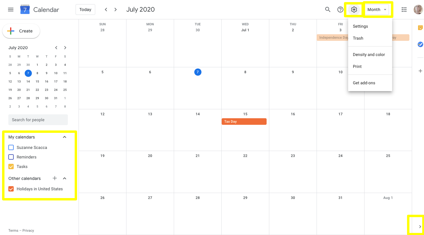
On the far left is a list of “My calendars”. Users can click which calendars and associated events they want to see within the app.
In the bottom-right corner is an arrowhead. This enables users to hide the Google apps side panel and give them more room to focus on upcoming events and appointments.
In the top-right, users have two places where they can customize their calendar:
- The Settings bar allows them to adjust the color and density of the calendar.
- The “Month” dropdown allows them to adjust how much of the calendar is seen at once.
These customizations would all be useful for any sort of project management, planning or appointment scheduling app.
For other apps, I’d recommend looking at Gmail. It’s chock full of customizations that you could adapt for your app.
Previously, if users clicked the Settings widget, it would move them out of the app and into the dedicated settings panel. To be honest, it was annoying, especially if you just wanted to make a small tweak.

Now, the Settings button opens this panel within Gmail. It enables users to adjust things like:
- Line spacing,
- Background theme,
- Inbox sorting priorities,
- Reading pane layout,
- Conversation view on/off.
This is a recent update to Gmail’s settings, which probably means these are the most commonly used design customizations its users actually use.
For any customizations users want to make that they can’t find in this new panel, they can click “See all settings” and customize the in-app design and layout (among other things) even further.
Other customizations you might find value in enabling in your app are:
- Keyboard control,
- Dark mode,
- Color-blind mode,
- Text resizing,
- List/grid view toggling,
- Widget and banner hiding,
- Columns displayed.
Not only do these design and layout controls enable users to create an interface they enjoy looking at and that works better for their purposes, it can also help with accessibility.
Wrapping Up
There’s a reason why Google dominates market share with many of its products. It gets the user experience. Of course, this is due largely to the fact that it has access to more user data than most companies.
And while we should be designing solutions for our specific audiences, there’s no denying that Google’s products can help us set a really strong base for any audience — if we just pay attention to the trends across its platforms.
Further Reading on SmashingMag:
- Is Your Website Stressing Out Visitors?
- Equivalent Experiences: Thinking Equivalently
- Accessible Images For When They Matter Most
- How To Convince Others Not To Use Dark Patterns
 (ra, yk, il)


