How to Use Icon Fonts in WordPress Post Editor (No Code)

Do you want to use icon fonts in the WordPress post editor?

Icon fonts allow you to easily use images and symbols in text. They are lightweight and won’t slow down your site, and they can be easily scaled to any size and styled like any other text font.

In this article, we’ll show you how to easily use icon fonts in the WordPress post editor without writing any HTML code.

Using icon fonts in the WordPress editor

We’ll show you multiple methods, each one using a slightly different approach than the other. You can choose one that works best for you.

Method 1. Adding Icon Fonts in WordPress Post Editor using JVM Rich Text Icons

This method is recommended to use on any kind of WordPress website. It is easy to use and works seamlessly with the block editor.

First, you need to install and activate the JVM Rich Text Icons plugin. For more details, see our step-by-step guide on how to install a WordPress plugin.

Upon activation, you can simply edit a WordPress post or page or create a new one. Inside the post editor, add a new paragraph block, and you’ll see a new Flag icon in the block toolbar.

Icon font button in the block toolbar

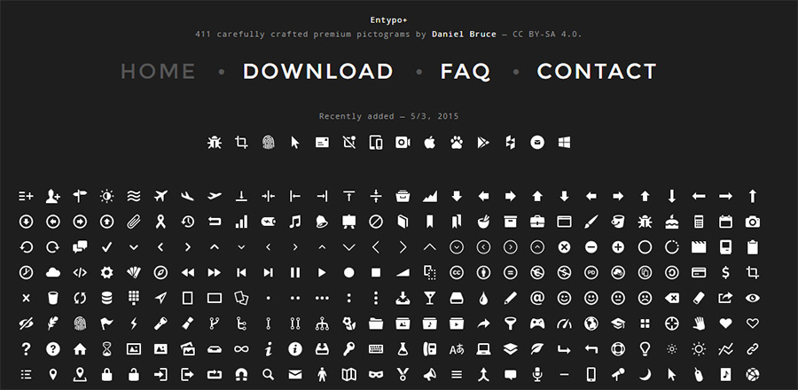
Clicking on it will show a popup of icons to choose from. It uses the popular Font Awesome icon fonts by default.

You can use the search to look for an icon or simply scroll down to find the icon you want, and then click to add it.

Choose icons to insert

One advantage of using icon fonts is that you can use CSS to style them.

However, since you are already using the block editor, you can simply use the built-in color tools to style the icons.

Style icon fonts using block editor tools

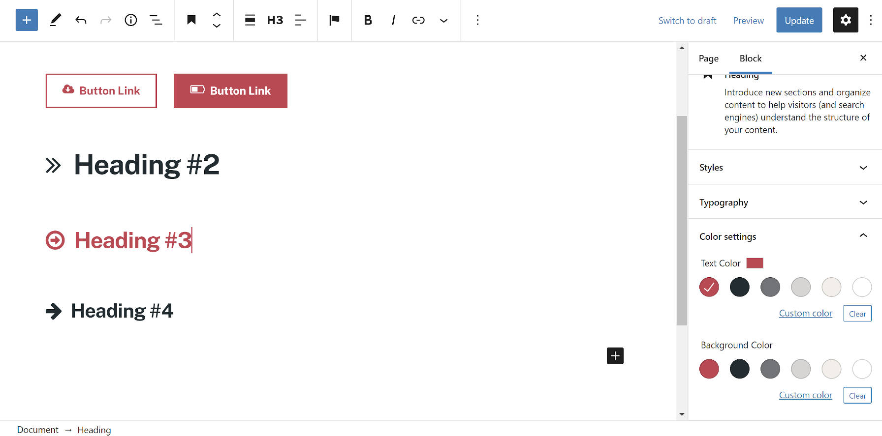
The plugin allows you to use icon fonts in most text blocks such as Paragraph, List, Button, Columns, Cover, and more.

Here is an example of using icon fonts and block options to style three columns.

Icon fonts in columns

Another useful example of using icon fonts is with buttons.

This time we are using inline icon fonts alongside some text for the two buttons.

Using icon fonts in buttons and lists

Feel free to use the block editor tools like text alignment, colors, spacing, and more to get the most out of the icon fonts.

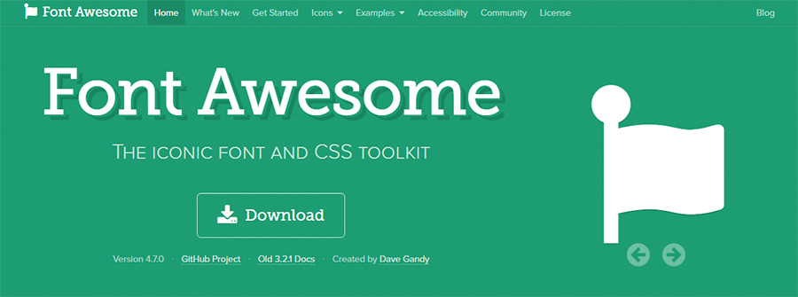
Method 2. Add Icon Fonts in WordPress Post Editor with Font Awesome

This method requires you to add shortcodes in the post editor to display icon fonts. You can use this method if you don’t need to regularly use icon fonts in your WordPress posts and pages.

First, you need to install and activate the Font Awesome plugin. For more details, see our step-by-step guide on how to install a WordPress plugin.

Upon activation, you can edit a post or page in WordPress and use the following shortcode to add a font icon.

[icon name="home"]
Adding icon fonts using shortcode

The name parameter here is the name of the font used by Font Awesome. You can find the entire list on the Font Awesome cheatsheet page.

Once added, you can preview your post or page to see how the icon will look on the live site since it will not display as an icon in the block editor.

This is how it looked on our test site.

Font icon preview

You can use the shortcode inside a paragraph and inline with other text. You can also add it on its own using the ‘Shortcode’ block.

However, using the ‘Shortcode’ block will not give you the styling options you’ll get with other text blocks.

You can also add the shortcode inside columns to create a features row.

Shortcode in columns

It would be a bit trickier as you will not be able to see the actual images, and the column heights will keep changing within the editor.

Here is how it looked on our test website. The columns are the same height, even though they are not in the editor.

Icon fonts preview using Font Awesome

You’ll probably have to preview your work in a new browser tab many times to see how it will look to users.

Method 3. Using Icon Fonts with WordPress Page Builders

This method is great if you are creating a landing page or designing your website using a WordPress page builder like SeedProd.

SeedProd is the best WordPress page builder on the market. It allows you to easily create beautiful landing pages or design your complete website.

SeedProd WordPress Website Builder

First, you need to install and activate the SeedProd plugin. For more details, see our step-by-step guide on how to install a WordPress plugin.

Upon activation, you’ll be asked to enter your plugin license key. You can find this information under your account on the SeedProd website.

SeedProd license key

After entering your license key and clicking ‘Verify Key,’ you can start working on your landing page.

Simply go to the SeedProd » Landing Pages page and click on the ‘Add New Landing Page’ button.

Add new landing page

After that, you will be asked to choose a template for your landing page.

SeedProd comes with a bunch of beautiful designs that you can use as a starting point, or you can start with a blank template and design the whole thing yourself.

Choose landing page template

For this tutorial, we will be using a pre-designed template. Simply click on a template to select it and continue.

Next, you will be asked to provide a title for your landing page and choose a URL.

Provide page title and URL

After entering them, click on the ‘Save and Start Editing the Page’ button to continue.

SeedProd will now launch the page builder interface. It is a drag-and-drop design tool where you can simply point and click on any item to edit it.

SeedProd page builder interface

You can also drag and drop blocks from the left column to add new elements to your design.

For the sake of this tutorial, we are going to add the Icon block.

Add icon block

After you add the block, you can simply click to edit its properties.

The left column will change to show the options for the Icon block. You can click into the ‘Icon’ section to the left and choose a different icon image or change the color and style.

Icon block settings

Another way to use icons in SeedProd is by adding the ‘Icon Box’ block.

The difference between this and the ‘Icon’ block we used previously is that ‘Icon Box’ allows you to add text along with your chosen icon.

This is one of the most common ways to use icons when displaying product features, services, and other items.

Icon box block

You can place your icon box inside columns, choose colors, and adjust the icon size to your liking.

Additionally, you can also format the accompanying text using SeedProd’s formatting toolbar.

Icon box inside columns

Once you are finished editing your page, don’t forget to click on the ‘Save’ button at the top right corner of the screen.

If you’re ready, you can click ‘Publish’ for the page to go live, or you can click on ‘Preview’ to make sure it looks like you want it to.

Save and publish your landing page

You can also click on ‘Save as Template’ so you can reuse this design with SeedProd on other parts of your website.

Here is how the icon fonts looked on our test website.

Icon fonts preview

We hope this article helped you learn how to use icon fonts in WordPress post editor without writing HTML code. You may also want to see our WordPress performance guide to optimize your website speed or the best landing page plugins for WordPress.

If you liked this article, then please subscribe to our YouTube Channel for WordPress video tutorials. You can also find us on Twitter and Facebook.

The post How to Use Icon Fonts in WordPress Post Editor (No Code) first appeared on WPBeginner.

Insert Font Awesome Icons Into the Block Editor via the JVM Gutenberg Rich Text Icons Plugin

Joris van Montfort, a freelance WordPress developer, released the JVM Gutenberg Rich Text Icons plugin over the weekend. The goal was simple: allow users to insert icons nearly anywhere in the block editor at the click of a button.

The plugin uses version 4.7 of the Font Awesome library out of the box. However, developers can modify this to include custom icon sets.

Like many of the most useful plugins, it stays in its lane, performing a simple task and doing it well. The plugin presents users with a “flag” button in the editor toolbar whenever they edit a Rich Text field.

Inserting an icon into a Rich Text field in the WordPress editor.
Inserting an icon into a Heading block.

Rich Text is a block editor component for entering text. Anywhere users can type in the editor canvas is fair game for inserting an icon. This includes paragraphs, headings, image captions, and more. It also extends to blocks from other plugin developers. If they employ a Rich Text field anywhere, the “flag” button will appear, and users can plop an icon in it.

Icons inserted through the plugin automatically inherit the surrounding text size. If you stick it in a Heading block, it will grow larger. If you stick it in a Button block, it will match up with the Button text. The same is true for the colors too.

Testing icons in different blocks in the WordPress editor.
Inserting icons in various blocks at different sizes and colors.

Because it is impossible to match each theme’s design perfectly, some minor spacing or alignment adjustments may be needed. For the most part, the icons looked good when I tested them with various themes. However, there were a couple of one-pixel-off issues and minor alignment miscues with some blocks. On the whole, I did not run into any design-breaking issues. The plugin displayed its icons as it should.

One usability issue I encountered was being unable to delete an icon via the Backspace or Delete keys on my keyboard in use with the Buttons block. It worked well with other blocks. The solution for this was to click on the inserted icon. Then, select the “flag” icon in the toolbar to reopen the inserter. After choosing no replacement, the old one disappeared.

The plugin developer provided filter hooks for third-party developers to implement icon sets other than Font Awesome via a custom JSON file. Instructions are outlined in the plugin’s readme. There are also hooks for uploading or overwriting the stylesheet and classes.

While I like the plugin’s execution, I dislike that it loads its own Font Awesome stylesheet. If using another plugin or theme that does the same, its inclusion increases the page load size for end-users by loading multiple copies of the same code. This is not the fault of the plugin developer. It is a limitation created by WordPress’s lack of a dependency system. However, users who give the plugin a try should be mindful of this potential issue.

1,000 SVG Icons!

Well, 996 to be exact.

I think it’s fair to say that Font Awesome is the most successful icon project ever, and in addition to their paid offerings, they have an open-source free version. We’ve always offered up SVG icons you can easily copy/paste in our free Assets panel, but up until now, there were only ~20 of them. So, ya know, a 50× increase ain’t bad. Especially since the way we were able to integrate this is way easier than what we were doing before because they publish the icons in a JavaScript format that is easy for us to use in React components.

More icons. Better icons. Easier to maintain.

Here’s how it works:

Despite the name “Font Awesome”, we’re not delivering these icons as a font, we’re offering up inline <svg> you can copy and paste.

If you prefer using icon fonts, you might wanna check out the project We Love Icon Fonts which is like a CDN for hosting icon web fonts.

High five to Mr. Shaw on this one who had the idea and got this implemented for us.

The post 1,000 SVG Icons! appeared first on CodePen Blog.

Font Awesome Releases New COVID-19 Awareness Icons

Screenshot of all the new icons included in Font Awesome 5.13 related to COVID-19.
COVID-19 awareness icons added to Font Awesome.

On Monday, the Font Awesome team launched a new set of icons to promote awareness around COVID-19. The solid icons available in the Font Awesome 5.13 update are all available for free and are open-source. The regular, light, and duotone versions of the icons are a part of the pro package.

The goal of the new icons is to help websites and apps boost awareness around the global pandemic. The latest update adds 47 new icons that range from medical use to promoting hygienic practices such as hand washing. Some icons represent viruses and social/physical distancing. There is even a couple of toilet paper icons thrown in for good measure. Apparently, those are necessary in today’s world of mass panic buying.

“Based on recommendations from The World Health Organization and others, you’ll find symbols to communicate good hygiene and social distancing,” wrote Jory Raphael, Icon Design Lead at Font Awesome. “While we can’t be on the front lines like brave medical professionals across the globe, we hope these icons aid in communicating some of the most important things people can do to protect themselves and their communities.”

The icons were originally requested two weeks ago on the Font Awesome GitHub repository. The design team moved quickly to make them available. There are additional icon tickets for liquid soap and a bar of soap open.

Like all Font Awesome icons, the new icons are available as part of the font package or for download as individual SVG files.

The fonts may come in handy for website owners, designers, and developers who are building sites or pages with content related to COVID-19. Icons can add context to content or focus attention where needed.

Users of the Font Awesome WordPress plugin should have immediate access to the new icons if needed. The plugin relies on the external Font Awesome CDN or Font Awesome kits. Users can also choose which version of the library of icons they wish to use, which includes the latest release.

If you know of any other icon sets or resources for designers and developers related to COVID-19, please share them in the comments.

Vue Tutorial 4 – Managing a List

Granny is ready to send us grocery shopping again. The last time we went shopping for granny, she only added a few things to her typical (static) list. That was fine because we were easily able to program the “Add to the list” functionality in our Vue app. 

This time, she is throwing a dinner party for all of her relatives, including the distant cousins you’ve never met before. We’re in trouble! Our Vue app doesn’t allow us to remove items from the list so we have to get programming.  

Font Awesome is Branching out with Duotone Colors and Icon Smashups

Font Awesome 5.9 was released last month with 421 new and updated icons. The popular icon font library has grown to include more than 5,000 vector icons and is used on 34% of the top million websites. It’s also one of the top open source projects on GitHub and a popular choice for WordPress theme and plugin developers using icons in their work.

Just a month after 5.8 brought in another batch of top requested brand icons, including Airbnb, Salesforce, and Evernote, the latest release adds more Editor icons to help those who are building text and WYSIWYG editor UIs.

Another notable update in 5.9 is the introduction of icon duos, where Font Awesome has taken some icons and put them together with other icons. For example, the update includes combinations like car-bus and burger-soda.

Font Awesome also recently announced that it will soon be introducing duotone colors to the library, which users will be able to customize.

Documentation on the using the duotones is not yet available, but Font Awesome confirmed that users will be able to change the tones of each icon within their own CSS to any combination. The feature will work out-of-the-box by inheriting the current color but users will be able to change the master color or each layer individually. The icons can then be further customized by targeting each layer in CSS. Follow Font Awesome on Twitter for all the latest news on icon updates and the upcoming duotone color feature release.

Breaking CSS Custom Properties out of :root Might Be a Good Idea

CSS Custom Properties have been a hot topic for a while now, with tons of great articles about them, from great primers on how they work to creative tutorials to do some real magic with them. If you’ve read more than one or two articles on the topic, then I’m sure you’ve noticed that they start by setting up the custom properties on the :root about 99% of the time.

While putting custom properties on the :root is great for things that you need to be available throughout your site, there are times when it makes more sense to scope your custom properties locally.

In this article, we’ll be exploring:

  • Why we put custom properties on the :root to begin with.
  • Why global scoping isn’t right for everything.
  • How to overcome class clashing with locally scoped custom properties

What’s the deal with custom properties and :root?

Before we jump into looking at the global scope, I think it’s worth looking at why everyone sets custom properties in the :root to begin with.

I’ve been declaring custom properties on the :root without even a second thought. Pretty much everyone does it without even a mention of why — including the official specification.

When the subject of :root is actually breached, it mentions how :root is the same as html, but with higher specificity, and that’s about it.

But does that higher specificity really matter?

Not really. All it does is select html with a higher specificity, the same way a class selector has higher specificity than an element selector when selecting a div.

:root {
  --color: red;
}

html {
  --color: blue;
}

.example {
  background: var(--color);
  /* Will be red because of :root's higher specificity */
}

The main reason that :root is suggested is because CSS isn’t only used to style HTML documents. It is also used for XML and SVG files.

In the case of XML and SVG files, :root isn’t selecting the html element, but rather their root (such as the svg tag in an SVG file).

Because of this, the best practice for a globally-scoped custom property is the :root. But if you’re making a website, you can throw it on an html selector and not notice a difference.

That said, with everyone using :root, it has quickly become a “standard.” It also helps separate variables to be used later on from selectors which are actively styling the document.

Why global scope isn’t right for everything

With CSS pre-processors, like Sass and Less, most of us keep variables tucked away in a partial dedicated to them. That works great, so why should we consider locally scoping variables all of a sudden?

One reason is that some people might find themselves doing something like this.

:root {
  --clr-light: #ededed;
  --clr-dark: #333;
  --clr-accent: #EFF;
  --ff-heading: 'Roboto', sans-serif;
  --ff-body: 'Merriweather', serif;
  --fw-heading: 700;
  --fw-body: 300;
  --fs-h1: 5rem;
  --fs-h2: 3.25rem;
  --fs-h3: 2.75rem;
  --fs-h4: 1.75rem;
  --fs-body: 1.125rem;
  --line-height: 1.55;
  --font-color: var(--clr-light);
  --navbar-bg-color: var(--clr-dark);
  --navbar-logo-color: var(--clr-accent);
  --navbar-border: thin var(--clr-accent) solid;
  --navbar-font-size: .8rem;
  --header-color: var(--clr-accent);
  --header-shadow: 2px 3px 4px rgba(200,200,0,.25);
  --pullquote-border: 5px solid var(--clr-light);
  --link-fg: var(--clr-dark);
  --link-bg: var(--clr-light);
  --link-fg-hover: var(--clr-dark);
  --link-bg-hover: var(--clr-accent);
  --transition: 250ms ease-out;
  --shadow: 2px 5px 20px rgba(0, 0, 0, .2);
  --gradient: linear-gradient(60deg, red, green, blue, yellow);
  --button-small: .75rem;
  --button-default: 1rem;
  --button-large: 1.5rem;
}

Sure, this gives us one place where we can manage styling with custom properties. But, why do we need to define my --header-color or --header-shadow in my :root? These aren’t global properties, I’m clearly using them in my header and no where else.

If it’s not a global property, why define it globally? That’s where local scoping comes into play.

Locally scoped properties in action

Let’s say we have a list to style, but our site is using an icon system — let’s say Font Awesome for simplicity’s sake. We don’t want to use the disc for our ul bullets — we want a custom icon!

If I want to switch out the bullets of an unordered list for Font Awesome icons, we can do something like this:

ul {
  list-style: none;
}

li::before {
  content: "\f14a"; /* checkbox */
  font-family: "Font Awesome Free 5";
  font-weight: 900;
  float: left;
  margin-left: -1.5em;
}

While that’s super easy to do, one of the problems is that the icon becomes abstract. Unless we use Font Awesome a lot, we aren’t going to know that f14a means, let alone be able to identify it as a checkbox icon. It’s semantically meaningless.

We can help clarify things with a custom property here.

ul {
  --checkbox-icon: "\f14a";
  list-style: none;
}

This becomes a lot more practical once we start having a few different icons in play. Let’s up the complexity and say we have three different lists:

<ul class="icon-list checkbox-list"> ... </ul>

<ul class="icon-list star-list"> ... </ul>

<ul class="icon-list bolt-list"> ... </ul>

Then, in our CSS, we can create the custom properties for our different icons:

.icon-list {
  --checkbox: "\f14a";
  --star: "\f005";
  --bolt: "\f0e7";

  list-style: none;
}

The real power of having locally scoped custom properties comes when we want to actually apply the icons.

We can set content: var(--icon) on our list items:

.icon-list li::before {
  content: var(--icon);
  font-family: "Font Awesome Free 5";
  font-weight: 900;
  float: left;
  margin-left: -1.5em;
}

Then we can define that icon for each one of our lists with more meaningful naming:

.checkbox-list {
  --icon: var(--checkbox);
}

.star-list {
  --icon: var(--star);
}

.bolt-list {
  --icon: var(--bolt);
}

We can step this up a notch by adding colors to the mix:

.icon-list li::before {
  content: var(--icon);
  color: var(--icon-color);
  /* Other styles */
}

Moving icons to the global scope

If we’re working with an icon system, like Font Awesome, then I’m going to assume that we’d be using them for more than just replacing the bullets in unordered lists. As long as we're using them in more than one place it makes sense to move the icons to the :root as we want them to be available globally.

Having icons in the :root doesn’t mean we can’t still take advantage of locally scoped custom properties, though!

:root {
  --checkbox: "\f14a";
  --star: "\f005";
  --bolt: "\f0e7";
  
  --clr-success: rgb(64, 209, 91);
  --clr-error: rgb(219, 138, 52);
  --clr-warning: rgb(206, 41, 26);
}

.icon-list li::before {
  content: var(--icon);
  color: var(--icon-color);
  /* Other styles */
}

.checkbox-list {
  --icon: var(--checkbox);
  --icon-color: var(--clr-success);
}

.star-list {
  --icon: var(--star);
  --icon-color: var(--clr-warning);
}

.bolt-list {
  --icon: var(--bolt);
  --icon-color: var(--clr-error);
}

Adding fallbacks

We could either put in a default icon by setting it as the fallback (e.g. var(--icon, "/f1cb")), or, since we’re using the content property, we could even put in an error message var(--icon, "no icon set").

See the Pen
Custom list icons with CSS Custom Properties
by Kevin (@kevinpowell)
on CodePen.

By locally scoping the --icon and the --icon-color variables, we’ve greatly increased the readability of our code. If someone new were to come into the project, it will be a whole lot easier for them to know how it works.

This isn’t limited to Font Awesome, of course. Locally scoping custom properties also works great for an SVG icon system:

:root {
  --checkbox: url(../assets/img/checkbox.svg);
  --star: url(../assets/img/star.svg);
  --baby: url(../assets/img/baby.svg);
}

.icon-list {
  list-style-image: var(--icon);
}

.checkbox-list { --icon: checkbox; }
.star-list { --icon: star; }
.baby-list { --icon: baby; }

Using locally scoped properties for more modular code

While the example we just looked at works well to increase the readability of our code — which is awesome — we can do a lot more with locally scoped properties.

Some people love CSS as it is; others hate working with the global scope of the cascade. I’m not here to discuss CSS-in-JS (there are enough really smart people already talking about that), but locally scoped custom properties offer us a fantastic middle ground.

By taking advantage of locally scoped custom properties, we can create very modular code that takes a lot of the pain out of trying to come up with meaningful class names.

Let’s um, scope the scenario.

Part of the reason people get frustrated with CSS is that the following markup can cause problems when we want to style something.

<div class="card">
  <h2 class="title">This is a card</h2>
  <p>Lorem ipsum dolor sit, amet consectetur adipisicing elit. Libero, totam.</p>
  <button class="button">More info</button>
</div>

<div class="cta">
  <h2 class="title">This is a call to action</h2>
  <p>Lorem, ipsum dolor sit amet consectetur adipisicing elit. Aliquid eveniet fugiat ratione repellendus ex optio, ipsum modi praesentium, saepe, quibusdam rem quaerat! Accusamus, saepe beatae!</p>
  <button class="button">Buy now</button>
</div>

If I create a style for the .title class, it will style both the elements containing the .card and .cta classes at the same time. We can use a compound selector (i.e. .card .title), but that raises the specificity which can lead to less maintainability. Or, we can take a BEM approach and rename our .title class to .card__title and .cta__title to isolate those elements a little more.

Locally scoped custom properties offer us a great solution though. We can apply them to the elements where they’ll be used:

.title {
  color: var(--title-clr);
  font-size: var(--title-fs);
}

.button {
  background: var(--button-bg);
  border: var(--button-border);
  color: var(--button-text);
}

Then, we can control everything we need within their parent selectors, respectively:

.card {
  --title-clr: #345;
  --title-fs: 1.25rem;
  --button-border: 0;
  --button-bg: #333;
  --button-text: white;
}

.cta {
  --title-clr: #f30;
  --title-fs: 2.5rem;
  --button-border: 0;
  --button-bg: #333;
  --button-text: white;
}

Chances are, there are some defaults, or commonalities, between buttons or titles even when they are in different components. For that, we could build in fallbacks, or simply style those as we usually would.

.button {
  /* Custom variables with default values */
  border: var(--button-border, 0);    /* Default: 0 */
  background: var(--button-bg, #333); /* Default: #333 */
  color: var(--button-text, white);   /* Default: white */

  /* Common styles every button will have */
  padding: .5em 1.25em;
  text-transform: uppercase;
  letter-spacing: 1px;
}

We could even use calc() to add a scale to our button, which would have the potential to remove the need for .btn-sm, btn-lg type classes (or it could be built into those classes, depending on the situation).

.button {
  font-size: calc(var(--button-scale) * 1rem);
  /* Multiply `--button-scale` by `1rem` to add unit */
}

.cta {
  --button-scale: 1.5;
}

Here is a more in-depth look at all of this in action:

See the Pen
Custom list icons with CSS Custom Properties
by Kevin (@kevinpowell)
on CodePen.

Notice in that example above that I have used some generic classes, such as .title and .button, which are styled with locally scoped properties (with the help of fallbacks). With those being setup with custom properties, I can define those locally within the parent selector, effectively giving each its own style without the need of an additional selector.

I also set up some pricing cards with modifier classes on them. Using the generic .pricing class, I set everything up, and then using modifier classes, I redefined some of the properties, such as --text, and --background, without having to worry about using compound selectors or additional classes.

By working this way, it makes for very maintainable code. It’s easy to go in and change the color of a property if we need to, or even come in and create a completely new theme or style, like the rainbow variation of the pricing card in the example.

It takes a bit of foresight when initially setting everything up, but the payoff can be awesome. It might even seem counter-intuitive to how you are used to approaching styles, but next time you go to create a custom property, try keeping it defined locally if it doesn’t need to live globally, and you’ll start to see how useful it can be.

The post Breaking CSS Custom Properties out of :root Might Be a Good Idea appeared first on CSS-Tricks.

The 10 Best Free Icon Fonts For Web Designers

Open source web fonts let designers radically change their page designs and typographic styles. And some of these web fonts use icon sets to bring vector-based icons into CSS.

If you’re looking for 100% free icon fonts for your website then this post has collected all of the best ones. Each icon pack is totally free with SVG vectors and webfont formats to include in your stylesheets and web pages.

All the Icons, Fonts, Web Templates & Design Assets You Could Ask For


1. Captain Icon

captain icon webicons

My personal favorite web font is the Captain Icon pack created by designer Mario del Valle. It’s a totally free open source project hosted on GitHub with vector files and web fonts.

What I like most about this icon pack is the style. Each icon has a very unique design, and they’re all hand drawn from scratch. This makes them stand out far above the other more generic icon sets.

But I don’t think Captain Icon works for every project. It’s best used on creative sites where a hand-drawn style fits with the layout.

2. Octicons

octicons web fonts

GitHub recently open sourced their own icon pack called Octicons. This free icon set is currently in version 5.0 and includes dozens of icons with some basic symbols.

These icons can be found scattered throughout the GitHub website. But they’re just simple enough that they can work on pretty much any interface.

If you need a simple, lightweight icon font then Octicons won’t let you down.

3. Typicons

typicons set

With rounded corners and simpler outlines, the Typicons set is perfect for any site. It comes with 330+ unique icons all with a similar style.

The pack is completely free and also available on GitHub. This means you can include the icons directly into your site and even make edits to them as needed.

Few people know about Typicons but it’s one of the better icon web fonts available. They can even work for iOS with some minor adjustments and special code snippets.

4. Zondicons

zondicons iconset

Zondicons are totally free and real easy to add into your site. Unfortunately these aren’t hosted on GitHub so they don’t have an update archive.

But you can see all of the examples on the demo page including which CSS classes you need to get them working properly. The main Zondicons download link comes right from the website, so it’s hard to tell if they’ve ever been updated or if new icons were added.

I do recommend this webfont if you’re okay with simpler designs. This makes the icons far easier to use, but they can also blend into the site with a more “generic” style.

5. Entypo

entypo homepage

The webfont icon family Entypo has been around for quite a few years. These icons are superb and they’re top of the line when it comes to freebies.

New icons are added sporadically and they’re very simple to access. The fonts also split into two packs: the main pack and the social pack. So if you don’t need social media icons you can reduce the font file size by quite a bit.

Entypo comes with over 400 icons and a brilliant CC sharealike license. To learn more about installation and customizing the icons you should read through the FAQ page and visit the main GitHub repo.

6. MFG Labs

mfg labs iconset

One of the newer fonts in this list comes from MFG Labs with their own icon set. It’s completely free and hosted on GitHub for the world to access.

Each icon comes packed with standard webfont formats using Unicode PUAs in CSS. This is fully semantic in all browsers and helps to reduce clashes against other CSS code.

MFG Labs icons have a unique style that stands out from the herd. I absolutely recommend this icon font for any type of website, commercial or otherwise.

7. Ionicons

ionicons webfont

Native devs love the Ionic Framework and it’s one of the most popular choices for web-to-mobile apps. The Ionic team decided to release their icons as a webfont called Ionicons.

Naturally they’re totally free and available on GitHub. You can even add these icons directly to your site using the CDN version of the stylesheet.

I mostly recommend Ionicons for newbies who haven’t used icon fonts before. They’re super easy to setup, and once you understand how they work you can move onto pretty much any other icon webfont out there.

8. Font Awesome

font awesome iconset

The original web font and Bootstrap’s personal choice, Font Awesome is perhaps the definitive pick for most web designers.

Font Awesome has been around for years and it’s widely regarded as the first major open source icon font. It frequently gets new updates with fresh icons and currently it’s in v4.7 with a free download on GitHub.

Every icon is fully scalable and maintainable directly in CSS. You can change colors, shadows, background gradients, or pretty much anything else using pure CSS3.

This is by far one of the safest icon sets you can use and you know it’s going be here for the long haul.

9. Material Design Icons

material webfont icons

Google’s material design brought a new approach to UI/UX on the web. This led to many new frameworks & resources including this material design icon font.

These material icons are totally free and accessible on GitHub. This icon pack is absolutely massive with over 1,000 icons covering a wide array of interface features.

And because it’s open source you’re free to reuse these on any projects and even customize the icons if needed. Perfect for anyone working with Google’s material guidelines on the web.

10. Devicons

devicons webfont

The Devicons pack is one of the newer web fonts you can try with a focus on tech logos & branding.

This icon font has every logo you can think of from the big tech players like Google to newer CMS logos like Ghost. I’ll admit, this is only useful for sites that want vector tech logos which certainly won’t be a majority.

But it’s a hefty icon set and it’s totally free! You’ll find install details on this page with a free CDN version you can use to reduce load times.

Wrapping Up

It’s hard picking just ten icon fonts because so many new ones are released every year. But these are my top picks and if you recommend any others be sure to share in the comments below.