It was less than a year ago when I first had a chance to use Penpot and instantly got excited about it. They managed to build something that designers haven’t yet seen before — a modern, open-source tool for everyone. In the world of technology, that might not sound groundbreaking. After all, open-source tools and software are being taken for granted as a cornerstone of modern web development. But for some reason, not for design — until now. Penpot’s approach to building design software comes with a lot of good arguments. And it gathered a strong community.
One of the reasons why Penpot is so exciting is that it allows creators to build user interfaces in a visual environment, but using the same standards and technologies as the end product. It makes a design workflow easier on many levels. Today, we are going to focus on just one of them, building layouts.
Design tools went a long way trying to make it easier to design complex, responsive layouts and flexible, customizable components. Some of them tried to mimic the mechanisms used in web technologies and others tried to mimic these imitations. But such an approach will take you only so far.
Short History Of Web Layouts
So how are the layouts for the web built in practice?
If you’ve been around the industry long enough, you might remember the times when you used frames, tables, and floats to build layouts. And if you haven’t, you didn’t miss much. Just to give you a taste of how bad it was: same as exporting tiny images of rounded corners from ever-crashing Photoshop, just to meticulously position them in every corner of a rectangle so you could make a dull, rounded button, it was just a pain. Far too often, it was a pleasure to craft yet another amazing design — but so much tears and sorrow to actually implement it.
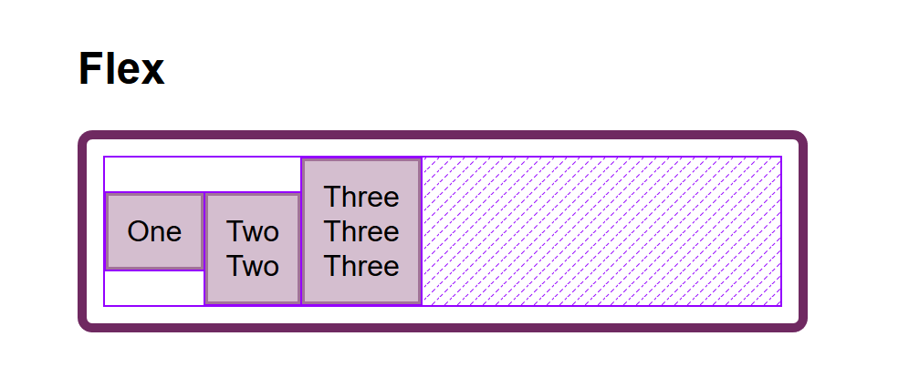
Then Flexbox came in and changed everything. And soon after it, Grid. Two powerful yet amazingly simple engines to build layouts that changed web developers’ lives forever.
Ironically, design tools never caught up. Flexbox and Grid opened an ocean of possibilities, yet gated behind a barrier of knowing how to code. None of the design tools ever implemented them so a larger audience of designers could leverage them in their workflows. Not until now.
Creating Layouts With Penpot
Penpot is becoming the first design tool to support both Flexbox and Grid in their toolkit. And by support, I don’t mean a layout feature that tries to copy what Flexbox or Grid has to offer. We’re talking about an actual implementation of Flexbox and Grid inside the design tool.
Penpot’s Flexbox implementation went public earlier this year. If you’d like to give it a try, last year, I wrote a separate article just about it. Now, Penpot is fully implementing both Flexbox and Grid.
You might be wondering why we need both. Couldn’t you just use Flexbox for everything, same as you use the same simple layout features in a design tool? Technically, yes, you could. In fact, most people do. (At the time of writing, only a quarter of websites worldwide use CSS Grid, but its adoption is steadily increasing; source)
So if you want to build simple, mostly linear layouts, Flexbox is probably all you’ll ever need. But if you want to gain some design superpowers? Learn Grid.
Penpot’s CSS Grid Layout is out now, so you can already give it a try. It’s a part of their major 2.0 release, bringing a bunch of long-awaited features and improvements. I’d strongly encourage you to give it a go and see how it works for yourself. And if you need some inspiration, keep reading!
CSS Grid Layout In Practice
As an example, let’s build a portfolio page that consists of a sidebar and a grid of pictures.
Creating A Layout
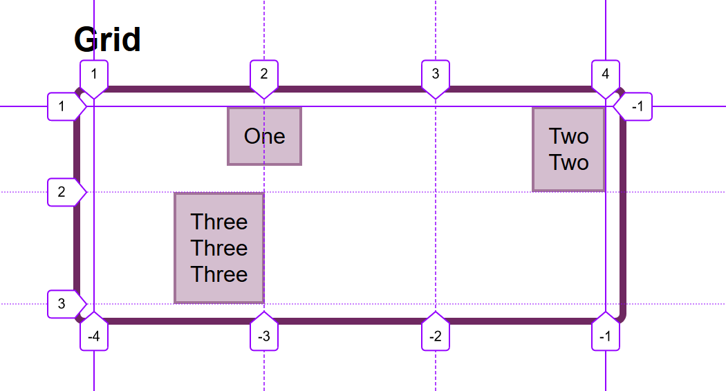
Our first step will be to create a simple two-dimensional grid. In this case using a Grid Layout makes more sense than Flex Layout as we want to have more granular control over how elements are laid out on multiple axes.
To make the grid even more powerful, you can merge cells, group them into functional areas, and name them. Here, we are going to create a dedicated area for the sidebar.
As you adjust the layout later, you can see that the sidebar always keeps the same width and full height of the design while other cells get adjusted to the available space.
Building Even More Complex Grids
That’s not all. Apart from merging cells of the grid, you can tell elements inside it to take multiple cells. On our portfolio page, we are going to use this to make the featured picture bigger than others and take four cells instead of one.
As a result, we created a complex, responsive layout that would be a breeze to turn it into a functional website but at the same time would be completely impossible to build in any other design tool out there. And that’s just a fraction of what Grid Layout can do.
Next Steps
I hope you liked this demo of Penpot's Grid Layout. If you’d like to play around with the examples used in this article, go ahead and duplicate this Penpot file. It’s a great template that explains all the ins and outs of using Grid in your designs!
In case you’re more of a video-learning type, there’s a great tutorial on Grid Layout you can watch now on YouTube. And if you need help at any point, the Penpot community will be more than happy to answer your questions.
Summary
Flexbox and Grid in Penpot open up opportunities to craft layouts like never before. Today, anyone can combine the power of Flex Layout and Grid Layout to create complex, sophisticated structures that are flexible, responsive, and ready to deploy out-of-the-box—all without writing a single line of code.
Working with the right technologies not only makes things easier, but it also just feels right. That's something I've always longed for in design tools. Adopting CSS as a standard for both designers and developers facilitates smoother collaboration and helps them both feel more at home in their workflows.
For designers, that’s also a chance to strengthen their skill set, which matters today more than ever. The design industry is a competitive space that keeps changing rapidly, and staying competitive is hard work. However, learning the less obvious aspects and gaining a better understanding of the technologies you work with might help you do that.
Try CSS Grid Layout And Share Your Thoughts!
If you decide to give CSS Grid Layout a try, don’t hesitate to share your experience! The team behind Penpot would love to hear your feedback. Being a completely free and open-source tool, Penpot’s development thrives thanks to its community and people like you.
The world of developer tools lives and breathes open-source. Open, free programming languages, frameworks, or even code editors everyone can contribute to — lay at the heart of the premise of the free, open web. Yet, with the design tools, it’s always been a much different story. For our design processes, most are sticking to a palette of paid, commercial tools — the majority of them were either created or later acquired by big tech companies. Fortunately, also in this space, we’re starting to see some alternatives.
One such alternative is Penpot, an open-source design app that recently started to boom in popularity. With over 250k signups and 20k GitHub stars, Penpot has already made a name for itself, and it’s growing as a viable alternative to other design tools out there.
However, being open-source is not the only thing that makes Penpot unique. It also has a few killer features up its sleeve that make it a really great match for a good collaboration between designers and developers. Curious to learn more? Let’s take a closer look together.
A Design Tool Done Right
If you’ve ever done a fair share of designing and coding, I bet you also had your moments of confusion and frustration. One thing I never managed to understand: Why are the apps used primarily for designing user interfaces that are later built with web technologies often so bad at matching the standards of these exact technologies?
For example, they offer fancy layout tools that follow a completely different logic than how layouts are built on the web. Or they offer drawing tools that work differently than graphics on the web, so once you export your work, you get weird, unexpected results. Why?
The answer is actually quite simple. For most of the design tools, hand-off and developer-focused features were an afterthought. Based on different patterns and standards, they often prove to be confusing and frustrating for developers.
This is where Penpot is different. Created by a team of designers and developers working very closely together, great design-development collaboration was their priority from the start.
Same as other web apps, Penpot can be run on any operating system or web browser. But to make access to it truly open and democratic, it is also based on Open Web Standards. For example, Penpot’s design files are saved in SVG format — the same standard as the most popular image format for vector graphics on the web.
What it means in practice is not only better compatibility with web technologies but a natural parity between designs and code. With Penpot, you don’t have to export to SVG, your graphics are SVG, by definition.
Same works with translating styles from designs into code. Penpot doesn’t have to generate any CSS values. It can just read and cater CSS values directly from designs.
A great example of that in practice is Flex Layout, i.e. Penpot’s layouting feature that not only works exactly like CSS Flexbox. It simply is CSS Flexbox. We’ll give it a shot together in the later part of the article!
Open Source And Why Should You Care
Before we take a deeper dive into the tool itself, let’s talk about Open Source for a bit. But why is it so important, and what does it mean for you?
It Means It’s Free
In the programming world, Open Source usually means that the source code of the tool, app, or framework is available for anyone to view, modify, and distribute. But why would that be important for you and your choice of a design tool?
First and foremost, the code of the app´ is 100% free and available for commercial use. Every part and feature of the app that is free today will remain as such. Personally, out of all the design tools I have ever tried, I’ve never seen an equally featured and solidly built design app that is completely free, even for a big team. In this field, Penpot is far ahead of any competition.
It Means Better Security And Control
But open source is so much more. It also means greater transparency, control, and security. Anyone can audit the app’s code for potential security vulnerabilities or add new features to the tool that meet specific needs. Additionally, open source means that code cannot be controlled by a single entity or corporation, and users are not locked into a particular vendor’s ecosystem.
That all is true also for Penpot. It might not sound particularly significant or sexy at first glance, but if your company would ever have to worry about maintaining full control over its toolkit’s security standards or if you’d like to avoid vendor lock-in, choosing an app that is Open Source might be a big deal.
It Means Endless Customizability
Have you ever used plugins in a design tool? If so, you’d probably be pleased to hear that customizability is what Penpot brings to a whole new level. Open source means that users can modify the tool’s source code to meet any specific needs, customizing it as necessary.
You not only can extend the functionality of the app. You can literally edit it in any way you like to match your team’s processes and specific needs.
It Means You Can Run It Yourself
Penpot being open source, also means the ability to host your own instance of the tool. This means that you can run Penpot on your servers, having full control over your data and the application itself.
It Means A Peace Of Mind For The Future Of The Tool
Finally, open source provides peace of mind for the future of Penpot. With the tool being open source, users will always have control over the tool they work with, no matter what the future holds. Regardless of what happens next, you’ll always be able to use Penpot on your own terms. This means that people can invest in Penpot with confidence, knowing that they will always have access to the tool and their work (rather than being at the mercy of potential business shifts, acquisitions, pricing changes etc.)
I hope that by now, you’re left with no doubt about how many advantages it brings to work with Open Source tools. Now, let’s take a look at Penpot itself.
Where Penpot Shines...
If you recently worked with any of the most popular design tools in Penpot, you’ll feel right at home. Its interface should be familiar and predictable, and also offer all the basic features you could be looking for.
The user interface is unobtrusive, the perceived performance is good, and everything works as expected. But it’s the handoff-related features where Penpot really shines.
I already mentioned Flex Layout, Penpot’s own layouting feature. If you have ever used the Flexbox model in CSS, it might look oddly familiar. In fact, it’s exactly that: CSS flexbox inside a design app.
And that means not only better parity with code than other design apps (at least as long as you’re planning to use CSS flexbox in your code) but also a better scope of possibilities inside the design tool itself (e.g. you can wrap items of the automatic layout into multiple rows).
More powerful layouts also mean much better possibilities when it comes to designing truly responsive designs. With what Penpot can do, there’s a high chance that, in many cases, you won’t have to create separate designs for different breakpoints ever again.
All of that wouldn’t be as good if not for the great Inspect tab. Penpot gives you all the CSS you might need at hand, as well as the source SVG code of any component you select.
Pretty neat!
...And Where It Doesn’t (Yet)
Regardless of all the praise, Penpot is not perfect either. Being a relatively young tool makes it a challenging task to compete against the giants dominating the design tools scene.
If you compare it closely to other popular design apps, you’ll definitely find a few features missing, as well as some of them not as complex as elsewhere. For example, Penpot’s components toolkit and prototyping features are still relatively simple and limited.
That being said, Penpot’s roadmap is very actively being worked on. You can check what the team is onto right now on their website.
What’s also important to keep in mind is that Penpot’s development potential as an Open Source tool couldn’t be underestimated. The tool’s community of contributors is already pretty strong, and I believe it will only keep growing. That’s a competitive advantage closed source tools will never be able to meet.
Seeing what Penpot can do today, I personally can’t wait to see what’s next.
For example, looking at Penpot’s implementation of Flex Layout, think how cool it would be to have a similar tool for CSS Grid. Who’s in a better place to build it than Penpot? Spoiler alert: if you look at their public roadmap closely enough, you’ll find out they’re already working on it.
Final Thoughts
Even though Penpot is a relatively new tool, it stands as a solid choice for a design platform. It does a great job of narrowing the gap between designers and developers.
I believe it’s an open-source approach and a welcomed change that should only benefit our industry, as hopefully, others will follow.
If you’d like to give Penpot a try, it’s now out of beta and available for you and your team — completely for free
We have a whole selection of ways to align things in CSS today, and it isn’t always an obvious decision which to use. However, knowing what is available means that you can always try a few tactics if you come across a particular alignment problem.
In this article, I will take a look at the different alignment methods. Instead of providing a comprehensive guide to each, I’ll explain a few of the sticking points people have and point to more complete references for the properties and values. As with much of CSS, you can go a long way by understanding the fundamental things about how the methods behave, and then need a place to go look up the finer details in terms of how you achieve the precise layout that you want.
Aligning Text And Inline Elements
When we have some text and other inline elements on a page, each line of content is treated as a line box. The property text-align will align that content on the page, for example, if you want your text centered, or justified. Sometimes, however, you may want to align things inside that line box against other things, for example, if you have an icon displayed alongside text, or text of different sizes.
In the example below, I have some text with a larger inline image. I am using vertical-align: middle on the image to align the text to the middle of the image.
Remember that the line-height property will change the size of the line-box and therefore can change your alignment. The following example uses a large line-height value of 150px, and I have aligned the image to top. The image is aligned to the top of the line box and not the top of the text, remove that line-height or make it less than the size of the image and the image and text will line up at the top of the text.
It turns out that line-height and indeed the size of text is pretty complicated, and I’m not going to head down that rabbit hole in this article. If you are trying to precisely align inline elements and want to really understand what is going on, I recommend reading “Deep Dive CSS: Font Metrics, line-height And vertical-align.”
When Can I Use The vertical-align Property?
The vertical-align property is useful if you are aligning any inline element. This includes elements with display: inline-block. The content of table cells can also be aligned with the vertical-align property.
The vertical-align property has no effect on flex or grid items, and therefore if used as part of a fallback strategy, will cease to apply the minute the parent element is turned into a grid or flex Container. For example, in the next pen, I have a set of items laid out with display: inline-block and this means that I get the ability to align the items even if the browser does not have Flexbox:
In this next pen, I have treated the inline-block as a fallback for Flex layout. The alignment properties no longer apply, and I can add align-items to align the items in Flexbox. You can tell that the Flexbox method is in play because the gap between items that you will get when using display: inline-block is gone.
Now that we do have better ways to align boxes in CSS (as we will look at in the next section), we don’t need to employ the vertical-align and text-align properties in places other than the inline and text elements for which they were designed. However, they are still completely valid to use in those text and inline formats, and so remember if you are trying to align something inline, it is these properties and not the Box Alignment ones that you need to reach for.
Box Alignment
The Box Alignment Specification deals with how we align everything else. The specification details the following alignment properties:
justify-content
align-content
justify-self
align-self
justify-items
align-items
You might already think of these properties as being part of the Flexbox Specification, or perhaps Grid. The history of the properties is that they originated as part of Flexbox, and still exist in the Level 1 specification; however, they were moved into their own specification when it became apparent that they were more generally useful. We now also use them in Grid Layout, and they are specified for other layout methods too, although current browser support means that you won’t be able to use them just yet.
Therefore, next time someone on the Internet tells you that vertical alignment is the hardest part of CSS, you can tell them this (which even fits into a tweet):
In the future, we may even be able to dispense with display: flex, once the Box Alignment properties are implemented for Block Layout. At the moment, however, making the parent of the thing you want centering a flex container is the way to get alignment horizontally and vertically.
The Two Types Of Alignment
When aligning flex and grid items, you have two possible things to align:
You have the spare space in the grid or flex container (once the items or tracks have been laid out).
You also have the item itself inside the grid area you placed it in, or on the cross axis inside the flex container.
I showed you a set of properties above, and the alignment properties can be thought of as two groups. Those which deal with distribution of spare space, and those which align the item itself.
Dealing With Spare Space: align-content And justify-content
The properties which end in -content are about space distribution, so when you choose to use align-content or justify-content you are distributing available space between grid tracks or flex items. They don’t change the size of the flex or grid items themselves; they move them around because they change where the spare space goes.
Below, I have a flex example and a grid example. Both have a container which is larger than required to display the flex items or grid tracks, so I can use align-content and justify-content to distribute that space.
Moving Items Around: justify-self, align-self, justify-items And align-items
We then have align-self and justify-self as applied to individual flex or grid items; you can also use align-items and justify-items on the container to set all the properties at once. These properties deal with the actual flex or grid item, i.e. moving the content around inside the Grid Area or flex line.
Grid Layout
You get both properties as you can shift the item on the block and inline axis as we have a defined Grid Area in which it sits.
Flex Layout
You can only align on the cross axis as the main axis is controlled by space distribution alone. So if your items are a row, you can use align-self to shift them up and down inside the flex line, aligning them against each other.
In my example below, I have a flex and a grid container, and am using align-items and align-self in Flexbox to move the items up and down against each other on the cross axis. If you use Firefox, and inspect the element using the Firefox Flexbox Inspector, you can see the size of the flex container and how the items are being moved vertically inside of that.
Aligned flex items with the flex container highlighted in Firefox (Large preview)
In grid, I can use all four properties to move the items around inside their grid area. Once again, the Firefox DevTools Grid Inspector will be useful when playing with alignment. With the grid lines overlaid, you can see the area inside which the content is being moved:
Aligned grid items with the Grid highlighted in Firefox (Large preview)
Play around with the values in the CodePen demo to see how you can shift content around in each layout method:
One of the cited issues with people remembering the alignment properties in Grid and Flexbox, is that no one can remember whether to align or to justify. Which direction is which?
For Grid Layout, you need to know if you are aligning in the Block or Inline Direction. The Block direction is the direction blocks lay out on your page (in your writing mode), i.e. for English that is vertically. The Inline direction is the direction in which sentences run (so for English that is left to right horizontally).
To align things in the Block Direction, you will use the properties which start with align-. You use align-content to distribute space between grid tracks, if there is free space in the grid container, and align-items or align-self to move an item around inside the grid area it has been placed in.
The below example has two grid layouts. One has writing-mode: horizontal-tb (which is the default for English) and the other writing-mode: vertical-rl. This is the only difference between them. You can see that the alignment properties which I have applied work in exactly the same way on the block axis in both modes.
To align things in the inline direction, use the properties which begin with justify-. Use justify-content to distribute space between grid tracks, and justify-items or justify-self to align items inside their grid area in the inline direction.
Once again, I have two grid layout examples so that you can see that inline is always inline — no matter which writing mode you are using.
Flexbox is a little trickier due to the fact that we have a main axis which can be changed to row or column. So, let’s first think about that main axis. It is set with the flex-direction property. The initial (or default) value of this property is row which will lay the flex items out as a row in the writing mode currently in use — this is why when working in English, we end up with items laid out horizontally when we create a flex container. You can then change the main axis to flex-direction: column and the items will be laid out as a column which means they are laid out in the block direction for that writing mode.
As we can do this axis switching, the most important factor in Flexbox is asking, “Which axis is my main axis?” Once you know that, then for alignment (when on your main axis) you simply use justify-content. It doesn’t matter if your main axis is row or column. You control space between the flex items with justify-content.
On the cross axis, you can use align-items which will align the items inside the flex container or flex line in a multi-line flex container. If you have a multi-line container using flex-wrap: wrapand have space in that container, you can use align-content to distribute the space on the cross axis.
In the example below, we are doing both with a flex container displayed as a row and a column:
The justify-content and align-content properties in Grid and Flexbox are about distributing extra space. So the thing to check is that you have extra space.
Here is a Flex example: I have set flex-direction: row and I have three items. They don’t take up all of the space in the flex container, so I have spare space on the main axis, the initial value for justify-content is flex-start and so my items all line up at the start and the extra space is at the end. I am using the Firefox Flex Inspector to highlight the space.
The spare space at the end of the container (Large preview)
If I change flex-direction to space-between, that extra space is now distributed between the items:
The spare space is now between the items (Large preview)
If I now add more content to my items so they become larger and there is no longer any additional space, then justify-content does nothing — simply because there is no space to distribute.
A common question I’m asked is why justify-content isn’t working when flex-direction is column. This is generally because there is no space to distribute. If you take the above example and make it flex-direction: column, the items will display as a column, but there will be no additional space below the items as there is when you do flex-direction: row. This is because when you make a Flex Container with display: flex you have a block level flex container; this will take up all possible space in the inline direction. In CSS, things do not stretch in the block direction, so no extra space.
The column is only as tall as needed to display the items (Large preview)
Add a height to the container and — as long as that is more than is required to display the items — you have extra space and therefore justify-content will work on your column.
Adding a height to the container means we have spare space (Large preview)
Why Is There No justify-self In Flexbox?
Grid Layout implements all of the properties for both axes because we always have two axes to deal with in Grid Layout. We create tracks (which may leave additional space in the grid container in either dimension,) and so we can distribute that space with align-content or justify-content. We also have Grid Areas, and the element in that area may not take up the full space of the area, so we can use align-self or justify-self to move the content around the area (or align-items, justify-items to change the alignment of all items).
Flexbox does not have tracks in the way that Grid layout does. On the main axis, all we have to play with is the distribution of space between the items. There is no concept of a track into which a flex item is placed. So there is no area created in which to move the item around in. This is why there is no justify-self property on the main axes in Flexbox.
Sometimes, however, you do want to be able to align one item or part of the group of items in a different way. A common pattern would be a split navigation bar with one item being separated out from the group. In that situation, the specification advises the use of auto margins.
An auto margin will take up all of the space in the direction it is applied, which is why we can center a block (such as our main page layout) using a left and right margin of auto. With an auto margin on both sides, each margin tries to take up all the space and so pushes the block into the middle. With our row of flex items, we can add margin-left: auto to the item we want the split to happen on, and as long as there is available space in the flex container, you get a split. This plays nicely with Flexbox because as soon as there is no available space, the items behave as regular flex items do.
One of the things I think is often overlooked is how useful Flexbox is for doing tiny layout jobs, where you might think that using vertical-align is the way to go. I often use Flexbox to get neat alignment of small patterns; for example, aligning an icon next to text, baseline aligning two things with different font sizes, or making form fields and buttons line up properly. If you are struggling to get something to line up nicely with vertical-align, then perhaps try doing the job with Flexbox. Remember that you can also create an inline flex container if you want with display: inline-flex.
There is no reason not to use Flexbox, or even Grid for tiny layout jobs. They aren’t just for big chunks of layout. Try the different things available to you, and see what works best.
People are often very keen to know what the right or wrong way to do things is. In reality, there often is no right or wrong; a small difference in your pattern might mean the difference between Flexbox working best, where otherwise you would use vertical-align.
Wrapping Up
To wrap up, I have a quick summary of the basics of alignment. If you remember these few rules, you should be able to align most things with CSS:
Are you aligning text or an inline element? If so, you need to use text-align, vertical-align, and line-height.
Do you have an item or items you want to align in the center of the page or container? If so, make the container a flex container then set align-items: center and justify-content: center.
For Grid Layouts, the properties that start with align- work in the Block direction; those which start with justify- work in the inline direction.
For Flex Layouts, the properties that start with align- work on the Cross Axis; those which start with justify- work on the main axis.
The justify-content and align-content properties distribute extra space. If you have no extra space in your flex or grid container, they will do nothing.
If you think you need justify-self in Flexbox, then using an auto margin will probably give you the pattern you are after.
You can use Grid and Flexbox along with the alignment properties for tiny layout jobs as well as main components — experiment!
For more information about alignment, see these resources:


