CSS is great and getting better all the time. Over recent years, especially, it has evolved really fast, too. Understandably, some of the really handy powers CSS gives you might have slipped you by because of this, so in this article, I’m going to show you some really handy stuff you can do with modern CSS today, and also share some stuff that we can look forward to in the future.
Let’s dig in.
Masonry Layout
Masonry layouts became very popular with Pinterest, Tumblr and Unsplash, and up until recently, we tended to rely on JavaScript to assist with our layout, which is almost never a good idea.
Sure, you can use CSS multicol pretty darn effectively to achieve a masonry layout, but that approach can be problematic with tabbed-focus as it lays content out in columns. This creates a disconnect between the visual layout and the tabbing index.
Fast forward to today (well, veryshortly in the future) and a masonry layout is pretty trivial, thanks to an update to CSS Grid. Here’s a complete masonry layout, with gutters, in 6 lines of CSS:
The magic is in grid-template-rows set as masonry, which turns it into the “masonry axis”, thus providing the “filled in” layout we’ve all come accustomed to.
Let’s expand on this and explore a quick demo of creating a responsive masonry layout. Using a slightly modified version of the above CSS, we can replace the grid-template-columns line to use this auto grid method instead:
The minmax() function allows us to define what the smallest size is for our items, which for us, is 16rem. Then we tell minmax() what the maximum size should be for each item. We declare that as 1fr, which takes 1 portion of the remaining available space.
This definition of grid-template-columns allows our layout to break and stack if it runs out of horizontal space which the masonry axis then automatically sorts our remaining elements for us.
Note: Right now, masonry is only working in Firefox Nightly, or behind a flag, but the grid layout will still work perfectly in non-supporting browsers, making it a decent progressive enhancement target.
That’s a pretty cool new CSS, right? There’s loads more arriving soon and loads in the long-term pipeline too. We can look forward to Media Queries Level 5 which let us target the current ambient light level and whether or not the user prefers reduced data.
We’ve also got CSS Nesting in draft, which will give us Sass-like nesting capabilities like this:
Lastly, there are some cool new tricks on the horizon, like scroll-linked animations, which will open the door wide-open to a new generation of creative work on the web.
In conclusion, the present and future of CSS are very bright indeed and if you take a pragmatic, progressive approach to your CSS: things will continue to get better and better on your projects too.
Editorial Design Patterns With CSS Grid And Named Columns
Editorial Design Patterns With CSS Grid And Named Columns
Rachel Andrew
Many websites, in particular those which display long-form content, have a fairly straightforward repeating pattern of components: a full-width area for images, a central content area, and perhaps a split view of two half-width blocks. These components repeat to display an article, images and other related content — with content editors selecting the right component as they create articles for publication.
In this article, I’m going to demonstrate an approach to this kind of editorial design, which builds on a few techniques some of which are discussed in the following articles:
In addition to this being a nice way to name sections of your layout, this technique exposes a whole bunch of interesting things about Grid Layout which you may find useful in creating your own layout patterns. It also demonstrates more of the promise of subgrid (a part of the upcoming Level 2 of the grid specification and being implemented in Firefox).
Naming Things In CSS Grid Layout
When using CSS Grid Layout, you can name lines and areas. Both of these things can make working with Grid — especially complex grids — more straightforward. Defining naming conventions for things in your layout can be useful when working with your team; it is much easier to understand where anything placed with grid-area: content will end up than having something placed from column-line: 3 / 9.
When using the grid-template-areas approach, you give the items that you want to place on the grid a name by using the grid-area property and then placing them around the grid. In the following example, the item with grid-area: content goes into the grid area defined by the grid-template-areas property:
See the Pen [Layout With Named Area](https://codepen.io/rachelandrew/pen/zYOQBba) by Rachel Andrew.
This works well for components where you have one item to go into one area; however, if you want to place multiple things into the content area (one below the other), using grid-area is the wrong approach. Instead, you might define names for the column lines and place the item from the start to end line.
See the Pen [Layout With Named Columns](https://codepen.io/rachelandrew/pen/xxKNONQ) by Rachel Andrew.
This isn’t as neat, however, when using the grid-area approach we have to know both the start and end line when placing an item using grid-column or grid-row — or do we?
Take a look at this next CodePen example. My items are placed using a single name or ident by using the grid-column property, even though some of the grid areas being targeted cross a number of columns:
See the Pen [Layout with Named Columns](https://codepen.io/rachelandrew/pen/mdbYEod) by Rachel Andrew.
My aim here is to abstract away the complexity of the grid setup when actually using the grid. I can put a lot of work into creating the initial grid, but then place things without thinking too much about it as I populate my pages. I also want to make sure that we can repeat the components as often as we need to as we build up the article. What I have in mind is a content creator using a CMS, and creating blocks of content using the different patterns whilst knowing that they will be placed correctly one below the other on the overall grid.
In order to understand how I got to this point requires an understanding of a few things about CSS Grid Layout as well as named lines and areas.
We Can Name Lines
As you’ve already seen in my second example above, we can name lines on the grid that can be pretty much anything we like — other than the word span. The name is an ident rather than a string which is why it is not quoted.
However, you will see many examples where the naming conventions name-start and name-end are used that append -start onto the name of the start line and -end on the name of the end line. This is not purely convention and for the technique I am going to show you why we need to name our lines this way. So you should pick a name for the area you are describing, and then add the -start and -end suffixes — which need to match, of course!
We name our lines inside square brackets. Lines can (and often need to) have multiple names. In this case, space separates the names. When placing the items using line-based positioning, you can pick any name for the line to do the placement.
With our named lines in place, we could place our items using grid-column by specifying the start and end line name. This pattern is just the same as using line numbers, so the name before the slash is the start line and the name after is the end line.
See the Pen [Example using start and end lines](https://codepen.io/rachelandrew/pen/VwZOPgO) by Rachel Andrew.
This places the items but isn’t the neat single name per item that I used in the example. However, we now have everything in place due to the special way that Grid handles named areas and lines.
Line Names Give Us A Named Area
Assuming you have named your lines with -start and -end as I have, Grid will give you a named area of the main name you used. Therefore, in my case, I have areas named content, start-half, end-half, full and center. Each of these areas is a single row (as I don’t have named rows), however, it will span the column tracks from the -start to the -end line.
Named Areas Give Us A Named Line Of The Main Name Used
If we want to be able to place our items as if we have a column name, we also need to make use of the fact that when we create a grid area, we get a line name of the main name used; that is, the main name being the name with -start and -end removed. This line name resolves to the start or end of the area depending on whether we are targeting grid-column-start or grid-column-end.
So, we have an area named content, because we have column lines named content-start and content-end. The area named content also gives us the ability to use grid-column-start: content which will resolve to the start line of that content area, while grid-column-end: content will resolve to the end line of the content area.
This, therefore, means that we can place an item into the content area by using the following:
.content {
    grid-column: content / content;
}
Next, we can now tidy up this technique further due to the fact that if you use a named line for grid-column-start and omit the end line (rather than spanning one track as would be the case if you used line numbers), grid copies the name over to the end line. Therefore, grid-column: content is exactly the same as grid-column: content / content;
This is then all we need to be able to place items using grid-column with a simple, single name. This behavior is all exactly as specified and not some kind of “hack”. It demonstrates the depth of thinking that went into the creation of the Grid Layout specification, and the amount of careful work that has gone into making it so straightforward to lay items out in our designs.
Giving This Technique Superpowers With Subgrid
I think this technique is a nice one that enables a very straightforward way of declaring where elements should be placed on the grid. However, if we add subgrid support to the mix, it becomes very powerful indeed.
Currently, subgrid is being implemented in Firefox, and so these next examples require Firefox Nightly to run. You can download Nightly here.
The subgrid value of grid-template-columns and grid-template-rows means that sizing created on a parent grid can be opted into by an item which is a child of the grid (assuming it is also using grid layout) by having display: grid applied.
Line Names From The Parent Are Passed Into Subgrids
In addition to the track sizing information being passed into the child grid, any line names set on the parent will be passed in. This means that we can use our “column names” within subgridded components, making this solution very useful in a world where subgrid exists. An item placed in content — even if nested down inside subgrids — will line up with one placed as a direct child of the main grid.
In this next example, I have nested two elements directly inside the div with a class of full-2. I have also placed a ul inside .content. If we look at the items inside full-2, in order to place these on the parent grid, we need to make the selector full-2 a grid with display: grid then use the grid-template-columns property with a value of subgrid.
This causes the grid on .full-2 to use the tracks defined on the parent grid, and have access to the named lines defined there. As this is a full-width item, this really will behave just like the parent grid in terms of placing our items. We can then use any of the names we defined for the different columns to place the items. In this case, I have set both child elements to grid-column: center and they display one after the other in that center area.
The nested elements line up with the grid on the parent (Large preview)
If we take a look at our nested ul inside .content, we will need to create a subgrid on the selector .content just as with the last example; when we do this, the ul falls into the first track of the subgrid. If we want to lay out the listen items on the subgrid, we need to do two things: cause the ul to take up the same area as its parent by placing it with grid-column: content, and then making it a grid which is a subgrid.
Having done this the list items will lay out using auto-placement into the column tracks of the subgrid:
You can keep “nesting’ subgrids into your markup structure like this, and each time the line names will be passed through. This is a feature that I think will be particularly useful.
When you create a subgrid, the line numbers correspond to the lines of the subgrid and not the parent grid. Therefore, if you do want to ensure that elements in the subgrid line up with the parent grid, then using line names or named areas (as shown in this example) will make that straightforward and logical.
Wrapping Up
You now know how to use this technique for your main grid, and hopefully, it won’t take too long before we start seeing support for subgrid in all browsers. It’ll enable techniques such as this one and make it incredibly powerful for us to use.
It's a cool little effect. The default link style has an underline (which is a good idea) and then on :hover you see the underline essentially thicken up turning into almost what it would have looked liked if you used a background-color on the link instead.
Here's an example of the effect on the Superfriendly site:
A journey:
The Superfriendly site does it with box-shadow. Turning box-shadow: inset 0 -0.07em 0 #0078d6; into box-shadow: inset 0 -0.85em 0 #a2d5fe; with a transition. Andres Cuervo ported that idea to a Pen. (I forked it to fix the "start offset" idea that was broken-seeming to me on the original).
You might be tempted to draw the line with a pseudo-element that's, say, absolutely positioned within the relatively positioned link. Then you animate its height or scaleY or something. Here's that kind of idea. Your enemy here is going to be links that break onto new lines, which box-shadow seems to handle more elegantly.
Another idea would be using linear-gradient with hard color stops to kinda "fake" the drawing of a line that's positioned to look like an underline. Then the gradient can be animated to cover the element on hover, probably by moving its background-position. Here's that kind of idea and another example we wrote up a little while back. This handles line breaks nicer than the previous method.
The default text-decoration: underline; has a distinct advantage these days: text-decoration-skip-ink! It has become the default behavior for links to have the underlines deftly skip around the decenders in text, making for much nicer looking underlines than any of these techniques (also: borders) can pull off. There are properties that are somewhat new that you may not be aware of that give you more control over the underline that we have traditionally had, like text-decoration-color. But there is more, like thickness and offset, that make this effect possible! Miriam Suzanne has a demo of exactly this, which only works in Firefox Nightly at the moment, but should be making the rounds soon enough.
Summary: If you need to do this effect right now in the most browsers you can, the box-shadow technique is probably best. If it's just an enhancement that can wait a bit, using text-decoration-thickness / text-decoration-offset / text-decoration-color with a transition is a better option for aesthetics, control, and being able to understand the code at first glance.
Now you can fund your favorite developers or apply for receiving community funds for your open source projects. Read more about it in this announcement.
Rachel Andrew takes a look at what happens when we use display: grid and how we might use the new subgrid value of grid-template-columns and grid-template-rows.
Digging Into The Display Property: Grids All The Way Down
Digging Into The Display Property: Grids All The Way Down
Rachel Andrew
Today, we are going to take a look at what happens when we use display: grid and how we might use the new subgrid value of grid-template-columns and grid-template-rows to allow for grids all the way down through our markup, which relate to each other.
This article is part of a series that look at various aspects of the CSS display property, and is a follow-on to the first two articles:
CSS Grid Layout is switched on by using display: grid. If you have read the first article in this series, you will know that what this single value property actually means is display: block grid. We get a block level box which is defined as a grid container, with direct children that are grid items and participate in grid layout.
If you take a look at the display specification, you will see that in the table that defines all of the different values for display. The words grid container are linked to the definition of a grid container in the Grid Specification. Therefore, to find out what this actually means we need to go look there. When we do, we get some useful clarification of the behavior of a grid container.
A grid container is said to establish a Grid Formatting Context which is similar to a Block Formatting Context (BFC). I’ve written an extensive guide to the Block Formatting Context. In that article you will discover two things about a BFC that are the same for a grid formatting context. Floats do not intrude into the grid container, and the margins on the container do not collapse with those of the contents.
There are differences, however, only once we get inside the grid container. The children of a grid container and not participating in block and inline layout, they are grid items and therefore participating in grid layout. This means that a few things we are used to in block and inline layout do not hold true.
If any item in the layout is floated or cleared, the float and clear properties do not have an effect once the item becomes a grid item. The vertical-align property has no effect, and the ::first-letter and ::first-line pseudo-elements cannot be used.
The fact that an item cannot be both floated and a grid item is helpful in terms of creating fallbacks. When creating a fallback for browsers which do not support grid using floats (when grid is supported), you don’t need to do anything special: the float is overwritten.
I outline this approach in my article on supporting browsers without grid. There are situations where the behavior has turned out to be problematic, although these issues could be solved by using another part of CSS as described in this post unpacking an issue with grid and floats, “Editorial Layouts, Exclusions, and CSS Grid”.
With all that said, if we do nothing else than change the value of display to grid, we won’t see much of a difference to our layout. The direct children are grid items, however, by default we end up with a one-column grid. A grid always has one column and one row. The rest of the rows that we can see after doing this are implicit rows, i.e. rows created to hold the content.
When we create a grid container with no columns, we get a one column grid. (Large preview)
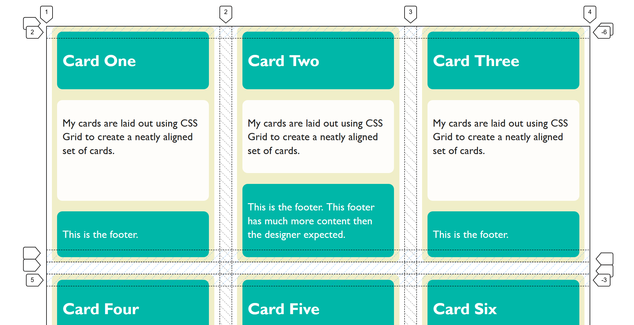
We can start to form something that looks more like a grid to us by giving the property grid-template-columns a value. The property takes a track listing as a value; if I give it three 1fr tracks, we now find ourselves with a three-column grid, and using the gap property gives me spacing between those cards.
We now have something that looks to us like a grid:
We define some column tracks and a gap to get an obvious grid layout (Large preview)
Each of the grid items in our example has children of its own. The cards have headers and footers and an area for the main content of the card. These children are grid items, but their children have returned to block and inline layout. The header, content area and footer do not do any grid like things. This is because when we change the value of display to grid, it doesn’t inherit but instead only the children become grid items; their children return to block layout.
Nesting Grids
If a card has more content than the other cards, the cards in that row get taller. The initial value of align-items for grid items is stretch. Our cards stretch to full height. The items inside, however, are in normal block and inline flow and so they don’t stretch magically to fill the card. (This is why in the image above you can see that the cards with less content have a gap at the bottom.)
If we wanted them to (in order to make that footer always sit at the bottom), we could make our grid item a grid, too. In this case, a single-column grid is all we need. We can then define row tracks, giving the area into which the div with a class of content sits, a track size of 1fr. This causes it to take up all of the available space in the container, and will push the footer to the bottom of the card.
You can do this nesting of grids as much as you need. I don’t really think of it as nesting since we’re not creating nested tables here, and we are usually using the structural HTML elements already in place. We are just changing the value of display one level at a time to what is most appropriate for the children of that element. That might be flex layout or grid layout, but most often it will be block and inline layout. In that case, we don’t need to do anything because that is what happens by default.
Lining Up The Headers And Footers
As we have now seen, if we want a set of cards laid out on a grid, and we want them to display as tall as the tallest card, and we want the footers pushed to the bottom of the card, we need very little CSS. The layout CSS for the above example is as follows:
What if we want the background color on the headers and footers to line up though? Each card is a grid item, but the headers and footers are in the grid on the item. They have no relationship to each other and so we can’t line them up. Here it would be nice if we could somehow inherit the grid through the children.
If we could define a grid on the parent which had three rows, then place the cards across these three rows and have the header, content and footer each sit in one of the rows. That way, each header would be in the same row, and therefore if one header got taller, the whole row would get taller.
We don’t have a good solution to that in browsers today, but it is on the way. The subgrid feature of CSS Grid Layout Level 2 will enable this exact pattern. You will be able to create a grid on the parent and then selectively opt the rows and/or columns to use that grid, rather than define a new grid on the child element which is completely independent of that grid.
Note that the examples which follow only work at the time of writing in Firefox Nightly. The subgrid value ofgrid-template-columnsandgrid-template-rowsis a new feature and part of Level 2 of the CSS Grid Specification. To try out this feature, download a copy of Firefox Nightly.
You can see how this works in the images below. In the first image, I have created three row tracks on the parent and spanned the card across them. With the Firefox Grid Inspector highlighting the grid, you can see that the rows of the parent don’t relate to the rows used by the children.
Inspecting the grid with the Firefox Grid Inspector shows the elements are not displaying in the tracks of the parent. (Large preview)
If, instead of defining three rows on the child, I use the subgrid value for grid-template-rows, the card now uses those rows on the parent. You can see how the two are now aligned and therefore the headers and footers align as well:
Using subgrid each part of the card goes into its own track (Large preview)
What we are doing here with subgrid isn’t a new value of display. The item which is a subgrid is a grid container itself, as we have set display: grid on it. The grid items are behaving as grid items normally do. This is regular grid layout — no different from the original nested grid except that (instead of the item having its own row track sizing) it is using the tracks of the parent.
This is the nice thing about subgrid; there isn’t a whole lot to learn if you already know how to use grid layout. You can read about the rest of the details in my previous post here on Smashing Magazine, “CSS Grid Level 2: Here Comes Subgrid”.
Yesterday (23rd May 2019), subgrid landed in Firefox Nightly, so we have a testable implementation of the subgrid value of grid-template-columns and grid-template-rows. Please do grab a copy of Nightly and try this out. With a copy of Nightly, you can see the final example working in this CodePen:
See if you can think up other use cases that are solved by having the subgrid feature, or perhaps things which you think are missing. While a feature is only available in a Nightly browser, that’s the time where it is possible to make changes to the spec if some issue are discovered. So, do a favor to your future web developing self and try out features like this in order that you can help contribute to the web platform and make things better.
If you think you have found a bug in the Firefox implementation, you can take a look at the main implementation bug on Bugzilla which links to related issues in the Depends on section. If you can’t see your issue, create as a simple a reduced test case as possible and raise the bug. If you think that subgrid should do something in order to solve a use case, and that is something not detailed in the specification, you can raise an issue on the CSS Working Group GitHub for a potential enhancement.
What About display: contents?
If you have been following along, you might think that display: contents (as described in the previous article about display) might solve the problems that subgrid seeks to solve — that of allowing indirect children to participate in a grid layout. That isn’t the case, and our example of cards is a perfect way to demonstrate the difference.
If, instead of making our card a grid layout with display: grid, we removed the box using display: contents, we would get this result in this next CodePen. (Try removing the display: contents line from the rules for .card to see the difference.)
In this example, the box of the card has been removed and so the header, content and footer directly participate in grid layout and are autoplaced across the grid. This wasn’t what we wanted at all! The contents value of display will be really helpful once the accessibility issues in browsers mentioned in my last article are dealt with, however, it solves different problems to the one that we are exploring.
More Reading And Examples
I’ve been creating a number of examples and demos to help everyone understand subgrid. You can try those out at the links below:
Automatically detect JS errors impacting your users. Get comprehensive diagnostic reports, know instantly which errors are worth fixing, & debug in minutes.


