Design Systems Blogathon

It was fun watching a bunch of back and forth blogging between a bunch of smart people quoting a bunch of smart people last week. If you missed it, you might wanna start at the end and work backward.

I only have one tidbit to add. I don't do much with design systems as someone who works on pretty small teams, any of which have found a system that works for them that doesn't involve what anyone would probably call a design system. When we have intentionally wandered in the direction of a design system, we found ourselves not as architects or gardeners, but as zookeepers. We were just documenting what we already had, which was fine as an exercise, but not particularly useful in practice. Again, just for us.

The post Design Systems Blogathon appeared first on CSS-Tricks.

Magic Flip Cards: Solving A Common Sizing Problem

Magic Flip Cards: Solving A Common Sizing Problem

Magic Flip Cards: Solving A Common Sizing Problem

Dan Halliday

What are the chances your next client will use the word interactive while introducing their project? In my experience, the answer is 100%, so I’m always looking for robust CSS techniques to help me deliver the various features and effects that come up when discussing this goal.

A little piece of interactivity I’m asked to implement again and again is flip cards — blocks of content that turn about when hovered or tapped to reveal content on their reverse side. It’s a neat effect that encourages playful browsing, and another way to show more information without navigating away from the page. But the standard method has a problem when it comes to accommodating different card content lengths.

In this tutorial, we’re going to build a flip card grid which solves that problem with some CSS basics — transforms, flex, and grid. You’ll need to be familiar with these, and it will help to have a good grasp of CSS positioning techniques. We will cover:

  • How flip cards are usually implemented using absolute positioning;
  • The sizing problem that absolute positioning introduces; and
  • A general solution for automatic sizing of overlaid content.

Creating A Basic Flip Card

With good modern browser support for three-dimensional transforms, creating a basic flip card is relatively straightforward. The usual method is to place the front and back card faces in a parent container, and absolutely position the back face so it can match the size of the front face. Add an x-axis transform to the back face to make it appear reversed, add another to the card itself on hover, and we’re in business.

cards {
  display: grid;
}

.card {
  perspective: 40rem;
}

.card-body {
  transform-style: preserve-3d;
  transition: var(--time) transform;
  
  .card:hover & {
    transform: rotateX(-180deg);
  }  
}

.card-front, .card-back {
  backface-visibility: hidden;
}

.card-back {
  position: absolute;
  top: 0; right: 0; bottom: 0; left: 0;
  transform: rotateX(-180deg);
}

A standard flip card implementation using absolute positioning (see the Pen “[Magic Flip Cards 1: The Standard Implementation](https://codepen.io/smashingmag/pen/JjdPJvo)” by Dan Halliday)

A standard flip card implementation using absolute positioning (see the Pen “Magic Flip Cards 1: The Standard Implementation” by Dan Halliday)

What Could Go Wrong?

Our standard solution has a big problem, though: it doesn’t work when the back face needs more space than the front face provides. Giving the card a large, fixed size is one solution, but that approach is also guaranteed to fail at some point for some set of screen sizes.

How the standard flip card implementation fails with longer back content
This is how the standard flip card implementation fails with longer back content. (Large preview)

Design comps naturally feature neat-looking boxes with text that fits perfectly. But when starting development, it can be hard to get a page and card layout that works for the real content. And when displaying dynamic content from a CMS, it can be impossible! Even with word or character limits, there’s often no solution that works reliably across all devices.

How the standard flip card implementation fails with longer back content (see the Pen “[Magic Flip Cards 2: How Absolute Positioning Fails](https://codepen.io/smashingmag/pen/QWbLMLz])” by Dan Halliday)

How the standard flip card implementation fails with longer back content (see the Pen “Magic Flip Cards 2: How Absolute Positioning Fails” by Dan Halliday)

We should always strive to create layout implementations that tolerate a wide range of content lengths. But it’s not easy! I’ve often had occasion to fall back to using fixed sizing and position, whether due to time constraints, insufficient browser support, a weak reference design, or just my own inexperience.

Over the years, I’ve learned that a good iterative process and healthy dialogue with the designer can help a lot when wrangling these issues, and often you can meet somewhere in the middle to get a robust layout with some interactivity. But back to the task at hand — can it be done?

Thinking Outside the Box

In fact, it is possible to size the cards based on both the front and back content, and it’s not as hard as it seems at first. We just need to be methodical and persistent!

Constraining the Problem

Let’s start by making a list of our layout’s requirements. Trying to write down precisely what you want might seem like a chore, but it’s a great way to uncover constraints that can be simplified to solve a problem. Let’s say:

  • We want to see one or more rectangular cards, arranged in a single-column or multi-column grid;
  • We want the cards to flip over on hover or tap to reveal a second set of content on the back face;
  • We want the cards to always be big enough to show all their front and back content, regardless of content length or styling; and
  • In the case of multiple columns, ideally, we want all the cards to be the same size so that the rows align nicely.

Thinking through these requirements, we can notice a couple of things that simplify the problem:

  • If the cards are going to be presented in a grid, we have a constraint on their width — that is, their widths are functions of the viewport or grid container rather than their own content;
  • Given that we know a card’s width (as a percentage of its parent, at least), we’ve solved for the horizontal dimension and we just need to have the card’s height expand to fits the taller of its front or back face; and
  • If we can do that and each card is vertically self-sized, we can use CSS Grid’s grid-auto-rows to make all rows of cards as tall as the tallest card.

Figuring Out The Card Trick

So, how do we self-size the cards? Now we’ve simplified our problem, we’re within reach of the solution.

Forget, for a moment, the idea of putting content on top of other content, and focus on our new requirement: a parent that is as tall as its tallest child. That’s easy! Using columns, we can cause a parent to expand to the height of its tallest child. Then, we just need to employ a little sleight of hand to get the children aligned:

  1. Set the children to be the same width as their parent
  2. Allow the second child to overflow to the right
  3. Transform it leftwards back into its proper place
.cards {
  display: grid;
}

.card-body {
  display: flex;
}

.card-front, .card-back {
  min-width: 100%;
  mix-blend-mode: multiply; // Preview both faces
}

.card-back {
  transform: translate(-100%, 0);
}

Vertical sizing by fixed horizontal overflow (see the Pen “[Magic Flip Cards 3: Vertical Sizing by Fixed Horizontal Overflow](https://codepen.io/smashingmag/pen/ExjYvjP])” by Dan Halliday)

Vertical sizing by fixed horizontal overflow (see the Pen “Magic Flip Cards 3: Vertical Sizing by Fixed Horizontal Overflow” by Dan Halliday)

If this approach seems obvious, rest assured that I spent many hours going through some really terrible ideas before thinking of it. At first, I had planned to print a hidden duplicate version of the back face text inside the front face to expand the card to the correct size. And when I did think of using column overflow, I was originally cropping the right-hand column using overflow:hidden, and transforming it only at the last moment when the hover started, as I hadn’t yet realized I could just keep it transformed from the beginning and use another method such as opacity or backface-visibility to turn it on and off as needed.

In other words, obvious solutions are the result of hard work! If you feel like you’ve been bashing your head against your desk for hours on a layout problem, it is important to take a step back and decide whether you are spending your client’s time wisely: whether to suggest they alter the design, and whether to pursue the solution in your own time as a learning exercise when the pressure’s off. But when you do come up with simple methods, never feel stupid because it took a long time. Now, let’s review our complete solution.

.cards {
  display: grid;
}

.card {
  perspective: 40rem;
}

.card-body {
  display: flex;
  transform-style: preserve-3d;
  transition: var(--time) transform;

  .card:hover & {
    transform: rotateX(-180deg);
  }
}

.card-front, .card-back {
  backface-visibility: hidden;
  min-width: 100%;
}

.card-back {
  transform: rotateX(-180deg) translate(-100%, 0);
}

The complete magic flip cards solution (see the Pen “[Magic Flip Cards 4: The Complete Solution](https://codepen.io/smashingmag/pen/xxGKLZO])” by Dan Halliday)

The complete magic flip cards solution (see the Pen “Magic Flip Cards 4: The Complete Solution” by Dan Halliday)

Are There Any Caveats?

The solution works well generally, with just a few minor caveats to bear in mind:

  • The cards must be present in a grid layout or in some other context where their widths are not content-dependent.
  • Cards require a content wrapper of some sort (our card-body) so that the hover area doesn’t change during animations. If the card itself is animated, you’ll see some glitching as the animation rapidly stops and restarts.
  • Styling such as backgrounds and box-shadows are best placed directly on the front and back faces, as any effects on the card itself will not be animated. Beware of styling such as box-shadows on the card body, as naturally they will get flipped upside down.
  • Cards’ front and back faces need their box-sizing property set to border-box if they have their own padding, owing to their min-width requirement, otherwise they will overflow.
  • Safari still requires -webkit-backface-visibility, in its vendor-prefixed form.

Adding Some Polish

Now we’ve solved the hard problem, let’s look at a couple of tweaks we can make to get the whole interaction working as smoothly as possible.

First, check whether the cards overlap while flipping. This will depend on whether you’re using multiple columns, the width of the column gutter, the orientation of the flip, and the perspective value of the card, but it is likely to happen. You can increase the duration of the animation to see things more clearly. When hovering, it looks unnatural for the hovered card to flip underneath its later neighbors, so we need to put it on top using z-index. Easy enough, but watch out! We need to wait until the outgoing animation is complete before restoring the z-index. Enter transition-delay:

.card {
  transition: z-index;
  transition-delay: var(--time);
  z-index: 0;
  
  &:hover {
    transition-delay: 0s;
    z-index: 1;
  }
}

Next, consider creating an active state for the cards. I usually try and make cards like these link to somewhere relevant — even if not specified by the designer — as elements with hover effects like this feel very tappable so it’s good to provide a destination for readers who try their luck. I like a short, subtle scale transform, as it works reasonably well whether or not the second half of the animation is cut off by loading of the destination page (I’d love for browsers to complete in-flight animations cleanly before navigation, though I’m sure that would be far more difficult to implement in practice than it sounds).

This is also a great opportunity to think about how accessible our cards’ back content is. Our markup is concise and well-ordered so we’ve covered screen readers and other use cases that ignore styling, but how about keyboard users? If we’re going to make the cards themselves anchors, they will receive focus as keyboard users tab through the page. Let’s reuse the card’s hover state as a focus state, and the back content will appear naturally during keyboard browsing.

.card {
  transition: z-index, transform calc(var(--time) / 4);
  transition-delay: var(--time), 0s;
  z-index: 0;
  
  &:hover {
    transition-delay: 0s;
    z-index: 1;
  }

  &:active {
    transform: scale(0.975);
  }
}

.card-body {
  .card:hover &, .card:focus & {
    transform: rotateX(-180deg);
  }
}

Finally, don’t forget that now the card automatically scales to fit its content, you can use pretty much any alignment and spacing techniques you like inside the front and back containers. Use flex alignment to center titles, add padding, even put another grid inside the card. This is the beauty of good layout solutions that scale with their content — reduced coupling of children to parents, and the modularity that allows you to focus on one thing at a time.

.card-front, .card-back {
  display: flex;
  align-items: center;
  background-color: white;
  box-shadow: 0 5px 10px black;
  border-radius: 0.25rem;
  padding: 1.5rem;
}

Wrapping Up

I hope you find this CSS technique useful! Why not try some variations on the animation, such as a scale effect, or a simple cross-fade? The technique isn’t limited to the cards form factor either. It can be used anywhere where the responsibility for vertical sizing falls to more than one element. Imagine a magazine website featuring large photographs with overlaid captions — you could use it to accommodate both images with tall aspect ratios, and long dynamic text.

Above all, remember the benefits of taking some time to really think hard about whether there’s a way of implementing a design that looks as if it would only work with fixed sizing and position. Often, there is, and no matter how tricky the problem may seem at first, writing down all your requirements, putting some time aside to create a minimal test case, and stepping through it methodically is always the best bet.

Smashing Editorial (ra, il)

Breaking the Monolith

Read on to find out more about the monolithic codebase!

A monolithic codebase is a very well-recognized problem many production systems that are existing for a long time are facing today. Re-architecting it with a completely new system comprising of domain-isolated microservices implemented from scratch is very rarely possible. Primarily because it's impractical to the business folks to shut down the existing system which ultimately has to fund this exercise and also because of the risks of failure associated with such a big-bang cutover.

Road to Great Code, Challenge #1 — Shuffle Playlist

Hone your craft with this Java coding challenge!

No matter what your profession is, it’s important to hone your craft. Uncle Bob (Rob Martin) in his book titled The Clean Coder suggests that us programmers should regularly practice writing code and solve common problems. Once we get good at solving them, he goes as far as recommending that we program to the rhythm of the music. Not to mention that we shouldn’t only stick to one programming language that we’ve mastered. We should constantly expose ourselves to different languages to get a better understanding of the programming universe.

You may also like: Clean Code Principles

22 Amazing Gifts For Designers – 2019 Edition

We have collected 22 fantastic Christmas gifts for all your creative web designer and graphic designer friends out there. While not exhaustive, these are some of the best gifts for designers available right now, just in time for your holiday shopping.

Ready? Let’s get started with our 2019 gift guide!

Rocketbook Smart Reusable Notebook

Rocketbook - Gifts For Designers - 1st Web Designer

The Rocketbook notebook provides a classic pen and paper experience, yet is built for the digital age. Although it feels like a traditional notebook, the Rocketbook is endlessly reusable and connected to all of your favorite designer’s relevant cloud services. When your designer friend writes using any pen from the Pilot Frixion line, their writing sticks to Rocketbook pages like regular paper. But add a drop of water… and the notebook erases like magic. Designed for those who want an endlessly reusable notebook to last for years, if not a lifetime, the Rocketbook has pages made with synthetic materials that provide an extremely smooth writing experience. Blast handwritten notes to popular cloud services like Google Drive, Dropbox, Evernote, box, OneNote, Slack, iCloud, email and more using the free Rocketbook application for iOS and Android.

CHECK PRICE ON AMAZON

reMarkable – the Paper Tablet – 10.3″ Digital Notepad and E-reader

reMarkable - Gifts For Designers - 1st Web Designer

reMarkable is the first digital device that gives your favorite designer a pen-to-paper note-taking experience. reMarkable converts theirr hand-written notes to typed text, making them easy to refine, organize and share. With no backlight or glare, reMarkable offers a paper-like reading experience they won’t find on any LCD display. Annotate on their documents just like theywould on paper. Includes digital tools like undo, erase, move, and many more.

CHECK PRICE ON AMAZON

Wacom Intuos Pro Digital Graphic Drawing Tablet

Wacom Intuous Pro Drawing Tablet - Gifts For Designers - 1st Web Designer

The professional standard in creative pen tablets Wacom Intuos Pro sets a new standard for professional graphics tablets. The new Wacom Pro Pen 2 features impressive pressure sensitivity, tilt response and virtually lag free tracking. Your favorite designer will get natural creative control while they illustrate, edit or design digitally with Intuos Pro.

CHECK PRICE ON AMAZON

Wacom INTUOS4/CINTIQ21 Grip Pen

Wacom Intuous4 Grip Pen - Gifts For Designers - 1st Web Designer

Sketch and write on an Intuos tablet or Cintiq display comfortably with this Wacom Grip Pen stylus. It has a contoured body and ergonomic weight to help prevent wrist fatigue during extended use, and its tilt sensitivity provides a natural feel for accurate drawing. Maximize productivity with the programmable side switches and pressure-sensitive eraser.

CHECK PRICE ON AMAZON

Moleskine Pen+ Smart Writing Set Pen & Dotted Smart Notebook

Moleskine Smart Writing Set - Gifts For Designers - 1st Web Designer

Your favorite designer will watch their ideas travel off the page and evolve on screen. Part of the Smart Writing System, the Smart Writing Set is an instant-access kit containing a dotted layout Paper Tablet, Pen+ smart pen and Moleskine Notes app: everything needed to bring all the advantages of digital creativity to freehand notes and sketches.

CHECK PRICE ON AMAZON

Adobe Stock – Try Risk Free For 30 Days!

Adobe Stock Subscription - Gifts For Designers - 1st Web Designer

Give the gift that keeps on giving, starting with a risk-free 30-day trial! Find the perfect high-res, royalty-free, stock image to enhance your favorite designer’s next creative project. Preview watermarked images inside designs first. Then license, access and manage them directly within Photoshop, InDesign, Illustrator, and other Adobe desktop apps.

GET THE FREE TRIAL

Vaydeer USB 3.0 Wireless Charging Aluminum Monitor Stand Riser

Vaydeer Monitor Stand - Gifts For Designers - 1st Web Designer

Your favorite designer can create additional space on their desktop while adding USB 3.0 ports, wireless charging for your devices, and keyboard and mouse storage, all in a sleek and affordable package!

CHECK PRICE ON AMAZON

Sinstar 8 in 1 Aluminum Multi Port Adapter Type C Combo Hub

Sinstar Multi Port Adapter - Gifts For Designers - 1st Web Designer

This handy little device features three USB 3.0 ports, SD and Micro SD card slots, Ethernet, charging port, and 4K HDMI video output. The compact and easy-to-use design makes it simple to take the Type-C USB Hub with you anywhere you go. Your favorite designer won’t be far from the convenience of accessing their favorite USB devices.

CHECK PRICE ON AMAZON

Rhodia Webnotebook

Rhodia Webnotebook - Gifts For Designers - 1st Web Designer

The Rhodia Webnotebook has a leatherette cover with a glued spine. The Webnotebook is A5 in size and has 96 sheets with an elastic closure to keep the book closed. The Webnotebook has a coloured ribbon and expanding pocket.

CHECK PRICE ON AMAZON

Lemome A5 Hardcover Dot Grid Notebook with Pen Loop

Lemome Notebook - Gifts For Designers - 1st Web Designer

A popular choice for everyday use, designers can use it to capture ideas, drafts, and drawings. Never lose your pen again, since the strap holds the pen and fits securely onto the side of the notebook. You’ll never have to rummage around again for something to write. Thick premium paper means it’s perfect to write and draw on.

CHECK PRICE ON AMAZON

Field Notes Signature Series Notebook 2-Pack

Field Notes - Gifts For Designers - 1st Web Designer

What designer doesn’t want Field Notes? Field Notes Signature Series Notebook 2-Packs are available in two versions: Cream covered books with plain ruled paper inside, or gray covered sketch books with plain paper inside. The covers are gently debossed with just a tint of ink. Inside you’ll find 72 pages of very high quality white Strathmore Premium Wove paper. The ruled pack has a fine application of gray lines on the pages.

CHECK PRICE ON AMAZON

Pantone: 10 Notebooks

Pantone Notebooks - Gifts For Designers - 1st Web Designer

Ten petite journals feature Pantone’s iconic color chip design in ten sumptuous shades. Grid-dot interior pages and a sturdy slipcase make these notebooks eminently practical and chic for on-the-go note-taking when used solo, and an eye-catching object for desktop display when grouped together.

CHECK PRICE ON AMAZON

Envato Elements

Envato Elements - Gifts For Designers - 1st Web Designer

Another gift that keeps on giving! One affordable subscription provides access to 1,800,000+ assets, including graphics, video, audio, presentation templates, photos, fonts, WordPress themes and plugins, and so much more. Sign up the designer you care about and they will forever be grateful!

SIGN UP NOW

Bellroy Classic Pouch

Bellroy Classic Pouch - Gifts For Designers - 1st Web Designer

The Classic Pouch is the humble sidekick that can make a big difference to your favorite designer’s day. They’ll never again leave behind their pen, charger, gum or lip balm, just because they can’t keep track of their essentials. And they won’t rummage around their bag looking for them, either. The Classic Pouch is the place to keep them in one place (and in the right place). An everyday pouch for keeping daily essentials in one spot — cables, cosmetics, toiletries, tools and more!

CHECK PRICE ON AMAZON

Vintage Typography Notecards

Vintage Typography Cards - Gifts For Designers - 1st Web Designer

Discovered in vintage typographic manuals, the specimens featured on these elegant cards range from one-of-a-kind hand-drawn samples to classic favorites used in the early decades of the twentieth century. The back of each card features a minihistory of the typeface’s origins and use.

CHECK PRICE ON AMAZON

Fifty Type Specimens: From the Collection of Tobias Frere-Jones

Fifty Type Specimens - Gifts For Designers - 1st Web Designer

Fifty Type Specimens is a collection of postcards with stunning images of typography, for inspiration, correspondence, or display. Cards feature classic letterforms, pages from specimen books, and crops of gorgeous letters presented in a box with the feel of an old specimen book. Historic typefaces, selected by renowned designer Tobias Frere-Jones, are organized into four geographic categories by thumb tabs: Germany, France, United States, and the United Kingdom.

CHECK PRICE ON AMAZON

UI PROGO Stainless Steel Stencils

UI Progo Stencils - Gifts For Designers - 1st Web Designer

Premium quality materials with innovative design to create the ultimate tool for stenciling. With icons that are large enough to actually use, these stencils are a must-have for all designers, artists, students, and journaling enthusiasts. Complete with the latest social media icons, these stencils give you what you need to create the perfect design you have in mind. Made to be portable, you can take them with you to work, the office, or class.

CHECK PRICE ON AMAZON

2020 Stendig Wall, Office, and Home Calendar

Stendig Wall calendar - Gifts For Designers - 1st Web Designer

This calendar is special. It is much more than just a wall calendar: It is a masterpiece of art. This is the original, genuine and authentic work of the great Massimo Vignelli, designed in 1966. This modern calendar has withstood the test of time. Year after year designers, architects, doctors, lawyers, and many others purchase this calendar to let guests in their home or office know one thing: “I have style”.

CHECK PRICE ON AMAZON

Creative Workshop: 80 Challenges to Sharpen Your Design Skills

Creative Workshop - Gifts For Designers - 1st Web Designer

80 creative challenges that will help designers achieve a breadth of stronger design solutions, in various media, within any set time period. Exercises range from creating a typeface in an hour to designing a paper robot in an afternoon to designing web pages and other interactive experiences. Each exercise includes compelling visual solutions from other designers and background stories to help your favorite designer increase their capacity to innovate.

CHECK PRICE ON AMAZON

A Few Minutes of Design: 52 Activities to Spark Your Creativity

A Few Minutes of Design - Gifts For Designers - 1st Web Designer

This colorful, handy card deck presents fifty-two exercises and activities to jump-start your favorite designer’s creative juices, free them from creative block, start a new project, or finish an existing one. Each exercise offers insight into the innumerable small decisions involved in design: How to establish a pattern, continue a series, how to say it without words, how to name a project, what fits, and what doesn’t? These cards benefit established practicing designers or creatives in any field with activities that are sometimes playful, sometimes challenging, but always enlightening. Each activity is estimated to take 15 minutes.

CHECK PRICE ON AMAZON

Meggs’ History of Graphic Design

Meggs History of Graphic Design - Gifts For Designers - 1st Web Designer

Meggs’ History of Graphic Design is the industry’s unparalleled, award-winning reference. With over 1,400 high-quality images throughout, this visually stunning text will guide your favorite designer through a saga of artistic innovators, breakthrough technologies, and groundbreaking developments that define the graphic design field. The initial publication of this book was heralded as a publishing landmark, and author Philip B. Meggs is credited with significantly shaping the academic field of graphic design.

CHECK PRICE ON AMAZON

Pantone Postcard Box: 100 Postcards

Pantone Postcards - Gifts For Designers - 1st Web Designer

With a palette drawn from the systems of Pantone, each postcard in this set of 100 offers a different bold hue to brighten up your favorite designer’s mail.

CHECK PRICE ON AMAZON

Is There A Future Beyond Writing Great Code?

Is There A Future Beyond Writing Great Code?

Is There A Future Beyond Writing Great Code?

Ronald Mendez

Let’s do a quick exercise. Say you’ve been working professionally as a developer for more than five years. You’ve gained hands-on experience through dozens of projects and kept your skillset sharp by learning about new techniques, tools, and frameworks. You contribute to different libraries, routinely refactor the code you write, and periodically exchange code reviews with your colleagues.

But then someone comes up and asks you that one question you haven’t had the chance to figure out: Where do you see yourself, ten years from now?

You might be worried about the idea that if you continue down the same road, you’ll simply be an older developer who codes a bit better and a bit faster. Some developers are happy with this thought and simply can’t wait to continue down that road. But others might realize that this rollercoaster of lessons and growth you’ve been through is quickly shifting to cruise-control mode.

Once you feel you’re in complete control of your role as a developer, you start feeling the itch to do more. Not more of the same, but more personal growth instead. Maybe something different.

During the past few years of my career, I’ve been looking for answers. I got the chance to work with (and learn from) many successful developers who managed to transition into highly influential roles in which they make the most out of their technical background. Each of them explored a different path in which they were able to make an organic transition, based on a balance between their core skills and their complementary skills.

Where Can We Go From Here?

There are some new paths we can explore, that can force us to grow beyond our comfort zones and at the same time benefit from the skillset we’ve worked so hard to cultivate.

As developers, most of the articles we read, the programming books, and even the advice from our peers, are all tailored to help us to only focus on writing better code. Other than that, we’re not really taught how to work better or, to put it in a more philosophical perspective, how to evolve.

We usually have no clue about what comes after achieving the goals we set out for ourselves when we started our careers or if there’s even something we want to do other than coding eight hours a day, for the rest of our lives. It’s common to even underestimate our possible contribution to the team if we were to be doing something other than writing code in the near future. We’re not sure how we can make a bigger impact, even though our perspective and skills are definitely needed in more influencing positions.

Listen To The Industry

Back in 2008, when I started my career as a frontend developer, there wasn’t a person in the world who hadn’t heard of Mark Zuckerberg, the young programmer that became a millionaire while changing the way people communicate. Millennials began to romanticize the idea of legally getting rich while wearing a hoodie. Suddenly, almost every person from my generation wanted to become a developer.

Now, over a decade later, we’re starting to feel the true impact of this boom of coders. Through this year’s Stack Overflow Survey, we learned that more than two-thirds of respondents have less than ten years of professional coding experience.

We can clearly see that experienced developers with leadership skills are scarce, so now companies have to find creative ways to book their best talent in a way that they can oversee more junior developers and maintain the quality of work. This creates an organic leadership structure within growing teams.

The industry continues to grow at a rapid pace and so are our roles as developers. It has become more common to find directors and managers that started out as programmers, and companies are now opening up more leadership positions that require development backgrounds.

It’s safe to say that, even though programming was considered as the next blue-collar job, the role of the developer is growing into highly influential positions within organizations. But there is no written roadmap or proven formula to guide us through that transition.

What Are Some Of Our Options?

There came a point in my career in which I was asked the dreaded question about the future I envision for myself. I had no answer. In fact, it triggered even more questions that hadn’t crossed my mind.

I was already working as frontend lead so I had been given more and more responsibilities apart from writing code, which made me think of a possible future in which I probably wouldn’t be programming. The possibility of having more impact across different projects was definitely appealing.

So I set out to research what options could be interesting for my future. I looked at the path that some colleagues had taken in which they had successfully transitioned from the role of developers to important positions within the company. Most of the cases consisted of taking small steps and being in the right place at the right time. But overall, they all ended up involving themselves in these three main groups of activities:

  1. Managing teams and projects
    Leading a group of people into greatness sounds exciting, but it’s not easy. As seasoned developers, there are many options of growth that involve either managing a group of fellow developers as a team or managing projects across multi-disciplinary teams. Although it’s a highly rewarding option, it requires stepping away from the keyboard and learning to delegate, which can be very tricky for developers that are used to personally solving all of their problems.

    Moving on to a position in which we are in more control of the process and the team involved around it will most likely lead for the need of sacrificing the control we’re used to having when it comes to code.
  2. Mentoring and developing talent
    How many bosses have fantasized about cloning their top developers? In the real world, this is still not likely to happen, so smart bosses do the next best thing: they set up processes in which the savviest coders can actively pass along their knowledge to their peers.

    We have to keep in mind that even though some developers do this naturally in their day-to-day, it’s always more effective if senior developers are given a more formal role in which they can routinely allocate their time to work on the growth of their teams. This can be done with code reviews, workshops, and individual assessments with some colleagues.
  3. Being in the business of technology
    It’s very common to hear developers complain about how projects were pitched or defined when they were sold to clients. And, in most cases, it’s usually too late to complain.

    In my experience, I found myself happier working on projects in which developers had been involved during the sale. It’s always great to have a logical-minded ally flagging potential technical issues in a room where nobody else had a clue.

    The roles of consultants and technical directors are crucial in large digital projects. The involvement of developers in client workshops and drafting technical documentation at the start of any project can potentially be game-changers for the lifecycle of a project.

Working On A New Set Of Tools

Let’s say we want to continue to grow and want to embark on a future where we want to do more than just writing code. Once we have an idea about where we’re headed, it’s very likely that we may not yet be prepared for the leap. After all, we’ve just been focusing on acquiring skills that make us better developers.

Once we realize we have a lot to learn, we need to start working on the right set of skills. This time it will be different: we won’t be learning new languages, frameworks, or libraries. We’re going to need to stock up on skills that might have not felt important in the past, but are crucial for taking the next steps in these uncertain territories.

Communication

For anybody who has a job at any company, this would be a no-brainer. Communication is known to be the core of collaboration within any type of organization. Unfortunately, programmers have been given a free pass in this area for many years. The need to find logical-minded, hard-working, passionate individuals has allowed us to thrive without the need to really have great communication skills and even be a very socially awkward bunch.

If we have any aspirations to work with different teams and clients, it’s very clear that we will have to work on improving all aspects of our communication. One-on-one meetings, presentations, and important emails will all need to be carefully polished from now on.

Ownership

Having logical mindsets has impacted on the way we organize our work. As developers, we usually have a black-and-white sense of where our work begins and where it ends. This is positive when it allows us to have a clear understanding of the work that needs to be done by us, but sometimes prevents us from pushing our boundaries and working outside of our comfort zones.

The first order of business is to start taking ownership of all aspects of the work we’re involved in. By blurring the line that defines where a developer’s work ends, we’re able to take on new responsibilities and eventually transition into different roles.

Leadership

Wherever we’re headed in our careers, we’re going to need for our teammates to trust us. We’ll need them to know we’re headed in the right direction, even if for a moment it’s not totally clear.

In order to achieve this, we’ll need to be able to prove our knowledge, we’ll need to be confident in our decisions, and we will definitely need to be able to acknowledge our mistakes and quickly learn from them.

This is not a simple task and it’s not something you will be able to check off a list. It’s going to require our dedication for as long as we wish to continue growing outside the development bubble.

Get To Work

Once we’re sure we want to take a leap in our career, we have to start moving in the right direction. The first step would be to explore the options, decide which path you want to pursue, and see how that path aligns with your current role.

Does your company offer a space in which you could be a mentor or a manager? Do you think that there’s a chance of making it happen there or do you think you will need to continue your growth elsewhere? These are just some of the questions you have to ask yourself and will also lead to a conversation with some of your teammates and managers.

Taking a step in a new direction will require putting in the hard work, having an open mind, and being resilient enough to fail and try again, as many times as it takes.

Smashing Editorial (dm, il)

What the Web Still Is

Being a pessimist is an easy thing to fall back on, and I’m trying to be better about it. As we close the year out, I thought it would be a good exercise to take stock of the state of the web and count our blessings.

Versatile

We don't use the internet to do just one thing. With more than two decades of globally interconnected computers, the web allows us to use it for all manner of activity.

This includes platforms, processes, and products that existed before the web came into being, and also previously unimagined concepts and behaviors. Thanks to the web, we can all order takeout the same way we can all watch two women repair a space station in realtime.

Decentralized

There is still no one single arbiter you need to petition to sign off on the validity of your idea, or one accepted path for going about to make it happen. Any website can link out to, or be linked to, without having to pay a tax or file pre-approval paperwork.

While we have seen a consolidation of the services needed to run more sophisticated web apps, you can still put your ideas out for the entire world to see with nothing more than a static HTML page. This fact was, and still is, historically unprecedented.

Resilient

The internet has been called the most hostile environment to develop for. Someone who works on the web has to consider multiple browsers, the operating systems they are installed on, and all the popular release versions of both. They also need to consider screen size and quality, variable network conditions, different form factors and input modes, third party scripts, etc. This is to say nothing about serving an unknown amount of unknown users, each with their own thoughts, feelings, goals, abilities, motivations, proficiencies, and device modifications.

If you do it right, you can build a website or a web app so that it can survive a lot of damage before it is rendered completely inoperable. Frankly, the fact that the web works at all is nothing short of miraculous.

The failsafes, guardrails, redundancies, and other considerations built into the platform from the packet level on up allow this to happen. Honoring them honors the thought, care, and planning that went into the web's foundational principles.

Responsive

Most websites now make use of media queries to ensure their content reads and works well across a staggeringly large amount of devices. This efficient technology choice is fault-tolerant, has a low barrier of entry, and neatly side-steps the myriad problems you get with approaches such as device-sniffing and/or conditionally serving massive piles of JavaScript.

Responsive Design was, and still is revolutionary. It was the right answer, at the right place and time. It elegantly handled the compounding problem of viewport fragmentation as the web transformed from something new and novel into something that is woven into our everyday lives.

Adaptable

In addition to being responsive, the web works across a huge range of form factors, device capabilities, and specialized browsing modes. The post you are currently reading can show up on a laptop, a phone, a Kindle, a TV, a gas station pump, a video game console, a refrigerator, a car, a billboard, an oscilloscope—heck, even a space shuttle (if you’re reading this from space, please, please, please let me know).

It will work with a reading mode that helps a person focus, dark and high contrast modes that will help a person see, and any number of specialized browser extensions that help people get what they need. I have a friend who inverts her entire display to help prevent triggering migraines, and the web just rolls with it. How great is that?

Web content can be read, translated, spoken aloud, copied, clipped, piped into your terminal, forked, remixed, scraped by a robot, output as Braille, and even played as music. You can increase the size of its text, change its font and color, and block parts you don't want to deal with—all in the service of making it easier for you to consume. That is revolutionary when compared to the media that came before it.

Furthermore, thanks to things like Progressive Web Apps and Web Platform Features, the web now blends seamlessly into desktops and home screens. These features allow web content to behave like traditional apps and are treated as first-class citizens by the operating systems that support them. You don’t even necessarily need to be online for them to work!

Accessible

The current landscape of accessibility compliance is a depressing state of affairs. WebAIM’s Million report, and subsequent update, highlights this with a sobering level of detail.

Out of the top one million websites sampled, ~98% of home pages had programmatically detectable Web Content Accessibility Guideline (WCAG) errors. This represents a complete, categorical failure of our industry on every conceivable level, from developers and designers, to framework maintainers, all the way up to those who help steer the future of the platform.

And yet.

In that last stubborn two percent lives a promise of the web. Web accessibility—the ability for someone to use a website or web app regardless of their ability or circumstance—grants autonomy. It represents a rare space where a disabled individual may operate free from the immense amount of bias, misunderstanding, and outright hate that is pervasive throughout much of society. This autonomy represents not only freedom for social activities but also employment opportunities for a population that is routinely discriminated against.

There is a ton of work to do, and we do not have the luxury of defeatism. I’m actually optimistic about digital accessibility’s future. Things like Inclusive Design have shifted the conversation away from remediation into a more holistic, proactive approach to product design.

Accessibility, long viewed as an unglamorous topic, has started to appear as a mainstream, top-level theme in conference and workshop circuits, as well as popular industry blogs. Sophisticated automated accessibility checkers can help prevent you from shipping inaccessible code. Design systems are helping to normalize the practice at scale. And most importantly, accessibility practitioners are speaking openly about ableism.

Inexpensive

While the average size of a website continues to rise, the fact remains that you can achieve an incredible amount of functionality with a small amount of code. That’s an important thing to keep in mind.

It has never been more affordable to use the web. In the United States, you can buy an internet-ready smartphone for ~$40. Emerging markets are adopting feature phones such as the JioPhone (~$15 USD) at an incredible rate. This means that access to the world’s information is available to more people—people who traditionally may have never been able to have such a privilege.

Think about it: owning a desktop computer represented having enough steady income to be able to support permanent housing, as well as consistent power and phone service. This created an implicit barrier to entry during the web’s infancy.

The weakening of this barrier opens up unimaginable amounts of opportunity, and is an excellent reminder that the web really is for everyone. With that in mind, it remains vital to keep our payload sizes down. What might be a reflexive CMD + R for you might be an entire week’s worth of data for someone else.

Diverse

There are more browsers available than I have fingers and toes to count on. This is a good thing. Like any other category of software, each browser is an app that does the same general thing in the same general way, but with specific design decisions made to prioritize different needs and goals.

My favorite browser, Firefox, puts a lot of its attention towards maintaining the privacy and security of its users. Brave is similar in that regard. Both Edge and Safari are bundled with their respective operating systems, and have interfaces geared towards helping the widest range of users browse web content. Browsers like Opera and Vivaldi are geared towards tinkerers, people who like a highly customized browsing experience. Samsung Internet is an alternative browser for Android devices that can integrate with their proprietary hardware. KaiOS and UC browsers provide access to millions of feature phones, helping them to have smartphone-esque functionality. Chrome helps you receive more personalized ads efficiently debug JavaScript.

Browser engine diversity is important as well, although the ecosystem has been getting disturbingly small as of late. The healthy competition multiple engines generates translates directly to the experience becoming better for the most important people in the room: Those who rely on the web to live their everyday lives.

Speaking of people, let’s discuss the web’s quality of diversity and how it applies to them: Our industry, like many others, has historically been plagued by ills such as misogyny, racism, homophobia, transphobia, and classism. However, the fact remains that the ability to solve problems in the digital space represents a rare form of leverage that allows minoritized groups to have upward economic mobility.

If you can't be motivated by human decency, it’s no secret that more diverse teams perform better. We’ve made good strides in the past few years towards better representation, but there’s still a lot of work to be done.

Listen to, and signal boost the triumphs, frustrations, and fears of the underrepresented in our industry. Internalize their observations and challenge your preconceived notions and biases. Advocate for their right to be in this space. Educate yourself on our industry’s history. Support things like codes of conduct, which do the hard work of modeling and codifying expectations for behavior. All of this helps to push against a toxic status quo and makes the industry better for everyone.

Standardized

The web is built by consensus, enabling a radical kind of functionality. This interoperability—the ability for different computer systems to be able to exchange information—is built from a set of standards we have all collectively agreed on.

Chances are good that a web document written two decades ago will still work with the latest version of any major browser. Any web document written by someone else—even someone on the opposite side of the globe—will also work. It will also continue to work on browsers and devices that have yet to be invented. I challenge you to name another file format that supports this level of functionality that has an equivalent lifespan.

This futureproofing by way of standardization also allows for a solid foundation of support for whatever comes next. Remember the principle of versatile: It is important to remember that these standards are also not prescriptive. We’re free to take these building blocks use arrange them in a near-infinite number of ways.

Open

Furthermore, this consensus is transparent. While the process may seem slow sometimes, it is worth highlighting the fact that the process is highly transparent. Anyone who is invested may follow, and contribute to web standards, warts and all.

It’s this openness that helps to prevent things like hidden agendas, privatization, lock-in, and disproportionate influence from consolidating power. Open-source software and protocols and, most importantly, large-scale cooperation also sustain the web platform’s long-term growth and health. Think of web technologies that didn’t make it: Flash, Silverlight, ActiveX, etc. All closed, for-profit, brittle, and private.

It also helps to disincentive more abstract threats, things like adversarial interoperability and failure to disclose vulnerabilities. These kinds of hazards are a good thing to remember any time you find yourself frustrated with the platform.


Make no mistake: I feel a lot of what makes the web great is actively being dismantled, either inadvertently or deliberately. But as I mentioned earlier, cynicism is easy. My wish for next year? That all the qualities mentioned here are still present. My New Year’s resolution? To help ensure it.

The post What the Web Still Is appeared first on CSS-Tricks.
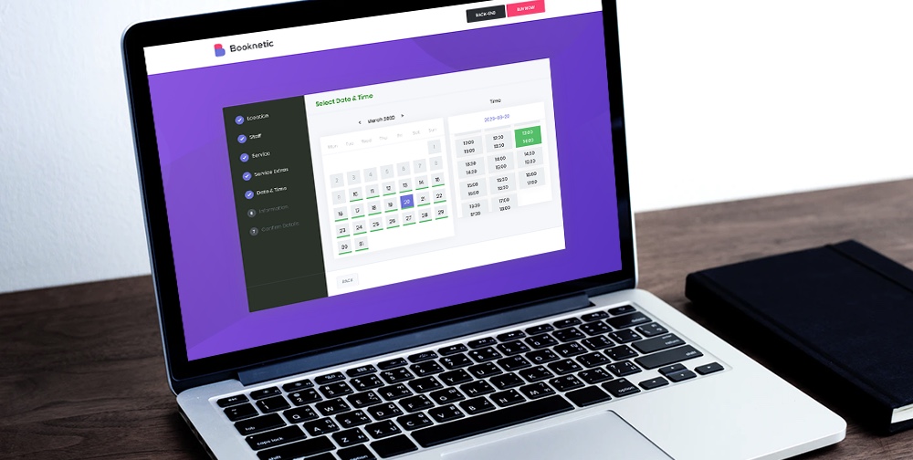
Tips for Writing Your Article

This could be you if you follow these tips!


In my last article, I presented my point of view on writing articles, and why we should all try this exercise. Some in the comments seemed willing to write articles as well but felt constrained in their desire. Although I am far from the claim of a great reporter, I will give you some advice.

Anomaly Detection Using the Bag-of-Words Model

I am going to show in detail one use case of unsupervised learning: behavioral-based anomaly detection. Imagine you are collecting daily activity from people. In this example, there are six people (S1-S6). When all the data are sorted and pre-processed, the result may look like this list:

  • S1 = eat, read book, ride bicycle, eat, play computer games, write homework, read book, eat, brush teeth, sleep
  • S2 = read book, eat, walk, eat, play tennis, go shopping, eat snack, write homework, eat, brush teeth, sleep
  • S3 = wake up, walk, eat, sleep, read book, eat, write homework, wash bicycle, eat, listen music, brush teeth, sleep
  • S4 = eat, ride bicycle, read book, eat, play piano, write homework, eat, exercise, sleep
  • S5 = wake up, eat, walk, read book, eat, write homework, watch television, eat, dance, brush teeth, sleep
  • S6 = eat, hang out, date girl, skating, use mother's CC, steal clothes, talk, cheating on taxes, fighting, sleep

S1 is the set of the daily activity of the first person, S2 of the second, and so on. If you look at this list, then you can pretty easily recognize that activity of S6 is somehow different from the others. That's because there are only six people. What if there were six thousand? Or six million? Unfortunately, there is no way you could recognize the anomalies. But machines can. Once a machine can solve a problem on a small scale, it can usually handle the large scale relatively easily. Therefore, the goal here is to build an unsupervised learning model that will identify S6 as an anomaly.

An Introduction to JUnit

Testing is an essential part of creating software and one that is often looked at as a second class citizen in the realm of application code. Despite this mischaracterization, test code often plays just as much — or an even larger — role in successfully releasing software that contains as few bugs as possible.

In this tutorial, we will walk through each of the steps required to develop simple but well-thought-out tests, starting with the theory and concepts behind creating tests. With this theory in hand, we will create a test fixture in JUnit 4 to exercise an example application and add test cases to this fixture as necessary. We will also learn how to mock external dependencies and use the setup mechanism provided by JUnit to abstract the initialization logic for our test cases. Along the way, we will cover the given-when-then approach to testing and the standard naming conventions used in many large-scale projects.

Creating a simple REST application

Hi guys,
I wonder if this is something I could do on this forum.
I've never worked with REST, so I thought that it could be a good exercise to try to develop a very small and simple Java application and try to make use of REST as well.
I found a brief which seems simple enough, I'll share it with you (I'm happy to change this of course if you think it's useful as for me it's just practice).

As a Rest Client
I want to submit new orders for bricks
So I can start customers’ orders

Given
A customer wants to buy any number of bricks
When 
A "Create Order" request for a number of bricks is submitted
Then
An Order reference is returned
And
The Order reference is unique to the submission

There will be more stuff later about retrieving an Order, but I thought this is a good start.

Now, I said above that I have no experience with REST, so I've been doing a bit of research and before I start coding I thought it might be a good idea to sort of clarify how we should proceed and the tech needed (I could also upload everything to git so that anybody else interested in it could benefit).

I guess I could start with a normal Java project, have a POJO Order class and a Brick one and a main class which would create the necessary objects, they seem to be the very minimum to start with.
As to how to proceed after that, I might need a bit of a guidance – that's providing that I started the right way of course.

In terms of storage, what's the easiest, using an SQL database of some Spring inbuilt database if there is any such a thing – I'd like to simplify the storage as much as possible so that I can concentrate more on the java code.

Is it a good idea to use Spring boot?
I know this is gonna be a very long thread, but I think it might be useful.

For vs. For Each vs. While in C#

Introduction 

I am often asked by some people/colleagues, "which loop is faster?" "Which loop has higher performance?" Etc. I have heard that the For loop is faster than the For...each loop but I have never tried it before. So, I decided to see how big the difference is among all the loops and which one is faster at looping through an array and a list in terms of speed and performance.

Let's start our journey to fin the best C# loop. For this exercise, I'll be creating a console application in Visual Studio 2017.  

Hands-on With Istio Service Mesh: Implementing Canary Deployment

In this hands-on exercise, we will build a Kubernetes cluster, install Istio on the cluster, build two simple dockerized microservices using Spring Boot, deploy to the cluster, and configure canary deployment using the Istio Service Mesh Virtual Service and Destination Rules.

The exercise assumes a basic knowledge of Kubernetes, Istio, Spring Boot, and Docker. We will use Google Cloud Engine for building Kubernetes cluster.

Why You Can’t Afford to Ignore Distributed Tracing for Observability

Observability is a hot topic, but not a lot of people know what it truly means. Everyone reads about monitoring vs. observability these days, and I have had the chance to experience what I think is the main concept behind this movement.

First of all, monitoring is complicated. Dashboards don't scale because they usually reveal the information you need until only after an outage is experienced, and, at some point, looking for spikes in your graphs becomes a straining eye exercise. And that's not monitoring, it is just a "not very" smart way to understand how something isn't working. In other words, monitoring is just the tip of the iceberg where the solid foundation is the knowledge you have of your system.

How to Choose the Best Products to Sell Online (Beginner’s Guide)

You want to make extra money on the side, so you looked into several online business ideas and decided that creating an online store is the way to go.

The next step is where beginners often struggle the most: choosing which products to sell on your online store.

In this ultimate guide, we will explain how to easily choose the best products to sell online by following our step by step process.

Choosing products to sell online

1. Basics of Choosing Products to Sell on Your Ecommerce Store

Before you start looking into products that you can sell, there are some basics that you need to keep in mind. Let’s look at some of the most important ones first.

1. Choosing Your Ecommerce Platform

First you need to choose a platform that you want to use to sell your products.

Choosing the right eCommerce platform is important because it would affect your choice of products and how you do business.

Choosing an eCommerce platform

WooCommerce is the most popular eCommerce platform in the world. It is easy to use, and you can use it to sell all kind of products while accepting payments using multiple payment gateways. See our guide on how to start an online store to get started with WooCommerce.

However, WooCommerce is not the only platform out there. There are some great WooCommerce alternatives that could be better for you depending on what you are trying to sell.

If you lack technical skills and want a quicker way to build an online store, then you may want to look into Shopify. It is a fully hosted solution that takes care of all the technical stuff. The catch here is that you will be paying a little more, and your costs will grow as you make more sales.

For a side by side comparison, see our article on Shopify vs WooCommerce with the pros and cons of both platforms.

2. Shipping

Shipping has a huge impact on the success of an eCommerce store. A study conducted by Business Insider discovered that higher shipping costs are the #1 cause of all abandoned shopping carts online.

Shipping costs more cart abandonment

You would obviously want to select products that you can ship at lower costs or for free. If you only plan to sell digital products (music, video, software, ebook, etc), then you don’t have to worry about shipping because the products will be downloaded by customers online.

3. Inventory

Do you want to manage inventory and keep products stocked? For that, you will need storage space and inventory management through your eCommerce software. Keeping products in stock will increase your cost of business.

On the other hand, drop-shipping solves this problem. You can select products that are shipped directly by the manufacturer or supplier.

4. Price

You’ll need to find products where you can offer a competitive price to your customers. If the product you are selling is more expensive than your competitors, then obviously that would discourage many first time buyers.

2. Types of Products That You Can Sell Easily

There are many different kinds of products that you can sell in your online store. Let’s narrow them down into two major sections.

1. Commoditized Products

These are products that everyone needs and are sold by many small and large stores without any difference in quality. For example, everyday products like soap, detergent, cereal, and more.

These products are made by some of the largest brands in the retail industry and are available widely with little to no difference in price.

This makes it harder for you to compete with giants like Amazon, Walmart, Target, etc. They can offer those products at lower costs, free shipping, and other perks.

This rules out a large number of products for you.

2. Niche Products

These are products that are unique or hand-made, available in limited stocks, and from specific suppliers. Think of home-made soaps, novelty t-shirts, ceramics, gift items, software, and countless other products.

Since these products are not widely available, they give you a competitive advantage.

There are even unique platforms like Etsy stores where you can find small vendors who make beautiful products and would love to partner up with other stores.

Etsy stores

You can also find suppliers abroad using websites like AliExpress or Alibaba.com. These suppliers can make those niche products to your specifications and deliver them to you.

Niche products are available in almost any product category imaginable. You’ll find tons of unique ideas as you do your product research.

This brings us to our next tip.

3. Doing Product Research On Your Own

Don’t use your best guess to select products you sell online. Back it up with data so that you know there is a demand for these products and customers are looking for them.

The first tool you are going to use for your research is Amazon.

It is the world’s largest eCommerce store with thousands of products. Luckily, it is also a treasure trove of free data that you can scrap and make your decisions.

Go through different product categories to find out top performing products in each category. Keep narrowing down your search to sub-categories to find targeted sub-niches of products.

Let’s suppose you wanted to sell kid’s toys, narrow down your search to very specific toy categories. This excludes popular products, and you get a very focused set of products as you filter through.

Narrow down categories to find product data

Switch to the ‘Bestsellers’ view to find the top performing products on Amazon under each category.

Sort products by Bestsellers

SEMRush is another great tool that you can use to gather data from competitors or any eCommerce store you want.

SEMRush

It shows you where those eCommerce stores are getting most of their traffic, which products they are promoting through paid advertisements, what are their most viewed products, and more.

It also shows your competitor’s product listing ads from Google. You can see their best performing product listing ads, keywords, and other data.

Here are some other tools you can use to gather product data from other websites.

  • Ahrefs – A powerful competitor research tool that will show what’s popular on the websites of your competitors.
  • AdPlexity – A popular eCommerce research tool that helps you collect eCommerce data from across the web, from competitors, or any other website.
  • AmazeOwl – It is an Amazon product reseach tool available as a free desktop application.

4. Use Customer Personas to Find Product Ideas

Using customer personas to find products

A customer persona is a fictional profile of an ideal customer that you want to target. You create this profile by answering simple questions about an ideal buyer.

This is your target audience and personifying them helps you understand them better when you are doing product research.

If you have an existing store, then you can use eCommerce tracking in Google Analytics to build an ideal buyer persona.

If you are just starting out, then use your best guess to build a customer persona. This exercise helps you understand your customer’s needs, questions they may have, and what kind of products they would like to buy.

To learn more about buyer persona, see this guide on creating a concrete buyer persona with ready-made templates and examples.

5. Find Products You are Passionate About

As career advisors say, ‘Choose a job you love, and you’ll never have to work a day in your life’.

Similarly, choosing products that you are passionate about helps you sell them more effectively.

These could be products that you personally love and passionately recommend to your family and friends. These could be products related to a hobby or activity that you are passionate about.

Nothing drives more passion when you build something useful and want others to use it.

Following your passion allows you to look deeply into products and find ideas that offer real value to your customers.

We hope this article helped you learn how to choose the best products to sell online. You may also want to see our article on tips to grow your business online without spending a lot of money.

If you liked this article, then please subscribe to our YouTube Channel for WordPress video tutorials. You can also find us on Twitter and Facebook.

The post How to Choose the Best Products to Sell Online (Beginner’s Guide) appeared first on WPBeginner.

How to get your Readers to become more Engaged, Loyal and to Share your Content

For many of us as bloggers, the ultimate goal is to build an audience of readers who feel engaged with our brand, who show up on a loyal and regular basis, and who eventually feel so much a part of what we do that they naturally want to share it with their own friends, family and networks.

Last week I sat down and put together a short presentation on how to do just that with your blog and shared it on my Periscope account. It contains a short exercise that for me helps to get into the mind of a reader and to analyse the journey that they might need to take to get fully engaged.

I’ve included the full presentation below for those who would like to watch rather than read but the exercise in brief is….

Grab a pen and paper and draw a line horizontally across the page.

On one side put ‘surfer’ and the other describe what you want them to become. For me it’s about helping them to go from being a ‘surfer’ to being ‘engaged, subscribed and sharing’ (and a customer).

Your page might look like this:

readers journey

Now that you’ve got the starting and ending positions – what needs to happen to get them from point A to point B?

When I did this exercise I came up with a variety of things that need to happen. I jotted down a few words for each thing:

  • I need to grab their attention
  • I need to pique their interest
  • They need to feel some desire about what I’m doing
  • They need to feel I’m a credible source
  • They need to start to feel engaged
  • They should feel some sense of anticipation that something is coming that gives them a reason to subscribe
  • They should feel a sense of belonging

Your list might be similar – or it could have other milestones that might get them to your ultimate goal.

Your page probably looks something like this:readers journey2

With this little roadmap of the journey of one of your readers it’s now time to ask yourself what would move a reader along this process?

There are a number of things that can help but as bloggers I want to suggest that the content we produce is the primary vehicle that drives people along this journey.

Every piece of content you publish whether on your blog, in an email, in social media updates has the potential to move people along this process but different types of content will achieve different things so it can be well worth mixing up the types of content that you produce to help with this.

I go into more detail of the types of content that help at different points in the journey in the video below (it starts at about the 6:35 minute mark if you want to start there).

On my photography blog:

  • Content that gets attention might include humorous content, infographics, list posts
  • Content that gets interest and builds desire can include our ‘image collections’ (aspirational content)
  • Content that builds credibility includes some of our longer form very comprehensive tutorials
  • Content that builds anticipation includes some of our series of posts that come out over a week or month
  • Content that builds engagement and gives a sense of belonging might include our weekly challenges

Of course here I’m just talking about blog content but the same goes for your content on social media and if you really want to ramp it up – your email autoresponders can be a brilliant way to move people through this type of sequence of content.

There’s lots more if you have about 25 minutes to watch the presentation below, but if not I hope some of the above also gives you a few ideas of how to get in your readers shoes and create content that moves them intentionally towards engagement rather than just hoping it happens.

Here’s the full recording of the presentation.

The post How to get your Readers to become more Engaged, Loyal and to Share your Content appeared first on ProBlogger.

How to get your Readers to become more Engaged, Loyal and to Share your Content
http://www.problogger.net/archives/2016/02/23/how-to-get-your-readers-to-become-more-engaged-loyal-and-to-share-your-content/
http://www.problogger.net/archives/category/blog-promotion/feed/
Blog Promotion – ProBlogger
Blog Tips to Help You Make Money Blogging – ProBlogger
http://www.problogger.net/wp-content/plugins/podpress/images/powered_by_podpress_large.jpg

Powered by WPeMatico