Clean Architecture principles are pivotal for any software developer aiming to produce robust, maintainable, and scalable software. Understanding and implementing these concepts can significantly elevate your programming prowess. Here’s a deeper dive into 20 essential architectural insights:
The Dependency Rule: At the heart of Clean Architecture is the Dependency Rule. It mandates that source code dependencies should always point inward. This inward directionality ensures a resilient foundation, emphasizing the separation of concerns and fostering a more maintainable structure. Tools like NDepend aren't just handy; they're essential for developers keen on visual checks and balances.
Entities first: Before you even think of databases or frameworks, it's crucial to focus on business rules. By honing in on entities initially, you're guarding your software against the pitfalls of tight coupling. This prioritization assures that business logic remains independent, versatile, and agile.
Decouple frameworks: In the dynamic world of programming, it's tempting to intertwine business logic with framework-specific code. However, true brilliance lies in maintaining separation. For instance, while using ASP.NET Core web API, always keep a protective layer between your core code and the Entity Framework.
Databases as external details: A hallmark of a seasoned developer is their ability to treat databases, frameworks, and third-party libraries as mere external details. This perspective ensures that the core business logic remains consistent and unperturbed, irrespective of external changes or upgrades.
Leverage Data Transfer Objects (DTOs): DTOs are the unsung heroes of software architecture. They play a pivotal role in ensuring data moves seamlessly across layers without any unnecessary entanglement of business logic.
Beware of large classes: Large classes are more than just unwieldy; they're often a sign of underlying design flaws. An expansive class is a ticking time bomb, prone to errors and complications. It's imperative to be proactive, splitting such classes and ensuring clarity of purpose for each segment.
Shun global state: The allure of global states is undeniable, but so are the tight coupling and unpredictability they introduce. Instead of succumbing to their apparent convenience, opt for explicit dependency passing, ensuring more structured and reliable code.
Prioritize configurability: In a constantly evolving tech landscape, adaptability is key. By externalizing configuration details and leveraging features like .NET Core’s built-in configuration system, you're not just adding layers of flexibility; you're future-proofing your application.
Database agnosticism: Your software should be a chameleon, adapting to whichever database environment it finds itself in, be it SQL, NoSQL, or even flat files. This adaptability ensures unparalleled flexibility, easy maintainability, and scalability tailored to any project's unique needs.
Unit testing: Beyond mere validation, unit testing is a testament to the health of every application layer. It's the safety net every developer needs, ensuring that core components interact harmoniously without unexpected hiccups.
Clarity over shortcuts: The siren song of shortcuts can be tempting. But clarity and readability should always trump brevity. This focus ensures that, whether it's you revisiting the code or a new team member diving in, the experience is smooth and intuitive.
Consistency in naming: The power of consistent naming conventions can't be overstated. This uniformity serves as a roadmap, guiding developers through the code making troubleshooting and enhancements a breeze.
Maintain clear boundaries: A well-defined boundary acts as a fortress, protecting the core logic from external influences, be it user interfaces, databases, or external services. This clear delineation fosters modularity, a cornerstone of efficient software architecture.
Embrace immutable data structures: Immutable data structures are akin to a trusted shield, guarding against inadvertent errors and ensuring predictability. Their adoption can dramatically reduce bugs and ensure a more stable code environment.
Dependency Injection: Dependency Injection (DI) isn't just a buzzword; it's a game-changer. DI inverts dependencies, ushering in enhanced modularity and testability. By decoupling components and making them interchangeable, DI empowers developers with unmatched flexibility.
DRY principle: Repetition is the antithesis of efficiency. By adhering to the "Don't Repeat Yourself" principle, developers can centralize and reuse code, streamlining processes and ensuring a harmonious software ecosystem.
KISS: Complexity is the enemy of efficiency. By keeping architectures simple and straightforward, developers can ensure that they're building on a solid, easily understandable foundation.
YAGNI principle: Predicting future needs can lead to over-engineering. The "You Aren't Gonna Need It" principle is a reminder to build for the present, ensuring lean, purpose-driven code.
Document decisions: A well-documented architectural decision is a lifeline for both current team members and future onboardees. By maintaining a comprehensive decision log, the rationale behind choices becomes clear, paving the way for informed future modifications.
Limit Function parameters: Simplicity should permeate every aspect of architecture, including function design. Limiting parameters to a maximum of three or four ensures readability and prevents overwhelming complexity. Overloading functions with countless parameters not only confounds developers but can also introduce unnecessary dependencies and increase the potential for errors.
Conclusion
Clean architecture isn't just about following a set of rules or learning programming; it's about adopting a mindset. It's about recognizing the importance of clear boundaries, maintainability, and scalability in software design.
Well, look what it is… A new Python workshop! In this hour-long workshop, Structuring Your Code, Megan Amendola covers some crucial principles for Python code structuring. First, we’ll address code structure strategies and narrative flow. Then, we’ll cover iterative coding,...
I really enjoy API development. As someone who enjoys writing, I also enjoy providing solid documentation for consumers of my APIs to utilize. When my APIs are used by teams across the United States and other countries it becomes important to provide reliable and detailed information. The same is true for public APIs when the consumer is simply not known.
However, I really am not a fan of repetition in my code...and that includes API documentation.
Do you have components in your Vue app that share similar options, or even template markup?
It'd be a good idea to create a base component with the common options and markup, and then extend the base component to create sub components. Such an architecture would help you apply the DRY principle in your code (Don't Repeat Yourself) which can make your code more readable and reduce the possibility of bugs.
Sub-flows are an Axway Integration Builder step type. Sub-flows are useful to encapsulate functionality in a reusable component (flow) and help you create DRY flows (Don't Repeat Yourself). They are basically flows that are called from another flow and can be viewed as a function.
In this post, we'll review the steps to create and use a sub-flow in another flow as well as how to pass in variables and arguments and access the sub-flow response.
Very often, while using switch variables (a variable that's either 0 or 1, a concept that's explained in a greater detail in in this post), I wish I could perform logical operations on them. We don't have functions like not(var(--i)) or and(var(--i), var(--k)) in CSS, but we can emulate these and more with arithmetic operations in a calc() function.
This article is going to show you what calc() formulas we need to use for each logical operation and explain how and why they are used with a couple of use cases that lead to the writing of this article.
How: the formulas
not
This is a pretty straightforward one: we subtract the switch variable (let's call it --j) from 1:
--notj: calc(1 - var(--j))
If --j is 0, then --notj is 1 (1 - 0). If j is 1, then --notj is 0 (1 - 1).
and
Now, if you've ever taken electronics classes (particularly something like Programmed Logic Systems or Integrated Circuits), then you already know what formula we need to use here. But let's not jump straight into it.
The and of two operands is true if and only if both are true. The two operands in our case are two switch variables (let's call them --k and --i). Each of them can be either 0 or 1, independently of the other. This means we can be in one out of four possible scenarios:
--k: 0, --i: 0
--k: 0, --i: 1
--k: 1, --i: 0
--k: 1, --i: 1
The result of the and operation is 1 if both our switch variables are 1 and 0 otherwise. Looking at it the other way, this result is 0 if at least one of the two switch variables is 0.
Now you need to think of it this way: the result of what arithmetic operation is 0 if at least one of the two operands is 0? That's multiplication, as multiplying anything by 0 gives us 0!
So, our --and formula is:
--and: calc(var(--k)*var(--i))
Considering each of our four possible scenarios, we have:
for --k: 0, --i: 0, we have that --and is 0 (0*0)
for --k: 0, --i: 1, we have that --and is 0 (0*1)
for --k: 1, --i: 0, we have that --and is 0 (1*0)
for --k: 1, --i: 1, we have that --and is 1 (1*1)
nand
Since nand is not and, we need to replace the --j in the not formula with the formula for and:
--nand: calc(1 - var(--k)*var(--i))
For each of our four possible scenarios, we get:
for --k: 0, --i: 0, we have that --nand is 1 (1 - 0*0 = 1 - 0)
for --k: 0, --i: 1, we have that --nand is 1 (1 - 0*1 = 1 - 0)
for --k: 1, --i: 0, we have that --nand is 1 (1 - 1*0 = 1 - 0)
for --k: 1, --i: 1, we have that --nand is 0 (1 - 1*1 = 1 - 1)
or
The result of the or operation is 1 if at least one of our switch variables is 1 and 0 otherwise (if both of them are 0).
The first instinct here is to go for addition, but while that gives us 0 if both --k and --i are 0 and 1 if one is 0 and the other one is 1, it gives us 2 if both of them are 1. So that doesn't really work.
But we can use the good old De Morgan's laws, one of which states:
not (A or B) = (not A) and (not B)
This means the result of the or operation is the negation of the and operation between the negations of --k and --i. Putting this into CSS, we have:
--or: calc(1 - (1 - var(--k))*(1 - var(--i)))
For each scenario, we get:
for --k: 0, --i: 0, we have that --or is 0 (1 - (1 - 0)*(1 - 0) = 1 - 1*1 = 1 - 1)
for --k: 0, --i: 1, we have that --or is 1 (1 - (1 - 0)*(1 - 1) = 1 - 1*0 = 1 - 0)
for --k: 1, --i: 0, we have that --or is 1 (1 - (1 - 1)*(1 - 0) = 1 - 0*1 = 1 - 0)
for --k: 1, --i: 1, we have that --or is 1 (1 - (1 - 1)*(1 - 1) = 1 - 0*0 = 1 - 0)
nor
Since nor is not or, we have:
--nor: calc((1 - var(--k))*(1 - var(--i)))
For each of our four possible scenarios, we get:
for --k: 0, --i: 0, we have that --nor is 1 ((1 - 0)*(1 - 0) = 1*1)
for --k: 0, --i: 1, we have that --nor is 0 ((1 - 0)*(1 - 1) = 1*0)
for --k: 1, --i: 0, we have that --nor is 0 ((1 - 1)*(1 - 0) = 0*1)
for --k: 1, --i: 1, we have that --nor is 0 ((1 - 1)*(1 - 1) = 0*0)
xor
The result of the xor operation is 1 when one of the two operands is 1 and the other one is 0. This feels trickier at first, but, if we think this means the two operands need to be different for the result to be 1 (otherwise it's 0), we stumble upon the right arithmetic operation to use inside calc(): subtraction!
If --k and --i are equal, then subtracting --i from --k gives us 0. Otherwise, if we have --k: 0, --i: 1, the result of the same subtraction is -1; if we have --k: 1, --i: 0, the result is 1.
Close, but not quite! We get the result we want in three out of four scenarios, but we need to get 1, not -1 in the --k: 0, --i: 1 scenario.
However, one thing that -1, 0 and 1 have in common is that multiplying them with themselves gives us their absolute value (which is 1 for both -1 and 1). So the actual solution is to multiply this difference with itself:
Testing each of our four possible scenarios, we have:
for --k: 0, --i: 0, we have that --xor is 0 ((0 - 0)*(0 - 0) = 0*0)
for --k: 0, --i: 1, we have that --xor is 1 ((0 - 1)*(0 - 1) = -1*-1)
for --k: 1, --i: 0, we have that --xor is 1 ((1 - 0)*(1 - 0) = 1*1)
for --k: 1, --i: 1, we have that --xor is 0 ((1 - 1)*(1 - 1) = 0*0)
Why: Use cases
Let's see a couple of examples that make use of logical operations in CSS. Note that I won't detail other aspects of these demos as they're outside the scope of this particular article.
Hide disabled panel only on small screens
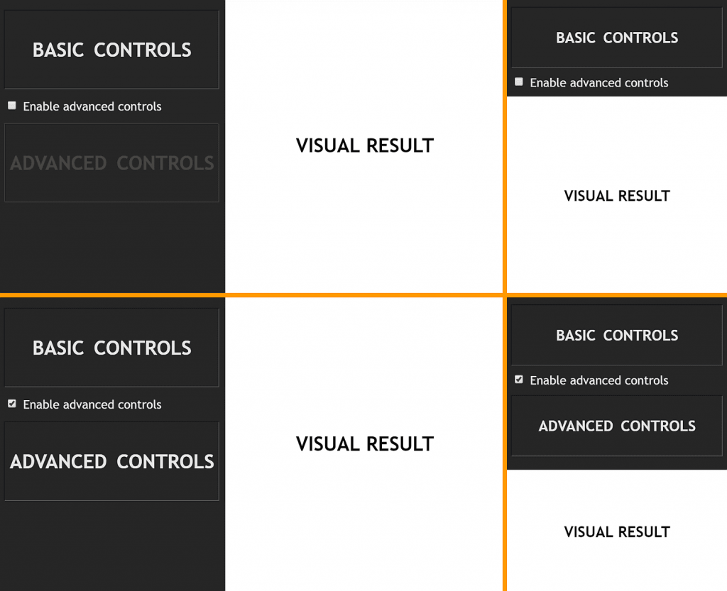
This is a use case I came across while working on an interactive demo that lets users control various parameters to change a visual result. For more knowledgeable users, there's also a panel of advanced controls that's disabled by default. It can, however, be enabled in order to get access to manually controlling even more parameters.
Since this demo is supposed to be responsive, the layout changes with the viewport. We also don't want things to get crammed on smaller screens if we can avoid it, so there's no point in showing the advanced controls if they're disabled and we're in the narrow screen case.
The screenshot collage below shows the results we get for each the four possible scenarios.
Collage of the possible cases.
So let's see what this means in terms of CSS!
First off, on the <body>, we use a switch that goes from 0 in the narrow screen case to 1 in the wide screen case. We also change the flex-direction this way (if you want a more detailed explanation of how this works, check out my second article on DRY switching with CSS variables).
We then have a second switch on the advanced controls panel. This second switch is 0 if the checkbox is unchecked and 1 if the checkbox is :checked. With the help of this switch, we give our advanced controls panel a disabled look (via a filter chain) and we also disable it (via pointer-events). Here, not comes in handy, as we want to decrease the contrast and the opacity in the disabled case:
We want the advanced controls panel to stay expanded if we're in the wide screen case (so if --k is 1), regardless of whether the checkbox is :checked or not, or if the checkbox is :checked (so if --i is 1), regardless of whether we're in the wide screen case or not.
This is precisely the or operation!
So we compute an --or variable:
.advanced {
  /* same as before */
  --or: calc(1 - (1 - var(--k))*(1 - var(--i)));
}
If this --or variable is 0, this means we're in the narrow screen case and our checkbox is unchecked, so we want to zero the height of the advanced controls panel and also its vertical margin:
.advanced {
  /* same as before */
  margin: calc(var(--or)*#{$mv}) 0;
  height: calc(var(--or)*#{$h});
}
Use the same formulas to position multiple faces of a 3D shape
This is a use case I came across while working on the personal project of CSS-ing the Johnson solids this summer.
Let's take a look at one of these shapes, for example, the gyroelongated pentagonal rotunda (J25), in order to see how logical operations are useful here.
The shape we want to get.
This shape is made up out of a pentagonal rotunda without the big decagonal base and a decagonal antiprism without its top decagon. The interactive demo below shows how these two components can be built by folding their nets of faces into 3D and then joined to give us the shape we want.
As it can be seen above, the faces are either a part of the antiprism or a part of the rotunda. This is where we introduce our first switch variable --i. This is 0 for the faces that are a part of the antiprism and 1 for the faces that are a part of the rotunda. The antiprism faces have a class of .mid because we can add another rotunda to the other antiprism base and then the antiprism would be in the middle. The rotunda faces have a class of .cup because this part does look like a coffee cup... without a handle!
The rotunda looks like an upside down up cup without a handle.
.mid { --i: 0 }
.cup { --i: 1 }
Focusing only on the lateral faces, these can have a vertex pointing up or down. This is where we introduce our second variable --k. This is 0 if they have a vertex pointing up (such faces have a .dir class) and 1 if they're reversed and have a vertex pointing down (these faces have a class of .rev)
.dir { --k: 0 }
.rev { --k: 1 }
The antiprism has 10 lateral faces (all triangles) pointing up, each attached to an edge of its decagonal base that's also a base for the compound shape. It also has 10 lateral faces (all triangles as well) pointing down, each attached to an edge of its other decagonal base (the one that's also the decagonal base of the rotunda and is therefore not a base for the compound shape).
The rotunda has 10 lateral faces pointing up, alternating triangles and pentagons, each attached to the decagonal base that's also a base for the antiprism (so it's not a base for the compound shape as well). It also has 5 lateral faces, all triangles, pointing down, each attached to an edge of its pentagonal base.
The interactive demo below allows us to better see each of these four groups of faces by highlighting only one at a time. You can use the arrows at the bottom to pick which group of faces gets highlighted. You can also enable the rotation around the y axis and change the shape's tilt.
As previously mentioned, the lateral faces can be either triangles or pentagons:
.s3gon { --p: 0 }
.s5gon { --p: 1 }
Since all of their lateral faces (.lat) of both the antiprism and the rotunda have one edge in common with one of the two base faces of each shape, we call these common edges the base edges of the lateral faces.
The interactive demo below highlights these edges, their end points and their mid points and allows viewing the shapes from various angles thanks to the auto-rotations around the y axis which can be started/ paused at any moment and to the manual rotations around the x axis which can be controlled via the sliders.
In order to make things easier for ourselves, we set the transform-origin of the .lat faces on the middle of their base edges (bottom horizontal edges).
Highlighting the base edges and their midpoints (live).
We also make sure we position these faces such as to have these midpoints dead in the middle of the scene element containing our entire 3D shape.
Having the transform-origin coincide with the midpoint the base edge means that any rotation we perform on a face is going to happen around the midpoint of its base edge, as illustrated by the interactive demo below:
We place our lateral faces where we want them to be in four steps:
We rotate them around their y axis such that their base edges are now parallel to their final positions. (This also rotates their local system of coordinates — the z axis of an element always points in the direction that element faces.)
We translate them such that their base edges coincide with their final positions (along the edges of the base faces of the two components).
If they need to have a vertex pointing down, we rotate them around their z axis by half a turn.
We rotate them around their x axis into their final positions
These steps are illustrated by the interactive demo below, where you can go through them and also rotate the entire shape (using the play/pause button for the y axis rotation and the slider for the x axis rotation).
The y axis rotation value is based mostly on the face indices and less on our switch variables, though it depends on these as well.
The structure is as follows:
- var n = 5; //- number of edges/ vertices of small base

section.scene
  //- 3D shape element
  .s3d
    //- the faces, each a 2D shape element (.s2d)

    //- lateral (.lat) antiprism (.mid) faces,
    //- first half pointing up (.dir), others pointing down (.rev)
    //- all of them being triangles (.s3gon)
    - for(var j = 0; j < 4*n; j++)
      .s2d.mid.lat.s3gon(class=j < 2*n ? 'dir' : 'rev')

    //- lateral (.lat) rotunda (.cup) faces that point up (.dir),
    //- both triangles (.s3gon) and pentagons (.s5gon)
    - for(var j = 0; j < n; j++)
      .s2d.cup.lat.s3gon.dir
      .s2d.cup.lat.s5gon.dir
    //- lateral (.lat) rotunda (.cup) faces that point down (.rev)
    //- all of them triangles (.s3gon)
    - for(var j = 0; j < n; j++)
      .s2d.cup.lat.s3gon.rev

    //- base faces,
    //- one for the antiprism (.mid),
    //- the other for the rotunda (.cup)
    .s2d.mid.base(class=`s${2*n}gon`)
    .s2d.cup.base(class=`s${n}gon`)
Which gives us the following HTML:
<section class="scene">
  <div class="s3d">
    <!-- LATERAL faces -->
    <div class="s2d mid lat s3gon dir"></div>
    <!-- 9 more identical faces,
         so we have 10 lateral antiprism faces pointing up -->

    <div class="s2d mid lat s3gon rev"></div>
    <!-- 9 more identical faces,
         so we have 10 lateral antiprism faces pointing down -->

    <div class="s2d cup lat s3gon dir"></div>
    <div class="s2d cup lat s5gon dir"></div>
    <!-- 4 more identical pairs,
         so we have 10 lateral rotunda faces pointing up -->

    <div class="s2d cup lat s3gon rev"></div>
    <!-- 4 more identical faces,
         so we have 5 lateral rotunda faces pointing down -->

    <!-- BASE faces -->
    <div class="s2d mid base s10gon"></div>
    <div class="s2d cup base s5gon"></div>
  </div>
</section>
This means faces 0... 9 are the 10 lateral antiprism faces pointing up, faces 10... 19 are the 10 lateral antiprism faces pointing down, faces 20... 29 are the 10 lateral rotunda faces pointing up and faces 30... 34 are the 5 lateral rotunda faces pointing down.
So what we do here is set an index --idx on the lateral faces.
$n: 5; // number of edges/ vertices of small base

.lat {
  @for $i from 0 to 2*$n {
    &:nth-child(#{2*$n}n + #{$i + 1}) { --idx: #{$i} }
  }
}
This index starts at 0 for each group of faces, which means the indices for faces 0... 9, 10... 19 and 20... 29 go from 0 through 9, while the indices for faces 30... 34 go from 0 through 4. Great, but if we just multiply these indices with the base angle1 of the common decagon to get the y axis rotation we want at this step:
...then we get the following final result. I'm showing the final result here because it's a bit difficult to see what's wrong by looking at the intermediate result we get after only applying the rotation around the y axis.
So let's see what problems the above result has and how to solve them with the help of our switch variables and boolean operations on them.
The first issue is that the lateral antiprism faces pointing up need to be offset by half of a regular decagon's base angle. This means adding or subtracting .5 from --idx before multiplying with the base angle, but only for these faces.
The second issue is that the lateral rotunda faces pointing down are not distributed as they should be, such that each of them has a base edge in common with the base pentagon and the vertex opposing the base in common with the triangular rotunda faces pointing up. This means multiplying --idx by 2, but only for these faces.
What we're targeting now are the faces for which both --i and --k are 1 (so the faces for which the result of the and operation is 1), so what we need is to multiply --idx with 1 plus their and:
The next step is the translation for which we use translate3d(). We don't move any of our faces left or right, so the value along the x axis is always 0. We do move them however vertically (along the y axis) and forward (along the z axis)
Vertically, we want the cup faces that will later get rotated to point down to have their base edge in the plane of the small (pentagonal) base of the cup (and of the compound shape). This means the faces for which --i is 1 and --k is 1 get moved up (negative direction) by half the total height of the compound shape (a total height which we have computed to be $h). So we need the and operation here.
// same as before
--and: calc(var(--i)*var(--k));
--y: calc(var(--and)*#{-.5*$h});

transform: rotatey(var(--ay))
           translate3d(0, var(--y, 0), var(--z, 0));
We also want all the other cup faces as well as the antiprism faces that will eventually point down to have their base edge in the common plane between the cup and the antiprism. This means the faces for which --i is 1 and --k is 0 as well as the faces for which --i is 0 and --k is 1 get translated down (positive direction) by half the height of the compound shape and then back up (negative direction) by the height of the antiprism ($h-mid). And what do you know, this is the xor operation!
// same as before
--xor: calc((var(--k) - var(--i))*(var(--k) - var(--i)));
--and: calc(var(--i)*var(--k));
--y: calc(var(--xor)*#{.5*$h - $h-mid} -
          var(--and)*#{.5*$h});

transform: rotatey(var(--ay))
           translate3d(0, var(--y, 0), var(--z, 0));
Finally, we want the antiprism faces that will remain pointing up to be in the bottom base plane of the compound shape (and of the antiprism). This means the faces for which --i is 0 and --k is 0 get translated down (positive direction) by half the total height of the compound shape. So what we use here is the nor operation!
Along the z direction, we want to move the faces such that their base edges coincide with the edges of the base faces of the compound shape or the edges of the common base (which is not a face of the compound shape) shared by the two 3D components. For the top faces of the cup (which we later rotate to point down), the placement is on the edges of a pentagon, while for all the other faces of the compound shape, the placement is on the edges of a decagon.
This means the faces for which --i is 1 and --k is 1 get translated forward by the inradius of the pentagonal base while all the other faces get translated forward by the inradius of a decagonal base. So the operations we need here are and and nand!
// same as before
--and: calc(var(--i)*var(--k));
--nand: calc(1 - var(--and));
--z: calc(var(--and)*#{$ri5gon} + var(--nand)*#{$ri10gon});

transform: rotatey(var(--ay))
           translate3d(0, var(--y, 0), var(--z, 0));
Next, we want to make all .rev (for which --k is 1) faces point down. This is pretty straightforward and doesn't require any logical operation, we just need to add a half a turn rotation around the z axis to the transform chain, but only for the faces for which --k is 1:
// same as before
--az: calc(var(--k)*.5turn);

transform: rotatey(var(--ay))
           translate3d(0, var(--y), var(--z))
           rotate(var(--az));
The pentagonal faces (for which --p is 1) are then all rotated around the x axis by a certain angle:
--ax: calc(var(--p)*#{$ax5});
In the case of the triangular faces (for which --p is 0, meaning we need to use --notp), we have a certain rotation angle for the faces of the antiprism ($ax3-mid), another angle for the faces of the rotunda that point up ($ax3-cup-dir) and yet another angle for the rotunda faces pointing down ($ax3-cup-red).
The antiprism faces are those for which --i is 0, so we need to multiply their corresponding angle value with --noti here. The rotunda faces are those for which --i is 1, and out of these, the ones pointing up are those for which --k is 0 and the ones pointing down are those for which --k is 1.
1 For any regular polygon (such as any of the faces of our shapes), the arc corresponding to one edge, as well as the angle between the circumradii to this edge's ends (our base angle) is a full circle (360°) over the number of edges. In the case of an equilateral triangle, the angle is 360°/3 = 120°. For a regular pentagon, the angle is 360°/5 = 72°. For a regular decagon, the angle is 360°/10 = 36°. ↪️
CSS custom properties (a.k.a. CSS variables) are becoming more and more popular. They finally reached decent browser support and are slowly making their way into various production environments. The popularity of custom properties shouldn’t come as a surprise, because they can be really helpful in numerous use cases, including managing color palettes, customizing components, and theming. But CSS variables can also be really helpful when it comes to responsive design.
Article Series:
Defining Variables and Breakpoints (This Post)
Building a Flexible Grid System (Coming Tomorrow!)
Let’s consider an <article> element with a heading and a paragraph inside:
It’s a common scenario in such a case to change some sizes and dimensions depending on the viewport’s width. One way to accomplish this is by using media queries:
Such an approach gives us an easy way to control CSS properties on different screen sizes. However, it may be hard to maintain as the complexity of a project grows. When using media queries, keeping code readable and DRY at the same time quite often turns out to be challenging.
The most common challenges when scaling this pattern include:
Repeated selectors: Apart from bloating code with multiple declarations, it also makes future refactoring more difficult, e.g. every time a class name changes it requires remembering to update it in multiple places.
Repeated properties: Notice that when overwriting CSS rules within media queries, it requires repeating the entire declaration (e.g. font-size: 3rem;) even though it’s just the value (3rem) that actually changes.
Repeated media queries: To keep responsive styles contextual, it’s a common practice to include the same media queries in multiple places, close to the styles they override. Unfortunately, it not only makes code heavier, but also might make breakpoints much harder to maintain. On the other hand, keeping all responsive styles in one place, away from their original declarations, may be very confusing: we end up with multiple references to the same elements sitting in completely different places.
We can argue that repeated declarations and queries shouldn’t be such a big deal with proper file compression enabled, at least as long as we’re referring to performance. We can also merge multiple queries and optimize your code with post-processing tools. But wouldn’t it be easier to avoid these issues altogether?
There’s a lot of ways to avoid the issues listed above. One of them, that we will explore in this article, is to use CSS custom properties.
Using CSS variables for property values
There are plenty of amazing articles on the web explaining the concept of CSS custom properties. If you haven’t got chance to get familiar with them yet, I would recommend starting with one of the beginner articles on this topic such as this awesome piece by Serg Hospodarets as we are not going to get into details of the basic usage in this article.
The most common way of utilizing CSS custom properties in responsive design is to use variables to store values that change inside of media queries. To accomplish this, declare a variable that holds a value that is supposed to change, and then reassign it inside of a media query:
Assigning variables to the :root selector is not always a good idea. Same as in JavaScript, having many global variables is considered a bad practice. In real life, try to declare the custom properties in the scope they will actually be used.
This way, we are avoiding multiple rules of the .foo class. We are also separating the logic (changing values) from the actual designs (CSS declarations). Adapting this approach in our example from above gives us the following CSS:
Notice that the use of variables in shorthand properties (e.g. padding, margin or font) allow some very interesting repercussions. As custom properties may hold almost any value (more on this later), even an empty string, it’s unclear how the value of a shorthand property will be separated out into longhand properties that are used in the cascade later. For example, the auto used in the margin property above may turn out to be a top-and-bottom margin, a left-and-right margin, a top margin, a right margin, a bottom margin or a left margin — it all depends on the values of the custom properties around.
It’s questionable whether the code looks cleaner than the one from the previous example, but on a larger scale, it’s definitely more maintainable. Let’s try to simplify this code a bit now.
Notice that some values are repeated here. What if we try to merge duplicate variables together? Let’s consider the following alteration:
It looks cleaner but is it actually better? Not necessarily. For the sake of flexibility and readability, this may not be the right solution in every case. We definitely shouldn’t merge some variables just because they accidentally turned out to hold the same values. Sometimes, as long as we’re doing this as a part of a well thought out system, it may help us simplify things and preserve consistency across the project. However, in other cases, such a manner may quickly prove to be confusing and problematic. Now, let’s take a look at yet another way we can approach this code.
Using CSS variables as multipliers
CSS custom properties are a fairly new feature to the modern web. One of the other awesome features that rolled out in the last years is the calc() function. It lets us perform real math operations in live CSS. In terms of the browser support, it’s supported in all browsers that support CSS custom properties.
calc() tends to play very nicely with CSS variables, making them even more powerful. This means we can both use calc() inside custom properties and custom properties inside calc()!
For example, the following CSS is perfectly valid:
Why does this matter to us and our responsive designs? It means that we can use a calc() function to alter CSS custom properties inside media queries. Let’s say we have a padding that should have a value of 5px on mobile and 10px on desktop. Instead of declaring this property two times, we can assign a variable to it and multiply it by two on larger screens:
Looks fine, however all the values (--padding, calc(--padding * 2)) are away from their declaration (padding). The syntax may also be pretty confusing with two different padding variables (--padding and --foo-padding) and an unclear relationship between them.
To make things a bit clearer, let’s try to code it the other way around:
This way, we accomplished the same computed output with much cleaner code! So, instead of using a variable for an initial value of the property (1rem), a variable was used to store a multiplier (1 on small screens and 2 on larger screens). It also allows us to use the --multiplier variable in other declarations. Let’s apply this technique to paddings and margins in our previous snippet:
You may have noticed that 3 / 2 is not a valid CSS value at all. Why does it not cause an error then? The reason is that the syntax for CSS variables is extremely forgiving, which means almost anything can be assigned to a variable, even if it’s not a valid CSS value for any existing CSS property. Declared CSS custom properties are left almost entirely un-evaluated until they are computed by a user agent in certain declarations. So, once a variable is used in a value of some property, this value will turn valid or invalid at the computed-value time.
Oh, and another note about that last note: in case you’re wondering, I used a value of 3 / 2 simply to make a point. In real life, it would make more sense to write 1.5 instead to make the code more readable.
Now, let’s take a look at the finished live example combining everything that we discussed above:
Again, I would never advocate for combining calc() with custom properties to make the code more concise as a general rule. But I can definitely imagine scenarios in which it helps to keep code more organized and maintainable. This approach also allows the weight of CSS to be significantly reduced, when it’s used wisely.
In terms of readability, we can consider it more readable once the underlying rule is understood. It helps to explain the logic and relations between values. On the other hand, some may see it as less readable, because it’s tough to instantly read what a property holds as a value without first doing the math. Also, using too many variables and calc() functions at once may unnecessarily obscure code and make it harder to understand, especially for juniors and front-end developers who are not focused on CSS.
Conclusion
Summing up, there’s a lot of ways to use CSS custom properties in responsive design, definitely not limited to the examples shown above. CSS variables can be used simply to separate the values from the designs. They can also be taken a step further and be combined with some math. None of the presented approaches is better nor worse than the others. The sensibility of using them depends on the case and context.
Now that you know how CSS custom properties can be used in responsive design, I hope you will find a way to introduce them in your own workflow. Next up, we’re going to look at approaches for using them in reusable components and modules, so stay tuned for the next post tomorrow!