How To Build An Endless Runner Game In Virtual Reality (Part 3)

How To Build An Endless Runner Game In Virtual Reality (Part 3)

How To Build An Endless Runner Game In Virtual Reality (Part 3)

Alvin Wan

And so our journey continues. In this final part of my series on how to build an endless runner VR game, I’ll show you how you can synchronize the game state between two devices which will move you one step closer to building a multiplayer game. I’ll specifically introduce MirrorVR which is responsible for handling the mediating server in client-to-client communication.

Note: This game can be played with or without a VR headset. You can view a demo of the final product at ergo-3.glitch.me.

To get started, you will need the following.

  • Internet access (specifically to glitch.com);
  • A Glitch project completed from part 2 of this tutorial. You can start from the part 2 finished product by navigating to https://glitch.com/edit/#!/ergo-2 and clicking “Remix to edit”;
  • A virtual reality headset (optional, recommended). (I use Google Cardboard, which is offered at $15 a piece.)

Step 1: Display Score

The game as-is functions at a bare minimum, where the player is given a challenge: avoid the obstacles. However, outside of object collisions, the game does not provide feedback to the player regarding progress in the game. To remedy this, you will implement the score display in this step. The score will be large text object placed in our virtual reality world, as opposed to an interface glued to the user’s field of view.

In virtual reality generally, the user interface is best integrated into the world rather than stuck to the user’s head.

Score display
Score display (Large preview)

Start by adding the object to index.html. Add a text mixin, which will be reused for other text elements:

<a-assets>
  ...
  <a-mixin id="text" text="
     font:exo2bold;
     anchor:center;
     align:center;"></a-mixin>
  ...
</a-assets>

Next, add a text element to the platform, right before the player:

<!-- Score -->
<a-text id="score" value="" mixin="text" height="40" width="40" position="0 1.2 -3" opacity="0.75"></a-text>

<!-- Player -->
...

This adds a text entity to the virtual reality scene. The text is not currently visible, because its value is set to empty. However, you will now populate the text entity dynamically, using JavaScript. Navigate to assets/ergo.js. After the collisions section, add a score section, and define a number of global variables:

  • score: the current game score.
  • countedTrees: IDs of all trees that are included in the score. (This is because collision tests may trigger multiple times for the same tree.)
  • scoreDisplay: reference to the DOM object, corresponding to a text object in the virtual reality world.
/*********
 * SCORE *
 *********/

var score;
var countedTrees;
var scoreDisplay;

Next, define a setup function to initialize our global variables. In the same vein, define a teardown function.

...
var scoreDisplay;

function setupScore() {
  score = 0;
  countedTrees = new Set();
  scoreDisplay = document.getElementById('score');
}

function teardownScore() {
  scoreDisplay.setAttribute('value', '');
}

In the Game section, update gameOver, startGame, and window.onload to include score setup and teardown.

/********
 * GAME *
 ********/

function gameOver() {
    ...
    teardownScore();
}

function startGame() {
    ...
    setupScore();
    addTreesRandomlyLoop();
}

window.onload = function() {
    setupScore();
    ...
}

Define a function that increments the score for a particular tree. This function will check against countedTrees to ensure that the tree is not double counted.

function addScoreForTree(tree_id) {
  if (countedTrees.has(tree_id)) return;
  score += 1;
  countedTrees.add(tree_id);
}

Additionally, add a utility to update the score display using the global variable.

function updateScoreDisplay() {
  scoreDisplay.setAttribute('value', score);
}

Update the collision testing accordingly in order to invoke this score-incrementing function whenever an obstacle has passed the player. Still in assets/ergo.js, navigate to the collisions section. Add the following check and update.

AFRAME.registerComponent('player', {
  tick: function() {
    document.querySelectorAll('.tree').forEach(function(tree) {
      ...
      if (position.z > POSITION_Z_LINE_END) {
        addScoreForTree(tree_id);
        updateScoreDisplay();
      }
    })
  }
})

Finally, update the score display as soon as the game starts. Navigate to the Game section, and add updateScoreDisplay(); to startGame:

function startGame() {
  ...
  setupScore();
  updateScoreDisplay();
  ...
}

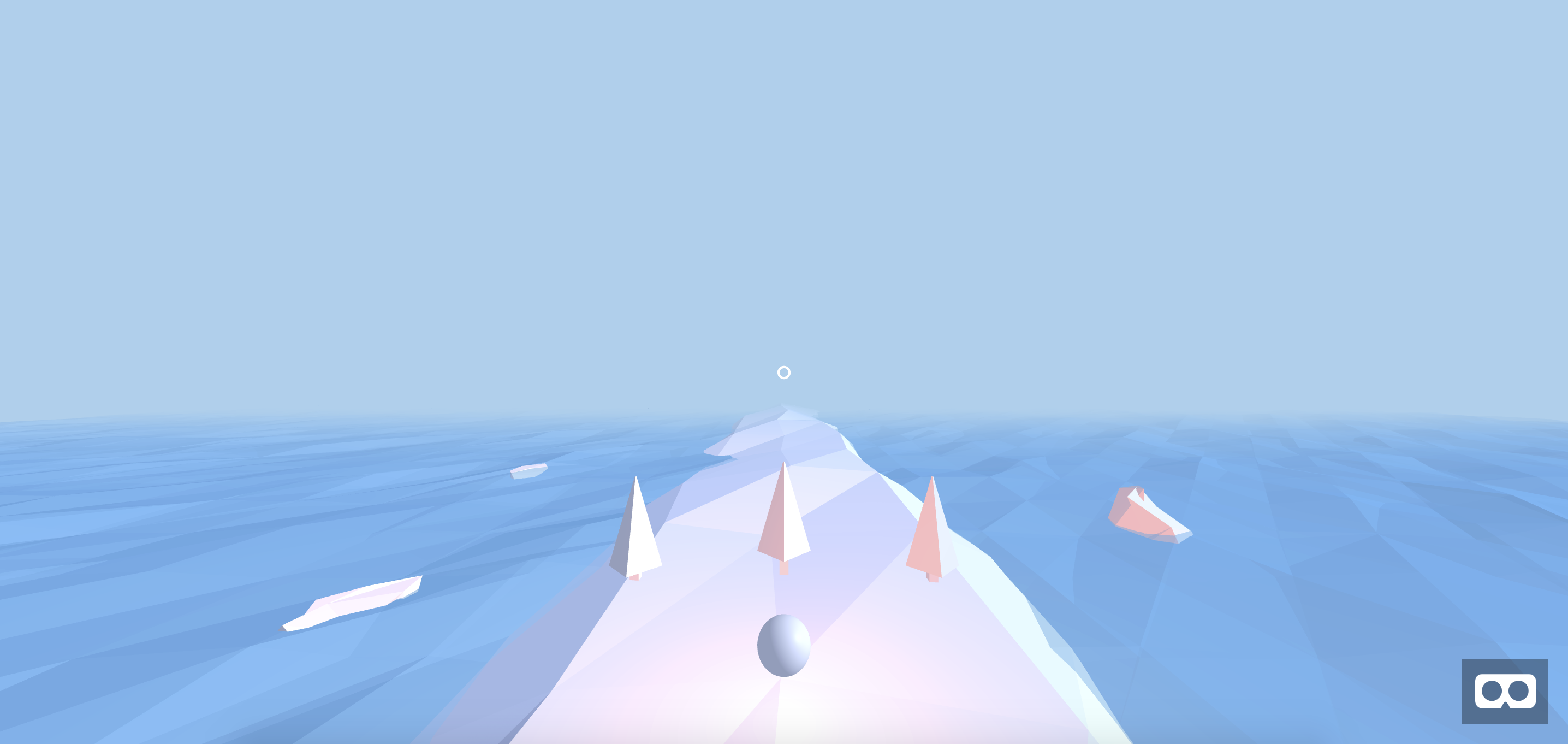
Ensure that assets/ergo.js and index.html match the corresponding source code files. Then, navigate to your preview. You should see the following:

Score display
Score display (Large preview)

This concludes the score display. Next, we will add proper start and Game Over menus, so that the player can replay the game as desired.

Step 2: Add Start Menu

Now that the user can keep track of the progress, you will add finishing touches to complete the game experience. In this step, you will add a Start menu and a Game Over menu, letting the user start and restart games.

Let’s begin with the Start menu where the player clicks a “Start” button to begin the game. For the second half of this step, you will add a Game Over menu, with a “Restart” button:

Start and game over menus
Start and game over menus (Large preview)

Navigate to index.html in your editor. Then, find the Mixins section. Here, append the title mixin, which defines styles for particularly large text. We use the same font as before, align text to the center, and define a size appropriate for the type of text. (Note below that anchor is where a text object is anchored to its position.)

<a-assets>
   ...
   <a-mixin id="title" text="
       font:exo2bold;
       height:40;
       width:40;
       opacity:0.75;
       anchor:center;
       align:center;"></a-mixin>
</a-assets>

Next, add a second mixin for secondary headings. This text is slightly smaller but is otherwise identical to the title.

<a-assets>
   ...
   <a-mixin id="heading" text="
       font:exo2bold;
       height:10;
       width:10;
       opacity:0.75;
       anchor:center;
       align:center;"></a-mixin>
</a-assets>

For the third and final mixin, define properties for descriptive text — even smaller than secondary headings.

<a-assets>
   ...
   <a-mixin id="copy" text="
       font:exo2bold;
       height:5;
       width:5;
       opacity:0.75;
       anchor:center;
       align:center;"></a-mixin>
</a-assets>

With all text styles defined, you will now define the in-world text objects. Add a new Menus section beneath the Score section, with an empty container for the Start menu:

<!-- Score -->
...

<!-- Menus -->
<a-entity id="menu-container">
  <a-entity id="start-menu" position="0 1.1 -3">
  </a-entity>
</a-entity>

Inside the start menu container, define the title and a container for all non-title text:

...
  <a-entity id="start-menu" ...>
    <a-entity id="start-copy" position="0 1 0">
    </a-entity>
    <a-text value="ERGO" mixin="title"></a-text>
  </a-entity>
</a-entity>

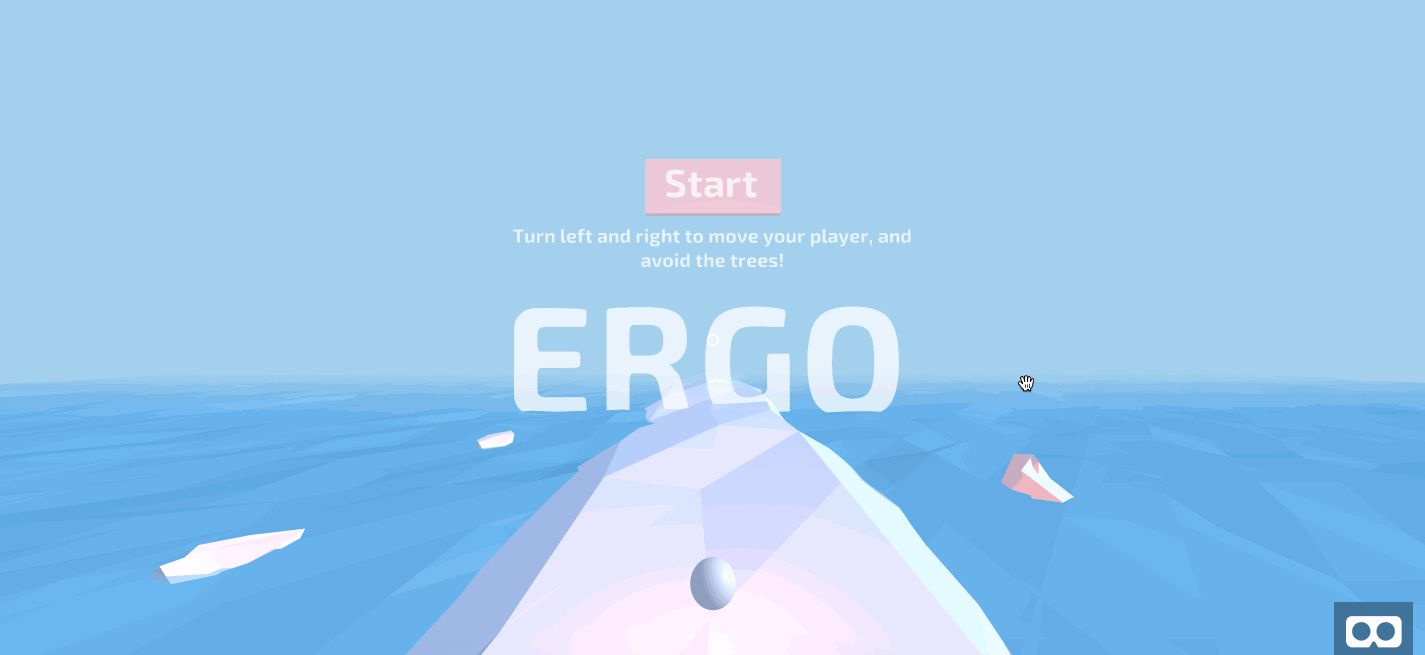
Inside the container for non-title text, add instructions for playing the game:

<a-entity id="start-copy"...>
  <a-text value="Turn left and right to move your player, and avoid the trees!" mixin="copy"></a-text>
</a-entity>

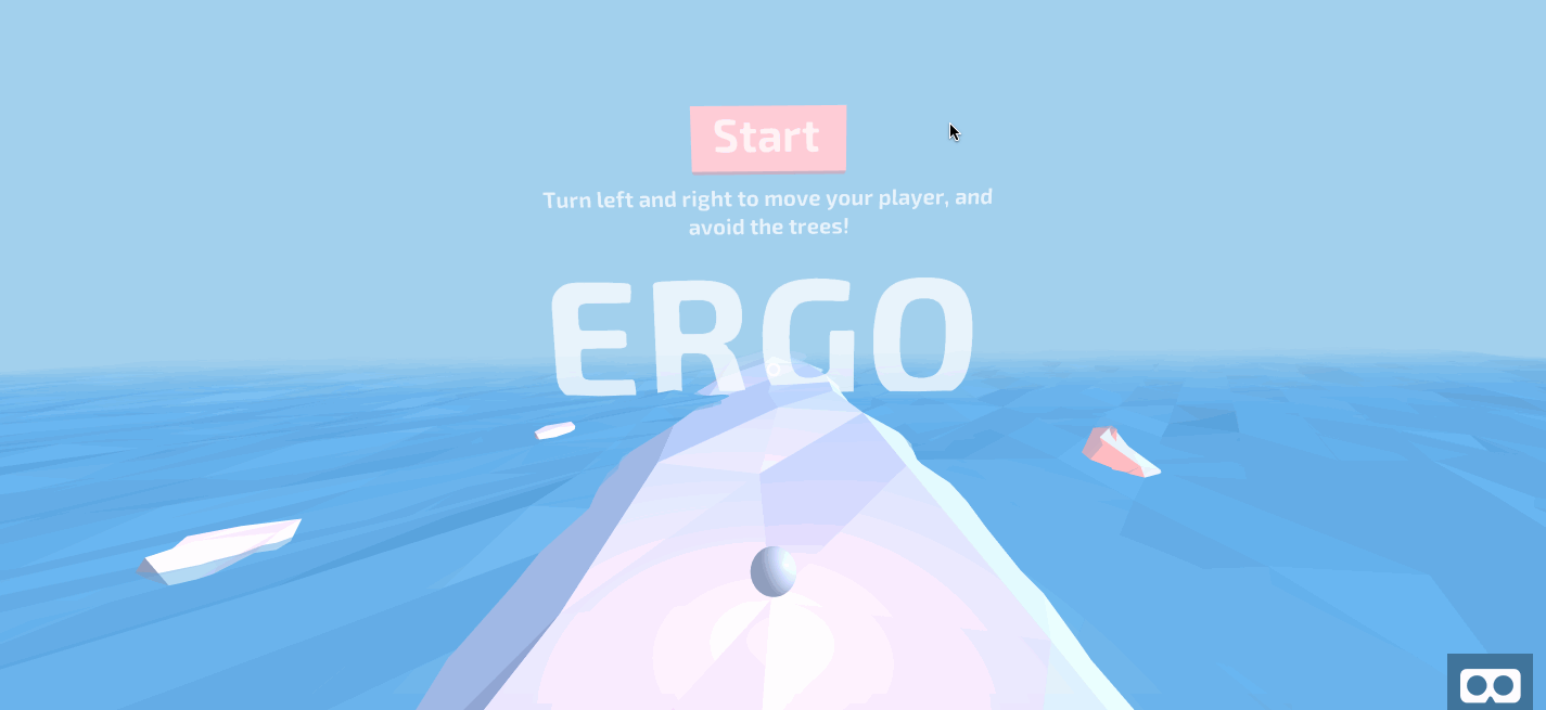
To complete the Start menu, add a button that reads “Start”:

<a-entity id="start-copy"...>
  ...
  <a-text value="Start" position="0 0.75 0" mixin="heading"></a-text>
  <a-box id="start-button" position="0 0.65 -0.05" width="1.5" height="0.6" depth="0.1"></a-box>
</a-entity>

Double-check that your Start menu HTML code matches the following:

<!-- Menus -->
<a-entity id="menu-container">
  <a-entity id="start-menu" position="0 1.1 -3">
    <a-entity id="start-copy" position="0 1 0">
      <a-text value="Turn left and right to move your player, and avoid the trees!" mixin="copy"></a-text>
      <a-text value="Start" position="0 0.75 0" mixin="heading"></a-text>
      <a-box id="start-button" position="0 0.65 -0.05" width="1.5" height="0.6" depth="0.1"></a-box>
    </a-entity>
    <a-text value="ERGO" mixin="title"></a-text>
  </a-entity>
</a-entity>

Navigate to your preview, and you will see the following Start menu:

Image of Start menu
Start menu (Large preview)

Still in the Menus section (directly beneath the start menu), add the game-over menu using the same mixins:

<!-- Menus -->
<a-entity id="menu-container">
  ...
  <a-entity id="game-over" position="0 1.1 -3">
    <a-text value="?" mixin="heading" id="game-score" position="0 1.7 0"></a-text>
    <a-text value="Score" mixin="copy" position="0 1.2 0"></a-text>
    <a-entity id="game-over-copy">
      <a-text value="Restart" mixin="heading" position="0 0.7 0"></a-text>
      <a-box id="restart-button" position="0 0.6 -0.05" width="2" height="0.6" depth="0.1"></a-box>
    </a-entity>
    <a-text value="Game Over" mixin="title"></a-text>
  </a-entity>
</a-entity>

Navigate to your JavaScript file, assets/ergo.js. Create a new Menus section before the Game section. Additionally, define three empty functions: setupAllMenus, hideAllMenus, and showGameOverMenu.

/********
 * MENU *
 ********/

function setupAllMenus() {
}

function hideAllMenus() {
}

function showGameOverMenu() {
}

/********
 * GAME *
 ********/

Next, update the Game section in three places. In gameOver, show the Game Over menu:

function gameOver() {
    ...
    showGameOverMenu();
}
```

In `startGame`, hide all menus:

```
function startGame() {
    ...
    hideAllMenus();
}

Next, in window.onload, remove the direct invocation to startGame and instead call setupAllMenus. Update your listener to match the following:

window.onload = function() {
  setupAllMenus();
  setupScore();
  setupTrees();
}

Navigate back to the Menu section. Save references to various DOM objects:

/********
 * MENU *
 ********/

var menuStart;
var menuGameOver;
var menuContainer;
var isGameRunning = false;
var startButton;
var restartButton;

function setupAllMenus() {
  menuStart     = document.getElementById('start-menu');
  menuGameOver  = document.getElementById('game-over');
  menuContainer = document.getElementById('menu-container');
  startButton   = document.getElementById('start-button');
  restartButton = document.getElementById('restart-button');
}

Next, bind both the “Start” and “Restart” buttons to startGame:

function setupAllMenus() {
  ...
  startButton.addEventListener('click', startGame);
  restartButton.addEventListener('click', startGame);
}

Define showStartMenu and invoke it from setupAllMenus:

function setupAllMenus() {
  ...
  showStartMenu();
}

function hideAllMenus() {
}

function showGameOverMenu() {
}

function showStartMenu() {
}

To populate the three empty functions, you will need a few helper functions. Define the following two functions, which accepts a DOM element representing an A-Frame VR entity and shows or hides it. Define both functions above showAllMenus:

...
var restartButton;

function hideEntity(el) {
  el.setAttribute('visible', false);
}

function showEntity(el) {
  el.setAttribute('visible', true);
}

function showAllMenus() {
...

First populate hideAllMenus. You will remove the objects from sight, then remove click listeners for both menus:

function hideAllMenus() {
  hideEntity(menuContainer);
  startButton.classList.remove('clickable');
  restartButton.classList.remove('clickable');
}

Second, populate showGameOverMenu. Here, restore the container for both menus, as well as the Game Over menu and the ‘Restart’ button’s click listener. However, remove the ‘Start’ button’s click listener, and hide the ‘Start’ menu.

function showGameOverMenu() {
  showEntity(menuContainer);
  hideEntity(menuStart);
  showEntity(menuGameOver);
  startButton.classList.remove('clickable');
  restartButton.classList.add('clickable');
}

Third, populate showStartMenu. Here, reverse all changes that the showGameOverMenu effected.

function showStartMenu() {
  showEntity(menuContainer);
  hideEntity(menuGameOver);
  showEntity(menuStart);
  startButton.classList.add('clickable');
  restartButton.classList.remove('clickable');
}

Double-check that your code matches the corresponding source files. Then, navigate to your preview, and you will observe the following behavior:

Start and game over menus
Start and Game Over menus (Large preview)

This concludes the Start and Game Over menus.

Congratulations! You now have a fully functioning game with a proper start and proper end. However, we have one more step left in this tutorial: We need to synchronize the game state between different player devices. This will move us one step closer towards multiplayer games.

Step 3: Synchronizing Game State With MirrorVR

In a previous tutorial, you learned how to send real-time information across sockets, to facilitate one-way communication between a server and a client. In this step, you will build on top of a fully-fledged product of that tutorial, MirrorVR, which handles the mediating server in client-to-client communication.

Note: You can learn more about MirrorVR here.

Navigate to index.html. Here, we will load MirrorVR and add a component to the camera, indicating that it should mirror a mobile device’s view where applicable. Import the socket.io dependency and MirrorVR 0.2.3.

<script src="https://cdnjs.cloudflare.com/ajax/libs/socket.io/2.1.1/socket.io.js"></script>
<script src="https://cdn.jsdelivr.net/gh/alvinwan/mirrorvr@0.2.2/dist/mirrorvr.min.js"></script>

Next, add a component, camera-listener, to the camera:

<a-camera camera-listener ...>

Navigate to assets/ergo.js. In this step, the mobile device will send commands, and the desktop device will only mirror the mobile device.

To facilitate this, you need a utility to distinguish between desktop and mobile devices. At the end of your file, add a mobileCheck function after shuffle:

/**
 * Checks for mobile and tablet platforms.
 */
function mobileCheck() {
  var check = false;
  (function(a){if(/(android|bb\d+|meego).+mobile|avantgo|bada\/|blackberry|blazer|compal|elaine|fennec|hiptop|iemobile|ip(hone|od)|iris|kindle|lge |maemo|midp|mmp|mobile.+firefox|netfront|opera m(ob|in)i|palm( os)?|phone|p(ixi|re)\/|plucker|pocket|psp|series(4|6)0|symbian|treo|up\.(browser|link)|vodafone|wap|windows ce|xda|xiino|android|ipad|playbook|silk/i.test(a)||/1207|6310|6590|3gso|4thp|50[1-6]i|770s|802s|a wa|abac|ac(er|oo|s\-)|ai(ko|rn)|al(av|ca|co)|amoi|an(ex|ny|yw)|aptu|ar(ch|go)|as(te|us)|attw|au(di|\-m|r |s )|avan|be(ck|ll|nq)|bi(lb|rd)|bl(ac|az)|br(e|v)w|bumb|bw\-(n|u)|c55\/|capi|ccwa|cdm\-|cell|chtm|cldc|cmd\-|co(mp|nd)|craw|da(it|ll|ng)|dbte|dc\-s|devi|dica|dmob|do(c|p)o|ds(12|\-d)|el(49|ai)|em(l2|ul)|er(ic|k0)|esl8|ez([4-7]0|os|wa|ze)|fetc|fly(\-|_)|g1 u|g560|gene|gf\-5|g\-mo|go(\.w|od)|gr(ad|un)|haie|hcit|hd\-(m|p|t)|hei\-|hi(pt|ta)|hp( i|ip)|hs\-c|ht(c(\-| |_|a|g|p|s|t)|tp)|hu(aw|tc)|i\-(20|go|ma)|i230|iac( |\-|\/)|ibro|idea|ig01|ikom|im1k|inno|ipaq|iris|ja(t|v)a|jbro|jemu|jigs|kddi|keji|kgt( |\/)|klon|kpt |kwc\-|kyo(c|k)|le(no|xi)|lg( g|\/(k|l|u)|50|54|\-[a-w])|libw|lynx|m1\-w|m3ga|m50\/|ma(te|ui|xo)|mc(01|21|ca)|m\-cr|me(rc|ri)|mi(o8|oa|ts)|mmef|mo(01|02|bi|de|do|t(\-| |o|v)|zz)|mt(50|p1|v )|mwbp|mywa|n10[0-2]|n20[2-3]|n30(0|2)|n50(0|2|5)|n7(0(0|1)|10)|ne((c|m)\-|on|tf|wf|wg|wt)|nok(6|i)|nzph|o2im|op(ti|wv)|oran|owg1|p800|pan(a|d|t)|pdxg|pg(13|\-([1-8]|c))|phil|pire|pl(ay|uc)|pn\-2|po(ck|rt|se)|prox|psio|pt\-g|qa\-a|qc(07|12|21|32|60|\-[2-7]|i\-)|qtek|r380|r600|raks|rim9|ro(ve|zo)|s55\/|sa(ge|ma|mm|ms|ny|va)|sc(01|h\-|oo|p\-)|sdk\/|se(c(\-|0|1)|47|mc|nd|ri)|sgh\-|shar|sie(\-|m)|sk\-0|sl(45|id)|sm(al|ar|b3|it|t5)|so(ft|ny)|sp(01|h\-|v\-|v )|sy(01|mb)|t2(18|50)|t6(00|10|18)|ta(gt|lk)|tcl\-|tdg\-|tel(i|m)|tim\-|t\-mo|to(pl|sh)|ts(70|m\-|m3|m5)|tx\-9|up(\.b|g1|si)|utst|v400|v750|veri|vi(rg|te)|vk(40|5[0-3]|\-v)|vm40|voda|vulc|vx(52|53|60|61|70|80|81|83|85|98)|w3c(\-| )|webc|whit|wi(g |nc|nw)|wmlb|wonu|x700|yas\-|your|zeto|zte\-/i.test(a.substr(0,4))) check = true;})(navigator.userAgent||navigator.vendor||window.opera);
  return check;
};

First, we will synchronize the game start. In startGame, of the Game section, add a mirrorVR notification at the end.

function startGame() {
  ...
  if (mobileCheck()) {
    mirrorVR.notify('startGame', {})
  }
}

The mobile client now sends notifications about a game starting. You will now implement the desktop’s response.

In the window load listener, invoke a setupMirrorVR function:

window.onload = function() {
  ...
  setupMirrorVR();
}

Define a new section above the Game section for the MirrorVR setup:

/************
 * MirrorVR *
 ************/

function setupMirrorVR() {
  mirrorVR.init();
}

Next, add keyword arguments to the initialization function for mirrorVR. Specifically, we will define the handler for game start notifications. We will additionally specify a room ID; this ensures that anyone loading your application is immediately synchronized.

function setupMirrorVR() {
  mirrorVR.init({
    roomId: 'ergo',
    state: {
      startGame: {
        onNotify: function(data) {
          hideAllMenus();
          setupScore();
          updateScoreDisplay();
        }
      },
    }
  });
}

Repeat the same synchronization process for Game Over. In gameOver in the Game section, add a check for mobile devices and send a notification accordingly:

function gameOver() {
  ...
  if (mobileCheck()) {
    mirrorVR.notify('gameOver', {});
  }
}

Navigate to the MirrorVR section and update the keyword arguments with a gameOver listener:

function setupMirrorVR() {
  mirrorVR.init({
    state: {
      startGame: {...
      },
      gameOver: {
        onNotify: function(data) {
          gameOver();
        }
      },
    }
  }) 
}

Next, repeat the same synchronization process for the addition of trees. Navigate to addTreesRandomly in the Trees section. Keep track of which lanes receive new trees. Then, directly before the return directive, and send a notification accordingly:

function addTreesRandomly(...) {
  ...
  var numberOfTreesAdded ...
  var position_indices = [];
  trees.forEach(function (tree) {
    if (...) {
      ...
      position_indices.push(tree.position_index);
    }
  });

  if (mobileCheck()) {
    mirrorVR.notify('addTrees', position_indices);
  }
  return ...
}

Navigate to the MirrorVR section, and update the keyword arguments to mirrorVR.init with a new listener for trees:

function setupMirrorVR() {
  mirrorVR.init({
    state: {
      ...
      gameOver: {...
      },
      addTrees: {
        onNotify: function(position_indices) {
          position_indices.forEach(addTreeTo)
        }
      },
    }
  }) 
}

Finally, we synchronize the game score. In updateScoreDisplay from the Score section, send a notification when applicable:

function updateScoreDisplay() {
  ...
  if (mobileCheck()) {
    mirrorVR.notify('score', score);
  }
}

Update the mirrorVR initialization for the last time, with a listener for score changes:

function setupMirrorVR() {
  mirrorVR.init({
    state: {
      addTrees: {
      },
      score: {
        onNotify: function(data) {
          score = data;
          updateScoreDisplay();
        }
      }
    }
  });
}

Double-check that your code matches the appropriate source code files for this step. Then, navigate to your desktop preview. Additionally, open up the same URL on your mobile device. As soon as your mobile device loads the webpage, your desktop should immediately start mirroring the mobile device’s game.

Here is a demo. Notice that the desktop cursor is not moving, indicating the mobile device is controlling the desktop preview.

Final Endless Runner Game with MirrorVR game state synchronization
Final result of the endless runner game with MirrorVR game state synchronization (Large preview)

This concludes your augmented project with mirrorVR.

This third step introduced a few basic game state synchronization steps; to make this more robust, you could add more sanity checks and more points of synchronization.

Conclusion

In this tutorial, you added finishing touches to your endless runner game and implemented real-time synchronization of a desktop client with a mobile client, effectively mirroring the mobile device’s screen on your desktop. This concludes the series on building an endless runner game in virtual reality. Along with A-Frame VR techniques, you’ve picked up 3D modeling, client-to-client communication, and other widely applicable concepts.

Next steps can include:

  • More Advanced Modeling
    This means more realistic 3D models, potentially created in a third-party software and imported. For example, (MagicaVoxel) makes creating voxel art simple, and (Blender) is a complete 3D modeling solution.
  • More Complexity
    More complex games, such as a real-time strategy game, could leverage a third-party engine for increased efficiency. This may mean sidestepping A-Frame and webVR entirely, instead publishing a compiled (Unity3d) game.

Other avenues include multiplayer support and richer graphics. With the conclusion of this tutorial series, you now have a framework to explore further.

Smashing Editorial (rb, ra, il)

Crafting Reusable HTML Templates

In our last article, we discussed the Web Components specifications (custom elements, shadow DOM, and HTML templates) at a high-level. In this article, and the three to follow, we will put these technologies to the test and examine them in greater detail and see how we can use them in production today. To do this, we will be building a custom modal dialog from the ground up to see how the various technologies fit together.

Article Series:

  1. An Introduction to Web Components
  2. Crafting Reusable HTML Templates (This post)
  3. Creating a Custom Element from Scratch (Coming soon!)
  4. Encapsulating Style and Structure with Shadow DOM (Coming soon!)
  5. Advanced Tooling for Web Components (Coming soon!)

HTML templates

One of the least recognized, but most powerful features of the Web Components specification is the <template> element. In the first article of this series, we defined the template element as, “user-defined templates in HTML that aren’t rendered until called upon.” In other words, a template is HTML that the browser ignores until told to do otherwise.

These templates then can be passed around and reused in a lot of interesting ways. For the purposes of this article, we will look at creating a template for a dialog that will eventually be used in a custom element.

Defining our template

As simple as it might sound, a <template> is an HTML element, so the most basic form of a template with content would be:

<template>
  <h1>Hello world</h1>
</template>

Running this in a browser would result in an empty screen as the browser doesn’t render the template element’s contents. This becomes incredibly powerful because it allows us to define content (or a content structure) and save it for later — instead of writing HTML in JavaScript.

In order to use the template, we will need JavaScript

const template = document.querySelector('template');
const node = document.importNode(template.content, true);
document.body.appendChild(node);

The real magic happens in the document.importNode method. This function will create a copy of the template’s content and prepare it to be inserted into another document (or document fragment). The first argument to the function grabs the template’s content and the second argument tells the browser to do a deep copy of the element’s DOM subtree (i.e. all of its children).

We could have used the template.content directly, but in so doing we would have removed the content from the element and appended to the document's body later. Any DOM node can only be connected in one location, so subsequent uses of the template's content would result in an empty document fragment (essentially a null value) because the content had previously been moved. Using document.importNode allows us to reuse instances of the same template content in multiple locations.

That node is then appended into the document.body and rendered for the user. This ultimately allows us to do interesting things, like providing our users (or consumers of our programs) templates for creating content, similar to the following demo, which we covered in the first article:

See the Pen
Template example
by Caleb Williams (@calebdwilliams)
on CodePen.

In this example, we have provided two templates to render the same content — authors and books they’ve written. As the form changes, we choose to render the template associated with that value. Using that same technique will allow us eventually create a custom element that will consume a template to be defined at a later time.

The versatility of template

One of the interesting things about templates is that they can contain any HTML. That includes script and style elements. A very simple example would be a template that appends a button that alerts us when it is clicked.

<button id="click-me">Log click event</button>

Let’s style it up:

button {
  all: unset;
  background: tomato;
  border: 0;
  border-radius: 4px;
  color: white;
  font-family: Helvetica;
  font-size: 1.5rem;
  padding: .5rem 1rem;
}

...and call it with a really simple script:

const button = document.getElementById('click-me');
button.addEventListener('click', event => alert(event));

Of course, we can put all of this together using HTML’s <style> and <script> tags directly in the template rather than in separate files:

<template id="template">
  <script>
    const button = document.getElementById('click-me');
    button.addEventListener('click', event => alert(event));
  </script>
  <style>
    #click-me {
      all: unset;
      background: tomato;
      border: 0;
      border-radius: 4px;
      color: white;
      font-family: Helvetica;
      font-size: 1.5rem;
      padding: .5rem 1rem;
    }
  </style>
  <button id="click-me">Log click event</button>
</template>

Once this element is appended to the DOM, we will have a new button with ID #click-me, a global CSS selector targeted to the button’s ID, and a simple event listener that will alert the element’s click event.

For our script, we simply append the content using document.importNode and we have a mostly-contained template of HTML that can be moved around from page to page.

See the Pen
Template with script and styles demo
by Caleb Williams (@calebdwilliams)
on CodePen.

Creating the template for our dialog

Getting back to our task of making a dialog element, we want to define our template’s content and styles.

<template id="one-dialog">
  <script>
    document.getElementById('launch-dialog').addEventListener('click', () => {
      const wrapper = document.querySelector('.wrapper');
      const closeButton = document.querySelector('button.close');
      const wasFocused = document.activeElement;
      wrapper.classList.add('open');
      closeButton.focus();
      closeButton.addEventListener('click', () => {
        wrapper.classList.remove('open');
        wasFocused.focus();
      });
    });
  </script>
  <style>
    .wrapper {
      opacity: 0;
      transition: visibility 0s, opacity 0.25s ease-in;
    }
    .wrapper:not(.open) {
      visibility: hidden;
    }
    .wrapper.open {
      align-items: center;
      display: flex;
      justify-content: center;
      height: 100vh;
      position: fixed;
        top: 0;
        left: 0;
        right: 0;
        bottom: 0;
      opacity: 1;
      visibility: visible;
    }
    .overlay {
      background: rgba(0, 0, 0, 0.8);
      height: 100%;
      position: fixed;
        top: 0;
        right: 0;
        bottom: 0;
        left: 0;
      width: 100%;
    }
    .dialog {
      background: #ffffff;
      max-width: 600px;
      padding: 1rem;
      position: fixed;
    }
    button {
      all: unset;
      cursor: pointer;
      font-size: 1.25rem;
      position: absolute;
        top: 1rem;
        right: 1rem;
    }
    button:focus {
      border: 2px solid blue;
    }
  </style>
  <div class="wrapper">
  <div class="overlay"></div>
    <div class="dialog" role="dialog" aria-labelledby="title" aria-describedby="content">
      <button class="close" aria-label="Close">&#x2716;&#xfe0f;</button>
      <h1 id="title">Hello world</h1>
      <div id="content" class="content">
        <p>This is content in the body of our modal</p>
      </div>
    </div>
  </div>
</template>

This code will serve as the foundation for our dialog. Breaking it down briefly, we have a global close button, a heading and some content. We have also added in a bit of behavior to visually toggle our dialog (although it isn't yet accessible). In our next article, we will put custom elements to use and create one of our own that consumes this template in real-time.

See the Pen
Dialog with template with script
by Caleb Williams (@calebdwilliams)
on CodePen.

Article Series:

  1. An Introduction to Web Components
  2. Crafting Reusable HTML Templates (This post)
  3. Creating a Custom Element from Scratch (Coming soon!)
  4. Encapsulating Style and Structure with Shadow DOM (Coming soon!)
  5. Advanced Tooling for Web Components (Coming soon!)

The post Crafting Reusable HTML Templates appeared first on CSS-Tricks.

An Introduction to Web Components

Front-end development moves at a break-neck pace. This is made evident by the myriad articles, tutorials, and Twitter threads bemoaning the state of what once was a fairly simple tech stack. In this article, I’ll discuss why Web Components are a great tool to deliver high-quality user experiences without complicated frameworks or build steps and that don’t run the risk of becoming obsolete. In subsequent articles of this five-part series, we will dive deeper into each of the specifications.

This series assumes a basic understanding of HTML, CSS, and JavaScript. If you feel weak in one of those areas, don’t worry, building a custom element actually simplifies many complexities in front-end development.

Article Series:

  1. An Introduction to Web Components (This post)
  2. Crafting Reusable HTML Templates (Coming soon!)
  3. Creating a Custom Element from Scratch (Coming soon!)
  4. Encapsulating Style and Structure with Shadow DOM (Coming soon!)
  5. Advanced Tooling for Web Components (Coming soon!)

What are Web Components, anyway?

Web Components consist of three separate technologies that are used together:

  1. Custom Elements. Quite simply, these are fully-valid HTML elements with custom templates, behaviors and tag names (e.g. <one-dialog>) made with a set of JavaScript APIs. Custom Elements are defined in the HTML Living Standard specification.
  2. Shadow DOM. Capable of isolating CSS and JavaScript, almost like an <iframe>. This is defined in the Living Standard DOM specification.
  3. HTML templates. User-defined templates in HTML that aren’t rendered until called upon. The <template> tag is defined in the HTML Living Standard specification.

These are what make up the Web Components specification.

HTML Imports is likely to be the fourth technology in the stack, but it has yet to be implemented in any of the big four browsers. The Chrome team has announced it an intent to implement them in a future release.

Web Components are generally available in all of the major browsers with the exception of Microsoft Edge and Internet Explorer 11, but polyfills exist to fill in those gaps.

Referring to any of these as Web Components is technically accurate because the term itself is a bit overloaded. As a result, each of the technologies can be used independently or combined with any of the others. In other words, they are not mutually exclusive.

Let’s take a quick look at each of those first three. We’ll dive deeper into them in other articles in this series.

Custom elements

As the name implies, custom elements are HTML elements, like <div>, <section> or <article>, but something we can name ourselves that are defined via a browser API. Custom elements are just like those standard HTML elements — names in angle brackets — except they always have a dash in them, like <news-slider> or <bacon-cheeseburger>. Going forward, browser vendors have committed not to create new built-in elements containing a dash in their names to prevent conflicts.

Custom elements contain their own semantics, behaviors, markup and can be shared across frameworks and browsers.

class MyComponent extends HTMLElement {
  connectedCallback() {
    this.innerHTML = `<h1>Hello world</h1>`;
  }
}
    
customElements.define('my-component', MyComponent);

See the Pen
Custom elements demo
by Caleb Williams (@calebdwilliams)
on CodePen.

In this example, we define <my-component>, our very own HTML element. Admittedly, it doesn’t do much, however this is the basic building block of a custom element. All custom elements must in some way extend an HTMLElement in order to be registered with the browser.

Custom elements exist without third-party frameworks and the browser vendors are dedicated to the continued backward compatibility of the spec, all but guaranteeing that components written according to the specifications will not suffer from breaking API changes. What’s more, these components can generally be used out-of-the-box with today’s most popular frameworks, including Angular, React, Vue, and others with minimal effort.

Shadow DOM

The shadow DOM is an encapsulated version of the DOM. This allows authors to effectively isolate DOM fragments from one another, including anything that could be used as a CSS selector and the styles associated with them. Generally, any content inside of the document’s scope is referred to as the light DOM, and anything inside a shadow root is referred to as the shadow DOM.

When using the light DOM, an element can be selected by using document.querySelector('selector') or by targeting any element’s children by using element.querySelector('selector'); in the same way, a shadow root’s children can be targeted by calling shadowRoot.querySelector where shadowRoot is a reference to the document fragment — the difference being that the shadow root’s children will not be select-able from the light DOM. For example, If we have a shadow root with a <button> inside of it, calling shadowRoot.querySelector('button') would return our button, but no invocation of the document’s query selector will return that element because it belongs to a different DocumentOrShadowRoot instance. Style selectors work in the same way.

In this respect, the shadow DOM works sort of like an <iframe> where the content is cut off from the rest of the document; however, when we create a shadow root, we still have total control over that part of our page, but scoped to a context. This is what we call encapsulation.

If you’ve ever written a component that reuses the same id or relies on either CSS-in-JS tools or CSS naming strategies (like BEM), shadow DOM has the potential to improve your developer experience.

Imagine the following scenario:

<div>
  <div id="example">
    <!-- Pseudo-code used to designate a shadow root -->
    <#shadow-root>
      <style>
      button {
        background: tomato;
        color: white;
      }
      </style>
      <button id="button">This will use the CSS background tomato</button>
    </#shadow-root>
  </div>
  <button id="button">Not tomato</button>
</div>

Aside from the pseudo-code of <#shadow-root> (which is used here to demarcate the shadow boundary which has no HTML element), the HTML is fully valid. To attach a shadow root to the node above, we would run something like:

const shadowRoot = document.getElementById('example').attachShadow({ mode: 'open' });
shadowRoot.innerHTML = `<style>
button {
  color: tomato;
}
</style>
<button id="button">This will use the CSS color tomato <slot></slot></button>`;

A shadow root can also include content from its containing document by using the <slot> element. Using a slot will drop user content from the outer document at a designated spot in your shadow root.

See the Pen
Shadow DOM style encapsulation demo
by Caleb Williams (@calebdwilliams)
on CodePen.

HTML templates

The aptly-named HTML <template> element allows us to stamp out re-usable templates of code inside a normal HTML flow that won’t be immediately rendered, but can be used at a later time.

<template id="book-template">
  <li><span class="title"></span> &mdash; <span class="author"></span></li>
</template>

<ul id="books"></ul>

The example above wouldn’t render any content until a script has consumed the template, instantiated the code and told the browser what to do with it.

const fragment = document.getElementById('book-template');
const books = [
  { title: 'The Great Gatsby', author: 'F. Scott Fitzgerald' },
  { title: 'A Farewell to Arms', author: 'Ernest Hemingway' },
  { title: 'Catch 22', author: 'Joseph Heller' }
];

books.forEach(book => {
  // Create an instance of the template content
  const instance = document.importNode(fragment.content, true);
  // Add relevant content to the template
  instance.querySelector('.title').innerHTML = book.title;
  instance.querySelector('.author').innerHTML = book.author;
  // Append the instance ot the DOM
  document.getElementById('books').appendChild(instance);
});

Notice that this example creates a template (<template id="book-template">) without any other Web Components technology, illustrating again that the three technologies in the stack can be used independently or collectively.

Ostensibly, the consumer of a service that utilizes the template API could write a template of any shape or structure that could be created at a later time. Another page on a site might use the same service, but structure the template this way:

<template id="book-template">
  <li><span class="author"></span>'s classic novel <span class="title"></span></li>
</template>

<ul id="books"></ul>

See the Pen
Template example
by Caleb Williams (@calebdwilliams)
on CodePen.

That wraps up our introduction to Web Components

As web development continues to become more and more complicated, it will begin to make sense for developers like us to begin deferring more and more development to the web platform itself which has continued to mature. The Web Components specifications are a set of low-level APIs that will continue to grow and evolve as our needs as developers evolve.

In the next article, we will take a deeper look at the HTML templates part of this. Then, we’ll follow that up with a discussion of custom elements and shadow DOM. Finally, we’ll wrap it all up by looking at higher-level tooling and incorporation with today’s popular libraries and frameworks.

Article Series:

  1. An Introduction to Web Components (This post)
  2. Crafting Reusable HTML Templates (Coming soon!)
  3. Creating a Custom Element from Scratch (Coming soon!)
  4. Encapsulating Style and Structure with Shadow DOM (Coming soon!)
  5. Advanced Tooling for Web Components (Coming soon!)

The post An Introduction to Web Components appeared first on CSS-Tricks.

Web Standards Meet User-Land: Using CSS-in-JS to Style Custom Elements

The popularity of CSS-in-JS has mostly come from the React community, and indeed many CSS-in-JS libraries are React-specific. However, Emotion, the most popular library in terms of npm downloads, is framework agnostic.

Using the shadow DOM is common when creating custom elements, but there’s no requirement to do so. Not all use cases require that level of encapsulation. While it’s also possible to style custom elements with CSS in a regular stylesheet, we’re going to look at using Emotion.

We start with an install:

npm i emotion

Emotion offers the css function:

import {css} from 'emotion';

css is a tagged template literal. It accepts standard CSS syntax but adds support for Sass-style nesting.

const buttonStyles = css`
  color: white;
  font-size: 16px;
  background-color: blue;

  &:hover {
    background-color: purple;
  }
`

Once some styles have been defined, they need to be applied. Working with custom elements can be somewhat cumbersome. Libraries — like Stencil and LitElement — compile to web components, but offer a friendlier API than what we’d get right out of the box.

So, we’re going to define styles with Emotion and take advantage of both Stencil and LitElement to make working with web components a little easier.

Applying styles for Stencil

Stencil makes use of the bleeding-edge JavaScript decorators feature. An @Component decorator is used to provide metadata about the component. By default, Stencil won’t use shadow DOM, but I like to be explicit by setting shadow: false inside the @Component decorator:

@Component({
  tag: 'fancy-button',
  shadow: false
})

Stencil uses JSX, so the styles are applied with a curly bracket ({}) syntax:

export class Button {
  render() {
    return <div><button class={buttonStyles}><slot/></button></div>
  }
}

Here’s how a simple example component would look in Stencil:

import { css, injectGlobal } from 'emotion';
import {Component} from '@stencil/core';

const buttonStyles = css`
  color: white;
  font-size: 16px;
  background-color: blue;
  &:hover {
    background-color: purple;
  }
`
@Component({
  tag: 'fancy-button',
  shadow: false
})
export class Button {
  render() {
    return <div><button class={buttonStyles}><slot/></button></div>
  }
}

Applying styles for LitElement

LitElement, on the other hand, use shadow DOM by default. When creating a custom element with LitElement, the LitElement class is extended. LitElement has a createRenderRoot() method, which creates and opens a shadow DOM:

createRenderRoot()  {
  return this.attachShadow({mode: 'open'});
}

Don’t want to make use of shadow DOM? That requires re-implementing this method inside the component class:

class Button extends LitElement {
  createRenderRoot() {
      return this;
  }
}

Inside the render function, we can reference the styles we defined using a template literal:

render() {
  return html`<button class=${buttonStyles}>hello world!</button>`
}

It’s worth noting that when using LitElement, we can only use a slot element when also using shadow DOM (Stencil does not have this problem).

Put together, we end up with:

import {LitElement, html} from 'lit-element';
import {css, injectGlobal} from 'emotion';
const buttonStyles = css`
  color: white;
  font-size: 16px;
  background-color: blue;
  &:hover {
    background-color: purple;
  }
`

class Button extends LitElement {
  createRenderRoot() {
    return this;
  }
  render() {
    return html`<button class=${buttonStyles}>hello world!</button>`
  }
}

customElements.define('fancy-button', Button);

Understanding Emotion

We don’t have to stress over naming our button — a random class name will be generated by Emotion.

We could make use of CSS nesting and attach a class only to a parent element. Alternatively, we can define styles as separate tagged template literals:

const styles = {
  heading: css`
    font-size: 24px;
  `,
  para: css`
    color: pink;
  `
} 

And then apply them separately to different HTML elements (this example uses JSX):

render() {
  return <div>
    <h2 class={styles.heading}>lorem ipsum</h2>
    <p class={styles.para}>lorem ipsum</p>
  </div>
}

Styling the container

So far, we’ve styled the inner contents of the custom element. To style the container itself, we need another import from Emotion.

import {css, injectGlobal} from 'emotion';

injectGlobal injects styles into the “global scope” (like writing regular CSS in a traditional stylesheet — rather than generating a random class name). Custom elements are display: inline by default (a somewhat odd decision from spec authors). In almost all cases, I change this default with a style applied to all instances of the component. Below are the buttonStyles which is how we can change that up, making use of injectGlobal:

injectGlobal`
fancy-button {
  display: block;
}
`

Why not just use shadow DOM?

If a component could end up in any codebase, then shadow DOM may well be a good option. It’s ideal for third party widgets — any CSS that's applied to the page simply won't break the the component, thanks to the isolated nature of shadow DOM. That’s why it’s used by Twitter embeds, to take one example. However, the vast majority of us make components for for a particular site or app and nowhere else. In that situation, shadow DOM can arguably add complexity with limited benefit.

The post Web Standards Meet User-Land: Using CSS-in-JS to Style Custom Elements appeared first on CSS-Tricks.

How To Build An Endless Runner Game In Virtual Reality (Part 2)

How To Build An Endless Runner Game In Virtual Reality (Part 2)

How To Build An Endless Runner Game In Virtual Reality (Part 2)

Alvin Wan

In Part 1 of this series, we’ve seen how a virtual reality model with lighting and animation effects can be created. In this part, we will implement the game’s core logic and utilize more advanced A-Frame environment manipulations to build the “game” part of this application. By the end, you will have a functioning virtual reality game with a real challenge.

This tutorial involves a number of steps, including (but not limited to) collision detection and more A-Frame concepts such as mixins.

Prerequisites

Just like in the previous tutorial, you will need the following:

  • Internet access (specifically to glitch.com);
  • A Glitch project completed from part 1. (You can continue from the finished product by navigating to https://glitch.com/edit/#!/ergo-1 and clicking “Remix to edit”;
  • A virtual reality headset (optional, recommended). (I use Google Cardboard, which is offered at $15 a piece.)

Step 1: Designing The Obstacles

In this step, you design the trees that we will use as obstacles. Then, you will add a simple animation that moves the trees towards the player, like the following:

Template trees moving towards player
Template trees moving towards player (Large preview)

These trees will serve as templates for obstacles you generate during the game. For the final part of this step, we will then remove these “template trees”.

To start, add a number of different A-Frame mixins. Mixins are commonly-used sets of component properties. In our case, all of our trees will have the same color, height, width, depth etc. In other words, all your trees will look the same and therefore will use a few shared mixins.

Note: In our tutorial, your only assets will be mixins. Visit the A-Frame Mixins page to learn more.

In your editor, navigate to index.html. Right after your sky and before your lights, add a new A-Frame entity to hold your assets:

<a-sky...></a-sky>

<!-- Mixins -->
<a-assets>
</a-assets>

<!-- Lights -->
...

In your new a-assets entity, start by adding a mixin for your foliage. This mixins defines common properties for the foliage of the template tree. In short, it is a white, flat-shaded pyramid, for a low poly effect.

<a-assets>
  <a-mixin id="foliage" geometry="
      primitive: cone;
      segments-height: 1;
      segments-radial:4;
      radius-bottom:0.3;"
     material="color:white;flat-shading: true;"></a-mixin>
</a-assets>

Just below your foliage mixin, add a mixin for the trunk. This trunk will be a small, white rectangular prism.

<a-assets>
  ...
  <a-mixin id="trunk" geometry="
      primitive: box;
      height:0.5;
      width:0.1;
      depth:0.1;"
     material="color:white;"></a-mixin>
</a-assets>

Next, add the template tree objects that will use these mixins. Still in index.html, scroll down to the platforms section. Right before the player section, add a new tree section, with three empty tree entities:

<a-entity id="tree-container" ...>

  <!-- Trees -->
  <a-entity id="template-tree-center"></a-entity>
  <a-entity id="template-tree-left"></a-entity>
  <a-entity id="template-tree-right"></a-entity>

  <!-- Player -->
  ...

Next, reposition, rescale, and add shadows to the tree entities.

<!-- Trees -->
<a-entity id="template-tree-center" shadow scale="0.3 0.3 0.3" position="0 0.6 0"></a-entity>
<a-entity id="template-tree-left" shadow scale="0.3 0.3 0.3" position="0 0.6 0"></a-entity>
<a-entity id="template-tree-right" shadow scale="0.3 0.3 0.3" position="0 0.6 0"></a-entity>

Now, populate the tree entities with a trunk and foliage, using the mixins we defined previously.

<!-- Trees -->
<a-entity id="template-tree-center" ...>
  <a-entity mixin="foliage"></a-entity>
  <a-entity mixin="trunk" position="0 -0.5 0"></a-entity>
</a-entity>
<a-entity id="template-tree-left" ...>
  <a-entity mixin="foliage"></a-entity>
  <a-entity mixin="trunk" position="0 -0.5 0"></a-entity>
</a-entity>
<a-entity id="template-tree-right" ...>
  <a-entity mixin="foliage"></a-entity>
  <a-entity mixin="trunk" position="0 -0.5 0"></a-entity>
</a-entity>

Navigate to your preview, and you should now see the following template trees.

Template trees for obstacles
Template trees for obstacles (Large preview)

Now, animate the trees from a distant location on the platform towards the user. As before, use the a-animation tag:

<!-- Trees -->
<a-entity id="template-tree-center" ...>
  ...
  <a-animation attribute="position" ease="linear" from="0 0.6 -7" to="0 0.6 1.5" dur="5000"></a-animation>
</a-entity>
<a-entity id="template-tree-left" ...>
  ...
  <a-animation attribute="position" ease="linear" from="-0.5 0.55 -7" to="-0.5 0.55 1.5" dur="5000"></a-animation>
</a-entity>
<a-entity id="template-tree-right" ...>
  ...
  <a-animation attribute="position" ease="linear" from="0.5 0.55 -7" to="0.5 0.55 1.5" dur="5000"></a-animation>
</a-entity>

Ensure that your code matches the following.

<a-entity id="tree-container"...>

<!-- Trees -->
<a-entity id="template-tree-center" shadow scale="0.3 0.3 0.3" position="0 0.6 0">
  <a-entity mixin="foliage"></a-entity>
  <a-entity mixin="trunk" position="0 -0.5 0"></a-entity>
  <a-animation attribute="position" ease="linear" from="0 0.6 -7" to="0 0.6 1.5" dur="5000"></a-animation>
</a-entity>

<a-entity id="template-tree-left" shadow scale="0.3 0.3 0.3" position="-0.5 0.55 0">
  <a-entity mixin="foliage"></a-entity>
  <a-entity mixin="trunk" position="0 -0.5 0"></a-entity>
  <a-animation attribute="position" ease="linear" from="-0.5 0.55 -7" to="-0.5 0.55 1.5" dur="5000"></a-animation>
</a-entity>

<a-entity id="template-tree-right" shadow scale="0.3 0.3 0.3" position="0.5 0.55 0">
  <a-entity mixin="foliage"></a-entity>
  <a-entity mixin="trunk" position="0 -0.5 0"></a-entity>
  <a-animation attribute="position" ease="linear" from="0.5 0.55 -7" to="0.5 0.55 1.5" dur="5000"></a-animation>
</a-entity>

<!-- Player -->
...

Navigate to your preview, and you will now see the trees moving towards you.

Template trees moving towards player
Template trees moving towards playerTemplate trees moving towards player (Large preview)

Navigate back to your editor. This time, select assets/ergo.js. In the game section, setup trees after the window has loaded.

/********
 * GAME *
 ********/

...

window.onload = function() {
  setupTrees();
}

Underneath the controls but before the Game section, add a new TREES section. In this section, define a new setupTrees function.

/************
 * CONTROLS *
 ************/

...

/*********
 * TREES *
 *********/

function setupTrees() {
}

/********
 * GAME *
 ********/

...

In the new setupTrees function, obtain references to the template tree DOM objects, and make the references available globally.

/*********
 * TREES *
 *********/

var templateTreeLeft;
var templateTreeCenter;
var templateTreeRight;

function setupTrees() {
  templateTreeLeft    = document.getElementById('template-tree-left');
  templateTreeCenter  = document.getElementById('template-tree-center');
  templateTreeRight   = document.getElementById('template-tree-right');
}

Next, define a new removeTree utility. With this utility, you can then remove the template trees from the scene. Underneath the setupTrees function, define your new utility.

function setupTrees() {
    ...
}

function removeTree(tree) {
  tree.parentNode.removeChild(tree);
}

Back in setupTrees, use the new utility to remove the template trees.

function setupTrees() {
  ...

  removeTree(templateTreeLeft);
  removeTree(templateTreeRight);
  removeTree(templateTreeCenter);
}

Ensure that your tree and game sections match the following:

/*********
 * TREES *
 *********/

var templateTreeLeft;
var templateTreeCenter;
var templateTreeRight;

function setupTrees() {
  templateTreeLeft    = document.getElementById('template-tree-left');
  templateTreeCenter  = document.getElementById('template-tree-center');
  templateTreeRight   = document.getElementById('template-tree-right');

  removeTree(templateTreeLeft);
  removeTree(templateTreeRight);
  removeTree(templateTreeCenter);
}

function removeTree(tree) {
  tree.parentNode.removeChild(tree);
}

/********
 * GAME *
 ********/

setupControls();  // TODO: AFRAME.registerComponent has to occur before window.onload?

window.onload = function() {
  setupTrees();
}

Re-open your preview, and your trees should now be absent. The preview should match our game at the start of this tutorial.

Part 1 finished product
Part 1 finished product (Large preview)

This concludes the template tree design.

In this step, we covered and used A-Frame mixins, which allow us to simplify code by defining common properties. Furthermore, we leveraged A-Frame integration with the DOM to remove objects from the A-Frame VR scene.

In the next step, we will spawn multiple obstacles and design a simple algorithm to distribute trees among different lanes.

Step 2 : Spawning Obstacles

In an endless runner game, our goal is to avoid obstacles flying towards us. In this particular implementation of the game, we use three lanes as is most common.

Unlike most endless runner games, this game will only support movement left and right. This imposes a constraint on our algorithm for spawning obstacles: we can’t have three obstacles in all three lanes, at the same time, flying towards us. If that occurs, the player would have zero chance of survival. As a result, our spawning algorithm needs to accommodate this constraint.

In this step, all of our code edits will be made in assets/ergo.js. The HTML file will remain the same. Navigate to the TREES section of assets/ergo.js.

To start, we will add utilities to spawn trees. Every tree will need a unique ID, which we will naively define to be the number of trees that exist when the tree is spawned. Start by tracking the number of trees in a global variable.

/*********
 * TREES *
 *********/

...
var numberOfTrees = 0;

function setupTrees() {
...

Next, we will initialize a reference to the tree container DOM element, which our spawn function will add trees to. Still in the TREES section, add a global variable and then make the reference.

...
var treeContainer;
var numberOfTrees ...

function setupTrees() {
    ...
    templateTreeRight   = ...
    treeContainer       = document.getElementById('tree-container');
    
    removeTree(...);
    ...
}

Using both the number of trees and the tree container, write a new function that spawns trees.

function removeTree(tree) {
    ...
}

function addTree(el) {
  numberOfTrees += 1;
  el.id = 'tree-' + numberOfTrees;
  treeContainer.appendChild(el);
}

...

For ease-of-use later on, you will create a second function that adds the correct tree to the correct lane. To start, define a new templates array in the TREES section.

var templates;
var treeContainer;
...

function setupTrees() {
    ...
    templates           = [templateTreeLeft, templateTreeCenter, templateTreeRight];

    removeTree(...);
    ...
}

Using this templates array, add a utility that spawns trees in a specific lane, given an ID representing left, middle, or right.

function function addTree(el) {
    ...
}

function addTreeTo(position_index) {
  var template = templates[position_index];
  addTree(template.cloneNode(true));
}

Navigate to your preview, and open your developer console. In your developer console, invoke the global addTreeTo function.

> addTreeTo(0);  # spawns tree in left lane
Invoking addTreeTo manually
Invoke addTreeTo manually (Large preview)

Now, you will write an algorithm that spawns trees randomly:

  1. Pick a lane randomly (that hasn’t been picked yet, for this timestep);
  2. Spawn a tree with some probability;
  3. If the maximum number of trees has been spawned for this timestep, stop. Otherwise, repeat step 1.

To effect this algorithm, we will instead shuffle the list of templates and process one at a time. Start by defining a new function, addTreesRandomly that accepts a number of different keyword arguments.

function addTreeTo(position_index) {
    ...
}

/**
 * Add any number of trees across different lanes, randomly.
 **/
function addTreesRandomly(
  {
    probTreeLeft = 0.5,
    probTreeCenter = 0.5,
    probTreeRight = 0.5,
    maxNumberTrees = 2
  } = {}) {
}

In your new addTreesRandomly function, define a list of template trees, and shuffle the list.

function addTreesRandomly( ... ) {
  var trees = [
    {probability: probTreeLeft,   position_index: 0},
    {probability: probTreeCenter, position_index: 1},
    {probability: probTreeRight,  position_index: 2},
  ]
  shuffle(trees);
}

Scroll down to the bottom of the file, and create a new utilities section, along with a new shuffle utility. This utility will shuffle an array in place.

/********
 * GAME *
 ********/

...

/*************
 * UTILITIES *
 *************/

/**
 * Shuffles array in place.
 * @param {Array} a items An array containing the items.
 */
function shuffle(a) {
   var j, x, i;
   for (i = a.length - 1; i > 0; i--) {
       j = Math.floor(Math.random() * (i + 1));
       x = a[i];
       a[i] = a[j];
       a[j] = x;
   }
   return a;
}

Navigate back to the addTreesRandomly function in your Trees section. Add a new variable numberOfTreesAdded and iterate through the list of trees defined above.

function addTreesRandomly( ... ) {
  ...
  var numberOfTreesAdded = 0;
  trees.forEach(function (tree) {
  });
}

In the iteration over trees, spawn a tree only with some probability and only if the number of trees added does not exceed 2. Update the for loop as follows.

function addTreesRandomly( ... ) {
  ...
  trees.forEach(function (tree) {
    if (Math.random() < tree.probability && numberOfTreesAdded < maxNumberTrees) {
      addTreeTo(tree.position_index);
      numberOfTreesAdded += 1;
    }
  });
}

To conclude the function, return the number of trees added.

function addTreesRandomly( ... ) {
  ...
  return numberOfTreesAdded;
}

Double check that your addTreesRandomly function matches the following.

/**
 * Add any number of trees across different lanes, randomly.
 **/
function addTreesRandomly(
  {
    probTreeLeft = 0.5,
    probTreeCenter = 0.5,
    probTreeRight = 0.5,
    maxNumberTrees = 2
  } = {}) {

  var trees = [
    {probability: probTreeLeft,   position_index: 0},
    {probability: probTreeCenter, position_index: 1},
    {probability: probTreeRight,  position_index: 2},
  ]
  shuffle(trees);

  var numberOfTreesAdded = 0;
  trees.forEach(function (tree) {
    if (Math.random() < tree.probability && numberOfTreesAdded < maxNumberTrees) {
      addTreeTo(tree.position_index);
      numberOfTreesAdded += 1;
    }
  });

  return numberOfTreesAdded;
}

Finally, to spawn trees automatically, setup a timer that runs triggers tree-spawning at regular intervals. Define the timer globally, and add a new teardown function for this timer.

/*********
 * TREES *
 *********/
...
var treeTimer;

function setupTrees() {
...
}

function teardownTrees() {
  clearInterval(treeTimer);
}

Next, define a new function that initializes the timer and saves the timer in the previously-defined global variable. The below timer is run every half a second.

function addTreesRandomlyLoop({intervalLength = 500} = {}) {
  treeTimer = setInterval(addTreesRandomly, intervalLength);
}

Finally, start the timer after the window has loaded, from the Game section.

/********
 * GAME *
 ********/
...
window.onload = function() {
  ...
  addTreesRandomlyLoop();
}

Navigate to your preview, and you’ll see trees spawning at random. Note that there are never three trees at once.

Tree spawning at random
Tree randomly spawning (Large preview)

This concludes the obstacles step. We’ve successfully taken a number of template trees and generated an infinite number of obstacles from the templates. Our spawning algorithm also respects natural constraints in the game to make it playable.

In the next step, let’s add collision testing.

Step 3: Collision Testing

In this section, we’ll implement the collision tests between the obstacles and the player. These collision tests are simpler than collision tests in most other games; however, the player only moves along the x-axis, so whenever a tree crosses the x-axis, check if the tree’s lane is the same as the player’s lane. We will implement this simple check for this game.

Navigate to index.html, down to the TREES section. Here, we will add lane information to each of the trees. For each of the trees, add data-tree-position-index=, as follows. Additionally add class="tree", so that we can easily select all trees down the line:

<a-entity data-tree-position-index="1" class="tree" id="template-tree-center" ...>
</a-entity>
<a-entity data-tree-position-index="0" class="tree" id="template-tree-left" ...>
</a-entity>
<a-entity data-tree-position-index="2" class="tree" id="template-tree-right" ...>
</a-entity>

Navigate to assets/ergo.js and invoke a new setupCollisions function in the GAME section. Additionally, define a new isGameRunning global variable that denotes whether or not an existing game is already running.

/********
 * GAME *
 ********/

var isGameRunning = false;

setupControls();
setupCollision();

window.onload = function() {
...

Define a new COLLISIONS section right after the TREES section but before the Game section. In this section, define the setupCollisions function.

/*********
 * TREES *
 *********/

...

/**************
 * COLLISIONS *
 **************/

const POSITION_Z_OUT_OF_SIGHT = 1;
const POSITION_Z_LINE_START = 0.6;
const POSITION_Z_LINE_END = 0.7;

function setupCollision() {
}

/********
 * GAME *
 ********/

As before, we will register an AFRAME component and use the tick event listener to run code at every timestep. In this case, we will register a component with player and run checks against all trees in that listener:

function setupCollisions() {
  AFRAME.registerComponent('player', {
    tick: function() {
      document.querySelectorAll('.tree').forEach(function(tree) {
      }
    }
  }
}

In the for loop, start by obtaining the tree’s relevant information:

 document.querySelectorAll('.tree').forEach(function(tree) {
  position = tree.getAttribute('position');
  tree_position_index = tree.getAttribute('data-tree-position-index');
  tree_id = tree.getAttribute('id');
}

Next, still within the for loop, remove the tree if it is out of sight, right after extracting the tree’s properties:

 document.querySelectorAll('.tree').forEach(function(tree) {
  ...
  if (position.z > POSITION_Z_OUT_OF_SIGHT) {
    removeTree(tree);
  }
}

Next, if there is no game running, do not check if there is a collision.

 document.querySelectorAll('.tree').forEach(function(tree) {
  if (!isGameRunning) return;
}

Finally (still in the for loop), check if the tree shares the same position at the same time with the player. If so, call a yet-to-be-defined gameOver function:

document.querySelectorAll('.tree').forEach(function(tree) {
  ...
  if (POSITION_Z_LINE_START < position.z && position.z < POSITION_Z_LINE_END
      && tree_position_index == player_position_index) {
    gameOver();
  }
}

Check that your setupCollisions function matches the following:

function setupCollisions() {
  AFRAME.registerComponent('player', {
    tick: function() {
      document.querySelectorAll('.tree').forEach(function(tree) {
        position = tree.getAttribute('position');
        tree_position_index = tree.getAttribute('data-tree-position-index');
        tree_id = tree.getAttribute('id');

        if (position.z > POSITION_Z_OUT_OF_SIGHT) {
          removeTree(tree);
        }

        if (!isGameRunning) return;

        if (POSITION_Z_LINE_START < position.z && position.z < POSITION_Z_LINE_END
            && tree_position_index == player_position_index) {
          gameOver();
        }
      })
    }
  })
}

This concludes the collision setup. Now, we will add a few niceties to abstract away the startGame and gameOver sequences. Navigate to the GAME section. Update the window.onload block to match the following, replacing addTreesRandomlyLoop with a yet-to-be-defined startGame function.

window.onload = function() {
  setupTrees();
  startGame();
}

Beneath the setup function invocations, create a new startGame function. This function will initialize the isGameRunning variable accordingly, and prevent redundant calls.

window.onload = function() {
    ...
}

function startGame() {
  if (isGameRunning) return;
  isGameRunning = true;

  addTreesRandomlyLoop();
}

Finally, define gameOver, which will alert a “Game Over!” message for now.

function startGame() {
    ...
}

function gameOver() {
  isGameRunning = false;

  alert('Game Over!');
  teardownTrees();
}

This concludes the collision testing section of the endless runner game.

In this step, we again used A-Frame components and a number of other utilities that we added previously. We additionally re-organized and properly abstracted the game functions; we will subsequently augment these game functions to achieve a more complete game experience.

Conclusion

In part 1, we added VR-headset-friendly controls: Look left to move left, and right to move right. In this second part of the series, I’ve shown you how easy it can be to build a basic, functioning virtual reality game. We added game logic, so that the endless runner matches your expectations: run forever and have an endless series of dangerous obstacles fly at the player. Thus far, you have built a functioning game with keyboard-less support for virtual reality headsets.

Here are additional resources for different VR controls and headsets:

In the next part, we will add a few finishing touches and synchronize game states, which move us one step closer to multiplayer games.

Stay tuned for Part 3!

Smashing Editorial (rb, ra, yk, il)

Using React Loadable for Code Splitting by Components and Routes

In a bid to have web applications serve needs for different types of users, it’s likely that more code is required than it would be for one type of user so the app can handle and adapt to different scenarios and use cases, which lead to new features and functionalities. When this happens, it’s reasonable to expect the performance of an app to dwindle as the codebase grows.

Code splitting is a technique where an application only loads the code it needs at the moment, and nothing more. For example, when a user navigates to a homepage, there is probably no need to load the code that powers a backend dashboard. With code splitting, we can ensure that the code for the homepage is the only code that loads, and that the cruft stays out for more optimal loading.

Code splitting is possible in a React application using React Loadable. It provides a higher-order component that can be set up to dynamically import specific components at specific times.

Component splitting

There are situations when we might want to conditionally render a component based on a user event, say when a user logs in to an account. A common way of handling this is to make use of state — the component gets rendered depending on the logged in state of the app. We call this component splitting.

Let’s see how that will look in code.

See the Pen
React-Loadable
by Kingsley Silas Chijioke (@kinsomicrote)
on CodePen.

As a basic example, say we want to conditionally render a component that contains an <h2> heading with “Hello.” Like this:

const Hello = () => {
	return (
		<React.Fragment>
			<h2>Hello</h2>
		</React.Fragment>
	)
}

We can have an openHello state in the App component with an initial value of false. Then we can have a button used to toggle the state, either display the component or hide it. We’ll throw that into a handleHello method, which looks like this:

class App extends React.Component {
	state = {
		openHello: false
	}

	handleHello = () => {
		this.setState({ openHello: !this.state.openHello })
	}
	render() {
		return (
			<div className="App">
				<button onClick={this.handleHello}>
					Toggle Component
				</button>

				{
					this.state.openHello ?
						<Hello />
					: null
				}
			</div>
		);
	}
}

Take a quick peek in DevTools and take note the Network tab:

Now, let’s refactor to make use of LoadableHello. Instead of importing the component straight up, we will do the import using Loadable. We’ll start by installing the react-loadable package:

## yarn, npm or however you roll
yarn add react-loadable

Now that’s been added to our project, we need to import it into the app:

import Loadable from 'react-loadable';

We’ll use Loadable to create a “loading” component which will look like this:

const LoadableHello = Loadable({
	loader: () => import('./Hello'),
	loading() {
		return <div>Loading...</div>
	}
})

We pass a function as a value to loader which returns the Hello component we created earlier, and we make use of import() to dynamically import it. The fallback UI we want to render before the component is imported is returned by loading(). In this example, we are returning a div element, though we can also put a component in there instead if we want.

Now, instead of inputting the Hello component directly in the App component, we’ll put LoadableHello to the task so that the conditional statement will look like this:

{
	this.state.openHello ?
		<LoadableHello />
	: null
}

Check this out — now our Hello component loads into the DOM only when the state is toggled by the button:

And that’s component splitting: the ability to load one component to load another asynchronously!

Route-based splitting

Alright, so we saw how Loadable can be used to load components via other components. Another way to go about it is us ing route-based splitting. The difference here is that components are loaded according to the current route.

So, say a user is on the homepage of an app and clicks onto a Hello view with a route of /hello. The components that belong on that route would be the only ones that load. It’s a fairly common way of handling splitting in many apps and generally works well, especially in less complex applications.

Here’s a basic example of defined routes in an app. In this case, we have two routes: (1) Home (/) and (2) Hello (/hello).

class App extends Component {
	render() {
		return (
			<div className="App">
				<BrowserRouter>
					<div>
						<Link to="/">Home</Link>
						<Link to="/hello">Hello</Link>
						<Switch>
							<Route exact path="/" component={Home} />
							<Route path="/hello" component={Hello} />
						</Switch>
					</div>
				</BrowserRouter>
			</div>
		);
	}
}

As it stands, all components will render when a use switches paths, even though we want to render the one Hello component based on that path. Sure, it’s not a huge deal if we’re talking a few components, but it certainly could be as more components are added and the application grows in size.

Using Loadable, we can import only the component we want by creating a loadable component for each:

const LoadableHello = Loadable({
	loader: () => import('./Hello'),
	loading() {
		return <div>Loading...</div>
	}
})
const LoadableHome = Loadable({
	loader: () => import('./Home'),
	loading() {
		return <div>Loading...</div>
	}
})
class App extends Component {
	render() {
		return (
			<div className="App">
				<BrowserRouter>
					<div>
						<Link to="/">Home</Link>
						<Link to="/hello">Hello</Link>
						<Switch>
							<Route exact path="/" component={LoadableHome} />
							<Route path="/hello" component={LoadableHello} />
						</Switch>
					</div>
				</BrowserRouter>
			</div>
		);
	}
}

Now, we serve the right code at the right time. Thanks, Loadable!

What about errors and delays?

If the imported component will load fast, there is no need to flash a “loading” component. Thankfully, Loadable has the ability to delay the loading component from showing. This is helpful to prevent it from displaying too early where it feels silly and instead show it after a notable period of time has passed where we would expect to have seen it loaded.

To do that, our sample Loadable component will look like this;

const LoadableHello = Loadable({
	loader: () => import('./Hello'),
	loading: Loader,
	delay: 300
})

Here, we are passing the Hello component as a value to loading, which is imported via loader. By default, delay is set to 200ms, but we’ve set ours a little later to 300ms.

Now let’s add a condition to the Loader component that tells it to display the loader only after the 300ms delay we set has passed:

const Loader = (props) => {
	if (props.pastDelay) {
		return <h2>Loading...</h2>
	} else {
		return null
	}
}

So the Loader component will only show if the Hello component does not show after 300ms.

react-loader also gives us an error prop which we can use to return errors that are encountered. And, because it is a prop, we can let it spit out whatever we want.

const Loader = (props) => {
	if (props.error) {
		return <div>Oh no, something went wrong!</div>;
	} else if (props.delay) {
		return <h2>Loading...</h2>
	} else {
		return null;
	}
}

Note that we’re actually combining the delay and error handling together! If there’s an error off the bat, we’ll display some messaging. If there’s no error, but 300ms have passed, then we’ll show a loader. Otherwise, load up the Hello component, please!

That’s a wrap

Isn’t it great that we have more freedom and flexibility in how we load and display code these days? Code splitting — either by component or by route — is the sort of thing React was designed to do. React allows us to write modular components that contain isolated code and we can serve them whenever and wherever we want and allow them to interact with the DOM and other components. Very cool!

Hopefully this gives you a good feel for code splitting as a concept. As you get your hands dirty and start using it, it’s worth checking out more in-depth posts to get a deeper understanding of the concept.

The post Using React Loadable for Code Splitting by Components and Routes appeared first on CSS-Tricks.

Extracting Text from Content Using HTML Slot, HTML Template and Shadow DOM

Chapter names in books, quotes from a speech, keywords in an article, stats on a report — these are all types of content that could be helpful to isolate and turn into a high-level summary of what's important.

For example, have you seen the way Business Insider provides an article's key points before getting into the content?

That’s the sort of thing we're going to do, but try to extract the high points directly from the article using HTML Slot, HTML Template and Shadow DOM.

These three titular specifications are typically used as part of Web Components — fully functioning custom element modules meant to be reused in webpages.

Now, what we aim to do, i.e. text extraction, doesn’t need custom elements, but it can make use of those three technologies.

There is a more rudimentary approach to do this. For example, we could extract text and show the extracted text on a page with some basic script without utilizing slot and template. So why use them if we can go with something more familiar?

The reason is that using these technologies permits us a preset markup code (also optionally, style or script) for our extracted text in HTML. We’ll see that as we proceed with this article.

Now, as a very watered-down definition of the technologies we’ll be using, I’d say:

  • A template is a set of markup that can be reused in a page.
  • A slot is a placeholder spot for a designated element from the page.
  • A shadow DOM is a DOM tree that doesn’t really exist on the page till we add it using script.

We’ll see them in a little more depth once we get into coding. For now, what we’re going to make is an article that follows with a list of key points from the text. And, you probably guessed it, those key points are extracted from the article text and compiled into the key points section.

See the Pen
Text Extraction with HTML Slot and HTML Template
by Preethi Sam (@rpsthecoder)
on CodePen.

The key points are displayed as a list with a design in between the points. So, let’s first create a template for that list and designate a place for the list to go.

<article><!-- Article content --></article>

<!-- Section where the extracted keypoints will be displayed -->
<section id='keyPointsSection'>
  <h2>Key Points:</h2>
  <ul><!-- Extracted key points will go in here --></ul>
</section>

<!-- Template for the key points list -->
<template id='keyPointsTemplate'>
  <li><slot name='keyPoints'></slot></li>
  <li style="text-align: center;">&#x2919;&mdash;&#x291a;</li>
</template>

What we’ve got is a semantic <section> with a <ul> where the list of key points will go. Then we have a <template> for the list items that has two <li> elements: one with a <slot> placeholder for the key points from the article and another with a centered design.

The layout is arbitrary. What’s important is placing a <slot> where the extracted key points will go. Whatever’s inside the <template> will not be rendered on the page until we add it to the page using script.

Further, the markup inside <template> can be styled using inline styles, or CSS enclosed by <style>:

<template id='keyPointsTemplate'>
    <li><slot name='keyPoints'></slot></li>
    <li style="text-align: center;">&#x2919;&mdash;&#x291a;</li>
    <style>
        li{/* Some style */}
    </style>
</template>

The fun part! Let’s pick the key points from the article. Notice the value of the name attribute for the <slot> inside the <template> (keyPoints) because we’ll need that.

<article>
  <h1>Bears</h1>
  <p>Bears are carnivoran mammals of the family Ursidae. <span><span slot='keyPoints'>They are classified as caniforms, or doglike carnivorans</span></span>. Although only eight species of bears <!-- more content --> and partially in the Southern Hemisphere. <span><span slot='keyPoints'>Bears are found on the continents of North America, South America, Europe, and Asia</span></span>.<!-- more content --></p>
  <p>While the polar bear is mostly carnivorous, <!-- more content -->. Bears use shelters, such as caves and logs, as their dens; <span><span slot='keyPoints'>Most species occupy their dens during the winter for a long period of hibernation</span></span>, up to 100 days.</p>
  <!-- More paragraphs --> 
</article>

The key points are wrapped in a <span> carrying a slot attribute value ("keyPoints") matching the name of the <slot> placeholder inside the <template>.

Notice, too, that I’ve added another outer <span> wrapping the key points.

The reason is that slot names are usually unique and are not repeated, because one <slot> matches one element using one slot name. If there’re more than one element with the same slot name, the <slot> placeholder will be replaced by all those elements consecutively, ending in the last element being the final content at the placeholder.

So, if we matched that one single <slot> inside the <template> against all of the <span> elements with the same slot attribute value (our key points) in a paragraph or the whole article, we’d end up with only the last key point present in the paragraph or the article in place of the <slot>.

That’s not what we need. We need to show all the key points. So, we’re wrapping the key points with an outer <span> to match each of those individual key points separately with the <slot>. This is much more obvious by looking at the script, so let’s do that.

const keyPointsTemplate = document.querySelector('#keyPointsTemplate').content;
const keyPointsSection = document.querySelector('#keyPointsSection > ul');
/* Loop through elements with 'slot' attribute */
document.querySelectorAll('[slot]').forEach((slot)=>{
  let span = slot.parentNode.cloneNode(true);
  span.attachShadow({  mode: 'closed' }).appendChild(keyPointsTemplate.cloneNode(true));
  keyPointsSection.appendChild(span);
});

First, we loop through every <span> with a slot attribute and get a copy of its parent (the outer <span>). Note that we could also loop through the outer <span> directly if we’d like, by giving them a common class value.

The outer <span> copy is then attached with a shadow tree (span.attachShadow) made up of a clone of the template’s content (keyPointsTemplate.cloneNode(true)).

This "attachment" causes the <slot> inside the template’s list item in the shadow tree to absorb the inner <span> carrying its matching slot name, i.e. our key point.

The slotted key point is then added to the key points section at the end of the page (keyPointsSection.appendChild(span)).

This happens with all the key points in the course of the loop.

That’s really about it. We’ve snagged all of the key points in the article, made copies of them, then dropped the copies into the list template so that all of the key points are grouped together providing a nice little CliffsNotes-like summary of the article.

Here's that demo once again:

See the Pen
Text Extraction with HTML Slot and HTML Template
by Preethi Sam (@rpsthecoder)
on CodePen.

What do you think of this technique? Is it something that would be useful in long-form content, like blog posts, news articles, or even Wikipedia entries? What other use cases can you think of?

The post Extracting Text from Content Using HTML Slot, HTML Template and Shadow DOM appeared first on CSS-Tricks.

Sliding In And Out Of Vue.js

Sliding In And Out Of Vue.js

Sliding In And Out Of Vue.js

Kevin Ball

Vue.js has achieved phenomenal adoption growth over the last few years. It has gone from a barely known open-source library to the second most popular front-end framework (behind only React.js).

One of the biggest reasons for its growth is that Vue is a progressive framework — it allows you to adopt bits and pieces at a time. Don’t need a full single page application? Just embed a component. Don’t want to use a build system? Just drop in a script tag, and you’re up and running.

This progressive nature has made it very easy to begin adopting Vue.js piecemeal, without having to do a big architecture rewrite. However, one thing that is often overlooked is that it’s not just easy to embed Vue.js into sites written with other frameworks, it’s also easy to embed other code inside of Vue.js. While Vue likes to control the DOM, it has lots of escape hatches available to allow for non-Vue JavaScript that also touches the DOM.

This article will explore the different types of third-party JavaScript that you might want to use, what situations you might want to use them inside of a Vue project, and then cover the tools and techniques that work best for embedding each type within Vue. We’ll close with some considerations of the drawbacks of these approaches, and what to consider when deciding if to use them.

This article assumes some familiarity with Vue.js, and the concepts of components and directives. If you are looking for an introduction to Vue and these concepts, you might check out Sarah Drasner’s excellent introduction to Vue.js series or the official Vue Guide.

Types Of Third-Party JavaScript

There are three major types of third-party JavaScript that we’ll look at in order of complexity:

  1. Non-DOM Touching Libraries
  2. Element Augmentation Libraries
  3. Components And Component Libraries

Non-DOM Libraries

The first category of third-party JavaScript is libraries that provide logic in the abstract and have no direct access to the DOM. Tools like moment.js for handling dates or lodash for adding functional programming utilities fall into this category.

These libraries are trivial to integrate into Vue applications, but can be wrapped up in a couple of ways for particularly ergonomic access. These are very commonly used to provide utility functionality, the same as they would in any other type of JavaScript project.

Element Augmentation Libraries

Element augmentation is a time-honored way to add just a bit of functionality to an element. Examples include tasks like lazy-loading images with lozad or adding input masking using Vanilla Masker.

These libraries typically impact a single element at a time, and expect a constrained amount of access to the DOM. They will likely be manipulating that single element, but not adding new elements to the DOM.

These tools typically are tightly scoped in purpose, and relatively straightforward to swap out with other solutions. They’ll often get pulled into a Vue project to avoid re-inventing the wheel.

Components And Component Libraries

These are the big, intensive frameworks and tools like Datatables.net or ZURB Foundation. They create a full-on interactive component, typically with multiple interacting elements.

They are either directly injecting these elements into the DOM or expect a high level of control over the DOM. They were often built with another framework or toolset (both of these examples build their JavaScript on top of jQuery).

These tools provide extensive functionality and can be challenging to replace with a different tool without extensive modifications, so a solution for embedding them within Vue can be key to migrating a large application.

How To Use In Vue

Non-DOM Libraries

Integrating a library that doesn’t touch the DOM into a Vue.js project is relatively trivial. If you’re using JavaScript modules, simply importor require the module as you would in another project. For example:

import moment from 'moment';

Vue.component('my-component', {
  //…
  methods: {
    formatWithMoment(time, formatString) {
      return moment(time).format(formatString);
    },
});

If using global JavaScript, include the script for the library before your Vue project:

<script src="https://cdnjs.cloudflare.com/ajax/libs/moment.js/2.24.0/moment.js"></script>
<script src="https://cdnjs.cloudflare.com/ajax/libs/vue/2.5.22/vue.min.js"></script>
<script src="/project.js"></script>

One additional common way to layer on a bit more integration is to wrap up your library or functions from the library using a filter or method to make it easy to access from inside your templates.

Vue Filters

Vue Filters are a pattern that allows you to apply text formatting directly inline in a template. Drawing an example from the documentation, you could create a ‘capitalize’ filter and then apply it in your template as follows:

{{myString | capitalize}}

When importing libraries having to do with formatting, you may want to wrap them up as a filter for ease of use. For example, if we are using moment to format all or many of our dates to relative time, we might create a relativeTime filter.

const relativeTime = function(value) {
  if (!value) return '';
  return moment(value).fromNow();
}

We can then add it globally to all Vue instances and components with the Vue.filter method:

Vue.filter(’relativeTime', relativeTime);

Or add it to a particular component using the filters option:

const myComponent = {
  filters: {
    ’relativeTime': relativeTime,
  } 
}

You can play with this on CodePen here:

See the Pen Vue integrations: Moment Relative Value Filter by Kevin Ball.

Element Augmentation Libraries

Element augmentation libraries are slightly more complex to integrate than libraries that don’t touch the DOM — if you’re not careful, Vue and the library can end up at cross purposes, fighting each other for control.

To avoid this, you need to hook the library into Vue’s lifecycle, so it runs after Vue is done manipulating the DOM element, and properly handles updates that Vue instigates.

This could be done in a component, but since these libraries typically touch only a single element at a time, a more flexible approach is to wrap them in a custom directive.

Vue Directives

Vue directives are modifiers that can be used to add behavior to elements in your page. Vue ships with a number of built-in directives that you are likely already comfortable with — things like v-on, v-model, and v-bind. It is also possible to create custom directives that add any sort of behavior to an element — exactly what we’re trying to achieve.

Defining a custom directive is much like defining a component; you create an object with a set of methods corresponding to particular lifecycle hooks, and then add it to Vue either globally by running:

Vue.directive('custom-directive', customDirective);

Or locally in a component by adding it to the directives object in the component:

const myComponent = {
  directives: {
    'custom-directive': customDirective,
  } 
}
Vue Directive Hooks

Vue directives have the following hooks available to define behavior. While you can use all of them in a single directive, it is also not uncommon to only need one or two. They are all optional, so use only what you need.

  • bind(el, binding, vnode)
    Called once and only once, when the directive is first bound to an element. This is a good place for one-time setup work, but be cautious, i.e. the element exists, may not yet actually be in the document.
  • inserted(el, binding, vnode)
    Called when the bound element has been inserted into its parent node. This also does not guarantee presence in the document, but does mean if you need to reference the parent you can.
  • update(el, binding, vnode, oldVnode)
    Called whenever the containing component’s VNode has updated. There are no guarantees that other children of the component will have updated, and the value for the directive may or may not have changed. (You can compare binding.value to binding.oldValue to see and optimize away any unnecessary updates.)
  • componentUpdated(el, binding, vnode, oldVnode)
    Similar to update, but called after all children of the containing component have updated. If the behavior of your directive depends on its peers (e.g. v-else), you would use this hook instead of update.
  • unbind(el, binding, vnode)
    Similar to bind, this is called once and only once, when the directive is unbound from an element. This is a good location for any teardown code.

The arguments to these functions are:

  • el: The element the directive is bound to;
  • binding: An object containing information about the arguments and value of the directive;
  • vnode: The virtual node for this element produced by Vue’s compiler;
  • oldVNode: The previous virtual node, only passed to update and componentUpdated.

More information on these can be found in the Vue Guide on custom directives.

Wrapping The Lozad Library In A Custom Directive

Let’s look at an example of doing this type of wrapping using lozad, a lazy-loading library built using the Intersection Observer API. The API for using lozad is simple: use data-src instead of src on images, and then pass a selector or an element to lozad() and call observe on the object that is returned:

const el = document.querySelector('img');
const observer = lozad(el); 
observer.observe();

We can do this simply inside of a directive using the bind hook.

const lozadDirective = {
  bind(el, binding) {
    el.setAttribute('data-src', binding.value) ;
    let observer = lozad(el);
    observer.observe();
  }
}
Vue.directive('lozad', lozadDirective)

With this in place, we can change images to lazy load by simply passing the source as a string into the v-lozad directive:

<img v-lozad="'https://placekitten.com/100/100'" />

You can observe this at work in this CodePen:

See the Pen Vue integrations: Lozad Directive Just Bind by Kevin Ball).

We’re not quite done yet though! While this works for an initial load, what happens if the value of the source is dynamic, and Vue changes it? This can be triggered in the pen by clicking the “Swap Sources” button. If we only implement bind, the values for data-src and src are not changed when we want them to be!

To implement this, we need to add an updated hook:

const lozadDirective = {
  bind(el, binding) {
    el.setAttribute('data-src', binding.value) ;
    let observer = lozad(el);
    observer.observe();
  },
  update(el, binding) {
    if (binding.oldValue !== binding.value) {
      el.setAttribute('data-src', binding.value);
      if (el.getAttribute('data-loaded') === 'true') {
        el.setAttribute('src', binding.value);
      }
    }
  }
}

With this in place, we’re set! Our directive now updates everything lozad touches whenever Vue updates. The final version can be found in this pen:

See the Pen Vue integrations: Lozad Directive With Updates by Kevin Ball.

Components And Component Libraries

The most complex third-party JavaScript to integrate is that which controls entire regions of the DOM, full-on components and component libraries. These tools expect to be able to create and destroy elements, manipulate them, and more.

For these, the best way to pull them into Vue is to wrap them in a dedicated component, and make extensive use of Vue’s lifecycle hooks to manage initialization, passing data in, and handling events and callbacks.

Our goal is to completely abstract away the details of the third-party library, so that the rest of our Vue code can interact with our wrapping component like a native Vue component.

Component Lifecycle Hooks

To wrap around a more complex component, we’ll need to be familiar with the full complement of lifecycle hooks available to us in a component. Those hooks are:

  • beforeCreate()
    Called before the component is instantiated. Pretty rarely used, but useful if we’re integrating profiling or something similar.
  • created()
    Called after the component is instantiated, but before it is added to the DOM. Useful if we have any one-off setup that doesn’t require the DOM.
  • beforeMount()
    Called just before the component is mounted in the DOM. (Also pretty rarely used.)
  • mounted()
    Called once the component is placed into the DOM. For components and component libraries that assume DOM presence, this is one of our most commonly used hooks.
  • beforeUpdate()
    Called when Vue is about to update the rendered template. Pretty rarely used, but again useful if integrating profiling.
  • updated()
    Called when Vue has finished updating the template. Useful for any re-instantiation that is needed.
  • beforeDestroy()
    Called before Vue tears down a component. A perfect location to call any destruction or deallocation methods on our third-party component
  • destroyed()
    Called after Vue has torn down a component.
Wrapping A Component, One Hook At A Time

Let’s take a look at the popular jquery-multiselect library. There exist many fine multiselect components already written in Vue, but this example gives us a nice combination: complicated enough to be interesting, simple enough to be easy to understand.

The first place to start when implementing a third-party component wrapper is with the mounted hook. Since the third-party component likely expects the DOM to exist before it takes charge of it, this is where you will hook in to initialize it.

For example, to start wrapping jquery-multiselect, we could write:

mounted() { 
  $(this.$el).multiselect();
}

You can see this functioning in this CodePen:

This is looking pretty good for a start. If there were any teardown we needed to do, we could also add a beforeDestroy hook, but this library does not have any teardown methods that we need to invoke.

Translating Callbacks To Events

The next thing we want to do with this library is add the ability to notify our Vue application when the user selects items. The jquery-multiselect library enables this via callbacks called afterSelect and afterDeselect, but to make this more vue-like, we’ll have those callbacks emit events. We could wrap those callbacks naively as follows:

mounted() { 
  $(this.$el).multiSelect({
     afterSelect: (values) => this.$emit('select', values),
     afterDeselect: (values) => this.$emit('deselect', values)
   });
}

However, if we insert a logger in the event listeners, we’ll see that this does not provide us a very vue-like interface. After each select or deselect, we receive a list of the values that have changed, but to be more vue-like, we should probably emit a change event with the current list.

We also don’t have a very vue-like way to set values. Instead of this naive approach then, we should look at using these tools to implement something like the v-model approach that Vue provides for native select elements.

Implementing v-model

To implement v-model on a component, we need to enable two things: accepting a value prop that will accept an array and set the appropriate options as selected, and then emit an input event on change that passes the new complete array.

There are four pieces to handle here: initial setup for a particular value, propagate any changes made up to the parent, and handle any changes to value starting outside the component, and finally handle any changes to the content in the slot (the options list).

Let’s approach them one at a time.

  1. Setup With A Value Prop
    First, we need to teach our component to accept a value prop, and then when we instantiate the multiselect we will tell it which values to select.
    export default {
      props: {
        value: Array,
        default: [],
      },
      mounted() { 
        $(this.$el).multiSelect();
        $(this.$el).multiSelect('select', this.value);
      },
    }
    
  2. Handle Internal Changes
    To handle changes occurring due to the user interacting with the multiselect, we can go back to the callbacks we explored before — but ‘less naively’ this time. Instead of simply emitting what they send us, we want to turn a new array that takes into account our original value and the change made.
    mounted() { 
      $(this.$el).multiSelect({
        afterSelect: (values) => this.$emit('input', [...new Set(this.value.concat(values))]),
        afterDeselect: (values) => this.$emit('input', this.value.filter(x => !values.includes(x))),
      });
      $(this.$el).multiSelect('select', this.value);
    },
    

    Those callback functions might look a little dense, so let’s break them down a little.

    The afterSelect handler concatenates the newly selected value with our existing values, but then just to make sure there are no duplicates, it converts it to a Set (guarantees uniqueness) and then a destructuring to turn it back to an array.

    The afterDeselect handler simply filters out any deselected values from the current value list in order to emit a new list.
  3. Handling External Updates To Value
    The next thing we need to do is to update the selected values in the UI whenever the value prop changes. This involves translating from a declarative change to the props into an imperative change utilizing the functions available on multiselect. The simplest way to do this is to utilize a watcher on our value prop:
    watch:
      // don’t actually use this version. See why below
      value() {
        $(this.$el).multiselect('select', this.value);
      }
    }
    

    However, there’s a catch! Because triggering that select will actually result in our onSelect handler, and thus use updating values. If we do this naive watcher, we will end up in an infinite loop.

    Luckily,for us, Vue gives us the ability to see the old as well as the new values. We can compare them, and only trigger the select if the value has changed. Array comparisons can get tricky in JavaScript, but for this example, we’ll take advantage of the fact that our arrays are simple (not containing objects) and use JSON stringify to do the comparison. After taking into account that we need to also deselect any that options that have been removed, our final watcher looks like this:
    watch: {
        value(newValue, oldValue) {
          if (JSON.stringify(newValue) !== JSON.stringify(oldValue)) {
            $(this.$el).multiSelect('deselect_all');
            $(this.$el).multiSelect('select', this.value);
          }
        }
      },
    
  4. Handling External Updates To Slot
    We have one last thing that we need to handle: our multiselect is currently utilizing option elements passed in via a slot. If that set of options changes, we need to tell the multiselect to refresh itself, otherwise the new options don’t show up. Luckily, we have both an easy API for this in multiselect (the ’refresh' function and an obvious Vue hook to hook into) updated. Handling this last case is as simple as:
    updated() {
      $(this.$el).multiSelect(’refresh');
    },
    

    You can see a working version of this component wrapper in this CodePen:

    See the Pen Vue integrations: Multiselect Wrapper with v-model by Kevin Ball.

Drawbacks And Other Considerations

Now that we’ve looked at how straightforward it is to utilize third-party JavaScript within Vue, it’s worth discussing drawback of these approaches, and when it appropriate to use them.

Performance Implications

One of the primary drawbacks of utilizing third-party JavaScript that is not written for Vue within Vue is performance — particularly when pulling in components and component libraries or things built using entire additional frameworks. Using this approach can result in a lot of additional JavaScript that needs to be downloaded and parsed by the browser before the user can interact with our application.

For example, by using the multiselect component, we developed above means pulling in not only that component’s code, but all of jQuery as well. That can double the amount of framework related JavaScript our users will have download, just for this one component! Clearly finding a component built natively with Vue.js would be better.

Additionally, when there are large mismatches between the APIs used by third-party libraries and the declarative approach that Vue takes, you may find yourself implementing patterns that result in a lot of extra execution time. Also using the multiselect example, we had to refresh the component (requiring looking at a whole bunch of the DOM) every time a slot changed, while a Vue-native component could utilize Vue’s virtual DOM to be much more efficient in its updates.

When To Use

Utilizing third-party libraries can save you a ton of development time, and often means you’re able to use well-maintained and tested software that you don’t have the expertise to build. The primary drawback is performance, particularly when bringing in large frameworks like jQuery.

For libraries that don’t have those large dependencies, and particularly those that don’t heavily manipulate the DOM, there’s no real reason to favor Vue-specific libraries over more generic ones. Because Vue makes it so easy to pull in other JavaScript, you should go based on your feature and performance needs, simply picking the best tool for the job, without worrying about something Vue-specific.

For more extensive component frameworks, there are three primary cases in which you’d want to pull them in.

  1. Prototyping
    In this case, speed of iteration matters far more than user performance; use whatever gets the job done fastest.
  2. Migrating an existing site.
    If you’re migrating from an existing site to Vue, being able to wrap whatever framework you’re already using within Vue will give you a graceful migration path so you can gradually pull out the old code piece by piece, without having to do a big bang rewrite.
  3. When the functionality simply isn’t available yet in a Vue component.
    If you have a specific and challenging requirement you need to meet, for which a third-party library exists but there isn’t a Vue specific component, by all means consider wrapping the library that does exist.

When there are large mismatches between the APIs used by third-party libraries and the declarative approach that Vue takes, you may find yourself implementing patterns that result in a lot of extra execution time.

Examples In The Wild

The first two of these patterns are used all over the open-source ecosystem, so there are a number of different examples you can investigate. Since wrapping an entire complex component or component library tends to be more of a stopgap/migration solution, I haven’t found as many examples of that in the wild, but there are a couple out there, and I’ve used this approach for clients occasionally as requirements have dictated. Here is a quick example of each:

  1. Vue-moment wraps the moment.js library and creates a set of handy Vue filters;
  2. Awesome-mask wraps the vanilla-masker library and creates a directive for masked inputs;
  3. Vue2-foundation wraps up the ZURB Foundation component library inside of Vue components.

Conclusion

The popularity of Vue.js shows no signs of slowing down, with a huge amount of credit being due to the framework’s progressive approach. By enabling incremental adoption, Vue’s progressive nature means that individuals can start using it here and there, a bit at a time, without having to do massive rewrites.

As we’ve looked at here, that progressive nature extends in the other direction as well. Just as you can embed Vue bit by bit in another application, you can embed other libraries bit by bit inside of Vue.

Need some piece of functionality that hasn’t been ported to a Vue component yet? Pull it in, wrap it up, and you’re good to go.

Further Reading on SmashingMag:

Smashing Editorial (rb, ra, il)

Collective #493


C493_leon

Leon

Leon is an open-source personal assistant who can live on your server.

Check it out


C493_meteorite

Meteorite

Like an assistant for your GitHub notifications, Meteorite helps you to focus on the most important issues and pull requests.

Check it out


C493_7

Get Ready for Priority Hints

Read about the new experimental feature known as Priority Hints now available through an Origin Trial in Chrome Beta which will allow you to tell the browser how resources should be prioritized.

Read it


C493_pong

Pong

Grégoire Divaret-Chauveau made a fun variation of Pong, where you are the ball.

Check it out


Collective #493 was written by Pedro Botelho and published on Codrops.

Faster, No-Reflow Embeds

In all our excitement over Prefill Embeds (we even podcasted it), I forgot to mention a few other things that very much improve the performance of our embedded Pens overall.

1) Faster.

This one is a little silly, but it's going to have to have an immediate impact on literally all Embedded Pens that use our recommended ei.js embed script. (By the way, we recommend that because it's nice for progressive enhancement. It allows for useful fallback content when that script doesn't run, like in an RSS feed.)

In order to safely query the DOM and look for the elements to enhance into an embed, we wait for the DOM to be ready. We were essentially doing this:

document.onreadystatechange = function () {
  if (document.readyState === 'complete') {
    // enhance embeds
  }
}

But, it was unnecessary for us to be waiting for complete there, which waited for things like all scripts and images to download. Instead, now we only wait for the interactive state of the document:

document.onreadystatechange = function () {
  if (document.readyState === 'interactive') {
    // enhance embeds
  }
}

Which means that embeds pop onto your page all the faster.

2) No reflow.

We've made another improvement that increases performance.

Because of the nature of how pages load, and since we're using JavaScript to manipulate things, there is a little bit of time between the HTML element rendering and JavaScript kicking in and replacing that element with the embed.

Essentially an element like this:

<p class="codepen" ...>
  <span>See the Pen <a href="https://codepen.io/klare/pen/KbZeYY/">
  Team Illustration</a> by Klare (<a href="https://codepen.io/klare">@klare</a>)
  on <a href="https://codepen.io">CodePen</a>.</span>
</p>

Turns into an element like this:

<div class="cp_embed_wrapper">
  <iframe src="..." ...></iframe>
</div>

The trouble is that those two elements can, and probably do, have different heights. So when that height shifts, it triggered some layout shifting jank on your page. Not anymore, because now we make them the same height.

We've updated embeds to have a little inline styling on the original HTML element that exactly matches the height of the embed that will come in.

So this is how the HTML element comes in immediately:

Then, it enhances into an embed like this:

So because those are the exact same height, you shouldn't experience any re-layout flow jankiness as they come in.

Note that these inline styles are only present in new embed code you copy out of CodePen. Of course, you're free to apply a fixed height to your existing embeds as well to get this same benefit. I've done that myself on CSS-Tricks for all our existing embeds!

The post Faster, No-Reflow Embeds appeared first on CodePen Blog.

Using React Portals to Render Children Outside the DOM Hierarchy

Say we need to render a child element into a React application. Easy right? That child is mounted to the nearest DOM element and rendered inside of it as a result.

render() {
  return (
    <div>
      // Child to render inside of the div
    </div>
  );
}

But! What if we want to render that child outside of the div somewhere else? That could be tricky because it breaks the convention that a component needs to render as a new element and follow a parent-child hierarchy. The parent wants to go where its child goes.

That’s where React Portals come in. They provide a way to render elements outside the DOM hierarchy so that elements are a little more portable. It may not be a perfect analogy, but Portals are sort of like the pipes in Mario Bros. that transport you from the normal flow of the game and into a different region.

The cool thing about Portals? Even though they trigger their own events that are independent of the child’s parent element, the parent is still listening to those events, which can be useful for passing events across an app.

We’re going to create a Portal together in this post then make it into a re-usable component. Let’s go!

The example we’re building

Here’s a relatively simple example of a Portal in action:

See the Pen React Portal by Kingsley Silas Chijioke (@kinsomicrote) on CodePen.

Toggling an element’s visibility is nothing new. But, if you look at the code carefully, you’ll notice that the outputted element is controlled by the button even though it is not a direct descendent of it. In fact, if you compare the source code to the rendered output in DevTools, you’ll see the relationship:

So the outputted element’s parent actually listens for the button click event and allows the child to be inserted even though it and the button are separate siblings in the DOM. Let’s break down the steps for creating this toggled Portal element to see how it all works.

Step 1: Create the Portal element

The first line of a React application will tell you that an App element is rendered on the document root using ReactDOM. Like this;

ReactDOM.render(<App />, document.getElementById("root"));

We need to place the App element in an HTML file to execute it:

<div id="App"></div>

Same sort of thing with Portals. First thing to creating a Portal is to create a new div element in the HTML file.

<div id="portal"></div>

This div will serve as our target. We’re using #portal as the ID, but it doesn’t have to be that. Any component that gets rendered inside this target div will maintain React’s context. We need to store the div as the value of a variable so we can make use of the Portal component that we’ll create:

const portalRoot = document.getElementById("portal");

Looks a lot like the method to execute the App element, right?

Step 2: Create a Portal component

Next, let’s set up the Portal as a component:

class Portal extends React.Component {
  constructor() {
    super();
    // 1: Create a new div that wraps the component
    this.el = document.createElement("div");
  }
  // 2: Append the element to the DOM when it mounts
  componentDidMount = () => {
    portalRoot.appendChild(this.el);
  };
  // 3: Remove the element when it unmounts
  componentWillUnmount = () => {
    portalRoot.removeChild(this.el);
  };
  render() {
    // 4: Render the element's children in a Portal
    const { children } = this.props;
    return ReactDOM.createPortal(children, this.el);
  }
}

Let’s step back and take a look at what is happening here.

We create a new div element in the constructor and set it as a value to this.el. When the Portal component mounts, this.el is appended as a child to that div in the HTML file where we added it. That’s the <div id="portal"></div> line in our case.

The DOM tree will look like this.

<div> // Portal, which is also portalRoot
  <div> // this.el
  </div>
</div>

If you’re new to React and are confused by the concept of mounting and unmounting an element, Jake Trent has a good explanation. TL;DR: Mounting is the moment the element is inserted into the DOM.

When the component unmounts we want to remove the child to avoid any memory leakage. We will import this Portal component into another component where it gets used, which is the the div that contains the header and button in our example. In doing so, we’ll pass the children elements of the Portal component along with it. This is why we have this.props.children.

Step 3: Using the Portal

To render the Portal component’s children, we make use of ReactDOM.createPortal(). This is a special ReactDOM method that accepts the children and the element we created. To see how the Portal works, let’s make use of it in our App component.

But, before we do that, let’s cover the basics of how we want the App to function. When the App loads, we want to display a text and a button — we can then toggle the button to either show or hide the Portal component.

class App extends React.Component {
  // The initial toggle state is false so the Portal element is out of view
  state = {
    on: false
  };

  toggle = () => {
    // Create a new "on" state to mount the Portal component via the button
    this.setState({
      on: !this.state.on
    });
  };
  // Now, let's render the components
  render() {
    const { on } = this.state;
    return (
      // The div where that uses the Portal component child
      <div>
        <header>
          <h1>Welcome to React</h1>
        </header>
        <React.Fragment>
          // The button that toggles the Portal component state
          // The Portal parent is listening for the event
          <button onClick={this.toggle}>Toggle Portal</button>
          // Mount or unmount the Portal on button click
          <Portal>
            {
              on ?
                <h1>This is a portal!</h1>
              : null
            }
          </Portal>
        </React.Fragment>
      </div>
    );
  }
}

Since we want to toggle the Portal on and off, we need to make use of component state to manage the toggling. That’s basically a method to set a state of on to either true or false on the click event. The portal gets rendered when on is true; else we render nothing.

This is how the DOM looks like when the on state is set to true.

When on is false, the Portal component is not being rendered in the root, so the DOM looks like this.

More use cases

Modals are a perfect candidate for Portals. In fact, the React docs use it as the primary example for how Portals work:

See the Pen Example: Portals by Dan Abramov (@gaearon) on CodePen.

It’s the same concept, where a Portal component is created and a state is used to append the its child elements to the Modal component.

We can even insert data from an outside source into a modal. In this example, the App component lists users fetched from an API using axios.

See the Pen React Portal 3 by Kingsley Silas Chijioke (@kinsomicrote) on CodePen.

How about tooltips? David Gilberston has a nice demo:

See the Pen React Portal Tooptip by David Gilbertson (@davidgilbertson) on CodePen.

J Scott Smith shows how Portals can be used to escape positioning:

He has another slick example that demonstrates inserting elements and managing state:

Summary

That’s a wrap! Hopefully this gives you a solid base understanding of Portals as far as what they are, what they do, and how to use them in a React application. The concept may seem trivial, but having the ability to move elements outside of the DOM hierarchy is a handy way to make components a little more extensible and re-usable… all of which points to the core benefits of using React in the first place.

More information

The post Using React Portals to Render Children Outside the DOM Hierarchy appeared first on CSS-Tricks.

Animating Between Views in React

You know how some sites and web apps have that neat native feel when transitioning between two pages or views? Sarah Drasner has shown some good examples and even a Vue library to boot.

These animations are the type of features that can turn a good user experience into a great one. But to achieve this in a React stack, it is necessary to couple crucial parts in your application: the routing logic and the animation tooling.

Let’s start with animations. We’ll be building with React, and there are great options out there for us to leverage. Notably, the react-transition-group is the official package that handles elements entering and leaving the DOM. Let’s explore some relatively straightforward patterns we can apply, even to existing components.

Transitions using react-transition-group

First, let’s get familiar with the react-transition-group library to examine how we can use it for elements entering and leaving the DOM.

Single components transitions

As a simple example of a use case, we can try to animate a modal or dialog — you know, the type of element that benefits from animations that allow it enter and leave smoothly.

A dialog component might look something like this:

import React from "react";

class Dialog extends React.Component {
  render() {
    const { isOpen, onClose, message } = this.props;
    return (
      isOpen && (
        <div className="dialog--overlay" onClick={onClose}>
          <div className="dialog">{message}</div>
        </div>
      )
    );
  }
}

Notice we are using the isOpen prop to determine whether the component is rendered or not. Thanks to the simplicity of the recently modified API provided by react-transition-group module, we can add a CSS-based transition to this component without much overhead.

First thing we need is to wrap the entire component in another TransitionGroup component. Inside, we keep the prop to mount or unmount the dialog, which we are wrapping in a CSSTransition.

import React from "react";
import { TransitionGroup, CSSTransition } from "react-transition-group";

class Dialog extends React.Component {
  render() {
    const { isOpen, onClose, message } = this.props;
    return (
      <TransitionGroup component={null}>
        {isOpen && (
          <CSSTransition classNames="dialog" timeout={300}>
            <div className="dialog--overlay" onClick={onClose}>
              <div className="dialog">{message}</div>
            </div>
          </CSSTransition>
        )}
      </TransitionGroup>
    );
  }
}

Every time isOpen is modified, a sequence of class names changes will happen in the dialog’s root element.

If we set the classNames prop to "fade", then fade-enter will be added immediately before the element mounts and then fade-enter-active when the transition kicks off. We should see fade-enter-done when the transition finishes, based on the timeout that was set. Exactly the same will happen with the exit class name group at the time the element is about to unmount.

This way, we can simply define a set of CSS rules to declare our transitions.

.dialog-enter {
  opacity: 0.01;
  transform: scale(1.1);
}

.dialog-enter-active {
  opacity: 1;
  transform: scale(1);
  transition: all 300ms;
}

.dialog-exit {
  opacity: 1;
  transform: scale(1);
}

.dialog-exit-active {
  opacity: 0.01;
  transform: scale(1.1);
  transition: all 300ms;
}

JavaScript Transitions

If we want to orchestrate more complex animations using a JavaScript library, then we can use the Transition component instead.

This component doesn’t do anything for us like the CSSTransition did, but it does expose hooks on each transition cycle. We can pass methods to each hook to run calculations and animations.

<TransitionGroup component={null}>
  {isOpen && (
    <Transition
      onEnter={node => animateOnEnter(node)}
      onExit={node => animateOnExit(node)}
      timeout={300}
    >
      <div className="dialog--overlay" onClick={onClose}>
        <div className="dialog">{message}</div>
      </div>
    </Transition>
  )}
</TransitionGroup>

Each hook passes the node to the callback as a first argument — this gives control for any mutation we want when the element mounts or unmounts.

Routing

The React ecosystem offers plenty of router options. I’m gonna use react-router-dom since it’s the most popular choice and because most React developers are familiar with the syntax.

Let’s start with a basic route definition:

import React, { Component } from 'react'
import { BrowserRouter, Switch, Route } from 'react-router-dom'
import Home from '../views/Home'
import Author from '../views/Author'
import About from '../views/About'
import Nav from '../components/Nav'

class App extends Component {
  render() {
    return (
      <BrowserRouter>
        <div className="app">
          <Switch>
            <Route exact path="/" component={Home}/>
            <Route path="/author" component={Author} />
            <Route path="/about" component={About} />
          </Switch>
        </div>
      </BrowserRouter>
    )
  }
}

We want three routes in this application: home, author and about.

The BrowserRouter component handles the browser’s history updates, while Switch decides which Route element to render depending on the path prop. Here’s that without any transitions:

Don’t worry, we’ll be adding in page transitions as we go.

Oil and water

While both react-transition-group and react-router-dom are great and handy packages for their intended uses, mixing them together can break their functionality.

For example, the Switch component in react-router-dom expects direct Route children and the TransitionGroup components in react-transition-group expect CSSTransition or Transition components to be direct children of it too. So, we’re unable to wrap them the way we did earlier.

We also cannot toggle views with the same boolean approach as before since it’s handled internally by the react-router-dom logic.

React keys to the rescue

Although the solution might not be as clean as our previous examples, it is possible to use the libraries together. The first thing we need to do is to move our routes declaration to a render prop.

<BrowserRouter>
  <div className="app">
    <Route render={(location) => {
      return (
        <Switch location={location}>
          <Route exact path="/" component={Home}/>
          <Route path="/author" component={Author} />
          <Route path="/about" component={About} />
        </Switch>
      )}
    />
</BrowserRouter>

Nothing has changed as far as functionality. The difference is that we are now in control of what gets rendered every time the location in the browser changes.

Also, react-router-dom provides a unique key in the location object every time this happens.

In case you are not familiar with them, React keys identify elements in the virtual DOM tree. Most times, we don’t need to indicate them since React will detect which part of the DOM should change and then patch it.

<Route render={({ location }) => {
  const { pathname, key } = location

  return (
    <TransitionGroup component={null}>
      <Transition
        key={key}
        appear={true}
        onEnter={(node, appears) => play(pathname, node, appears)}
        timeout={{enter: 750, exit: 0}}
      >
        <Switch location={location}>
          <Route exact path="/" component={Home}/>
          <Route path="/author" component={Author} />
          <Route path="/about" component={About} />
        </Switch>
      </Transition>
    </TransitionGroup>
  )
}}/>

Constantly changing the key of an element — even when its children or props haven't been modified — will force React to remove it from the DOM and remount it. This helps us emulate the boolean toggle approach we had before and it’s important for us here because we can place a single Transition element and reuse it for all of our view transitions, allowing us to mix routing and transition components.

Inside the animation function

Once the transition hooks are called on each location change, we can run a method and use any animation library to build more complex scenes for our transitions.

export const play = (pathname, node, appears) => {
  const delay = appears ? 0 : 0.5
  let timeline

  if (pathname === '/')
    timeline = getHomeTimeline(node, delay)
  else
    timeline = getDefaultTimeline(node, delay)

  timeline.play()
}

Our play function will build a GreenSock timeline here depending on the pathname, and we can set as many transitions as we want for each different routes.

Once the timeline is built for the current pathname, we play it.

const getHomeTimeline = (node, delay) => {
  const timeline = new Timeline({ paused: true });
  const texts = node.querySelectorAll('h1 > div');

  timeline
    .from(node, 0, { display: 'none', autoAlpha: 0, delay })
    .staggerFrom(texts, 0.375, { autoAlpha: 0, x: -25, ease: Power1.easeOut }, 0.125);

  return timeline
}

Each timeline method digs into the DOM nodes of the view and animates them. You can use other animation libraries instead of GreenSock, but the important detail is that we build the timeline beforehand so that our main play method can decide which one should run for each route.

Success!

I’ve used this approach on lots of projects, and though it doesn't present obvious performance issues for inner navigations, I did notice a concurrency issue between the browser's initial DOM tree build and the first route animation. This caused a visual lag on the animation for the first load of the application.

To make sure animations are smooth in each stage of the application, there’s one last thing we can do.

Profiling the initial load

Here’s what I found when auditing the application in Chrome DevTools after a hard refresh:

You can see two lines: one blue and one red. Blue represents the load event and red the DOMContentLoaded. Both intersect the execution of the initial animations.

These lines are indicating that elements are animating while the browser hasn’t yet finished building the entire DOM tree or it's parsing resources. Animations account for big performance hits. If we want anything else to happen, we’d have to wait for the browser to be ready with these heavy and important tasks before running our transitions.

After trying a lot of different approaches, the solution that actually worked was to move the animation after these events — simple as that. The issue is that we can’t rely on event listeners.

window.addEventListener(‘DOMContentLoaded’, () => {
  timeline.play()
})

If for some reason, the event occurs before we declare the listener, the callback we pass will never run and this could lead to our animations never happening and an empty view.

Since this is a concurrency and asynchronous issue, I decided to rely on promises, but then the question became: how can promises and event listeners be used together?

By creating a promise that gets resolved when the event takes place. That’s how.

window.loadPromise = new Promise(resolve => {
  window.addEventListener(‘DOMContentLoaded’, resolve)
})

We can put this in the document head or just before the script tag that loads the application bundle. This will make sure the event never happens before the Promise is created.

Plus, doing this allows us to use the globally exposed loadPromise to any animation in our application. Let’s say that we don’t only want to animate the entry view but a cookie banner or the header of the application. We can simply call each of these animations after the promise has resolved using then along with our transitions.

window.loadPromise.then(() => timeline.play())

This approach is reusable across the entire codebase, eliminating the issue that would result when an event gets resolved before the animations run. It will defer them until the browser DOMContentLoaded event has passed.

See now that the animation is not kicking off until the red line appears.

The difference is not only on the profiling report — it actually solves an issue we had in a real project.

Wrapping up

In order to act as reminders, I created a list of tips for me that you might find useful as you dig into view transitions in a project:

  • When an animation is happening nothing else should be happening. Run animations after all resources, fetching and business logic have completed.
  • No animation is better than crappy animations If you can’t achieve a good animation, then removing it is a fair sacrifice. The content is more important and showing it is the priority until a good animation solution is in place.
  • Test on slower and older devices. They will make it easier for you to catch spots with weak performance.
  • Profile and base your improvements in metrics. Instead of guessing as you go, like I did, see if you can spot where frames are being dropped or if something looks off and attack that issue first.

That’s it! Best of luck with animating view transitions. Please post a comment if this sparked any questions or if you have used transitions in your app that you’d like to share!

The post Animating Between Views in React appeared first on CSS-Tricks.

Regarding CSS’s Global Scope

html {
  font-family: Roboto, sans-serif;
}

With the except of some form elements, you've just set a font on every bit of text on a site! Nice! That's probably what you were trying to do, because of the probably hundreds of elements all over your site, setting that font-family every time would be tedious and error-prone.

CSS is global by nature. On purpose!

I like how David Khourshid put it:

You ever stop and think about why CSS has a global scope? Maybe we want to use consistent typography, colors, sizing, spacing, layout, transitions, etc. and have our websites & apps feel like one cohesive unit?

Love the cascade, the cascade is your friend.

And yet. The global nature of CSS is perhaps the most-pointed-at anti-feature of CSS. Some people really don't like it. We all know it's very easy to write a single CSS rule that has implications all over a site, breaking things you really didn't want to break.

There are whole new categories of testing to assist with these problems.

Scoped styles aren't the only reason there is such interest and adoption in the landscape of tools that is CSS-in-JS, but it's a big one. There are loads of sites that don't directly author any CSS at all — even preprocessed styles — and go for a JavaScript library instead where styles are authored quite literally in JavaScript. There is a playground demonstrating the syntax of the various options. Here's how styled-components works:

import React from 'react';
import styled from 'styled-components';

const Container = styled.main`
  display: flex;
  flex-direction: column;
  min-height: 100%;
  width: 100%;
  background-color: #f6f9fc;
`;

export default function Login() {
  return (
    <Container>
      ... Some stuff ....
    </Container>
  );
}

There are literally dozens of options, each doing things a bit differently while offering slightly different syntaxes and features. Vue even offers scoped CSS directly in .vue files:

<style scoped>
.example {
  color: red;
}
</style>

<template>
  <div class="example">hi</div>
</template>

Unfortunately, <style scoped> never quite made it as a native web platform feature. There is shadow DOM, though, where a style block can be injected in a template and those styles will be isolated from the rest of the page:

let myElement = document.querySelector('.my-element');

let shadow = myElement.attachShadow({
  mode: 'closed'
});
shadow.innerHTML = `
  <style>
    p { 
      color: red;
    }
  </style>

  <p>Element with Shadow DOM</p>
`;

No styles will leak into or out of that shadow DOM boundary. That's pretty cool for people seeking this kind of isolation, but it could be tricky. You'd likely have to architect the CSS to have certain global styles that can be imported with the shadow DOM'd web component so it can achieve some styling cohesion in your site. Personally, I wish it was possible to make the shadow DOM one-way permeable: styles can leak in, but styles defined inside can't leak out.

CSS-in-JS stuff is only one way to scope styles. There are actually two sides to the spectrum. You could call CSS-in-JS total isolation, whereas you could author CSS directly with total abstraction:

Total abstraction might come from a project, like Tachyons, that gives you a fixed set of class names to use for styling (Tailwind is like a configurable version of that), or a programmatic tool (like Atomizer) that turns specially named HTML class attributes into a stylesheet with exactly what it needs.

Even adhering 100% to BEM across your entire site could be considered total CSS isolation, solving the problems that the global scope may bring.

Personally, I'd like to see us move to this kind of future:

When we write styles, we will always make a choice. Is this a global style? Am I, on purpose, leaking this style across the entire site? Or, am I writing CSS that is specific to this component? CSS will be split in half between these two. Component-specific styles will be scoped and bundled with the component and used as needed.

Best of both worlds, that.

Anyway, it's tricky.

Maybe this will be the hottest CSS topic in 2019.

The post Regarding CSS’s Global Scope appeared first on CSS-Tricks.

I Used The Web For A Day Using A Screen Reader

I Used The Web For A Day Using A Screen Reader

I Used The Web For A Day Using A Screen Reader

Chris Ashton

This article is part of a series in which I attempt to use the web under various constraints, representing a given demographic of user. I hope to raise the profile of difficulties faced by real people, which are avoidable if we design and develop in a way that is sympathetic to their needs. Last time, I navigated the web for a day with just my keyboard. This time around, I’m avoiding the screen and am using the web with a screen reader.

What Is A Screen Reader?

A screen reader is a software application that interprets things on the screen (text, images, links, and so on) and converts these to a format that visually impaired people are able to consume and interact with. Two-thirds of screen reader users choose speech as their screen reader output, and one-third of screen reader users choose braille.

Screen readers can be used with programs such as word processors, email clients, and web browsers. They work by mapping the contents and interface of the application to an accessibility tree that can then be read by the screen reader. Some screen readers have to manually map specific programs to the tree, whereas others are more generic and should work with most programs.

Accessibility Originates With UX

You need to ensure that your products are inclusive and usable for disabled people. A BBC iPlayer case study, by Henny Swan. Read article →

Chart showing popularity of desktop screen readers ranks JAWS first, NVDA second and VoiceOver third.
Pie chart from the Screen Reader Survey 2017, showing that JAWS, NVDA and VoiceOver are the most used screen readers on desktop. (Large preview)

On Windows, the most popular screen reader is JAWS, with almost half of the overall screen reader market. It is commercial software, costing around a thousand dollars for the home edition. An open-source alternative for Windows is NVDA, which is used by just under a third of all screen reader users on desktop.

There are other alternatives, including Microsoft Narrator, System Access, Window-Eyes and ZoomText (not a full-screen reader, but a screen magnifier that has reading abilities); the combined sum of these equates to about 6% of screen reader usage. On Linux, Orca is bundled by default on a number of distributions.

The screen reader bundled into macOS, iOS and tvOS is VoiceOver. VoiceOver makes up 11.7% of desktop screen reader users and rises to 69% of screen reader users on mobile. The other major screen readers in the mobile space are Talkback on Android (29.5%) and Voice Assistant on Samsung (5.2%), which is itself based on Talkback, but with additional gestures.

Table showing popularity of mobile screen readers. Ranks VoiceOver first, Talkback second, Voice Assistant third.
Popularity of mobile screen readers: Ranks VoiceOver first, Talkback second, Voice Assistant third. (Large preview)

I have a MacBook and an iPhone, so will be using VoiceOver and Safari for this article. Safari is the recommended browser to use with VoiceOver, since both are maintained by Apple and should work well together. Using VoiceOver with a different browser can lead to unexpected behaviors.

How To Enable And Use Your Screen Reader

My instructions are for VoiceOver, but there should be equivalent commands for your screen reader of choice.

VoiceOver On Desktop

If you’ve never used a screen reader before, it can be a daunting experience. It’s a major culture shock going to an auditory-only experience, and not knowing how to control the onslaught of noise is unnerving. For this reason, the first thing you’ll want to learn is how to turn it off.

The shortcut for turning VoiceOver off is the same as the shortcut for turning it on: + F5 ( is also known as the Cmd key). On newer Macs with a touch bar, the shortcut is to hold the command key and triple-press the Touch ID button. Is VoiceOver speaking too fast? Open VoiceOver Utility, hit the ‘Speech’ tab, and adjust the rate accordingly.

Once you’ve mastered turning it on and off, you’ll need to learn to use the “VoiceOver key” (which is actually two keys pressed at the same time): Ctrl and (the latter key is also known as “Option” or the Alt key). Using the VO key in combination with other keys, you can navigate the web.

For example, you can use VO + A to read out the web page from the current position; in practice, this means holding Ctrl + + A. Remembering what VO corresponds to is confusing at first, but the VO notation is for brevity and consistency. It is possible to configure the VO key to be something else, so it makes sense to have a standard notation that everyone can follow.

You may use VO and arrow keys (VO + and VO + ) to go through each element in the DOM in sequence. When you come across a link, you can use VO + Space to click it — you’ll use these keys to interact with form elements too.

Huzzah! You now know enough about VoiceOver to navigate the web.

VoiceOver On Mobile

The mobile/tablet shortcut for turning on VoiceOver varies according to the device, but is generally a ‘triple click’ of the home button (after enabling the shortcut in settings).

You can read everything from the current position with a Two-Finger Swipe Down command, and you can select each element in the DOM in sequence with a Swipe Right or Left.

You now know as much about iOS VoiceOver as you do desktop!

Think about how you use the web as a sighted user. Do you read every word carefully, in sequence, from top to bottom? No. Humans are lazy by design and have learned to ‘scan’ pages for interesting information as fast as possible.

Screen reader users have this same need for efficiency, so most will navigate the page by content type, e.g. headings, links, or form controls. One way to do this is to open the shortcuts menu with VO + U, navigate to the content type you want with the and arrow keys, then navigate through those elements with the ↑↓ keys.

screenshot of 'Practice Webpage Navigation' VoiceOver tutoriasl screen
(Large preview)

Another way to do this is to enable ‘Quick Nav’ (by holding along with at the same time). With Quick Nav enabled, you can select the content type by holding the arrow alongside or . On iOS, you do this with a Two-Finger Rotate gesture.

screenshot of rota in VoiceOver, currently on 'Headings'
Setting the rotor item type using keyboard shortcuts. (Large preview)

Once you’ve selected your content type, you can skip through each rotor item with the ↑↓ keys (or Swipe Up or Down on iOS). If that feels like a lot to remember, it’s worth bookmarking this super handy VoiceOver cheatsheet for reference.

A third way of navigating via content types is to use trackpad gestures. This brings the experience closer to how you might use VoiceOver on iOS on an iPad/iPhone, which means having to remember only one set of screen reader commands!

screenshot of ‘Practice Trackpad Gestures’ VoiceOver tutorial screen
(Large preview)

You can practice the gesture-based navigation and many other VoiceOver techniques in the built-in training program on OSX. You can access it through System Preferences → Accessibility → VoiceOver → Open VoiceOver Training.

After completing the tutorial, I was raring to go!

Case Study 1: YouTube

Searching On YouTube

I navigated to the YouTube homepage in the Safari toolbar, upon which VoiceOver told me to “step in” to the web content with Ctrl + + Shift + . I’d soon get used to stepping into web content, as the same mechanism applies for embedded content and some form controls.

Using Quick Nav, I was able to navigate via form controls to easily skip to the search section at the top of the page.

screenshot of YouTube homepage
When focused on the search field, VoiceOver announced: 'Search, search text field Search'. (Large preview)

I searched for some quality content:

Screenshot of 'impractical jokers' in input field
Who doesn’t love Impractical Jokers? (Large preview)

And I navigated to the search button:

VoiceOver announces “Press Search, button.”
VoiceOver announces “Press Search, button.” (Large preview)

However, when I activated the button with VO + Space, nothing was announced.

I opened my eyes and the search had happened and the page had populated with results, but I had no way of knowing through audio alone.

Puzzled, I reproduced my actions with devtools open, and kept an eye on the network tab.

As suspected, YouTube is making use of a performance technique called “client-side rendering” which means that JavaScript intercepts the form submission and renders the search results in-place, to avoid having to repaint the entire page. Had the search results loaded in a new page like a normal link, VoiceOver would have announced the new page for me to navigate.

There are entire articles dedicated to accessibility for client-rendered applications; in this case, I would recommend YouTube implements an aria-live region which would announce when the search submission is successful.

Tip #1: Use aria-live regions to announce client-side changes to the DOM.

<div role="region" aria-live="polite" class="off-screen" id="search-status"></div>

<form id="search-form">
  <label>
    <span class="off-screen">Search for a video</span>
    <input type="text" />
  </label>
  <input type="submit" value="Search" />
</form>

<script>
  document.getElementById('search-form').addEventListener('submit', function (e) {
    e.preventDefault();
    ajaxSearchResults(); // not defined here, for brevity
    document.getElementById('search-status').textContent = 'Search submitted. Navigate to results below.'; // announce to screen reader
  });
</script>

Now that I’d cheated and knew there were search results to look at, I closed my eyes and navigated to the first video of the results, by switching to Quick Nav’s “headings” mode and then stepping through the results from there.

Playing Video On YouTube

As soon as you load a YouTube video page, the video autoplays. This is something I value in everyday usage, but this was a painful experience when mixed with VoiceOver talking over it. I couldn’t find a way of disabling the autoplay for subsequent videos. All I could really do was load my next video and quickly hit CTRL to stop the screen reader announcements.

Tip #2: Always provide a way to suppress autoplay, and remember the user’s choice.

The video itself is treated as a “group” you have to step into to interact with. I could navigate each of the options in the video player, which I was pleasantly surprised by — I doubt that was the case back in the days of Flash!

However, I found that some of the controls in the player had no label, so ‘Cinema mode’ was simply read out as “button”.

screenshot of YouTube player
Focussing on the 'Cinema Mode' button, there was no label indicating its purpose. (Large preview)

Tip #3: Always label your form controls.

Whilst screen reader users are predominantly blind, about 20% are classed as “low vision”, so can see some of the page. Therefore, a screen reader user may still appreciate being able to activate “Cinema mode”.

These tips aren’t listed in order of importance, but if they were, this would be my number one:

Tip #4: Screen reader users should have functional parity with sighted users.

By neglecting to label the “cinema mode” option, we’re excluding screen reader users from a feature they might otherwise use.

That said, there are cases where a feature won’t be applicable to a screen reader — for example, a detailed SVG line chart which would read as a gobbledygook of contextless numbers. In cases such as these, we can apply the special aria-hidden="true" attribute to the element so that it is ignored by screen readers altogether. Note that we would still need to provide some off-screen alternative text or data table as a fallback.

Tip #5: Use aria-hidden to hide content that is not applicable to screen reader users.

It took me a long time to figure out how to adjust the playback position so that I could rewind some content. Once you’ve “stepped in” to the slider (VO + Shift + ), you hold + ↑↓ to adjust. It seems unintuitive to me but then again it’s not the first time Apple have made some controversial keyboard shortcut decisions.

Autoplay At End Of YouTube Video

At the end of the video I was automatically redirected to a new video, which was confusing — no announcement happened.

screenshot of autoplay screen on YouTube video
There’s a visual cue at the end of the video that the next video will begin shortly. A cancel button is provided, but users may not trigger it in time (if they know it exists at all!) (Large preview)

I soon learned to navigate to the Autoplay controls and disable them:

In-video autoplay disable
In-video autoplay disable. (Large preview)

This doesn’t prevent a video from autoplaying when I load a video page, but it does prevent that video page from auto-redirecting to the next video.

Case Study 2: BBC

As news is something consumed passively rather than by searching for something specific, I decided to navigate BBC News by headings. It’s worth noting that you don’t need to use Quick Nav for this: VoiceOver provides element search commands that can save time for the power user. In this case, I could navigate headings with the VO + + H keys.

The first heading was the cookie notice, and the second heading was a <h2> entitled ‘Accessibility links’. Under that second heading, the first link was a “Skip to content” link which enabled me to skip past all of the other navigation.

“Skip to content” link is accessible via keyboard tab and/or screen reader navigation.
“Skip to content” link is accessible via keyboard tab and/or screen reader navigation. (Large preview)

‘Skip to content’ links are very useful, and not just for screen reader users; see my previous article “I used the web for a day with just a keyboard”.

Tip #6: Provide ‘skip to content’ links for your keyboard and screen reader users.

Navigating by headings was a good approach: each news item has its own heading, so I could hear the headline before deciding whether to read more about a given story. And as the heading itself was wrapped inside an anchor tag, I didn’t even have to switch navigation modes when I wanted to click; I could just VO + Space to load my current article choice.

Headings are also links on the BBC
Headings are also links on the BBC. (Large preview)

Whereas the homepage skip-to-content shortcut linked nicely to a #skip-to-content-link-target anchor (which then read out the top news story headline), the article page skip link was broken. It linked to a different ID (#page) which took me to the group surrounding the article content, rather than reading out the headline.

“Press visited, link: Skip to content, group” &mdash; not the most useful skip link result.
“Press visited, link: Skip to content, group” — not the most useful skip link result. (Large preview)

At this point, I hit VO + A to have VoiceOver read out the entire article to me.

It coped pretty well until it hit the Twitter embed, where it started to get quite verbose. At one point, it unhelpfully read out “Link: 1068987739478130688”.

VoiceOver can read out long links with no context.
VoiceOver can read out long links with no context. (Large preview)

This appears to be down to some slightly dodgy markup in the video embed portion of the tweet:

We have an anchor tag, then a nested div, then an img with an <code>alt</code> attribute with the value: “Embedded video”.
We have an anchor tag, then a nested div, then an img with an alt attribute with the value: “Embedded video”. (Large preview)

It appears that VoiceOver doesn’t read out the alt attribute of the nested image, and there is no other text inside the anchor, so VoiceOver does the most useful thing it knows how: to read out a portion of the URL itself.

Other screen readers may work fine with this markup — your mileage may vary. But a safer implementation would be the anchor tag having an aria-label, or some off-screen visually hidden text, to carry the alternative text. Whilst we’re here, I’d probably change “Embedded video” to something a bit more helpful, e.g. “Embedded video: click to play”).

The link troubles weren’t over there:

One link simply reads out “Link: 1,887”.
One link simply reads out “Link: 1,887”. (Large preview)

Under the main tweet content, there is a ‘like’ button which doubles up as a ‘likes’ counter. Visually it makes sense, but from a screen reader perspective, there’s no context here. This screen reader experience is bad for two reasons:

  1. I don’t know what the “1,887” means.
  2. I don’t know that by clicking the link, I’ll be liking the tweet.

Screen reader users should be given more context, e.g. “1,887 users liked this tweet. Click to like.” This could be achieved with some considerate off-screen text:

<style>
  .off-screen {
    clip: rect(0 0 0 0);
    clip-path: inset(100%);
    height: 1px;
    overflow: hidden;
    position: absolute;
    white-space: nowrap;
    width: 1px;
  }
</style>

<a href="/tweets/123/like">
  <span class="off-screen">1,887 users like this tweet. Click to like</span>
  <span aria-hidden="true">1,887</span>
</a>

Tip #7: Ensure that every link makes sense when read in isolation.

I read a few more articles on the BBC, including a feature ‘long form’ piece.

Reading The Longer Articles

Look at the following screenshot from another BBC long-form article — how many different images can you see, and what should their alt attributes be?

Screenshot of BBC article containing logo, background image and foreground image (with caption).
Screenshot of BBC article containing logo, background image, and foreground image (with caption). (Large preview)

Firstly, let’s look at the foreground image of Lake Havasu in the center of the picture. It has a caption below it: “Lake Havasu was created after the completion of the Parker Dam in 1938, which held back the Colorado River”.

It’s best practice to provide an alt attribute even if a caption is provided. The alt text should describe the image, whereas the caption should provide the context. In this case, the alt attribute might be something like “Aerial view of Lake Havasu on a sunny day.”

Note that we shouldn’t prefix our alt text with “Image: ”, or “Picture of” or anything like that. Screen readers already provide that context by announcing the word “image” before our alt text. Also, keep alt text short (under 16 words). If a longer alt text is needed, e.g. an image has a lot of text on it that needs copying, look into the longdesc attribute.

Tip #8: Write descriptive but efficient alt texts.

Semantically, the screenshot example should be marked up with <figure> and <figcaption> elements:

<figure>
  <img src="/havasu.jpg" alt="Aerial view of Lake Havasu on a sunny day" />
  <figcaption>Lake Havasu was created after the completion of the Parker Dam in 1938, which held back the Colorado River</figcaption>
</figure>

Now let’s look at the background image in that screenshot (the one conveying various drinking glasses and equipment). As a general rule, background or presentational images such as these should have an empty alt attribute (alt=""), so that VoiceOver is explicitly told there is no alternative text and it doesn’t attempt to read it.

Note that an empty alt="" is NOT the same as having no alt attribute, which is a big no-no. If an alt attribute is missing, screen readers will read out the image filenames instead, which are often not very useful!

screenshot from BBC article
My screen reader read out ‘pushbutton-mr_sjdxzwy.jpg, image’ because no `alt` attribute was provided. (Large preview)

Tip #9: Don’t be afraid to use empty alt attributes for presentational content.

Case Study 3: Facebook

Heading over to Facebook now, and I was having withdrawal symptoms from earlier, so went searching for some more Impractical Jokers.

Facebook takes things a step or two further than the other sites I’ve tried so far, and instead of a ‘Skip to content’ link, we have no less than two dropdowns that link to pages or sections of pages respectively.

Facebook offers plenty of skip link keyboard shortcuts.
Facebook offers plenty of skip link keyboard shortcuts. (Large preview)

Facebook also defines a number of keys as shortcut keys that can be used from anywhere in the page:

Keyboard shortcuts for scrolling between news feed items, making new posts, etc.
Keyboard shortcuts for scrolling between news feed items, making new posts, etc. (Large preview)

I had a play with these, and they work quite well with VoiceOver — once you know they’re there. The only problem I see is that they’re proprietary (I can’t expect these same shortcuts to work outside of Facebook), but it’s nice that Facebook is really trying hard here.

Whilst my first impression of Facebook accessibility was a good one, I soon spotted little oddities that made the site harder to navigate.

For example, I got very confused when trying to navigate this page via headings:

The “Pages Liked by This Page” heading (at the bottom right of the page) is in focus, and is a “heading level 3”.
The “Pages Liked by This Page” heading (at the bottom right of the page) is in focus, and is a “heading level 3”. (Large preview)

The very first heading in the page is a heading level 3, tucked away in the sidebar. This is immediately followed by heading level SIX in the main content column, which corresponds to a status that was shared by the Page.

‘Heading level 6’ on a status shared to the Page.
‘Heading level 6’ on a status shared to the Page. (Large preview)

This can be visualized with the Web Developer plugin for Chrome/Firefox.

h1 goes to multiple h6s, skipping h2/h3/h4/h5
h1 goes to multiple h6s, skipping h2, h3, h4, h5. (Large preview)

As a general rule, it’s a good idea to have sequential headings with a difference no higher than 1. It’s not a deal-breaker if you don’t, but it’s certainly confusing coming to it from a screen reader perspective and worrying that you’ve accidentally skipped some important information because you jumped from a h1 to a h6.

Tip #10: Validate your heading structure.

Now, onto the meat of the website: the posts. Facebook is all about staying in touch with people and seeing what they’re up to. But we live in a world where alt text is an unknown concept to most users, so how does Facebook translate those smug selfies and dog pictures to a screen reader audience?

Facebook has an Automatic Alt Text generator which uses object recognition technology to analyze what (or who) is in a photo and generate a textual description of it. So, how well does it work?

Cambridge Cathedral
How do you think this image fared with the Automatic Alt Text Generator? (Large preview)

The alt text for this image was “Image may contain: sky, grass and outdoor.” It’s a long way off recognizing “Cambridge Cathedral at dusk”, but it’s definitely a step in the right direction.

I was incredibly impressed with the accuracy of some descriptions. Another image I tried came out as “Image may contain: 3 people, including John Smith, Jane Doe and Chris Ashton, people smiling, closeup and indoor” — very descriptive, and absolutely right!

But it does bother me that memes and jokes that go viral on social media are inherently inaccessible; Facebook treats the following as “Image may contain: bird and text”, which whilst true is a long way off the true depiction!

Scientifically, a raven has 17 primary wing feathers, the big ones at the end of the wing. They are called pinion feathers. A crow has 16. So, the difference between a crown and a raven is only a matter of a pinion.
Sadly, Facebook’s alt text does not stretch to images-with-text-on. (Large preview)

Luckily, users can write their own alt text if they wish.

Case Study 4: Amazon

Something I noticed on Facebook, happens on Amazon, too. The search button appears before the search input field in the DOM. That’s despite the fact that the button appears after the input field visually.

Screenshot of Chrome inspector against Amazon search area
The 'nav-fill' text input appears lower in the DOM than the search button. (Large preview)

Your website is likely to be in a logical order visually. What if somebody randomly moved parts of your webpage around — would it continue to make sense?

Probably not. That’s what can happen to your screen reader experience if you aren’t disciplined about keeping your DOM structure in sync with your visual design. Sometimes it’s easier to move content with CSS, but it’s usually better to move it in the DOM.

Tip #11: Make the DOM order match the visual order.

Why these two high profile sites choose not to adopt this best practice guideline with their search navigation baffles me. However, the button and input text are not so far apart that their ordering causes a big accessibility issue.

Headings On Amazon

Again, like Facebook, Amazon has a strange headings order. I searched via headings and was most confused that the first heading in the page was a heading level 5 in the “Other Sellers on Amazon” section:

Screenshot of Amazon product page with VoiceOver overlay
'First heading, heading level 5, Other Sellers on Amazon'. (Large preview)

I thought this must be a bug with the screen reader, so I dug into Amazon’s source code to check:

screenshot of source code
The h5 'Other Sellers on Amazon' appears on line 7730 in the page source. It is the first heading in the page. (Large preview)

The h1 of the page appears almost 10,000 lines down in the source code.

screenshot of source code
The 'Red Dead Redemption 2 PS4' h1 appears on line 9054. (Large preview)

Not only is this poor semantically and poor for accessibility, but this is also poor for SEO. Poor SEO means fewer conversions (sales) — something I’d expect Amazon to be very on top of!

Tip #12: Accessibility and SEO are two sides of the same coin.

A lot of what we do to improve the screen reader experience will also improve the SEO. Semantically valid headings and detailed alt text are great for search engine crawlers, which should mean your site ranks more highly in search, which should mean you’ll bring in a wider audience.

If you’re ever struggling to convince your business manager that creating accessible sites is important, try a different angle and point out the SEO benefits instead.

Miscellaneous

It’s hard to condense a day’s worth of browsing and experiences into a single article. Here are some highlights and lowlights that made the cut.

You’ll Notice The Slow Sites

Screen readers cannot parse the page and create their accessibility tree until the DOM has loaded. Sighted users can scan a page while it’s loading, quickly determining if it’s worth their while and hitting the back button if not. Screen reader users have no choice but to wait for 100% of the page to load.

Screenshot of a website, with '87 percent loaded' in VoiceOver overlay
87 percent loaded. I can’t navigate until it’s finished. (Large preview)

It’s interesting to note that whilst making a performant website benefits all, it’s especially beneficial for screen reader users.

Do I Agree To What?

Form controls like this one from NatWest can be highly dependent on spacial closeness to denote relationships. In screen reader land, there is no spacial closeness — only siblings and parents — and guesswork is required to know what you’re ticking ‘yes’ to.

Screenshot of web form, ‘Tick to confirm you have read this’
Navigating by form controls, I skipped over the ‘Important’ notice and went straight to the ‘Tick to confirm’ checkbox. (Large preview)

I would have known what I was agreeing to if the disclaimer had been part of the label:

<label>
  Important: We can only hold details of one trip at a time.
  <input type="checkbox" /> Tick to confirm you have read this. *
</label>

Following Code Is A Nightmare

I tried reading a technical article on CSS Tricks using my screen reader, but honestly, found the experience totally impossible to follow. This isn’t the fault of the CSS Tricks website — I think it’s incredibly complex to explain technical ideas and code samples in a fully auditory way. How many times have you tried debugging with a partner and rather than explaining the exact syntax you need, you give them something to copy and paste or you fill it in yourself?

Look how easily you can read this code sample from the article:

Sample of code from CSS Tricks
(Large preview)

But here is the screen reader version:

slash slash first we get the viewport height and we multiple it by one [pause] percent to get a value for a vh unit let vh equals window inner height star [pause] zero zero one slash slash then we set the value in the [pause] vh custom property to the root of the document document document element style set property [pause] vh dollar left brace vh right brace px

It’s totally unreadable in the soundscape. We tend not to have punctuation in comments, and in this case, one line flows seamlessly into the next in screen reader land. camelCase text is read out as separate words as if they’d been written in a sentence. Periods such as window.innerHeight are ignored and treated as “window inner height”. The only ‘code’ read out is the curly brackets at the end.

The code is marked up using standard <pre> and <code> HTML elements, so I don’t know how this could be made better for screen reader users. Any who do persevere with coding have my total admiration.

Otherwise, the only fault I could find was that the logo of the site had a link to the homepage, but no alt text, so all I heard was “link: slash”. It’s only in my capacity as a web developer that I know if you have a link with an attribute href="/" then it takes you to the website homepage, so I figured out what the link was for — but “link: CSS Tricks homepage” would have been better!

screenshot showing markup of CSS Tricks website
(Large preview)

VoiceOver On iOS Is Trickier Than OSX

Using VoiceOver on my phone was an experience!

I gave myself the challenge of navigating the Twitter app and writing a Tweet, with the screen off and using the mobile keyboard. It was harder than expected and I made a number of spelling mistakes.

If I were a regular screen reader user, I think I’d have to join the 41% of mobile screen reader users who use an external keyboard and invest in a Bluetooth keyboard. Clara Van Gerven came to the same conclusion when she used a screen reader for forty days in 2015.

It was pretty cool to activate Screen Curtain mode with a triple-tap using three fingers. This turned the screen off but kept the phone unlocked, so I could continue to browse my phone without anyone watching. This feature is essential for blind users who might otherwise be unwittingly giving their passwords to the person watching over their shoulder, but it also has a side benefit of being great for saving the battery.

Summary

This was an interesting and challenging experience, and the hardest article of the series to write so far.

I was taken aback by little things that are obvious when you stop and think about them. For instance, when using a screen reader, it’s almost impossible to listen to music at the same time as browsing the web! Keeping the context of the page can also be difficult, especially if you get interrupted by a phone call or something; by the time you get back to the screen reader you’ve kind of lost your place.

My biggest takeaway is that there’s a big cultural shock in going to an audio-only experience. It’s a totally different way to navigate the web, and because there is such a contrast, it is difficult to even know what constitutes a ‘good’ or ‘bad’ screen reader experience. It can be quite overwhelming, and it’s no wonder a lot of developers avoid testing on them.

But we shouldn’t avoid doing it just because it’s hard. As Charlie Owen said in her talk, Dear Developer, the Web Isn’t About You: This. Is. Your. Job. Whilst it’s fun to build beautiful, responsive web applications with all the latest cutting-edge technologies, we can’t just pick and choose what we want to do and neglect other areas. We are the ones at the coal face. We are the only people in the organization capable of providing a good experience for these users. What we choose to prioritize working on today might mean the difference between a person being able to use our site, and them not being able to.

Let us do our jobs responsibly, and let’s make life a little easier for ourselves, with my last tip of the article:

Tip #13: Test on a screen reader, little and often.

I’ve tested on screen readers before, yet I was very ropey trying to remember my way around, which made the day more difficult than it needed to be. I’d have been much more comfortable using a screen reader for the day if I had been regularly using one beforehand, even for just a few minutes per week.

Test a little, test often, and ideally, test on more than one screen reader. Every screen reader is different and will read content out in different ways. Not every screen reader will read “23/10/18” as a date; some will read out “two three slash one zero slash one eight.” Get to know the difference between application bugs and screen reader quirks, by exposing yourself to both.

Did you enjoy this article? This was the third one in a series; read how I Used The Web For A Day With JavaScript Turned Off and how I Used The Web For A Day With Just A Keyboard.

Smashing Editorial (rb, ra, yk, il)