How Indigo.Design Usability Testing Takes The Guesswork Out Of Web Design

How Indigo.Design Usability Testing Takes The Guesswork Out Of Web Design

How Indigo.Design Usability Testing Takes The Guesswork Out Of Web Design

Suzanne Scacca

Usability is critical for a website’s success, but it can be difficult to nail down in early design and development stages without a little help.

It’s not as though the research and preparation you do for a new site won’t give you insights on how to build something that’s both beautiful and functional. And having a rock-solid design system and designer-developer handoff will certainly help you bring quality control and consistency to your site.

However, it’s not always enough.

While you can make research-backed assumptions about how visitors will respond to your website or app, it’s all theory until you get it into the hands of real users.

Today, I want to look at the process of usability testing: what it is, when you should use it and how to generate data-backed insights while developing your website using Indigo.Design.

What Is Usability Testing?

Usability testing is a method used to evaluate how easy it is to get around a website or app and to complete specific tasks.

It puts the focus on what people do rather than collect opinions on how they like the design. In other words, usability testing allows you to gather behavioral feedback to make sure the site actually does what it’s supposed to do.

To conduct a usability test, you need to put your site or app in the hands of target users. The data collected from these tests will then help you reshape the site into something that’s streamlined and better tailored to your users’ preferred journey.

Moderated Vs Unmoderated Usability Testing

There are a couple of ways to approach this:

Moderated Unmoderated
Type of test One-on-one Self-guided
The process Moderator engages the users as they walk through the session Users follow instructions and the analytics tool maps their session
Test group size Small Small to large
Use cases Highly specialized domains (e.g. doctors, accountants) Geographically dispersed audience
Web development stage Prototyping and onward Prototyping and onward

It’s okay if it’s not possible or feasible to run moderated tests on your website or app. With Indigo.Design, you can conduct either kind of test to painlessly gather accurate, quantifiable data from your users and take the guesswork out of design.

Usability testing allows you to gather behavioral feedback to make sure the site actually does what it’s supposed to do.

Usability Testing With Indigo.Design

You can start conducting usability tests as early as the prototyping stage. And, really, minimum viable products are the best kinds of websites and apps to test as it’s cheaper to iterate while you’re still in development. Plus, user feedback at this early stage will keep you from wasting time building out features or content that users don’t want or need.

To be clear, we’re not talking about soliciting opinions from stakeholders. What we need to know is whether or not real users can use your website or app successfully.

Just keep in mind that you need to bring a workable prototype to the table. That means:

  • A prototype that’s rich enough to support the usability tasks you’re going to test.
  • A medium-fidelity solution that strikes the right balance between empty-shell-of-a-website and ready-for-launch. It might not be pretty, but it has to be interactive.

Once you’ve gotten your product to this point, you can start usability testing:

1. Add Your Prototype To Indigo.Design

Adding prototypes to Indigo.Design is easy. You have two options:

Indigo.Design dashboard with prototypes and usability tests
The Indigo.Design “My Projects” dashboard where prototypes are uploaded and usability tests conducted. (Image source: Indigo.Design) (Large preview)

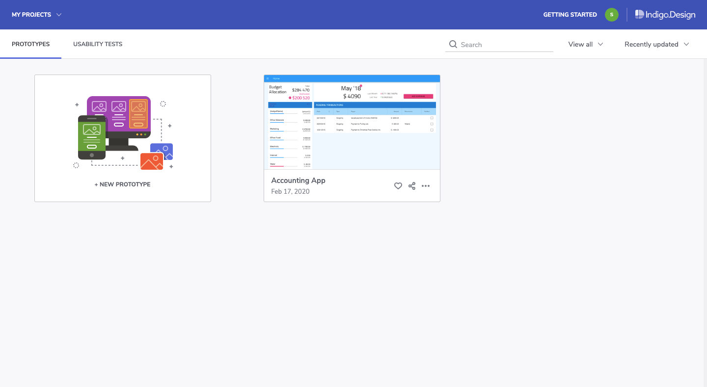
The first option is to upload a prototype from your computer. The following file formats are accepted:

  • PNG,
  • JPG,
  • GIF,
  • Sketch.

The second option is to add the Indigo.Design plugin to Sketch and sync your prototypes to the cloud. If you’re going to use this tool to simplify handoff, this plugin is going to be a huge time saver.

Once your prototype is loaded, hover over it and click “Edit Prototype”.

Indigo.Design edit prototype button
Indigo.Design users can edit prototypes with one click. (Image source: Indigo.Design) (Large preview)

If you haven’t yet confirmed that all interactions are properly set up inside Sketch, you can do that from within the Indigo.Design cloud and edit your interactions there:

Indigo.Design prototype editing and interaction setup
Indigo.Design users can verify their medium-fidelity prototypes are interactive before usability testing. (Image source: Indigo.Design) (Large preview)

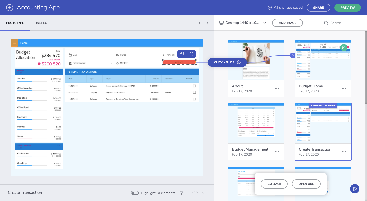
If the interactions aren’t properly set up, take care of that now. Create the hotspot on the interface on the left and then drag it to the corresponding card on the right to create an interaction.

2. Create A New Usability Test

From the same dashboard where prototypes are uploaded, you’ll begin your first usability test. You can do this from one of two places.

You can hover over the prototype you want to test and create a new one:

Indigo.Design new usability test button
Indigo.Design users can begin new usability test for uploaded prototypes. (Image source: Indigo.Design) (Large preview)

The other option is to go to the Usability Tests tab and begin the test there:

Indigo.Design usability tests dashboard
Indigo.Design “Usability Tests” dashboard where usability tests are created and managed. (Image source: Indigo.Design) (Large preview)

This is where you will eventually go to manage your usability tests and to review your test results, too.

With your new usability test initiated, this is what you’ll first see:

Indigo.Design usability test: create task
An Indigo.Design usability test. First step is to create a task. (Image source: Indigo.Design) (Large preview)

Essentially, what you need to do with this tool is:

Determine which “tasks” you want to test. These should be important steps that get your users to complete desired goals (theirs and yours).

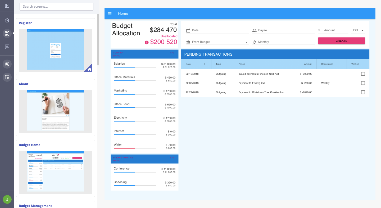
For example, with this being a finance management app, I expect users to primarily use this to create new budgets for themselves. So, that’s the first task I want to test:

New task “Create new budget” for usability test
Adding a new task to the Indigo.Design usability test. (Image source: Indigo.Design) (Large preview)

To create the “expected success path”, you must interact with your prototype exactly as you’d expect and want your users to on the live product.

Here’s an example of what the “create new budget” path might look like and how to build it out:

Creating expected success path in usability test
A quick walk-through of how to set up a new task and success path in Indigo.Design. (Image source: Indigo.Design)

Walk through your website or app on the right part of the screen.

When you’re done, confirm your work on the left before moving on to create other tasks you’ll be including in the test.

3. Put The Finishing Touches On Your Test

Creating tasks alone won’t be enough to gather the kind of data you want from your users.

For instance, if this is an MVP, you might want to explain that the experience may feel a little rough or to provide background on the solution itself (why you’ve built it, what you’re looking to do with it) so they’re not distracted by the design.

Don’t worry about your users misplacing these details in their email invitation. There’s a place to include these notes within the context of your usability test.

Go to the “Test Settings” tab:

Usability test - Welcome message, Thank You message
Usability tests in Indigo.Design come with room to add a Welcome and Thank You message. (Image source: Indigo.Design) (Large preview)

Under “Messaging to show participants”, this gives you the opportunity to include a welcome message with your test. This can be a blanket welcome statement or you can provide more context on the tasks if you feel it’s needed.

The thank-you statement is also useful as it provides an end-cap to the test. You can either thank them for their time or you can provide them with the next steps or information on what to expect about the product (maybe there are more usability tests to come).

Before I move on, I want to quickly call your attention to the “Success Criteria” toggle at the top of this section:

Indigo.Design usability test settings - success criteria
Indigo.Design usability test settings allow users to set strict success criteria. (Image source: Indigo.Design) (Large preview)

When enabled, this setting only allows for two results:

  • Pass
  • Fail

I’d say that you should leave this toggle set to “Off” if you want this tool to help you detect alternative paths. I’ll show you what that means in just a little bit.

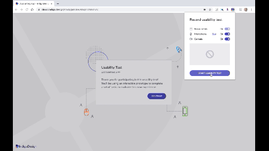
For now, it’s time to grab your usability test link and start sharing it with your participants. When you click the “Start Testing” button in the top-right corner of your screen, you’ll see this:

Indigo.Design usability test link
When you’re ready to start your usability test, click “Start Testing” and get your link. (Image source: Indigo.Design) (Large preview)

Copy this link and start sharing it with your participants.

If they’re Chrome users, they’ll be asked to install a browser extension that records their screen, microphone, and camera. They can enable or disable any of these.

The user will then step inside the test:

Indigo.Design usability test example
An example of a user walking through an Indigo.Design usability test. (Image source: Indigo.Design)

Once you’ve collected all the data you need, click the “Stop Testing” button in the top-right corner of the screen and start reviewing the results.

4. Review Your Usability Test Results

Your test results can always be found under your Usability Tests dashboard in Indigo.Design.

Indigo.Design usability test overview
An overview of a usability test’s results while it’s still in progress. (Image source: Indigo.Design) (Large preview)

If you’re logging into the platform, you’ll find an overview of all your test results, past and present.

You can get a more in-depth look at your results by opening the test:

Indigo.Design usability test results
Indigo.Design usability test results by task. (Image source: Indigo.Design) (Large preview)

On the left, you’ll see your test results by task. They’re broken up into:

  • Success rate: The percentage of users that took the exact steps you defined for the task.
  • Accomplished task: The number of users that completed the task. If you didn’t enable “Success Criteria”, this result will show all users who took the expected success path as well as alternative success paths.
  • Avg. time on task: The amount of time it took users to get through the task.

From this alone, you can tell quite a bit about the path you’ve laid before your users and how well-tuned it is to their mindsets and needs.

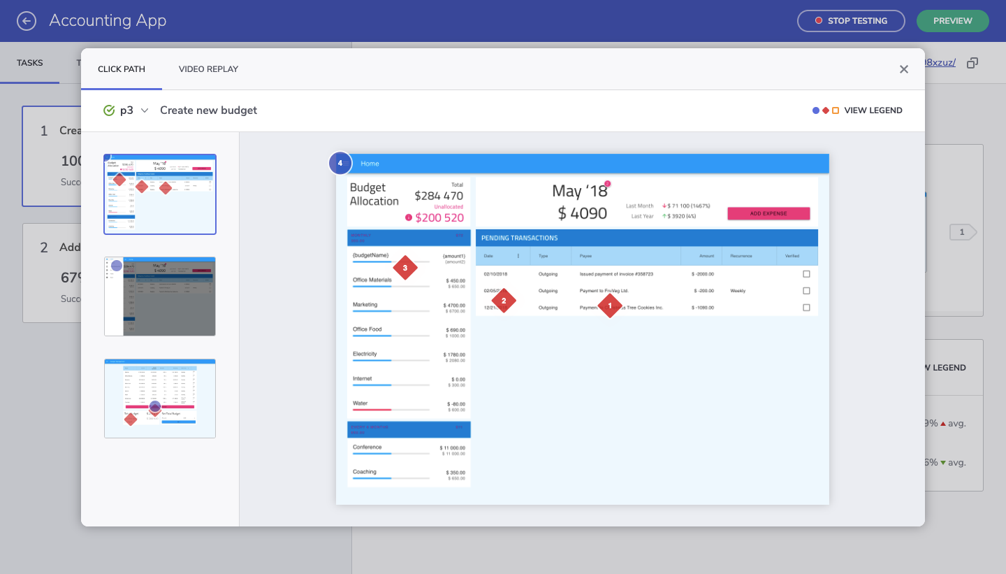
However, the right side of the screen gives us a better look at where things may have gone awry and why:

Indigo.Design test results — success path
Indigo.Design provides users to see what happened along the paths of their test subjects. (Image source: Indigo.Design) (Large preview)

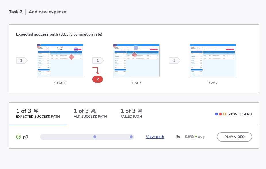
The top part of the screen shows us the original steps we laid down. Anywhere there’s a red mark and a number in red is where our test subjects deviated from that path.

This is much more effective than heatmap testing which only really gives us a general idea of where the users’ focus is. This clearly shows us that there’s something either wrong with the layout of the page or perhaps the content itself is poorly labeled and confusing.

Let’s look a bit closer at the bottom of the screen and the path data we have to play with:

  • Blue circles signify expected interactions,
  • Red diamonds signify unexpected interactions,
  • Orange squares signify that the participant requested help.
Expected success path in usability test
Data on how many users took the expected success path in a usability test. (Image source: Indigo.Design) (Large preview)

This shows us what the expected success path looked like and how long it took to complete on average.

You can click on the stats for “Alt. Success Path” and “Failed Path” to view how things went for your other participants:

Alternative success path in usability test
Data on how many users took the alternative success path in a usability test. (Image source: Indigo.Design) (Large preview)

When we allow leeway in terms of success criteria, we get a chance to see the alternative success paths.

This is useful for a couple of reasons. First, if there are enough users who took the same route and there were more of them than those on the success path, it might be worth reshaping the pathway entirely. If the alternative route is more logical and efficient, it would make sense to get rid of the path less traveled.

Failed path in usability test
Data on how many users failed to complete a task in the usability test. (Image source: Indigo.Design) (Large preview)

Secondly, the alternative success path along with the failed path shows us where friction occurs along the way. This enables us to see where our users’ breaking points really are. Not that we ever want to push our users to the edge, but it’s good to have a sense of what kinds of interactions just don’t work.

For instance, let’s say one of the buttons requires a right-click instead of a regular click. I know this is something I’ve encountered in some tools and it drives me nuts because it’s almost always unexpected and counterintuitive. I wouldn’t abandon the experience over it, but your users might.

So, by comparing the alternative success path with the failed path, you can figure out what these kinds of deal-breakers are much more easily.

Look A Little Deeper

I know the numbers and pathway steps are really important to look at but don’t forget to study the other information left behind by your participants.

For instance, if your users enabled browser recording, you can “Play Video” and watch them actually go through it.

If not, you can still use the “View path” link to watch the actual steps they took (if they weren’t the expected blue-circle steps).

Indigo.Design usability test review options
Indigo.Design allows users to keep tabs on what test subjects did or didn’t do to complete a task. (Image source: Indigo.Design) (Large preview)

This is what you’ll see for each of your test subjects:

Indigo.Design Click Path and Video Replay to watch step-by-step tests
Indigo.Design users can view every step their test subjects took by viewing the “Click Path” or watching the “Video Replay”. (Image source: Indigo.Design) (Large preview)

This particular view might be more useful to you than video since you can track the actual clicks on each static page. Not only do you see every part of the website where they clicked, but you also see in which order they made those clicks.

And like I said before, if you can identify trends where these alternative success paths or failed paths took your users, you can more quickly stamp out issues in your web design. It’s only when those clicks are all over the place or users give up on completing any of the tasks that you have a real problem.

Wrapping Up

Using a design system does not automatically imply good usability. You need to be able to design more than just consistently beautiful UIs.

That’s what’s so nice about the solution we’ve just looked at. With usability testing built into Indigo.Design, the focus isn’t just on shipping pixel-perfect websites. Whether you plan on doing moderated or unmoderated usability testing, you now have a tool that can accurately map your users’ journeys and the difficulties they would otherwise face.

Smashing Editorial (ra, il)

Simplify The Handoff From Sketch To Visual Studio Code With Indigo.Design

Simplify The Handoff From Sketch To Visual Studio Code With Indigo.Design

Simplify The Handoff From Sketch To Visual Studio Code With Indigo.Design

Suzanne Scacca

(This is a sponsored article.) If you think about it, software teams are a lot like sports teams. While each team member works towards the same exact goal, the role they play and the actions they take are vastly different from one another.

Which is why it’s crucial to have a seamless way of moving the ball from one team member to another.

Unfortunately, the handoff that takes place within software teams isn’t naturally as smooth as what you see on the sports field. And one of the primary reasons for this is the different systems and approaches used to build products.

Designers create pixel-perfect UIs in Sketch, only to have to translate them into a language that developers can use when they build apps in the Visual Studio Code IDE. Without a seamless way to move product designs through the pipeline, these inefficiencies lead to expensive reworks and debugging after an app has been shuttled from designer to developer.

Needless to say, a solution to the Sketch-to-IDE handoff problem has been a long time coming. It’s not that software teams don’t know how to collaborate or communicate well with one another. It’s just that their disparate systems and strategies make the transition from one team to another clunky, time-consuming and error-ridden.

Today, we’re going to look at why this happens and how your agency can fix the problem with two plugins and a prototyping cloud platform from Indigo.Design.

Where Does the Designer-Developer Handoff Go Wrong?

First, what we should really ask is:

Why is the designer-developer handoff such a problem?

Nick Babich recently wrote about how designers go to great lengths to create digital solutions that are perfectly measured and consistently crafted. But design systems don’t fluently translate to development systems.

The more the designer does to an interface, the more they have to actually communicate to a developer. So, it’s not enough to hand over a Sketch design file and leave the developer to run with it. Designers have to provide design specs that explain how all the moving pieces need to be laid out, spaced, styled, colored, engaged with and so on.

It’s been the only way to ensure that an app ends up pixel-perfect in the end. Even then, it still requires a lot of implementation on the part of the developer once they’re inside their IDE.

As you can imagine, this whole process takes a designer a lot of time to do. But without design specs, developers end up having to play a risky guessing game.

Not only that, developers aren’t typically in the habit of coding with HTML and CSS, which is tedious work and only represents the UI. There’s a lot more code behind the scenes that makes a web app work and not all developers are adept at or interested in learning to write the UI markup. When they’re forced into this position, the steep learning curve adds more time to projects and the resulting reworks and debugging sends costs spiraling out of control.

So, really, the designer-developer handoff has become a matter of whose time can we afford to waste?

Is it the designer who has to redline everything so the developer knows how to turn the design into reality?

Or:

Is it the developer who has to look at a design, manually measure everything on the screen and hope they get all the specifications right just by eyeballing it?

No one wins in either scenario. And you’re going to eat away at your profit margins in the process.

There may be some agencies who believe that forcing designers and developers to work in the same platform is the best solution. That way, there’s no need to do all of this translation or interpretation during the handoff from Sketch to Visual Studio Code. But that often results in stifled creativity on the part of the designer or a hampered ability to build effective software solutions on the part of the developer.

So, what’s the answer?

Improve The Designer-Developer Handoff With Indigo.Design

It’s not like Indigo.Design is the first platform to try to solve handoff issues for software teams. InVision and Zeplin have both offered up their own solutions.

Each of these platforms have made visual specifications more accessible for developers while consequently improving the efficiency of designer-developer teams. Specifically:

  • Designers don't need to mark up the UI anymore as the platforms handle the redlines.
  • Developers can manually extract the design specs without the designers’ help.

That said, with platforms like InVision and Zeplin, developers still have to inspect each element and manually code it based on the extracted specs. These platforms also have yet to create a seamless bridge between Sketch and Visual Studio Code.

So, if designers and developers want to work as efficiently as possible with one another, Indigo.Design has developed an answer to their problem:

Step 1: Design in Sketch

There’s really only one thing about this phase that has to change for the designer. The app, pages and flow will still be designed as usual within Sketch, using components from the Indigo.Design UI Kit.

An app built in Sketch
An example of what your app might look like in Sketch. (Source: Sketch) (Large preview)

However, there’s no longer any need to compile redlines or specs for the app anymore. Indigo.Design takes care of it for you.

In order to leverage this, your designer has to ditch whatever prototyping system they were using before. With this new streamlined and error-free system, your designer can easily push their designs into the cloud using the Indigo.Design plugin.

This can be accessed under the Plugins menu > Indigo.Design > Publish Prototype:

Indigo.Design plugin
The Indigo.Design plugin simplifies the publication of prototypes. (Source: Sketch) (Large preview)

There’s no need for the designer to export files and upload into another system for clients to review or developers to work with. They get to stay right where they are to publish the prototype.

Indigo.Design cloud link
All it takes is one link to move clients, developers and others into the Indigo.Design cloud. (Source: Indigo.Design) (Large preview)

It takes only about a minute to complete the process, too. The designer is then given a link to the cloud which they can share with clients and others to review and comment on the prototype.

Step 2: Work in the Indigo.Design Cloud

To get others into the cloud is easy. The link provided will take them into the experience cloud where the design can be reviewed:

Indigo.Design app prototype
An example of how an app prototype looks in Indigo.Design. (Source: Indigo.Design) (Large preview)

It’s easy to leave comments on top of the design, too. All users have to do is open the Comments panel, drop a pin and attach their comment to it:

Indigo.Design prototype comments
How to leave comments on prototypes in Indigo.Design. (Source: Indigo.Design) (Large preview)

There’s more to this collaboration software than that though. The prototype can also be edited from the cloud.

To access this, the designer, developer and anyone else with group access will locate the project from the prototype library:

Indigo.Design prototype editor access
Access to the prototype editor in Indigo.Design. (Source: Indigo.Design) (Large preview)

Click “Edit Prototype” to enter the Indigo.Design editor:

Indigo.Design editor
An example of how prototypes appear in the Indigo.Design editor. (Source: Indigo.Design) (Large preview)

Once a screen is selected, the designer can add a hotspot to create a new interaction in the app.

Indigo.Design prototype editing
Adding a new interaction to a prototype in Indigo.Design. (Source: Indigo.Design) (Large preview)

You can also use the Indigo.Design editor to inspect the specifications of the app UI:

Indigo.Design relative spacing measurements
Measuring relative spacing of an app UI in Indigo.Design. (Source: Indigo.Design) (Large preview)

Hovering over an element reveals relative spacing specs. Clicking on an element reveals much more detail:

Indigo.Design design specs
Indigo.Design reveals all specs of the UI in its editor. (Source: Indigo.Design) (Large preview)

The developer can also edit or copy the cleanly written and outputted CSS from this panel, too. (Though they shouldn’t have to, as I’ll explain in the next step.)

See what I mean about saving designers time in generating specs? By simply pushing this design into the Indigo.Design cloud, the specs are automatically generated.

Step 3: Build in Visual Studio Code

Now, let’s say your design is good enough to go into development. The moving of an Indigo.Design prototype to Visual Studio Code is just as easy as the move from Sketch was.

Retrieve the original cloud link provided by the Indigo.Design plugin in Sketch. If you don’t have it anymore, that’s fine. You can retrieve it from the libraries screen in Indigo.Design:

Indigo.Design prototype link
Where to retrieve your Indigo.Design prototype link. (Source: Indigo.Design) (Large preview)

All the developer has to do now is install the Indigo.Design Code Generator extension. This is what enables Visual Studio Code to talk directly to Indigo.Design to retrieve the prototype.

Once the extension is set up, the developer will do the following:

Visual Studio Code extension
How to launch the Indigo.Design Code Generator in Visual Studio Code. (Source: Visual Studio Code) (Large preview)

Open the app shell that’s already been developed. Then, launch the Indigo.Design Code Generator. This is where you’ll enter the cloud link:

Indigo.Design Code Generator extension
Enter your prototype link into the Indigo.Design Code Generator extension. (Source: Visual Studio Code) (Large preview)

This will reveal a pop-up with the app designs that live in the cloud as well as the individual components they’re comprised of.

Indigo.Design generate code assets
Developers control which components they want to generate code assets for. (Source: Visual Studio Code) (Large preview)

The developer has the option to generate code for all components of the app or to go component-by-component, checking only the ones they need. This is especially helpful if an app is in progress and the developer only needs to import new components into VSC.

By clicking “Generate Code Assets”, the selected components will be added into Angular as readable and semantic HTML and CSS.

The developer now has less to worry about in terms of rebuilding styles or configuring other specs. Instead, they can spend their time building business functionality and really refining the product.

A Note About This Process

It’s important to point out that this Sketch – cloud – Visual Studio Code workflow doesn’t just work with the first iteration of a design. Developers can build while designers work through feedback with clients or usability studies with users — something Indigo.Design has accounted for.

So, let’s say the designer moved a login form UI through Indigo.Design and the developer generated the code to get things moving.

While working on the form, the developer implemented some authentication code in the TypeScript file.

In the meantime, though, the designer received a message from the client, letting them know that a new Universal Login with Google needed to be implemented. Which means the UX has to change.

When the update is ready and the prototype sync’ed to Indigo.Design, the designer messages the developer to let them know about the changes. So, the developer launches the Visual Studio Code Generator once more. However, when regenerating the login screen, they select "Do Not Override" on the TypeScript file. This way, they can preserve the code they wrote while simultaneously importing the new HTML and CSS.

The developer can then make any necessary adjustments based on the updated design.

Wrap-Up

Indigo.Design has effectively created an efficient and bug-free handoff for designers working in Sketch and developers working in Visual Studio Code.

Designers don’t waste time designing in one platform and prototyping in another, drawing up design specs or dealing with file exports. Developers don’t waste time trying to re-create the design intent from a static file.

As Jason Beres, the Senior VP of Product Development for Indigo.Design, said:

With Indigo.Design code generation, all of these bugs are 100% avoided. Not only is the spirit of the design maintained, but pixel-perfect HTML and CSS is created so the developer isn’t in the unfortunate position of having to manually match the design.

And by working out the technical kinks in the designer-developer workflows and handoff, your agency will greatly reduce the cost of reworks and debugging. You’ll also boost profits by providing your software team with a more efficient and quicker way to get apps through the process and in pixel-perfect condition.

Smashing Editorial (yk,ra)

How To Use Spaces In Web Design With Gestalt Principles

How To Use Spaces In Web Design With Gestalt Principles

How To Use Spaces In Web Design With Gestalt Principles

Ayesha Ambreen

Human brains are hardwired to connect the dots and make sense out of everything the eyes see. Design is a creative field where forms and space intermingle to lend us a variety of experiences. Whatever design we come across, our brains are hardwired to transform that piece into simpler components made up of basic shapes and forms that are at play with the spaces. Our minds flood with memories and — thanks to our experiences — we recognize the patterns easily.

Space — both positive and negative — plays a pivotal role in unifying the design elements. As a result, we see a uniform pattern (or not). When the elements are arranged in an orderly manner, the intelligent use of spaces draws our eye to the most noticeable space — be it positive or negative.

The positive space poses as the flesh or the meat of the design; it’s the part where you see the shapes, colors, patterns and so on. The negative space, on the other hand, is the background or the hyped white space (most of the times).

The popular artwork by Vincent Van Gogh features an interesting case of negative versus positive space
“The Starry Night” by Vincent van Gogh

As much as the positive space seems to dominate the negative counterpart, both are used in equilibrium to tell a harmonious, coherent, and a seamlessly complete story.

In balanced compositions, the positive parts and negative space of the design work together and complement each other to form a seamless, aesthetically pleasing whole. Unbalanced compositions, on the contrary, can cause discomfort to the audience and convey an incomplete, rather distorted story.

But what kind of story do spaces tell in web design?

In the midst of the spaces, the success and failure of web design is determined more by the utility and the usability. Just consider that if you have poor design skills, the overall efficacy and the presentation of the web design will be disturbed. Content is king, but from an alternative point of view, the content will take its toll on your website if the spaces are not used appropriately.

If you think your developing skills rock but your design skills could need some more improvement, you’ve just hit the jackpot. In this article, we’re going to cover:

  • Positive versus negative space relationship, importance and implementation;
  • The connection between spaces and cognitive perception;
  • The Gestalt principles and their implication in web design.

We’re also going to discuss some real-world web design examples with each Gestalt principle and creative use of spaces.

Without further ado, let’s begin.

Positive Versus Negative Space: Relationship, Importance And Implementation

Spaces comprise of two main dimensions: positive and negative. The positive is the element and the negative is the no element. As mentioned before, the positive is object, negative is the negligible space behind it. Where one is the focus, other serves as the background. Where the former moves and motivates, the latter remains stationary and obscure. Where one is the moon, the other is the dark sky surrounding it.

In web design, the spaces interact with each other to maintain the idea of holistic composition. Visual hierarchy is only created when both the spaces are differentiated with contrast and yet tend to the bigger picture (think of yin and yang).

The popular Chinese symbol Yin and Yang
“Yin and yang”, a concept of dualism in ancient Chinese philosophy. (Large preview)

We differentiate between the positive and the negative space at the meeting point. The negative occurs mainly as the white space that complements the positive to make it pop out.

It might seem that the positive space takes the lead, the negative space is equally important for a myriad of benefits. Some of these benefits are:

  • It creates an easy-to-follow visual hierarchy;
  • Sets the focus of attention as well as reduces distraction;
  • Helps establish the scale and lets the focus appear bigger;
  • It improves page scan-ability;
  • Makes the flow on the page appear natural;
  • It clarifies the relationship between the visual elements without the need for additional aids;
  • It helps de-clutter the page;
  • Enhances the style and look of the webpage.

Negative space in design isn’t that negative if you ask me. However, both space types perform great when used in a balanced ratio. Unfortunately, chaos strikes only when either one dominates the other and gives an ‘overcrowded’ or a ‘lacking’ impression. In both cases, the audience is unable to process such complex information, and hence, the motive of using space creatively for web design falls apart.

Here’s a web template with misplaced content or ‘chaos’ space:

Here is what happens when space is not considered
Unconsidered ‘chaotic’ space (Large preview)
We translated the above website template into black and white to show space discrepancies
Space discrepancies shown in black and white (Large preview)
Here we have fixed space to show how space can spark clarity and uniformity when used in proportion
Fixed space to show how space can spark clarity and uniformity when used in proportion (Large preview)
The effective use of space in web design
The effective use of space in web design (Large preview)

As fascinating as the concept and arrangement of space occurs, doubt begins to fog the area.

  • Is the positive space surrounded by the negative one or is the negative space eaten up by the positive one?
  • How is the proportion of each space type determined?
  • Which one should validate as the focal object?
  • Is it mandatory to highlight one and eclipse the other to communicate your intended perception to the audience?
  • How would I achieve ‘design nirvana’ with the communion of positive and negative spaces?

Questions like these can only be answered with a clear understanding of the basics. And as per the golden rule of thumb: simplicity is the best policy (we made that up because it fits!).

We mentioned in the beginning that web design is all about creating a simple user interface that helps you and your audience kill more than two birds with one stone, or in literal terms, helps increase the visual desirability of the website design as well as making it effective and easier to use — yes, with an incredible power over the use of spaces.

The Connection Between Spaces And Cognitive Perception

Since our minds are always playing the detective for finding hidden clues and missing links between the spaces, it compares present visuals with the ones experienced before as a part of the cognitive process. In order to become an efficient web designer, you must first understand how the brain pays attention to its surroundings. It may help you pin the particular use of visual elements and use them to influence the viewer’s perception.

“Great designers understand the powerful role that psychology plays in visual perception. What happens when someone’s eye meets your design creations? How does their mind react to the message your piece is sharing?”

Laura Busche, Brand Content Strategist at Autodesk

You must now have a clear idea of how visual design and psychology are linked and have the power to influence each other. In other words, the main idea of developing a simple user-centric interface and using space for its design is by considering the Gestalt principles. These can help you understand and control the visual-psychological connection.

Recommended reading: Improve Your Designs With The Principles Of Similarity And Proximity

Gestalt Principles In Web Design

Gestalt is German for ‘forms’. It is more of a concept than a word, which states that:

“The whole is other than the sum of the parts.”

— Kurt Koffka

A collection of individual units appears as a group to us when they’re unified in some way. We see the elements as a group despite their individuality. This concept or theory applies fundamentally to all the design mediums: We don’t see text, colors, and shapes as separate elements, but instead a whole webpage as a collective entity. The same applies to a forest: we don’t only see a bunch of trees, just the same way we don’t see water drops when looking at an ocean.

The Gestalt principles describe how the human mind perceives visual components when certain terms and conditions are applied. It helps the brain create imagery of the visual. Hence, the Gestalt principles are based on six main categories:

  1. Figure And Ground
  2. Proximity
  3. Symmetry And Order
  4. Similarity
  5. Closure
  6. Continuity

Figure And Ground

The ‘figure’ is the object that is intuitively as well as visibly separated from the ground.

Negative space vs. positive space depiction through grail cup
Grail Cup (Large preview)

The most classic example that exists is that of the grail cup — the vase between two mirroring face silhouettes. When you first come across this image, your eyes are drawn to the most focally visual object that comes into your notice immediately, which might be the faces opposing each other or the vase. While your mind is adjusting your focus, the ground or the vase is blurred out and at that moment, your mind intuitively crops out the negative or the ground in the image.

After a while, you get to notice the vase in the background and realize it was there in the first place. As ambiguous as the Figure and Ground principle seems, designers usually create visually appealing surreal and illusionary art and web designs.

Image depicting the figure-ground relationship
Figure-ground relationship (Large preview)

Sometimes, the relationship between figure and ground is stable, which makes both distinguishable from one another. This relationship is sometimes unstable, meaning that the figure and ground are indistinguishable from each other. Due to the ambiguousness of this relationship, the viewers confront perceptual confusion.

To give you a clear idea of how the figure-ground relationship influences web design, let’s discuss a few examples in detail. Each of these examples focus on three main areas of the figure-ground relationship: You can add explicit visual cues by using contrast, boxes, and shadows for your web design. These techniques are used to distinguish the color, size, and level of detail, to separate the content, and to add depth to the respective object of focus.

In the first example below, Trellis uses a ‘hero image’ (images with clear CTAs) with a figure-ground relationship that clearly indicates the level of detail, color, and size.

Trellis website features a good example of figure-ground relationship
Trellis (Large preview) (Image source)

The text is the figure here in a large cursive font in the center of the page, making it stand out as compared to the image in the background. The white text over the contrasting grayscale image draws the focus of attention, which makes the text visible over it. From another perspective, the background is blurred so that the text pops out as the figure. All of these aspects show that the text here is prioritized as the figure or the positive space, while the blurred image is used as background or the negative space, hence strongly implying the concept of figure and ground.

Next comes the content in boxes. Ocean Health Index makes a smart use of boxed content to separate the figure from the background. This is what you see when you come across their website:

The Ocean Health Index website shows how both figure and ground can be used in web design
Ocean Health Index (Large preview) (Image source)

Which part of it jumps at you when you first view this web page? If you ask me, it’s the main text in white in the upper right-hand side and the two boxes with contrasting color and text. The bold white text on the top is obviously the figure. (Notice how it’s placed over the darker image to stand out.) The boxes down below are also part of the figure, due to the contrast they offer to the ground image. The other aspect of this figure is the second contrast that is placed inside the boxes in the form of contrastive-colored text.

The background uses subtle shades that help the figures appear sharply, showing a pattern of detail here. The boxes are also overlapping the background image, bringing them in clear view over the image.

Some websites also exhibit the figure-ground relationship by adding drop shadows to the figure, in order to give a feeling that the figure is placed over the background. Here’s a screenshot from Seriously Unsweetened:

The Seriously Unsweetened’s website uses figure-ground balanced on their website
Seriously Unsweetened (Large preview) (Image source)

Seriously Unsweetened’s landing page uses more than one technique to maintain that figure-ground relationship in a balanced manner. There are bright colors and shadows. The ground remains white, making it easier for the figure to appear accurately above the ground. In the positive space, the objects in the figure are presented under an illusion as of being ‘on the top’ of the background. The shadow game is played inside the primary figure, making us notice that there is another figure-ground relationship within the main figure. A clever one!

Proximity

Proximity refers to the closeness of elements in a page. Different elements in webpages can be grouped together to create a bigger association. Apart from being similar, the closeness of these elements with each other than other page elements will automatically be paired in the viewer’s mind.

The image depicts proximity in graphic design
Proximity in design (Large preview)

From images to texts and navigation bars to web forms, the Proximity principle applies heavily to web design. When you group similar content together, it creates a seamless relationship between the elements and delivers a better visual experience to the viewer.

Here is an example of proximity as displayed in the navigation of the Mashable website:

Mashable website features proximity principle
Mashable (Large preview) (Image source)

In the snapshot above, you can clearly notice how the elements of the same category are placed together to show the relation with the main menu type. The users’ eyes are automatically drawn to the subtypes under the main heading — also thanks to the use of colors and text size. You can see that the items that are unrelated are set apart with the help of a line, which serves as the users’ guide in relating and separating the items as per the principle of proximity.

Besides delineating the navigation bar, the grid-based content also complies with the golden rule of Proximity. Amazon’s product listing is the best example:

Amazon product pages also make use of proximity principle
Amazon Products (Large preview) (Image source)

Proximity complies with similarity, which is yet to be discussed. As you can see, similar products in the positive space are grouped and separated using narrow white space. This instructs the user to sort their preferred item from the list of similar products. Moreover, the principle of closure also comes into action among the list of similar items.

Now, we’ll take a closer look at the Basecamp web form which displays yet another ideal case for proximity in web design:

Interestingly, Basecamp web form also uses proximity to segment form details
Basecamp Web Form (Large preview) (Image source)

You can notice how the form is divided into two main segments: personal details and ID generation. The first section is implied as the most important field, followed by a lesser important requirement. The headings for both the sections vary as shown by the difference in color and font size. In this web form, proximity is an indicator that places and prioritizes grouping of information from highest to lowest importance.

Symmetry and Ordery

Symmetry refers to the exact reflection or the mirror image of the two opposing planes. It can be regarded as the balance that divides an object into two equal halves. Real-world examples of symmetry include geometrical images like equilateral triangles, circles, and squares and so on.

Here is a clear distinction between symmetric and asymmetric design
Symmetry versus asymmetry (Large preview)

The human mind desires to find the ‘balance’ in human faces, which it finds aesthetically pleasing. The mind also tends to find symmetry in other objects, such as images because symmetry creates harmony and allows the viewers to be at comfort while viewing the image.

Below is a great example of symmetry in web design as exhibited by HvD Fonts:

A good example of symmetry in Web design is HvD Fonts website
HvD Fonts (Large preview) (Image source)

Not only does this webpage show a typical figure-ground relationship, but also displays great symmetry. The page is dissected into four equal halves with fonts of similar size and color. The background in each of the four sections runs along the same theme with a grayscale effect. You can also notice that the negative space isn’t necessarily white; it’s the image in the background.

The idea of symmetry gives rise to another notion: asymmetry can be confusing and must be used with great care when used in web design. Many websites use asymmetry as the main balancing element for spacing, where the unconventional positive space is balanced with a neutral background and vice versa. And as per the concept of asymmetry, Xplode Marketing prompts asymmetry with unique aesthetics pleasing the eyes.

Xplode Marketing website prompts asymmetry with creative placement
Xplode Marketing (Large preview) (Image source)

This webpage immediately grabs the eye using optical illusions as well as asymmetry. The positive space objects are placed in an unusual pattern over the negative space that creates the appeal. The color is the main indicator of harmony between both the spaces and develops a natural connection for the viewers to notice. There is also a strong balance of left-hand graphics with the strong and dominant wings on the right. What do you think?

Similarity

The reason that proximity works closely with the principle of similarity is the quality of shared attributes among the similarly-grouped objects. Whether it be color, shape, posture, size, shape, orientation or any other property, connectedness will prevail when one or more of these are shared in all the objects displayed in proximity.

The image depicts how similar elements group together
Similarity in Design (Large preview)

Even if the positive space elements do not look visibly connected, these will stand apart from the negative one due to the principle of similarity.

Just look at these UrbanDecay palettes list for a moment:

The Urban Decay products are a classic example of similarity in design
Urban Decay (Large preview) (Image source)

The positive spaces aka the figures are different from each other but do share some similarity in various aspects, such as their position, color, product layout and mode of presentation. The only dissimilar object is the ad for the eye shadow primer that stands out uniquely in the line of the similar-product category. This is obviously a marketing tactic that is intended to draw attention without hurting the overall symmetry and beauty of the page. Another point to consider here is that similarity in size sets the other image apart from the similar product category.

Other than just product display, the positive space can be employed with the similarity in conjunction with the negative space.

Let’s take a look at the influenster landing page:

Influenster website applies the principle of similarity to achieve clarity in design.
Influenster’s front page(Large preview) (Image source)

The similarity in the above example shows clearly aligned boxes. Though the products in each positive space are different, the perception of similarity is conveyed by the consistent text fields in the overall page. The genre, layout, and the theme all are similar, hence delivering a seamless effect to the vision.

Closure

Did you ever come across an image that seems close but is open? That is because of the principle of closure. Our brains tend to ‘close’ the gaps in the incomplete objects and use our visual perception to complete the figure, seeing it as a whole.

A perfect example of closure where four circles come together to form a square
Closure in design (Large preview)

The positive and negative spaces close in to form a whole. The best example is that of the hidden shapes and forms in the negative space in and outside the design, which demands an intelligent assessment of message within the design. Using both the spaces creatively in the closure can give rise to an interesting yet simplified design.

Take a look at the screenshot from Magu Kambucha below:

Figure-Ground relationship and closure principles work hand-in-hand in Magu Kambucha website
Magu Kambucha (Large preview) (Image source)

In this example, you can see that closure is kept intact with the principle of the figure-ground relationship. The bottles and the bold text behind are obviously the figure, where the background is solid soft pink. Where’s the closure? See the text behind the bottles? You can’t see it completely, but still know it’s ‘Kambucha’. Except for the first ‘K’ and the last ‘A’, other letters are half hidden, which are intuitively completed and the whole form begins to take shape and consequently, the meaning. This, my friend, is one good example of closure we have here!

Take a look at the screenshot from Cult below:

The title of the website follows the closure principle to add dramatic effect to the animation in the website header
CULT Website (Large preview) (Image source)

Even though the text is not spelled out quite clearly, our minds can easily read the word CULT. The arrangement and alignment of the text made it easy to decipher, even when the words are incomplete.

Continuity

Finally, as per the general Gestalt principles, continuity follows the pattern by leading the eyes to follow a consistent path and establishing a linear pattern from object to object. It can best be understood by the example of a positive space line with a curved over the negative space. The colors of both lines indicate that the lines bent by each other, but the pattern of continuity suggests otherwise.

A depiction of continuous line
Continuity in design (Large preview)

In the image above, the viewers are more inclined to see a straight line despite the color degradation. This leads us to believe that the principle of Continuity guides the perception better than the power of color. This concept flows smoothly through both kinds of spaces. When we insert a subject in the negative space, our eyes tend to draw the line of distinction between the positive space and the negative one.

The imaginary line of continuity is what we tend to introduce in the design to guide our perception when differentiating between the positive and the negative space.

Let’s take our cue from the Crypton Trading website down below:

The pattern on Crypto Trading website exemplifies continuation in design
Crypton Trading (Large preview) (Image source)

See the perfect continuation of design in the right half of the page? Regardless of the light and dark hue in the background, the pattern is pretty much obvious on the page. And when you scroll down, you will see how the pattern as well the color change in a continuous and seamless motion. The shift in tones is negligible here and all we see is a continued pattern of lines and dots.

Another good example is the OscilloScope website:

The OscilloScope website also features the law of continuity through 360-degree view of their studio
OscilloScope Website (Large preview) (Image source)

The website uses the law of Continuity to take web visitors to a 360-degree view of the studio where they can navigate their way to the desired section.

The official website of the film ‘Cargo’ also uses the law of continuity to navigate users
Cargo the movie (Large preview) (Image source)

The film Cargo has a landing page that also uses the law of continuity: it get its text float across the website in a linear motion using the scroll-only navigation. Since the half-visible logo was shown vertically, the viewer has to scroll down to get a full view of it. As the page is scrolled down, the static logo starts floating along with the chunks of text running parallel to it. The navigation leads the user through different levels of experience without interfering the darkness lurking below.

Since our eyes usually follow the smoothest path, graphic designers can use such examples to make them follow the desired path and position the elements along a line.

Summing It Up

In this article, we covered the Gestalt principles in relation to positive and negative spaces in websites. We also made sure we include some real-life examples to give you a clear idea of how you can employ simple yet effective techniques to influence your audience’s perception. The key here is to use these principles to create a web design that appears more than the sum of its parts.

We humans think in terms of our perception — mainly based on visuals. According to the Gestalt principles in relation to positive and negative spaces, we tend to see the bigger picture rather than individual elements at first glance.

Positive and negative spaces help us differentiate, help us recall our experiences, and recognize the patterns. With the help of the Gestalt principles, we are better able to visualize how well we can use spaces in web design to create appealing pieces. Since spaces can appear as a tangled affair for any designer, the best way is to keep intact your Gestalt principles. This is the only way you can truly realize the importance, usage, and effectiveness of spaces in your designs and effortlessly become an effective contributor in the web design domain.

Want to add something else? Don’t forget to share your ideas. We’d love to receive the feedback!

Further Reading

Here are a few design sources to help you understand the Gestalt principles:

Don’t forget to check out the related recommended tutorials:

Smashing Editorial (il)