

Today's websites are packed with heavy media assets like images and videos. Images make up around 50% of an average website's traffic. Many of them, however, are never shown to a user because they're placed way below the fold.
What’s this thing about images being lazy, you ask? Lazy-loading is something that’s been covered quite a bit here on CSS-Tricks, including a thorough guide with documentation for different approaches using JavaScript. In short, we’re talking about a mechanism that defers the network traffic necessary to load content when it’s needed — or rather when trigger the load when the content enters the viewport.
The benefit? A smaller initial page that loads faster and saves network requests for items that may not be needed if the user never gets there.
If you read through other lazy-loading guides on this or other sites, you’ll see that we’ve had to resort to different tactics to make lazy-loading work. Well, that’s about to change when lazy-loading will be available natively in HTML as a new loading attribute… at least in Chrome which will hopefully lead to wider adoption. Chrome has already merged the code for native lazy-loading and is expected to ship it in Chrome 75, which is slated to release June 4, 2019.

The pre-native approach
Until now, developers like ourselves have had to use JavaScript (whether it’s a library or something written from scratch) in order to achieve lazy-loading. Most libraries work like this:
-
The initial, server-side HTML response includes an
imgelement without thesrcattribute so the browser does not load any data. Instead, the image's URL is set as another attribute in the element's data set, e. g.data-src.
<img data-src="https://tiny.pictures/example1.jpg" alt="..."><script src="LazyLoadingLibrary.js"></script>
<script>LazyLoadingLibrary.run()</script>data-src attribute's value to the previously empty src attribute.
<img src="https://tiny.pictures/example1.jpg" data-src="https://tiny.pictures/example1.jpg" alt="...">This has worked for a pretty long time now and gets the job done. But it’s not ideal for good reasons.
The obvious problem with this approach is the length of the critical path for displaying the website. It consists of three steps, which have to be carried out in sequence (after each other):
- Load the initial HTML response
- Load the lazy-loading library
- Load the image file
If this technique is used for images above the fold the website will flicker during loading because it is first painted without the image (after step 1 or 2, depending on if the script uses defer or async) and then — after having been loaded — include the image. It will also be perceived as loading slowly.
In addition, the lazy-loading library itself puts an extra weight on the website's bandwidth and CPU requirements. And let’s not forget that a JavaScript approach won't work for people who have JavaScript disabled (although we shouldn't really care about them in 2019, should we?).
Oh, and what about sites that rely on RSS to distribute content, like CSS-Tricks? The initial image-less render means there are no images in the RSS version of content as well.
And so on.
Native lazy-loading to the rescue!

As we noted at the start, Chromium and Google Chrome will ship a native lazy-loading mechanism in the form of a new loading attribute, starting in Chrome 75. We’ll go over the attribute and its values in just a bit, but let’s first get it working in our browsers so we can check it out together.
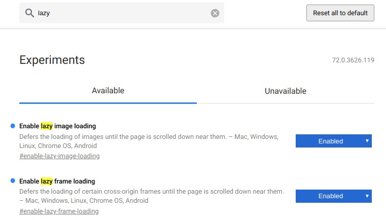
Enable native lazy-loading
Until Chrome 75 is officially released, we have Chrome Canary and can enable lazy-loading manually by switching two flags.
- Open
chrome://flagsin Chromium or Chrome Canary. - Search for
lazy. - Enable both the "Enable lazy image loading" and the "Enable lazy frame loading" flag.
- Restart the browser with the button in the lower right corner of the screen.
You can check if the feature is properly enabled by opening your JavaScript console (F12). You should see the following warning:
[Intervention] Images loaded lazily and replaced with placeholders. Load events are deferred."
All set? Now we get to dig into the loading attribute.
The loading attribute
Both the img and the iframe elements will accept the loading attribute. It's important to note that its values will not be taken as a strict order by the browser but rather as a hint to help the browser make its own decision whether or not to load the image or frame lazily.
The attribute can have three values which are explained below. Next to the images, you'll find tables listing your individual resource loading timings for this page load. Range response refers to a kind of partial pre-flight request made to determine the image's dimensions (see How it works) for details). If this column is filled, the browser made a successful range request.
Please note the startTime column, which states the time image loading was deferred after the DOM had been parsed. You might have to perform a hard reload (CTRL + Shift + R) to re-trigger range requests.
The auto (or unset) value
<img src="auto-cat.jpg" loading="auto" alt="...">
<img src="auto-cat.jpg" alt="...">
<iframe src="https://css-tricks.com/" loading="auto"></iframe>
<iframe src="https://css-tricks.com/"></iframe>
Setting the loading attribute to auto (or simply leaving the value blank, as in loading="") lets the browser decide whether or not to lazy-load an image. It takes many things into consideration to make that decision, like the platform, whether Data Saver mode is enabled, network conditions, image size, image vs. iframe, the CSS display property, among others. (See How it works) for info about why all this is important.)
The eager value
<img src="auto-cat.jpg" loading="eager" alt="...">
<iframe src="https://css-tricks.com/" loading="eager"></iframe>
The eager value provides a hint to the browser that an image should be loaded immediately. If loading was already deferred (e. g. because it had been set to lazy and was then changed to eager by JavaScript), the browser should start loading the image immediately.
The lazy value
<img src="auto-cat.jpg" loading="lazy" alt="...">
<iframe src="https://css-tricks.com/" loading="lazy"></iframe>
The lazy value provides a hints to the browser that an image should be lazy-loaded. It's up to the browser to interpret what exactly this means, but the explainer document states that it should start loading when the user scrolls "near" the image such that it is probably loaded once it actually comes into view.
How the loading attribute works
In contrast to JavaScript lazy-loading libraries, native lazy-loading uses a kind of pre-flight request to get the first 2048 bytes of the image file. Using these, the browser tries to determine the image's dimensions in order to insert an invisible placeholder for the full image and prevent content from jumping during loading.
The image's load event is fired as soon as the full image is loaded, be it after the first request (for images smaller than 2 KB) or after the second one. Please note that the load event may never be fired for certain images because the second request is never made.
In the future, browsers might make twice as many image requests as there would be under the current proposal. First the range request, then the full request. Make sure your servers support the HTTP Range: 0-2047 header and respond with status code 206 (Partial Content) to prevent them from delivering the full image twice.
Due to the higher number of subsequent requests made by the same user, web server support for the HTTP/2 protocol will become more important.
Let’s talk about deferred content. Chrome's rendering engine Blink uses heuristics to determine which content should be deferred and for how long to defer it. You can find a comprehensive list of requirements in Scott Little's design documentation. This is a short breakdown of what will be deferred:
- Images and frames on all platforms which have
loading="lazy"set - Images on Chrome for Android with Data Saver enabled and that satisfy all of the following:
loading="auto"or unset- no
widthandheightattributes smaller than 10px - not created programmatically in JavaScript
- Frames which satisfy all of the following:
loading="auto"or unset- is from a third-party (different domain or protocol than the embedding page)
- larger than 4 pixels in height and width (to prevent deferring tiny tracking frames)
- not marked as
display: noneorvisibility: hidden(again, to prevent deferring tracking frames) - not positioned off-screen using negative
xorycoordinates
Responsive images with srcset
Native lazy-loading also works with responsive img elements using the srcset attribute. This attribute offers a list of image file candidates to the browser. Based on the user's screen size, display pixel ratio, network conditions, etc., the browser will choose the optimal image candidate for the occasion. Image optimization CDNs like tiny.pictures are able to provide all image candidates in real-time without any back end development necessary.
<img src="https://demo.tiny.pictures/native-lazy-loading/lazy-cat.jpg" srcset="https://demo.tiny.pictures/native-lazy-loading/lazy-cat.jpg?width=400 400w, https://demo.tiny.pictures/native-lazy-loading/lazy-cat.jpg?width=800 800w" loading="lazy" alt="...">Browser support
At the time of this writing, no browser supports native-loading by default. However, Chrome will enable the feature, as we’ve covered, starting in Chrome 75. No other browser vendor has announced support so far. (Edge being a kind of exception because it will soon make the switch to Chromium.)
You can detect the feature with a few lines of JavaScript:
if ("loading" in HTMLImageElement.prototype) {
  // Support.
} else {
  // No support. You might want to dynamically import a lazy-loading library here (see below).
}
See the Pen
Native lazy-loading browser support by Erk Struwe (@erkstruwe)
on CodePen.
Automatic fallback to JavaScript solution with low-quality image placeholder
One very cool feature of most JavaScript-based lazy-loading libraries is the low-quality image placeholder (LQIP). Basically, it leverages the idea that browsers load (or perhaps I should say used to load) the src of an img element immediately, even if it gets later replaced by another URL. This way, it’s possible to load a tiny file size, low-quality image file on page load and later replace it with a full-sized version.
We can now use this to mimic the native lazy-loading’s 2 KB range requests in browsers that do not support this feature in order to achieve the same result, namely a placeholder with the actual image dimensions and a tiny file size.
See the Pen
Native lazy-loading with JavaScript library fallback and low-quality image placeholder by Erk Struwe (@erkstruwe)
on CodePen.
Conclusion
I'm really excited about this feature. And frankly, I'm still wondering why it hasn't got much more attention until now, given the fact that its release is imminent and the impact on global internet traffic will be remarkable, even if only small parts of the heuristics are changed.
Think about it: After a gradual roll-out for the different Chrome platforms and with auto being the default setting, the world's most popular browser will soon lazy-load below-the-fold images and frames by default. Not only will the traffic amount of many badly-written websites drop significantly, but web servers will be hammered with tiny requests for image dimension detection.
And then there's tracking: Assuming many unsuspecting tracking pixels and frames will be prevented from being loaded, the analytics and affiliate industry will have to act. We can only hope they don't panic and add loading="eager" to every single image, rendering this great feature useless for their users. They should rather change their code to be recognized as tracking pixels by the heuristics described above.
Web developers, analytics and operations managers should check their website's behavior with this feature and their servers' support for Range requests and HTTP/2 immediately.
Image optimization CDNs could help out in case there are any issues to be expected or if you’d like to take image delivery optimization to the max (including automatic WebP support, low-quality image placeholders, and much more). Read more about tiny.pictures!
References
- Blink LazyLoad design documentation
- Blink LazyImages design documentation
- Blink LazyFrames design documentation
- Blink ImageReplacement design documentation
- Feature Policy proposal for disabling the feature page-wide
- Addy Osmani's blog post announcing native lazy-loading
- Chrome Platform Status feature page
- Lazy-load explainer by Scott Little
- HTML specs pull request
- Chrome platform status and release timeline
The post A Deep Dive into Native Lazy-Loading for Images and Frames appeared first on CSS-Tricks.