Your website must be optimized for mobile devices. Why?
Well, for starters, 80% of the top websites according to the Alexa rankings were optimized for mobile users. Plus, 80% of all Internet users have smartphones.
It’s easy for people to browse the Internet from their mobile devices. Doesn’t it seem like everyone is glued to their smartphones all the time?
Even those who aren’t holding their phones right now, I’m sure, have them within arm’s reach, either in their pockets, purses, or on nearby tables.
This is great news for your company and your website. Our love for mobile devices makes it easier for your current and prospective customers to access your site.
According to Statista, more than half of the global web traffic comes from mobile devices:
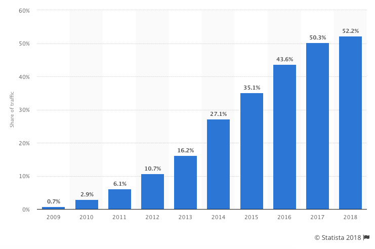
As you can see from this graph, this number continues to grow each year. I expect this trend to continue in the years to come.
This percentage is even higher in some areas of the world. For example, more than 65% of web traffic in Asia comes from mobile devices.
If you’re not optimizing your content and your website as a whole, you’re likely not making the most of your traffic.
Additionally, it may be preventing you from getting more traffic.
Google has made it clear that it wants to serve mobile users mobile-friendly web pages.
Optimizing your website and content for mobile is a must, even though it might seem like another chore to do.
Not only will it help you get more SEO traffic in both the short and long term, but it will also help you with your conversion rates because a smaller percentage of your traffic will bounce.
No matter what industry you’re in or where you’re located, your site needs to accommodate mobile users. How can you do this?
I’m here to explain the top principles of an effective mobile web design. If you can apply these concepts to your mobile site, you’ll benefit from an increase in traffic and more engaged users.
In this post, I’m going to show you the several ways you can optimize content for mobile. I encourage you to put as many of them into effect as possible.
A quick definition of mobile-friendly
I don’t want to jump ahead too far.
If you’re already familiar with what mobile-friendly means, feel free to skip ahead to the next section.
Otherwise, it’s really not that complicated.
As the name implies, mobile-friendly content just means that content appears well not just on desktop computers but also on smaller mobile devices.
That means that the text is easily readable, links and navigation are easily clickable, and it’s easy to consume the content in general.
Let’s begin with a test: It’s important to know where you stand. If your content is already mobile-friendly, you won’t need to do all the things in this post.
There are two main ways that you can test your site for mobile-friendliness.
The first is with Google’s own mobile-friendly test tool, which is something that everyone should use.
Another option is to use a site like this mobile phone emulator, which lets you see what your site looks like on a variety of different phones. It won’t give you a grade like Google’s tool will, but you’ll be able to see if anything shows up weird.
A quick note on responsive design
You’ve probably heard about “responsive” design.
It’s typically used as a synonym for mobile-friendly design although that’s technically not true.
There are a few different strategies to create mobile-friendly websites, and using responsive design is just one of them.
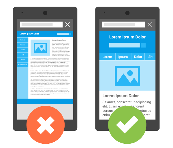
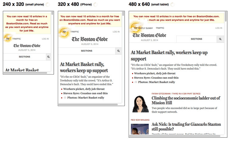
It means that as the screen’s size changes, the content adjusts to match that size:
That being said, responsive design is a clear winner in most situations.
Because of that, some of the tactics I’m about to show you are based on the assumption that you will implement responsive design as opposed to one of the other methods for creating mobile-friendly pages.
Here are 14 tips for making your website mobile-friendly.
1. Install a responsive theme
If you want a quick fix then you can consider changing your theme entirely.
For an established site this probably not best option but if it is a low traffic site, or you are just getting started, then installing a brand new responsive theme is a easy solution.
If you are using WordPress then changing your theme is simple.
Head over to your WordPress dashboard and under ‘appearance’ click on ‘themes’ and then click on ‘install themes’.
Put in ‘responsive’ and hit search.
What this will do is bring up all of the themes in the WordPress database that are responsive, including the responsive theme, which is actually quite nice, and obviously responsive, and they also have hundreds of other themes for you to choose from.
Choose the one that’s best for your site, and that’s responsive, and install it.
Double check that your new theme looks great on all devices, and make sure you still follow the rest of the tips below to ensure everything else is up to par.
2. Simplify your menus
Obviously, mobile screens are significantly smaller than laptop or desktop screens. Keep this in mind when designing your menu options.
The menu of your desktop site can be more extensive and have lots of options. But this complicates things on a smaller screen.
You don’t want visitors to have to scroll or zoom in and out to see all the navigation choices. Everything needs to be concise and fit on one screen.
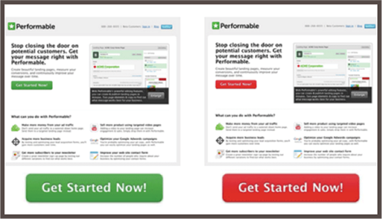
Here’s a great example of this concept applied by Domino’s Pizza:
Take a look at what their standard website looked like on a mobile device before it was optimized. Navigation was nearly impossible.
Users had to zoom in to see the menu to find out how to proceed. If your mobile site is the same, it will crush your conversions.
But look at how simple this menu is on a mobile-optimized site. Dominos was able to simplify its entire website into five menu options.
Each option fits on the screen and has a clear destination. Evaluate your current website, and try to simplify the menu options for mobile users.
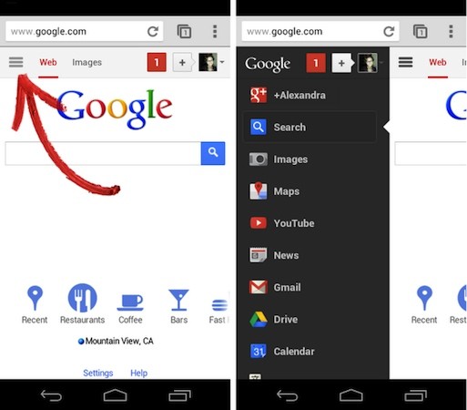
For most websites the typical sidebar is useless on mobile as well.
It gets pushed down to the very bottom of the page and barely ever gets used.
So, unless you can create a fancy sidebar like Google did, it’s probably better to remove it altogether for mobile users.
3. Keep forms as short as possible
Think about all the different forms you have on your website. If you’re asking the visitor for a lot of information, it’s not an effective approach.
Instead, you should change the design to keep your forms short.
Again, if someone is filling out a form on their computer, it’s not as big of an issue because it’s easier to type and navigate on a larger screen. But this isn’t the case with smartphones and tablets.
Evaluate your forms, and ask yourself whether you need each line.
For example, if you’re trying to get users to subscribe to your email list, you don’t need their home addresses and phone numbers.
Forms designed for buying conversions shouldn’t ask the user what their favorite color is. Get their billing and shipping info, and end it.
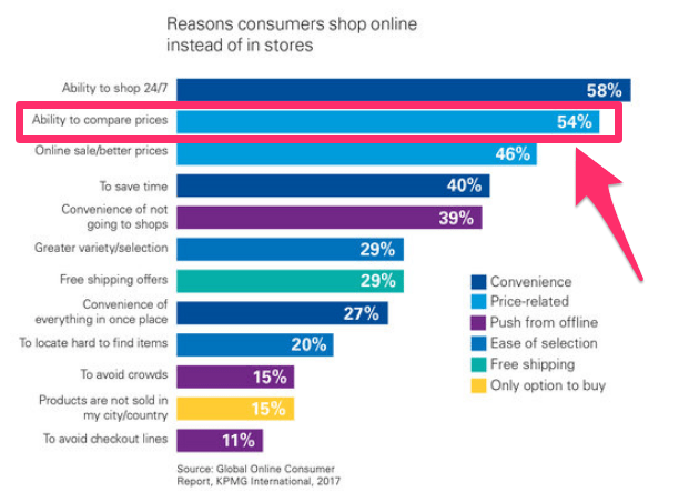
In fact, a long and complicated checkout process is one of the top reasons for shopping cart abandonment:
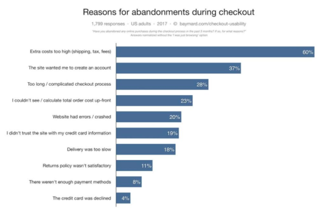
If you want to reduce shopping cart abandonment rates from mobile devices, you’ll need to change the design of your mobile website forms.
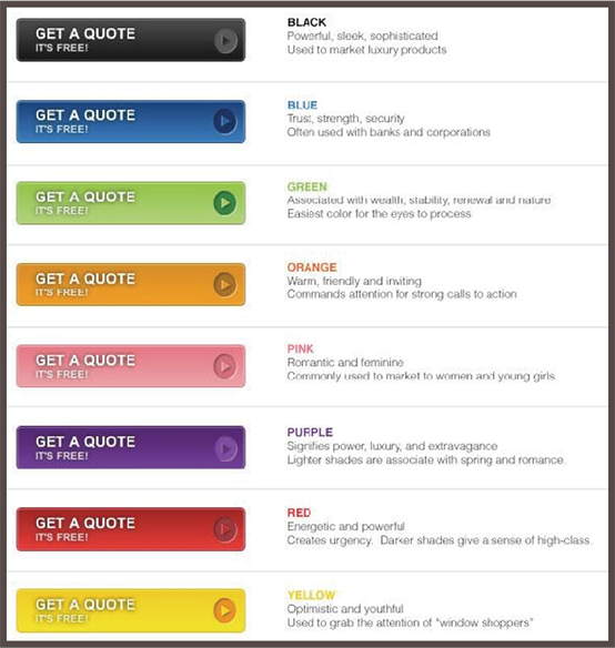
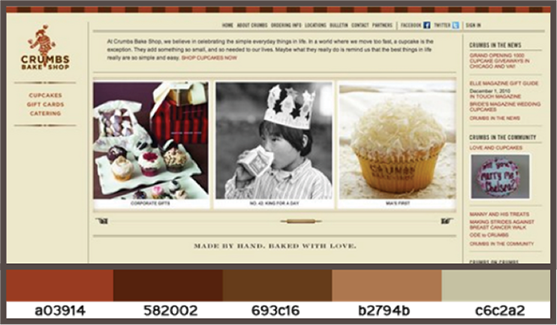
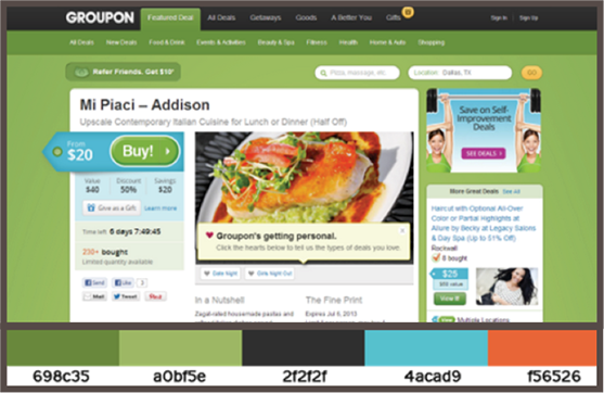
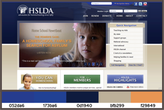
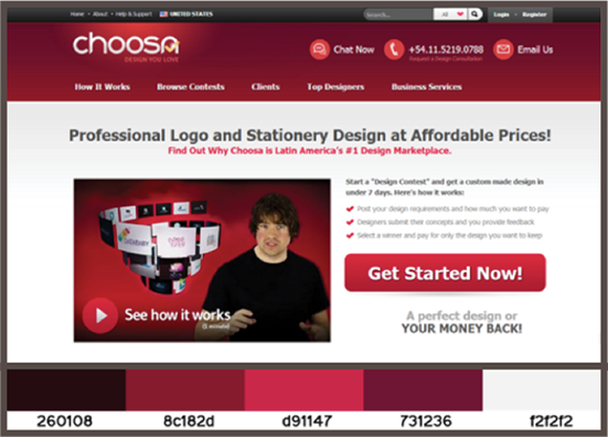
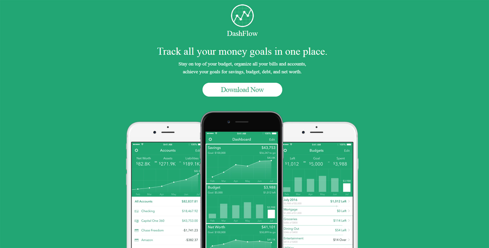
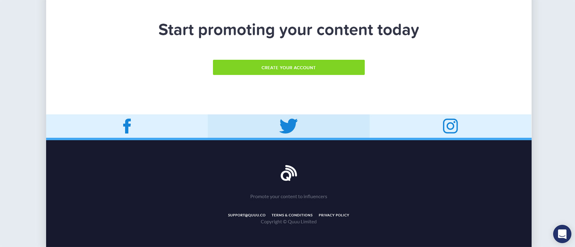
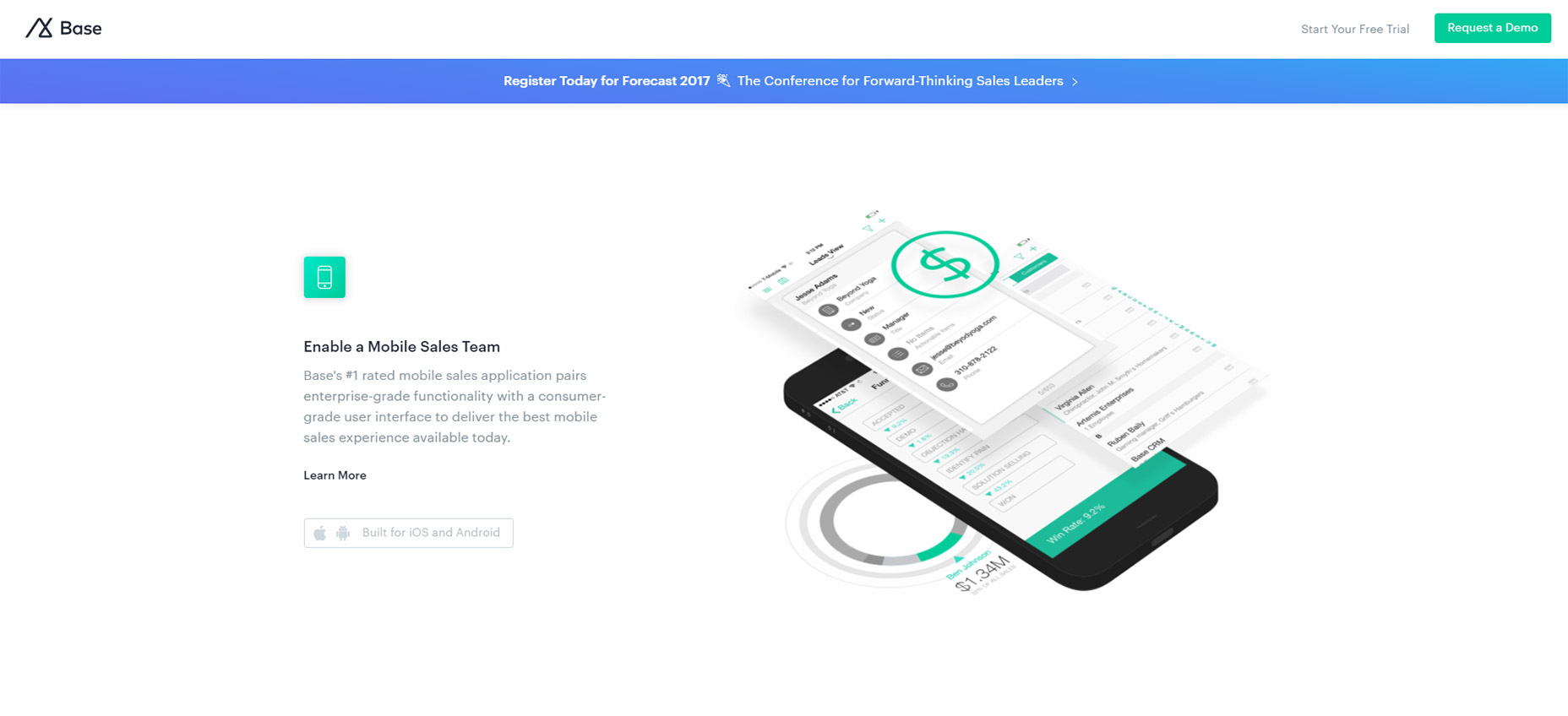
4. Clearly display your CTAs
Let’s continue talking about conversions. To have an effective mobile web design, your call-to-action buttons need to be obvious.
Since we’re dealing with a smaller screen here, you don’t want to overwhelm the user by trying to squeeze more than one CTA on the screen.
Think about your goal for each landing page. Are you trying to get downloads? New subscribers? Increase social media presence? Get visitors to buy something?
Your CTA needs to focus on that primary goal.
Focusing your attention on your CTA buttons will give you an edge over your competitors. That’s because 53% of websites have call-to-action buttons that take users more than three seconds to identify.
That’s far too long. Your CTA should be easy to spot in just one or maximum two seconds.
5. Include a search function
This design principle relates back to what I previously said about your menu options. Right now, some of you may have a menu with 20 or 30 different options.
It may seem impossible to try to simplify those options to fit on just one page. Well, it can be done, especially if you add a search bar to your mobile site.
Encouraging users to search for what they want reduces the need for you to rely on a large and complex menu. Too many options will confuse the visitor and kill your conversions.
This feature for sure needs to be incorporated into the web design of ecommerce sites. Let’s take a look at the home screen of an industry giant Amazon:
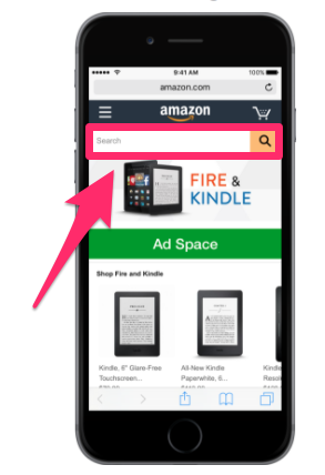
Amazon sells over 12 million products. Take a minute to let that number sink in. I’m willing to bet your website doesn’t sell nearly as many products.
I’m not saying this to make you feel bad. But I want you to realize that if Amazon can use a search bar to help mobile users browse through millions of items, your company shouldn’t have any issues applying the same concept for hundreds or thousands of products.
Implement a search bar to simplify your design and make it easy for mobile users to find exactly what they’re looking for.
6. Make customer service easily accessible
No matter how much time and effort you put into simplifying your mobile web design, people will still have issues.
Don’t worry, it’s all part of running a successful business and website. But the key here is being able to quickly and effectively help your mobile site visitors work through their problems.
Make sure you’ve got obvious customer support information on your mobile site.
Provide your phone number, email address, and social media profiles. Display anything that gives the user an option to contact a representative from your company as fast as possible.
Put yourself in the shoes of a frustrated mobile user who has a question or problem. If they can’t get help from your customer service team, it’ll leave them with a bad impression of your company.
Adding obvious customer support information to your mobile web design is something that can’t go overlooked.
7. Size matters
Navigating a website from a desktop or laptop computer is simple. It’s easy to control a cursor from a mouse or keypad.
But browsing with your thumbs on a 4-inch screen isn’t as easy. Keep this in mind when laying out different elements of your mobile site.
Buttons need to be large enough to be tapped with a finger. Make sure you keep enough space between buttons so someone doesn’t accidentally click the wrong one.
Having to tap the same button several times to make it work will frustrate mobile users visiting your website.
You also need to keep in mind the placement of clickable items on the screen:
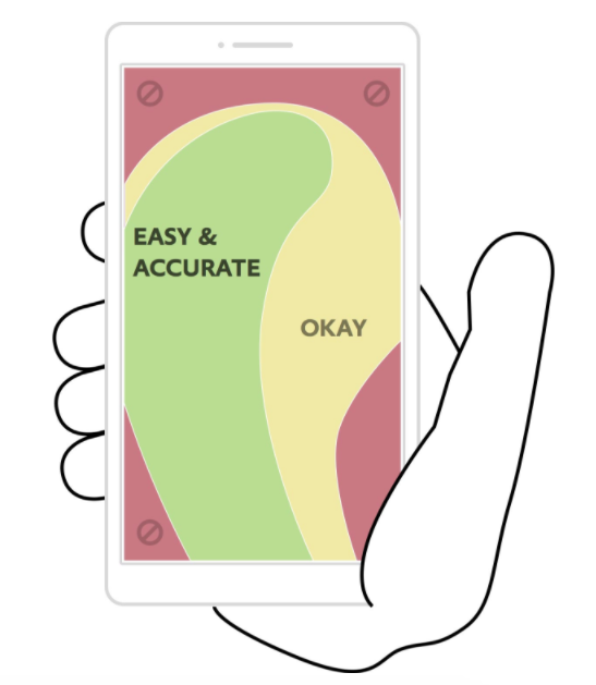
Keep in mind 75% of smartphone users use their thumbs to tap on the screen.
This image shows you the best location on the screen to place buttons. Avoid the corners: it’s hard for a person to reach those places with their thumb while holding a mobile device.
The reach decreases further as the screen size becomes larger. It’s in your best interest to place the most important elements and clickable buttons toward the middle of the screen.
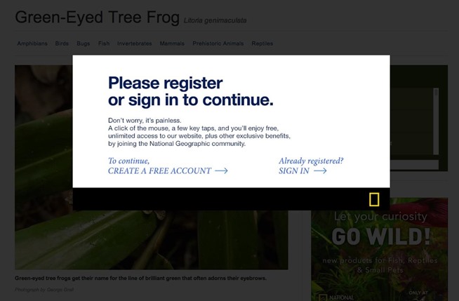
8. Eliminate pop-ups
Get rid of pop-ups on your mobile site. For the most part, people don’t like pop-ups as it is. They are annoying and hinder the user experience.
The problem with pop-ups on mobile devices is they become even more of a nuisance because they are so difficult to close.
Recall that people use their thumbs to tap on small screens. The small “X” button to close a pop-up will be so small on a mobile device that users won’t be able to close the window.
They might even accidentally click on the ad while trying to close it. They’ll get brought to a new landing page, which will ruin their experience.
Sometimes users will try to zoom in on the close button to make it easier to tap, but then the dimensions of the screen get messed up as well.
It’s best to remove these pop-ups altogether. Come up with other ways to promote whatever your pop-up is advertising.
If you do decide to keep a popup on your mobile site then be sure to do a lot of testing.
I’ve certainly experimented with using pop-ups to collect email addresses on my sites, and you should try them on yours as well.
However, you have to be very careful.
Many cheap pop-up tools and plugins look fine on desktop screens but completely ruin the user experience on mobile devices.
They’re often difficult to close, and sometimes you can’t even close them.
Not surprisingly, they cause visitors to instantly close the window.
Other than simply removing the popup on mobile (which is what I still recommend) there are two other solutions to a pop-up problem on mobile devices:
Solution #1 – Simplify them: One solution is to make your forms as simple as possible to fill out (minimize the number of fields) and make them easy to close.
This is probably the worst solution, but it’s still better than sticking with whatever default pop-up you’re currently serving.
Solution #2 – Only use pop-ups when a visitor clicks: This is another great option.
If you’ve heard about content upgrades, you may have already seen it in action.
The idea here is that you don’t use pop-ups that come up after a visitor spends a certain amount of time on your pages.
Instead, you offer them some sort of lead magnet and tell them to click a link to get it. Then, the pop-up will come up and ask for their information.

People are much more receptive to pop-ups in this situation because they’re the ones who asked for it.
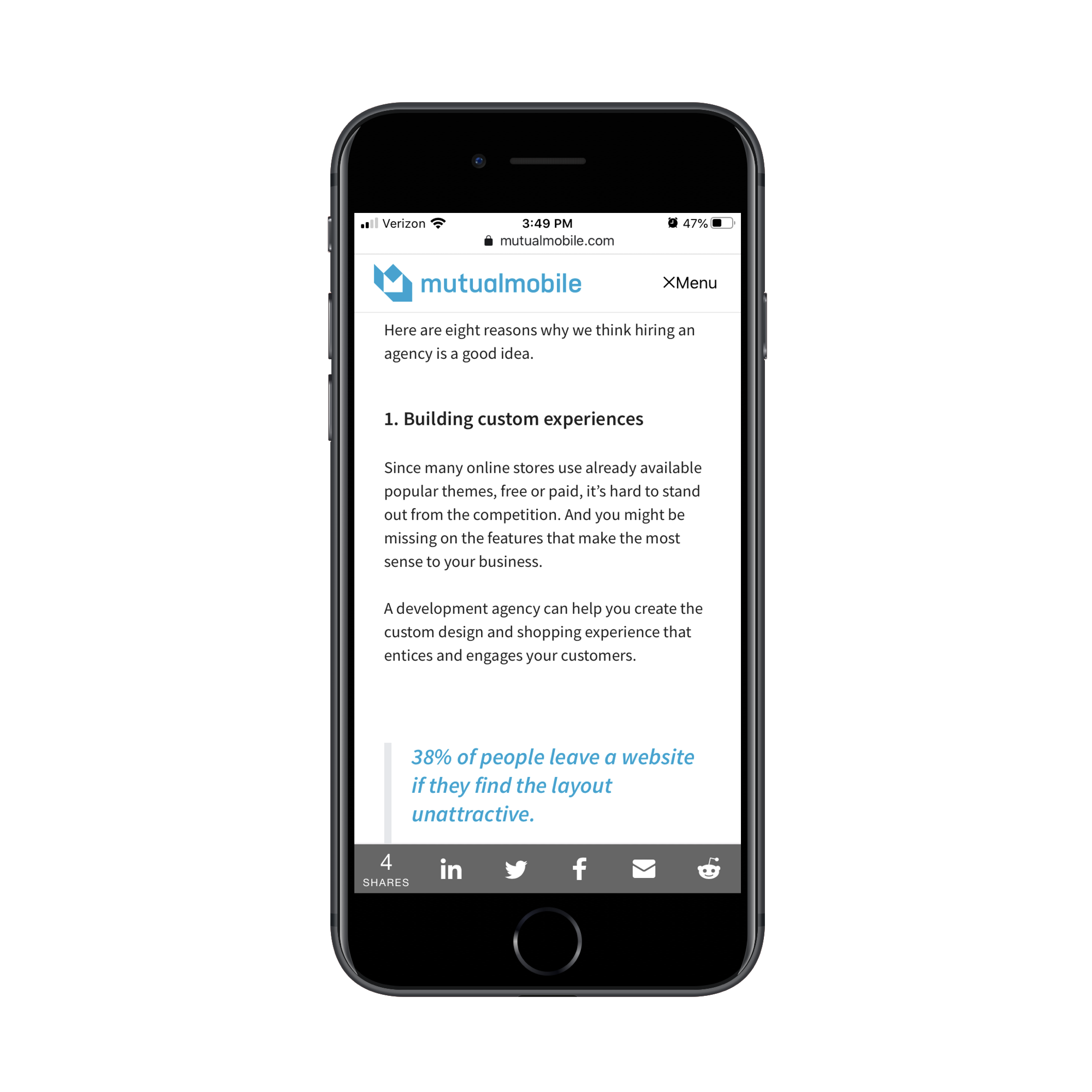
9. Avoid large blocks of text
Reduce the amount of text on the screen of your mobile website. Obviously, you’ll need to use some words to communicate with your visitors, but keep sentences and paragraphs as short as possible.
Large blocks of text are overwhelming and difficult to read. Remember, if a paragraph is two lines long on your desktop site, it might be six lines long on a smartphone.
Take a look at how typography affects conversions:
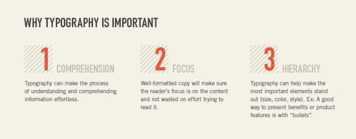
Keep these three elements in mind whenever you’re adding text to your mobile site.
Can the visitor comprehend your message? Where is their point of focus? What is the visual hierarchy?
Eliminating large blocks of text makes this possible.
10. Choose the right font
Let’s continue talking about the text on your mobile site. Picking the right font is a crucial design principle as well.
Fonts need to be clear and easy to read. But you can also use fonts to set two lines of text apart.
You don’t want the text of one line to run into the text of another.
For example, you could use all capital letters and bold font for the headline of a section. Then use regular capitalization rules and non-bold font for the line underneath to show a clear separation.
You’ve got a small space to work with, so you can’t rely on a page break or image every time you want to separate text.
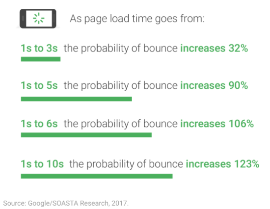
11. Prioritize speed
No matter what changes you implement on your mobile website, you need to keep its speed in mind.
Research shows that 53% of people will abandon a mobile website that takes more than three seconds to load. Take a look at how these bounce rates increase with increasing page loading times:
The best way to keep your page loading time as low as possible is by simplifying your design.
Fortunately, if you follow all the other principles I’ve outlined so far, this shouldn’t be an issue.
Eliminate unnecessary heavy images and flashing lights. Simple websites load faster and have higher conversion rates.
12. Widths should be in terms of percentages
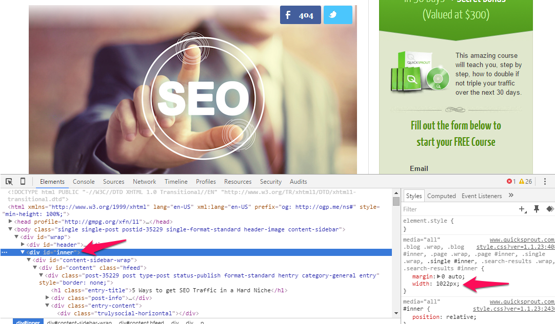
Lets get a bit technical. All HTML elements (e.g., “divs”) have some sort of width assigned to them.
If you right-click any element on a web page and then choose “inspect element” (in Chrome), you’ll see a panel come up.
If you click on an element in the left window of the panel, the corresponding CSS (style properties) values will be displayed in the right window.
You will typically see a value for “width” specified, like this example shows:
This value can be set in terms of pixels (essentially tiny blocks on the screen) or a percentage.
When you assign 50% as a value, that tells the browser to make that element 50% of the width of the screen (or of the section that it’s contained in).
This is a good thing because if the screen is smaller, that section still shrinks to fit half the screen, which keeps things looking how they should.
If you instead specify widths by pixels, the widths of those elements do not change as the screen size changes.
If the width of a section in pixels is bigger than the screen size (common for phones), the user will have to scroll horizontally, which is a pain on mobile devices.
What you should do about widths: If you bought a good theme or hired competent developers, you don’t have to worry about this too much.
However, if you ever design your own landing pages or modify your theme, keep in mind to specify widths as percentages.
If you’ve used pixels in the past, track those down and fix them now.
This is a simple change that will make a big difference.
There is one exception, though. You can specify pixel widths if you know how to use media queries effectively.
What are media queries? Read on…
13. Use media queries to make your site responsive
The real key to using responsive design is to use media queries.
Again, if your site is already responsive, you don’t have to worry about this unless you start creating your own custom pages.
But if the situation comes up, you’d better know how to handle it.
Have you ever wondered how some pages not only resize as the screen size changes but also reshape?
Certain sections might get wider or thinner than before, and other elements may move altogether (navbars and sidebars).
The answer is that the site uses media queries to truly make the site responsive.
Here’s what a basic media query looks like (you can find them in the CSS of some pages):
@media screen and (max-width: 1020px) {
#container, #header, #content, #footer {
float: none;
width: auto;
}
p{ font-size: 2em; }
}
There’s a lot to see here, so let’s break it down into simple chunks.
Right at the start of the line, the media query is labeled with the “@media” tag.
The “screen” part is standard to include and means that the media query will be applied based on screen size.
The most important part is the stuff in the brackets.
You can specify both “min-width” and “max-width.”
In this case, the max-width is 1020px.
This means that when the screen is up to 1020 pixels wide, all the CSS code inside this media query should apply.
The code inside will be given priority over other codes for the specified elements.
Going back to the code, you can see a bunch of normal CSS code inside the outside curly brackets for the overall media query.
You can see that when the screen is under 1020px wide, any elements with an id of “container,” “header,” “content,” or “footer,” will now have “auto” width and a float value of “none.”
Similarly, all text in paragraph tags (p), will have a font size of 2.0 em.
Applying this is simple.
Load your webpage, and then drag a corner to make the screen smaller.
If you notice that certain parts become hard to read at a certain point, create a media query. Change it so that your content elements become larger or smaller, whatever is needed to make the content more mobile-friendly.
Note that you can apply multiple media queries to a page. Just specify a maximum and minimum width, and make sure they don’t overlap.
14. Get ahead of the curve with Accelerated Mobile Pages (AMP)
Accelerated Mobile Pages (AMP) are still HTML pages, but they follow a specific format.
Google has teamed up with a bunch of huge brands to create and support them.
These pages get priority in the search results of mobile users for certain relevant queries.
The whole point of them is that they load really fast for mobile users, which is why Google is encouraging content creators to make them.
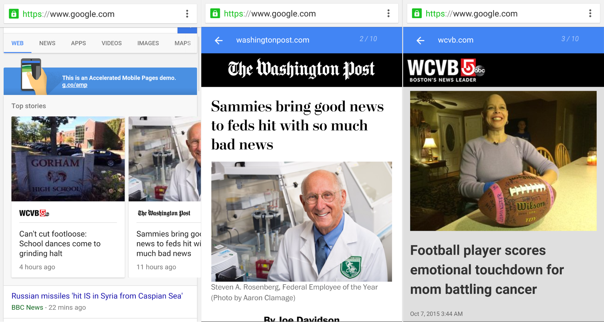
If you’re interested in seeing a demo, use your mobile device, and search for something on https://www.google.com/webhp?esrch=AcceleratedMobilePages::Preview.
Should you create AMP? I can’t give you a definitive answer. On the one hand, they may help get you some extra traffic, but I haven’t experimented with them enough to conclude anything.
The one downside is that you need to maintain two versions of your content. The good news is that it’s easy with WordPress because there’s actually a plugin for that—all you need to do is enable it.
Finally, if you’re interested in creating AMP on your own non-WordPress site, here’s the official tutorial. I’d create my own, but Google’s will always be better.
If you have the extra time and resources, I’d encourage you to test out AMP, but most businesses will be better off to wait a bit and see if they get adopted more widely first.
Conclusion
If you’re not optimizing your content for mobile users, you’re behind the curve and missing out on traffic (and wasting some of your current traffic).
Your website needs to be optimized for mobile users. To do this effectively, you need to understand some important design principles.
Simplify your menu choices, and keep forms short. Make sure your CTAs are clearly displayed, and stick to one CTA per page.
Add a search bar to help improve navigation while clearing up space on the screen. You should make it easy for mobile users to contact your customer service team.
Realize that people are using their thumbs to tap on the screen, so buttons need to be sized accordingly. Get rid of pop-ups as well.
Carefully select an appropriate font that’s easy to read. Eliminate large blocks of text on the screen and follow the rest of the tips in this guide.
No matter what, make sure your mobile site loads as fast as possible.
Follow these top mobile design principles to maximize traffic and conversions on your mobile website.


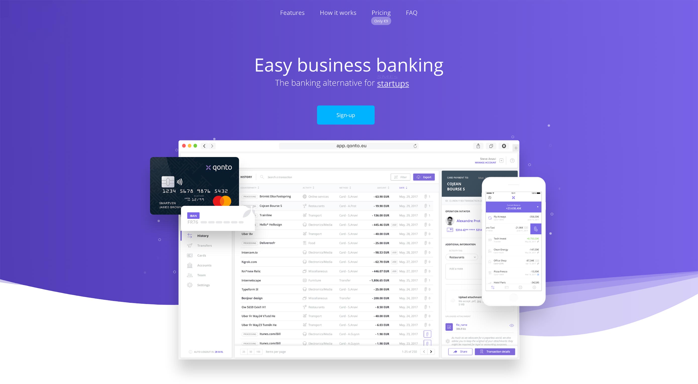
 A call to action (CTA) is nothing but fancy marketing jargon for a button that motivates the user to take a desirable action, leading them down your set conversion funnel. Consider this: you must have at least once, in your life, signed up for some or other subscription service (Spotify, Amazon Prime, etc.) or downloaded […]


 Animated page elements are super common on landing pages and startup websites. But they’re not always talked about in design circles because the idea of “animate on view” isn’t covered a lot.
