How to Make a Google Ad Landing Page in WordPress (The Easy Way)

Do you want to make a landing page for your Google Ads campaign in WordPress?

A Google Ads landing page is optimized to help you reach your campaign’s goals. Creating the right landing page is crucial for getting maximum sales and leads from your Google Ads.

In this article, we will show you how you can make a Google Ad landing page in WordPress including the ability to dynamically change content.

How to make a Google Ad landing page in WordPress

Why Make a Google Ad Landing Page in WordPress?

When someone clicks on your Google Ad, you can redirect them to any page on your WordPress website. This might be a page that already exists on your site, such as your request a quote page, product page, etc.

However, sending those visitors to a generic page could confuse them if it’s not closely related to the ad they clicked on. This can cause visitors to leave your site, and you’ll miss out on those sales.

That’s why many successful website owners create customized landing pages for their Google Ads.

This gives you the freedom to fine-tune the page to help you reach your Google Ad campaign goals. For example, if you want to get more sales then you might add a call to action (CTA) button, a form that accepts credit card payments, and powerful social proof such as customer reviews and testimonials.

No matter whether you want to get more sales, generate leads, or reach some other goal, an effective Google Ad landing page will give you a higher conversion rate.

With that in mind, let’s see how you can easily make a Google Ad landing page in WordPress.

How to Make a Google Ad Landing Page in WordPress

The easiest way to make a Google Ad landing page in WordPress is by using SeedProd. It is the best landing page builder for WordPress.

SeedProd allows you to easily create beautiful landing pages that you can show to anyone who clicks on your Google Ads.

The SeedProd plugin works with many popular third-party tools that you may already be using to get sales and capture leads. This includes top email marketing services, Google Analytics, and more.

The first thing you need to do is install and activate the SeedProd plugin. For more details, see our step by step guide on how to install a WordPress plugin.

Note: There is a free version of SeedProd plugin available on WordPress.org, but we will be using the Pro version since it has more powerful features. It also includes a selection of professionally-designed landing templates that you can use in your Google Ad campaigns.

After activating the plugin, SeedProd will ask for your license key.

SeedProd license key

You can find this information under your account on the SeedProd website and in the purchase confirmation email you got when you bought SeedProd.

After entering your key, go to SeedProd » Landing Pages in your WordPress dashboard.

Create a Google Ad landing page with SeedProd

SeedProd comes with 150 professionally designed templates which are grouped into categories. Along the top you’ll see categories that let you create beautiful coming soon pages, activate maintenance mode, create a custom login page for WordPress, and more.

We want to design a Google Ad landing page, so go ahead and click on the ‘Add New Landing Page’ button.

Making a Google Ad landing page in WordPress

All of SeedProd’s templates are easy to customize, so you can use any of the designs for your Google Ad landing page.

However, many WordPress blog and website owners use Google Ads to get sales, so you may want to click on the ‘Sales’ tab.

SeedProd's ready-made templates

SeedProd will now show all the templates that are designed to help you sell more products and services.

To take a closer look at any design, simply hover your mouse over that template. Then, click on the magnifying glass icon.

SeedProd's landing page templates

This will open the template in a new tab.

When you find a design that you want to use for your Google Ad landing page, simply click on ‘Choose This Template.’

A SeedProd landing page template

You can now type in a name for your landing page into the ‘Page Name’ feld.

SeedProd will automatically create a ‘Page URL’ using the page name. This is the web address where your Google Ad landing page will appear.

Customizing the landing page URL

Even though we’re making a landing page for a Google Ad campaign, it’s still a good idea to fine-tune this page for the search engines.

By optimizing your landing page for SEO, you may get some extra visitors from relevant search engine result pages. To learn more, you can see our ultimate WordPress SEO guide.

With that said, it’s a good idea to include relevant keywords in your URL. You can change the page’s automatically-generated URL by typing into the ‘Page URL’ field.

When you’re happy with the information you’ve typed in, click on ‘Save and Start Editing the Page.’ This will load the SeedProd page builder interface.

This simple drag and drop builder shows a live preview of your landing page to the right. On the left is a menu that shows the different blocks and sections that you can add to your Google Ad landing page.

The SeedProd page builder

SeedProd comes with lots of ready-made blocks that can help you get more conversions, including pricing tables, countdowns, and customer testimonials. You can build an entire Google Ad landing page within minutes using these ready-made blocks.

You can also use SeedProd blocks like spacers, columns, and dividers to help organize and structure your Google Ad landing page. This can help visitors navigate your landing page and find the information they want.

When you find a block that you want to add to the Google Ad landing page, simply drag and drop it onto your template.

SeedProd's Testimonial block

To customize a block, go ahead and click to select the block in the SeedProd editor. The left-hand menu will now update to show all the settings that you can use to customize the block.

For example, if you click on a Testimonials block you’ll be able to change the name of the person quoted and add some new testimonial text.

Creating a Google Ad landing page in WordPress

Images are a great way to catch the visitor’s attention and communicate more of information. For this reason, many of SeedProd’s landing page templates come with placeholder images.

To replace the placeholder content with your own image, simply click on the Image block.

Next, in the left-hand menu simply hover your mouse over the image and then click on the Trashcan icon to delete it.

Creating a Google Ad landing page with SeedProd

Once you’ve done that, there are a few different ways to add a new image to your Google Ad landing page.

Once option is to click on ‘Use Your Own Image.’ You can then either choose an image from the WordPress media library, or upload a new file from your computer.

Adding an image to your SeedProd design

Don’t have an image that you want to use? SeedProd comes with a built-in library of thousands of royalty free stock images that you can add to your Google Ad landing pages.

To see SeedProd’s stock image library, simply click on ‘Use a Stock Image.’

Next, just type in a word or phrase that describes the image you’re looking for and then click on the ‘Search’ button.

SeedProd's stock photo library

SeedProd will now show all the stock images that match your search term.

When you find an image that you want to use, simply give it a click to add the image to your Google Ad landing page.

Adding stock photos with SeedProd's library

Many online store owners use Google Ad campaigns to advertise their products and services.

If you created an online store using WooCommerce, then SeedProd has a number of special WooCommerce blocks that you can add to your landing page, including Add To Cart and Checkout blocks.

These blocks make it easier for customers to make a purchase, which is great for your conversion rates. It also lets you design a Google Ad landing page without being restricted by your WooCommerce theme.

To take a look at these eCommerce blocks, scroll to the ‘WooCommerce’ section in SeedProd’s left-hand menu.

You can now add any of these blocks to your Google Ad landing page.

Adding WooCommerce blocks to a Google Ad landing page

As you’re building your landing page, you can move blocks around your layout by dragging and dropping them. This makes it easy to create a Google Ad landing page with a totally custom layout.

SeedProd comes with ‘Sections’ too. These are rows and block templates that can help you quickly create a nicely organized Google Ad landing page.

You can see all of these sections by clicking on the ‘Sections’ tab.

SeedProd's 'section' templates

From here, you can preview any section by hovering over it. When the magnifying glass icon appears, give it a click. To get more sales, you may want to take a look at sections such as Hero, Call To Action, Features, and Testimonial.

To add a section to your page, click on ‘Choose This Section.’ SeedProd will now add the section to the very end of your Google Ad landing page.

A 'features' section template in SeedProd

Color can be a great way to catch the visitor’s attention, and help reinforce your WordPress website’s branding.

To change the background color of any section, simply click to select that section. Then, click on the little cog icon that appears.

Once you’ve done that, click on the Background Color field and choose a new background color using the popup settings.

Changing your landing page's background color

People typically pay more attention to personalized content. With that in mind, you may get more sales by showing personalized content on your Google Ad landing page.

SeedProd has full support for dynamic text replacement, so different visitors see a different message based on the search term they used to find your ad. For example, if you’re targeting the keywords ‘summer offers’ or ‘Black Friday’ with your ad campaign, then you might dynamically change your heading to include those terms.

To add dynamic text to your Google Ad landing page, simply click on any Heading or Text block. Then, go ahead and click on the Insert Dynamic Text button.

SeedProd's dynamic text settings

In the popup that appears, click on ‘Query Parameter.’

This lets you pass data via the query parameter on your page. For example, you might pass in the phrase ‘Black Friday’ and then show that text in your headline.

SeedProd's query parameter settings

To learn more, please see SeedProd’s guide to dynamic text.

As you’re working on your Google Ad landing page, you can preview your design by clicking on the Preview button. This launches your landing page in a new tab.

SeedProd's 'preview' feature

When you’re happy with how your landing page looks, it’s a good idea to optimize the page’s settings, as this can get you more conversions.

Many landing pages use forms to capture leads and potential new customers.

SeedProd integrates with all of the top email marketing services including Constant Contact, Sendinblue, and Drip.

To connect your landing page to your email marketing service, simply click on the ‘Connect’ tab. You can then hover your mouse over the email marketing service that you use on your website, and click on the ‘Connect’ button when it shows up.

Connecting SeedProd to your email marketing service

SeedProd will now walk you through the process of connecting your Google Ad landing page to your email marketing service.

When you’re happy with how your Google ad landing page is set up, you can click on the ‘Save’ button and then choose ‘Publish.’

Now you simply need to open the ad campaign inside your Google Ads account, and add the URL for the landing page you just created. Once you’ve done that, anyone who clicks on your Google Ad will be redirected to your landing page.

A beautiful, professionally-designed Google Ad landing page can help you reach your campaign goals. However, there is always room to improve your conversion rates.

With that in mind, it’s a good idea to monitor your landing page’s stats to see what’s working and not working. You can then use SeedProd to tweak your landing page’s design, and fine-tune it to get even more conversions.

The easiest way to measure important metrics in WordPress is using MonsterInsights.

It’s the best WordPress analytics plugin and is used by over 3 million websites. To learn more, please see our step by step guide on how to install Google Analytics in WordPress.

We hope this article helped you learn how to make a Google Ad landing page in WordPress. You can also go through our guide on how to add push notifications on your website, or our expert picks of the must have WordPress plugins for business websites.

If you liked this article, then please subscribe to our YouTube Channel for WordPress video tutorials. You can also find us on Twitter and Facebook.

The post How to Make a Google Ad Landing Page in WordPress (The Easy Way) first appeared on WPBeginner.

How Even Small UX Changes Can Result In An Increase In Conversion (A Case Study)

Sunuva is a global fashion brand for kids established in 2007. Today, their products are featured in famous luxury store brands, such as Bloomingdale’s, Harrods, Barneys, Harvey Nichols, and other luxury department store chains. This is a great example of how — after conducting a UX audit — the team and I at Turum-burum established changes based on analytics data that can have significant results.

UX Audit and Support Over the Implementation of Recommendations

Since our customer, Sunuva, already had a development team, our task was to conduct a thorough UX Audit with further support over the implementation of the recommendations.

Turum-burum was hired by the swimwear company to do the following:

  • Perform a thorough site usability audit with each site detail deeply researched;
  • Provide optimal solutions and explanations for the users’ problems;
  • Be on hand to advise the customer’s development team for any further clarifications.

We conducted a thorough audit of the website by using data analytics tools, Hotjar recordings and click maps and data of known user snag points provided by the customer.

The process of the project review consisted of the following three main stages:

  • UX auditing of the website (mobile and desktop);
  • Interviewing business representatives;
  • Providing further support and advice on any further clarifications.

After the audit was completed, we have done the following:

  • Created a document listing the problems for each key page;
  • Prioritized all those issues;
  • Provided a full detailed proposal of amendments with documented examples and indications of how each amendment could improve the user experience.
Key Problems and Recommendations

The analysis of the website metrics showed that the website had engagement indicators, traffic composition, and the conversion rate for both new and returning users along the bounce and exit rate were within the normal range for this segment.

Yet, we found several issues that needed to be addressed, such as the interface mistakes that adversely affected the key metrics and prevented customers from converting. The main points of growth include:

  • Increase the conversion rate on the mobile;
  • Increase the number of views of the product detail pages;
  • Increase the add-to-basket rate on the desktop;
  • Minimize the shopping cart abandonment rate;
  • Increase the checkout completion percentage rate.

The most critical points that we found were the following:

They are all outlined and described in detail below. Let’s dive in!

Catalog Structure

Problem

The catalog structure resulted in the product list containing a wide range of mixed products. In turn, it became more difficult for users to find the products they needed. According to heat maps, users often used filters — size (age) and gender, if it’s not specified in the selected category. Those who have never used a filter had difficulty finding items on the list. According to our analytics data, only 37% of users who viewed the product list found the product they needed, became interested in them, and decided to go to the product details page.

Recommendation

To ease the search for the products, fast tags under the product list with common groups (for example, Boys, Girls, Baby, Kids, Teen; Shorts, Suits, Vests) should be added. Also, it’s recommended to show an expanded list of sizes and gender filters by default, so that users can find them quickly and use them. This should shorten the time needed for the search. In the mobile, the filter button should always stay in a fixed position, while the user scrolls down the page.

Users’ Mistakes

Problem

No error notification would pop up whenever users clicked on the “Add to basket” button without selecting a size beforehand. It made them go back, select a size, and click the button again.

Recommendation

Whenever users don’t select a size and click on the “Add to basket” button, the size list would open automatically, and users tend to shift their focus to it.

Recommendation

It would be better not to show the notification that some amount is missing from free shipping on the checkout page. Adding a progress bar in the basket or adding an info message about free shipping and all the details should work much better.

No Priority In Header Elements And Information

Problem

There was no priority in the information and sufficient differences in the visual accent in the header elements. The incorrect placement of the accent confused many users. This issue ruined the customer experience.

Recommendation

  • Visually separate elements, such as Currency, Wishlist, Search, My Account, and Basket.
  • Place more emphasis on the catalog categories.
  • Align the currency, wishlist, search, account elements, and so on with the logo. It helps users focus on the more important parts of the site and shortens the time to search for the necessary products.

Problem

It was difficult to notice the catalog categories in the burger menu and differentiate them from the info categories. Users had to spend more time finding the necessary category and its items.

Recommendation

It’s better to visually differentiate the catalog categories from the info categories. Make less emphasis on the info categories. It will help users to focus on the product categories and faster find the needed items.

Absence Of “Recently Viewed” Blocks

Problem

There were no blocks or lists with recently viewed items and no quick “Add to basket” button. According to the analytics data, users would be 2.5 times more likely to return than to buy goods during the next session. In this case, they have already seen some goods and may be ready to buy them quicker. Users might not be able to find the items again or spend too much time doing that. This drastically affected the conversion rate.

Recommendation

Show the viewed item list. Add the “Add to basket” buttons on the product list cards, hover on desktop, and fixed on the mobile. It will help users find the products they are interested in much quicker.

Not So Obvious Category Blocks

Problem

Users never clicked on the category blocks, because the labels were too hard to read, and it seemed to block part of the banner. That’s why it was hard for users to find the necessary items quickly and took more time to search for them.

Recommendation

Change the appearance of the title and the blocks. Visually detach them from the banner, so that users know they are clickable and lead to the category listing.

Results of the Work Done on the Sunuva Website

Our team has utilized analytic tools, session recordings, heat maps, and other customer data to execute their tasks and provide recommendations. As a result, our customer has reported an increase in the conversion rate and site traffic after nearly implementing every recommendation.

“Turum-burum’s work drove an increase in the client’s conversion rate and site traffic. Proactive and detail-oriented, they took the time to understand all of the available data to provide optimal solutions and explanations for the client’s problems. They were supportive and transparent throughout.”

Jennifer Tully, E-Commerce Manager, Sunuva
How to Get Started with UX/UI Changes to Increase the Conversion Rate?

These are seven simple steps that you can follow in order to conduct a UX audit on your own that will help you find and eliminate some interface mistakes:

Steps
1. Follow the user’s footsteps. Make a purchase like you are the customer
2. Analyze micro and macro conversions. Using GTM and GA
3. Conduct audience research. What is your target audience portrait?
4. Conduct a technical audit. Is everything working on your website?
5. Check heatmaps and scroll maps. Hotjar and Plerdy could be helpful.
6. Watch session recordings.
7. Analyze feedback. (Hotjar, Survio)

After these steps are taken, establish several hypotheses on how your website could be improved and prioritize them according to their impact on conversion. Following that, start checking these hypotheses with A/B testing or measuring the changes in analytics. This process can be endless.

Converting a user who has already visited your site can cost your business much less than attracting new ones with the help of marketing tools. That’s why you should constantly improve the interface to meet new business goals, new market demand, and new user behavior patterns. If you can’t do this on your own, hire a team of UX/UI experts regularly.

Find Out More About UX/UI Agency Turum-burum

🇺🇦 Turum-burum, a UX/UI and CRO company from Ukraine, has over 12 years of UX/UI experience, and its primary focus is on e-commerce and SaaS projects. They influence key website metrics to increase clients’ revenue with the help of design.

They are Google UX Partners and take part in Retail Development Programs from Google in Ukraine. They cooperate with Baymard Institute, CXL, Hotjar, etc.

If you need any UX/UI or CRO services, check this Turum-burum’s presentation where you can find their contacts.

Form Pages by WPForms – Google Forms Alternative for WordPress

Have you ever tried creating a distraction-free form landing page in WordPress? If so, then you likely realized that it is not easy.

The biggest challenge with WordPress forms until now has been that all form layouts are controlled by WordPress themes, and sadly most WordPress themes do not prioritize form layouts.

This forced a lot of WordPress users to use Google Forms to create standalone forms which isn’t an ideal workflow. Since there wasn’t a perfect Google Forms alternative in WordPress, we created one.

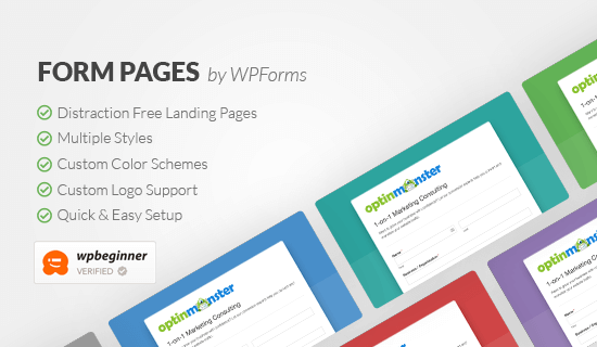
Today, I’m excited to announce the launch of Form Pages by WPForms, a “distraction-free” form landing page builder for WordPress to help you improve your form conversions.

Form Pages by WPForms Preview

Form Pages addon for WPForms allows you to quickly create dedicated form landing pages without hiring a developer or writing any code in less than 5 minutes.

Like everything else in WPForms, we made the process “stupid simple”.

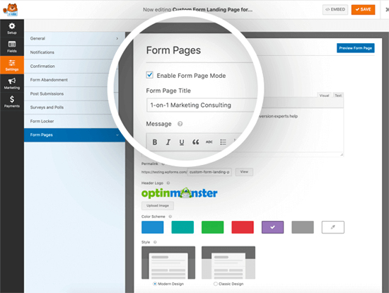
You can create a custom landing page for any of your WordPress forms by simply enabling the “Form Page Mode” from the Form Settings.

Form Pages by WPForms

On the settings page, you can add your logo, custom page title, description, and define the landing page URL.

It comes with two different form styles Modern and Classic. The Classic style will give you the exact same look-and-feel of Google Forms whereas the Modern Design will allow you to bring your form into 2019.

You can combine the form styles with six pre-made color schemes. You can also build a custom color scheme by selecting the main color. WPForms will then generate other colors and gradients to automatically build your color scheme.

Once done simply save your settings, and that’s it.

Your custom form landing page is ready to be shared.

Form Pages by WPForms is the perfect Google Forms alternative for WordPress because it lets you build custom form landing pages and combine it with other powerful WPForms features such as smart surveys, conditional logic, payment integrations, marketing integrations, user registration, form abandonment technology, and so much more.

Form Pages addon is available as part of the WPForms Pro plan.

If you’re serious about improving your form conversions, then you need get started with WPForms Pro today.

Bonus: You can get 50% off WPForms when using the coupon code: SAVE50

Thank you as always for your continued support of WPBeginner and our products. We look forward to bringing you even more powerful solutions in 2019.

Syed and the WPBeginner Team

The post Form Pages by WPForms – Google Forms Alternative for WordPress appeared first on WPBeginner.

Six Conversion-Boosting Web Design Tricks

Even if your website manages to consider all these aspects, it can only deliver so much value if it fails to encourage visitors to take action.

Your website’s conversion rate directly impacts your return on investment, so it’s worth researching and discovering how much your current website encourages its users to take the next step in your business relationship.

If you find that your conversion rates are lower than you want, make some simple tweaks to assure that it’s doing its intended job – bringing in new customers and converting customers to your brand.

The UX Designer Toolbox
Unlimited Downloads: 500,000+ Wireframe & UX Templates, UI Kits & Design Assets


Conversion Rate Optimization: A Primer

We can’t talk about converting visitors without addressing conversion rate optimization (CRO), which is the practice of making improvements to your website in hopes of getting more visitors to take a desired action.

Examples of these conversion actions include filling out a contact form, making a purchase, or downloading an ebook. CRO can involve something as simple as changing the wording or a message on a landing page or changing the color of a button, to something as complex as redesigning the entire hierarchy of your site. At its core, CRO has two goals:

  1. To optimize your site’s data to match the way your user approaches information gathering, and;
  2. To leverage the psychological principles of web design to maximize the chances of continued user interaction.

How Should Businesses Approach CRO?

Now that we have an operational definition of CRO, the next logical question most have is, “How do we make it work for us?”

Conversion rate optimization, like its cousin, search engine optimization (SEO), is an always-evolving multifaceted discipline. What works for one company might not work for another. What makes CRO markedly different from SEO is that it will depend heavily on your market research and desired buyer personas. Your CRO approach will vary from other methods, but generally, it operates on a few principles:

1. Creating a Clear Value Proposition

Often, when a business is facing lackluster conversion rates, it’s because there is no clear value proposition on the homepage. If you optimize your site for search, a new user will come across it looking for a solution to a problem.

Your goal is to convince them, quickly and effectively, that your company is the solution. Businesses often fall prey to the “peacock” trope – they try to fill their homepages with what makes them different and effective, which makes the user (and thus your message) lost.

A better approach is to write a clear, concise value proposition for your homepage. Add this to a clean, simple homepage and an alluring photo, and your user will be encouraged to move on to the next step.

2. Demographic Responsive Design

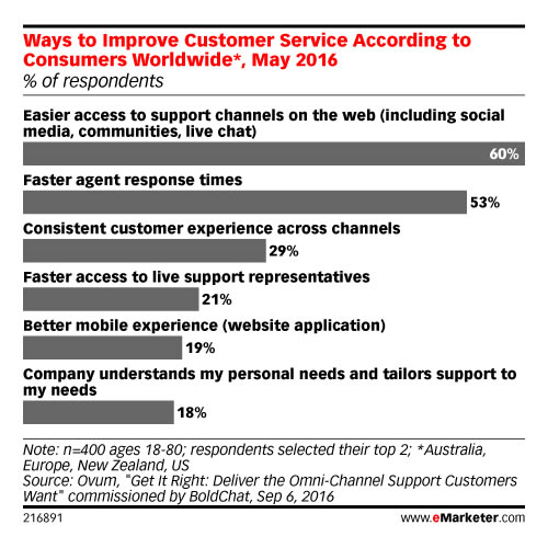
By now, most are familiar with the concept of responsive design and its importance to conversion rates. In case you need a refresher, here is a statistic to whet your appetite: According to the firm eMarketer, more than half the respondents to a recent survey reported they wouldn’t purchase from a brand that offers a poorly designed mobile experience.

In today’s era of data and personalization, our obligation extends far beyond mobile responsiveness. This is where the concept of demographic-responsive design comes into play. We know that each generation has unique qualities – we know millennials as idealists and see Gen Z’ers as being more cynical. With the power of demographic-responsive design, we can accommodate these two dichotomous traits with only a little extra effort.

3. Banish Your Homepage

Is the homepage dead? In today’s world of mobility and personalization, some web designers (and marketers, for that matter) are beginning to think so.

In today’s marketing landscape, the homepage has become less relevant, especially when combined with demographic-based responsive design. Instead of a central homepage, consider creating landing pages indexed by demographics, location, or other relevant metrics.

At its best, a landing page is a one-stop roadmap for your visitor. Provide everything your users need to convert on a tailored landing page, with little navigation required.

4. Make Your Forms Simple

Forms are tedious, and users dread filling them out. This holds especially true in the online sphere, where user attention is diminished even more than in the real world.

Online forms are little more than digital paperwork. Since users already see this as a chore, take steps to minimize the drudgery and create forms that convert:

  • Ask only for information that’s absolutely necessary – with no optional fields. There’s no need to lengthen the process with information you don’t need for a business transaction.
  • If possible and when it makes sense, use predictive text. For example, addresses and locations can often be auto-filled, which reduces some of the user burden.
  • Make your error fields clear. It’s a constant annoyance for users to figure out why their form won’t submit. Strong visual cues and clear instructions will help minimize submission failure and make navigation more intuitive.

5. Revamp Your CTA

If your website is failing to convert, it might simply be because your calls to action aren’t effective enough. A good CTA guides the user to the next step in the business process, telling them they’re on the right track. There might be several reasons your CTA is failing to impress:

  • It’s too confusing. Pack too much into a CTA, and your users might wonder if they’re doing the right thing. Worse, they may become convinced that you’re not what they need.
  • It’s too generic. Learn more. Contact us. Continue. While these CTAS are simple, they don’t offer as much to a user as a more descriptive CTA might. Enticing users to continue is an important aspect of your CTA.
  • They’re too hard to find. You have a well-worded, descriptive CTA, but it gets lost in your webpage. Dominant colors, animated buttons, typography that pops – these are all essential to making your CTA visible. Users shouldn’t have to search for it. Bring the conversion to them.

6. The Argument for Simplicity

In web design, we talk a lot about simplicity and how important it is a site’s success. The reason we harp on this so often is because we’re following a scientific precedent.

Those with a marketing background are no doubt familiar with Gestalt psychology, which aims to explain how our brains maintain order and perception in an otherwise chaotic world. One of the main principles of this discipline is the Law of Pragnanz, or literally translated from German, the law of pithiness. This principle says that we crave order, and thus organize our experiences in the simplest manner possible. Instinctively, we like simplicity because it leaves less room for the element of surprise.

If you want an example of this concept in real life, consider the anxiety associated with a large purchase such as a home or car, which requires reams of paperwork. Contrast that with a website like Amazon, where we can review order history, print return labels, and schedule UPS pickup, even for large purchases or those coordinated through third-party vendors.

We can apply the same scientific principles to boost conversion rates. Simplifying your site in terms of typography, images, and content is a start. Deepen your efforts by simplifying forms and heeding these other tips:

  • Use “engagement bots.” This artificial intelligence tool isn’t exactly new, but we’ve expanded their use. Chatbots can answer questions for customers 24/7, automate the return process, and keep users on track for conversion any time of day or night.
  • Make your shopping carts intuitive. Cart placement, icons, and coloring should all have one focus – to guide a user easily through checkout.
  • Scroll, don’t navigate. Especially on a mobile interface, separate landing pages can be cumbersome. Put all the information a user needs on one landing page and make it scrollable.

Final Thoughts

Increasingly, the internet focuses on user behavior, so understanding your users and the conversations they have is more important than ever. Websites must be more than functional, they must be attractive, with a user experience that focuses on conversion optimization.

Simplicity will always trump pages overloaded with information, as these will confuse your user. To boost your conversion rate, consider using these tips and tricks to tweak your website’s design.