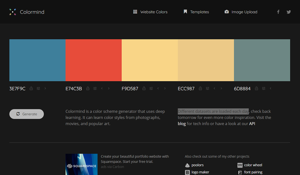
From my experience, most of the colors I see people using in CSS are hex and RGB. Recently, I’ve started seeing more usage of HSL colors, however, I still think that the full potential of HSL is overlooked. With the help of this article, I’d like to show you how HSL can truly help us work better with colors in CSS.
Introduction
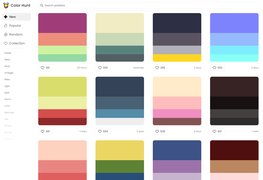
Usually, we use hexadecimal color codes (hex colors) which are fine, but they have a couple of issues:
- They are limiting;
- They’re hard to understand from reading them.
By “limited”, I mean that it’s not easy to alter the color without opening a color wheel and picking a color yourself. Adding on that, it’s not easy to guess what color is from looking at the hex code.
Consider the following figure:

I picked a hex color for a sky blue, and a darker one. Notice that the hex colors are not related to each other. It’s hard to tell that they are both blue but with different shades.
In a real-life scenario, you might need to create a lighter or darker shade of a color to quickly test or validate something. With hex colors, this isn’t possible until you open the color picker.
Thankfully, HSL colors can help us in solving this specific problem, and it opens a lot of possibilities for us.
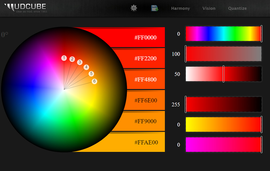
What Is HSL?
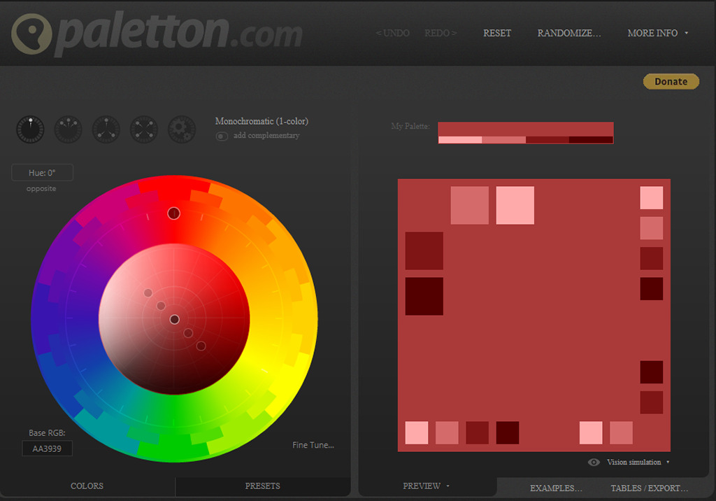
HSL stands for hue, saturation, and lightness. It’s based on the RGB color wheel. Each color has an angle and a percentage value for the saturation and lightness values.

Let’s take an example of the sky blue color that we discussed previously. First, we pick the color like we usually do from a color picker, and we make sure to get the HSL value for it.
Note: I’m using Sketch app, but you use whatever design tool you want.
Consider the following figure:

Notice that the HSL values in there. The first one is the angle, which represents the angle of the color we have. In this case, it’s sky blue. Once we have the angle, we can start tweaking the saturation and brightness as per our needs.

Saturation
Saturation controls how saturated the color should be. 0% is completely unsaturated, while 100% is fully saturated.

Lightness
As for lightness, it controls how light or dark the color is. 0% is is black, and 100% is white.
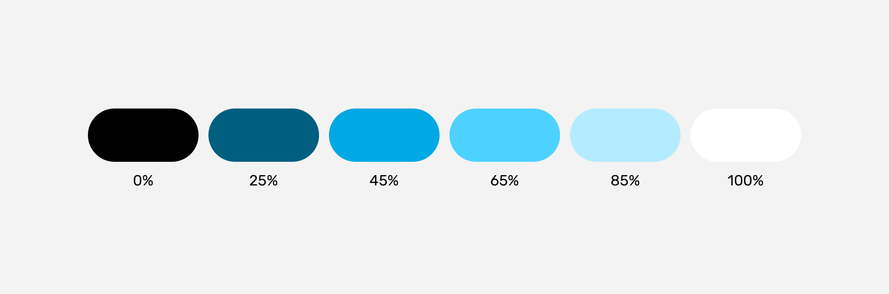
Consider the following figure:
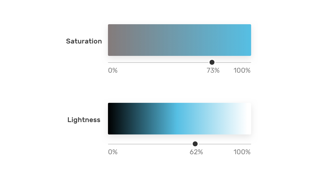
With that, we have three values that are representing color, angle, saturation, and brightness. Here is how we can use the color in CSS:
.element {
    background-color: hsl(196, 73%, 62%);
}
By modifying the color angle, we can get colors that are similar in saturation and lightness to the base one. This is very useful when working on new brand colors as it can create a consistent set of secondary brand colors.
Consider the following figure:
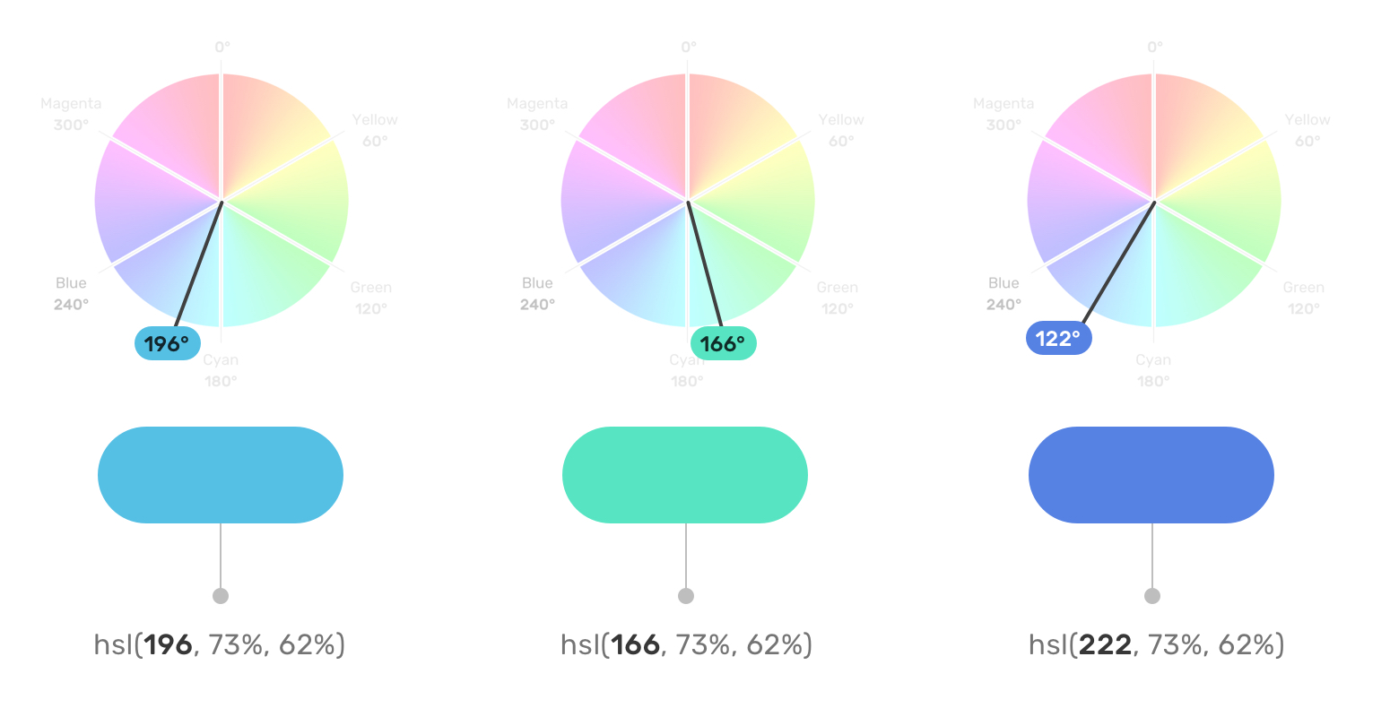
Do you feel that the three colors are related to each other in terms of how the color is saturated, and how it’s dark or light it is? That has been achieved by only changing the color angle. This is what great about HSL colors. It’s more human-friendly to read and edit than any other color type.
Use Cases For HSL Colors
Changing Colors On Hover
When a color in a specific component needs to appear darker on hover, HSL colors can be perfect for this. It can be helpful for components like buttons and cards.

:root {
  --primary-h: 221;
  --primary-s: 72%;
  --primary-l: 62%;
}

.button {
  background-color: hsl(var(--primary-h), var(--primary-s), var(--primary-l));
}

.button:hover {
  --primary-l: 54%;
}
Notice how I combined CSS variables with HSL colors. On hover, I only need to alter the lightness value. Remember, the higher the value, the lighter. For a darker shade, we need to reduce the value.
A Combination Of Tinted Colors
HSL can be handy when we have a design that uses the same color but with different shades. Consider the following design:
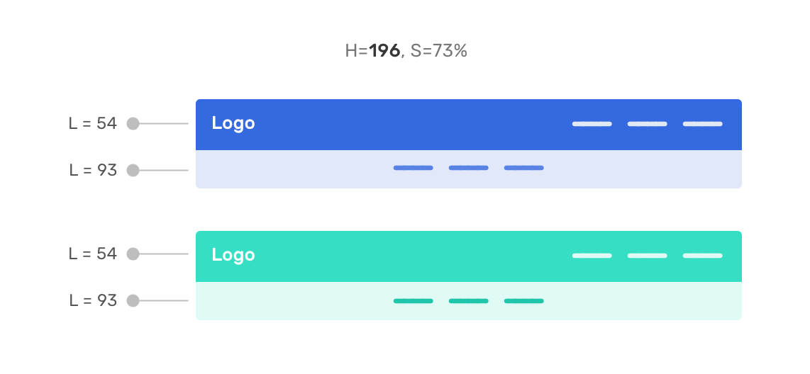
The main header navigation has the primary color, while the secondary navigation has a lighter shade. With HSL, we can get the lighter shade easily by altering the lightness value.
This can be extremely useful while having a UI with multiple themes. I created two themes and switching from one to another only requires me to edit the hue degree.
First theme:
Second theme:
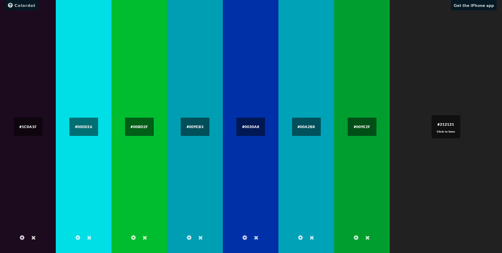
Color Palettes
By altering the lightness, we can create a set of shades for a color that can be used throughout the UI where possible.

This is useful for design systems where designers provide developers with the shades for each color of the brand.
Here is an interactive demo that shows that. The input slider only changes the hue value, and the rest of the shades change based on that.

Notice how the white on the right is too much. We can replace this with a custom white that is derived from a very light shade of the color we have. In my opinion, it’s much better.
Variations Of A Button
Another useful use case for HSL colors is when we have primary and secondary options that are from the same color but with different shades. In this example, the secondary button has a very light tint of the main color. HSL colors are perfect for that.

:root {
  --primary-h: 221;
  --primary-s: 72%;
  --primary-l: 62%;
}

.button {
  background-color: hsl(var(--primary-h), var(--primary-s), var(--primary-l));
}

.button--secondary {
    --primary-l: 90%;
    color: #222;
}

.button--ghost {
    --primary-l: 90%;
    background-color: transparent;
    border: 3px solid hsl(var(--primary-h), var(--primary-s), var(--primary-l));
}
Tweaking the primary button variations where fast and can be extended more for broader usage. Changing the hue value will change all the buttons’ themes.
Dynamic Washed-Out Effects
In some cases, we might need a gradient to have a very light shade of the other color stop. With HSL, we can use the same color but with a different lightness value for the second one.

.section {
  background: linear-gradient(to left, hsl(var(--primary-h), var(--primary-s), var(--primary-l)), hsl(var(--primary-h), var(--primary-s), 95%));
}

.section-2 {
  --primary-h: 167;
}
The gradient starts from the right with a solid color and then fades out to the lighter shade. This can be used for a decorative hero section, for example.

That’s all with the use cases. I hope that you learned something new and useful.
Conclusion
HSL colors are very powerful when we use them the right way. They can save us time and effort and even help us to explore options for how to apply color to design.


