I think those classifications are handy, and help conversations along. But there is a point where nuance is necessary and these classification buckets get a little leaky.
Note, these charts are just intended to paint a spectrum, not to be a comprehensive list of services.
Headless CMSs
A Headless CMS is a CMS that provides an admin area for creating and editing content, but offers no front-end to build the website from. All the content is accessed via APIs.
Imagine WordPress, which has an admin area, but it also has themes from which you build the website from on the server-side, with all kinds of PHP functions for you to use the content data. All that theming stuff is the "head". So a headless CMS would be like WordPress with just the admin area. And indeed you can use it that way, as it offers APIs.
There is even more nuance here, as there are services that offer an admin area, but don't actually store the data for you. Plus there is CMSs that are hosted for you, and CMSs where you have to bring your own hosting. Let's have a peak.
This is tricky to talk about because literally, any web host will host static files, and probably do an OK job of it. I think it's most useful to consider hosts that only do static hosting on purpose because it means they can optimize for that situation do other useful things.
Sometimes you'll see people trying to use stuff like Dropbox or Google Drive to do static file hosting (for a website), but I've found these services generally ultimately don't like that and prevent the use for that. If it works today, fine, but I wouldn't count on any of them long term.
Static Site Generators
You would think this category would be straightforward, without much spectrum. A static site generator takes input and makes statically generated pages that can render without, say, needing to hit a database. But even here there is a spectrum.
The language the generator is in kinda matters. It affects speed. It affects installability on different local platforms. It affects your ability to write code to extend it and hack on it.
But perhaps more importantly, not all static site generators are only static site generators. Some can be run on the server as well, weirdly enough. And there are some that kinda look like static site generators, but are more correctly classified as flat-file CMSs.
Gatsby is truly a static site generator, but generally, the sites "hydrate" into SPAs, but remain static (nothing server-rendered). Big ecosystem of plugins to help with connecting data sources, handling images, etc.
There are all these sites out there that want to help you with your images. They do things like optimize your images and help you serve them performantly.
That's a very good thing. By any metric, images are a major slice of the resources on websites, and we're notoriously bad at optimizing them and doing all the things we could to lower the performance hit from them. I'm sitting at a conference right now and Dave just bet everyone in the audience $100 that he could find an unoptimized image on their site. I wasn't about to take him up on it.
So you use some service to help you deliver images better. Smart. Many of them will make managing and optimizing images a lot easier. But I don't consider them a no-brainer. There is a lot to think about, like making choices that don't paint you into a corner.
I should be able to upload images from my own CMS.
I don't want to go to your site to upload my assets. I want to use the media management in my own CMS. So, the service should have an API at a minimum, and possible even officially maintained CMS plugins.
This site uses WordPress. I can drag and drop images into the media library and posts very easily. I can search my media library for images I've uploaded before. I like that, and I want to take advantage of it today, and as it evolves.
The images should be uploaded to my own server.
If it also has to be uploaded to the image service, that's fine. But it should go to my server first, then to the service. That way, I still maintain ownership of the source file.
Images within content should use functional, semantic markup in my CMS.
I'd prefer that the images within content are stored as totally functional HTML in my database:
<img src="/images/flower.jpg" alt="a blue flower">
It could be fancier than that, like using srcset (but probably not sizes as that will change as the design changes), or be contained within <picture> or <figure> elements... whatever you like that makes sense as semantic HTML. The most important thing being that the content in my database has fully functional HTML with a src on the image that points to a real image on my real server.
The implementation of the image service will involve filtering that HTML to do whatever it needs to do, like replace the URLs to generate fancier responsive image markup and whatnot.
Between having functional HTML and images on my server, that enables me to turn off the image service if I need to. Services have a habit of coming and going, or changing in ways that make them more or less palatable. I don't want to be locked-in; I want freedom. I want to be able turn off the service and have a perfectly functional site with perfectly functional images, and not be obstructed from moving to a different service — or no service at all.
Even if I didn't use the service in the past, I want all my images to benefit from it.
I just mentioned filtering the HTML for images in my database. That should happen for all the images on my site, even if they were uploaded and used before I started using the image service.
This probably means the services offers a URL-based "get" API to optimize images on-the-fly pulled from their canonical locations.
I shouldn't have to think about format or size.
I want to upload whatever I have. Probably some huge un-optimized screenshot I just took. If I think about it at all, I want to upload something much too big and much too high-quality so that I know I have a great original version available. The service will create optimized, sized, and formatted images as needed.
I also want to upload SVG and have it stay SVG (that's also optimized).
The images will ultimately be served on a CDN.
CDNs are vital for speed. Australians get images from servers hosted in Australia. Canadians get images from servers hosted in Canada. The servers are configured to be fast and cookie-less and all the fancy over-my-head things that make an asset CDN scream.
The images should serve in the right format.
If you serve images in WebP format to browsers that support it, you'll probably get as much or more performance out of that optimization than serving re-sized images with responsive images syntax. It's a big deal.
I want the service to know what the best possible format for any particular image for any particular browser and serve the image in that format. This is going to change over time, so I want the service to stay on top of this so I don't have to.
I know that involved formats like JPEG-XR and JPEG-2000 three years ago. Is that still the case? I have no idea. This is a core value proposition for the service.
It should optimize the images and handle quality.
This is perhaps the most obvious feature and the reason you reach for an image service in the first place. Images need optimization. There are perhaps dozens of image optimization tools/algorithms that aim to squeeze every last byte out of images. The image service probably uses those or even has its own fancy tech for it. Ideally, the default is to optimize an image the most it possibly can be without noticeably hurting the quality, but still allowing me to ratchet it down even more if I want to.
Don't shame me for using high-pixel density images.
A lot of image services have some sort of tester tool where you drop in a URL and it tells you how bad you're doing with images. Many of them test the size of the image on the rendered page and compare the dimensions of the original image. If the original image is larger, they tell you could have had savings by sizing it down. That's obnoxious to me. High-pixel density displays have been around for a long time and it's no crime to serve them.
It should help me serve the right size for the device it's on and the perfect responsive syntax if needed.
Not all images benefit from the same responsive breakpoints. Check out the site Responsive Image Breakpoints. It generates versions of the image that are best depending on the image itself. That's the kind of help I like to see from an image service. Take something hard and automate it for me.
I know I'll probably need to bring my own sizes attribute because that is very dependant on my own CSS and how the design of the site plays out. It's still important, and makes me wonder if an image service could step up and help me figure out what my optimal sizes attribute should be for certain images. Like loading my site at different sizes and seeing how large the image renders with my CSS and calculating it from there to use later.
Just me.
This is just my own list of requirements. I feel like it's fairly reflective of "normal" sites that have a bunch of images and want to do the right thing to serve them.
I didn't go into all the fancy features image services offer, like being able to tell you that an image contains a giraffe facing west and hasn't eaten since Thursday while offering to recolor its retinas. I know those things are vital to some companies. This is more about what seems to me the widest and most common use case of just hosting and delivering images in the best way current technology allows.
(This is a sponsored article.) Managing the deployment of a website used to be easy: It simply involved uploading files to the server through FTP and you were pretty much done. But those days are gone: Websites have gotten very complex, involving many tools and technologies in their stacks.
Nowadays, a typical web project may require to execute build tools to compress assets and generate the deliverable files for production, upload the assets to a CDN and invalidate stale ones, execute a test suit to make sure the code has no errors (for both client and server-side code), do database migrations (and, to be on the safe side, first execute a backup of the database), instantiate the desired number of servers behind a load balancer and deploy the application to them (through an atomic deployment, so that the website is always available), download and install the dependencies, deploy serverless functions, and finally notify the team that everything is ready through Slack or by email.
All this process sounds like a bit too much, right? Well, it actually is too much. How can we avoid getting overwhelmed by the complexity of the task at hand? The solution boils down to a single word: Automation. By automating all the tasks to execute, we will not dread doing the deployment (and having a trembling sweaty finger when pressing the Enter button), indeed we may not be even aware of it.
Automation improves the quality of our work, since we can avoid having to manually execute mind-numbing tasks again and again, which will enable us to use all our time for coding, and reassures us that the deployment will not fail due to human errors (such as overriding the wrong folder as in the old FTP days).
Introduction To Continuous Integration, Delivery, And Deployment
Managing and automating software deployment involves both tools and processes. In particular, Git as the version control system where to store our source code, and the availability of Git-hosting services (such as GitHub, GitLab and BitBucket) which trigger events when new code is pushed into the repository, enable to benefit from the following processes:
Continuous Integration The strategy of merging changes in the code into the main branch as often as possible, upon which automated tests against a build of the codebase are run to validate that the new code doesn’t introduce errors;
Continuous Delivery An extension to Continuous Integration which also automates the release process, enabling to deploy the project into production at any moment;
Continuous Deployment An extension to Continuous Delivery which automatically deploys the new code whenever it passes all required tests (as small a change it may contain), enabling to easily identify the source of any problem that might arise, and removing pressure off the team as it doesn’t need to deal with a "release day" anymore.
Adhering to these strategies has several benefits. The most immediate one is that our product can ship new features faster, indeed they can go live as soon as the team has finished coding them. The team can also receive feedback immediately (either from team members on a development environment, from the client on a staging environment, and from the users after it goes live) and be able to react straight away, thus creating a positive feedback loop. And because the whole process is fully automated, the team can save time and focus on the code, thus improving the quality of the product.
Continuous delivery enables getting feedback as early as possible. (Large preview)
Introducing Buddy, A Tool For Automating Software Deployment
The popularity of Git has given rise to a new generation of tools to manage the complexity of software deployments. Buddy is one of these new tools, born with the goal of making it easy to implement Continuous Integration/Delivery/Deployment, while broadening the number of features our application can provide, improving its quality, and reducing its costs by allowing to incorporate the offerings of the best or cheapest cloud-based service providers (among them AWS, DigitalOcean, Google Cloud Platform, Cloudflare, Rackspace, Azure, and others) into our stacks. This way, for instance, our application can be hosted on GitHub, be protected from DDoS through Cloudflare, have its static files hosted through DigitalOcean, use serverless functions from AWS Lambda, and authenticate users through Firebase, and everything is handled seamlessly.
Buddy operates through the use of pipelines: Sets of actions defined by the developer in a specific order, executed either manually or automatically when executing a Git push, that deliver the application from a Git repository to wherever needed and transforming it as required. Pipelines are extremely flexible, enabling developers to add only the required actions and have them customized for their specific needs.
For instance, the following pipeline performs all required tasks to deploy some Node.js application: execute the build step, upload files to the server through SFTP, upload assets to AWS S3 and purge them from the CDN, restart the server and finally inform the team through Slack (as it can be appreciated in the image below, the pipeline can be self-explanatory):
An example of a pipeline to deploy a Node.js application. (Large preview)
We can create different pipelines for different environments, and execute special actions when the process fails (such as when a test was not successful when the server to deploy to is down, or others). For instance, the following pipeline (to deploy a Node.js & PHP app that uses DigitalOcean, Fortrabbit & AWS CloudFront for hosting) makes a backup of assets and purges the CDN only when deploying to production, and sends a notification to the team through Slack in case of failure:
Pipeline configured for different environments. (Large preview)
A noteworthy effect of configuring our pipelines with actions from different cloud-service providers is that we can conveniently switch among them whenever the need arises, making it easy to avoid vendor lock-in (this includes also changing the repository provider). Buddy offers slightly over 100 actions out of the box, and also allows developers to create and use their own actions. This image shows all the readily available actions:
Let’s see how to create a simple pipeline to test and deploy a Node.js application, and send a notification to the team. The first step is to create a new project, during which you will be asked to select the project’s hosting provider (from among GitHub, GitLab, Bitbucket, Buddy Git Hosting, and your private Git server), and then to select the repository:
Then we can create the pipeline, specifying when it must run (either manually, automatically after new code is pushed to the repository, or automatically every x amount of time) and from which branch:
Then we can add actions to the pipeline. For that, we simply click on the “+” button to add a new action, upon which we must configure it as needed. To build and test a Node.js application we add and configure a “Node.js” action:
After testing the application, we can deploy it by uploading it to our production server through SFTP. For this, we add an “SFTP” action, and configure it through custom-defined environment variables ${SFTP} and ${SFTP_USER}:
From this moment on, if the pipeline was configured to run when new code is pushed to the repository, doing a git push will trigger the execution of the pipeline.
Staying Constantly Up To Date
Web development is in a never-ending state of flux, with new tools and services being launched without a break, some of them often becoming a hot trend immediately and the new normal barely a few months later. Technologies seldom heard of a few years ago progressively gain importance and eventually become a must (voice search, machine learning, WebAssembly), new frameworks and libraries offer new ways of building sites (GraphQL, Gatsby, Next.js, Nuxt.js), and our applications need to be accessed from newly-invented devices (Amazon Echo, In-car systems). To keep our applications relevant, we must continuously evaluate the latest offerings and decide if to add them to our technology stack. Hence, it is extremely important that our platforms for developing the application do not restrict what technologies we can use.
Automation has become a must to avoid being overwhelmed by the complexity of modern website deployment. We can make use of Continuous Integration/Delivery/Deployment (readily feasible by hosting our source code through Git) to shorten the time needed for delivering new features into our applications and getting feedback from the users.
Buddy helps in this task, enabling developers to create pipelines to execute actions concerning a wide array of technologies and cloud-service providers, and combining these actions in any possible way to satisfy the most particular needs.
On July 3, users across the globe came to a standstill when they weren’t able to load photos on both Facebook and Instagram. Likewise, users of Facebook-owned WhatsApp weren’t able to send images or videos.
If Facebook was a standalone CDN, it would probably be in the top three CDNs in the world because of the sheer number of assets and traffic. Running the CDN infrastructure and networks at Facebook cannot be a small task.
Smush is already the Coca-Cola of image optimization (even her competitors call image optimization Smushing). And now there’s even more to love; more compression (5MB!) for free with better 50-image-smushing alongside a CDN upgrade and expanded 3rd-party support for Smush Pro users.
She’s the true standard for making all the images in your WordPress media library fast, clear, and stunning.
It’s no wonder she’s trusted to optimize nearly 350 images per second, that’s 30 million images per day and 35.9 billion images as of this post going to press. But who’s counting ;)
This year brought the most significant upgrades to our heroic optimizer.
And, Automatic Image Resizing (for our pro members)
New Features For Free & Pro Users
With the free version of Smush, every image you upload is automatically optimized with her award-winning lossless compression improving PageSpeed, making more space on your servers, ranking you higher in Google and saving you time and money.
And as you know we’re big fans of making things as free and open as possible and with your feedback, we’ve found two new opportunities to give everyone a chance at more savings.
We’ve upped our free compression for images from 1MB to 5MB
Smush free now optimizes 50 images at a time even more smoothly than it did before with a nice UX upgrade
In addition, WPMU DEV members will find more fine-tune controls across their Smush Pro interface including a bolstered CDN and upgraded Lazy Loading.
For example:
Toggle control over which thumbnail sizes to compress with the custom image size selector
Lazy Load can now be turned off for specific post types and now individual images by class
Want to restore the uncompressed versions of all your images? Smush now has a bulk restore option
We upgraded how images are detected and processed to improve performance all around
We’re constantly working to ensure Smush is the right choice for every setup. With this release Smush gets upgraded compatibility with Revolution Slider and 3rd-party Lazy Loading Support together with improved compatibility for WPBakery Page Builder, ACF, SiteGround, GoDaddy and Bluehost
So let’s dive in and see how the new features in Smush 3.2.1 are extending your advantage when it comes to image optimization for on your WordPress websites.
Compress any Image up to 5MB Absolutely For Free
Smush has always offered everyone free and unlimited compression on any 1MB or smaller image. Talk about big-time resource savings for millions of users across billions of images.
Today we’re giving everyone an upgrade! A 500% upgrade! Now you can Smush any image up to 5MB using her secure and powerful servers. That should cover not only your thumbnails but just about any file you send her way.
Do it Bulk and Undo it Bulk
Now to resolve a hot ticket and give our members something to smile about by introducing a much requested feature to the Pro version… bulk undo!
If you’ve ever wanted to undo Smush compression on one or two images it’s not a huge deal but for a cluster of images or your whole image library, it can be daunting. Not anymore. Now Smush comes with the option to bulk revert your images to the default WordPress compression.
Automate by Thumbnail Size
Did you know when you upload a single image to your site, by default, WordPress creates 3 file sizes? Depending on what theme or plugins you use this can quickly jump to 5 or 10 images? Think about it, when you upload 3 images WordPress may actually generate 30 different image files… and each one of those image files can be optimized automatically by Smush.
But we’ve taken Smush automated optimization control a step further.
Now you can set what size thumbnails to include or exclude from being compressed. Nice!
Maybe your managing a photoblog and you want all the small and medium images optimized but need to exclude a large full-res preview version that is uncompressed and preserves all the meta-information. Now you can.
In the settings section of the Bulk Smush module switch image sizes from All to Custom. Then choose the file sizes you want to exclude from automatic Smush. For most users the default All is perfect but if you run into special use cases now you have the power to choose.
When you want to smush a lot (or only a few) image sizes
This important and awesome new feature came with the ability to choose what pages you wanted to Lazy Load. Now you can actually set what specific images you want to Lazy Load.
In the Lazy Load module, under the Include/Exclude setting scroll to Classes & IDs and your image ID.
In the block editor, you can give your images custom classes by spinning open the advanced setting of your image block and giving it a class. So much power!
She’s got the power, dodododup!
It’s the Little Things (and the Big Things)
With 45+ new features, improvements and bug fixes the little things can tend to get overshadowed but we’ve worked really hard on both the big ticket items and the smaller upgrades to our user experience, performance, and 3rd-party compatibility.
It’s the things that make everything run smoother and are never noticed when “they just work”… and that is Smush – it just works.
In September 2018, I was just a few months into my journey of learning web development. As I'm sure is the case with many new developers, it was a big task for me to learn not only the basic skills required, but also keeping current with the fast-moving industry. Just as I was getting to the level where it felt as though I could build a simple website, I started to realize that it was only the first step.
Opening up a few HTML pages stored locally on my laptop felt like a million miles away from being able to say to someone, "Hey, check out my website, live on the actual internet!"
But I did it! And the best part is that it wasn't as scary, difficult or expensive as it first felt like it'd be.
It all started with me sending Chris an email, which he used to write an awesome article explaining everything in plain English.
At this point, I didn't have a fully coded website — just an idea for a basic site that I was using to teach myself as I went along. I used the ongoing progress of my site as a push to learn how to get a live website quicker. But I'm sure you could do the whole thing with an HTML document that just says "Hello, world!"
I built my site using Gatsby, a static site generator powered by React. Building a website with these tools in a modular way felt really natural to me. The concept of reusable parts is something I’m familiar with in my career as a physical product designer and mechanical design engineer. It means that you can build in stages, like Lego, brick-by-brick, until you eventually have a life-sized castle you can invite your friends to visit!
This isn't a guide. It's my personal experience in the process of getting a website from my laptop to being live on the internet. Hopefully it'll give you some hope that it's possible and achievable, even by someone who has no formal training in web development and who has only been doing it for 12 months!
Domain registrars
Before I ever bought a domain, it seemed like a pretty serious thing to do. Owning a domain means being responsible for it. People will go to that address and eventually see content that you've put there.
I don’t know if everyone has the same experience, but I spent weeks deciding on a domain name before going for it. It almost became an obsession of mine for a while, searching online for acronym generators to try and be clever, spending hours on dictionary.com trying to find synonyms that were cool. In the end, I settled for my name and what I do: joshlong.design. I still smile a little when I see my name in the address bar.
Since reading Chris' article, I've actually bought two domains from two different providers: a .com and a .design. I realize that I went against Chris' advice of consolidating domain names at a single registrar, but I needed to shop around a bit to get a good deal on my .design domain. I only own two domain names — and one of them I don't actually have any plans for just yet — so keeping on top of where I bought them isn't a task. In fact, I don't remember the last time I needed to login and manage the domain I use on a daily basis!
Buying a domain name was as simple as any other online shopping transaction. Nothing really huge or scary about it. I bought my .com through Namecheap, and my .design through Google Domains, and the process was pretty similar for both. All they needed was my name, address and payment details. Pretty standard stuff!
I don't remember Google trying to sell me a load of extra packages. They seemed happy with me just buying a domain, though they did offer me free WHOIS protection which I snapped up because I didn’t want my contact details freely available for anyone who’s feeling nosey. However, as Chris warned might happen, the other registrar I went through tried really hard to sell me some extras like hosting, email, a VPN (whatever that is!) and SSL certificates.
Google Domains checkout is happy just to sell the domain name.Namecheap tries to sell you all the additional services they offer before getting to the checkout.
I didn't go for any of those extras. I already had a hosting plan, and you can use an alias through Gmail to "fake" having a me@mycoolsite.com email address. I honestly have no idea why I'd need a VPN, and the hosting I was going to go for gave me a free SSL certificate through Let's Encrypt. So just the domain name, please!
Hosting
As Chris suggested it would be, choosing a host was a tad trickier than choosing and buying a domain name. But in the end, the web technology I used to build my site kind of guided me in a particular direction.
My site is built with Gatsby, which means it outputs straight-up static assets, basically as HTML and JavaScript files. That means that I didn't need a host that offered a server (in my most super smart authoritative voice), especially for WordPress with a MySQL database and Apache server, 6 cores @ 3.6 Ghz, 4GB RAM, 5TB bandwidth, 5 IP Addresses and 500GB SSD Storage, etc.
All that jargon goes straight over my head. All I wanted to do was upload my files to the internet and go to my domain to see them all compiled and shiny. Should be easy, right?
Well it turns out that it actually was that easy. As there's been so much hype around it recently, I thought I'd take a look at Netlify.
Netlify is recommended by Gatsby. They have really good documentation, and for my uses I felt as though I could comfortably stay within the free tier that they offer. In fact, at the moment I'm using 0.08% a month of the total bandwidth the free tier offers. Winning! Although maybe that means I’m not doing enough to get people to my site...
A quick aside about GitHub: I'm no expert at it and I don't really know any of the etiquette it entails. All I did was sign up, create a new repository and follow the instructions that they give you. After that, every time I made a change to my site, I used the buttons in my code editor (VS Code) to commit and push my changes. It works, but I have no idea if it's the correct or best practice way of doing it! I'm starting now, though, to understand how to use Git through the command line. I had no idea at all how to do it when I started, but I still muddled through it — and you can too!
Back to Netlify.
I signed up for an account (no credit card details required) and added a new site to Netlify by telling it about the GitHub repository where it was stored. When you’ve connected your repository, you can watch Netlify doing its thing deploying your site.
Part of the Netlify’s deploy process is that it shows your website going live in real time. That’s useful for debugging if something goes wrong, or just to watch and get excited like an impatient puppy waiting for a biscuit.You also get a deploy summary to quickly see what files were uploaded during deployment.
After my site was deployed to the randomly generated URL Netlify gives you, I followed their instructions for adding a domain I had registered elsewhere. They make it so easy!
I assume the instructions will be different for different hosts, but basically, Netlify gave me some server addresses which I then had to go back to my domain registrar to enter them in. These addresses are referred to as nameservers, so look out for that word!
Netlify gives you your nameserver addresses and super easy to understand documentation to set them up with your domain registrar
Once I entered my Netlify nameservers into Google Domains, Google knew where to look to send people who type my domain name into their browser’s address bar. All I had to do after that was wait for some internet magics to happen in the background. That took around three hours for me but can take anywhere from 10 minutes to 24 hours from what I hear.
After that was done, I could type my shiny new domain name into the address bar and — just like that — I'm looking at my own site, hosted live on the internet!
Content Management Systems
The world of Content Management Systems (CMS) is vast, and confusing, but it can also be completely irrelevant to you if you want it to be. I felt so liberated when I realized you don't have to worry about it. It was one less thing in my list of things to do.
My Gatsby site posts and pages (my content) was just a directory of markdown files and my CMS was my text editor. Chris and Dave talked about the idea of this in a recent episode of ShopTalk Show.
My website content is managed right in my text editor, VS Code.
Because I wanted to have a standard structure for different types of posts and pages, I eventually started using NetlifyCMS which is an open-source CMS which can be included in your site real fast. (Chris also did a video recently about NetlifyCMS for his confer-reference site... see what I did there?!) Now I can create blog posts and drafts from anywhere in the world, straight from my website, as long as I have an internet connection!
The same content managed through NetlifyCMS, which offers a great UI and GitHub integration
Asset Hosting (CDNs)
A Content Delivery Network (CDN), as Chris explained in his article, is basically somewhere on the internet where you store the files you need for your website to run, HTML, CSS, images, etc. When your website needs them, it goes to the CDN and grabs the files for your site to use.
From what I've read, it's good practice to use a CDN, and because of the hosting decision I made, it's not something I have to worry about - it's included by Netlify as standard, for free!
Netlify has it's own CDN where all of the files for your website are stored. When someone goes to your website, Netlify goes to its CDN and grabs the files. It's amazingly quick, and makes your site feel so much smoother to navigate.
It's a long journey, but you can do it!
There was a point, before I set off on the journey of getting my website live, where I tried to convince myself that it's fine to just have local websites, as my career isn’t in web development. The reason for that was because the path felt like it would be difficult, long and expensive.
In fact, it was none of those things! You could get a website live on the internet for £0.99 (~$1.25 for you Americans) or less if you find a deal on a domain name. The domain name was my only expense because for the path I took for hosting, asset management and content management.
At a super basic level, the path looks like this..
If you happen to use the same vendor to buy your domain name and your hosting, you can skip the nameserver step. (Netlify sells domains too!)
It's definitely possible for anyone to get their website live on the internet. There's a process that you need to follow, but if you take your time, it can be relatively straightforward. It's a really wonderful feeling, getting a thing you built in front of people, and it's honestly something that I thought I'd never be able to do. But it's certainly within everyone's reach!
Something I've come to really admire over this process (and thousands of Google searches) is the willingness of everyone in the web community to collaborate and help, accepting me and my questions as I tried to learn what I was doing. It's something that I wish was more common in my own industry.
I'd love to hear other people's experiences getting their first website live. What were your pitfalls and triumphs? Was it as scary as it first seemed?
The irony of web performance is that the average page weight of a site continues to go up year after year, despite us being more aware of the problem and having more tools at our disposal to fight it than ever.
To paraphrase Seinfeld, "we know how to fight page weight issues; we just don't use the tools we have to fight page weight issues."
That's why Jetpack provides powerful features for all users at any plan level. They made it so that performance is integrated right into managing content on a WordPress site.
One of those things is lazy loading images. Lazy loading is an excellent technique to defer loading images until they are actually needed. So, an image never loads until the user actually scrolls to where it comes into display. That could potentially save a ton of server requests and precious bytes when waiting for a page to load. Jetpack includes lazy loading, even on free plans, so everyone has access to this performance boost.
And what's the point of lazy loading anything if you don't have somewhere to host the files? Well, Jetpack also offers unlimited static file and image hosting for every plan level. No more wondering how much storage is left on your server! You get an unlimited amount of space to store anything you need. That's pretty awesome!
It gets even more awesome. That's because the unlimited storage is part of a CDN that is designed to serve images from high-speed dedicated data centers that make downloads as fast and smooth as possible. Again, that's free to everyone!
That makes Jetpack a super resource for combatting performance issues on a WordPress site. Hey, we use Jetpack here at CSS-Tricks and it's a linchpin for so much of how this site works and operates. The performance benefits are a nice perk but it's worth checking out everything it has to offer because there's likely so much more you can leverage.
Most applications today serve users across the globe and need a way to deliver their content fast. To accomplish this, developers often rely on a Content Delivery Network (CDN), a network of servers that are geographically distributed with the intent of serving content to users as fast as possible.
Amazon CloudFront is one such CDN. In this article, I will describe how to upload files to S3 bucket and serve those files through CloudFront in Node.js.
We love pushing the boundaries on the web, and so we’ve decided to try something new. You probably have heard of JAMstack — the new web stack based on JavaScript, APIs, and Markup — but what does it mean for your workflow and when does it make sense in your projects?
As a part of our Smashing Membership, we run Smashing TV, a series of live webinars, every week. No fluff — just practical, actionable webinars with a live Q&A, run by well-respected practitioners from the industry. Indeed, the Smashing TV schedule looks pretty dense already, and it’s free for Smashing Members, along with recordings — obviously.
We’ve kindly asked Phil Hawksworth to run a webinar explaining what JAMStack actually means and when it makes sense, as well as how it affects tooling and front-end architecture. The one hour-long webinar is now available as well. We couldn’t be happier to welcome Phil to co-MC our upcoming SmashingConf Toronto (June 25-26) and run JAMStack_conf London, which we co-organize on July 9-10 this year as well. So, let’s get into it!
Phil Hawksworth: Excellent, okay, well let’s get into it then. Just by way of a very quick hello, I mean I’ve said hello already, Scott’s given me a nice introduction. But yes, I currently work at Netlify, I work in the developer experience team there. We are hopefully going to have plenty of time for Q&A but, as Scott mentioned, if you don’t get a chance to ask questions there, or if you just rather, you can ping them directly at me on Twitter, so my Twitter handle is my names, it’s Phil Hawksworth, so any time you can certainly ask me questions about JAMstack or indeed anything on Twitter.
Phil Hawksworth: But I want to start today just by kind of going back in time a little bit to this quote which really resonates very, very strongly with me. This is a quote from the wonderful Aaron Schwartz who, of course, contributed so much to the Creative Commons and the open web and he wrote this on his blog way back in 2002, and he said, “I care about not having to maintain cranky AOL server, Postgres and Oracle installs.” AOL server, I had to look up to remind myself was an open source web server at the time.
Phil Hawksworth: But this chimes really strongly with me. I also don’t want to be maintaining infrastructure to keep a blog alive, and that’s what he was talking about. And it was in this blog post on his own blog and it was titled “Bake, Don’t Fry”. He was picking on a term that someone who’d built a CMS recently had started to use, and he kind of popularized this term about baking (Bake, Don’t Fry); what he’s talking about there is pre-rendering rather than rendering on demand, so baking the content ahead of time, rather than frying it on demand when people come and ask for it — getting things away from request time and into kind of build time.
Phil Hawksworth: And when we’re talking about pre-rendering and rendering, what we mean by that is we’re talking about generating markup. I feel a bit self-conscious sometimes talking about kind of server render or isomorphic rendering or lots of these kind of buzzwordy terms; I got called out a few years ago at a conference, Frontiers Conference in Amsterdam when I was talking about rendering on the server and someone said to me, “You mean generating HTML? Just something that outputs HTML?” And that’s, of course, what I mean.
Phil Hawksworth: But all of this kind of goes a long way towards simplifying the stack. When we think about the stack that we serve websites from; I’m all about trying to simplify things, I’m super keen on trying to simplify the stack. And that’s kind of at heart of this thing called “JAMstack” and I want to try and explain this a little bit. The “JAM” in JAMstack stands for JavaScript, APIs and Markup. But that’s not enough really to help us understand what it means — what on earth does that really mean?
Phil Hawksworth: Well, what I want to try and do in the next half hour or so, is I want to kind of expand on that definition and give more of a description of what JAMstack is. I want to talk a bit about the impact and the implications of JAMstack, and, you know, think about what that can give us as to why we might choose it. Along the way, I’m going to try to mention some of the tools and services that will be useful, and hopefully, I’ll wrap up with some resources that you might want to dig into and perhaps mention some first steps to get you under way.
Phil Hawksworth: So, that’s the plan for the next half-hour. But, I want to, kind of, come back to this notion about simplifying the stack, because, hopefully, people who join this or have come to watch this video later on, maybe you’ve got a notion of what JAMstack is, or maybe it’s a completely new term, and you’re just curious. But, ultimately, there are a lot of stacks out there, already. There are lots of ways that you can deliver a website. It feels like we’ve been building different types of infrastructure for a really long time, whether that’s a LAMP stack or the MAMP stack, or the — I don’t know — the MEAN stack. There’s a bunch of them floating by on the screen here. There are lots and lots of them.
Phil Hawksworth: So, why on earth would we need another one? Well, JAMstack is, as I mentioned, is JavaScript/API/Markup, but if we try and be a tiny bit more descriptive, JAMstack is intended to be a modern architecture, to help create fast and secure sites and dynamic apps with JavaScript/APIs and pre-rendered markup, served without web servers, and it’s this last point which is, kind of, something that sets it apart and maybe, makes it a little bit more, kind of, interesting and unusual.
Phil Hawksworth: This notion of serving something without web servers, that sounds either magical or ridiculous, and hopefully, we’ll figure out what along the way. But to try and shed some light over this and describe it in a little bit more detail, it’s sometimes useful to compare it to what we might think of as a traditional stack, or a traditional way of serving things on the web. So, let’s do that just for a second. Let’s just walkthrough, perhaps, what a request might look like as it gets serviced in a traditional stack.
Phil Hawksworth: So, in this scenario, we got someone opening up a web browser and making a request to see a page. And maybe that request hits a CDN, but probably, more likely, it hit some other infrastructure that we are hosting — as the people who own this site. Maybe we tried to make sure that this is going to scale under lots of load because we, obviously, want a very popular and successful sight. So, perhaps we got a load balancer, that has some logic in it, which will service that request to one of a number of web servers that we’ve provisioned and configured and deployed to. There might be a number of those servers.
Phil Hawksworth: And those servers will execute some logic to say, “Okay, here’s our template, we need to populate that with some data.” We might get our data from one of a number of database servers that will perform some logic to look up some data, return that to the web server, create a view that we then pass back through the load balancer. Perhaps, along the way, calling off to CDN, stashing some assets in the CDN, and I should clarify, a CDN is a Content Delivery Network, so a network of machines distributed around the Internet to try and get request service as close to possible to the user and add things, like caching.
Phil Hawksworth: So, we might stash some assets there, and ultimately, return a view into the browser, into the eyeballs of the user, who gets to then experience the site that we built. So, obviously, that’s, either, an oversimplification or a very general view of how we might service a request in a traditional stack. If we compare that to the JAMstack, which is servicing things in a slightly different way, this is how it might look.
Phil Hawksworth: So, again, same scenario, we’re starting in a web browser. We’re making a request for a view of the page, and that page is already in a CDN. It serves statically from there, so it’s returned to the user, into the browser, and we’re done. So, obviously, a very simplified view, but straight away, you can start to see the differences here in terms of complexity. In terms of places that we need to manage code, deeply code, all of those different things. So, for me, one of the core attributes one of a JAMstack, is that it means that you’re building a site that’s capable of being served directly from a CDN, or even from a static file server. CDN is something that we might want to put in place to handle load, but ultimately, this could be served directly from any kind of static file server, kind of static hosting infrastructure.
Phil Hawksworth: JAMstack, kind of, offers an opportunity to reduce complexity. Just comparing those two parts of the diagram that we’ll come back to a few times, over the course of the next half hour, you can see that it’s an opportunity to reduce complexity and reduce risk. And so, it means that we can start to enjoy some of the benefits of serving static assets, and I’m going to talk about what those are a little bit later on. But you might be looking at this and thinking, “Well, great, but isn’t this just the new name for static websites?” That’s a reasonable thing to level at me when I’m saying, “We’re going to serve things statically.”
Phil Hawksworth: But I want to come back to that. I want to talk about that a little bit more, but first of all, I want to, kind of, talk about this notion of stacks and what on earth is a stack, anyway? And I think of a stack as the layers of technology, which deliver your website or application. And we’re not talking about the build pipeline, or the development process, but certainly the way we serve sites can have a big impact on how we develop and how we deploy things, and so on.
Phil Hawksworth: But here, we’re talking about the technology stack, the layers of technology, that actually deliver your website and your application to the users. So, let’s do another little comparison. Let’s talk about the LAMP stack for a second.
Phil Hawksworth: The LAMP stack, you may remember, is made up of an apache web server, for doing things like the HCP routing and the serving of static assets. PHP, for some pre-processing, so pretty hyper-text processing; applying the logic, maybe building the views for the templates and what have you. And has some access to your data, by my NISQL, and then LINUX is the operating system that sits beneath all of that, keeps that all breathing. We can wrap that up together notionally as this web server. And we may have many of these servers, kind of, sitting together to serve a website.
Phil Hawksworth: That’s a, kind of, traditional look at the LAMP stack, and if we compare that to the JAMstack, well, here, there’s a critical change. Here, we’re actually moving up level, rather than thinking about the operating system and thinking about how we run the logic to deliver a website. Here we’re making an assumption that we’re going to be serving these things statically. So, we’re doing the ACP routing, and the serving of assets from a static server. That can be reasonably done. We got very good at this, over the years, building ways to deliver static websites, or static assets.
Phil Hawksworth: This might be a CDN, and again, we’ll talk about that in a moment. But the area of interest for us, is happening more in the browser. So, here, this is where our markup is delivered and is parsed. This is where JavaScript can execute, and this is happening in the browser. In many ways, the browser has become the runtime for the modern web. Rather than having the runtime in the server infrastructure, itself, now we’ve moved that up a level, closer to the user, and into the browser.
Phil Hawksworth: When it comes to accessing data, well, that’s happening through, possibly, external APIs, making calls via JavaScripts to these external APIs to get server access, or we can think APIs as the browser APIs, being able to interact with JavaScript with capabilities right there in your browser.
Phil Hawksworth: Either way, the key here about the JAMstack is that, we’re talking about things that are pre-rendered: they’re served statically and then, they maybe progressively enhanced in the browser to make use of browser APIs, JavaScripts, and what have you.
Phil Hawksworth: So, let’s just do this little side-by-side comparison here. Again, I just want to kind of reiterate that the JAMstack has moved up a level to the browser. And if we see the two sides of this diagram, with the LAMP stack on the left and effectively, the JAMstack on the right, you might even think that, well, even when we were building things with the LAMP stack, we’re still outputting mark-up. We’re still outputting JavaScript. We might still be accessing APIs. So, in many ways, the JAMstack is almost like a subset of what we were building before.
Phil Hawksworth: I used to sometimes talk about JAMstack as the assured stack, because it’s assures a set of tools and technologies that we need to deliver a site. But, either way, it’s a much simplified way of delivering a site that, kind of, does away with the need for things to execute and perform logic at the server at request time.
Phil Hawksworth: So, this can do a lot of things. This can, kind of, simplify deployments and again, I’m going to call back to this diagram from time-to-time. If we think about how we deploy our code and our site, for every deploy, from the very first one, through the whole development lifecycle, all the way through the life of the website. On the traditional stack, we might be having to change the logic and the content for every box on that diagram.
Phil Hawksworth: Whereas, in the JAMstack, when we’re talking about deploying, we’re talking at getting things to the CDN, getting things to the static server, and that’s what the deployment entails. The build, the kind of logic that runs the build — that can run anywhere. That doesn’t need to run in the same environment that’s hosting the web server. In fact, it doesn’t! It starts the key to the JAMstack. We put the separation at what happens at request time, serving these static assets, versus what happens at build time, which can be your logic that you run to build and then to the deployment.
Phil Hawksworth: So, this kind of decoupling is a key thing, and I’m going to come back to that later on. We’ve got very good at serving static files, and getting things to a CDN or getting things to the file system (the file server) is somewhere that we’ve seen huge, kind of, advancement over the last few years. There are a lot of tools and processes, now, that can help us do this really well. Just to call out a few services that can serve static assets well and give workflows to getting your build to that environment, they’re the usual suspects that you might imagine the big clouds infrastructure providers, like Azure, AWS, and Google Cloud.
Phil Hawksworth: But then, there are others. So, the top one on the right is a service called Surge, which has been around for a few years. It allows you to run a command in your build environment and deploy your assets through to their hosting environment. Netlify, the next one down, is where I work and we do very much the same thing but we have different automation as well. I could go into it another time. And the one on the bottom, another static hosting environment site, called Now.
Phil Hawksworth: So, there’s a bunch of different options for doing this, and all of these spaces provide different tooling for getting to the CDN, as quickly as possible. Getting your sites deployed in the most seamless way that we can. And they all have something in common where they’re building on the principal of running something locally. I often think of a static site generator as something that we might run in a build which when we run that, it takes things like content and templates and maybe, data from different services and it outputs something which can be served statically.
Phil Hawksworth: We can preview that locally in our static server. Something that is kind of simple to do on any local development environment, and then the process of deploying that is getting that to the hosting environment and ideally, out to a CDN in order to get, kind of, scale. So, with that kind of foundation laid out, I want to address a bit of a common misconception when it comes to JAMstack sites. And I didn’t do myself any favors by opening this up as describing JAMstack sites as being JavaScript, APIs, and Markup. Because the common misconception is that every JAMstack site has to be JavaScript and APIs, and Markup, but this kind of thing that we’ve overlooked is that we don’t have to use all three — every one one of these is, kind of, optional. We can use as much, or as little of these as we like. In the same way that a LAMP stack site wouldn’t necessarily need to be hitting a data base. Now, I’ve built things in the past that are served by an apache server, on a Linux machine, and I’ve been using PHP, but I haven’t been hitting a database and I wouldn’t start to rename a stack necessarily for that.
Phil Hawksworth: So, if we think about what is a JAMstack site, then it could be a bunch of different things. It might be something that’s built out with a static site generator, like Jekyll, pulling content from YAML files to build a site that has no JavaScript, doesn’t hit APIs at all, and we serve it on something, like GitHub Pages. Or, that would be a JAMstack site. Or maybe we’re using a static site generator, like Gatsby, which is, rather in a Ruby environment for Jekyll, now this is a JavaScript static site generator built in the React ecosystem.
Phil Hawksworth: That might be pulling content again, and it’s organizing Markdown files. It might be enriching that with calls to APIs, GraphQL’s APIs. It might be doing things in the browser, like doing JavaScript hydration of populating templates right there in the browser. And it might be served on Amazon S3. Is that a JAMStack site? Yeah, absolutely!
Phil Hawksworth: Moving on to a different static site generator, Hugo, which is built with Go! Again, we might be organizing content in Markdown files, adding interactions in the browser using JavaScript. Maybe not calling any external APIs and maybe hosting that on Google Cloud. Is it JAMstack? Absolutely! You see, I’m building to a theme here. Using something like Nuxt, another static site generator, now built in the View ecosystem. Maybe that’s pulling content from different adjacent files? Again, we might be using JavaScript interactions in the browser, perhaps calling APIs to do things like e-Commerce, serving it another static site. Another hosting infrastructure like Netlify, is it a JAMstack? Yes, it is!
Phil Hawksworth: But we might even go, you know, go off to this side end of the scale, as well. And think about a handmade, progressive web app that we’ve built artisanally, hand-rolled, JavaScript that we built ourselves. We’re packaging it up with webpack. We’re maybe using JavaScript web tokens and calling out to APIs to do authentication, interacting with different browser APIs, hosting it on Azure. Yes, that’s JAMstack as well!
Phil Hawksworth: And, you know, all of these things, and many more, can be considered JAMstack, because they all share one attribute in common and that is none of them are served with an origin server. None of them have to hit a server that performs logic at request time. These are being served as static assets, and then enriched with JavaScript and calls to APIs, afterwards.
Phil Hawksworth: So, again, I just want to reiterate that a JAMstack means it’s capable of being served directly from the CDN. So, I want to just call out some of the impacts and implications of this, because why would we want to do this? Well, the first notion is about security, and we’ve got a greatly reduced surface area for attack, here. If we think about (coming back to this old diagram again), the places where we might have to deal with an attack, we have to secure things like the load balancer, the webservers, the database servers. All of these things, we have to make sure aren’t able to be penetrated by any kind of an attack and, indeed, the CDN.
Phil Hawksworth: If the more pieces we can take out of this puzzle, the fewer places that can be attacked and the fewer places we have to secure. Having few moving parts to attack is really very valuable. At Netlify, we operate our own CDNs, so we get the luxury of being able to monitor the traffic that comes across it, and even though all of the sites hosted on Netlify, all of the JAMstack sites that you might imagine, none of them have a WordPress admin page on them because it’s completely decoupled. There is no WordPress admin, but we see a huge volume of traffic, probing for things like WP Admin, looking for ways in, looking for attack vectors.
Phil Hawksworth: I really love some of the things that Kent C. Dodds has done. I don’t know if you are familiar with the React community, you’ve probably encountered Kent C. Dodds in the past. He doesn’t use WordPress, but he still routes this URL, the WPAdmin. I think he used to route it through to a Rick Roll video on YouTube. He’s certainly been trolling people who have gone probing for it. But, the point is, by decoupling things in that way and, kind of, moving things that happen, build time from what happens in request time, we can just drastically reduce our exposure. We’ve got no moving parts at request time. The moving parts are all completely decoupled at build time. Potentially, on completely, well, necessarily on completely different infrastructure.
Phil Hawksworth: This, of course, also has an impact on performance, as well. Going back to our old friend here, the places we might want to try and improve performance across the stack here, when there’s logic that needs to be executed at these different places. The way that this often happens in traditional stacks is, they start to add layers, add static layers, in order to improve performance. So, in other words, try and find ways that we can start to behave as if it’s static. Not have to perform that logic at each level of the stack in order to speed things up. So, we’re starting to introduce things like caching all over the infrastructure and obvious places we might find to do that is in the web server, rather than perform that logic, we want to serve something immediately without performing that logic.
Phil Hawksworth: So, it’s kind of like a step towards, kind of, being pseudo-static. Likewise in database servers, we want to add caching layers to cache-com queries. Even in the low balance, the whole CDN, you can think of as a cache. But on the traditional stack, we need to figure out how to manage that cache, because not everything will be cached. So, there’s going to some logic about. What needs to be dynamically populated versus what can be cached. And the JAMstack model, everything is cached. Everything is cached from the point that the deployment is done, so we can think about it completely differently.
Phil Hawksworth: This, then, starts to, kind of, hint through to scaling, as well. And by scale, I’m talking about, how do we handle large loads of traffic? Traditional stacks will start to add infrastructure in order to scale. So, yes, to caching. We’re starting to put in place in our traditional stack. That will help — to a degree. What typically happens is, in order to handle large loads of traffic, we’ll start expanding the infrastructure and starting to add more servers, more pieces to handle these requests, costing these things out and estimating the load is a big overhead and it can be a headache for anyone doing technical architecture. It certainly was for me, which is why I was starting to lean much more towards doing the JAMstack approach where I just know that everything is served from the CDN, which is designed by default to handle scale, to handle performance right out of the gate.
Phil Hawksworth: So, I also want to give a nod to developer experience, and the impact this can have there. Now, developer experience should never be seen as something which trumps user experience, but I believe that a good developer experience can reduce friction, can allow for developers to do a much better job of building up to great user experiences!
Phil Hawksworth: So, when we think about where the developer experience lives, and where the areas of concern for a developer are here: well, in a traditional stack, we might need to think about how we get the code to all of these different parts of the infrastructure, and how they all play together. In the JAMstack world, really, what we’re talking about is this box here at the bottom. You know, how do we ran the build and them, how do we automate a deployment to get something served in the first place? And the nice thing is, that in the JAMstack model, what you do in that build is completely up to you.
Phil Hawksworth: That’s a really well-defined problem space, because ultimately, you’re trying to build something you can serve directly from a CDN. You want to pre-render something, using whatever tools you like: whether it’s a static site generator built in Ruby or Python or JavaScript or Go or PHP, you have the freedom to make that choice. And so, that can create a much nicer environment for you to work in. And also, it creates an opportunity to have real developer confidence because a real attribute of JAMstack sites is that they can be much more easily served as immutable and atomic deployment.
Phil Hawksworth: And I want to, kind of, jump away from the slides just for a moment, to describe what that means, because an immutable deployment and an atomic deployment can… (that can just sound a little bit like marketing speak) but what I’m going to do, is I’m going to jump into my browser. Now … actually, I’m going to go back for a second. Let me… just do this.
Phil Hawksworth: Here we are. This will be easier. Jumping right into the page. Now, Scott, you will tell me, Scott, if you can’t see my browser, I’m hoping. Now, assuming everyone can see my browser.
Scott: Everything looks good.
Phil Hawksworth: Excellent! Thank you very much!
Phil Hawksworth: So, what I’m doing here, is I’m using Netlify as an example, as an example of the service. But, this is an attribute which is common to sites that can be hosted, statically. So, when we talk about an immutable deployment, what we mean is, that rather each deployment of code having to touch lots of different parts of the infrastructure, and change lots of things, here we’re not mutating the state of the site on the server. We’re creating an entirely new instance of the site for every deployment that’s happened. And we can do that because the site is a collection of static assets.
Phil Hawksworth: Here, I’m looking at the deployment that have happened from my own website. I’ll give you a treat. There you are, that’s what it looks like. It’s just a blog, it doesn’t look like anything particularly remarkable or exciting. It’s a statically generated blog, but what I have here is every deployment that’s ever happened, lives on in perpetuity, because it’s a collection of static assets that are served from a CDN. Now, I could go back as far as my history can carry me and go and look at the site, as it was back in… when was this? This was August, 2016. And by virtue of it being a set of static assets, we’re able to host this on its own URL that lives on in perpetuity and if I even wanted to, I could decide to go in and publish that deployment.
Phil Hawksworth: So, now, anyone’s who’s looking at my website, if I go back to my website here, if I refresh that page, now that’s being served directly from the CDN with the assets that were there before. Now, I can navigate around again. Here, you can see. Look, I was banging on about this, I was using these terrible terms like isomorphic rendering and talking about the JAMstack back in 2016. So, this is now what’s being served live on my site. Again, because there are mutual deployments that just live on forever. I’m going to just put my own, kind of, peace of mind, I’m going to — is this the first page? Yeah. I’m going to go back to my latest deployment. I’ll have to shut again, and get me back into the real world. Let me just make sure this is okay.
Phil Hawksworth: Okay! Great! So, then now, this is back to serving my previous version, or my latest version of the site. I’ll hop back to keynote. So, this is possible because things are immutable and atomic. The atomic part of that means, again, that the deployment is completely contained. So, you never get the point where some of the assets are available on the web server, but some of them won’t. Only when everything is there in context and everything is there, complete, do we toggle the serving of the site to the new version. Again, this is the kind of thing you can do much more easily if you’re building things out as a JAMstack site that serves directly from the CDN as a bunch of assets.
Phil Hawksworth: I noticed that my timer has reset, after going back and forward from keynote, so I think I have about six or seven minutes left. Tell me, Scott, if—
Scott: So, yeah, we’re still good for about ten minutes.
Phil Hawksworth: Ten minutes? Okay, wonderful!
Scott: There’s no rush.
Phil Hawksworth: Thank you, that should be good!
Phil Hawksworth: So, just switching gear a tiny bit and talking about APIs and services (since APIs is part of JAMstack), the kind of services that we then might be able to use is mostly JAMstack. You know, we might be using services that we built in-house, or we might be using bought-services. There are lots of different providers who can do things for us, and that’s because that’s their expertise. Through APIs, we might be pulling in content from content management systems as a service, and there’s a bunch of different providers for this, who specialize in giving a great content management experience and then, exposing the content through API, so you used to be able to pull them in.
Phil Hawksworth: Likewise, there are different ways that you can serve assets. People like Cloudary are great at this, for doing image optimization, serving assets directly to your sites, again, through APIs. Or what about e-Commerce? You know, there are places like Stripe or Snipcart that can provide us API, so that we don’t have to build these services ourselves and get into the very complex issues that come with trying to build an e-Commerce engine. Likewise, identity, from people like Auth0 who are using Oauth. There are lots of services that are available and we can consume these things through APIs, either in the browser or at build time, or sometimes, a combination of both.
Phil Hawksworth: Now, some people might think, “Well, that’s fine, but I don’t want to give the keys to the kingdom away. I don’t want to risk giving these services over to external providers,” and to that, I say, well, you know, vendors who provide a single service really depend on its success. If there’s a company that’s core business, or entire business, is in building-out an e-Commerce engine, an e-Commerce service for you, they’re doing that for all of their clients, all of their customers, so they really depend on its success and they have the specialist skills to do that.
Phil Hawksworth: So, that kind of de-risks it from you a great deal. Especially when you start to factor in the fact that you can have your technical and service-level contracts to give you that extra security. But it’s not all about bought services, it’s also about services you can build yourselves. Now, there’s a number of ways that this can happen, but sometimes, you absolutely need a little bit of logic on the server. And so far, I’ve just been talking about taking the server out of the equation. So, how do we do that?
Phil Hawksworth: Well, this is where serverless can really come to the rescue. Serverless and JAMstack, they just fit together really beautifully. And when I’m talking about serverless, I’m talking about no functions as a service. I know that serverless can be a bit of a loaded term, but here, I’m talking about functions as a service. Because functions as a service can start to enable a real micro-services architecture. Using things like AWS Lambda or Google Cloud functions or similar functions as a service, can allow you to build out server infrastructure without a server. Now, you can start deploying JavaScript logic to something that just runs on demand.
Phil Hawksworth: And that means, you can start supplementing some of these other services with, maybe, very targeted small services you build yourselves that can run the serverless functions. These kind of smaller services are easier to reason about, understand, build out and they create much greater agility. I want to just mention a few examples and results from JAMstack sites. I’m not going to go down the server list avenue too much, right now. We can, maybe, come back to that in the questions. I really just kind of want to switch gear and, thinking about time a little bit, talk about some examples and results.
Phil Hawksworth: Because there are some types of sites that lend themselves in a very obvious way to a JAMstack site. Things like the documentation for React, or Vuejs, those [inaudible 00:32:40], pre-rendered JAMstacks sites. As do sites for large companies, such as Citrix, this is a great example of Citrix multi-language documentation. You can actually view the video from the JAMstack conference that happened in New York, where Beth Pollock had worked on this project, talked about the change that went on in that project. From building on traditional, non-enterprised infrastructure to a JAMstack approach and building with Jekyll, which is not necessarily the fastest generating static site generator, but still, they saw a huge improvement.
Phil Hawksworth: Beth talked about the turnaround time for updates went from weeks to minutes. Maybe people are kind of frowning at the idea of weeks for updates to sites, but sometimes in big complex infrastructure, with lots of stakeholders and lots of moving parts, this really is the situation we’re often finding ourselves in. Beth also talked about estimating the annual cost savings for this move to a JAMstack site. To get the site running properly, estimated their savings of around 65%. That’s huge kind of savings. Changing gear to a slightly different type of site, something a little closer to home, Smashing Magazine itself is a JAMstack site, which might be a little bit surprising, because on one hand, yes, there’s lots of articles and it’s also content, which is published regularly, but not every minute of the day, for sure.
Phil Hawksworth: So, that might lend itself, perhaps, for something that’s pre-generated, but of course, there’s also a membership area and an event section, and a job board, and e-Commerce, and all of these things. This is all possible on the JAMstack because not only are we pre-rendering, but we’re also enriching things with JavaScript and the front end to call out to APIs, which let some of these things happen. The project that I think I saw Vitaly arrive in the call, so that’s going to be good, we might be able to come back to this in a few minutes.
Phil Hawksworth: But the project that migrated, Smashing Magazine onto a JAMstack approach, I believe, simplified the number of platforms from five, effectively down to one. And I’m using Vitaly’s words directly here: Vitaly talked about having some caching issues, trying to make the site go quickly, using probably every single WordPress caching plug-in out there, and goodness knows, there are a few of them! So, Smashing Magazine saw an improvement in performance, time to first load went from 800 milliseconds to 80 milliseconds. Again, I’m simplifying the infrastructure that served the site up in the first place. So, it’s kind of interesting to see the performance gains that can happen there.
Phil Hawksworth: Another totally different type of site. This is from the Google Chrome team, who built this out to demonstrate at Google I/O this year. This very much feels like an application. This is Minesweeper in a browser. I apologize if you’re watching me play this. I’m not playing it while talking to you; I recorded this sometime ago and it’s agony to see how terrible I seem to be at Minesweeper while trying to record. That’s not a mine, that can’t be!
Phil Hawksworth: Anyway, we’ll move on.
Phil Hawksworth: The point of that is, this is something that feels very much more like an app, and it was built in a way to be very responsible about the way it used JavaScript. The payload to interactive was 25KB. This progressively would download and use other resources along the way, but it meant that the time to interact was under five seconds on a very slow 3G network. So, you can be very responsible with the way you use JavaScript and still package up JavaScript, as part of the experience for a JAMstack site.
Phil Hawksworth: So, I’m kind of mindful of time. We’re almost out of time, so what is the JAMstack? Well, it’s kind of where we started from. JAMstack sites are rendered in advance: they’re not dependent on an origin server (that’s kind of key), and they may be progressively enhanced in the browser with JavaScript. But as we’ve shown, you don’t have to use JavaScript at all. You might just be serving that statically, ready to go, without that. It’s an option available to you.
Phil Hawksworth: This key tenant, I think of, JAMstack sites is they’re served without web service. They’re pre-rendered and done in advance.
Phil Hawksworth: If you’re interested in more, it’s already been mentioned a little bit, there is a conference in London in July — July 9th and 10th. The speakers are going to be talking about all kinds of things to do with performance in the browser, things that you can do in the browser, results of building on the JAMstack and things to do with serverless.
Phil Hawksworth: There’s also a bunch of links in this deck that I will share, after this presentation, including various bits and pieces to do with static site generation, things like headless CMS, the jamstack.org site itself, and a great set of resources on a website called “The New Dynamic” which is just always full of latest information on JAMstack. We’re out of time, so I’ll wrap it up there, and then head back across to questions. So, thanks very much for joining and I’d love to take questions.
Scott: Thanks, Phil. That was amazing, thank you. You made me feel quite old when you pulled up the Minesweeper reference, so—
Phil Hawksworth: (laughs) Yeah, I can’t take any credit for that, but it’s kind of fascinating to see that as well.
Scott: So, I do think Vitaly is here.
Vitaly: Yes, always in the back.
Phil Hawksworth: I see Vitaly’s smiling face.
Vitaly: Hello everyone!
Phil Hawksworth: So, I’m going to hand it over to Vitaly for the Q&A, because I seem to have a bit of a lag on my end, so I don’t want to hold you guys up. Vitaly, I’ll hand it over to you.
Scott: Okay. Thanks, Scott.
Vitaly: Thanks, Scott.
Vitaly: Hello—
Vitaly: Oh, no, I’m back. Hello everyone. Now Scott is back but Phil is gone.
Scott: I’m still here! Still waiting for everything.
Vitaly: Phil is talking. Aw, Phil, I’ve been missing you! I haven’t seen you, for what, for days, now? It’s like, “How unbelievable!” Phil, I have questions!
Vitaly: So, yeah. It’s been interesting for us, actually, to move from WordPress to JAMstack — it was quite a journey. It was quite a project, and the remaining moving parts and all. So, it was actually quite an undertaking. So, I’m wondering, though, what would you say, like if we look at the state of things and if we look in the complexes, itself, that applications have. Especially if you might deal with a lot of legacy, imagine you have to deal with five platforms, maybe seven platforms here, and different things. Maybe, you have an old legacy project in Ruby, you have something lying on PHP, and it’s all kind of connected, but in a hacky way. Right? It might seem like an incredible effort to move to JAMstack. So, what would be the first step?
Scott: So … I mean, I think you’re absolutely right, first of all. Re-platforming any site is a big effort, for sure. Particularly if there’s lots of legacy. Now, the thing that I think is kind of interesting is an approach that I’ve seen getting more popular, is in identifying attributes of the site, parts of the site, that might lend themself more immediately to being pre-generated and served statically than others. You don’t necessarily have to everything as a big bang. You don’t have to do the entire experience in one go. So, one of the examples I shared, kind of, briefly was the Citrix documentations site.
Scott: They didn’t migrate all of Citrix.com across to being JAMstack. They identified a particular part that made sense to be pre-rendered, and they built that part out. And then, what they did was they started to put routing in front of all the requests that would come into their infrastructure. So, it would say, “Okay, well, if it’s in this part of the past the domain, either in the sub-domain or maybe, through to a path, route that through something which is static, then the rest of it, pass that through to the rest of the infrastructure.
Scott: And I’ve seen that happen, time and time again, where with some intelligent redirects, which, thankfully, is something that you can do reasonably simply on the JAMstack. You can start to put fairly expressive redirect engines in front of the site. It means that you can pass things through just that section of the site that you tried to take on as a JAMstack project. So, choosing something and focusing on that first, rather than trying to do a big bang, where you do all of the legacy and migration in one. I think that’s key, because, yeah, trying to do everything at once is pretty tough.
Vitaly: It’s interesting, because just, I think, two days, maybe even today, Chris Coyier wrote an article renaming JAMstack to SHAMstack where, essentially, it’s all about JavaScript in which we need think about steady coasting, because JavaScript could be hosted steadily as well. And it’s interesting, because he was saying exactly that. He actually — when we think about JAMstack, very often, we kind of tend to stay in camps. It’s either, fully rendered and it lives a static-thing. Somewhere there, in a box and it’s served from a city and that’s it, or it’s fully-expressive and reactive and everything you ever wanted. And actually, he was really right about a few things, like identifying some of the things that you can off-load, to aesthetic-side, generated assets, so to say, to that area.
Vitaly: And, JAMstackify, if you might, say some of the fragments of your architecture. Well, that’s a new term, I’m just going to coin, right there! JAMstackify.
Phil Hawksworth: I’m going to register the domain quickly, before anybody else.
Phil Hawksworth: And it’s a nice approach. I think, it kind of makes my eye twitch a little bit when I hear that Chris Coyier has been redubbing it the SHAMstack, because it makes it sound like he thinks it’s a shambles. But I know that he’s really talking about static-hosting and markup, which I—
Vitaly: Yes, that’s right.
Phil Hawksworth: I really like, because the term JAMstack can be really misleading, because it’s trying to cover so many different things and the point I was trying to, I probably hammered it many times in that slide, is that it can be all kinds of things. It’s so broad, but the key is pre-rendering and hosting the core of the sites statically. It’s very easy for us to get into religious wars about where it needs to be a React site. It has to be a React app, in order to be a JAMstack site, or it’s a React app, so it can’t be JAMstack. But, really, the crux of it is, whether you use JavaScript or not, whether you’re calling APIs or not, if you pre-render and get things into a static host that can be very performant, that’s the core of JAMstack.
Vitaly: Yes, absolutely.
Phil Hawksworth: We’re very fortunate that browser’s are getting so much more capable, and the APIs that are there within browser’s themselves can allow us to do much more as well. So, that kind of opens the doors even further, but it doesn’t mean that everything that we build as a JAMstack site has to make use of everything. Depending on what we’re trying to deliver, that’s how we should start to choose the tools that we’re playing with to deploy those things.
Vitaly: Absolutely. We have Doran here. Doran, I think I know, Doran. I have a feeling that I know Doran. He’s asking, “Do you expect serverless to be gravitating towards seamless integration with JAMstack from [inaudible 00:44:36]? What is referred to as the A in JAM.
Phil Hawksworth: That’s a great question, because I think, serverless functions are — they just go so well with JAMstack sites, because in many ways, in fact, I think someone once asked me if JAMstack sites are serverless, and so I squirmed about that question, because serverless is such a loaded term. But, in many ways, it’s bang-on because I was talking, time and time again, about there’s no origin server. There’s no server infrastructure for you to manage. In fact, I once wrote a blog post called “Web Serverless,” because the world needs another buzz term, doesn’t it?
Phil Hawksworth: And really, the kind of point of that was, yes, we’re building things without servers. We don’t want to have to manage these servers, and serverless functions, or functions as a service, just fits into that perfectly. So, in the instances that you do need an API that you want to make a request to, where really it’s not sensible for you to make that request directly from the browser. So, for instance, if you’ve got secrets, or keys, in that request, you might not want those requests — that information — ever exposed in the client. But we can certainly proxy those things, and typically, traditionally, what we need to do then, is spin-up a server, have some infrastructure that was effectively doing little more than handling requests, adding security authentication to it and passing those requests on, proxying them back.
Phil Hawksworth: Serverless functions are perfect for that. They’re absolutely ideal for that. So, I sometimes think of serverless functions, or functions of a service, almost as like an escape hatch, where you just need some logic on a server, but you don’t want to have to create an entire infrastructure. And you can do more and more with that, and stipe the development pipelines for, development workflows, for functions as a service is maturing. It’s getting more accessible for JavaScript developers to be able to build these things out. So, yeah, I really think those two things go together very nicely.
Vitaly: All right, that’s a very comprehensive answer. Actually, I attended a talk just recently, where a front-end engineer from Amazon was speaking about serverless and Lamda functions they’re using — I was almost gone. He was always speaking about Docker, and Kubernetes, and all those things, Devox World, I was sitting there, thinking, “How did he end up there. I don’t understand what’s going on!” I had no idea what’s going on.
Phil Hawksworth: Exactly, but the thing is, it used to be the… I was… I accepted that I didn’t understand any of that world, but I didn’t have any desire to, since that was for an entirely different discipline. And that discipline is still really important. You know, people who are designing infrastructure — that’s still really key. But, it just feels, now, that I’m tempted. As someone with a front-end development background, as a JavaScript developer, I’m much more tempted to want to play in that world, because the tools are coming, kind of, closer to me.
Phil Hawksworth: It’s much more likely that I might be able to use some of these things, and deliver things kind of safely, rather than just as an experiment of my own, which is where I used to be dappling. So, it feels like we’re becoming more powerful as web developers, which is exciting to me.
Vitaly: Like Power Rangers, huh?
Vitaly: One thing I do want to ask you, though, and this is actually something we discussed already, maybe, a week ago, but I still wanted to bring it up, because the one thing that you mentioned in the session was the notion of having a stand-alone instance of every single deploy, which is really cool. The question, though, is if you have a large assignment, with tens of thousands of pages, you really don’t want to redeploy every thing, every single time. So, essentially, if you have, like, if you’re mostly using the static side of things. So, we had this idea for a while and I know this is actually something that you brought up last time. The idea of atomic deployments.
Vitaly: Where you actually, literally, were served some sort of div between two different versions of snapshots of the set-up. So, if you say, change the header everywhere, then, of course, every single page has to be redeployed. But if you change, maybe, a component, like let’s say, carousel, that maybe effects only a 1000 pages, then it would make sense to redeploy 15000 pages. But only this 1000. So, can we get there? Is it a magical idea that’s out there, or is it something that’s quite tangible, at this point?
Phil Hawksworth: I think that is, probably, the Holy Grail for static site generators and this kind of model because, certainly, you’ve identified probably the biggest hurdle to overcome. Or the biggest ceiling that you bump into. And that is websites that have many, tens of thousands or hundreds of thousands, or millions of URLs — the notion that the build can become very long. Being able to detect which URL’s will change, based on a code change, is a challenge. It’s not insurmountable, but it’s a big challenge. Understanding what the dependency graph is across your entire site and then, intelligently deploying that — that’s really tough to do.
Phil Hawksworth: Because as you mentioned, a component change might have very far-reaching implications but you — it’s difficult, always, to know how that’s going to work. So, there are a number of static site generators, the projects that are putting some weight behind that challenge, and trying to figure out how they do partial-regeneration and incremental builds. I’m very excited that the prospect that that might get solved day, but at the moment, it’s definitely a big challenge. You can start to do things like try to logically sharred your site, and think about, again, kind of similar to the migration issue. Well, this section I know is independent in terms of its, kind of, some of the assets that it uses, or the type of content that lives there, so I can deploy them individually.
Phil Hawksworth: But that’s not ideal to me. That’s not really the perfect scenario. One of the approaches that I’ve explored a little bit, just as a proof of concept, is thinking about how you do things, like, making intelligent use of 404s. So, for instance, a big use case for very large signs, maybe news sites is, when they need a URL when a breaking news story happens, they need to be first to get it deploy out there. They need to get a URL up there. Things like the BBC News, you’ll see that the news story will arrive on the website, and then overtime, they’ll add to it, incrementally, but getting there first is key. So, having a build that takes 10 minutes, 20 minutes, whatever it’s going to be, that could be a problem.
Phil Hawksworth: But, if they’re content is abstracted and maybe used to have been called from an API. I mentioned content management systems that are abstracted, like Contentful, or Sanity, or a bunch of those. Anything that has a content API changes to that content structure that will trigger a build and we’ll go through the run, but the other thing that could happen is that, well, if you publish your URL for that, and then publicize that URL, even if the build hasn’t run, if someone hicks that URL, if the first stop on its 404 is instead of saying, “We haven’t got it,” is actually to hit that API directly, then, you can say, “Well, the build hasn’t finished to populate that yet, but I can do it in the client.” I can go directly to the API, get that, populate it in the client.
Vitaly: Hmm, interesting.
Phil Hawksworth: So, even while the build is still happening, you can start populating those things. And then, once the build’s finished, of course it wouldn’t hit a 404. You would hit that statically running page. So, there are techniques and there are strategies to tackle it, but still, it’s a very long, rambling answer, I’m sorry, but my conclusion is, yeah, that’s a challenge. Fingers crossed we’ll get better strategies.
Vitaly: Yeah, that’s great. So, I’m wondering, so, at this point, we really aren’t thinking, not just what the performance in terms of the content delivering, but those in performance in terms of the build speed. Like building deployment. So, this is also something that we’ve been looking into for, quite a bit of time now, as well.
Vitaly: One more thing I wanted to ask you. So, this is interesting, like this technique that you mentioned. How do you learn about this? This is just something people tend to publish on their own blogs or, is it some medium or is there a central repository where you can get some sort of case studios, of how JAMstack—how companies moved while unloading, or have failed to move to JAMstack.
Phil Hawksworth: So, it’s kind of maturing this landscape a little bit, at the moment. I mean, some of these examples, I think, I’m in a very fortunate position, I work somewhere that I’m in a role that I’m playing with the toys, coming up with interesting ways to use it and start experimenting with them. So, these proofs of concepts are, kind of, things that I get to experiment with and try to address these challenges. But the, I kind of mentioned earlier, a case study that was shown at the JAMstack conference in New York, and certainly, events like that, we’re starting to see best practices or industry practices and industry approaches being talked about at those kind of events. And certainly, I want to see more and work on more case studies to get in places like on Smashing Magazines, so that we can share this information much more readily.
Phil Hawksworth: I think, large companies and the enterprise space, is gradually adopting JAMstack, in different places, in different ways, but the world is still sloped to get out there, so I think, each time a company adopts it and shares their experience, we all get to learn from that. But I really want to see more and more of these case studies get published, so that we can lean particularly about how these kind of challenges are overcome.
Vitaly: Alright, so, then, maybe just the last question from me, because I always like to read questions. So, the JAMstack land, if you could change something, maybe there is something that you desperately would love to see, beyond deployments. Anything else that would be really making you very happy? That would make your day? What would that be? What’s on your wishlist, for JAMstack?
Phil Hawksworth: What a question. I mean, had we not talked about incremental builds, that would be—
Vitaly: We did. That’s too late, now. This card has been passed, already. We need something else.
Phil Hawksworth: So—
Vitaly: What I mean, like on a platform, if you looked at the back platform, there are so many exciting things happening. We have Houdini, we have web components coming, and everything, since you could be changing the entire landscape of all the right components. On the other side, we have all this magical, fancy world with SS NGS, and, of course, obviously, we also have single-page applications and all. What are you most excited about?
Phil Hawksworth: I’m going to be obtuse here, because there is so much stuff that’s going on, it’s exciting, and there is so many new capabilities that you can make use of in the browser. The thing that I really get excited about is people showing restraint (laughs) and as I said, dull answer, but I love seeing great executions that are done with restraint, in a thoughtful — about the wider audience. It’s really good fun, and gratifying to build with the shiniest new JavaScript library or the new browser API that does, I don’t know, scratch and sniff capabilities in the browser, which we desperately need, any day now.
Phil Hawksworth: But I really like seeing things that I know are going to work in many, many places. They’re going to be really performant, are going to be sympathetic to the browsers that exist — not just on the desks of CEOs and CTOs who got the snazzy toys, but also people who have got much lower-powered devices, or they’ve got challenging network conditions and those kinds of things. I like seeing interesting experiences, and rich experiences, delivered in a way that are sympathetic to the platform, and kind of, compassionate for the wider audience, because I think the web reaches much further than us, the developers, who build things for it. And I get excited by seeing interesting things done, in ways that reach more people.
Phil Hawksworth: That’s probably not the answer you were necessarily—
Vitaly: Oh, that’s a nice ending. Thank you so much. No, that’s perfect, that really is. All right, I felt everything went good! Thank you so much for being with us! I’m handing out to Scott!
Phil Hawksworth: Great!
Vitaly: I’m just here to play questions and answers. So, thank you so much, Phil! I’m still here, but Scott, the stage is yours, now! Maybe you can share with us what’s coming up next on Smashing TV?
Scott: I will, but first, Phil, I can’t wait to see how the implementation of scratch-and-sniff API work. Sounds very interesting. And, Vitaly, JAMstackify is already taken.
Vitaly: (dejected) Taken?! Can we buy it?
Scott: No, it exists!
Vitaly: Well, that’s too late. I’m always late.
Phil Hawksworth: That’s exciting in its own way.
Vitaly: That’s the story of my life. I’m always late.
Scott: Members coming up next, I believe, Thursday, the 13th, we have my ol’ pa, Zach Leatherman, talking about what he talks about best, which is fonts. So, he’s talking about the Five Y’s of Font Implementations. And then, I’m also very interested in the one we have coming up on the 19th, which is editing video, with JavaScript and CSS, with Eva Faria. So, stay tuned for both of those.
Scott: So, that is again, next Thursday, with Zach Leatherman, and then on the 19th, with Eva, who will be talking about editing video in JavaScript and CSS. So, on that note, Phil, I can’t see you anymore, are you still there?
Phil Hawksworth: I’m here!
Scott: On that note, thank you very much everyone! Also, is anybody in the, kind of, close to Toronto area? Or anybody that’s ever wanted to visit Toronto? We have a conference coming up at the end of June, and there’s still a few tickets left. So, maybe we’ll see some of you there.
Vitaly: Thank you so much, everyone else!
Vitaly: Oh, by the way, just one more thing! Maybe Phil mentioned it, but we also have the JAMstack Conference in London, in July. So, that’s something to watch out for, as well. But I’m signing off and going to get my salad! Not sure what you—
Scott: Okay, goodbye, everybody!
Vitaly: All right, bye-bye, everyone.
That’s A Wrap!
We kindly thank Smashing Members from the very bottom of our hearts for their continuous and kind support — and we can’t wait to host more webinars in the future.
Please do let us know if you find this series of interviews useful, and whom you’d love us to interview, or what topics you’d like us to cover and we’ll get right to it.
In 2019, the size of the average mobile webpage is 1.6 MB. Images usually account for about half of the average webpage because they’re so resource-intensive to serve up.
If you’ve never taken image optimization seriously and your WordPress site is slow, then you have the most to gain by doing it right. If your WordPress images are loading slowly, that usually means there is a problem. By focusing on your images, you can prevent a lot of issues related to site performance.
In this post, we’re going to cover why optimizing images is the best place to start when working on WordPress performance optimization. We’ll also go over some tips on how to get started if you need to fix WordPress images that are loading slowly.
Why you need to start with images when doing WordPress Performance Optimization
The web is now a multimedia-rich landscape with videos, podcasts and more images than ever before. Images can help your site stand out in a crowded media landscape, but they come at a cost. If you do not serve your images correctly, your site could be at a disadvantage. If you speed up image loading, you can improve your site’s performance, provide a mobile-friendly user experience, improve SEO and increase conversions.
Images are the Worst Offenders When They’re Done Wrong
Images that are oversized really weigh down your webpages.
If you’re aiming for a webpage file size of 1.5MB, and you add a couple of images that are 2MB each, you’re going to blow right past your budget with just one image.
But images can be much larger. The average size file that the average DSLR produces is between 4MB to 12MB! If you don’t know any better and use a 12MB image, or worse, more than one 12MB image, then you’re really going to screw up your page’s performance big time.
If you get those images to be less than a 1 MB combined, you could potentially cut 20MB from your page weight. Obviously this is a major exaggeration, but the point is to illustrate how much the excess can add up if you don’t do it right.
Something as simple as resizing your images can improve performance dramatically and help you save on hosting charges. Your host does charge you more for the diskspace all those huge images take up. That could cover your WPMU DEV membership right there ;)
We are Living in a Mobile-First World, and I am Mobile-First Girl
Optimising your images for mobile ensures that you’re providing a great user experience for users on all kinds of devices so they keep coming back to your site.
Mobile devices have exploded in popularity, so much so that we now live in a mobile-first world. In July 2018, Google announced that page speed is a ranking factor for mobile searches.
This means when creating your sites, you need to make sure that you’re serving images that sized appropriately for mobile devices that are on slower data connections.
If you’re serving Retina images intended for desktop devices on a tiny viewport, you’re wasting data. For your visitors who don’t have unlimited data plans, this can be very frustrating and expensive.
Image SEO is Back to Being a Way to Drive Traffic
Not only has Google changed how mobile optimization affects ranking, but it has also changed the way image search results are displayed and this has resulted in profound changes to image SEO.
You can now drive traffic to your site when your images appear in image search.
In 2013, Google added a view image button to image search results. When someone would click on that button, they would be taken directly to the image instead of the webpage the image was on. Sites reported a 63% drop in traffic from image search.
In 2018, Google was forced to remove the view image button so traffic has started flowing once again. There is a lot of opportunities to get your images ranked well since SEOs have neglected SEO image optimization.
Image Optimization Affects the Bottom Line
Images can make your WordPress site slow if not served correctly and they can bring down your conversion rate.
If you’re selling products on your site, you can use Google’s mobile page speed test to show you how much potential revenue you’re missing out on. On the results page, scroll down to the bottom, and open the Evaluate the impact of a faster site section.
I mean, that number makes a pretty compelling argument
Not only will image optimization get your more conversions, it will also determine how many potential customers you get to begin with because of search traffic.
Google’s aim is to deliver the best user experience, from search to answer. If you’re providing a great user experience by improving the performance of resource-hogging images, then Google will rank your site higher in search.
How to Make Your WordPress Site Faster by Improving Images
Now that we’ve covered why images are the best place to start, I’m going to share some simple things you can do on your site to speed up image loading.
Delete Unnecessary Images
One of the easiest ways to cut page weight and make fewer HTTP requests, is to limit the number of images on your web pages. If a webpage takes more than 3 seconds to load, consider cutting assets and images that are not contributing to conversions.
Always Make Sure Your Images are the Right Size for their container
If your images are not showing when your site loads, it is probably because your images are way oversized and they’re taking too long to download. To fix this, you need to determine the size the image should be and then replace the image on your site with an image that is appropriately sized.
See our post on scaling images and watch the video below for a couple of methods on how to do this.
Use the correct format and use next-gen formats if possible
Some file formats are larger than others, with animated GIFs being one of the most inefficient file formats ever. You should use the correct format to suit your needs and help you produce the smallest file size possible.
Lazy loading is a quick and easy way to delay the loading of images and other assets that appear below the fold. If the image is not in the browser viewport, then the browser waits to download it so that it can serve what the visitor can see, much much faster.
CDNs have locations all over the globe so the data transfer required to load your images happens much more quickly. Using a CDN to deliver your images is an easy way to load images faster in WordPress.
While your host may include a CDN with your hosting account to improve the performance of your site, Smush Pro’s CDN was designed specifically with image optimization in mind.
Want an Easy Way to Optimize WordPress?
There’s a lot to figuring out what you need to do to make your WordPress site faster when you’re first getting started. If you don’t know where to begin, images are a safe bet. Properly optimized images yield a lot of different benefits and with all-in-one solutions like Smush Pro, it’s easy to dramatically improve the images on your site in just a few minutes.
Not only will the Smush Pro CDN deliver your images at lightning fast speeds, our CDN will also serve up the perfect size image for your users. In other words, leave the scaling to us! And with lazy loading and the ability to convert your images to next-gen formats, Smush Pro has everything you need to help you make your WordPress site faster.
Images are one of the most important elements on your site and getting them right can be the difference between a popular site that provides an awesome user experience and one that doesn’t get any traffic or conversions. But images are, well, complicated.
There’s a lot you need to do to get them perfect so you get the most benefit.
In this ultimate WordPress Image Optimization guide, I’m going to give you all the information you need to optimize your images. We’re going to go through everything:
We’ll cover all the important subtopics and information we’ve shared in our previous image optimization posts as concisely as possible, so you’ll be a WordPress image optimizer in no time. If you’d like a much more thorough explanation of these topics, I’ve included links throughout this post to our in-depth tutorials.
If you’re wondering what the best WordPress image optimizer is, look no further than our very own Smush Pro. Combine it with Hummingbird and SmartCrawl SEO, all three can dramatically improve the performance of your images. You can try all three on your site with a free 30-day trial.
Looking to optimize images on a low traffic, individual, or hobby site? We also have a free version of Smush available on WordPress.org
How to Optimize Images
Before you ever upload an image to WordPress, you need to make sure that your image is the best it can be when you make it. You need to compose it properly, size it perfectly, use the appropriate image format and give it a descriptive file name.
Composing Images
The most important question when creating your images is the following:
Is this image necessary?
Images take a lot of resources to deliver to your visitors. They’re “expensive” site assets so you shouldn’t use them just to fill a space. Create original images that enhance your content and use inexpensive assets, such as headings and text, instead of images to communicate and add style whenever possible.
Never add text to your images. This practice doesn’t follow accessibility best practices and if your images shrink down to be mobile-responsive, then the text will be smaller and harder to read. Plus, images with text need to be of much higher quality to preserve the fine detail of the letters. Don’t waste resources, create the text over your images with CSS instead, for better results.
Giving up images is hard, I know. They can really make your site look great, but consider this, sessions that convert users had 38% fewer images than sessions that didn’t convert, so more images don’t add to the bottom line.
Sizing and Cropping Images
When it comes to images, size matters! And bigger is not better. GTmetrix and Google PageSpeed Insights recommend scaling your images to fit the container they will inhabit to improve performance.
If you do nothing else for image optimization, at the very least scale your images. It will make a huge difference if you’ve been doing it wrong.
Images that are oversized for their container need to be manually shrunk by the browser. This wastes time and data when loading your web pages, without providing any benefit in performance and quality.
How to Reduce Image Size in WordPress
The first step is to use the developer tools in your browser to find out the different sizes of the image containers on your site.
Watch our quick tutorial on how to detect incorrectly sized images in WordPress.
Then use an image editor to resize the image to fit the largest container it will inhabit on your site. If you want to use Retina images on your site, you’ll need double both the width and height of the largest container. We’ll talk more about Retina images below.
If you’re scaling a new image for your site, then all that’s left is to upload the image and use it in the container it was sized for. If you’re correcting an existing image on the site, upload the image and replace the URL of the old image with the new one.
Smush Pro can also resize your images automatically. So if you have a mature site with lots of images, let Smush take care of the scaling. Try Smush Pro free for 30-days.
Cropping Images
When cropping your images, try to create tighter crops and cut the excess detail and space from the image.
4:3 and 16:9 ratios are better for image SEO, so if your goal is to get the image ranked in image search, aim for an image that is not panoramic or tall and skinny.
Using the Right Image Format for the Job
Are you using PNGs for everything? Be honest. The best way to optimize images in WordPress without a plugin is to use the right image format.
Additional image file capabilities (such as transparency), unnecessary detail and too many colors all add bloat to your images. Sometimes, these are necessary and other times they’re not.
The key is to use the appropriate image file with the right capabilities to suit your needs.
Use the Smush guide to file formats to find the best file type for your images.
WordPress Image Resize Compression
There are two kinds of image graphics types, vector images, and raster images.
Vector images are mathematically generated geometric shapes that can be resized without a loss of quality.
Raster images consist of tiny blocks called pixels arranged on a grid. Raster images only appear high quality at the size they were meant to be displayed at or smaller. Otherwise, the image will appear pixelated.
WordPress Image Compression
Another thing to keep in mind when choosing your image file type is the type of image compression that each one uses as this will affect the quality of the image when it is decoded and appears on your site.
Lossy Compression permanently removes image data when the image is compressed. Some detail is imperceivable to the human eye, so this doesn’t always create a visible loss of quality.
Generally, lossy compression between 75-100% will maintain the integrity and high quality of the image, yet at 75% the image is half as large. Most social networks compress their images between the 70-85% range when you upload them.
Lossless compression preserves all the data so nothing is lost and the image can be reproduced exactly with no loss in quality. The downside is a much larger file size. Here’s a comparison.
JPEGS are the standard file type produced by consumer cameras and mobile devices.
JPEGS can contain millions of colors and uses lossy compression to produce a small file size.
They’re supported in all major browsers.
JPEGs don’t support transparency or animation.
PNG
PNG images are best when preserving detail (such as screenshot text) is critical.
PNGs utilize lossless image compression, so they’re larger than comparable JPEGs.
There are 3 kinds of PNGs:
PNG-8 supports 256 indexed colors and is like the GIF of PNGs.
PNG-24 supports 24-bit colors to create a palette of millions of colors so it’s more like a JPEG.
PNG-32 supports 24-bit colors plus an extra alpha channel for advanced transparency capabilities.
All three PNG types support transparency, but they do so in different ways. You can get a full explanation of the different types of PNGs and how they handle transparency in this post.
WebP
WebP is Google’s open source image format that combines the best of JPEG and PNG, but with much smaller file size. They’re close to being widely supported.
There are two types of WebP image files
The first is known simply as WebP and uses lossy compression. It’s like the WebP version of a JPEG.
The second type is known as WebP Lossless and it is more like the PNG equivalent because it uses lossless compression.
SVG
SVG is an XML-based markup language that allows you to create two-dimensional shapes to create vector graphics. It’s best suited for simple shapes such as logos, graphs, flags, icons, and geometric shapes.
SVGs don’t work well for photographs.
They’re compatible with all browsers.
Since they’re technically a markup language, WordPress doesn’t allow SVGs by default to prevent malware injection. You should only allow trusted users who understand the risks of using SVGs the ability to use them on your site.
GIF
GIFs are great for animating dumb memes and not much else.
GIFs produce exceptionally large file sizes, especially if the image includes animations. For animations, MP4s or WebM files have a smaller file size.
GIFs have a limited color palette of 256 colors and support transparency.
They’re compatible with all browsers.
There’s no consensus on how to pronounce them so who needs ‘em.
Here’s a quick functionality recap
Image Titles
Once you’ve selected the right format in which to save your image, you need to change the default image title generated by your camera.
Give your images succinct and descriptive titles. Use your keywords if they appropriately describe the image. If your keywords don’t describe your image, don’t use them in the image title. I’ll show you a more appropriate place for them in the SEO section of this post.
Bulk Image Editors
Creating a batch of images for a new site or going back to fix all the issues with the images currently on your site can take a lot of time. Luckily, there are several tools that can help you process your image in bulk.
Lightroom Classic was designed to manage non-destructive edits to your images. Use it to bulk scale, crop or rename the JPEG images from your camera.
Photoshop can help you bulk edit PNGs or JPEGs. Use the image processor or create custom Photoshop Actions to record a complex sequence of edits and then apply them to other images.
Optimizing Your Images in WordPress
Preparing your images correctly can prevent a lot of problems before they begin. Once you’ve got your images ready, then WordPress has some awesome features to help you manage your images and make them look their best.
The default WordPress image sizes, except for medium_large which is hidden by default
If your theme specifies additional image sizes for your archive page, the home page, etc. WordPress creates those as well. WordPress also preserves the original size you upload and names it Full as in full-size.
To do less work manually resizing your images for the different containers on your site, you can adjust the defaults in the Media > Settings section or add custom sizes so you’ll have more options to choose from. Just avoid going overboard and creating images for every conceivable purpose or else you’re going to burn through the disk space on your hosting server.
When you make a change to the way that WordPress creates additional images, then it doesn’t update the images that are already in your media library. To change the images you’ve already uploaded, you’ll have to use the popular Regenerate Thumbnails plugin.
You’ll need to regenerate thumbnails if you’re doing any of the following:
switching over to a new theme that has different custom sizes.
Responsive Images
One of the uses for all the varying image sizes is so WordPress can serve responsive images.
Responsive image functionality was introduced in WordPress version 4.4 and is enabled by default. It works by using the srcset attribute to give the browser a list of multiple images at various sizes to choose from.
Instead of downloading and serving the largest image file every time, the browser loads the appropriate size file for the device. If the visitor is using a mobile device, they’ll receive a smaller image in the srcset. If they’re visiting your site on a desktop Retina device, then they’ll receive the huge full-size Retina-ready file.
WordPress writes the srcset code and adds images to the set automatically, but it’s still a good idea that nothing in your theme or plugins is interfering with this process as a part of your image optimization audit.
Retina Images
Retina and other high definition screens have 4x as many pixels. To preserve the detail and sharpness of your images on high definition screens, you need to create Retina images with enough data to fill all those new pixels and then only serve them to Retina devices.
How to serve Retina images in WordPress
Step 1: Produce images with double the pixel dimensions
To produce Retina images in WordPress with enough data for every pixel, you need to double the pixel dimensions for every image you upload.
If you have a large hero image that is 1600px wide and 400px tall, you need to produce an image that is 3200px wide and 800px tall.
If the width of your blog is 800px, then the images for your blog posts will have to have a width of 1600px and so forth.
You only need to double the pixel dimensions for the largest possible size that your image will display at. You do NOT need to create images with double dimensions for every possible responsive size.
Step 2: Serve Retina Images to Retina devices
Option 1: One of the better ways to serve Retina images is by using the srcset attribute. You simply add Retina images to the source set that WordPress uses to generate responsive images.
First, you’ll need to use a WebP converter to convert existing images in your media library as well as future uploads. Then you need to determine if the visitor’s browser supports WebP images.
Finally, you can use srcset or a different method to serve WebP images if they are supported or a legacy file format like PNG or JPEG if they aren’t.
Smush Pro can convert the images that use the tag on your site to WebP and serve them to compatible browsers with her CDN. You’ll need to use a different method for CSS background images though. Get a free trial and see what a difference it makes for your site.
Check out the video below for an example of how to use a WordPress image optimizer to serve next-gen images.
Image SEO
Image SEO has gained importance recently and there’s a lot of opportunities to drive traffic with images. Unlike written content, where duplicate content is penalized, with images, the best-optimized image will “win” in search results and be the best ranked.
Properly identifying your images using the right HTML attributes can help your images be discovered in image search. Here are the important ones you need to fill out every time.
Image Title
The image title in WordPress is different from the file name title. The file title you add when creating an image in Photoshop or other image editor is more important than the image title field in the WordPress media library. The former contributes to SEO, that latter can be left out entirely.
Alt Text
Alt text isn’t just important for SEO, it’s also important for accessibility. To write an effective alt tag for your image, you’ll want to write a succinct description that communicates what the image contains or is trying to convey to someone who can’t see the image, either because they’re using a screen reader, or can’t download the image.
Add your alt text here
Image Caption
Captions and the other text surrounding your image, give your image context. They also help Google understand what the image is about. Not all images need a caption, but captions function similarly to call outs in the body text. Because they’re set apart from the rest of your text and highlighted, they’re four times as likely to be read.
Other Elements on the Page Near the Image
Google also takes the whole page into account when trying to understand your images. What is the page title? What is the URL? Even though these are not related to your image directly, Google uses them as a ranking factor. Include your keywords and related phrases in your page title, page URL and image URL if possible.
Image Sitemaps
In order to make sure that Google indexes all your images, you need to create an image sitemap. Sitemaps are especially important if you update your content frequently, have an eCommerce site or if you have a new site and want Google to index your images as quickly as possible.
Flip the switch to include images in the sitemap SmartCrawl generates
Social Media Tags
Social media tags are a way for you to label your content, so when someone shares it on a social network, they share what you want them to share. Facebook, Twitter, LinkedIn, and Pinterest all support Open Graph, which is Facebook’s social media tags language. Twitter has its own meta tags but will recognize Open Graph data if Twitter social media tags aren’t available.
The important Open Graph tag for your images is og:image and allows you to specify what image you want Facebook and other social networks to display when someone shares your post.
Serving Images
The last thing you need to pay attention to when optimizing images is how your images are delivered. There are several tools you can use in WordPress to improve image optimization and PageSpeed. Smush Pro has lazy loading and her own CDN. Hummingbird can help with browser caching. Get a free trial for 30-days and try the pro versions of both on your site.
Lazy Loading
Lazy loading is a technique for improving initial page speed and payload by deferring the loading of non-critical assets that are not currently in the browser viewport. To defer offscreen images in WordPress basically means to wait to load the images we can’t see yet.
Browser Caching
Caching is a reliable way to improve site speed for your visitors by storing assets in a cache for faster retrieval. With HTTP caching, the browser stores a copy of assets (such as images) downloaded via HTTP by the user in its cache so it will be able to retrieve them without making an additional trip to the server. This dramatically improves performance for repeat visitors when done properly.
Content Delivery Networks, CDN
Instead of only serving your images from your web server in a single location, – CDNs have locations all over the globe so the data transfer required to load your images happens much more quickly.
One thing to keep in mind if you’re using a CDN to serve your images is you’ll want to avoid changing CDNs or activating a CDN and deactivating. This will change the image URLs and can negatively impact your image SEO.
Additional Resources
For more detailed tutorials on image optimization, check out our other posts on the topic:
That’s All There is to WordPress Image Optimization
There’s a lot to image optimization, so the smartest way to get started is to audit your site and see where your images stand. Focus on the most important things first, scaling images and adding alt text are two things that are time intensive, but can help you make a dramatic improvement.
Other image optimization tactics such as enabling lazy loading, using browser caching, adding a CDN, creating an image sitemap, using next-gen images can be done in one fell swoop with a WordPress image optimizer like Smush Pro. So if you don’t have a lot of time or are managing a bunch of sites, using a WordPress automatic image compression plugin is good places to start.
Lastly, using powerful bulk image editors such as Lightroom and Photoshop can help you with improving individual images much more quickly.
If you’re serious about improving your image optimization game, look no further than WPMU DEV’s optimization trifecta: Hummingbird, SmartCrawl and the crazy popular Smush Pro. Smush Pro is the best WordPress image optimizer because it does it all. You can try all three on your site with a free 30-day trial. If you’ve never taken image optimization seriously, you’re going to be pleasantly surprised by how much your site’s performance will improve.
When creating a WordPress website, everyone make mistakes. However each mistake is a learning opportunity that helps you grow.
Over the years, we have helped thousands of WordPress users start their websites and blogs. In setting up our own websites as well as helping others, we have learned to avoid some common WordPress mistakes.
It has helped us save time, money, and grow our business more effectively.
In this article, we will share those experiences with you, so you can avoid these common WordPress mistakes.
The goal is to help you learn from other people’s mistakes when making your own websites.
1. Choosing The Wrong Platform
The biggest mistake people make when starting out is choosing the wrong blogging platform. Basically, there are two types of WordPress. First, there is WordPress.com which is a blog hosting service, and then there is WordPress.org also which is the famous self-hosted WordPress platform that everyone loves.
You need to start with self-hosted WordPress.org because it gives you access to all the features you need out of the box.
The challenge is that a lot of domain registrars try to upsell other services. This confuses the small business owners who are just starting out.
The add-on services may include privacy protection, extra email accounts, security services, and more.
You can skip all of these things and save money to spend on growing your business. If you later decide that you need those services, then you can always purchase them from your hosting company.
You also need to choose the right hosting plan for your website. For 90% of websites that are just starting out, a shared hosting account is quite enough to get you going.
We recommend using Bluehost. They are one of the biggest hosting companies in the world and officially recommended by WordPress.
They are offering WPBeginner users a discount on hosting + free domain and SSL certificate. Basically, you can get started for $2.75 per month.
As your business grows, you can choose to upgrade your hosting plan or move to a managed WordPress hosting company.
For more details, see our guide on the cost of a WordPress website and how to save money when building your website.
3. Not Setting up Automated Backups
Each year billions of dollars worth of damages are caused by data loss. Almost every website on the internet is prone to accidents, theft, hacking attempts, and other disasters.
Your most powerful line of defense against these threats is automated backups. Without a backup, you could lose all your WordPress data, and it would be very difficult to recover it (sometimes even impossible).
We have seen many people lose their entire websites just because they didn’t have an up to date backup.
Setting up backups is extremely easy, and there are excellent WordPress backup plugins available in the market. Once you set up one of these backup plugins, they would automatically create backups for you.
The second part of this mistake is not storing backup files on a remote location. A lot of folks store their WordPress backups on their web hosting server. If they lose their website data, then they also lose the backups.
Make sure that you store your backups on cloud storage service like Google Drive, Dropbox, etc. Backup plugins like UpdraftPlus can automatically do that for you.
4. Not Setting up Google Analytics
If you want to grow your business with confidence, then you need to know how people find and use your website. That’s where Google Analytics can help.
We recommend using MonsterInsights, the most popular Google Analytics plugin for WordPress. It saves you time during setup, and shows you the stats that matter, right inside your WordPress dashboard.
If you don’t want MonsterInsights Pro, then there’s also a free version of MonsterInsights available that you can get started with.
5. Not Setting up a Contact Form
Not setting up a contact form is another easily avoidable mistake that many beginners make. Without a contact form, your website visitors will not be able to contact you, and this can cause you to lose significant opportunities.
You will see a contact page on almost every popular website. It is one of the most important pages every website need to have.
WordPress does not come with a built-in contact form, but there are a lot of great WordPress contact form plugins available that you can use.
We recommend using WPForms Lite which is the free version of the popular WPForms plugin that’s being used by over 2 million websites.
Did you know that more than 70% of people who visit your website will never come back again?
If you are not building your email list, then you are basically losing money with every website visitor that leaves your site. Converting website visitors into email subscribers allows you to bring back those users to your website.
You will need an email marketing service to set up your email list. We recommend using Constant Contact because they are one of the best email marketing companies on the market with a very beginner friendly platform.
One of the biggest challenges WordPress beginners face is choosing the right design for their website.
With thousands of WordPress themes out there, an average beginner tries multiple themes before settling for the right one, and this process can even lead the user to rebuild their website multiple times.
This allows your website visitors to become familiar with your website, your brand, and its unique style. Consistency and continuity of your design makes a big impact on brand recognition and awareness.
We are often asked by readers, how to choose a theme that just works?
Well, when it comes to design we prefer simplicity over glitter. It has worked really well not just for us, but many successful online businesses.
You need to choose a great looking but simple WordPress theme that pays attention to the following items:
It must look equally good on all devices (desktop, mobile, and tablets).
It should be easy to customize and flexible to adapt to your needs.
We have seen many beginners and even experienced WordPress users who don’t install updates on their site. Many of them believe that doing so will cause errors and could break their site.
That’s not true.
You can easily and safely update WordPress without breaking your website. By not updating WordPress, you leave your website vulnerable to security breaches while using outdated software.
It’s not just WordPress, your WordPress theme and plugins also regularly release updates for bug fixes, security patches, and new features.
A lot of WordPress users rely on their best guesses when it comes to promoting their websites. Some completely ignore SEO, while some do it half-heartedly.
SEO (Search Engine Optimization) helps you rank higher in search engines, so more users can find your website.
Search engines are the biggest source of traffic for most websites. SEO is crucial for the success of your online business.
We have a complete step by step WordPress SEO guide for beginners which will help you properly optimize your website for SEO.
10. Not Using Categories and Tags Properly
Another big mistake is not using categories and tags properly. Some users end up using categories where they should have used tags and vice-versa.
We have seen websites with dozens of categories and no tags at all. We have seen websites using hundreds of tags and no categories at all.
Basically, categories are your website’s table of contents. If your website was a file cabinet, categories would be its drawers.
On the other hand, tags are like the index page. If your website was a file cabinet, tags would be the labels on individual file folders.
For a more detailed explanation, see our guide on categories vs tags and how to use them properly in WordPress for maximum SEO advantage.
11. Not Using Posts and Pages Properly
Sometimes beginner WordPress users end up using posts to create important website pages. Similarly, some users end up using pages for articles when they should have used posts instead.
A lot of users realize their mistake after a while when their website becomes difficult to manage.
Basically, pages are for static pages that don’t change very often like about, contact, privacy policy, etc.
On the other hand, posts are for time-based content like news, updates, articles, and blogs.
12. Not Choosing The Right URL Structure (Permalinks)
Selecting the right URL settings (permalink structure) for your website is really important. Changing your URL structure later is not easy, and it can have a significant impact on your website traffic.
We recommend going to the Settings » Permalinks page in your WordPress admin area and choosing a URL structure with that shows your post name in the URL.
13. Ignoring Website Speed and Performance
Human attention span is dropping rapidly, and users want instant gratification. With faster internet connections, your users would find a few extra seconds of page load time to be extremely slow.
And it’s not just users, even search engines rank faster websites higher in their results. By ignoring website speed and performance you risk user experience as well as search rankings.
Which is why you need to make sure that your website loads fast. We have a step by step guide that will help you improve WordPress speed and performance without going too deep into the technical stuff.
14. Not Choosing The Right Plugins
The real power of WordPress comes with its plugins. There are thousands of free WordPress plugins that you can install with a few clicks.
However, not all plugins are good. In fact, some plugins are bad and could affect your website’s performance and security. Often users end up downloading plugins from unreliable sources that distribute hidden malware.
Here are a few things you need to keep in mind when choosing plugins:
Only install plugins from WordPress.org or WordPress companies with good reputation.
Look for plugin reviews and support forums because they are a good indicator of a plugin’s quality
Check trusted WordPress resources like WPBeginner for plugin recommendations
If you want some recommendations right now, then check out our list of must have WordPress plugins for all websites.
Many users do not take any security measures to harden WordPress security. Some believe that their website is too small, and it will not be targeted by hackers.
Hackers target websites indiscriminately. For example, they could use your website to distribute malware, brute force attacks, steal data, and more.
By not securing your website, you can lose search rankings, your website data, and/or customer information. This could cost you a lot of money and headache.
You need to follow the security best practices and build layers of security around your WordPress site. It does not take too much time, and you don’t need any special skills to do that.
How many of you hated the first domain you registered and wanted to switch away from it when you got serious about blogging? Yup, it happens to all of us.
While you can change the website URL or domain name, it does have a significant SEO impact. What makes matters even worse is when you switch URLs without taking proper steps.
A lot of people don’t delete the default demo content added by a new WordPress install. This includes a sample page, a post titled ‘Hello World’, and a default comment.
Not removing this content allows search engines to crawl and index them. Now if you search for the text in demo content on Google, you’ll find hundreds of thousands of pages. That’s duplicate content and search engines penalize duplicate content as low-quality pages.
Similarly, many people don’t change the default WordPress tag line that says ‘Just another WordPress site’.
You need to delete all default content and the tag line, as they look unprofessional and create a bad impression.
18. Not Setting up Comment Moderation
Comment spam is annoying and can make your brand look bad. Many beginners have their blogs set up to automatically publish all new comments without moderation.
This means spam comments with links to malware and low-quality sites can go live on your website without your knowledge. This could damage your search rankings and your website’s reputation.
You need to always keep comment moderation turned on for all your WordPress sites. Simply go to Settings » Discussion page and check the box next to ‘A comment must be manually approved’ option.
After that, you need to make it part of your routine to check and approve comments on your website. For more tips, see our article on how to combat comment spam in WordPress.
19. Not Optimizing Your Images for Web
Images are essential in the making of a highly engaging website. However, they are also heavier in filesize than plain text.
If you are adding images to your website without optimizing them, then this would affect your website speed.
You need to make it a habit of saving your images as optimized for the web. You can use Photoshop, GIMP (free), or other online tools to reduce the image file size before uploading it.
20. Saving Unnecessary Code in Theme’s Functions File
Another common mistake that we often come across is when folks add too many code snippets in their theme’s functions.php file.
Functions file is designed to behave like a plugin, but it is not the ideal place for all types of code snippets. You will lose these modifications when you switch the theme. You may even forget that you added some code in there after a while.
We recommend only adding code in your theme’s functions file if the code is related to changing something with that particular theme.
21. Getting Locked Out by Editing Functions File in WordPress Admin Area
Another annoying mistake that is quite common is when folks edit functions file inside the WordPress admin area.
By default, WordPress comes with a built-in code editor to edit theme and plugin files inside WordPress. Often beginners end up breaking their website when adding or removing code using those editors.
Even though WordPress added functionality to catch fatal errors and not save them. You could still lock yourself out and make your website inaccessible.
Data is really important when planning a strategy to grow your business and website. Many users make the mistake of not adding their WordPress site to Google Search Console for a long time.
This means they miss out important search data that could help them grow their website.
Google Search Console is a free tool provided by Google. It allows you to see how your website appears in search results and fix any search indexing problems quickly.
See our complete Google Search Console guide to see how you can use it to improve search rankings and grow your business.
23. Using Uncategorized as Default Category
A lot of folks leave Uncategorized as their default category. WordPress requires all posts to be filed under a category and when no category is selected, it automatically adds the post under default category.
Many times users forget to select a category for their post and hit the publish button which publishes that post in Uncategorized.
24. Not Using a Professional Branded Email Address
We have seen many folks sending us emails from their Gmail or Hotmail accounts while pitching for a business that already has a website.
Now, how do we know for sure that they are officially representing that company or website?
Similarly if you have a business, and you are still sending people business emails from a free email account, then people will have a hard time taking you seriously.
People do not have the time or skills to verify that you are the actual owner of that website or business.
People often leave under construction websites publicly accessible. This is not very professional and can harm your business.
A publicly accessible website can be automatically crawled and indexed by search engines anytime. Your competitors can find it and steal your ideas. Your customers can find it and see the unfinished website.
There is an easier solution to avoid this mistake. Simply put your website in maintenance mode and add a coming soon page to build anticipation.
26. Not Learning WordPress
WordPress is very easy to use even for non-technical users. This allows many users to keep running their websites without learning more about WordPress.
By doing so, you miss the opportunity to explore the incredibly helpful features of WordPress. Things that are very simple to implement but could transform your business.
Learning WordPress is quite easy, particularly when you already have a running WordPress site. Explore different sections of WordPress, try out new plugins, learn more about SEO, and email marketing.
WPBeginner is the largest free WordPress resource site for beginners with tons of awesome resources, videos, how-tos, step-by-step tutorials, and more.
Following are just some of the helpful resources you’ll find on WPBeginner (all of them are completely free).
WPBeginner Dictionary – The best place for beginners to start and familiarize themselves with the WordPress lingo
WPBeginner Videos – New to WordPress? Watch these 23 videos to master WordPress.
WPBeginner Blog – The central place for all our WordPress tutorials.
You can also subscribe to our YouTube Channel where we regularly share video tutorials to help you learn WordPress.
We hope this article helped you learn about common WordPress mistakes and how to easily avoid them. You may also want to see our tips on effective ways to increase your website traffic without spending too much money.
If you liked this article, then please subscribe to our YouTube Channel for WordPress video tutorials. You can also find us on Twitter and Facebook.
When you upload an image, WordPress does a lot of work behind-the-scenes so you can serve the image to your visitors. You can piggyback on this process and add custom image sizes to save yourself from having to resize images manually.
In this post, I’ll explain how and why WordPress creates different image sizes. Then I’ll teach you how to add your own image sizes by modifying the functions.php file, regenerate thumbnails and add your new image sizes to the Gutenberg image block and/or the WordPress loop.
WordPress Image Sizes Explained
Every time you upload an image into the WordPress media library, these are the additional image size options WordPress creates by default:
Thumbnail
Medium
Medium Large
Large
If your theme specifies additional image sizes, WordPress creates those as well.
WordPress also preserves the original size you upload and names it Full as in full-size.
You can see all of these (with the exception of Medium_Large) in the Gutenberg image block Image Size drop down when inserting an image into a page or post.
Why does WordPress create so many images?
Images are like pants. You want to make sure you get the right size. Pants and images that are too small look silly and it’s painfully obvious to you and everyone else that they don’t fit right. Too small images on your site will look stretched out or pixellated.
By contrast, if they’re too large, that’s super wasteful. You wouldn’t put a pair of pants made for a man on a baby, right? It’s so much extra fabric that isn’t even necessary. That baby is going to get lost in a pant leg ;)
Images are the same. If your image is too large for the container, you’re wasting bandwidth and time downloading it to serve on your page. And for what? For nothing.
Ideally, the full-size images you upload should be big enough to fit the largest image container on your site, but no larger. Then when you use images on your site, you should use the exact size image you need.
Since scaling images to create the right size in Photoshop or other image editor takes valuable time, WordPress takes on this task and does it for you. Thanks, WordPress!
If the WordPress default image sizes aren’t perfectly sized for your theme, you can adjust the defaults in the Media > Settings section or add custom sizes so you’ll have more options to choose from.
The WordPress default image sizes, except for medium_large which is hidden by default
The default image sizes are as follows:
150px square for thumbnails
300px width for medium images
768px max width for medium_large images
1024px max width for large images.
Medium_large was added to take advantage of responsive image support, which is why it isn’t included in the settings page. Speaking of responsive images…
Responsive Images
All of these images in various sizes serve another purpose, so you shouldn’t set the defaults to zero to keep WordPress from creating them, as some tutorials suggest.
WordPress added responsive images to core in version 4.4. Instead of populating image src attributes with the URL for just one image, WordPress also added srcset (set of sources) which is a list of URLs of images of various sizes.
Guess what images it uses to create that list? Yup, WordPress uses the same images at different sizes it creates when you upload an image.
It offers this list to the browser so it can select an image that is appropriate for the visitor’s device. If the visitor is using a mobile device, they’ll receive a smaller image in the srcset. If they’re visiting your site on a desktop Retina device, then they’ll receive the full-size Retina-ready image file you uploaded. Again, this is why you should upload an image big enough to fill that need.
When you add a custom image size, WordPress will add it to the srcset as long as it has the same aspect ratio. If the custom image size crops the image into a different shape then it will be omitted from the set.
WordPress Thumbnails and Featured Image Size
We’ve now reached the part of our tutorial where we will unravel the whole thumbnail/featured image mess. Basically, the problem boils down to this; because WordPress maintains backward compatibility as it evolves, the names of things change, but the functions still refer to things by their old names.
The WordPress Thumbnails image size was introduced in version 2.9 but was quickly changed to Featured Images in version 3.0, but alas, the name stuck. So you’ll often hear featured images referred to as thumbnails in tutorials and even in the function names.
If you don’t have the featured image meta box, paste add_theme_support( ‘post-thumbnails’ ); into your functions.php file
Here are some examples:
If your theme doesn’t have featured images and you want to enable that feature, you’ll add add_theme_support( 'post-thumbnails' ); to your functions file.
To display the WordPress featured image size in a theme, you’ll use the_post_thumbnail() function.
Thumbnails and featured images share a default size of 150px by 150px. If you use the_post_thumbnail() function without an argument to specify the size, it will use the default 150px square size.
To make this less confusing for yourself so you can actually use the right size, I suggest creating a custom image size and naming it featured-large or something similar. Then, when you want to use that image in you’re the loop, you’ll use the_post_thumbnail('featured-large').
Before You Start Creating Custom Image Sizes in WordPress
As you start creating custom image sizes, avoid going overboard and creating images for every conceivable purpose. Otherwise, you’ll burn through space on your hosting and if you’re using an image optimization service that charges you per image, you’re going to go through your image allowance a whole lot faster.
If your plan allows you to optimize 100 images but every upload generates 9 additional sizes that also need to be optimized, you’ll hit your limit once you upload 10 images. Keep this in mind when adding custom sizes and choosing image optimization plans.
Smush Pro doesn’t have image optimization limits and comes with a CDN so you can keep your server storage space clear. You’ll be able to add more custom image sizes than you normally would. Think of it as the equivalent of putting flowy MC Hammer pants instead of little skinny jeans on those babies because the fabric is cheap :)
Should the image be cropped to fit the width and height you specified above
Cropping
The cropping parameter is a boolean, so you’ll use true or false. If you leave it out entirely, then it will default to false.
If you set the cropping parameter to true, then WordPress will crop your image to fit the dimensions you specify when it creates the custom image.
For example, if your custom image size is a 600px by 600px square and you set cropping to true, then if you upload a 600px by 800px rectangular image, 200px will get chopped off to make the image square.
Setting the cropping parameter to true is helpful for image sizes that have to be exact, like featured images or post archive images that have to fit a certain dimension perfectly.
For images that can have more wiggle room, such as the WordPress post image size and images on pages that tend to have variable heights and widths, then you can set cropping to false. This will resize the images, but it won’t change the shape of the image or cut off any pixels.
Take a look at our image SEO guide if you’re trying to drive traffic to your sites with your images.
Regenerating Thumbnails
One of the most important steps when either:
modifying the WordPress default image sizes
adding custom image sizes or
switching over to a new theme that has different custom sizes
is regenerating thumbnails.
In this context, thumbnails refers to all the additional images WordPress creates, including the custom image sizes that are included in your theme and the ones that you create via your functions file.
When you make a change to the way that WordPress creates additional images, then it will only affect the images you upload going forward. It doesn’t update the images that are already in your media library.
To change the images you’ve already uploaded, you’ll have to use the popular Regenerate Thumbnails plugin.
After you install it, you’ll find it in the Tools section.
Just push the button to create new image sizes
When you regenerate your thumbnails in your new sizes, you’ll have the option to delete old unused image sizes to free up server space.
How to Add Custom Image Sizes to the drop-down in the Gutenberg image block
You only need to add the code below to your functions file if you want your custom image sizes to appear in the drop-down in the Gutenberg image block. If you created a custom image size to use behind-the-scenes for your theme, you can skip this step.
Here’s the custom image size I’m adding with the code below
We’re going to be hooking onto the image_size_names_choose filter.
In the array, I’ll add the name of the custom size that I specified in the add_image_size function and the name that I want to appear in the drop-down within the parentheses.
As I learned when doing this tutorial, you’ll have to regenerate thumbnails before the image appears in the drop down.
WordPress Add Image Size Full Code Snippet
Next, we’ll combine everything we learned into one code block with a real-world example.
Let’s say you want to add custom image sizes to your blog.
Here are the image sizes you want to add:
A 1600px by 400px featured image
An 800px size that spans the width of your blog’s content section
Since our theme doesn’t currently support featured images, we’ll start with that.
You’ll then see my custom sizes. Notice that I didn’t crop the images that are going to span the width of the blog content. I will hard crop my featured images since I want them to line up just right.
The only image I want to add to the Gutenberg drop down is the blog image since I’ll be using the WordPress featured image size in my theme.
After I add this code to my functions.php file, the next step is to regenerate thumbnails.
To use my custom featured image for my posts in the loop, I’ll add the following to single.php or index.php
See how I added 'featured-large' in the_post_thumbnail() function? That will display my featured image below my blog posts titles, above my content.
Custom Image Sizes Best Practices
Here are a few more tips so you don’t run into trouble creating custom images in WordPress.
Always upload the largest file you can. If your image size is too small, WordPress won’t be able to create all the sizes it needs to serve your images properly on a variety of devices.
If you need to resize the medium_large default size, use the update_option() function. You can use this same function to update any other WordPress default image size.
If you’re outside the WordPress loop, you can use the function get_the_post_thumbnail() to use one of your custom images.
Once you understand how custom image sizes in WordPress work, you can modify them to fit your needs and save a lot of time. Getting your image sizes right also helps you improve your site performance and search engine rankings, so it is an important thing to get right.
If you really want to take your image optimization to another level, check out Smush. We’ve added an amazing CDN to Smush Pro that has automatic image resizing, which will help you avoid dealing with modifying your functions file to add custom image sizes.
As a result, your website needs to be high-quality if you want to beat your competitors. However, not only it has to provide value and look great, but also needs to perform up to par. If your site is slow to load or is incredibly messy or laggy, people will be unlikely to stick around. They will often migrate to your competitor, which could cost you a lot of money and business.
So it is important that your site runs well, doesn’t lag and loads quickly. Unfortunately, this is easier said than done as there are many variables that can lead to bad site performance. This includes errors, large amounts of traffic, unoptimized content, and more. With that in mind, this article is going to take a look at a few different tools that you can use to help increase the performance of your website.
Monitoring tools
While improving the performance of your site is great, you should also try to find out why the performance is struggling in the first place. In order to do that, you should be utilizing at least one type of monitoring tools. There is a wide range of tools that can be used such as log monitoring, analytics monitoring, and networking monitoring. Free network monitoring tools are also great and they can provide you with a ton of value without breaking the bank.
These tools will alert you when an error or a specific event occurs, and they may even let you know how to fix it. Without using these tools you may not be aware of why your site is performing poorly, which will limit your ability to fix the issue.
Use a CDN or a load balancer
As we briefly mentioned earlier, having too much traffic on your site can often be a major cause of performance issues. This is because your single server is overloaded with requests, so it takes longer to respond to them and provide people access to your site. One thing that many companies may consider doing to rectify this is using a content delivery network (CDN).
CDNs use a principle called load balancing to help your site stay perfectly functional. Load balancing involves distributing your traffic over a number of different servers, instead of overloading one with requests. This eases the load on your website and will allow you to maintain a suitable speed despite the increased traffic. While these can sometimes be fairly expensive, they are a proven and reliable way to keep your website performing appropriately.
Ensure it is optimized for mobile audiences
Just because your site runs and performs well on a desktop computer or laptop, don’t automatically assume it will run as well on a mobile device. If your site isn’t specifically optimized or designed with mobile in mind, there is a good chance the user experience will be subpar.
And with over half of the world’s internet traffic coming from mobile devices, this is more important than ever. There is a better chance someone is viewing your site on a mobile phone or tablet than a computer, so make sure it looks good. This can be done by using a reliable host, a responsive theme, redesigning pop-ups and more. Of course, don’t forget to test your site on different devices as well.
Hopefully, this article has been helpful when it comes to bettering the performance of your website.
If you’ve ever used a CDN-hosted version of a JavaScript library, you may have noticed a strange looking integrity attribute on the script tag. This attribute contains seemingly endless alphanumeric junk that you may be tempted to strip out in the quest for cleaner code.
All that junk is actually a really useful security feature called Subresource Integrity (SRI) that can help to defend your site against certain types of hacks and compromises. In this article, we’ll take a look at what SRI is, how it can help protect you, and how you can start using it in your own projects, not just for files hosted on CDNs.
A Bit Of History
Way back in the days when JavaScript was very much the poorer cousin to HTML and CSS, we didn’t need to think too much about how our scripts could be used as an attack vector for our websites. Most sites were all hosted on a single physical server somewhere on our own hosting infrastructure, and it was the server we thought about defending when it came to security best practices.
As browsers became more capable and net connections got fatter, we started to use more and more JavaScript, and eventually, reusable JavaScript libraries began to spring up. In those early days, libraries like script.aculo.us, Prototype and eventually jQuery began to gain adoption amongst developers looking to add more interactivity into their pages.
With these added libraries and subsequent plugins came added page weight, and before long we were starting to think seriously about front-end performance. Resources like Content Delivery Networks (CDNs) that had previously been the reserve of giant corporations were becoming commonplace for everyday folk building snappy websites.
Along the way, some bright spark noticed that sites were all requesting their own copies of common libraries — things like the latest jQuery — and if there was a common CDN version of those libraries that could be used by every site, then the user wouldn’t need to keep downloading the same file. They’d take the hit for the first site to use the file, but then it would sit in their local browser cache and downloads could be skipped for each subsequent site. Genius!
This is why you’ll see CDN links for your favorite libraries using URLs like jsdelivr.com — they’re making use of a common CDN to host the files so that their users see the performance benefits.
What Could Go Wrong?
This remains a good, practical way to work, but it does introduce a potential vector for attack. Let’s imagine that it’s 2012 and everyone is using the brand new jQuery 1.8. Back with the traditional way of doing things, everyone would have their own jQuery 1.8 file hosted as part of their own website on their own server.
If you were some kind of evil actor — like some sort of jQuery-based Hamburglar — and had figured out a sneaky way to hack the library for your own evil gains, you’d have to target every website individually and compromise their servers to have any impact. That’s a lot of effort.
But that’s not how things are now, as everyone is using jQuery loaded from a common CDN. And when I say everyone, I don’t mean hundreds of web pages. I mean millions of web pages. Suddenly that one file has become a very attractive target for our shady hacker. If they can compromise that one file, they can very quickly have code running in millions of web pages across the globe.
It doesn’t matter what that code is. It could be a prank to deface pages, it could be code to steal your passwords, it could be code to mine cryptocurrency, or it could be sneaky trackers to follow you around the web and make a marketing profile. The important thing is that the innocent file that the developer added to a page has been changed and you now have some evil JavaScript running as part of your site. That’s a big problem.
Enter Subresource Integrity
Rather than rolling back the clocks and abandoning a useful way to use code, SRI is a solution that adds a simple level of security on top. What SRI and the integrity attribute does is make sure that the file you linked into a page never changes. And if it does change, then the browser will reject it.
Checking that code hasn’t changed is a very old problem in computer science and thankfully it has some very well established solutions. SRI does a good job of adopting the simplest — file hashing.
File hashing is the process of taking a file and running it through an algorithm that reduces it to a short string representation, known as a hash or checksum. Without getting into the weeds, the process is either repeatable or reversible, so much that if you were to give someone else a file along with the hash they’d be able to run the same algorithm to check that the two match. If the file changes or the hash changes, then there’s no longer a match and you know something is wrong and should distrust the file.
When using SRI, your webpage holds the hash and the server (CDN or anywhere) holds the file. The browser downloads the file, then quickly computes to make sure that it is a match with the hash in the integrity attribute. If it matches the file is used, and if not it is blocked.
Trying It Out
If I go to getbootstrap.com today to get a CDN link to a version of Bootstrap, I’m given a tag that looks like this:
You can see that the src attribute is as we’re used to, and the integrity attribute holds what we now know to be a hash.
The hash is actually in two parts. The first is a prefix to declare which hashing algorithm to use. In this case, it’s sha384. This is followed by a dash and then the hash itself, encoded with base64.
You may be familiar with base64 as a way of encoding inline files like images into pages. It’s not a cryptographic process — it’s just a fast and convenient way to encode potentially messy data in a way that translates neatly to ASCII. This is why it’s used a lot on the web.
On seeing this, the browser will download bootstrap.min.js. Before executing it, it will base64 decode the hash and then use the sha384 hashing algorithm to confirm that the hash matches the file it’s just downloaded. If it matches, the file is executed.
I can test this out by putting that tag in a page, and then flipping to the Network tab in my browser tools to see that the file has been loaded.
As you can see, the hash that’s specified in my page no longer matches the file, so the file gets blocked.
Using SRI In Your Own Projects
Having this capability for libraries on a CDN is great, and if you see the option to use an embedded file with an integrity attribute then you should definitely favor that option. But it’s not limited to big projects on CDNs, you can use this yourself for your own sites.
It’s not at all far fetched to imagine a scenario where a hacker manages to get access to just a few files on your site. I think most of us have see a client, colleague or friend who has at some point had a WordPress site compromised with a load of nasty junk that they didn’t even realise was there.
SRI can protect you from this too. If you generate integrity hashes for your own files, then you can have your site reject any changes just as it would for a remotely hosted file.
Generating Hashes
You can, as you’d expect, run some commands at your computer’s terminal to generate a hash for a file. This example of how to do so comes from the MDN Subresource Integrity page:
That’s getting the content of FILENAME.js and passing it as input to openssl to create a digest using sha384, which is then passed as input into another openssl command to base64 encode the result. Not only is that complicated and obscure, but it’s also not the sort of thing you want to be doing by hand every time your JavaScript file changes.
More usefully, you’ll want to integrate this somehow into your site’s build process, and as you’d imagine, there are plenty of ready-made options there. The exact implementation is going to vary wildly based on your project, but here are some building blocks.
If you use Gulp to build your sites, there’s gulp-sri which will output a JSON file with a list of your files and their hashes. You can then make use of this in your site. For example, for a dynamically rendered site, you might create a template plugin to read that file and add the hashes to your templates where needed.
If you’re still with Gulp but have a static site (or a statically generated site) you might use gulp-sri-hash which will actually run through your HTML pages and modify the pages to add hashes where needed, which is very handy.
If you’re using Webpack, there’s webpage-subresource-integrity which in true Webpack style is more complex than any human might expect it to be, but does appear to work.
For those using the Handlebars templating engine, there appear to be options available to you, and if your build process is just basic JavaScript, there are simple solutions there too.
If you’re using a CMS like WordPress, I found a plugin that appears to make it easy, although I’ve not tried it myself. Googling for your own platform of choice with SRI or Sub Resource Integrity will likely point you in the right direction.
You essentially want to hook your hashing in after your JavaScript files have been minified and then make that hash available in some way to whatever part of your system outputs the <script> tags. One of the wonders of the web platform is that it’s so technically diverse, but that sadly leaves me unable to give you good implementation instructions!
Other Things To Note
In this article, I’ve talked a lot about JavaScript files because that’s really where it makes the most sense to defend against hacking attacks. SRI also works with CSS, and so you can use it in exactly the same way there. The risk for malicious CSS is much lower, but the potential to deface a site still exists and who knows what browser bugs could also lead to CSS inadvertently exposing your site to a hacker. So it’s work using SRI there too.
Another interesting thing you can do is use a Content Security Policy to specify that any script (or styles) on your page must use SRI, and of course that SRI must validate.
Content-Security-Policy: require-sri-for script;
This is a way to ensure that SRI is always used, which could be useful on sites worked on by multiple team members who may or may not be fully up to speed with how to do things. Again, a good place to read more about this is the always-great MDN docs for Subresource Integrity.
The last thing that’s worth talking about is browser support for SRI. Support in modern browsers is broad, with the main exception being Internet Explorer. Due to the backwards-compatible way the specification has been implemented, however, it’s safe to use immediately. Browsers that understand the integrity attribute will use the hash and check integrity, and older browsers will just carry on as they always have and keep working. Of course, you’ll not get the added protection in those older browsers, but you will in the browsers that do offer support.
Conclusion
We’ve seen not only what those weird hashes in the integrity attributes do, but how we can use them to defend against certain types of attacks on our website. Of course, there’s no one silver bullet that will defend our sites against every type of exploit, but Subresource Integrity is a really useful tool in the chain.
Exploiting a security flaw is often about getting multiple small pieces to line up. If A is in place, and you can make B happen, then a bug in C makes D possible. Browser features like SRI give us a good way to tie things down just a little bit more and potentially break that chain and prevent a hacker from getting what they want. What’s more, if you can integrate it into your build process or CMS, it’s something you should be able to set up once and then forget about and it won’t cause you day to day inconvenience.
As such, I’d really recommend taking a serious look at Subresource Integrity and implementing it on your sites if you can.
Just when everyone thought WebP images were done, they came back in a big way. WebP images are smack in the middle of their comeback story, now that Firefox and Microsoft Edge have recently started supporting WebP images. What is WebP? It’s is the best image format that no one has heard of, but that’s […]
Keeping up with hackers is a time-consuming business. Those with malicious intent always seem to be a step ahead — or at least close behind — the latest vulnerabilities.
Because of the access to data and application functionality they provide, APIs hold the potential to be the chink in your security armor. And API security best practices are increasingly under review as a result.
Within the arsenal of every WordPress developer exists a toolbox of plugins used to implement key features on a website. Forms, up until now, have been a point of contention for most developers, given that no form plugins have offered seamless integration with existing website code. Therefore, forms often become an alien chunk of code requiring custom and time-consuming stylization.
WS Form is a developer-focused WordPress form plugin, which outputs framework-ready, responsive HTML5 code. It allows you to rapidly create forms using an innovative layout editor and a plethora of development features.
Front-End, Framework-Compatible HTML from a Layout Editor
If you’re developing or implementing a theme using Bootstrap (versions 3 & 4) or Foundation (versions 5, 6 & 6.4+), WS Form will output code that is native to those frameworks. For themes that do not use those frameworks, a fallback framework is included that is fully responsive and easy for developers to style.
The WS Form layout editor allows you to edit your form at any breakpoint. Form elements are dragged and dropped into the form, and all responsive CSS classes are handled for you. For developers wanting additional control, each field type comes with a vast array of settings, including the ability to add your own wrapper and field-level classes.
And within WS Form, time travel is real. The undo history feature allows you to step back to any point in your form development and continue from that point forward.
Introducing the First Form Debug Console
WS Form is the first WordPress form plugin to offer a dedicated debug console for developers.
A time-consuming task, when developing any form, is having to repeatedly populate a form to test it. WS Form is the first WordPress form plugin to offer the ability to automatically populate a form. Simply click "Populate" in the debug console, and the form will be pre-populated with different sample data each time. This dramatically speeds up development time, particularly with larger, multi-tab forms.
The console provides per form instance activity and error logging, as well as the ability to reload a form while still on the same web page.
Extensive HTML5 Input Type Support
WS Form includes settings for all form input types. Settings include everything from default values and placeholder text to custom validation messages and datalists. In addition to elementary HTML5 input types, WS Form offers additional fields, such as reCAPTCHA, signatures, and even e-commerce and payment buttons.
Some HTML5 input types, such as date and color selectors, are still not supported in all web browsers. WS Form overcomes this obstacle by checking for native support, and if unavailable, a suitable alternative component is loaded. You have the option of loading that component from your web server or from a CDN.
Conditional logic allows you to make a form interactive and improve usability. For example, you could opt to only show shipping address fields if a checkbox is checked, or you could show an error message if a password confirmation does not match.
WS Form comes with an extensive array of options when creating if, then, and else conditions at form, tab, section, and field levels. Furthermore, conditional options are context sensitive, so, for example, color fields allow you to fire behavior if the hue or lightness of that field matches specified conditions. WS Form even allows you to fire actions, such as sending an email or showing a message, if any condition is met. This could be useful for automatically saving a form as a user steps through tabs on a form.
An Ever-Expanding Library of Form Actions
WS Form actions are fired whenever a form is saved or submitted by a user. Actions can also be fired using conditional logic.
The actions include:
Sending emails
Showing messages (e.g., a thank you message)
Running JavaScript
Firing a WordPress hook (actions or filters)
Initiating WordPress GDPR functionality, such as a data export or erasure request
Building a WordPress form in WS Form means you can rapidly prototype and implement forms. With responsive HTML5 code, automatic framework compatibility, and advanced conditional logic, just to name a few of the features, WS Form is changing the way WordPress forms can enhance and empower a website.
Use coupon code CSST20 to receive 20% off any WS Form PRO product!


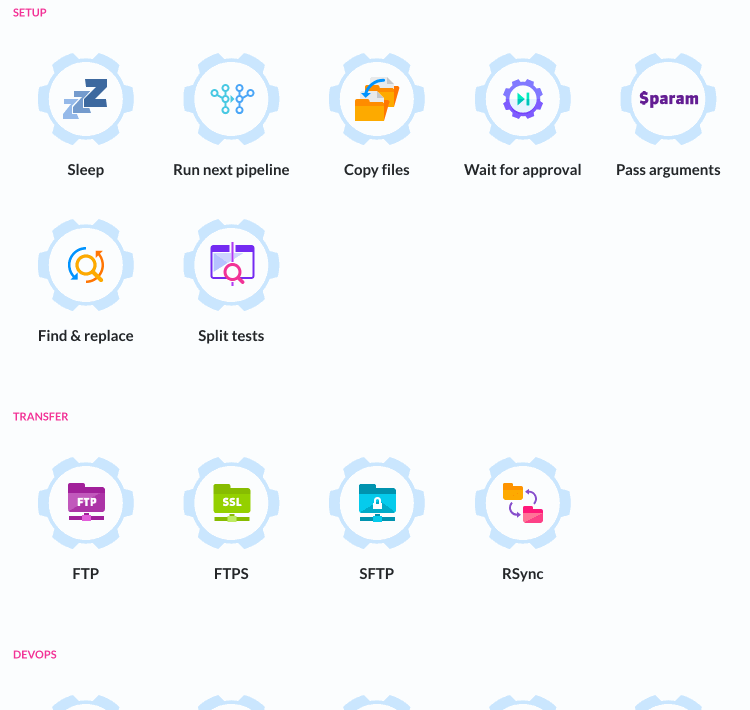


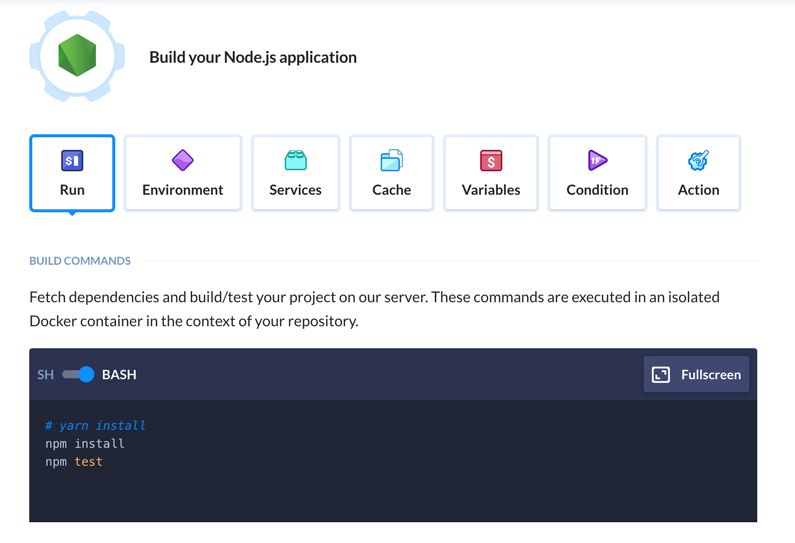
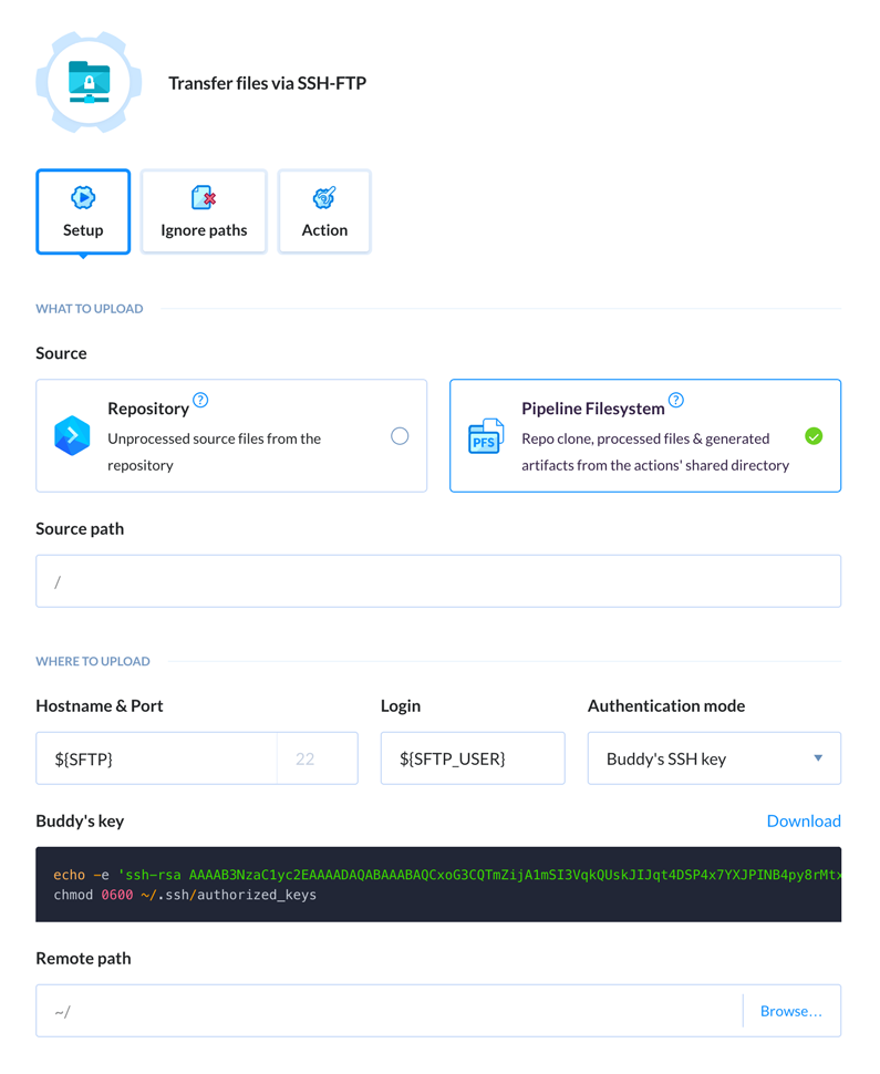
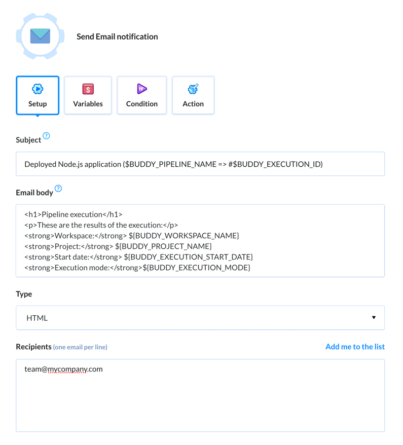


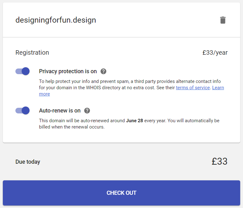
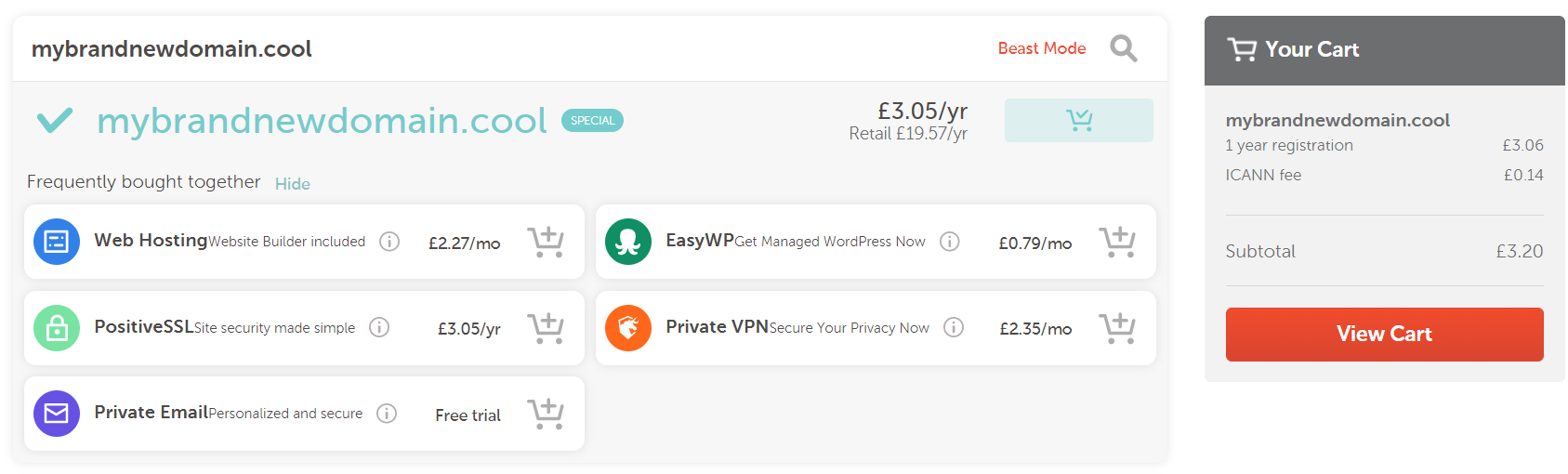
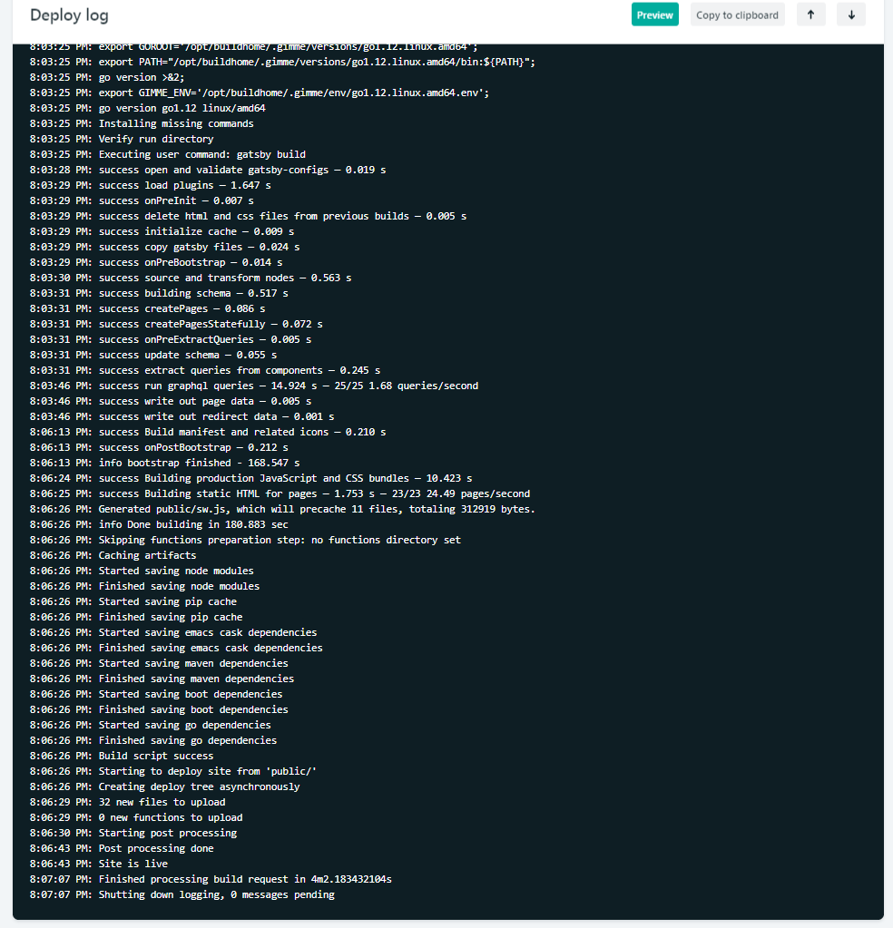
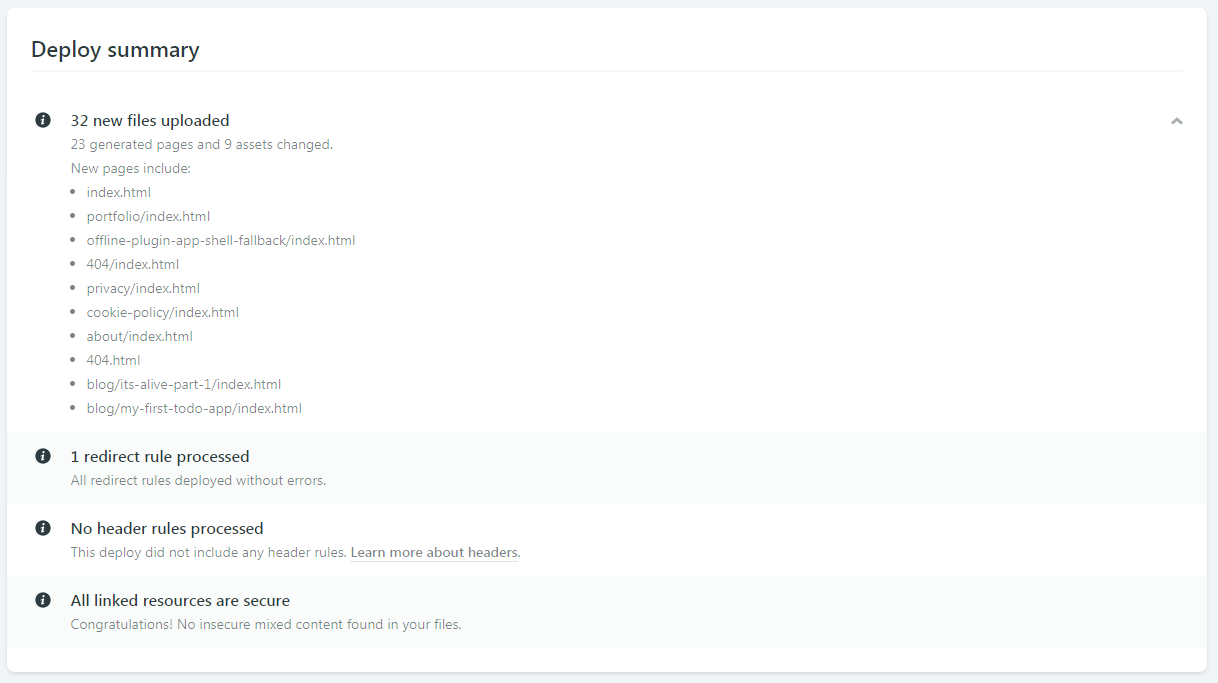
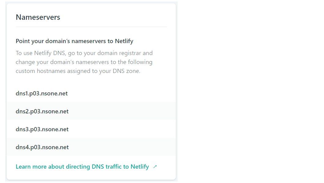


