Our Managed WordPress Hosting Test Results Are In…

Earlier this week we posted a detailed breakdown on how we’ve been performance testing WPMU DEV managed WordPress hosting against our primary competition.

In this post we’re going to share with you exactly how each host did.

And usually, whoever does these comparisons, wins them, right?

Well, not this time (ooooo!)……….

Here’s a quick recap of the hosting testing methodology we used, that you can replicate, for free, at home.

Basically, we…

  1. Took our top 8 hosting competitors based off general popularity and our members hosting usage, and tested the performance of their base managed WordPress plan versus ours, specifically: GoDaddy, Flywheel, WP Engine, Cloudways, SiteGround, BlueHost, Kinsta, and HostGator.
  2. Made an account with each host at their entry level (base) managed WordPress plan (apart from Cloudways as they don’t do managed WP) and created the same exact test website on each platform.
  3. Ran each host through a rigorous load test (to see how many users they can handle at the same time) using the awesome and freely available Loader.io – you can go run your own tests right now to see how you do.
  4. Put each hosts speed and Time To First Byte (TTFB) to the test with the equally free KeyCDN’s performance testing tool – again, go check it out and test your own host.
  5. Established how many parallel clients (read: users visiting the site at the same time) each host could take.
  6. Worked out TTFB in what we think is the fairest way (as they can vary dramatically based on server location): TTFB Average (Geo-Optimized), TTFB Average (All Locations).
  7. Did all this without implementing caching of CDNs, so you get to test the actual server in real dynamic conditions (much more on that decision in our methodology post, tl;dr you can put any host behind a great CDN and serve static pages like a gun, but WP isn’t about that… although we are open to adding that as a test too.)

Alright, now you’re all caught up, let’s not delay any further.

Dev Man is shocked at what he sees from these test results.
Dev Man might be in for a surprise with these results.

Here’s how our base plan fared against some of the most popular managed WordPress hosting providers on the web:

The raw results:

A look at the results of our WordPress hosting tests
*As of September 2020. Based on starting plans for each platform.

How each host ranked in each category:

Max Parallel Clients (how many users the host can handle at once)

1.Kinsta – 170
2.WPMU DEV – 140
3.Cloudways – 70
4.WP Engine – 50
4.Flywheel – 50
4.SiteGround – 50
5.Bluehost – 40
5.GoDaddy – 40
5.HostGator – 40

TTFB Average (speed of server response averaged across the globe)

1.GoDaddy – 332ms
2.Cloudways – 402ms
3.WPMU DEV – 476ms
4.WP Engine – 511ms
5.Kinsta – 622ms
6.SiteGround – 683ms
7.HostGator – 912ms
8.Bluehost – 1.5s
9.Flywheel – 1.7s

TTFB Best (the fastest response recorded, we assume this is down to geolocation)

1.Kinsta – 35.15ms
2.Cloudways – 53.34ms
3.GoDaddy – 66.5ms
4.WPMU DEV – 81.14ms
5.WP Engine – 170.23ms
6.SiteGround – 190.09ms
7.HostGator – 520.68ms
8.Bluehost – 1.2s
9.Flywheel – 1.35s

A quick summary of the results…

When it came to the maximum number of parallel clients each server handled during the load test, Kinsta came out on top with 170 concurrent users – followed closely by us with 140.

As we touched on in our methodology post, these hosts are the ones (metaphorically) letting the most people into the bar at the same time thanks to their higher parallel client numbers.

So that’s great work by Kinsta, being able to cope with that many users visiting your site on your base plan is pretty impressive, although we’re pretty chuffed about our second place.

In terms of speed, Kinsta also took out the TTFB (Geo-Optimized) category with the speediest TTFB time (35.15ms) of them all… we’re betting that KeyCDN and their servers are not all that far apart.

And lastly, the TTFB Average (All Locations) crown went to GoDaddy, with an average TTFB time of 332ms over the 10 locations that KeyCDN accounted for. Nice work to the big GD!

We came 3rd and 4th respectively in both TTFB categories, which we’re pretty happy about.

Of course, we do offer a selection of geolocation options on our base plan. So if you value speed in, say, the US East Coast ,or the UK, or Germany the most – we should hopefully win that for you with our geolocated servers.

Taking price into consideration…

If cost wasn’t an issue and we had to pick an overall winner from the testing, it would have to be Kinsta, as they took home first place in two of the three hosting performance categories. Nice work Kinsta!

But, of course, if we’re comparing apples with apples we have to also look at pricing. Which, handily, we include below:

Another look at the test results, and host prices as well
*Sept 2020, managed WP plans, renewal prices, annual discounts applied, rounded up.

A few notes on the pricing:

  • It’s accurate as of September 2020.
  • All prices are in USD and retrieved via US VPN in incognito.
  • We’re only listing renewal prices (no initial discounts or multi-year lock-ins) but we are including annual discounts.
  • We’ve rounded up .99 (GoDaddy & BlueHost) and .95 (HostGator).
  • Cloudways is not a managed WP platform but is included due to our members usage, so site limits don’t apply, we’re choosing Digital Ocean with them.

So… how does WPMU DEV hosting rate now?

Considering the cost, we’d like to think that we offer the best value for money in terms of performance and load.

While Kinsta is obviously great choice for high performance on their base plan, you’d have to realistically test them against our silver or gold plans ($18.75 and $37.50 respectively) if you’re looking at a fair comparison.

GoDaddy is clearly fast (their CDN is great too btw) but we reckon we’ve given them a good run for their money.

But probably, after all this, we’d say that the host that’s most comparable with us is Cloudways because, well, we use the same partner (Digital Ocean) and as you can see we rank very similarly.

A big advantage for some users for Cloudways would be that you can install as many applications as you like on a Digital Ocean platform, whereas with us you just get the 1 WordPress site. However, that has enabled us to build a stack that vastly outperforms them when it comes to load testing.

Overall though, we’d say that either our hosting or Cloudways is probably your best bet based on these tests… although you could do a lot worse than using Kinsta or GoDaddy.

Our take on how WPMU DEV Hosting did.

Dev Man celebrating his (almost) win
Even though WPMU DEV didn’t come out on top in terms of performance, we’re still wrapped with the results.

Overall, we were really pleased with how WPMU DEV Hosting fared against the competition.

But that doesn’t mean that we can’t do better. In fact it’s energized us to try harder and get you better results.

Specifically we’d like to improve:

  • Our pricing… we’re working to offer you an even more affordable plan that delivers similar results (and better than our competitors).
  • Our TTFB… we’re adding new locations as I type this (Australia we’re coming for ya soon) that should improve our overall speed.
  • Our overall offering… in addition to all of the above, we’re hoping to provide you, by the end of the year, a managed WP platform for free on top of this.

As amazing as it would have been to take out first place and rule everything, in the grand scheme of things, we’re still new to hosting (just over a year old in fact!), and to already be up there with the best in the biz feels great, and we’re excited about doing better.

Some other key takeaways from this host performance testing experience:

  1. We feel like a lot of hosts rely too heavily on caching or CDN mechanisms to save them, but that they give you an unrealistic feel for the capacity of your hosting in a genuine and dynamic sense… anyone can serve a static html page to a bazillion visitors.
  2. TTFB is hard to measure fairly, it’d be great if more hosts let us know *where* they were hosting you for their base plan.
  3. We reckon the number of clients your server can handle is MORE important than the speed at which you’re serving them. Back to our bar analogy: Would you rather server 140 people in a timely manner? Or serve 40 at a slightly faster pace before 41 enters, and you’re forced to close and deny more potential customers?

Check out the full comparisons of each host vs. WPMU DEV Hosting.

A preview of our WPMU DEV compared page
Our comparison page gives you a full view of WPMU DEV vs. a range of other hosting options.

As touched on earlier, when comparing hosts it’s important to take EVERYTHING into account, not just performance.

So at the same time as running these performance tests, we also put together some insightful hosting comparison pages which square DEV hosting off against all the hosts mentioned above.

What’s great about these pages is that as well as the performance results, we’ve also included up to date feature and cost comparison tables you can use as reference.

That way you get a well-rounded idea of what host is going to suit you or your business best. So definitely check them out if you get a chance.

Let’s do this more often…

And that’s all there is to it.

We hope you’ve enjoyed this inside look at how we tested WPMU DEV Hosting.

Our team has taken a lot of valuable insights from this experience, and we hope you did too.

Anything you’d have us do differently? Were there some big hosting players we left off the list?

Let us know below.

The whole point of this process has been to be completely fair and transparent with all of our processes and findings. And if you think there’s a better (or fairer) way we could have tested, please let us know, we’re open to discussing anything and everything in the comments!

But in fact, you really don’t even have to take our word for it…

See how WPMU DEV Hosting performs for yourself.

If our findings have piqued your interest, feel free to run your own tests following our methodology (or any other you prefer).

Check out our hosting plans or take a WPMU DEV membership (Incl. 1 Bronze level site) for a free 7 day trial.

Want to test for longer than 7 days? Everything WPMU DEV comes with an automatic 30 day money-back guarantee.

Until the next round of hosting testing.✌

1,000 SVG Icons!

Well, 996 to be exact.

I think it’s fair to say that Font Awesome is the most successful icon project ever, and in addition to their paid offerings, they have an open-source free version. We’ve always offered up SVG icons you can easily copy/paste in our free Assets panel, but up until now, there were only ~20 of them. So, ya know, a 50× increase ain’t bad. Especially since the way we were able to integrate this is way easier than what we were doing before because they publish the icons in a JavaScript format that is easy for us to use in React components.

More icons. Better icons. Easier to maintain.

Here’s how it works:

Despite the name “Font Awesome”, we’re not delivering these icons as a font, we’re offering up inline <svg> you can copy and paste.

If you prefer using icon fonts, you might wanna check out the project We Love Icon Fonts which is like a CDN for hosting icon web fonts.

High five to Mr. Shaw on this one who had the idea and got this implemented for us.

The post 1,000 SVG Icons! appeared first on CodePen Blog.

Lazy Loading and `srcset` images in the Grid

We make screenshots of all Pens and serve them in a variety of ways, most notably in any “grid” of Pens on CodePen. All Pens will show an image in the grid at first, and then if the Pen is animated (and you don’t have the user setting to only show images) it will fade into an <iframe> preview. So… we load a ton of image screenshots on CodePen.

We used to use CSS background-image for all those images, so we linked up just a single image there, and we chose something pretty large so it would look good on large and high resolution monitors. Now we’ve swapped the images out for an <img loading="lazy" srcset="" /> integration, which has many advantages.

Now, we’ll serve you more-correctly sized images depending on the browser and screen you are on. Saved bandwidth for both you and us in that you aren’t downloading (much) more image data than you need. Plus, the lazy loading means you won’t download the image at all if the image isn’t visible to you yet (like you haven’t scrolled it into view yet).

Definitely the way to go! This, combined with the fact that we’re now serving them from a global CDN, optimized, and in the best possible format per your browser, it’s been a big upgrade. We’re probably serving half or less image data on average.

We’re still poking at our whole system for generating the screenshots, which should be much better than it has been in the past, but is close to being better yet again. For example, soon all screenshots will be generated on cloud servers with GPUs, which we know to give us the best results.

The post Lazy Loading and `srcset` images in the Grid appeared first on CodePen Blog.

How to Get the Most Out of Smush

Optimizing your images manually would involve a lot of resizing, a fair bit of coding, and heaps of time. Luckily, Smush does all the hard work for you and plenty more besides, all of which you will find covered in this guide to help you get the most out of the plugin.

Smush offers an abundance of features to help you get your images under control.

For example, whilst Smush may be best-known for compressing images (without losing quality), it can also help defer your offscreen images with its lazy-load feature, convert your images to next-gen formats (WebP), and serve your images from our super-fast CDN.

Luckily, you don’t need to dedicate much time or effort to your images when you have Smush installed. Most features can be activated with one click.

Whether you’re a new user or just hoping to uncover some cool features you might have missed, this guide will help you get the most out of this plugin.

We look at how to:

So without further ado, here’s how to get the most out of Smush:

1. Smush All Your Images in Bulk

When you first install Smush, chances are you’ll have a backlog of images that need your attention.

The Bulk Smush feature scans your site for any images that would benefit from being compressed.

Screenshot of the bulk smush feature which shows 7 images which need smushing.
Each time you add new images, Smush will add them to this total.

All you have to do is click the button – Smush does all the hard work for you and lets you know when the job is complete.

Screenshot showing the bulk smush successfully completed.
Much faster than compressing them yourself.

You can exclude certain image sizes from Bulk Smush if required. However, as Smush compresses without sacrificing quality, it may be beneficial to smush them all.

Screenshot of the various image sizes which are available to exclude.
Remove the ticks from the images sizes you want to exclude from being compressed.

2. Automatically Compress New Uploads

Once you have used the Bulk Smush feature to catch up on your backlog of image compressing, you will seldom need to use it again.

This is because of the handy Automatic Compression feature. If you enable this, Smush will compress images as soon as you upload them to your site.

Screenshot showing the various image sizes that you can include when bulk smushing if you didn't want to select 'all'.
The days of routine image pruning can easily be a thing of your past.

3. Super-Smush For Double the Compression

If your main focus is on your site’s speed, you may want to take image compression a step further.

Super-Smush offers twice the compression of regular smushing by stripping out every bit of unneeded data, without reducing the quality of your images.

Screenshot of the super-smush button.
Give it a try – we challenge you to notice a difference in quality!

If you don’t want to take it as far as Super-Smush, you can instead strip the unnecessary metadata from your images, leaving only what is needed for SEO purposes. Photos often store camera settings in the file such as focal length, date, time and location – removing this will reduce your file size.

If you’re a photographer, you might want to keep this information, but it serves little purpose on most sites so is generally safe to remove.

4. Display Your Full Size Images

If you upload an image that is larger than 2560px in either width or height, WordPress will automatically scale it down to generate a ‘web-optimized’ maximum image size.

If you are purposefully adding larger images and want to override this, you can use the image resizing option.

Screenshot of the resize my full size images button
You can set your own new maximum image size.

Bear in mind that your theme may also have its own maximum image size – you will need to check this before enabling this feature.

If you are uploading full-sized images, you can also choose whether or not these will be included in Bulk Smush.

Screenshot of the settings for smushing original images.
Another couple of simple one-click features.

Make sure you enable the bottom selection if you want to store a copy of all your full-size images, in case you ever wanted to return them to their pre-smushed forms.

Learn more about how WordPress handles images by checking out this blog.

5. Convert Your PNGs to JPEGs

There are some circumstances where one of these two file types is more suitable than the other. However, if your main concerns for your site are memory usage and speed, then using JPEGs instead of PNGs should be beneficial.

If you upload your images as PNGs, Smush can check to see whether converting them to JPEGs will reduce the file size.

Screenshot of the png to jpeg button
The files will remain as PNGs if there is no reduction in the file size.

You can, of course, make the same conversion outside of WordPress. However, using Smush removes the hassle and converts all your files in one swoop.

6. Smush From the Media Library

If you would prefer to select individual images for compression, look no further than your own media library.

Here, you will find a new column labelled ‘Smush’.

Screenshot of the column which appears in the media library upon activation of smush.
You can compress your images one-by-one.

If you have auto-compression turned off, any photos which you upload should be ready to smush from within your media library.

You can smush your images individually, or alternatively single out images to be ignored from bulk smushing.

7. Lazy Load Your Images For a Boost of Speed

If you have pages with lots of photos, displaying them all at once can put a lot of pressure on the server.

Deferring your off-screen images is a good way to allow the server to concentrate on loading the elements of your site above the fold so that your visitor can get stuck straight in.

Screenshot of the lazy loading feature activated.
It takes one click to deactivate if you find it’s not right for your site.

If there are certain types of images or certain output locations you wish to exclude from lazy loading, you can easily add them here.

Screenshot of the different media types and output locations you can exclude.
Remove the ticks from any of the options that you don’t wish to include.

You can also exclude certain various post types, specific URLs, and CSS classes and IDs.

Basically, if you want to enable lazy loading, you can fine-tune exactly how and where it is enabled.

Once you have chosen which images will lazy load, you can then decide how you want the pre-loading images to appear.

Screenshot of the display animation options.
If you don’t want any form of animation, simply select ‘None’.

8. Utilize Smush’s CDN

The closer you are to the server that is providing your content, the faster it will load. A CDN (Content Delivery Network) is a series of servers which are spread around the globe, and when a browser makes the HTTP request, the content is served from the closest server to its location.

Smush Pro boasts a 45-point CDN, with a few extra tricks up its sleeve. It can automatically resize your images as well as convert them to Google’s own next-gen format, WebP.

If all you want is for your images to be served from the CDN, you do not need to delve any further into these.

However, there are a few useful tools that can be of benefit to your site, so they are worth checking out.

To activate the Smush Pro Image CDN, From Smush Pro in your websites dashboard, go to the CDN tab and click the blue button.

Screenshot of the CDN just before activation.
Once you have activated the CDN, you will see more options within Smush.

This will store and serve copies of all your JPG, PNG, and Gif images from the Smush edge servers – drastically improving speed.

Don’t Leave Your Background Images Out

As standard, only images used on your posts and pages will be served through the CDN

If you want your background image to be served from the same speedy CDN as the rest of your images, Smush has you covered.

Screenshot of the background images option.
Your background images will reach your visitor quicker if served through our CDN.

You will need to ensure that your background images are properly declared with CSS in your theme’s files.

9. Serve the Correct Image Sizes

Ideally, you should never serve an image larger than what will be displayed on the user’s screen. Using original or full-size images when a smaller image will do makes your pages take longer to load while your browser waits for the images to render.

Smush’s CDN houses a handy feature to resize your image to fit the container, without needing to touch a line of code.

Screenshot of the automatic resizing option.
As the resizing is done from the CDN, your original images will remain full size.

10. Convert Your Images to Next-Gen Formats

JPEG 2000, JPEG XR, and WebP are modern image formats with superior compression capabilities. This means they produce much smaller image files so you can greatly improve your page speed.

Images served in the WebP format can benefit from more than 25% compression, and when you think about the number of images on your site, that’s a tonne of space that can be saved.

Smush’s CDN offers the option to convert your images to WebP in just one click.

Screenshot of the webp conversion button.
All the legwork is taken care of by Smush.

Not all browsers support next-gen formats, which is something you would usually have to bear in mind when deciding to make the switch.

However, if you enable the WebP Conversion feature, Smush will automatically check whether or not a browser supports this format, and if not, will serve it in the original one. This ensures that none of your visitors are compromised.

Support at Your Fingertips

Now you know the ins and outs of this little plugin, it’s time to get stuck in and see how your site can benefit.

Smush is a very user-friendly plugin, so you should have no trouble managing your images.

If, however, you find yourself in need of some friendly advice, members should look no further than our awesome support team who are available 24/7.

You can also check out the plugin documentation and view new updates and features coming soon in our roadmap.

How To Get The Most Out Of Smush Image Optimization

Optimizing your images manually would involve a lot of resizing, a fair bit of coding, and heaps of time. Luckily, Smush does all the hard work for you and plenty more besides, all of which you will find covered in this guide to help you get the most out of the plugin.

For example, while Smush may be best-known for compressing images (without losing quality), it can also help defer your offscreen images with its lazy-load feature, convert your images to next-gen formats (WebP), and serve your images from our super-fast CDN available with Smush Pro.

Luckily, you don’t need to dedicate much time or effort to your images when you have Smush installed. Most features can be activated with one click.

Whether you’re a new user or just hoping to uncover some cool features you might have missed, this guide will help you get the most out of this plugin.

We look at how to:

  1. Smush All Your Images in Bulk
  2. Automatically Compress New Uploads
  3. Super Or Ultra-Smush For Double the Compression
  4. Display Your Full Size Images
  5. Convert Your PNGs to JPEGs
  6. Smush From the Media Library
  7. Optimize Directory Images
  8. Lazy Load Your Images For a Boost of Speed
  9. Utilize Smush’s CDN
  10. Serve the Correct Image Sizes
  11. Convert Your Images to Next-Gen Formats
  12. Save Time With Automatic Smush Configs
  13. Integrate With Popular WordPress Tools

So without further ado, here’s how to get the most out of Smush:

1. Smush All Your Images in Bulk

When you first install Smush, chances are you’ll have a backlog of images that need your attention.

The Bulk Smush feature scans your site for any images that would benefit from being compressed.

Screenshot of the bulk smush feature which shows 31 images which need smushing.
Each time you add new images, Smush will add them to this total.

All you have to do is click the button – Smush does all the hard work for you and lets you know when the job is complete.

If you have a lot of images to optimize, you’re also free to leave the plugin completely and come back to it, Smush will continue to compress your images in the background and you’ll be notified once the process is complete.

But rest assured, no matter how many images you have to optimize, thanks to built-in features like parallel image processing, which gives you 8x the normal processing speed, your images are in the best and fastest hands.

Screenshot showing the bulk smush successfully completed.
Much faster than compressing them yourself.

You can exclude certain image sizes from Bulk Smush if required. However, as Smush compresses without sacrificing quality, it may be beneficial to smush them all.

Screenshot of the various image sizes which are available to exclude.
Remove the ticks from the images sizes you want to exclude from being compressed.

One other feature worth noting is that when you click the Re-Check Images button, Smush performs an automatic scan of your Media Library to check if new images have been added since the last bulk smush.

Media Library Scan
Smush automatically scans your media library when you recheck images.

2. Automatically Compress New Uploads

Once you have used the Bulk Smush feature to catch up on your backlog of image compressing, you will seldom need to use it again.

This is because of the handy Automatic Compression feature. If you enable this, Smush will compress images as soon as you upload them to your site.

Smush also has a generous maximum file size limit of 256MB per image, so if you have any gigantic images to be uploaded, they’ll automatically be compressed and optimized for you too.

Screenshot showing the various image sizes that you can include when bulk smushing if you didn't want to select 'all'.
The days of routine image pruning can easily be a thing of your past.

3. Super Or Ultra-Smush For More Compression

If your main focus is on your site’s speed, you may want to take image compression a step further.

Super-Smush offers twice the compression of regular smushing by stripping out every bit of unneeded data, without reducing the quality of your images.

A screen showing the different Smush modes.
Take your image compression power to the next level.

Or, if you want to really amp up your compression powers, try the Ultra-Smush option for an impressive 5x compression on top of the already amazing Super-Smush. Ultra is only available with Smush Pro, but completely worth the upgrade if having the fastest possible sites is a priority for you.

New Ultra Smush delivers 5x greater image compression than Super Smush!Check it out here

If you don’t want to take it as far as Super or Ultra-Smush, you can instead strip the unnecessary metadata from your images, leaving only what is needed for SEO purposes. Photos often store camera settings in the file such as focal length, date, time and location – removing this will reduce your file size.

If you’re a photographer, you might want to keep this information, but it serves little purpose on most sites so is generally safe to remove.

4. Display Your Full Size Images

If you upload an image that is larger than 2560px in either width or height, WordPress will automatically scale it down to generate a ‘web-optimized’ maximum image size.

If you are purposefully adding larger images and want to override this, you can use the image resizing option.

Screenshot of the resize my full size images button
You can set your own new maximum image size.

Bear in mind that your theme may also have its own maximum image size – you will need to check this before enabling this feature.

Want to disable automatic resizing of images altogether? You can enable Disable scaled images. This means scaled versions of images will not be generated, and only your original uploaded images will be kept.

If you are uploading full-sized images, you can also choose whether or not these will be included in Bulk Smush.

Screenshot of the settings for smushing original images.
Another couple of simple one-click features.

Make sure you enable the Backup original images selection if you want to store a copy of all your full-size images, in case you ever wanted to return them to their pre-smushed forms.

Learn more about how WordPress handles images by checking out this blog post.

5. Convert Your PNGs to JPEGs

There are some circumstances where one of these two file types is more suitable than the other. However, if your main concerns for your site are memory usage and speed, then using JPEGs instead of PNGs should be beneficial.

If you upload your images as PNGs, Smush can check to see whether converting them to JPEGs will reduce the file size.

Screenshot of the png to jpeg button
The files will remain as PNGs if there is no reduction in the file size.

You can, of course, make the same conversion outside of WordPress. However, using Smush removes the hassle and converts all your files in one swoop.

6. Smush From the Media Library

If you would prefer to select individual images for compression, look no further than your own media library.

Here, you will find a new column labelled ‘Smush’.

Screenshot of the column which appears in the media library upon activation of smush.
You can compress your images one-by-one.

If you have auto-compression turned off, any photos which you upload should be ready to smush from within your media library.

You can smush your images individually, or alternatively single out images to be ignored from bulk smushing.

7. Optimize Directory Images

While your uploads folder is typically the main folder where images are found, they may also reside elsewhere in your directory.

For example, plugins that create their own image copies may store those images in the plugins folder.

In cases like this, the Directory Smush feature helps you easily identify and compress images stored outside the uploads folder.

A screen showing the directory Smush feature
Find and optimize images stored outside of the typical uploads folder.

Simply choose which directories and subdirectories you want to scan, and Smush will optimize and compress all of the images in bulk, it’s that easy.

A look at how Smush enables you to scan directories.
Optimize selected directories and subdirectories with a click.

8. Lazy Load Your Images For a Boost of Speed

If you have pages with a lot of images, displaying them all at once can put a lot of pressure on the server.

Deferring your off-screen images is a good way to allow the server to concentrate on loading the elements of your site above the fold so that your visitor can get stuck straight in.

Screenshot of the lazy loading feature activated.
It takes one click to deactivate if you find it’s not right for your site.

If there are certain types of images or certain output locations you wish to exclude from lazy loading, you can easily add them here.

Screenshot of the different media types and output locations you can exclude.
Remove the ticks from any of the options that you don’t wish to include.

You can also exclude certain various post types, specific URLs, and CSS classes and IDs.

Basically, if you want to enable lazy loading, you can fine-tune exactly how and where it is enabled.

Once you have chosen which images will lazy load, you can then decide how you want the pre-loading images to appear.

Screenshot of the display animation options.
If you don’t want any form of animation, simply select ‘None’.

9. Utilize Smush’s CDN

The closer you are to the server that is providing your content, the faster it will load. A CDN (Content Delivery Network) is a series of servers which are spread around the globe, and when a browser makes the HTTP request, the content is served from the closest server to its location.

Smush Pro boasts a 121-point CDN, with a few extra tricks up its sleeve. It can automatically resize your images as well as convert them to Google’s own next-gen format, WebP.

Check out the video below to learn more about our CDN.

If all you want is for your images to be served from the CDN, you do not need to delve any further into these.

However, there are a few useful tools that can be of benefit to your site, so they are worth checking out.

You can activate and configure the Smush Pro Image CDN right from your dashboard.

Screenshot of the CDN just after activation.
Once you have activated the CDN, you will see more options within Smush.

This will store and serve copies of all your JPG, PNG, and Gif images from the Smush edge servers – drastically improving speed.

Don’t Leave Your Background Images Out

As standard, only images used on your posts and pages will be served through the CDN.

If you want your background image to be served from the same speedy CDN as the rest of your images, Smush has you covered.

Screenshot of the background images option.
Your background images will reach your visitor quicker if served through our CDN.

You will need to ensure that your background images are properly declared with CSS in your theme’s files.

10. Serve the Correct Image Sizes

Ideally, you should never serve an image larger than what will be displayed on the user’s screen. Using original or full-size images when a smaller image will do makes your pages take longer to load while your browser waits for the images to render.

Smush’s CDN houses a handy feature to resize your image to fit the container, without needing to touch a line of code.

Screenshot of the automatic resizing option.
As the resizing is done from the CDN, your original images will remain full size.

11. Convert Your Images to Next-Gen Formats

JPEG 2000, JPEG XR, and WebP are modern image formats with superior compression capabilities. This means they produce much smaller image files so you can greatly improve your page speed.

Images served in the WebP format can benefit from more than 25% compression, and when you think about the number of images on your site, that’s a tonne of space that can be saved.

Smush Pro gives you two options for converting your images to next-gen formats.

1.Convert images with Smush Local WebP

The Local WebP feature in Smush Pro enables you to serve images from your Media Library in next-gen WebP format, without needing the Smush CDN.

A screenshot of the LocalWebP feature from the main Smush dashboard
Serve images in next-gen formats without the need for Smush’s CDN.

The conversion to WebP is lossy when converting from JPEG images, and lossless when converting from PNG images.

Note that once you have configured this feature, you will need to run a Bulk Smush again for your existing images to get a WebP version created for each one.

Local WebP also only works for images in your Media Library and cannot create WebP versions of images found in other directories.

2.Convert images with Smush CDN

Smush’s CDN offers the option to convert your images to WebP in just one click.

Screenshot of the webp conversion button.
All the legwork is taken care of by Smush.

Not all browsers support next-gen formats, which is something you would usually have to bear in mind when deciding to make the switch.

However, if you enable the WebP Conversion feature, Smush will automatically check whether or not a browser supports this format, and if not, will serve it in the original one. This ensures that none of your visitors are compromised.

12. Save Time With Automatic Smush Configs

If you manage multiple sites, this feature will save you hours of time by allowing you to apply your preferred Smush settings to any site with a click.

All you have to do is follow the already mentioned steps in this article and set Smush up exactly how you want it.

Then navigate to Settings > Configs and simply hit ‘Save Config’ to save your current settings as a new config, which you can apply to other sites instantly.

A screenshot showing the Smush Configs module
Set up Smush with your ideal settings and apply to other sites with a click.

You can also choose from a number of default configs and you can integrate with The Hub site management tool to easily apply your configs to multiple sites at once.

13. Integrate With Popular WordPress Tools

A screen showing brands that Smush is compatible with
Smush plays nicely with and enhances your favorite WordPress tools.

Smush is fully compatible with your favorite WordPress tools and has direct in-plugin integrations with Gutenberg, Amazon S3, Gravity Forms, WPBakery builder, and NextGen Gallery.

Like most Smush features, all of these integrations can be activated with a click and allow for more specialized and targeted image optimization for the tool you’re integrating with.

Support at Your Fingertips

Now you know the ins and outs of this little plugin, it’s time to get stuck in and see how your site can benefit.

Smush is a very user-friendly plugin, so you should have no trouble managing your images.

If, however, you find yourself in need of some friendly advice, members should look no further than our awesome support team who are available 24/7.

And when you’re ready to take your image optimization to the next level, give Smush Pro a try and automatically unlock advanced features like our 121-point CDN, 5x Ultra Smush – plus – free access to the entire WPMU DEV suite of plugins and site management tools.

You can also check out the plugin documentation and view new updates and features coming soon in our roadmap.

How To Ace Google’s Image Page Speed Recommendations With Smush

Smush has everything you need to optimize your images, as well as a handy repertoire of tools ready to help you smash PageSpeed Insights image-related recommendations.

It’s a simple way to speed up your site, without sacrificing your image quality.

With Smush you can:

  • Compress images in bulk and with one click
  • Automatically resize and rescale your images
  • Enable lazy loading so your server can concentrate on displaying content above the fold
  • Convert your image files to formats that are drastically smaller and much quicker to display.

Over a million installs and more than 50 billion images smushed.

There are four main recommendations when it comes to images, and Smush can answer all of them.

“I had no idea that my page load time was being dragged down by the images. The plugin nearly halved the time it took.” – karlcw

This guide will show you how Smush can help you get your PageSpeed Insights score into the green.

Defer Offscreen Images

You don‘t want to be wasting server resources and sacrificing page speed to load images that are halfway down your page, so deferring offscreen images makes sense for many sites.

When you install Smush, Lazy Load is one of the first features you should check out. Simply enabling it can fix the ‘defer offscreen images’ PageSpeed recommendation.

Smush’s Lazy Load feature comes with more than just an on and off button.

You can choose which image formats you want to include.

Screenshot of the media types, whocing jpeg, png, gif, svg and iframe which can all be excluded.
Maybe you want your JPEGs to Lazy Load, but not your PNGs?

As well as any post types you want to exclude.

Screenshot of the different pages you can exclude from lazy load including the front page, blog and posts.
There’s also the option to add the URL of any specific pages.

Lazy Loading is something that can easily be undone so turn it on, check your new PageSpeed Insights score, and most importantly, check the impact it has on your site.

Efficiently Encode Images

If you want a full and comprehensive guide to optimizing your images, I would recommend checking out this blog, as here, we’re purely focusing on how Smush can help you meet PageSpeed Insights audit requirements. In this section, specifically the ‘efficiently encode images’ recommendation.

Smushing your images prevents your server being clogged up with extra MBs that don’t need to be there.

You can Smush in a variety of ways, with virtually no difference in quality.

Smush on Upload

Automatic compression is on by default and is used to efficiently encode images. It’s a high impact, low-risk feature, which should be used on most sites.

Screenshot of automatic compression showing it enabled and ready to automatically compress images on upload.
You can select whether you want it to apply to all images, or exclude certain sizes.

If you don’t want Smush to automatically compress your photos, there are a few other ways you can manage this:

Bulk Smush

You can use the Bulk Smush feature to scan your site for photos which are in need of attention and smush them all at once.


Screenshot of bulk smush showing that there are three images in need of smushing.
Click the button and let the plugin do all the work for you.

Smush Through the Media Library

You can also head to the media library to check whether you have images available for smushing.

Screenshot of an image of a moon in the media library ready to be smushed.
You can smush individually through the media library or select images to be ignored from autosmush.

Smush Other Directories

You’re not confined to just your media uploads – you can also smush non-WordPress images outside of your uploads directory.

Screenshot of the directory smush option showing the navigati9on to the wp-content folder to search for more images.
You can easily navigate through your folders to find the images you want to Smush.

Super Smush

Super Smush is your next port of call if you want to bring your file sizes down even further.

It offers 2X the smushing power compared to the standard method, so it’s handy if you have a lot of images that are soaking up valuable resources.

Even if ensuring your images were properly encoded wasn’t one of PageSpeed Insights audit opportunities, it still makes sense to get rid of any excess bloating, as long as there is no noticeable difference to your images.

Utilize the CDN

Smush also offers a blazing-fast 45 point CDN  (Pro version only) which allows you to serve your images in next-gen formats as well as ensuring they’re delivered to your browser at breakneck speed.

Make your Images Next Gen

Next-gen image formats such as WebP and JPEG 2000/XR can bring your file size down drastically.

Serving your images in one of these formats will save you server resources, as well as meet one of PageSpeed Insights requirements.

With Smush’s CDN enabled, you can serve your images in the next-gen WebP format.

As not all browsers support WebP images, Smush does a super-quick check of the browser, and if WebP images are supported, then great – that’s what’s served to your visitor. If not, Smush can simply serve up a PNG or JPEG to make sure that no one misses out.

Properly-sized Images

Forcing the browser to resize an image before it can be displayed to the user slows down your site and lowers your PageSpeed Insight score. Part of the recommendation is to refrain from serving images that are larger than the version that will be displayed on the visitor’s screen.

Screenshot of the automatic resizing feature showing it currently turned on.
With Smush’s CDN, this is one of the easiest PageSpeed Insight recommendations to solve.

If you want to ensure you’re being completely thorough in the correct sizing of your images, read this blog to find out a few alternative tricks.

Smash PageSpeed Insights with Smush

While many users struggle to improve their web site optimization, Smush lets you boost your page loading speeds by making images easier and faster to load…and it does this all in just a few clicks!

Follow the above recommendations and put Smush to work for your site today. Also, keep an eye on our roadmap for all the exciting new features coming soon to Smush.

Edit & Optimize Image Assets

CodePen’s Asset Hosting is the easiest way to upload and use images in your code, and it’s available right inside the Pen Editor! Let us handle the storage and CDN delivery¹ and you let your creativity fly. We’ve just released another major upgrade to this feature!

Now your image assets are even better with dynamic editing and optimization! Resize, rotate, and adjust the quality in the new image editor without changing the original image. Here’s a video demonstrating:

Take advantage of the increased assets storage to upload full size, high-quality images then use the image editor to make a smaller, optimized version to fit exactly where you need. You can even match a new aspect ratio with Fit modes like Cover or Pad. Save your edits as a new image, or make changes on-the-fly with the fancy URL parameters!

For example, the URL to an asset might be:

https://assets.codepen.io/3/image.png?width=310&height=436&format=auto

The base URL is:

https://assets.codepen.io/3/image.png

That will serve your image perfectly as it always has, but then see the URL parameters too:

?width=310&height=436&format=auto

Those will serve a manipulated version of the image based on those values, and still be fast, cached, global CDN served, and all that.

widthwidth of image. Positive integer. Cannot increase size of original.
heightheight of image. Positive integer. Cannot increase size of original.
formatauto will attempt to serve the image as WebP if the requesting browser supports it.
fitscale-down is the default.
cover will make sure the image covers the dimensions without squishing (it may crop your image!)
pad will make sure the image covers the dimensions without squishing (it may leave white edges!)
quality0 - 100. If the image is GIF, JPG, or WebP (No PNG), this will do lossy compression reducing the file size.
rotate90, 180, or 270

Here’s a workflow showing just how useful this on-the-fly editing can be!

This can be super useful for the responsive images syntax in HTML (recall our responsive art direction challenge), or anywhere changing an image via the URL would be handy. For example:

<img 
  src="https://assets.codepen.io/3/wall-e.jpg?width=300&format=auto" 
  srcset="
    https://assets.codepen.io/3/wall-e.jpg?width=1200&format=auto 600w,
    https://assets.codepen.io/3/wall-e.jpg?width=2400&format=auto 1200w
  "
  alt="Wall-E Toy looking up and to the left"
>

WebP can also dramatically decrease the file size while staying high quality, but manually converting to and working with WebP files can be a pain. Let us handle it for you! Drop in your JPG, GIF and PNG images and we can automatically serve a WebP image to supporting browsers with format=auto.

You can get up to 20 GB of Asset Hosting on our PRO Plans, so sign up for PRO to get started. That extra storage might be helpful, as you might notice another feature in there: “Save As New Image” which allows you to store your manipulated image as a new copy of the image if you’d like to.


¹ We’ll even smooth out issues with CORS headers so you can drop those images in 2D canvas or WebGL without problem!

The post Edit & Optimize Image Assets appeared first on CodePen Blog.

How I Used Brotli to Get Even Smaller CSS and JavaScript Files at CDN Scale

The HBO sitcom Silicon Valley hilariously followed Pied Piper, a team of developers with startup dreams to create a compression algorithm so powerful that high-quality streaming and file storage concerns would become a thing of the past.

In the show, Google is portrayed by the fictional company Hooli, which is after Pied Piper’s intellectual property. The funny thing is that, while being far from a startup, Google does indeed have a powerful compression engine in real life called Brotli

This article is about my experience using Brotli at production scale. Despite being really expensive and a truly unfeasible method for on-the-fly compression, Brotli is actually very economical and saves cost on many fronts, especially when compared with gzip or lower compression levels of Brotli (which we’ll get into).

Brotli’s beginning…

In 2015, Google published a blog post announcing Brotli and released its source code on GitHub. The pair of developers who created Brotli also created Google’s Zopfli compression two years earlier. But where Zopfli leveraged existing compression techniques, Brotli was written from the ground-up and squarely focused on text compression to benefit static web assets, like HTML, CSS, JavaScript and even web fonts.

At that time, I was working as a freelance website performance consultant. I was really excited for the 20-26% improvement Brotli promised over Zopfli. Zopfli in itself is a dense implementation of the deflate compressor compared with zlib’s standard implementation, so the claim of up to 26% was quite impressive. And what’s zlib? It’s essentially the same as gzip.

So what we’re looking at is the next generation of Zopfli, which is an offshoot of zlib, which is essentially gzip.

A story of disappointment

It took a few months for major CDN players to support Brotli, but meanwhile it was seeing widespread adoption in tools, services, browsers and servers. However, the 26% dense compression that Brotli promised was never reflected in production. Some CDNs set a lower compression level internally while others supported Brotli at origin so that they only support it if it was enabled manually at the origin.

Server support for Brotli was pretty good, but to achieve high compression levels, it required rolling your own pre-compression code or using a server module to do it for you — which is not always an option, especially in the case of shared hosting services.

This was really disappointing for me. I wanted to compress every last possible byte for my clients’ websites in a drive to make them faster, but using pre-compression and allowing clients to update files on demand simultaneously was not always easy.

Taking matters into my own hands

I started building my own performance optimization service for my clients.

I had several tricks that could significantly speed up websites. The service categorized all the optimizations in three groups consisting of several “Content,” “Delivery,” and “Cache” optimizations. I had Brotli in mind for the content optimization part of the service for compressible resources.

Like other compression formats, Brotli comes in different levels of power. Brotli’s max level is exactly like the max volume of the guitar amps in This is Spinal Tap: it goes to 11.

Brotli:11, or Brotli compression level 11, can offer significant reduction in the size of compressible files, but has a substantial trade-off: it is painfully slow and not feasible for on demand compression the same way gzip is capable of doing it. It costs significantly more in terms of CPU time.

In my benchmarks, Brotli:11 takes several hundred milliseconds to compress a single minified jQuery file. So, the only way to offer Brotli:11 to my clients was to use it for pre-compression, leaving me to figure out a way to cache files at the server level. Luckily we already had that in place. The only problem was the fear that Brotli could kill all our processing resources.

Maybe that’s why Pied Piper had to continue rigging its servers for more power.

I put my fears aside and built Brotli:11 as a configurable server option. This way, clients could decide whether enabling it was worth the computing cost.

It’s slow, but gradually pays off

Among several other optimizations, the service for my clients also offers geographic content delivery; in other words, it has a built-in CDN.

Of the several tricks I tried when taking matters into my own hands, one was to combine public CDN (or open-source CDN) and private CDN on a single host so that websites can enjoy the benefits of shared browser cache of public resources without incurring separate DNS lookup and connection cost for that public host. I wanted to avoid this extra connection cost because it has significant impact for mobile users. Also, combining more and more resources on a single host can help get the most of HTTP/2 features, like multiplexing.

I enabled the public CDN and turned on Brotli:11 pre-compression for all compressible resources, including CSS, JavaScript, SVG, and TTF, among other types of files. The overhead of compression did indeed increase on first request of each resource — but after that, everything seemed to run smoothly. Brotli has over 90% browser support and pretty much all the requests hitting my service now use Brotli.

I was happy. Clients were happy. But I didn’t have numbers. I started analyzing the impact of enabling this high density compression on public resources. For this, I recorded file transfer sizes of several popular libraries — including jQuery, Bootstrap, React, and other frameworks — that used common compression methods implemented by other CDNs and found that Brotli:11 compression was saving around 21% compared to other compression formats.

It’s important to note that some of the other public CDNs I compared were already using Brotli, but at lower compression levels. So, the 21% extra compression was really satisfying for me. This number is based on a very small subset of libraries but is not incorrect by a big margin as I was seeing this much gain on all of the websites that I tested.

Here is a graphical representation of the savings.

Vertical bar chart. Compares jQuery, Bootstrap, D3.js, Ant Design, Senamtic UI, Font Awesome, React, Three.js, Bulma and Vue before and after Brotli compression. Brotli compression is always smaller.

You can see the raw data below..Note that the savings for CSS is much more prominent than what JavaScript gets.

LibraryOriginalAvg. of Common Compression (A)Brotli:11 (B)(A) / (B) – 1
Ant Design1,938.99 KB438.24 KB362.82 KB20.79%
Bootstrap152.11 KB24.20 KB17.30 KB39.88%
Bulma186.13 KB23.40 KB19.30 KB21.24%
D3.js236.82 KB74.51 KB65.75 KB13.32%
Font Awesome1,104.04 KB422.56 KB331.12 KB27.62%
jQuery86.08 KB30.31 KB27.65 KB9.62%
React105.47 KB33.33 KB30.28 KB10.07%
Semantic UI613.78 KB91.93 KB78.25 KB17.48%
three.js562.75 KB134.01 KB114.44 KB17.10%
Vue.js91.48 KB33.17 KB30.58 KB8.47%

The results are great, which is what I expected. But what about the overall impact of using Brotli:11 at scale? Turns out that using Brotli:11 for all public resources reduces cost all around:

  • The smaller file sizes are expected to result in lower TLS overhead. That said, it is not easily measurable, nor is it significant for my service because modern CPUs are very fast at encryption. Still, I believe there is some tiny and repeated saving on account of encryption for every request as smaller files encrypt faster.
  • It reduces the bandwidth cost. The 21% savings I got across the board is the case in point. And, remember, savings are not a one-time thing. Each request counts as cost, so the 21% savings is repeated time and again, creating a snowball savings for the cost of bandwidth. 
  • We only cache hot files in memory at edge servers. Due to the widespread browser support for Brotli, these hot files are mostly encoded by Brotli and their small size lets us fit more of them in available memory.
  • Visitors, especially those on mobile devices, enjoy reduced data transfer. This results in less battery use and savings on data charges. That’s a huge win that gets passed on to the users of our clients!

This is all so good. The cost we save per request is not significant, but considering we have a near zero cache miss rate for public resources, we can easily amortize the initial high cost of compression in next several hundred requests. After that,  we’re looking at a lifetime benefit of reduced overhead.

It doesn’t end there

With the mix of public and private CDNs that we introduced as part of our performance optimization service, we wanted to make sure that clients could set lower compression levels for resources that frequently change over time (like custom CSS and JavaScript) on the private CDN and automatically switch to the public CDN for open-source resources that change less often and have pre-configured Brotli:11. This way, our clients can still get a high compression ratio on resources that change less often while still enjoying good compression ratios with instant purge and updates for compressible resources.

This all is done smoothly and seamlessly using our integration tools. The added benefit of this approach for clients is that the bandwidth on the public CDN is totally free with unprecedented performance levels.

Try it yourself!

Testing on a common website, using aggressive compression can easily shave around 50 KB off the page load. If you want to play with the free public CDN and enjoy smaller CSS and JavaScript, you are welcome to use our PageCDN service. Here are some of the most used libraries for your use:

<!-- jQuery 3.5.0 -->
<script src="https://pagecdn.io/lib/jquery/3.5.0/jquery.min.js" crossorigin="anonymous" integrity="sha256-xNzN2a4ltkB44Mc/Jz3pT4iU1cmeR0FkXs4pru/JxaQ=" ></script>


<!-- FontAwesome 5.13.0 -->
<link href="https://pagecdn.io/lib/font-awesome/5.13.0/css/all.min.css" rel="stylesheet" crossorigin="anonymous" integrity="sha256-h20CPZ0QyXlBuAw7A+KluUYx/3pK+c7lYEpqLTlxjYQ=" >


<!-- Ionicons 4.6.3 -->
<link href="https://pagecdn.io/lib/ionicons/4.6.3/css/ionicons.min.css" rel="stylesheet" crossorigin="anonymous" integrity="sha256-UUDuVsOnvDZHzqNIznkKeDGtWZ/Bw9ZlW+26xqKLV7c=" >


<!-- Bootstrap 4.4.1 -->
<link href="https://pagecdn.io/lib/bootstrap/4.4.1/css/bootstrap.min.css" rel="stylesheet" crossorigin="anonymous" integrity="sha256-L/W5Wfqfa0sdBNIKN9cG6QA5F2qx4qICmU2VgLruv9Y=" >


<!-- React 16.13.1 -->
<script src="https://pagecdn.io/lib/react/16.13.1/umd/react.production.min.js" crossorigin="anonymous" integrity="sha256-yUhvEmYVhZ/GGshIQKArLvySDSh6cdmdcIx0spR3UP4=" ></script>


<!-- Vue 2.6.11 -->
<script src="https://pagecdn.io/lib/vue/2.6.11/vue.min.js" crossorigin="anonymous" integrity="sha256-ngFW3UnAN0Tnm76mDuu7uUtYEcG3G5H1+zioJw3t+68=" ></script>

Our PHP library automatic switches between private and public CDN if you need it to. The same feature is implemented seamlessly in our WordPress plugin that automatically loads public resources over Public CDN. Both of these tools allow full access to the free public CDN. Libraries for JavaScript, Python. and Ruby are not yet available. If you contribute any such library to our Public CDN, I will be happy to list it in our docs.

Additionally, you can use our search tool to immediately find a corresponding resource on the public CDN by supplying a URL of a resource on your website. If none of these tools work for you, then you can check the relevant library page and pick the URLs you want.

Looking toward the future

We started by hosting only the most popular libraries in order to prevent malware spread. However, things are changing rapidly and we add new libraries as our users suggest them to us. You are welcome to suggest your favorite ones, too. If you still want to link to a public or private Github repo that is not yet available on our public CDN, you can use our private CDN to connect to a repo and import all new releases as they appear on GitHub and then apply your own aggressive optimizations before delivery.

What do you think?

Everything we covered here is solely based on my personal experience working with Brotli compression at CDN scale. It just happens to be an introduction to my public CDN as well. We are still a small service and our client websites are only in the hundreds. Still, at this scale the aggressive compression seems to pay off.

I achieved high quality results for my clients and now you can use this free service for your websites as well. And, if you like it, please leave feedback at my email and recommend it to others.

The post How I Used Brotli to Get Even Smaller CSS and JavaScript Files at CDN Scale appeared first on CSS-Tricks.

Let’s Make One of Those Fancy Scrolling Animations Used on Apple Product Pages

Apple is well-known for the sleek animations on their product pages. For example, as you scroll down the page products may slide into view, MacBooks fold open and iPhones spin, all while showing off the hardware, demonstrating the software and telling interactive stories of how the products are used.

Just check out this video of the mobile web experience for the iPad Pro:

Source: Twitter

A lot of the effects that you see there aren’t created in just HTML and CSS. What then, you ask? Well, it can be a little hard to figure out. Even using the browser’s DevTools won’t always reveal the answer, as it often can’t see past a <canvas> element.

Let’s take an in-depth look at one of these effects to see how it’s made so you can recreate some of these magical effects in our own projects. Specifically, let’s replicate the AirPods Pro product page and the shifting light effect in the hero image.

The basic concept

The idea is to create an animation just like a sequence of images in rapid succession. You know, like a flip book! No complex WebGL scenes or advanced JavaScript libraries are needed.

By synchronizing each frame to the user’s scroll position, we can play the animation as the user scrolls down (or back up) the page.

Start with the markup and styles

The HTML and CSS for this effect is very easy as the magic happens inside the <canvas> element which we control with JavaScript by giving it an ID.

In CSS, we’ll give our document a height of 100vh and make our <body> 5⨉ taller than that to give ourselves the necessary scroll length to make this work. We’ll also match the background color of the document with the background color of our images.

The last thing we’ll do is position the <canvas>, center it, and limit the max-width and height so it does not exceed the dimensions of the viewport.

html {
  height: 100vh;
}


body {
  background: #000;
  height: 500vh;
}


canvas {
  position: fixed;
  left: 50%;
  top: 50%;
  max-height: 100vh;
  max-width: 100vw;
  transform: translate(-50%, -50%);
}

Right now, we are able to scroll down the page (even though the content does not exceed the viewport height) and our <canvas> stays at the top of the viewport. That’s all the HTML and CSS we need.

Let’s move on to loading the images.

Fetching the correct images

Since we’ll be working with an image sequence (again, like a flip book), we’ll assume the file names are numbered sequentially in ascending order (i.e. 0001.jpg, 0002.jpg, 0003.jpg, etc.) in the same directory.

We’ll write a function that returns the file path with the number of the image file we want, based off of the user’s scroll position.

const currentFrame = index => (
  `https://www.apple.com/105/media/us/airpods-pro/2019/1299e2f5_9206_4470_b28e_08307a42f19b/anim/sequence/large/01-hero-lightpass/${index.toString().padStart(4, '0')}.jpg`
)

Since the image number is an integer, we’ll need to turn it in to a string and use padStart(4, '0') to prepend zeros in front of our index until we reach four digits to match our file names. So, for example, passing 1 into this function will return 0001.

That gives us a way to handle image paths. Here’s the first image in the sequence drawn on the <canvas> element:

As you can see, the first image is on the page. At this point, it’s just a static file. What we want is to update it based on the user’s scroll position. And we don’t merely want to load one image file and then swap it out by loading another image file. We want to draw the images on the <canvas> and update the drawing with the next image in the sequence (but we’ll get to that in just a bit).

We already made the function to generate the image filepath based on the number we pass into it so what we need to do now is track the user’s scroll position and determine the corresponding image frame for that scroll position.

Connecting images to the user’s scroll progress

To know which number we need to pass (and thus which image to load) in the sequence, we need to calculate the user’s scroll progress. We’ll make an event listener to track that and handle some math to calculate which image to load.

We need to know:

  • Where scrolling starts and ends
  • The user’s scroll progress (i.e. a percentage of how far the user is down the page)
  • The image that corresponds to the user’s scroll progress

We’ll use scrollTop to get the vertical scroll position of the element, which in our case happens to be the top of the document. That will serve as the starting point value. We’ll get the end (or maximum) value by subtracting the window height from the document scroll height. From there, we’ll divide the scrollTop value by the maximum value the user can scroll down, which gives us the user’s scroll progress.

Then we need to turn that scroll progress into an index number that corresponds with the image numbering sequence for us to return the correct image for that position. We can do this by multiplying the progress number by the number of frames (images) we have. We’ll use Math.floor() to round that number down and wrap it in Math.min() with our maximum frame count so it never exceeds the total number of frames.

window.addEventListener('scroll', () => {  
  const scrollTop = html.scrollTop;
  const maxScrollTop = html.scrollHeight - window.innerHeight;
  const scrollFraction = scrollTop / maxScrollTop;
  const frameIndex = Math.min(
    frameCount - 1,
    Math.floor(scrollFraction * frameCount)
  );
});

Updating <canvas> with the correct image

We now know which image we need to draw as the user’s scroll progress changes. This is where the magic of  <canvas> comes into play. <canvas> has many cool features for building everything from games and animations to design mockup generators and everything in between!

One of those features is a method called requestAnimationFrame that works with the browser to update <canvas> in a way we couldn’t do if we were working with straight image files instead. This is why I went with a <canvas> approach instead of, say, an <img> element or a <div> with a background image.

requestAnimationFrame will match the browser refresh rate and enable hardware acceleration by using WebGL to render it using the device’s video card or integrated graphics. In other words, we’ll get super smooth transitions between frames — no image flashes!

Let’s call this function in our scroll event listener to swap images as the user scrolls up or down the page. requestAnimationFrame takes a callback argument, so we’ll pass a function that will update the image source and draw the new image on the <canvas>:

requestAnimationFrame(() => updateImage(frameIndex + 1))

We’re bumping up the frameIndex by 1 because, while the image sequence starts at 0001.jpg, our scroll progress calculation starts actually starts at 0. This ensures that the two values are always aligned.

The callback function we pass to update the image looks like this:

const updateImage = index => {
  img.src = currentFrame(index);
  context.drawImage(img, 0, 0);
}

We pass the frameIndex into the function. That sets the image source with the next image in the sequence, which is drawn on our <canvas> element.

Even better with image preloading

We’re technically done at this point. But, come on, we can do better! For example, scrolling quickly results in a little lag between image frames. That’s because every new image sends off a new network request, requiring a new download.

We should try preloading the images new network requests. That way, each frame is already downloaded, making the transitions that much faster, and the animation that much smoother!

All we’ve gotta do is loop through the entire sequence of images and load ‘em up:

const frameCount = 148;


const preloadImages = () => {
  for (let i = 1; i < frameCount; i++) {
    const img = new Image();
    img.src = currentFrame(i);
  }
};


preloadImages();

Demo!

A quick note on performance

While this effect is pretty slick, it’s also a lot of images. 148 to be exact.

No matter much we optimize the images, or how speedy the CDN is that serves them, loading hundreds of images will always result in a bloated page. Let’s say we have multiple instances of this on the same page. We might get performance stats like this:

1,609 requests, 55.8 megabytes transferred, 57.5 megabytes resources, load time of 30.45 seconds.

That might be fine for a high-speed internet connection without tight data caps, but we can’t say the same for users without such luxuries. It’s a tricky balance to strike, but we have to be mindful of everyone’s experience — and how our decisions affect them.

A few things we can do to help strike that balance include:

  • Loading a single fallback image instead of the entire image sequence
  • Creating sequences that use smaller image files for certain devices
  • Allowing the user to enable the sequence, perhaps with a button that starts and stops the sequence

Apple employs the first option. If you load the AirPods Pro page on a mobile device connected to a slow 3G connection and, hey, the performance stats start to look a whole lot better:

8 out of 111 requests, 347 kilobytes of 2.6 megabytes transferred, 1.4 megabytes of 4.5 megabytes resources, load time of one minute and one second.

Yeah, it’s still a heavy page. But it’s a lot lighter than what we’d get without any performance considerations at all. That’s how Apple is able to get get so many complex sequences onto a single page.


Further reading

If you are interested in how these image sequences are generated, a good place to start is the Lottie library by AirBnB. The docs take you through the basics of generating animations with After Effects while providing an easy way to include them in projects.

The post Let’s Make One of Those Fancy Scrolling Animations Used on Apple Product Pages appeared first on CSS-Tricks.

Started using Cloudflare

I started using Cloudflare yesterday, and I must say, I'm incredibly impressed with them. They have a pretty well-rounded featureset that goes above and beyond just being a static CDN.

Static Hoisting

The other day in “Static or not?” I said:

[…] serving HTML from a CDN is some feat.

What I meant is that serving resources like images, CSS, and JavaScript from a CDN is fairly straightforward. The industry at large has been doing that for many years. An asset with a URL can be moved to a CDN and served from it. Changes to that asset are usually handled by changing the URL (e.g. style.324535.css, style.css?v=345434 or the like) so that we can take full advantage of browser cache. But HTML is a little different. The URLs to our HTML are the URLs of our public-facing websites and those URLs don’t change.

Historically, we’ve said “oh well” to this. Our web servers will serve our HTML and we’ll just do the best we can with performance there. But the Jamstack approach is changing that by saying, actually, we’ll serve that HTML from a CDN as well.

Guillermo Rauch calls that “hoisting” and likens it to how JavaScript hoists declarations higher in code. Jamstack hoists static assets higher in the hosting stack.

What Jamstack as a software architecture has now made possible, however, is to hoisting the results of computation to the edge, right next to where your visitors are.

A core tenet of Jamstack has been to pre-render (pre-compute) as much as possible, which has given prominence to static site generation. The key idea is that computation that would have happened later on, in the request’s timeline, has now been shifted to the build phase, performed once and made available for all users to share.

Hoisting, notably, happens automatically. What can be hoisted will be hoisted. But things that need servers to run (e.g. cloud functions and API stuff) can still do that. Getting even more complex, in our talk with Brian Leroux, Dave and I got into how even the results of cloud function execution can be put on a CDN and cached.

Direct Link to ArticlePermalink

The post Static Hoisting appeared first on CSS-Tricks.

Site Optimization Framework To Boost Your Website Performance Using AEM

I often found that there are issues observed post-implementation due to not following the best practices recommended by Adobe.

What Causes Performance Issues

  1. Thread contention — long-running requests such as slow searches, write-heavy background jobs, moving of whole branches of site content, etc.
  2. High CPU utilization.
  3. Expensive requests such as expensive searches or inefficient application code, components, etc.
  4. Lack of proper maintenance.
  5. Insufficient dispatcher caching.
  6. Lack of CDN.
  7. Lack of browser caching.
  8. Too many scripts loaded on-page and loaded at top of the page.
  9. CSS loaded throughout the page instead of in the HTML head.
  10. Insufficient server sizing or incorrect architecture.
  11. Unoptimized taxonomy and DAM assets.

Solution — Site Optimization Framework shows how to boost your website performance.

How to Properly Run a Website Speed Test (8 Best Tools)

Do you want to run a website speed test? Most beginners don’t know where to begin and what to look for in their website speed test.

There are a ton of online website speed test tools that you can use. However, all of them present results in a way that it becomes incomprehensible for non-tech savvy users.

In this article, we’ll show you how to properly run a website speed test and the best tools to run your speed tests.

Running a website speed test with proper tools

Best Tools to Run a Website Speed Test

There are a lot of free and paid website speed test and performance monitoring tools that you can use. Each one of them has some really cool features that distinguish them.

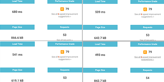
You don’t need to just test your website with one tool. You can use multiple tools and run multiple tests to be thorough.

However, we recommend users to just use these tools to improve your website performance. Trying to achieve a perfect grade or score on these tools is often extremely difficult and quite impossible in most cases for real-world functioning websites.

Your goal should be to improve your page load speed for your users, so they can enjoy a faster and consistent user experience on your website.

Having said that, let’s take a look at the best tools to run a website speed test.

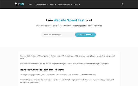
1. IsItWP Website Speed Test Tool

IsItWP Website Speed Test Tool

IsItWP’s free website speed test tool is the most beginner-friendly website speed testing tool. It allows you to quickly check your website performance, run multiple tests, and drill down the results to find out what’s slowing down your website.

You also get improvement suggestions neatly organized. You can click on each category to see the steps you can take to troubleshoot performance issues. The website also offers server uptime monitoring and other useful tools for website owners.

2. Pingdom

Pingdom

Pingdom is one of the most popular website performance monitoring tool. It is easy to use and allows you to select different geographical locations to run a test which is really handy.

The results are presented with an easy to understand overview, which is followed by the detailed report. You get performance improvement suggestions at the top and individual resources as they loaded.

3. Google Pagespeed Insights

Google Pagespeed insights

Google Pagespeed Insights is a website performance monitoring tool created by Google. It gives you website performance reports for both mobile and desktop views. You can switch between these reports and find some issues that are common among both reports and some that Google recommends being fixed in the mobile view.

You also get detailed recommendations for each issue, which is helpful for developers. However, the tool itself is a bit intimidating for beginners and non-developer users.

4. GTmetrix

GTmetrix

GTmetrix is another powerful website speed testing tool. It allows you to test your website using popular tools like pagespeed and YSlow. You can change geographic location and browser by creating an account.

It shows detailed reports with a brief summary of the results. You can switch between the two tools and view recommendations. Clicking on each recommendation will provide you with more details.

5. WebPageTest

WebPageTest

WebPageTest tool is another free online speed test tool that you can use. It is a bit more advanced than some other tools on our list. However, it does allow you to choose a browser and geographic location for your tests.

By default, it runs the test 3 times to get your website speed test results. It shows a detailed view of each result which you can click to expand and view the full report.

6. Load Impact

Load Impact

Load Impact is slightly different than other website speed test tools on this list. It allows you to see how your website slows down when more visitors arrive at the same time.

It is a paid service with a limited free test, which allows you to send 25 virtual users within 3 minutes. The paid version allows you to test larger traffic loads. This helps you test website speed test, while also testing how increased traffic affects your website.

7. Uptrends

Uptrends

Uptrends is another free website speed test tool. It allows you to select a geographic region, browser, and switch between mobile and desktop tests.

Results are simple and easy to understand as it also shows your Google pagespeed score in the summary. You can scroll down for details and comb through your resources to understand the performance issues.

8. Byte Check

Byte Check

Byte Check is another free website response time checker. It is made specifically to check TTFB (time to first byte) measurement, which is the time your website takes to deliver the first byte of data back to user’s browser. It is a highly effective way to test how faster your WordPress hosting server is.

You can use any of the tools mentioned above to check your website speed and performance. However, simply running the tests alone would not help you much.

You’ll need to learn how to run these tests properly and use the data to optimize your website.

How to Properly Run a Website Speed Test

Running website speed tests is not guaranteed to tell you exactly how your website performs.

You see, the internet is like a highway. Sometimes there is more traffic or congestion which may slow you down. Other times, everything is clear and you can run through it much quicker.

There are several other factors involved which would affect the quality and accuracy of your results. It is important to run these tests thoroughly before you start analyzing the data.

Let’s see how to properly run a website speed test to get more accurate results.

1. Run Multiple Tests

There are multiple factors that can affect your test. Even though most website speed test tools run over the cloud at the fastest internet speeds, each test would show you slightly different results.

The most important difference you will notice is the time it took to download the complete webpage. We recommend running at least 3 tests to get a more accurate picture.

Run multiple tests

You can then take out an average result and use it to decide whether or not your website needs improvement.

2. Test from Different Geographic Locations

If most of your customers visit your website from Asia, then testing your website speed using servers located in the USA would not be ideal.

The test results will show you a different user experience than what your actual users are feeling when they visit your website.

Geo locations

This is why you need to use Google Analytics to see where your users are coming from. After that, use that information to select a geographic region for your tests.

For example, if you learned that most of your website users are coming from Europe, then choosing a test server in Germany will give you the closest results.

If your website visitors are from all over the world, then you can run multiple tests to find out how your website performance varies for different regions.

3. Make Sure Your Website Caching is Turned On

Make sure that your website caching is turned on before running the tests. This would allow you to test website caching and how effective it is in improving the performance.

Now the problem is that some caching solutions only store cache when a user requests the page. This means cache takes some time to build and may expire by the time you run the tests.

This is why we recommend WP Rocket. It is the best WordPress caching plugin that lets you setup your WordPress cache with a few clicks and without learning technical stuff.

The best part is that it proactively builds your website cache, which significantly improves your website performance. See our guide on how to set up WordPress cache using WP Rocket for more details.

4. Check the Performance of Your Website Firewall / CDN Service

While WordPress caching plugins can do a lot, they definitely have their limitations. For example, it cannot block DDOS attacks and brute force attempts. It also does nothing against spambots which means your server resources get wasted a lot.

This is where you need Sucuri. It is the best WordPress firewall plugin which improves your server performance by blocking malicious requests.

Now, normally all your website files are served from the same server. You can improve this by adding a CDN service to your website. We recommend using MaxCDN (by StackPath), which is the best CDN solution for beginners.

A CDN service allows you to serve static website files like images, stylesheets, and scripts through a network of servers spread around the globe. This reduces the server load on your website, makes it load faster, and improves user experience for all your users.

Turning on your CDN service and the firewall will improve your test results significantly.

Understanding Website Speed Test Results

The most important parameter that you should look into is the time it takes your website to load.

Page load time

This is the parameter that affects your users the most. If your website takes longer to load, then users may decide to hit the back button, have a bad impression of your brand, and consider your website of low quality.

If your website is taking longer than 2 seconds to load, then look at the drill-down reports. Find out which resources are taking longer to load.

Usually, these are images, stylesheets, scripts loading from third-party websites, video embeds, and so on. You would want to make sure that those images are served from the cache or your CDN service.

Looking at individual resources

You would also want to pay attention to how long your server takes to respond to each request and how much time time it takes to deliver the first byte.

You would also want to make sure that browser compression (also called gzip compression) is working. This reduces the filesizes between your server and user’s browser by compressing them.

If your page has lots of images and videos, then you may want to consider deferred loading techniques also called lazy loading. This allows content to be loaded when a user scrolls down and only loads the content that is visible on the user’s screen.

As always, you definitely want to make sure your images are optimized for web by using an image compression tool.

The second important parameter you would want to test is the TTFB (time to first byte). If your web server is continuously showing a slower time to the first byte, then you may need to talk with your web hosting company.

All top WordPress hosting companies like Bluehost, SiteGround, and WP Engine have their own caching solutions. Turning on your host’s caching solution may significantly improve TTFB results.

We hope this article helped you learn how to properly run a website speed test and the best tools to run your tests. You may also want to follow our step by step WordPress speed and performance guide to boost your website speed.

If you liked this article, then please subscribe to our YouTube Channel for WordPress video tutorials. You can also find us on Twitter and Facebook.

The post How to Properly Run a Website Speed Test (8 Best Tools) appeared first on WPBeginner.

A Tutorial on Firebase Hosting

If you are looking to host your NextGen web app safely, Firebase from Google can put you at ease by providing fast, reliable, and secure static hosting for your web app. Offering production-grade web content hosting, Google Firebase enables you to effortlessly deploy web apps and static web page content and connect to a CDN (content-delivery network) with a single command.

Furthermore, with Firebase as an all-in-one hosting solution, you are exempt from sizing up various available cloud-based hosting service providers.

Struggling To Get A Handle On Traffic Surges

Struggling To Get A Handle On Traffic Surges

Struggling To Get A Handle On Traffic Surges

Suzanne Scacca

(This is a sponsored article.) When a traffic spike hits, you want your website to be able to ride the wave instead of drown beneath it.

But how do you do that without constantly overspending on server resources in anticipation of a traffic surge that may or may not happen?

Part of it comes down to knowing how to read your data really well so that you can predict upcoming upticks (or slumps) in traffic. Even then, the ebbs and flows of your data don’t always accurately predict when a traffic surge will hit, how big it will be or how long it will last.

So, what you need to do is make sure your clients’ websites are prepared to take the hit and then sustain the traffic. What we’re going to do today is help you create a system of tools, monitoring, and testing that will enable your websites to do this.

How To Prepare Your Website For A Traffic Surge

To properly prepare your website for traffic surges, you need to set up a system that’s both proactive and reactive. Here’s what it should include:

1. Move Your Website to a Scalable Cloud Solution

The reason why traffic surges are able to wreak havoc on websites is because the hosting servers and resources are unprepared to handle them. Pure and simple.

That said, if you can’t predict when a surge will happen, how do you ensure your hosting has the capacity to handle the increased traffic load? Do you simply throw more money into an oversized hosting plan just in case?

Obviously, that’s not a cost-efficient way to deal with a potential traffic surge. Instead, you should look for a hosting solution that will scale to your needs.

Leverage DigitalOcean Hosting Technology

One such provider that can help with this is DigitalOcean, a developer of scalable cloud solutions.

What’s nice about this option is that DigitalOcean gives you optimized “droplets” to choose from. There’s no need to guess which plan is right for you — everything is clearly spelled out in DigitalOcean’s very useful use case recommendations:

Digital Ocean vCPU droplets
DigitalOcean sells virtual CPUs that are optimized for specific use cases. (Source: DigitalOcean) (Large preview)

As you can see, Droplets are easy-to-configure virtual machines built for different kinds of websites and applications. What’s more, they’re configured for speed and security right out of the box with KVM hypervisors, SSD storage and 40GbE connectivity.

What’s more, as your website’s traffic grows, it’s easy to upgrade the amount of storage and bandwidth within your Droplet. And if you can figure out the rhyme or reason for traffic surges later on, you can quickly scale your resources up and down to accommodate the changes in traffic.

That said, a scalable cloud hosting solution isn’t enough to deal with traffic surges. There are a couple more things you’ll need.

Use Load Balancers for Surges

If you’re unfamiliar with load balancing technology, let’s take a look at the difference between a website with and without it.

This is what happens when someone visits your website without a load balancer:

DigitalOcean - No Load Balancing graphic
A graphic from DigitalOcean on how visitors access a website without load balancing. (Source: DigitalOcean) (Large preview)

They log onto the Internet, enter your URL in their web browser or click on a link to it and then your server is supposed to deliver your website to their screen.

But if the amount of traffic requesting access to your site suddenly surges, this lone server may not be able to efficiently handle the load. This is why excessively high traffic surges can lead to painfully slow websites or no access to websites altogether.

With a load balancer, however, this is what happens to your web traffic:

DigitalOcean - Load Balancing graphic
A graphic from DigitalOcean on how visitors access a website when load balancing is implemented. (Source: DigitalOcean) (Large preview)

A load balancer serves as a sort of proxy for your server. This way, when traffic peaks, your server doesn’t have to struggle to handle the demand. Instead, the load balancer leverages multiple servers to balance out the growing volume of HTTP requests.

It’s kind of like distributing your workload amongst your team. Rather than continue to pile on the requests for team members who are already overloaded, you share the work with those who have the capacity for it.

Unlike real-world work distribution, however, load balancers do all of this behind the scenes and don’t need you to coordinate anything as it’s fully managed.

Take Advantage of Performance Monitoring and Backups

So long as you have the right amount of bandwidth and storage configured in your droplet, and load balancing activated, your website will be in good shape. It won’t be impervious to traffic surges, but it’ll be as close to it as you can get.

Just keep in mind that for all of the fortifying you do at the server level, it’s still important to have a contingency plan in place.

Your business (website) continuity plan should include all of the things you need to do to get your website back to normal, including how to:

  • Restore the website,
  • Investigate the event that led to it,
  • And reach out to visitors and customers who were impacted.

That said, there are some parts of your continuity plan that DigitalOcean can help with.

Automated backups are essential for any website, but they’re absolutely critical if you know that your website will be susceptible to traffic surges. 24/7 support is another must and is something DigitalOcean offers as well.

Another thing to look for is built-in performance monitoring — something I’m going to touch on further down in this post.

2. Optimize Your Assets

With a solid cloud hosting solution in place, you can certainly give your website the help it needs to survive a huge traffic surge. However, it can’t all fall on your host. You need to do your part to make your website “light” enough to serve over and over again to the onslaught of visitors.

Here are some things you can do to optimize your website and its assets for greater performance:

Enable Caching and Other File Optimizations

Want your digital assets to be easier to handle? Then, you’ll need the following optimizations configured:

Caching

There are a variety of ways to implement caching and speed up how quickly your website gets delivered to visitors’ browsers. You can do this at the server, page, browser database levels.

Your web host can help you configure server caching.

If you’ve built your website with a content management system like WordPress, you can install a caching plugin to take care of the website and database baching for you. (It’ll also do things like file minification, Gzip compression combine CSS and JavaScript files.)

You can always enable caching manually. You’ll use your cache headers and two mechanisms in particular — Cache-control and Expires — to configure how your content is cached.

Image Optimization

Don’t forget about your media. Image and video files can take up a lot of room on your server as well as impede how quickly your server works during a traffic surge. To optimize these assets, you should use file compression and resizing.

To compress images in bulk, I’ll use an online tool like TinyPNG or TinyJPG to handle it for me.

TinyPNG image compression
TinyPNG offers a quick and easy way to bulk-compress image assets. (Source: TinyPNG) (Large preview)

On average, I can usually cut my file sizes by about 75% with this one tool.

To further shrink the heft of your images, you should be resizing them. There’s no reason to upload full-sized assets to a website if the maximum width you’re going to use is 1280 pixels or thereabouts.

For this, I’ll either use my file software to do it all in one go or I’ll use an online service like Bulk Resize Photos.

Bulk Resize Photos image resizing tool
Bulk Resize Photos offers an easy way to bulk-resize image assets using a variety of resizing methods. (Source: Bulk Resize Photos) (Large preview)

There’s a lot of flexibility here in how images are resized, but I find that setting a max width usually works best.

Use Managed Databases

In addition to optimizing the assets you put into a website, you should take some care to optimize your databases. That said, it’s often easier said than done.

While I’m familiar with database cleanup and optimization plugins you can use with WordPress to keep things running more smoothly, that’s not going to help much when it comes to a traffic surge. You need something that will help your database continue to process incoming data requests even at a higher rate.

For that, you’d be best off with a managed database solution — something you can provision from DigitalOcean.

When a traffic surge is detected, managed database services simplify what needs to be done in order to scale your resources accordingly. There are no calculations needed; simply log into your account and add more resources as needed.

Another reason why managed services are ideal in these kinds of situations is because of their built-in high availability. And this isn’t just some blanket promise of 99.9% uptime. If you take a look at your host’s SLA, you’ll find that it will go to great lengths to prevent egregious amounts of downtime.

Add a CDN

There’s another layer of optimization to add to your site when traffic surges are a common occurrence: a CDN.

Content delivery networks are useful for a whole host of reasons. They’re great for serving websites to global visitors. They’re definitely handy for e-commerce websites that want to provide a faster checkout experience. And they provide additional speed, security, and failover for websites that occasionally encounter high upticks in traffic.

If you’re planning on using DigitalOcean to host your website, look to its Spaces product (with built-in CDN integration) for more efficient storage and delivery of your assets.

3. Analyze Your Traffic Reports

In general, it’s really important to be diligent about collecting data from your website. That’s especially so when battling traffic surges. Here’s why:

If there are predictable highs and lows in your website traffic, you’ll know when and how exactly to plan for them. This not only means optimizing your website and server to handle the traffic but having the right amount of staff on to monitor and manage it.

To do this, use Google Analytics to keep tabs on everything.

Google Analytics - charting out pageviews
A sample traffic and pageviews chart from Google Analytics. (Source: Google Analytics) (Large preview)

This example is a 12-month data pull that shows how many page views occurred every day (more or less). You can do this with other metrics like the number of users or sessions as well. The main goal, however, is to identify any sources of stress throughout the year, and excessive pageviews (or e-commerce conversions, if relevant) may be a more effective way to measure this.

You can see here that there were a number of high-highs and low-lows that took place:

Google Analytics - traffic surge searching
An example of how Google Analytics users would look for traffic surges in their data. (Source: Google Analytics) (Large preview)

Rather than take them at face value, cross-reference them against other data points to ensure that what you’re looking at was a traffic surge you can learn from.

Rule Out Web Development

For example, was there any on-site development going on on those days? If someone were repairing a bug or designing a new page, that could cause the pageview numbers to increase greatly.

If this happens a lot, it would be a good idea to automatically strip this data out of your reports at the Google Analytics level. You can do this from the Admin menu.

Go to View > Filters > Add Filter:

Google Analytics filters
Google Analytics users can remove their personal visit and pageview metrics from results. (Source: Google Analytics) (Large preview)

By filtering out data for your IP address as well as anyone else who may preview the site frequently for testing or content creation purposes, you’ll give yourself a more accurate view of your traffic levels.

Let’s say that the spikes in traffic weren’t from your internal team. Next, you’ll want to see if these traffic surges (or drops) occur at predictable intervals.

Look for Predictable Surges

If your website has been live for more than a year, you can use Google Analytics to see if there’s a correlation. Simply set your dates to compare against the same timeframe from the previous year:

Google Analytics date range comparison
Google Analytics allows users to compare two date ranges side-by-side. (Source: Google Analytics) (Large preview)

Then, look for overlaps in traffic surges:

Google Analytics date range comparison data
Google Analytics users can simultaneously review two date ranges for traffic surge predictability. (Source: Google Analytics) (Large preview)

In this case, there’s maybe only one or two notable spikes that occurred in both years. The first was in early April and the other was around mid-November.

If these were excessively large surges in both years — like at least five times more than the usual amount of traffic — I’d say they’d be worth investigating. In this example, however, it’s probably just a coincidence and they can be ruled out.

Check the Calendar

If you have identified a notable traffic surge in your data, the last thing to do is check it against your calendar.

What you’re looking for are events that could have caused the surge. Things like:

  • Holiday sales that generated a bunch of buzz.
  • Press releases that got picked up on major news wires.
  • Viral blog posts or email offers you sent out.

I’d also suggest looking at the traffic during the days or weeks following the traffic surge.

How did it taper off? Was it suddenly or a slow burn? Was the website able to improve its daily traffic numbers — even slightly — thanks to the surge?

Also, look at how the organization was impacted. This is especially important for e-commerce websites that provide customer support and product returns. Was there an uptick in post-sale activity after the surge? When did it hit? How long did it last for?

If you can figure out why the traffic surge happened (i.e. what event triggered it) and what the fallout was, you can actually use this to your advantage in the future. For example, if you know that a sale or viral post caused the surge, you can plan your server and staffing resources ahead of the next one.

Regardless of what you find looking at old reports, this needs to become part of your ongoing process. Set up Google Analytics to generate traffic reports and email them to you on a regular basis. This way, as traffic levels change — for good or bad — you’ll always be in the know with what’s going on and can adapt your strategy accordingly.

4. Real-time Performance Monitoring

Google Analytics will help you figure out what happened in the past and prepare more effectively for future traffic surges. Real-time performance monitoring, on the other hand, will allow you to react to traffic surges and other performance changes in the heat of the moment.

There are various tools you can use for real-time monitoring. Here’s just a sample of them:

Frontend Performance Monitoring

When page speed suddenly begins to deteriorate or your website goes down, there’s no time to waste. That said, it shouldn’t be up to you to regularly log into your website to make sure everything’s running fine.

Instead, you can use an uptime and speed monitoring service like Pingdom:

Pingdom monitoring and alerting services
Users can automate uptime, user and speed monitoring with Pingdom. (Source: Pingdom) (Large preview)

It handles the tedious job of monitoring your website for upticks in traffic, problems with speed or uptime as well as issues detected at checkout. It will also serve you real-time notices so you can take care of issues caused by traffic surges before they get too bad.

This way, you’ll only need to give your website the attention and care it needs when a traffic surge has a negative impact on performance instead of constantly worrying about it.

Backend Performance Monitoring

While it’s great to have a frontend monitoring service to tell you when traffic’s out of whack, it’s not enough. You need to know what’s going on on the backend as well.

Of course, with a managed hosting solution, you’ll get some help from your provider. However, it’s a good idea to familiarize yourself with your server metrics so you can be proactive about fighting off the devastating effects of surges.

Here are some of the metrics to keep an eye on:

  • Hosting resources (like memory and disk space),
  • Your application performance (like error rates and resource usage),
  • Connectivity (like latency and bandwidth utilization).

Become acquainted with these key metrics so you’re never scrambling to figure out what’s going on with your website or how to fix it.

Now, with DigitalOcean, you won’t just get access to these handy metrics. It will set you up with real-time monitoring and alerts, too. And that’s not all.

The problem with many monitoring systems is that they’re just that: they look for outages, errors, and instability, but it’s still up to you to take action. With DigitalOcean, though, you can automate certain actions to take place when specific scenarios are detected.

For example, let’s say your website is receiving a much larger rush of traffic than you had anticipated for the holiday sale. Your resources are depleting too fast, which would normally put a website in risk of slowing to a crawl or crashing altogether. But in this case, the monitoring mechanism has noted the issue and your auto-scaling action has been triggered.

Imagine how useful it would be to automate your server’s response to certain events. You could spend less time worrying about how to restore your website and instead focus on how to keep optimizing your server assets to sustain the high levels of traffic.

Wrapping Up

If your clients’ websites or PWAs aren’t ready for a traffic surge, it could spell major trouble for their businesses once the dust settles. And it’s not just downtime or slow-loading pages that will cost them (or you).

Having all of those extra visitors see a website that’s in ill shape — from broken checkouts or forms to malware infections — will hurt your business, too.

Rather than cross your fingers or tell yourself that your website isn’t big enough or popular enough to experience one of those traffic surges, be prepared. By starting with a practical cloud hosting solution from DigitalOcean and then optimizing your server, assets and processes surrounding them, you’ll improve your website’s chances of not only surviving a surge intact but greatly profiting from it.

Smashing Editorial (ra, yk, il)

Oh, the Places JavaScript Will Go

I tend to be pretty vocal about the problems client-side JavaScript cause from a performance perspective. We're shipping more JavaScript than ever to our user's devices and the result is increasingly brittle and resource-intensive experiences. It's... not great.

But that doesn't mean I don't like JavaScript. On the contrary, I enjoy working in JavaScript quite a bit. I just wish we were a little more selective about where we use it.

What excites me is when JavaScript starts reaching into parts of the technical stack where it didn't live before. Both server-side programming and the build tool process weren't exactly off-limits to front-end developers, but before Node.js and tools like Grunt, Gulp, webpack, and Parcel came along, they required different languages to be used. There are a lot of improvements (asset optimizations, test running, server-side adjustments necessary for improved front-end performance, etc) that required server-side languages, which meant most front-end developers tended not to go there. Now that those tools are powered by JavaScript, it's far more likely that front-end developers can make those changes themselves.

Whenever we take a part of the technology stack and make it more approachable to a wider audience, we'll start to see an explosion of creativity and innovation. That's exactly what's happened with build processes and bundlers. There's been an explosion of innovation in no small part thanks to extending where front-end developers can reach.

That's why I'm really excited about edge computing solutions.

Using a CDN is one of the most valuable things you can do to improve performance and extend your reach. But configuring that CDN and getting the maximum amount of value has been out of reach for most front-end teams.

That's changing.

Cloudflare has Cloudflare Workers, powered by JavaScript. Akamai has EdgeWorkers, powered by JavaScript. Amazon has Lambda@Edge, powered by JavaScript. Fastly just announced Compute@Edge which is powered by WebAssembly. You can't write JavaScript at the moment for Compute@Edge (you can write TypeScript if that's your thing), but I suspect it's only a matter of time before that changes.

Each of these tools provides a programmable layer between your CDN and the people visiting your site, enabling you to transform your content at the edge before it ever gets to your users. Critically, all of these tools make doing these things much more approachable to front-end developers.

For example, instead of making the client do all the work for A/B testing, you can use any one of these tools to handle all the logic on the CDN instead, helping to make client-side A/B testing (an annoyance of every performance-minded engineer ever) a thing of the past. Optimizely's already using this technology to do just that for their own A/B testing solution.

Using a third-party resource? Edge computing makes it much easier to proxy those requests through your own CDN, sparing you the extra connection cost and helping eliminate single point of failures.

Custom error messages? Sure. User authentication? You betcha. Personalization? Yup. There's even been some pretty creative technical SEO work happening thanks to edge computing.

Some of this work was achievable before, but often it required digging through archaic user interfaces to find the right setting or using entirely different languages and tools like ESI or Varnish which don't really exist outside of this little sliver of space they operate in.

Making these things approachable to anyone with a little JavaScript knowledge has the potential to help be a release valve of sorts, making it easier for folks to move some of that heavy work away from client devices and back to a part of the tech stack that is much more predictable and reliable. Like Node.js and JavaScript-driven build tools, they extend the reach of front-end developers further.

I can't wait to see all the experimentation that happens.

The post Oh, the Places JavaScript Will Go appeared first on CSS-Tricks.

Netlify Build Plugins Announcement

Netlify just dropped a new thing: Build Plugins. (It's in beta, so you have to request access for now.) Here's my crack at explaining it, which is heavily informed from David Well's announcement video.

You might think of Netlify as that service that makes it easy to sling up some static files from a repo and have a production site super fast. You aren't wrong. But let's step back and look at that. Netlify thinks about itself as a platform in three tiers:

  1. Netlify Build
  2. Netlify Dev
  3. Netlify Edge

Most of the stuff that Netlify does falls into those buckets. Connecting your Git repo and letting Netlify build and deploy the site? That's Build. Using Netlify's CLI to spin up the local dev environment and do stuff like test your local functions? That's Dev. The beefed-up CDN that actually runs our production sites? That's Edge. See the product page for that breakdown.

So even if you're just slapping up some files that come out of a static site generator, you're still likely taking advantage of all these layers. Build is taking care of the Git connection and possibly running a npm run build or something. You might run netlify dev locally to run your local dev server. And the live site is handled by Edge.

With this new Build Plugins release, Netlify is opening up access to how Build works. No longer is it just "connect to repo and run this command when the build runs." There is actually a whole lifecycle of things that happen during a build. This is how David described that lifecycle:

  1. Build Starts
  2. Cache is fetched
  3. Dependencies are installed
  4. Build commands are run
  5. Serverless Functions are built
  6. Cache is saved
  7. Deployment
  8. Post processing

What if you could hook into those lifecycle events and run your own code alongside them? That's the whole idea with Build Plugins. In fact, those lifecycle events are literally event hooks. Sarah Drasner listed them out with their official names in her intro blog post:

  • init: when the build starts
  • getCache: fetch the last build’s cache
  • install: when the project’s dependencies are installing
  • preBuild: runs directly before building the functions and running the build commands
  • functionsBuild: runs when the serverless functions are building, if they exist on the site
  • build: when the build commands are executing
  • package: package it to be deployed
  • preDeploy: runs before the built package is deployed
  • saveCache: save cached assets
  • finally: build finished, site deployed 🚀

To use these hooks and run your own code during the build, you write a plugin (in Node JavaScript) and chuck it in a plugins folder at like ./plugins/myPlugin/index.js

function netlifyPlugin(config) {
  return {
    name: 'my-plugin-name',
    init: () => {
      console.log('Hi from init')
    },
  }
}

module.exports = netlifyPlugin

...and adjust your Netlify config (file) to point to it. You're best off reading Sarah's post for the whole low-down and example.

OK. What's the point?

This is the crucial part, right? Kind of the only thing that matters. Having control is great and all, but it only matters if it's actually useful. So now that we can hook into parts of the build process on the platform itself, what can we make it do that makes our lives and sites better?

Here's some ideas I've gathered so far.

Sitemaps

David demoed having the build process build a sitemap. Sitemaps are great (for SEO), but I definitely don't need to be wasting time building them locally very often and they don't really need to be in my repo. Let the platform do it and put the file live as "a build artifact." You can do this for everything (e.g. my local build process needs to compile CSS and such, so I can actually work locally), but if production needs files that local doesn't, it's a good fit.

Notifications

Sarah demoed a plugin that hits a Twilio API to send a text message when a build completes. I do this same kind of thing having Buddy send a Slack message when this site's deployment is done. You can imagine how team communication can be facilitated by programmatic messaging like this.

Performance monitoring

Build time is a great time to get performance metrics. Netlify says they are working on a plugin to track your Lighthouse score between deployments. Why not run your SpeedCurve CLI thing or Build Tracker CLI there to see if you've broken your performance budget?

Optimizations

Why not use the build time to run all your image optimizations? Image Optim has an API you could hit. SVGO works on the command line and Netlify says they are working on that plugin already. I'd think some of this you'd want to run in your local build process (e.g. drop image in folder, Gulp is watching, image gets optimized) but remember you can run netlify dev locally which will run your build steps locally, and you could also organize your Gulp such that the code that does image optimization can build part of a watch process or called explicitly during a build.

Images are a fantastic target for optimzation, but just about any resource can be optimized in some way!

Bailing out a problematic builds

If your build process fails, Netlify already won't deploy it. Clearly useful. But now you could trigger that failure yourself. What if that performance monitoring didn't just report on what is happening, but literally killed the build if a budget wasn't met? All you have to do is throw an error or process.exit, I hear.

Even more baller, how about fail a build on an accessibility regression? Netlify is working on an Axe plugin for audits.

Clearly you could bail if your unit tests (e.g. Jest) fail, or your end-to-end tests (e.g. Cypress) fail, meaning you could watch for 404's and all sorts of user-facing problems and prevent problematic deploys at all.

Use that build

Netlify is clearly all-in on this JAMstack concept. Some of it is pretty obvious. Chuck some static files on a killer CDN and the site has a wonderfully fast foundation. Some of it is less obvious. If you need server-powered code still, you still have it in the form of cloud functions, which are probably more powerful than most people realize. Some of it requires you to think about your site in a new way, like the fact that pre-building markup is not an all-or-nothing choice. You can build as much as you can, and leave client-side work to do things that are more practical for the client-side to do (e.g. personalized information). If you start thinking of your build process as this powerful and flexible tool to offload as much work as possible to, that's a great place to start.

The post Netlify Build Plugins Announcement appeared first on CSS-Tricks.

How to Optimize Images for Web Performance without Losing Quality

Did you know that optimizing your images before uploading to WordPress can have a huge impact on your website speed?

When starting a new blog, many beginners simply upload images without optimizing them for the web. These large image files make your website slower.

You can fix this by using image optimization best practices as part of your regular blogging routine.

In this article, we will show you how to optimize your images for faster web performance without losing quality. We will also share automatic image optimization plugins for WordPress that can make your life easy.

How to Easily Optimize Images for the Web (Without Losing Quality)

Since this is a comprehensive guide on image optimization for the web, we have created an easy-to-follow table of content:

What Is Image Optimization?

Image optimization is a process of saving and delivering images in the smallest possible file size without reducing the overall image quality.

While the process sounds complex, it’s actually quite easy these days. You can use one of the many image optimization plugins and tools to automatically compress images by up to 80% without any visible loss in image quality.

Here’s an example of an optimized vs unoptimized image:

Optimized vs Unoptimized Images in WordPress

As you can see, when optimized properly the same image can be up to 80% smaller than the original without any loss in quality. In this example, the image is 52% smaller.

How Does Image Optimization Work?

In simple terms, image optimization works by using compression technology.

Compression can be ‘lossy’ or ‘lossless’.

Lossless compression reduces the overall file size with absolutely no loss of image quality. With lossy compression, there may be a minor loss in quality, but ideally, it won’t be noticeable to your visitors.

What Does It Mean to Optimize Images?

You may have received a recommendation to optimize images from your WordPress hosting support or a speed test tool and wonder what you need to do.

You will need to reduce the file size of your images by optimizing them for the web. We’ll show you how to do that step-by-step.

What Are the Benefits of Image Optimization?

While there are many benefits to optimizing your images, here are the top ones that you should know:

  • Faster website speed
  • Improved SEO rankings
  • Higher overall conversion rate for sales and leads
  • Less storage and bandwidth (which can reduce hosting and CDN costs)
  • Faster website backups (which can reduce the cost of backup storage)

Images are the second heaviest item on a web page after video. According to the HTTP archive, images make up 21% of an average webpage’s total weight.

Since we know fast websites rank higher in search engines (SEO) and have better conversions, image optimization is something that every business website must do if they want to succeed online.

Now you might be wondering how big a difference image optimization can really make.

According to a Strangeloop study, a one-second delay in website load time can cost you 7% of sales, 11% fewer pageviews, and a 16% decrease in customer satisfaction.

Strangeloop case study

If these aren’t enough reasons to speed up your website, then you should know that search engines like Google also give preferential SEO treatment to faster-loading websites.

This means that by optimizing your images for the web, you can both improve website speed and boost WordPress SEO rankings.

Video Tutorial

If you’d prefer written instructions, then just keep reading.

How to Save and Optimize Images for Web Performance

The key to successful image optimization for web performance is to find the perfect balance between the lowest file size and acceptable image quality.

The three things that play a huge role in image optimization are:

  • Image file format (JPEG vs PNG vs GIF)
  • Compression (higher compression = smaller file size)
  • Image dimensions (height and width)

By choosing the right combination of the three, you can reduce your image size by up to 80%.

Let’s take a look at each of these in more detail.

1. Image File Format

For most website owners, the only three image file formats that really matter are JPEG, PNG, and GIF. Choosing the right file type plays an important role in image optimization.

To keep things simple, you want to use JPEGs for photos or images with lots of colors, PNGs for simple images or when you need transparent images, and GIFs for animated images only.

For those who don’t know the difference between each file type, the PNG image format is uncompressed which means it is a higher-quality image. The downside is that file sizes are much larger.

On the other hand, JPEG is a compressed file format that slightly reduces image quality in order to provide a significantly smaller file size.

Whereas GIF only uses 256 colors along with lossless compression which makes it the best choice for animated images.

On WPBeginner, we use all three image formats based on the type of image.

2. Compression

The next thing is image compression which plays a huge role in image optimization.

There are different types and levels of image compression available. The settings for each will vary depending on the image compression tool you use.

Most image editing tools like Adobe Photoshop, ON1 Photo, GIMP, Affinity Photo, and others come with built-in image compression features.

You can also save images normally and then use a web tool like TinyPNG or JPEGmini for easier image compression.

Although they require some manual effort, these two methods allow you to compress images before uploading them to WordPress, and this is what we do on WPBeginner.

There are also several popular WordPress plugins like Optimole and EWWW Image Optimizer that can automatically compress images when you first upload them. This is convenient, and many beginners and even large corporations prefer to use these image optimization plugins.

We will share more about using WordPress plugins later in the article.

3. Image Dimensions

Normally, when you import a photo from your phone or a digital camera, it has a very high resolution and large file dimensions (height and width).

Typically, these photos have a resolution of 300 DPI and dimensions starting from 2000 pixels and more. While high-quality photos are well-suited for print or desktop publishing, their large size makes them unsuitable for websites.

Reducing the image dimensions to something more reasonable can significantly decrease image file size. You can simply resize images using image editing software on your computer.

For example, we optimized a photo with a resolution of 300 DPI and image dimensions of 4900×3200 pixels. The original file size was 1.8 MB.

We chose the JPEG format for higher compression and changed the dimensions to 1200×795 pixels. The file size was reduced to just 103 KB. That’s 94% smaller than the original file size.

Now that you know the three important factors in image optimization, let’s take a look at various image optimization tools for website owners.

Best Image Optimization Tools and Programs

As we mentioned earlier, most image editing software comes with image optimization and compression settings.

Outside of the image editing software, there are also several powerful free image optimization tools that you can use to optimize images for the web (with just a few clicks).

We recommend using these tools to optimize images before you upload them to WordPress, especially if you are a perfectionist.

This method helps you save disk space on your WordPress hosting account, and it guarantees the fastest image with the best quality since you manually review each image.

Adobe Photoshop

Adobe Photoshop is a premium image editing application that lets you export images with a smaller file size for the web.

Export image for the web

Using the export dialog, you can choose an image file format (JPG, PNG, GIF) that gives you the smallest file size.

You can also reduce image quality, colors, and other options to further decrease file size.

Optimize image before saving

GIMP

GIMP is a free and open-source alternative to Adobe Photoshop. It can be used to optimize your images for the web. The downside is that it is not as easy to use as some other solutions on this list.

First, you need to open your image in GIMP and then select the File » Export As… option. This will bring up the Export Image dialog box where you can give your file a new name. Next, you need to click the ‘Export’ button.

You will now see the image export options. For JPEG files, you can use the ‘Quality’ slider to select the compression level and reduce file size.

Exporting an Image in GIMP

Finally, you should click on the ‘Export’ button to save the optimized image file.

TinyPNG

TinyPNG is a free web app that uses a smart lossy compression technique to reduce the size of your PNG and JPEG files. All you have to do is go to their website and upload your images using simple drag and drop.

Optimize Your Images

They will compress the image and give you a download link.

They also have an extension for Adobe Photoshop which is what we use as part of our image editing process because it lets you access TinyPNG from inside Photoshop.

For developers, they have an API to convert images automatically, and for beginners, they have a WordPress plugin that will do it for you. More on this later.

JPEGmini

JPEGmini uses a lossless compression technology that significantly reduces the size of images without affecting their perceptual quality. You can also compare the quality of your original image and the compressed image.

JPEGMini online image compression tool

You can use their web version for free, or purchase the program for your computer. They also have a paid API to automate the process for your server.

ImageOptim

ImageOptim is a Mac utility that allows you to compress images without losing any quality by finding the best compression parameters and removing unnecessary color profiles.

Optimizing Images Using ImageOptim

A Windows alternative to this is Trimage.

Best Image Optimization Plugins for WordPress

We believe that the best way to optimize your images is by doing it before uploading them to WordPress. However, if you run a multi-author site or need an automated solution, then you can try a WordPress image compression plugin.

Here is our list of the best WordPress image compression plugins:

  1. Optimole, a popular plugin by the team behind ThemeIsle
  2. EWWW Image Optimizer
  3. JPEG, PNG & WebP Image Compression, a plugin by the TinyPNG team mentioned above
  4. Imagify, a plugin by the popular WP Rocket team
  5. ShortPixel Image Optimizer
  6. Smush
  7. reSmush.it

These WordPress image optimization plugins will help you speed up your website.

Final Thoughts and Best Practices for Image Optimization

If you’re not saving images optimized for the web, then you need to start doing so now. It will make a huge difference in your site speed, and your users will thank you for it.

Not to mention, faster websites are great for SEO, and you will likely see an increase in your search engine rankings.

Outside of image optimization, the two things that will significantly help you speed up your website are using a WordPress caching plugin and using a WordPress CDN.

Alternatively, you can use a managed WordPress hosting company because they often offer both caching and CDN as part of the platform.

We hope this article helped you learn how to optimize your images in WordPress. You may also want to see our guide on how to improve your WordPress security and the best WordPress plugins for business websites.

If you liked this article, then please subscribe to our YouTube Channel for WordPress video tutorials. You can also find us on Twitter and Facebook.

The post How to Optimize Images for Web Performance without Losing Quality first appeared on WPBeginner.