When I was asked to make an auto-scrolling logo farm, I had to ask myself: “You mean, like a <marquee>?” It’s not the weirdest request, but the thought of a <marquee> conjures up the “old” web days when Geocities ruled. What was next, a repeating sparkling unicorn GIF background?
“Deprecated: This feature is no longer recommended. Though some browsers might still support it, it may have already been removed from the relevant web standards, may be in the process of being dropped, or may only be kept for compatibility purposes. Avoid using it, and update existing code if possible […] Be aware that this feature may cease to work at any time.”
That’s fine because whatever infinite scrolling feature <marquee> is offered, we can most certainly pull off in CSS. But when I researched examples to help guide me, I was surprised to find very little on it. Maybe auto-scrolling elements aren’t the rage these days. Perhaps the sheer nature of auto-scrolling behavior is enough of an accessibility red flag to scare us off.
Whatever the case, we have the tools to do this, and I wanted to share how I went about it. This is one of those things that can be done in lots of different ways, leveraging lots of different CSS features. Even though I am not going to exhaustively explore all of them, I think it’s neat to see someone else’s thought process, and that’s what you’re going to get from me in this article.
What We’re Making
But first, here's an example of the finished result:
The idea is fairly straightforward. We want some sort of container, and in it, we want a series of images that infinitely scroll without end. In other words, as the last image slides in, we want the first image in the series to directly follow it in an infinite loop.
So, here’s the plan: We’ll set up the HTML first, then pick at the container and make sure the images are correctly positioned in it before we move on to writing the CSS animation that pulls it all together.
Existing Examples
Like I mentioned, I tried searching for some ideas. While I didn’t find exactly what I was looking for, I did find a few demos that provided a spark of inspiration. What I really wanted was to use CSS only while not having to “clone” the marquee items.
Geoff Graham’s “Sliding Background Effect” is close to what I wanted. While it is dated, it did help me see how I could intentionally use overflow to allow images to “slide” out of the container and an animation that loops forever. It’s a background image, though, and relies on super-specific numeric values that make it tough to repurpose in other projects.
The effect is what I’m after for sure, but it uses some JavaScript, and even though it’s just a light sprinkle, I would prefer to leave JavaScript out of the mix.
Ryan Mulligan’s “CSS Marquee Logo Wall” is the closest thing. Not only is it a logo farm with individual images, but it demonstrates how CSS masking can be used to hide the images as they slide in and out of the container. I was able to integrate that same idea into my work.
But there’s still something else I’m after. What I would like is the smallest amount of HTML possible, namely markup that does not need to be duplicated to create the impression that there’s an unending number of images. In other words, we should be able to create an infinite-scrolling series of images where the images are the only child elements in the “marquee” container.
I did find a few more examples in other places, but these were enough to point me in the right direction. Follow along with me.
The HTML
Let's set up the HTML structure first before anything else. Again, I want this to be as “simple” as possible, meaning very few elements with the shortest family tree possible. We can get by with nothing but the “marquee” container and the logo images in it.
This keeps things as “flat” as possible. There shouldn’t be anything else we need in here to make things work.
Setting Up The Container
Flexbox might be the simplest approach for establishing a row of images with a gap between them. We don’t even need to tell it to flow in a row direction because that’s the default.
.marquee {
  display: flex;
}
I already know that I plan on using absolute positioning on the image elements, so it makes sense to set relative positioning on the container to, you know, contain them. And since the images are in an absolute position, they have no reserved height or width dimensions that influence the size of the container. So, we’ll have to declare an explicit block-size (the logical equivalent to height). We also need a maximum width so we have a boundary for the images to slide in and out of view, so we’ll use max-inline-size (the logical equivalent to max-width):
Notice I’m using a couple of CSS variables in there: one that defines the marquee’s height based on the height of one of the images (--marquee-item-height) and one that defines the marquee’s maximum width (--marquee-max-width). We can give the marquee’s maximum width a value now, but we’ll need to formally register and assign a value to the image height, which we will do in a bit. I just like knowing what variables I am planning to work with as I go.
Next up, we want the images to be hidden when they are outside of the container. We’ll set the horizontal overflow accordingly:
And I really like the way Ryan Mulligan used a CSS mask. It creates the impression that images are fading in and out of view. So, let’s add that to the mix:
To push marquee images outside the container, we need to define a --marquee-item-offset, but that calculation is not trivial, so we will learn how to do it in the next section. We know what the animation needs to be: something that moves linearly for a certain duration after an initial delay, then goes on infinitely. Let’s plug that in with some variables as temporary placeholders.
.marquee__item {
  position: absolute;
  inset-inline-start: var(--marquee-item-offset);
  animation: go linear var(--marquee-duration) var(--marquee-delay, 0s) infinite;
}
To animate the marquee items infinitely, we have to define two CSS variables, one for the duration (--marquee-duration) and one for the delay (--marquee-delay). The duration can be any length you want, but the delay should be calculated, which is what we will figure out in the next section.
.marquee__item {
  position: absolute;
  inset-inline-start: var(--marquee-item-offset);
  animation: go linear var(--marquee-duration) var(--marquee-delay, 0s) infinite;
  transform: translateX(-50%);
}
Finally, we will translate the marquee item by -50% horizontally. This small “hack” handles situations when the image sizes are uneven.
Note: I’m using the BEM modifier .marquee--8 to define the animation of the eight logos. We can define the animation keyframes now that we know the --marquee-item-width value.
@keyframes go {
  to {
    inset-inline-start: calc(var(--marquee-item-width) * -1);
  }
}
The animation moves the marquee item from right to left, allowing each one to enter into view from the right as it travels out of view over on the left edge and outside of the marquee container.
Now, we need to define the --marquee-item-offset. We want to push the marquee item all the way to the right side of the marquee container, opposite of the animation end state.
You might think the offset should be 100% + var(--marquee-item-width), but that would make the logos overlap on smaller screens. To prevent that, we need to know the minimum width of all logos combined. We do that in the following way:
But that is not enough. If the marquee container is too big, the logos would take less than the maximum space, and the offset would be within the container, which makes the logos visible inside the marquee container. To prevent that, we will use the max() function like the following:
The max() function checks which of the two values in its arguments is bigger, the overall width of all logos or the maximum width of the container plus the single logo width, which we defined earlier. The latter will be true on bigger screens and the former on smaller screens.
The delay equals the animation duration divided by a quadratic polynomial (that’s what ChatGPT tells me, at least). The quadratic polynomial is the following part, where we multiply the number of items and number of items minus the current item index:
Note that we are using a negative delay (* -1) to make the animation start in the “past,” so to speak. The only remaining variable to define is the --marquee-item-index (the current marquee item position):
This solution could be better, especially when the logos are not equal widths. To adjust the gaps between inconsistently sized images, we could calculate the delay of the animation more precisely. That is possible because the animation is linear. I’ve tried to find a formula, but I think it needs more fine-tuning, as you can see:
Another improvement we can get with a bit of fine-tuning is to prevent big gaps on wide screens. To do that, set the max-inline-size and declare margin-inline: auto on the .marquee container:
What do you think? Is this something you can see yourself using on a project? Would you approach it differently? I am always happy when I land on something with a clean HTML structure and a pure CSS solution. You can see the final implementation on the Heyflow website.
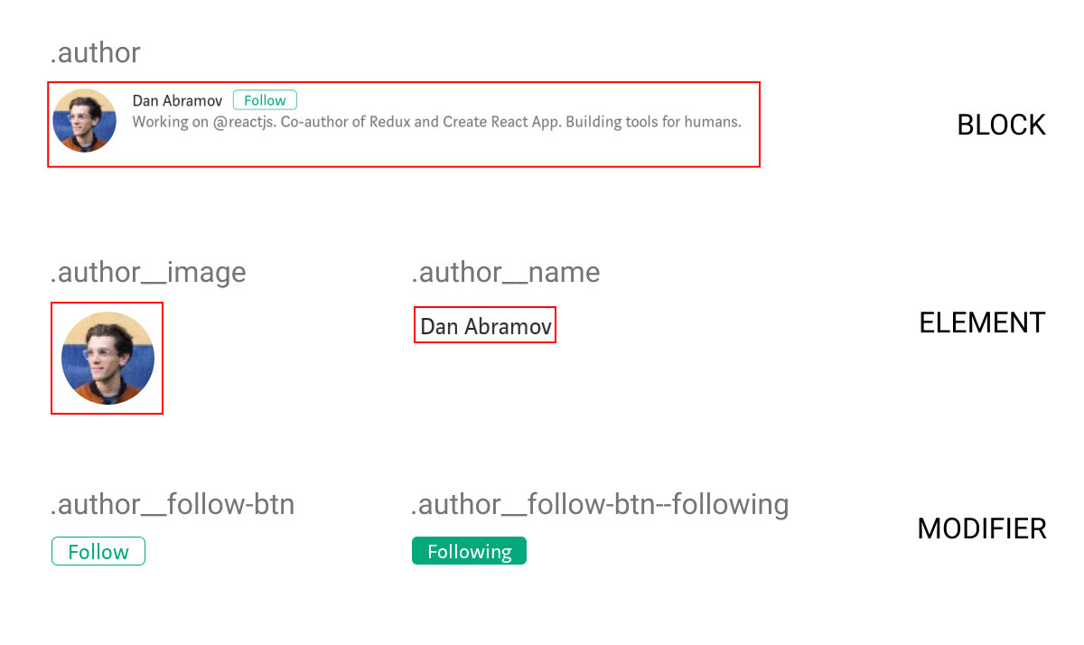
BEM. Like seemingly all techniques in the world of front-end development, writing CSS in a BEM format can be polarizing. But it is – at least in my Twitter bubble – one of the better-liked CSS methodologies.
Personally, I think BEM is good, and I think you should use it. But I also get why you might not.
Regardless of your opinion on BEM, it offers several benefits, the biggest being that it helps avoid specificity clashes in the CSS Cascade. That’s because, if used properly, any selectors written in a BEM format should have the same specificity score (0,1,0). I’ve architected the CSS for plenty of large-scale websites over the years (think government, universities, and banks), and it’s on these larger projects where I’ve found that BEM really shines. Writing CSS is much more fun when you have confidence that the styles you’re writing or editing aren’t affecting some other part of the site.
There are actually exceptions where it is deemed totally acceptable to add specificity. For instance: the :hover and :focus pseudo classes. Those have a specificity score of 0,2,0. Another is pseudo elements — like ::before and ::after — which have a specificity score of 0,1,1. For the rest of this article though, let’s assume we don’t want any other specificity creep. 🤓
But I’m not really here to sell you on BEM. Instead, I want to talk about how we can use it alongside modern CSS selectors — think :is(), :has(), :where(), etc. — to gain even more control of the Cascade.
What’s this about modern CSS selectors?
The CSS Selectors Level 4 spec gives us some powerful new(ish) ways to select elements. Some of my favorites include :is(), :where(), and :not(), each of which is supported by all modern browsers and is safe to use on almost any project nowadays.
:is() and :where() are basically the same thing except for how they impact specificity. Specifically, :where() always has a specificity score of 0,0,0. Yep, even :where(button#widget.some-class) has no specificity. Meanwhile, the specificity of :is() is the element in its argument list with the highest specificity. So, already we have a Cascade-wrangling distinction between two modern selectors that we can work with.
The incredibly powerful :has() relational pseudo-class is also rapidly gaining browser support (and is the biggest new feature of CSS since Grid, in my humble opinion). However, at time of writing, browser support for :has() isn’t quite good enough for use in production just yet.
Lemme stick one of those pseudo-classes in my BEM and…
/* ❌ specificity score: 0,2,0 */
.something:not(.something--special) {
  /* styles for all somethings, except for the special somethings */
}
Whoops! See that specificity score? Remember, with BEM we ideally want our selectors to all have a specificity score of 0,1,0. Why is 0,2,0 bad? Consider this same example, expanded:
Even though the second selector is last in the source order, the first selector’s higher specificity (0,2,0) wins, and the color of .something--special elements will be set to red. That is, assuming your BEM is written properly and the selected element has both the .something base class and .something--special modifier class applied to it in the HTML.
Used carelessly, these pseudo-classes can impact the Cascade in unexpected ways. And it’s these sorts of inconsistencies that can create headaches down the line, especially on larger and more complex codebases.
Dang. So now what?
Remember what I was saying about :where() and the fact that its specificity is zero? We can use that to our advantage:
The first part of this selector (.something) gets its usual specificity score of 0,1,0. But :where() — and everything inside it — has a specificity of 0, which does not increase the specificity of the selector any further.
:where() allows us to nest
Folks who don’t care as much as me about specificity (and that’s probably a lot of people, to be fair) have had it pretty good when it comes to nesting. With some carefree keyboard strokes, we may wind up with CSS like this (note that I’m using Sass for brevity):
In this example, we have a .card component. When it’s a “featured” card (using the .card--featured class), the card’s title and image needs to be styled differently. But, as we now know, the code above results in a specificity score that is inconsistent with the rest of our system.
A die-hard specificity nerd might have done this instead:
That’s not so bad, right? Frankly, this is beautiful CSS.
There is a downside in the HTML though. Seasoned BEM authors are probably painfully aware of the clunky template logic that’s required to conditionally apply modifier classes to multiple elements. In this example, the HTML template needs to conditionally add the --featured modifier class to three elements (.card, .card__title, and .card__img) though probably even more in a real-world example. That’s a lot of if statements.
The :where() selector can help us write a lot less template logic — and fewer BEM classes to boot — without adding to the level of specificity.
Whether or not you should opt for this approach over applying modifier classes to the various child elements is a matter of personal preference. But at least :where() gives us the choice now!
What about non-BEM HTML?
We don’t live in a perfect world. Sometimes you need to deal with HTML that is outside of your control. For instance, a third-party script that injects HTML that you need to style. That markup often isn’t written with BEM class names. In some cases those styles don’t use classes at all but IDs!
Once again, :where() has our back. This solution is slightly hacky, as we need to reference the class of an element somewhere further up the DOM tree that we know exists.
Referencing a parent element feels a little risky and restrictive though. What if that parent class changes or isn’t there for some reason? A better (but perhaps equally hacky) solution would be to use :is() instead. Remember, the specificity of :is() is equal to the most specific selector in its selector list.
So, instead of referencing a class we know (or hope!) exists with :where(), as in the above example, we could reference a made up class and the <body> tag.
The ever-present body will help us select our #widget element, and the presence of the .dummy-class class inside the same :is() gives the body selector the same specificity score as a class (0,1,0)… and the use of :where() ensures the selector doesn’t get any more specific than that.
That’s it!
That’s how we can leverage the modern specificity-managing features of the :is() and :where() pseudo-classes alongside the specificity collision prevention that we get when writing CSS in a BEM format. And in the not too distant future, once :has() gains Firefox support (it’s currently supported behind a flag at the time of writing) we’ll likely want to pair it with :where() to undo its specificity.
Whether you go all-in on BEM naming or not, I hope we can agree that having consistency in selector specificity is a good thing!
In my previous article, I discussed the advantages of using ITCSS to organize our styles, mainly for large projects where several people work. Its use will make our structure much more orderly and make the styles of our application more maintainable.
Having solved the problem of hierarchy and organization of our project, it remains to work on a nomenclature that will help us to have a self-documented code that is better understood. For this task, it can help us to include the BEM nomenclature together with the ITCSS nomenclature. In this article, we are going to approach BEMIT and what advantages it can offer us.
If you’re disciplined and make use of the inheritance that the CSS cascade provides, you’ll end up writing less CSS. But because our styles often comes from all kinds of sources — and can be a pain to structure and maintain—the cascade can be a source of frustration, and the reason we end up with more CSS than necessary.
Some years ago, Harry Roberts came up with ITCSS and it’s a clever way of structuring CSS.
Mixed with BEM, ITCSS has become a popular way that people write and organize CSS.
However, even with ITCSS and BEM, there are still times where we still struggle with the cascade. For example, I’m sure you’ve had to @import external CSS components at a specific location to prevent breaking things, or reach for the dreaded !important at some point in time.
Recently, some new tools were added to our CSS toolbox, and they allow us to finally control the cascade. Let’s look at them.
O cascade, :where art thou?
Using the :where pseudo-selector allows us to remove specificity to “just after the user-agent default styles,” no matter where or when the CSS is loaded into the document. That means the specificity of the whole thing is literally zero — totally wiped out. This is handy for generic components, which we’ll look into in a moment.
First, imagine some generic <table> styles, using :where:
:where(table) {
  background-color: tan;
}
Now, if you add some other table styles before the :where selector, like this:
…the table background becomes hotpink, even though the table selector is specified before the :where selector in the cascade. That’s the beauty of :where, and why it’s already being used for CSS resets.
:where has a sibling, which has almost the exact opposite effect: the :is selector.
The specificity of the :is() pseudo-class is replaced by the specificity of its most specific argument. Thus, a selector written with :is() does not necessarily have equivalent specificity to the equivalent selector written without :is(). Selectors Level 4 specification
The <table class="c-tbl"> background color will be tan because the specificity of :is is less specific than table.
However, if we were to change it to this:
:is(table, .c-tbl) {
  --tbl-bgc: orange;
}
…the background color will be orange, since :is has the weight of it’s heaviest selector, which is .c-tbl.
Example: A configurable table component
Now, let’s see how we can use :where in our components. We’ll be building a table component, starting with the HTML:
Let’s wrap .c-tbl in a :where-selector and, just for fun, add rounded corners to the table. That means we need border-collapse: separate, as we can’t use border-radius on table cells when the table is using border-collapse: collapse:
And, because of our rounded corners and the missing border-collapse: collapse, we need to add some extra styles, specifically for the table borders and a hover state on the cells:
Now we can create variations of our table component by injecting other styles before or after our generic styles (courtesy of the specificity-stripping powers of :where), either by overwriting the .c-tbl element or by adding a BEM-style modifier-class (e.g. c-tbl--purple):
Cool! But notice how we keep repeating colors? And what if we want to change the border-radius or the border-width? That would end up with a lot of repeated CSS.
Let’s move all of these to CSS custom properties and, while we’re at it, we can move all configurable properties to the top of the component’s “scope“ — which is the table element itself — so we can easily play around with them later.
CSS Custom Properties
I’m going to switch things up in the HTML and use a data-component attribute on the table element that can be targeted for styling.
<table data-component="table" id="table">
That data-component will hold the generic styles that we can use on any instance of the component, i.e. the styles the table needs no matter what color variation we apply. The styles for a specific table component instance will be contained in a regular class, using custom properties from the generic component.
[data-component="table"] {
  /* Styles needed for all table variations */
}
.c-tbl--purple {
  /* Styles for the purple variation */
}
If we place all the generic styles in a data-attribute, we can use whatever naming convention we want. This way, we don’t have to worry if your boss insists on naming the table’s classes something like .BIGCORP__TABLE, .table-component or something else.
In the generic component, each CSS property points to a custom property. Properties, that have to work on child-elements, like border-color, are specified at the root of the generic component:
:where([data-component="table"]) {
  /* These will will be used multiple times, and in other selectors */
  --tbl-hue: 200;
  --tbl-sat: 50%;
  --tbl-bdc: hsl(var(--tbl-hue), var(--tbl-sat), 80%);
}

/* Here, it's used on a child-node: */
:where([data-component="table"] td) {
  border-color: var(--tbl-bdc);
}
For other properties, decide whether it should have a static value, or be configurable with its own custom property. If you’re using custom properties, remember to define a default value that the table can fall back to in the event that a variation class is missing.
:where([data-component="table"]) {
  /* These are optional, with fallbacks */
  background-color: var(--tbl-bgc, transparent);
  border-collapse: var(--tbl-bdcl, separate);
}
If you’re wondering how I’m naming the custom properties, I’m using a component-prefix (e.g. --tbl) followed by an Emmett-abbreviation (e.g. -bgc). In this case, --tbl is the component-prefix, -bgc is the background color, and -bdcl is the border collapse. So, for example, --tbl-bgc is the table component’s background color. I only use this naming convention when working with component properties, as opposed to global properties which I tend to keep more general.
Now, if we open up DevTools, we can play around with the custom properties. For example, We can change --tbl-hue to a different hue value in the HSL color, set --tbl-bdrs: 0 to remove border-radius, and so on.
When working with your own components, this is the point in time you’ll discover which parameters (i.e. the custom property values) the component needs to make things look just right.
We can also use custom properties to control column alignment and width:
:where[data-component="table"] tr > *:nth-of-type(1)) {
  text-align: var(--ca1, initial);
  width: var(--cw1, initial);
  /* repeat for column 2 and 3, or use a SCSS-loop ... */
}
In DevTools, select the table and add these to the element.styles selector:
element.style {
  --ca2: center; /* Align second column center */
  --ca3: right; /* Align third column right */
}
Now, let’s create our specific component styles, using a regular class, .c-tbl (which stands for “component-table” in BEM parlance). Let’s toss that class in the table markup.
Now, let’s change the --tbl-hue value in the CSS just to see how this works before we start messing around with all of the property values:
.c-tbl {
  --tbl-hue: 330;
}
Notice, that we only need to update properties rather than writing entirely new CSS! Changing one little property updates the table’s color — no new classes or overriding properties lower in the cascade.
Notice how the border colors change as well. That’s because all the colors in the table inherit from the --tbl-hue variable
We can write a more complex selector, but still update a single property, to get something like zebra-striping:
And remember: It doesn’t matter where you load the class. Because our generic styles are using :where, the specificity is wiped out, and any custom styles for a specific variation will be applied no matter where they are used. That’s the beauty of using :where to take control of the cascade!
And best of all, we can create all kinds of table components from the generic styles with a few lines of CSS.
Purple table with zebra-striped columnsLight table with a “noinlineborder” parameter… which we’ll cover next
Adding parameters with another data-attribute
So far, so good! The generic table component is very simple. But what if it requires something more akin to real parameters? Perhaps for things like:
zebra-striped rows and columns
a sticky header and sticky column
hover-state options, such as hover row, hover cell, hover column
We could simply add BEM-style modifier classes, but we can actually accomplish it more efficiently by adding another data-attribute to the mix. Perhaps a data-param that holds the parameters like this:
I know my data-attribute way of styling and configuring generic components is very opinionated. That’s just how I roll, so please feel free to stick with whatever method you’re most comfortable working with, whether it’s a BEM modifier class or something else.
The bottom line is this: embrace :where and :is and the cascade-controlling powers they provide. And, if possible, construct the CSS in such a way that you wind up writing as little new CSS as possible when creating new component variations!
Cascade Layers
The last cascade-busting tool I want to look at is “Cascade Layers.” At the time of this writing, it’s an experimental feature defined in the CSS Cascading and Inheritance Level 5 specification that you can access in Safari or Chrome by enabling the #enable-cascade-layers flag.
The true power of Cascade Layers comes from its unique position in the Cascade: before Selector Specificity and Order Of Appearance. Because of that we don’t need to worry about the Selector Specificity of the CSS that is used in other Layers, nor about the order in which we load CSS into these Layers — something that will come in very handy for larger teams or when loading in third-party CSS.
Perhaps even nicer is his illustration showing where Cascade Layers fall in the cascade:
Credit: Bramus Van Damme
At the beginning of this article, I mentioned ITCSS — a way of taming the cascade by specifying the load-order of generic styles, components etc. Cascade Layers allow us to inject a stylesheet at a given location. So a simplified version of this structure in Cascade Layers looks like this:
@layer generic, components;
With this single line, we’ve decided the order of our layers. First come the generic styles, followed by the component-specific ones.
Let’s pretend that we’re loading our generic styles somewhere much later than our component styles:
@layer components {
  body {
    background-color: lightseagreen;
  }
}

/* MUCH, much later... */

@layer generic {
  body {
    background-color: tomato;
  }
}
The background-color will be lightseagreen because our component styles layer is set after the generic styles layer. So, the styles in the components layer “win” even if they are written before the generic layer styles.
Again, just another tool for controlling how the CSS cascade applies styles, allowing us more flexibility to organize things logically rather than wrestling with specificity.
Now you’re in control!
The whole point here is that the CSS cascade is becoming a lot easier to wrangle, thanks to new features. We saw how the :where and :is pseudo-selectors allows us to control specificity, either by stripping out the specificity of an entire ruleset or taking on the specificity of the most specific argument, respectively. Then we used CSS Custom Properties to override styles without writing a new class to override another. From there, we took a slight detour down data-attribute lane to help us add more flexibility to create component variations merely by adding arguments to the HTML. And, finally, we poked at Cascade Layers which should prove handy for specifying the loading order or styles using @layer.
If you leave with only one takeaway from this article, I hope it’s that the CSS cascade is no longer the enemy it’s often made to be. We are gaining the tools to stop fighting it and start leaning into even more.
There are several articles that explain z-index (here’s a good one), since it continues to trip up developers of all experience levels. I do not think that the number of articles is a sign that none of them do a good job at explaining it, but that there are a lot of developers out there and just because one developer read and understood the article doesn’t necessarily mean that everyone on their team read and understands it now. While taking the time to better understand how z-index (or any piece of technology) works will definitely set you up to work with it better, we can also take another approach: make it easier to work with z-index.
We use abstractions and conventions to hide away the tricky and error-prone parts, which in turn makes it easier for everyone who needs to do the same task. I had the opportunity to attempt to make z-index easier to work with for my team while working on a redesign of our company’s website. The system I designed allowed my team to implement the entire UI while never having to question what a certain z-index value was used for, what number to use when adding a new z-index declaration, or how to fix stacking bugs that crept into the system.
Common Solution
The most common system I’ve seen for managing z-index values — other than no system — is setting several general-use values, each separated by an arbitrary number. This solution definitely tames z-index issues, but as I’ve worked on teams that use this system there still seems to be confusion about how to use it properly. Here is an example from the Bootstrap documentation.
Bootstrap defines z-index values in Sass variables like $zindex-dropdown, $zindex-sticky, and $zindex-fixed. Those names seem pretty straight forward, but when a developer goes to choose a value for a feature they’re working on, there could be confusion as to which value is most appropriate for their use. They end up asking, “Is what I’m implementing a ‘dropdown’ or a ‘popover’?” which can easily be debated and may not have a clear answer.
A second issue I see with this solution is that the actual values for the variables might seem confusing or lead to insecurity. This solution leaves space in between each value to give developers space to add their own values in between if necessary. Bootstrap defines seven values separated by increments of 10, starting at 1000 and ending at 1070.
Many questions could come to mind when reading this:
“Why start at 1000?
“Is there anything less than 1000?”
“Where is 1010? Is it a bug? Is something else using it?”
“Why was 10 chosen? What if I need more than 9 values to go in between?”
Though I’ve never actually needed these “what if” questions answered, they can add insecurity and confusion to a system that already seems magical and misunderstood. Can we remove all of these concerns, allowing the developer to easily and accurately choose the z-index value they need?
A New Solution
Since working on a redesign gave my team a fresh start, this was one common issue we wanted to see if we could avoid. To align with our general coding standards, my goals for managing z-index was to avoid magic numbers and to make it easier for every team member to confidently contribute. The second goal of making it easier for others is vague, so I focused on trying to solve these common issues:
People often choose arbitrarily large z-index values;
z-index bug fixes often result in a new z-index bug;
The relationship between z-index values is difficult to trace.
Let’s look at solutions for each of these issues that I was able to apply, leaning on conventions and using existing technologies.
Giving Z-Index Values Semantics
One reason people often choose arbitrarily large z-index values is because they don’t know the z-index value of the item above which they are trying to place a new item. Once they find an arbitrarily high value that works, they leave it instead of finding an optimal value. Later on, when someone finds this value they have no idea why it is what it is, and even the original author may have forgotten.
z-index: 9999;
The solution for fixing “magic numbers” like this is by using a named constant instead. While naming the value alone does not give us much more value than the class name does, when we put our z-index constants together, their relationship starts to become explicit.
To remove the magic numbers, I first started defining all of our z-index values in a JavaScript file. I used a JavaScript file since our application was using a CSS-in-JS solution, though this and the ideas in this article can be implemented with styling preprocessors like Sass variables as well as in CSS using custom properties.
With z-index constants, the CSS value has little more meaning, and the actual value is obscured away.
css`
  z-index: ${backdrop};
`;
This also makes the original value easy to find, revealing the related constants, but there is a further improvement that can be made. We know by how z-index works that these values are related to each other, so we can change our constants to make that more apparent.
Using simple arithmetic, we can use the previous constants to make the next constant. Taking this idea one step further to further eliminate ambiguity, I added some utility constants to make these definitions read more like a sentence.
Now when someone sees a line like z-index: ${dropdown}; they can look find the dropdown’s definition and read, “The dropdown is above the open button.”
This makes future maintenance of the constants easier. Whenever you have a new value to add, you can be confident that you are adding it to the right place.
Deleting values is easy too, but you need to remember to update any other values that are dependent on it. Using JavaScript, the linter highlighted this for me.
Stacking bug tickets often show up that say something like, “the dropdown is overlapping with the button when it should be underneath.” When coming across these, the fix is as simple as swapping the relationship pointers in the definitions.
Now that we’ve swapped the z-index order, we notice another potential bug before we even check the browser. The close button might now conflict with the open button. You can now have the necessary conversations to resolve bugs before anyone sees a problem in production.
One extra piece I found to be helpful in rare situations was a utility for placing items below others. To avoid mixing above and below, I made the rule that below should only be used for negative values.
In this system, every z-index value is only as high as it needs to be, and since it’s dynamically chosen, you aren’t concerned with what the value actually is.
You can also delete and add values knowing with confidence how it will affect the other stacked elements.
Once our application ended up with a dozen or so z-index constants, though it started to become a little bit confusing having a long flat list.
Organizing By Stacking Context
When thinking about stacking context and how the values of each stacking context are independent of others, it sounded like other front-end solutions for effective scoping. I drew similarities to other JavaScript modules, components, atomic design, and BEM. They are all trying to solve similar problems of how we can independently scope concerns, keeping them from affecting other areas.
Taking inspiration from BEM, I made a naming convention for our constants to better organize the values and bring more order to the flat list of constants. The format I ended up using had a template like this: z<Context><Element>.
The z portion is a prefix denoting the fact that the value is meant to be used in z-index declarations, considering we had other constants defined in our JavaScript files like color variables.
The<Context> portion is replaced with the name stacking context the constant belongs to. This is similar to the “block” in BEM and in practice almost always shares the same name as the component being styled. The main exception is the root HTML stacking context that is used for page region stacking.
The final portion of the format, <Element> is for the name of the specific item to be positioned in the stacking context and is most similar to “element” in BEM.
Here is a full example of what this naming convention could look like when added to what we’ve talked about previously. For an interactive version, you can play around with the same example in a CodePen:
// Utils
const base = 0;
const above = 1; // use this for all values above the base
const below = -1; // and this for all values below the base

// Page Layout
export const zLayoutNavigation = above + base;
export const zLayoutFooter = above + base;
export const zLayoutModal = above + zLayoutNavigation;
export const zLayoutPopUpAd = above + zLayoutModal;

// NavMenu
export const zNavMenuBackdrop = below + base;
export const zNavMenuPopover = above + base;
export const zNavMenuToggle = above + zNavMenuPopover;
Now that our constants are organized by their stacking context, we can quickly see which values are related and where a new value or fix should go.
Taking It Further
That is essentially the specification of how this should work. Considering this solution was only designed with one application in mind, there are some further steps that could be taken to make it more mature and support more use cases. Some of these ideas are more specific to the language it’s being implemented in but most ideas carry over.
One area that could possibly be improved around what is being shipped to the browser. When I implemented this, the framework we were using did not give us much control over the build tools, so the JavaScript file of all the definitions was bundled with the application. This did not have a measurable performance impact on our application, but you may have noticed that all of the values could be computed at compile time. An implementation using Sass would end up not shipping any of the Sass variables to the client, but instead, insert the derived z-index value in the CSS. For JS and CSS solutions, build tools like Webpack and PostCSS, respectively, could help do the same.
The way the solution evolved as I worked on it, the z-index constants ended up all in one file. This ended up being a great way to see all of the z-index values across the application at once, making it easier to quickly glance for any possible stacking conflicts. They were also filed away with other styling constants like colors and typography, so it made sense to originally have them all defined together. As the file grew though, it started to be internally organized by stacking context as explained above. Since the stacking contexts often mapped to a component, it started feeling like each set of constants could be collocated with their component. This would bring all the normal benefits of collocation, being closer to the files they’re used in, causing less friction when needing to add, edit, and remove constants. We never refactored it, but that seems like a viable option to explore.
One additional piece has to do with ergonomics and developer experience. The constants are all exported as a flat list at the moment. The naming convention took inspiration from BEM, but Sass and JavaScript allow us to use other ways to organize our data. Sass maps or JavaScript Objects or Maps could have been used to organize the values hierarchically. If we had all the values in a z object, it could have led to shorter import statements. We could have gone further to have an object per stacking context as well leading to a usage style more like z.layout.navigation. Different tools like TypeScript could guard against making typos here, though this might be more effort than it’s worth.
Our Results
The system as spelled out was successfully implemented and deployed to our production applications. Checking back in on the objectives, we definitely got rid of the magic numbers. As far as developer ease and confidence goes, my team was able to easily add new z-index values and fix pre- and post-launch bugs without fear that the changes would introduce new bugs. On multiple occasions, we fixed bugs before they were filed.
We also were able to avoid the issue of coming across a random z-index: 9999;. Though the application had sticky headers, floating action buttons, dropdowns, modals, pop up ads, and more in the stacking context, the highest value we had was 5. Even then, no one knew it since the values were all abstracted away from us in variables.
Solving developer experience issues resulted in a z-index mini-framework, helping people make the correct decision with less effort and move more quickly.
Something else we noticed was that sometimes we were assigning a z-index when we did not necessarily need one. Since stacking contexts can be created by several different properties, declarations like position: sticky; can act in a similar manner as setting z-index: 1;. In those cases, we continued to add a constant and declaration anyway. Keeping them allowed for better consistency in the system instead of allowing there to be special cases, which would degrade confidence about whether everything was working correctly or not. Keeping the constant list complete aided in understanding the system and set us up better for rearranging the values when necessary.
What It Doesn’t Solve
Like any framework, there are parts that it doesn’t not do a good job at solving for you. Naming things is still hard, and this framework slightly exacerbates the problem by requiring that you name all of your z-index values. Even still, we found that the gained clarity overcame the chore of having to name them all.
This system also does not necessarily help you figure out which stacking context a bug is in. Coming across a z-index bug where you don’t know where the new stacking context is created or where the z-index value is set is not solved by this framework, but once you have found the issue, the path to making the correct fix is clear.
Using It In Your App
The ideas shared here should be actionable in most applications depending on your styling solution and browser support. Migrating to use this system is not very risky since stacking contexts are already scoped individually; you can migrate one context as it already exists at a time. Changing to use these conventions forces you to describe more clearly what you already have in your app, shining a light on what might currently seem like a dark, scary corner.
If your z-index values are in a state where you are unsure about most or all of them, then the best way to convert to this system will probably be to start by creating a constant for each value in a single list in a single file. As the stacking contexts become more clear, you can start grouping them and renaming them (if necessary) to conform to the naming convention.
My team was not working with any external CSS libraries or frameworks that included z-index values, but that could possibly add some difficulty to adopting this system. Hopefully, the utilities are configurable enough to deal with most uses and to even incorporate the third-party values into the system.
Finally, all of the examples here have been written as a single file of z-index values, but you could collocate these values with the component to make an even stronger connection between the two. Using a file naming convention will make it easier to find all of the values throughout the application.
Try It Out Yourself
If you are having trouble wrangling z-index values on your site and end up trying out these suggestions, I would love to hear about your experience. This mini-framework was developed over just a few months and has only been used in one production codebase, so there are certainly unexplored use cases and opinions that could be added or tweaked.
Some really refreshing technological comparison writing from Eric Bailey. Like, ya know, everything in life, we don’t have to hate or love everything. Baby bear thinking, I like to say. There are benefits and drawbacks. Every single bullet point here is well-considered and valid. I really like the first in each section, so I’ll quote those as a taste here:
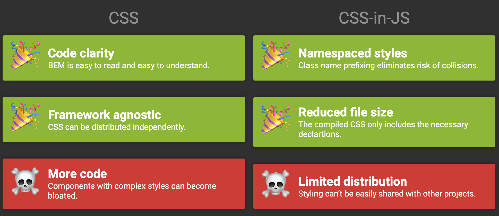
Tailwind Benefit: “The utility CSS approach creates an API-style approach to thinking about CSS, which helps many developers work with it.”
Tailwind Drawback:“You need to learn Tailwind class names in addition to learning CSS property names to figure out the visual styling you want. Tailwind is reliant on, and will be outlived by CSS, so it is more long-term beneficial to focus on CSS’ capabilities directly.”
BEM Benefit:“BEM will allow you to describe any user interface component you can dream up in a flexible, extensible way. As it is an approach to encapsulate the full range of CSS properties, it will allow you to style things Tailwind simply does not have classes for—think highly art directed experiences.”
BEM Drawback:“BEM runs full-tilt into one of the hardest problems in computer science—naming things. You need to not only describe your component, but also all its constituent parts and their states.”
And remember, these certainly aren’t the only two choices on the block. I covered my thoughts on some other approaches here.
Smashing Podcast Episode 18 With Mina Markham: How Can I Learn React?
Smashing Podcast Episode 18 With Mina Markham: How Can I Learn React?
Drew McLellan
In this episode of the Smashing Podcast, we’re talking about learning React. What’s React like to work with, and how can experienced developers get started? I spoke to Mina Markham to find out.
Drew McLellan: She is a front-end architect, conference speaker and organizer, and lover of design systems. Her work on the Pantsuit patent library for Hillary Clinton’s Hillary for America presidential campaign marked a watershed for design systems within the industry and was featured on publications, such as Wired, Fast Company, and Communication Arts. Like many of us, she writes code for a living, currently as a senior engineer at Slack. So we know she’s a talented and forward thinking developer, but did you know she was once mistaken for Patrick Swayze? My smashing friends, please welcome Mina Markham. Hi Mina. How are you?
Mina Markham: I’m smashing.
Drew: Good to hear. Now, sometimes on the Smashing Podcast, we talk to people about the subject that they’re best known for. And sometimes it’s fun just to talk about something a bit tangential. Now, I could chat to you all day about pattern libraries, design systems, the amazing work you’ve done in that particular area, and I could talk to you about subjects that you’ve perhaps spoken about, events, such as the Event Apart, things like art direction. And we could obviously talk about CSS until the cows come home. But you tweeted a few days ago, and I realized that we’re actually both in the same boat in that we’re both experienced front-end engineers and we’re both recently started working with React. So before we get onto React itself, where were you coming to up to this point? Had you been working with other libraries and frameworks for JavaScript development?
Mina: No, actually I’ve been doing mostly vanilla JavaScript for a while. And before that, of course I got into JavaScript. Let me rephrase that. I started working with Java script using jQuery because it made the most sense to me. It was something that was very easily for me to parse to figure out what was happening. And then from there I backtracked to doing just vanilla, plain JavaScript, ESX, and I hadn’t really gotten too much into the framework wars. I had no, like I had no favorite. I had no dog in the fight. I was like, “For you, React, whatever. I don’t really care.” But times change.
Drew: And in this sort of way of working with vanilla JavaScript, because I’ve done a lot of that myself as well. I’ve worked with various frameworks. I’ve done a lot with jQuery back in the day. I worked with YUI, Yahoo User Interface Library. Had you felt many of the pain points that something like React’s architecture tries to address?
Mina: I don’t think I ever had. I spent most of my career making websites versus web apps and things like that. So everything I did was pretty static up to a certain extent. So I never really had to deal with state management, things like that. So the pain points that React attempts to solve I had never really applied to the kind of work that I did.
Drew: Generally speaking, what’s the sort of nature of the projects that you’ve with React so far?
Mina: It was actually only been the one project, which I’m currently working on and I can’t give away too many details because public company and all that good stuff.
Drew: Of course.
Mina: But essentially what I’m trying to do is I’m trying to use React to, it’s a very interactive sort of product where I need people to be able to enter in and save data at a certain state and then manipulate it and generate something else with said data. And that’s just something that it’s not simple DOM manipulation at that point. It really is a lot of more complex, front-end manage of data and managing the state of said data. So there really was no other alternative but to use some kind of library that attempts to solve that problem. I knew I wouldn’t be able to get past with just plain JavaScript. I contemplated maybe handling somethings on the server side, but again, due to the very interactive nature of what I’m working with, it need to be in the client. And so we already use React at Slack for various other things. And so I was like, “Okay, well we just should go ahead and adopt the same thing that the rest of the parent the companies are using and go from there.”
Drew: One of the things that I’m always seems to be a pain point with people picking up React is getting to grips with the tool chain that’s needed to get things working, Webpack being an obvious elephant in the room. Have you had to do much configuration of the tool chain or like me if you had the luxury of teammates doing it for you?
Mina: Oh, I love the infrastructure team at Slack the data. The front-end infrastructure team at Slack, they handled all of that. I didn’t have to think about it. It was great. Because I tried to learn React before in the past. Usually the way I learn best is by actually working and implementing on things. And we use React to build a lot of hillaryclinton.com back in 2016. So it’s not like I’ve never worked with people who use it. It’s just my work never directly needed me to get involved. But that code base was very complex and very sophisticated, and there was so much happening that there’s such a barrier to entry to try to learn anything in there if you didn’t already know how React and Redux and all of that works, which I didn’t. So I wasn’t really effective in learning in that environment.
Mina: Luckily, here I do have people to like take away a little bit more of the complex bits of it. I don’t have to worry about the Webpack config at all. That’s been set up. That’s been tried and tested and ready to go. I am in a similar boat where we also use Redux in addition to React, which I didn’t realize were two different things. I didn’t know which part handled which. Dropping into a code base like that, it was a little disorienting because I didn’t realize that they were all the same thing. I had people who were seasoned React developers telling me, “Oh, we also are using Redux, which makes it a little bit harder for you to really learn what React all can do if you’re starting from scratch.” And I never quite knew what they meant by that because I didn’t know what they were talking about.
Mina: To answer your original question, I am still having a little bit more of a little bit barrier to entry, because it’s not just learning React. I’m having to learn React and also how to use the Redux store. So those two things at the same time can be a little much.
Drew: Yeah, I’ve found exactly the same thing coming into an existing code base as my first React project that uses Redux. And I think as is the nature of any of these sort of technologies when they’re young, they iterate really quickly, and what’s best practice at one point, 6 months later has moved on and there’s a different way of doing things. And when you have a code base that spans many years, you can sometimes have different styles of implementing things in there. It doesn’t always keep sync. And of course, if you’re following a tutorial or whatever to learn, you’re reading books, you’re using resources, they will be in the most modern version of how to do things. And that doesn’t necessarily nit to what you see when you look at an existing, mature product. Is that something you’d experienced at all, or have you managed to keep your code base really up to date?
Mina: I think that is something that I definitely have been experiencing. When I tried to learn how to do React on my own, I looked at various tutorials and things like that. And I noticed, or at least people have told me who have worked who have been working with me that some of the things that we do or kind of anti-pattern or not quite how things work now, because this code base is slightly, well mature us relative, but it’s a few years old. And so there are some ways that I guess are easier to do things than the way we’re doing them currently because this was written years ago. So it’s a little bit of a treadmill trying to keep up with current times and make sure I want to do things the best way, but also I don’t want to break an established code base because I want to play around with stuff.
Drew: Obviously, one of the things with React that people like you and I are coming to it, it can feel a bit jarring as this whole thing with JSX. Are you using JSX in your project?
Mina: We are. I am using JSX.
Drew: Have you made peace with that?
Mina: I fell like a little small piece of me dies every time I open one of those files. It still feels sacrilege to put my HTML in the JavaScript file. I know that’s kind of revolutionary and the whole point, but it just feels off to me that I’m writing my markup in a JavaScript file. I’ve made peace with it, but every time I do it, I’m just like, “…” Separation concerns, it is a thing. I’d like it back, please.
Drew: It’s a valid point, isn’t it? My background when I was starting to work more seriously with JavaScript, and this was probably when I was back at Yahoo, things were very much on the model of server rendered HTML pages and then taking a progressive enhancement approach, layering JavaScript on top to enhance the interface. And if the state of something in the interface needed to change, your code had to know about all the parts of the interface that it needed to update, which obviously leads you to a tightly coupled approach with these big monolithic views where the code you write needs to know about all the other code around it. And I guess that doesn’t really lend itself to a componentized approach which you would take when working with a pattern library or a design system, which is more to your area of particular expertise. I guess, React lends itself more to that approach, does it?
Mina: I think it does, especially with the being able to couple the very specific CSS to one JSX or one React component. And so that way it makes it much easier to separate or only take what you need for the library and leave the rest, whereas a pattern library or design system that attempts to do something more monolithic with just one big style CSS file or something like that, it does make it a lot difficult. You kind of have to take it all or nothing. So I do appreciate that React allows us to do more individualized, more componentized way of development, even if I still wish there was a way for me to do truly separate my presentation layer and my content layer from my interactivity layer. But maybe that’s just me being a little bit old school in that sense.
Drew: I definitely feel the pain there. The idea is that, come and correct me if I’m wrong, my understanding is that rather than separating the technologies, the CSS, and the JavaScript, and the HTML, it’s separating the functionality. So everything that is one component all exist together-
Mina: Yeah.
Drew: … which I guess is useful if that component then is no longer needed. You can just delete it, and it’s gone, and it doesn’t leave a footprint around your app. That’s not always the case with CSS though. How are you working with CSS with React? Have You looked at things like styled-components or anything like that?
Mina: No, we haven’t. I’ve heard of styled-components, but I’ve never quite really investigated them very fully to be perfectly honest. So the way that we’re working with CSS with React is we write Less, and we just have a Less file attached to each individual component that gets imported into that component. And then it gets bonded up via Webpack and served to the client.
Drew: Are you using a system like BEM or something to turn namespace?
Mina: Yeah. We’re using BEM for namespacing, although the adherence to it is kind of varied depending on who’s writing what. But we try to use a BEM namespacing pattern to make it a little bit clearer what the purpose of each individual class and component is.
Drew: And does that seem to be working successfully for you?
Mina: I think so. Occasionally it kind of has the same old problem of I sometimes don’t know how to name something. After a while daily things has always and will always be a difficult thing for master. So that’s the only issue I have with is I occasionally I have no idea what I should call a particular component.
Drew: Definitely. That’s a constant battle, isn’t it, how to out the name things?
Mina: Yeah.
Drew: I always end up when working on a new feature or something like that, you give a component and all the classes and everything the name that the feature has got at the moment. And then by the time you come to launch, it’s been renamed something else. So you have references to the old name in the code and the interface has the new name. And …
Mina: I try to always name things based on the function or the purpose of it versus things that are a little bit more ephemeral, because it’s less likely that the actual purpose of this component will change. I forgot to mention, but in addition to using BEM, I guess we use BEMITs if you’re familiar with that. It’s basically the ITCSS plus BEM, both of which were created by Harry Roberts. So I use Hungarian notation to denote whether or not something is a component, versus a layout object, versus like a larger pattern comprised of multiple components. And then from there we use the BEM convention to signify like the block element and all that.
Drew: And have you had to do much refactoring and deleting of components and things in your code base and had to deal with the issue of CSS getting left behind?
Mina: Yeah. So the non-React part of my job, of maintaining slack.com is that’s all just a bunch of Less files that are being compiled for CSS. And I guarantee you, there’s a lot of zombie code in there, because we definitely iterate above things a lot in the time I’ve been there. And we don’t always have time to go back and do the cleanup versus when we redesign a page or something. So it’s overdue for an audit, I’ll say that.
Drew: This is something that we’ve just been looking at in our React project, looking at how we approach CSS. At the moment, we have a few big, global CSS files for the whole of the app, and we do get this situation where our bundle size is just growing, and growing, and growing and never gets any smaller, even though things do get removed. So we’ve been looking at things like styled-components, Tailwind as well is another option that we’re really seriously considering. Have you looked at tailwind much?
Mina: I haven’t looked at it a lot. I’ve been curious about it, but again, I’ve never really had time to dig in to actually see if it’s something that I want to try to bring into our code base.
Drew: I was actually quite surprised, because like you, I’m a bit old school with how to do these things. I like nice separation of concerns. And I like to write my CSS in CSS, and of course the approach with Tailwind is you have all these class names, which feel a bit like inline styles that you’re applying. And if it feels dirty.
Mina: Yeah.
Drew: And I volunteered within the team, we each which took a technology to investigate if they’d be a good fit for our problems, and I volunteered to look at Tailwind because I was absolutely certain I was going to hate it.
Mina: No, no.
Drew: But it turns out I actually think it solves a lot of problems. I was quite impressed.
Mina: Yeah. I’ve sort of come around to a similar way of thinking, because I in the past would much prefer to have one class comprise all of the styles I needed for a particular component and not do a class per property, as I believe Tailwind does or languages like it do. For the similar reasons, it felt very much like, “Well, I’m just running inline CSS at this point. Why would I do this?” But as I’ve been developing more and more, inside of our Slack design system, I created a bunch of what I call utility classes that do things like add a bit of margin with a pattern. I’ve noticed that more and more, I’m using those classes in addition to the component classes. So I’m like, “Okay, well maybe I should revisit this whole to doing a CSS as a one declaration at a time.” I don’t know if I’d go that far, but it’s definitely worth considering.
Drew: Computing seems to flip flop in terms of trends between thin clients and fat clients solutions. We started with mainframes with terminals, and then the PC era with windows and office and all these sort of big applications. And they were all getting really slow, and than the web came along, and that was just a browser, and all the work was being done on the server. And it was all fast and snappy again. And now we’ve gone back to putting all that work back in the browser with everything being done with JavaScript, things like React and the JAMstack approach where we’re back to a sort of fat client. I sometimes worry that we’re asking too much of the browser. Is this a mistake? Are we asking too much of the browser trying to do all this stuff in React?
Mina: I want to say yes with the caveat of, again, my experience is very much contained to mostly static websites. I don’t do a lot of product development. So maybe in that realm, this makes more sense. But from my perspective, I feel like we’re a lot of the times using a hatchet when we just need a butter knife. I don’t know why we need put all this in the browser, put so much work and so much pressure on the client. I feel like we could do this much simpler. One of the things that always made me a little hesitant to use React, or I say hesitant, but what I mean when it made me viscerally angry and I actively opposed, was when I would go to a website and literally nothing would render because there was one error or something, Like, “Really? The entire page is broken because one function broke down?”
Mina: It just kind of annoyed me that a lot of times it was an all or nothing approach. One of the talks that I gave at AEA in the past and other places in the past was talking about how to include progressive enhancement and not just your development, but also of art direction and design of sites. And I would point out specifically examples of websites that didn’t do progressive enhancement or any kind of graceful degradation. It was like either you have the JavaScript running in the browser or you get absolutely nothing. And it would be like just a simple site that represent information about the history of web design, which was one of the sites actually talked about, the history of web design from like 1990 until now. It was a beautiful website with lots of timelines, animation of things. But it also could have been rendered statically with just a list. There were steps in between showing nothing and showing that beautifully enhanced experience that I think got lost because of the way we’ve been approaching modern web development now.
Drew: So would you say there are absolutely some categories of projects that suit a solution like React and some where it really shouldn’t be used and you should be using more traditional methods?
Mina: I think that if your site particularly is mostly static, it was just serving up information, I guess I don’t understand why you need a project like React to render something that doesn’t have a lot of interaction beyond just DOM manipulation. I guess I don’t see what benefit you get from that. Again, I may not be working on the appropriate projects. I may not just have seen or found that use case, but I’m having a hard time seeing if it’s just mostly static site, presenting content, not a lot interaction, not a lot of interaction beyond manipulated DOM and doing animations. I don’t see how having a React library helps you accomplish that goal.
Drew: It’s interesting because I’m not bad talking it because I haven’t actually used it, but I see a lot of Gatsby projects and Gatsby being a static site generator that uses a React front-end in it. And I see all the examples of the themes and things they have available are all content based sites, or blogs, and a recipe site, and a portfolio, and these sort of things. And there’s something I think actually that this isn’t necessarily the right fit for something like React. Why isn’t this being statically rendered and then progressively enhance?
Mina: Yeah.
Drew: It’s not software.
Mina: Yeah. I haven’t actually used Gatsby either. I’ve heard plenty of great things about it, but that’s probably one of the examples I would think of where I’m like, “Okay, I guess I’m just not seeing why that tool is necessary to do that particular job.” Again, I don’t know. Maybe it’s just because more people are comfortable writing in React when they are writing new something else, and it’s just providing a tool that meets people where they are. I’ve heard great things about static site generators that use React for people who have used them and love them, but it’s not a use case that I would have immediately been like, “Oh, that makes sense.”
Drew: It seems like there’s always been this battle between what we would call a website and what you might call a web app. And the chasm between the two seems to be getting wider, and wider, and wider, whereas a progressive enhancement approach tries to bridge the gap by taking something static and adding JavaScript and adding interactivity. It seems that things like React are ideally suited for software that you’re running in the browser. Would you agree with that?
Mina: I would definitely agree with that because it feels like it’s was built for that type of environment; it was built for running software. It was built by Facebook for Facebook. So it was built for a product. It was built for running whatever you call a web app in the browser and not necessarily for the type of work that, as I mentioned, I’m used to doing. So I think in those scenarios, it definitely makes a lot of sense to use it if you’re building a more complex, more sophisticated piece of software that’s meant to run inside of a browser. But if you’re building a marketing site or whatever, I guess I would still struggle to see why it will be necessary there.
Drew: So are we giving people permission to still build decent, statically rendered websites?
Mina: I would love to see more of that happen. I feel like that’s kind of gotten lost and it’s sort of lost its, if it ever was cool or whatever. I feel like we’ve lost that part of web development. It’s so funny: you and I both said that we’re kind of old school, and I laugh at that because I’ve actually been doing web development for, what, six years now? How am I old school? It hasn’t been that long for me. And yet somehow I’m part of the old guard who doesn’t like new and shiny things. I don’t get it.
Drew: So in fact React has actually existed for the whole time that you’ve been a web developer.
Mina: Maybe I just have an old soul. I don’t know.
Drew: I think that’s probably the case. I’ve not looked personally at, there are service side rendered approaches you can take with React apps. Have you experienced any of those?
Mina: I haven’t experienced any them. I briefly looked into them for the project I’m currently working on, because I feel like there’s parts of the operation that would work better on a server versus in the clients. But I think because of my limited knowledge and the fact that the code base is a little more complicated than I can understand, I wasn’t quite able to figure out how to make that part work. I would love to figure it out eventually, but I spent a day digging into it. I was like, “You know what? I’m not grokking this away I need to be. So I’m just going to back up and take a different route.”
Drew: Yeah. I think we’ve all been there.
Mina: Yeah. I went down a path. I was like, “Oh, this is dark and scary. Let’s reverse. Let’s reverse.”
Drew: Step away from the code.
Mina: Yes.
Drew: So you’ve been very diplomatic and polite about React so far. I sense that there’s some tension bubbling under the surface a bit. Come on. Tell us what you really feel.
Mina: I have been polite and diplomatic, mostly because the Reacts fan base can be a little mean sometimes, and I would rather not have them come for me. So please, React is great. It’s wonderful. Use it for what you want to use it for. I kid, but even that tweet that you mentioned at the beginning of this podcast where I think what you said is that I don’t hate it. I don’t love it, but I don’t hate it. Even that statement, I got people, there was no vitriol, but it was more they where ready to leap to the defense and say, “Well, I love it because X, Y, Z.” I’m like, “I didn’t say it was bad. I just said that I’m meh about the whole thing.” But apparently being meh is not okay. I have to love it.
Mina: So that’s why I probably have been a bit more diplomatic than I would ordinarily be, just because I don’t want people to think that I’m bad mouthing it, because I’m not. It has a place in more web development. It serves a function. It does its job well. People love it. It’s just not a tool that I’ve ever had or wanted to use until now.
Drew: Yeah. Things can get very tribal, can’t they, with people feeling like they have to take one side or another, and you’re either absolutely for something or absolutely against something? And I’m not sure it serves a good purpose, and I don’t think it really moves us forward as an industry and as a community to do that.
Mina: Yeah. It’s really odd. It’s fascinating to watch from just a sociological standpoint, but it’s often just really like weird to observe. It’s like I’m not allowed to just be, like I said, neutral about certain things. I have to have a strong opinion, which is I don’t think healthy. What’s the term, “Strong opinions, loosely held?” That’s kind of the way I go about things. I feel strongly about certain things, but it’s not like you can’t change my mind. Where I feel like some people, their identity gets wrapped up into certain aspects of it ,that if you are not for whatever they’ve chosen to identify with, it’s a personal slight versus just, I don’t care about this particular topic, or tool, or whatever.
Drew: Yes. I don’t know if it’s made worse by the fact that we all are sort of tending to specialize a lot more in particular parts of the stack. And I know there are people who are React developers. They would call themselves a React developer because that’s what they work in. And they wouldn’t necessarily write any vanilla Java script or wouldn’t use Vue or whatever. React is their world. So I guess it almost feels like an attack on their entire career to say, “I don’t like React.” Well, they’re really invested in making you like React or whatever the technology may be.
Mina: I will admit to being one of those people in the past. Actually, probably it was mostly about SASS, I believe. I was very much on the team of doing SASS as a preprocessor and all other preprocessors are trash. I don’t want to talk about them. I don’t want to deal with them. And I realized that was a very narrow way to look at things. Use the appropriate tool for the job. Whatever makes you more productive, that’s the right tool. It doesn’t really matter what it is.
Drew: Are there any technologies that we work with that don’t have that sort of tribal feel? Is there anything that people are just happy to use or not use? I can’t think of anything.
Mina: Wow. No one has opinions about markup, actually.
Drew: No.
Mina: I feel like no one has opinions about like actual HTML and just markup, just like, “It’s there.” They use it. But people have strong opinions about CSS and how it’s either terrible or wonderful, and the preprocessor wars that don’t really happen all that much anymore, and then of course, all of the tribalism within the various JavaScript libraries.
Drew: So you would say your journey so far with React is still just, “It’s a tool. It does its job?”
Mina: It went from a curiosity to active and visceral dislike because of how prevalent it was and how I unnecessary I thought that that prevalence was to meh. I’m now with meh, which again does not mean I hate it. It just means …
Drew: I think that’s a good place to be. I think we’re probably all sort of stronger as technologists if we understand the value of a particular technology for its purpose. We can evaluate what is good for what circumstance and pick the right tool for the job.
Mina: Yeah. And that’s kind of where I’ve arrived at this point in my career where I don’t get really invested in any particular language, or technology, or whatever, because it’s like, “Just whatever tool is most appropriate for what you’re trying to do, then use that.” I’ve learned that there’s a place for everything; there’s a time and a place to do everything. And up until recently, there was no real time or place for me to use this React librarian, and now there is.
Drew: I think that’s a good place to be. So I’ve been learning all about React lately as you have in the day job. Is there anything else that you’ve been learning about lately?
Mina: I’ve actually learned ironically, which is I think another language that has originated at Facebook, I’ve been doing a lot of Hack development, mostly because that’s what I use at Slack, at my day job. Learning Hack paved the way for me to get more comfortable using React because they follow very similar patterns, except one is server side and one’s not. So that, along with just in general, I’ve been learning more about the back-end and how that works for various different reasons. And I’ve been stretching myself for the past couple years and getting more and more outside of my comfortable zone. Design systems, libraries, that’s very much my world, and I feel very good and comfortable in that world. But I’m stepping outside of it and doing a lot more server side logic, and API development, and data modeling, and all of that. I’ve been doing a lot on that for the past year as well.
Drew: I find that the more I understand about the whole stack about back-end stuff in front-end stuff, each one helps my knowledge of the other. I find I write better front-end code by having written back-end code and understanding-
Mina: Yeah. I think I feel the same way. Now that I have a better idea of, like we said, the whole stack of how we get from the data to the end client. I find that I’m thinking about the entire pipeline no matter what part I’m actually working in. I’m thinking about what’s the best way to structure this API so that when I get to the template, I don’t have to do so much manipulating of the data that I receive on that end of it. It’s definitely made me overall a better engineer, I feel like it
Drew: If you, dear listener, would like to hear more from Mina, you can follow her on Twitter where she’s @MinaMarkham and find her personal site at mina.codes. Thanks for joining us today, Mina. Do you have any parting words?
Maintaining a large-scale CSS project is hard. Over the years, we’ve witnessed different approaches aimed at easing the process of writing scalable CSS. In the end, we all try to meet the following two goals:
Efficiency: we want to reduce the time spent thinking about how things should be done and increase the time doing things.
Consistency: we want to make sure all developers are on the same page.
For the past year and a half, I’ve been working on a component library and a front-end framework called CodyFrame. We currently have 220+ components. These components are not isolated modules: they’re reusable patterns, often merged into each other to create complex templates.
The challenges of this project have forced our team to develop a way of building scalable CSS architectures. This method relies on CSS globals, BEM, and utility classes.
I’m happy to share it! 👇
CSS Globals in 30 seconds
Globals are CSS files containing rules that apply crosswise to all components (e.g., spacing scale, typography scale, colors, etc.). Globals use tokens to keep the design consistent across all components and reduce the size of their CSS.
Explaining a methodology using basic examples doesn’t bring up the real issues nor the advantages of the method itself.
Let’s build something together!
We’ll create a gallery of card elements. First, we’ll do it using only the BEM approach, and we’ll point out the issues you may face by going BEM only. Next, we’ll see how Globals reduce the size of your CSS. Finally, we’ll make the component customizable introducing utility classes to the mix.
Here’s a look at the final result:
Let’s start this experiment by creating the gallery using only BEM:
In this example, we have two components: .grid and .card. The first one is used to create the gallery layout. The second one is the card component.
First of all, let me point out the main advantages of using BEM: low specificity and scope.
/* without BEM */
.grid {}
.card {}
.card > a {}
.card img {}
.card-content {}
.card .title {}
.card .description {}


/* with BEM */
.grid {}
.card {}
.card__link {}
.card__img {}
.card__content {}
.card__title {}
.card__description {}
If you don’t use BEM (or a similar naming method), you end up creating inheritance relationships (.card > a).
/* without BEM */
.card > a.active {} /* high specificity */


/* without BEM, when things go really bad */
div.container main .card.is-featured > a.active {} /* good luck with that 😦 */


/* with BEM */
.card__link--active {} /* low specificity */
Dealing with inheritance and specificity in big projects is painful. That feeling when your CSS doesn’t seem to be working, and you find out it’s been overwritten by another class 😡! BEM, on the other hand, creates some kind of scope for your components and keeps specificity low.
But… there are two main downsides of using only BEM:
Naming too many things is frustrating
Minor customizations are not easy to do or maintain
In our example, to stylize the components, we’ve created the following classes:
The number of classes is not the issue. The issue is coming up with so many meaningful names (and having all your teammates use the same naming criteria).
For example, imagine you have to modify the card component by including an additional, smaller paragraph:
<div class="card__content">
  <h1 class="card__title-wrapper"><span class="card__title">Title of the card</span></h1>
  <p class="card__description">Lorem ipsum dolor...</p>
  <p class="card__description card__description--small">Lorem ipsum dolor...</p> <!-- 👈 -->
</div>
How do you call it? You could consider it a variation of the .card__description element and go for .card__description .card__description--small. Or, you could create a new element, something like .card__small, .card__small-p, or .card__tag. See where I’m going? No one wants to spend time thinking about class names. BEM is great as long as you don’t have to name too many things.
The second issue is dealing with minor customizations. For example, imagine you have to create a variation of the card component where the text is center-aligned.
You’ll probably do something like this:
<div class="card__content card__content--center"> <!-- 👈 -->
  <h1 class="card__title-wrapper"><span class="card__title">Title of the card</span></h1>
  <p class="card__description">Lorem ipsum dolor sit amet consectetur adipisicing elit. Tempore, totam?</p>
</div>


<style>
  .card__content--center { text-align: center; }
</style>
One of your teammates, working on another component (.banner), is facing the same problem. They create a variation for their component as well:
Now imagine you have to include the banner component into a page. You need the variation where the text is aligned in the center. Without checking the CSS of the banner component, you may instinctively write something like banner banner--center in your HTML, because you always use --center when you create variations where the text is center-aligned. Not working! Your only option is to open the CSS file of the banner component, inspect the code, and find out what class should be applied to align the text in the center.
How long would it take, 5 minutes? Multiply 5 minutes by all the times this happens in a day, to you and all your teammates, and you realize how much time is wasted. Plus, adding new classes that do the same thing contributes to bloating your CSS.
CSS Globals and utility classes to the rescue
The first advantage of setting global styles is having a set of CSS rules that apply to all the components.
For example, if we set responsive rules in the spacing and typography globals, these rules will affect the grid and card components as well. In CodyFrame, we increase the body font size at a specific breakpoint; because we use “em” units for all margins and paddings, the whole spacing system is updated at once generating a cascade effect.
Spacing and typography responsive rules — no media queries on a component level
As a consequence, in most cases, you won’t need to use media queries to increase the font size or the values of margins and paddings!
Not just that! You can use the globals to store behavioral components that can be combined with all other components. For example, in CodyFrame, we define a .text-component class that is used as a “text wrapper.” It takes care of line height, vertical spacing, basic styling, and other things.
If we go back to our card example, the .card__content element could be replaced with the following:
<!-- without globals -->
<div class="card__content">
  <h1 class="card__title-wrapper"><span class="card__title">Title of the card</span></h1>
  <p class="card__description">Lorem ipsum dolor sit amet consectetur adipisicing elit. Tempore, totam?</p>
</div>


<!-- with globals -->
<div class="text-component">
  <h1 class="text-lg"><span class="card__title">Title of the card</span></h1>
  <p>Lorem ipsum dolor sit amet consectetur adipisicing elit. Tempore, totam?</p>
</div>
The text component will take care of the text formatting, and make it consistent across all the text blocks in your project. Plus, we’ve already eliminated a couple of BEM classes.
Finally, let’s introduce the utility classes to the mix!
Utility classes are particularly useful if you want the ability to customize the component later on without having to check its CSS.
Here’s how the structure of the card component changes if we swap some BEM classes with utility classes:
The number of BEM (component) classes has shrunk from 9 to 3:
.card {}
.card__title {}
.card__icon-wrapper {}
That means you won’t deal much with naming things. That said, we can’t avoid the naming issue entirely: even if you create Vue/React/SomeOtherFramework components out of utility classes, you still have to name the components.
All the other BEM classes have been replaced by utility classes. What if you have to make a card variation with a bigger title? Replace text-lg with text-xl. What if you want to change the icon color? Replace color-white with color-primary. How about aligning the text in the center? Add text-center to the text-component element. Less time thinking, more time doing!
Why don’t we just use utility classes?
Utility classes speed-up the design process and make it easier to customize things. So why don’t we forget about BEM and use only utility classes? Two main reasons:
By using BEM together with utility classes, the HTML is easier to read and customize.
Use BEM for:
DRY-ing the HTML from the CSS you don’t plan on customizing (e.g., behavioral CSS-like transitions, positioning, hover/focus effects),
advanced animations/effects.
Use utility classes for:
the “frequently-customized” properties, often used to create component variations (like padding, margin, text-alignment, etc.),
elements that are hard to identify with a new, meaningful class name (e.g., you need a parent element with a position: relative → create <div class="position-relative"><div class="my-component"></div></div>).
Example:
<!-- use only Utility classes -->
<article class="position-relative overflow-hidden bg radius-lg transition-all duration-300 hover:shadow-md col-6@sm col-4@md">
  <!-- card content -->
</article>


<!-- use BEM + Utility classes -->
<article class="card radius-lg col-6@sm col-4@md">
  <!-- card content -->
</article>
For these reasons, we suggest that you don’t add the !important rule to your utility classes. Using utility classes doesn’t need to be like using a hammer. Do you think it would be beneficial to access and modify a CSS property in the HTML? Use a utility class. Do you need a bunch of rules that won’t need editing? Write them in your CSS. This process doesn’t need to be perfect the first time you do it: you can tweak the component later on if required. It may sound laborious “having to decide” but it’s quite straightforward when you put it to practice.
Utility classes are not your best ally when it comes to creating unique effects/animations.
Think about working with pseudo-elements, or crafting unique motion effects that require custom bezier curves. For those, you still need to open your CSS file.
Consider, for example, the animated background effect of the card we’ve designed. How hard would it be to create such an effect using utility classes?
The same goes for the icon animation, which requires animation keyframes to work:
You can store the CSS (or SCSS) of each component into a separate file (and, optionally, use PostCSS plugins to compile each new /component/componentName.css file into style.css). Feel free to organize the globals as you prefer; you could also create a single globals.css file and avoid separating the globals in different files.
Conclusion
Working on large-scale projects requires a solid architecture if you want to open your files months later and don’t get lost. There are many methods out there that tackle this issue (CSS-in-JS, utility-first, atomic design, etc.).
The method I’ve shared with you today relies on creating crosswise rules (globals), using utility classes for rapid development, and BEM for modular (behavioral) classes.
You can learn in more detail about this method on CodyHouse. Any feedback is welcome!
Digital space obviously has its challenges, but it also provides incredible opportunities for us to connect and learn in ways we just wouldn’t be able to do otherwise. The situation with COVID-19 has challenged us to consider ways in which we could offer a similar SmashingConf experience and access to experts just as in an in-person workshop — without needing to leave your desk.
With insightful takeaways, exercises, access to slides, recordings and friendly Q&As, it has been such an incredible experience already! We’ve had literally people from all over the world collaborating together on group exercises — something we’d never be able to achieve with an in-person event.
We’re looking forward to connecting with Brad Frost, Joe Leech, Miriam Suzanne and many others. Try spotting them, but don’t get too distratced by the Mouse!
And we’re just getting started! We already have a schedule of online workshops ready for you so you can start marking your calendars and join us anytime you like. What better way is there to boost your skills online and learn practical, actionable insights from experts in the industry — live!
Do you like what you see, but are worried about getting some time off from work? Well, you surely didn’t think we would leave your hanging? We know how difficult it can sometimes be, and so we’ve prepared a neat lil’ Convince-Your-Boss template to help you out. Good luck!
That’s right! Paul Boag’s Click! Encourage Clicks Without Shady Tricks is currently in its final production stage and the pre-release starts on May 5. This practical guide has 11 chapters full of advice that can help you start improving your conversion rate in just a matter of simple steps. You can subscribe for a pre-order discount and be one of the first to get your hands on the book. Stay tuned!
Live UX Review With The Author
Next week, we’ll be hosting a Smashing TV webinar with Paul Boag who’ll be reviewing your websites and sharing some techniques you can use to improve conversion rates — without having to resort to any shady tricks. Tell me more →
Also, in case you missed it, there is a Smashing Podcast episode featuring two of the authors of the book: Trine Falbe and Martin Michael Frederiksen. They discuss what it means for a design to be ethical, and how we can make improvements in our own projects.
We publish a new article every day on various topics that are current in the web industry. Here are some that our readers seemed to enjoy the most and have recommended further:
“Best Practices With React Hooks” by Adeneye David Abiodun This article covers the rules of React Hooks and how to effectively start using them in your projects. Please note that in order to follow this article in detail, you will need to know how to use React Hooks.
“Inspired Design Decisions With Herb Lubalin” by Andy Clarke How can we combine elements to develop powerful headers and calls to action? How do we use pre-formatted HTML text, and the text element in SVG for precise control over type? How can we optimise SVGs and make SVG text accessible? In this article, we’ll explore just that.
“Baking Structured Data Into The Design Process” by Frederick O’Brien Retrofitting search engine optimization only gets you so far. As metadata gets smarter, it’s more important than ever to build it into the design process from the start.
“How To Make Life Easier When Using Git” by Shane Hudson You don’t need to know your trees from your dangling blobs. If you use Git every day and feel like it’s a juggling act, then here are some tricks and tips to help make your life a bit easier.
Best Picks From Our Newsletter
We’ll be honest: Every second week, we struggle with keeping the Smashing Newsletter issues at a moderate length — there are just so many talented folks out there working on brilliant projects! Kudos to everyone involved!
Interested in sponsoring? Feel free to check out our partnership options and get in touch with the team anytime — they’ll be sure to get back to you right away.
Tips For Leading A Remote Team
Leading a remote design team can feel a bit daunting, especially if it’s your first time. Luckily, other people out there have found themselves in the same situation before and developed strategies to keep the team productive and effective, no matter where everyone might be located. Mark Boulton is one of them.
In light of recent events when many teams need to switch to remote work, Mark summarized some simple but useful approaches that have helped him leading remote teams for years. From continuing your team’s rituals to dealing with expectations on availability and coaching people through the ups and downs that working remotely brings along, Mark’s tips aren’t hard to adopt but they can make a real difference. (cm)
Getting To Grips With CSS Viewport Units
CSS Viewport units provide us with a way to size things in a fluid and dynamic way, without the need for JavaScript. If you haven’t gotten around to dive deeper into the topic yet, Ahmad Shadeed wrote a useful guide to CSS Viewport units.
Starting with a general overview of the viewport units vw, vh, vmin, and vmax, the guide covers how viewport units differ from percentages and explores practical use cases for viewport units and how to implement them in your projects. Just the push you might have needed to make the switch. (cm)
A Better File Uploader For The Web
Building a better file uploader for the web. That was the idea behind the JavaScript image uploader Uppload. Created by Anand Chowdhary, the image uploader is open-source and can be used with any file uploading backend. And with more than 30 plugins, it’s highly customizable, too.
Users can drag and drop their files to upload them or import from a camera, URL, or social media and a several other services (there’s even an option to take and upload a screenshot just by entering a URL). During the uploading process, users can apply effects to the images and adjust filters like brightness, contrast, and saturation. If that’s overkill for your project, you can select only what you need and treeshake the rest, of course. Uppload supports browsers down to IE10. Handy! (cm)
Open-Source Flip Counter Plugin
Do you want to count down to an event, visualize a fundraising campaign, or show a clock or sales counter? Then Rik Schennink’s Flip Counter might be for you. The plugin is open-source, mobile-friendly, easy to set up, and it gets by without any dependencies.
Apart from its ease of use and flexibility, Flip shines with the beautifully smooth animation that is used to flip the numbers on the cards. Depending on your use case, there are several presets that you can use as a starting point to build your flip counter. The visual style can be customized with CSS. A lovely little detail. (cm)
How To Write Good Email Code
Maybe you’ve been in that situation before where you had to code an HTML email but struggled with email code best practices. To help you master the challenge, Mark Robbins set up a library for good email code. You can simply copy and paste the code and use it in your emails or you can learn more about the theory behind it.
Priority lies in making sure the code is semantic, functional, accessible, and meeting user expectations, as Mark points out. Consistency between email clients and pixel perfect design are important, too, but always secondary. One for the bookmarks. (cm)
A Complete Solution For Tooltips, Popovers, And Dropdowns
If you’re looking for a quick and easy solution for tooltips, popovers, dropdowns, and menus, you might want to take a look at Tippy.js. The library provides the logic and styling involved in all types of elements that pop out from the flow of your document and get overlaid on top of the UI.
Tippy.js is optimized to prevent flipping and overflow, it’s WAI-Aria compliant, works in all modern browsers, and, so the promise, it even delivers high performance on low-end devices. You can style the elements with custom CSS and TypeScript is supported out of the box, too. Handy! (cm)
Open-Source Tool To Make Animated Product Mockups
What do you do when you’re missing a tool for a specific purpose? You build it yourself. That’s what Alyssa X did when she was looking for a tool to make animated GIFs and videos to showcase a product. Her take on the subject: Animockup.
With Animockup, you can showcase your product in action within a device mockup. Just drag some screen footage into the browser-based tool, and Animockup automatically places it into your desired mockup. You can add text, images, and adjust the styling, and choose from a selection of presets to optimize your mockup for sharing on Twitter, Dribble, Instagram and the like. A useful little helper. (cm)
Create CSS Color Gradients With Ease
Hand-picking colors to make a color gradient requires design experience and a good understanding of color harmony. If you need a gradient for a background or for UI elements but don’t feel confident enough to tackle the task yourself (or if you’re in a hurry), the color gradient generator which the folks at My Brand New Logo have created has got your back.
Powered by color gradient algorithms, the generator creates well-balanced gradients based on a color you select. There are four different styles of gradients that go from subtle to a mother-of-pearl effect and an intense, deep color gradient. You can adjust the gradient with sliders and, once you’re happy with the result, copy-paste the generated CSS code to use it in your project. Nice! (cm)
Collaborative Diagrams
Pen and paper are often hard to beat when you want to visualize an idea with a quick diagram. If you’re looking for a digital alternative that is just as straightforward and easy to use as your analog tools, you might want to check out Excalidraw.
Excalidraw is a virtual whiteboard that you can draw on. You can choose from a set of shapes, connect them with arrows or lines, add text, and color. There are some other styling options, too, but the tool is kept rather simple so that you can focus on what’s really important: visualizing your idea. A great feature that comes in especially handy now that a lot of teams work remotely: You can share a live-collaboration session with your team members or your clients. Export and save options are included, too, of course. (cm)
Mastering BEM Naming Conventions
BEM makes your code scalable and reusable, prevents it from becoming messy, and facilitates teamwork. However, even experienced CSS developers struggle with the naming conventions sometimes. To prevent you from getting lost in the BEM cosmos, the folks at 9elements put together the BEM Cheat Sheet with naming suggestions for some of the most common web components: breadcrumb navigation, buttons, cards, lists, tabs, form checkboxes, sidebars, and more.
If you want to dive in even deeper into the BEM methodology, Luke Whitehouse shares tips to tackle an ever-present issue in BEM: grandchildren, i.e. elements that are tied to another element, rather than to the block itself. Luke explores three different approaches to master the challenge: flattening the grandchildren and treating them as if they have no relation with their parent element, by creating new blocks, and by extending the BEM naming convention. A good read. (cm)
A Preserve For Classic Games
Do you feel nostalgic when you think of the video games you played back in the 80s and 90s? Well, why not take a little trip back to those days when games were just as much fun without the fancy effects they shine with today?
ClassicReload preserves more than 6,000 old retro games and abandoned OD/interfaces that you can play right in your browser. You can search for your favorite or browse the games by name, year, genre, and platform to discover something new. No matter if it’s The Oregon Trail, Prince of Persia, or Dangerous Dave you’ve been longing for for so long, if you’ve got a sweet spot for games, the site will keep you entertained for quite a while. (cm)
Managing HTML DOM And jQuery Alternatives
How do you manage HTML DOM with vanilla JavaScript only? Phuoc Nguyen collected 100 native DOM scripting snippets along with explanations on how to use them. The snippets are labeled by difficulty and range from basic (e.g. detecting if an element is focused) to more intermediate tasks like exporting a table to CSV and, finally, advanced use cases like creating a range slider.
Speaking of going vanilla: If you’re using jQuery in your projects, it might be a good idea to check if you actually need the additional dependency or if a few lines of utility code could do the trick. “You might not need jQuery” lists useful alternative code snippets that help you forgo jQuery. (cm)
Overly Descriptive Color Palettes
Have you ever considered combining snail-paced soft pink with unsealed mahogany and lousy watermelon as a color scheme for your next project? Well, what might sound a bit weird at first, is the concept behind colors.lol, a color inspiration site with “overly descriptive color palettes”, as its creator Adam Fuhrer describes it.
Created as a fun way to discover interesting color combinations, the palettes are hand-selected from the Twitter bot @colorschemez. The feed randomly generates color combinations and matches each color with an adjective from a list of over 20,000 words. Hiding behind the unusual names are of course real hex color values that you can use right away — #FDB0C0, #4A0100, and #FD4659 in the case of snail-paced soft pink and its fellas, for example. A fun take on color. (cm)
Flexible Repeating SVG Masks
Sometimes it’s a small idea, a little detail in a project that you tinker with and that you can’t let go off until you come up with a tailor-made solution to make it happen. Nothing that seems like a big deal at first glance, but that requires you to think outside the box. In Tyler Gaw’s case, this little detail was a flexible header with a little squiggle at the bottom instead of a straight line. The twist: to make the component future-proof, Tyler wanted to use a seamless, horizontal repeating pattern that he could color with CSS in any color he liked.
To get the job done, Tyler settled on flexible repeating SVG masks. SVG provides the shape, CSS handles the color, and mask-image does the heavy lifting by hiding anything in the underlying div that doesn’t intersect with the shape. A clever approach that can be used as the base for some fun experiments. (cm)
As a token of appreciation, Vitaly Friedman released his very own “Smart Interface Design Checklists”, a PDF deck with 150+ questions to ask when designing and building anything from hamburgers to carousels and tables. Subscribe to the newsletter below and get it in your inbox right away!
Smashing Newsletter
Every second Tuesday, we send a newsletter with useful techniques on front-end and UX. Subscribe and get Smart Interface Design Checklists PDF in your inbox.
Front-end, design and UX. Sent 2× a month. You can always unsubscribe with just one click.
How Should Designers Learn To Code? Git, HTML/CSS, Engineering Principles (Part 2)
How Should Designers Learn To Code? Git, HTML/CSS, Engineering Principles (Part 2)
Paul Hanaoka
Literally, tomes have been written on version control. Nevertheless, I will start by sharing a brief explanation and other introductory content to whet your appetite for further study.
Version control (not to be confused with version history) is basically a way for people to collaborate in their own environments on a single project, with a single main source of truth (often called the “master” branch).
I’ll go over today is the bare minimum you’ll need to know in order to download a project, make a change, and then send it to master.
There are many types of version control software and many tools for managing and hosting your source code (you may have heard of GitLab or Bitbucket). Git and GitHub are one of the more common pairs, my examples will reference GitHub but the principles will apply to most other source code managers.
Did you know that CSS can be used for collecting statistics? Indeed, there's even a CSS-only approach for tracking UI interactions using Google Analytics. Read a related article →
Your First Contribution
Before doing these steps, you’ll need a few things set up:
A high tolerance for pain or a low threshold for asking others for help.
Step 1: Fork (Get A Copy Of The Code On Your GitHub Account)
On GitHub, you will fork (fork = create a copy of the code in your account; in the following illustration, the blue, orange, red, and green lines show forks) the repository (repo) in question.
By creating branches off of the master, it’s possible for multiple people to contribute to different areas of a project and then merge their work together. (Large preview)
You do this by navigating to the repo in GitHub and clicking the “Fork” button, currently at the top right-hand corner of a repo. This will be the “origin” — your fork on your GitHub account.
Step 2: Clone (Download The Code To Your Computer)
In your terminal, navigate to where you’d like to store the code. Personally, I have a /github folder in my /user folder — it makes it easier for me to organize it this way. If you’d like to do that, here are the steps — after typing these commands into your terminal window, press the ↵ key to execute:
cd ~/             ## you'll usually start in your root directory, but just in case you don't this will take you there
mkdir github      ## this creates a "github" folder — on OSX it will now be located at users/your-username/github
cd github         ## this command navigates you inside the github folder
Now that you’re in the /github folder, you will clone (download a copy of the code onto your computer) the repo.
Navigate into the /project folder. In this case, we’ll enter cd liferay.design. Most projects will include a README.md file in the /root folder, this is typically the starting place for installing and running the project. For our purposes, to install, enter npm install. Once it’s installed, enter npm run dev.
Congratulations! You now have the site available on your local computer — typically projects will tell you where it’s running. In this case, open up a browser and go to localhost:7777.
Step 4: Commit (Make Some Changes And Save Them)
A commit is a collection of changes that you make; I’ve heard it described as saving your progress in a game. There are many opinions on how commits should be structured: mine is that you should create a commit when you’ve achieved one thing, and if you were to remove the commit, it wouldn’t completely break the project (within reason).
If you aren’t coming to a repo with a change in mind, a good place to go is the ‘Issues’ tab. This is where you can see what needs to be done in the project.
If you do have an idea for some change, go ahead and make it. Once you’ve saved the file(s), here are the steps required to create a commit:
git status                                         ## this will print out a list of files that you've made changes in
git add path/to/folder/or/file.ext                 ## this will add the file or folder to the commit
git commit -m 'Summarize the changes you've made'  ## this command creates a commit and a commit message
Tip: The best recommendation I’ve ever seen for commit messages is from Chris Breams’s “How To Write A Git Commit Message”. A properly formed Git commit subject line should always be able to complete the following sentence: “If applied, this commit will [your subject line here].” For more info on commits, check “Why I Create Atomic Commits In Git” by Clarice Bouwer.
Step 5: Push (Send Your Changes To Your Origin)
Once you’ve made some changes on your computer, before they can be merged into the master branch (added to the project), they need to be moved from your local to your remote repo. To do this, enter git push origin in the command line.
Step 6: Pull Request (Ask For Your Changes To Be Merged Into Upstream)
Now that your changes have gone from your fingers to your computer, to your remote repository — it’s now time to ask for them to be merged into the project via a pull request (PR).
The easiest way to do this is by going to your repo’s page in GitHub. There will be a small message right above the file window that says “This branch is X commits ahead repo-name:branch” and then options to “Pull request” or “Compare”.
Clicking the “Pull request” option here will take you to a page where you can compare the changes and a button that says “Create pull request” will then take you to the “Open a pull request” page where you’ll add a title and include a comment. Being brief, but detailed enough in the comment, will help project maintainers understand your proposed changes.
There are CLI tools like Node GH (GitHub also recently released a beta of their CLI tool) that allow you to initiate and manage pull requests in the terminal. At this point you may prefer to use the web interface, and that’s great! So do I.
The ‘Pull request’ and ‘Compare’ options will appear once your fork has diverged from the upstream repo. (Large preview)
Bonus Step: Remote (Link All The Repos)
At this point, we have three repository references:
upstream: the main repo that you’re tracking, often it’s the repo that you forked;
origin: the default name of the remote that you clone;
local: the code that is currently on your computer.
So far, you have #2 and #3 — but #1 is important because it’s the primary source. Keeping these three things in-line with each other is going to help the commit history stay clean. This helps project maintainers as it eliminates (or at least minimizes) merge conflicts when you send pull requests (PR’s) and it helps you get the latest code and keep your local and origin repositories up-to-date.
Set An Upstream Remote
To track the upstream remote, in your terminal enter the following:
This will allow you to quickly get the latest version of what is upstream — if you haven’t worked in a repo in a long time and don’t have any local changes that you want to keep, this is a handy command that I use:
On the web, there is an endless supply of resources for learning HTML and CSS. For the purposes of this article, I’m sharing what I would recommend based on the mistakes I made how I first learned to write HTML and CSS.
What Are HTML And CSS?
Before we get any further, let’s define HTML and CSS.
In case you also don’t know what a lot of those words mean — briefly put, HTML is the combination of references (links) between documents on the web, and tags that you use to give structure to those documents.
There’s an HTML5 tag for pretty much any basic element — otherwise you can always use a div! (Large preview)
For a thorough introduction to HTML and CSS, I highly recommend the Introduction to HTML and CSS first steps, both on the Mozilla Developer Network (MDN) web docs. That, along with the excellent articles that websites such as CSS Tricks, 24 Ways and countless of others provide, contain basically everything you’ll ever need to reference with regards to HTML/CSS.
There are two main parts of an HTML document: the <head> and the <body>.
- The <head> contains things that aren’t displayed by the browser — metadata and links to imported stylesheets and scripts.
- The <body> contains the actual content that will be rendered by the browser. To render the content, the browser reads the HTML, provides a base layer of styles depending on the types of tags used, adds additional layers of styles provided by the website itself (the styles are included in/referenced from the <head>, or are inline), and that is what we see in the end. (Note: There is often also the additional layer of JavaScript but it’s outside of the scope of this article.)
CSS stands for Cascading Style Sheets — it is used to extend the HTML by making it easier to give documents a custom look and feel. A style sheet is a document that tells the HTML what elements should look like (and how they should be positioned) by setting rules based on tags, classes, IDs, and other selectors. Cascading refers to the method for determining which rules in a sheet take priority in the inevitable event of a rule conflict.
“‘Cascading’ means that styles can fall (or cascade) from one style sheet to another, enabling multiple style sheets to be used on one HTML document.”
CSS often gets a bad reputation — in sites with lots of style sheets it can quickly become unwieldy, especially if there aren’t documented, consistent methods used (more on that later) — but if you use it in an organized fashion and following all the best practices, CSS can be your best friend. Especially with the layout capabilities that are now available in most modern browsers, CSS is not nearly as necessary to hack and fight as it once was.
Rachel Andrew wrote a great guide, How To Learn CSS — and one of the best things to know before you start is that:
“You don’t need to commit to memorizing every CSS Property and Value.”
Don’t worry about memorizing the syntax for the background property, and don’t worry if you forget about how exactly to align stuff in Flexbox (the CSS Tricks Guide to Flexbox is possibly one of my top-10 most visited pages, ever!); Google and Stack Overflow are your friends when it comes to CSS properties and values.
Some code editors even have built-in autocomplete so you don’t even need to search on the web in order to be able to figure out all the possible properties of a border, for example.
One of my favorite new features in Firefox 70 is the inactive CSS rules indicator. It will save you hours of time trying to figure out why a style isn’t being applied.
Let’s start with semantic code. Semantics refers to the meanings of words, semantic code refers to the idea that there is meaning to the markup in any given language.
There are many reasons why semantics are important. If I could summarize this, I would say that if you learn and use semantic code, it will make your life a lot easier because you will get a lot of things for free — and who doesn’t like free stuff?
Default styles
For example, using a headline tag <h1> for the title of your document will make it stand out from the rest of the document’s contents, much like a headline would.
Performance benefits Clean HTML is the foundation for a high-performing site. And clean HTML will also likely lead to cleaner CSS which means less code overall, making your site or app faster.
There are tons of applications, tangents, and levels we could explore over the concept of abstraction — too many for this article which is intended to give you a brief introduction into concepts so that you are aware of them as you continue to learn.
Abstraction is a foundational engineering paradigm with a wide variety of applications — for the purposes of this article, abstraction is separating form from function. We’ll apply this in three areas: tokens, components, and the Don’t Repeat Yourself principle.
Tokens
If you’ve used a modern design tool for any length of time, you’ve probably encountered the idea of a token. Even Photoshop and Illustrator now have this idea of shared styles in a centralized library — instead of hard-coding values into a design, you use a token. If you’re familiar with the concept of CSS or SASS variables, you’re already familiar with tokens.
One layer of abstraction with tokens is to assign a name to a color — for example, $blue-00 can be mapped to a hex value (or an HSL value, or whatever you want) — let’s say #0B5FFF. Now, instead of using the hex value in your stylesheets, you use the token value — that way if you decide that blue-00 is actually #0B36CE, then you only have to change it in a single place. This is a nice concept.
Tokens for colors in the Lexicon Alerts component helps keep things DRY. (Large preview)
If you take this same paradigm of abstraction and go a layer further, you can token-ception — and assign a variable to a functional value. This is particularly useful if you have a robust system and want to have different themes within the system. A functional example of this would be assigning a variable like $primary-color and map that to $blue-00 — so now you can create markup and instead of referencing blue, you’re referencing a functional variable. If you ever want to use the same markup, but with a different style (theme), then you only need to map $primary-color to a new color, and your markup doesn’t need to change at all! Magic!
Components
In the past 3-4 years, the idea of components and componentization has become more relevant and accessible to designers. The concept of symbols (pioneered by Macromedia/Adobe Fireworks, later expanded by Sketch, and then taken to the next level by Figma and Framer), is now more widely available in most design tools (Adobe XD, InVision Studio, Webflow, and many others). Componentization, even more than tokens, can separate the form of something from the function of it — which helps to improve both the form and the function.
One of the more notable early examples is Nicole Sullivan’s media object component. At first glance you might not realize that a whole page is essentially composed of a single component, rendered in different ways. In this way, we can re-use the same markup (form), modifying it slightly by passing in options or parameters, and styles — and have it provide a variety of value (function).
Don’t Repeat Yourself
DRY (Don’t Repeat Yourself) is one of my favorite principles — creating things that can be reused over and over is one of the small victories you can have when coding.
While you often can’t (and arguably shouldn’t) strive to apply the DRY principle 100% of the time, every time — it’s at least beneficial to be aware of this so that as you’re working, you can consider how you can make whatever you’re working on more reusable.
A note on the Rule of Three: A corollary to the DRY principle is the rule of three — essentially, once you re-use (copy/paste) something three times, you should rewrite it into a reusable component. Like the Pirate’s Code, it’s more of a guideline than a hard and fast rule, and can vary from component to component and from project to project.
CSS And Styling Methodologies: Atomic vs. BEM
There are a lot of different ways to organize and write CSS code — Atomic and BEM are only two of the many that you’re likely to come across. You don’t have to “pick” a single one, nor do you have to follow them exactly. Most of the teams I’ve worked with usually have their own unique blend, based on the project or technology. It is helpful to be familiar with them so that over time, you can learn which approach to take depending on the situation.
All of these approaches go beyond “just” CSS and styling, and can often influence the tooling you use, the way you organize your files, and potentially the markup.
Atomic CSS
Not to be confused with Atomic Web Design — atomic (perhaps more aptly referred to as “functional”) CSS, is a methodology that essentially favors using small, single-purpose classes to define visual functions. A few notable libraries:
What I like about this method is that it allows you to quickly style and theme things — one of the biggest drawbacks is that your markup can get pretty cluttered, pretty fast.
Basically, everything that can be reused is a block. Blocks are comprised of elements, something that can’t be used outside of a block, and potentially other blocks. Modifiers are things that describe the status of something or the way it looks or behaves.
Personally, I like the theory and philosophy of BEM. What I do not like is the way that things are named. Way too many underscores, hyphens, and it can feel unnecessarily repetitive (.menu, .menu__item, etc).
After you have sufficiently mastered these topics, don’t worry, there is still plenty to learn. Some suggestions:
Functional and object-oriented programming
We touched on it lightly, but there’s plenty more to learn beyond CSS.
Higher-level languages and frameworks
Typescript, Ruby, React, Vue are the next things you’ll tackle once you have a strong grasp of HTML and CSS.
Querying languages and using data
Learning about GraphQL, MySQL, REST APIs will take your coding ability to the next level.
Conclusion: Designers Who Code != Software Engineers
Hopefully, this article has shown you that learning to code isn’t as difficult as you may have previously thought. It can take a lot of time, but the amount of resources available on the internet is astounding, and they’re not decreasing — quite the opposite!
One significant point that I want to emphasize is that “coding” is not the same as “software engineering” — being able to fork a repo and copy/paste in code from Stack Overflow can get you a long way, and while most, if not all, software engineers that I know have done that — you must use your new-found skills with wisdom and humility. For everything you can now access with some engineering prowess, there is that much more that you don’t know. While you may think that a feature or style is easy to accomplish because — “Hey, I got it working in devtools!” or “I made it work in Codepen.” — there are many engineering processes, dependencies, and methods that you probably don’t know that you don’t know.
All of that is to say — don’t forget that we are still designers. Our primary function is to add business value through the lens of understanding customer or user problems and synthesizing them with our knowledge of design patterns, methods, and processes. Yes, being a “designer who writes code” can be very useful and will expand your ability to add this value — but we still need to let engineers make the engineering decisions.
Anything Amiss?
There’s a good chance that something in this post was obscure, obtuse, and/or obsolete and I’d love the opportunity to make it better! Please leave a comment below, DM me, or @mention me on Twitter so I can improve.
There’s been a lot of well-deserved hype around Svelte recently, with the project accumulating over 24,000 GitHub stars. Arguably the simplest JavaScript framework out there, Svelte was written by Rich Harris, the developer behind Rollup. There’s a lot to like about Svelte (performance, built-in state management, writing proper markup rather than JSX), but the big draw for me has been its approach to CSS.
Single file components
React does not have an opinion about how styles are defined
—React Documentation
A UI framework that doesn't have a built-in way to add styles to your components is unfinished.
—Rich Harris, creator of Svelte
In Svelte, you can write CSS in a stylesheet like you normally would on a typical project. You can also use CSS-in-JS solutions, like styled-components and Emotion, if you'd like. It’s become increasingly common to divide code into components, rather than by file type. React, for example, allows for the collocation of a components markup and JavaScript. In Svelte, this is taken one logical step further: the Javascript, markup and styling for a component can all exist together in a single `.svelte` file. If you’ve ever used single file components in Vue, then Svelte will look familiar.
By default, styles defined within a Svelte file are scoped. Like CSS-in-JS libraries or CSS Modules, Svelte generates unique class names when it compiles to make sure the styles for one element never conflict with styles from another.
That means you can use simple element selectors like div and button in a Svelte component file without needing to work with class names. If we go back to the button styles in our earlier example, we know that a ruleset for <button> will only be applied to our <Button> component — not to any other HTML button elements within the page. If you were to have multiple buttons within a component and wanted to style them differently, you'd still need classes. Classes will also be scoped by Svelte.
The classes that Svelte generates look like gibberish because they are based on a hash of the component styles (e.g. svelte-433xyz). This is far easier than a naming convention like BEM. Admittedly though, the experience of looking at styles in DevTools is slightly worse as the class names lack meaning.
The markup of a Svelte component in DevTools.
It’s not an either/or situation. You can use Svelte’s scoped styling along with a regular stylesheet. I personally write component specific styles within .svelte files, but make use of utility classes defined in a stylesheet. For global styles to be available across an entire app — CSS custom properties, reusable CSS animations, utility classes, any ‘reset’ styles, or a CSS framework like Bootstrap — I suggest putting them in a stylesheet linked in the head of your HTML document.
It lets us create global styles
As we've just seen, you can use a regular stylesheet to define global styles. Should you need to define any global styles from within a Svelte component, you can do that too by using :global. This is essentially a way to opt out of scoping when and where you need to.
For example, a modal component may want to toggle a class to style the body element:
Another benefit of Svelte is that it will alert you about any unused styles during compilation. In other words, it searches for places where styles are defined but never used in the markup.
Conditional classes are terse and effortless
If the JavaScript variable name and the class name is the same, the syntax is incredibly terse. In this example, I’m creating modifier props for a full-width button and a ghost button.
CSS preprocessors feels a lot less necessary when working with Svelte, but they can work perfectly alongside one another by making use of a package called Svelte Preprocess. Support is available for Less, Stylus and PostCSS, but here we'll look at Sass. The first thing we need to do is to install some dependencies:
npm install -D svelte-preprocess node-sass
Then we need to import autoPreprocess in rollup.config.js at the top of the file.
import autoPreprocess from 'svelte-preprocess';
Next, let’s find the plugins array and add preprocess: autoPreprocess() to Svelte:
Then all we need to do is specify that we’re using Sass when we’re working in a component file, using type="text/scss" or lang="scss" to the style tag.
We’ve seen that Svelte comes with most of the benefits of CSS-in-JS out-of-the-box — but without external dependencies! However, there’s one thing that third-party libraries can do that Svelte simply can’t: use JavaScript variables in CSS.
The following code is not valid and will not work:
I’ve written CSS in all kinds of different ways over the years: Sass, Shadow DOM, CSS-in-JS, BEM, atomic CSS and PostCSS. Svelte offers the most intuitive, approachable and user-friendly styling API. If you want to read more about this topic then check out the aptly titled The Zen of Just Writing CSS by Rich Harris.
Some people outright hate the idea of CSS-in-JS. Just that name is offensive. Hard no. Styling doesn't belong in JavaScript, it belongs in CSS, a thing that already exists and that browsers are optimized to use. Separation of concerns. Anything else is a laughable misstep, a sign of not learning from the mistakes of the past (like the <font> tag and such.)
Some people outright love the idea of CSS-in-JS. The co-location of templates and functionality, à la most JavaScript frameworks, has proven successful to them, so wrapping in styles seems like a natural fit. Vue's single file components are an archetype here.
(Here's a video on CSS-in-JS I did with Dustin Schau if you need a primer.)
What does CSS-in-JS not rid you of needing to understand:
How styles are applied to the DOM
How inheritance works
How CSS properties work
How CSS layout works
CSS-in-JS doesn't absolve you of learning CSS. Mostly, anyway.
I've heard lots of pushback on CSS-in-JS in the vein of "you people are reaching for CSS-in-JS because you don't understand CSS" or "You're doing this because you're afraid of the cascade. I already know how to scope CSS." I find that stuff to be more poking across the isles that isn't particularly helpful.
Laura buns has a wonderfully two-sided article titled "The web without the web" part of which is about React and CSS-in-JS:
I hate React because CSS-in-JS approaches by default encourage you to write completely self-contained one off components rather than trying to build a website UI up as a whole.
You don't need to use CSS-in-JS just because you use React, but it is popular, and that's a very interesting and fair criticism. If you scope everything, aren't you putting yourself at higher risk of inconsistency?
I've been, so far, a fan of CSS modules in that it's about as light as you get when it comes to CSS-in-JS, only handling scoping and co-location and that's about it. I use it with Sass so we have access to mixins and variables that help consistency, but I could see how it could allow a slide into dangerous too-many-one-offs territory.
And yet, they would be disposable one-offs. Code-splittable one-offs. Everything exists in balance.
Laura goes on to say she likes CSS-in-JS approaches for some of the power and flexibility it offers:
I like the way CSS-in-JS gives you enough abstraction to still use tricks like blind owl selectors while also giving you the full power of using JS to do stuff like container queries.
Martin Hofmann created a site comparing BEM vs. Emotion that looks at one little "alert" component. I like how it's an emotionless (literally, not referencing the library) comparison that looks at syntax. BEM has some advantages, notably, requiring no tooling and is easily sharable to any web project. But the Emotion approach is cleaner in many ways and looks easier to handle.
I'd like to see more emotionless comparisons of the technologies. Choice A does these three things well but is painful here and here, while choice B does these other things well and solves a few other pain points.
We recently linked up Scott Jehl's post that looks into loading CSS asynchronously. Scott's opening line:
One of the most impactful things we can do to improve page performance and resilience is to load CSS in a way that does not delay page rendering.
It's notable that an all-in CSS-in-JS approach gets this ability naturally, as styling is bundled into JavaScript. It's bundled at a cost. A cost to performance. But we get some of that cost back if we're eliminating other render-blocking things. That's interesting stuff worthy of more data, at least.
I might get my butt kicked for this, but I'm a bit less interested in conversations that try to blame CSS-in-JS for raising the barrier to entry in the industry. That's a massive thing to consider, but we aren't talking about shutting down CSS here and forcing everyone to some other language. We're talking about niche libraries for certain types of projects at certain scales.
I think it's worth taking a look at CSS-in-JS ideas if...
You're working on a component-heavy JavaScript project anyway.
You're already co-locating templates, functionality, and data queries.
You think you can leverage it without harming user experience, like gaining speed back elsewhere.
Your team is comfortable with the required tech, as in, you aren't pushing away talent.
Max Stoiber is an unabashed fan. His post on the topic talks about the confidence this style brings him and the time he saves in finding what he needs, both things I've found to be true. But he also thinks the approach is specifically for JavaScript framework apps.
If you are using a JavaScript framework to build a web app with components, CSS-in-JS is probably a good fit. Especially if you are part of a team where everybody understands basic JavaScript.
I'd love to hear y'all thoughts on this in the comments. Have you worked out your feelings on all this? Madly in love? Seething with dislike? I'd be most interested in hearing success stories or failure stories on real projects.
If you search for how to style apps for the web, you’ll come across many different approaches and libraries, some even changing day by day. Block Element Modifier (BEM); preprocessors such as Less and SCSS; CSS-in-JS libraries, including JSS and styled-components; and, lately, design systems. You come across all of these in articles and blogs, tutorials and talks, and — of course — debates on Twitter.
How do we choose between them? Why do so many approaches exist in the first place? If you’re already comfortable with one method, why even consider moving to another?
In this article, I’m going to take a look at the tools I have used for production apps and sites I’ve worked on, comparing features from what I’ve actually encountered rather than summarizing the content from their readmes. This is my journey through BEM, SCSS, styled-components, and design systems in particular; but note that even if you use different libraries, the basic principles and approach remain the same for each of them.
CSS Back In The Day
When websites were just getting popular, CSS was primarily used to add funky designs to catch the user’s attention, such as neon billboards on a busy street:
Microsoft’s first site (left) and MTV’s site from the early 2000s. (Large preview)
Its use wasn’t for layout, sizing, or any of the basic needs we routinely use CSS for today, but as an optional add-on to make things fancy and eye-catching. As features were added to CSS, newer browsers supporting a whole new range of functionality and features appeared, and the standard for websites and user interfaces evolved — CSS became an essential part of web development.
It’s rare to find websites without a minimum of a couple hundred lines of custom styling or a CSS framework (at least, sites that don’t look generic or out of date):
Wired’s modern responsive site from InVision’s responsive web design examples post. (Large preview)
What came next is quite predictable. The complexity of user interfaces kept on increasing, along with the use of CSS; but without any guidelines suggested and with a lot of flexibility, styling became complicated and dirty. Developers had their own ways of doing things, with it all coming down to somehow getting things to look the way the design said it was supposed to be.
This, in turn, led to a number of common issues that many developers faced, like managing big teams on a project, or maintaining a project over a long period of time, while having no clear guides. One of the main reasons this happens even now, sadly, is that CSS is still often dismissed as unimportant and not worth paying much attention to.
CSS Is Not Easy To Manage
There’s nothing built into CSS for maintenance and management when it comes to large projects with teams, and so the common problems faced with CSS are:
Lack of code structure or standards greatly reduces readability;
Maintainability as project size increases;
Specificity issues due to code not being readable in the first place.
If you’ve worked with Bootstrap, you’ll have noticed you’re unable to override the default styles and you might have fixed this by adding !important or considering the specificity of selectors. Think of a big project’s style sheets, with their large number of classes and styles applied to each element. Working with Bootstrap would be fine because it has great documentation and it aims to be used as a solid framework for styling. This obviously won’t be the case for most internal style sheets, and you’ll be lost in a world of cascaded styles.
In projects, this would be like a couple thousand lines of CSS in a single file, with comments if you’re lucky. You could also see a couple of !important used to finally get certain styles to work overriding others.
Which of the styles applied to the same element would be applied to the image on the right, assuming they both point to it?
What is the order of weight of selectors such as inline styles, IDs, classes, attributes, and elements? Okay, I made it easy there; they’re in order of weight:
Start at 0; add 1,000 for a style attribute; add 100 for each id; add 10 for each attribute, class or pseudo-class; add 1 for each element name or pseudo-element.
This is a simplified way of calculating and representing specificity which works in usual cases, but do note that the real representation would look like: (0,0,0,0). Here, the first number signifies the style attribute, second the ID, and so on. Each selector can actually have a value greater than 9 and it’s only when there is an equal number of selectors of highest weight that selectors of lower weight are considered.
Do you see why the second example was the correct answer? The id selector clearly has far more weight than element selectors. This is essentially the reason why your CSS rule sometimes doesn’t seem to apply. You can read about this in detail in Vitaly Friedman’s article, “CSS Specificity: Things You Should Know”.
The larger the codebase, the greater the number of classes. These might even apply to or override different styles based on specificity, so you can see how quickly it can become difficult to deal with. Over and above this we deal with code structure and maintainability: it’s the same as the code in any language. We have atomic design, web components, templating engines; there’s a need for the same in CSS, and so we’ve got a couple of different approaches that attempt to solve these different problems.
Block Element Modifier (BEM)
“BEM is a design methodology that helps you to create reusable components and code sharing in front-end development.”
— getbem.com
The idea behind BEM is to create components out of parts of apps that are reused or are independent. Diving in, the design process is similar to atomic design: modularize things and think of each of them as a reusable component.
I chose to start out managing styles with BEM as it was very similar the way React (that I was already familiar with) breaks down apps into reusable components.
BEM is nothing more than a guide: no new framework or language to learn, just CSS with a naming convention to organize things better. Following this methodology, you can implement the patterns you’ve already been using, but in a more structured manner. You can also quite easily do progressive enhancements to your existing codebase as it requires no additional tooling configuration or any other complexities.
Advantages
At its heart BEM manages reusable components, preventing random global styles overriding others. In the end, we have more predictable code, which solves a lot of our specificity problems.
There’s not much of a learning curve; it is just the same old CSS with a couple of guides to improve maintainability. It is an easy way of making code modular by using CSS itself.
Drawbacks
While promoting reusability and maintainability, a side effect of the BEM naming principle is making naming the classes difficult and time-consuming.
The more nested your component is in the block, the longer and more unreadable the class names become. Deeply nested or grandchild selectors often face this issue.
<div class="card__body">
  <p class="card__body__content">Lorem ipsum lorem</p>
  <div class="card__body__links">
    <!-- Grandchild elements -->
    <a href="#" class="card__body__links__link--active">Link</a>
  </div>
</div>
That was just a quick intro to BEM and how it solves our problems. If you’d like to take a deeper look into its implementation, check out “BEM For Beginners” published here in Smashing Magazine.
Sassy CSS (SCSS)
Put blandly, SCSS is CSS on steroids. Additional functionality such as variables, nesting selectors, reusable mixins, and imports help SCSS make CSS more of a programming language. For me, SCSS was fairly easy to pick up (go through the docs if you haven’t already) and once I got to grips with the additional features, I’d always prefer to use it over CSS just for the convenience it provided. SCSS is a preprocessor, meaning the compiled result is a plain old CSS file; the only thing you need to set up is tooling to compile down to CSS in the build process.
Super handy features
Imports help you split style sheets into multiple files for each component/section, or whichever makes readability easier.
Note: SCSS mixin: Check out more handy SCSS features over here.
Nesting of selectors improves readability as it works the same way HTML elements are arranged: in a nested fashion. This approach helps you recognize hierarchy at a glance.
BEM With SCSS
It is possible to group the code for components into blocks, and this greatly improves readability and helps in ease of writing BEM with SCSS:
This code is relatively less heavy and complicated as opposed to nesting multiple layers. (Large preview)
Note: For further reading on how this would work, check out Victor Jeman’s “BEM with Sass” tutorial.
Styled-Components
This is one of the most widely used CSS-in-JS libraries. Without endorsing this particular library, it has worked well for me, and I’ve found its features quite useful for my requirements. Take your time in exploring other libraries out there and pick the one that best matches your needs.
I figured a good way to get to know styled-components was to compare the code to plain CSS. Here’s a quick look at how to use styled-components and what it’s all about:
Instead of adding classes to elements, each element with a class is made into a component. The code does look neater than the long class names we have with BEM.
Interestingly, what styled-components does under the hood is take up the job of adding relevant classes to elements as per what’s specified. This is essentially what we do in style sheets (note that it is in no way related to inline styling).
Why Are Styled-Components One Of The Widely Used CSS-In-JS Libraries?
For styling, here we’re just using template literals with normal CSS syntax. This allows you to use the full power of JavaScript to handle the styling for you: conditionals, properties passed in as arguments (using an approach similar to React), and essentially all the functionality that can be implemented by JavaScript.
While SCSS has variables, mixins, nesting, and other features, styled-components only adds on, making it even more powerful. Its approach, based heavily on components, might seem daunting at first since it’s different from traditional CSS. But as you get used to the principles and techniques, you’ll notice that everything possible with SCSS can be done in styled-components, as well as a lot more. You just use JavaScript instead.
Note: Template literals in styled-components allow you to use JS directly for conditional styling and more.
Another thing to note is how perfectly this fits into the world of web components. A React component has its own functionality with JavaScript, JSX template, and now CSS-in-JS for styling: it’s fully functional all by itself and handles everything required internally.
Without us realizing, that was the answer to a problem we’ve been talking about for too long: specificity. While BEM was a guideline to enforce component-based structure for elements and styles but still relying on classes, styled-components impose it for you.
Styled-components has a couple of additional features I’ve found especially useful: themes, which can configure a global prop (variable) passed down to each styled-component; automatic vendor prefixing; and automatic clean-up of unused code. The amazingly supportive and active community is just the icing on the cake.
Note: There’s a lot more to check out and take advantage of. Read more in the styled-components docs.
Quick Recap On Features
Template literals are used for syntax, the same as traditional CSS.
It imposes modular design.
It solves specificity issues by handling class names for you.
Everything that can be done with SCSS and more, implemented with JS.
Why It Might Not Be For You
It obviously relies on JavaScript, which means without it the styles don’t load, resulting in a cluttered mess.
Previously readable class names are replaced with hashes that really have no meaning.
The concept of components rather than cascading classes might be a bit hard to wrap your head around, especially since this affects the way you arrange things a lot.
Design Systems
As usage of web components increases, as well as the need for atomic design (basically breaking down UI into basic building blocks), many companies are choosing to create component libraries and design systems. Unlike the technologies or approaches on how to handle styling mentioned above, design systems represent an organizational approach to handling components and consistent design across whole platforms or apps.
It’s possible to use an approach we’ve discussed within a design system to organize styles, while the design system itself focuses on the building blocks of the apps rather than internal implementations.
“Design systems are essentially collections of rules, constraints, and principles implemented in design and code.”
Design systems and component libraries are aimed at whole ecosystems spanning different platforms and media, and can determine the overall outlook of the company itself.
“A design system is an amalgamation of style, components, and voice.”
Once they gain momentum, tech businesses sometimes have to scale up extremely fast, and it can be hard for the design and development teams to keep up. Different apps, new features and flows, constant reevaluation, changes, and enhancements are to be shipped as rapidly as possible when the business requires them.
Take the case of a simple modal; for instance, one screen has a confirmation modal which simply accepts a negative or positive action. This is worked on by Developer A. Then the design team ships another screen that has a modal comprising a small form with a few inputs — Developer B takes this up. Developers A and B work separately and have no idea that both of them are working on the same pattern, building two different components that are essentially the same at base level. If different developers worked on the different screens we might even see UI inconsistencies committed to the codebase.
Now imagine a large company of multiple designers and developers — you could end up with a whole collection of components and flows that are supposed to be consistent, but instead are distinct components existing independently.
The main principle of design systems is to help meet business requirements: build and ship new features, functionality, and even full apps while maintaining standards, quality, and consistency of design.
When talking about styling in particular, we’d be specifically interested in the component library part, although the design system itself is far more than just a collection of components. A component handles its functionality, template, and styling internally. A developer working on the app needn’t be aware of all of the internal working of the components, but would just need to know how to put them together within the app.
Now imagine a couple of these components that are further made reusable and maintainable, and then organized into a library. Developing apps could be almost as simple as drag-and-drop (well, not exactly, but a component could be pulled in without worrying about any internal aspects of its working). That’s essentially what a component library does.
Why You Might Want To Think About Building A Design System
As mentioned earlier, it helps the engineering and design teams keep up with rapidly changing business needs while maintaining standards and quality.
It ensures consistency of design and code throughout, helping considerably with maintainability over a long period of time.
One of the greatest features of design systems is that they bring the design and development teams closer, making work more of a continuous collaboration. Rather than whole pages of mock-ups given to developers to work on from scratch, components and their behaviors are well-defined first. It’s a whole different approach, but a better and faster way to develop consistent interfaces.
Why It Might Not Be The Best Fit For You
Design systems require a lot of time and effort up front to plan things out and organize from scratch — both code- and design-wise. Unless really required, it might not be worth delaying the development process to focus on building the design system at first.
If a project is relatively small, a design system can add unnecessary complexity and end up a waste of effort when what was actually required was just a couple of standards or guidelines to ensure consistency. Because several high-profile companies have adopted design systems, the hype can influence developers into thinking this is the always best approach, without analyzing the requirements and ensuring this could actually be practical.
Styling applications is a world in itself, one not often given the importance and attention it deserves. With complex modern user interfaces, it’s only matter of time before your app becomes a mess of unordered styles, reducing consistency and making it harder for new code to be added or changes made to the existing codebase.
Distilling what we’ve discussed so far: BEM, along with SCSS, could help you organize your style sheets better, take a programming approach to CSS, and create meaningful structured class names for cleaner code with minimal configuration. Building over a front-end framework like React or Vue, you might it find it convenient to hand class naming to a CSS-in-JS library if you’re comfortable with a component-based approach, putting an end to all your specificity issues, along with a couple of other benefits. For larger applications and multiple platforms, you might even consider building a design system in combination with one of the other methods, to boost development speeds while maintaining consistency.
Essentially, depending on your requirements and the size and scale of your software, it’s important to spend time determining your best approach to styling.
I work for Supercool, a fast-moving design agency that makes custom built sites for arts clients, powered by the off-the-shelf system, Craft CMS; it's high-spec graphic design with relatively demanding typography and art direction. Over the past few months we’ve been moving to CSS grid. We’re transitioning slowly, allowing ourselves to discover new paradigms and design methods, instead of simply porting old habits to a new syntax.
So far, we've developed a number of really useful strategies for keeping track of the layout. I've written a couple of surprisingly nifty mixins, using named areas and templates, and we've hit upon some basic conventions to create highly readable code. I thought it would be valuable to walk through a fully-developed production implementation of a single major component using grid, digging in to some of the design questions it throws up and steering you away from some pitfalls we’ve encountered. CSS grid is a large spec, with lots of possible approaches and lots of right ways to do things, but at some point you have to lock down your method and get it live.
I’m expecting some basic familiarity with CSS, Sass, BEM, and some interest in the task of prototyping fully-realized, accessible, custom frameworks with 50+ components from Sketch or Photoshop-type documents on a tight timeline (say, a week).
First, let’s identify and separate out the design into distinct coding tasks and plan how we’ll approach them:
Type: The designer has already defined a type system.
Colors: First, we build a theme model and then include that in the partial.
Content: What elements are in this block? What are its variations? This is where our BEM mixin comes in.
Layout: This is how the content is placed in the block. You might want to skip directly to this.
Conventions: This is exactly how we choose to write all the above. There are many right answers in CSS, so what is important is that we all just agree to a convention, the rules of the road. This really comes first, but for the sake of this article, we’ll conclude here.
Type system
We use utility classes (e.g. h-text--h1, h-text--badge) for type styles. There may be a hundred type styles in a project. We export those styles from Sketch right into our Patternlab using Typex. That’s a whole other article on its own, so let’s just stipulate type as handled. We won’t bring type into our component partial.
Theming is a few tiny mixins dropped in, so we ideally won’t see a ton of color rules in our partial. We store them all together in a _themer.scss partial in our "Mixins and Models" library, so we can be sure to follow the design system of the site. This way, when someone comes back to the build later on, they have a key reference partial describing the design and branding rules. When building and maintaining numerous sites in broadly the same market — but each all with different brand spec — you’ve gotta make sure you don’t mix up one brand with another! So, much like type, we abstract the color rules away from the partial. In essence, we’re really only looking at layout (as much as possible) in our _header.scss file.
Given that we agree the convention to always theme using our mixin, this is how it would be included on an element:
@include var($property, $value);
Then we’ll set a theme model, of how colors work on this particular site and apply that theme to a component with:
@include theme;
Here’s the sample theme model we’re going to use with this page header. It’s super simple.
We’re pairing a color with black or white. We depend on a contrast rule and flip them for emphasis, maybe on events, like hover, or a highlighted call to action. This is all we need to do to make that happen and now we have a document of how color should really work on this site. We can go to and check against if we need to debug or expand the UI.
We also want to prep inheritance to help us, so let’s identify some helpful conventions:
Using this theme model, we might generate any number of themes, perhaps storing them as utility classes, or looping over a list of modifiers inside a component, or just allowing the user to set variables right on the block in the CMS. When IE 11 drops below 1% in our stats, we can do much more with variables, but this is enough for our current purposes.
Let’s not get side-tracked. What about grid?!
Content components
Grid lets us describe exactly what content we have in each partial in a new way. It’s really a game changer for design agencies building new UI for every project and we’re discovering new (and fun) applications for it as we explore.
To give context: we customize each interface for our clients, with custom fields made to suit their specific needs and their content model, using Craft CMS. We have internal tools that pull in events from ticketing APIs and create entries from that data, which may then be edited and expanded (or created entirely) in the CMS. The client can fill in or edit named fields in permanent page regions, and also add in whole designed, branded content blocks into the layout of each page as they build them.
There’s a lot of UI. The clients have a lot of control over content and we have a lot of control over the HTML, so we can ensure a high standard of accessible, semantic code on the page. We develop the content model together during discovery and then turn ’em loose on content creation. They add what they want and we ensure that it works and always looks right. Better than right! Super. (Sorry! :P)
Accessible, logical HTML is my jam. At minimum, I require a green accessibility score on Lighthouse score for my projects. (Who am I kidding, I want that delicious 100!) Core paths and pages are tested with a couple of screen readers, the keyboard tab, keyboard navigation), low vision simulators, dasher, voice access and binary switch. (I also work for Robots and Cake so this is a big part of my development.) I add giant clickable phone numbers and email addresses to pages over and over. I just want to get people where they are going.
I’ve been concerned about the way content can be re-ordered with grid (and flexbox, for that matter). Having gone through a few builds now, I actually think grid can help us with this problem. With CSS Grid, there’s no reason to move around HTML in service to the layout. We can go back to thinking about the whole document as a logical, linear sequence as our first concern.
Branding vs. Performance vs. Maintenance
Arts venues require high-spec graphic design, unified across print and web, and have constantly changing materials (e.g. programs, brochures, tickets, posters, microsites, etc.) they need to get out to their audiences, including contractual marketing obligations that must be met. As you can imagine, we have a lot of high quality large images we have to prioritize and typically come with strong print-led branding. That means we may be serving around fifteen custom fonts (including weight variations, display faces, etc.) and complex CSS to the page as well. We have to keep ourselves as lean as we can. We are shipping CSS that’s around 20 KB nano Gzipped at the moment but I’m working on reducing it further.
However, we do keep the grid area names full length by setting reduce identifiers to false in our PostCSS task. It’s vastly more useful to have the layout maps available in DevTools than it is to save those few bytes. For maintenance, self-documentation, and the sake of your future self who is debugging this site without repo access on a delayed train in Sowerby Bridge: keep the maps.
Code health
The way to balance all these competing needs is to articulate and agree on conventions so that there’s less to fix in testing and so that solved problems stay solved. We examine all the components we build and make sure they always start with a heading, that links go places, and buttons trigger actions, that countable objects are delivered as a list and preceded by a landmark heading, that navs are <nav> and times are <time> and div soup is eaten for breakfast— the basics.
With CSS Grid, there’s no excuse to move aroundHTMLin service to the layout. Your content can always flow logically while changes in layout happen in CSS. And, as there’s no need for margins or padding to create gutters, you can simply declare:
.o-grid .o-grid { width:100%; }
...to be sure any number of nested groups all visually occupy the same page grid. The HTML can be a clearer guide to what things really are: a closer document.
There’s a lot to manage between the heading and the action, and it’s my challenge to keep track of all these fields in all those components and make it traversable, scannable, linearizable, and easily read in some kind of logical, understandable manner, while making sure I’m faithfully executing the design spec.
Let’s bring in my first, surprisingly useful, grid mixin.
Each component partial now starts out with a list of all its possible elements, which is a very handy piece of documentation, especially when Twigging the actual front-end component.
The mixin takes care of assigning the grid areas.
Element and component names stay consistent across Sketch, CSS, and HTML and any inconsistencies will be very obvious, as the layout will fail. I’m firm, but fair.
BEM naming is enforced automatically but isn’t muddling things up in the partial.
Now, in the partial, we will just declare grid-template-areas, using normal English words, giving us a series of maps of the layouts that also match the database fields. Super readable!
We decided to stick to named areas for internal grids because I read a great article on this very site explaining how Autoprefixer can handle grid for IE 11 if you stick to the listed supported properties — and it does for the most part. If you view this test case with Autoprefixer applied in the super useful Debug Mode in a browser test, you’ll see it working.
So far, so good.
But there are pitfalls! You must set inline elements to block to make sure they always operate as grid cells in IE 11. Comment out the marked line in the example to see what happens otherwise:
Debug has caught an issue.
Ouch! Be careful with those blocks. You may find some versions of IE 11 don’t even pick up this fix, in which case you might try just using plain ol’ <p> tags... sigh.
I don’t include display:grid in this mixin because there are scenarios where the actual grid is set on an inner container, for example, but we’d still want the grid-areas to match on the correct BEM class.
Let’s identify a few more rules of the road to ensure this component slides right into a page layout without hassle. At time of writing, there’s no subgrid) available (but there will be!), so this component knows nothing of the parent grid it’s living in. This happens to match the BEM component approach well — as each component is written flat, and orphaned, to limit inheritance. I’m not advocating for BEM (or BEM-ish as we obviously use) here — I’m just saying that if you’re already using it, this is a bonus.
In this example, the designer has set a page layout of 12 column grid with 20px (1.25rem) gutters, site-wide, with no offset pieces. Our component is a page region and will occupy all 12 grid columns. In this transitional period, we’re still using this kind of set grid as we have a ton of systems still based on this idea that we have to integrate with. So, here’s our convention for this condition: for a full width region drop the grip gap and write the grid template columns as fractional units (fr) of 12.
Doing things this way means:
the sight lines of this internal grid broadly follow the grid it sits within;
it’s easy to see the underlying design rules in the code; and
it’s easy to line things up exactly, if required.
A quick note on "lining up"
Wait... what do I mean 'to have things line up exactly'? Doesn’t it already line up exactly?
Two equal columns split mid-gutter of the parent 12-column grid.
Well, no. The fractional units approach divides across the space perfectly, so you end up in the gutter. Two even columns lands you halfway across the gutter. Two columns where one is 2/3 and the other is 1/3 will split 1/3 of the way across that gutter, and so on.
Two unequal columns (set to 2fr and 1fr, respectively) split a third of the way into a gutter of the 12-column parent grid.
It’s not exactly hard to fix the alignment, as we know the width of our page grid gutter. For example, on an even split, we could include the grid gap.
However, we can’t do that with any other division. What we can do is add that gap as a margin — the margin is added inside no matter what box sizing you have set. In this example, we have three columns (two named areas and one empty space), splitting our gutter into thirds:
This is how to calculate those margins: Make sure the total fr units sum results in 12. Divide the grid gap by the number of columns in the parent grid, then multiply that like so:
The right margin multiplier of n is equal to the sum of the fr units to the right of n. The left margin of n is equal to the sum of the fr units to the left of n.
So, for grid-template-columns with a value of 2fr 3fr 2fr 4fr 1fr:
I’m sure you can think of other solutions, like switching to named lines, or adding in extra fixed-width columns or even writing all maps with 12 named areas per row. There are so many ways you can deal with this, but I think a lot of them remove the advantage of named areas. Areas give us a readable layout map that contains what our future selves need to know. It is code as documentation.
To be clear, the design problem I’m walking us through is not one of alignment. Alignment is easy with grid. The question is not of solving the immediate, trivial, layout problem, but of solving it in a way that supports our goal of being able to come back in six months and grasp:
What elements are in the component.
How they are laid out.
Why the code is written in this way.
The grid specification is huge and it’s easy to get lost in the options. Perhaps it’s a better plan to reset to a 12-column grid and use the number spec (i.e. explicitly link to our page grid, which uses the number spec) when absolute alignment is required — but I do feel there’s a smarter, simpler solution waiting to be found. For this site, we ended up writing a page grid object and added nested internal grid cells to it with classes: .o-page-grid__sidebar.
What do you all think? I definitely foresee differing perspectives on this. 🤦♀️
What next? A themed event header with a full width info bar that sticks and an internal button that lines up with the sidebar on the parent grid? You bet. I’ll include a parent grid so it’s easier to see:
Here’s a demo of all these variations as one partial. Yes, it’s a map! And it’s a wrap!
Conventions
Phew, we covered a lot! But you can see how flexible and self-documenting a system like this can be, right?
Type is handled with a separate type system.
Colors are handled by a theme partial that describes the underlying color rules of the design, rather than simply coloring elements ad hoc.
Elements are called what they are, in English, and included as a list at the top of the partial with the template mixin. This list can be taken into Twig or a template as a reference.
Correct HTML is always used and nesting doesn’t break grid. That means you can apply any number of nested grids to the same layout space by setting a convention.
Precise alignment is done in a number spec, and not a name spec (but note that alignment is possible with name spec).
IE 11 is supported.
I do have one more quick note and example of another component built with named areas. In this example, cards are not regions, but components placed in a grid, so there’s no reason to use the fr of 12 convention. You can expect a media object partial to look like this:
.c-card {
  &--news {
    align-content: start;
    grid-template-areas:
      "image"
      "datetime"
      "title";
  }

  &--search {
    justify-content: start;
    grid-template-columns: 1fr 3fr;
    grid-template-areas:
      "image page"
      "image title"
      "image summary";
  }

  &--merchandise {
    grid-gap: 0;
    grid-template-columns: $b 1fr 1fr $b;
    grid-template-areas:
      "image image   image   image"
      ".     title   title   ."
      ".     summary summary ."
      ".     price   action  .";
  }

  &--donations {
    // donations thanks button is too long and must take up more space than input
    grid-gap: 0;
    grid-template-columns: $b 1fr 2fr $b;
    grid-template-areas:
      "image image   image   image"
      ".     title   title   ."
      ".     summary summary ."
      ".     input   action  .";
  }
}

// ...
Let’s say you have a part of an interface that the user clicks and something happens. Sounds like a button to me, but let’s call it a “clicky thing” for now. I know, you’re confident that it’s a button too: It’s rounded and stands out with a nice tomato color, asking to be interacted with. But let’s think about it for a moment. It’ll save time in the long run, I promise.
What if the text in this clicky thing was “Read more”, and clicking it led the user to an article on another page? Hmm. And what if there was a blue underlined word, “Close”, that closes the popup dialog? Is it a link just because it’s blue and underlined? Of course not.
Whoa! It seems like there’s no way to tell if it’s a link or a button just by looking at it. That’s crazy! We need to understand what this thing does before choosing the right element. But what if we don’t know what it does just yet or are simply confused? Well, there’s a handy flow chart for us:
A scientific flow chart for choosing the right element (Large preview)
It’s a button.
If not, then it’s a link.
That’s it.
So, is everything a button? No, but you can always start with a button for almost any element that can be clicked or interacted with in a similar way. And if it’s lacking something, like navigation to another page, use a link instead. And no, a pointer is not a reason to make it <a href>. We have cursor: pointer for that.
Don’t forget to provide focus styles. (Large preview)
All right, it’s a <button> button — we agree on that. Let’s put it in our template and style it according to the design: some padding, rounding, a tomato fill, white text, and even some focus styles. Oh, that’s so nice of you.
That didn’t take long. You wanted to build it quickly and grab some lunch because you’re hungry. Ok, let’s see how it looks and get going.
Sometimes the browser is not your best friend. (Large preview)
Oh my god! Something is wrong with the browser. Why is this button so ugly? The text is tiny, even though we have explicitly set the body to 16px, and even the font-family is wrong. The rounded border with a silly pseudo-shadow is so retro that it’s not even a trend yet.
Ahh, it’s the browser’s default styling. You need to carefully undo it or even add Normalize.css or Reset.css… or you could just use a <div> and forget about it. Isn’t solving problems quickly what they pay you for? You’re hungry and this isn’t helping at all. But you’re a professional: Pull yourself together and think.
What’s the difference between a <button> and a <div> anyway? A built-in <button> is an interactive element, meaning that it can be interacted with. That’s deep. You can click it, you can focus on it using a keyboard, and it also conveys an accessible button role to screen readers, making it possible for users to understand that it’s a button.
Impressive! You’re not only aware of HTML’s <button> element, but you also know a thing or two about ARIA and screen-reader support. You might have even tried VoiceOver or NVDA to test how accessible your interfaces are.
So, you’ve decided to do a trick. You won’t mess with the browser’s styling, and you’ll make the element look like a proper interactive button for users who might need it. That’s smart!
Now it not only looks right, but it’s focusable via the keyboard thanks to the tabindex="0" attribute, and screen readers will treat it as a proper button because you have wisely added role="button" to it. Git commit && push then! There are some additional tasks for this thing, but we’re done with the styling. What could possibly go wrong? Time for lunch. Great, let’s go!
An hour later…
That was a nice lunch! Let’s get back to our clicky thing. We need to complete some tasks before moving on. Let’s see… We need to call a doSomething function once the button is clicked, and there should be a way to disable the button so that it’s not clickable. Sounds easy. Let’s add an event listener to this button:
Done. The user can now click it with a mouse on the desktop and tap it with a finger on a touchscreen. A click event will fire reliably, and you’ll see a lot of Something! in your console. What’s the next task?
Hold on! We need to make sure it works the same for keyboard users. Because we have this tabindex="0" on the button, it can be focused, and once it’s focused, users should be able to press the space bar or “Enter” key to trigger whatever we have attached.
So, we need to attach another event listener to catch all keyups, and we’ll trigger our function only for certain keys. Thank God that touch devices are smart enough to convert all taps into clicks; otherwise, we’d have to attach a bunch of touch events, too.
Phew! Now our clicky thing is fully accessible from the keyboard. I’m so proud of you! And JavaScript is truly magical — what would we do without it?
All right, what’s the last task: “The button should have a disabled state that changes its look and behavior to something numb.” Numb? I guess that means something gray and not responsive to interaction. OK, let’s add a state in the style sheet using BEM naming.
That looks comfortably numb to me. Whenever the button needs to be disabled, we’ll add the button--disabled modifier to make it gray. But it’s not numb enough yet: It can still be focused and triggered both by a pointer and from the keyboard.
Darn, this is getting tricky.
Not only that, but the button shouldn’t be accessible in the tab order, meaning that the tabindex attribute should not be there. And we need to check whether the button has the disabled state and then stop triggering our function. Also, this modifier could be applied dynamically. While it’s not a problem for CSS to match elements with selectors on the fly and apply styles, we might need some sort of mutation observer to trigger other changes for this button.
I know, right? We thought this would be a simple little button that triggers a function and has a disabled state. We’ve tried to make it right with accessibility and all that stuff, and now we’re deep in this rabbit hole.
Let’s grab some takeaway food. We won’t be home for dinner by the time we finish and properly test this. Bloody W3C! Why don’t they try to make our lives easier? As if they care about us!
As the matter of fact, they do…
Let’s take a few steps back before jumping into this mess. Why don’t we try to do these things using the <button> element? It’s got some useful tricks up its sleeve, not just the browser’s ugly styles. Oh, and don’t forget type="button" — you don’t want the popup’s “Close” button to accidentally submit the form, because type="submit" is the default value.
Apparently, when the <button> is focused and the space bar or “Enter” key is pressed, it will trigger the click event, just as mobile devices do when they get taps, pats, licks or whatever else they’re capable of receiving today. One event listener fewer in our code! Nice.
// A click is enough!
button.addEventListener('click', doSomething);
As for the disabled state, the disabled attribute is available for the <button> element, as well as for all form elements, including <fieldset>. No kidding. Did you know that you can disable a whole bunch of inputs grouped together just by applying a single attribute to the parent <fieldset>?
A bunch of inputs disabled with a single attribute (Large preview)
<fieldset disabled>
    <legend>A bunch of numb inputs</legend>
    <p>
        <label>
            <input type="radio" name="option">
            Of course it’s a link
        </label>
    </p>
    <p>
        <label>
            <input type="radio" name="option">
            Obviously, it’s a button
        </label>
    </p>
    <p>
        <label>
            <input type="radio" name="option">
            I just wanna go home
        </label>
    </p>
    <button type="button">Button</button>
</fieldset>
Now you know! This attribute does not just disable all events on form elements, but also removes them from the tab order. Problem solved!
But wait, there’s more! It also triggers the :disabled pseudo-class in CSS, meaning that we can get rid of the BEM modifier to declare styles and use the built-in dynamic modifier instead.
.button:disabled {
    background-color: #9B9B9B;
}
As for the browser’s ugly styles, we don’t have to use all of Normalize.css to fix a single button. Use it as a source of wisdom: The three extra lines below will fix most of the annoying differences from the <div>. If you ever need more, you can copy the relevant parts from it.
But if it surprises you now and then, make sure to check the HTML specification for answers. It’s gotten much friendlier over the years, and it’s full of good usage and accessibility examples. And, of course, good ol’ HTML5 Doctor is still a reliable place to figure out the difference between the <section> and <article> elements and to check whether the document outline is a thing yet (not really). There’s a good chance you’ll also end up reading the HTML documentation by Mozilla, and you won’t regret it either.
This task is now done! What’s next? A dropdown carousel calendar with a search field? Oh my! Good luck with that. But remember: the <button> is your friend!
Having been in the web development industry for more than 14 years, I’ve seen and written my fair share of good and bad CSS. When I began at Ramsey Solutions five years ago, I was introduced to Sass. It blew my mind how useful it was! I dove right in and wanted to learn everything I could about it. Over the past five years, I’ve utilized a number of different Sass techniques and patterns and fell in love with some that, to steal Apple’s phrase, just work.
In this article, I’ll explore a wide range of topics:
In my experience, finding the balance between simple and complex is the crucial component to making great software. Software should not only be easy for people to use, but for you and other developers to maintain in the future. I’d consider these techniques to be advanced, but not necessarily clever or complex, on purpose!
"Everyone knows that debugging is twice as hard as writing a program in the first place. So if you’re as clever as you can be when you write it, how will you ever debug it?"
—The Elements of Programming and Style (2nd Edition), Chapter 2
With that in mind, let’s first look at Sass’ ampersand.
The power of the ampersand
There are many different naming conventions you can use to organize your CSS. The one I enjoy using the most is SUIT, a variation of BEM (which is short for Block, Element, Modifier). If you’re unfamiliar with SUIT or BEM, I’d recommend taking a peek at one or both of them before moving on. I’ll be using the SUIT convention throughout the rest of this article.
Whatever naming convention you choose, the base idea is that every styled element gets its own class name, prepended with the component name. This idea is important for how some of the following organization works. Also, this article is descriptive, not prescriptive. Every project is different. You need to do what works best for your project and your team.
The ampersand is the main reason I like to use SUIT, BEM, and conventions like them. It allows me to use nesting and scoping without either biting back with specificity. Here’s an example. Without using the ampersand, I would need to create separate selectors to create -title and -content elements.
.MyComponent {
  .MyComponent-title {}
}

.MyComponent-content {}

// Compiles to
.MyComponent .MyComponent-title {} // Not what we want. Unnecessary specificity!
.MyComponent-content {} // Desired result
When using SUIT, I want the second result for -content to be how I write all my selectors. To do so, I would need to repeat the name of the component throughout. This increases my chance to mistype the name of the component as I write new styles. It’s also very noisy as it ends up ignoring the beginning of many selectors which can lead to glossing over obvious errors.
.MyComponent {}
.MyComponent-title {}
.MyComponent-content {}
.MyComponent-author {}
// Etc.
If this were normal CSS, we’d be stuck writing the above. Since we’re using Sass, there’s a much better approach using the ampersand. The ampersand is amazing because it contains a reference to the current selector along with any parents.
You can see in the above example how the ampersand references each selector in the chain as it goes deeper into the nested code. By utilizing this feature, we can create new selectors without having to rewrite the name of the component each and every time.
This is great because we can take advantage of the ampersand to write the name of the component one time and simply reference the component name throughout. This decreases the chance that the component name is mistyped. Plus, the document as a whole becomes easier to read without .MyComponent repeated all over the code.
There are times when the component needs a variant or modifier, as they’re called in SUIT and BEM. Using the ampersand pattern makes it easier to create modifiers.
"But, what about modifying the child elements?" you might ask. "How are those selectors created? The modifier isn’t needed on every element, right?"
This is where variables can help!
Variables and scoping
In the past, I’ve created modifiers a few different ways. Most of the time, I’d rewrite the special theme name I want to apply when modifying the element.
This gets the job done, but I’m back to rewriting the component name in multiple places, not to mention the modifier name. There’s definitely a better way to do this. Enter Sass variables.
Before we explore Sass variables with selectors, we need to understand how they’re scoped. Sass variables have scope, just like they would in JavaScript, Ruby, or any other programming language. If declared outside of a selector, the variable is available to every selector in the document after its declaration.
We know variables can store font names, integers, colors, etc. Did you know it can also store selectors? Using string interpolation, we can create new selectors with the variable.
That’s cool, but the variable is globally scoped. We can fix that by creating the $block variable inside the component declaration, which would scope it to that component. Then we can re-use the $block variable in other components. This helps DRY up the theme modifier.
Now that’s what I’m talking about! "Caching" the selector with ampersand allows us to create our modifiers at the top and keep the theme modifications with the element it’s modifying.
"Sure, that works at the top level," you say. "But what if you are nested really deep, like eight levels in?" You ask great questions.
No matter how deep the nest, this pattern always works because the main component name is never attached to any of the children, thanks to the SUIT naming convention and ampersand combo.
.MyComponent {
  $block: &;
  $xmasTheme: #{&}--xmasTheme;

  &-content {
    font-size: 1.5rem;
    color: blue;

    ul {
      li {
        strong {
          span {
            &::before {
              background-color: blue;

              #{$xmasTheme} & {
                background-color: red;
              }
            }
          }
        }
      }
    }
  }
}

// Compiles to
.MyComponent-content {
  font-size: 1.5rem;
  color: blue;
}

.MyComponent-content ul li strong span::before {
  background-color: blue;
}

/*
* The theme is still appended to the beginning of the selector!
* Now, we never need to write deeply nested Sass that's hard to maintain and
* extremely brittle: https://css-tricks.com/sass-selector-combining/
*/
.MyComponent--xmasTheme .MyComponent-content ul li strong span::before {
  background-color: red;
}
Code organization is the main reason I like to use this pattern.
It’s relatively DRY
It supports the "opt-in" approach, which keeps modifiers with the elements they modify
Naming stuff is hard but this enables us to reuse common element names like "title" and "content"
It’s low-lift to add a modifier to a component by placing the modifier class on the parent component
"Hhhmmmmm... doesn’t that get hard to read though after you create a bunch of different components? How do you know where you’re at when everything is named &-title and &-content?"
You continue to ask great questions. Who said the source Sass had to be in one file? We can import those components, so let’s turn to that topic!
One of Sass’ best features is @import. We can create separate Sass files (partials) and import them into other Sass files that compile together with the imported file located at the spot it’s imported. This makes it easy to package up related styles for components, utilities, etc. and pull them into a single file. Without @import, we’d need to link to separate CSS files (creating numerous network requests, which is badong) or write everything in a single stylesheet (which is tough to navigate and maintain).
One of the more popular methodologies for organizing Sass files is the 7-1 Pattern. That’s seven distinct folders containing Sass files that are imported into a single Sass file.
Those folders are:
abstracts
base
components
layout
pages
themes
vendor
Use @import to pull each Sass file in those folder into a main Sass file. We want to import them in the following order to maintain good scope and avoid conflicts during compilation:
You may or may not want to use all of these folders (I personally don’t use the theme folder since I keep themes with their components), but the idea of separating all of styles into distinct files makes it easier to maintain and find code.
More of the benefits of using this approach:
Small components are easier to read and understand
Debugging becomes simpler
It’s clearer to determine when a new component should be created — like when a single component file gets to be too long, or the selector chain is too complex
This emphasizes re-usage — for example, it might make sense to generalize three component files that essentially do the same thing into one component
Speaking of re-usage, there are eventually patterns that get used often. That’s when we can reach for mixins.
Mixin’ it up
Mixins are a great way to reuse styles throughout a project. Let’s walk through creating a simple mixin and then give it a little bit of intelligence.
The designer I work with on a regular basis always sets font-size, font-weight, and line-height to specific values. I found myself typing all three out every time I needed to adjust the fonts for a component or element, so I created a mixin to quickly set those values. It’s like a little function I can use to define those properties without having to write them in full.
At this point, the mixin is pretty simple—it resembles something like a function in JavaScript. There’s the name of the mixin (text) and it takes in three arguments. Each argument is tied to a CSS property. When the mixin is called, Sass will copy the properties and the pass in the argument values.
While it’s a good demonstration, this particular mixin is a little limited. It assumes we always want to use the font-size, line-height, and font-weight properties when it’s called. So let’s use Sass’ if statement to help control the output.
@mixin text($size, $lineHeight, $weight) {
  // If the $size argument is not empty, then output the argument
  @if $size != null {
    font-size: $size;
  }

  // If the $lineHeight argument is not empty, then output the argument
  @if $lineHeight != null {
    line-height: $lineHeight;
  }

  // If the $weight argument is not empty, then output the argument
  @if $weight != null {
    font-weight: $weight;
  }
}

.MyComponent {
  @include text(12px, null, 300);
}

// Compiles to
.MyComponent {
  font-size: 12px;
  font-weight: 300;
}
That’s better, but not quite there. If I try to use the mixin without using null as a parameter on the values I don’t want to use or provide, Sass will generate an error:
.MyComponent {
  @include text(12px, null); // left off $weight
}

// Compiles to an error:
// "Mixin text is missing argument $weight."
To get around this, we can add default values to the parameters, allowing us to leave them off the function call. All optional parameters have to be declared after any required parameters.
Not only do default argument values make the mixin easier to use, but we also gain the ability to name parameters and give them values that may be commonly used. On Line 21 above, the mixin is being called with the arguments out of order, but since the values are being called out as well, the mixin knows how to apply them.
There’s a particular mixin that I use on a daily basis: min-width. I prefer to create all my sites mobile first, or basically with the smallest viewport in mind. As the viewport grows wider, I define breakpoints to adjust the layout and the code for it. This is where I reach for the min-width mixin.
// Let's name this "min-width" and take a single argument we can
// use to define the viewport width in a media query.
@mixin min-width($threshold) {
  // We're calling another function (scut-rem) to convert pixels to rem units.
  // We'll cover that in the next section.
  @media screen and (min-width: scut-rem($threshold)) {
    @content;
  }
}

.MyComponent {
  display: block;

  // Call the min-width mixin and pass 768 as the argument.
  // min-width passes 768 and scut-rem converts the unit.
  @include min-width(768) {
    display: flex;
  }
}

// Compiles to
.MyComponent {
  display: block;
}

@media screen and (min-width: 48rem) {
  .MyComponent {
    display: flex;
  }
}
There are a couple of new ideas here. The mixin has a nested function called @content. So, in the .MyComponent class, we’re no longer calling the mixin alone, but also a block of code that gets output inside the media query that’s generated. The resulting code will compile where @content is called. This allows the mixin to take care of the @media declaration and still accept custom code for that particular breakpoint.
I also am including the mixin within the .MyComponent declaration. Some people advocate keeping all responsive calls in a separate stylesheet to reduce the amount of times @media is written out in a stylesheet. Personally, I prefer to keep all variations and changes that a component can go through with that component’s declaration. It tends to make it easier to keep track of what’s going on and help debug the component if something doesn’t go right, rather than sifting through multiple files.
Did you notice the scut-rem function in there? That is a Sass function taken from a Sass library called Scut, created by David The Clark. Let’s take a look at how that works.
Getting functional
A function differs from a mixin in that mixins are meant to output common groups of properties, while a function modifies properties based on arguments that return a new result. In this case, scut-rem takes a pixel value and converts it to a rem value. This allows us to think in pixels, while working with rem units behind the scenes to avoid all that math.
I’ve simplified scut-rem in this example because it has a few extra features that utilize loops and lists, which are out of the scope of what we’re covering here. Let’s look at the function in its entirety, then break it down step-by-step.
The first thing to note is the declaration on Line 2. It’s using !default when declaring a variable, which tells Sass to set the value to 16 unless this variable is already defined. So if a variable is declared earlier in the stylesheet with a different value, it won’t be overridden here.
The next piece of the puzzle is scut-strip-unit. This function takes a px, rem, percent or other suffixed value and removes the unit label. Calling scut-strip-unit(12px) returns 12 instead of 12px. How does that work? In Sass, a unit divided by another unit of the same type will strip the unit and return the digit.
12px / 1px = 12
Now that we know that, let’s look at the scut-strip-unit function again.
The function takes in a unit and divides it by 1 of the same unit. So if we pass in 12px, the function would look like: @return 12px / (12px * 0 + 1). Following the order of operations, Sass evaluates what’s in the parentheses first. Sass smartly ignores the px label, evaluates the expression, and tacks px back on once it’s done: 12 * 0 + 1 = 1px. The equation is now 12px / 1px which we know returns 12.
Why is this important to scut-rem? Looks look at it again.
On Line 4, the scut-strip-unit function removes px from the argument and returns 18. The base variable is equal to 16 which turns the equation into: 18 / 16 * 1rem. Remember, Sass ignores any unit until the end of the equation, so 18 / 16 = 1.125. That result multiplied by 1rem gives us 1.125rem. Since Scut strips the unit off of the argument, we can call scut-rem with unit-less values, like scut-rem(18).
I don’t write that many functions because I try to keep the stuff I create as simple as possible. Being able to do some complex conversions using something like scut-rem is helpful though.
The selector order that placeholders mess up
End up where I think it did, that CSS?
I really don’t like to use placeholders and @extend in my code. I find it easy to get in trouble with them for a couple different reasons.
Be careful what is extended
I tried writing out some examples to demonstrate why using @extend can be problematic, but I have used them so little that I can’t create any decent examples. When I first learned Sass, I was surrounded by teammates who’ve already gone through the trials and tribulations. My friend Jon Bebee wrote an extremely excellent article on how @extend can get you into trouble. It’s a quick read and worth the time, so I’ll wait.
About those placeholders...
Jon proposes using placeholders as a solution to the problem he outlines: Placeholders don’t output any code until they’re used with @extend.
OK, wait. So it output .MyComponent twice? Why didn’t it simply combine the selectors?
These are the questions I had when I first started using placeholders (and then subsequently stopped). The clue is the name itself. Placeholders simply hold a reference to the place in the stylesheet they were declared. While a mixin copies the properties to the location it is used, placeholders copy the selector to the place where the placeholder was defined. As a result, it copies the .MyComponent selector and places it where %item is declared. Consider the following example:
Even though B and C are declared further down in the stylesheet, the placeholder places the extended properties tall the way up to where it was originally declared. That’s not a big deal in this example because it’s really close to the source where it’s used. However, if we’re adhering to something like the 7-1 Pattern we covered earlier, then placeholders would be defined in a partial in the abstracts folder, which is one of the first imported files. That puts a lot of style between where the extend is intended and where it’s actually used. That can be hard to maintain as well as hard to debug.
Sass Guidelines (of course) does a great job covering placeholders and extend and I would recommend reading it. It not only explains the extend feature, but at the end, advocates against using it:
Opinions seem to be extremely divided regarding the benefits and problems from @extend to the point where many developers including myself have been advocating against it, [...]
There are many other features of Sass I didn’t cover here, like loops and lists, but I’ve honestly haven’t relied on those features as much as the ones we did cover in this article. Take a look through the Sass documentation, if for nothing else, to see what things do. You may not find a use for everything right away, but a situation may come up and having that knowledge in your back pocket is priceless.
Let me know if I missed something or got something wrong! I’m always open to new ideas and would love to discuss it with you!
Further Reading
Sass Style Guide - Thoughts and recommendations for keeping Sass clean and maintainable.
Defining and Dealing with Technical Debt - We talked a lot about DRY methods and efficiency in this article. This post talks about the various consequences of verbose or inefficient code.
Loops in CSS Preprocessors - We didn't cover loops here, but Miriam Suzanne goes in depth in this article.
Sass Snippets - A collection of handy Sass mixins and other Sass patterns.


