Switching It Up With HTML’s Latest Control

The web is no stranger to taking HTML elements and transforming them to look, act, and feel like something completely different. A common example of this is the switch, or toggle, component. We would hide a checkbox beneath several layers of styles, define the ARIA role as “switch,” and then ship. However, this approach posed certain usability issues around indeterminate states and always felt rather icky. After all, as the saying goes, the best ARIA is no ARIA.

Well, there is new hope for a native HTML switch to catch on.

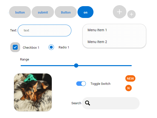
Safari Technology Preview (TP) 185 and Safari 17.4 released with an under-the-radar feature, a native HTML switch control. It evolves from the hidden-checkbox approach and aims to make the accessibility and usability of the control more consistent.

<!-- This will render a native checkbox --//>
<input type="checkbox" />

<!-- Add the switch attribute to render a switch element --//>
<input type="checkbox" switch />
<input type="checkbox" checked switch />

Communication is one aspect of the control’s accessibility. Earlier in 2024, there were issues where the switch would not adjust to page zoom levels properly, leading to poor or broken visibility of the control. However, at the time I am writing this, Safari looks to have resolved these issues. Zooming retains the visual cohesion of the switch.

The switch attribute seems to take accessibility needs into consideration. However, this doesn’t prevent us from using it in inaccessible and unusable ways. As mentioned, mixing the required and indeterminate properties between switches and checkboxes can cause unexpected behavior for people trying to navigate the controls. Once again, Adrian sums things up nicely:

“The switch role does not allow mixed states. Ensure your switch never gets set to a mixed state; otherwise, well, problems.”

— Adrian Roselli

Internationalization (I18N): Which Way Is On?

Beyond the accessibility of the switch control, what happens when the switch interacts with different writing modes?

When creating the switch, we had to ensure the use of logical CSS to support different writing modes and directions. This is because a switch being in its right-most position (or inline ending edge) doesn’t mean “on” in some environments. In some languages — e.g., those that are written right-to-left — the left-most position (or inline starting edge) on the switch would likely imply the “on” state.

While we should be writing logical CSS by default now, the new switch control removes that need. This is because the control will adapt to its nearest writing-mode and direction properties. This means that in left-to-right environments, the switch’s right-most position will be its “on” state, and in right-to-left environments, its left-most position will be the “on” state.

See the Pen Safari Switch Control - Styling [forked] by @DanielYuschick.

Final Thoughts

As we continue to push the web forward, it’s natural for our tools to evolve alongside us. The switch control is a welcome addition to HTML for eliminating the checkbox hacks we’ve been resorting to for years.

That said, combining the checkbox and switch into a single input, while being convenient, does raise some concerns about potential markup combinations. Despite this, I believe this can ultimately be resolved with linters or by the browsers themselves under the hood.

Ultimately, having a native approach to switch components can make the accessibility and usability of the control far more consistent — assuming it’s ever supported and adopted for widespread use.

Unchain My Inaccessibly-Labelled Heart

Suzy Naschansky from the HTMHell Advent Calendar:

<h2 id="article1-heading">All About Dragons</h2>  
<p>I like dragons. Blah blah blah blah blah.</p>  
<p>
  <a id="article1-read-more" aria-labelledby="article1-read-more article1-heading">Read more</a>  
</p>  

See that aria-labelledby attribute? It chains two IDs from the markup, one for the heading (#article1-heading) and one for the link (#article1-read-more). What happens there is a screenreader will replace the existing semantic label between the link tags and use the content from both elements and announce them together as a single string of text:

Read more All About Dragons

I’m always sheepish when realizing there’s something I think I should know but don’t. This is definitely one of those cases and I’m thankful as all heck that Suzy shared it.

I was actually in a situation just recently where I could’ve should’ve done this. I always try to avoid a bunch of “Read more” links on the same page but coming up with different flavors of the same thing is tough when you’re working with something like a loop of 15 posts (even though there are resources to help). And if we need to keep labels short for aesthetic reasons — design requirements and whatnot — it’s even more challenging. The aria-labelledby attribute gives me exactly what I want: consistent visual labels and more contextual announcements for assistive tech.

And this is only a thing when the text you want to use for the accessible label already exists on the page. Otherwise, you’d want to go with aria-label and with the caveat that it’s purely for interactive elements that are unable to label things accessibly with semantic HTML.

If you are working in a CMS like WordPress (which I am), you might need to do a little extra work. Like when I drop a Button block on the page, these are the options I have to work with:

Some nice options in there, but nothing to do with accessible labelling. If you’re wondering what’s buried in that Advanced panel:

Close, but no cigar.

Instead, you’ll need to edit the button in HTML mode:

But before doing that, you gotta add an ID to the heading you want to use. The Heading block has the same Advanced panel setting for adding an anchor, which’ll inject an ID on the element:

Then you can go edit the Button block in HTML mode and add the accessible-labels ID as well as an ID for the button itself. This is an example of the edited markup:

<div class="wp-block-buttons">
  <!-- wp:button -->
  <div class="wp-block-button">
    <a id="read-more-button" aria-labelledby="read-more-button heading-accessible-labels" class="wp-block-button__link wp-element-button" href="https://webaim.org/projects/million/">
      Read Report
    </a>
  </div>
  <!-- /wp:button -->
</div>

Great! But WordPress just ain’t cool with that:

You can try to resolve the issue:

Le sigh. The Button block has to be converted to a Custom HTML block. Kinda defeats the whole visual editing thing that WordPress is so good at. I did a super quick search for a plugin that might add ARIA labelling options to certain blocks, but came up short. Seems like a ripe opportunity to make one or submit PRs for the blocks that could use those options.


Unchain My Inaccessibly-Labelled Heart originally published on CSS-Tricks, which is part of the DigitalOcean family. You should get the newsletter.

Accessible Front-End Patterns For Responsive Tables (Part 1)

Tables allow us to organize data into grid-like format of rows and columns. Scanning the table in one direction allows users to search and compare the data while scanning in the other direction lets users get all details for a single item by matching the data to their respective table header elements.

Tables often rely on having enough screen space to communicate these data relations effectively. This makes designing and developing more complex responsive tables somewhat of a challenge. There is no universal, silver-bullet solution for making the tables responsive as we often see with other elements like accordions, dropdowns, modals, and so on. It all depends on the main purpose of the table and how it’s being used.

If we fail to consider these factors and use the wrong approach, we can potentially make usability worse for some users.

In this article, we’re going to be strictly focused on various ways we can make tables on the web responsive, depending on the data type and table use-case, so we’re not going to cover table search, filtering, and other similar functionalities.

If you are interested in improving user experience (UX) for tables and other UI elements beyond just responsiveness, make sure to check out Smashing Magazine’s incredibly useful Smart Interface Design Patterns workshop, which covers best practices and guidelines for various UI components, tables included.

Short Primer On Accessible Tables

Before diving into specific responsive table patterns, let’s quickly go over some best practices regarding design and accessibility. We’ll cover some general points in this section and other, more specific ones in later examples.

Design And Visual Features

First, we need to ensure that users can easily scan the table and intuitively match the data to their respective table header elements. From the design perspective, we can ensure the following:

  • Use proper vertical and horizontal alignment (“A List Apart” covers this in their article).
  • Design a table with clear divisions and optimal spacing between rows and cells.
  • Table header elements should stand out and be styled differently from data cells.
  • Consider using alternate background color for rows or columns (“zebra stripes”) for easier scanning.

ARIA Roles

We want to include proper ARIA attributes to our table element and its descendants. Applying some CSS styles like display: block or display: flex (to create responsive stacked columns) may cause issues in some browsers. In those cases, screen readers interpret the table element differently, and we lose the useful table semantics. By adding ARIA labels, we can fix the issue and retain the table semantics.

Including these roles in HTML manually could become tedious and prone to error. If you are comfortable about using JavaScript for adding additional markup, and you aren’t using a framework that generates static HTML files, you can use this handy little JavaScript function made by Adrian Roselli to automatically add ARIA roles to table elements:

function AddTableARIA() {
  try {
    var allTables = document.querySelectorAll("table");
    for (var i = 0; i < allTables.length; i++) {
      allTables[i].setAttribute("role", "table");
    }
    var allRowGroups = document.querySelectorAll("thead, tbody, tfoot");
    for (var i = 0; i < allRowGroups.length; i++) {
      allRowGroups[i].setAttribute("role", "rowgroup");
    }
    var allRows = document.querySelectorAll("tr");
    for (var i = 0; i < allRows.length; i++) {
      allRows[i].setAttribute("role", "row");
    }
    var allCells = document.querySelectorAll("td");
    for (var i = 0; i < allCells.length; i++) {
      allCells[i].setAttribute("role", "cell");
    }
    var allHeaders = document.querySelectorAll("th");
    for (var i = 0; i < allHeaders.length; i++) {
      allHeaders[i].setAttribute("role", "columnheader");
    }
    // This accounts for scoped row headers
    var allRowHeaders = document.querySelectorAll("th[scope=row]");
    for (var i = 0; i < allRowHeaders.length; i++) {
      allRowHeaders[i].setAttribute("role", "rowheader");
    }
    // Caption role not needed as it is not a real role, and
    // browsers do not dump their own role with the display block.
  } catch (e) {
    console.log("AddTableARIA(): " + e);
  }
}

However, keep in mind the following potential drawbacks of using JavaScript here:

  • Users might choose to browse the website with JavaScript turned off.
  • The JavaScript file may not be downloaded or may be downloaded much later if the user is browsing the website on an unreliable or slow network.
  • If this is bundled alongside other JavaScript code in the same file, an error in other parts of the file might prevent this function from running in some cases.

Adding An a11y-Friendy Title

Adding a title next to the table helps both sighted users and users with assistive devices get a complete understanding of the content.

Ideally, we would include a caption element inside the table element as a first child. Notice how we can nest any HTML heading element as a child to maintain the title hierarchy.

<table>
  <caption>
    <h2>Top 10 best-selling albums of all time</h2>
  </caption>

   <!-- Table markup -->
</table>

If we are using a wrapper element to make the table scrollable or adding some other functionality that makes the caption element not ideal, we can include the table inside a figure element and use a figcaption to add a title. Make sure to include a proper ARIA label on either the table element or a wrapper element and link it to a figcaption element:

<figure>
  <figcaption id="caption">Top 10 best-selling albums of all time</figcaption>
  <table aria-labelledby="caption"><!-- Table markup --></table>
</figure>
<figure>
  <figcaption id="caption">
    <h2>Top 10 best-selling albums of all time</h2>
  </figcaption>
  <div class="table-wrapper" role="group" aria-labelledby="caption" tabindex="0">
    <table><!-- Table markup --></table>
  </div>
</figure>

There are other accessibility aspects to consider when designing and developing tables, like keyboard navigation, print styles, high contrast mode, and others. We’ll cover some of those in the following sections. For a more comprehensive guide on creating accessible table elements, make sure to check out Heydon Pickering’s guide and Adrian Roselli’s article which is being kept up to date with the latest features and best practices.

Bare-bones Responsive Approach

Sometimes we don’t have to make any major changes to our table to make it responsive. We just need to ensure the table width responds to the viewport width. That can be easily achieved with width: 100%, but we should also consider setting a dynamic max-width value, so our table doesn’t grow too wide on larger containers and becomes difficult to scan, like in the following example:

table {
  width: fit-content;
}

With the fit-content value, we ensure that the table doesn’t grow beyond the minimum width required to optimally display the table contents and that it remains responsive.

The table responds to viewport size, and it looks good on small screens, but on wider screens, it becomes difficult to scan due to the unnecessary space between the columns.

We can also ensure that the table max-width value always adapts to its content. We don’t have to rely on assigning a magic number for each table or wrap the table in a container that constrains the width to a fixed value.

This works well for simple tables that don’t require too much screen space to be effectively parsed and aren’t affected by word-break. We can even use fluid typography and fluid spacing to make sure these simple tables remain readable on smaller screens.

/* Values generated with Utopia https://utopia.fyi/type/calculator/ */

tbody {
  font-size: clamp(1.13rem, calc(0.35rem + 2.19vw), 1.75rem);
}

tbody td {
  padding-top: clamp(1.13rem, calc(0.35rem + 2.19vw), 1.75rem);
  padding-bottom:  clamp(2rem, calc(0.62rem + 3.9vw), 3.11rem);
}

This is important to know because on some devices, like smartphones and tablets, scrollbars aren’t visible right away, and users might get the impression that the table is not scrollable.

Lea Verou and Roman Komarov have suggested using “scrolling shadows” to subtly indicate the scrolling direction using gradient background and background-attachment property. Using this property, we can set background gradient behavior when scrolling. We also use linear gradients as edge covers for shadows, so we gradually hide the shadow when the user has reached an edge and cannot scroll in that direction anymore.

.table-wrapper {
  overflow: auto;
  background: 
    linear-gradient(90deg, var(--color-background) 20%, rgba(255, 255, 255, 0)),
    linear-gradient(90deg, rgba(255, 255, 255, 0), var(--color-background) 80%) 
                    100% 0,
    radial-gradient(farthest-side at 0 0%, var(--color-shadow), rgba(0, 0, 0, 0)),
    radial-gradient(farthest-side at 100% 0%, var(--color-shadow), rgba(0, 0, 0, 0))
                    100% 0;
  background-repeat: no-repeat;
  background-size: 20% 200%, 20% 200%, 8% 400%, 8% 400%;
  background-attachment: local, local, scroll, scroll;
}

Keep in mind that background-attachment property is not supported on iOS Safari and a few other browsers, so make sure to either provide a fallback or remove the background on unsupported browsers. We can also provide helpful text next to the table to make sure users understand that the table can be scrolled.

Forcing Table Cropping

We can also dynamically set the table column width to enforce table cropping mid-content, so the user gets a clear hint that the table is scrollable. I’ve created a simple function for this example. The last column will always get cropped to 85% of its size, and we’ll reduce the number of visible columns by one if we cannot show at least 5% of the column’s width.

function cropTable(visibleCols) {
  const table = document.querySelector("figure");
  const { width: tableWidth } = table.getBoundingClientRect();
  const cols = table.querySelectorAll("th, td");
  const newWidth = tableWidth / visibleCols;

  // Resize columns to fit a table.
  cols.forEach(function(col) {
    // Always make sure that col is cropped by at least 15%.
    col.style.minWidth = newWidth + (newWidth * 0.15) + "px";
  });

  // Return if we are about to fall below min column count.
  if (visibleCols <= MIN_COLS) {
    return;
  }

  // Measure a sample table column to check if resizing was successful.
  const { width: colWidth } = cols[0].getBoundingClientRect();

  // Check if we should crop to 1 column less (calculate new column width).
  if (colWidth * visibleCols > tableWidth + newWidth * 0.95) {
    cropTable(visibleCols - 1);
  }
}

This function might need to be adjusted to a more complex use case. Check the example below and see how the table column width responds to window resizing:

Stacking Approach (Rows To Blocks)

The stacking approach has been a very popular pattern for years. It involves converting each table row into a block of vertically stacked columns. This is a very useful approach for tables where data is not comparable or when we don’t need to highlight the hierarchy and order between items.

For example, cart items in a webshop or a simple contacts table with details — these items are independent, and users primarily scan them individually and search for a specific item.

As mentioned before, converting the table rows to blocks usually involves applying display: block on small screens. However, as Adrian Roselli has noted, applying a display property overrides native table semantics and makes the element less accessible on screen readers. This discovery was jarring to me, as I’ve spent years crafting responsive tables using this pattern without realizing I was making them less accessible in the process.

It’s not all bad news, as Adrian Roselli notes the following change for Chrome version 80:

Big progress. Chrome 80 no longer drops semantics for HTML tables when the display properties flex, grid, inline-block, or contents are used. The new Edge (ChromiEdge) follows suit. Firefox still dumps table semantics for only display: contents. Safari dumps table semantics for everything.

— Adrian Roselli

For this example, we’ll use display: flex instead of using display: block for our stacking pattern. This is not an ideal solution as other browsers might still drop table semantics, so make sure to test the accessibility on various browsers and devices.

/* Small screen width styles */
table, tbody, tbody tr, tbody td, caption {
  display: flex;
  flex-direction: column;
  width: 100%;
  word-break: break-all;
}

See the Pen Table - stacked [forked] by Adrian Bece.

Accordion

The stacking pattern might look nice initially and seems to be an elegant solution from a design perspective. However, depending on the table and data complexity, this pattern might significantly increase page height, and the user might have to scroll longer to reach the content below the table.

One improvement I found interesting was to show the primary data column (usually the first column) and hide the less important data (other columns) under an accordion. This makes sense for our example, as users would first look for a name by contact and then scan for their details in the row.

<tr>
  <td onclick="toggle()">
    <button aria-label="Expand contact details">
      <!-- Icon -->
    </button>
    <!-- Main content-->
  </td>
  <td><!-- Secondary content--></td>
  <td><!-- Secondary content--></td>
  <td><!-- Secondary content--></td>
</tr>

We’ll assume that the first table column contains primary data, and we’ll hide other columns unless a row-active class is applied:

/* Small screen width styles */

thead tr > *:not(:first-child) {
  display: none;
}

tbody,
tbody tr,
tbody td {
  display: flex;
  flex-direction: column;
  word-break: break-all;
}

tbody td:first-child {
  flex-direction: row;
  align-items: center;
}

tbody tr:not(.row-active) > *:not(:first-child) {
  max-width: 0;
  max-height: 0;
  overflow: hidden;
  padding: 0;
}

Now we have everything in place for showing and hiding table row details. We also need to keep in mind the screen reader support and toggle the aria-hidden property to hide secondary info from screen readers. We don’t need to toggle the ARIA property if we’re toggling the element visibility with the display property:

function toggle() {
  const row = this.window.event.target.closest("tr");
  row.classList.toggle("row-active");

  const isActive = row.classList.contains("row-active");

  if (isActive) {
    const activeColumns = row.querySelectorAll("td:not(:first-child)");
    activeColumns.forEach(function (col) {
      col.setAttribute("aria-hidden", "false");
    });
  } else {
    const activeColumns = row.querySelectorAll(`td[aria-hidden="false"]`);
    activeColumns.forEach(function (col) {
      col.setAttribute("aria-hidden", "true");
    });
}

We’ll assign this function to the onclick attribute on our main table column elements to make the whole column clickable. We also need to assign proper ARIA labels when initializing and resizing the window. We don’t want incorrect ARIA labels applied when we resize the screen between two modes.

function handleResize() {
  const isMobileMode = window.matchMedia("screen and (max-width: 880px)");
  const inactiveColumns = document.querySelectorAll(
    "tbody > tr > td:not(:first-child)"
  );

  inactiveColumns.forEach(function (col) {
    col.setAttribute("aria-hidden", isMobileMode.matches.toString());
  });
}

//On window resize
window.addEventListener("resize", handleResize);

// On document load
handleResize();

See the Pen Table - accordion [forked] by Adrian Bece.

This approach significantly reduces table height on smaller screens compared to the previous example. The content below the table would now easily be reachable by quickly scrolling past the table.

Toggleable Columns Approach

Going back to our scrollable table example, in some cases, we can give users an option to customize the table view by allowing them to show and hide individual columns, temporarily reducing table complexity in the process. This is useful for users that want to scan or compare data only by specific columns.

We’ll use a checkbox form and have them run a JavaScript function. We’ll only have to pass an index of the column that we want to toggle. We’ll have to hide both the columns in data rows in a table body and a table header element:

function toggleRow(index) {
  // Hide a data column for all rows in the table body.
  allBodyRows.forEach(function (row) {
    const cell = row.querySelector(`td:nth-child(${index + 1})`);
    cell.classList.toggle("hidden");
  });

  // Hide a table header element.
  allHeadCols[index].classList.toggle("hidden");
}

This is a neat solution if you want to avoid the stacking pattern and allow users to easily compare the data but give them options to reduce the table complexity by toggling individual columns. In this case, we’re using a display property to toggle the visibility, so we don’t have to handle toggling ARIA labels.

See the Pen Responsive table - column toggle [forked] by Adrian Bece.

Conclusion

Table complexity and design depend on the use case and the data they display. They generally rely on having enough screen space to display columns in a way user can easily scan them. There is no universal solution for making tables responsive and usable on smaller screens for all these possible use cases, so we have to rely on various patterns.

In this article, we’ve covered a handful of these patterns. We’ve focused primarily on simple design changes with a scrolling table pattern and a stacking pattern and began checking out more complex patterns that involve adding some JavaScript functionality.

In the next article, we’ll explore more specific and complex responsive table patterns and check out some responsive table libraries that add even more useful features (like filtering and pagination) to tables out of the box.

References

Newer Things to Know About Good Ol’ HTML Lists

HTML lists are boring. They don’t do much, so we don’t really think about them despite how widely used they are. And we’re still able to do the same things we’ve always done to customize them, like removing markers, reversing order, and making custom counters.

There are, however, a few “newer” things — including dangers — to know when using lists. The dangers are mostly minor, but way more common than you might think. We’ll get to those, plus some new stuff we can do with lists, and even new ways to approach old solutions.

To clarify, these are the HTML elements we’re talking about:

  • Ordered lists <ol>
  • Unordered lists <ul>
  • Description lists <dl>
  • Interactive lists <menu>

Ordered lists, unordered lists, and interactive lists contain list items (<li>) which are displayed according to what kind of list we’re dealing with. An ordered list (<ol>) displays numbers next to list items. Unordered lists (<ul>) and menu elements (<menu>) displays bullet points next to list items. We call these “list markers” and they can even be styled using the ::marker pseudo-element. Description lists use description terms (<dt>) and description details (<dd>) instead of <li> and don’t have list markers. They‘re supposed to be used to display metadata and glossaries, but I can’t say I’ve ever seen them in the wild.

Let’s start off with the easy stuff — how to correctly (at least in my opinion) reset list styles. After that, we’ll take a look at a couple of accessibility issues before shining a light on the elusive <menu> element, which you may be surprised to learn… is actually a type of list, too!

Resetting list styles

Browsers automatically apply their own User Agent styles to help with the visual structure of lists right out of the box. That can be great! But if we want to start with a blank slate free of styling opinions, then we have to reset those styles first.

For example, we can remove the markers next to list items pretty easily. Nothing new here:

/* Zap all list markers! */
ol, ul, menu {
  list-style: none;
}

But modern CSS has new ways to help us target specific list instances. Let’s say we want to clear markers from all lists, except if those lists appear in long-form content, like an article. If we combine the powers of newer CSS pseudo-class functions :where() and :not(), we can isolate those instances and allow the markers in those cases:

/* Where there are lists that are not articles where there are lists... */
:where(ol, ul, menu):not(article :where(ol, ul, menu)) {
  list-style: none;
}

Why use :where() instead of :is()? The specificity of :where() is always zero, whereas :is() takes the specificity of the most specific element in its list of selectors. So, using :where() is a less forceful way of overriding things and can be easily overridden itself.

UA styles also apply padding to space a list item’s content from its marker. Again, that’s a pretty nice affordance right out of the box in some cases, but if we’re already removing the list markers like we did above, then we may as well wipe out that padding too. This is another case for :where():

:where(ol, ul, menu) {
  padding-left: 0; /* or padding-inline-start */
}

OK, that’s going to prevent marker-less list items from appearing to float in space. But we sort of tossed out the baby with the bathwater and removed the padding in all instances, including the ones we previously isolated in an <article>. So, now those lists with markers sorta hang off the edge of the content box.

Notice that UA styles apply an extra 40px to the <menu> element.

So what we want to do is prevent the list markers from “hanging” outside the container. We can fix that with the list-style-position property:

Or not… maybe it comes down to stylistic preference?

Newer accessibility concerns with lists

Unfortunately, there are a couple of accessibility concerns when it comes to lists — even in these more modern times. One concern is a result of applying list-style: none; as we did when resetting UA styles.

In a nutshell, Safari does not read ordered and unordered lists styled with list-style: none as actual lists, like when navigating content with a screen reader. In other words, removing the markers also removes the list’s semantic meaning. The fix for this fix it to apply an ARIA list role on the list and a listitem role to the list items so screen readers will pick them up:

<ol style="list-style: none;" role="list">
  <li role="listItem">...</li>
  <li role="listItem">...</li>
  <li role="listItem">...</li>
</ol>

<ul style="list-style: none;" role="list">
  <li role="listItem">...</li>
  <li role="listItem">...</li>
  <li role="listItem">...</li>
</ul>

Oddly, Safari considers this to be a feature rather than a bug. Basically, users would report that screen readers were announcing too many lists (because developers tend to overuse them), so now, only those with role="list" are announced by screen readers, which actually isn’t that odd after all. Scott O’Hara has a detailed rundown of how it all went down.

A second accessibility concern isn’t one of our own making (hooray!). So, you know how you’re supposed to add an aria-label to <section> elements without headings? Well, it sometimes makes sense to do the same with a list that doesn’t contain a heading element that helps describe the list.

<!-- This list is somewhat described by the heading -->
<section>
  <h2>Grocery list</h2>
  <ol role="list">
     <!-- ... -->
  </ol>
</section>

<!-- This list is described by the aria-label -->
<ol role="list" aria-label="Grocery list">
  <!-- ... -->
</ol>

You absolutely don’t have to use either method. Using a heading or an ARIA label is just added context, not a requirement — be sure to test your websites with screen readers and do what offers the best user experience for the situation.

In somewhat related news, Eric Bailey wrote up an excellent piece on why and how he considers aria-label to be a code smell.

Wait, <menu> is a list, too?

OK, so, you’re likely wondering about all of the <menu> elements that I’ve been slipping into the code examples. It’s actually super simple; menus are unordered lists except that they’re meant for interactive items. They’re even exposed to the accessibility tree as unordered lists.

In the early days of the semantic web, I mistakenly believed that menus were like <nav>s before believing that they were for context menus (or “toolbars” as the spec says) because that’s what early versions of the HTML spec said. (MDN has an interesting write-up on all of the deprecated stuff related to <menu> if you’re at all interested.)

Today, however, this is the semantic way to use menus:

<menu aria-label="Share article">
  <li><button>Email</button></li>
  <li><button>Twitter</button></li>
  <li><button>Facebook</button></li>
</menu>

Personally, I think there are some good use-cases for <menu>. That last example shows a list of social sharing buttons wrapped up in a labeled <menu> element, the notable aspect being that the “Share article” label contributes a significant amount of context that helps describe what the buttons do.

Are menus absolutely necessary? No. Are they HTML landmarks? Definitely not. But they’re there if you enjoy fewer <div>s and you feel like the component could use an aria-label for additional context.

Anything else?

Yes, there’s also the aforementioned <dl> (description list) element, however, MDN doesn’t seem to consider them lists in the same way — it’s a list of groups containing terms — and I can’t say that I’ve really seen them in use. According to MDN, they’re supposed to be used for metadata, glossaries, and other types of key-value pairs. I would just avoid them on the grounds that all screen readers announce them differently.

But let’s not end things on a negative note. Here’s a list of super cool things you can do with lists:


Newer Things to Know About Good Ol’ HTML Lists originally published on CSS-Tricks, which is part of the DigitalOcean family. You should get the newsletter.

A Guide To Keyboard Accessibility: JavaScript (Part 2)

In the previous article, we talked about how to improve accessibility for keyboard users using HTML and CSS. Those languages can do the job most of the time, but certain design requirements and the nature of certain components create the need for more complex interactions, and this is where JavaScript comes into play.

For keyboard accessibility purposes, most of the job is done with basic tools that open many possibilities for keyboard interactivity. This article covers a toolset that you can mix into different components to improve accessibility for keyboard users.

The Basics

Most of the time, your job with JavaScript to enhance components’ keyboard accessibility will be done with just a handful of tools, including the use of event listeners and certain JavaScript methods of a couple of Web APIs that can help us in this task.

One of the most important tools we have to add interactivity to our projects is the existence of events, which is the execution of functions that trigger when the element you’re checking receives a change.

keydown Event

One example of an event you can listen to with this Web API is the keydown event, which checks when a key is pressed.

Now, this isn’t used to add keyboard accessibility to elements like buttons or links because, by default, when you add a click event listener to them, this will also trigger the event when you use the Enter (for button and links) and Space keys (button only). Instead, the utility of the keydown event comes when you need to add functionality to other keys.

To add an example, let’s come back to the tooltip we created in the first part of this article. I mentioned that this tooltip needs to be closed when you press the Esc key. We’d need a keydown event listener to check if the pressed key is Esc. For that, we need to detect the event’s pressed key. In this case, we’ll check the event key’s property.

We’ll use keycode.info to check the event dump for this key. If you press the Esc key on this page, you’ll notice that e.key is equal to "Escape".

Note: There are two other ways to detect the pressed key, and those are checking e.keyCode and e.which. They will return a number. In the case of the Esc key, it’ll be 27. But, keep in mind those are deprecated alternatives, and while they work, e.key is the preferred option.

With that, we need to select our buttons and add the event listener. My approach to this matter is to use this event listener to add a class to the button and add this class as an exception to show it using the :not() pseudo-class. Let’s start changing our CSS a bit:

button:not(.hide-tooltip):hover + [role="tooltip"],
button:not(.hide-tooltip):focus + [role="tooltip"],
[role="tooltip"]:hover {
  display: block;
}

Now, with this exception added, let’s create our event listener!

const buttons = [...document.querySelectorAll("button")]

buttons.forEach(element => {
  element.addEventListener("keydown", (e) => {
    if (e.key === "Escape") {
      element.classList.add("hide-tooltip")
    }
  })
})

And there you have it! With just a sprinkle of JavaScript, we have added an accessibility function to our tooltip. And that was just the start of what we can do with a keydown event listener. It’ll be a crucial tool to improve keyboard accessibility for multiple components, but there is another event listener we should take into consideration.

blur Event

There is another event we’ll use often. This one detects when the element stops receiving focus. This event listener is important, and most of the time, you’ll use it to reverse the possible changes you have made with the keydown event listener.

Let’s come back to the tooltip. Right now, it has a problem: if you press the Esc key to close the tooltip, and then you focus on the same element again, the tooltip won’t appear. Why? Because we added the hide-tooltip class when you press the Esc key, but we never removed this class. This is where blur comes into play. Let’s add an event listener to revert this functionality.

element.addEventListener("blur", (e) => {
  if (element.classList.contains("hide-tooltip")) {
    element.classList.remove("hide-tooltip");
  }
});

Other Event Listeners (And Why You Might Don’t Need Them)

I mentioned that we’re going to need two event listeners in our toolkit, but there are other event listeners you could use, like focusout or focus. However, I think use cases for them are quite scarce. There is a special mention to focus because even if you can find good use cases for it, you need to be very careful. After all, if you don’t use it properly, you can cause a change of context.

A change of context is defined by WCAG as “major changes that, if made without user awareness, can disorient users who are not able to view the entire page simultaneously.” Some examples of change of context include:

  • Opening a new window;
  • Changing the layout of your site significantly;
  • Moving the focus to another part of the site.

This is important to keep in mind because creating a change of context at the moment of focusing on an element is a failure of WCAG criteria 3.2.1:

When any user interface component receives focus, it does not initiate a change of context.

— Success Criterion 3.2.1: Focus order

If you’re not careful, bad use of a function that listens to the focus event can create a change of context. Does that mean you shouldn’t use it? Not really, but to be honest, I can hardly find a use for this event. Most of the time, you’ll be using the :focus pseudo-class to create similar functionalities.

With that said, there is at least one component pattern that can benefit from this event listener in some cases, but I’ll cover it later when I start talking about components, so let’s put a pin on that topic for now.

focus() Method

Now, this is something we’ll be using with some frequency! This method from the HTMLElement API allows us to bring the keyboard focus to a particular element. By default, it’ll draw the focus indicator in the element and will scroll the page to the element’s location. This behavior can be changed with a couple of parameters:

  • preventScroll
    When it’s set to true, will make the browser doesn’t scroll until the programmatically focused element.
  • focusVisible
    When set to false, it will make the programmatically focused element doesn’t display its focus indicator. This property works only on Firefox right now.

Keep in mind that to focus the element, it needs to be either focusable or tabbable. If you need to bring the focus to a normally not tabbable element (like a dialog window), you’ll need to add the attribute tabindex with a negative integer to make it focusable. You can check out how tabindex works in the first part of this guide.

<button id="openModal">Bring focus</button>
<div id="modal" role="dialog" tabindex="-1">
  <h2>Modal content</h2>
</div>

Then we’ll add a click event listener to the button to make the dialog window focused:

const button = document.querySelector("#openModal");
const modal = document.querySelector("#modal")

button.addEventListener("click", () => {
  modal.focus()
})

And there you have it! This method will be very handy in a lot of components in tandem with the keydown attribute, so understanding how both of them work is crucial.

Changing HTML Attributes With JavaScript

Certain HTML attributes need to be modified with JavaScript to create accessibility in complex component patterns. Two of the most important ones for keyboard accessibility are tabindex and the more recently added inert. tabindex can be modified using setAttribute. This attribute requires two parameters:

  • name
    It checks the name of the attribute you want to modify.
  • value
    It will add the string this attribute requires if it doesn’t require a particular attribute (for example, if you add the attributes hidden or contenteditable, you’ll need to use an empty string).

Let’s check a quick example of how to use it:

const button = document.querySelector("button")

button.setAttribute("tabindex", "-1")

setAttribute will help a lot for accessibility in general. (I use it a lot to change ARIA attributes when needed!) But, when we talk about keyboard accessibility, tabindex is almost the only attribute you’ll be modifying with this method.

I mentioned the inert attribute before, and this one works a bit differently because it has its own property in the HTMLElement Web API. HTMLElement.inert is a boolean value that will let us toggle the inert attribute.

Keep in mind a couple of things before thinking about using this attribute:

  • You’ll need a polyfill because it’s not fully implemented in all browsers and is still quite recent. This polyfill created by Chrome engineers works pretty well in the tests I have made, so if you need this property, this is a safe approach, but keep in mind that it might have unexpected behaviors.
  • You can use setAttribute to change this attribute as well! Both work equally well, even with a polyfill. Whichever you decide to use is up to you.
const button = document.querySelector("button")

// Syntax with HTMLElement.inert
button.inert = true

// Syntax with Element.setAttribute()
button.setAttribute("inert", "")

This combination of tools will be handy for keyboard accessibility purposes. Now let’s start to see them in action!

Component Patterns

Toggletips

We learned how to make a tooltip in the previous part, and I mentioned how to enhance it with JavaScript, but there is another pattern for this kind of component called toggletip, which is a tooltip that works when you click them, instead of hovering on them.

Let’s check a quick list of what we need to make sure it happens:

  • When you press the button, the information should be announced to screen readers. That should happen when you press the button again. Pressing the button won’t close the toggletip.
  • The toggletip will be closed when you either click outside the toggletip, stop focusing the button, or press the Esc key.

I’ll take Heydon Pickering’s approach that he talks about in his book Inclusive Components. So, let’s start with the markup:

<p>If you need to check more information, check here
  <span class="toggletip-container">
    <button class="toggletip-button">
      <span class="toggletip-icon" aria-hidden="true">?</span>
      <div class="sr-only">Más información</div>
    </button>
    <span role="status" class="toggletip-info"></span>
  </span>
</p>

The idea is to inject the necessary HTML inside the element with the role="status". That’ll make screen readers announce the content when you click it. We’re using a button element to make it tabbable. Now, let’s create the script to show the content!

toggletipButton.addEventListener("click", () => {
  toggletipInfo.innerHTML = "";
  setTimeout(() => {
    toggletipInfo.innerHTML = toggletipContent;
  }, 100);
});

As Heydon mentions in his book, we use this approach of first removing the container’s HTML content and then using setTimeout to add it to make sure every time you click it, it’ll be announced for screen reader users. Now we need to check that when you’re clicking elsewhere, the content stops showing.

document.addEventListener("click", (e) => {
  if (toggletipContainer !== e.target) {
    toggletipInfo.innerHTML = ""
  }
})

With that out of the way, it’s time to add keyboard accessibility to this component. We don’t need to make the toggletip’s content show when you press the button because a good HTML semantic does that for us already. We need to make the toggletip’s content stop showing when you press the Esc key and when you stop focusing on this button. It works very similarly to what we did for tooltips in the previous section as examples, so let’s start working with that. First, we’ll use the keydown event listener to check when the Esc key is pressed:

toggletipContainer.addEventListener("keydown", (e) => {
  if (e.key === "Escape") {
    toggletipInfo.innerHTML = ""
    }
})

And now, we need to check the blur event to do the same. This one should be on the button element instead of the container itself.


toggletipButton.addEventListener("blur", () => {
  toggletipInfo.innerHTML = "";
});

And this is our result!

Roving tabindex

Tabbed interfaces are patterns that you can still see from time to time. They have a very interesting functionality when we talk about keyboard navigation: when you press the Tab key, it’ll go to the active tab panel. To navigate between the tab list, you’ll need to use the Arrow keys. This is a technique called roving tabindex that consists in removing the ability of the non-active elements to be tababble by adding the attribute tabindex="-1" and then using other keys to allow the navigation between those items.

With tabs, this is the expected behavior for those:

  • When you press Left or Up keys, it’ll move the keyboard focus onto the previous tab. If the focus is on the first tab, it’ll move the focus to the last tab.
  • When you press the Right or Down keys, it’ll move the keyboard focus onto the next tab. If the focus is on the first tab, it’ll move the focus to the last tab.

Creating this functionality is a mix of three techniques we saw before: modifying tabindex with setAttribute, the keydown event listener, and the focus() method. Let’s start by checking the markup of this component:

<ul role="tablist">
  <li role="presentation">
    <button id="tab1" role="tab" aria-selected="true">Tomato</button>
  </li>
  <li role="presentation">
    <button id="tab2" role="tab" tabindex="-1">Onion</button>
  </li>
  <li role="presentation">
    <button id="tab3" role="tab" tabindex="-1">Celery</button>
  </li>
  <li role="presentation">
    <button id="tab4" role="tab" tabindex="-1">Carrot</button>
  </li>
</ul>
<div class="tablist-container">
  <section role="tabpanel" aria-labelledby="tab1" tabindex="0">
  </section>
  <section role="tabpanel" aria-labelledby="tab2" tabindex="0" hidden>
  </section>
  <section role="tabpanel" aria-labelledby="tab3" tabindex="0" hidden>
  </section>
  <section role="tabpanel" aria-labelledby="tab4" tabindex="0" hidden>
  </section>
</div>

We are using aria-selected="true" to show which is the active tab, and we’re adding tabindex="-1" to make the non-active tabs unable to be selected with the Tab key. Tabpanels should be tabbable if there is no tabbable element inside of it, so this is why I added the attribute tabindex="0" and the non-active tabpanels are hidden by using the attribute hidden.

Time to add the navigation with the arrow keys. For this, we’ll need to create an array with the tabs and then create a function for it. Our next step is to check which is the first and last tab in the list. This is important because the action that will happen when you press a key will change if the keyboard focus is on one of those elements.

const TABS = [...TABLIST.querySelectorAll("[role='tab']")];

const createKeyboardNavigation = () => {
  const firstTab = TABS[0];
  const lastTab = TABS[TABS.length - 1];
}

After that, we’ll add a keydown event listener to each tab. I’ll start by adding the functionality with Left and Up arrows.

// Previous code of the createKeyboardNavigation function
TABS.forEach((element) => {
  element.addEventListener("keydown", function (e) {
    if (e.key === "ArrowUp" || e.key === "ArrowLeft") {
      e.preventDefault();
      if (element === firstTab) {
        lastTab.focus();
      } else {
        const focusableElement = TABS.indexOf(element) - 1;
        TABS[focusableElement].focus();
      }
    }
  }
}

This is what’s happening here:

  • First, we check that the pressed key is the Up or Left arrow. For that, we check the event.key.
  • If that’s true, we need to prevent those keys scroll the page because, remember, by default, they do that. We can use e.preventDefault() for this goal.
  • If the focused key is the first tab, it’ll automatically bring the keyboard focus to the last one. This is made by calling the method focus() to focus the last tab (which we store in a variable).
  • If it’s not the case, we need to check which is the position of the active tab. As we store the tab elements in an array, we can use the method indexOf() to check the position.
  • As we’re trying to navigate to the previous tab, we can subtract 1 from the result of indexOf() and then search the corresponding element in the TABS array and programmatically focus it with the focus() method.

Now we need to do a very similar process with the Down and Right keys:

// Previous code of the createKeyboardNavigation function
else if (e.key === "ArrowDown" || e.key === "ArrowRight") {
  e.preventDefault();
  if (element == lastTab) {
    firstTab.focus();
  } else {
    const focusableElement = TABS.indexOf(element) + 1;
    TABS[focusableElement].focus();
  }
}

As I mentioned, it’s a very similar process. Instead of subtracting one from the indexOf() result, we add 1 because we want to bring the keyboard focus to the next element.

Showing The Content And Changing HTML Attributes

We created the navigation, and now we need to show and hide the content as well as manipulate the attributes aria-selected and tabindex. Remember, we need to make that when the keyboard focus is on the active panel, and you press Shift + Tab, the focus should be in the active tab.

First, let’s create the function that shows the panel.

const showActivePanel = (element) => {
  const selectedId = element.target.id;
  TABPANELS.forEach((e) => {
    e.hidden = "true";
  });
  const activePanel = document.querySelector(
    `[aria-labelledby="${selectedId}"]`
  );
  activePanel.removeAttribute("hidden");
};
<
    const showActivePanel = (element) => {
      const selectedId = element.target.id;
      TABPANELS.forEach((e) => {
        e.hidden = "true";
      });
      const activePanel = document.querySelector(
        `[aria-labelledby="${selectedId}"]`
      );
      activePanel.removeAttribute("hidden");
    };

What we’re doing here is checking the id of the tab is being pressed, then hiding all the tab panels, and then looking for the tab panel we want to activate. We’ll know it’s the tab because it has the attribute aria-labelledby and uses the same value as the tab’s id. Then we show it by removing the attribute hidden.

Now we need to create a function to change the attributes:

const handleSelectedTab = (element) => {
  const selectedId = element.target.id;
  TABS.forEach((e) => {
    const id = e.getAttribute("id");
    if (id === selectedId) {
      e.removeAttribute("tabindex", "0");
      e.setAttribute("aria-selected", "true");
    } else {
      e.setAttribute("tabindex", "-1");
      e.setAttribute("aria-selected", "false");
    }
  });
};

What we’re doing here is, again, checking the id attribute and then looking at each tab. We’ll check if this tab’s id corresponds with the pressed element’s id.

If it’s the case, we’ll make it keyboard tabbable by either removing the attribute tabindex (because it’s a button, so it’s keyboard tabbable by default) or by adding the attribute tabindex="0". Additionally, we’ll add an indicator to screen reader users that this is the active tab by adding the attribute aria-selected="true".

If it doesn’t correspond, tabindex and aria-selected will be set to -1 and false, respectively.

Now, all we need to do is add a click event listener to each tab to handle both functions.

TABS.forEach((element) => {
  element.addEventListener("click", (element) => {
    showActivePanel(element),
    handleSelectedTab(element);
  });
});

And that’s it! We created the functionality to make tabs work, but we can do a little something else if needed.

Activate Tab On Focus

Do you remember what I mentioned about the focus event listener? You should be careful when you use it because it can create a change of context by accident, but it has some use, and this component is a perfect opportunity to use it!

According to ARIA Authoring Practices Guide (APG), we can make the displayed content show when you focus on the tab. This concept is often referred to as a follow focus and can be helpful for keyboard and screen reader users because it allows navigating more easily through the content.

However, you need to keep a couple of considerations about it:

  • If showing the content means making a lot of petitions and, by extension, making the network slower, making the displayed content follow the focus is not desired.
  • If it changes the layout in a significant way, that can be considered a change of context. That depends on the kind of content you want to show, and doing a change of context on focus is an accessibility issue, as I explained previously.

In this case, the amount of content doesn’t suppose a big change in either network or layout, so I’ll make the displayed content follows the focus of the tabs. This is a very simple task with the focus event listener. We can just literally copy and paste the event listener we created and just change click to focus.

TABS.forEach((element) => {
  element.addEventListener("click", (element) => {
    showActivePanel(element),
    handleSelectedTab(element);
  });

  element.addEventListener("focus", (element) => {
    showActivePanel(element),
    handleSelectedTab(element);
  });
});

And there you have it! Now the displayed content will work without the need to click the tab. Doing that or making it only work with a click is up to you and is surprisingly a very nuanced question. Personally, I’d stick just with making it shows when you press the tab because I think the experience of changing the attribute aria-selected by just focusing on the element can be slightly confusing. Still, it’s just a hypothesis on my part so take what I say with a grain of salt and always check it with users.

Additional keydown Event Listeners

Let’s come back to the createKeyboardNavigation for a moment. There are a couple of keys we can add. We can make the Home and End key brings the keyboard focus to the first and last tab, respectively. This is completely optional, so it’s ok if you don’t do it, but just to reiterate how a keydown event listener helps out, I’ll do that.

It’s a very easy task. We can create another couple of if statements to check if the Home and End keys are being pressed, and because we have stored the first and last tabs in variables, we can you focus them with the focus() method.

// Previous code of the createKeyboardNavigation function
else if (e.key === "Home") {
  e.preventDefault();
  firstTab.focus()
} else if (e.key === "End") {
  e.preventDefault();
  lastTab.focus()
}

And this is our result!

Opening And Closing The Modal

Modals are quite a complex pattern when we talk about keyboard accessibility, so let’s start with an easy task — opening and closing the modal.

It is indeed easy, but you need to keep something in mind: it’s very likely the button opens the modal, and the modal is far away in the DOM. So you need to manage the focus programmatically when you manage this component. There is a little catch here: you need to store which element opened the modal so we can return the keyboard focus returns to this element at the moment we close it.

Luckily, there is an easy way to do that, but let’s start by creating the markup of our site:

<body>
  <header>
    <!-- Header's content -->
  </header>
  <main>
    <!-- Main's content -->
    <button id="openModal">Open modal</button>
  </main>
  <footer>
    <!-- Footer's content -->
  </footer>
  <div role="dialog"
    aria-modal="true"
    aria-labelledby="modal-title"
    hidden
    tabindex="-1">
    <div class="dialog__overlay"></div>
    <div class="dialog__content">
      <h2 id="modal-title">Modal content</h2>
      <ul>
        <li><a href="#">Modal link 1</a></li>
        <li><a href="#">Modal link 2</a></li>
        <li><a href="#">Modal link 3</a></li>
      </ul>
      <button id="closeModal">Close modal</button>
    </div>
  </div>
</body>

As I mentioned, the modal and the button are far away from each other in the DOM. This will make it easier to create a focus trap later, but for now, let’s check the modal’s semantics:

  • role="dialog" will give the element the required semantics for screen readers. It needs to have a label to be recognized as a dialog window, so we’ll use the modal’s title as the label using the attribute aria-labelledby.
  • aria-modal="true" helps to make a screen reader user can only read the content of the element’s children, so it blocks access from screen readers. However, as you can see on the aria-modal page for a11ysupport.com, it’s not fully supported, so you can’t rely just on that for this task. It’ll be useful for screen readers who support it, but you’ll see there is another way to ensure screen reader users don’t interact with anything besides the modal once it’s opened.
  • As I mentioned, we need to bring the keyboard focus to our modal, so this is why we added the attribute tabindex="-1".

With that in mind, we need to create the function to open our modal. We need to check which was the element that opened it, and for that, we can use the property document.activeElement to check which element is being keyboard-focused right now and store it in a variable. This is my approach for this task:

let focusedElementBeforeModal

const modal = document.querySelector("[role='dialog']");
const modalOpenButton = document.querySelector("#openModal")
const modalCloseButton = document.querySelector("#closeModal")

const openModal = () => {
  focusedElementBeforeModal = document.activeElement

  modal.hidden = false;
  modal.focus();
};

It’s very simple:

  1. We store the button that opened the modal;
  2. Then we show it by removing the attribute hidden;
  3. Then we bring the focus to the modal with the focus() method.

It’s essential that you store the button before bringing the focus to the modal. Otherwise, the element that would be stored in this case would be the modal itself, and you don’t want that.

Now, we need to create the function to close the modal:

const closeModal = () => {
  modal.hidden = true;
  focusedElementBeforeModal.focus()
}

This is why it’s important to store the proper element. When we close the modal, we’ll bring back the keyboard focus to the element that opened it. With those functions created, all we have to do is add the event listeners for those functions! Remember that we also need to make the modal closes when you press the Esc key.

modalOpenButton.addEventListener("click", () => openModal())
modalCloseButton.addEventListener("click", () => closeModal())
modal.addEventListener("keydown", (e) => {
  if (e.key === "Escape") {
    closeModal()
  }
})

Right now, it looks very simple. But if that were all, modals wouldn’t be considered a complex pattern for accessibility, were they? This is where we need to create a very key task for this component, and we have two ways to do it.

Creating A Focus Trap

A focus trap ensures the keyboard focus can’t escape from the component. This is crucial because if a keyboard user can interact with anything outside a modal once it’s opened, it can create a very confusing experience. We have two ways to do that right now.

One of them is checking each element that can be tabbable with a keyboard, then storing which are the first and the last, and doing this:

  • When the user presses Shift + Tab and the keyboard focus is on the first tabbable element (remember, you can check that with document.activeElement), the focus will go to the last tabbable element.
  • When the user presses Tab, and the keyboard focus is on the last tabbable element, the keyboard focus should go to the first tabbable element.

Normally, I’d show you how to make this code, but I think A11y solutions made a very good script to create a focus trap. It sort of works as the keyboard navigation with the arrow keys we created for tab elements (as I mentioned before, patterns repeat themselves!), so I invite you to check this page.

I don’t want to use this approach as the main solution because it’s not exactly flawless. Those are some situations this approach doesn’t cover.

The first one is that it doesn’t take into account screen readers, especially mobile screen readers. As Rahul Kumar mentions in his article “Focus Trapping for Accessibility (A11Y)”, Talkback and Voiceover allow the user of gestures and double taps to navigate to the next or previous focusable element, and those gestures can’t be detected with an event listener because those gestures are something that technically speaking doesn’t happen in the browser. There is a solution for that, but I’ll put a pin on that topic for a moment.

The other concern is that this focus trap approach can lead to weird behaviors if you use certain combinations of tabbable elements. Take, for example, this modal:

Technically speaking, the first tabbable element is the first input. However, all the inputs in this example should focus on the last tabbable element (in this case, the button element) when the user presses the keys Shift + Tab. Otherwise, it could cause a weird behavior if the user presses those keys when the keyboard focus is on the second or third input.

If we want to create a more reliable solution, the best approach is using the inert attribute to make outer content inaccessible for screen readers and keyboard users, ensuring they can interact only with the modal’s content. Remember, this will require the inert polyfill to add more robustness to this technique.

Note: It’s important to note that despite the fact a focus trap and using inert in practice help to ensure keyboard accessibility for modals, they don’t work exactly the same. The main difference is that setting all documents but modal as inert, it’ll still let you move outside of the website and interact with the browser’s elements. This is arguably better for security concerns but deciding if you want to create a focus trap manually or use the inert attribute is up to you.

What we’ll do first is select all areas that don’t have the role dialog. As inert will remove all keyboard and screen reader interaction with the elements and their children, we’ll need to select only the direct children of body. This is why we let the modal container exist at the same level as tags like main, header, or footer.

// This selector works well for this specific HTML structure. Adapt according to your project.
const nonModalAreas = document.querySelectorAll("body > *:not([role='dialog'])")

Now we need to come back to the openModal function. After opening the modal, we need to add the attribute inert to those elements. This should be the last step in the function:

const openModal = () => {
  // Previously added code
  nonModalAreas.forEach((element) => {
    element.inert = true
  })
};

What about when you close the modal? You need to go to the closeModal function and remove this attribute. This needs to go before everything else in the code runs. Otherwise, the browser won’t be able to focus on the button that opened this modal.

const closeModal = () => {
  nonModalAreas.forEach((element) => {
    element.inert = false;
  });
// Previously added code
};

And this is our result!

See the Pen Modal test [forked] by Cristian Diaz.

Let’s suppose you don’t feel comfortable using the inert attribute right now and want to create a focus trap manually, as the one A11y Solutions shows. What can you do to ensure screen reader users can’t get out of the modal? aria-modal can help with that, but remember, the support for this property is quite shaky, especially for Talkback and VoiceOver for iOS. So the next best thing we can do is add the attribute aria-hidden="true" to all elements that are not the modal. It’s a very similar process to the one we made for the inert attribute, and you can use the same elements in the array we used for this topic as well!

const openModal = () => {
  //Previously added code
  nonModalAreas.forEach((element) => {
    element.setAttribute("aria-hidden", "true")
  });
};

const closeModal = () => {
  nonModalAreas.forEach((element) => {
    element.removeAttribute("aria-hidden")
  });
  // Previously added code
};

So, whether you decide to use the inert attribute or create a focus trap manually, you can ensure user experience for keyboard and screen reader users works at its best.

<dialog> Element

You might notice the markup I used and that I didn’t use the relatively new <dialog> element, and there is a reason for that. Yes, this element helps a lot by managing focus to the modal and to the button that opened easily, but, as Scott O’Hara points out in his article “Having an open dialog”, it still has some accessibility issues that even with a polyfill are not fully solved yet. So I decided to use a more robust approach there with the markup.

If you haven’t heard about this element, it has a couple of functions to open and close the dialog, as well as some new functionalities that will be handy when we create modals. If you want to check how it works, you can check Kevin Powell’s video about this element.

That doesn’t mean you shouldn’t use it at all. Accessibility’s situation about this element is improving, but keep in mind you still need to take into consideration certain details to make sure it works properly.

Other Component Patterns

I could go on with many component patterns, but to be honest, I think it’ll start getting redundant because, as a matter of fact, those patterns are quite similar between the different kinds of components you can make. Unless you have to make something very unconventional, those patterns we have seen here should be enough!

With that said, how can you know what requirements you will need for a component? This is an answer with many nuances that this article cannot cover. There are some resources like Scott O’Hara’s accessible components’ repository or UK government’s design system, but this is a question that does not have a simple answer. The most important thing about this topic is to always test them with disabled users to know what flaws they can have in terms of accessibility.

Wrapping Up

Keyboard accessibility can be quite hard, but it’s something you can achieve once you understand how keyboard users interact with a site and what principles you should keep in mind. Most of the time, HTML and CSS will do a great job of ensuring keyboard accessibility, but sometimes you’ll need JavaScript for more complex patterns.

It’s quite impressive what you can do for keyboard accessibility once you notice most of the time, the job is made with the same basic tools. Once you understand what you need to do, you can mix those tools to create a great user experience for keyboard users!

Making Sense Of WAI-ARIA: A Comprehensive Guide

This article is a sponsored by Fable

The Web Accessibility Initiative — Accessible Rich Internet Applications (WAI-ARIA) is a technical specification that provides direction on how to improve the accessibility of web applications. Where the Web Content Accessibility Guidelines (WCAG) focus more on static web content, WAI-ARIA focuses on making interactions more accessible.

Interactions on the web are notorious for being inaccessible and are often part of the most critical functions such as:

  • submitting a job application,
  • purchasing from an online store, or
  • booking a healthcare appointment.

I’m currently the Head of Accessibility Innovation at Fable, a company that connects organizations to people with disabilities for user research and accessibility testing and provides custom training for digital teams to gain the skills to build inclusive products.

As an instructor for accessible web development, I spend a lot of time examining the source code of websites and web apps and ARIA is one of the things I see developers misusing the most.

HTML

When you use HTML elements like input, select, and button, there are two things you’ll get for accessibility: information about the element is passed to the DOM (Document Object Model) and into an Accessibility Tree. Assistive technologies can access the nodes of the accessibility tree to understand:

  • what kind of element it is by checking its role, e.g., checkbox;
  • what state the element is in, e.g., checked/not checked;
  • the name of the element, e.g., “Sign up for our newsletter.”

The other thing you get when using HTML elements is keyboard interactivity. For example, a checkbox can be focused using the tab key and selected using the spacebar (specific interactions can vary by browser and operating system, but the point is they are available and standardized across all websites when you use HTML elements).

When you don’t use HTML, for example, if you build your own custom select using <div>s and <span>s or you use a component library, you need to do extra work to provide information about the element and build keyboard interactivity for assistive technology users. This is where ARIA comes into play.

ARIA

Accessible Rich Internet Applications (ARIA) include a set of roles and attributes that define ways to make web content and web applications more accessible to people with disabilities.

You can use ARIA to pass information to the accessibility tree. ARIA roles and attributes don’t include any keyboard interactivity. Adding role="button” to a <div> doesn’t make it respond when you press the Enter key — that you have to build using JavaScript or another language. However, the ARIA Authoring Practices Guide does include a list of what keyboard interactivity should be added to various components such as accordions, buttons, carousels, etc.

Roles

Let’s start with roles. What the heck is this thing in the code below?

<div className="dd-wrapper">
  <div className="dd-header">
    <div className="dd-header-title"></div>
  </div>
  <div className="dd-list">
    <button className="dd-list-item"></button>
    <button className="dd-list-item"></button>
    <button className="dd-list-item"></button>
  </div>
</div>

This is actually a snippet of code I found online from a select element for React. The fact that the element is completely unrecognizable from the code is exactly the issue that any assistive technology would have — it can’t tell the user what it is or how to interact with it because there’s no ARIA role.

Watch what we can do here:

<div className="dd-wrapper" role="listbox">

You might not be familiar with a listbox, but it’s a type of select that a screen reader user could recognize and know how to interact with. Now you could just use <select>, and you wouldn’t have to give it a role because it’s already got one that the DOM and accessibility tree will recognize, but I know that’s not always a feasible option.

A role tells an assistive technology user what the thing is, so make sure you use the correct role. A button is very different from a banner. Choose a role that matches the function of the component you’re building.

Another thing you should know about ARIA roles is that they override an HTML element’s inherent role.

<img role="button">

This is no longer an image but a button. There are very few reasons to do this, and unless you exactly knew what you’re doing and why, I’d stay away from overriding existing HTML roles. There are many other ways to achieve this that make more sense from accessibility and a code robustness perspective:

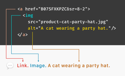
<button><img src="image.png" alt="Print" /></button> 
<input type="image" src="image.png" alt="Print" />
<button style="background: url(image.png)" />Print</button>

If you’re building a component, you can look up the pattern for that component in the ARIA Authoring Practices Guide which includes information on which role(s) to use. You can also look up all available roles in the mdn web docs.

In summary, if you’re building something that doesn’t have a semantic HTML tag that describes it (i.e., anything interactive built using <div> or <span>), it needs to have an ARIA role so that assistive technology can recognize what it is.

States And Properties (Aka ARIA Attributes)

In addition to knowing what an element is, if it has a state (e.g., hidden, disabled, invalid, readonly, selected, and so on) or changes state (e.g., checked/not checked, open/closed, and so on), you need to tell assistive technology users what its current state is and its new state whenever it changes. You can also share certain properties of an element. The difference between states and properties isn’t really clear or important, so let’s just call them attributes.

Here are some of the most common ARIA attributes you might need to use:

  • aria-checked
    It’s used with ="true" or ="false" to indicate if checkboxes and radio buttons are currently checked or not.
  • aria-current
    It’s used with ="true" or ="false" to indicate the current page within breadcrumbs or pagination.
  • aria-describedby
    It’s used with the id of an element to add more information to a form field in addition to its label. aria-describedby can be used to give examples of the required format for a field, for example, a date, or to add an error message to a form field.
<label for="birthday">Birthday</label>
<input type="text" id="birthday" aria-describedby="date-format">
<span id="date-format">MM-DD-YYYY</span>
  • aria-expanded
    It’s used with ="true" or ="false" to indicate if pressing a button will show more content. Examples include accordions and navigation items with submenus.
<button aria-expanded="false">Products</button>

This indicates that the Products menu will open a submenu (for example, of different product categories). If you were to code it like this:

<a href="/products/">Products</a>

You’re setting the expectation that it’s a link, and clicking it will go to a new page. If it’s not going to go to a new page, but it actually stays on the same page but opens a submenu, that’s what button plus aria-expanded says to an assistive technology user. That simple difference between <button> and <a> and the addition of aria-expanded communicates so much about how to interact with elements and what will happen when you do.

  • aria-hidden
    It’s used with ="true" or ="false" to hide something that is visible, but you don’t want assistive technology users to know about it. Use it with extreme caution as there are very few cases where you don’t want equivalent information to be presented.

One interesting use case I’ve seen is a card with both an image and the text title of the card linking to the same page but structured as two separate links. Imagine many of these cards on a page. For a screen reader user, they’d hear every link read out twice. So the image links used aria-hidden="true". The ideal way to solve this is to combine the links into one that has both an image and the text title, but real-life coding isn’t always ideal, and you don’t always have that level of control.

Note that this breaks the fourth rule of ARIA (which we’ll get to in a bit), but it does it in a way that doesn’t break accessibility. Use it with extreme caution when there are no better workarounds, and you’ve tested it with assistive technology users.

  • aria-required
    It’s used with ="true" or ="false" to indicate if a form element has to be filled out before the form can be submitted.

If you’re building a component, you can look up the attributes for that component on the ARIA Authoring Practices Guide. The mdn web docs covers states and properties as well as ARIA roles.

Keep in mind that all these ARIA attributes tell a user something, but you still have to code the thing you’re telling them. aria-checked="true" doesn’t actually check a checkbox; it just tells the user the checkbox is checked, so that better be true or you’ll make things worse and not better for accessibility. The exception would be aria-hidden="true" which removes an element from the accessibility tree, effectively hiding it from anyone using assistive technology who can’t see.

So now we know how to use ARIA to explain what something is, what state it’s in, and what properties it has. The last thing I’ll cover is focus management.

Focus Management

Anything interactive on a website or web app must be able to receive focus. Not everyone will use a mouse, trackpad, or touch screen to interact with sites. Many people use their keyboard or an assistive technology device that emulates a keyboard. This means that for everything you can click on, you should also be able to use the tab key or arrow keys to reach it and the Enter key, and sometimes the spacebar, to select it.

There are three concepts you’ll need to consider if you use <div> and <span> to create interactive elements:

  1. You need to add tabindex="0" so that a keyboard or emulator can focus on them.
  2. For anything that accepts keyboard input, you need to add an event listener to listen for key presses.
  3. You need to add the appropriate role so that a screen reader user can identify what element you’ve built.

Remember that native HTML controls already accept keyboard focus and input and have inherent roles. This is just what you need to do when creating custom elements from non-semantic HTML.

Ben Myers does a deep dive into turning a div into a button, and I’ll share parts of his example here. Notice the tabindex and the role:

<div tabindex="0" role="button" onclick="doSomething();">
    Click me!
</div>

And you’ll need JavaScript to listen to the key presses:

const ENTER = 13;
const SPACE = 32;
// Select your button and store it in ‘myButton’
myButton.addEventListener('keydown', function(event) {
    if (event.keyCode === ENTER || event.keyCode === SPACE) {
        event.preventDefault(); // Prevents unintentional form submissions, page scrollings, the like
        doSomething(event);
    }
});

When it comes to figuring out which keys to listen for, I suggest looking up the component you’re building in the ARIA Authoring Practices Guide and following the keyboard interaction recommendations.

Common Mistakes

Having looked at a lot of code in my lifetime, I see some accessibility errors being made repeatedly. Here’s a list of the most common mistakes I find and how to avoid them:

Using An aria-labelledby Attribute That References An ID That Doesn’t Exist

For example, a modal that has a title in the modal but aria-labelledby is referencing something else that no longer exists. It’s probably something removed by another developer who didn’t realize the aria-labelledby connection was there. Instead, the modal title could’ve been an <h1> and either aria-labelledby could reference the <h1> or you could set the focus on the <h1> when the modal opens and a screen reader user would know what’s going on as long as role="dialog” was also used. Try to avoid fragile structures that, if someone else came along and edited the code, would break easily.

Not Moving The Focus Into The Modal When It Opens

Countless times I’ve seen a screen reader user navigating the page behind the modal either unaware a modal has opened or confused because they can’t find the contents of the modal. There are several ways to trap focus within a modal, but one of the newer methods is to add inert to the <main> landmark (and, of course, make sure the modal isn’t inside <main>). Inert is getting better support across browsers lately. To learn more, check out Lars Magnus Klavenes’ Accessible modal dialogs using inert.

Adding Roles That Duplicate HTML

In general, doing something like this <button role="button”> is pointless. There is one case where it might make sense to do this. VoiceOver and Safari remove list element semantics when list-style: none is used. This was done on purpose because if there is no indication to a sighted user that the content is a list, why tell a screen reader user that it’s a list? If you want to override this, you can add an explicit ARIA role="list" to the <ul>.

Adrian Roselli says an unstyled list not being announced as a list “…may not be a big deal unless user testing says you really need a list.” I agree with him on that point, but I’m sharing the fix in case your user testing shows it’s beneficial.

Adding tabindex="0" To Every Element

Sometimes developers start using a screen reader and assume that tabbing is the only way to navigate; therefore, anything without tabindex isn’t accessible. This is NOT true. Remember, if you don’t know how to use a screen reader, you can’t troubleshoot usability issues. Meet with an everyday screen reader user to figure those out.

Using Child Roles Without Parent Roles

For example, role="option" must have a direct parent with role="listbox".

<div role="listbox">
    <ul>
      <li role="option">

The above code isn’t valid because there’s a <ul> between the parent and child elements. This can be fixed by adding a presentation role to essentially hide the <ul> from the accessibility tree, like <ul role="presentation”>.

Using role="menu" For Navigation

Website navigation is really a table of contents and not a menu. ARIA menus are not meant to be used for navigation but application behavior like the menus in a desktop application. Instead, use <nav>, and if you have child navigation links, those should be hidden until a button is pressed to show them:

<nav aria-label="Main menu">
    <button aria-expanded="false">Products</button>
    <ul hidden>
       <li>Cat pyjamas</li>...

If you want to learn more, Heydon Pickering does a deep dive into Building Accessible Menu Systems in his Smashing Magazine article.

Regarding navigation, using <nav> more than once on a page without giving each instance a unique label means that screen reader users will have to explore each navigation region to find the one they’re looking for. A simple aria-label on each <nav> will make it much easier.

<nav aria-label="Customer service">
  <ul>
    <li><a href="#">Help</a></li>
    <li><a href="#">Order tracking</a></li>
    <li><a href="#">Shipping & Delivery</a></li>
    <li><a href="#">Returns</a></li>
    <li><a href="#">Contact us</a></li>
    <li><a href="#">Find a store</a></li>
  </ul>
</nav>
How To Validate ARIA

Use automated accessibility checkers like Axe or WAVE extensions when you run your code in a browser. Accessibility linters like Axe for Visual Studio Code or ESLint for JSX elements will check your code as you write it.

Listen to your code with a screen reader. You’d never ship code without running it in a browser to make sure it works, and using a screen reader can be the same kind of check. NVDA is free for Windows, and VoiceOver comes built into Macs and iPhones. TalkBack is built into Android phones.

Test with assistive technology users. I consider this mandatory for any large organization that has a budget for accessibility (and they all should). There are companies that can recruit assistive technology users for testing or run user testing for you, and the company I work for can provide 2-day turnarounds on user testing that is facilitated by you or unmoderated to support accessibility testing at scale.

Frameworks And Component Libraries

If you’re using a web framework, one way to make the lift of building for accessibility a bit lighter is to use a component library with accessibility built in. I’ll add the caveat that accessibility can be complex and not everything that claims to be accessible is truly usable by assistive technology users. The best way to ensure accessibility is to always test with the users you are building for.

Here are some starting points for your search:

Conclusion

Hopefully, this has demystified ARIA for you. Like a secret language that only the most elite accessibility geeks know, it has its own Fight Club-esque rules.

  1. The first rule of ARIA is “Don’t use ARIA.” A <button> will always be better than <div role="button">.
  2. Secondly, don’t override native semantics. Instead of <button role="heading">, use <h3><button>.
  3. Also, always remember that all ARIA interactive elements must work with the keyboard.
  4. Don’t use role="presentation" or aria-hidden="true" on a focusable element. <button role="presentation”> means you’re hiding that button only from assistive technology users. That’s not just inaccessible; it’s outright excluding certain users.
  5. Last but not least, all interactive elements must have an accessible name. There are many ways to do that, and here are some of them:
<button>Print</button> (the name is the button text)

<div aria-label="Settings"><svg></div> (the aria-label assigns a name)

<div aria-labelledby="myName">
  <h1 id="myName">Heading</h1>
</div>

<label for="name">Name</label>
<input type="text" id="name" />

I like to think of ARIA as a tool used by the most elite Special Ops Team that you call in for your most difficult accessibility challenges. Well, maybe I just always wanted to do one-arm pushups like Emily Blunt in Edge of Tomorrow, and this is the closest I can get. Anyhow, I hope this was helpful and that you are no longer confused about ARIA. Go forth and build accessible things!

Dialog Components: Go Native HTML or Roll Your Own?

As the author of a library called AgnosticUI, I’m always on the lookout for new components. And recently, I decided to dig in and start work on a new dialog (aka modal) component. That’s something many devs like to have in their toolset and my goal was to make the best one possible, with an extra special focus on making it inclusive and accessible.

My first thought was that I would avoid any dependencies and bite the bullet to build my own dialog component. As you may know, there’s a new <dialog> element making the rounds and I figured using it as a starting point would be the right thing, especially in the inclusiveness and accessibilities departments.

But, after doing some research, I instead elected to leverage a11y-dialog by Kitty Giraudel. I even wrote adapters so it integrates smoothly with Vue 3, Svelte, and Angular. Kitty has long offered a React adapter as well.

Why did I go that route? Let me take you through my thought process.

First question: Should I even use the native <dialog> element?

The native <dialog> element is being actively improved and will likely be the way forward. But, it still has some issues at the moment that Kitty pointed out quite well:

  1. Clicking the backdrop overlay does not close the dialog by default
  2. The alertdialog ARIA role used for alerts simply does not work with the native <dialog> element. We’re supposed to use that role when a dialog requires a user’s response and shouldn’t be closed by clicking the backdrop, or by pressing ESC.
  3. The <dialog> element comes with a ::backdrop pseudo-element but it is only available when a dialog is programmatically opened with dialog.showModal().

And as Kitty also points out, there are general issues with the element’s default styles, like the fact they are left to the browser and will require JavaScript. So, it’s sort of not 100% HTML anyway.

Here’s a pen demonstrating these points:

Now, some of these issues may not affect you or whatever project you’re working on specifically, and you may even be able to work around things. If you still would like to utilize the native dialog you should see Adam Argyle’s wonderful post on building a dialog component with native dialog.

OK, let’s discuss what actually are the requirements for an accessible dialog component…

What I’m looking for

I know there are lots of ideas about what a dialog component should or should not do. But as far as what I was personally going after for AgnosticUI hinged on what I believe make for an accessible dialog experience:

  1. The dialog should close when clicking outside the dialog (on the backdrop) or when pressing the ESC key.
  2. It should trap focus to prevent tabbing out of the component with a keyboard.
  3. It should allow forwarding tabbing with TAB and backward tabbing with SHIFT+TAB.
  4. It should return focus back to the previously focused element when closed.
  5. It should correctly apply aria-* attributes and toggles.
  6. It should provide Portals (only if we’re using it within a JavaScript framework).
  7. It should support the alertdialog ARIA role for alert situations.
  8. It should prevent the underlying body from scrolling, if needed.
  9. It would be great if our implementation could avoid the common pitfalls that come with the native <dialog> element.
  10. It would ideally provide a way to apply custom styling while also taking the prefers-reduced-motion user preference query as a further accessibility measure.

I’m not the only one with a wish list. You might want to see Scott O’Hara’s article on the topic as well as Kitty’s full write-up on creating an accessible dialog from scratch for more in-depth coverage.

It should be clear right about now why I nixed the native <dialog> element from my component library. I believe in the work going into it, of course, but my current needs simply outweigh the costs of it. That’s why I went with Kitty’s a11y-dialog as my starting point.

Auditing <dialog> accessibility

Before trusting any particular dialog implementation, it’s worth making sure it fits the bill as far as your requirements go. With my requirements so heavily leaning on accessibility, that meant auditing a11y-dialog.

Accessibility audits are a profession of their own. And even if it’s not my everyday primary focus, I know there are some things that are worth doing, like:

This is quite a lot of work, as you might imagine (or know from experience). It’s tempting to take a path of less resistance and try automating things but, in a study conducted by Deque Systems, automated tooling can only catch about 57% of accessibility issues. There’s no substitute for good ol’ fashioned hard work.

The auditing environment

The dialog component can be tested in lots of places, including Storybook, CodePen, CodeSandbox, or whatever. For this particular test, though, I prefer instead to make a skeleton page and test locally. This way I’m preventing myself from having to validate the validators, so to speak. Having to use, say, a Storybook-specific add-on for a11y verification is fine if you’re already using Storybook on your own components, but it adds another layer of complexity when testing the accessibility of an external component.

A skeleton page can verify the dialog with manual checks, existing a11y tooling, and screen readers. If you’re following along, you’ll want to run this page via a local server. There are many ways to do that; one is to use a tool called serve, and npm even provides a nice one-liner npx serve <DIRECTORY> command to fire things up.

Let’s do an example audit together!

I’m obviously bullish on a11y-dialog here, so let’s put it to the test and verify it using some of the the recommended approaches we’ve covered.

Again, all I’m doing here is starting with an HTML. You can use the same one I am (complete with styles and scripts baked right in).

View full code
<!DOCTYPE html>
<html lang="en">
  <head>
    <meta charset="UTF-8">
    <meta name="viewport" content="width=device-width, initial-scale=1.0">
    <meta http-equiv="X-UA-Compatible" content="ie=edge">
    <title>A11y Dialog Test</title>
    <style>
      .dialog-container {
        display: flex;
        position: fixed;
        top: 0;
        left: 0;
        bottom: 0;
        right: 0;
        z-index: 2;
      }
      
      .dialog-container[aria-hidden='true'] {
        display: none;
      }
      
      .dialog-overlay {
        position: fixed;
        top: 0;
        left: 0;
        bottom: 0;
        right: 0;
        background-color: rgb(43 46 56 / 0.9);
        animation: fade-in 200ms both;
      }
      
      .dialog-content {
        background-color: rgb(255, 255, 255);
        margin: auto;
        z-index: 2;
        position: relative;
        animation: fade-in 400ms 200ms both, slide-up 400ms 200ms both;
        padding: 1em;
        max-width: 90%;
        width: 600px;
        border-radius: 2px;
      }
      
      @media screen and (min-width: 700px) {
        .dialog-content {
          padding: 2em;
        }
      }
      
      @keyframes fade-in {
        from {
          opacity: 0;
        }
      }
      
      @keyframes slide-up {
        from {
          transform: translateY(10%);
        }
      }

      /* Note, for brevity we haven't implemented prefers-reduced-motion */
      
      .dialog h1 {
        margin: 0;
        font-size: 1.25em;
      }
      
      .dialog-close {
        position: absolute;
        top: 0.5em;
        right: 0.5em;
        border: 0;
        padding: 0;
        background-color: transparent;
        font-weight: bold;
        font-size: 1.25em;
        width: 1.2em;
        height: 1.2em;
        text-align: center;
        cursor: pointer;
        transition: 0.15s;
      }
      
      @media screen and (min-width: 700px) {
        .dialog-close {
          top: 1em;
          right: 1em;
        }
      }
      
      * {
        box-sizing: border-box;
      }
      
      body {
        font: 125% / 1.5 -apple-system, BlinkMacSystemFont, Segoe UI, Helvetica, Arial, sans-serif;
        padding: 2em 0;
      }
      
      h1 {
        font-size: 1.6em;
        line-height: 1.1;
        font-family: 'ESPI Slab', sans-serif;
        margin-bottom: 0;
      }
      
      main {
        max-width: 700px;
        margin: 0 auto;
        padding: 0 1em;
      }
    </style>
    <script defer src="https://cdn.jsdelivr.net/npm/a11y-dialog@7/dist/a11y-dialog.min.js"></script>
  </head>

  <body>
    <main>
      <div class="dialog-container" id="my-dialog" aria-hidden="true" aria-labelledby="my-dialog-title" role="dialog">
        <div class="dialog-overlay" data-a11y-dialog-hide></div>
        <div class="dialog-content" role="document">
          <button data-a11y-dialog-hide class="dialog-close" aria-label="Close this dialog window">
            ×
          </button>
          <a href="https://www.yahoo.com/" target="_blank">Rando Yahoo Link</a>
  
          <h1 id="my-dialog-title">My Title</h1>
          <p id="my-dialog-description">
            Some description of what's inside this dialog…
          </p>
        </div>
      </div>
      <button type="button" data-a11y-dialog-show="my-dialog">
        Open the dialog
      </button>
    </main>
    <script>
      // We need to ensure our deferred A11yDialog has
      // had a chance to do its thing ;-)
      window.addEventListener('DOMContentLoaded', (event) => {
        const dialogEl = document.getElementById('my-dialog')
        const dialog = new A11yDialog(dialogEl)
      });
    </script>
  </body>

</html>

I know, we’re ignoring a bunch of best practices (what, styles in the <head>?!) and combined all of the HTML, CSS, and JavaScript in one file. I won’t go into the details of the code as the focus here is testing for accessibility, but know that this test requires an internet connection as we are importing a11y-dialog from a CDN.

First, the manual checks

I served this one-pager locally and here are my manual check results:

FeatureResult
It should close when clicking outside the dialog (on the backdrop) or when pressing the ESC key.
It ought to trap focus to prevent tabbing out of the component with a keyboard.
It should allow forwarding tabbing with TAB and backward tabbing with SHIFT+TAB.
It should return focus back to the previously focused element when closed.
It should correctly apply aria-* attributes and toggles.
I verified this one “by eye” after inspecting the elements in the DevTools Elements panel.
It should provide Portals.Not applicable.
This is only useful when implementing the element with React, Svelte, Vue, etc. We’ve statically placed it on the page with aria-hidden for this test.
It should support for the alertdialog ARIA role for alert situations.
You’ll need to do two things:

First, remove data-a11y-dialog-hide from the overlay in the HTML so that it is <div class="dialog-overlay"></div>. Replace the dialog role with alertdialog so that it becomes:

<div class="dialog-container" id="my-dialog" aria-hidden="true" aria-labelledby="my-dialog-title" aria-describedby="my-dialog-description" role="alertdialog">

Now, clicking on the overlay outside of the dialog box does not close the dialog, as expected.
It should prevent the underlying body from scrolling, if needed.
I didn’t manually test but this, but it is clearly available per the documentation.
It should avoid the common pitfalls that come with the native <dialog> element.
This component does not rely on the native <dialog> which means we’re good here.

Next, let’s use some a11y tooling

I used Lighthouse to test the component both on a desktop computer and a mobile device, in two different scenarios where the dialog is open by default, and closed by default.

a11y-dialog Lighthouse testing, score 100.

I’ve found that sometimes the tooling doesn’t account for DOM elements that are dynamically shown or hidden DOM elements, so this test ensures I’m getting full coverage of both scenarios.

I also tested with IBM Equal Access Accessibility Checker. Generally, this tool will give you a red violation error if there’s anything egregious wrong. It will also ask you to manually review certain items. As seen here, there a couple of items for manual review, but no red violations.

a11y-dialog — tested with IBM Equal Access Accessibility Checker

Moving on to screen readers

Between my manual and tooling checks, I’m already feeling relatively confident that a11y-dialog is an accessible option for my dialog of choice. However, we ought to do our due diligence and consult a screen reader.

VoiceOver is the most convenient screen reader for me since I work on a Mac at the moment, but JAWS and NVDA are big names to look at as well. Like checking for UI consistency across browsers, it’s probably a good idea to test on more than one screen reader if you can.

VoiceOver caption over the a11y-modal example.

Here’s how I conducted the screen reader part of the audit with VoiceOver. Basically, I mapped out what actions needed testing and confirmed each one, like a script:

StepResult
The dialog component’s trigger button is announced.“Entering A11y Dialog Test, web content.”
The dialog should open when pressing CTRL+ALT +Space should show the dialog.“Dialog. Some description of what’s inside this dialog. You are currently on a dialog, inside of web content.”
The dialog should TAB to and put focus on the component’s Close button.“Close this dialog button. You are currently on a button, inside of web content.”
Tab to the link element and confirm it is announced.“Link, Rando Yahoo Link”
Pressing the SPACE key while focused on the Close button should close the dialog component and return to the last item in focus.

Testing with people

If you’re thinking we’re about to move on to testing with real people, I was unfortunately unable to find someone. If I had done this, though, I would have used a similar set of steps for them to run through while I observe, take notes, and ask a few questions about the general experience.

As you can see, a satisfactory audit involves a good deal of time and thought.

Fine, but I want to use a framework’s dialog component

That’s cool! Many frameworks have their own dialog component solution, so there’s lots to choose from. I don’t have some amazing spreadsheet audit of all the frameworks and libraries in the wild, and will spare you the work of evaluating them all.

Instead, here are some resources that might be good starting points and considerations for using a dialog component in some of the most widely used frameworks.

Disclaimer: I have not tested these personally. This is all stuff I found while researching.

Angular dialog options

In 2020, Deque published an article that audits Angular component libraries and the TL;DR was that Material (and its Angular/CDK library) and ngx-bootstrap both appear to provide decent dialog accessibility.

React dialog options

Reakit offers a dialog component that they claim is compliant with WAI-ARIA dialog guidelines, and chakra-ui appears to pay attention to its accessibility. Of course, Material is also available for React, so that’s worth a look as well. I’ve also heard good things about reach/dialog and Adobe’s @react-aria/dialog.

Vue dialog options

I’m a fan of Vuetensils, which is Austin Gil’s naked (aka headless) components library, which just so happens to have a dialog component. There’s also Vuetify, which is a popular Material implementation with a dialog of its own. I’ve also crossed paths with PrimeVue, but was surprised that its dialog component failed to return focus to the original element.

Svelte dialog options

You might want to look at svelte-headlessui. Material has a port in svelterial that is also worth a look. It seems that many current SvelteKit users prefer to build their own component sets as SvelteKit’s packaging idiom makes it super simple to do. If this is you, I would definitely recommend considering svelte-a11y-dialog as a convenient means to build custom dialogs, drawers, bottom sheets, etc.

I’ll also point out that my AgnosticUI library wraps the React, Vue, Svelte and Angular a11y-dialog adapter implementations we’ve been talking about earlier.

Bootstrap, of course

Bootstrap is still something many folks reach for, and unsurprisingly, it offers a dialog component. It requires you to follow some steps in order to make the modal accessible.

If you have other inclusive and accessible library-based dialog components that merit consideration, I’d love to know about them in the comments!

But I’m creating a custom design system

If you’re creating a design system or considering some other roll-your-own dialog approach, you can see just how many things need to be tested and taken into consideration… all for one component! It’s certainly doable to roll your own, of course, but I’d say it’s also extremely prone to error. You might ask yourself whether the effort is worthwhile when there are already battle-tested options to choose from.

I’ll simply leave you with something Scott O’Hara — co-editor of ARIA in HTML and HTML AAM specifications in addition to just being super helpful with all things accessibility — points out:

You could put in the effort to add in those extensions, or you could use a robust plugin like a11y-dialog and ensure that your dialogs will have a pretty consistent experience across all browsers.

Back to my objective…

I need that dialog to support React, Vue, Svelte, and Angular implementations.

I mentioned earlier that a11y-dialog already has ports for Vue and React. But the Vue port hasn’t yet been updated for Vue 3. Well, I was quite happy to spend the time I would have spent creating what likely would have been a buggy hand-rolled dialog component toward helping update the Vue port. I also added a Svelte port and one for Angular too. These are both very new and I would consider them experimental beta software at time of writing. Feedback welcome, of course!

It can support other components, too!

I think it’s worth pointing out that a dialog uses the same underlying concept for hiding and showing that can be used for a drawer (aka off-canvas) component. For example, if we borrow the CSS we used in our dialog accessibility audit and add a few additional classes, then a11y-dialog can be transformed into a working and effective drawer component:

.drawer-start { right: initial; }
.drawer-end { left: initial; }
.drawer-top { bottom: initial; }
.drawer-bottom { top: initial; }

.drawer-content {
  margin: initial;
  max-width: initial;
  width: 25rem;
  border-radius: initial;
}

.drawer-top .drawer-content,
.drawer-bottom .drawer-content {
  width: 100%;
}

These classes are used in an additive manner, essentially extending the base dialog component. This is exactly what I have started to do as I add my own drawer component to AgnosticUI. Saving time and reusing code FTW!

Wrapping up

Hopefully I’ve given you a good idea of the thinking process that goes into the making and maintenance of a component library. Could I have hand-rolled my own dialog component for the library? Absolutely! But I doubt it would have yielded better results than what a resource like Kitty’s a11y-dialog does, and the effort is daunting. There’s something cool about coming up with your own solution — and there may be good situations where you want to do that — but probably not at the cost of sacrificing something like accessibility.

Anyway, that’s how I arrived at my decision. I learned a lot about the native HTML <dialog> and its accessibility along the way, and I hope my journey gave you some of those nuggets too.


Dialog Components: Go Native HTML or Roll Your Own? originally published on CSS-Tricks. You should get the newsletter.

Windows High Contrast Mode, Forced Colors Mode And CSS Custom Properties

I’m extremely excited about the upcoming Forced Colors media query. It takes the work done for Windows High Contrast mode and elevates it to an open, cross-browser standard. This means that a person will be able to use whatever browser works best for them to get what they need, instead of being forced to use one specific browser.

What Is Windows High Contrast Mode? What Is Forced Colors Mode?

Windows High Contrast mode, and its successor, Forced Colors mode, are important pieces of assistive technology. These two display modes affect:

  • The operating system installed on a device,
  • The browser is installed on the operating system, and
  • All web content is loaded by that browser.

These display modes prioritize legibility above all else. Ornamentation and decoration are discarded in order to allow content to be displayed clearly.

All content affected by these two modes maps to a color theme. This color theme can be modified by someone to use any combination of colors, to create a suite of colors that works for their specific access needs.

For some, Windows High Contrast/Forced Colors mode represents the last option they have to view content on their device — including web content. This is highly specialized, highly personalized assistive technology, and using it is a very intentional act.

Others may circumstantially benefit from using Windows High Contrast/Forced Colors mode. One of my favorite examples of this is being able to use your laptop in the park, despite the glare of the noonday sun.

Here’s how Smashing Magazine looks with Forced Colors activated and set to use the High Contrast #1 theme:

And this is how Smashing Magazine looks with Forced Colors activated and set to use the High Contrast White theme:

And this is how Smashing Magazine looks with Forced Colors activated and set to use a custom theme:

High Contrast Mode, Forced Colors Mode, And Browser Support

I’ll be honest, the current state of Forced Colors support is a bit of a mess.

Internet Explorer will never support Forced Colors mode because Microsoft has discontinued support of the browser. It will also never support Custom Properties. Internet Explorer does, however, support High Contrast mode.

Edge supports Forced Colors mode. It also has legacy support for Windows High Contrast mode. This means that code written specifically to support High Contrast mode in Internet Explorer will work in Edge as well.

The Forced Color mode syntax is an update on Windows High Contrast mode syntax, which uses specialized keywords (more on this in a bit). As a consequence of this, Internet Explorer supports some, but not all Forced Color mode syntax.

Every other major evergreen browser has support for Forced Colors mode, except for Safari. The trick here is that macOS, iOS, and Android currently do not have a way to specify Forced Color mode themes. This means that for now, only Windows is capable of fully supporting a full Forced Color mode experience.

Here are two tables of the current support landscape if you need help visualizing this:

Browser Supports legacy High Contrast Mode CSS properties? Supports Forced Colors mode CSS properties? Supports CSS Custom Properties?
Internet Explorer ✅ Yes ⚠ Some 🚫 No
Edge ✅ Yes ✅ Yes ✅ Yes
Chrome 🚫 No ✅ Yes ✅ Yes
Firefox 🚫 No ✅ Yes ✅ Yes
Safari 🚫 No ⏳ Soon ✅ Yes


Operating System Supports switching and creating Forced Color mode themes?
Windows ✅ Yes
macOS 🚫 Not yet
iOS 🚫 Not yet
Android 🚫 Not yet

SVG That Uses currentColor

This is a whole thing unto itself, and beyond the scope of this post, but there are some issues right now with how Forced Color mode works with SVGs that utilize currentColor to control their coloring.

If you’d like to learn more about the particulars — including how to work with them — I recommend reading this excellent, in-depth article by Melanie Richards.

Why This Is All Worth Mentioning

The reason why this is important is that Forced Colors mode syntax differs slightly from the Windows High Contrast mode syntax.

Edge has backwards compatibility, but Internet Explorer will never have forwards compatibility. This means that Internet Explorer viewing web content with High Contrast mode activated may not properly display content using the newer Forced Color mode syntax.

This is worth mentioning because not everyone can or will be able to upgrade their device to use something other than Internet Explorer, regardless of Microsoft’s upcoming discontinuation of support.

As a result of this, it is vital to approach High Contrast/Forced Color mode work with a cautious, ego-free mindset. If at all possible, talk to High Contrast/Forced Color mode users to determine what their specific preferences actually are.

How To Design For Windows High Contrast And Forced Colors Mode

You don’t.

High contrast mode is not about design anymore but strict usability. You should aim for highest readability, not color aesthetics.

— Kitty Giraudel (@KittyGiraudel) June 20, 2017


No, seriously. Forced Colors and Windows High Contrast modes are all about presenting all content — including web content — in a predictable and consistent way.

You only want to make small, surgical tweaks to your content, not create a completely new, bespoke Forced Color mode experience.

Each element’s inherent HTML semantics tell Forced Colors and Windows High Contrast modes how to be displayed. Areas, where semantic HTML isn’t used, are good areas to check — to see if your content holds up.

Forced Colors Mode Keywords

Forced Colors mode — like Windows High Contrast mode — uses a suite of specialized keywords. These keywords assign color to meaning. For example, all inert, regular text will use the same theme color, with this color being mapped to the CanvasText keyword.

The reason keywords are used is because the text color could be any color. Every content type Forced Color mode effect can also, potentially, be any color.

Forced Colors mode has multiple themes, including ones that a person can create for themselves. This lets someone tweak how things look until it works for them.

Sourced from this excellent post, the list of Forced Color keywords is:

Content Keyword
Text CanvasText
Hyperlinks LinkText
Disabled Text GrayText
Selected Text, foreground HighlightText
Selected Text, background Highlight
Buttons, foreground ButtonText
Buttons, background ButtonFace
Backgrounds Canvas

Here is how these keywords map to the Windows High contrast theme selection interface:

And here is an example of a custom theme:

This theme might look like the ugliest thing you’ve ever seen, but it’s vital to remember, that this combination of colors might be what lets someone use their device.

CSS Custom Properties

The upgrade of Windows High Contrast mode into Forced Colors mode works really well with another contemporary feature of CSS: Custom Properties.

If you are unfamiliar, Custom Properties are a way to create “variables” in CSS—formalized, encoded values that can be dynamically manipulated.

:root {
  --color-background: #ffffff;
  --color-text: #000000;
} 

@media (prefers-color-scheme: dark) {
  :root {
    --color-background: #000000;
    --color-text: #ffffff;
  }
}

body {
  background-color: var(--color-background);
  color: var(--color-text);
}

In this example, I’m creating Custom Properties in the :root selector that will be used to control the background and text color.

I’m initially setting the text color to black and the background color to white, and then updating the Custom Properties to use white text and a black background when dark mode is activated. Invoking the Custom Properties in the body selector is the magic that makes it all happen.

CSS Custom Properties can be used for far more than just color, and their values update in realtime, both via display mode updates and JavaScript logic. This is powerful stuff.

Using Custom Properties With Forced Colors Mode

We’re going to take all this background information and apply it to something concrete: A modal dialog. Do you remember how I said Custom Properties can use more than just color values? We’re going to take advantage of that now.

Unfortunately, the dialog element still has assistive technology compatibility issues, meaning that the most accessible solution is still to use one constructed with the help of ARIA and JavaScript. Kitty Giraudel’s a11y-dialog is a wonderful, flexible resource that I enthusiastically recommend to help you do just that.

Accessibility Workarounds

Since the modal is constructed by using divs, Forced Colors mode does not know it is a modal. It, like Windows High Contrast Mode, does not take ARIA into consideration when determining how color is assigned.

This is one of the reasons why the Forced Color mode media query and its keywords exist — to tweak content until it works the way someone would expect it to.

Sometimes content isn’t written semantically, and there’s nothing you can do about it. It is no different than using CSS to make tweaks to vendor-supplied code you have no direct control over.

Styling The Modal For Forced Colors Mode

Here’s a CodePen for our modal, before we make our Forced Color mode tweaks:

And here is a screenshot of how it looks with Forced Color mode activated:

While a blind person using a screen reader may know a modal is present, because of how it is announced, a low vision person using Forced Colors mode may be confused because the modal’s boundaries are not communicated strongly enough visually. This may be further complicated by low vision people who use both Forced Colors mode and a screen reader.

Notice, that even though Forced Colors mode does not know it is a dialog, it does know what a CSS outline declaration is. It takes the very faint, thin light gray border we’re using and colors it with the color value mapped to the CanvasText Forced Color mode keyword.

Also notice, that the modal’s box-shadow has been discarded when Forced Color mode is activated. This, and the outline recoloring are by design.

Remember: Forced Color mode prioritizes legibility above all else, and makes visual updates to honor that.

Making Our Update

Much as how we’re redefining component-level CSS Custom Properties for things like :hover and :active state on the modal close icon, we can redefine for different display modes. Here is a CodePen for our modal after our Forced Color mode tweaks have been made:

Testing

Here’s how to enable contrast themes in Windows. Use macOS or Linux? You’re in luck! There are multiple ways to test for Forced Color support:

  1. Get a Windows craptop and use a tunneling service, such as ngrok. The craptop is also a chance to test your website or web app’s performance — another potential access barrier.
  2. Use an app to load a Virtual Machine with a Windows image provided by Microsoft.
  3. Use a service like Assistiv Labs, which provides a cloud-hosted on-demand Windows Virtual Machine geared towards accessibility testing.
  4. Use Polypane’s media emulation functionality to toggle an emulated Forced Color mode.
  5. Use Microsoft Edge’s DevTools to toggle an emulated Forced Color mode.

I would advise some caution for options four and five, as an emulated experience only uses a single theme, and it’s not representative of the Forced Color mode’s full capabilities.

I particularly like the Assistiv Labs option, because it’s focused on accessibility testing, and it does not heavily tax my laptop the way a local app-run Virtual Machine would.

Wrapping Up

At the surface level, this might seem like a lot of words just to demonstrate how to update a CSS Custom Property. This post’s goal, however, is to introduce you to a powerful piece of assistive technology and show how modern CSS can elegantly thread into it to make flexible, maintainable, and adaptive digital experiences.

Now that you know about Forced Color mode and how it works, why not take some time and audit how your websites and web apps look when it is activated? Some little tweaks might make a huge difference for someone who relies on a Forced Color mode experience to browse the web.

Further Reading

A Complete Guide To Accessibility Tooling

Learning to build accessible websites can be a daunting task for those who are just starting to implement accessible practices. We’ve pulled together a wide range of accessibility tooling, ranging from single-use bookmarklets to full-blown applications, in order to help you get started with building more accessible websites.

ARIA

The WebAIM Million survey found that home pages with ARIA present averaged 41% more detectable errors than those without ARIA. ARIA is an essential tool for creating complex web applications, but the specification is strict and can be tricky to debug by those who do not use assistive technology regularly. Tooling can help us ensure that we are using ARIA correctly and not introducing more errors to our applications.

The Paciello Group has created a WAI-ARIA bookmarklet which scans your page to make sure all elements and their given roles and ARIA attributes are valid. Upon activating the bookmarklet, the page is scanned for any errors, and a new tab will be opened with the results. The results include the total number of valid roles, any detected ARIA errors, and code snippets of where any errors were found so that you can easily debug your page.

One thing not explicitly tested in the above bookmarklet is the presence of duplicate ARIA roles. Certain landmark roles have names that sound like they might apply to several elements, but should only be used once per page, such as banner or contentinfo. Adrian Roselli has come up with a simple CSS-based bookmarklet to check if any of these ARIA roles have been duplicated. Activating the bookmarklet will add a red outline to any offending element.

NerdeRegion is a Chrome extension that logs all the output of any aria-live regions. Can’t figure out why your screen reader is announcing something unexpectedly? NerdeRegion can let you keep track of timestamped announcements and the source element they originate from, all within a panel in DevTools. Since there can be bugs and inconsistencies with how aria-live regions are announced with different screen readers, NerdeRegion can be a great tool to figure out if an issue is potentially caused by your code or by the device combination.

Automatic Testing Tools

This class of tools can be used by the developer or tester to run automated tests on the output of your code, catching errors that may not appear obvious in the source code. There are many high-quality paid services and other tools beyond what we’ve mentioned here, but we’ve focused on tools with comprehensive free offerings in order to reduce barriers to entry. All of the listed tools can be run on pages that are not on the public internet, allowing them to be more easily incorporated into a development flow. It is important to note that accessibility testing is complicated and always requires manual testing to understand the full context of the site, but these automated testing tools can give you a solid head start.

A lot of tools use axe-core under the hood, so it may be redundant to use a combination of tools. Ultimately, what kind of tool you choose is more about what kind of UI you prefer, and the level of comprehensiveness in the results. For example, Lighthouse, the tool built into Google Chrome, uses a partial selection of axe-core rules, so if you manage to get a clean scan with axe DevTools, you shouldn’t need to run a Lighthouse scan as well.

Axe DevTools is available as a Chrome or Firefox browser extension and shows up as a panel in the developer tools. You can test a whole page or just part of a page, and all detected issues are sorted by severity and come with code snippets for easier debugging. Axe also lets you catch more errors than other automated tools with its Intelligent Guided Tests feature. Intelligent Guided Tests identify areas to test and do as much heavy lifting as possible, before asking the tester questions in order to generate a result. Axe also allows you to save and export results, which is useful for working through fixing errors as part of a longer and more cooperative development process.

Accessibility Insights also runs on axe-core, but has several features that differentiate it from axe DevTools. It can be run on various platforms, including Android, Windows, or as a browser extension. All versions of Accessibility Insights feature an inspector-like tool for looking up individual element information, as well as a way of running automated checks. The web extension also contains an Assessment feature, which has a combination of automated, guided and manual tests in order to allow you to generate a full report.

WAVE by WebAIM has been an integral part of my tool kit. Available in extension form as well as a mass testing service and an API, I find this tool best for checking my work as I develop due to its simplicity and speed. Everything is loaded as a panel on the side of your page, and you can get a holistic view of errors by scrolling through the page. If an error is displayed in the side panel but you aren’t sure where in the DOM it is, you can turn off styles to locate it within the markup. WAVE’s heading and landmark feature is one of my favorite things about it as it ensures that my document semantics are correct as I build.

SiteImprove has a free Chrome extension in addition to their paid service offerings. Like WAVE, you run the extension on a page and it lists errors in a panel on the side of the page, including filters for things like conformance level, severity and responsibility. The severity filter is especially useful as automatic testing always tends to produce some false positives.

Colors

Low contrast text errors were found on a whopping 86.4% of homepages last year. Developers often have limited control over a color palette, so it is important to try to establish an accessible color palette as early on in the process as possible.

When you’re starting to design a color palette, an in-browser color picking tool may be helpful. Are My Colors Accessible is a tool that can help you figure out an accessible color palette. The basic mode calculates the contrast ratio between any two colors. The font size and font weight of your text can affect the contrast ratio required based on the level of conformance, and this tool helpfully lays out all the different standards it meets. It also features HSL range sliders so that you can tweak any of the colors, with the results automatically updating as you make adjustments. Palette mode lets you compare every color in a palette against each other and displays the contrast ratio and standards met, which is helpful for determining how you can combine different colors together. Making any color adjustments also updates the permalink, allowing you to easily share color combinations with your team. If you prefer a different interface for selecting colors, Atul Varma has built a similar tool that uses a color picker instead of HSL range sliders.

Geenes attempts to do it all by building out full tint/shade ranges for each color group you add, allowing you to design a full-color system instead of a limited palette. In addition to providing contrast ratios, Geenes also allows you to apply your palette to various mockups, and emulate different forms of color blindness. You can trial most features for free, and unlock multiple palettes with a donation.

Certain tools can help you solve specific color-related accessibility issues. Buttons in particular can be tricky, as not only do you have to worry about the text color with the background color, you also need to consider the button background with the page background, and the focus outline color with both backgrounds. Stephanie Eckles’s project ButtonBuddy explains these requirements in simple language and helps you pick colors for these individual parts.

Some color combinations may technically meet contrast requirements when viewed by people without color blindness but could pose problems for specific kinds of color blindness and low vision. Who Can Use applies a visual filter to emulate different types of color blindness and then calculates an approximate color contrast ratio.

If you would like to test your color combinations in the context of an existing site, Stark is a color picker extension for Chrome that lets you simulate certain kinds of color blindness. Additionally, Anna Monus has created a helpful writeup of color blindness tools already built into Chrome. While this kind of emulation can never fully replace testing with real users, it can help us make better initial choices.

Sometimes as developers, we start working on a project where we may need to design as we go and begin writing code without a full, pre-established brand palette. Once development has started, it can be tedious to keep importing color palettes back and forth into external tooling. There are many options for checking color contrast within a code environment. Alex Clapperton has developed a CLI tool where you pass in two colors and it outputs the contrast ratio and passing standards right in the terminal. The BBC has published a JavaScript color contrast checker that takes two colors and determines whether or not it meets your desired standard. A tool like this can live in your codebase with your tests, or be implemented in your design system library like Storybook, PatternLab, and so on.

A11y Color Tokens takes it a step further and lets you automatically generate complementary color tokens in CSS or SASS. You pass in a color and desired ratio to generate a shade or tint of that color that meets requirements. If you need to quickly check the contrast ratio of something, Chrome and Firefox now show the color contrast information within their respective developer tools color selectors as well. If none of these tools suit your fancy, Stephanie Walter has covered many other color-related tool options in her blog post on color accessibility.

Compatibility

Building for assistive technology can often add another level of complexity when it comes to debugging. Because assistive technology is essentially another layer of an interface on top of the browser, we now need to concern ourselves with combinations of browser and assistive technology. A bug may be present in either the browser or the assistive technology, or it may be present only in a particular combination. It’s a good idea to keep this list of bug trackers on hand when trying to fix a specific issue. Some of these are public so that you can see if others experience the bug you are having, but others only offer a means to report bugs in private.

Not all browsers and screen reader combinations work well together, and not all accessibility features are equally supported across browsers. These tools can help you check if you are experiencing a bug on a specific combination of devices. HTML5 Accessibility is a list of newer HTML features and whether or not the default browser implementation is accessibly supported. In a similar vein, Accessibility Support provides a list of ARIA roles and their support in the most popular browser and screen reader combinations.

Focus Management

Managing focus is a necessary but often difficult part of making complex applications accessible. We need to consider that the focus order is logical, that focus is moved around correctly on any custom components, and that each interactable element has a clear focus style.

This bookmarklet by Level Access labels every focusable element on the page, so that you can check that the focus order matches the reading order. For the Firefox users out there, Firefox’s Accessibility Inspector has added this feature since version 84.

In complex codebases, where different components or third-party code might be moving focus around unexpectedly, this little snippet by Scott Vinkle can help you see what element currently has focus. If I’m struggling with the focus being moved around by other parts of my application, sometimes I also like to replace console.log with console.trace to determine exactly what function is moving the focus around.

In order to test all focus styles on a web page, we can use Scott O’Hara’s script as a starting point. Tabbing through every element can get cumbersome after a while, so a script to rotate through each element can help us make sure our focus styles look consistent and work within the context of the page.

Setting a positive tabindex to try and fix the focus order is a common accessibility gotcha. Elements that have a positive tabindex will force the browser to tab to them first. While this may not technically be an error, this is often unexpected and can cause more problems than it solves. Paul J. Adam’s tabindex bookmarklet allows you to highlight all elements that have the tabindex attribute applied.

Layout Usability

The document reading order can sometimes fall out of sync with what a viewer might expect if a layout relies too heavily on the CSS Grid or Flexbox order property. Adrian Roselli has coded up a bookmarklet for keeping track of the reading order to help you make sure your site passes the meaningful sequence guideline.

The WCAG contains a text spacing criterion where all content should still work when certain text settings are applied. To test for this, Steve Faulkner has created a bookmarklet that automatically applies the required text spacing settings to all the text on a page. Avoiding things like fixed heights and allowing for overflow not only makes your site more accessible, it ensures that whatever content you put into your site won’t break the layout, something your content editors will thank you for.

Jared Smith built a bookmarklet to turn your cursor into a 44×44 pixel box so that you can hover it over your controls to make sure that they meet the recommended target size criterion.

Linters

Linters are a class of tools that catch errors by scanning the source code before the application is run or built. By using linters, we can fix smaller bugs before we even run or build the code, saving valuable QA time later.

Many developers already know and use ESLint in some capacity. Instead of learning new tooling, it’s possible to get a head start on your accessibility testing by including a new plugin into your existing workflow. Eslint-plugin-jsx-a11y is an ESLint plugin for your JSX elements, where any errors will be shown as you write your code. Scott Vinkle has written up a helpful guide on setting it up.

Deque has come out with axe Linter, available as a Github app or VS Code Extension. Axe Linter checks React, Vue, HTML and Markdown files against core rules without any configuration so it is easy to get up and running, although you are welcome to pass in your own options. One helpful feature is that it distinguishes between WCAG 2 and WCAG 2.1 which is useful if you are trying to meet a specific standard.

Markup

The web is built to be resilient. If you have broken markup, the browser will try its best to patch over any mistake. However, this can have unintended side effects, both from a styling perspective and an accessibility standpoint. Running your output through the W3C HTML validator can help catch things like broken tags, attributes being applied to elements that shouldn’t have them, and other HTML errors. Deque has created a W3C HTML Validator bookmarklet based on the same engine which lets you check the markup on localhost or password-protected pages that the regular validator cannot reach.

If you’re more of a visual person, Gaël Poupard’s project a11y.css is a stylesheet that checks for possible risks within your markup. Available in both extension or bookmarklet format, you can customize the language as well as the level of advice displayed. In a similar vein, sa11y is a tool that can be installed as a bookmarklet or integrated into your codebase. Sa11y is specifically designed for looking at the output of CMS content. It displays any warnings in non-technical language so that content editors can understand and make the necessary corrections.

Reading Level

An accessible site starts with accessible content. Cognitive accessibility has been a major focus of the ongoing WCAG 3 draft and is currently mentioned in Success Criterion 3.1.5, which suggests that authors aim for content to be understandable by a lower secondary (7-9th grade) reading level.

The Hemingway Editor calculates the reading level of your content as you write it, so that you can edit to make sure it is easily understandable. The panel on the side offers suggestions for how you can improve your content to make it more readable. If your site has already been published, Juicy Studio has produced a readability tool where you pass in a URL to the provided form and your site’s content is analyzed and graded using three different reading level algorithms. There is also a helpful explanation as to what each of these scores entails. However, one limitation of this particular tool is that it takes into account all the text rendered on the page, including things like navigation and footer text, which may skew the results.

Test Suites And Continuous Integration

The downside of most automated testing tools is that they require people to run them in the browser. If you are working on a single large codebase, you can incorporate accessibility testing into your existing testing process or as part of your continuous integration flow. When you write custom tests, you have an awareness of your application that automated testing tools don’t have, allowing you to perform customized, comprehensive testing in a more scalable way.

Once again, axe-core pops up as an open-source library that frequently underpins most of these tools, so whether or not a tool works for you will likely be based on how well it integrates with your code rather than any differences in testing results. Marcy Sutton has published a framework-agnostic guide for getting started writing automated tests for accessibility. She covers the difference between unit tests and integration tests and why you might want to choose one over the other in different scenarios.

If you already have a test framework that you enjoy, there’s a high chance that there is already a library that incorporates axe-core into it. For example, Josh McClure has written up a guide that uses cypress-axe, and Nick Colley has produced a Jest flavored version in jest-axe.

Pa11y is a tool that provides a configurable interface around testing that is also available in a CI version as well. Its many configuration options can let you solve complex issues that can come up with testing. For example, the actions feature lets you pass an array of actions before running the tests and can be useful for testing screens that require authentication before accessing the page.

User Preferences

There are many new media queries to help detect the user’s operating system and browser preferences. These days, developers are often detecting these settings in order to set the default for things like motion preferences and dark mode, but this may also lead to bugs that are difficult to reproduce if you do not have the same settings.

Magica11y is a set of functions that lets you determine your users’ preferences. Send the documentation page to non-technical testers or incorporate these into your app so that you can reproduce your user’s environments more accurately.

Wrapping Up

It’s estimated that automated accessibility testing can only catch 30% of all accessibility errors. Even as tooling continues to improve, it will never replace including disabled people in your design and development process. A sustainable and holistic accessibility process might involve having the whole team use tooling to catch as many of these errors as possible early on in the process, instead of leaving it all for testers and disabled users to find and report these issues later.

Need even more tooling? The A11y Project and Stark have curated lists of additional accessibility tools for both developers and users! Or feel free to leave any suggestions in the comments below, we’d love to hear what tools you incorporate into your workflow.

Useful Front-End Boilerplates And Starter Kits

Today, we’re shining the spotlight on boilerplates and starter kits for all kinds of projects, from static site templates and React/Vue starter kits to favicon and accessibility templates and emergency site templates. This collection is by no means complete, but rather a selection of things that the team at Smashing found useful and hope will make your day-to-day work more productive and efficient.

If you’re interested in more tools like these ones, please do take a look at our lovely email newsletter, so you can get tips like these drop right into your inbox!

Table of Contents

Below you’ll find quick jumps to specific boilerplates and guides you may need. Scroll down for a general overview or skip the table of contents.

Accessibility Boilerplate

To prevent accessibility from becoming an afterthought, it is a good idea to already lay the foundation when beginning a web project. So if you’re looking for a boilerplate solution to kickstart your project responsibly, the Accessibility Boilerplate is for you.

The template uses plain old semantic markup to correctly structure your content, making it easily accessible by search engines and assistive technologies. The HTML5 syntax is further enhanced with ARIA roles and Microdata. An oldie but goodie.

In case you need a little bit of help with WAI-ARIA, this collection of accessible snippets will sure come in handy. The snippets include all WAI-ARIA attributes and descriptions to help make your content more accessible. To help you resolve existing accessibility errors, Jacob Lett put together a collection of snippets for reducing redundant title text, dealing with empty links used for JavaScript behavior, and bringing meaning to visual elements like icons.

ASP.NET Boilerplate

The ASP.NET Boilerplate uses familiar tools to provide you with a solid developer experience when building modern web applications. Based on domain-driven design, it provides a strong infrastructure and development model for modularity, multi-tenancy, caching, background jobs, data filters, setting management, domain events, unit and integration testing, and everything else you’ll need to have more time to focus on your business code. Startup templates help you get started — either with an Angular single-page application or classic MVC & jQuery architecture.

Another fully-fledged boilerplate is the ASP.NET Core Hero Boilerplate. It enables you to run a single line of CLI on your Console to get a complete implementation. The template includes both WebAPI and MVC. A perfect starting point to learn about various essential packages and architecture.

Browser Extensions Boilerplate

Do you plan to build a browser extension? The Browser Extension Webpack Boilerplate has got your back. Designed for creating WebExtensions API-based browser extensions using Webpack, the extensions are, in theory, compatible with Chrome, Chromium, Firefox, Firefox for Android, Opera, and Microsoft Edge. Actual compatibility will depend on the APIs you used.

Modern Cross-Browser Extensions Boilerplate

Things that seem trivial in the web development world can turn out to be surprisingly hard in a web extension context. Especially when it comes to cross-browser extensions. To give you the experience you know from building cross-browser web apps when developing cross-browser web extensions, Cezar Augusto built extension-create.

extension-create helps you develop cross-browser extensions with built-in support for module import/exports, auto-reload, and more. There’s no build configuration necessary: To create an extension, a new browser instance (for now, Chrome) will open up, and you’re ready to dive right in. Each command and major feature works as a standalone module which is particularly useful if you have your extension setup but want to benefit from specific features, such as the browser launcher with default auto-reload.

Modern CSS Resets And Their Alternatives

With CSS browser compatibility issues being much less likely today, CSS resets have mostly become redundant. However, there are instances when a modern CSS reset might still make sense. Box sizing, body styles, links, fluid image styles, fonts, and a @media query for reduced motion, these are things you might want to reset, as Andy Bell shows. A modern reset of sensible defaults, so to say.

Another modern alternative to CSS resets is Normalize.css. It normalizes styles for a wide range of elements, corrects bugs and browser inconsistencies, improves usability with subtle modifications, and it uses detailed comments to explain what code does.

CSS Boilerplates And Snippets

Are you embarking on a smaller project or do you feel that a larger framework is overkill for your needs? Barebones only styles a handful of standard HTML elements and CSS Grid, and, as it turns out, that’s often more than enough to get started. With its approximately 400 lines, the boilerplate is light as a feather, and there’s no compiling or installing necessary to get you started.

The CSS snippet collection by 30 seconds of code contains utilities and interactive examples for CSS3. Whether it’s custom checkboxes, menu overlays, or button animations, the collection has got you covered with useful snippets for layouts, styling and animating elements, and handling user interactions. CodeMyUI also features a collection of pure CSS code snippets for user interfaces — some of them with quite fancy effects.

Color Themes For Your Dev Environment

Have you ever wished for a streamlined color theme across your entire development environment? One that you feel is pleasant for the eyes and that stays the same when you switch from your code editor to the terminal across to Slack? themer helps you achieve just that.

themer takes a set of colors and generates themes for your development environment based on them. You can either start with a pre-built color set or create one from scratch by entering two main shades for background color and foreground text and accent colors for syntax highlighting, errors, warnings, and success messages. Once you’re happy with the result, you can download the themes you want to generate from the palette — different terminals and text editors are supported, just like Slack, Alfred, Chrome, Prism, and other tools and services. To make the color coordination complete, there are matching wallpapers based on your theme, too.

Bootstrap Your Dotfiles

Dotbot helps you install dotfiles with just one short command, even on a freshly installed system. It is designed to be lightweight and self-contained (no external dependencies or installation required) and can be used as a replacement for any other tool you were using to manage your dotfiles. Dotbot uses YAML or JSON-formatted configuration files to let you specify how you set your dotfiles and it knows how to link files and folders, create folders, execute shell commands, and clean directories of broken symbolic links. User plugins are supported for custom commands.

If you want to dive deeper into dotfiles, the Awesome Dotfiles list features helpful articles and tutorials, as well as example dotfile repos and frameworks, tools, and more.

Electron Boilerplate

A minimalist boilerplate application for Electron runtime comes from Jakub Szwacz. To provide you with an easy-to-understand base that you can build upon, it only includes the bare minimum of tooling and dependencies that are needed for a fully-functional Electron environment. The boilerplate doesn’t impose any front-end technologies on you, so you are free to pick your favorite.

Emergency Site Kit

In case of emergency, many organizations need a quick way to publish critical information. However, existing CMS websites are often unable of handling sudden traffic spikes and, depending on the kind of emergency, the local network infrastructure might even be damaged, leaving people with poor mobile connections out. Max Boeck’s Emergency Site Kit is here to provide people with the information they need in such cases, no matter the circumstances.

The kit helps you quickly publish a simple website that is fast, accessible, and that can withstand large amounts of traffic. Built on the rule of least power, it uses simple technologies to ensure maximum resilience: The static files are optimized for first roundtrip, there’s only basic styling and one critical request, and service workers ensure offline support. One for the bookmarks.

How To Favicon In 2021

Sometimes, it’s a good idea to re-evaluate best practices. When it comes to favicons, for example — particularly given the fact that front-end developers have to deal with more than 20 static PNG files to display a simple favicon these days. To make the process more straightforward, Andrey Sitnik came up with a smarter solution that requires just five icons and one JSON file to fit most modern needs.

Inspired by Andrey’s approach, Chris Coyier went even a step further and went ultra-minimalist for the CSS Tricks favicon. He explains how it works in his post “How to Favicon in 2021”. An SVG concept to get your favicons ready for dark mode is also included.

A Boilerplate For Forms

Let’s be honest, forms can be a pain. Luckily, there’s a little HTML and CSS boilerplate to change that: Boilerform. Providing baseline BEM-structured CSS and appropriate attributes on elements, the little boilerplate gives your forms a head start.

Designed to be straightforward to implement, you can, in its most basic form, drop a CSS file into your head with a short snippet and wrap your elements in a boilerform wrapper. To give you more control, there’s also a Sass and Patterns Library to work with. Whether it’s a contact form, card payment, or user signup, Boilerform has got you covered.

All-In-One Front-End Boilerplates

The Modern Front-End Development Boilerplate is an all-in-one starter kit to develop, build, and deploy your next web project. Features include multiple front-end SCSS frameworks, an easy-to-manage folder structure, a centralized place to manage project-related settings like images, fonts, and JavaScript, hassle-free font-face generation, an integrated backup feature, and much more.

Another modern front-end boilerplate comes from the team at digital product studio tonik: the HTML Frontend Boilerplate is a modern solution for building fast, organized, and standardized web apps and sites.

GitHub Template Guidelines

No matter if it’s a private repository you share with your team or an open-source tool intended for the community: the first thing people usually see of your project is the Readme on GitHub. But what goes into the Readme that actually provides value to the user? Cezar Augusto put together guidelines for building GitHub templates. Handy!

Create .gitignore Files For Your Git Repositories

Another little detail that can be automated to save you some precious time are .gitignore files. gitignore.io does exactly that. The site has a graphical and a command line method of creating .gitignore files for your operating system, programming language, or IDE.

You can either enter the system and language you want to ignore directly on the site or copy the snippet that fits your shell from the documents to create an alias and, finally, the .gitignore file with the help of the command line.

Hackathon Starter

If you have ever attended a hackathon, you know how much time it takes to get a project started: Once you’ve decided what to build, you need to pick a programming language, a web framework, a CSS framework, and you need to set up an initial project that team members can contribute to.

Hackathon Starter is here to help you set the base for your Node.js web applications so that you can focus on what really matters: the hackathon project itself. The boilerplate features local authentication with email and password, authentication via Twitter, Facebook, Google, GitHub, LinkedIn, and Instagram, flash notifications, MVC project structure, account management, API examples, and much more to help you get started.

HTML Boilerplate Explained

How do you start a new project? Do you copy the HTML structure of the last site you built or maybe a boilerplate from HTML5 Boilerplate? Manuel Matuzović usually does the same, but recently, he encountered a situation where copying and pasting wasn’t an option: To document the structure he and his team are using at work, he had to understand the choices that have been made.

The task took up quite some time to research, so Manuel published the boilerplate on his blog for everyone to use, along with detailed explanations for each line of code so that you know exactly what you’re dealing with. A great opportunity to dive deeper into the underlying structure of a page.

Mobile-First Boilerplates

Do you need a lightweight, mobile-first boilerplate that includes only the essentials? Then Kraken might be for you. Kraken is not supposed to be a finished product but rather a starting point that you can adapt to any project. The base structure is a fully-fluid, single column layout, and an object-oriented approach to CSS lets you mix, match, and reuse classes throughout a project.

Another great little helper if you feel you don’t need all the utility of larger frameworks is Skeleton. It only styles a handful of standard HTML elements and includes a grid. The boilerplate gets by with only 400 lines and there’s no installation and zero compiling necessary to get started.

HTML5 Boilerplate

One of the most popular (if not the most popular) boilerplate to help you build fast, robust, and adaptable web apps or sites, is HTML5 Boilerplate. It bundles up the combined knowledge and effort of 100s of developers in one little package.

What’s in it? A lean, mobile-friendly HTML template, with optimized Google Analytics snippet, a placeholder touch device icon, and docs with extra tips and tricks. The boilerplate also includes Normalize.css, a modern, HTML5-ready alternative to CSS resets, and further base styles, helpers, media queries, and print styles. Perfect to give your project a head-start.

An alternative worth looking into is Igor Agapov’s Modern HTML Starter Template which was built with a focus on performance.

Boilerplates For Responsive HTML Emails

We all know about the challenges that come with formatting HTML emails. A handy boilerplate for sending out nicely formatted messages while avoiding some of the major pitfalls comes from Sean Powell: HTML Email Boilerplate.

Sean’s template is available in two versions — with and without comments — and consists of a header with global styles and a body section with more specific fixes and guidance to use where needed in your design. Whether you want to create your own template based on the snippets or cherry-pick the ones that fix your specific rendering issues, the boilerplate has got you covered.

Another email boilerplate worth looking into is Mark Robbins’ Good Email Code template, a simple stripped-back template that you can use for every email you send. If you’re interested in learning why each part of the code is where it is, Mark breaks it down in more detail.

Developed to help you build responsive HTML emails with confidence, the Email Framework provides you with pre-built grid options for responsive/fluid and hybrid layouts as well as with common components. The framework supports over 60 email clients and has been thoroughly tested using Litmus.

Last but not least, for those occasions when all you need is a simple responsive HTML template with a clear call-to-action button, you might also want to check out Lee Munroe’s template. It’s tested on all major email clients, on mobile, desktop, and web. Happy emailing!

A Complete Guide To HTML <head>

The head of a web page can get quite full, especially in large pages. But what do you actually need? And how to organize the head to prevent implications on performance? Josh Buchea put together a handy guide that dives deep into HTML <head> elements.

The guide covers everything from the recommended minimum and including elements for how a document should be rendered to links and references, favicons, social media, just like browser-depended information for things like smart app banners or “add to homescreen” features. A nice bonus: The guide is available in 11 languages. One for the bookmarks.

PHP Boilerplates

If you’re looking for a simple yet powerful PHP framework with a very small footprint, CodeIgniter has got you covered. CodeIgniter encourages MVC without forcing it on you, it has exceptional performance, and comes with built-in protection against CSRF and CSS attacks. There’s nearly zero configuration required to get you up and running.

A PHP framework that was also built with simplicity, performance, and security in mind is the PHP Microsite Boilerplate. As the name implies, it is perfect for building a rather small website without complex code structure. Key features include easy routing, intelligent serviceworker cache, and it’s SEO-optimized, and prepared for Accelerated Mobile Pages as well as for Progressive Web Apps.

Create Projects From Cookiecutters

A command-line utility that creates projects from cookiecutters (i.e, project templates)? Cookiecutter does just that. It takes a source directory tree, copies it into your new project, and replaces all the names that are surrounded by templating tags {{ and }} with names it finds in cookiecutter.json. These can be file names, directory names, and strings inside files. This enables you to bootstrap a new project from a standard form, skipping all the mistakes that are often involved when starting a new project. Project templates can be in any language or markup format and you can use both local cookiecutters or remote ones from Git or Mercurial repos.

Quick Snippets

Sometimes you come across a small tip that turns out to be true gold: Maybe it’s a solution to a problem you’ve been tinkering with for some time or a short code snippet that makes your workflow a lot more efficient. The site QuickSnippets collects little nuggets like these.

Currently, the collection features almost 1,300 snippets by 296 authors to help you in your everyday work. The snippets cover everything from browsers, tools, and editors to CSS, HTML, JavaScript, Laravel, PHP, React, UI/UX, and Vue.js. A treasure chest just waiting to be opened.

React Boilerplates

When it comes to React, there are several community-created boilerplates out there that are bound to save you time. One of them is the React Boilerplate. The highly-scalable, offline-first foundation was created with a focus on performance, best practices, and developer experience and shines with features such as quick scaffolding, instant feedback, predictable change management, and internationalization support, among other things.

Another boilerplate worth looking into comes from the team at Infinite Red: Ignite is the culmination of five years of constant React Native development and was created for both Expo and bare React Native. It comes with a CLI, component/model generators, and more.

The Electron React Boilerplate is another great foundation for scalable cross-platform apps. Fast iteration, incremental typing, and code optimization and minification out of the box are the three pillars it’s built upon.

The React Starterkit by Konstantin Tarkus is a front-end starter kit using React, Relay, GraphQL, and JAMstack architecture. It’s optimized for serverless deployment to CDN edge locations and comes pre-configured with CSS-in-JS styling, code quality tools like ESLint, Prettier, TypeScript, and Jest, as well as VSCode snippets and settings to make your workflow more efficient.

Speaking of VS Code: The React + Redux Snippets extension makes sure you always have the snippets you need available in your editor. It’s designed taking maximum advantage of code completion — perfect for power users.

Last but not least, if you want to use the best of all worlds to create your own, unique React boilerplate, Leonardo Maldonado’s tutorial is for you. He takes you step by step through building your own boilerplate from scratch with the main dependencies used in the React community today.

A Snippet For Loading Responsive WebP Images

It has always been complicated to load images in the best sizes and formats, and with new image formats like WebP and AVIF gaining popularity, things don’t get any easier. If you want to ship WebP already today, you’ll need a loading strategy that also providess a fallback for browsers that don’t support the new format yet. Stefan Judis shows how to do it.

Stefan’s solution for loading a responsive WebP image uses the picture element, and even though it it involves quite a lot of lines of code, it’s worth it as the snippet not only loads the image in the best format but also the best sizes. One for the bookmarks.

Also, in case you missed it, Stefan has started publishing his Web Weekly newsletter this year. Every Monday, you’ll find a colorful mix of resources all around frontend, productivity and web development learnings paired with handy tools and GitHub projects in your inbox. Stefan’s goal: make it the best email to start your week.

SaaS Boilerplate

User authentication, cookie sessions, subscription payments, billing management, team management, GraphQL API, transactional emails — when you’ve built a SaaS product before, you know how much time it takes to make all the different tools involved play well together to offer the functionality you need. To change that, Max Stoiber created Bedrock.

The modern full-stack Next.js and GraphQL boilerplate combines the best tools the JavaScript ecosystem has to offer into one solid foundation for your SaaS product. No need to master all of the technologies involved, if you know Next.js and GraphQL, you can start coding almost immediately.

Static Site Boilerplate

Automated build processes, a local development server, production minification and optimizations, and the latest standards for static websites. Eric Alli’s Static Site Boilerplate uses the latest tech to make the process of building static websites more straightforward.

The built-in development server will get you up and running in seconds, your HTML, styles, and scripts will be automatically linted, changes to files are monitored in real time, images are compressed for your production build, and sitemap.xml and robots.txt files are automatically included with your production build. A real timesaver.

Style Guide Boilerplates

What do you need to consider when building a style guide that, well, works? Brad Frost’s Styleguide Guide takes you step by step through each and every section and what goes into it — from the homepage to guidelines, styles, components, utilities, page templates, downloads, and even support, and contributions. A very complete overview.

Brett Jankord’s Style Guide Boilerplate is a great starting point for crafting living styleguides. You can create a directory for it on your site to see how your live site’s CSS affects the base elements and start customizing the patterns and modules to your liking.

Typographic Starter Kit

Do you need a little bit of help with typography? Not in terms of aesthetic design choices, but regarding markup? The typographic starter kit Typeplate has got your back. It defines proper markup with extensible styling for common typographic patterns.

Typeplate is available as a stripped-down Sass or CSS library of your choosing (including Bower and CDNJS) and is primarily concerned with technically implementing design patterns, not their looks: from typographic scale and word-wrap to indenting, hyphenation, small and drop capitals, small print, code blocks, quotes, footnotes, lists, and more.

VS Code Snippets To Streamline Your Workflow

Are you using VS Code? We came across some useful extensions that handle the React, Vue, and Angular snippets you might need to type frequently for you. For Vue, be sure to check out Sarah Drasner’s extension. It was built for real-world use and focuses on developer ergonomics instead of cataloguing API definitions.

Burke Holland provides you with a collection of essential React snippets and commands that he selected from his day-to-day React use. And if you’re looking for Angular snippets, John Papa has got you covered. His extension adds snippets for Angular for TypeScript and HTML to your VS Code setup.

Speaking of VS Code setup: Have you heard of the “VS Code Can Do That Workshop” already? From customizing the editor to using Git and source control, it features eight exercises to enhance your VS Code skills.

Vue Boilerplates

Do you plan to build a Progressive Web App with Vue.js? Vuesion has got your back. Described as the “most complete boilerplate for production-ready PWAs”, Vuesion focuses on performance, development speed, and best practices. The code is all yours, ready to be modified and build upon, so that you can implement the things you actually need, without being limited by the template itself.

If you’re looking for a solution to achieve a consistent user experience across your applications, CION might be for you. The design system utilizes design tokens, a living styleguide with integrated code playgrounds, and reusable components for common UI tasks. A great starting point that can be extended to your project’s needs.

To improve prototyping in Vue, there’s the prototyping tool OverVue. It allows developers to dynamically create and visualize a Vue application, implementing a real-time intuitive tree display of component hierarchy and a live-generated code preview. The resulting boilerplate can be exported as a template for further development.

Have you ever tinkered with the idea of using Vue to power a blog? Ben Hong did, and created a dev environment to help you do the same. Optimized for blogging, the VuePress Blog Boilerplate includes default features like RSS feed generation, a list of recent posts, etc. The minimal setup and Markdown-centered project structure help you focus on writing, and, thanks to the Vue-powered engine, you can use Vue components in Markdown and develop your theme in Vue, too.

For handy Vue snippets, little tips, tricks, useful directives, and nice practices, be sure to also check out Vue Snippets collection. A small but mighty collection.

WordPress Plugin Boilerplate Generator

No one likes to repeat unnecessary tasks. That’s why WordPress developer Enrique Chavez built the WordPress Plugin Boilerplate Generator. Every time he started working on a new plugin, he found himself renaming file names, packages, subpackages. The generator automates the task.

All you need to do is type your plugin details in a short form containing plugin name, slug, uri, autor name, email, and uri, and the generator will generate a ZIP file for you with the correctly-named file structure. A great little timesaver.

WordPress Starter Theme

Do you plan to build your own WordPress theme? The starter theme Underscores helps you get started. It’s not meant to be used as a parent theme but as a stable base to kickstart your theme development adventures.

Underscores comes with only minimal CSS so that there’s less stuff getting in your way when building your own theme. It shines with lean, well-commented HTML5, a helpful 404 template, an optional sample custom header implementation, custom template tags that keep your code clean, a mobile-friendly dropdown, and some other nifty features.

Making Disabled Buttons More Inclusive

Let’s talk about disabled buttons. Specifically, let’s get into why we use them and how we can do better than the traditional disabled attribute in HTML (e.g. <button disabled> ) to mark a button as disabled.

There are lots of use cases where a disabled button makes a lot of sense, and we’ll get to those reasons in just a moment. But throughout this article, we’ll be looking at a form that allows us to add a number of tickets to a shopping cart.

This is a good baseline example because there’s a clear situation for disabling the “Add to cart” button: when there are no tickets to add to the cart.

But first, why disabled buttons?

Preventing people from doing an invalid or unavailable action is the most common reason we might reach for a disabled button. In the demo below, we can only add tickets if the number of tickets being added to the cart is greater than zero. Give it a try:

Allow me to skip the code explanation in this demo and focus our attention on what’s important: the “Add to cart” button.

<button type="submit" disabled="disabled">
  Add to cart
</button>

This button is disabled by the disabled attribute. (Note that this is a boolean attribute, which means that it can be written as disabled or disabled="disabled".)

Everything seems fine… so what’s wrong with it?

Well, to be honest, I could end the article right here asking you to not use disabled buttons because they suck, and instead use better patterns. But let’s be realistic: sometimes disabling a button is the solution that makes the most sense.

With that being said, for this demo purpose, we’ll pretend that disabling the “Add to cart” button is the best solution (spoiler alert: it’s not). We can still use it to learn how it works and improve its usability along the way.

Types of interactions

I’d like to clarify what I mean by disabled buttons being usable. You may think, If the button is disabled, it shouldn’t be usable, so… what’s the catch? Bear with me.

On the web, there are multiple ways to interact with a page. Using a mouse is one of the most common, but there are others, like sighted people who use the keyboard to navigate because of a motor impairment.

Try to navigate the demo above using only the Tab key to go forward and Tab + Shift to go backward. You’ll notice how the disabled button is skipped. The focus goes directly from the ticket input to the “dummy terms” link.

Using the Tab key, it changes the focus from the input to the link, skipping the “Add to cart” button.

Let’s pause for a second and recap the reason that lead us to disable the button in the first place versus what we had actually accomplished.

It’s common to associate “interacting” with “clicking” but they are two different concepts. Yes, click is a type of interaction, but it’s only one among others, like hover and focus.

In other words…

All clicks are interactions, but not all interactions are clicks.

Our goal is to prevent the click, but by using disabled, we are preventing not only the click, but also the focus, which means we might be doing as much harm as good. Sure, this behavior might seem harmless, but it causes confusion. People with a cognitive disability may struggle to understand why they are unable to focus the button.

In the following demo, we tweaked the layout a little. If you use a mouse, and hover over the submit button, a tooltip is shown explaining why the button is disabled. That’s great! But if you use only the keyboard, there’s no way of seeing that tooltip because the button cannot be focused with disabled. Ouch!

Using the mouse, the tooltip on the “Add to cart” button is visible on hover. But the tooltip is missing when using the Tab key.

Allow me to once again skip past the code explanation. I highly recommend reading “Inclusive Tooltips” by Haydon Pickering and “Tooltips in the time of WCAG 2.1” by Sarah Higley to fully understand the tooltip pattern.

ARIA to the rescue

The disabled attribute in a <button> is doing more than necessary. This is one of the few cases I know of where a native HTML attribute can do more harm than good. Using an ARIA attribute can do a better job, allowing us to add not only focus on the button, but do so consistently to create an inclusive experience for more people and use cases.

The disabled attribute correlates to aria-disabled="true". Give the following demo a try, again, using only the keyboard. Notice how the button, although marked disabled, is still accessible by focus and triggers the tooltip!

Using the Tab key, the “Add to cart” button is focused and it shows the tooltip.

Cool, huh? Such tiny tweak for a big improvement!

But we’re not done quite yet. The caveat here is that we still need to prevent the click programmatically, using JavaScript.

elForm.addEventListener('submit', function (event) {
  event.preventDefault(); /* prevent native form submit */

  const isDisabled = elButtonSubmit.getAttribute('aria-disabled') === 'true';

  if (isDisabled || isSubmitting) {
    // return early to prevent the ticket from being added
    return;
  }

  isSubmitting = true;
  // ... code to add to cart...
  isSubmitting = false;
})

You might be familiar with this pattern as a way to prevent double clicks from submitting a form twice. If you were using the disabled attribute for that reason, I’d prefer not to do it because that causes the temporary loss of the keyboard focus while the form is submitting.

The difference between disabled and aria-disabled

You might ask: if aria-disabled doesn’t prevent the click by default, what’s the point of using it? To answer that, we need to understand the difference between both attributes:

Feature / Attributedisabledaria-disabled="true"
Prevent click
Prevent hover
Prevent focus
Default CSS styles
Semantics

The only overlap between the two is semantics. Both attributes will announce that the button is indeed disabled, and that’s a good thing.

Contrary to the disabled attribute, aria-disabled is all about semantics. ARIA attributes never change the application behavior or styles by default. Their only purpose is to help assistive technologies (e.g. screen readers) to announce the page content in a more meaningful and robust way.

So far, we’ve talked about two types of people, those who click and those who Tab. Now let’s talk about another type: those with visual impairments (e.g. blindness, low vision) who use screen readers to navigate the web.

People who use screen readers, often prefer to navigate form fields using the Tab key. Now look an how VoiceOver on macOS completely skips the disabled button.

The VoiceOver screen reader skips the “Add to cart” button when using the Tab key.

Once again, this is a very minimal form. In a longer one, looking for a submit button that isn’t there right away can be annoying. Imagine a form where the submit button is hidden and only visible when you completely fill out the form. That’s what some people feel like when the disabled attribute is used.

Fortunately, buttons with disabled are not totally unreachable by screen readers. You can still navigate each element individually, one by one, and eventually you’ll find the button.

The VoiceOver screen reader is able to find and announce the “Add to cart” button.

Although possible, this is an annoying experience. On the other hand, with aria-disabled, the screen reader will focus the button normally and properly announce its status. Note that the announcement is slightly different between screen readers. For example, NVDA and JWAS say “button, unavailable” but VoiceOver says “button, dimmed.”

The VoiceOver screen reader can find the “Add to cart” button using Tab key because of aria-disabled.

I’ve mapped out how both attributes create different user experiences based on the tools we just used:

Tool / Attributedisabledaria-disabled="true"
Mouse or tapPrevents a button click.Requires JS to prevent the click.
TabUnable to focus the button.Able to focus the button.
Screen readerButton is difficult to locate.Button is easily located.

So, the main differences between both attributes are:

  • disabled might skip the button when using the Tab key, leading to confusion.
  • aria-disabled will still focus the button and announce that it exists, but that it isn’t enabled yet; the same way you might perceive it visually.

This is the case where it’s important to acknowledge the subtle difference between accessibility and usability. Accessibility is a measure of someone being able to use something. Usability is a measure of how easy something is to use.

Given that, is disabled accessible? Yes. Does it have a good usability? I don’t think so.

Can we do better?

I wouldn’t feel good with myself if I finished this article without showing you the real inclusive solution for our ticket form example. Whenever possible, don’t use disabled buttons. Let people click it at any time and, if necessary, show an error message as feedback. This approach also solves other problems:

  • Less cognitive friction: Allow people to submit the form at any time. This removes the uncertainty of whether the button is even disabled in the first place.
  • Color contrast: Although a disabled button doesn’t need to meet the WCAG 1.4.3 color contrast, I believe we should guarantee that an element is always properly visible regardless of its state. But that’s something we don’t have to worry about now because the button isn’t disabled anymore.

Final thoughts

The disabled attribute in <button> is a peculiar case where, although highly known by the community, it might not be the best approach to solve a particular problem. Don’t get me wrong because I’m not saying disabled is always bad. There are still some cases where it still makes sense to use it (e.g. pagination).

To be honest, I don’t see the disabled attribute exactly as an accessibility issue. What concerns me is more of a usability issue. By swapping the disabled attribute with aria-disabled, we can make someone’s experience much more enjoyable.

This is yet one more step into my journey on web accessibility. Over the years, I’ve discovered that accessibility is much more than complying with web standards. Dealing with user experiences is tricky and most situations require making trade-offs and compromises in how we approach a solution. There’s no silver bullet for perfect accessibility.

Our duty as web creators is to look for and understand the different solutions that are available. Only then we can make the best possible choice. There’s no sense in pretending the problems don’t exist.

At the end of the day, remember that there’s nothing preventing you from making the web a more inclusive place.

Bonus

Still there? Let me mention two last things about this demo that I think are worthy:

1. Live Regions will announce dynamic content

In the demo, two parts of the content changed dynamically: the form submit button and the success confirmation (“Added [X] tickets!”).

These changes are visually perceived, however, for people with vision impairments using screen readers, that just ain’t the reality. To solve it, we need to turn those messages into Live Regions. Those allow assistive technologies to listen for changes and announce the updated messages when they happen.

There is a .sr-only class in the demo that hides a <span> containing a loading message, but allows it to be announced by screen readers. In this case, aria-live="assertive" is applied to the <span> and it holds a meaningful message after the form is submitting and is in the process of loading. This way, we can announce to the user that the form is working and to be patient as it loads. Additionally, we do the same to the form feedback element.

<button type="submit" aria-disabled="true">
  Add to cart
  <span aria-live="assertive" class="sr-only js-loadingMsg">
     <!-- Use JavaScript to inject the the loading message -->
  </span>
</button>

<p aria-live="assertive" class="formStatus">
  <!-- Use JavaScript to inject the success message -->
</p>

Note that the aria-live attribute must be present in the DOM right from the beginning, even if the element doesn’t hold any message yet, otherwise, Assistive Technologies may not work properly.

Form submit feedback message being announced by the screen reader.

There’s much more to tell you about this little aria-live attribute and the big things it does. There are gotchas as well. For example, if it is applied incorrectly, the attribute can do more harm than good. It’s worth reading “Using aria-live” by Ire Aderinokun and Adrian Roselli’s “Loading Skeletons” to better understand how it works and how to use it.

2. Do not use pointer-events to prevent the click

This is an alternative (and incorrect) implementation that I’ve seen around the web. This uses pointer-events: none; in CSS to prevent the click (without any HTML attribute). Please, do not do this. Here’s an ugly Pen that will hopefully demonstrate why. I repeat, do not do this.

Although that CSS does indeed prevent a mouse click, remember that it won’t prevent focus and keyboard navigation, which can lead to unexpected outcomes or, even worse, bugs.

In other words, using this CSS rule as a strategy to prevent a click, is pointless (get it?). ;)


The post Making Disabled Buttons More Inclusive appeared first on CSS-Tricks.

You can support CSS-Tricks by being an MVP Supporter.

Collective #644


Collective 644 item image

Front-End Performance Checklist

An annual front-end performance checklist with everything you need to know to create fast experiences on the web today, from metrics to tooling and front-end techniques.

Check it out


Collective 644 item image

@react-three/a11y

@react-three/a11y brings accessibility to WebGL, with easy to use components to enable focus indication, keyboard tab navigation, and screen reader support.

Check it out


Collective 644 item image

OpenScan

OpenScan is an open-source app that enables users to scan hard copies of documents or notes and convert it into a PDF file.

Check it out


The post Collective #644 appeared first on Codrops.

Striking a Balance Between Native and Custom Select Elements

Here’s the plan! We’re going to build a styled select element. Not just the outside, but the inside too. Total styling control. Plus we’re going to make it accessible. We’re not going to try to replicate everything that the browser does by default with a native <select> element. We’re going to literally use a <select> element when any assistive tech is used. But when a mouse is being used, we’ll show the styled version and make it function as a select element.

That’s what I mean by “hybrid” selects: they are both a native <select> and a styled alternate select in one design pattern.

Custom selects (left) are often used in place of native selects (right) for aesthetics and design consistency.

Select, dropdown, navigation, menu… the name matters

While doing the research for this article, I thought about many names that get tossed around when talking about selects, the most common of which are “dropdown” and “menu.” There are two types of naming mistakes we could make: giving the same name to different things, or giving different names to the same thing. A select can suffer from both mistakes.

Before we move ahead, let me try to add clarity around using “dropdown” as a term. Here’s how I define the meaning of dropdown:

Dropdown: An interactive component that consists of a button that shows and hides a list of items, typically on mouse hover, click or tap. The list is not visible by default until the interaction starts. The list usually displays a block of content (i.e. options) on top of other content.

A lot of interfaces can look like a dropdown. But simply calling an element a “dropdown” is like using “fish” to describe an animal. What type of fish it is? A clownfish is not the same as a shark. The same goes for dropdowns.

Like there are different types of fish in the sea, there are different types of components that we might be talking about when we toss the word “dropdown” around:

  • Menu: A list of commands or actions that the user can perform within the page content.
  • Navigation: A list of links used for navigating through a website.
  • Select: A form control (<select>) that displays a list of options for the user to select within a form.

Deciding what type of dropdown we’re talking about can be a foggy task. Here are some examples from around the web that match how I would classify those three different types. This is based on my research and sometimes, when I can’t find a proper answer, intuition based on my experience.

Dropdown-land: Five scenarios where different dropdowns are used across the internet. Read the table below for a detailed description.
Diagram LabelScenarioDropdown Type
1The dropdown expects a selected option to be submitted within a form context (e.g. Select Age)Select
2The dropdown does not need an active option (e.g. A list of actions: copy, paste and cut)Menu
3The selected option influences the content. (e.g. sorting list)Menu or Select (more about it later)
4The dropdown contains links to other pages. (e.g. A “meganav” with websites links)Disclosure Navigation
5The dropdown has content that is not a list. (e.g. a date picker)Something else that should not be called dropdown

Not everyone perceives and interacts with the internet in the same way. Naming user interfaces and defining design patterns is a fundamental process, though one with a lot of room for personal interpretation. All of that variation is what drives the population of dropdown-land. 

There is a dropdown type that is clearly a menu. Its usage is a hot topic in conversations about accessibility. I won’t talk much about it here, but let me just reinforce that the <menu> element is deprecated and no longer recommended. And here’s a detailed explanation about inclusive menus and menus buttons, including why ARIA menu role should not be used for site navigation.

We haven’t even touched on other elements that fall into a rather gray area that makes classifying dropdowns even murkier because of a lack of practical uses cases from the WCAG community.

Uff… that was a lot. Let’s forget about this dropdown-land mess and focus exclusively on the dropdown type that is clearly a <select> element.

Let’s talk about <select>

Styling form controls is an interesting journey. As MDN puts it, there’s the good, the bad, and the ugly. Good is stuff like <form> which is just a block-level element to style. Bad is stuff like checkboxes, which can be done but is somewhat cumbersome. <select> is definitely in ugly terrain.

A lot of articles have been written about it and, even in 2020, it’s still a challenge to create custom selects and some users still prefer the simple native ones

Among developers, the <select> is the most frustrating form control by far, mainly because of its lack of styling support. The UX struggle behind it is so big that we look for other alternatives. Well, I guess the first rule of <select> is similar to ARIA: avoid using it if you can.

I could finish the article right here with “Don’t use <select>, period.” But let’s face reality: a select is still our best solution in a number of circumstances. That might include scenarios where we’re working with a list that contains a lot of options, layouts that are tight on space, or simply a lack of time or budget to design and implement a great custom interactive component from scratch.

Custom <select> requirements

When we make the decision to create a custom select — even if it’s just a “simple” one — these are the requirements we generally have to work with:

  • There is a button that contains the current selected option.
  • Clicking the box toggles the visibility of the options list (also called listbox).
  • Clicking an option in the listbox updates the selected value. The button text changes and the listbox is closed.
  • Clicking outside the component closes the listbox.
  • The trigger contains a small triangle icon pointing downward to indicate there are options.

Something like this:

Some of you may be thinking this works and is good to go. But wait… does it work for everyone?  Not everyone uses a mouse (or touch screen). Plus, a native <select> element comes with more features we get for free and aren’t included in those requirements, such as:

  • The checked option is perceivable for all users regardless of their visual abilities.
  • The component can interact with a keyboard in a predictable way across all browsers (e.g. using arrow keys to navigate, Enter to select, Esc to cancel, etc.).
  • Assistive technologies (e.g. screen readers) announce the element clearly to users, including its role, name and state.
  • The listbox position is adjusted. (i.e. does not get cut off of the screen).
  • The element respects the user’s operating system preferences (e.g high contrast, color scheme, motion, etc.).

This is where the majority of the custom selects fail in some way. Take a look at some of the major UI components libraries. I won’t mention any because the web is ephemeral, but go give it a try. You’ll likely notice that the select component in one framework behaves differently from another. 

Here are additional characteristics to watch for:

  • Is a listbox option immediately activated on focus when navigating with a keyboard?
  • Can you use Enter and/or Space to select an option?
  • Does the Tab key jump go to the next option in the listbox, or jump to the next form control?
  • What happens when you reach the last option in the listbox using arrow keys? Does it simply stay at the last item, does it go back to the first option, or worst of all, does focus move to the next form control? 
  • Is it possible to jump directly to the last item in the listbox using the Page Down key?
  • Is it possible to scroll through the listbox items if there are more than what is currently in view?

This is a small sample of the features included in a native <select> element.

Once we decide to create our own custom select, we are forcing people to use it in a certain way that may not be what they expect.

But it gets worse. Even the native <select> behaves differently across browsers and screen readers. Once we decide to create our own custom select, we are forcing people to use it in a certain way that may not be what they expect. That’s a dangerous decision and it’s in those details where the devil lives.

Building a “hybrid” select

When we build a simple custom select, we are making a trade-off without noticing it. Specifically, we sacrifice functionality to aesthetics. It should be the other way around.

What if we instead deliver a native select by default and replace it with a more aesthetically pleasing one if possible? That’s where the “hybrid” select idea comes into action. It’s “hybrid” because it consists of two selects, showing the appropriate one at the right moment:

  • A native select, visible and accessible by default
  • A custom select, hidden until it’s safe to be interacted with a mouse

Let’s start with markup. First, we’ll add a native <select> with <option> items before the custom selector for this to work. (I’ll explain why in just a bit.)

Any form control must have a descriptive label. We could use <label>, but that would focus the native select when the label is clicked. To prevent that behavior, we’ll use a <span> and connect it to the select using aria-labelledby.

Finally, we need to tell Assistive Technologies to ignore the custom select, using aria-hidden="true". That way, only the native select is announced by them, no matter what.

<span class="selectLabel" id="jobLabel">Main job role</span>
<div class="selectWrapper">
  <select class="selectNative js-selectNative" aria-labelledby="jobLabel">
    <!-- options -->
    <option></option>
  </select>
  <div class="selectCustom js-selectCustom" aria-hidden="true">
     <!-- The beautiful custom select -->
  </div>
</div>

This takes us to styling, where we not only make things look pretty, but where we handle the switch from one select to the other. We need just a few new declarations to make all the magic happen.

First, both native and custom selects must have the same width and height. This ensures people don’t see major differences in the layout when a switch happens.

.selectNative,
.selectCustom {
  position: relative;
  width: 22rem;
  height: 4rem;
}

There are two selects, but only one can dictate the space that holds them. The other needs to be absolutely positioned to take it out of the document flow. Let’s do that to the custom select because it’s the “replacement” that’s used only if it can be. We’ll hide it by default so it can’t be reached by anyone just yet.

.selectCustom {
  position: absolute;
  top: 0;
  left: 0;
  display: none;
}

Here comes the “funny” part. We need to detect if someone is using a device where hover is part of the primary input, like a computer with a mouse. While we typically think of media queries for responsive breakpoints or checking feature support, we can use it to detect hover support too using @media query (hover :hover), which is supported by all major browsers. So, let’s use it to show the custom select only on devices that have hover:

@media (hover: hover) {
  .selectCustom {
    display: block;
  }
}

Great, but what about people who use a keyboard to navigate even in devices that have hover? What we’ll do is hide the custom select when the native select is in focus. We can reach for an adjacent Sibling combinatioron (+). When the native select is in focus, hide the custom select next to it in the DOM order. (This is why the native select should be placed before the custom one.)

@media (hover: hover) {
  .selectNative:focus + .selectCustom {
    display: none;
  }
}

That’s it! The trick to switch between both selects is done! There are other CSS ways to do it, of course, but this works nicely.

Last, we need a sprinkle of JavaScript. Let’s add some event listeners:

  • One for click events that trigger the custom select to open and reveal the options
  • One to sync both selects values. When one select value is changed, the other select value updates as well
  • One for basic keyboard navigation controls, like navigation with Up and Down keys, selecting options with the Enter or Space keys, and closing the select with Esc

Usability testing

I conducted a very small usability test where I asked a few people with disabilities to try the hybrid select component. The following devices and tools were tested using the latest versions of Chrome (81), Firefox (76) and Safari (13):

  • Desktop device using mouse only
  • Desktop device using keyboard only
  • VoiceOver on MacOS using keyboard
  • NVDA on Windows using keyboard
  • VoiceOver on iPhone and iPad using Safari

All these tests worked as expected, but I believe this could have even more usability tests with more diverse people and tools. If you have access to other devices or tools — such as JAWS, Dragon, etc. — please tell me how the test goes.

An issue was found during testing. Specifically, the issue was with the VoiceOver setting “Mouse pointers: Moves Voice Over cursor.” If the user opens the select with a mouse, the custom select will be opened (instead of the native) and the user won’t experience the native select.

What I most like about this approach is how it uses the best of both worlds without compromising the core functionality:

  • Users on mobile and tablets get the native select, which generally offers a better user experience than a custom select, including performance benefits.
  • Keyboard users get to interact with the native select the way they would expect.
  • Assistive Technologies can interact with the native select like normal.
  • Mouse users get to interact with the enhanced custom select.

This approach provides essential native functionality for everyone without the extra huge code effort to implement all the native features.

Don’t get me wrong. This technique is not a one-size-fits-all solution. It may work for simple selects but probably won’t work for cases that involve complex interactions. In those cases, we’d need to use ARIA and JavaScript to complement the gaps and create a truly accessible custom select.

A note about selects that look like menus

Let’s take a look back at the third Dropdown-land scenario. If you recall, it’s  a dropdown that always has a checked option (e.g. sorting some content). I classified it in the gray area, as either a menu or a select. 

Here’s my line of thought: Years ago, this type of dropdown was implemented mostly using a native <select>. Nowadays, it is common to see it implemented from scratch with custom styles (accessible or not). What we end up with is a select element that looks like a menu. 

Three similar dropdowns that always have a selected option.

A <select>  is a type of menu. Both have similar semantics and behavior, especially in a scenario that involves a list of options where one is always checked.  Now, let me mention the WCAG 3.2.2 On Input (Level A) criterion:

Changing the setting of any user interface component should not automatically cause a change of context unless the user has been advised of the behavior before using the component.

Let’s put this in practice. Imagine a sortable list of students. Visually, it may be obvious that sorting is immediate, but that’s not necessarily true for everyone. So, when using <select>, we risk failing the WCAG guideline because the page content changed, and ignificantly re-arranging the content of a page is considered a change of context.

To ensure the criterion success, we must warn the user about the action before they interact with the element, or include a <button> immediately after the select to confirm the change.

<label for="sortStudents">
  Sort students
  <!-- Warn the user about the change when a confirmation button is not present. -->
  <span class="visually-hidden">(Immediate effect upon selection)</span>
</label>
<select id="sortStudents"> ... </select>

That said, using a <select> or building a custom menu are both good approaches when it comes to simple menus that change the page content. Just remember that your decision will dictate the amount of work required to make the component fully accessible. This is a scenario where the hybrid select approach could be used.

Final words

This whole idea started as an innocent CSS trick but, after all of this research, I was reminded once more that creating unique experiences without compromising accessibility is not an easy task.

Building truly accessible select components (or any kind of dropdown) is harder than it looks. WCAG provides excellent guidance and best practices, but without specific examples and diverse practical uses cases, the guidelines are mostly aspirational. That’s not to mention the fact that ARIA support is tepid and that native <select> elements look and behave differently across browsers.

The “hybrid” select is just another attempt to create a good looking select while getting as many native features as possible. Don’t look at this technique experiment as an excuse to downplay accessibility, but rather as an attempt to serve both worlds. If you have the resources, time and the needed skills, please do it right and make sure to test it with different users before shipping your component to the world.

P.S. Remember to use a proper name when making a “dropdown” component. 😉

The post Striking a Balance Between Native and Custom Select Elements appeared first on CSS-Tricks.

Equivalent Experiences: Thinking Equivalently

Equivalent Experiences: Thinking Equivalently

Equivalent Experiences: Thinking Equivalently

Eric Bailey

This is the second of two articles on the topic of how digital accessibility is informed by equivalency. Previously, we have learned about the underlying biases that inform digital product creation, what isn’t an equivalent experience, the compounding effects of inaccessible design and code, and powerful motivating forces for doing better.

In this article, I will discuss learning how to embrace an equivalent, inclusive mindset. I will also provide practical, robust ways to improve your websites and web apps by providing solutions to common, everyday barriers cited by the people I interviewed.

Setting A Standard

The Web Content Accessibility Guidelines (WCAG) outlines in painstaking detail how to craft accessible digital experiences. While a long and dense document, it is incredibly comprehensive — to the point where it’s been codified as an international standard. For over 10 years, we’ve had a globally agreed upon, canonical definition of what constitutes as usable.

How Would I?

If you need a little help constructing the initial mental framework the WCAG gets at, a question I always ask myself when making something is, “How would I use this if…” It’s a question that gets you to check all the biases that might be affecting you in the moment.

Examples could be:

  • How would I use this if...
    • ...I can’t see the screen?
    • ...I can’t move my arms?
    • ...I’m sensitive to flashing and strobing animation?
    • ...English isn’t my primary language?
    • ...I have a limited budget for bandwidth?
    • ...I’ve set a large default type size?
    • ...and so on.

A Gentle Introduction

If you’re looking for a more approachable resource for how to dig into what the WCAG covers, the Inclusive Design Principles would be a great place to start. The seven principles it describes all map back to WCAG success criterion.

Screenshot of the top portion of the Inclusive Design Principles website. It includes a simple illustration of three hot air balloons floating in front of a cloud and sun. It also has the intro paragraph, “These Inclusive Design Principles are about putting people first. It’s about designing for the needs of people with permanent, temporary, situational, or changing disabilities — all of us really.” The contributors are listed as Henny Swan, Ian Pouncey, Heydon Pickering, and Léonie Watson
(Large preview)

Learn From The People Who Actually Use It

You don’t have to take my word for it. Here are some common issues cited by the people I interviewed, and how to fix them:

Wayfinding

Headings

Heading elements are incredibly important for maintaining an equivalent, accessible experience.

When constructed with skill and care, heading elements allow screen reader users to quickly determine the contents of a page or view and navigate to content relevant to their interests. This is equivalent to how someone might quickly flit around, scrolling until something that looks pertinent comes into view.

A graphic showing how nested heading elements correspond to the layout of a design for a site called SkyList. The first level heading is “Types of Clouds,” which maps to the page’s h1 element. The three h2 heading elements read, “High,” “Mid-level,” and “Low.” Each of these headings is represented in the design as a shaded area. Within each area are card designs, including an image placeholder, a title, and a paragraph placeholder. The h3 heading elements for the High section cards are “Cirrus,” “Cirrostratus,” and “Cirrocumulus.” The h3 heading elements for the Mid-level section cards are “Altocumulus,” “Altostratus,” and “Nimbostratus.” The h3 heading elements for the Low section cards are “Cumulus,” “Stratus,” “Cumulonimbus,” and “Stratocumulus.”
The HeadingsMap browser extension lets you view a page’s heading hierarchy. (Large preview)

Justin Yarbrough voices poorly-authored heading elements as a concern, and he’s not alone.

WebAIM’s screen reader survey cites headings as the most important way to find information. This survey is well-worth paying attention to, as it provides valuable insight into how disabled people actually use assistive technology.

Landmarks

In addition to heading elements, another way to determine the overall structure and layout are landmarks. Landmarks are roles implicitly described by HTML sectioning elements, used to help describe the overall composition of the main page or view areas.

A ‘holy grail’ layout showing a header element row stretching across three columns. Below that is another row with three columns, using nav, main, and aside elements. Below that is a third and final column-stretching row  using the footer element. Each element is also labeled with its corresponding landmark.
These are five of the eight landmark HTML elements and the roles using them create. (Large preview)

Here’s what Justin has to say:

“If I’m just trying to find the main content, I’ll first try the Q JAWS shortcut key to see if a main region’s set up. If not, I’m just more or less stuck trying to scan the page to find it arrowing through the page.”

Much as how we might use a layer group name of “primary nav” in our design file, or a class name of c-nav-primary in our CSS, it’s important we also use a nav sectioning element to describe our main site navigation (as well as any other navigation the page or view contains).

Doing so ensures intent is carried all the way through from conception, to implementation, to use. The same notion carries through for the other HTML sectioning elements that create landmarks for assistive technology.

Labeled Controls

Brian Moore tells us about “form fields with no label or at least one that isn’t programmatically associated so it doesn’t read anything.”

It’s another frustratingly common problem.

Providing a valid for/id attribute pairing creates a programmatic association between form inputs and the label that describes what it does. And when I say label, I mean the label element. Not a clickable div, a placeholder, aria-label, or some other brittle and/or overwrought solution. label elements are a tried-and-true solution that enjoys wide and deep support for accessibility.

In addition, a label element should not be used by itself, say for a label on a diagram. This might seem counter-intuitive at first, but please bear with me.

<!-- Please do this -->
<label for="your-name">Your name</label>
<input type="text" id="your-name" name="your-name" autocomplete="name">

<!-- Don’t do this -->
<label for="eye">Cornea</label>
<label for="eye">Pupil</label>
<label for="eye">Lens</label>
<label for="eye">Retina</label>
<label for="eye">Optic Nerve</label>
<img id="eye" alt="A diagram of the human eye." src="parts-of-the-eye.png" />

The same kinds of assistive technology that let a person jump to headings and landmarks also allow them to jump to input labels. Because of this, there is the expectation that when a label element is present, there is also a corresponding input it is associated with.

Alternative Descriptions

If you have low or no vision, and/or have difficulty understanding an image, HTML’s alt attribute (and not the title attribute) provides a mechanism to understand what the image is there for. The same principle applies for providing captions for video and audio content like podcasts.

Kenny Hitt mentions that when:

“…someone posts something on Twitter, if it’s just an unlabeled image, I don’t even take the time to participate in the conversation. When you start every conversation by asking what’s in the picture, it really derails things.”

Up until last week, the only way for Twitter to provide alternative descriptions for its images was to enable an option buried away in the subsection of a preference menu. Compare this to a platform like Mastodon, where the feature is enabled by default.

Soren Hamby, mentions Stitcher, a popular podcast app. “The onboarding was a lot of themed graphics, but the alt text for each one was ‘unselected’ and for the same image with a check over it was selected. I think it would be reasonable for them to say ‘sci-fi genre selected’ […] it’s such a small thing but it makes all the difference.”

Ensuring that alternate description content is concise and descriptive is just as important as including the ability to add it. Daniel Göransson, a developer for Axess Lab, has a great article on how to write them effectively.

Robust, accessible features can also be part of evaluation criteria, as well as a great method for building customer loyalty. Soren mentions that they are “often the deciding factor, especially between services.” In particular, they cite Netflix’s audio descriptions.

ARIA

One topic Daniel Göransson’s article on alternative descriptions mentions is to not over-describe things. This includes information like that it is an image, who the photographer is, and keyword stuffing.

The same principle applies for Accessible Rich Internet Applications (ARIA). ARIA is a set of attributes designed to extend HTML to fill in the gaps between interactive content and assistive technology. When ARIA is used to completely replace HTML, it oftentimes leads to an over-described experience.

Brian explains: “There seems to be a perception that more ARIA fixes accessibility and it can help, but too much either reads wrong things or just talks way too much. If on screen text of one or two words is good enough for everyone else, it is good enough for screen reader users too. We don’t need whole sentence or two descriptions of buttons or links i.e ‘link privacy policy’ is far better than something like ‘this link will open our privacy policy, this link will open in a new window’ when the on screen link text is ‘privacy policy.’”

The First Rule of ARIA Use advises us to only use it when a native element won’t suffice. You don’t need to describe what your interactive component is or how it works, the same way you don’t need to include the word “image” in your alternative description.

Provided that you use the appropriate native HTML element, assistive technology will handle all of that for you. Do more, more robustly, with less effort? Sounds great to me!

A code sample of an anchor element wrapping an image, with an alt description that reads, “A cat wearing a party hat.” Arrows from the HTML elements and attributes point towards how everything combines to create a phrase spoken aloud by a screen reader. The phrase reads, “Link. Image. A cat wearing a party hat.
(Large preview)

Unlike most of HTML, CSS, and JS, the success of implemented ARIA is contextual, variable, and largely invisible. In spite of this, we seem to be slathering ARIA onto everything without bothering to check not only if it actually works, but also what the people who actually use it think of it.

Support for ARIA is fragmented across operating systems, browsers, and assistive technology offerings, all their respective versions, and every possible permutation of all three. Simply put, writing ARIA and trusting it will work as intended isn’t enough.

If misconfigured and/or over-applied, ARIA can break. It may not report actual functionality, announce the wrong functionality, and (accurately or inaccurately) over-describe functionality. Obviously, these experiences aren’t equivalent.

Representation matters. To get a better understanding of how the ARIA code you wrote actually works, I recommend hiring people to tell you. Here are four such services that do exactly that:

Contrast

Color Contrast

Color contrast is another common issue, one whose severity often seems to be downplayed. If I could wager a guess, it’s because it’s easy to forget that other people’s vision might be different than your own. Regardless, it is a concern that affects a wide swath of the global population, and we should treat the issue with the seriousness it deserves.

The Click-Away Pound Survey tells us that out of the top issues faced by users with access needs, contrast and legibility weighs in as the fifth most significant issue. On top of that, it has increased as a concern, going from 44% of respondents in 2016 to 55% in 2019.

We live in an age where there’s more color contrast checking resources than I can count. Products like Stark can help designers audit their designs before it is translated into code. Tools like Eightshape’s Contrast Grid and Atul Varma’s Accessible color palette builder let you craft your design systems with robust, accessible color combinations out of the gate.

A side-by-side comparison demonstrating acceptable and bad color contrast ratios. The first example shows black text on a dark yellow background, with a passing contrast ratio of 9.89:1. The second example shows light gray text on a light blue background, with a failing contrast ratio of 2.13:1. The text for both examples reads, “The lighting collection ranges from timeless classics to contemporary designs that make for perfect additions to any home and space.”
(Large preview)

The somewhat ironic thing about color contrast is how, ah, visible it is. While some of the previous accessibility issues are invisible—hidden away as the underlying code—contrast is a pretty straightforward issue.

Mostly, contrast is a binary scenario, in that you either can or cannot see content. So, the next time you check your website or webapp with an automated accessibility checker such as Deque’s axe, don’t be so quick to downplay the color contrast errors it reports.

High Contrast

There are technology solutions for situations where even satisfactory color contrast ratios isn’t sufficient—namely, inverted colors mode and High Contrast Mode. Many participants I interviewed mentioned using these display modes during their daily computer use.

Provided you use semantic HTML, both of these modes don’t need much effort on the development end of things to work well. The important bit is to check out what you’re building in these two modes to make sure everything is working as intended.

Striving For Perfection

To quote Léonie Watson,

“Accessibility doesn’t have to be perfect, it just needs to be a little bit better than yesterday.”

By understanding both why, and how to improve your digital accessibility experiences in ways that directly address common barriers, you’re able to provide meaningful and enjoyable experiences to all.

Further Reading

Thank you to Brian Moore, Damien Senger, Jim Kiely, Justin Yarbrough, Kenny Hitt, and Soren Hamby for sharing their insights and experiences.

Smashing Editorial (ra, il)

Accessibility Links

Austin Gil has kicked off the first in a five-part series about “HTML Forms Right” and to starts with semantics. It’s talking to the “we build our front-ends with JavaScript” crowd. The first block of code is an example of an Ajax form submission where the data submitted is gathered through the JavaScript API FormData.

Why is that so vital? Well, no <form> tag, no FormData. Why else use a form (aside from the Enter-key submission):

“But Austin, I’m building an SPA. Therefore if the user even sees the form, it means JavaScript MUST be enabled.” And you’d be right. Although, if it is an important form, you may want to consider supporting a no-JS world. The day may come that you want to implement SSR.

Server-Side Rendering (SSR) is going to get easier and easier to do as the benefits of it become more and more obvious. Google tells us a page that is client-side rendered has week-long-ish queue to get indexed and re-indexed on changes. Not to mention SSR is almost definitely going to be far faster to load.


Oscar Braunert’s Inclusive Inputs is a nice follow-up read as it begins with form HTML that is so close to being right, but is painfully not right. (Hint: it’s missing the label/input connection). Then he gets into interesting patterns like how to accessibly mark up required fields and fields with errors. Like:

<div class="form-group">
  <label for="password">
    Password
    <span class="required" aria-hidden="true">*</span>
    <span class="sr-only">required</span>
  </label>
  <input 
    type="password"
    id="password"
    name="password"
    aria-describedby="desc_pw"
  >
  <p class="aside" id="desc_pw">Your password needs to have at least eight characters.</p>
</div>

Amber Wilson gets into Accessible HTML elements with the twist of avoiding any ARIA usage at all:

You may be aware that ARIA roles are often used with HTML elements. I haven’t written about them here, as it’s good to see how HTML written without ARIA can still be accessible.

Shout out to <dl>.


Sarah Higley does get into ARIA in Roles and relationships, but she warns us to be very careful upfront:

[…] a budding accessibility practitioner might find themselves experimenting with more serious roles like menulistbox, or even treegrid. These are tantalizing, powerful patterns that allow you to create experiences that are not supported by only vanilla HTML. Unfortunately, they are also brittle; even small mistakes in using these roles can take a user on a very bad trip.

Talk to your kids about ARIA before it’s too late.

Ideally, don’t use ARIA at all. But if the accessibility is screwed up to the point it can’t be fixed at the DOM level, Sarah gets into some tricks. For example, one uses role="presentation" to essentially remove an element’s default role (when it is in the way).


Speaking of ARIA and not using it unless you have to, one of the things you can do with ARIA is label controls. Adrian Roselli has thoughts on how best to do that:

Here is the priority I follow when assigning an accessible name to a control:

1. Native HTML techniques
2. aria-labelledby pointing at existing visible text
3. Visibly-hidden content that is still in the page
4. aria-label

The post Accessibility Links appeared first on CSS-Tricks.

Why You Should Choose HTML5 &lt;article&gt; Over &lt;section&gt;

Why You Should Choose HTML5 &lt;article&gt; Over &lt;section&gt;

Why You Should Choose HTML5 &lt;article&gt; Over &lt;section&gt;

Bruce Lawson

A few days ago, I was having a chat with some friends, one of whom asked me the difference between <article> and <section> in HTML. This is one of the eternal mysteries of web development, up there with “why is it white-space: nowrap, not white-space: no-wrap?” and “why is CSS ‘gray’ a darker color than ‘darkgray’?”.

I gave my usual answer: think of <article> not just as a newspaper article, or a blog post, but as an article of clothing — a discrete entity that can be reused in another context. So your trousers are an article, and you can wear them with a different outfit; your shirt is an article, and can be worn with different trousers; your knee-length patent leather stiletto boots are an article (you wouldn’t wear just one of them, would you?).

The spec says:

“The article element represents a complete, or self-contained, composition in a document, page, application, or site and that is, in principle, independently distributable or reusable, e.g. in syndication. This could be a forum post, a magazine or newspaper article, a blog entry, a user-submitted comment, an interactive widget or gadget, or any other independent item of content.”

So a homepage with a list of blog posts would be a <main> element wrapping a series of <article> elements, one for each blog post. You would use the same structure for a list of videos (think YouTube) with each video being wrapped in an <article>, a list of products (think Amazon) and so on. Any of those <article>s is conceptually syndicatable — each could stand alone on its own dedicated page, in an advert on another page, as an entry in an RSS feed, and so on.

Apple’s WatchOS contains Reader which uses the <article> element to know the primary content of your page. Apple says:

“We’ve brought Reader to watchOS 5 where it automatically activates when following links to text-heavy web pages. It’s important to ensure that Reader draws out the key parts of your web page by using semantic markup to reinforce the meaning and purpose of elements in the document. Let’s walk through an example. First, we indicate which parts of the page are the most important by wrapping it in an article tag.”

Combining <article> with HTML5 microdata helps Reader construct the optimal display for small watch screens:

“Specifically, enclosing these header elements inside the article ensure that they all appear in Reader. Reader also styles each header element differently depending on the value of its itemprop attribute. Using itemprop, we’re able to ensure that the author, publication date, title, and subheading are prominently featured.”

So What About <section>?

My usual advice continues: don’t bother with <section> or worry about how it differs from <article>. It was invented as a generic wrapper for headings so that the browser could determine the HTML5 document outline.

The what? The document outline algorithm is a way to use only one heading tag — <h1> — and have it magically “become” the correct level of heading (e.g. turn into an <h2>, <h3>, etc.), depending on how deeply it’s nested in HTML5 sectioning elements:<article>, <section>, and so on.

So, for example, here’s what you’ve typed into your CMS:

<h1>My Fabulous article</h1>

<p>Lorem Ipsum Trondant Fnord</p>

This works brilliantly when shown as a standalone article. But what about on your homepage, which is a list of your latest articles?

<h1>My latest posts</h1>

<article>

  <h1>My fabulous article</h1>

 <p>Lorem Ipsum Trondant Fnord</p>

</article>

<article>

  <h1>Another magnum opus</h1>

  <p>Magnum solero paddlepop</p>

</article>

In this example, according to the specification, the <h1>s inside the <article> elements “become” logical <h2>s, because <article>, like <section>, is a sectioning element.

Note: This isn’t a new idea. Way back in 1991, Sir Uncle Timbo wrote:

“I would in fact prefer, instead of <h1>, <h2>, etc. for headings [those come from the AAP DTD] to have a nestable <SECTION>...</SECTION> element, and a generic <H>...</H> which at any level within the sections would produce the required level of Heading.”

Unfortunately, however, no browser implements HTML5 outlining, so there is no point in using <section>. At one point, the JAWS screen reader attempted to implement the document outlining algorithm (in IE, but not on Firefox) but implemented it buggily. It seems that browser developers simply aren’t interested (more sordid details in the Further Reading section for true anoraks).

“But,” interjected another friend in the conversation, “now browsers display different sizes of font depending on how deeply the <h1> is nested in <section>s”, and proceeded to prove it. Mind blown!

Here’s a similar demo. The left column shows four <h1>s, nested in sections; the right column shows a, <h1>, <h2>, <h3>, <h4> with no nesting. The Firefox screenshot shows that the nested <h1>s default to the same font as the traditional <h1><h4> tags:

Screenshot showing that the nested h1 elements, and the real heading elements display in the same sizes
A comparison of <h1>s nested in <section> elements and <h1>, <h2>, <h3>, <h4> (Large preview)

The results are the same in Chrome, Chromium derivatives such as Edge beta for Mac, and Safari on Mac.

So does this mean that we should all happily start using <h1> as our only heading element, nesting it in <section>s?

No. Because this is only a change in the visual styling of the h1s. If we crack open the Firefox Accessibility inspector in devtools, we can see that the text “level 2” is styled to look like an H2, but is still set at “level 1” — the Accessibility Tree hasn’t been changed to be level 2.

Screenshot of the firefox accessibility inspector selecting a nested h1 element
Firefox’s Accessibility Inspector shows that a nested <h1> appears visually the same as an <h2> but its aria-level is incorrectly set to “1”, not “2” (Large preview)

Compare this with the Real H2 in the right column:

Screenshot of the firefox accessibility inspector selecting a real h2 element
Firefox’s Accessibility Inspector shows that a real <h2> has a computed aria-level of “2”, which is correct (Large preview)

This shows the accessibility tree has been correctly informed that this is a level 2 heading. In fact, Mozilla did try communicating the computed level to the accessibility tree:

“We experimented a bit with that... but had to revert it because people in our a11y team complained about too many regressions (accidentally lowering <h1> levels and such).”

For assistive technology users, a proper hierarchy of headings is vital. As the eighth WebAIM screenreader user survey shows,

“The usefulness of proper heading structures is very high, with 86.1% of respondents finding heading levels very or somewhat useful.”

Therefore, you should continue to use <h1> until <h6>, and ignore section.

Never Say Never

“But..” you might now be spluttering indignantly, “there’s a <section> element right on this very page!”. And you would be right, dear reader. The “quick summary” is wrapped in a <section>, for accessibility reasons. When screen reader user Léonie Watson gave her webinar “How A Screen Reader User Accesses The Web”, she pointed out an area where Smashing Magazine’s markup could be tweaked to make her experience better.

As you can see from the screenshot, Smashing articles are preceded by a quick summary, followed by a horizontal line separating the summary from the article proper.

Screenshot of the top of a Smashing Magazine article
The Smashing “Quick Summary” is separated from its full article by a horizontal line. (Large preview)

But the separator is purely decorative, so Léonie couldn’t tell where the summary ends and the article begins. She suggested a fix: we wrapped the summary in a <section> element:

<section aria-label="quick summary">

    Summary text

</section>

In most screen readers, a <section> element isn’t announced unless it has an accessible name. In this case, the text of the aria label. Now, her screen reader announced “Quick summary region”, and after the summary “Quick summary region end”. This simple markup also makes it possible for a screen reader user to jump over the summary if they want to.

We could have used a simple <div> but then, as Marco Zehe writes,

“As a rule of thumb, if you label something via aria-label or aria-labelledby, make sure it has a proper widget or landmark role.”

So rather than use <div role=”region” aria-label=”quick summary”>, we chose <section> as that has a built-in role of region and Bruce’s infallible law of ARIA™ applies: built-in beats bolt-on. Bigly.

Conclusion

Hopefully, you’ve come away with these take-homes:

  • Don’t use loads of <h1>s. Make <h1> the main heading of your page, then use <h2>, <h3>, <h4>, etc. in a proper hierarchy without skipping levels.
  • <section> can be used with aria-label to signal to a screen reader user where a particular sub-part of an article begins and ends. Otherwise, forget about it, or use another element, such as <aside aria-label=”quick summary”> or <div role=”region” aria-label=”quick summary”>.
  • <main>, <header>, <footer> and <nav> are very useful for screen reader users, and entirely transparent to those who don’t use assistive technology. So use them.
  • <article> isn’t just for blog posts — it’s for any self-contained thing. It also helps WatchOS display your content properly.

I gratefully acknowledge Léonie Watson’s help writing this article. Any errors are totally her fault.

Further Reading

  • Headings And Sections,” HTML 5.2 W3C Recommendation (14 Dec. ’17)
    Note its warning: “There are currently no known native implementations of the outline algorithm … Therefore the outline algorithm cannot be relied upon to convey document structure to users. Authors should use heading rank (h1-h6) to convey document structure.”
  • There Is No Document Outline Algorithm,” Adrian Roselli
    All the gory details of how the specification for the sectioning algorithm has changed.
  • ARIA in HTML,” W3C Editor’s Draft (19 Dec. ’19)
    Rules to live by if you do find yourself adding ARIA roles and attributes to HTML.
  • The Practical Value Of Semantic HTML,” Bruce Lawson
    My own article, linking to details of how WatchOS uses HTML5 and microdata.
Smashing Editorial (ra, il)

Weekly Platform News: HTML Loading Attribute, the Main ARIA Specifications, and Moving from iFrame to Shadow DOM

In this week's roundup of platform news, Chrome introduces a new attribute for loading, accessibility specifications for web developers, and the BBC moves visualizations to the Shadow DOM.

Chrome ships the loading attribute

The HTML loading attribute for lazy-loading images and iframes is now supported in Chrome. You can add loading="lazy" to defer the loading of images and iframes that are below the viewport until the user scrolls near them.

Google suggests either treating this feature as a progressive enhancement or using it on top of your existing JavaScript-based lazy-loading solution.

This feature has not yet been added to the HTML Standard (but there is an open pull request), and multiple links to Google’s documentation are listed on its Chrome Status page.

(via web.dev)


Overview of ARIA specifications

The main accessibility specifications for web developers:

Name Description
ARIA in HTML Defines which ARIA role, state, and property attributes are allowed on which HTML elements (the implicit ARIA semantics are defined here)
Using ARIA Provides practical advice on how to use ARIA in HTML, with an emphasis on dynamic content and advanced UI controls (the “five rules of ARIA use” are defined here)
ARIA (Accessible Rich Internet Applications) Defines the ARIA roles, states, and properties
ARIA Authoring Practices Provides general guidelines on how to use ARIA to create accessible apps (includes ARIA implementation patterns for common widgets)
HTML Accessibility API Mappings Defines how browsers map HTML elements and attributes to the operating system’s accessibility APIs
WCAG (Web Content Accessibility Guidelines) Provides guidelines for making web content more accessible (success criteria for WCAG conformance are defined here)

Related: “Contributing to the ARIA Authoring Practices Guide" by Simon Pieters and Valerie Young


Shadow DOM on the BBC website

The BBC has moved from <iframe> to Shadow DOM for the embedded interactive visualizations on its website. This has resulted in significant improvements in load performance (“more than 25% faster”).

The available Shadow DOM polyfills didn’t reliably prevent styles from leaking across the Shadow DOM boundary, so they decided to instead fall back to <iframe> in browsers that don’t support Shadow DOM.

Shadow DOM [...] can deliver content in a similar way to iframes in terms of encapsulation but without the negative overheads [...] We want encapsulation of an element whose content will appear seamlessly as part of the page. Shadow DOM gives us that without any need for a custom element.

One major drawback of this new approach is that CSS media queries can no longer be used to conditionally apply styles based on the content’s width (since the content no longer loads in a separate, embedded document).

With iframes, media queries would give us the width of our content; with Shadow DOM, media queries give us the width of the device itself. This is a huge challenge for us. We now have no way of knowing how big our content is when it’s served.

(via Toby Cox)


In other news...

  • The next version of Chrome will introduce the Largest Contentful Paint performance metric; this new metric is a more accurate replacement for First Meaningful Paint, and it measures when the largest element is rendered in the viewport (usually, the largest image or paragraph of text) (via Phil Walton)
  • Microsoft has created a prototype of a new tool for viewing a web page’s DOM in 3D; this tool is now experimentally available in the preview version of Edge (via Edge DevTools)
  • Tracking prevention has been enabled by default in the preview versions of Edge; it is set to balanced by default, which “blocks malicious trackers and some third-party trackers” (via Techdows)

Read more news in my new, weekly Sunday issue. Visit webplatform.news for more information.

The post Weekly Platform News: HTML Loading Attribute, the Main ARIA Specifications, and Moving from iFrame to Shadow DOM appeared first on CSS-Tricks.

Weekly Platform News: Mozilla’s AV1 Encoder, Samsung One UI CSS, DOM Matches Method

Šime posts regular content for web developers on webplatform.news.

In this week's weekly roundup, Vimeo and Mozilla partner up on a video encoding format, how to bind instructions to to form fields using aria labels, the DOM has a matching function, and Samsung is working on its own CSS library.


Vimeo partners with Mozilla to use their rav1e encoder

Vittorio Giovara: AV1 is a royalty-free video codec designed by the Alliance for Open Media and the the most anticipated successor of H.264. Vimeo is contributing to the development of Mozilla’s AV1 encoder.

In order for AV1 to succeed, there is a need of an encoder like x264, a free and open source encoder, written by the community, for the community, and available to everyone: rav1e. Vimeo believes in what Mozilla is doing.

Use aria-describedby to bind instructions to form fields

Raghavendra Satish Peri: If you provide additional instructions for a form field, use the aria-describedby attribute to bind the instruction to the field. Otherwise, assistive technology users who use the Tab key might miss this information.

<label for="dob">Date of Birth</label>
<input type="text" aria-describedby="dob1" id="dob" />
<span id="dob1">Use DD/MM/YY</span>

Samsung Internet announces One UI CSS

Diego González: Samsung is experimentally developing a CSS library based on its new One UI design language. The library is called One UI CSS and includes styles for common form controls such as buttons, menus, and sliders, as well as other assets (web fonts, SVG icons, polyfills).

Some of the controls present in One UI CSS.

DOM elements have a matches method

Sam Thorogood: You can use the matches method to test if a DOM element has a specific CSS class, attribute or ID value. This method accepts a CSS selector and returns true if the element matches the given selector.

el.classList.has('foo')  /* becomes */ el.matches('.foo');
el.hasAttribute('hello') /* becomes */ el.matches('[hello]');
el.id === 'bar'          /* becomes */ el.matches('#bar');

The post Weekly Platform News: Mozilla’s AV1 Encoder, Samsung One UI CSS, DOM Matches Method appeared first on CSS-Tricks.