If you’ve always wanted to learn a new language, Babbel will be the most productive 10 minutes of your day. Trusted by over 10 million subscribers worldwide, the subscription-based language learning platform can get you confidently conversing in a new tongue in just three weeks. This isn’t your grade school textbook: the bite-sized lessons, available in 14 languages, teach you localized vocabulary you’ll actually use in the real world. Plus, speech recognition technology helps you perfect your accent. Sign up today and get up to 60 percent off your subscription.
The 10th door of this year’s 12 Days of Web edition, is Stephanie Eckles’s article where she reviews eleven exciting additions to CSS that became fully or nearly cross-browser in 2022.
Whether you’re looking to land the next promotion or solve a sales or marketing challenge at work, The Juice can help. The ultimate industry insider hack, The Juice aggregates career-enhancing resources from top brands and thought leaders and organizes them in one place, so you don’t have to keep filling out marketing forms for access (or dodging sales calls yourself). Start thinking like top B2B marketers and sales professionals with The Juice.
Our annual Summer Sale is back! This is one of only a few times we offer our biggest discounts. Get 20% off Divi, 40% off Divi Cloud and up to 50% off products in the Divi Marketplace!
Using a Software Defined Radio dongle, an antenna and the Web USB API, Charlie Gerard built an aircraft radar system to receive live data from planes flying by.
A super interesting article on how Reddit’s Place was built, a collaborative canvas on which a single user could only place a single tile every five minutes.
With WordPress themes & plugins, illustrations, free websites builders (and many others), this article will provide you with instantly helpful tools and resources.
A step-by-step guide to creating immersive background effects and beautiful gradient headlines using backdrop-filter and background-clip CSS properties. By Zoran Jambor.
Ahmad Shadeed explains how to solve a sometimes tricky problem: aligning content with another section given that they are placed in different wrappers.
A fun preloader concept featuring a worm that does a flip when reaching the left or right sides of the ring. Made with SVG and CSS animation by Jon Kantner.
DoorDash Developer allows you to easily integrate delivery services into your website or app. We’ve created the API, you set the rules, offer delivery on your terms and only pay for what you use. And integration is incredibly easy.
Learn how to use Mermaid, a JavaScript based diagramming and charting tool that takes Markdown-inspired text definitions and creates diagrams dynamically in the browser.
A fun game: Fifty-nine seconds of delicious, electromagnetic horsepower. Are you hungry for the future? Insert a coin and wave away inside this hyper-interactive food machine. By Pink Yellow.
Tania Rascia shows how to make a form system where we can simply define the schema of a form and pass it into a component that takes care of all the common form needs.
Alan Dávalos’ in-depth analysis about the big changes in the web between 2021 and 2022 and how those affect the way we should face web development as a whole.
Read all about the new Google Search Console URL Inspection API, which gives programmatic access to URL-level data for properties you manage in Search Console.
The California Design System makes it easy for state digital teams to build accessible, consistent, and performant services and products. Interesting to learn from.
Austria’s data regulator has found that the use of Google Analytics is a breach of GDPR. In the absence of a new EU-US data deal, other countries may follow.
Any time between now and Nov 26th you can enter to win a brand new MacBook Pro. Entering is completely free and the more raffle tickets you submit the better chance you have to win!
Springboard offers a comprehensive UI/UX design bootcamp. In the course, you’ll complete design projects and a real-world externship with an industry client. Graduate with a UI/UX design mindset and a portfolio to show for it.
Shortcut (formerly Clubhouse.io) provides speedy task management, reporting, and collaboration for software teams. We bring the “flow” to your workflows.
In this article you’ll learn what the new `accent-color` property does and how to use it alongside `color-scheme` for simple, accessible checkboxes and radio buttons.
Glass is a new subscription-based photo sharing app and community for professional and amateur photographers alike without dark patterns driving engagement.
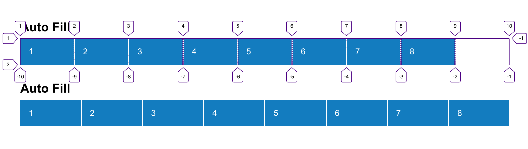
Container queries are going to solve this long-standing issue in web design where we want to make design choices based on the size of an element (the container) rather than the size of the entire page. So, if a container is 600px wide, perhaps it has a row-like design, but any narrower than that it has a column-like design, and we’ll have that kind of control. That’s much different than transitioning between layouts based on screen size.
We can already size some things based on the size of an element, thanks to the % unit. For example, all these containers are 50% as wide as their parent container.
The % here is 1-to-1 with the property in use, so width is a % of width. Likewise, I could use % for font-size, but it will be a % of the parent container’s font-size. There is nothing that lets me cross properties and set the font-size as a % of a container’s width.
That is, unless we get container units! Here’s the table of units per the draft spec:
unit
relative to
qw
1% of a query container’s width
qh
1% of a query container’s height
qi
1% of a query container’s inline size
qb
1% of a query container’s block size
qmin
The smaller value of qi or qb
qmax
The larger value of qi or qb
With these, I could easily set the font-size to a percentage of the parent container’s width. Or line-height! Or gap! Or margin! Or whatever!
Miriam notes that we can actually play with these units right now in Chrome Canary, as long as the container queries flag is on.
🥳 oh, and also Chrome Canary (with the container query flag) now has support for Query Units:https://t.co/GkIbLFW5C6
Not sure when it happened – so far I've only tested qi, because that's the most useful.
If I may quote @chriscoyier… "CSS comes at you fast"
I had a quick play too. I’ll just put a video here as that’ll be easier to see in these super early days.
And some great exploratory work from Scott here as well:
Developed a demo using the new container units and it’s really powerful stuff! Just two font size declarations and <100 lines of CSS in this demo and it has a ton of flexibility.https://t.co/LlrHFhVND0
Query units can save us effort and time when dealing with things like font-size, padding, and margin within a component. Instead of manually increasing the font size, we can use query units instead.
Cassidy Williams writes about Incremental Static Regeneration or “hybrid web development” and how it can improve and scale sites “beyond the Jamstack”.
Handy makes defining and recognizing custom hand poses in WebXR a snap. It recognizes 100+ hand poses, including ASL finger spelling. Built on Three.js.
Read how from the release of the page experience algorithm, there is no longer any preferential treatment for AMP in Google’s search results, Top Stories carousel and the Google News.
In this article, Ahmad Shadeed explains the background-image property in detail, and provides a visual explainer on how multiple backgrounds can be stacked.
When implementing a user interface in a browser, it’s good to minimize those differences and issues wherever you can, so that the UI is predictable. Keeping track of all of those differences is hard, so I’ve put together a list of common issues, with their solutions, as a handy reference guide for when you’re working on a new project.
Let’s begin.
1. Reset The Backgrounds Of button And input Elements
When adding a button, reset its background, or else it will look different across browsers. In the example below, the same button is shown in Chrome and in Safari. The latter adds a default gray background.
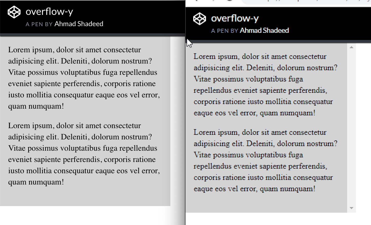
To limit the height of an element and allow the user to scroll within it, add overflow: scroll-y. This will look good in Chrome on macOS. However, on Chrome Windows, the scroll bar is always there (even if the content is short). This is because scroll-y will show a scroll bar regardless of the content, whereas overflow: auto will show a scroll bar only when needed.
Left: Chrome on macOS. Right: Chrome on Windows. (Large preview)
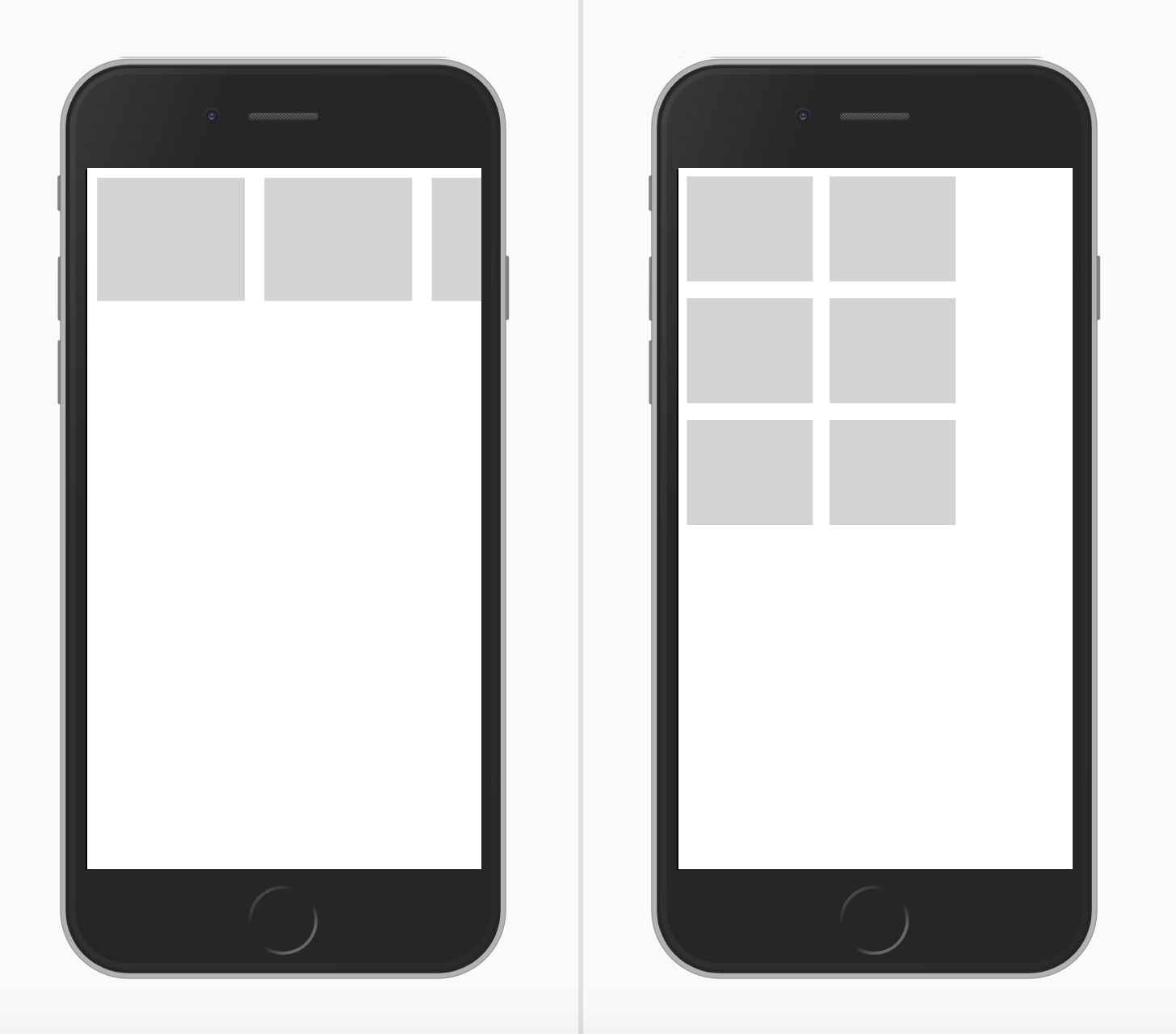
Make an element behave as a flex container simply by adding display: flex. However, when the screen size shrinks, the browser will display a horizontal scroll bar in case flex-wrap is not added.
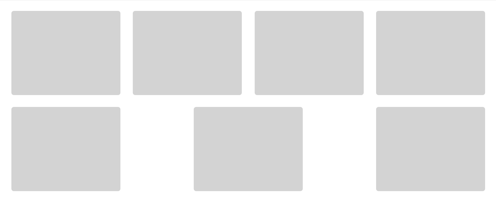
4. Don’t Use justify-content: space-between When The Number Of Flex Items Is Dynamic
When justify-content: space-between is applied to a flex container, it will distribute the elements and leave an equal amount of space between them. Our example has eight card items, and they look good. What if, for some reason, the number of items was seven? The second row of elements would look different than the first one.
In this case, using CSS grid would be more suitable.
5. Long Words And Links
When an article is being viewed on a mobile screen, a long word or inline link might cause a horizontal scroll bar to appear. Using CSS’ word-break will prevent that from happening.
When adding gradient with a transparent start and end point, it will look black-ish in Safari. That's because Safari doesn’t recognize the keyword transparent. By substituting it with rgba(0, 0, 0, 0), it will work as expected. Note the below screenshot:
7. The Misconception About The Difference Between auto-fit And auto-fill In CSS Grid
In CSS grid, the repeat function can create a responsive column layout without requiring the use of media queries. To achieve that, use either auto-fill or auto-fit.
In short, auto-fill will arrange the columns without expanding their widths, whereas auto-fit will collapse them to zero width but only if you have empty columns. Sara Soueidan has written an excellent article on the topic.
8. Fixing Elements To The Top Of The Screen When The Viewport Is Not Tall Enough
If you fix an element to the top of the screen, what happens if the viewport is not tall enough? Simple: It will take up screen space, and, as a result, the vertical area available for the user to browse the website will be small and uncomfortable, which will detract from the experience.
When adding an image, define max-width: 100%, so that the image resizes when the screen is small. Otherwise, the browser will show a horizontal scroll bar.
img {
    max-width: 100%;
}
10. Using CSS Grid To Define main And aside Elements
CSS grid can be used to define the main and aside sections of a layout, which is a perfect use for grid. As a result, the aside section’s height will be equal to that of the main element, even if it’s empty.
To fix this, align the aside element to the start of its parent, so that its height doesn’t expand.
.wrapper {
  display: grid;
  grid-template-columns: repeat(12, minmax(0, 1fr));
  grid-gap: 20px;
}

// align-self will tell the aside element to align itself with the start of its parent.
aside {
  grid-column: 1 / 4;
  grid-row: 1;
  align-self: start;
}

main {
  grid-column: 4 / 13;
}
Sometimes, while working with SVGs, fill won’t work as expected if the fill attribute has been added inline in the SVG. To solve this, either to remove the fill attribute from the SVG itself or override fill: color.
Take this example:
.some-icon {
    fill: #137cbf;
}
This won’t work if the SVG has an inline fill. It should be this instead:
.some-icon path {
    fill: #137cbf;
}
12. Working With Pseudo-Elements
I love to use pseudo-elements whenever I can. They provide us with a way to create fake elements, mostly for decorative purposes, without adding them to the HTML.
When working with them, the author might forget to do one of the following:
add the content: "" property,
set the width and height without defining the display property for it.
In the example below, we have a title with a badge as a pseudo-element. The content: "" property should be added. Also, the element should have display: inline-block set in order for the width and height to work as expected.
13. The Weird Space When Using display: inline-block
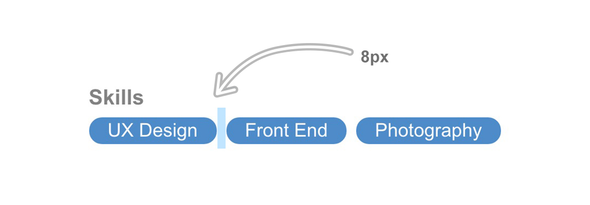
Setting two or more elements to display: inline-block or display: inline will create a tiny space between each one. The space is added because the browser is interpreting the elements as words, and so it’s adding a character space between each one.
In the example below, each item has a space of 8px on the right side, but the tiny space caused by using display: inline-block is making it 12px, which is not the desired result.
14. Add for="ID" When Assigning A Label Element To An Input
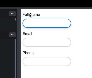
When working with form elements, make sure that all label elements have an ID assigned to them. This will make them more accessible, and when they’re clicked, the associated input will get focus.
15. Fonts Not Working With Interactive HTML Elements
When assigning fonts to the whole document, they won’t be applied to elements such as input, button, select and textarea. They don’t inherit by default because the browser applies the default system font to them.
Some elements will cause a horizontal scroll bar to appear, due to the width of those elements.
The easiest way to find the cause of this issue is to use CSS outline. Addy Osmani has shared a very handy script that can be added to the browser console to outline every element on the page.
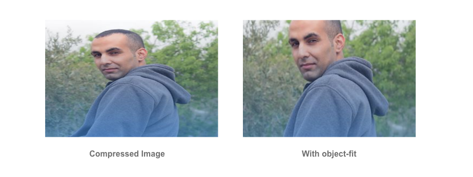
Using object-fit won’t be the perfect solution in all cases. Some images need to appear without cropping or resizing, and some platforms force the user to upload or crop an image at a defined size. For example, Dribbble accepts thumbnails uploads at 800 by 600 pixels.
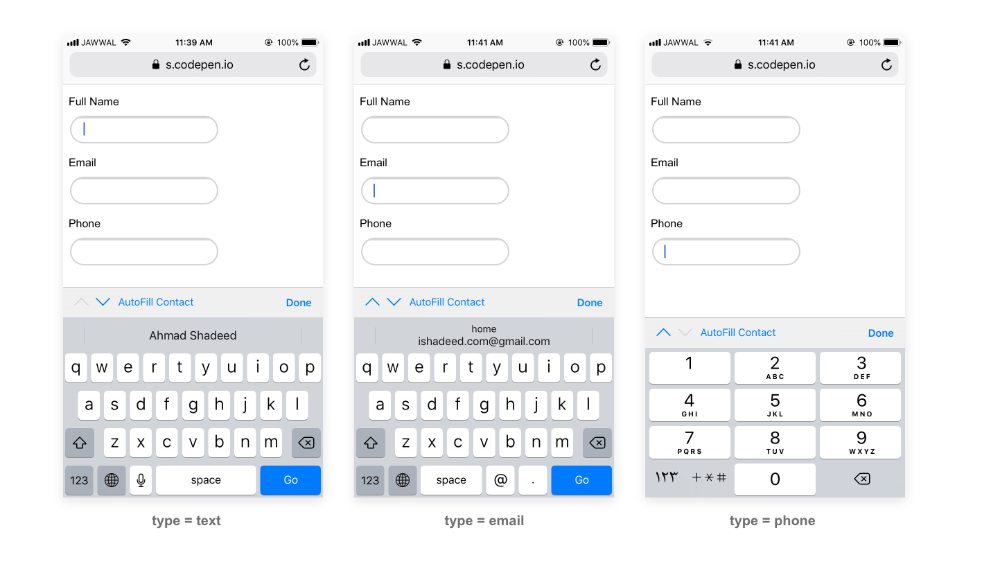
18. Add The Correct type For input.
Use the correct type for an input field. This will enhance the user experience in mobile browsers and make it more accessible to users.
When adding a phone number like + 972-123555777 in a right-to-left layout, the plus symbol will be positioned at the end of the number. To fix that, reassign the direction of the phone number.
All of the issues mentioned here are among the most common ones I’ve faced in my front-end development work. My goal is to keep a list to check regularly while working on a web project.
Do you have an issue that you always face in CSS? Let us know in the comments!


 Made by Hakim El Hattab.


 Start working towards your career in design today.


