


Inspirational Website of the Week: Studio RHE
An excellent design with a horizontal scroll layout. Very cool menu and awesome typography. Our pick this week.

This content is sponsored via BuySellAds
Use Kintone to Spend Less Time on the Back-end
Kintone is a powerful web database, providing developers with a convenient environment to test out front-end coding ideas, without having to run a back-end.

The magical world of Particles with React Three Fiber and Shaders
An interactive introduction to Particles with React Three Fiber and Shaders where you’ll learn anything going from attributes, buffer geometries, and more advanced techniques like Frame Buffer Object through 8 unique 3D scenes.

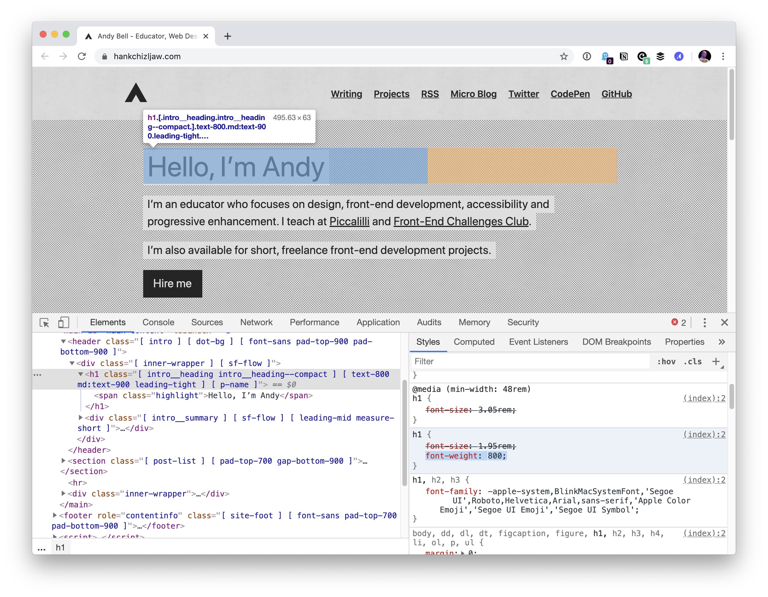
Inside the mind of a frontend developer: Hero section
An exploration of how a frontend developer thinks while building a simple hero section. By Ahmad Shadeed.

Dialogs, modality and popovers seem similar. How are they different?
Hidde de Vries explores the difference between some web platform concepts that seem very similar but are actually different from each other.

Conditionally Adaptive CSS. Browser behavior that might improve your performance.
Your website might be ready to adapt to any viewport. But why should users wait for irrelevant desktop styles when they load it on mobile? Vadim Makeev elaborates.

Speedy CSS Tip! Animated Gradient Text
Learn how to make an animated gradient text effect with scoped custom properties and background-clip. By Jhey Tompkins.

Gallery Example
A cyberpunk style image gallery with glitch effects by Toshiya Marukubo.

Marten
Marten is a Crystal web framework that makes building web applications easy, productive, and fun. It enables pragmatic development and rapid prototyping.

Heroku Free Alternatives
A list of services with a free plan that developers can use as an alternative to Heroku.

CSS Mechanical Keyboard
A wonderful mechanical keyboard made in pure CSS.

Huge type on the web
Matej Latin explores huge type in print, looks for similar examples on the web, and tries to find out what is it that works well about those designs.

Idiot proof git
Tips and aliases that make rebase-based workflows in Git much less advanced feeling.

Bezel (Beta)
Bezel is a collaborative 3D design tool, empowering teams to design and prototype on a spatial canvas together.

Blessed.rs
An unofficial guide to the Rust ecosystem with helpful pointers on which crates to use when.
PwshSprites
Shaun Lawrie made a pixel art editor for the terminal in PowerShell.

Font Stretch Attempt with CSS
A stretchy letter demo made with a brilliant trick by Jhey Tompkins.

Cozo
A general-purpose, transactional, relational database that uses Datalog and focuses on graph data and algorithms.

Gradient border with rounded corners
Adam Argyle made a gradient border with rounded corners using some clever CSS tricks.

Significant buildings of a modernist architect Walter Gropius
A really cool scroll experience about Walter Gropius’ architecture.

From Our Blog
3D Typing Effects with Three.js
A detailed tutorial on how to create typable 3D text with Three.js.


