If you’re starting a project like a web app or a website that requires an admin dashboard, then this collection of Bootstrap admin templates will be a great starting point! Bootstrap is a free and open-source JavaScript framework that contains a whole lot of ready-made code to help you create things.
2018 seemed to go by so quickly! But, that doesn’t mean that there’s any shortage of great website designs out there. With more and more websites joining the web every day, it’s actually really hard to find one that stands out. So, for your viewing pleasure, we put together a quick list of the best website designs that stood out to us in 2018. Some of these you may already know, but a few of them might be a surprise.
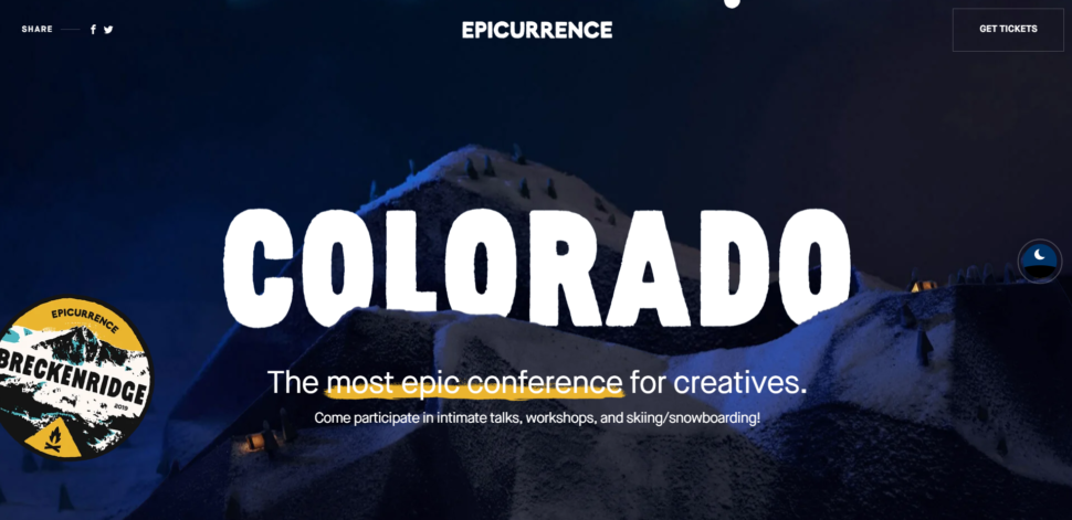
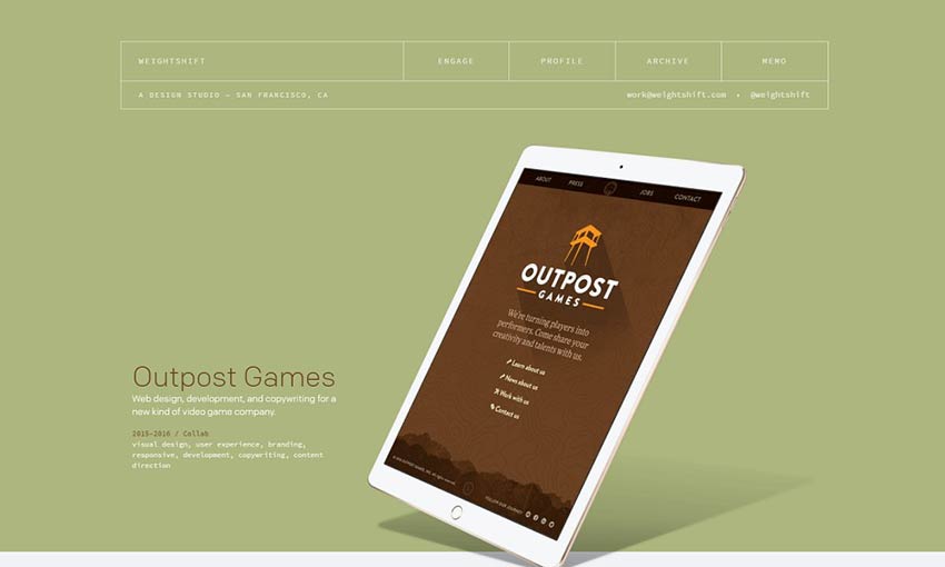
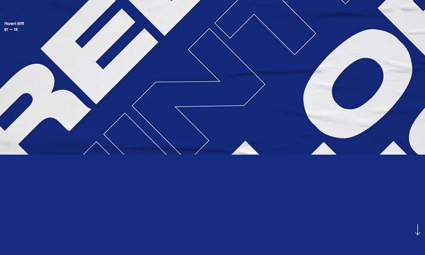
Epicurence
Anywhere you go on Epicurence is simply a visual delight. The site is packed with fun animations and unique transitions. Not to mention the beautiful colors and eye catching images. It’s hard to pick one single part of Epiccurence that’s better than the other. Well done!
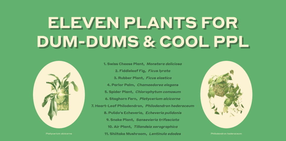
Eleven Plants For Dum-Dums
Now, I know what you’re thinking, and no, this isn’t some super hipster design studio. Eleven plants For Dum-Dums is literally just a website that lists 11 different kinds of plants. What makes it stand out is the use of animation and the color green. It’s a really fun website to visit, and they make each section about each plant so unique, that it’s impossible to look away.
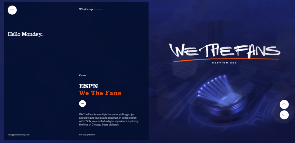
Hello Monday
As much as we all probably dislike Monday, Hello Monday the website is a welcome site. On the main page, the way they transition from story to story is super clean. The transitions are also timed really well. They give you enough time to glimpse the story and click if you want, but they don’t stay up too long and make you feel like you’re staring at a wall.
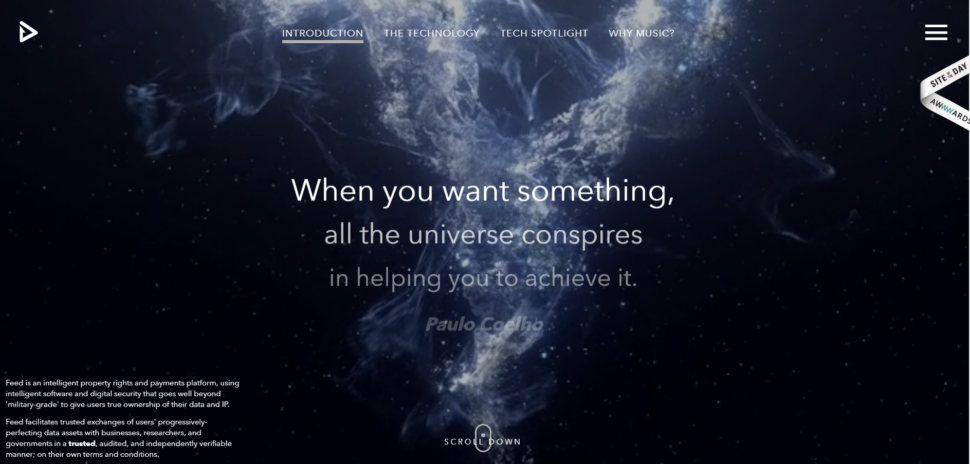
Feed Music
Feed Music’s main page captures your attention instantly. So much so, that you almost don’t want to click on anything else. The animation is smooth and the colors are beautifully balanced. To top it all off, if you scroll down through the content in the middle of the main page, you feel like you’re watching to intro to a Star Wars movie.
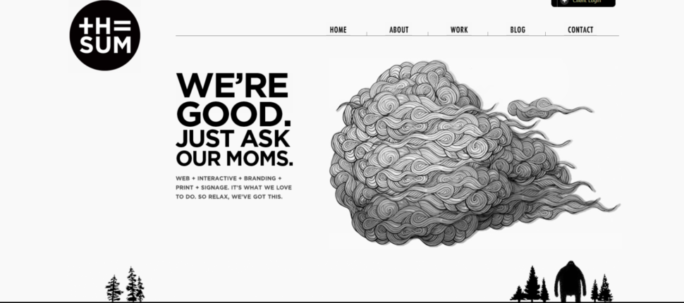
The Sum
Just in case you haven’t read anything else on our blog, we love custom graphics. The Sum takes a very minimalistic approach, but wow are the visuals amazing. Combine that with a sense of humor, and a fast functioning website, and you have yourself a winner.
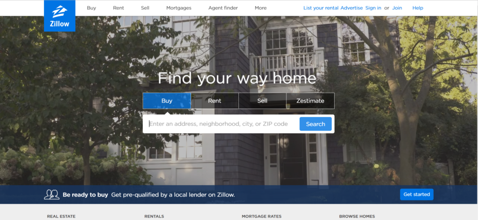
Zillow
Let’s take a dip into more familiar territory, shall we? Zillow is a pretty common name to hear nowadays, especially if you’re in the real estate business. It’s safe to say that they’re really good at what they do. Another thing that they really nailed is the design of their website. The best website designs are the ones that serve their purpose and look good doing it. Zillow is not only visually appealing, it functions like a champ, and it’s easy to use. What more could you want?
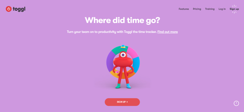
Toggl
Here’s another big name you hear about a lot. What makes Toggl so mind blowing is their weirdly entertaining animations on almost all their pages. Each page provides soft and relaxing colors, and the oever website has such a friendly and helpful tone to it that it’s impossible not to feel at home.
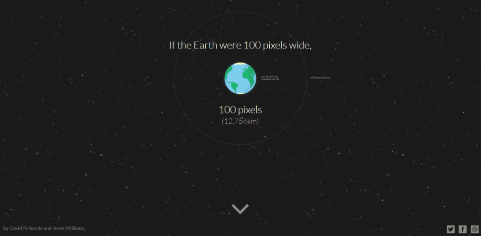
Distance to Mars
Distance to Mars was designed to educate people in a clever way. The website is dedicated to one purpose, showing viewers the distance to mars. Along the way, they’ll provide some scientific facts that are quite entertaining. If you have a few extra seconds, it’s definitely worth checking out.
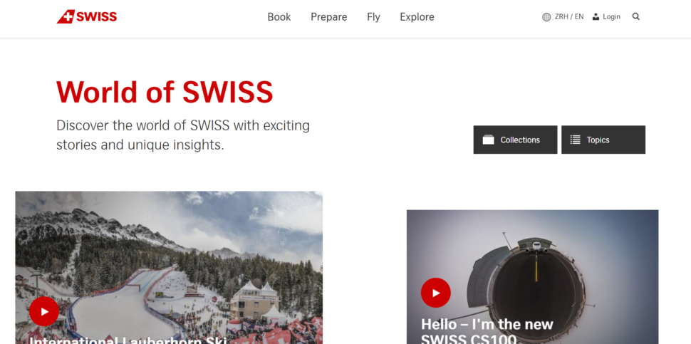
World of SWISS
World of SWISS is a website dedicated to SWISS airlines. The website i beautiful and clean, but most of all, it perfectly tells a their story. On the main page, you’ll find no shortage of articles and videos describing what it’s like to fly with them. The website’s function is smooth and the visuals are crisp and perfect for the brand. This is a great example of how simplicity and functionality can go a long way.
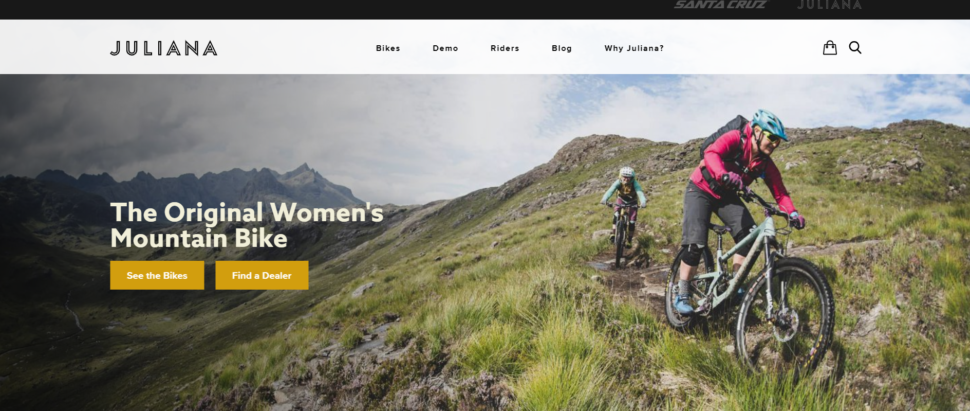
Juliana Bicycles
As a bicycle site just for women, Juliana Bicycles delivers clean and vibrant images, and outstanding functionality. They take advantage of responsive interactions, and it really works well for the site. It’s colorful, clean, and really really cool.
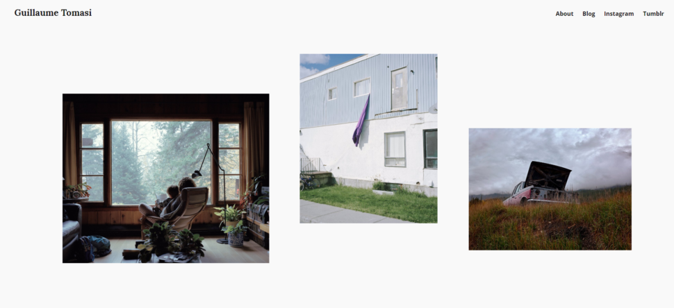
Guillaume Tomasi
Guillaume Tomasi is a photographer in Montreal that has built a portfolio that’s quite impressive. Both according to its contents and the beautiful manner at which he pulled it off. The website is simply beautiful and is a great example of both how to design a website and portfolio. The interactions are simple but fun, and definitely get the job done. Never once will you feel inconvenienced by the way the website works. It’s simple, but it’s different for sure.
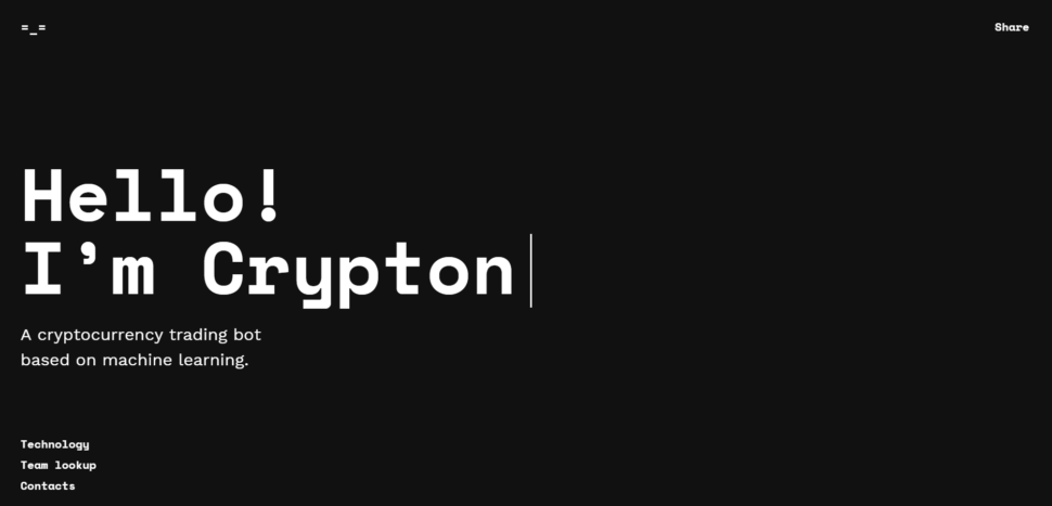
Crypton
Crypton is a robot accountant that helps you buy and sell cryptocurrency. The site uses the best of the best AI to help you predict changes in values for all kinds of cryptocurrencies. Since its creation, it’s been given quite a few awards for its design and development, and you can see why from the moment you click on it.
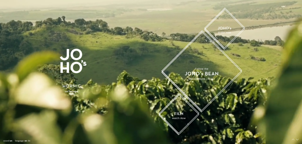
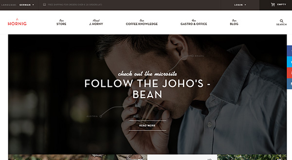
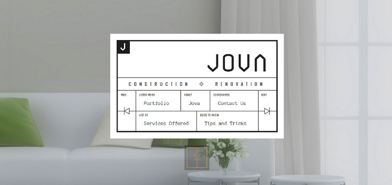
JOHOs
If you want a website with superb images, nice interactions, quick functionality, and delicate story telling, then look no further than JOHOs. The website tells the story of the brand’s coffee beans. You get to travel along with them from the growing process all the way to the brew. It’s like a mini movie and it’s so mesmerizing to watch.
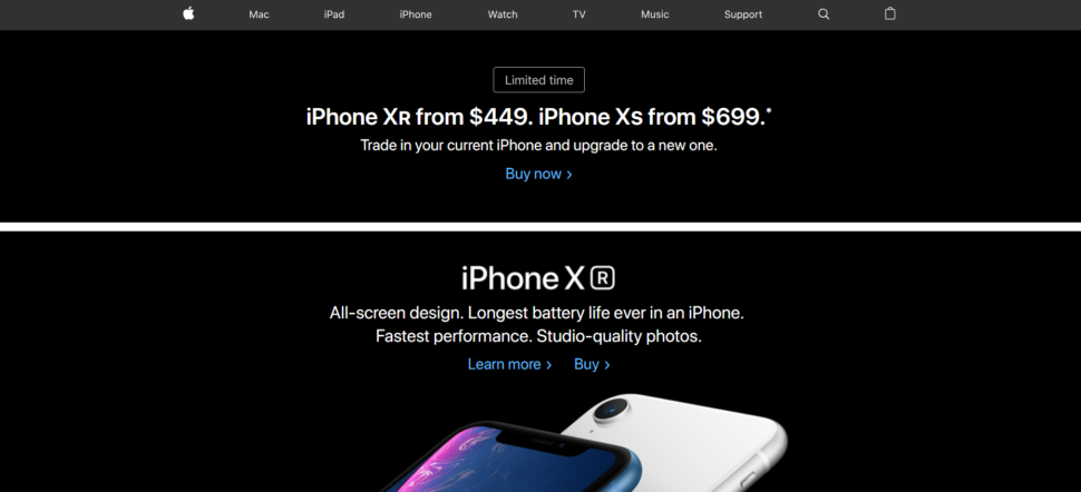
Apple
We’ll end this list with Apple, a company that has been notorious throughout its existence for creating sleek and functional products, and their website is no different. It’s packed to the brim with high quality imagery and super modern style. The iPhones displayed on the main page all but jump out at you.
Conclusion
The best website designs are not good at any one particular thing. But rather, they’re great at many different things. Each website on this list of best website designs of 2018 showcase many strong advantages that they have over other websites.
Some of the names in this list you may have already been familiar with, and some are probably new to you. Regardless of whether is new news or old news, these websites are simply stunning, and the design teams behind each one have something to be extremely proud of. Go ahead and click on the links are check them out for yourself!
For web and graphic designers, it’s important to nail that portfolio, instantly convincing anyone who visits that you’re the one for the job. With the new year rolling around, it might just be time for a fresh redesign.
There are so many amazing portfolios out there to draw inspiration from. If you’d like to explore and learn from the work of your fellow designers, you’re going to love this list. These are the portfolios that get it right!
We Ain’t Plastic definitely leaves its mark. Its subtle effects, animations and images all come together to create a website that was obviously crafted with love. It also gets right to the point, careful not to overload you with too much information.
This beautiful one-page portfolio proves that simple-but-strong design is often the best way to go. The perfectly elegant animations are the most memorable part of this website, alongside the dynamic layout.
Stylish and well put together, navigating this portfolio is no less than delightful. Every animation looks great, and though many navigation elements are fairly unique, getting around is very intuitive thanks to fantastic UI design.
Fun animations and colorful images quickly bring this site to life. You won’t be able to stop scrolling, stopping to see each animated image. And a pretty parallax effect brings the site to a satisfying end.
This dark, modern website is filled with all sorts of fun little details, animations and browser interactions. Discovering them all is a joy. You know this is a designer who loves his job. Click to see the projects and you’ll get some interesting behind-the-scenes info on design choices, too!
Everything about this website indicates excellency at both style and skill. There’s so much attention to detail that it’s astounding. As you navigate the well laid-out portfolio you’ll be constantly driven to keep exploring and learning more about the developer.
What’s better than a collection of case studies so nicely presented? Scroll through the clean, brightly colored website and check out the examples to see a short demonstration of the company’s past work!
This portfolio uses a pleasant block-based layout that’s easy to navigate on any device. Images are the focal point, taking up a majority of the screen. What text there is tells you exactly what you need to know.
Here’s one reminiscent of a business card: Sophisticated, beautiful and simply but carefully designed. There are plenty of case studies to learn more about the company and its methods. Nothing is better than understanding your designer’s goals and processes.
This is a portfolio made with readability and ease of navigation in mind. There’s a lot of content and past work, but text is frequently broken up by interesting images of past design projects. It’s simple to navigate the sections. And the slight change of background color as you scroll is a nice touch.
A beautiful palette, unique layout, and cute art and animations certainly make this a standout website. Looking at this portfolio, you know the designer truly has an artist’s eye.
Amazing Portfolios by Designers
There’s nothing more inspiring than a skilled web designer’s portfolio. Experts and innovators are always pushing the limits of what a website should be capable of, with portfolios that skillfully display their mastery in design.
Which portfolio was your favorite? There’re just too many awesome ones to choose from!
Photoshop has been out on the market for a long time and there isn’t a designer who hasn’t heard about it. That’s a fact. Professionals use it to edit everything, from photos, movies, to anything graphic design related. Undoubtedly, Photoshop is a leader among the editing tools, and rightly so. The multitude of features and options it comes with make it a software for the advanced. Unfortunately, its complexity can be an impossible labyrinth for some, an unpenetrable mystery. For this very reason, we decided to make all your lives easier by putting together a handy list of the best Photoshop alternatives.
We know the hassle that Photoshop comes with, and we know the price. Not only does it need hundreds of hours of practice until you get familiarized with it, but it can also be quite costly for designers at the beginning of their career. Our goal on Webdesignledger is to make designers’ work as enjoyable as possible through accessible resources. Today’s blog post is for those who have been looking for Photoshop alternatives that are easier to use and more affordable. Check these out and choose your favorite:
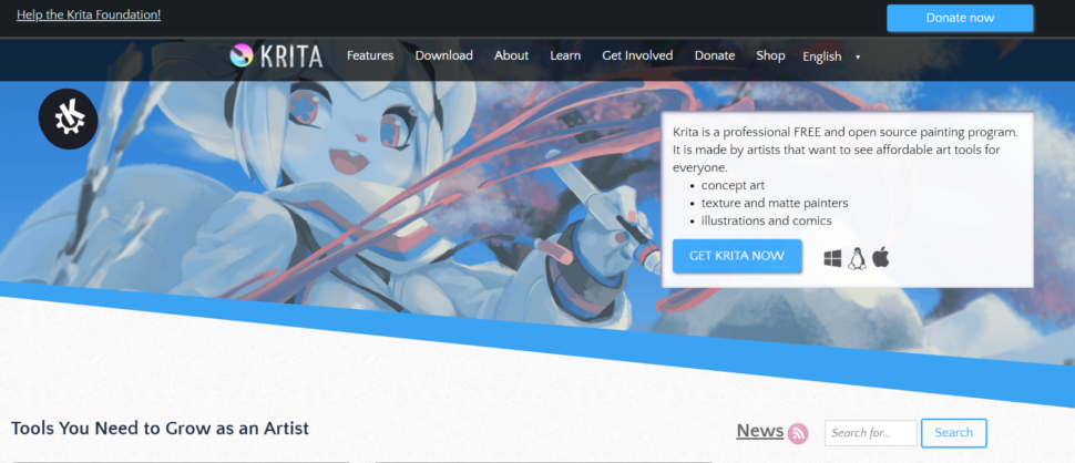
The reasons we love this tool are quite numerous. We’ll start with our favorite: it’s free. Don’t we all like free quality products? Krita is Photoshop’s younger sister, they look and feel very similar. It’s feature-rich and highly recommended by the people online. We recommend you all to use Krita as a Photoshop alternative because:
it has a ton of cool effects
it offers a multitude of templates on different subjects
you can use it on tablets
Unfortunately, Krita doesn’t keep the history of your edits, nor does it have a camera RAW filter. But these little negatives don’t matter so much when all the other features complement each other so well.
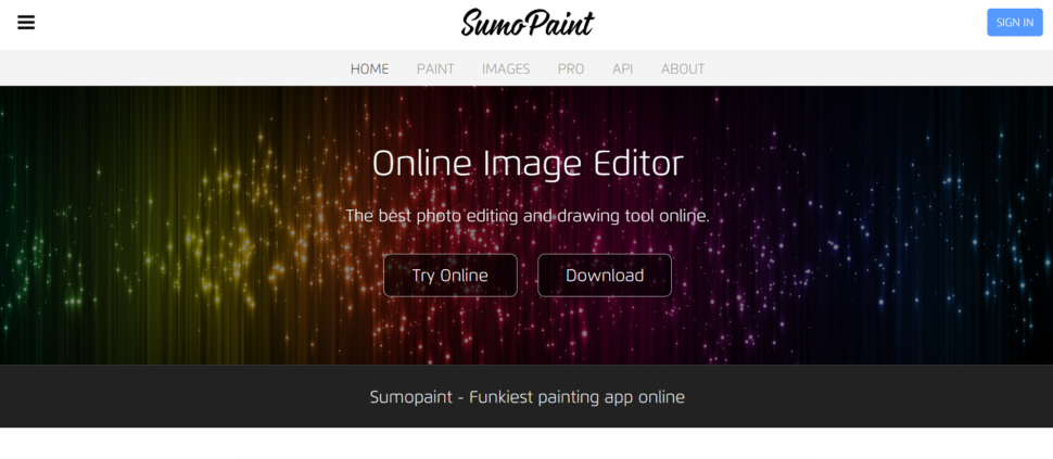
One of the downsides of Photoshop is that you need room for it. You may have to delete stuff on your computer in order to install it. This is where Sumpaint comes into action. This amazing alternative is an online tool which means you can keep everything on your laptop in place. Sumopaint is on our list today because:
it’s super easy to use
it has plenty of features
it offers support for layers and blending modes
3. Multi-Layer (Android)
Edit on the go with your tablet or smartphone with this amazing Photoshop alternative. Multi Layer beats all the other phone tools with its richness of features. Believe it or not, the app offers grit support and even support for blending and layers. Being a free tool, they have to financially support the app through ads which will pop up at times. But even so, we love it for:
Unlike Krita which doesn’t feature a history toolbar, GIMP does! It is also free and that always makes us happy. Plus, what if I told you that it’s able to do almost everything that Photoshop can, sometimes even better? No wonder people recommend it so much online as a Photoshop alternative. It’s easy to work with and we wouldn’t trade it for Photoshop as:
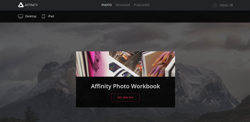
We dare to say that Affinity Photo is better than Photoshop. First, let’s start with the price. Compared to Photoshop, Affinity Photo is so much cheaper! With a one-off payment, you are good to go. Its creators openly affirmed that the aspects Photoshop lacks in, they’ve got it covered. Affinity Photo is among the best on the market, and this is why:
it’s much faster than Photoshop
crashes less than Photoshop
features unlimited undos
6. Sketch
This list could not exist without Sketch. The tool is as feature rich as flexible. Although it is a paid software, you get a ton for the price. And that’s due to the numerous community-created plugins you can access anytime to extend its functionality. The only downside to Sketch is its limited platform availability. Unless you are a Mac user you can’t enjoy this amazing tool. But even so, we applaud it for:
its infinite zooming
the ability to build a new graphic with the vector and pencil tool
including color picker, layers, gradients, and style presets
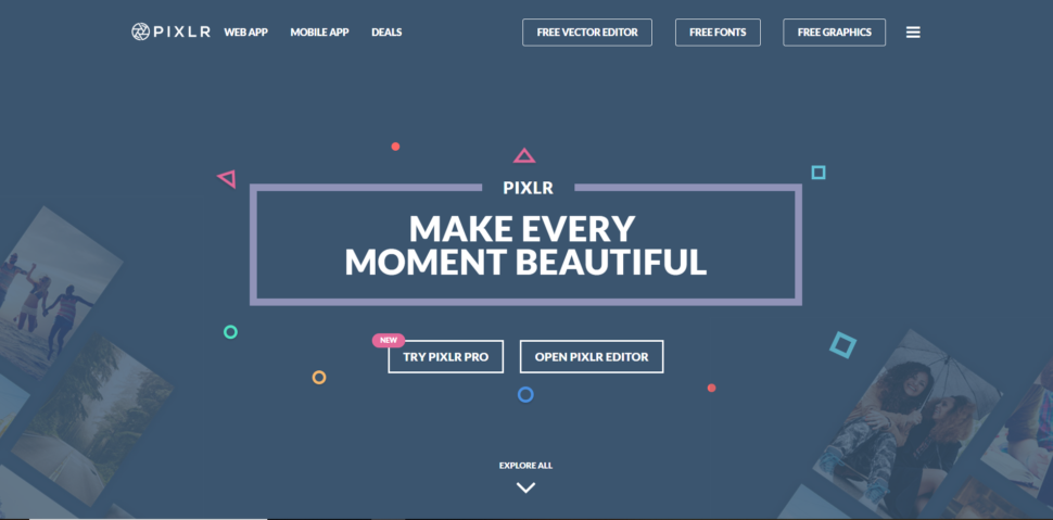
This app is for free. You’ll want to know this little detail when I tell you that it comes with more than 600 effects. Pixlr is that app that you must have on downloaded on your phone for quick edits that actually look good. Crop, resize, whiten teeth if needed, it’s all possible with Pixlr. We added the app to our list due to:
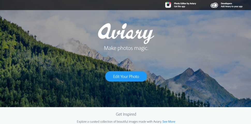
Aviary specializes in basic editing and it does it in style. It’s a super tool for editing images into memes and not only. It’s easy to use, yet full of features. You can edit small details such as blemishes, add stickers, and change the depth of focus. Aviary can be accessed both online and on phones. We mostly like that:
it’s free and the online editor is add free
it comes with a wide range of tools
it’s easy to use
Which Photoshop alternative do you use? We would love to know your recommended tools and what makes them special in the comment section below. Also, stay up to date with the latest news and trends in design by visiting us daily. We strive to bring the best and most useful content and would appreciate if you liked, shared, and subscribe to our blog.
If you think that the WP Bakery is a new product while the Visual Composer Website Builder is just the new name behind which is the old Visual Composer – unfortunately, you are wrong.
We admit that the whole thing is quite confusing and we understand why so many of our users, as well as long-term partners, are upset with us.
Which brings us to the reason we decided to publish this post in the first place. Above all, we want to apologize for the confusion around Visual Composer, and we want to explain the whole story of what happened here.
We are sorry for the mess we have created around Visual Composer.
We admit that we should have explained what caused this situation at the very beginning before it escalated.
So let’s finally do that and dive deeper into the mind-twisting story behind this huge mess that got even worse as we tried to fix it along the way.
It all started with one thing that caused a big domino effect of issues that went down one after another:
Changing the name of the Visual Composer Page Builder
On every major WP theme, you have probably noticed the name above. After all, it was included as a premium plugin in the majority of the all-time favorite WordPress themes.
So the big question is: Why would we change the name in the first place when it was so well-known and easily recognizable?
The truth is – because we had to; we did not have a choice.
If you want the whole story, check out the video below.
It all began with our new product, the Visual Composer Website Builder. It is worth mentioning that the Visual Composer Page Builder and the Visual Composer Website builder are two entirely different products used for different purposes.
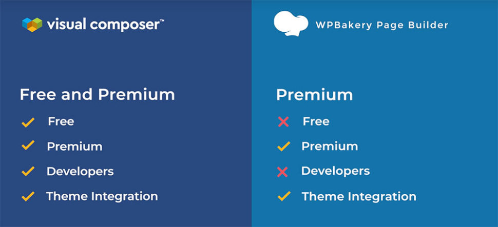
The Page Builder is an Envato-exclusive product with a lifetime license (like all products sold with Envato). The Website Builder, on the other hand, was meant to move away from the lifetime license model. We wanted to create a product much more complex in features and specially designed for the users whose building needs have rapidly evolved.
However, the new features came hand in hand with much higher development costs which that could only be sustained with a yearly license model. In addition to that, we wanted to be in the direct touch with our users because we recognized the need for the best support we could possibly provide.
However, our plans took a wrong direction because
We overlooked a crucial detail that forced us into a difficult decision
And that detail in question was the contract we signed with Envato and all its limitations.
Long story short, we were not allowed to sell another product under the Visual Composer name outside their platform.
At that point, we had to choose our next step. We had two options:
We could adjust our new product to fit the lifetime license model and put it up on Envato.
We could change the product name to lift the contractual limitations.
It was not an easy choice to make, and we knew that both options had significant downsides. We weighed our two options over and over again, and eventually, we decided to go with the option 2. We decided not to compromise the quality of our new product, and this was the only way to do it.
And that is how the Visual Composer Page Builder became WP Bakery
And that is where the whole confusion started. Not only were we buried in the developing process of our new product which required our full attention, but we also had to deal with a whole new set of unplanned changes.
Dealing with all that work, we did not immediately notice the vast confusion we created.
Not only were people confused about the name change, but they also didn’t understand what our new product, Visual Composer Website Builder, was. Was it a new product or just a rebranding of the old one? And what about WP Bakery?
So let’s take it step by step and explain the difference between the two once and for all.
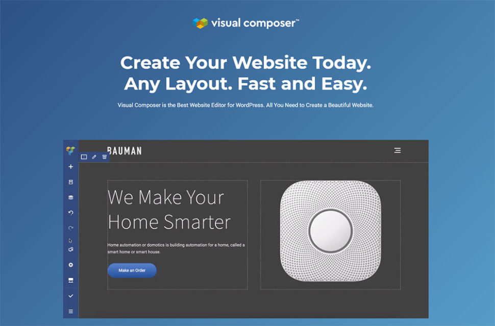
What is Visual Composer Website Builder and what does it do?
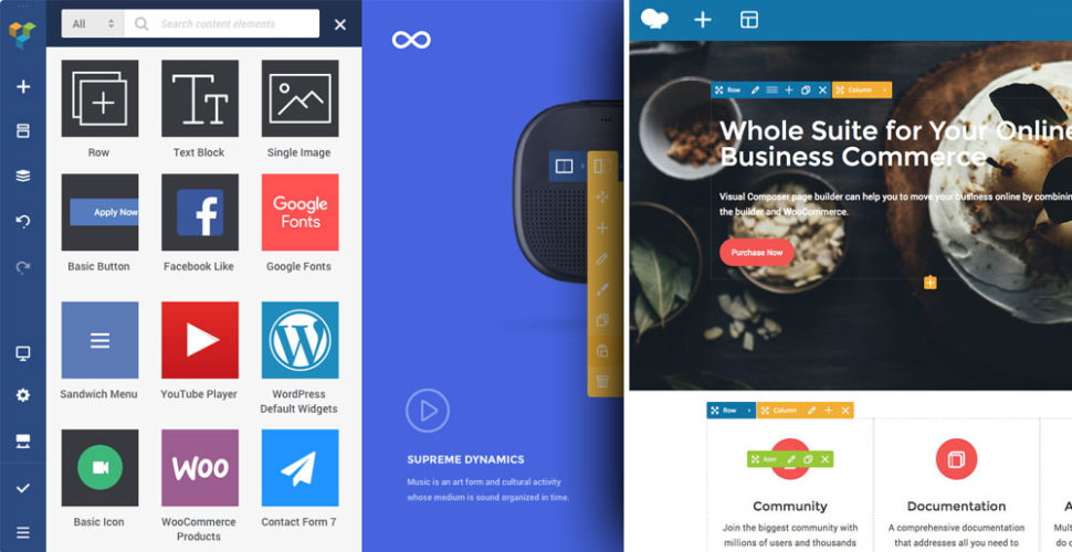
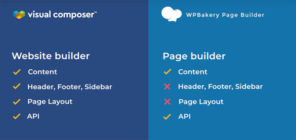
The Visual Composer Website Builder is a live-preview editor with drag-and-drop features. It is not the same thing as the Visual Composer Page Builder. It is an entirely new tool. It comes in two versions; the free and the Premium version.
There are hundreds of ready-to-use content elements to choose from that will help you turn your ideas and visions into reality. It is easy to use thanks to the drag-and-drop features, and you can see all the changes instantly.
It can be used with any theme, including your existing themes. On top of that, you can choose from a variety of WP templates for different types of pages (landing pages, portfolios, corporate websites, product pages and many more).
Page editing works in two ways; frontend editor and tree view. With the tree view, you can navigate through the elements available on the page which will save you a lot of time during the process.
One big perk of the Visual Composer Website Builder is the fact that there is a header, footer, and sidebar editor available in the Premium version of the product.
In addition to that, you can access numerous useful add-ons that you can get from the third-party developers or the Visual Composer’s dedicated Hub.
Are Visual Composer Website Builder and WP Bakery the same thing?
Short answer: No. These are two entirely different tools. Let’s take a moment to explain the main differences between the two.
Some people believe that the Visual Composer Website Builder is merely a premium version of the WP Bakery. It is not.
Visual Composer Website Builder’s code was built from zero with React.Js. It does not use any of the WordPress shortcodes. It was developed using the feedback from our users to offer them the best experience possible.
However, the most significant difference between the two products is that WP Bakery is only for the content part, while Visual Composer Website Builder allows you to build a complete website (with Headers and Footers).
Like mentioned before, Visual Composer Website Builder does not use any shortcodes, while WP Bakery is shortcode-based.
In practice, this means that the VC Website Builder:
allows you to generate clean code
doesn’t get messy if you disable the plugin (like it happens with shortcode-based plugins)
On top of that, VC Website Builder comes with a cloud-based Hub from which you can download all the elements you find useful. Basically, you can handpick the elements you need and download only them rather than bloating the website with a bunch of unnecessary assets.
There’s a full list of difference between the two products that you can check right here.
That being said, we also have to point out that WP Bakery is still getting the same amount of work and attention as it did before we developed VC Website Builder. Both of the products are equally as important to us, and we want to offer the best user experience possible.
Thank you for taking a moment to go through this story with us. If you have any additional questions regarding our products, please leave a comment, and we will try to give you the answer as soon as possible
Indeed, their simple and typical design make it easy to just put them together as quickly as possible and move on. The table of contents is more than just a list of the parts of a book or other document in the order that they appear. An opportunity to shock an unsuspecting reader of a report, […]
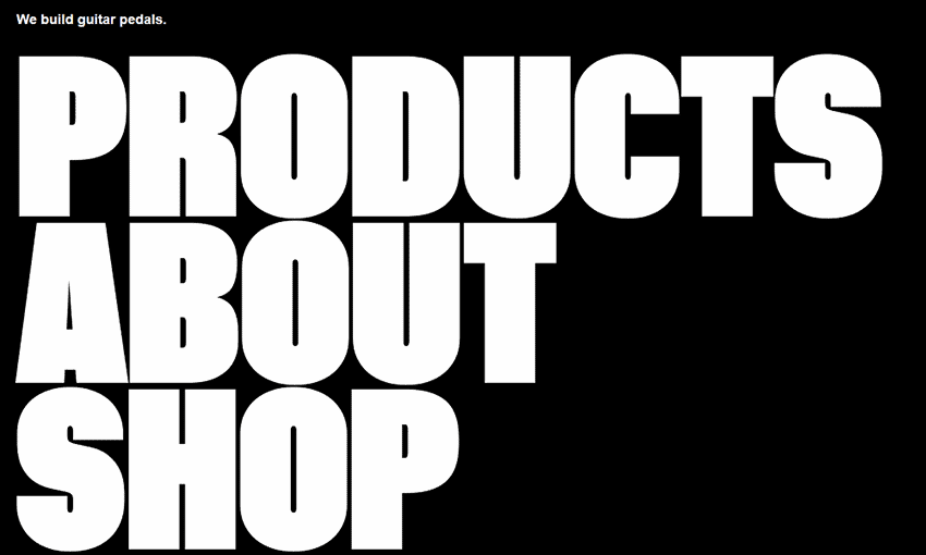
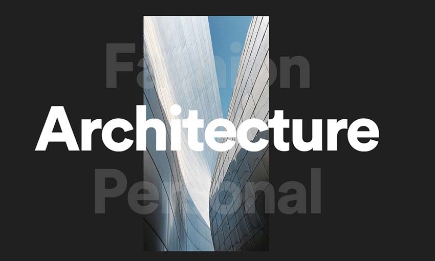
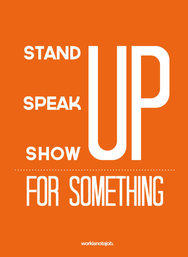
Have you been paying attention to the latest web design trends? Typography is getting bigger and bolder! Good typography is essential to a great website. And, what makes a more prominent statement than huge text that gets right in your face and tells you what you need to know?
If you’re considering a redesign for 2019, you’ll want to keep track of the latest trends in web design so that you can see what’s speaking to internet users (and what’s out). These websites have got the right idea – take a look and see how this trend is affecting web design!
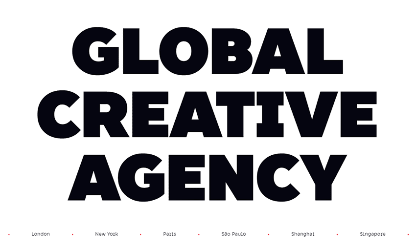
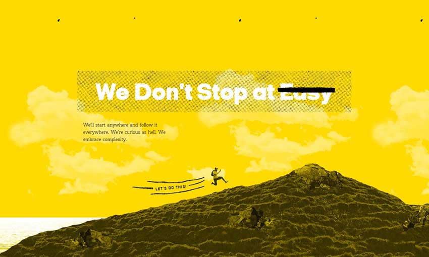
When we say big text, we mean it! The homepage is made up of nothing but a directory of large text. It gets straight to the point with just a one-sentence blurb about what the company does, before immediately directing you where you want to go.
Dragon Rouge gets super creative with its typography. It opens with a list of countries it operates in, scrolling by as the gigantic title fades in. Various screen and hover effects involving the distinctive typography present themselves as you explore the site. Make sure you look around to find all the cool text effects!
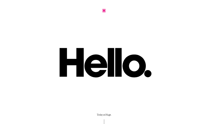
When you open this site, you’re instantly greeted with a big “hello”! The rest of the site’s headers uses the same eye-grabbing font, establishing consistency and always drawing you in to the important info. The more readable serif body font pairs well with it, too.
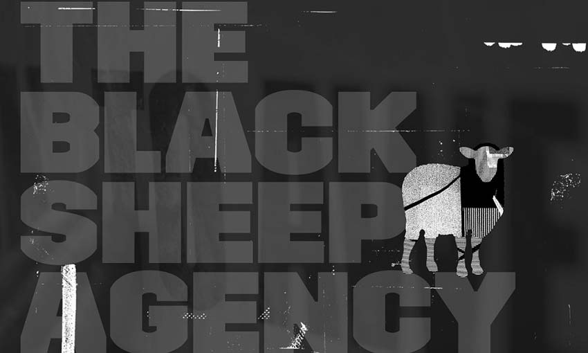
Black Sheep combines big, blocky text with interesting visuals to create a really cool effect. This type of typography suits the dark, grungy aesthetic well.
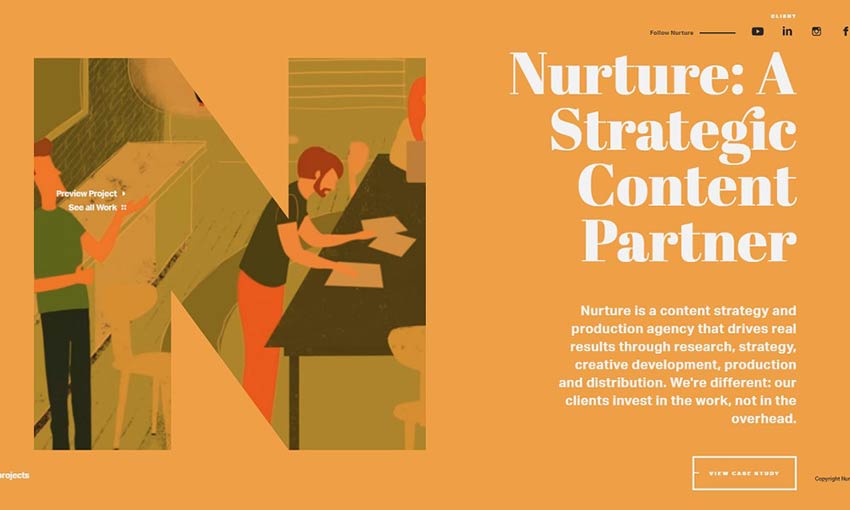
A lot of bold typography tends to look similar: Sans-serif, flat and clearly defined. Nurture Digital uses a more stylized font, and it works really well with the creative, cartoon-like animations. You’ll also find videos with a large letter overlay as you scroll through recent projects, creating a distinct effect.
Besides the awesome animated typography banner, the site uses large, sans-serif headers to draw your eyes towards the most important areas. For a designer, that would be their past work, awards and contact links. This is how you design a modern portfolio!
Your homepage doesn’t need to follow the same tired formula. Sometimes all you need is a little typography. The only place to go is the menu, and here you’ll find more big text directing you to learn more about the company. Inside, you’ll find even more unique text-based page design.
This full-screen website is primarily designed with text and effects, using only occasional images to draw you in. The little effects and additions like the subtle static animation and occasional scribbles tie this presentation together.
A flat, colorful text banner greets you here. As you scroll, the site transitions from carefully crafted paragraphs to elegant images. This site makes expert use of colors and content to create an experience that draws your eye exactly where they want you to look.
This is a neat trick. Overlaying a thin font and a thick one of different colors keeps both words readable. It’s a pretty cool reminder to experiment with your web design. The simple, sans serif header fonts work well with the flat, clean design of the website as well.
Besides the simple text-based homepage navigation, one cool feature of this website is the background. As you browse, the name of the category you’re on will appear there. It’s a cool way to decorate your background using just text.
It’s often best to stick to two or three fonts for a website, but rules are made to be broken. Almanac uses a variety of striking fonts and styling. This works perfectly with the colorful, animated design of the website.
Make a Big Statement
People are getting tired of overly simplistic designs, white websites and elegant subtlety. Right now, the trends are turning towards boldly designed sites that grab your attention. That means colorful design, eye-catching animations – and bold typography!
If you liked the aesthetics of the websites above, take a risk with your design and include some impactful typography in your next website.
2018 has finally ended and it hasn’t been long since we stepped into 2019. With new resolutions and trends present all over, website designing is also going to come up with a new face. In...
Sniff Design Studio® is an award-winning web and graphic design studio that specializes in catering to national and international pet business professionals since 2003. We work to inspire brands while crafting identities with meaningful, purpose-filled and eye-catching designs. After all, good design is key to gaining and maintaining important customer response to a product or idea. At Sniff Design Studio®, we believe that presentation is everything – no bones about it.
In a world built on abundance, where clients have their unlimited choices—with numerous competitors offering similar products and services—becoming noticed is becoming more and more difficult. Now more than ever, it is important for a petrepreneur to have an effective brand and marketing strategy to consistently attract ideal clients.
So, what is the key to standing out from the pack? Having a BRAND WITH BITE.
1 – BRANDING BUILDS TRUST
Your brand is the first experience most clients have with your company. It’s the persona of your business—the voice, feeling, design, and strategy that calls your audience to action and compels them to stay. A solid pet business brand helps is also a visual reminder of who you are, what you stand for, and the problems you solve, so it is important to remain consistent and cohesive.
Before you jump straight to the design portion of your brand image, think about the adjectives you want people to think of when they think of your brand. Does your brand reflect those adjectives? If it is not, then your customers will wind up confused and your messaging will be muddied—not exactly the ideal situation if you want to attract your ideal client.
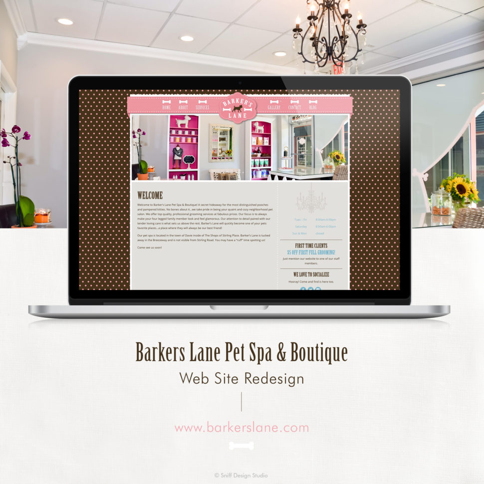
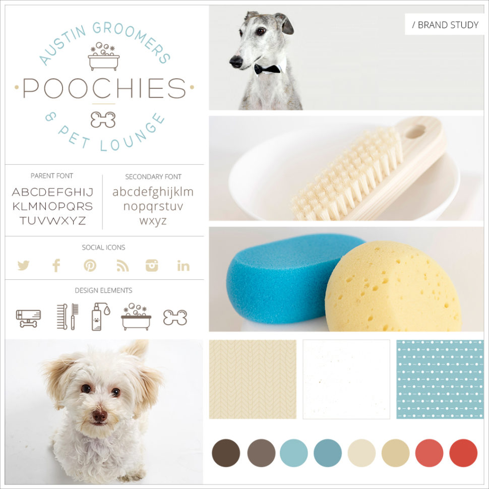
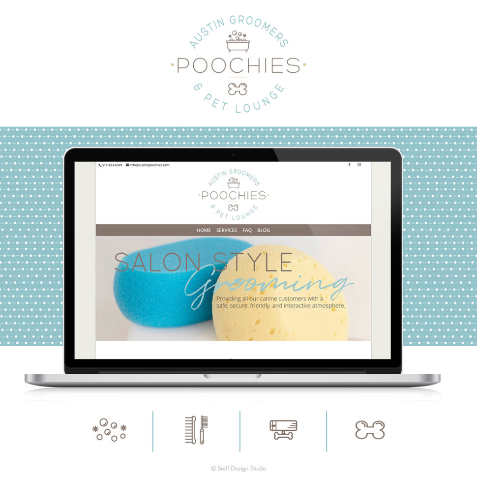
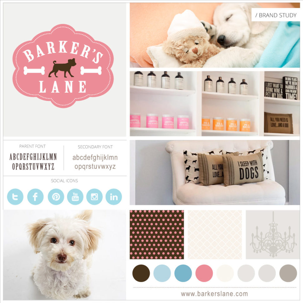
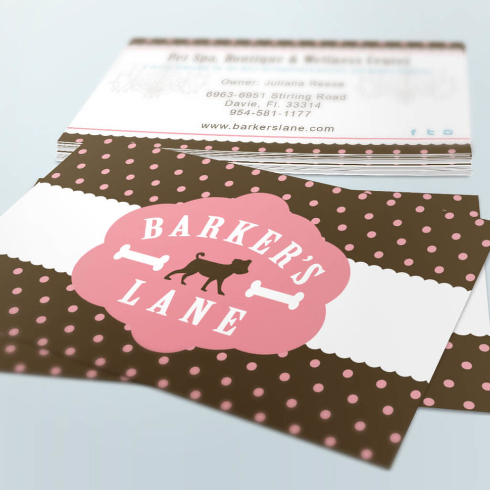
For example, the brand image below was created for a new pet business located in Texas. This business wanted to create a design that read as upscale and soothing while still projecting a modern minimalism. The softened blue palette gives their brand that soothing, trusting feeling and the thin, long fonts give off a dainty, upscale feeling.
Having a custom and cohesive guide for your brand visuals helps you create a memorable and recognizable image for your company. A simple logo alone does not make for a strong brand identity to start. Simply put, your pet businesses brand needs to be a series of thoughtful and professionally designed elements specifically created to help you be:
Distinct – stand out from the pack
Memorable – strong visual impact and therefore, easily recognizable
Cohesive – various print + digital assets that compliment each other while establishing a consistent message
Authentic – tells a story that is uniquely you
Iconic – allows your brand to be timeless while still being able to evolve
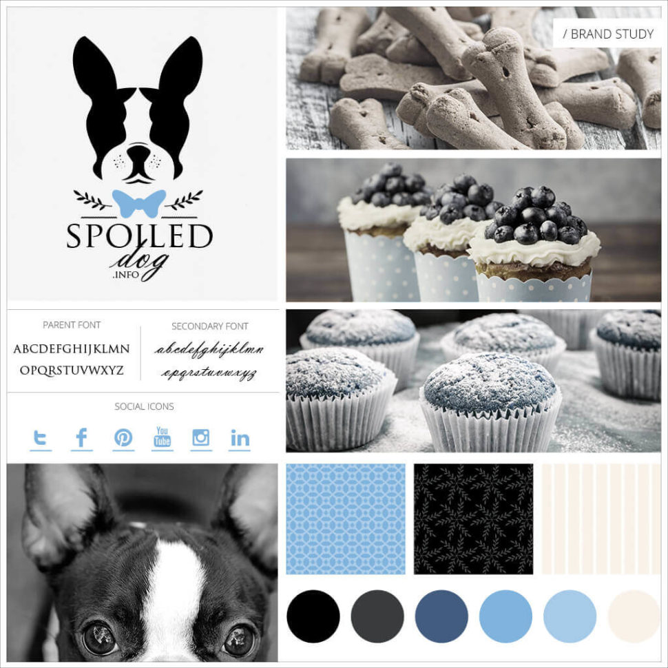
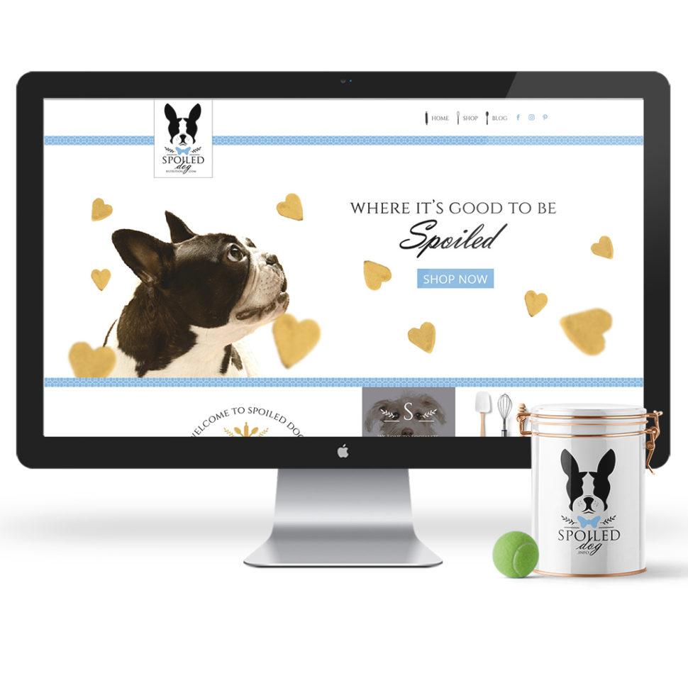
This pet business brand was designed to be distinguished and easily recognizable by utilizing bold and striking shapes to make their logo. To add a personal touch, it also showcases the client’s love of Boston Terriers. A set of patterns was also used to help further this brand’s all natural look and feel; since their treats are truly all-natural. After the launch of their new brand, their online and offline sales have nearly doubled. With a strong brand, your customers will have no problem remembering you for their future needs.
With the pet industry consistently growing and not showing any signs of slowing down, it is more important than ever to set yourself apart from your competition. A strong brand identity leads to increased engagement, conversion, and growth. After all, first impressions matter and you’ll never get a second chance to make that first impression (you WILL be judged on how your brand or lack thereof, is initially perceived). Clients often make assessments on service or product quality based on how polished (or unpolished) a brand looks. So, if your brand image is less than stellar, you could be leaving sales on the table. A professionally-designed brand matters when it comes to everything you do and it adds value. Ultimately, it will give you a major competitive advantage because branding is a visual, tangible, and controllable area that will set you apart from your competition. Make your audience’s experience with your unique and tail wagging-ly exciting.
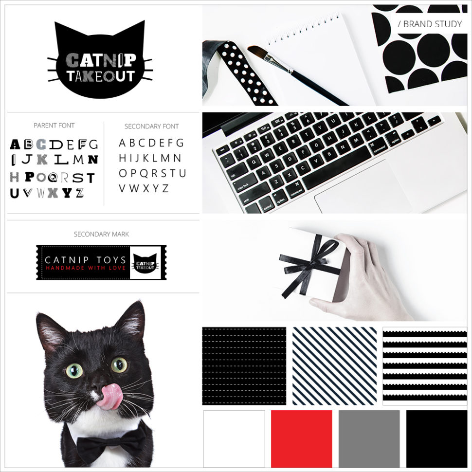
This pet business re-brand for Catnip Takeout is truly unique. Not only is it for a feline pet business, but also was designed and developed to only use two colors. This was then carried throughout the entire company branding. A custom typeface that uses a strong pattern was created to emphasize that this toy maker is known for their use of bold and beautiful patterns for their cat toys.
There is no point in having a great pet product or service if your visual communication fails to connect your audience with your messaging. If your visual identity isn’t consistent and appealing then your audience may not take you seriously. Worse yet, your client or customer may choose your competitors instead of you – just because your competitors looked and felt more professional.
Branding is the key tool for meticulously connecting and presenting all of your communications in a way that provides clarity on your company differentiators and product offerings. Setting the brand standards for your company’s voice and visuals provides focus and guidance—no more aimless wanderings. With brand standards, you’ll be able to create content with intent.
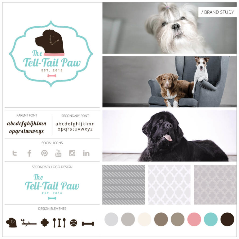
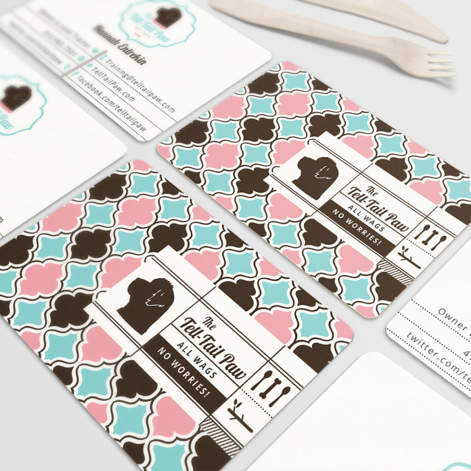
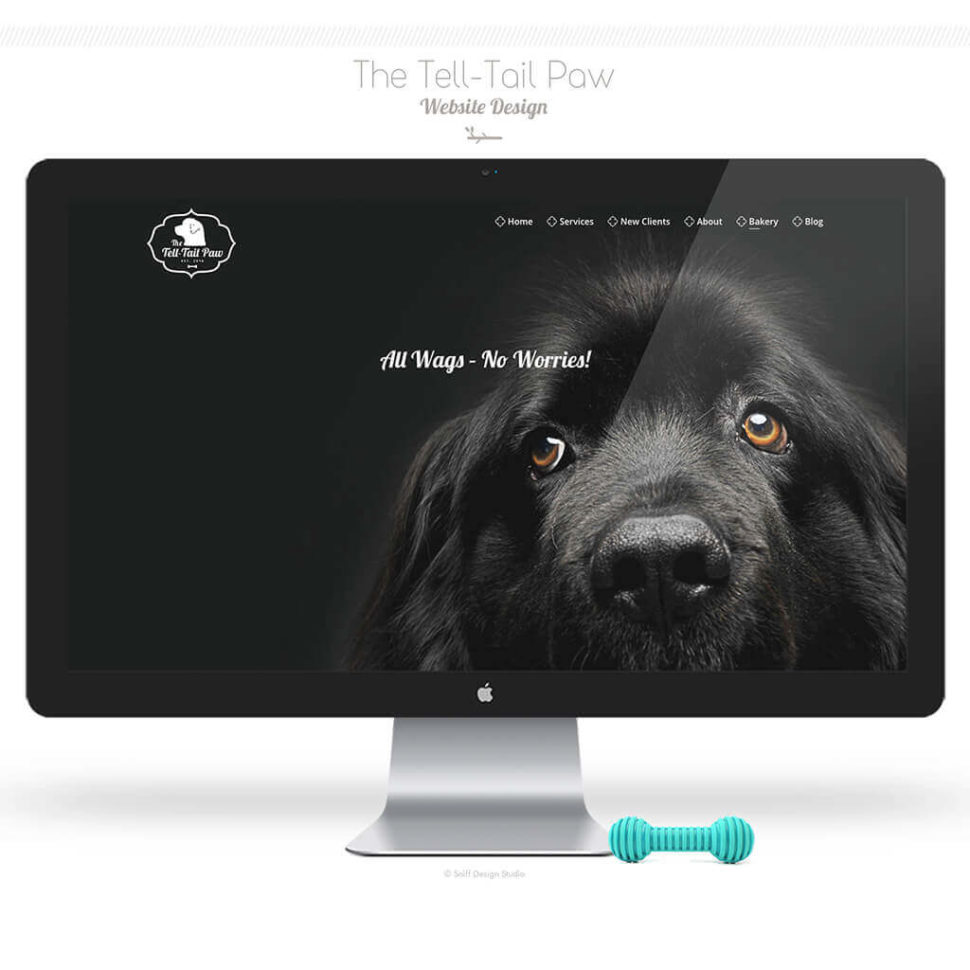
An example of brand clarity and direction is seen here in The Tell-Tail Paw, LLC. This pet business’ brand was created and developed around the client’s formal background in gourmet baking and her love of literary classics. This brand was designed to exude a look of sophistication and class by using a bright, yet elegant color palette combined with a classy and upscaled pattern and iconography to match.
As mentioned previously, creating a consistent, cohesive brand will help to build brand trust and emotional connections with your target audience and since most consumers purchase based on emotion, it’s important to have this established from the beginning.
This company knowing their audience well, had a sweet, bright and sophisticated brand look created that would instantly connect with her upscale clientele. In addition, the brand also included her two moms’ favorite colors: feminine pink and chocolate brown. To top things off, custom illustrations were created to further and solidify her brand. This logo has been around for years and yet still connects with customers today.
When it comes to your pet business we know all your time, skill, effort, and energy is poured into it. Having a professionally-designed brand identity will help solidify your worth and place within this highly-competitive industry. Since great design is the first thing your audience will notice both online and offline, you can not afford to cut corners. Know you’re worth it and be willing to invest so you can show this to the rest of the world.
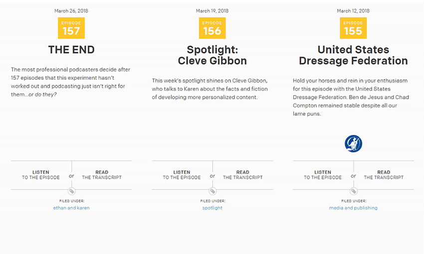
Are you looking to get a glimpse into the world of web design? Podcasts, like an online talk show, are a wonderful way to examine a new perspective from the more experienced. Tips, insights and interviews are what they’re are all about, along with thoughtful discussion.
When you have a lot of downtime, such as when you’re driving or even working, fill the silence with one of these podcasts! You might learn something new, or at least be entertained by the stories and interesting hosts.
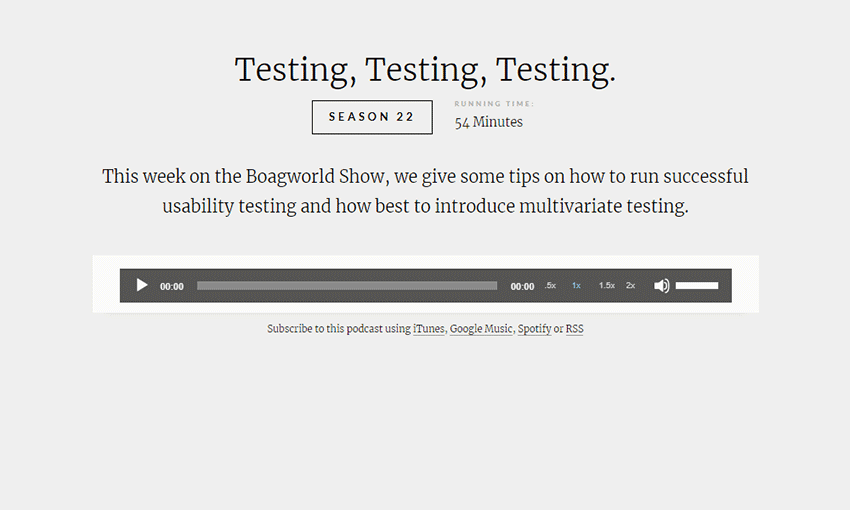
This fun podcast has been in business since 2005. It discusses all sorts of interesting web design topics, and is made with both beginners and veteran designers in mind. You can listen on the website or on a variety of other platforms including Spotify and Google Play.
A 40-minute podcast is perfect for those quick breaks, and you can listen to a designer who’s been in the business for 20+ years talk to all sorts of guests. Learn how to become a successful designer!
This two-person podcast is great for both aspiring and established web designers and developers. ShopTalk is usually an hour long and it’s just packed with helpful tips. On the website you can jump to certain points in the podcast, download the file, or even ask them a question!
Though it’s retired, plenty of valuable episodes remain in this podcast. The Web Ahead focused on bringing in experts in the internet from around the world. While some content may become outdated, this remains a timeless source of advice for those who work online.
Want to keep up with trends in web development? Coding languages, programs and everything open source is what this podcast is all about. Many episodes feature three people, so this is definitely a lively one.
Though not focused on design, this huge archive is a wonderful resource for freelancers of all stripes. Knowing how to run a small business is essential, and there’s hundreds of episodes to listen to here. Pick a topic you like and listen up!
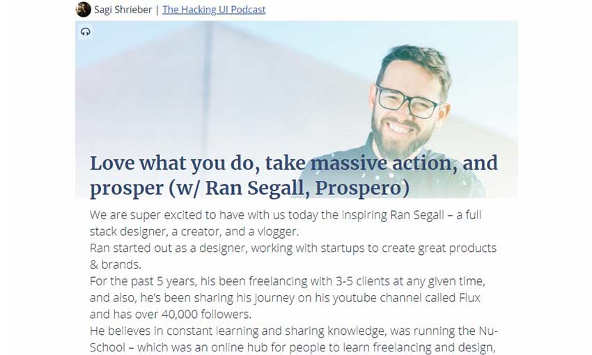
The designer-developer duo is here to talk about those topics, as well as a mish-mash of other info that every freelancer wants to hear. Want to blog, start a business, or keep up with technology? Hacking UI is perfect!
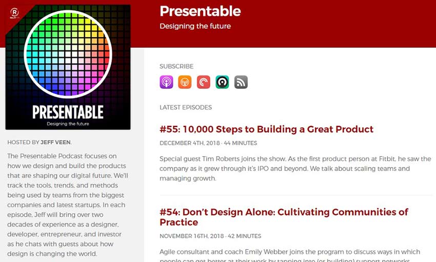
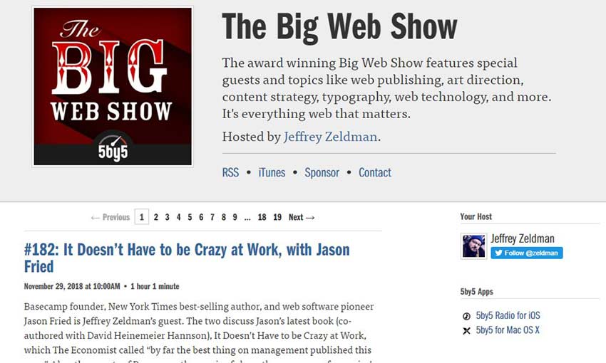
This is a great one for designers in particular, offering advice on art, content and technology. Each episode usually features a skilled guest – often an experienced designer or developer in their field. Most run at just under or over an hour.
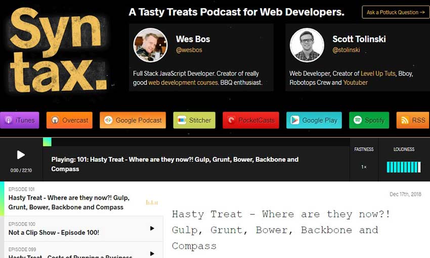
Made for developers, Syntax covers a variety of broad topics including programming languages, design standards and even life tips. There are also shorter “Hasty Treat” episodes for when you’re low on time.
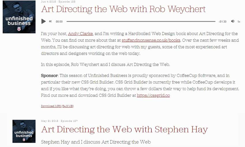
Entertaining and funny, Unfinished Business goes over a variety of topics with a focus on design and the internet. Everything from dealing with unruly clients to mental health issues in the design industry is covered here.
Here’s a podcast with a strong niche: Interviewing people at the head of making the web more responsive. The internet is becoming more dynamic and mobile-friendly, and the hosts of RWD will teach you how to stay ahead.
Another Viewpoint
Everyone has a unique way of learning. Some do best with lots of reading and research, while others can only learn by experience. Many do best simply by listening and absorbing information.
If you’d love to listen to web designers talk about their experiences and offer advice, try out one of these podcasts! They can offer an enlightening extra perspective into the world of design and development.
The end of the year is always a good time to look back at all the things – good and bad – that happened over the last 12 months. But today let’s just focus on the good. Hence, this list of the best WordPress dev tools of 2018!
During this year we’ve been collecting some truly awesome website designs that were full of amazing interactions and innovative effects. Melting distortion effects and custom cursors were big this year. Today we’d like to share this compilation of sites we loved the most in 2018. If you follow the Collective you might recognize some that we chose as Inspirational Website of the Week.
We hope you enjoy this selection and find it inspirational!
Modern brands seek to interact with their audience. Thus, website design must be expressive and lively. Today, you can’t impress your audience with bright images only. People want to get a certain combination of emotions when visiting your website. For example, when users buy garments through social networks like Instagram, they feel like they will look exactly like the model promoting the clothes. Let’s see what web design trends are anticipated to occur in 2019.
Non-standard approach to web design
In the next year, websites will be greatly affected by a chaotic nature and randomness of visual information. For example, non-standard placement of visual blocks can hone the user’s appetites for your brand, goods, or services.
A full-screen video is an informative element
A full-screen video will take a leading position in web design. That’s because this content is informative and useful for readers as there is no need to scroll the entire page down and read a long post. Instead, you may take your time and watch or listen to the information you consider to be useful for you.
Geometric shapes can brush up your website
The use of geometric shapes in web design is not a new thing. This trend appeared in 2016 and it’s presumed, that it will gain the highest popularity in 2019. The websites designed in such a way look friendly, thus, attracting more and more users.
Cinemagraphs will replace gifs
People often confuse cinemagraphs with gifs but in fact, these two effects are quite different. Cinemagraphs are static images containing only a single dynamic element. Marketers generate lots of bright ideas for cinemagraphs. Traditional animation still works well. All these web effects attract more users and motivate people to check out the rest of the content on your website.
Bright colors stay actual
Bright colors will remail actual in 2019. They can make your site look more stylish and rich. Gradients can be also used to make a page more fresh and unique. An interesting innovation is flashing and vibrating colors. If you are at the start line with redesigning your website, think about outsourcing to Ukraine. Contacting overseas developers can save your time and money. Offshore development companies have lower rates for software engineering, web development, and design.
Simple design and unique fonts
Unique fonts are in high demand in the web design industry. Along with a minimalistic design, unusual fonts enhance websites and emphasize the importance of the content. Non-standard fonts will gain their popularity in 2019.
Minimalism and translucent buttons
In today’s busy world, people don’t want to pay too much attention to the long guidelines or blog articles on the web. They will likely read a pair of words about what you do and what useful services you can offer to them. Thus, more and more website owners aim to deliver valuable content. The philosophy of minimalism – less is more – becomes popular.
Photos of people
People become central figures in advertisements produced by brands. That’s because people want to see other people in ads to understand how this or another thing will meet their needs in real life. Realistic ad campaigns stir emotions and associations with style and aesthetics.
Natural and exclusive shapes
We prefer natural lines, shapes, and forms to straight lines. The natural design makes users calm and, at the same time, it encourages them to check out your content.
Surely, you don’t have to follow all the trends in web design, yet, it’s useful to be aware of them. Let’s sum it up!
Notable headlines. They attract users and help highlight the main point.
Minimalism. Interfaces should be simple, clear, and user-friendly.
Empty spaces. Empty spaces help make design clear.
Bright colors have the ability to move people.
Voluminous elements. Volume attracts users attention and makes your website stand out from competitors.
Gradients. A smooth transition of colors makes people calm.
Animation. It helps make users focused on the main point.
You can easily use one of these concepts or mix them carefully to get the most out of the upcoming trends.
This is a guest article by Irina Kravchenko, a content writer from Diceus.
We love showcasing the power of groundbreaking themes. Today, it’s time for Divi WordPress theme examples. I am a fan of Divi WordPress themes and why not? The theme is outstanding and can easily make...
Typography on the web has come a long way. We’ve gone from the days of just a few basic system-based fonts to now having nearly endless possibilities. But all of that choice leads to some challenges for designers.
Performance, for example, can be negatively impacted for every font we load on a page. Even the use of a single font family with multiple styles (bold, italic, etc.) requires multiple calls to the server. This can really start to add up in an industry when every millisecond matters.
Therein lies the great promise of variable fonts. Suddenly, there’s no need to load in half a dozen font files in order to retrieve the styles you want. Instead, everything you need for a font family is included in just a single file. It’s a great boost to efficiency and easy to implement.
Curious about this new addition to our typography toolbox? Here’s what you need to know:
More Flexibility
While potential performance gains may be the most obvious feature of variable fonts, there’s more to love. Another of the key selling-points is that they offer a greater level of flexibility than traditional fonts.
For instance, variable fonts allow designers to leverage CSS transitions. This could be used to create some ultra-smooth animation as a font changes from one style to another. Elements such as links and navigation can be made that much more interesting and unique. While it may sound like a small detail, this provides us with yet another way to improve user experience.
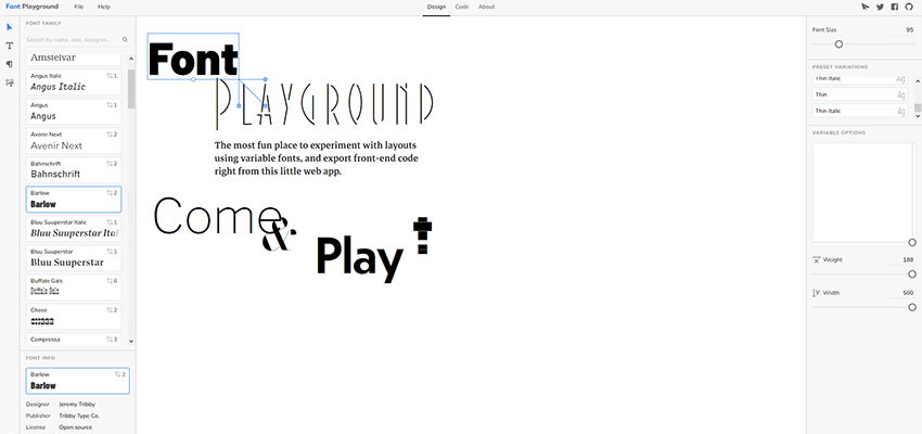
Under that same umbrella, it is also possible to create custom font styles when using a variable font. Because of how these fonts are built, you don’t have to settle for premade styles such as light or extra-bold. Instead, you can opt for virtually anything in-between, or adjust available font axes to tailor the type to your needs.
What’s really amazing is that a tool such as Font Playground makes these adjustments super easy. They offer a visual UI for tweaking things to your heart’s content. You won’t have to be an expert to get the results you want. And, it will even provide you with the necessary CSS code.
The overarching point is that typography becomes less rigid and more open to designer interpretation. Sure, you can use the standard styles if you like. But you also have the option of putting your own personal touch on a project, as well.
Still in Its Infancy
As with just about all new technology, variable fonts have a few asterisks beside their name. However, these limitations are more a product of how early they are in their existence, rather than a fatal flaw.
Limited Selection
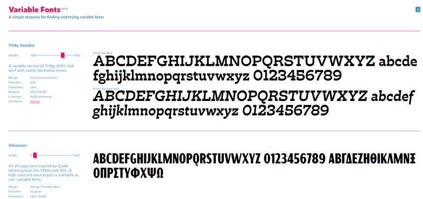
The number of variable fonts seems to be growing daily. Still, the available amount looks tiny compared to traditional fonts.
At this point, Google Fonts isn’t offering any variable fonts in their standard library. Although, the Amstelvar, Cabin and Nunito fonts are available via their Early Access program.
But there are a growing number of alternative resources. Places such as V-Fonts and Font Playground have enough selections to fit most project needs. And, a number of independent developers have begun publishing their own families.
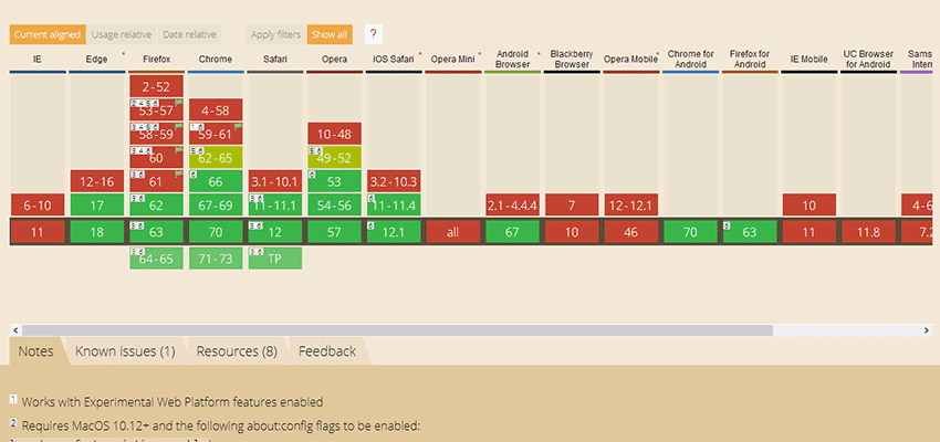
Limited Support
Browser support for variable fonts cover newer versions of most modern browsers. You won’t find support for legacy products such as Internet Explorer or even less-recent versions of Chrome, Edge, Firefox and Safari.
This may or may not be a deal breaker, depending on your intended audience. Of course, the more time that passes, the less worrisome legacy support becomes. And, the selection of available fonts will only continue to grow.
A Boon to Web Typography
Variable fonts look to bring web typography to a higher level. Rather than being forced into using only the available styles, designers will have the power to do more. Add this to simplified font management and increased performance and you have something that can benefit virtually any project.
It’s not hard to imagine a future where variable fonts become the standard. And the more we see variable fonts in action, the more difficult it is to see how more traditional offerings can stay relevant.
Can you hear that? That’s the sweet sound of jingle bells followed by the explosion of fireworks. The combination of these two sounds can only mean one thing: 2019 is right around the corner. That might sound a little scary, but I can assure you that this article contains nothing but good vibes and happy thoughts.
As a designer, you’re probably pretty aware that you should be keeping up with trends, right? I certainly hope so. But, that doesn’t mean that you can’t put a little personal flare on those trends. For the purpose of this article, and because the title already says typography trends for 2019, we’re going to discuss… you guessed it: typography trends for 2019. This list is in no particular order. It will contain new trends and a few classics that you totally need to stick with. Fasten your seatbelts, explorers, we’re diving straight in.
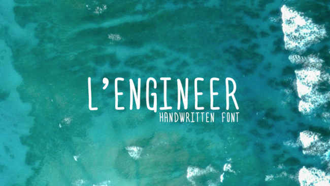
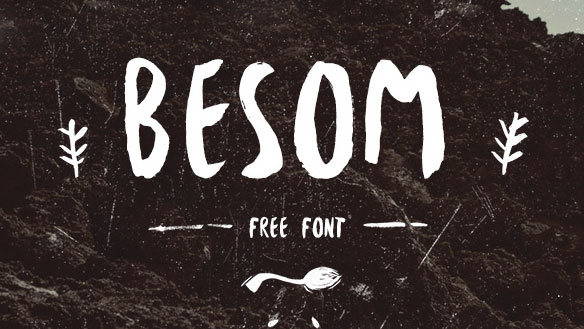
We’re going to start this list off with a style of font that will most likely be a trend for many years to come. Handwritten fonts are great because they allow you to put your own touch on your brand, and they bring with them a sense of detail that other fonts can’t. Granted, a handwritten font may not look so great on the side of a corporate office building, but they certainly are a great way to reach out to your audience on a more personal level.
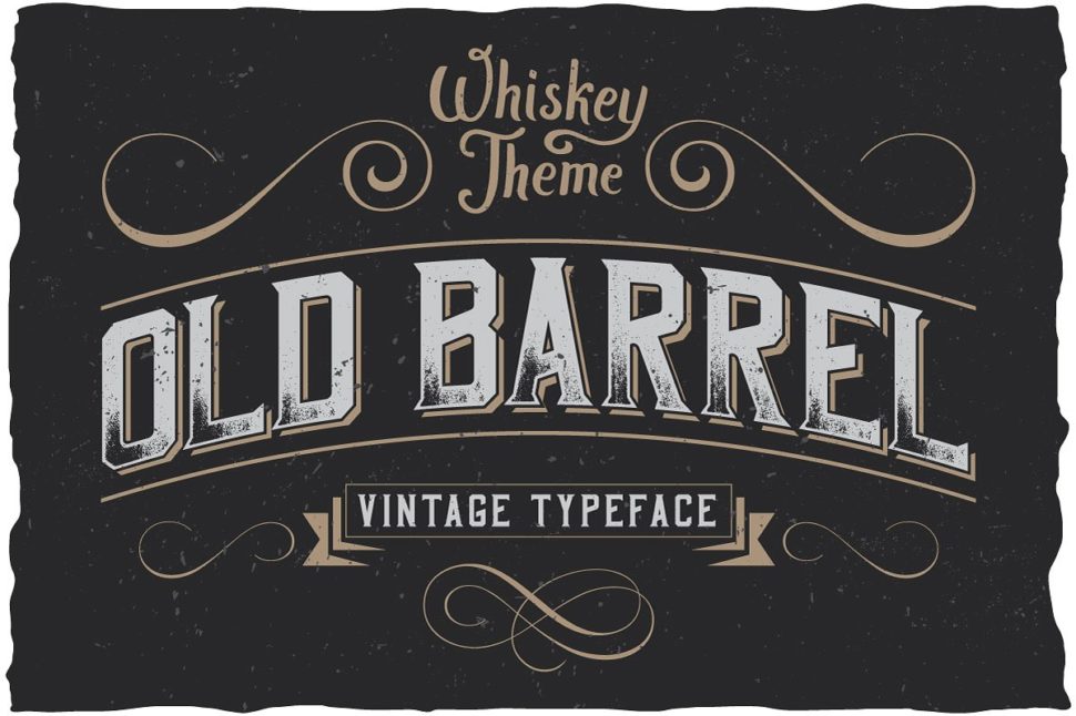
Vintage fonts are also a timeless classic that deserves a spot of any typography trends lists ever. The reason people are so drawn to vintage fonts is very similar to the reason they’re so drawn to handwritten fonts. The difference here is that the audience is most likely already familiar with the font, as it is vintage. Instead of making new connections using a handwritten touch, you renew old connections by going vintage.
Watercolor fonts have risen in popularity almost side-by-side with handwritten fonts because they go so well together. Watercolors have recently existed mainly in the background of a few web pages. But now, people are starting to use them in the spotlight. Watercolor fonts are a great way to portray calm, cool, and collected vibes. They take away from the seriousness of business and add to the homely feel.
Serifs again are nothing new. In fact, they’re probably one of the oldest typography trends we can dig up. They are, however, a trend that’s making a comeback. Serifs can vary depending on how extra you want to be, but they’re another great way to put a little more flare on your work.
Big and small font types… together?
Yes, it’s true. A lot of people are instantly attracted to things that match or at least are the same size. The idea behind using both big and small fonts together isn’t exactly a new thing, but it has made great headway over the years. Because the letters in the font don’t match up, it can grab someone’s attention quicker than a buy-one-get-one sale at Old Navy. plus, it’s a creative way to put emphasis on a particular part of your brand or logo.
In addition to the variation in size, the mix-match of different font types has become a design phenomenon. I mean, why stick to just one font if you’ve found a few that you like? If done correctly, you’ll be able to mix a number of different fonts together and create your own personal masterpiece. Just try not to be too overwhelming.
For too long black and white fonts have haunted our screens! Okay, maybe that’s a little dramatic, but sometimes we just need a little color. Color fonts have been popular on and off for forever, and they’re starting to make a massive comeback. Color fonts allow us to be that much more creative with our projects. They can say as little or as much as you want them to about the letters that they’re highlighting. They’re the perfect way to snag someone’s attention in a crowd full of black and white.
Cutouts and overlays
Everyone wants to add layers to their designs, and it’s for good reason. People don’t want to sit and stare at a flat-looking, boring, underwhelming webpage. They want to be wowed and wanting more. Cutouts and overlays are a great way to give that 3-dimensional effect without having to wear the glasses that hurt your eyes after 30 minutes. They give you yet another layer to be creative with, and thus attracting more attention.
While handwritten fonts and different sized lettering are cool, perfectly straight lines and rounded corners will always be one of the typography trends, too. Don’t get me wrong, though, geometric fonts leave plenty of room to be creative. Geometric fonts have grown exponentially over the past year or two, and I don’t see them slowing down anytime soon.
Customize everything
If you have the extra cash to shell out, customizing your brand is a great way to set your own trends. I’m not talking about just logotypes here, I literally mean customize everything. What better way to give people a new experience than to create one custom for your brand? You’re a designer, challenge yourself!
Bring in the New Year right
Again, these typography trends aren’t in any particular order, but they are all super duper sweet. Trends are made every day. While some of us choose to follow those trends, others create their own path for us to follow in the future. The #1 rule of design is to be yourself and create your best work. Design something that you’re proud of, and show it off to the word.
As a graphic designer, it can be difficult to always have your creativity on demand. Add to this a slew of projects with impossible deadlines, demanding clients, and a life to live and you’ve got a hard pot to fill. Staying inspired with new ideas for graphics is possible. One of the best places to look […]