The terms UI and UX (design) are very often used interchangeably. Even up to a point where many people/designers/clients refer to them as “UI/UX design” – a kind of all-in-one combo.
Selecting complementary fonts is never an easy task for web designers. Sometimes it’s hard to know where to even begin. If you’re having trouble putting together a good body and header font combo for your website, or just want a little nudge in the right direction, here are ten popular combinations that look amazing together.
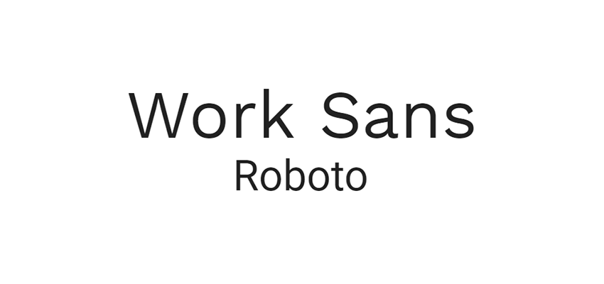
These two fonts get along wonderfully. Work Sans is a font specifically made to be used at large-to-medium sizes. And while its wide letter spacing makes it unsuitable as a body font, it’s perfect for headers. Meanwhile, Roboto was designed to look natural and legible. It’s an extremely popular, practical font, and one that pairs well with Work Sans’ eye-catching but elegant appearance.
Looking for something a little more sophisticated? These two fonts were created in the same project to complement each other. Source Serif Pro will add a dash of style to your headers, while Source Sans Pro, made with user interfaces in mind, offers a streamlined, easy-to-read experience.
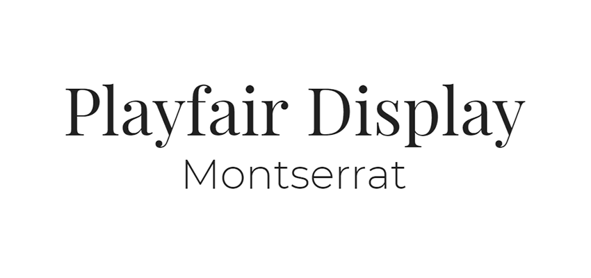
Playfair Display was made with traditional, late 18th century typefaces in mind. As a display font it looks best in your headers, where it will add a sleek, timeless look to your website. And merged with the Montserrat body font, which was inspired by early 20th century signs in Buenos Aires, you’ll achieve a surprisingly synergistic combination.
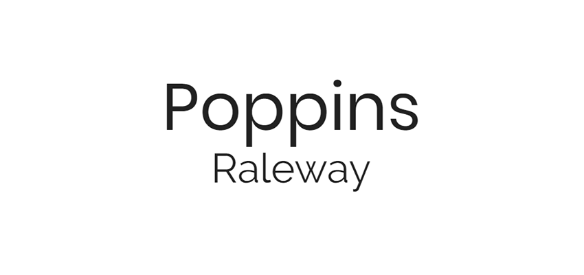
Poppins is a pleasing geometric font based around circles and curves. It works well as both a header and body font because of its versatile, beautiful design. Raleway, meanwhile, is actually designed as a large size font. Despite this, it works very well as a body font with Poppins. Try it out; you’ll be surprised at this unlikely combo!
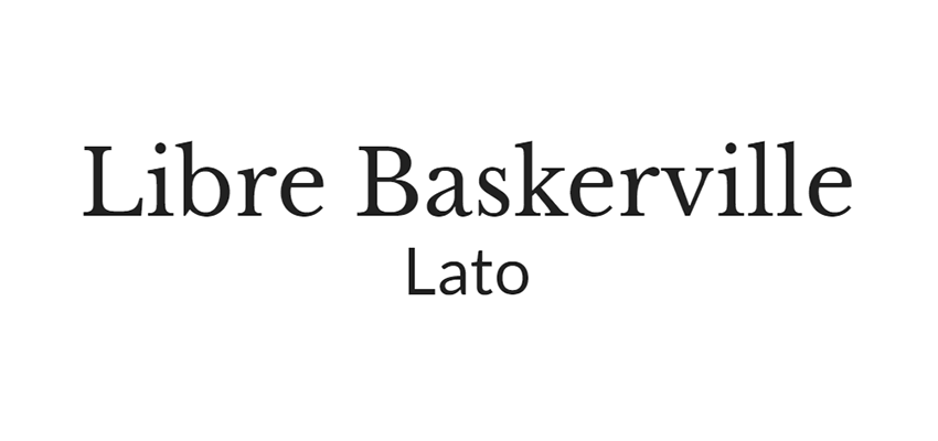
These two fonts work together because they contrast well. Libre Baskerville is a tall, elegant serif font, while Lato is sans serif, modern, and designed to give off a warm, friendly feeling. Both of them will lend a lot of personality to your site.
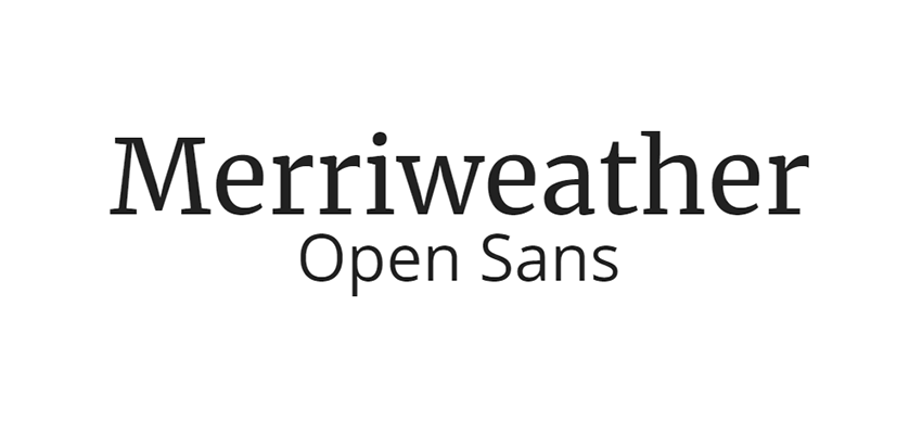
The ever-popular Open Sans pairs fantastically with pleasant, friendly Merriweather. The latter’s wide, bold appearance makes it a great header font, while Open Sans’ simple and neutral design will make reading long passages easy on the eyes.
Monospace fonts are somewhat unpopular due to their illegibility in body text. However, Space Mono can make a great header, especially if you want to give your site a “technology” feel – perfect for a web developer. Combine with the minimalist Muli and you’ll have stand-out set of fonts.
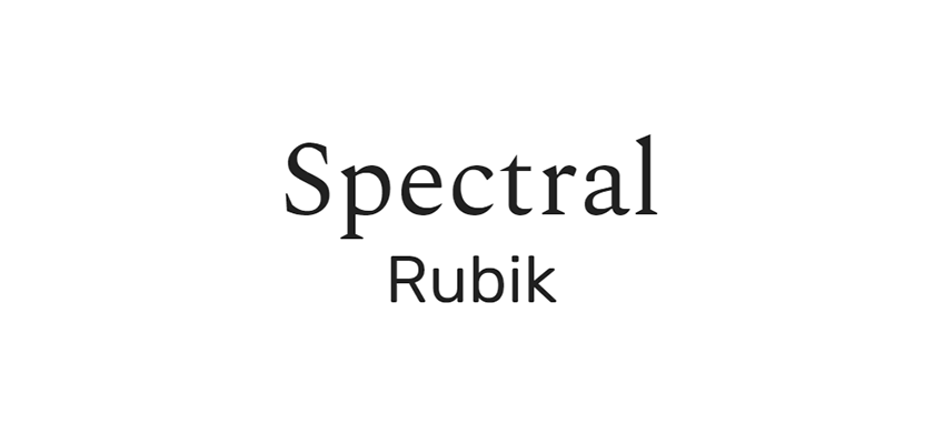
Spectral’s beauty and Rubik’s simple, rounded design come together to make a lovely combo. With Spectral as a display font, visitors will be instantly drawn in by the light, sleek design, and Rubik will keep them there with its smooth look.
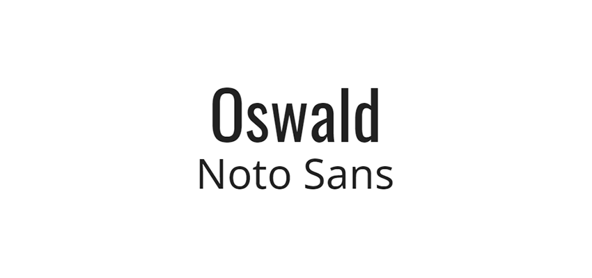
Based off of Alternate Gothic fonts, Oswald is tall, bold, and condensed – perfectly suitable for display text. Noto Sans was made specifically for compatibility. It covers over 30 scripts! If your site uses a non-English alphabet, look into this combo.
This is another font set that works because of contrast. Ubuntu is a versatile sans serif font that looks particularly nice in a large header size, while Lora has a gorgeous calligraphy-like style. Usually such fonts are unsuitable as body text, but Lora is refined enough to be legible while still giving off that distinguished air.
Combining the Best Fonts
Finding fonts that work well together is an art of itself. It’s important that your heading and body fonts are compatible, as choosing the right ones will lead to a more harmonious design. These ten font combos are a great place to start.
And the best part is, with Google Fonts, they’re all free and easy to import into your site. Get started using your favorite combo on your current project right away!
A website is the face of your business on the internet, and a good website can greatly increase brand visibility. Website design is of a great importance while building brand awareness since it can attract...
Website
builders are having a lot more fun these days. This is thanks to the new
technologies they’re able to tap. These technologies enable them to create
websites that are more attractive. They feature better performance and more
functionality and are flat-out easier to build.
It hasn’t always been this way.
Website builders have been on the market for quite a few years. Today, we have visual front-end website builders.
These tools are more powerful and flexible than ever and more user-friendly to
boot.
Web designers now have access to
tools that enable them to use their creativity to the max.
Here are 7 of the best modern
website and page building solutions for your 2019 projects.
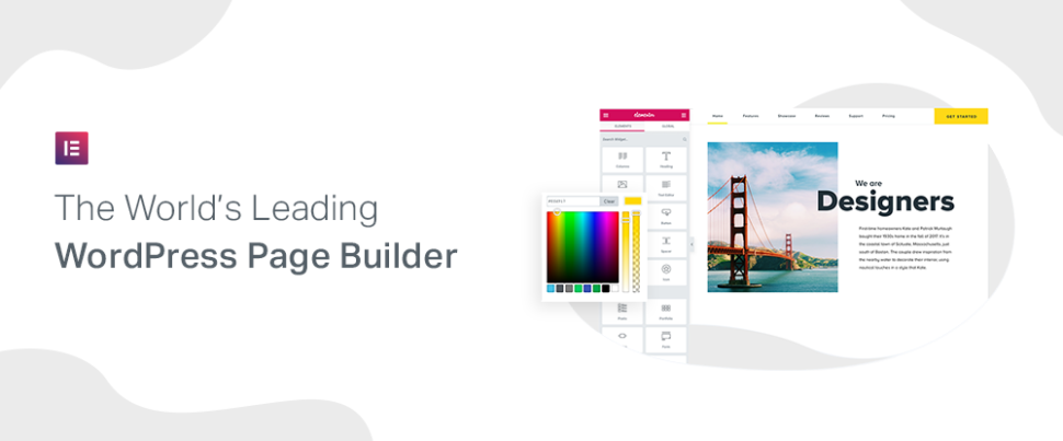
Elementor is the #1 website builder for WordPress. With more than 2 million installs worldwide, Elementor has proven to be extremely popular among web designers in the US, the UK, and Europe.
Why is Elementor so popular? Because it enables you to work in the most efficient way possible. Everything is WYSWYG, and every element is customizable. This means that if you can imagine it, you can create it.
You no longer have to struggle with theme limitations or constraints. Since you can work your magic from the frontend design panel, you can do all your designing without a single line of code. Elementor offers a powerful array of tools to help you build your site such as Theme Builder, WooCommerce Builder, and Pop-up Builder. To make a truly tailor-made look, harness the versatile functionality from the Header & Footer Builder, parallax & animation, dynamic content, sticky headers, to the countdown timer, star ratings & reviews – you name it.
So if you’re looking for a website builder that allows you to design, develop, and market simultaneously, and one you can master quickly, Elementor is for you and it’s an absolute steal.
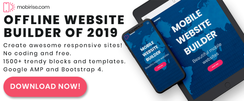
One reason for giving
Mobirise a try is because it’s free; for both personal and commercial use with
no strings attached. That’s all well and good of course, but there are plenty
of other reasons as well; like the fact that this is an offline builder.
Being offline means you won’t be tied down to a specific platform, you
have total control over what you can do with this website builder, and also
with your site, and you can host your site anywhere. Since Mobirise is
Bootstrap 4 or Google AMP-based, your site is guaranteed to feature crazy-fast
page loading and be 100% mobile friendly.
Mobirise is also a drag and drop builder. It’s easy to learn and use, and
you can forget about coding because it won’t be necessary. A host of useful
design aids come with the package, including trendy building blocks and
templates, icons, Google fonts, and a half-million free images.
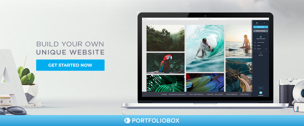
Portfoliobox
is another website builder that offers the advantages of not being theme-based.
You’ll find it flexible and easy to use, it doesn’t require coding, and a
worldwide user base of over 1 million attests to its popularity.
Portfoliobox offers three plans: a
Free Plan, a Pro Plan, and a Student Plan; each designed to enable you to
create a modern and unique website featuring a stunning portfolio in a few
hours.
The Free plan offers hosting of 10
pages, 10 products, and 30 images. With the Pro plan, you get unlimited hosting
of pages, products, and blog posts together with hosting of 1,000 images,
custom CSS/JS, Google Analytics, and a personalized domain.
Those who qualify for a free
Student plan get everything the Pro plan offers except the personalized domain.
All three plans provide the complete set of Portfoliobox design templates.
The
ability to design, build, and launch websites made easy pretty much sums up
Webflow’s capabilities. The responsive web design platform translates your
design decisions into clean, semantic code for you. And it’s not just for
static sites, as you can build a fully custom and client-friendly content
management system (CMS) for every site that needs it.
You can use Webflow to build
ecommerce solutions, create prototypes, and add delightful interactions and
animations, all without coding.
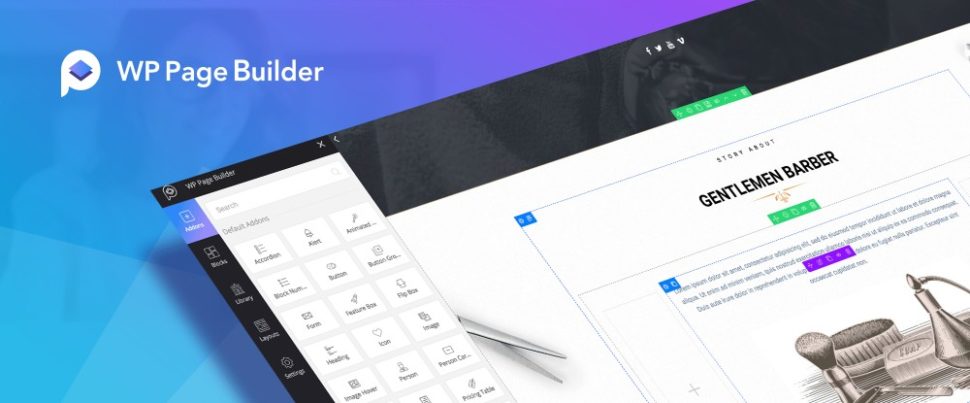
WP
Page Builder is another design, build, and launch website-building tool option.
Everything is drag and drop with this real-time, front-end page builder so
there’s no need for coding, plus it’s compatible with any theme you happen to
be using.
The pages you create with the
flexible and simple-to-use WP Page Builder will always be 100% responsive and
mobile friendly.
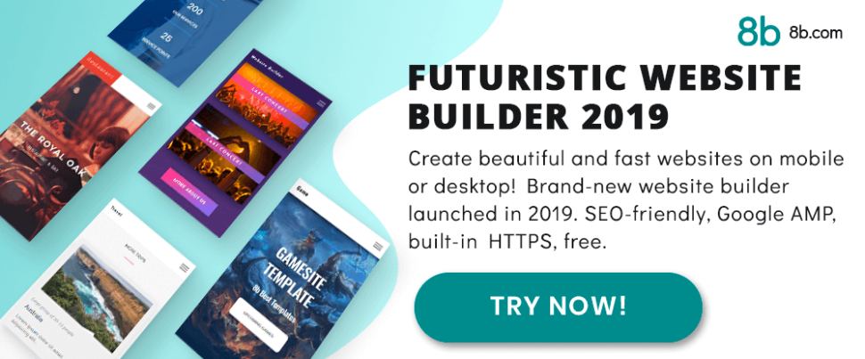
This
brand-new (January 2019 launch) website builder is futuristic in its design,
it’s amazingly simple to work with, and you can use it with equal ease in your
home on your desktop, or when on the go on your mobile device.
Since the 8b website builder is
Google Amp-based, your sites will be crazy-fast and 100% mobile friendly.
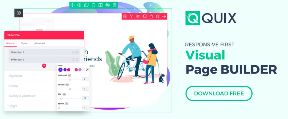
Quix
– the first ever Joomla page builder that provides real-time SEO analysis of
your pages, SVG support and provides image optimization for rapid page loading.
This visual page builder allows you to develop your site at fastest pace and
create pages, forms, headers-footers, and themes.
Other page builders in the market
allow you to do only what a page builder meant to do. But Quix provides far
beyond than that by understanding user needs.
3 Key Tips for Successful Website Designing and Building
1
– Make your site mobile responsive
This was once a suggested option,
but today it is not anymore. There are more than 62% of shoppers making
purchases over their cellphones. Over 90% using smartphones to compare prices
and check out product reviews.
2
– Place your contact information where it’s easy to find, e.g., above the fold
People will want to contact your
business or sales team. Thus, you should put your contact information where
it’s easy to locate. If you’re using social media, putting links at the header
or footer serves the same purpose.
3
– Respect the need for speed
The typical busy shopper has
little patience with a website page that’s slow. 4 in 5 won’t tolerate
slow-loading sites and many of them will simply search for a competitor’s site.
Nearly 9 in 10 will seriously think about looking elsewhere if a site is not
behaving well.
Keep your site running smoothly by
optimizing videos and images for quick downloads. Make sure you’re using a host
that can easily manage your site’s bandwidth demands.
Conclusion
Finding a website builder that
will best fit your needs can be a challenge. Only because the marketplace is
saturated with them. The challenge can be especially great for beginning web
designers. They may not always know what to look for.
The intent of this article is to narrow
the search to a select few. Thereby, make it easy for you to find a
website-building tool that’s efficient, flexible, and a pleasure to use.
When you’re a freelancer, it’s not always easy to stay on task. Without a real boss looming over your shoulder, you might find yourself posting on social media and watching YouTube videos five hours before the deadline hits. Even when you’re doing your dream job, motivation can be hard to find.
Luckily, you don’t have to do it alone. There are a variety of web apps out there designed to smooth out this process and make it easier to work consistently. These browser-based tools could be a godsend, so let’s take a look at the best productivity apps designed for freelancers.
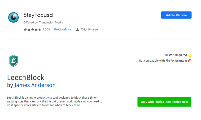
Whether you prefer Chrome (StayFocused) or Firefox (LeechBlock), the premise here is the same: Start blocking those sites notorious for sucking away your time! If you find yourself wasting hours on social media when you’re supposed to be working, it’s time to shut those sites off by force.
Both extensions are highly customizable and allow you to block sites at certain times of day, when you’ve spent a certain amount of time on them, and so on.
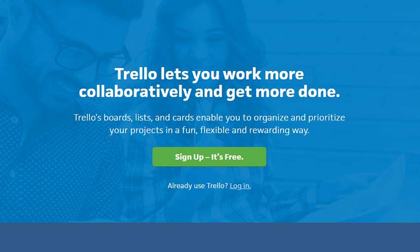
Sometimes you can get the greatest boost to productivity simply by staying organized. Trello allows you to create “boards” for each of your projects, further creating individual cards within them. You can even add checklists, categories and other little tools to each card. It’s designed for teams, but it’s also great for keeping those personal projects organized.
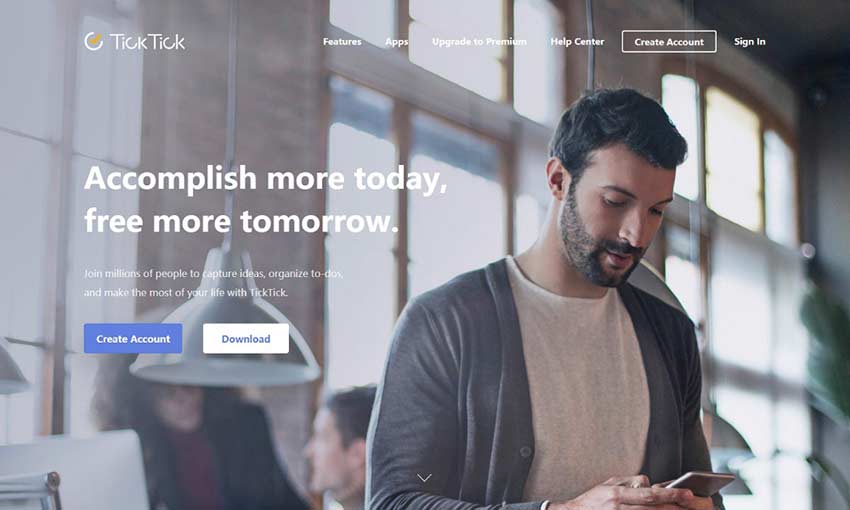
For many, nothing is more satisfying than ticking off boxes on a checklist. The multi-device app comes with all the basics of a checklist app and more. From reminders and scheduling to priorities and tags (and turning emails into tasks). You can even work with your team on a checklist.
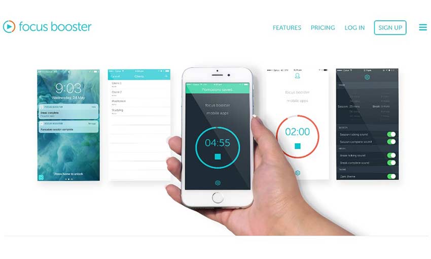
Focus Booster uses the pomodoro technique to keep you focused but fresh, with mini-timers that allow you to work in sessions with frequent breaks in between. If you struggle to stay focused after an extended time, this technique is perfect for you. You can download Focus Booster, use it on the web, or install the mobile app.
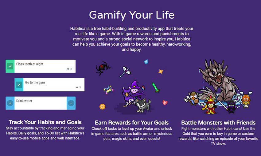
If you love video games, Habitica might be for you. “Gamify your life” by turning your tasks into quests, and get showered with gold and XP when you do something productive. Then use it to customize your avatar. There are no rules – just set up your tasks, set the difficulty and get rewarded.
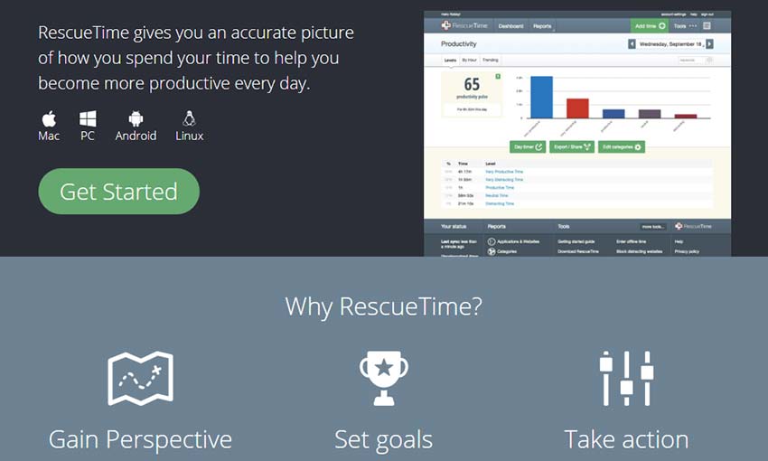
Where have all those hours gone? RescueTime runs in the background, tracking what apps you’re using and the websites you spend your time on, then compiles it into a report. It can be eye-opening to realize how long you spend being unproductive. But once you know, you can take steps to stop wasting so much time on certain websites.
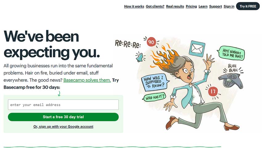
If your whole team is having trouble with focus, Basecamp might be the solution. The app allows you to assign tasks to people, communicate effectively with everyone, and organize all your tools and files in one place. There’s much more to it, but that’s the basics. No more communicating and sharing files through email chains, or wasting time explaining things over and over again.
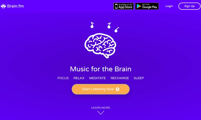
This is an interesting one. Brain.fm uses AI-composed music to help you relax, sleep, or more importantly, focus. It does this by stimulating your brain in ways that their scientists believe can help boost attention. It’s definitely worth a try!
Don’t Fall Behind!
After spending your whole corporate life being told what to do, self-discipline isn’t a skill you’ll pick up right away. Don’t feel bad if you’re struggling, or if you simply need that small extra incentive to focus. These apps were designed to help people like you, so make use of them!
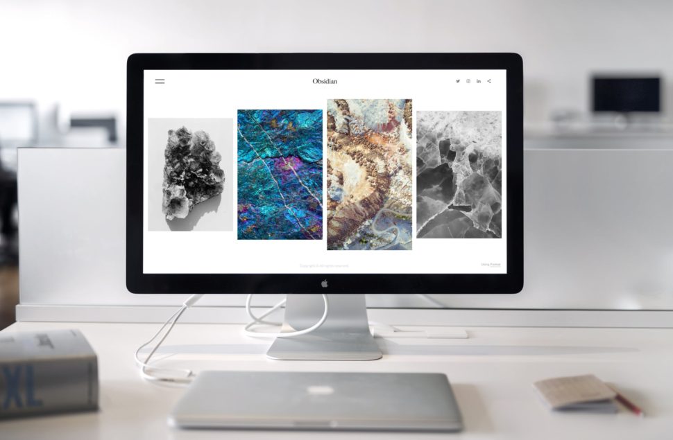
We’re delighted to share our second compilation of monthly web design gems with you. We’re featuring some wonderful and unique website designs to get your creative juices flowing. There is a special emphasis on clear and bold typography and experimental touches, no boring layouts, that’s for sure. Keep an eye on those refined parallax scrolling techniques for images and content.
A logo is an anchor of a branding strategy and web design in general. If you don’t believe us, just try to imagine Apple, Coca Cola, or one of other top 100 companies of the...
As the days are passing, millions of people are focusing on their jobs in terms of earning more money for their future. However, we should admit that not all the jobs are going to be permanent for sure. At this stage, we need to make some important decisions in order to make enough money for […]
One of the many challenges that a website design company needs to solve is selecting the correct color scheme for their design projects. Get the color combo wrong and your website will not attract as much traffic. The visual aspect of a website is one of the strongest components to successful webpage design. And in […]
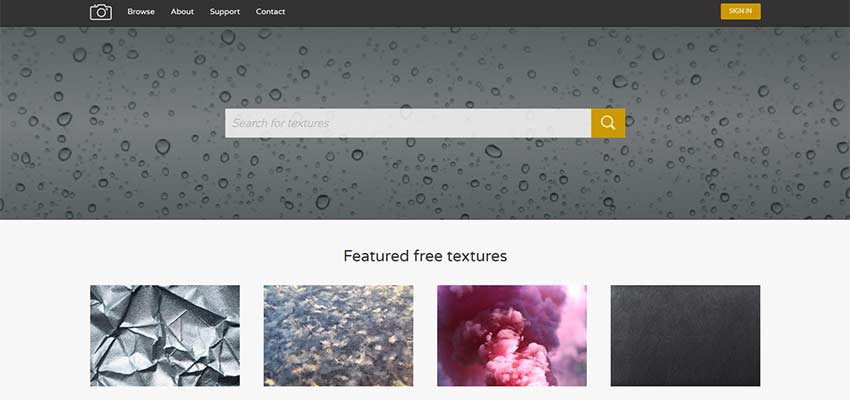
Textures are an all-but-necessary component in web design. They can give a webpage depth, draw the eye to key elements, serve as great backgrounds and just look great when used well! If you’re looking for free textures to enhance your projects, you’ve come to the right place. Here are ten free websites where you can download high-quality textures.
Created by two photographers and artists, this website hosts a ton of textures all licensed under Creative Commons Zero. From nature, to concrete, to abstract – there are all sorts of images to find here. You can also sort by tags, so it’s easy to find what you’re looking for.
There’s a download limit of 5 per day for anonymous users and 50 for registered users.
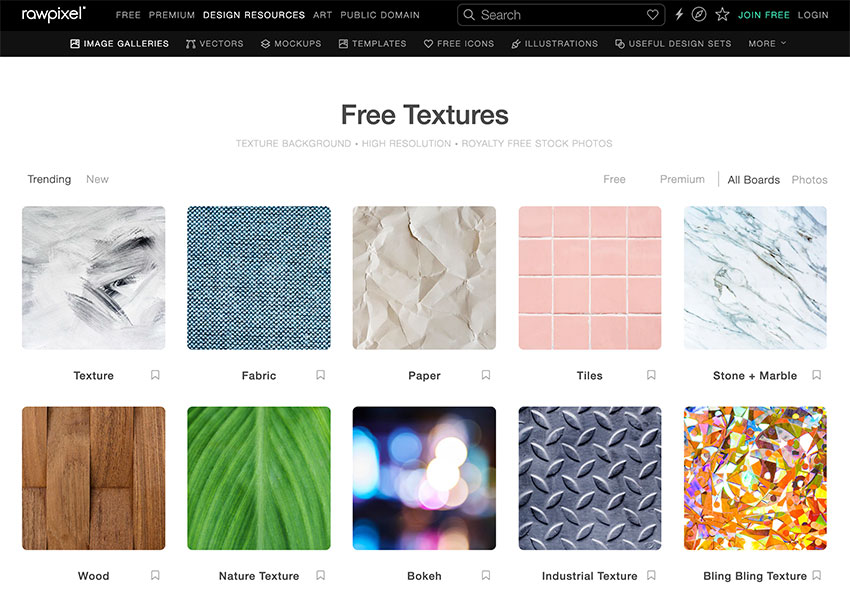
Rawpixel is a royalty-free stock photography resource, which has a textures section that contains tons of gorgeous, high-quality images. Their Free plan includes 100 images per month.
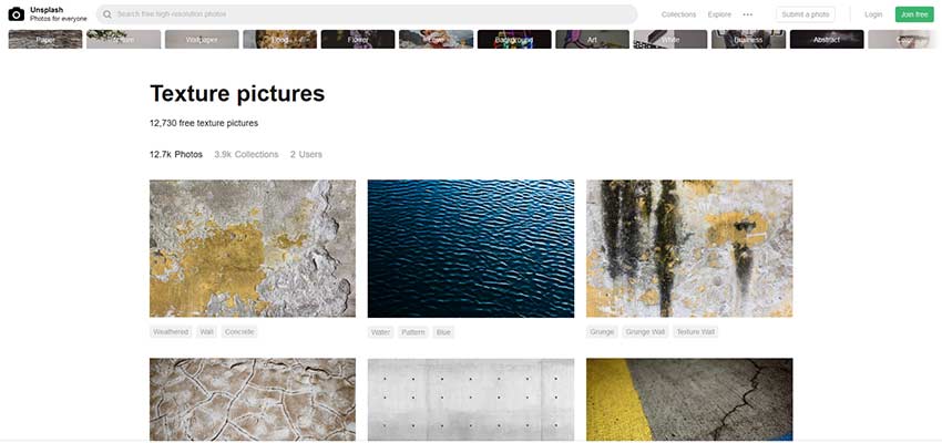
Unsplash is a free photography website supported by a large community of photographers. There are tons of textures and patterns, all available for personal and commercial use under CC0.
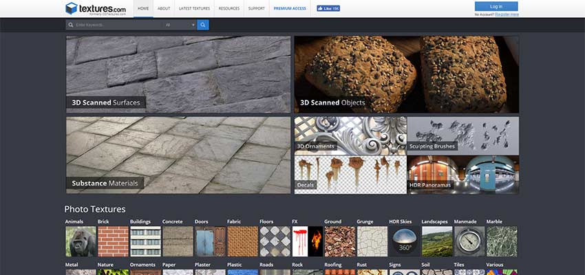
Textures.com is a versatile site that comes with basically every kind of textured graphic you can think of. Need photos? 3D scanned surfaces? Panoramas, decals or brushes? You can find them here. The robust search feature allows you to search for specific textures as well as tags like “seamless” or “scanned”.
You can download up to 15 images a day with an account. From there, you’ll need to purchase credits or a subscription. You’ll also need credits to download larger files.
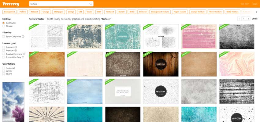
Need textured vectors? Vecteezy is the place to find them. There are tons of beautiful, clean vectors available for download. Some are free while others require credit. You can sort by license, which is really helpful if you only want to see the free images.
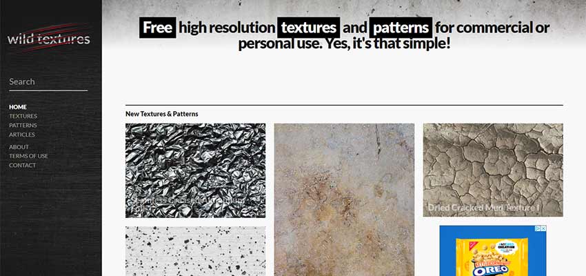
Wild Textures has textures of all kinds, but where the website shines is in its sorting system. You can sort by categories, tags and even by color! This makes it super easy to find the perfect texture. There’s also some auto-generated previews of the pictures used for different functions.
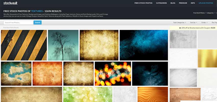
This vault of stock photos and textures contains everything from grungy patterns to the abstract. Simple or complex, you’ll find a high-definition picture that fits your needs here. Users who upload can choose from commercial or non-commercial use, or public domain – so make sure to check the license.
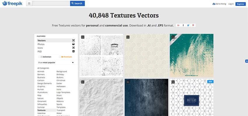
Freepik has a massive library of vector textures that come in .ai and .eps format. Without buying a plan, you’re limited to 5 anonymous and 30 registered downloads a day. There are also a few commercial stipulations.
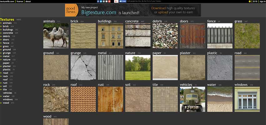
A small-but-robust library, Texturelib is free for personal or commercial use. Most of the images are inspired by nature, but there are also quite a few architecture textures – such as photos of roads, windows and doors.
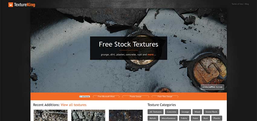
TextureKing has a variety of grungy, nature-like textures, available for use in almost any commercial project. While the site features about 400 images and doesn’t appear to be updated very often, there are a few categories to pick from, and the high-quality textures can be downloaded for free without an account.
Textures in Web Design
When used correctly (and perhaps sparingly), textures are a great design choice. Use them to call attention to important elements, to craft a rough, grungy atmosphere – and to add depth and beauty to a flat design! With so many free resources, you should have all the tools you need to craft deep, gorgeous websites.
There are times when customers want as much content as possible, as many design elements and drop-downs as possible. They saw some cool sites and they wanted a little of everything.
That’s quite understandable, but we’re trying to explain that a site with a lot of content and complicated design is not necessarily easy to use, sometimes even having the opposite effect for users.
That’s why we’ve created a mini guide of 4 Ways To Simplify Your Website Design To Attract Customers:
1) Shorten the content of the website:
Web visitors rarely read line by line, usually, they only scan the web pages and their focus is only on a few words and images. However, there are many web pages that have content that is not needed to send the message. You can clean up a lot of the content of a website by limiting the number of words on the screen. Try refraining text to remove parasite words.
How can you do that? You can practice by expressing a single idea in a single paragraph – it’s a good way to write and helps readers “scan” the text with the look. Another way to write is the “pyramid” format, that is, start from the conclusion and add content along the way. A site that I really like for the simplicity offered is Apple.com.
2) Delete the visual decorations:
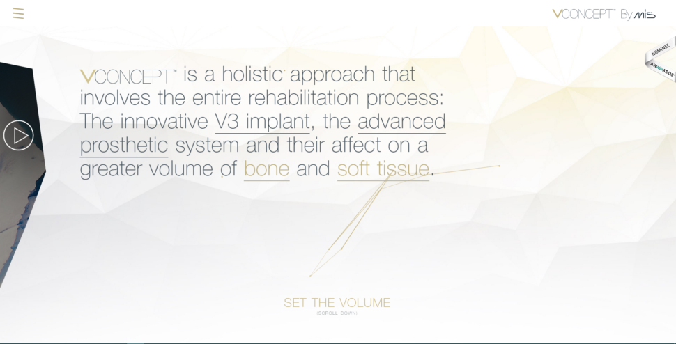
When it comes to visuals, it often happens that we want to add extra elements because it ‘looks good’. Everyone desires a design that looks good and unique. But although intentions are good, the end result may be disastrous. Try to have as little decoration as possible or other items that won’t distract the reader from what is important.
Below I attached a screenshot on the Vconcept.com page. It can be noticed that they do not have a lot of text, but the text is very difficult to understand and they have a problem with the fonts. They use plain text, underlined text, some words have a different color, and the first word that represents the company’s logo is a different font. We can also talk about all triangles flying in the background, a decoration that does not bring any benefit to the site.
3) Reuse design elements:
Try to create repetitive elements and consolidate them. If you use a lot of colors, fonts and style variations, the result will be overwhelming, but in a ba way. I recommend that you re-use the design elements to maintain a consistent design on the page. There are also some basic rules such as: Do not use more than two types of font per page. The same rule applies to colors and design elements. If you have a quote at the end of each page, make sure it looks the same on all pages.
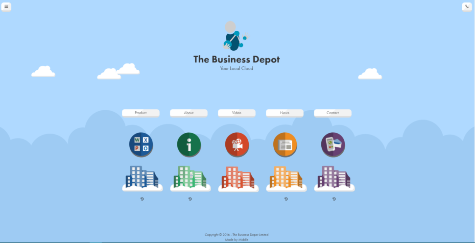
An example would be thebusinessdepot.co.uk. They seem to use a simple theme, but too many colors are used. Also for each page, there is a different color that has no meaning.
4) Have one user as target:
I know it sounds a little crazy for me to tell you this, but it works. I’ve encountered too many companies that are trying to address a wide range of clients, different ages, different backgrounds, different sexes, and so on. Which person do you think your message will reach if you have such a large target? Surely the message will be very diluted and so will be the results. Try to have one user in the head when thinking about the design of a site. Think exactly who you are addressing, what age you have, what educational profile, what gender, what hobbies and concentrate all your energy and resources on this person.
Also, if you have product campaigns on your site, try making them as clear as possible. If your goal is to make a customer purchase a particular online course, delete all the things that might distract him. I also recommend a landing page dedicated to each marketing campaign you have. This way you can send a much clearer message to your customers.
We hope that you found these tips helpful and that you will make your website stand out in the crowd.
When one mentions design people quickly assume that one is talking about graphic design. However, in website design and development, designing is diverse with more than just graphic design. This diversity has been brought by the advancement in technology where new and more specialized design tools are being developed. Comparing the two including the work they […]
When the first version of WordPress was shipped in May 2003, it had groundbreaking design features for the time and defined the first batch of WordPress theme design trends to come. There were highly intelligent line breaks, nice textures, and the ability for bloggers to add links to their blogrolls.
What makes a good website? Depending on what industry you’re in, or your preferences, that answer may be a little different from person to person. There are a few key factors that make up a good website, but depending on the experience the owner is trying to give the audience, it’s never quite the same. With that said, today we’re going to focus on some of the elements that go into a good real estate website design.
As you might expect, a real estate website is a very specific niche. Yes, there are lots of different houses displaying different styles, but the goal of the website is very specific: sell houses. So what exactly goes into real estate website design? Let’s dive a little deeper:
Beautiful images
It is incredibly hard to sell a product online with terrible pictures. If the customer can’t get a good sense of what the house looks like from a computer screen, they may get the wrong impression, and lookover a house completely. High-quality, detailed images are absolutely vital to the overall design of the website.
You should try to provide the best images possible for the listings, yes, but that theme should carry throughout the entire website. Don’t cut any corners.
Let your images do the talking
You know that phrase, “A picture is worth a thousand words”? That phrase rings incredibly true in the real estate business. Working off of our last point, if you have high-quality images of beautiful homes, you can easily implement them into the main theme of the overall sight.
Remember, people are visiting these websites for one thing and one thing only: to look at beautiful houses. What better way to please them than to give them what they want, front and center?
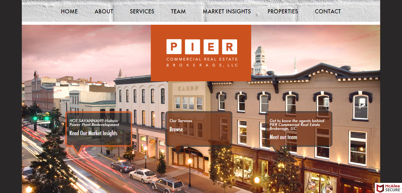
Take a look at Piercommercial.com, for example. It’s a simple, clean design that isn’t overwhelmed by tabs and sidebars. They’ve provided all the necessary information you need as a potential buyer, and topped it off with a nice image.
Include client testimonials
Granted, this is a great idea for any website selling a product or service, but you can understand why. Testimonials are a great way to include custom content that no other website can obtain. Each customer served or home sold produces a unique, one-of-a-kind experience that just simply can’t be duplicated naturally.
Besides that, a real estate website is all about pulling in traffic, and converting them to customers. The absolute best way to do that is to include past experiences that resulted in a happy customer. You can huff and puff all day long about how awesome you are at selling houses, but the average customer will believe another satisfied customer over you 9 times out of 10.
All of that being said, you’ll want to include images that represent the market you’re in. It doesn’t make much sense for a commercial real estate agent to use images of a country cottage. Perhaps the best practice would be to use images of homes or buildings that you’ve sold in the past.
Make it mobile friendly
It kind of goes without saying at this point that any website design should be created with mobile users in mind. In this case, we’re talking about real estate website design, which means that you’ll have clients out and about, going house to house as they find them.They’ll need a quick way to look up some information about the house that they very well could be standing right in front of.
As time goes on, the need for more mobile friendly websites will increase to a point where it will pretty much be unavoidable. So, if your website isn’t already created with mobile users in mind, you have homework to do.
Keep the navigation simple
There’s no need to get fancy with the navigation in your real estate website design. The best practice in this case would be to be straightforward. Again, this is something that a lot of websites struggle with. While it is appropriate to be a little silly or playful on some websites, a real estate page should be simple and professional.
I know, I know, professional can be boring, but it will help you in the end. You have to remember what kind of an audience you’re reeling in. most of the time, you’ll have people that want to get in, find what they’re looking for, and get out. Make it simple and straightforward, and it’ll avoid any potential confusion.
Focus on speed
Real estate websites contain a lot of information. This, of course, can result in very slow loading times, which isn’t a good thing. In fact, if your website loads slowly, not only will potential, high-paying clients leave, Google will, too. With that said, you should take every chance you get to improve loading speeds.
There are a few ways to help your site load faster, but perhaps the best and most widely used method is condensing image files. For a website with loads of images, it’s pretty important that all of their file sizes are as small as they can be without compromising the quality of the image itself. There are lots of free softwares that will help you do this online.
Create area profiles
Most people, when searching for their new home, know exactly the area they want to live in. if you create an area profile, it will help you in two ways:
First, it will really speed up the search process that everyone goes through when looking for a home. They don’t want to look at every house available in the state, or even city. They want to look neighborhood by neighborhood.
Second, it really helps with SEO search results. When someone is looking for a house in a specific neighborhood, they type ,”Homes for sale” and then the name of the neighborhood. If you’ve created a profile dedicated to such neighborhood, you’ll rank for it. It’s a win-win.
The conclusion
Real estate website design isn’t any sort of new industry or practice. It’s been around for quite a while, actually, but it does change. Although there are plenty of experimental methods out there (as there are for just about everything), there are methods that remain true to success. If you’re struggling with your real estate website design, or maybe just looking for ways to improve on it, give these tips a shot.
Within the world of the internet, there are many great things. You can order food, shop in your underwear, and connect with people from all over the world right from your living room. Unfortunately, with these amazing things comes some pretty terrible things, too. Today, we’re going to be focusing on some of the worst design fails ever, and how you can avoid them.
Some of these fails are generic, and will have specific examples. Regardless of which category each one falls into, the point of this list is to avoid each and every one of the following fails completely. After all, that’s why they call it a fail.
Overdesign
Over designed websites are the worst thing to happen to any website. Fortunately, these websites are being weeded out slowly, but they definitely still exist, and they’re still pretty terrible.
The reasons to avoid such a terrible decision are pretty obvious. For one, too much on one page can greatly slow down your loading speeds, and it sends the reader away almost immediately. Secondly, it confuses everyone. Looking at the image above, if you manage not to get a headache and pass out, you’ll have a hard time finding what you’re looking for.
Granted, web design isn’t always easy. After all, if it were easy, we wouldn’t have a need for web designers at all. The moral of this story is to make it simple, make it clean, and for the love of God, make it easy to navigate.
Auto-playing audio and video
We’ve all been there. It’s late, you’re tired, you’re just ready to go to bed, and out of nowhere, amongst your dozens of tabs you have opened, a video starts playing. Now, you get to play the always fun and engaging game of “guess the tab” and try your best to shut down the video. It feels like you’re trying to defuse a bomb. Only in this case, you don’t know where the bomb is and you feel like crying.
If ever you find yourself wondering if an auto-playing video or audio file anywhere within your web design, stop yourself. Unless you want to slow your loading times down, and make literally everyone on the internet upset, avoid this design fail.
Websites that aren’t mobile friendly
We live in a time where everyone uses their phone for just about everything. Even if they aren’t dependant on their phones, they use them at least a few times a day. The way the web is evolving means that more and more people will be using their phones for tasks that used to be impossible using mobile web browsers. It should be a crime to not at least think about mobile users when designing a website.
Each year, the amount of mobile users goes up by a healthy amount. In fact, as of the start of 2019, over 63% of internet users are on mobile devices. Pretty soon, mobile users might make up most, if not all of your visitors. With that in mind, it’s absolutely worth spending some time to avoid this design fail, and making your website mobile friendly.
Sidebars
As helpful as sidebars used to be, and arguably still are, they’re just not good looking. Most of the time, the sidebar takes up a good portion of your main interface, and it gets quite distracting. Call it a trend if you want, but major websites like Amazon and Ebay have ditched the sidebar for a more streamlined look.
The idea is to have your visitors interact with your website. As easy as it would be to just throw up a sidebar and have all the navigation options users might need right in front of them, it takes away from the experience.
Passive-aggressive CTAs
Listen, I love conversions as much as the next guy, but being passive-aggressive about a CTA is a very quick way to turn a potential customer away completely. It might seem like a good idea, but using a CTA like, “No thanks, I don’t want to grow my traffic” actually comes off as desperate on your part, not the potential customer.
I think the overall theme of this article, aside from design fails, is to stop and think before you act. Think about how you would react in your visitors’ shoes. If you can honestly say that you wouldn’t like it, then odds are that your visitors won’t, either. A passive-aggressive CTA is a great example of this analogy, but being passive-aggressive in general works here, too. Stop, and try a different approach.
Trying to keep up with all the trends
Trends are important in any type of design. In fact, keeping up with trends should be the main objective of any designer, whether it’s web, interior, clothing, or anything else. So why, you may ask, is it such a bad thing to keep up with many trends at once? The short answer is that it takes the focus off of the content of the website.
Yes, using a color gradient is cool, and encouraged. Maybe even a few custom doodles to bring your website to life and give it a unique look. What’s not encouraged is pumping your website full of so many trends that it looks like the front cover of The Cosmopolitan. You’ll end up misdirecting your visitors. Keep it simple, and focus on the content. If the content of your website is quality, then the rest of your site will follow suit with little to no effort from you.
The conclusion
When you really take a look, design fails are everywhere, and they always will be. To be fair, there is a place for design fails on the internet. They give us opportunities to learn, and in a way, they make good design stand out more.
Of course, this is just a small list of design fails to avoid. There are many more out there that you should try your best to avoid. And, as important as it is to stay up-to-date with web design trends, perhaps the worst mistake any of us could make is using too many. Web design is all about balance. You find that balance, and you, my friend, have found the keys to success.
Over the last couple of weeks we’ve been collecting some great website designs for your inspiration. Watch out for those toned-down colors and delicate interactions. Designers certainly don’t shun experimental details, they give a unique touch. Enjoy!
What is a landing page? Knowing this can help you generate leads and retain more customers when you design a website. Simply put, a landing page is where someone “lands” after clicking on a search result, call to action, or advertisement. These pages have one core focus: converting people into customers. Any page on your site can be a landing page for certain search terms.
These awesome landing pages are a great source of inspiration when you’re trying to improve your own. Take a look and see why they work so well!
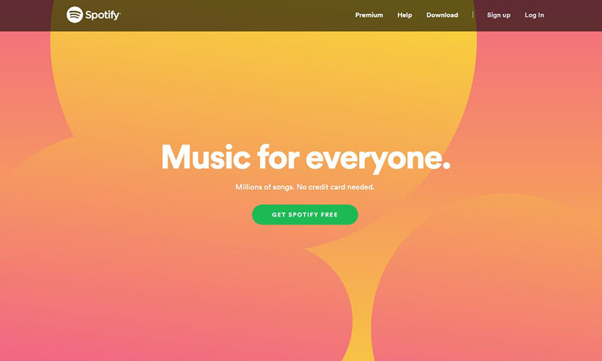
If you’re going to make your homepage your landing page, take a tip from Spotify. While navigational elements exist, they’re overshadowed by the huge background banner and noticeable button asking you to register. The pitch may be only three sentences long, but it says all it needs to.
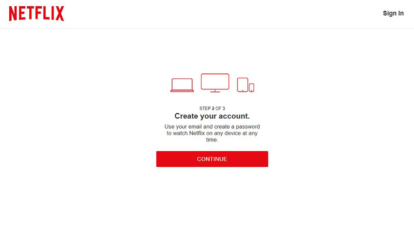
Netflix opens with an absolutely huge call to action button that’s just begging to be clicked on. When you do, you’re taken to a clean page, free of distractions but for a simple footer. Walking through the sign-up process doesn’t take long, and it even saves your progress if you leave the page.
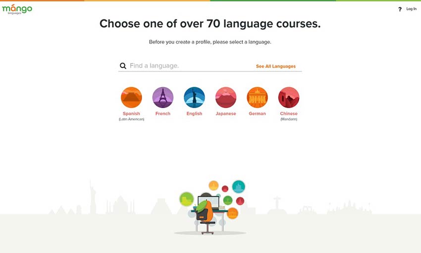
Mango Languages does a great job on its landing pages. The sign-up link is very prominent and posted multiple times on the homepage. Clicking it leads you to a page free of distracting navigation. Just choose your language and sign up!
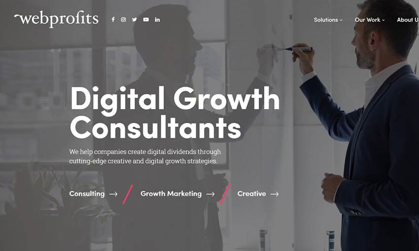
Sometimes it’s impossible to condense your landing page down to a single action for users to take. The best thing you can do is make the distinction clear, and that’s what Web Profits does. The homepage is very simple with just three distinct links. Click one, and you’ll be directed to a landing page more suited to what you’re looking for. The page may be long, but the inclusion of at least four identical CTAs makes sure there’s always a button in sight when you’re ready to get started.
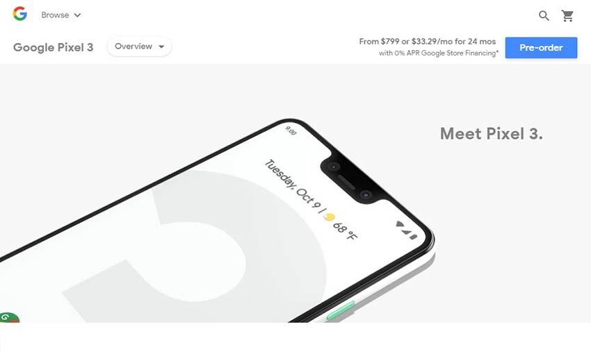
Google’s full-screen, animated page already does a great job putting the focus on the products. Click one of the calls to action and you’ll be presented with a page that gets right to the point. Pricing and order buttons are always visible in the header as you scroll through videos and feature lists. And, advertisements for other products are kept at the bottom of the page.
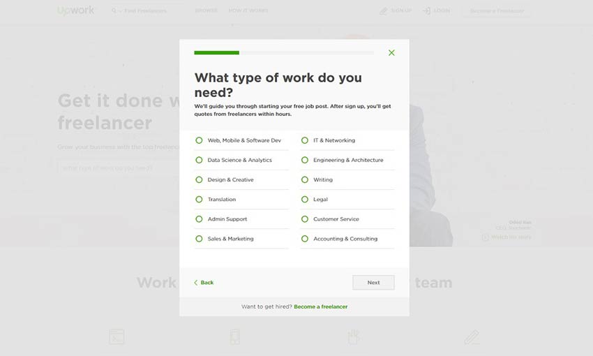
When you’re creating a landing page, it’s extremely important that you waste no time. Upwork’s sign-up dialogue exemplifies this quality. An eye-grabbing header and title draw your eye towards the Get Started button, which immediately begins walking you through creating a job post and the sign-up process. You may only have a few seconds to grab a visitor’s attention, so make sure you waste no time. This is also a fantastic example of above-the-fold content, with the site features all being below it and the important CTA above.
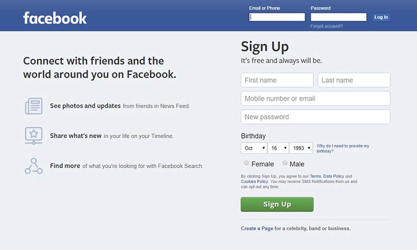
If you visit Facebook without an account, they keep their pitch simple. With three concise bullet points explaining what the site is and an obvious sign-up form right on the page, it’s easy for anyone to get started. They also keep the form short and leave the in-depth questions for later, which is a good practice.
Design Great Landing Pages
The best landing pages are concise, have few distractions, and get the visitor to take the action you want them to take. Remember that when you’re designing your next landing page for your email campaign or advertising banner! Make your argument short, compelling and tailored to the audience likely to click on the landing page. Accomplish that and you’ll be converting in no time.
Illustrations can beautifully and uniquely capture reality. If your website has a nature/outdoors theme, photography might not quite cut it for really nailing that stylized, personal touch. Need some ideas? These awesome examples will give you all the inspiration you need!
Your Web Designer Toolbox Unlimited Downloads: 500,000+ Web Templates, Icon Sets, Themes & Design Assets
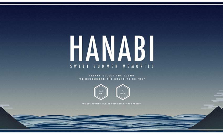
The simplistic style of this background is reminiscent of a watercolor painting. Upload a photo, and see it turn into a colorful spray of fireworks! It’s a unique idea with beautiful execution.
Firewatch instantly hits you with gorgeous art of a mountain landscape at sunset. Scroll down and you’ll get even more of a treat as the parallax reveals a new depth to the background. If you want to design your front page around illustration, take note!
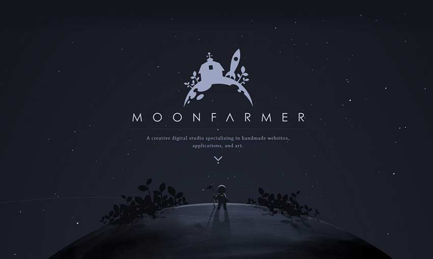
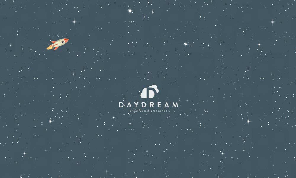
A parallax planet set against stunning animated starscapes. This one-page website obviously had a lot of work and inspiration poured into it. Even with some simple panning and rotating, you can create something really beautiful.
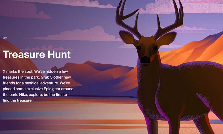
This whole page is packed with stunning illustrations of camping and natural scenery. The parallax at the top of the page is used to good effect, and as you scroll down, you’ll see even more pretty images. Take note of how the site’s color theme meshes well with the large illustrations.
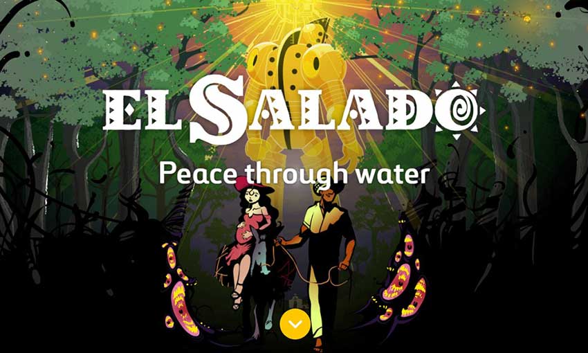
This website uses both photography and art to tell you about the story of a village in conflict. The graphic novel, though illustrated, speaks about a very real event in history. You’ll find both a cartoonish depiction of conflict as a monster and photos of the actual village that inspired the story here.
This site is filled with all kinds of art, but natural pieces appear to be a specialty. Scroll down to encounter a beautiful parallax piece of a mountain trail that serves as your send-off with social media links. Explore to find even more awesome nature illustrations!
This website is a real experience, top to bottom. As you scroll down, you’ll descend the falls, seeing the illustration continue between information about the company until you reach the bottom of the image. A very unique and clever one-page design.
You don’t need to create the next “Starry Night” on your website. A simple, minimalistic header more than gets the point across. The bright colors and stylized designs look great, and all the fun little animations are a joy to look at.
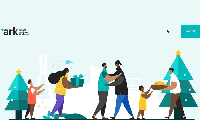
This site is just really well put together. With a starry opening, a sky full of clouds that follows you as you navigate the site, and some great art, you won’t find a page more well-crafted. There are so many subtle animations, like the transition from night to day and the mouse animations in the background. You can even step inside the building!
The premise is simple: An endangered species for every day, presented in a beautiful illustration. Scroll down and you can see the animals from the last few days. Plants, animals, and insects are all featured, along with a little blurb about the species.
This colorful site is super fun to navigate. The homepage is filled with delightful background images, but no matter where you go, the illustrated header and footer banners follow you.
Here’s a cool effect! When you open the site, you’ll see an elegant header filled with flowers and leaves. Scroll down and they’ll move out of your way, but remain as an overlay as you read on.
Capturing Nature Through Illustration
Drawings of the natural world can look especially beautiful, as you’ve seen in these gorgeous examples. Illustrated headers, icons, and logos with a nature theme can completely transform your website and overhaul your branding.
If you loved these examples, definitely consider giving illustrations a try in your next project!


