45+ Web Design Industry Statistics and Latest Trends for 2022

Are you searching for the latest web design statistics and trends?

With over 1 billion websites on the internet, it’s important that your site is well designed and provides a great user experience for your visitors.

In this article, we’ll share the most up-to-date web design industry statistics. With these insights and trends, you can design a website that drives results for your business.

Web Design Industry Statistics and Trends

Big List of Web Design Industry Statistics and Trends

We’ve divided this list of web design statistics into specific categories to make it easier to navigate. You can jump to the section you’re most interested in using the links below.

General Web Design Statistics

General Web Design Statistics and Trends
  • Currently, there are around 1.14 billion websites in the world. 17% of these websites are active, and 83% are inactive.
  • WordPress is used by 43.2% of all websites on the internet. Behind WordPress, Shopify, Joomla, Squarespace, and Wix are the other top website builders.
  • 50% of consumers believe that website design is crucial to a business’s overall brand.
  • It takes about 50 milliseconds (0.05 seconds) for users to form an opinion about whether they like your website or not.  
  • 75% of people form their opinion of a website based on its design.
  • Given 15 minutes to consume content, 2/3rds of people would rather read something beautifully designed than something plain, according to Adobe. 
  • 38.5% of web designers believe that outdated design is a top reason why visitors leave a website.

The importance of web design is clear from these statistics. How your website looks can have a huge impact on your online presence and how people view your business.

Since 75% of people form their opinion of a website based on its design and it only takes them 0.05 seconds to decide whether they like it or not, it’s important your site makes a good first impression.

Luckily, with WordPress, it’s easy to create a beautiful website, even if you don’t have any design experience.

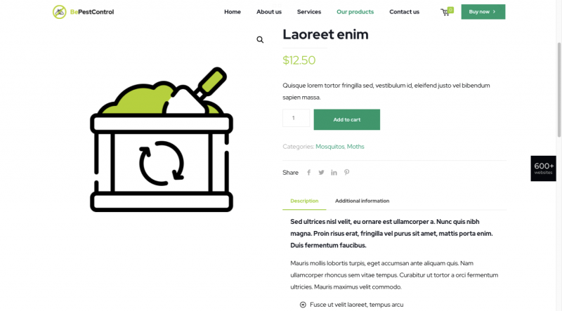
With WordPress.org, the most popular website builder platform, you get access to thousands of free and premium WordPress themes. Themes instantly customize the appearance of your site including the layout, color, typography, and other design elements.

Plus, you can also use drag and drop page builders to easily create custom designs, or even design a custom theme from scratch.

It makes sense why WordPress is used by 43.2% of all websites on the internet.

To get started with WordPress, see our detailed guide on how to make a WordPress site.

Mobile & Responsive Web Design Statistics

Responsive Web Design Statistics
  • People on mobile devices account for about half of the web traffic worldwide. In the second quarter of 2022, mobile devices (excluding tablets) generated 58.99% of global website traffic. 
  • 61% of internet users have a higher opinion of companies with mobile-friendly website design.
  • 73.1% of web designers believe that a non-responsive design is a top reason why visitors leave a website.
  • 57% of internet users say they won’t recommend a business with a poorly designed website on mobile. 
  • Decreasing mobile site load times by just one-tenth of a second resulted in major increases in conversion rates.
  • 32% of small businesses already have a mobile app, and 42% plan to build one in the future. On the other hand, 26% of small businesses are unlikely to ever release one.
  • 50% of smartphone users are more likely to use a company or brand’s mobile site when browsing or shopping on a smartphone because they don’t want to download an app.
  • Google introduced worldwide mobile-first indexing in 2018. This means that Google primarily uses the mobile version of content when ranking your webpages in search engine results.

Considering that mobile devices account for about half of the web traffic worldwide, it’s essential that your website design is optimized for mobile users.

To easily design a responsive website, you can use a WordPress theme to ensure that it looks equally great on mobile phones, tablets, and desktops. Check out our recommendations for the best responsive WordPress themes.

Aside from how your mobile website looks, you also need to consider how fast it loads. Increasing mobile site loading speed by just 1/10th of a second results in higher conversion rates.

See our guide on how to speed up WordPress performance to enhance the user experience, boost conversions, and improve SEO.

On-Page Web Design Statistics

On-Page Web Design Statistics
  • Photos/images (40%), color (39%), and videos (21%) were the top visual elements consumers appreciate in website design. 
  • When visiting a website for the first time, 22% of visitors look for eye-catching colors. But, 21% will leave a site because of outlandish colors. 
  • 46% of people say that their favorite color to see on a website is blue, while only 23% say their favorite color for website design is yellow.
  • While it’s an important part of web design, only 8% of respondents notice whitespace when viewing a website for the first time. 
  • Similarly, only 18% of consumers look at a website’s font styles when visiting their pages for the first time, despite the importance of typography.
  • 38% of people look at a website’s page layout or navigational links when visiting a website for the first time. 
  • Users spend an average of 5.94 seconds looking at a website’s main image. 
  • 88.5% of website designers reported that ‘Flat design’ is currently the most popular web design trend. It’s a simple design style that uses two-dimensional elements and bright colors.
  • According to a study by Small Biz Trends, 70% of small business websites lack a call-to-action (CTA) on the homepage. 
  • 51% of people think “thorough contact information” is the most important element missing from many company websites.
  • 84.6% of web designers said that crowded web design is the most common mistake made by small businesses.

The statistics above will give you an idea of what design elements your website visitors appreciate the most, as well as any elements you could do without, such as Google Fonts.

High-quality images, color, and videos are the top visual elements consumers appreciate in website design. But, 70% of small business websites lack a call-to-action on the homepage.

While your design might impress visitors, if you don’t have a call-to-action, you won’t be able to convert those visitors into leads or customers.

You can redesign your website for higher conversions by following this tutorial on how to add call to action buttons in WordPress.

UI/UX Web Design Statistics 

UI/UX Design Statistics
  • Good UI (user interface) can raise a website’s conversion rate by up to 200%, while a better UX design can raise the conversion rate by up to 400%.
  • Companies who invest in UX (user experience) can expect to see an ROI of $100 for every $1 invested.
  • 31% of people think that an engaging user experience is a top priority for website designs. 
  • 88% of users will never return to a website after a poor user experience.
  • Gen Z users prefer UX/UI design that is highly personalized and intuitive.
  • Millennials are familiar with technology and have a low tolerance for anything that doesn’t work as it should. 
  • Gen X users want a pain-free UX experience.
  • Baby Boomers prefer simple and easy designs.
  • 47% of visitors expect loading time to be less than 2 seconds.
  • Website speed statistics show that pages loading within 2 seconds have an average 9% bounce rate. For page load times of 5 and 6 seconds, the rates are 38% and 46%.

User interface (UI) and user experience (UX) are two common terms used in the web design industry. Both are important for creating a successful, user-friendly site design.

UI refers to the screens, buttons, toggles, and icons that a user interacts with when visiting a website. While UX refers to the entire interaction a user has with a website and how they feel about it overall.

As you can see above, Gen Z users prefer UX/UI design that is highly personalized. See this guide on how to show personalized content to different users in WordPress.

In addition, 31% of people think that an engaging user experience is a top priority for website designs.

There are multiple easy ways you can make your WordPress website more engaging. For example, you can add interactive content like conversational forms, infographics, or quizzes.

eCommerce Web Design Statistics 

eCommerce Web Design Statistics
  • 85% of shoppers say product information and pictures are important to them when deciding which brand or retailer to buy from.
  • 78% of shoppers want eCommerce sites to include more images on their product pages.
  • 60% of consumers rate usability as an important design characteristic for an online shop.
  • The percentage of users who will continue shopping because of great UX is 90%.
  • In 2021, 53.9% of all retail eCommerce is expected to be generated via mobile devices.
  • Slow-loading websites cost retailers $2.6 billion in lost sales each year.
  • 23% of small retail businesses don’t have a website and rely solely on their social media accounts.
  • 24% of small retail businesses without a website responded that their reason for not having one was that they don’t know how to create/run a website.

What’s surprising here is that 23% of small retail businesses don’t have a website because they don’t know how to create one.

Yet, 53.9% of all retail eCommerce was expected to be generated via mobile devices last year.

If your retail business doesn’t have a website, you’re missing out on a ton of sales.

Like we mentioned earlier, creating a website is easy with WordPress and WooCommerce. Simply follow our tutorial on how to start an online store for step by step instructions.

In eCommerce web design, 85% of shoppers say product information and pictures are important to them when deciding which brand or retailer to buy from.

To improve your WooCommerce design and generate more sales, read this tutorial on how to customize WooCommerce product pages.

Web Design Industry Statistics

Web Design Industry Statistics
  • In 2020, the total number of web developers and designers in the United States was around 178,900. By 2030, this number is projected to reach over 205,000.
  • Employment of web developers and digital designers is projected to grow 13% from 2020 to 2030, much faster than the average for all occupations.
  • The web design services market size in the US is 40.8 billion.
  • Do-it-yourself website builder platforms are currently worth $24 billion in the US. They also experience a 4.9% annual growth rate.
  • The median pay for web developers and digital designers was $77,200 per year, or $37.12 per hour, in 2020. 
  • A client looking for a custom WordPress site usually pays between $3,000 and $15,000 dollars to a remote freelancer. 
  • 80.7% of website designers take one month to design a website. 

Employment of web developers and digital designers is projected to grow 13% from 2020 to 2030, much faster than the average for all occupations.

WordPress developers are in especially high demand, since WordPress powers 43.2% of all websites.

If you’re interested in becoming a WordPress developer, you can get started by reading our guide on how to learn WordPress for free.

Another interesting statistic is that the cost of a custom WordPress site or theme is between $3,000 and $15,000 dollars.

But, if your small business doesn’t have the budget, you can easily create a custom WordPress theme with a plugin like SeedProd.

SeedProd is the best drag and drop website builder for WordPress. It allows even complete beginners to create custom WordPress themes and page layouts, without editing any code.

Plus, SeedProd comes with ready-made themes and templates, color schemes, font pairings, design-related blocks, and more.

To get started, follow this guide on how to easily create a custom WordPress theme.

List of Sources

Adobe, Top Design Firms, Google, Deloitte, Statista, GoodFirms, IBISWorld, U.S. Bureau of Labor Statistics, Digital.com, SWEOR, Siteefy, W3Techs, Toptal, HubSpot, Forrester, Small Biz Trends, KoMarketing, Wilderness Agency, WPEngine, IsItWP, Hootsuite, WebFX, Neil Patel

We hope these website design statistics will help you make the best design decisions, whether you’re designing a brand new website or redesigning an existing one. You may also want to check out our pick of the best web design software and best SMTP services to improve your email deliverability.

If you liked this article, then please subscribe to our YouTube Channel for WordPress video tutorials. You can also find us on Twitter and Facebook.

The post 45+ Web Design Industry Statistics and Latest Trends for 2022 first appeared on WPBeginner.

5 Web Design Trends That Unfolded in 2021

Given all the drama, panic and fear that dominated 2020, we are seeing brands tone down their usage of color in 2021. Businesses, their customers, and the population as a whole have had to make adjustments. and may have to make even more as we prepare for what will be the new normal, whatever that new normal will look like. This applies to web designers as well.

While design trends may tend to change with time, some are more or less evergreen. If they change at all, the change is slow, while newer ones may suddenly be thrust upon us.

None of the following 5 new design trends for 2021 should cause a web designer any grief. They are not radical, mind-bending conceptions. They make sense, they are not difficult to implement, and they even suggest that the new normal may be an improvement over the old one.

We’ll show you examples of websites that are already incorporating some of these new trends, together with a selection of BeTheme pre-built websites that are also onboard.

  1. Use soothing and reassuring color palettes

Strong, bold color palettes along with a variety of gradient schemes have been emphasized in recent design trends to capture a visitor’s attention.

We’ve tired of the stress, strain, and shouting associated with 2020’s “normal”, and we are more than ready to change to calmer times, and softer and more toned-down color palettes as well.

The Bellroy company’s website is an excellent example of a toned-down look. You can in fact almost smell the leather in its line of practical everyday products.

Note the toned-down background’s effect on the brightly colored object. The object still stands out, as it should do, but without shouting for your attention.

The BeSpa pre-built website’s color scheme offers another example of sending a message that is calm, inspiring, and above all, doesn’t shout to get attention.

This calm and comfortable imagery invokes pleasant, live in the moment feelings; feelings of well-being and security, and feelings that invite a visitor to explore further.

  1. Effortlessly blend physical and digital imagery

Many, including numbers of new remote workers, were stuck at home with not much to do but look at their screens in 2020. This led to a greater blending of their physical lives with the digital world.

Taking note of this change in scenery, some web designers began blending graphics and special effects with real-world images, as is the case with the fashion designer Constance Burke website:

Note the blending of real models with hand drawn sketches of real products.

The BeSki pre-built site also blends the real with the digital, but takes a vastly different approach in doing so:

Note how the snow in the hero section with its real image on the homepage blends in with the next section with its digital image, which in turn blends back into a real image section, and so on.

  1. Create friendly and more efficient online shopping experiences

In 2020 we witnessed a boom in online shopping, a trend that is likely to continue and accelerate. With more people shopping online than ever before, ecommerce sites need to present visitors with pathways to conversions that are efficient and easy to follow.

When they are in a brick and mortar store and know what they want, shoppers want to get in and out as quickly as possible. If they are not sure of exactly what they want or are just looking, they still want assistance or suggestions to help them make comparisons or selections.

Walgreens’ product page design sets a good example for what shoppers would like to see in an eCommerce website design in 2021:

Everything a prospective buyer needs to know is up front, and other useful information such as special offers, discounts, and customer ratings are above the fold. In the event a purchase is to be made, the next steps are clearly presented.

BePestControl’s pre-built site uses a similar method:

In this example, a shopper can either place a selection directly in the cart or read the additional information beneath the button before doing so. BePestControl highlights the importance of using straightforward navigation aids to make shopping a more satisfying experience in 2021.

  1. Emphasize user-controlled video content

Once upon a time video on websites was the greatest thing since warm bread, and it is still an important vehicle for providing informative content. But are today’s users thrilled with it? Not quite so much.

Most users only want to view a video if they feel the need to see it. In other words, user-controlled videos are in, and embedded autoplay videos are becoming more and more unpopular. If viewers are given the choice as to whether to view or not to view, you can expect video to make a substantial comeback this year.

This is how Payoneer has dealt with the issue:

Notice how the Watch Video button stands out against the background. Although it invites and even entices a visitor to view the video, he or she is not forced to do so. Either way, the visitor will appreciate having been given the option.

The BeOptics pre-built site uses an analogous, albeit a slightly more subtle approach:

Here, the See More botton acts as a gateway to more information and makes visitors aware that they have an opportunity to learn more instead of compelling them to do so as would be the case with an autovideo.

  1. Spend more time showing off trust builders

Although trust builders are indispensable elements in web design, finding the right ones can be a challenge. Instead of spending several minutes to size up a brick and mortar business, an online shopper will often do so in a minute or less.

Fortunately, the following trust building approaches are familiar to web designers, and they can make use of any one or of several:

  • Data visualization (e.g., charts, graphs, counters, statistic callouts)
  • Logos, whether they are a client’s, a partner’s, or media’s
  • Client or customer reviews and/or testimonials
  • Case studies/portfolios
  • Security seals (e.g., Better Business Bureau (BBB), TRUSTe, PayPal Checkout)
  • Proof of social involvement, environmental involvement, etc.

It’s simply a matter of which of these would be a good fit to a business’s website and could convince a visitor to become a valued customer.

The approach taken by Omaze is to emphasize social involvement, encourage its visitors to make donations, and offer prizes when they do so.

It also brings added legitimacy to the table by reserving a space for highlighting reputable publications that have featured the organization.

Testimonials and data visualization are two additional trust building elements that Omaze puts to good use.

No matter how large or small the organization or enterprise you’re designing a website for may be, there’s always room for incorporating one or more impressive trust builders.

BePortfolio shows how you might incorporate trust builders in a portfolio site:

BePortfolio’s home page dedicates plenty of space to the following trust builders:

  • Portfolio samples
  • Satisfied customer counts
  • Testimonials and case studies
  • Client logos

Giving people a reason to trust your brand is fine, but it’s a lot better if you can give them more than enough reasons to do so.

Have you begun to use these new web design trends yet?

As we noted earlier, some trends stay with us a long time. The lifetime of others can be dictated by external events, as can be the emergence of new events such as those discussed in this article. 2020 changed the way we looked at certain things, and 2021 is changing the way we look at things again as we begin to define and understand the new normal.

Whether you want to bring existing sites up to 2021 standards or implement these new trends in your new designs, BeTheme’s 600+ pre-built websites are guaranteed to get you started in the right direction.

Read More at 5 Web Design Trends That Unfolded in 2021

WordPress Web Design Trends For 2020

Are you keeping up with the latest web design trends in the WordPress World? Looking ahead, we aim to show you some of the important design and technical features that are coming up.

So, as you know, web design is continually evolving as more businesses compete to establish their brand online and stand out from a growing crowd of template-based websites.

In recent years, we’ve seen — and written about — many web design trends that have captured the collective imagination of web designers and brand-conscious businesses.  Suddenly, every website you click through seems to be influenced by web design styles like brutalism, minimalism, modern retro, material, modular, or security-focused design.

And what about using geometry in web designrule-breaking typography, saturated colors, asymmetrical, broken, or slanted layouts, CSS Grids, video headers, parallax, cinemagraphs, customized illustrations, hand-drawn animations, microinteractions, and website push notifications? Yep, we’ve covered those too!

We’ve even debated the merits of using single-page web design and shared with you what the research says about using sidebars in websites.

While some web design trends focus on helping sites stand out from the crowd, other trends are borne out of functional or economic necessity, or even compliance. For example, think of mobile-based design or inclusive web design. It’s hard to imagine building sites today without mobile-friendly designs or taking accessibility into account.

Website owners want great-looking sites that will deliver results. It should be no surprise, then, that the trends listed below incorporate aesthetic design with essential functionality.

WordPress Web Design Trends For 2020

Let’s start with the trend that I believe will dominate the world of WordPress web design not only in 2020 but for many years to come.

The Best WordPress Design Starts Out Of The Blocks

Without a doubt, WordPress Gutenberg block-based web design is the most important WordPress design trend you’ll need to pay attention to in 2020 and beyond.

During the latest State of The Word address delivered in November 2019 at the WordPress Camp US (WCUS) in St. Louis, Missouri, Matt Mullenweg (WordPress co-founder) made it clear that Gutenberg is the future of WordPress web design and web development.

Matt Mullenweg giving a State Of The Word address at WCUS St. Louis, Missouri, 2019
Matt Mullenweg is telling us that all WordPress roads will lead to Gutenberg. (‘State Of The Word’ address at WCUS St. Louis, Missouri, November 2019.)

To appreciate the significance of Matt’s speech, you need to know that Gutenberg is the biggest change WordPress has made in its 16-year history.

Since the release of WordPress 5.0 on December 6, 2018, Gutenberg has had 20 new releases, the number of contributors has grown significantly (from 200 to over 480 in one year), and the adoption of the Gutenberg editor on WordPress sites has almost tripled.

Anyone designing or building WordPress sites today simply cannot afford to ignore just how serious WordPress is about its adoption push for Gutenberg.

WordPress 5.3 Release Screen
WP 5.3 shows that WordPress is serious about Gutenberg.

In the past year, Gutenberg developers have made significant enhancements to the editor (I cover some of these below) and decreased Gutenberg’s average time to load and average time to type. While not everyone has moved away from the WordPress Classic editor yet, more users are responding to the increase in Gutenberg’s post-loading speed by switching to the new editor.  Matt announced during his address that over 270,000 posts per day are now being published using Gutenberg.

You can watch Matt’s full address in the video below:

(Matt’s entire presentation above was created and delivered using Gutenberg.)

So, how is Gutenberg going to affect WordPress web design in 2020?

For a start, Gutenberg will allow more users to start customizing their own sites.

Many of Gutenberg’s new features are already available with WordPress version 5.3. These features include user enhancements like:

  • Smoother block movements as you drag elements on the page with motion settings for improved accessibility.
  • A ‘typewriter’ mode that keeps your vertical place as you type for a more pleasant writing experience.
  • Block previews that let users see what blocks will look like before selecting them.
  • Support for uploading large images such as high-resolution pics from your smartphone. (Shameless plug: use an image compression plugin like Smush when uploading large images to your site and you will never have a problem).
  • Faster block navigation mode for improved usability and accessibility (users can navigate through block menus using their keyboard).
  • The ability to customize navigation menus with elements like background and text colors using an inline navigation menu block.
Gutenberg's new menu customization blocks.
Gutenberg’s new customization blocks give users the ability to design their own navigation menus.

Gutenberg also features new blocks that let you group blocks together (Group block), add white space between blocks (Spacer block), and use custom gradients and multi-buttons on pages and posts.

A composite screenshot of Gutenberg Custom Gradients and Buttons Block.
Hello, custom gradients and buttons!

During his address, Matt also mentioned that one of the most sought after features users wanted from Gutenberg blocks was the ability to add social icons. Gutenberg’s Social Icons block will let users add social icons and buttons anywhere on their posts and pages. I expect different types of social media blocks will be made available for users to choose from.

Gutenberg Social Icons Block.
The Social Icon block is one of the most requested features of Gutenberg.

As more contributors and developers are now focusing on Gutenberg as the way forward, WordPress also announced that it will launch a Block Directory that will allow users to search for and install blocks into their sites using an inline block directory. This includes blocks that will add entire collections to your site, like pattern libraries, for example.

You will be able to design pages on the fly using the Gutenberg block directory.

With Gutenberg’s block directory, users will be able to design pages on the fly. This leads to our next WordPress web design trend for 2020.

One Theme To Rule Them All

WordPress theme developers take note: Gutenberg’s block-based capabilities will give users more freedom to design and customize their own posts and pages. Rather than focusing on developing purpose-specific themes (e.g. an eCommerce or blog-focused theme) that merely accommodate Gutenberg blocks, WordPress theme developers should rethink how to support this new freedom with multi-purpose themes that offer features for building all kinds of websites.

With Gutenberg, you'll be able to create any website you want.

As Matt Mullenweg (WordPress co-founder) recently stated in the State of The Word WCUS,

“What we’re really trying to enable with these fundamental building blocks is that you can look at any website in the world and build that inside WordPress in just a few clicks.”

This represents both a challenge and an opportunity for WordPress theme designers. How do you build themes that users can transform into anything they want?

Let’s take a look at some theme designs that are attempting to do just that:

Neve

WordPress Theme: Neve
Neve by Themeisle.

Neve is a fast-loading, highly customizable, multi-purpose theme that can be used for all kinds of website projects. Although this theme has a minimalist design, it is highly extensible and works perfectly with Gutenberg as well as most page builders.

In addition to being WooCommerce ready, responsive, RTL enabled, and translation ready, this lightweight theme is also fully AMP optimized (see the next web design trend below to learn why this is important).

Genesis Framework

A WordPress theme built with the Genesis framework.
Breakthrough Pro is a WordPress theme built with the Genesis framework by StudioPress.

Genesis Framework developed by StudioPress (now part of WP Engine) aims to move beyond being merely Gutenberg-ready by releasing a number of themes enhanced to be specially optimized for Gutenberg.

Themes like Breakthrough Pro, for example, incorporate Gutenberg theme support for things like block color palettes, font sizes, editor width, and image sizes, custom styling and default Gutenberg block styles that work with the full range of available editor widths, and easy WYSIWYG editing that lets you build pages and posts using Gutenberg blocks with matching front end and admin styles.

Make Fast Sites Faster

Sites not only need to look good, but they also need to load faster. Especially on mobile sites.

Two growing trends to watch out for are  Accelerated Mobile Pages (AMP) and Progressive Web Apps (PWA).

AMP (Accelerated Mobile Pages) are essentially stripped-down HTML versions of your existing webpages designed for faster-loading speeds. Google caches and serves AMP content to make pages load instantaneously to users in its search results.

Themes like Neve, which I discussed earlier are AMP optimized, so no special configurations are required.

Amp Optimized WordPress Theme
This website was built using Neve – an AMP optimized WordPress theme.

PWA plugins for WordPress allow users to return to your site back to your website by launching the app from their home screen and interact with your website through an app-like interface.

Converting your WordPress website into a Progressive Web App allows users to return to your site by launching an app from their mobile phones and interact with your website through an app-like interface.

Super PWA WordPress plugin.
Use a plugin like Super PWA to turn your WordPress site into an app.

In a world where milliseconds can make a huge difference to whether visitors choose your site or click through to someone else’s and a one-second delay can decrease conversion rates by as much as 7%, WordPress sites that can load even faster than its competitors will keep attracting users’ eyeballs and winning clicks.

WordPress theme designers and web developers can stay ahead of this trend by developing mobile-friendly WordPress themes that won’t require the need of AMP at all and converting sites into PWAs.

Make Sites You Can Talk To

More users are searching online using their mobile devices and using voice search features. According to a voice search study by Backlinko, page speed plays a significant role in voice search SEO, where the average voice search result page loads in 4.6 seconds (52% faster than the average page).

You can add voice search capabilities to WordPress sites using plugins.

WP Fastest Site Search

WP Fastest Site Search WordPress plugin.
WP Fastest Site Search plugin lets you add voice search to WordPress.

WP Fastest Site Search not only lets you add voice search capabilities to WordPress sites, but it also replaces the standard WordPress search widget and adds other search enhancement features like autocomplete, spell correct, PDF search, and image search in addition to search filters and search results pages.

Adding voice search plugins to WordPress, however, is not enough. You will also need to learn how to optimize your WordPress site for voice search. Voice search optimization helps users find what they are looking for faster and this requires fast-loading, mobile-optimized sites. Also, it’s important to focus on areas like content readability to make sure that the site can answer readers’ questions. WPAstra has written a great article on voice search SEO.

Make Sites That Talk Back

Users not only expect to find and get what they are looking for faster online, but they also expect to get instant replies to their queries.

Just think about how ‘waiting’ has evolved for users online We have gone from drumming our fingers nervously on the table as we wait for email replies, to watching anxiously as animated dots on mobile screens tell us that someone is replying to our text messages. Technology has conditioned users to expect instant gratification and now we have to deliver.

The solution? AI chatbots.

Olark Live Chat

Olark Live Chat
Add live chat to your WordPress site.

Live chat integrated with AI technologies allows businesses to respond and engage immediately with customers who land on their website. If someone is not available to respond live, AI scripts can take over to direct users appropriately and provide a feeling of instant support. Sometimes, all users need is to feel they’re loved, even if only by a caring bot.

WordPress, You Move Me

Most users stick around a website for less than 15 seconds. That’s how long you’ve got to grab their attention.

Integrating motion UI features such as animated elements and transitions into your web design can help grab your visitors’ attention as they enter or leave your site. The key here is to strike the right balance between grabbing their attention and then directing them to whatever it is they are searching for.

If you don’t know how to start adding motion to your website, start where most WordPress users start… with a plugin!

Animate It!

AnimateIt WordPress Plugin
Add animations to your content and grab your visitor’s attention.

Animate it! lets you add CSS3 animations to content on posts widgets and pages when visitors enter, exit, scroll, or click on elements on your site.

Video Backgrounds

Video backgrounds are another way to add motion to your WordPress site. You can use the Gutenberg Cover Block to add a video background to your pages.

Cover blocks let you easily add video animation to WordPress

When adding videos and animations, just make sure that your site still loads fast. Install our Smush and Hummingbird plugins to help you with this.

Say Hello From Ahlo To Zialo

While businesses aim to expand globally in areas like eCommerce and the internet keeps making the world a smaller place, more cultures around the world are trying to preserve their uniqueness.

In 2020 and beyond, multilingual WordPress sites that allow users to view content in their own language are going to become more popular.

While WordPress itself currently does not support bilingual or multilingual sites out-of-the-box, it does support WordPress being translated into all languages. Also, there are plugins that will allow you to easily create a multilingual site.

WPML

WPML - WordPress Multilingual Plugin.
WPML – WordPress Multilingual Plugin

WPML (WordPress Multilingual Plugin) lets you translate WordPress sites into many different languages and integrates with WooCommerce, allowing sites to interact with users in over 100 countries and languages. Other popular language translation plugins include Polylang, Weglot, and TranslatePress.

It’s important to note that for years, WordPress has been supporting developers that help improve its multilingual capabilities. WordPress is not looking to replace translation plugins or make multilingual WordPress a core offering.

Simon Wheatley quote about multilingual WordPress project
WordPress supports plugins that improve its multilingual capabilities.

Everyone’s Got An Opinion And Something To Say

Imagine being able to design and develop WordPress sites using real-time collaboration. Different departments would be able to give valuable input into specific areas of the site as it is being developed, resulting in better sites for users and development teams.

Although real-time collaboration in WordPress is not quite there yet, it is on its way. Leonardo Losovitz has written a great article on how Gutenberg is reinventing the experience of creating, editing, and managing content in WordPress and helping web designers assist users.

Gutenberg will soon make it possible to collaborate with other WordPress in real-time.

Real Time Collaboration Using Gutenberg.
Gutenberg is here to stay and will soon help WordPress users build sites collaboratively. Image source: GitHub

Start Designing Tomorrow’s WordPress Sites Today

As you can see from the above, Gutenberg is the most significant development to affect WordPress and will influence all future WordPress web design trends and developments. Ignore this at your own peril.

WordPress web design from 2020 will focus on sites that integrate design and functionality, load extremely fast, and cater to a growing mobile user base worldwide. Knowing this should help you build better sites.

We’ve covered many web design trends in the past and we’ll keep predicting trends in the future. We’ll even show you where to get web design inspiration from, so if you’re a web designer or a web developer, make sure to subscribe to receive our latest updates and stay on-trend.

4 Ways To Design a Perfect Split Screen Homepage

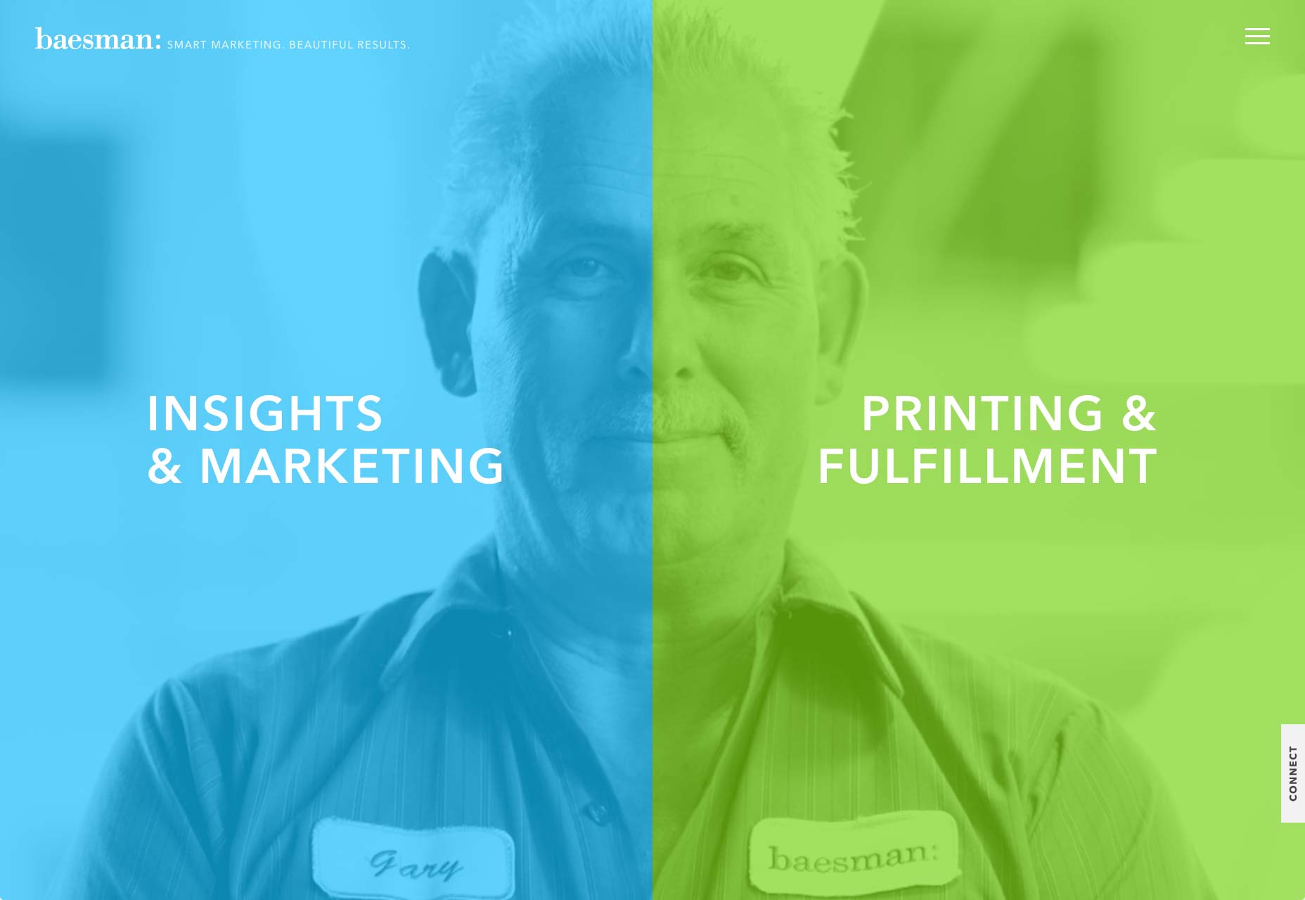
One screen divided in two.
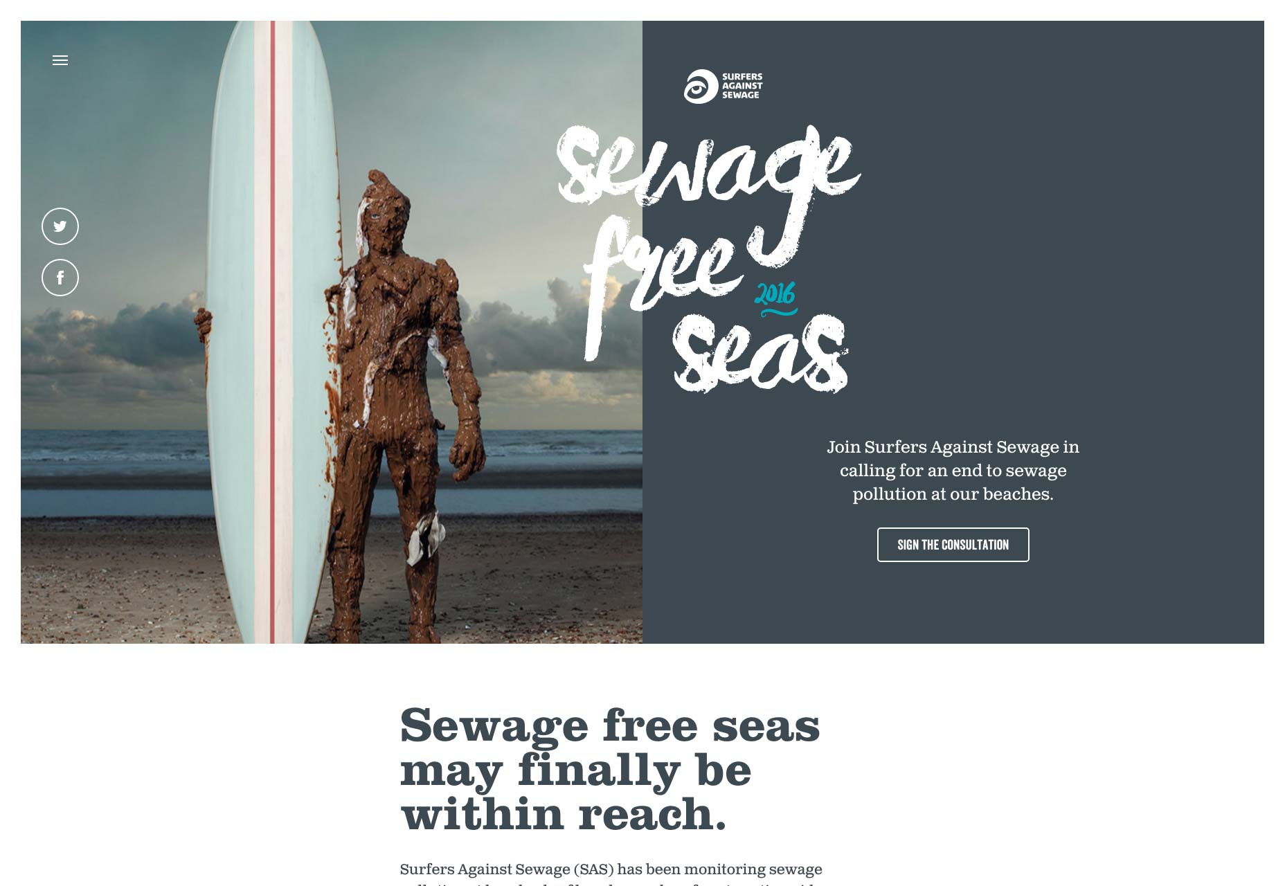
The split screen technique has long been known in the film industry, with early examples dating back to the silent movies days of the early 20th century, and it is still a popular device in by film and tv today.

A split-screen layout is in use when full-screen elements are divided into two or more vertical parts. A scene from the film “Scott Pilgrim vs the World”

However, this is a relatively new technique for the web design industry. Split screens only became popular around mid-2016 and now we have more and more websites which use this design pattern. There are a few reasons why this design pattern became so popular:

  • It has a nice aesthetic quality. When executed correctly it can offer users a wonderful viewing experience.
  • It’s a good choice for responsive frameworks. Split-screen design can be adapted for a variety of screens, even small ones. When it comes to smaller screens, such as mobile displays, the panels can be stacked.
  • It helps guide navigation. Using simple design techniques, you can draw the user’s attention to a specific part of the screen or encourage them to click.

When Split Screen Works The Best

Split-screen is especially good when you have two things to promote. For example, when a site offers two entirely opposite variations. This approach allows designers to give prominence to both things and allow the user to quickly select between them.

One screen, two messages in Dropbox Guides

When You Should Avoid Split Screen

Split-screen designs don’t expand well as the content grows, therefore it is not recommended to apply them to content-heavy layouts. It’s important to keep the screens simple because complex split screens make the UI look overloaded with information. That’s why split-screen layout would be a perfect fit for minimalist website designs.

How to Decide if Split Screen is Good For You

If you’re considering a split-screen technique for your website, I advise you to ask yourself a few questions:

  • Is it suitable for your content?
  • Will there be enough negative space to make the layout work?
  • Will your users appreciate the layout or it will confuse them?
  • Will it be OK to split your users’ attention in half?

The most important thing to keep in mind that content is king and split-screen should be a simple way to deliver your message to people.

Design Techniques For Split Screens

1. Pair Vibrant Color and Dramatic Typography

Thanks to Flat and Material Design, vibrant colors and dramatic typography are big trends now. Vibrant colors are visually stimulating and dramatic typography enhances the text content. Simply combine the two and you will create a visually interesting design. Baesman has done this masterfully. They gave equal importance to both elements while, at the same time, allowing the user to choose between them quickly.

Bright colors and interesting typography pairs can add interest

2. Draw User Attention to the CTA Button

Much more than a simple graphic trend, splitting the screen into two distinct parts provides an original way to guide the user through your site. It’s a great option when you want to create a bigger focal point for calls to action. In the example below, you can see how negative space creates a vertical divide to give equal weighting to two different options.

Vertical divide allows emphasis on two different CTAs without favoring either

3. Create Visual Flow Between “Screens”

When split screen represents a single object, it’s important to establish a connection between content containers. One possible way to do that is by using a color. Simply duplicate a distinct color to establish visual flow between two screens. This works particularly well with a brand color or hue with a lot of contrast. Using color it’s possible to communicate a stronger connection between two pieces of content.

Another possible way to create a strong connection is layering a single element such as text copy across screens:

Overlapping text connects two screens

Last but not least you can use a colored overlay for this purpose:

Consider the left part of the screen

4. Use Animation To Encourage Users To Act

Fine animation and interactive effects encourage users to click. Look at the design used for the “Chekhov is Alive” site below. The design begs you to click to find your character.

Conclusion

It takes approximately three seconds for a visitor to make a decision regarding your website. Consequently, your layouts should always be visitor-friendly if you want to reduce bounce rates. Split-screen technique can help you with that. Split-screen designs are a fun, functional, and responsive way to create an engaging design.

LAST DAY: Zelda – A Beautiful and Classy Script Font – only $7!

Source