Web Components Are Easier Than You Think

When I’d go to a conference (when we were able to do such things) and see someone do a presentation on web components, I always thought it was pretty nifty (yes, apparently, I’m from 1950), but it always seemed complicated and excessive. A thousand lines of JavaScript to save four lines of HTML. The speaker would inevitably either gloss over the oodles of JavaScript to get it working or they’d go into excruciating detail and my eyes would glaze over as I thought about whether my per diem covered snacks.

But in a recent reference project to make learning HTML easier (by adding zombies and silly jokes, of course), the completist in me decided I had to cover every HTML element in the spec. Beyond those conference presentations, this was my first introduction to the <slot> and <template> elements. But as I tried to write something accurate and engaging, I was forced to delve a bit deeper.

And I’ve learned something in the process: web components are a lot easier than I remember.

Either web components have come a long way since the last time I caught myself daydreaming about snacks at a conference, or I let my initial fear of them get in the way of truly knowing them — probably both.

I’m here to tell you that you—yes, you—can create a web component. Let’s leave our distractions, fears, and even our snacks at the door for a moment and do this together.

Let’s start with the <template>

A <template> is an HTML element that allows us to create, well, a template—the HTML structure for the web component. A template doesn’t have to be a huge chunk of code. It can be as simple as:

<template>
  <p>The Zombies are coming!</p>
</template>

The <template> element is important because it holds things together. It’s like the foundation of building; it’s the base from which everything else is built. Let’s use this small bit of HTML as the template for an <apocalyptic-warning> web component—you know, as a warning when the zombie apocalypse is upon us.

Then there’s the <slot>

<slot> is merely another HTML element just like <template>. But in this case, <slot> customizes what the <template> renders on the page.

<template>
  <p>The <slot>Zombies</slot> are coming!</p>
</template>

Here, we’ve slotted (is that even a word?) the word “Zombies” in the templated markup. If we don’t do anything with the slot, it defaults to the content between the tags. That would be “Zombies” in this example.

Using <slot> is a lot like having a placeholder. We can use the placeholder as is, or define something else to go in there instead. We do that with the name attribute.

<template>
  <p>The <slot name="whats-coming">Zombies</slot> are coming!</p>
</template>

The name attribute tells the web component which content goes where in the template. Right now, we’ve got a slot called whats-coming. We’re assuming zombies are coming first in the apocalypse, but the <slot> gives us some flexibility to slot something else in, like if it ends up being a robot, werewolf, or even a web component apocalypse.

Using the component

We’re technically done “writing” the component and can drop it in anywhere we want to use it.

<apocalyptic-warning>
  <span slot="whats-coming">Halitosis Laden Undead Minions</span>
</apocalyptic-warning>

<template>
  <p>The <slot name="whats-coming">Zombies</slot> are coming!</p>
</template>

See what we did there? We put the <apocalyptic-warning> component on the page just like any other <div> or whatever. But we also dropped a <span> in there that references the name attribute of our <slot>. And what’s between that <span> is what we want to swap in for “Zombies” when the component renders.

Here’s a little gotcha worth calling out: custom element names must have a hyphen in them. It’s just one of those things you’ve gotta know going into things. The spec prescribes that to prevent conflicts in the event that HTML releases a new element with the same name.

Still with me so far? Not too scary, right? Well, minus the zombies. We still have a little work to do to make the <slot> swap possible, and that’s where we start to get into JavaScript.

Registering the component

As I said, you do need some JavaScript to make this all work, but it’s not the super complex, thousand-lined, in-depth code I always thought. Hopefully I can convince you as well.

You need a constructor function that registers the custom element. Otherwise, our component is like the undead: it’s there but not fully alive.

Here’s the constructor we’ll use:

// Defines the custom element with our appropriate name, <apocalyptic-warning>
customElements.define("apocalyptic-warning",

  // Ensures that we have all the default properties and methods of a built in HTML element
  class extends HTMLElement {

    // Called anytime a new custom element is created
    constructor() {

      // Calls the parent constructor, i.e. the constructor for `HTMLElement`, so that everything is set up exactly as we would for creating a built in HTML element
      super();

      // Grabs the <template> and stores it in `warning`
      let warning = document.getElementById("warningtemplate");

      // Stores the contents of the template in `mywarning`
      let mywarning = warning.content;

      const shadowRoot = this.attachShadow({mode: "open"}).appendChild(mywarning.cloneNode(true));
    }
  });

I left detailed comments in there that explain things line by line. Except the last line:

const shadowRoot = this.attachShadow({mode: "open"}).appendChild(mywarning.cloneNode(true));

We’re doing a lot in here. First, we’re taking our custom element (this) and creating a clandestine operative—I mean, shadow DOM. mode: open simply means that JavaScript from outside the :root can access and manipulate the elements within the shadow DOM, sort of like setting up back door access to the component.

From there, the shadow DOM has been created and we append a node to it. That node will be a deep copy of the template, including all elements and text of the template. With the template attached to the shadow DOM of the custom element, the <slot> and slot attribute take over for matching up content with where it should go.

Check this out. Now we can plop two instances of the same component, rendering different content simply by changing one element.

Styling the component

You may have noticed styling in that demo. As you might expect, we absolutely have the ability to style our component with CSS. In fact, we can include a <style> element right in the <template>.

<template id="warningtemplate">
  <style>
    p {
      background-color: pink;
      padding: 0.5em;
      border: 1px solid red;
    }
  </style>

    <p>The <slot name="whats-coming">Zombies</slot> are coming!</p>
</template>

This way, the styles are scoped directly to the component and nothing leaks out to other elements on the same page, thanks to the shadow DOM.

Now in my head, I assumed that a custom element was taking a copy of the template, inserting the content you’ve added, and then injecting that into the page using the shadow DOM. While that’s what it looks like on the front end, that’s not how it actually works in the DOM. The content in a custom element stays where it is and the shadow DOM is sort of laid on top like an overlay.

Screenshot of the HTML source of the zombie-warning component. The custom element is expanded in the shadow dam, including the style block, the custom element, and the template.

And since the content is technically outside the template, any descendant selectors or classes we use in the template’s <style> element will have no affect on the slotted content. This doesn’t allow full encapsulation the way I had hoped or expected. But since a custom element is an element, we can use it as an element selector in any ol’ CSS file, including the main stylesheet used on a page. And although the inserted material isn’t technically in the template, it is in the custom element and descendant selectors from the CSS will work.

apocalyptic-warning span {
  color: blue;
}

But beware! Styles in the main CSS file cannot access elements in the <template> or shadow DOM.

Let’s put all of this together

Let’s look at an example, say a profile for a zombie dating service, like one you might need after the apocalypse. In order to style both the default content and any inserted content, we need both a <style> element in the <template> and styling in a CSS file.

The JavaScript code is exactly the same except now we’re working with a different component name, <zombie-profile>.

customElements.define("zombie-profile",
  class extends HTMLElement {
    constructor() {
      super();
      let profile = document.getElementById("zprofiletemplate");
      let myprofile = profile.content;
      const shadowRoot = this.attachShadow({mode: "open"}).appendChild(myprofile.cloneNode(true));
    }
  }
);

Here’s the HTML template, including the encapsulated CSS:

<template id="zprofiletemplate">
  <style>
    img {
      width: 100%;
      max-width: 300px;
      height: auto;
      margin: 0 1em 0 0;
    }
    h2 {
      font-size: 3em;
      margin: 0 0 0.25em 0;
      line-height: 0.8;
    }
    h3 {
      margin: 0.5em 0 0 0;
      font-weight: normal;
    }
    .age, .infection-date {
      display: block;
    }
    span {
      line-height: 1.4;
    }
    .label {
      color: #555;
    }
    li, ul {
      display: inline;
      padding: 0;
    }
    li::after {
      content: ', ';
    }
    li:last-child::after {
      content: '';
    }
    li:last-child::before {
      content: ' and ';
    }
  </style>

  <div class="profilepic">
    <slot name="profile-image"><img src="https://assets.codepen.io/1804713/default.png" alt=""></slot>
  </div>

  <div class="info">
    <h2><slot name="zombie-name" part="zname">Zombie Bob</slot></h2>

    <span class="age"><span class="label">Age:</span> <slot name="z-age">37</slot></span>
    <span class="infection-date"><span class="label">Infection Date:</span> <slot name="idate">September 12, 2025</slot></span>

    <div class="interests">
      <span class="label">Interests: </span>
      <slot name="z-interests">
        <ul>
          <li>Long Walks on Beach</li>
          <li>brains</li>
          <li>defeating humanity</li>
        </ul>
      </slot>
    </div>

    <span class="z-statement"><span class="label">Apocalyptic Statement: </span> <slot name="statement">Moooooooan!</slot></span>

  </div>
</template>

Here’s the CSS for our <zombie-profile> element and its descendants from our main CSS file. Notice the duplication in there to ensure both the replaced elements and elements from the template are styled the same.

zombie-profile {
  width: calc(50% - 1em);
  border: 1px solid red;
  padding: 1em;
  margin-bottom: 2em;
  display: grid;
  grid-template-columns: 2fr 4fr;
  column-gap: 20px;
}
zombie-profile img {
  width: 100%;
  max-width: 300px;
  height: auto;
  margin: 0 1em 0 0;
}
zombie-profile li, zombie-profile ul {
  display: inline;
  padding: 0;
}
zombie-profile li::after {
  content: ', ';
}
zombie-profile li:last-child::after {
  content: '';
}
zombie-profile li:last-child::before {
  content: ' and ';
}

All together now!

While there are still a few gotchas and other nuances, I hope you feel more empowered to work with the web components now than you were a few minutes ago. Dip your toes in like we have here. Maybe sprinkle a custom component into your work here and there to get a feel for it and where it makes sense.

That’s really it. Now what are you more scared of, web components or the zombie apocalypse? I might have said web components in the not-so-distant past, but now I’m proud to say that zombies are the only thing that worry me (well, that and whether my per diem will cover snacks…)


The post Web Components Are Easier Than You Think appeared first on CSS-Tricks.

You can support CSS-Tricks by being an MVP Supporter.

Responsible Web Applications

Joy Heron bought a cool domain name and published an article there:

Luckily, with modern HTML and CSS, we can create responsive and accessible web apps with relative ease. In my years of doing software development, I have learned some HTML and CSS tips and tricks, and I want to present these in this post. This list is not exhaustive, but these are tried and true patterns that I frequently use in different projects.

Sure, it’s a collection of tips and tricks, but it’s a great one that covers modern best practices across HTML, CSS, and JavaScript. If someone asked me what they should read if they missed out on the last, say, three years of front-end and wanted to remind themselves of the important stuff, I’d send them this.

I like the casual use of a massive shape-outside in the header.

Direct Link to ArticlePermalink


The post Responsible Web Applications appeared first on CSS-Tricks.

You can support CSS-Tricks by being an MVP Supporter.

Styling Web Components

Nolan Lawson has a little emoji-picker-element that is awfully handy and incredibly easy to use. But considering you’d probably be using it within your own app, it should be style-able so it can incorporated nicely anywhere. How to allow that styling isn’t exactly obvious:

What wasn’t obvious to me, though, was how to allow users to style it. What if they wanted a different background color? What if they wanted the emoji to be bigger? What if they wanted a different font for the input field?

Nolan list four possibilities (I’ll rename them a bit in a way that helps me understand them).

  1. CSS Custom Properties: Style things like background: var(--background, white);. Custom properties penetrate the Shadow DOM, so you’re essentially adding styling hooks.
  2. Pre-built variations: You can add a class attribute to the custom elements, which are easy to access within CSS inside the Shadow DOM thanks to the pseudo selectors, like :host(.dark) { background: black; }.
  3. Shadow parts: You add attributes to things you want to be style-able, like <span part="foo">, then CSS from the outside can reach in like custom-component::part(foo) { }.
  4. User forced: Despite the nothing in/nothing out vibe of the Shadow DOM, you can always reach the element.shadowRoot and inject a <style>, so there is always a way to get styles in.

It’s probably worth a mention that the DOM you slot into place is style-able from “outside” CSS as it were.

This is such a funky problem. I like the Shadow DOM because it’s the closest thing we have on the web platform to scoped styles which are definitely a good idea. But I don’t love any of those styling solutions. They all seem to force me into thinking about what kind of styling API I want to offer and document it, while not encouraging any particular consistency across components.

To me, the DOM already is a styling API. I like the scoped protection, but there should be an easy way to reach in there and style things if I want to. Seems like there should be a very simple CSS-only way to reach inside and still use the cascade and such. Maybe the dash-separated custom-element name is enough? my-custom-elemement li { }. Or maybe it’s more explicit, like @shadow my-custom-element li { }. I just think it should be easier. Constructable Stylesheets don’t seem like a step toward make it easier, either.

Last time I was thinking about styling web components, I was just trying to figure out how to it works in the first place, not considering how to expose styling options to consumers of the component.

Does this actually come up as a problem in day-to-day work? Sure does.

I don’t see any particularly good options in that thread (yet) for the styling approach. If I was Dave, I’d be tempted to just do nothing. Offer minimal styling, and if people wanna style it, they can do it however they want from their copy of the component. Or they can “force” the styles in, meaning you have complete freedom.


The post Styling Web Components appeared first on CSS-Tricks.

You can support CSS-Tricks by being an MVP Supporter.

How You Might Build a Modern Day Webring

I’m sure different people picture different things when they think about webrings, so let me clarify what I picture. I see an element on a website that:

  1. Signifies this site is part of a webring
  2. Allows you to move to the next or previous site of the webring
  3. Maybe has other functionality like going to a “random” site or seeing the complete list

But then another major thing:

  1. Site owners don’t have to do much. They just plop (it?) on the site and a functional webring UI is there.

So like this:

A Calvin & Hobbes webring UI that comes up all the time when you search the web about webrings

How did it used to work? You know what? I have no idea. My guess is that it was an ancient <frameset><frame /></frameset> situation, but this stuff is before my time a bit. How might we do this today?

Well, we could use an <iframe>, I guess. That’s what sites like YouTube do when they give “embed code” as an HTML snippet. Sites like Twitter and CodePen give you a <div> (or whatever semantic HTML) and a <script>, so that there can be fallback content and the script enhances it into an <iframe>. An <iframe> might be fine, as it asks very little of the site owner, but they are known to be fairly bad for performance. It’s a whole document inside another document, after all. Plus, they don’t offer much by the way of customization. You get what you get.

Another problem with an iframe is that… how would it know what site it is currently embedded on? Maybe a URL parameter? Maybe a postMessage from the parent page? Not super clean if you ask me.

I think a Web Component might be the way to go here, as long as we’re thinking modern. We could make a custom element like <webring-*>. Let’s do that, and make it for CSS sites specifically. That’ll give us the opportunity to send in the current site with an attribute, like this:

<webring-css site="http://css-tricks.com">
  This is gonna boot itself up into webring in a minute.
</webring-css>

That solves the technology choice. Now we need to figure out the global place to store the data. Because, well, a webring needs to be able to be updated. Sites need to be able to be added and removed from the webring without the other sites on the webring needing to do anything.

For fairly simple data like this, a JSON file on GitHub seems to be a perfectly modern choice. Let’s do that.

Now everyone can see all the sites in the webring in a fairly readable fashion. Plus, they could submit Pull Requests against it to add/remove sites (feel free).

Getting that data from our web component is a fetch away:

fetch(`https://raw.githubusercontent.com/CSS-Tricks/css-webring/main/webring.json`)
  .then((response) => response.json())
  .then((sites) => {
     // Got the data.
  });

We’ll fire that off when our web component mounts. Let’s scaffold that…

const DATA_FOR_WEBRING = `https://raw.githubusercontent.com/CSS-Tricks/css-webring/main/webring.json`;

const template = document.createElement("template");
template.innerHTML = `
<style>
  /* styles */
</style>

<div class="webring">
  <!-- content -->
</div>`;

class WebRing extends HTMLElement {
  connectedCallback() {
    this.attachShadow({ mode: "open" });
    this.shadowRoot.appendChild(template.content.cloneNode(true));

    fetch(DATA_FOR_WEBRING)
      .then((response) => response.json())
      .then((sites) => {
        // update template with data
      });
  }
}

window.customElements.define("webring-css", WebRing);

The rest of this isn’t so terribly interesting that I feel like we need to go through it step by step. I’ll just blog-sketch it for you:

  1. Pull the attribute off the web component so we can see what the current site is
  2. Match the current site in the data
  3. Build out Next, Previous, and Random links from the data in a template
  4. Update the HTML in the template

And voilà!

Could you do a lot more with this, like error handling, better design, and better everything?

Yes.


The post How You Might Build a Modern Day Webring appeared first on CSS-Tricks.

You can support CSS-Tricks by being an MVP Supporter.

The failed promise of Web Components

Lea has some words:

Perusing the components on webcomponents.org fills me with anxiety, and I’m perfectly comfortable writing JS — I write JS for a living! What hope do those who can’t write JS have? Using a custom element from the directory often needs to be preceded by a ritual of npm flugelhorn, import clownshoes, build quux, all completely unapologetically because “here is my truckload of dependencies, yeah, what”. Many steps are even omitted, likely because they are “obvious”.

When I wrote A Bit on Web Component Libraries, I was told the main thing I got wrong is that:

The idea was to make primitives that libraries could build on top of so they could ship less code. It was always the intention that you would use a library with them.

It was many years ago that HTML imports died. It was Dave’s pet peeve about Web Components for a long time. So I guess after that, it was a all-JavaScript-or-bust approach for Web Components. And I hate to say it, but it feels like it’s a lot closer to a bust than a boon.

I’m still optimistic though. Web Components can do some very cool stuff that only Web Components can do. The Shadow DOM being a big part of that. For example, I remember years ago Twitter experimented with making embedded Tweets into Web Components (instead of iframes) because it was way faster (in every way). That never manifested (🤷‍♂️), but it seemed like a damn fine idea to me.

I think the styling story is a big deal. I bet I’d reach for them at least slightly more if styling them wasn’t so weird. I saw Scott was asking about it just today and 75% of people wish there was a way to just reach into that Shadow DOM and style it from regular CSS. I get why that needs to be protected (that’s a huge point of the Shadow DOM in the first place), but having to very explicitly reach in seems like enough protection to me.

Direct Link to ArticlePermalink


The post The failed promise of Web Components appeared first on CSS-Tricks.

You can support CSS-Tricks by being an MVP Supporter.
Our Best Posts on Web Components

A bit of backstory on why this page exists…

I made a fancy new Gutenberg block to insert posts into other posts, so this page is an example of using that (heavily) make a meta blog post about other blog posts. For the most part, topical pages like this are best served by tag pages. For example, our tag page for Web Components has more posts and is sortable in ways this is not. This is just a way to make a curated and hand-sorted grouping of posts, which is something we’ve done for a while with “Guide Collections”. But, we’re spinning down Guide Collections and redirecting them to tag pages and pages like this because they are easier to maintain.


The post Our Best Posts on Web Components appeared first on CSS-Tricks.

You can support CSS-Tricks by being an MVP Supporter.
A Bit on Web Component Libraries

A run of Web Components news crossed my desk recently so I thought I’d group it up here.

To my mind, one of the best use cases for Web Components is pattern libraries. Instead of doing, say, <ul class="nav nav-tabs"> like you would do in Bootstrap or <div class="tabs"> like you would in Bulma, you would use a custom element, like <designsystem-tabs>.

The new Shoelace library uses the sl namespace for their components. It’s a whole pattern library entirely in Web Components. So the tabs there are <sl-tab-group> elements.

Why is that good? Well, for one thing, it brings a component model to the party. That means, if you’re working on a component, it has a template and a stylesheet that are co-located. Peeking under the hood of Shoelace, you can see this is all based on Stencil.

Another reason it’s good is that it means components can (and they do) use the Shadow DOM. This offers a form of isolation that comes right from the web platform. For CSS folks like us, that means the styling for a tab in the tab component is done with a .tab class (hey, wow, cool) but it is isolated in that component. Even with that generic of a name, I can’t accidentally mess with some other component on the page that uses that generic class, nor is some other outside CSS going to mess with the guts here. The Shadow DOM is a sort of wall of safety that prevents styles from leaking out or seeping in.

I just saw the FAST framework¹ too, which is also a set of components. It has tabs that are defined as <fast-tabs>. That reminds me of another thing I like about the Web Components as a pattern library approach: if feels like it’s API-driven, even starting with the name of the component itself, which is literally what you use in the HTML. The attributes on that element can be entirely made up. It seems the emerging standard is that you don’t even have to data-* prefix the attributes that you also make up to control the component. So, if I were to make a tabs component, it might be <chris-tabs active-tab="lunch" variation="rounded">.

Perhaps the biggest player using Web Components for a pattern library is Ionic. Their tabs are <ion-tabs>, and you can use them without involving any other framework (although they do support Angular, React, and Vue in addition to their own Stencil). Ionic has made lots of strides with this Web Components stuff, most recently supporting Shadow Parts. Here’s Brandy Carney explaining the encapsulation again:

Shadow DOM is useful for preventing styles from leaking out of components and unintentionally applying to other elements. For example, we assign a .button class to our ion-button component. If an Ionic Framework user were to set the class .button on one of their own elements, it would inherit the Ionic button styles in past versions of the framework. Since ion-button is now a Shadow Web Component, this is no longer a problem.

However, due to this encapsulation, styles aren’t able to bleed into inner elements of a Shadow component either. This means that if a Shadow component renders elements inside of its shadow tree, a user isn’t able to target the inner element with their CSS.

The encapsulation is a good thing, but indeed it does make styling “harder” (on purpose). There is an important CSS concept to know: CSS custom properties penetrate the Shadow DOM. However, it was decided — and I think rightly so — that “variablizing” every single thing in a design system is not a smart way forward. Instead, they give each bit of HTML inside the Shadow DOM a part, like <div part="icon">, which then gives us the ability to “reach in from the outside” with CSS, like custom-component::part(icon) { }.

I think part-based styling hooks are mostly fine, and a smart way forward for pattern libraries like this, but I admit some part of it bugs me. The selectors don’t work how you’d expect. For example, you can’t conditionally select things. You also can’t select children or use the cascade. In other words, it’s just one-off, or like you’re reaching straight through a membrane with your hand. You can reach forward and either grab the thing or not, but you can’t do anything else at all.

Speaking of things that bug people, Andrea Giammarchi has a good point about the recent state of Web Components:

Every single library getting started, including mine, suggest we should import the library in order to define what [sic] supposed to be a “portable Custom Element”.

Google always suggests LitElement. Microsoft wants you to use FASTElement. Stencil has their own Component. hyperHTML has their own Component. Nobody is just using “raw” Web Components. It’s weird! What strikes me as the worst part about that is that Web Components are supposed to be this “native platform” thing meaning that we shouldn’t need to buy into some particular technology in order to use them. When we do, we’re just as locked to that as we would be if we just used React or whatever.

Andrea has some ideas in that article, including the use of some new and smaller library. I think what I’d like to see is a pattern library that just doesn’t use any library at all.

  1. FAST calls itself a “interface system,” then a “UI framework” in consecutive sentences on the homepage. Shoelaces calls itself a “library” but I’m calling it a “pattern library.” I find “design system” to be the most commonly used term to describe the concept, but often used more broadly than a specific technology. FAST uses that term in the code itself for the wrapper element that controls the theme. I’d say the terminology around all this stuff is far from settled.

The post A Bit on Web Component Libraries appeared first on CSS-Tricks.

You can support CSS-Tricks by being an MVP Supporter.
The Web in 2020: Extensibility and Interoperability

In the past few years, we’ve seen a lot of change and diversion in regard to web technologies. In 2020, I foresee us as a web community heading toward two major trends/goals: extensibility and interoperability. Let’s break those down.

Extensibility

Extensibility describes how much someone can take a particular technology and extend it to their own needs. We’ve built a component-based web over the last few years in terms of both development (React components! Vue components! Svelte components! Web components!) and design (Design systems!). Interesting how form follows function, isn’t it?

Now we’re trying to make that component system look and feel more unique. Extensibility on the web allows us to tailor the platform to our own needs, and experiment with outcomes.

CSS itself is becoming much more extensible…

CSS Houdini 

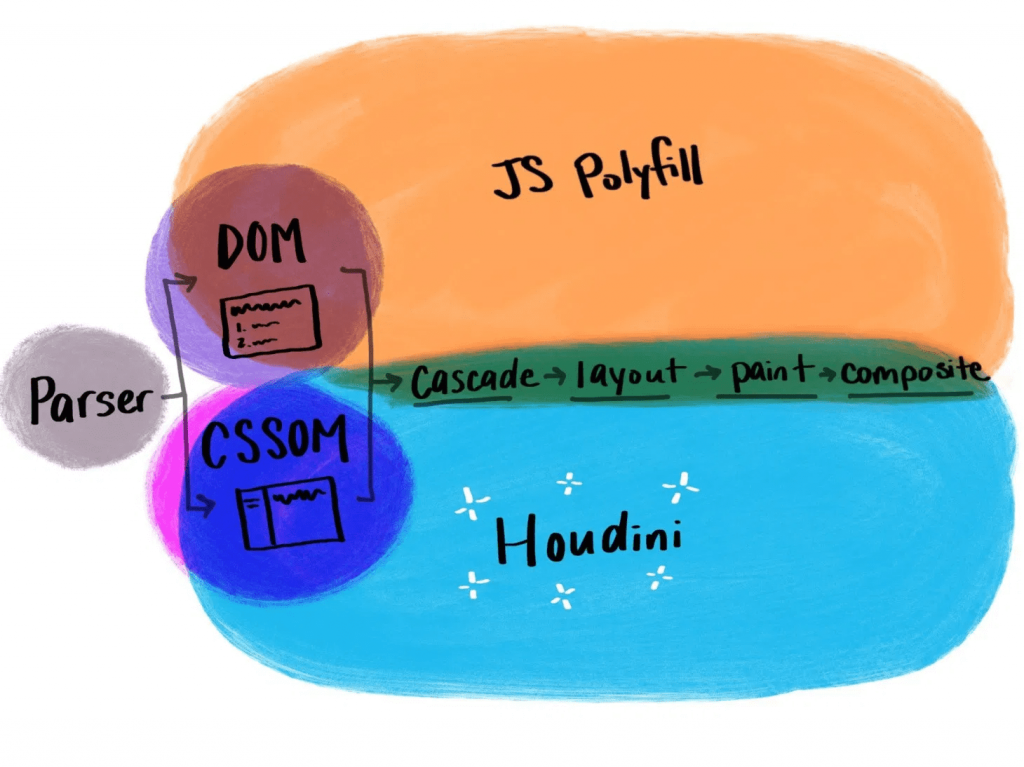
With CSS Houdini, developers will be able to extend what’s currently possible in the CSS Object Model and teach the browser how they want it to read and render their CSS.

That means that things that weren’t previously possible on the web, like angled corners or round layout, now become possible.

If you’re not yet familiar with Houdini, it’s an umbrella term that describes a few different browser APIs, intended to improve browser performance. It makes styling more extensible and lets users dictate their own CSS features. Houdini’s current APIs include:

With these APIs, users can tap into meaningful semantic CSS (thanks to the Typed Object Model), and even apply semantics to their CSS variables (Properties and Values). With the Paint API, you can draw a canvas and have it applied as a border image (hello, gradient borders), or create animated sparkles (link) that accept dynamic arguments and are implemented with a single line of CSS.

.sparkles {
  background: paint(sparkles)
}

You can build round menus without placing the items manually through margins (via the Layout API), and you can integrate your own interactions that live off of the main thread (using the Animation Worklet).

Houdini is definitely one to watch in the new year, and now is a great time to start experimenting with it if you haven’t yet.

Variable fonts

Another technology that falls in line with the goal of making websites more performant while offering more user extensibility is variable fonts. With so many new variable fonts popping up — and Google Fonts’ recent beta launch — variable fonts are now more available and easy to use than ever.

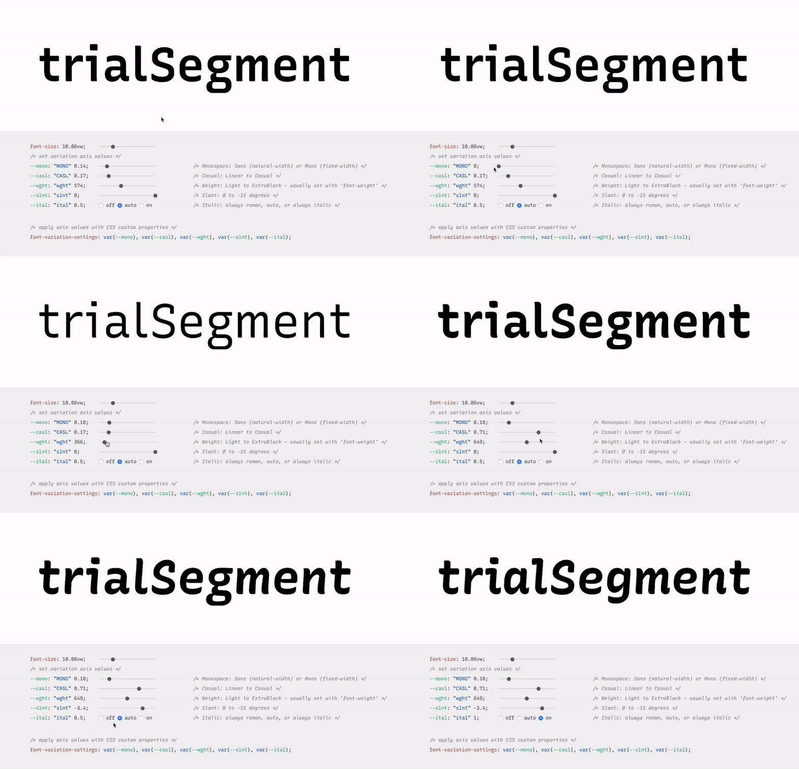
Variable fonts are vector-based and allow for a broad range of values to be set for various font axes, like weight and slant. The interpolation of these axes allows fonts to transition smoothly between points.

Here’s an example:

Variable fonts also allow for new axes to help designers and developers be even more creative with their work. Here’s an example of some of those from an excellent resource called v-fonts:

Variable fonts are relatively well supported, with 87% of modern browsers supporting the required font format.

Custom Properties

Custom properties, like variable fonts, are also well supported. While they’re not new, we’re still discovering all of the things we can do with custom properties.

Custom properties allow for truly dynamic CSS variables, meaning we can adjust them in JavaScript, separating logic and style. A great example of this comes from David Khourshid, who shows us how to create reactive animations and sync up the styling without sweating it.

We’re also starting to experiment with more logic in our stylesheets. I recently published a blog post that explains how to create dynamic color themes using the native CSS calc() function, along with custom properties.

This eliminates the need for additional tools to process our CSS, and ensures that this technique for theming works across any technology stack — which brings me to my next 2020 vision: interoperability.

Interoperability

Interoperability, by my definition in this post, means the ability to work between technologies and human needs. From a technical perspective, with the fragmented web, a lot of companies have migrated stacks in the recent past, or have multiple internal stacks, and are now likely interested in safeguarding their technology stack against future changes to maintain some semblance of uniformity.

Web components

Web components try to solve this problem by attacking the problem of component-based architecture from a web-standards perspective. The vision is to introduce a standard format that can be used with or without a library, benefiting the developer experience and establishing uniformity between components.

Each web component is encapsulated and works in modern browsers without dependencies. This technology is still evolving and I think we’ll see a lot of growth in 2020.

Logical properties 

Logical properties challenge us to adjust our mental model of how we apply layout sizing on a page in order for us to make our pages more friendly across languages and reading modes. They allow for our layouts to be interoperable with user experiences.

In English, and other left-to-right languages, we think of the layout world in terms of height and width, and use a compass-type expression for margins, border, and padding (top, left, bottom, right). However if we style this way and then adjust the language to a right-to-left language, like Arabic, the padding-left of our paragraphs no longer means padding from the beginning of where we would read. This breaks the layout.

If you were to write padding-inline-start instead of padding-left, the padding would correctly swap to the other side of the page (the start of where one would be reading) when switching to the right-to-left language, maintaining layout integrity.

Preference media queries

Preference media queries are also on the rise, with more capability coming in 2020. They allow us to tailor our sites to work with people who prefer high contrast or dark mode, as well as people who prefer a less animation-heavy experience.

The upcoming preference media queries include:

In this video, I go over how to create a preference media query for dark mode, using custom properties for styling:

Runner up: Speed

Speed is also a topic I see as a big focus of the web world in 2020. Several of the technologies I mentioned above have the benefit of improving web performance, even if it isn’t the main focus (e.g. how variable fonts may reduce the total weight of fonts downloaded). Performance becomes increasingly important when we think about the next billion users coming online in areas where network speeds may be lacking.

In addition, Web Assembly, which is a wrapper that lets users write closer to the browser metal, is gaining popularity. I also foresee a lot more work with WebGL in the coming year, which uses similar techniques for advanced and speedy graphics rendering. Writing lower-level code allows for speedier experiences, and in some cases of WebGL, may be required to prevent advanced visualization from crashing our browsers. I think we’ll see these two technologies grow and see more WebGL demos in 2020.


The web is constantly evolving and that's what makes it so exciting to be a part of. What do you see as a goal or technology to watch in 2020? Tell us in the comments!

The post The Web in 2020: Extensibility and Interoperability appeared first on CSS-Tricks.

Thinking Through Styling Options for Web Components

Where do you put styles in web components?

I'm assuming that we're using the Shadow DOM here as, to me, that's one of the big draws of a web component: a platform thing that is a uniquely powerful thing the platform can do. So this is about defining styles for a web component in a don't-leak-out way, and less so a way to get global styles to leak in (although that's very interesting as well, which can be done via custom properties which we'll look at later in the article).

If you're building the template inside the JavaScript — which is nice because of template literals and how we can sprinkle our data into the template nicely — you need access to those styles in JavaScript.

const template = `
  <style>${styles}</style>
  <div class="${class}">
    <h2>${title}</h2>
    ${content}
  </div>
`;

Where does that style variable come from? Maybe also a template literal?

const style = `
  :host {
    background: white;
  }
  h2 {
    font: 900 1.5rem/1.1 -system-ui, sans-serif;
  }
`;

I guess that's fine, but it makes for a big messy block of code just dunked somewhere in the class where you're trying to build this web component.

Another way is to <template> the template and make a <style> block part of it.

<template id="card-template">
  <style>
    :host {
      background: white;
    }
    h2 {
      font: 900 1.5rem/1.1 -system-ui, sans-serif;
    }
  </style>

  <div id="card-hook">
    <h2 id="title-hook"></h2>
    <p id="desc-hook"></p>
  </div>
</template>

I can see the appeal with this because it keeps HTML in HTML. What I don't love about it is that you have to do a bunch of manual shadowRoot.querySelector("#title-hook").innerHTML = myData.title; work in order to flesh out that template. That doesn't feel like a convenient template. I also don't love that you need to just chuck this template somewhere in your HTML. Where? I dunno. Just chuck it in there. Chuck it.

The CSS is moved out of the JavaScript too, but it just moved from one awkward location to another.

If we wanted to keep the CSS in a CSS file, we can sorta do that like this:

<template id="card-template">
  <style>
    @import "/css/components/card.css";
  </style>

  <div id="card-hook">
    <h2 id="title-hook"></h2>
    <p id="desc-hook"></p>
  </div>
</template>

(The use of <link rel="import" type="css" href=""> is deprecated, apparently.)

Now we have @import which is an extra HTTP Request, and notorious for being a performance hit. An article by Steven Lambert says it clocked in at half a second slower. Not ideal. I don't suppose it would be much better to do this instead:

class MyComponent extends HTMLElement {
    
  constructor() {
    super();
    this.attachShadow({ mode: "open" });

    fetch('/css/components/card.css')
      .then(response => response.text())
      .then(data => {
        let node = document.createElement('style');
        node.innerHTML = data;
        document.body.appendChild(node);
      });
  }

  // ...
}

Seems like that would potentially be a Flash-of-Unstyled-Web-Component? I guess I should get off my butt and test it.

Now that I'm digging into this again, it seems like ::part has gotten some steam (explainer). So I can do...

const template = `
  <div part="card">
    <h2>${title}</h2>
    ${content}
  </div>
`;

...then write styles in a global stylesheet that only apply inside that Shadow DOM, like:

my-card::part(card) {
  background: black;
  color: white;
}

...which has a smidge of browser support, but maybe not enough?

These "part" selectors can only touch the exact element it's connected to. You'd have to do all your styling by applying a part name to every single DOM node and then styling each entirely on its own. That's no fun, particularly because the appeal of the Shadow DOM is this isolated styling environment in which we're supposed to be able to write looser CSS selectors and not be worried our h2 { } style is going to leak all over the place.

Looks like if native CSS modules becomes a thing, that will be the most helpful thing that could happen.

import styles from './styles.css';

class MyElement extends HTMLElement {
  constructor() {
    this.attachShadow({mode: open});
    this.shadowRoot.adoptedStyleSheets = [styles];
  }
}

I'm not sure, however, if this is any sort of performance boost. Seems like it would be a wash between this and @import. I have to say I prefer the clarity and syntax with native CSS modules. It's nice to be writing JavaScript when working with JavaScript.

Constructable Stylesheets also look helpful for sharing a stylesheet across multiple components. But the CSS modules approach looks like it could also do that since the stylesheet has already become a variable at that point.

The post Thinking Through Styling Options for Web Components appeared first on CSS-Tricks.

A Web Component with Different HTML for Desktop and Mobile

Christian Schaefer has a great big write-up about dealing with web advertisements. The whole thing is interesting, first documenting all the challenges that ads present, and then presenting modern solutions to each of them.

One code snippet that caught my eye was a simple way to design a component that renders different HTML depending on the screen size.

<div class="ad">
  <template class="ad__mobile">
    // Mobile ad HTML code with inline script
  </template>
  <template class="ad__desktop">
    // Desktop ad HTML code with inline script
  </template>
  <script>
    const isMobile = matchMedia('(max-device-width: 20em)').matches;
    const ad = document.currentScript.closest('.ad');
    const content = ad
      .querySelector(isMobile ? '.ad__mobile' : '.ad__desktop')
      .content;
    
    ad.appendChild(document.importNode(content, true));
  </script>
</div> 

Clever. Although note that Christian ends up going a totally different route in the article.

Here's that same code where I use a custom element and move the JavaScript to JavaScript just 'cuz.

See the Pen
A Web Component with Different HTML for Desktop and Mobile
by Chris Coyier (@chriscoyier)
on CodePen.

The post A Web Component with Different HTML for Desktop and Mobile appeared first on CSS-Tricks.

lite-youtube-embed

A standard copy-and-paste YouTube embed lands on your page as an <iframe> which loads a big ol' pile of other stuff to play that video. But the UX of it is still essentially an image and a play button. Click the play button and the video plays. You can build essentially the same thing with an anchor link wrapping an image!

Not long ago, we covered a very clever "lazy load" technique doing exactly this from Arthur Corenzan that was further improved by Remy Sharp and Adrian Roselli.

Paul Irish has tackled it as well with a <lite-youtube> web component:

Provide videos with a supercharged focus on visual performance. This custom element renders just like the real thing but approximately 224X faster.

In the source code, Paul dug up some other prior attempts as well, like this jQuery plugin and a more generic script for lazy loading any iframe.

Direct Link to ArticlePermalink

The post lite-youtube-embed appeared first on CSS-Tricks.

Get Started With a Web Components Grid in 5 Minutes

Smart HTML elements is a lightweight and easy to use web components framework. It is built using CSS, HTML, and Javascript. It enables cross-browser compatible web applications with custom elements used in web components. It contains more than 30 UI components and has a user interface that works on mobile and on PCs. It is native and does not have any dependencies and works with any framework like Angular, React, and Vue.js.

This article explains Smart HTML Grid and its features. The Grid component can be easily integrated into web pages. It has many features like filtering, sorting, pagination, etc.

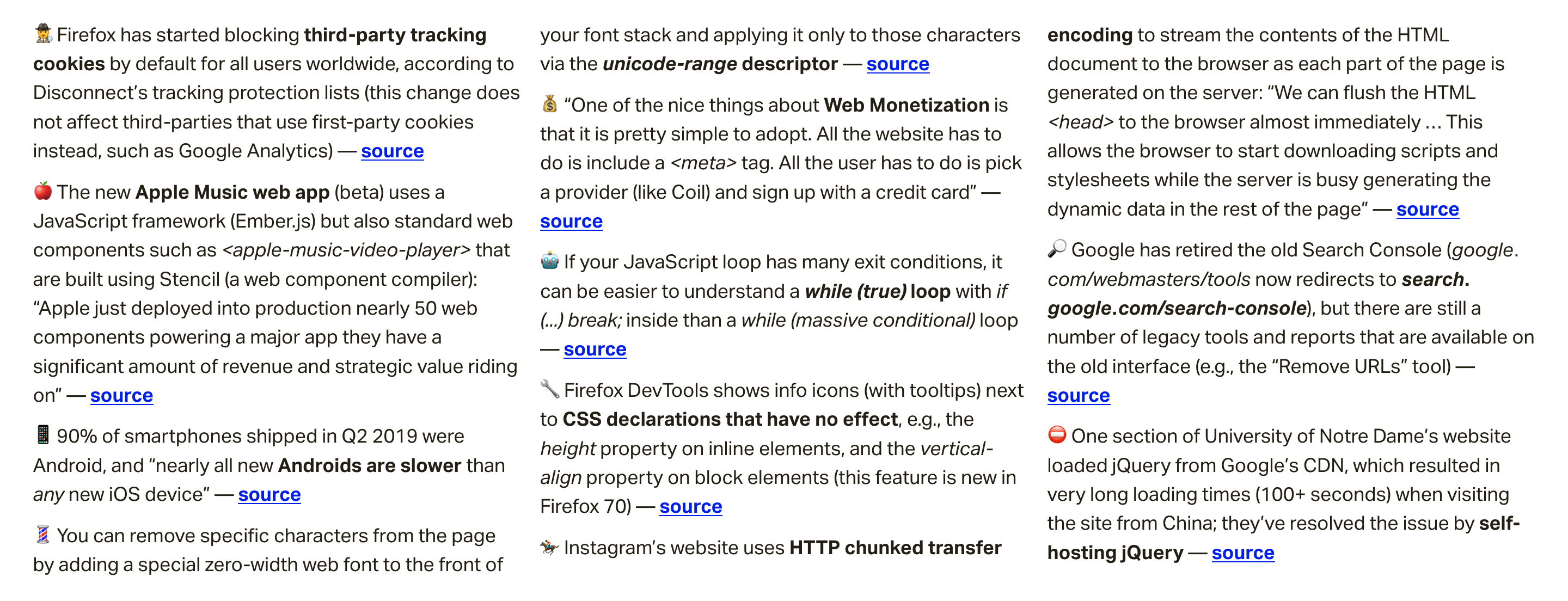
Weekly Platform News: Apple Deploys Web Components, Progressive HTML Rendering, Self-Hosting Critical Resources

In this week's roundup, Apple gets into web components, how Instagram is insta-loading scripts, and some food for thought for self-hosting critical resources.

Apple deploys web components built using Stencil

The new Apple Music web app (beta) uses a JavaScript framework (Ember.js) but also standard web components such as <apple-music-video-player> that are built using Stencil, a web component compiler.

Stencil is a build-time tool that generates standard web components with minimal overhead, while providing core features such as templating, state management, and routing, as well as performance features such as code-splitting and lazy-loading.

Apple just deployed into production nearly 50 web components powering a major app they have a significant amount of revenue and strategic value riding on. You can’t say that “no one uses web components” or they are “solving problems that don‘t exist or have been solved better in user land” with a straight face anymore.

(via Max Lynch)

Instagram makes use of chunked transfer encoding and progressive HTML rendering

Instagram’s website uses HTTP chunked transfer encoding to stream the contents of the HTML document to the browser as each part of the page is generated on the server.

We can flush the HTML <head> to the browser almost immediately ... This allows the browser to start downloading scripts and stylesheets while the server is busy generating the dynamic data in the rest of the page.

They also use this technique to flush JSON data to the page in <script> elements. The client script waits for this data (using Promise) instead of requesting it via XHR.

(via Glenn Conner)

Consider self-hosting your critical resources

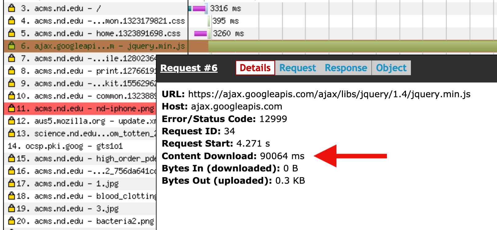
One section of University of Notre Dame’s website used to load jQuery from Google’s CDN, which could result in very long loading times (100+ seconds) when visiting the site from China. They’ve resolved the issue by self-hosting jQuery instead.

(via Erik Runyon)


Read even more news in my weekly Sunday issue. Visit webplatform.news for more information.

The post Weekly Platform News: Apple Deploys Web Components, Progressive HTML Rendering, Self-Hosting Critical Resources appeared first on CSS-Tricks.

Weekly Platform News: CSS ::marker pseudo-element, pre-rendering web components, adding Webmention to your site

Šime posts regular content for web developers on webplatform.news.

In this week's roundup: datepickers are giving keyboard users headaches, a new web component compiler that helps fight FOUC, we finally get our hands on styling list item markers, and four steps to getting webmentions on your site.

Using plain text fields for date input

Keyboard users prefer regular text fields over complex date pickers, and voice users are frustrated by the native control (<input type="date">).

Previously, I have relied on plain text inputs as date fields with custom validation for the site, typically using the same logic on the client and the server. For known dates — birthdays, holidays, anniversaries, etc. — it has tested well.

(via Adrian Roselli)

Pre-rendering web components

Stencil is a “web component compiler” that can be used to pre-render web components (including Shadow DOM) or hide them until they are fully styled to avoid the flash of unstyled content (FOUC).

This tool also makes sure that polyfills are only loaded when needed, and its Component API includes useful decorators and hooks that make writing web components easier (e.g., the Prop decorator handles changes to attributes).

import { Component, Prop, h } from "@stencil/core";

@Component({
  tag: "my-component"
})
export class MyComponent {
  @Prop() age: number = 0;

  render() {
    return <div>I am {this.age} years old</div>;
  }
}

(via Max Lynch)

The CSS ::marker pseudo-element

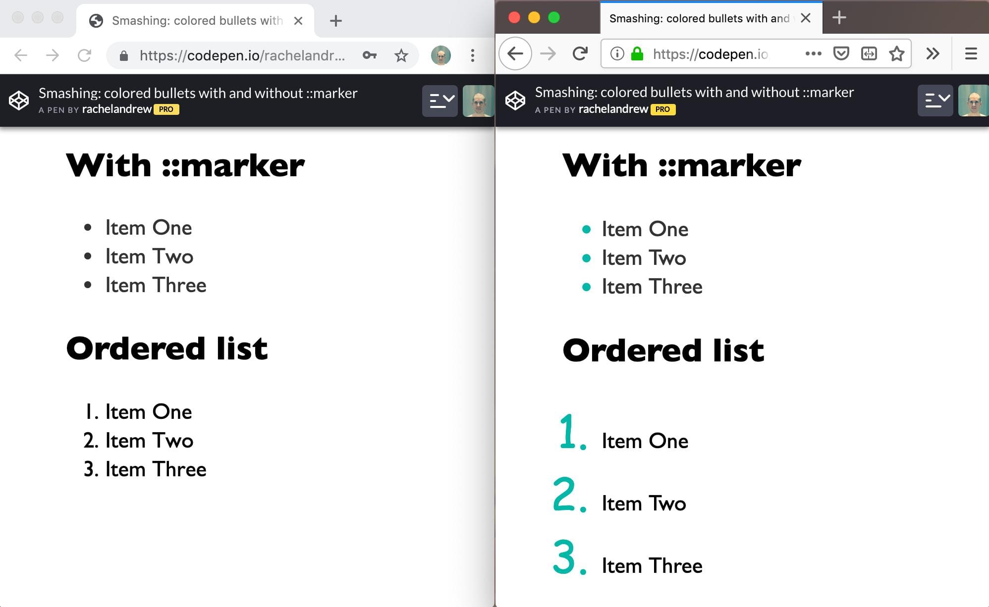
When the CSS display: list-item declaration is applied to an element, the element generates a marker box containing a marker, e.g., a list bullet (the <li> and <summary> elements have markers by default).

Markers can be styled via the ::marker pseudo-element (useful for changing the color or font of the marker), but this CSS feature is currently only supported in Firefox.

(via Rachel Andrew)

Adding Webmention to your website

  1. Sign up on Webmention.io; this is a service that collects webmentions on your behalf.
  2. Add <link rel="webmention"> (with the appropriate href value) to your web pages.

    There are also Webmention plugins available for all major content management systems (CMS) if you prefer building on top of your CMS.

  3. Fetch webmentions from Webmention.io (via Ajax) to display them on your page.
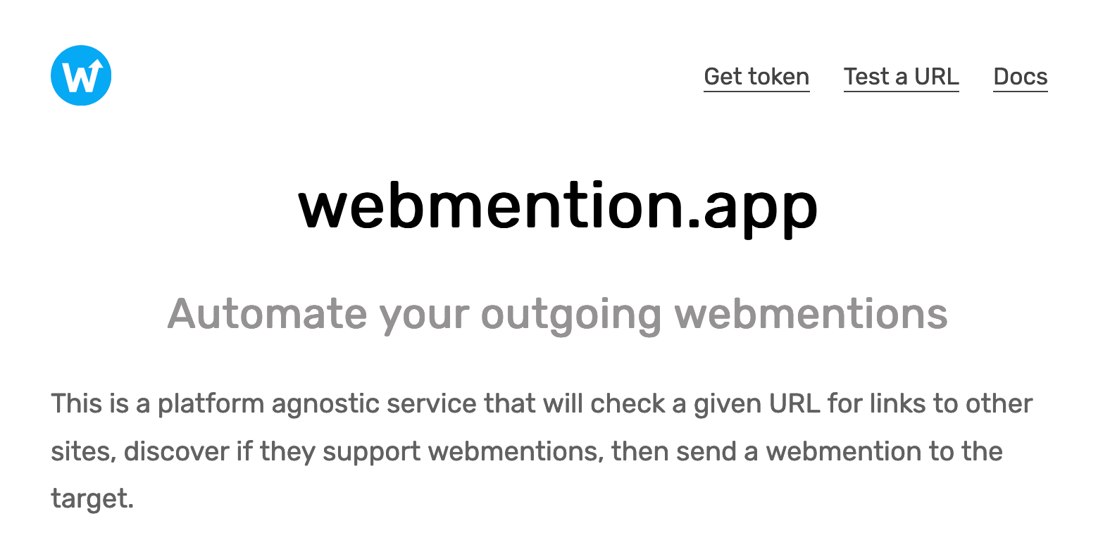
  4. Use webmention.app to automate sending webmentions (when you publish content that includes links to other sites that support Webmention).

(via Daniel Aleksandersen)

The post Weekly Platform News: CSS ::marker pseudo-element, pre-rendering web components, adding Webmention to your site appeared first on CSS-Tricks.

Why I don’t use web components

Here’s an interesting post by Rich Harris where he’s made a list of some of the problems he’s experienced in the past with web components and why he doesn’t use them today:

Given finite resources, time spent on one task means time not spent on another task. Considerable energy has been expended on web components despite a largely indifferent developer population. What could the web have achieved if that energy had been spent elsewhere?

The most convincing part of Rich’s argument for me is where he writes about progressive enhancement and the dependence on polyfills for using web components today. And I’m sure that a lot of folks disagree with many of Rich’s points here, and there’s an awful amount of snark in the comments beneath his post, but it’s certainly an interesting conversation worth digging into. For an opposing perspective, go read the very last paragraph in the last installment of our Web Components Guide, where author Caleb Williams suggests that there's no need to wait to use web components in projects:

These standards are ready to adopt into our projects today with the appropriate polyfills for legacy browsers and Edge. And while they may not replace your framework of choice, they can be used alongside them to augment you and your organization’s workflows.

But all of this is a good reminder that hey: web components are a thing that we should be able to freely criticize and talk about without being jerks. And I think Rich does that pretty well.

Direct Link to ArticlePermalink

The post Why I don’t use web components appeared first on CSS-Tricks.

Reduced Motion Picture Technique, Take Two

Did you see that neat technique for using the <picture> element with <source media=""> to serve an animated image (or not) based on a prefers-reduced-motion media query?

After we shared that in our newsletter, we got an interesting reply from Michael Gale:

What about folks who love their animated GIFs, but just didn’t want the UI to be zooming all over the place? Are they now forced to make a choice between content and UI?

I thought that was a pretty interesting question.

Also, whenever I see <img src="gif.gif"> these days, my brain is triggered into WELL WHAT ABOUT MP4?! territory, as I've been properly convinced that videos are better-in-all-ways on the web than GIFs. Turns out, some browsers support videos right within the <img> element and, believe it or not, you can write fallbacks for that, with — drumroll, please — for the <picture> element as well!

Let's take a crack at combining all this stuff.

Adding an MP4 source

The easy one is adding an additional <source> with the video. That means we'll need three source media files:

  1. A fallback non-animated graphic when prefers-reduced-motion is reduce.
  2. An animated GIF as the default.
  3. An MP4 video to replace the GIF, if the fallback is supported.

For example:

<picture>
  <source srcset="static.png" media="(prefers-reduced-motion: reduce)"></source>
  <source srcset="animated.mp4" type="video/mp4">
  <img srcset="animated.gif" alt="animated image" />
</picture>

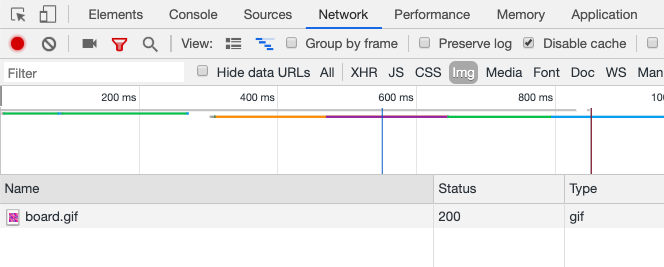
Under default conditions in Chrome, only the GIF is downloaded and shown:

Chrome DevTools showing only gif downloaded

Under default conditions in Safari, only the MP4 is downloaded and shown:

Safari DevTools showing only mp4 downloaded

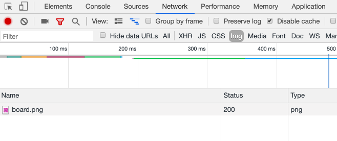
If you've activated prefers-reduced-motion: reduce in either Chrome or Safari (on my Mac, I go to System PreferencesAccessibilityDisplayReduce Motion), both browsers only download the static PNG file.

Chrome DevTools showing png downloaded

I tested Firefox and it doesn't seem to work, instead continuing to download the GIF version. Firefox seems to support prefers-reduced-motion, but perhaps it's just not supported on <source> elements yet? I'm not sure what's up there.

Wouldn't it be kinda cool to provide a single animated source and have a tool generate the others from it? I bet you could wire that up with something like Cloudinary.

Adding a toggle to show the animated version

Like Michael Gale mentioned, it seems a pity that you're entirely locked out from seeing the animated version just because you've flipped on a reduced motion toggle.

It should be easy enough to have a <button> that would use JavaScript to yank out the media query and force the browser to show the animated version.

I'm fairly sure there is no practical way to do this declaratively in HTML. We also can't put this button within the <picture> tag. Even though <picture> isn't a replaced element, the browser still gets confused and doesn't like it. Instead, it doesn't render it at all. No big deal, we can use a wrapper.

<div class="picture-wrap">
  
  <picture>
     <!-- sources  -->
  </picture>

  <button class="animate-button">Animate</button>

</div>

We can position the button on top of the image somewhere. This is just an arbitrary choice — you could put it wherever you want, or even have the entire image be tappable as long as you think you could explain that to users. Remember to only show the button when the same media query matches:

.picture-wrap .animate-button {
  display: none;
}

@media (prefers-reduced-motion: reduce) {
  .picture-wrap .animate-button {
     display: block;
  }
}

When the button is clicked (or tapped), we need to remove the media query to start the animation by downloading an animated source.

let button = document.querySelector(".animate-button");

button.addEventListener("click", () => {
  const parent = button.closest(".picture-wrap");
  const picture = parent.querySelector("picture");
  picture.querySelector("source[media]").remove();
});

Here's that in action:

See the Pen
Prefers Reduction Motion Technique PLUS!
by Chris Coyier (@chriscoyier)
on CodePen.

Maybe this is a good component?

We could automatically include the button, the button styling, and the button functionality with a web component. Hey, why not?

See the Pen
Prefers Reduction Motion Technique as Web Component
by Chris Coyier (@chriscoyier)
on CodePen.

The post Reduced Motion Picture Technique, Take Two appeared first on CSS-Tricks.

Wrapping React Components Inside Custom Elements

This week I had the pleasure of speaking in the ReactNext 2019 conference. My talk was called “I’m with Web Components and Web Components are with Me” and it was all about consuming Web Components in React apps and wrapping React components with custom elements. In this post, I’ll explain the second part and why you might want to do it. When the talk video will be available online, I’ll embed it in this post.

React and Web Components

In React documentation there is a section about React and Web Components. In that section, it is mentioned that React and Web Components are complementary to each other. While React is a view engine that is responsible for keeping the DOM in sync with the app's data, Web Components provide strong encapsulation for the creation of reusable HTML components. But in the real world most of the companies that I consult for don't use the two options together and why is that?

Making Web Components for Different Contexts

This article isn’t about how to build web components. Caleb Williams already wrote a comprehensive guide about that recently. Let’s talk about how to work with them, what to consider when making them, and how to embrace them in your projects.

If you are new to web components, Caleb’s guide is a great read, but here are more resources that will get you up to speed:

Since web components are now widely supported (thanks to the hard work of many people behind the scenes) — and considering the imminent switch that Edge will make to the chromium platform — people are now thinking about web components as "native" and a platform-compliant way to build reusable UI components to keep consistency across design systems and web projects, while using the power of the Shadow DOM to encapsulate style and logics inside the component itself.

Well, this can be true and false at the same time. But first, let’s get acquainted with the Abstraction Layers Triangle.

The Abstraction Layers Triangle

Technically, we should consider web components as an extension of our favorite markup language, HTML (yep!). The Web Components API allows us to create custom HTML elements (e.g. <foo-bar>) that don’t exist in HTML.

We are told web components are basically new HTML elements, so we should consider them as part of the HTML specifications and, consequently, we should follow its paradigms, core concepts, and utilization. If we assume all of these points, we will figure out that our components will live among the lowest levels of the web platform stack, alongside HTML, CSS, and JavaScript.

Frameworks and libraries like React, Vue, Angular, SvelteJS work on their abstraction level, right above other tools that live in a sort of "middle earth," like StencilJs, Hybrids and Lit. Under these layers of abstraction, we can find our basic web technologies… and vanilla web components. We can represent this concept with an ALT (A>bstraction L Triangle) diagram:

The higher we go, the more abstraction things get.

Why is this important? Well, it helps us visualize the various layers that exist on top of native components and understand the context they are used so that they can be built for an intended context. What's context? That's where we're headed.

Same technology, different contexts

The Shadow DOM is a key factor in the Web Components API. It allows us to bundle JavaScript and CSS inside a custom element to both prevent external interferences and style manipulations, unless we expressly allow it. There are indeed some approaches that developers can follow to allow external CSS to leak into the shadow root and into a component, including custom properties and the ::part and ::theme pseudo-elements, which is something Monica Dinculescu) has covered so well.

There is also another thing to consider: the context we are working with. After three years of building web components personally, I can identify two contexts: the private context (like a design system) and the standard context (like plain HTML, CSS, and JavaScript without custom styles).

Before designing components, we need to know how they will be used, so determining the type of context is a key to all of this. The most easy way is targeting only one context, but with a small CSS trick. we can build our components for both of them.

Let’s look at the differences between the two contexts before we get into that.

Private context

A private context is a closed ecosystem that provides components with their own style that must be used as-is. So, if we are building a component library that comes from specific styling guidelines or a design system, each component will reflect custom styles so there’s no need to code them up each time they’re needed.

That can be true also with JavaScript logic. For example, we can attach a closed shadow root that prevent others to accidentally pierce the shadow boundary with a querySelector. As a a result, we can simply pick and use all any component, avoiding issues like style inconsistencies and CSS collisions. As the author, you can also get to define a set of CSS custom properties (or ::parts) that can be used to style a component for a specific use case, but this is not the focus point of a design system.

Here’s an example of a web component component in a private context. It has all of the styles and logic contained inside its shadow-root and and can simply be dropped into any page.

See the Pen
Closed Context Web Component
by Mattia Astorino (@equinusocio)
on CodePen.

This example and the one to follow are for demonstration purposes and not intended for production use because they do not make considerations for key situations, like accessibility and other optimizations.

Components in a private context can be rarely used outside of that context. For example, if we try to take an element from a design system (which has its own enforced styles), we’re unable to simply add it to a project and expect to customize it. You know how Bootstrap can be themed and customized to your liking? This is pretty much the opposite of that. These components are made to live inside their context and their context only.

Standard context

A standard context may be the most complex type of component, not only because the environment can range anywhere from a full-fledged framework (like Vue and React) to plain vanilla HTML, but also because everyone should be able to use that component like any other element.

For example, when adding a component publicly, say to npm, those who use it will expect to be able to customize it, at least to some degree.

Do you know of any HTML element that comes with its own presentational style? The answer should be no because, well, elements must be explicitly styled with CSS. This is also true for web components made in a standard context. A single web component should be customizable by adding classes an attributes, or other methods.

Here’s the same <todo-list> element that we saw in the closed context example, but designed for a standard context. It works as-is, without any presentational styles inside its shadow root. In fact, it only contains the required logic and baseline CSS to make sure it functions. Otherwise, it’s completely customizable like any standard HTML element, like a div.

See the Pen
Standard Context Web Component
by Mattia Astorino (@equinusocio)
on CodePen.

Both of the examples we’ve looked at for each context are made with the same component. The difference is that the component in a standard context an be customized and selected with external CSS.

Web components and composition

OK, so working with web components is really the same as working with plain HTML, though as we’ve seen, it’s important to follow the paradigms and principles of the given content. Well, thing we need to be mindful of is the web component composition.

As explained by Google Web Fundamentals:

Composition is one of the least understood features of shadow DOM, but it's arguably the most important.

In our world of web development, composition is how we construct apps, declaratively out of HTML. Different building blocks (<div>s, <header>s, <form>s, <input>s) come together to form apps. Some of these tags even work with each other. Composition is why native elements like <select>, <details>, <form>, and <video> are so flexible. Each of those tags accepts certain HTML as children and does something special with them. For example, <select> knows how to render option> and <optgroup> into dropdown and multi-select widgets. The <details> element renders <summary> as an expandable arrow. Even <video> knows how to deal with certain children: <source> elements don't get rendered, but they do affect the video's behavior. What magic!

Composition is what we normally do when we work with HTML. Since web components are merely HTML elements with a DOM reference — and not logical containers — we should rely on composition to build our components and any sub-components. If you think about the ul and and select you will notice that you declaratively compose these elements to get the final output and you have specific attributes to be used with the main component (e.g. [readonly]) or the sub-component (e.g. [selected]). This is true also for web components, and if you are building a custom list, consider to build the main component (<custom-list>) and the child one (<custom-li>). Using the [slot] element, you can define where children elements will be placed and also placeholder content that will be shown when no children are passed through.

Web components and accessibility

Another thing to consider is that "small" topic we call accessibility. Since we are creating completely new HTML elements, we need to consider the accessibility of our elements in order to provide a basic semantic role, any keyboard navigation as well as the user’s operating system preferences, like the reduce motion and high contrast settings.

I strongly suggest the following resources as reference for building accessible and inclusive components, how to define semantic markup, and how to implement a basic keyboard navigation.

Conclusion

Web components are an emerging technology in web development and, as such, there really aren’t any clearly defined best practices to guide us as far as building them for their intended or maximized use. When you find yourself working with them, perhaps the single thing you can take away from this post is to consider whether they are intended for a closed context or a standard context, then ask yourself WHI:

  • Who will use this component?
  • How much flexibility should that person have to customize it?
  • Is this component for everyone or for a specific audience?

The post Making Web Components for Different Contexts appeared first on CSS-Tricks.