How to Turn a Procreate Drawing into a Web Animation

I recently started drawing on my iPad using the Procreate app with Apple Pencil. I’m enjoying the flexibility of drawing this way. What usually keeps me from painting at home are basic things, like setup, cleaning brushes, proper ventilation, and other factors not really tied to the painting itself. Procreate does a pretty nice job of emulating painting and drawing processes, but adding digital features like undo/redo, layers, and layer effects.

Here’s a Procreate painting I made that I wound up exporting and animating on the web.

See the Pen
Zebra Page- web animation from a Procreate drawing
by Sarah Drasner (@sdras)
on CodePen.

You can do this too! There are two basic animation effects we’ll cover here: the parallax effect that takes place on hover (with the ability to turn it off for those with vestibular disorders), and the small drawing effect when the page loads.

Parallax with drawing layers

I mentioned that part of the reason I enjoy drawing on the iPad is the ability to work in layers. When creating layers, I take care to keep certain “themes” on the same layer, for instance, the zebra stripes are on one layer and the dots are on own layer under beneath the stripes.

I’ll extend the drawing beyond the boundaries of where the line from the layer above ends, mainly because you’ll be able to peek around it a bit as we move the drawing around in the parallax effect. If the lines are sharp at any point, this will look unnatural.

Once I'm done creating my layers, I can export things as a Photoshop (PSD) file, thanks to Procreate's exporting options.

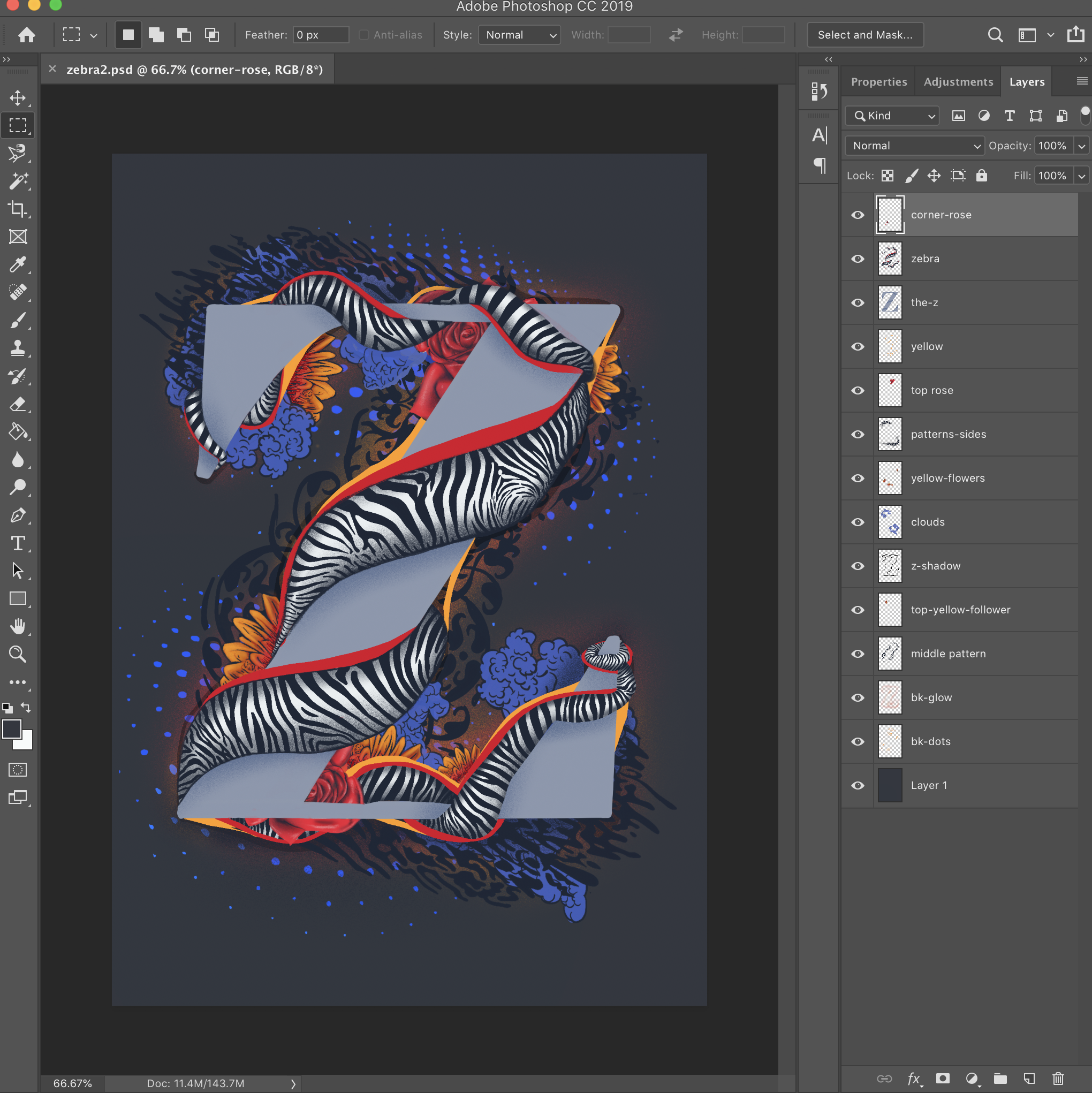
The same drawing opened in Photoshop.

Then I’ll join together a few, so that I’m only working with about 8 layers at most. I use a photoshop plugin called tinyPNG to export each layer individually. I’ve heard there are better compression tools, but I’ve been pretty happy with this one.

Next, I'll go into my code editor and create a div to house all the various images that are contained in the layers. I give that div relative positioning while all of the images inside it get absolute positioning. This places the images one on top the other.

<div id="zebra-ill" role="presentation">
  <img class="zebraimg" src='https://s3-us-west-2.amazonaws.com/s.cdpn.io/28963/zebraexport6.png' />
  <img class="zebraimg" src='https://s3-us-west-2.amazonaws.com/s.cdpn.io/28963/zebraexport5.png' />
 …
</div>
#zebra-ill {
  position: relative;
  min-height: 650px;
  max-width: 500px;
}

.zebraimg {
  position: absolute;
  top: 0;
  left: 0;
  perspective: 600px;
  transform-style: preserve-3d;
  transform: translateZ(0);
  width: 100%;
  }

The 100% width on the image will confines all of the images to the size of the parent div. I do this so that I’m controlling them all at once with the same restrictions, which works well for responsive conditions. The max-width and min-height on the parent allow me to confine the way that the div shrinks and grows, especially as when it gets dropped into a CSS Grid layout. It will need to be flexible, but have some constraints as well and CSS Grid is great for that.

Next, I add a mousemove event listener on the parent div with JavaScript. That lets me capture some information about the coordinates of the mouse using e.clientX and e.clientY.

const zebraIll = document.querySelector('#zebra-ill')

// Hover
zebraIll.addEventListener('mousemove', e => {
  let x = e.clientX;
  let y = e.clientY;
})

Then, I’ll go through each of the drawings and use those coordinates to move the images around. I'll even apply transform styles connected to those coordinates.

const zebraIll = document.querySelector('#zebra-ill')
const zebraIllImg = document.querySelectorAll('.zebraimg')
const rate = 0.05

//hover
zebraIll.addEventListener('mousemove', e => {
  let x = e.clientX;
  let y = e.clientY;
  
  zebraIllImg.forEach((el, index) => {
    el.style.transform = 
      `rotateX(${x}deg) rotateY(${y}deg)`
  })
})

See the Pen
zebra page
by Sarah Drasner (@sdras)
on CodePen.

Woah, slow down there partner! That’s way too much movement, we want something a little more subtle. So I’ll need to slow it way down by multiplying it by a low rate, like 0.05. I also want to change it a just bit per layer, so I'll use the layers index to speed up or slow down the movement.

const zebraIll = document.querySelector('#zebra-ill')
const zebraIllImg = document.querySelectorAll('.zebraimg')
const rate = 0.05

// Hover
zebraIll.addEventListener('mousemove', e => {
  let x = e.clientX;
  let y = e.clientY;
  
  zebraIllImg.forEach((el, index) => {
    let speed = index += 1
    let xPos = speed + rate * x
    let yPos = speed + rate * y
    
    el.style.transform = 
      `rotateX(${xPos - 20}deg) rotateY(${yPos - 20}deg) translateZ(${index * 10}px)`
  })
})

Finally, I can create a checkbox that asks the user if want to turn off this effect.

<p>
  <input type="checkbox" name="motiona11y" id="motiona11y" />
  <label for="motiona11y">If you have a vestibular disorder, check this to turn off some of the effects</label>
</p>
const zebraIll = document.querySelector('#zebra-ill')
const zebraIllImg = document.querySelectorAll('.zebraimg')
const rate = 0.05
const motioncheck = document.getElementById('motiona11y')
let isChecked = false

// Check to see if someone checked the vestibular disorder part
motioncheck.addEventListener('change', e => {
  isChecked = e.target.checked;
})

// Hover
zebraIll.addEventListener('mousemove', e => {
  if (isChecked) return
  let x = e.clientX;
  let y = e.clientY;
  
  // ...
})

Now the user has the ability to look at the layered dimensionality of the drawing on hover, but can also turn the effect off if it is bothersome.

Drawing Effect

The ability to make something look like it’s been drawn on to the page has been around for a while and there are a lot of articles on how it’s done. I cover it as well in a course I made for Frontend Masters.

The premise goes like this:

  • Take an SVG path and make it dashed with dashoffset.
  • Make the dash the entire length of the shape.
  • Animate the dashoffset (the space between dashes).

What you get in the end is a kind of “drawn-on” effect.

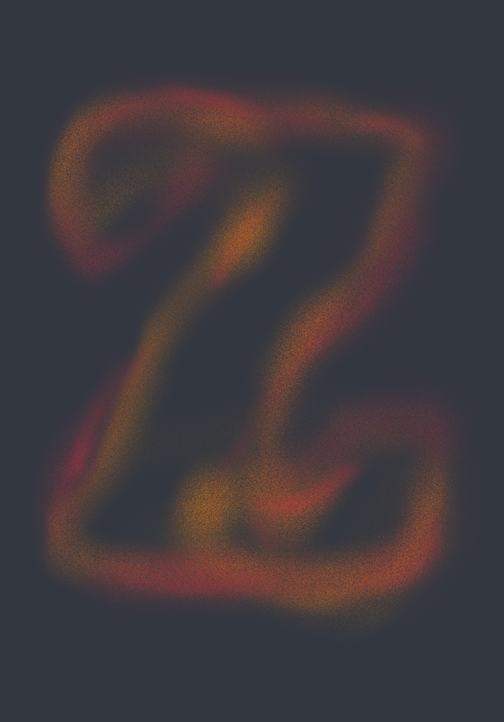
But in this particular drawing you might have noticed that the parts I animated look like they were hand-drawn, which is a little more unique. You see, though that effect will work nicely for more mechanical drawings, the web doesn’t quite yet support the use of tapered lines (lines that vary in thickness, as is typical of a more hand-drawn feel).

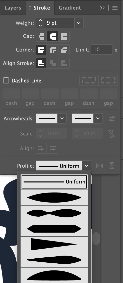
For this approach, I brought the file into Illustrator, traced the lines from that part of my drawing, and made those lines tapered by going into the Stroke panel, where I selected "More options" and clicked the tapered option from the dropdown.

Screenshot of the Illustrator Stroke menu.

I duplicated those lines, and created fatter, uniform paths underneath. I then took those fat lines and animate them onto the page. Now my drawing shows through the shape:

Here's what I did:

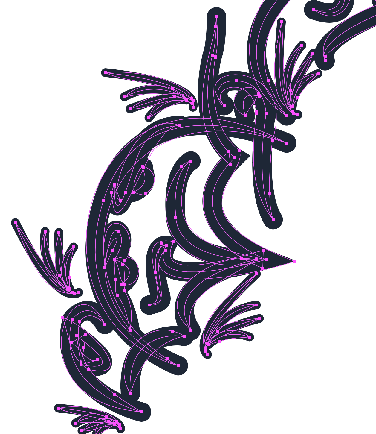
  • I traced with Pen tool and used tapered brush.
  • I duplicated the layer and changed the lines to be uniform and thicker.
  • I took the first layer and created a compound path.
  • I simplified path points.
  • I created clipping mask.

From there, I can animate everything with drawSVG and GreenSock. Though you don’t need to, you could use CSS for this kind of animation. There’s a ton of path points so in this case, so it makes sense to use something more powerful. I wrote another post that goes into depth on how to start off creating these kinds of animations. I would recommend you start there if you’re fresh to it.

To use drawSVG, we need to do a few things:

  • Load the plugin script.
  • Register the plugin at the top of the JavaScript file.
  • Make sure that paths are being used, and that there are strokes on those paths.
  • Make sure that those paths are targeted rather than the groups that house them. The parent elements could be targeted instead.

Here’s a very basic example of drawSVG (courtesy of GreenSock):

See the Pen
DrawSVGPlugin Values
by GreenSock (@GreenSock)
on CodePen.

So, in the graphics editor, there is a clipping mask with more artful lines, that expose fat uniform lines underneath. From here, we’ll grab a hold of those thicker paths and use the drawSVG plugin to animate them onto the page.

//register the plugin
gsap.registerPlugin(DrawSVGPlugin);

const drawLines = () => {
  gsap.set('.cls-15, #yellowunderline, .cls-13', {
    visibility: 'visible'
  })
  
  const timeline = gsap.timeline({ 
    defaults: {
      delay: 1,
      ease: 'circ',
      duration: 2
    }		  
  })
  .add('start')
  .fromTo('.cls-15 path', {
    drawSVG: '0%'
  }, {
    drawSVG: '100%',
    immediateRender: true
  }, 'start')
  .fromTo('#yellowunderline path', {
    drawSVG: '50% 50%'
  }, {
    drawSVG: '100%',
    immediateRender: true
  }, 'start+=1')
  .fromTo('.cls-13', {
    drawSVG: '50% 50%'
  }, {
    drawSVG: '100%',
    immediateRender: true
  }, 'start+=1')
}

window.onload = () => {
  drawLines()
};

And there we have it! An initial illustration for our site that’s created from a layered drawing in the Procreate iPad app. I hope this gets you going making your web projects unique with wonderful hand-drawn illustrations. If you make anything cool, let us know in the comments below!

The post How to Turn a Procreate Drawing into a Web Animation appeared first on CSS-Tricks.

How to Animate on the Web With Greensock

There are truly thousands of ways to animate on the web. We’ve covered a comparison of different animation technologies here before. Today, we’re going to dive into a step-by-step guide of one of my favorite ways to get it done: using GreenSock.

(They don’t pay me or anything, I just really enjoy using them.)

Why do I prefer Greensock to other methods? Technically speaking, it's often the best tool for the job. Its usage is extremely straightforward, even for complex movement. Here are a few more reasons why I prefer using it:

  • You can use them on DOM elements as well as within WebGL/Canvas/Three.js contexts.
  • The easing is very sophisticated. CSS animations are limited to two bezier handles for ease, meaning if you want, say, a bounce effect, you would have to make keyframes up and down and up and down for each pass. GreenSock allows multiple bezier handles to create advanced effects. A bounce is a single line of code. You can see what I mean by checking out their ease visualizer.
  • You can sequence movement on a timeline. CSS animations can get a little spaghetti when you have to coordinate several things at once. GreenSock remains very legible and allows you to control the timeline itself. You can even animate your animations! 🤯
  • It will perform some calculations under the hood to prevent strange cross-browser behavior as well as things that the spec dictates should be true aren't — like the way that stacking transforms work.
  • It offers a lot of advanced functionality, in the form of plugins, that you can use if you’d like to take your work a step further — things like Morphing SVG shapes, drawing SVG paths, dragging and dropping, inertia, and more.

People sometimes ask me why I'd use this particular library over all of the other choices. It’s further along than most others — they’ve been around since the Flash was still a thing. This demo reel is pretty inspiring, and also gets the point across that serious web animators do tend to reach for this tool:

What follows is a breakdown of how to create movement on the web, distilled down to the smallest units I could make them. Let’s get started!

Animating a DOM element

Consider a ball that we make with a

that's styled with a border-radius value of 50%. Here’s how we would scale and move it with Greensock:


gsap.to('.ball', {
  duration: 1,
  x: 200,
  scale: 2
})

See the Pen
Greensock Tutorial 1
by Sarah Drasner (@sdras)
on CodePen.

In this case, we’re telling GreenSock (gsap) to take the element with the class of .ball move it .to() a few different properties. We’ve shortened the CSS properties of transform: translateX(200px) to a streamlined x: 200 (note there's no need for the units, but you can pass them as a string). We’re also not writing transform: scale(2). Here's a reference of the transforms you might want to use with animations, and their corresponding CSS syntax:

x: 100 // transform: translateX(100px)
y: 100 // transform: translateY(100px)
z: 100 // transform: translateZ(100px)
// you do not need the null transform hack or hardware acceleration, it comes baked in with
// force3d:true. If you want to unset this, force3d:false
scale: 2 // transform: scale(2)
scaleX: 2 // transform: scaleX(2)
scaleY: 2 // transform: scaleY(2)
scaleZ: 2 // transform: scaleZ(2)
skew: 15 // transform: skew(15deg)
skewX: 15 // transform: skewX(15deg)
skewY: 15 // transform: skewY(15deg)
rotation: 180 // transform: rotate(180deg)
rotationX: 180 // transform: rotateX(180deg)
rotationY: 180 // transform: rotateY(180deg)
rotationZ: 180 // transform: rotateZ(180deg)
perspective: 1000 // transform: perspective(1000px)
transformOrigin: '50% 50%' // transform-origin: 50% 50%

Duration is what you might think it is: it’s a one-second stretch of time.

So, OK, how would we animate, say, an SVG? Let’s consider the same code above as an SVG:

  
gsap.to('.ball', {
  duration: 1,
  x: 200,
  scale: 2
})

See the Pen
Greensock Tutorial 2
by Sarah Drasner (@sdras)
on CodePen.

From an animation perspective, it’s actually exactly the same. It’s grabbing the element with the class .ball on it, and translating those properties. Since SVGs are literally DOM elements, we can slap a class on any one of them and animate them just the same way!

Great! We’re cooking with gas.

Eases

I mentioned before that eases are one of my favorite features, let’s take a look at how we’d use them.

Let’s take the original ball. Maybe we want to try one of those more unique bounce eases. It would go like this:

gsap.to('.ball', {
  duration: 1.5,
  x: 200,
  scale: 2,
  ease: 'bounce'
})

See the Pen
Greensock Tutorial 3
by Sarah Drasner (@sdras)
on CodePen.

That’s it! This version of GreenSock assumes that you want to use ease-out timing (which is better for entrances), so it applies that as a default. All you have to do is specify "bounce" as a string and you’re off to the races.

You might have noticed we also lengthened the duration a bit as well. That’s because the ball has to do more "work" in between the initial and end states. A one-second duration, though lovely for linear or sine easing, is a little too quick for a bounce or an elastic ease.

Delays and Timelines

I mentioned that the default ease-out timing function is good for entrances. What about an ease-in or ease-in-out exit? Let’s do that as well.

gsap.to('.ball', {
  duration: 1.5,
  x: 200,
  scale: 2,
  ease: 'bounce'
})

gsap.to('.ball', {
  duration: 1.5,
  delay: 1.5,
  x: 0,
  scale: 1,
  ease: 'back.inOut(3)'
})

You might have noticed a few things happening. For example, we didn't use bounce.in on the second-to-last line (ease: 'back.inOut(3)'). Instead, we used another ease called back for ease-in-out. We also passed in a configuration option because, as you can see with Greensock's ease visualizer tool, we’re not limited to just the default configuration for that ease. We can adjust it to our needs. Neat!

You may have also noticed that we chained the animations using a delay. We took the length of the duration of the first animation and made sure the next one has a delay that matches. Now, that works here, but that’s pretty brittle. What if we want to change the length of the first one? Well, now we’ve got to go back through and change the delay that follows. And what if we have another animation after that? And another one after that? Well, we’d have to go back through and calculate all the other delays down the line. That's a lot of manual work.

We can offload that work to the computer. Some of my more complex animations are hundreds of chained animations! If I finish my work and want to adjust something in the beginning, I don’t want to have to go back through everything. Enter timelines:

gsap
  .timeline()
  .to(‘.ball’, {
    duration: 1.5,
    x: 200,
    scale: 2,
    ease: "bounce"
  })
  .to(‘.ball’, {
    duration: 1.5,
    x: 0,
    scale: 1,
    ease: "back.inOut(3)"
  });

See the Pen
Greensock Tutorial 4
by Sarah Drasner (@sdras)
on CodePen.

This instantiates a timeline and then chains the two animations off of it.

But we still have a bit of repetition where we keep using the same duration in each animation. Let’s create a default for that as an option passed to the timeline.

gsap
  .timeline({
    defaults: {
      duration: 1.5
    }
  })
  .to('.ball', {
    x: 200,
    scale: 2,
    ease: "bounce"
  })
  .to('.ball', {
    x: 0,
    scale: 1,
    ease: "back.inOut(3)"
  });

See the Pen
Greensock Tutorial 4
by Sarah Drasner (@sdras)
on CodePen.

That’s pretty cool! Alright, you are probably starting to see how things are built this way. While it might not be a big deal in an animation this simple, defaults and timelines in really complex animations can truly keep code maintainable.

Now, what if we want to mirror this motion in the other direction with the ball, and just... keep it going? In other words, what if we want a loop? That’s when we add repeat: -1, which can be applied either to a single animation or to the entire timeline.

gsap
  .timeline({
    repeat: -1,
    defaults: {
      duration: 1.5
    }
  })
  .to('.ball', {
    x: 200,
    scale: 2,
    ease: "bounce"
  })
  .to('.ball', {
    x: 0,
    scale: 1,
    ease: "back.inOut(3)"
  })
  .to('.ball', {
    x: -200,
    scale: 2,
    ease: "bounce"
  })
  .to('.ball', {
    x: 0,
    scale: 1,
    ease: "back.inOut(3)"
  });

See the Pen
Greensock Tutorial 5
by Sarah Drasner (@sdras)
on CodePen.

We could also not only make it repeat but repeat and playback and forth, like a yoyo. That’s why we call this yoyo: true. To make the point clear, we’ll show this with just the first animation. You can see it plays forward, and then it plays in reverse.

gsap
  .timeline({
    repeat: -1,
    yoyo: true,
    defaults: {
      duration: 1.5
    }
  })
  .to('.ball', {
    x: 200,
    scale: 2,
    ease: "bounce"
  })

See the Pen
Greensock Tutorial 6
by Sarah Drasner (@sdras)
on CodePen.

Overlaps and Labels

It’s great that we can chain animations with ease, but real-life motion doesn’t exactly work this way. If you walk across the room to get a cup of water, you don’t walk. Then stop. Then pick up the water. Then drink it. You’re more likely to do things in one continuous movement. So let’s talk briefly about how to overlap movement and make things fire at once.

If we want to be sure things fire a little before and after each other on a timeline, we can use an incrementer or decrementer. If we take the following example that shows three balls animating one after another, it feels a little stiff.

gsap
  .timeline({
    defaults: {
      duration: 1.5
    }
  })
  .to('.ball', {
    x: 300,
    scale: 2,
    ease: "bounce"
  })
  .to('.ball2', {
    x: 300,
    scale: 2,
    ease: "bounce"
  })
  .to('.ball3', {
    x: 300,
    scale: 2,
    ease: "bounce"
  })

See the Pen
Greensock Tutorial 8
by Sarah Drasner (@sdras)
on CodePen.

Things get smoother if we overlap the movement just slightly using those decrementers passed as strings:

gsap
  .timeline({
    defaults: {
      duration: 1.5
    }
  })
  .to('.ball', {
    x: 300,
    scale: 2,
    ease: "bounce"
  })
  .to('.ball2', {
    x: 300,
    scale: 2,
    ease: "bounce"
  }, '-=1')
  .to('.ball3', {
    x: 300,
    scale: 2,
    ease: "bounce"
  }, '-=1')

See the Pen
Greensock Tutorial 9
by Sarah Drasner (@sdras)
on CodePen.

Another way we can do this is to use something called a label. Labels make sure things fire off at a particular point in time in the playhead of the animation. It looks like this:.add('labelName')

gsap
  .timeline({
    defaults: {
      duration: 1.5
    }
  })
  .add('start')
  .to('.ball', {
    x: 300,
    scale: 2,
    ease: "bounce"
  }, 'start')
  .to('.ball2', {
    x: 300,
    scale: 2,
    ease: "bounce"
  }, 'start')
  .to('.ball3', {
    x: 300,
    scale: 2,
    ease: "bounce"
  }, 'start')

See the Pen
Greensock Tutorial 10
by Sarah Drasner (@sdras)
on CodePen.

We can even increment and decrement from the label. I actually do this a lot in my animations. It looks like this: 'start+=0.25'

gsap
  .timeline({
    defaults: {
      duration: 1.5
    }
  })
  .add('start')
  .to('.ball', {
    x: 300,
    scale: 2,
    ease: "bounce"
  }, 'start')
  .to('.ball2', {
    x: 300,
    scale: 2,
    ease: "bounce"
  }, 'start+=0.25')
  .to('.ball3', {
    x: 300,
    scale: 2,
    ease: "bounce"
  }, 'start+=0.5')

Whew! We’re able to do so much with this! Here’s an example of an animation that puts a lot of these premises together, with a bit of interaction using vanilla JavaScript. Be sure to click on the bell.

See the Pen
phone interaction upgrade
by Sarah Drasner (@sdras)
on CodePen.

If you're looking more for framework-based animation with GreenSock, here's an article I wrote that covers this in Vue, and a talk I gave that addresses React — it's a couple of years old but the base premises still apply.

But there’s still so much we haven’t cover, including staggers, morphing SVG, drawing SVG, throwing things around the screen, moving things along a path, animating text... you name it! I'd suggest heading over to GreenSock’s documentation for those details. I also have a course on Frontend Masters that covers all of these in much more depth and the materials are open source on my GitHub. I also have a lot of Pens that are open source for you to fork and play with.

I hope this gets you started working with animation on the web! I can’t wait to see what you make!

The post How to Animate on the Web With Greensock appeared first on CSS-Tricks.

12 Essential Scroll-To-View Animation Trends

Animated page elements are super common on landing pages and startup websites. But they’re not always talked about in design circles because the idea of “animate on view” isn’t covered a lot.

I use the phrase scroll-to-view because it seems like an accurate description. Basically as you scroll down the page new animated elements come into view.

It’s not a technique that works for every website but it does add a nice touch into certain layouts. And I’ve curated some of my favorites here to showcase how these scroll-to-view animations work and why you might try using them yourself.

1. Tomorrow Sleep

On the Tomorrow Sleep website you’ll notice a few fairly benign animated effects. These fade different pieces of text and CTAs into view all around the layout.

What’s interesting is how most of the images and background areas are fully visible even on first scroll. Many websites use fading animation to display images and screenshots while keeping the text visible.

This minor difference helps draw attention to the text as it fades into view. A great way to capture attention from visitors browsing along.

2. Twist

Another technique I often see is targeting most of the page’s content for on-scroll animations.

For example the Twist app homepage includes varying page segments and blocks of text that animate in & out of view on scroll. These have a very soft fading effect so they’re noticeable yet not too harsh.

Some visitors may be annoyed by the delay but I don’t think it’s too long. Plus it only animates one time so if you hit the bottom of the page all animations are done.

3. Yarn App

For much more complex animations check out the Yarn App lander. This one has multi-part animations and even elements that come into view from different angles.

Some of the screenshot demo images animate upwards while the accompanying text/BG patterns animate down into view. This alternating style is pretty unique and not something I see often.

However the landing page is also incredibly simple and there isn’t much else here to grab attention. In this case varying animations work nicely.

4. DashFlow

Out of all these examples I think DashFlow uses the most common animation techniques.

This lander animates images and text into view all in one sitting. It’s real simple and uses a single-column layout so all content flows straight down in a linear path.

Nothing inherently special about this design beyond the very clear-cut method of animating items on scroll. A great style if you have a similar website and want to keep the animations simple.

5. Quuu Promote

Quuu Promote keeps animations to the bare minimum and only uses them in CTA areas.

I can’t say if this increases conversions but that does seem to be the goal. When you first load the page the very top header animates into view with a tilting animation on the CTA.

As you scroll down you’ll notice the rest of the page is pretty static. But at the bottom there’s one final CTA above the footer that also animates & runs the same tilting animation.

Goes to show you can have on-scroll animation effects that don’t run across the entire page.

6. Qonto

The homepage for Qonto has an interesting take on scroll-to-view animation. It uses the same type of animation across the entire website and animates individual items into view from the side.

For the majority of the page this includes icon sections that have a small graphic above some content explaining the app’s features. Not too subtle yet not overly overt either.

Plus you can find a few other animation styles in the header along with some BG images that fade into view. This page is just a gorgeous example of what web animation can do.

7. Hike

For an example of subtle animations check out Hike.

Their page alternates between animated elements and fixed elements. But the animation effects are fast so you don’t feel annoyed waiting for viewable content.

This is my preference for any scroll-to-animation effect. It’s always a beautiful technique but the timing needs to be quick and to the point. Nobody wants to wait around for content to come into view and Hike clearly understands this.

8. Project Fi

If there’s anyone who knows great UX it’s Google. And across all their products they have a ton of landing pages, Project Fi being one example with some fantastic animations.

These only apply to icons and they don’t fade into view, but rather pop up from lower on the page. As you scroll you’ll find icons that slide up into view for each small section.

It’s a pretty subtle effect but it adds some life into the design. And it’s based solely on the viewer’s position on the page so if you scroll to the top & move back down you’ll be greeted by the same animation effects.

9. Base

The Base CRM homepage is an excellent example of simple animation at work. This site uses custom animation effects to move images up and into the viewer’s eye line.

Based on the number of landing pages I see daily this is very typical of what I expect. It’s not really a complex animation to recreate and it doesn’t affect the experience too much either.

One thing I wish is that the animations would load a bit faster. But beyond that I think this is a prime example of animating images on scroll with a very clean layout to boot.

10. AnyList

All the best mobile applications have their own websites for promotion. And the best ones usually have some pretty snazzy animation styles.

AnyList mixes a few different techniques together on one page. Their header image animates up from beneath the cut-off area but it’s the only “moving” animation on the page.

Everything else just fades into view and it all uses a pretty quick load time for the animation. These techniques are used elsewhere on the site which gives it a more cohesive feel.

11. Ernest

The page style for Ernest is a little different than other landing pages I’ve covered.

It uses parallax scrolling animations to create motion on a single page layout with different sections.

These vary based on the direction you’re scrolling whether you move up or down, and at what speed. They also vary with intensity based on the different sections of the page.

You can navigate using the side dot navigation menu and this quickly jumps around the page to different areas. It’s one of the few techniques you’ll often see on parallax pages and it certainly helps Ernest stand out from the crowd.

12. TaxiNet

To catch a glimpse of full-page animations in action take a look at the TaxiNet website.

It’s a smorgasbord of scroll-based animation effects tied to icons, text, images, and even background styles. Individual page background colors animate into view with the user, definitely not a typical technique but certainly an interesting one.

If you like this style you could absolutely apply a similar approach to your own landing page. Just make sure you keep the animations snappy and quick because nobody wants to wait around for your neat animations to load.

But if you do ‘em right these scroll-to-view elements add a nice effect to any landing page.

LAST DAY: Zelda – A Beautiful and Classy Script Font – only $7!

Source