Level up your data Visualization With Charts in 7.0.2 Couchbase

If a picture is worth a thousand words, data visualization is worth a thousand data points. The 7.0.2 Couchbase Query Workbench (and the Analytics Workbench) introduces the charts tab, which allows users to create charts based on the results of the query.

A Closer Look at Charts

Internally we use D3 to render the charts themselves. Each individual value can be seen using the hover tooltip, and the legend (colors and what they represent) for the multicolored charts are seen in the right-hand corner of the canvas. The charts can also be downloaded as an SVG using the button on the right-hand side of the canvas. Sizing the canvas or the screen itself auto-adjusts the charts to fit. 
The Power of Software Visualization

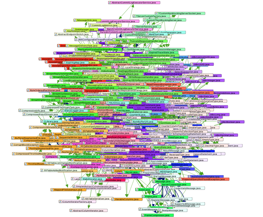
I thought I’d use our new 3D city view visualizations to have a closer look at Apache-Cassandra, a very popular and successful open source project that implements a NoSQL database. I know from previous analysis runs of the same software that it already had problems with structural erosion. Years ago I analyzed Cassandra 1.2.6 and found pretty big cycle groups for Java files as well as for packages. The maintainability level was only 9.4% (everything under 50% is concerning) while the metric “Propagation Cost” has a value of 62%. That means that every change will affect 62% of all code directly or indirectly which also is not a good thing because it significantly increases the chance of regression bugs.Visualization of 477 Java Files From Apache Cassandra

477 Java files form this big ball of mud in Apache-Cassandra 1.2.6

How I Visualize My Spreadsheet Formula Dependencies in a Chart

Overview

The formula is the heart of an Excel file. And of course, we all want to do correct calculations and deliver accurate results. When there is something wrong, we want to trace back to those referenced cells to find the root cause. Excel natively has a built-in convenient formula dependent/precedent trace feature, it highlights the dependent/precedent cells and displays arrows to indicate the relationships. This helps users to trace back and find any error formulas easily.

Now, when bringing the spreadsheet online, we can do more. We can display the relationships in a custom way that is most useful according to the application context, or bring them to a different service or application for doing the validation programmatically.

A Low-code Bitcoin Ticker Built With QuestDB and n8n.io

We've had many predictions of the emerging trends of 2020. Three that ended up ringing very true were the popularity of low-code platforms, the rise of time-series databases, and a digital currency boom. This tutorial combines these three topics into one example workflow automation that stores and analyzes Bitcoin market prices in QuestDB with a workflow template to get up and running quickly.

Prerequisites

This tutorial will use the docker images for both QuestDB and n8n.io, so users should ensure that they have the following installed and running on their system:

LJV: What We Can Learn From Java Data Structures Visualization

When I started to prepare a course of lectures on the Java language for the Moscow Institute of Physics and Technology, I became to search for material that can be used as illustrations. ‘One picture is worth a thousand words’ as they say, and sometimes it’s worth even more because it seems impossible to explain e. g. how a hash table works without drawing something. My task was to explain to students many Java concepts, from string pool to advanced data structures. I was looking for a solution that is able to make the visualization of Java data structures in the easiest and precise way, ideally compatible with ‘presentation as code’  technology.

There exists Aleksey Shipilev’s JOL (Java Object Layout) tool known among Java performance engineers. JOL analyzes the memory layout for any given object, including all the auxiliary data and fields, and the graph of objects reachable from the given instance. This tool gives accurate estimations of the object size and also shows the addresses in memory where objects are located. However, it’s not yet able to visualize the object graph and gives too many low-level details that are irrelevant for the students who just started to learn Java.

Grafana Analysis and Visualization with CA APM

Introduction

A Grafana is a multi-platform open-source analytical and visualization tool that consists of multiple individual panels arranged in a grid. It turns your time-series database (TSDB) data into beautiful graphs and visualizations. The panels interact with configured data sources, AWS CloudWatch, Prometheus, MySQL, InfluxDB, SQL Server, etc.

 Setup Grafana:

  • Refer to the instructions for your OS in the Installation section for instructions.
  • Open your web browser and go to http://localhost:3000/
  • On the login page, type admin for the username and password.

CA APM monitors the performance of applications and lets IT managers diagnose bottlenecks and other problems, it has capabilities to spot anomalies earlier, predict behavior, and enable automatic corrective actions.

How to Use Grafana Variables to Make More Interactive Dashboard Visualizations

The (All Too Common) Problem: Boring, Kind of Useful, Static Dashboards

Those of us that work with data often want to make useful dashboards that make it easier for ourselves and other people within our team and organization, to gain insight and make sense of the data we collect. 

A common problem I’ve run into (both when creating dashboards and using them as a stakeholder) is that many dashboards aren’t interactive enough for non-technical stakeholders to get their questions answered without asking engineers to write new code or change the underlying queries powering the dashboard. Or worse, stakeholders try to dig into the code and accidentally break things!

Create Charts in ReactJS Using Chart.js

In this article, we will learn how to create charts in a React application using the Chart.js library. Chart.js is an open-source JavaScript library for creating charts. Chart.js makes it easier to draw different types of charts like line, bar, doughnut, and area charts. In this article, we will create a line chart, bar chart, pie chart, and polar area using React and Web API. See chart.js' docs for more information.

Prerequisites

  • Basic knowledge of ReactJS and Web API.
  • Visual Studio and Visual Studio Code can be installed.
  • SQL Server Management Studio.

This article covers:

React Dashboard Ultimate Guide Part 3: Customize UI

This is the last part of a guide on building dynamic analytics dashboards and applications with React, GraphQL, and Cube.js. It covers an introduction to the customization of the UI. At the end of the blog post, I'll add links to the customization of individual components of the dashboard, such as query builders and the charts themselves. The online demo is available here. Parts one and two are available at their respective links. 

The dashboard template was generated using the Ant Design UI React library. It is one of the most popular React UI kits, alongside Material UI. It uses Less as a stylesheet language and allows us to customize the design by overriding default Less variables.

Getting to 85 — Agile Metrics with ActionableAgile, Part 1

The topic of Agile metrics inevitably comes up in many situations and conversations. I have been hiring Scrum Masters lately. One of my screening questions read, "What standard metrics would you track if any and for what purpose?" I cannot tell you how many candidates mention velocity, burndown and burnup charts. Very few can reasonably explain the meaning and use for those.

So far, I hired 2 Scrum Masters whose answer to the question didn't have any of those metrics. What these two have in common was they mentioned and could talk about Cycle Time. Mind you, that was not the only reason they got the job, but it gave them an advantage over others. Rarely do you hear Scrum practitioners bringing up Cycle Time, Lead Time, Throughput, or Work Item Age. These all firmly used to belong to the Kanban world. Somehow during the Holy Scrum-Kanban decades of feud these metrics were banished from the Scrum land and forgotten by many.

Cube.js: Ultimate Guide to the Open-Source Dashboard Framework

Cube.js is an open-source framework for building analytical web applications. It is primarily used to build internal business intelligence tools or to add customer-facing analytics to an existing application. In a majority of cases, the first step of building such an application is an analytics dashboard. It usually starts with — “let’s add an analytics dashboard to our admin panel.” Then, as it always happens in software development, things get more complicated — much more complicated.

When we started working on Cube.js, we wanted to build a tool, which is simple at first but scales easily in features, complexity, and data volume. Cube.js puts down a solid foundation for your future analytical system, whether it is a standalone application or embedded into the existing one.

The Mandelbrot Set In TensorFlow

What Is the Mandelbrot Set?

According to Wikipedia, “The Mandelbrot set is a famous example of a fractal in mathematics. The Mandelbrot set is important for chaos theory. The edging of the set shows a self-similarity, which is not perfect because it has deformations. The Mandelbrot set can be explained with the equation zn+1 = zn2 + c. In that equation, c and z are complex numbers, and n is zero or a positive integer (natural number). Starting with z0=0, c is in the Mandelbrot set if the absolute value of zn never becomes larger than a certain number (that number depends on c) no matter how large n gets.”

Visualizing the set has nothing to do with machine learning. It can be thought of as another TensorFlow example for mathematics. So, let’s learn how can we compute the Mandelbrot set in TensorFlow.

How to Create Clear Project Roles and Responsibilities

Sorting out who does what on a project would appear to be pretty basic. Clear tasks, with clear responsibilities and deadlines, is Project Management 101. But in too many projects, it remains unclear who is responsible for a deliverable until it’s too late.

The Circle Dot Chart addresses this issue. It’s a tool for getting clear on what deliverables are due, when, and who is responsible for them. The chart consists of lines that represent tasks, and circles at the intersection of tasks and functional responsibilities. It identifies key deliverables on the horizontal axis and key roles or key individuals on the vertical axis. Open circles indicate that an individual function is involved, while solid circles represent the directly responsible individual (DRI) for a given deliverable. It is essential that there be one and only one DRI.