Apple unveiled an expanded version of its San Francisco system font at WWDC 2022. Then, last month, Jim Nielsen zeroed in on the font’s variations, explaining how the font provides a spectrum of variations based on the width and weight. It’s a remarkable read if you haven’t checked it.
With all of these great new options, you might be tempted to use them in a web design. Chris was ogling over the expanded sets as well over on his personal blog and pondered:
But it’s not year clear how we might tap into the condensed, compressed, and expanded varieties in CSS, or if there is even a plan to allow that. I suppose we can peek around Apple.com eventually and see how they do it if they start using them there.
Doesn’t this make perfect sense to construct as a variable font and ship the whole kit and kaboodle that way?
Turns out, yes. It does make perfect sense. Chris follows up in a new post:
But just yesterday I randomly stumbled across the fact that the built-in San Francisco font (on the Apple devices that have it built-in) is already variable (!!). See, I was derping around with Roboto Flex, and had system-ui as the fallback font, and I was noticing that during the FOUT, the font-variation-settings I was using had an effect on the fallback font, which renders as San Francisco on my Mac. Which… unless I’m daft… means that San Francisco is a variable font.
So, as for using it? Chris has a demo, of course:
There are some gotchas to all this, the most significant being fallbacks for non-Apple devices. After all, that demo is simply calling system-ui for the font family — it’s not telling the browser to download a font file or anything and who knows if Apple is gonna ever ship a variable font file we can serve up as an actual custom web font.
The other interesting thing? Chris did some sleuthing and counted 35 layout featured included in that system font. Go read the rest of the post to see ’em all (and to get a good ol’ dose of Chris-isms — I know I miss them!).
The perfect cross-platform serif and sans-serif font stacks — Daniel Aleksandersen has lots of details about pre-installed fonts across operating systems, like: Mac and iOS also come with Helvetica Neue preinstalled. It addresses some of Helvetica’s legibility issues … On Windows, you might find a more modern version of Arial called Arial Nova. Arial Nova makes much the same legibility improvements and compromises as Helvetica Neue.
Pairing fonts – 3 ways to find great typeface combinations — Oliver Schöndorfer says it’s an artistist decision so don’t be afraid to try stuff. But also, do you even need more than one? If so, have a reason. Repeat your font choices as often as you can, and only when something does not work in a given situation, add a new style.
Twitter thread about Really Sans — Riley Cran gets into optical sizing and how Really Sans[…] is a sans serif typeface with two optical sizes. The small optical size works for text. The large optical size revives the tone of the 1970s headlines. I see Riley is using the pricing model based on # of employees rather than pageviews which I love.
Helvetica® Now Variable — I think having major fonts like Helvetica, that a lot of brands rely on, is the kind of thing that pushes the needle on variable fonts forward.
Fonts in the Twilight Zone — John Boardley looks at some rather unclassifiable fonts: Among my favorite kinds of typefaces are those that don’t fit neatly into predefined or existing categories; those that dip their toes into more than one genre, or take their cues from disparate historical periods.
Coding with Character — Doug Wilson looks at coding typefaces: If you spend all day looking at code, letters, and characters—why not make it fun?I’m down.
When recently testing a dark mode option for one of my sites, I experienced first-hand the issue that Robin Rendle addresses in this article. All of my page text — headings and body copy — appeared to bulk up when I switched to dark mode. And it didn’t matter what fonts I used or which browsers I tried. The same thing happened with all of them.
For example, here’s what happens with Adobe’s Source Sans Pro in Chrome for Windows:
See those blurry edges when we switch to dark mode?
It’s not an illusion. The light characters really are heavier against dark backgrounds. We can zoom in to see better:
The characters really are thicker in dark mode!
And it becomes really obvious when we invert the dark mode portions of those images:
We can really see the difference when putting the characters side-by-side on the same white background.
One solution
Since variable fonts enjoy wide browser support, we can use them to help us address this issue. The three panels below demonstrate a solution we’ll be working toward:
The top shows us some light text on a dark background. The middle panel shows what happens in dark mode without changing any font weight settings. And the bottom panel demonstrates dark mode text that we’ve thinned out a bit. That third panel is adjusted to match the weight of its light counterpart, which is what we’re trying to accomplish here.
Here’s how we can get this improved effect:
Reduce font-weight properties in dark mode via one of the following methods:
Manually changing each font-weight assignment directly in a dark mode media query.
Creating a single --font-weight-multiplier custom property that changes its value in dark mode, and by which we can then multiply by each element’s default font-weight value.
Same thing, but instead of calculating each element’s font-weight property individually, we take advantage of CSS variable scoping and the universal selector (*) to apply our multiplier calculation everywhere at once.
Adjust a variable font’s grade (“GRAD”) axis. Not all variable fonts support this specific feature, but Roboto Flex, does. Altering this axis value changes the font’s apparent weight, without affecting the width of the letters.
Adjust a variable font’s darkmode ("DRKM") axis. Dalton Maag’s aptly-named Darkmode, with its eponymous darkmode axis, is uniquely suited for this. As with the Roboto Flex’s grade axis, adjusting Darkmode’s darkmode axis changes the font’s apparent weight. But while the grade axis requires some fine-tuning of values, the darkmode axis is simply switched on (thinner) or off (regular).
The techniques in the first group work for most variable fonts. The solution Robin uses in his article is actually the very first item in the group. I’ll expand on the second and third items in the group by introducing custom properties that help us automatically adjust font weights in dark mode.
The second and third groups involve less common font-variation-settings axes. Though these strategies apply to fewer typefaces, they may be preferable when available. The trick is knowing what a variable font supports before choosing it.
I’ve made a demonstration page including all the strategies covered in this article. You can see what some different variable fonts look like in light mode, in dark mode with no adjustment, and in dark mode with our solutions for thinning out characters.
In addition to the strategies listed above, there’s always one more option: don’t do anything! If you think your fonts look good enough in light and dark mode, or you don’t have the bandwidth right now to wrestle with reflow, element resizing, browser/display inconsistencies, and extra CSS to maintain, then you may not have to change a thing. Focus on the rest of your site and leave yourself open to the possibility of revisiting this topic later.
Strategy 1: Reducing the font-weight value
Most variable text fonts have a weight axis, which lets us assign any specific font-weight value within the weight range available to that font (e.g. 0-1000, 300-800, etc.). Each technique in this strategy takes advantage of this fine control over the weight axis to reduce font-weight values in dark mode. (The need for such font-weight precision is also what renders most non-variable fonts unsuitable for this solution.)
If you neglect this step, some variable fonts may not properly reflect specific font-weight values in current Chromium browsers.
Dalton Maag Highgate’s font-weight set to 800 in Chrome without (left) and with (right) a font-weight range specified in the @font-face rule.
The basic solution: Manually entering each weight
Here’s the technique most of us may reach for. We create a dark mode media query in which we enter some font-weight values that are a bit lower than their defaults.
It works, and it’s no problem to maintain — so long as we’re not planning on adding or editing any other weights at our site! But if we do start incorporating more weights, it can get unwieldy fast. Remember to enter each selector/property combo both outside and inside the prefers-color-scheme media query. We’ll have to do some manual calculations (or guesswork) to determine the dark mode property values for each element.
Creating a weight multiplier custom property and using it in a calculation when setting an element’s weight
I generally try to adhere to Mike Riethmuller’s credo that “media queries are only used to change the value of custom properties.” And that’s the improvement we make in this solution. Instead of having to enter font weights for all our elements in and out of dark mode, the only thing we’re putting in our media query is a --font-weight-multiplier custom property:
Then, for all our font-weight properties throughout the stylesheet, we’ll multiply the variable’s value by our preferred default weight value for each element — thus lowering the font weight by 15% in dark mode. If we’re not in dark mode, we’ll multiply the default weight by 1, meaning it doesn’t change at all.
Here’s what I mean. Normally, we’d use this to set a body font weight of 400:
body {
  font-weight: 400;
}
For this solution, we use this:
body {
  font-weight: calc(400 * var(--font-weight-multiplier, 1));
}
In the var() function, notice that our variable has a fallback value of 1. Because --font-weight-multiplier is only set in dark mode, this fallback value will be used the rest of the time. So, by default, our font weight for body text stays at 400 (400*1). But in dark mode, the weight decreases to 340 (400*.85).
These weights will decrease from 700 to 595 (700*.85) in dark mode.
And we can use the same technique for any other elements where we want to set the font-weight to something other than 400 by default.
I’m using a value of .85 for --font-weight-multiplier, because I’ve found that to be a good general value for most fonts (like Adobe Source Sans Pro, the free typeface I use in most of this article’s demos). But feel free to play around with that number.
Creating a weight multiplier variable and automatically calculating and applying it to all elements at once.
When using many CSS custom properties, I think many of us stick to a “set as needed and manually apply everywhere” approach. That’s what the previous solution does. We set our custom property value in the :root (and/or use a fallback value), set it again in a media query, then apply it with calc() and var() functions throughout our stylesheet each time we assign a font-weight value.
But when we use this technique for various elements, you can see we have to do these three things every time we assign font-weight values:
Include the calc() function
Include the var() function
Remember the --font-weight-multiplier custom property’s name and default value
Instead, I’ve recently started inverting this approach for certain tasks, taking advantage of CSS variable scope with a “set everywhere and apply once” method. For this technique, I replace every font-weight property in the stylesheet with a --font-weight variable, keeping the name the same except for the dashes, for simplicity’s sake. I then set this value to the default weight for that particular selector (e.g. 400 for body text). Neither calc() nor var() is needed — yet. This is how we set everywhere.
Then we apply once, with a lone font-weight property in our stylesheet that sets every text element’s weight via the universal selector. Modifying our snippet above, we’d now have this:
The calc() function multiplies each of our --font-weight custom properties by our multiplier variable, and the font-weight property then applies the value to its appropriate element.
It’s unnecessary to use only a single var() for each custom property in the stylesheet. But I often like doing so when performing calculations and/or using a helper variable, as we do here. That said, while this is certainly the cleverest technique for adjusting font weights, that doesn’t mean it’s the best technique for all projects. There is at least one serious caveat.
The primary advantage of using the universal selector technique — that it applies to everything — also introduces its chief risk. There may be some elements that we don’t want thinned out! For example, if our form elements retain dark text on light backgrounds in dark mode, they may still get steamrolled by the universal selector.
There are ways to mitigate this risk. We could replace * with a long selector string containing a list of only elements to thin out (having them opt-in to the calculation). Or we could hard-code font weights for the elements that we don’t want affected (opt-out):
Such fixes may ultimately make code just as complicated as the previous technique. So, you’ll have to gauge which is appropriate for your project. If you still have concerns over performance, code complexity, or think this technique might introduce undesired (even unpredictable) results, the previous technique might be safest.
We’re not required to set the default --font-weight: 400 and --font-weight-multiplier: 1 custom properties in the above code, because we’ve included the fallback values in the var() functions. But as code gets more complicated, I often like assigning them in a logical place, just in case I want to find and alter them later.
A final note on this strategy: we can also apply weights with the font-variation-settings property and a "wght" axis value, instead of font-weight. If you’re using a typeface with several axes, maybe you find it more manageable to do all your font tweaking that way. I know of at least one font (Type Network’s Roboto Flex, which we’ll be using later in this article) that has 13 axes!
Here’s how to apply our solution via a font-variation-settings property:
One side effect of lowering our type weight is that, for most non-monspaced fonts, it also narrows the characters.
Here again is what happens when we lighten Source Sans Pro with our multiplier. The top two panels below show Source Sans Pro in light and dark mode by default. And the lower panel shows the lighter version.
Adobe’s Source Sans Pro in light mode, dark mode by default, and dark mode thinned out.
With no adjustments, the characters in light mode and dark mode are the same width. But when we lower the font weight, those characters now take up less space. You may not like how this change affects your flow or element sizes (e.g. narrower buttons). And some designers think it’s a good idea to add letter spacing in dark mode, anyway. So, if you want, you can create another custom property to add some space.
Implementing a custom property for letter spacing
Just like we did with our font-weight multiplier variable, we’re going to create a letter spacing variable with a default value that gets overridden in dark mode. In our default (light mode) :root, we set our new --letter-spacing custom property to 0 for now:
Then, in our dark mode query, we raise the value to something greater than 0. I’ve entered it as .02ch here (which combines pretty well with a --font-weight-multiplier value of .85). You could even get clever and fine-tune it with some calculations based on your font weights and/or sizes, if you like. But I’ll use this hard-coded value for now:
Note: Though I use the ch unit in this example, using em also works, if you prefer. For Source Sans Pro, a value of .009em is about equal to .02ch.
Here’s the full code for a font weight multiplier with letter spacing:
/* DEFAULT CSS CUSTOM PROPERTIES */
:root {
  --font-weight: 400;
  --font-weight-multiplier: 1;
  --letter-spacing: 0;
}

strong, b, th, h1, h2, h3, h4, h5, h6 {
  --font-weight: 700;
}

/* DARK MODE CSS CUSTOM PROPERTIES */
@media (prefers-color-scheme: dark) {
  :root {
    /* Variables to set the dark mode bg and text colors for our demo. */
    --background: #222;
    --color: #fff;

    /* Variables that affect font appearance in dark mode. */
    --font-weight-multiplier: .85;
    --letter-spacing: .02ch;
  }
}

/* APPLYING CSS STYLES... */
* {
  font-weight: calc(var(--font-weight, 400) * var(--font-weight-multiplier, 1));
  letter-spacing: var(--letter-spacing, 0);
}

body {
  background: var(--background, #fff);
  color: var(--color, #222);
}
Fonts with constant-width characters (aka multi-plexed fonts)
In addition to monospaced fonts, there are some other typefaces specifically designed so that their individual characters take up the same amount of horizontal space, regardless of weight. For example, if an “i” occupies five horizontal pixels of space at a weight of 400, and a “w” occupies thirteen pixels at the same weight, they will still occupy five and thirteen pixels, respectively, when their weights are increased to 700.
Arrow Type’s Recursive Sans is one such typeface. The following image shows how Recursive’s characters maintain the same widths in light mode, default dark mode, and dark mode with our font weight multiplier, respectively:
The characters in Arrow Type’s Recursive maintain their widths regardless of font weight.
Multi-plexed typefaces, like Recursive, are designed so you won’t need to adjust letter spacing when changing their font weights in dark mode. Your element sizes and page flow will remain intact.
Strategy 2: Adjust a variable font’s grade axis
The grade axis ("GRAD") changes a font’s apparent weight without changing its actual font-weight value or the widths of its characters. When using fonts with this axis, you may not need our font weight multiplier variable at all.
For Type Network’s free Roboto Flex font, a grade of -1 is thinnest, 0 (default) is normal, and 1 is thickest. With this font, I start by assigning its grade axis a value of around -.75 for dark mode.
Roboto Flex in light mode, dark mode default, and dark mode with “GRAD” set to -.75
So, adjusting the grade axis seems like the perfect solution if it’s available to you, right? Well, maybe. There are a few things to keep in mind when considering it.
First, the scale for all fonts doesn’t always go from -1 to 1. Some range from 0 to 1. At least one typeface uses percents, making 100 the default. And other fonts align the grade scale with font weights, so the range may be something like 100-900. If you want to use the grade axis in the latter case, you may have to set all your font weights everywhere to a default of 400, and then use the grade axis for all weight changes. For dark mode, you’ll then want to treat grade essentially like we do in our font weight multiplier solution — applying the multiplier to the "GRAD" axis in font-variation settings.
The second caveat is that some typefaces don’t let you grade a font to a value below its default weight. So, grade can’t lighten it at all. Apple’s San Francisco typeface (which can be tested via font-family: system-ui; on Apple devices) has both of these issues. As ofmacOS Catalina, San Francisco has a grade axis. It’s scaled to line up with font weights, and its minimum value is 400.
San Francisco’s grade and weight axes use the same scale, but have different ranges.
Because we can’t set the grade to a value lower than 400, we can’t lighten fonts from a default of 400 in dark mode. If we want to go lower, we’ll need to lower the weight axis value, instead.
Strategy 3: Adjusting a variable font’s darkmode axis
There’s currently only one typeface with a darkmode ("DRKM") axis at the time of this writing: Dalton Maag’s Darkmode.
The darkmode axis is essentially a grade axis without any fine-tuning. Just turn it on (1) for a thinner appearance in dark mode, and leave it off (0, the default) for normal display.
Darkmode in light mode, in dark mode with “DRKM” unset, and in dark mode with “DRKM” set to 1.
I like the Darkmode font a lot. But beware that it is a commercial license that’s required for professional use. Dalton Maag offers a trial version that can be used for “academic, speculative, or pitching purposes only.” I’m hoping this typeface is a pilot for more Dalton Maag families to get a darkmode axis, and that other font foundries will then follow suit!
Other factors to consider
We’ve covered a few big strategies for working with variable fonts in a dark mode context. But, as with most things, there are other things to consider that might sway you toward one solution or another.
Dark mode on high-resolution (“retina”) screens
On screens with higher pixel densities (e.g. most modern phones, MacBooks, iMacs, etc.), the thickening effect of dark mode is often less pronounced. Therefore, you may not want to thin the fonts on these screens out as much — if at all!
If you still want to lighten fonts a bit, you can add another media query to make the effect less severe. Depending which solution you’re using, you can raise the --font-weight-multiplier value closer to 1, raise the --GRAD value closer to 0, or disable --DRKM altogether (since it’s either on or off, with no in-between).
If you add this query, remember to place it below the original prefers-color-scheme query, or it may have no effect. Media queries don’t add CSS specificity, so their order matters!
@media (prefers-color-scheme: dark) and (-webkit-min-device-pixel-ratio: 2),
       (prefers-color-scheme: dark) and (min-resolution: 192dpi) {
  :root {
    --font-weight-multiplier: .92;
    /* Or, if you're using grade or darkmode axis instead: */
    /* --GRAD: -.3; */
    /* --DRKM: 0; */
  }
}
If you don’t want to lighten fonts at all on high density screens in dark mode, you can update your original dark mode prefers-color-scheme query to the following, to omit these screens:
@media (prefers-color-scheme: dark) and (-webkit-max-device-pixel-ratio: 1.9),
       (prefers-color-scheme: dark) and (max-resolution: 191dpi) {

  /* Custom properties for dark mode go here. */

}
Mixing fonts with different axes (and mixing variable fonts with non-variable fonts)
If you’re using more than one typeface on your site, you’ll need to consider what effects these adjustments may have on all of them. For example, if you’re using multiple fonts with intersecting axes, you could wind up accidentally combining the effects of multiple strategies (e.g. reducing both grade and weight simultaneously):
If your stylesheet includes solutions for several typefaces/axes, then the effect on fonts that have multiple axes (like this example’s Roboto Flex, which has both grade and weight axes) may be cumulative.
If all the fonts on your site are variable and have a grade axis with a matching scale and range (e.g. if they all range from -1 to 1), that’s the solution I’d recommend. However, you’ll have to revisit this if you plan to add other fonts later that don’t meet those criteria. Same goes for the darkmode axis, too, if it becomes more widespread.
If all your fonts are variable, but they don’t all share the same axes (e.g. grade and darkmode), then using only the --font-weight-multiplier custom property may be your safest bet.
Finally, if you’re mixing variable and non-variable fonts, know that the non-variable fonts will not change appearance with any of these solutions — with some exceptions. For example, if you’re using the font weight multiplier with the font-weight property, it is possible that some — but maybe not all — of your font weights will change enough to move to the next lower weight name.
Say your site includes a font with three weights: regular (400), semi-bold (600), and bold (700). In dark mode, your bold text may lighten up enough to display as semi-bold. But your regular font will still stay regular (as that’s the lowest weight included on the site). If you want to avoid that inconsistency, you could apply your variable font weights via font-variation-settings, and not font-weight, so your non-variable fonts aren’t affected at all. They’ll just always maintain their default weight in dark mode.
In closing
It’s always a happy coincidence when complementary technologies attain common usage near the same time. With the rise in popularity of both dark mode and variable fonts, we have the luxury of using the latter to mitigate one of the challenges of the former. Using CSS custom properties in conjunction with weight, grade, and darkmode axes, we can bring some consistency to the look of our text in both light and dark modes.
You can visit myinteractive demo with the fonts and axes from this article.
I have spent the past several years working (alongside a bunch of super talented people) on a font family called Recursive Sans & Mono, and it just launched officially on Google Fonts!
Wanna try it out super fast? Here’s the embed code to use the full Recursive variable font family from Google Fonts (but you will get a lot more flexibility & performance if you read further!)
Recursive is made for code, websites, apps, and more.
Recursive Mono has both Linear and Casual styles for different “voices” in code, along with cursive italics if you want them — plus a wider weight range for monospaced display typography.
Recursive Sans is proportional, but unlike most proportional fonts, letters maintain the same width across styles for more flexibility in UI interactions and layout.
I started Recursive as a thesis project for a type design masters program at KABK TypeMedia, and when I launched my type foundry, Arrow Type, I was subsequently commissioned by Google Fonts to finish and release Recursive as an open-source, OFL font.
You can see Recursive and learn more about it what it can do at recursive.design.
Recursive is made to be a flexible type family for both websites and code, where its main purpose is to give developers and designers some fun & useful type to play with, combining fresh aesthetics with the latest in font tech.
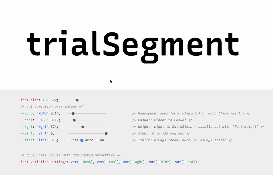
First, a necessary definition: variable fonts are font files that fit a range of styles inside one file, usually in a way that allows the font user to select a style from a fluid range of styles. These stylistic ranges are called variable axes, and can be parameters, like font weight, font width, optical size, font slant, or more creative things. In the case of Recursive, you can control the “Monospacedness” (from Mono to Sans) and “Casualness” (between a normal, linear style and a brushy, casual style). Each type family may have one or more of its own axes and, like many features of type, variable axes are another design consideration for font designers.
Because Google Fonts has a huge range of users — many of them new to web development — it is understandable that they’re keeping things simple by only showing the “weight” axis for variable fonts. But, for fonts like Recursive, this simplification actually leaves out a bunch of options. On the Recursive page, Google Fonts shows visitors eight styles, plus one axis. However, Recursive actually has 64 preset styles (also called named instances), and a total of five variable axes you can adjust (which account for a slew of more potential custom styles).
Recursive can be divided into what I think of as one of four “subfamilies.” The part shown by Google Fonts is the simplest, proportional (sans-serif) version. The four Recursive subfamilies each have a range of weights, plus Italics, and can be categorized as:
Sans Linear: A proportional, “normal”-looking sans-serif font. This is what gets shown on the Google Fonts website.
Sans Casual: A proportional “brush casual” font
Mono Linear: A monospace “normal” font
Mono Casual: A monospace “brush casual” font
This is probably better to visualize than to describe in words. Here are two tables (one for Sans, the other for Mono) showing the 64 named instances:
But again, the main Google Fonts interface only provides access to eight of those styles, plus the Weight axis:
Recursive has 64 preset styles — and many more using when using custom axis settings — but Google Fonts only shows eight of the preset styles, and just the Weight axis of the five available variable axes.
Not many variable fonts today have more than a Weight axis, so this is an understandable UX choice in some sense. Still, I hope they add a little more flexibility in the future. As a font designer & type fan, seeing the current weight-only approach feels more like an artificial flattening than true simplification — sort of like if Google Maps were to “simplify” maps by excluding every road that wasn’t a highway.
Luckily, you can still access the full potential of variable fonts hosted by Google Fonts: meet the Google Fonts CSS API, version 2. Let’s take a look at how you can use this to get more out of Recursive.
But first, it is helpful to know a few things about how variable fonts work.
How variable fonts work, and why it matters
If you’ve ever worked with photos on the web then you know that you should never serve a 9,000-pixel JPEG file when a smaller version will do. Usually, you can shrink a photo down using compression to save bandwidth when users download it.
There are similar considerations for font files. You can often reduce the size of a font dramatically by subsetting the characters included in it (a bit like cropping pixels to just leave the area you need). You can further compress the file by converting it into a WOFF2 file (which is a bit like running a raster image file though an optimizer tool like imageOptim). Vendors that host fonts, like Google Fonts, will often do these things for you automatically.
Now, think of a video file. If you only need to show the first 10 seconds of a 60-second video, you could trim the last 50 seconds to have a much small video file.
Variable fonts are a bit like video files: they have one or more ranges of information (variable axes), and those can often either be trimmed down or “pinned” to a certain location, which helps to reduce file size.
Of course, variable fonts are nothing like video files. Fonts record each letter shape in vectors, (similar to SVGs store shape information). Variable fonts have multiple “source locations” which are like keyframes in an animation. To go between styles, the control points that make up letters are mathematically interpolated between their different source locations (also called deltas). A font may have many sets of deltas (at least one per variable axis, but sometimes more). To trim a variable font, then, you must trim out unneeded deltas.
As a specific example, the Casual axis in Recursive takes letterforms from “Linear” to “Casual” by interpolating vector control points between two extremes: basically, a normal drawing and a brushy drawing. The ampersand glyph animation below shows the mechanics in action: control points draw rounded corners at one extreme and shift to squared corners on the other end.
Generally, each added axis doubles the number of drawings that must exist to make a variable font work. Sometimes the number is more or less – Recursive’s Weight axis requires 3 locations (tripling the number of drawings), while its Cursive axis doesn’t require extra locations at all, but actually just activates different alternate glyphs that already exist at each location. But, the general math is: if you only use opt into fewer axes of a variable font, you will usually get a smaller file.
When using the Google Fonts API, you are actually opting into each axis. This way, instead of starting with a big file and whittling it down, you get to pick and choose the parts you want.
Variable axis tags
If you’re going to use the Google Fonts API, you first need to know about font axes abbreviations so you can use them yourself.
Variable font axes have abbreviations in the form of four-letter “tags.” These are lowercase for industry-standard axes and uppercase for axes invented by individual type designers (also called “custom” or “private” axes).
There are currently five standard axes a font can include:
wght – Weight, to control lightness and boldness
wdth – Width, to control overall letter width
opsz – Optical Size, to control adjustments to design for better readability at various sizes
ital – Italic, generally to switch between separate upright/italic designs
slnt – Slant, generally to control upright-to-slanted designs with intermediate values available
Custom axes can be almost anything. Recursive includes three of them — Monospace (MONO), Casual (CASL), and Cursive (CRSV) — plus two standard axes, wght and slnt.
Google Fonts API basics
When you configure a font embed from the Google Fonts interface, it gives you a bit of HTML or CSS which includes a URL, and this ultimately calls in a CSS document that includes one or more @font-face rules. This includes things like font names as well as links to font files on Google servers.
This URL is actually a way of calling the Google Fonts API, and has a lot more power than you might realize. It has a few basic parts:
The main URL, specifying the API (https://fonts.googleapis.com/css2)
Details about the fonts you are requesting in one or more family parameters
A font-display property setting in a display parameter
As an example, let’s say we want the regular weight of Recursive (in the Sans Linear subfamily). Here’s the URL we would use with our CSS @import:
Once that’s in place, we can start applying the font in CSS:
body {
  font-family: 'Recursive', sans-serif;
}
There is a default value for each axis:
MONO 0 (Sans/proportional)
CASL 0 (Linear/normal)
wght 400 (Regular)
slnt 0 (upright)
CRSV 0 (Roman/non-cursive lowercase)
Choose your adventure: styles or axes
The Google Fonts API gives you two ways to request portions of variable fonts:
Listing axes and the specific non-default values you want from them
Listing axes and the ranges you want from them
Getting specific font styles
Font styles are requested by adding parameters to the Google Fonts URL. To keep the defaults on all axes but use get a Casual style, you could make the query Recursive:CASL@1 (this will serve Recursive Sans Casual Regular). To make that Recursive Mono Casual Regular, specify two axes before the @ and then their respective values (but remember, custom axes have uppercase tags):
A very helpful thing about Google Fonts is that you can request a bunch of individual styles from the API, and wherever possible, it will actually serve variable fonts that cover all of those requested styles, rather than separate font files for each style. This is true even when you are requesting specific locations, rather than variable axis ranges — if they can serve a smaller font file for your API request, they probably will.
As variable fonts can be trimmed more flexibility and efficiently in the future, the files served for given API requests will likely get smarter over time. So, for production sites, it may be best to request exactly the styles you need.
Where it gets interesting, however, is that you can also request variable axes. That allows you to retain a lot of design flexibility without changing your font requests every time you want to use a new style.
Getting a full variable font with the Google Fonts API
The Google Fonts API seeks to make fonts smaller by having users opt into only the styles and axes they want. But, to get the full benefits of variable fonts (more design flexibility in fewer files), you should use one or more axes. So, instead of requesting single styles with Recursive:wght@400;700, you can instead request that full range with Recursive:wght@400..700 (changing from the ; to .. to indicate a range), or even extending to the full Recursive weight range with Recursive:wght@300..1000 (which adds very little file size, but a whole lot of extra design oomph).
You can add additional axes by listing them alphabetically (with lowercase standard axes first, then uppercase custom axes) before the @, then specifying their values or ranges after that in the same order. For instance, to add the MONO axis and the wght axis, you could use Recursive:wght,MONO@300..1000,0..1 as the font query.
Or, to get the full variable font, you could use the following URL:
Customizing it further to balance flexibility and filesize
While it can be tempting to use every single axis of a variable font, it’s worth remembering that each additional axis adds to the overall files ize. So, if you really don’t expect to use an axis, it makes sense to leave it off. You can always add it later.
Let’s say you want Recursive’s Mono Casual styles in a range of weights,. You could use Recursive:wght,CASL,MONO@300..1000,1,1 like this:
You can, of course, add multiple font families to an API call with additional family parameters. Just be sure that the fonts are alphabetized by family name.
The standard axes can all be controlled with existing CSS properties. For instance, if you have a variable font with a weight range, you can specify a specific weight with font-weight: 425;. A specific Slant can be requested with font-style: oblique 9deg;. All axes can be controlled with font-variation-settings. So, if you want a Mono Casual very-heavy style of Recursive (assuming you have called the full family as shown above), you could use the following CSS:
body {
 font-weight: 950;
 font-variation-settings: 'MONO' 1, 'CASL' 1;
}
Another useful thing to know is that, while you should be able to activate slant with font-style: italic; or font-style: oblique Xdeg;, browser support for this is inconsistent (at least at the time of this writing), so it is useful to utilize font-variation-settings for the Slant axis, as well.
If you were to using all 64 preset styles of Recursive as separate WOFF2 files (with their full, non-subset character set), it would be total of about 6.4 MB. By contrast, you could have that much stylistic range (and everything in between) at just 537 KB. Of course, that is a slightly absurd comparison — you would almost never actually use 64 styles on a single web page, especially not with their full character sets (and if you do, you should use subsets and unicode-range).
A better comparison is Recursive with one axis range versus styles within that axis range. In my testing, a Recursive WOFF2 file that’s subset to the “Google Fonts Latin Basic” character set (including only characters to cover English and western European languages), including the full 300–1000 Weight range (and all other axes “pinned” to their default values) is 60 KB. Meanwhile, a single style with the same subset is 25 KB. So, if you use just three weights of Recursive, you can save about 15 KB by using the variable font instead of individual files.
The full variable font as a subset WOFF2 clocks in at 281 KB which is kind of a lot for a font, but not so much if you compare it to the weight of a big JPEG image. So, if you assume that individual styles are about 25 KB, if you plan to use more than 11 styles, you would be better off using the variable font.
This kind of math is mostly an academic exercise for two big reasons:
Variable fonts aren’t just about file size.The much bigger advantage is that they allow you to just design, picking the exact font weights (or other styles) that you want. Is a font looking a little too light? Bump up the font-weight a bit, say from 400 to 425!
More importantly (as explained earlier), if you request variable font styles or axes from Google Fonts, they take care of the heavy lifting for you, sending whatever fonts they deem the most performant and useful based on your API request and the browsers visitors access your site from.
So, you don’t really need to go downloading fonts that the Google Fonts API returns to compare their file sizes. Still, it’s worth understanding the general tradeoffs so you can best decide when to opt into the variable axes and when to limit yourself to a couple of styles.
What’s next?
Fire up CodePen and give the API a try! For CodePen, you will probably want to use the CSS @import syntax, like this in the CSS panel:
It is apparently better to use the HTML link syntax to avoid blocking parallel downloads of other resources. In CodePen, you’d crack open the Pen settings, select HTML, then drop the <link> in the HTML head settings.
Or, hey, you can just fork my CodePen and experiment there:
Take an API configuration shortcut
If you are want to skip the complexity of figuring out exact API calls and looking to opt into variable axes of Recursive and make semi-advanced API calls, I have put together a simple configuration tool on the Recursive minisite (click the “Get Recursive” button). This allows you to quickly select pinned styles or variable ranges that you want to use, and even gives estimates for the resulting file size. But, this only exposes some of the API’s functionality, and you can get more specific if you want. It’s my attempt to get people using the most stylistic range in the smallest files, taking into account the current limitations of variable font instancing.
Use Recursive for code
Also, Recursive is actually designed first as a font to use for code. You can use it on CodePen via your account settings. Better yet, you can download and use the latest Recursive release from GitHub and set it up in any code editor.
Explore more fonts!
The Google Fonts API doc helpfully includes a (partial) list of variable fonts along with details on their available axis ranges. Some of my favorites with axes beyond just Weight are Crimson Pro (ital, wght), Work Sans (ital, wght), Encode Sans (wdth, wght), and Inter (slnt, wght). You can also filter Google Fonts to show only variable fonts, though most of these results have only a Weight axis (still cool and useful, but don’t need custom URL configuration).
Some more amazing variable fonts are coming to Google Fonts. Some that I am especially looking forward to are:
Fraunces: “A display, “Old Style” soft-serif typeface inspired by the mannerisms of early 20th century typefaces such as Windsor, Souvenir, and the Cooper Series”
Roboto Flex: Like Roboto, but withan extensive ranges of Weight, Width, and Optical Size
Crispy: A creative, angular, super-flexible variable display font
Science Gothic: A squarish sans “based closely on Bank Gothic, a typeface from the early 1930s—but a lowercase, design axes, and language coverage have been added”
And yes, you can absolutely download and self-host these fonts if you want to use them on projects today. But stay tuned to Google Fonts for more awesomely-flexible typefaces to come!
Of course, the world of type is much bigger than open-source fonts. There are a bunch of incredible type foundries working on exciting, boundary-pushing fonts, and many of them are also exploring new & exciting territory in variable fonts. Many tend to take other approaches to licensing, but for the right project, a good typeface can be an extremely good value (I’m obviously biased, but for a simple argument, just look at how much typography strengthens brands like Apple, Stripe, Google, IBM, Figma, Slack, and so many more). If you want to feast your eyes on more possibilities and you don’t already know these names, definitely check out DJR, OHno, Grilli, XYZ, Dinamo, Typotheque, Underware, Bold Monday, and the many very-fun WIP projects on Future Fonts. (I’ve left out a bunch of other amazing foundries, but each of these has done stuff I particularly love, and this isn’t a directory of type foundries.)
In the past few years, we’ve seen a lot of change and diversion in regard to web technologies. In 2020, I foresee us as a web community heading toward two major trends/goals: extensibility and interoperability. Let’s break those down.
Extensibility
Extensibility describes how much someone can take a particular technology and extend it to their own needs. We’ve built a component-based web over the last few years in terms of both development (React components! Vue components! Svelte components! Web components!) and design (Design systems!). Interesting how form follows function, isn’t it?
Now we’re trying to make that component system look and feel more unique. Extensibility on the web allows us to tailor the platform to our own needs, and experiment with outcomes.
CSS itself is becoming much more extensible…
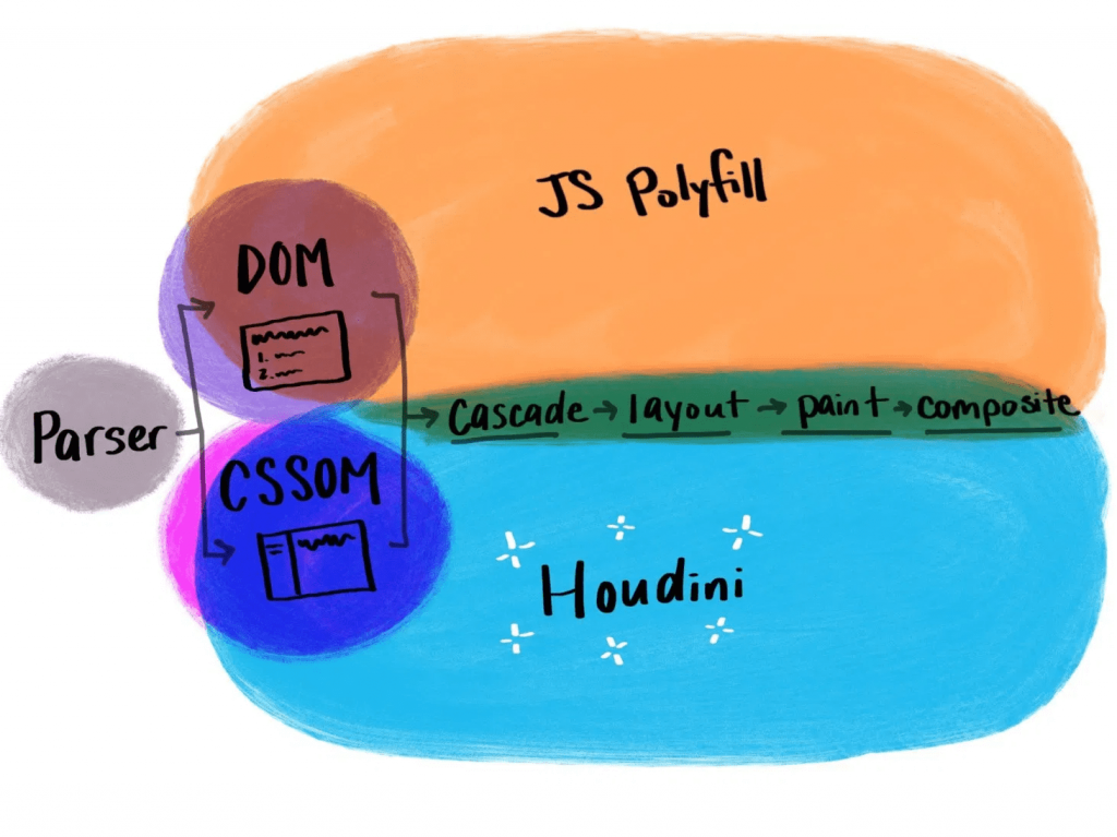
CSS Houdini
With CSS Houdini, developers will be able to extend what’s currently possible in the CSS Object Model and teach the browser how they want it to read and render their CSS.
That means that things that weren’t previously possible on the web, like angled corners or round layout, now become possible.
If you’re not yet familiar with Houdini, it’s an umbrella term that describes a few different browser APIs, intended to improve browser performance. It makes styling more extensible and lets users dictate their own CSS features. Houdini’s current APIs include:
With these APIs, users can tap into meaningful semantic CSS (thanks to the Typed Object Model), and even apply semantics to their CSS variables (Properties and Values). With the Paint API, you can draw a canvas and have it applied as a border image (hello, gradient borders), or create animated sparkles (link) that accept dynamic arguments and are implemented with a single line of CSS.
.sparkles {
  background: paint(sparkles)
}
You can build round menus without placing the items manually through margins (via the Layout API), and you can integrate your own interactions that live off of the main thread (using the Animation Worklet).
Houdini is definitely one to watch in the new year, and now is a great time to start experimenting with it if you haven’t yet.
Variable fonts
Another technology that falls in line with the goal of making websites more performant while offering more user extensibility is variable fonts. With so many new variable fonts popping up — and Google Fonts’ recent beta launch — variable fonts are now more available and easy to use than ever.
Variable fonts are vector-based and allow for a broad range of values to be set for various font axes, like weight and slant. The interpolation of these axes allows fonts to transition smoothly between points.
Here’s an example:
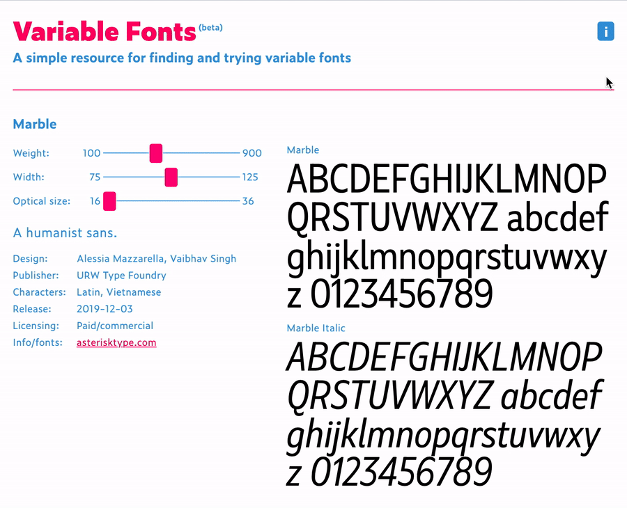
Variable fonts also allow for new axes to help designers and developers be even more creative with their work. Here’s an example of some of those from an excellent resource called v-fonts:
Variable fonts are relatively well supported, with 87% of modern browsers supporting the required font format.
Custom Properties
Custom properties, like variable fonts, are also well supported. While they’re not new, we’re still discovering all of the things we can do with custom properties.
Custom properties allow for truly dynamic CSS variables, meaning we can adjust them in JavaScript, separating logic and style. A great example of this comes from David Khourshid, who shows us how to create reactive animations and sync up the styling without sweating it.
We’re also starting to experiment with more logic in our stylesheets. I recently published a blog post that explains how to create dynamic color themes using the native CSS calc() function, along with custom properties.
This eliminates the need for additional tools to process our CSS, and ensures that this technique for theming works across any technology stack — which brings me to my next 2020 vision: interoperability.
Interoperability
Interoperability, by my definition in this post, means the ability to work between technologies and human needs. From a technical perspective, with the fragmented web, a lot of companies have migrated stacks in the recent past, or have multiple internal stacks, and are now likely interested in safeguarding their technology stack against future changes to maintain some semblance of uniformity.
Web components
Web components try to solve this problem by attacking the problem of component-based architecture from a web-standards perspective. The vision is to introduce a standard format that can be used with or without a library, benefiting the developer experience and establishing uniformity between components.
Each web component is encapsulated and works in modern browsers without dependencies. This technology is still evolving and I think we’ll see a lot of growth in 2020.
Logical properties
Logical properties challenge us to adjust our mental model of how we apply layout sizing on a page in order for us to make our pages more friendly across languages and reading modes. They allow for our layouts to be interoperable with user experiences.
In English, and other left-to-right languages, we think of the layout world in terms of height and width, and use a compass-type expression for margins, border, and padding (top, left, bottom, right). However if we style this way and then adjust the language to a right-to-left language, like Arabic, the padding-left of our paragraphs no longer means padding from the beginning of where we would read. This breaks the layout.
If you were to write padding-inline-start instead of padding-left, the padding would correctly swap to the other side of the page (the start of where one would be reading) when switching to the right-to-left language, maintaining layout integrity.
Preference media queries
Preference media queries are also on the rise, with more capability coming in 2020. They allow us to tailor our sites to work with people who prefer high contrast or dark mode, as well as people who prefer a less animation-heavy experience.
In this video, I go over how to create a preference media query for dark mode, using custom properties for styling:
Runner up: Speed
Speed is also a topic I see as a big focus of the web world in 2020. Several of the technologies I mentioned above have the benefit of improving web performance, even if it isn’t the main focus (e.g. how variable fonts may reduce the total weight of fonts downloaded). Performance becomes increasingly important when we think about the next billion users coming online in areas where network speeds may be lacking.
In addition, Web Assembly, which is a wrapper that lets users write closer to the browser metal, is gaining popularity. I also foresee a lot more work with WebGL in the coming year, which uses similar techniques for advanced and speedy graphics rendering. Writing lower-level code allows for speedier experiences, and in some cases of WebGL, may be required to prevent advanced visualization from crashing our browsers. I think we’ll see these two technologies grow and see more WebGL demos in 2020.
The web is constantly evolving and that's what makes it so exciting to be a part of. What do you see as a goal or technology to watch in 2020? Tell us in the comments!
There's been a ton of great stuff flying around about variable fonts lately (our tag has loads of stuff as well). I thought I'd round up all the new stuff I hadn't seen before.
Speaking of Google Fonts, Recursive is pretty lovely and will be coming to Google Fonts. It even has a little playground for its variable possibilities.
The annual release of the new default WordPress theme ("TwentyTwenty") will be done by Anders Norén. It'll be a rejigger of Chaplin and be all ready to have cool Gutenberg blocks. The font will be Inter, which is lovely and, of course, a variable font. The screenshots look great.
Here' a nice demo of a slider UI where the active slide has beefy thick font that animates to a thin variant on non-active slides. I still love the look of animating font weight, like this Marvin Visions site and Michelle Barker's Breathing.
There is something about variable fonts that gets people in a weird mood (just look at Mandy Michael's demos). But usually, the experiments are still typographic in nature. Not so with Typearture, where the demos are planes and cars and trucks and pigs and all sorts of weird stuff that is blowing minds. Like this galloping horse!
Remember that Wakamai Fondue (the best name ever for a site) is great at unearthing the technical possibilities of a variable font.
Visual demo of variable fonts interpolated in WebGL.
Grammato has a pretty bold proclamation of being a next-generation of typography. Not handwritten or a handwriting-font, but a handwriting-esque font that leverages variables fonts to somehow do its thing. Not sure I totally get it, but the site is nice.
Saved the most fun font for last: This Man This Monster from COMICRAFT is super cool looking and has unusual variable font variables: Bite, Chew, and Wonk (as opposed to the normal stuff you see, like weight and slant).
In this week's roundup, variable fonts get oblique, a new browser extension for linting, and the very first version of CSS Modules.
Use font-style: oblique on variable fonts
Some popular variable fonts have a 'wght' (weight) axis for displaying text at different font weights and a 'slnt' (slant) axis for displaying slanted text. This enables creating many font styles using a single variable font file (e.g., see the "Variable Web Typography" demo page).
You can use font-style: oblique instead of the lower-level font-variation-settings property to display slanted text in variable fonts that have a 'slnt' axis. This approach works in Chrome, Safari, and Firefox.
The webhint linting tool is now available as a browser devtools extension for Chrome, Edge, and Firefox (read Microsoft’s announcement). Compared to Lighthouse, one distinguishing feature of webhint are its cross-browser compatibility hints.
In other news...
CSS Modules V1 is a new proposal from Microsoft that would extend the JavaScript modules infrastructure to allow importing a CSSStyleSheet object from a CSS file (e.g., import styles from "styles.css";) (via Thomas Steiner)
Web apps installed in the desktop version of Chrome can be uninstalled on the about:apps page (right-click on an app’s icon to reveal the Remove... option) (via Techdows)
Because of AMP’s unique requirements, larger news sites such as The Guardian should optimally have two separate codebases (one for the AMP pages and one for the regular website) (via The Guardian)
Read more news in my new, weekly Sunday issue. Visit webplatform.news for more information.


