Designer workspaces are an ever-popular source of inspiration. Creatives often enjoy looking at the computer and equipment a designer uses, their often-minimalist desk and furniture, or even the prints or art they have on their wall.
There’s plenty to be inspired by and draw from when putting together or rearranging your own workspace setup.
In this article, we’re going to round up a selection of the most beautiful and inspiring designer workspaces from the past year.
Your Web Designer Toolbox Unlimited Downloads: 500,000+ Web Templates, Icon Sets, Themes & Design Assets
Beautifully spacious, this minimalist workspace combines the simplicity of Apple products and white furniture, with some creative chairs and a bright red bean bag.
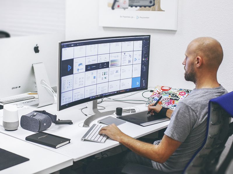
Eddie’s workspace shows off his wonderfully customized MacBook lid, covered with some beautiful stickers. He uses a Wacom tablet and curved widescreen monitor.
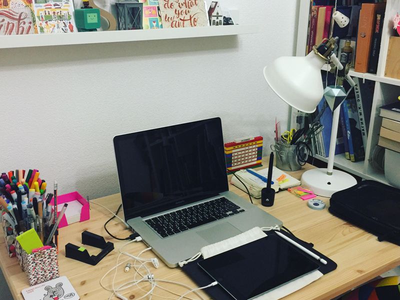
A little messy, but nonetheless inspiring, Svetlana’s workspace is filled with cards, prints, coloring pens and pen tablets. The iPad Pro is also used for illustration.
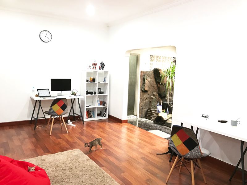
This workspace includes a beautiful colorful print, action figures, and a limited PS4 games console. It’s simple but playful and offers a balance between minimalist and maximalist.
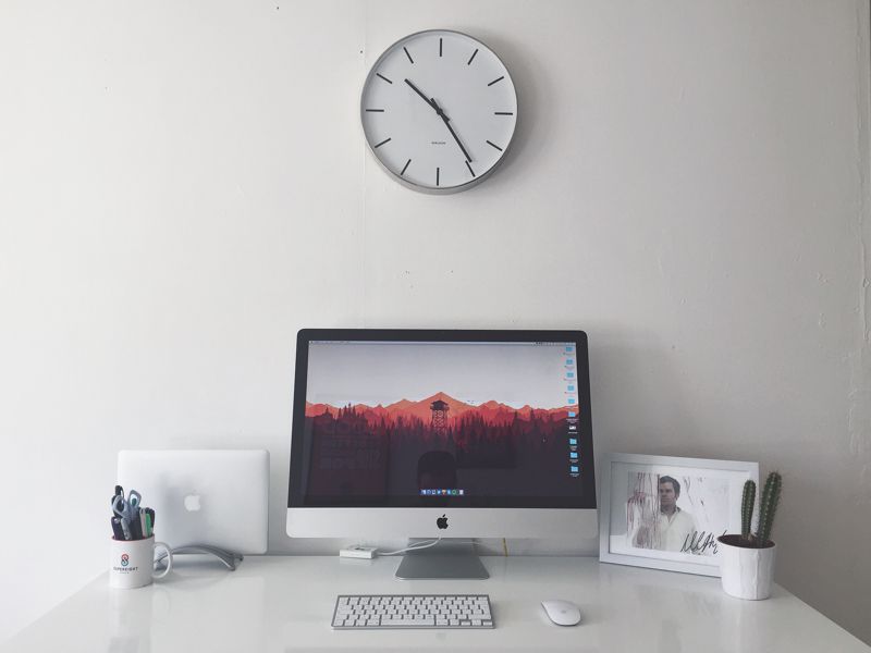
Very minimal in its setup, this workspace uses an abundance of white, with a beautifully curved seat and fancy lighting, walls and an unorthodox pencil pot.
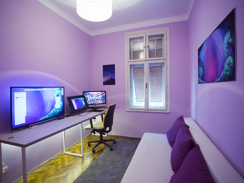
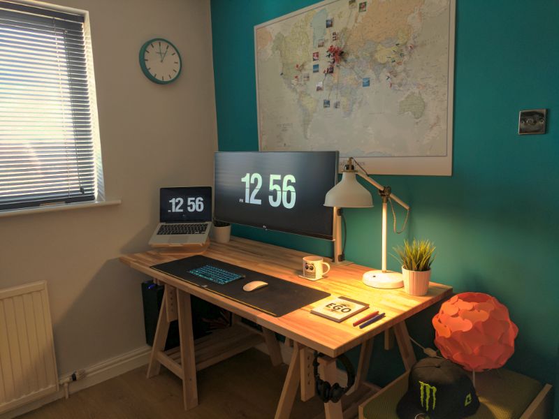
Using a wall-mounted monitor, this setup is extremely colorful against the teal wall behind. The desk looks high quality and has been carefully themed with lighting and items like the clock and lamp.
Colors play such a huge part in branding and logo design. They have the power to evoke emotion, attract attention, and present a recognizable brand to the world.
Almost every prominent logo design incorporates some element of color that is synonymous with their company. Think McDonald’s, Coca-Cola, Microsoft, YouTube – the list goes on. The way in which color is applied ranges anywhere from a small splash of color, to a gradient-heavy, multicolored design.
Wherever they lie in between these two extremes, there are a wide range of inspiring and differing examples that have been carefully executed to provide a unique identity.
In this article, we’re going to look at a selection of ten of the most impressive and well-executed examples of these colorful logo designs.
Using unusual color combinations, heavy gradients and three-dimensional techniques, this logo design is incredibly eye-catching and visually impressive.
This logo for Queuing app uses a beautiful, subtle red to pink gradient. It blends seamlessly with the curved logo mark and works perfectly on the app icon and in inverted form.
Using a striking color combination of bright yellow and pink, ShopAround has created a logo which is impactful and follows a unique direction in terms of layout and composition.
Primary’s logo mark is almost reminiscent of a marble or piece of artwork. It blends a number of colors and gradients to create a dynamic logo which pairs beautifully with the simple typography.
Almost erring on the side of the brutalism trend, Neighbourhood’s logo uses bright graphics and colors, all overlapping and contained within the serif typographic mark.
Popfn’s logo uses bold colors and subtle gradients to produce a stunning neon-style mark with both depth and visual interaction in the form of an impossible triangle.
The concept of a progressive webapp (PWA) is simple. Developers create websites that behave like native applications for all environments. These work like hybrid site-app combos where you have “webapps” that can run natively on a mobile device and just as well on a desktop web browser.
If you’re looking for some examples of PWAs then this collection is sure to please.
Your Web Designer Toolbox Unlimited Downloads: 500,000+ Web Templates, Icon Sets, Themes & Design Assets
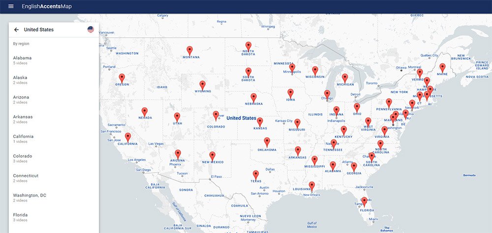
English Accents Map
The English Accents Map site is one of the strangest yet most interesting progressive webapps I’ve found. It features pin markers for different accents in regions across the UK and the US.
Each marker links to a set of videos from YouTube. These videos have been created by people with that local accent, so you can listen and study how certain areas of the world speak English.
Really cool PWA and definitely one of the coolest concepts I’ve seen for a website.
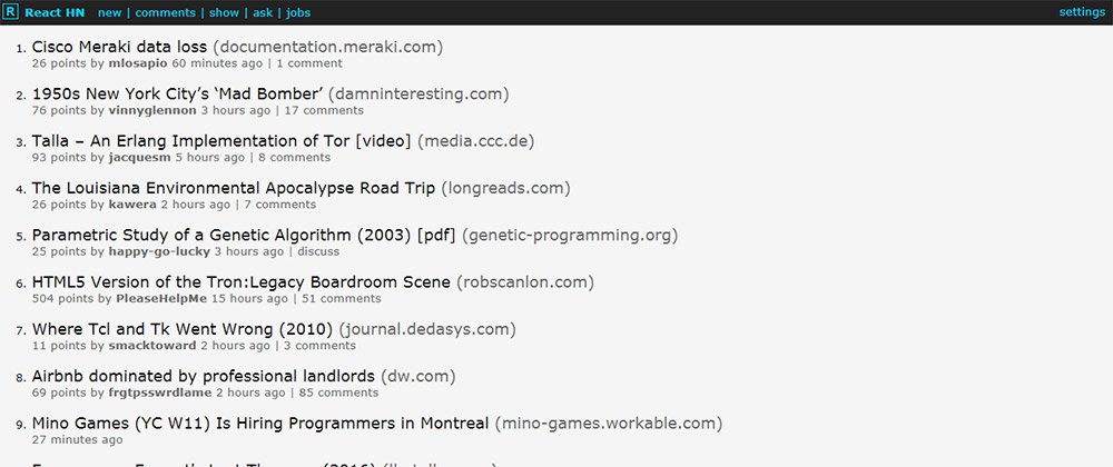
React HN
The React.js craze isn’t slowing down anytime soon and it’s certainly a staple for building any progressive webapp.
One example is the React HN site that pulls data from Hacker News and loads it all into a neat React.js webapp.
This is designed just like the HN homepage but it can operate like a native app on mobile devices. It doesn’t support account logins but you can do pretty much everything else, and it’s got a real snappy interface to boot.
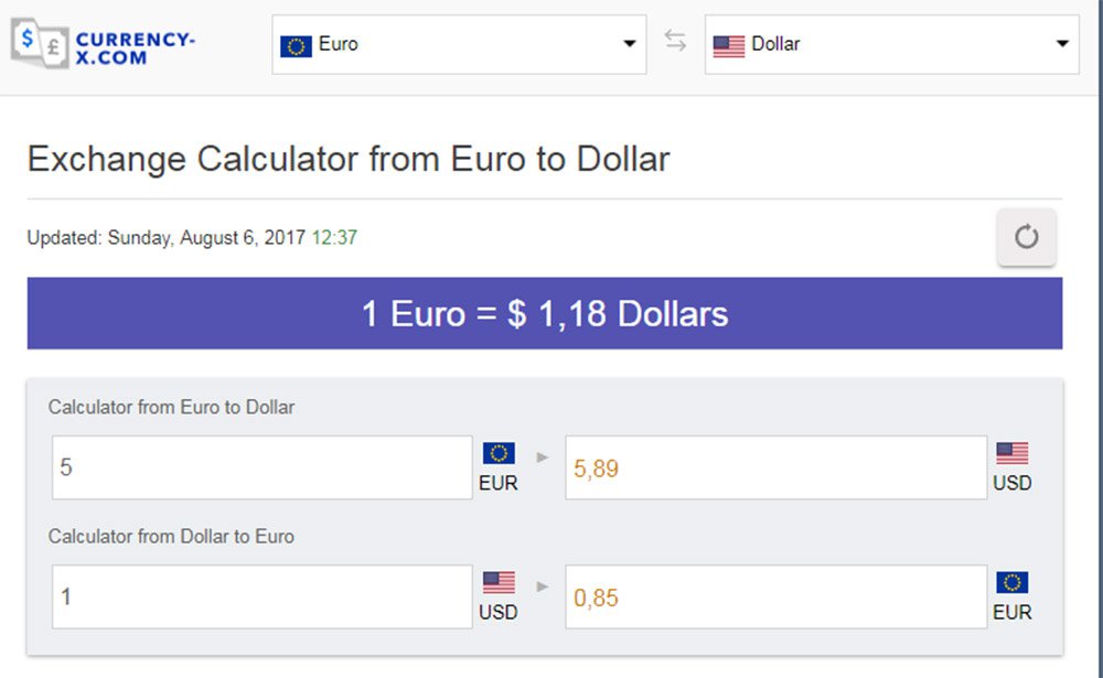
Currency-X
Looking for a free currency exchange rate app for your iPhone? Currency-X has you covered.
This free PWA works around a handful of currencies and runs with live data from APIs. This way the currency conversion rates are accurate and you can test them against pretty much every country from Kenya to Vietnam.
I do think the UX is lacking a bit and could be improved for mobile. But on the whole, this is one of the more impressive apps considering how much data it pulls.
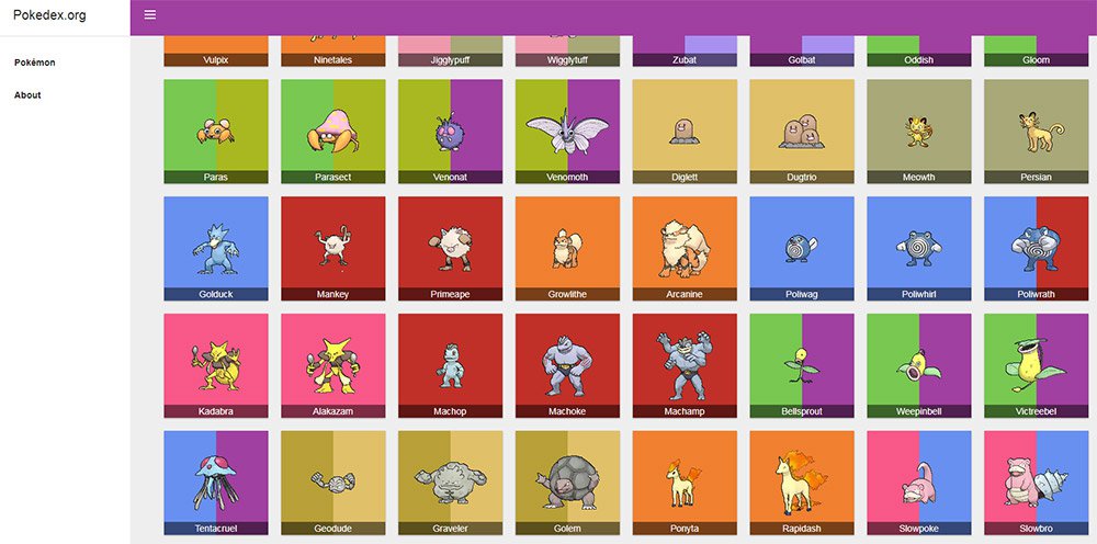
Pokedex.org
All you Pokemon fans are gonna love Pokedex.org for its simplicity and ease of use.
This webapp behaves like a literal Pokedex where you can search for monsters and get all their stats quickly. Data comes from the Pokeapi along with Wiki pages to ensure total accuracy.
And while this doesn’t distinguish between the different games it’s still an impressive webapp for the amazing price of free. Perfect for Pokemon players who want quick access to quick data.
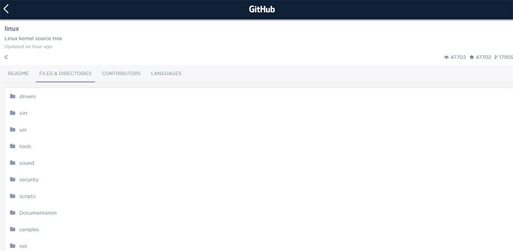
GitHub Explorer
Web developers love GitHub for its massive curation of free resources. The site has become a go-to resource for code snippets and now with GitHub Explorer you can dig into those code samples yourself.
The site is still a work in progress but it lets you browse through two methods: users and repos.
You can search by username or by repo name and pull up data fast. This includes the full readme file, all directories, and recent updates. However the search feature doesn’t include every repo so it’s more like a demo app showcasing what PWAs can offer.
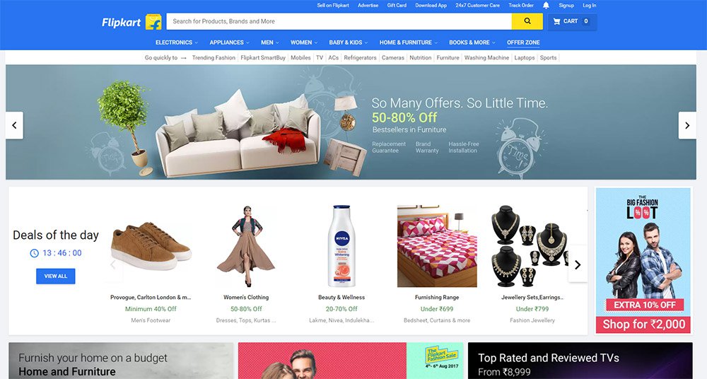
Flipkart
Believe it or not there are entire eCommerce shops that support PWA features. Flipkart is the only one I know of but their website is absolutely massive.
This India-based eCommerce site offers complete support as a native mobile application. You can search, browse products, and use your account to purchase items all with a native feel.
I’d argue this is the most complex PWA on the web and it deserves an award as one of the best UX’s I’ve seen all year.
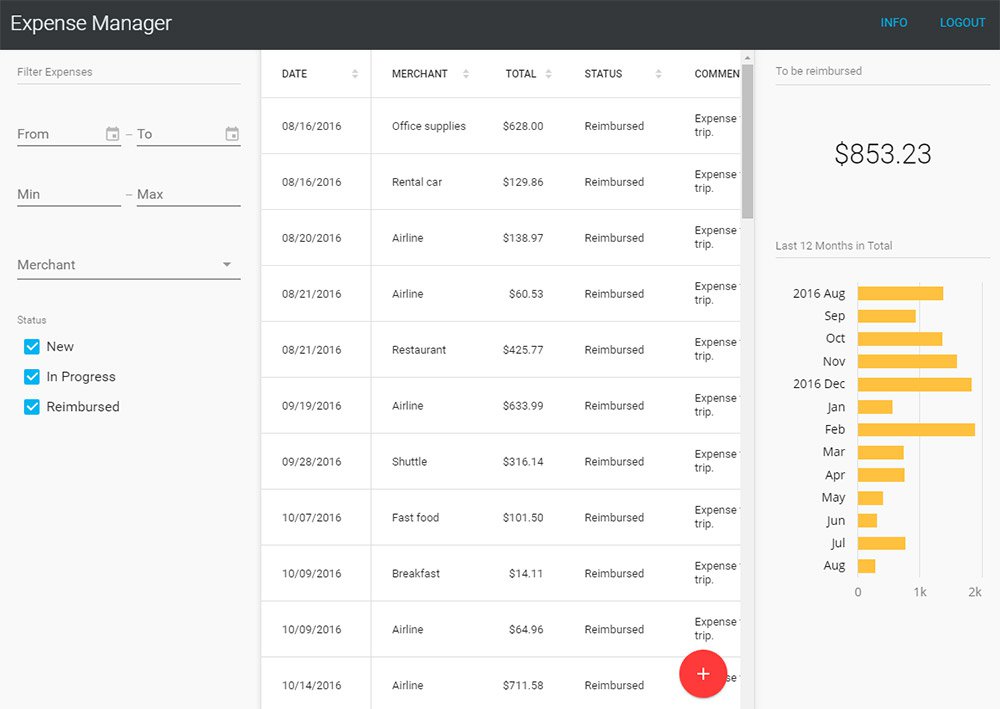
Expense Manager
If you want to track some quick expenses on your phone then the Expense Manager app is a nice place to start.
This thing behaves more like a simple calculator but it can save data for the long term. The demo account clears data after one hour but you can try the Vaadin framework yourself if you want a longterm solution.
The Expense Manager is mostly used to help sell this framework and bring attention to the company. And for that I’d say it gets the job done with plenty of “wow” factor to go around.
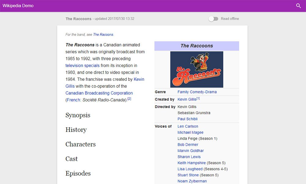
Offline Wikipedia
Here’s another cool demo app that I think should actually be built into the core of Wikipedia.
Offline Wikipedia is a PWA site created by Jake Archibald. It’s fully compliant with all the ideas of progressive webapps so it works on smartphones, tablets, laptops and desktops alike.
The interface is also pretty snappy so it’s easy searching and finding Wiki articles. Probably one of the few PWAs that I think really could add value to the main site.
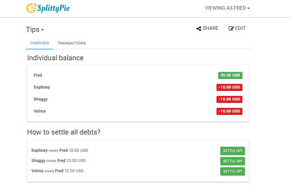
Splittypie
Never worry about splitting the bill again with Splittypie.
This app is fantastic and for the price of free you can’t beat it. You just visit the site in your browser and you create new “events” for tracking prices.
Whether you’re splitting a meal or the price of a ball game this app works for any device at the click (or tap) of a button.
Also the source code is freely available on GitHub if you want to use this as a base for your own PWA.
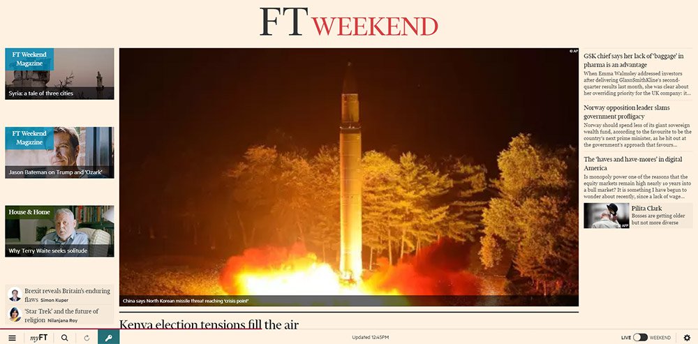
FT App
The massive publishing giant Financial Times surprisingly has their own PWA and it works really well.
Their app runs just like a news site except it’s fully responsive to touch. This means it behaves exactly like a native application where you don’t see new pages load, they just slide into view.
I’d like to think the future of publishing is full of websites like this. We’re already seeing this with Google AMP but that’s only a small step towards full PWAs.
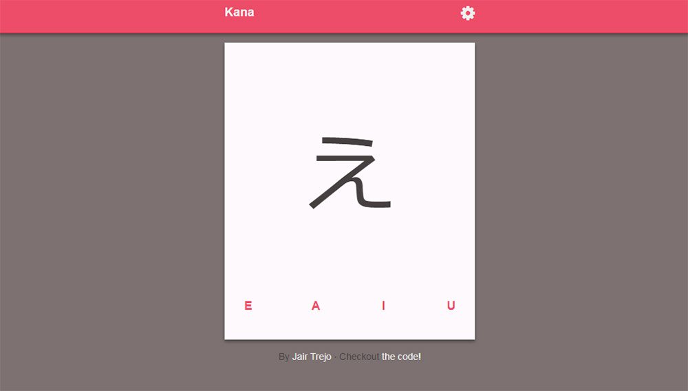
Get Kana!
Last but certainly not least is the Get Kana app. What’s cool is this site actually has a full application in the Android and iOS app stores.
But this progressive webapp is the next best thing for anyone who wants to try it out in their browser. It’s a Japanese learning app where you can learn the syllabaries for katakana & hiragana through flash cards.
Not something that everyone will find useful but absolutely one of the cleanest PWAs I’ve used. And best of all their code is freely available on GitHub if you want to dig into that too.