Tooltips with a Retro Gaming-Inspired Design

Today, we’ll delve into a creating tooltip with a retro gaming-inspired design that could add an interactive, fun touch to your interface. This guide will walk you through the setup needed to craft this unique tooltip and explain each step in detail. As a result, we’ll have a tooltip with a gaming-style font, harmonious colors, and smooth animations. Let’s dive in.

Kinsta

The HTML Structure

Let’s start with the structure. Our journey begins with HTML. This is where we craft the skeleton of our tooltip, using a simple button with an embedded span tag. The button triggers the tooltip, and the span tag houses the tooltip text:

<button>Hover Over Me
    <span>Hey! A retro gaming-style tooltip.</span>
</button>

CSS Styling

Next, we move on to the CSS styling, the core of our tooltip’s appearance and animation. Our CSS styling is broken down into four stages: General Setup, Button Styling, Tooltip Styling, and Tooltip Animation.

General Setup

/* Importing custom font for retro gaming feel */
@import url("https://fonts.googleapis.com/css2?family=Press+Start+2P&display=swap");

body {
  /* Centring the button */
  display: flex;
  align-items: center;
  justify-content: center;
  height: 100vh;
}

We import a custom gaming-style font Press Start 2P from Google Fonts for a retro gaming look. Then we style the body to center our button.

Button Styling

button {
  /* Making the button interactive and center aligned */
  display: flex;
  align-items: center;
  justify-content: center;
  position: relative;

  /* Styling the button */
  width: 16em;
  height: 3.2em;
  padding: 0 1em;
  border: none;
  border-radius: 3px;
  background-color: #f04e23;
  color: #fff;

  /* Applying custom font */
  font-family: "Press Start 2P", cursive;
  font-size: 1.8vw;

  cursor: pointer;
  outline: none;
  appearance: none;
}

We start by setting the button to flex and aligning the items to the center. The button is given a width and height, padding, and styled with a rounded border. We set the background color to red-orange (#f04e23), the text color to white, and apply the custom font. The cursor is set to pointer to indicate the button is interactive.

Tooltip Styling

span {
  /* Positioning tooltip relative to the button */
  position: absolute;
  left: 50%;
  bottom: 100%;
  opacity: 0; /* Initially hiding the tooltip */
  margin-bottom: 1em;
  padding: 1em;

  /* Styling tooltip */
  background-color: #303030;
  font-size: 0.6em;
  line-height: 1.6;
  text-align: left;
  white-space: nowrap;

  /* Setting initial state for animation */
  transform: translate(-50%, 1em);

  /* Making the changes smooth for animation */
  transition: all 0.15s ease-in-out;
}

span::before {
  /* Creating a triangle at the top of tooltip */
  content: "";
  position: absolute;
  top: 100%;
  left: 50%;
  width: 0;
  height: 0;
  border: 0.5em solid transparent;
  border-top-color: #303030;
  transform: translate(-50%, 0);
}

The span, which contains the tooltip text, is given an absolute position to enable it to be positioned relative to the button. The tooltip is hidden initially with opacity: 0;. The tooltip color is set to dark gray (#303030) to contrast with the button. The span::before selector is used to create a triangle at the top of the tooltip.

Tooltip Animation

button:hover span {
  /* Making tooltip visible and moving it upwards */
  opacity: 1;
  transform: translate(-50%, 0);
}

When the button is hovered over, the tooltip’s opacity changes to 1, making it visible. The transform property also changes; it shifts the position of the tooltip from its initial state (1em below the button, out of sight) to a new state (aligned with the bottom of the button, but appearing above it because of the absolute positioning). The transition property that we defined in the Tooltip Styling section ensures these changes occur smoothly over time, creating an engaging animation effect.

And that’s it! This should give you a button with a cool retro gaming-themed tooltip.

You can play around with the text, colors, font sizes, and other parameters to customize the look and feel of your tooltips to match your taste and preference.

The Final Result


an orange retro looking tooltip

While this retro gaming-style tooltip is a fun addition, remember that it’s not an industry standard. However, it could prove great for personal websites or projects that allow for a more creative and playful interface. You should also consider the color contrast for visually impaired users and the tooltip’s mobile compatibility.


Colorful World: Gradient Backgrounds in CSS

Gradients—a seamless transition of colors—are a powerful visual tool that can transform a plain background into a dynamic digital landscape. With CSS, you can create linear, radial, conic, and repeating gradients, each offering unique ways to infuse depth and vibrancy into web pages. This guide will primarily focus on the most widely used types: linear and radial gradients. Let’s delve into the versatile world of CSS gradient backgrounds and uncover their possibilities.

Kinsta

Understanding Linear and Radial Gradients

To craft visually striking gradient backgrounds, you need to grasp two core types that CSS offers – linear and radial gradients. These form the bedrock for crafting complex and stunning color transitions.

Dawn Inspiration with Linear Gradients

Creating a gradient that mirrors the mesmerizing hues of sunrise is quite straightforward with CSS linear gradients.

body {
    background: linear-gradient(to right, #ff7e5f, #feb47b);
}

In this code snippet, the gradient starts with a warm, pinkish hue (#ff7e5f), slowly transitioning to a brighter, sun-touched tone (#feb47b). The phrase ‘to right’ defines the direction of the gradient flow, leading to a seamless left-to-right color transition.

Sky Aesthetics with Radial Gradients

Radial gradients can be used to emulate the vastness of a clear blue sky. Here’s an example:

body {
    background: radial-gradient(circle, #3e92cc, #070d59);
}

This radial gradient creates a circular pattern that transitions from a bright blue (#3e92cc) at the center to a deep night blue (#070d59) at the edges, resulting in a sky-like visual effect.

Exploring the Rainbow with Linear Gradients

A sound understanding of linear and radial gradients allows for exploration into slightly more complex color transitions. Let’s demonstrate this by creating a CSS linear gradient that transitions through the vibrant spectrum of a rainbow.

body {
  background: linear-gradient(
    90deg,
    red,
    orange,
    yellow,
    green,
    blue,
    indigo,
    violet
  );
}

The code above generates a vivid rainbow gradient starting with red on the far left, flowing through the colors of the spectrum, and concluding with violet on the far right. The 90deg directive indicates the gradient transition’s direction.

Wrapping Up

While the examples presented only scratch the surface of gradients’ potential, they serve as a springboard for further experimentation. Don’t be afraid to mix colors, shift directions, or change gradient types to discover unique and captivating designs. CSS gradients also allow advanced control over the gradient process by using color stops, and other values like percentages or pixels, to fine-tune the color transition’s position and range. When strategically employed, they can accentuate specific sections of a webpage, such as a call-to-action button or a promotional banner, effectively drawing user attention.

Neon Glow Text: A CSS Showcase

Web design provides a canvas where technological precision and creativity converge. In this exploration, we’ll be embarking more on the creative side, unmasking an exciting feature of CSS – the neon glow text effect. This visually appealing trick is a delightful experiment with the capabilities of CSS.

Kinsta

Constructing Neon Glow Text with CSS

In this section, we’ll illuminate how CSS can generate a neon glow text effect. We’re going to incorporate the Monoton font from Google Fonts. By using CSS text-shadow, we’ll create our neon glow, and add a sprinkle of animation for that flickering neon allure.

/* Import Monoton font from Google Fonts */
@import url('https://fonts.googleapis.com/css2?family=Monoton&display=swap');

body {
    /* Create a dark background to enhance the neon effect */
    background-color: #000;
}

.neon {
    /* Apply the Monoton font and set color to white */
    font-family: 'Monoton', cursive;
    font-size: 70px;
    color: #ffffff;

    /* Create the neon effect using multiple text shadows */
    text-shadow:
        0 0 10px #ff4da6,
        0 0 20px #ff4da6,
        0 0 30px #ff4da6,
        0 0 40px #ff4da6;

    /* Add a glow animation for a flickering effect */
    animation: glow 1s infinite alternate;
}

/* Define the glow animation */
@keyframes glow {
    from {
        text-shadow:
            0 0 10px #ff4da6,
            0 0 20px #ff4da6,
            0 0 30px #ff4da6,
            0 0 40px #ff4da6;
    }
    to {
        text-shadow:
            0 0 20px #ff4da6,
            0 0 30px #ff4da6,
            0 0 40px #ff4da6,
            0 0 50px #ff4da6,
            0 0 60px #ff4da6;
    }
}

The text-shadow property acts as our magic tool here, infusing a radiant glow to the text. We stack multiple shadows with varying blur radii to build the glowing aura. The animation property adds dynamic behavior to our text, mimicking a flickering neon sign.

We’re going to add this to the corresponding HTML:

<h1 class="neon">Neon Glow</h1>

Beyond the Showcase: Practical Applications

The neon glow text effect, while not a staple in traditional web design, opens up an array of intriguing possibilities. For instance, imagine infusing a bit of vibrancy into HTTP response status messages or error pages. A 404 error page with a neon, flickering glow could turn a frustrating user experience into an amusing one.

Similarly, you could use this effect to emphasize promotional elements on a website. A neon glow effect announcing a limited-time discount might serve as a unique attention-grabber.

Wrapping Up

CSS can be an immensely powerful tool in a web designer’s arsenal, offering numerous possibilities to let creativity shine. Our demonstration is a testament to that, a creative possibility where a simple text gets a vibrant, retro makeover. We encourage you to keep exploring and experimenting, for every line of code holds the potential to make your designs distinct and memorable.

Creating Engaging Hover Effects with SCSS

SCSS is a powerful syntax of Sass that extends the capabilities of CSS, making it easier to create dynamic and customizable styles. To see this in action, we’ll demonstrate how to create a neat hover effect, which gives an appearance of being filled when hovered over. We’ll explain the implementation process, and customization options while providing context for the SCSS code.

Your Web Designer Toolbox
Unlimited Downloads: 500,000+ Web Templates, Icon Sets, Themes & Design Assets


The HTML Structure

Before diving into the SCSS magic, let’s start by defining a simple HTML structure for our button.

<div class="buttons">
  <h1>
    Simple hover effects with <code>box-shadow</code>
  </h1>
  <button class="fill"> Fill In</button>
</div>

In this snippet, we have a button element with a class of fill. This class will be used in our SCSS to define the hover effect.

Crafting the Hover Effect with SCSS

Now, let’s delve into the SCSS code and shed light on the key parts of our hover effect. Here, we apply various SCSS rules and CSS custom properties to create an engaging visual effect.

/* Base styling for the button */
button {
  --color: #a972cb; /* Button color */
  --hover: #ef6eae; /* Hover color */
  color: var(--color); /* Applying the color */
  background: none;
  border: 2px solid var(--color); /* Border with the color of the button */
  font: inherit;
  line-height: 1;
  margin: 0.5em;
  padding: 1em 2em;
  transition: 0.25s; /* Transition time */
}

/* Styling for button hover/focus state */
button:hover,
button:focus {
  color: #fff; /* White text on hover */
  border-color: var(--hover); /* Border color change on hover */
  box-shadow: inset 0 0 0 2em var(--hover); /* Inset box-shadow to create a fill effect */
}

The button selector defines the default styles for our button. We use CSS custom properties (--color and --hover) to set the color scheme for our button and its hover state. The transition property allows us to animate changes to these properties, creating a smooth fill effect on hover.

On hover or focus, we update the button’s text color, border-color, and apply an inset box-shadow to mimic the fill effect. This change is animated over 0.25 seconds as specified by the transition property in the button selector.

Rounding Up with Page Styling

For a better visual demonstration, we add some page styling. However, remember that these styles are tailored to this specific example, and in a real-world scenario, they should be adjusted according to suit your needs.

/* Page styling */
body {
  color: #fff;
  background: hsl(227, 10%, 10%);
  font: 300 1em 'Fira Sans', sans-serif;
  justify-content: center;
  align-content: center;
  align-items: center;
  text-align: center;
  min-height: 100vh;
  display: flex;
}

/* Heading styling */
h1 {
  font-weight: 400;
}

The body selector styles include the webpage’s font, text alignment, and color scheme. The h1 selector sets the font weight for the title.

Now, when the “Fill in” button is hovered over, we’ll see the effect in action.
button and text with effect when hovered over


Adapting this hover effect to suit your site’s aesthetic is as straightforward as modifying the --color and --hover CSS variables. Don’t forget to consider accessibility principles when choosing your color scheme, as the contrast between the button color and background color is important for readability. Rounded corners, set by the border-radius property, have been increasingly trendy and also contribute to better user experience due to their softer visual impact.
How to Bolster Your Design Ideas with These Unlikely Sources of Inspiration

We all know how frustrating it can be to feel creatively stuck. Whether you’re trying to come up with new ideas for a project or simply looking for a fresh perspective, sometimes all it takes is some out-of-the-box thinking to find inspiration to jump start your creativity.
Today, we’ll be covering a few unlikely sources of inspiration that can help you bolster your design ideas. These don’t include the super obvious choices like Awwwards or Best Website Gallery. Instead, these inspiring sources delve into less top-of-mind places and offer creative fuel in less conventional ways.

Enjoy!

Children’s Books

children's books as inspiration

Believe it or not, children’s books can be a great source of inspiration for designers. The vibrant colors and playful illustrations in these books can help spark new ideas and help you see things from a different perspective.

Take a Walk in Nature

There’s no denying that nature is one of the most beautiful things in the world. So why not use it as inspiration for your next design project? From the patterns of leaves to the colors of a sunset, there are endless possibilities when it comes to finding inspiration in nature.

Taking a walk in nature can also help clear your mind and give you some much-needed time to think about your project.

Music

Music may be a wonderful method to stimulate your creative thinking. Music may assist you access your creative side and produce some fantastic design ideas, whether you’re listening to your favorite album or looking at new artists.

Go to an Art Gallery or Museum

art gallery or museum - inspiration

Viewing art can also be a great way to get inspired. Whether you’re visiting a museum or simply looking at paintings online, observing other artists’ work can help you see things in a new light and come up with some fresh ideas for your own projects.

Go to an Antique Store or Vintage Shop

If you’re looking for some unique inspiration, take a trip to an antique store or vintage shop. Surrounded by old items, you may find yourself seeing things in a new way and coming up with some original ideas for your project. You could even browse vintage designs on Etsy to get some inspiration.

Look Through Fashion Magazines

Fashion magazines are another great source of inspiration, especially if you’re working on a design project that involves clothing or accessories. From the latest trends to classic looks, you’ll be sure to find plenty of inspiration in these magazines.

At the very least, you can find some really interesting color palette inspiration in fashion magazines.

Talk to a Friend

Sometimes doing something completely different than the work on hand can clear your mind enough to leave room for fresh inspiration. So go ahead and take a break from your project to chat with a friend. You never know, they may just have the perfect idea for your next great design.

People Watch at Your Local Coffee Shop

coffee shop inspiration

Another great way to get inspired is to watch people at your local coffee shop. You never know who or what you’ll see, and you might just come up with some creative ideas for your project by observing the people around you.

Take a Trip

If you’re really feeling stuck, sometimes the best thing to do is take a trip. This doesn’t necessarily mean that you have to go somewhere far away; even taking a day trip to a nearby town can help you clear your mind and come up with some new ideas.

Get Some Sleep

If you’re feeling creatively drained, it might be time to get some sleep. Sometimes all you need is a good night’s rest to recharge your batteries and come up with some great new ideas.

Design Inspiration Can Be Found Almost Anywhere

Whether you’re looking for a fresh perspective or simply trying to get out of a design rut, these ten sources of inspiration can help you bolster your ideas and come up with some truly original designs. So don’t be afraid to explore new places and try new things; you never know where you’ll find your next great idea.

Working From Home? 10 Cheap Ways To Set Up Your Home Office

Thanks to recent global events, scores of people around the world suddenly find themselves working from home – if they are lucky enough to be able to continue working at all. For newcomers to remote working, this can be a jolt to your lifestyle and pocketbook. Having to figure out how to set up a productive home office environment can be stressful and costly. But it doesn’t have to be.

In this post we are going to suggest some unconventional and creative ways to bring the cost of setting up your home office down by substituting more expensive home office supply necessities with less expensive solutions. By utilizing these ideas you can save a significant amount of stress and money and get your home office up and running quickly and affordably.

The Freelance Designer Toolbox

Unlimited Downloads: 500,000+ Web Templates, Icon Sets, Themes & Design Assets
All starting at only $16.50 per month


Laptop Stand

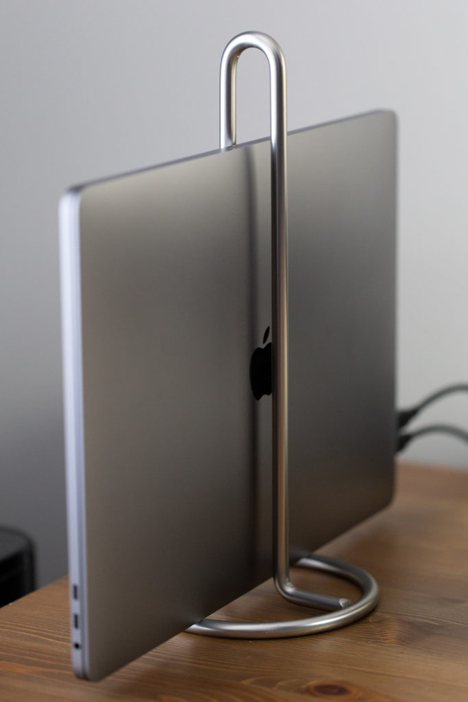
Do you dock your laptop in a stand where it’s closed and you use exterior monitors, keyboard and mouse? If so, you could easily find yourself paying at least $30-$60 for such an accessory. Why not use a paper towel holder that you can grab for only $9.99? Not only will it perform the same functionality, but it will look slick sitting on your home office desk.

Laptop Stand - Home Office

Monitor Stand

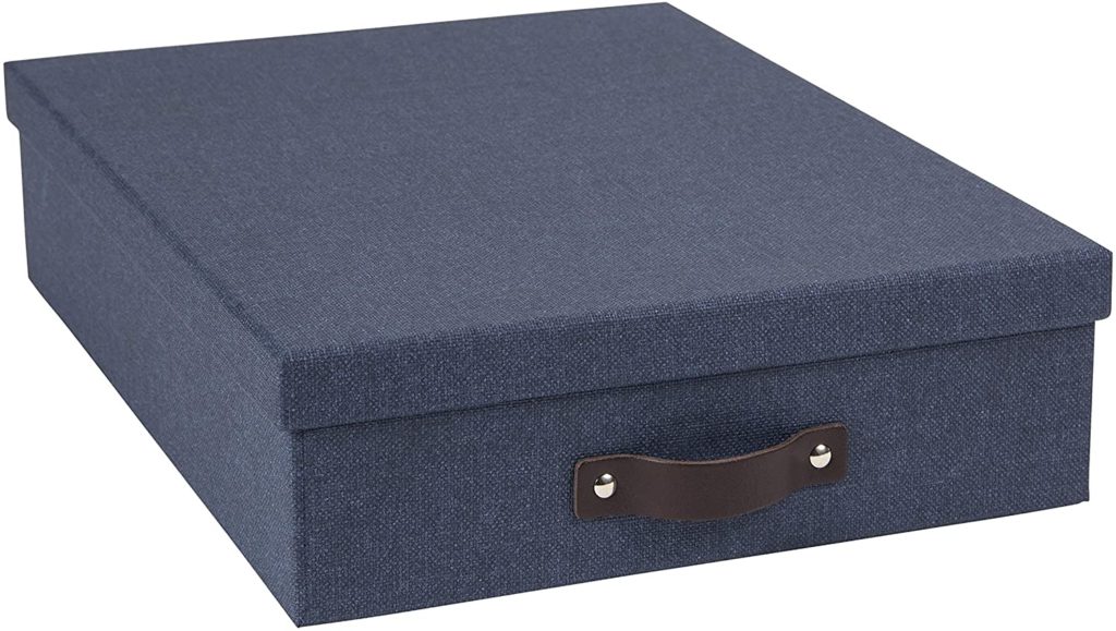
Fancy monitor stands will cost at least twice as much as using a fiberboard box such as this one. At only $15.81, you can raise your monitor up to eye level and also use it for storage at the same time.

Monitor Stand - Home Office

Pens, Mail, and Other Accessories Organizer

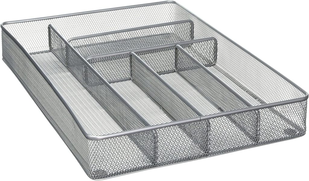
Keeping all of the loose items on your home office desk is not only important, it is necessary for your piece of mind and productivity. Rather than paying $25 or more, pick up a cutlery tray like this one to keep your accessories in, for less than $15!
Pens, Mail and other accessories - home office


Desk Pad

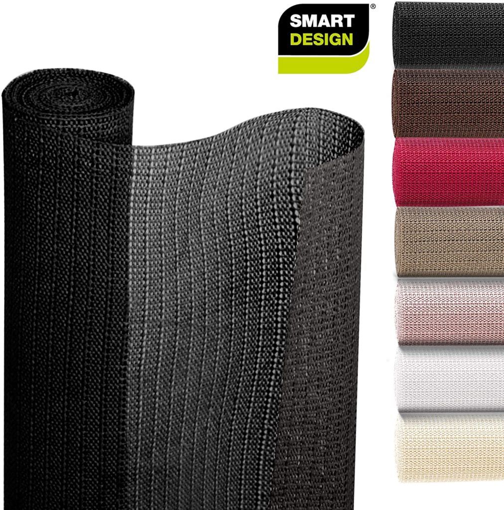
You can’t find a quality desk pad for under $20, so why not use kitchen shelf liners instead? You can cut them to your desired size, they are non-slip, they wipe clean easily, and they’re only $5.47.

Desk Pad - Home Office

Cell Phone and Tablet Stands

Here’s a cheap alternative to more expensive cell phone and tablet stands that will prop your smaller screens up for constant visibility on your desk. At $5.99 per pair, these can’t be beat!

Cell Phone and Tablet Stands - Home Office

Foot Rest/Stand

Ergonomic foot rests for underneath your home office desk can get crazy expensive, not to mention many of them are not the most pleasant to look at. While this recommendation is not repurposing something meant for another use, it’s a creative, fun, and unique way to give your feet a lift, and it’s only $10.99!

Foot Rest - Home Office

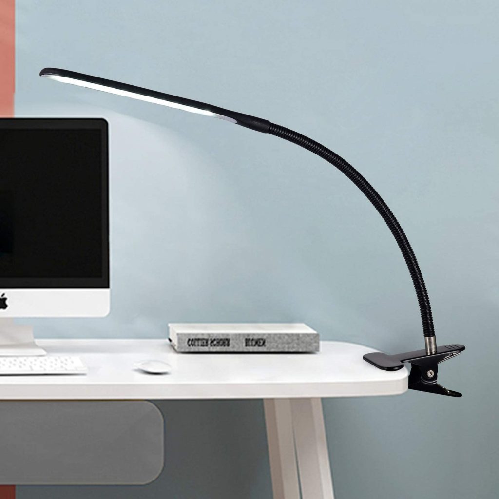
Desk Lamp

This is another desk necessity that is not repurposed, but for at least half the price of more decorative solutions this clip-on LED desk lamp is a steal at under $15!

Desk Lamp - Home Office

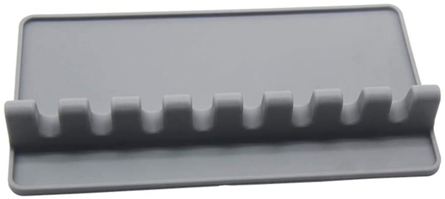
Cable Organizer

Substitute this kitchen utensil rest for more costly cord and cable organizers to clean up your desk area. Run your cables through the slots and enjoy inexpensive organization for only $6.

Cable Organizer - Home Office

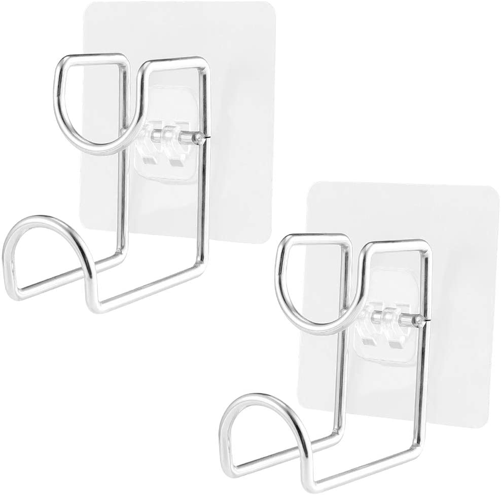
Multi-Use Hanging Hooks

Use these clip on hooks as a way to organize cables underneath your desk or to hang other accessories you may have for easily reachable access. This easy organizational solution can be bought for only $6.29.

Multi-Use Hanging Hooks - Home Office

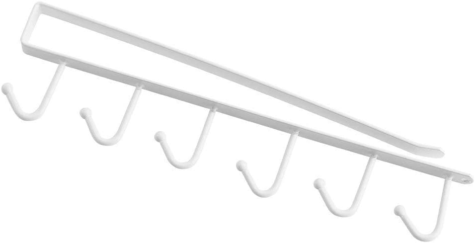
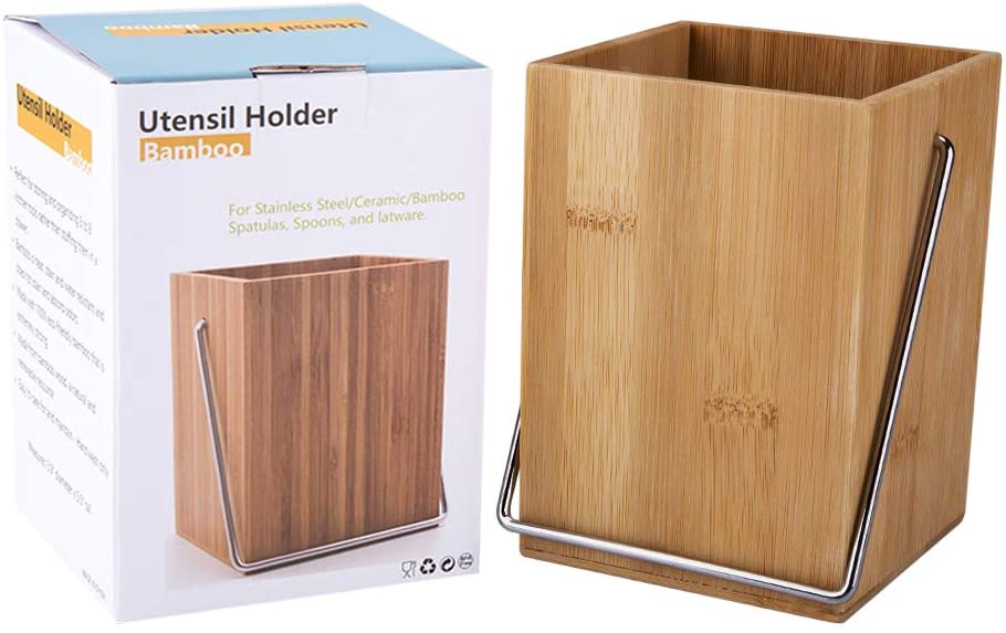
Utensil Holder

This bamboo organizer will add inexpensive yet stylish flair to your home office desk. At only $7.48, this is a great buy that will help keep your desk organized and writing and other utensils easily accessible.

Utensil Holder - Home Office

Do you have other creative home office solutions?

Hopefully our list has provided you with some creative ideas, and sparked you toward coming up with your own solutions that will make your personal working space unique and simultaneously affordable.

Web Design Trends – Predictions For 2020

Every year we see new web design trends emerge, and every year experts and pontificators alike come up with their predictions of what we will see. While some web designers and developers may choose to buck these trends or try …

15 Mind-bending Three.js JavaScript Experiments

3D browser animation just keeps getting more powerful, and web developers are taking an interest. WebGL, Three.js, and other JavaScript APIs and libraries have been around for a while, but many browsers and computers didn’t have the capacity to run advanced animations without significant slowdown.

But as software and hardware becomes more effective at dealing with complex 3D environments, it’s now much more common to see websites rendering animations. Three.js is particularly useful thanks to its ability to run without any plugins. With this powerful library, web developers can create jaw-dropping animations or even simple video games.

Ready to have your mind blown? Here are a few examples of gorgeous Three.js experiments that take full advantage of the library’s capabilities.

Lab City 3D

See the Pen
City 3D
by Victor Vergara (@vcomics)
on CodePen.

Playing with Sound

See the Pen
Playing with sound and three.js
by Sarah Drasner (@sdras)
on CodePen.

three.js Points Anti-Gravity

See the Pen
three.js Points anti-gravity is applied ver2
by yoichi kobayashi (@ykob)
on CodePen.

WebGL Distortion Slider

See the Pen
WebGL Distortion Slider
by Ash Thornton (@ashthornton)
on CodePen.

Test of Three.js and Tween.js

See the Pen
Test of Three.js and Tween.js
by cx20 (@cx20)
on CodePen.

three.js canvas – particles – waves

See the Pen
three.js canvas – particles – waves
by deathfang (@deathfang)
on CodePen.

WormHole

See the Pen
WormHole
by Josep Antoni Bover Comas (@devildrey33)
on CodePen.

Wire Typo

See the Pen
Wire Typo
by ilithya (@ilithya)
on CodePen.

THREE.js Particle Stream

See the Pen
THREE.js particle stream
by Szenia Zadvornykh (@zadvorsky)
on CodePen.

Perlin Noise

See the Pen
Perlin Noise
by Victor Vergara (@vcomics)
on CodePen.

Three Js Point Cloud Experiment

See the Pen
Three Js Point Cloud Experiment
by Sean Dempsey (@seanseansean)
on CodePen.

Shader Moon

See the Pen
Shader Moon
by Victor Vergara (@vcomics)
on CodePen.

3D Floating Typo

See the Pen
3D Floating Typo
by ilithya (@ilithya)
on CodePen.

RetroFighter Gunship

See the Pen
RetroFighter Gunship
by Rainner Lins (@rainner)
on CodePen.

Pixel Particles

See the Pen
Pixel Particles
by Szenia Zadvornykh (@zadvorsky)
on CodePen.

Mind-Blowing Three.js Experiments

Developers are always creating awesome new code experiments that do cool new functions or are just made to look beautiful. It’s a good idea to keep up with sites like CodePen so you can see how devs are pushing the limits of libraries like Three.js. There’s always someone trying something new and interesting.

And the best part is you can also use pens in your own open source websites and projects, or learn from them yourself and try making your own experiments. Learn from your fellow developers, fork their code to try your own ideas, and you’ll quickly learn the nuances of Three.js animation.

UNLIMITED DOWNLOADS: Email, admin, landing page & website templates


40+ Motivational Quotes for Creatives

Sometimes we all need a little motivation. The road to creating something great can be tough. There are many twists and turns, failures, trials and tribulations. We all grow a little weary.
The goal of this article is to reinvigorate your creativity with empowering quotes from creators, inventors, and entrepreneurs of all backgrounds.
These quotes vary in nature. Some apply to work ethic, some for inspiration and determination, and others are just great phrases to live by. Get inspired with these quotes for creators below and then get creating!

View more inspirational articles on 1stwebdesigner →

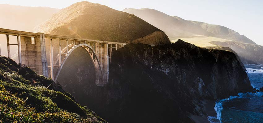
A bridge crossing over water.

Your Web Designer Toolbox
Unlimited Downloads: 500,000+ Web Templates, Icon Sets, Themes & Design Assets


Be Inspired to Create

“…If one advances confidently in the direction of his dreams, and endeavors to live the life which he has imagined, he will meet with a success unexpected in common hours…If you have built castles in the air, your work need not be lost; that is where they should be. Now put the foundations under them.”Henry David Thoreau

“To know your life purpose is to connect with a higher power.”Shannon L. Alder

“Inspiration exists, but it has to find you working.”Pablo Picasso

Success is not the key to happiness. Happiness is the key to success. If you love what you are doing, you will be successful.”Albert Schweitzer

“It’s never too late to be who you might have been.”George Eliot

“If you cannot do great things, do small things in a great way.”Napoleon Hill

A person holding a small plant.

“With the advent of spring and beginning of the new harvest season the creators of abundance, our peasants, come out to the fields to sow with good aspirations and hopes.”Islom Karimov

“To dare is to lose one’s footing momentarily. To not dare is to lose oneself.”Soren Kierkegaard

“Success is going from failure to failure without losing enthusiasm.”Winston Churchill

“The other side of every fear is a freedom.”Marilyn Ferguson

“Opportunity is missed by most because it is dressed in overalls and looks like work.”Thomas Edison

“Problems cannot be solved at the same level of awareness that created them.”Albert Einstein

“A creative man is motivated by the desire to achieve, not by the desire to beat others.”Ayn Rand

“What we see depends mainly on what we look for.”John Lubbock

A rocky coastline.

“Whether you think that you can, or that you can’t, you are usually right.” Henry Ford

“I always prefer to believe the best of everybody; it saves so much trouble.”  – Rudyard Kipling

“You don’t need money to be creative. The ghetto builds champions every day.”DJ Snake

“The most dangerous idea is silencing people.”Naval Ravikant

“A busy calendar and a busy mind will destroy your ability to do great things in this world. If you want to be able to do great things, whether you’re a musician, or whether you’re an entrepreneur, or whether you’re an investor, you need free time and you need a free mind.”Naval Ravikant

“The cure for boredom is curiosity. There is no cure for curiosity.”Dorothy Parker
“Go into yourself. Find out the reason that commands you to write; see whether it has spread its roots into the very depths of your heart; confess to yourself whether you would have to die if you were forbidden to write.”Rainer Maria Rilke

“So go on, get angry. But keep your mouth shut and go do your work.”Austin Kleon

“Somewhere, something incredible is waiting to be known.” Carl Sagan

A mountain on a starry night.

“The world always seems brighter when you’ve just made something that wasn’t there before.” Neil Gaiman

“We don’t make mistakes, just happy little accidents.”Bob Ross

“Many prefer not to exercise their imaginations at all. They choose to remain comfortably within the bounds of their own experience, never troubling to wonder how it would feel to have been born other than they are.”J.K. Rowling

“A new idea is delicate. It can be killed by a sneer or a yawn; it can be stabbed to death by a quip and worried to death by a frown on the right man’s brow.”Charles Brower

“Remember the two benefits of failure. First, if you do fail, you learn what doesn’t work; and second, the failure gives you the opportunity to try a new approach.”Roger Von Oech

“I’m convinced that about half of what separates successful entrepreneurs from the non-successful ones is pure perseverance.”Steve Jobs

“Anxiety is the handmaiden of creativity.”T. S. Eliot

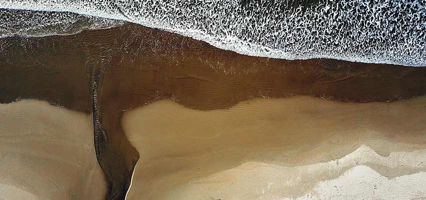
Waves crashing on a beach.

“You can’t use up creativity the more you use the more you have.”Maya Angelou

“There is only one of you in all time. This expression is unique and if you block it, it will never exist through any other medium and it will be lost.”Martha Graham

“Creative people are curious, flexible, persistent, and independent, with a tremendous spirit of adventure and a love of play.”Henri Matisse

“Curiosity about life in all of its aspects, I think, is still the secret of great creative people.”Leo Burnett

“You can’t wait for inspiration, you have to go after it with a club.” Jack London

“To raise new questions, new possibilities, to regard old problems from a new angle, requires creative imagination and marks real advance in science.”Albert Einstein

“The essential part of creativity is not being afraid to fail.”Edwin H. Land

“Creative activity could be described as a type of learning process where teacher and pupil are located in the same individual.”Arthur Koestler

“Don’t think. Thinking is the enemy of creativity. It’s self-conscious, and anything self-conscious is lousy. You can’t try to do things. You simply must do things.”Ray Bradbury
“Blessed are the curious, for they shall have adventures.”L. Drachman

“In the beginner’s mind there are many possibilities, but in the expert’s mind there are few.”Shunryu Suzuki

A young girl looks off into the distance.

Quotes That Will Make You Think…

For this last section, we’re featuring just a few more quotes for creators that are less motivational and moreso thought-provoking.

“We call ourselves creators and we just copy.”Lauryn Hill

“The most regretful people on earth are those who felt the call to creative work, who felt their own creative power restive and uprising, and gave to it neither power nor time.”Mary Oliver

“If you’re creating anything at all, it’s really dangerous to care about what people think.”Kristen Wiig

“Great is the human who has not lost his childlike heart.”Mencius (Meng-Tse)

“When Alexander the Great visited Diogenes and asked whether he could do anything for the famed teacher, Diogenes replied: “Only stand out of my light.” Perhaps some day we shall know how to heighten creativity. Until then, one of the best things we can do for creative men and women is to stand out of their light.”John W. Gardner

“Don’t worry about people stealing your ideas. If your ideas are any good, you’ll have to ram them down people’s throats.”Howard Aiken

“Some men look at things the way they are and ask why? I dream of things that are not and ask why not?”Robert Kennedy

Words of Wisdom

Which quote stood out the most to you? We hope you use these motivational and thought-provoking words to boost your creativity and make the world a more beautiful place. You can do it!

Why We Shouldn’t Judge Designers on the Tools They Use

The web design industry has what I’d like to call “tool envy”. It seems like there is always some hot new app that is supposed to revolutionize the way we do things. They range from little open source projects to major releases from the corporate giants out there.

Certainly, it’s great to have an ever-growing selection of useful software to choose from. But the perception is that there is something wrong with us if we don’t buy into the hype. It feels like we’ll be judged as “out of touch” if we don’t jump onto each and every bandwagon.

In fact, these new-fangled tools that all the kids are talking about make me feel out of touch. For instance, I don’t use Sketch. I have a copy of Adobe XD but it’s collecting dust on my drive. Slack annoys me (it’s pretty much a nicer-looking version of IRC). Does this make me a bad person?

Even worse is that I’m hesitant about being judged for what I do use. I still create mockups in Photoshop. I edit code in Dreamweaver. There, I said it (and “Hi” to my friends at Adobe). These tools, although frequently updated, are older than some of you reading this.

Could this mean that I’m a dinosaur, forever stuck in my ways?

Comfort Matters

Building a beautiful and functional website takes a lot of work. And dealing with the ups and downs of the process can be mentally taxing. The tools we use can either help us or hinder us along the way. Therefore, there is a certain comfort in utilizing something that is familiar.

You know what’s stressful? Learning a new app. Even an intuitive piece of software is going to have some mystery as you first start to use it. Not to mention the differences between it and what you had previously used. Your whole workflow can become a jumbled mess, albeit temporarily.

For a busy designer, this is a serious concern. Learning to work a new way could mean falling behind on paying projects while struggling to figure out this shiny new tool.

Don’t get me wrong. I understand that one of these new prototype building tools may have advantages over my old school methods. But the idea of completely switching gears seems a bit unnecessary. Besides, if I did this every single time someone told me to change, well, I may not accomplish much actual work.

In the real world, productivity is vital. Therefore, when I need to get things done, I’d prefer to stick with the tried-and-true.

A teddy bear sitting on a sofa.

Change Isn’t Bad – It’s Just Not Always Necessary

While all of this may sound a bit like an old person shooing kids off their lawn, it doesn’t mean that I’m against change. It’s more that I need a compelling reason to do so. And it seems like these reasons make themselves apparent over time.

Eventually, there’s a tipping point where clinging to a certain language, tool or technique puts us out of step with the mainstream. Or, it simply becomes an obstacle with regards to building a site the way we want to. It’s those types of moments where the need to change becomes clear.

Take page layouts, for example. In the early days of web design, we often used HTML tables to create all manner of layouts – even if it wasn’t necessarily the cleanest of code. But then CSS standards came along. They provided a simpler and more accessible way to build multicolumn layouts – something that’s still evolving to this day.

In this case, using tables eventually became a hinderance. CSS allowed designers to accomplish more and do so in a user-friendly way. While some designers held out for a while, eventually the industry shifted and didn’t look back.

But not everything is so cut-and-dry. You can still design an amazing website in Photoshop, or write complex code in a text editor. Whether or not you want to use those tools is more about personal preference.

Here’s the bottom line: If a tool or technique enables you to achieve your goals, and you’re comfortable with it, why change?

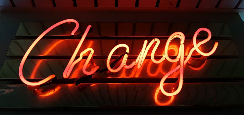
A neon sign that reads "Change".

Design Is More Than Tools

Whether you’re working with clients or creating your own portfolio, the end result is what matters most. Clients, for one, generally don’t care to be bothered with details of your workflow. After all, they hired you because you know what you’re doing. They just want their website to look fabulous and work as intended.

As for the design community, well, it’s always easy to judge others. I’d bet that all of us have placed some sort of label (positive or otherwise) on a fellow designer at some point in time.

The reality is that there are a whole lot of web designers out there. And there just as many ways to build a great website. What is comfortable and familiar to one of us may have the opposite effect on someone else – and that’s okay.

So, if you’re using the hot new app that everyone’s buzzing about – enjoy it. For everyone else, don’t feel compelled to change for the sake of change. If you’re happy with the tools you’re using, you needn’t feel left behind. Because, when it’s time to take things in another direction, you’ll know it.

Travel Website Design Inspiration

Are you making a travel website that needs to capture the beauty of the world? World explorer, outdoorsy business, or travel agency, we know you need some big inspiration to get started with your design.

We’ve collected the work of some amazing web designers here for you. Let the mockups and websites they’ve created help you create your own awe-inspiring travel site.

UNLIMITED DOWNLOADS: Email, admin, landing page & website templates


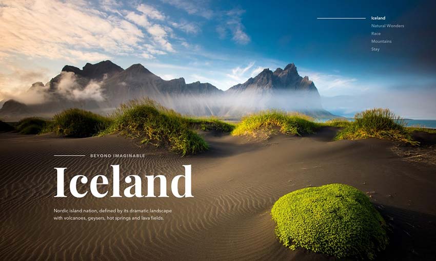
Fire & Ice Website

Example of Fire & Ice Website

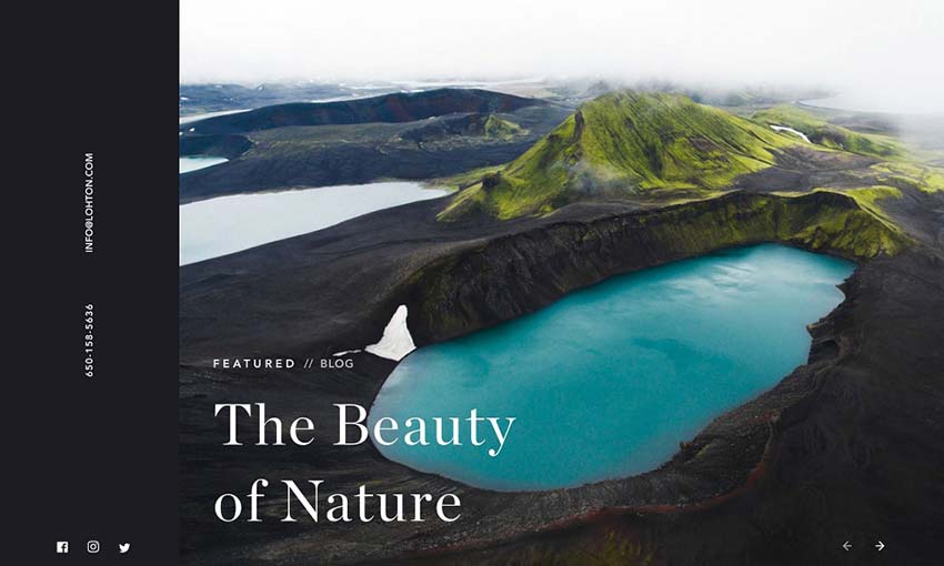
Dark and light contrasts the elements of this beautiful design, with light used to highlight the gorgeous imagery. Fullscreen photography, galleries, and sliders of the most scenic places in Iceland are scattered throughout and keep people engaged.

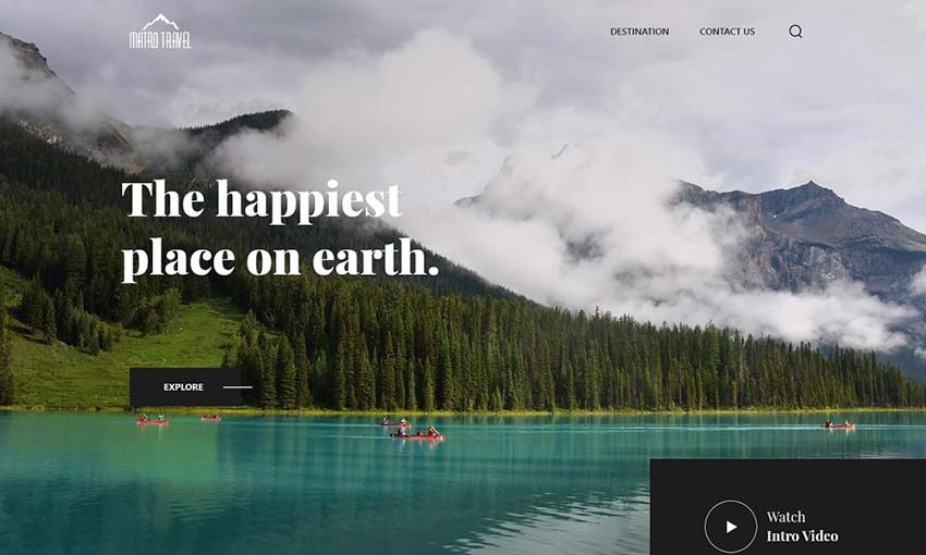
Marvel Travels – Startup Travel Agency

Example of Marvel Travels - Startup Travel Agency

Bright and clean design dominates this well-made mockup. There’s a nice full screen hero image followed by plenty of smaller images next to calls to action and other information.

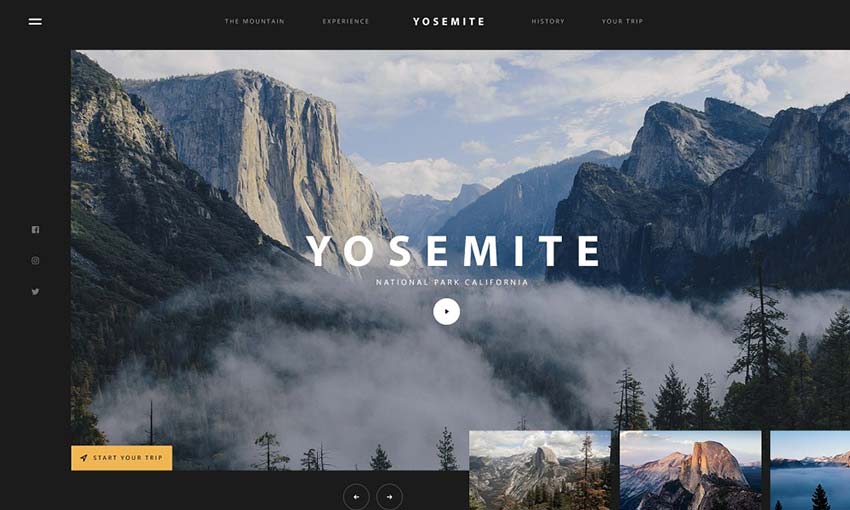
Yosemite

Example of Yosemite

Huge photography, a large and user-friendly UI, and sections of interest that take up the whole screen or more are scattered about this landing page. It’s fitting for one of the largest national parks in America.

Blog Page

Example of Blog Page

If you want to create a blog that stuns people just as much as the homepage, look here. Create a travel blog that looks like this and people are sure to quickly subscribe for more.

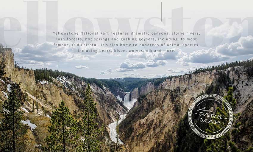
Yellowstone

Example of Yellowstone

Yellowstone’s gorgeous homepage is simply a masterpiece. It combines the amazing imagery of an untouched national park with a pleasing user interface and helpful info at every scroll.

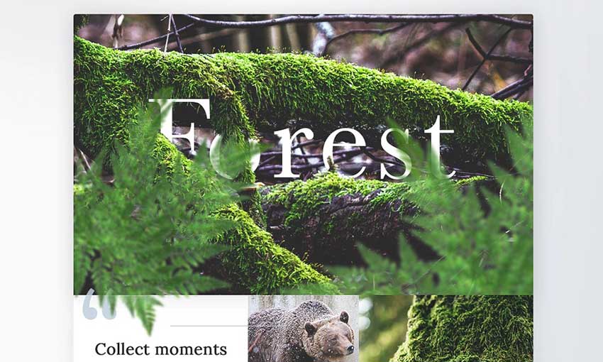
Forest

Example of Forest

The tile-based design here is used well, with 3D overlays and lots of interactive media in every block. A similar design would look great for a website that relies on visuals rather than text content.

Coastal Holiday Home

Example of Coastal Holiday Home

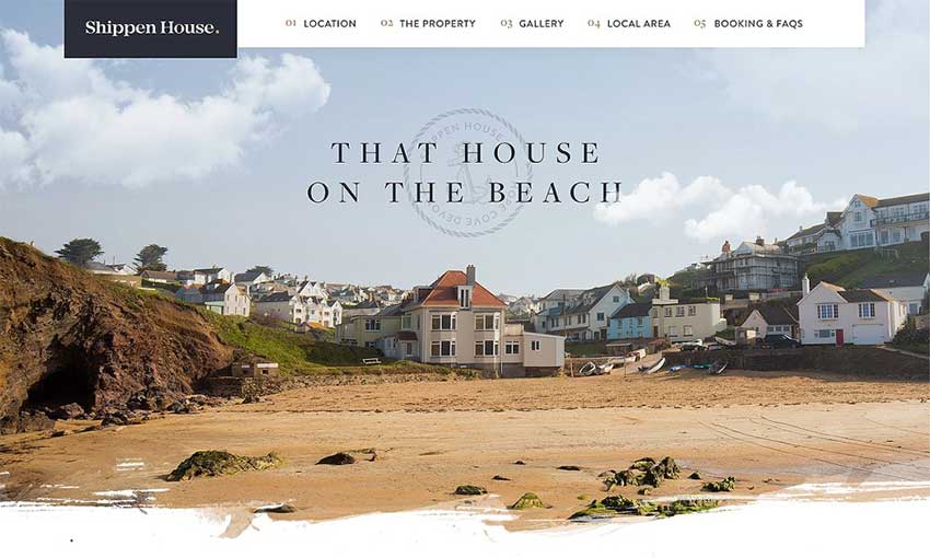
This mockup has more of a focus on real estate. Photos of vast landscapes are replaced with pretty interior and exterior shots, and it all has a bright, fresh look to it.

Travelers: National Geographic Site

Example of Travelers: National Geographic Site

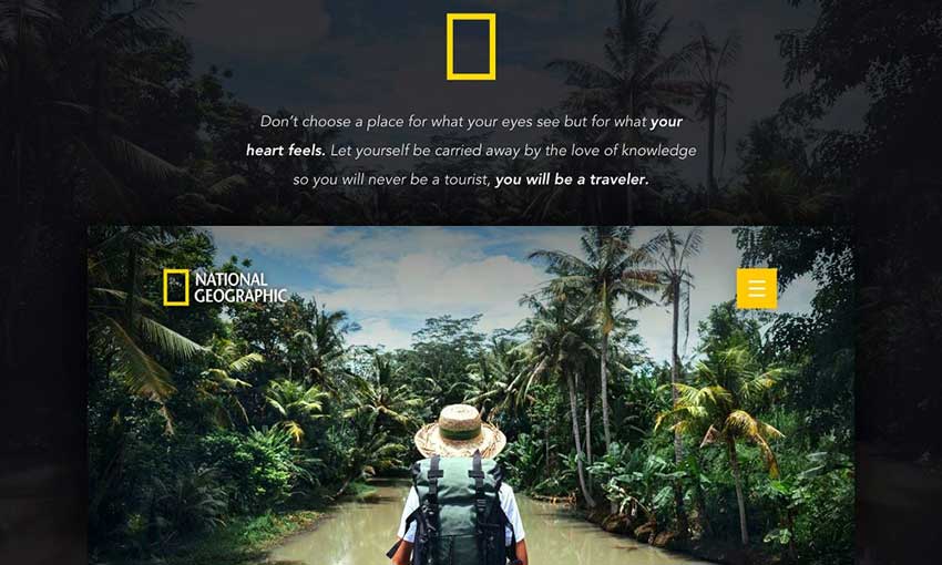
It may only be inspired by National Geographic, but this project looks completely authentic. Exciting photography is what the brand is all about, and it’s woven perfectly into its landing page.

Wandr: Iceland

Example of Wandr: Iceland

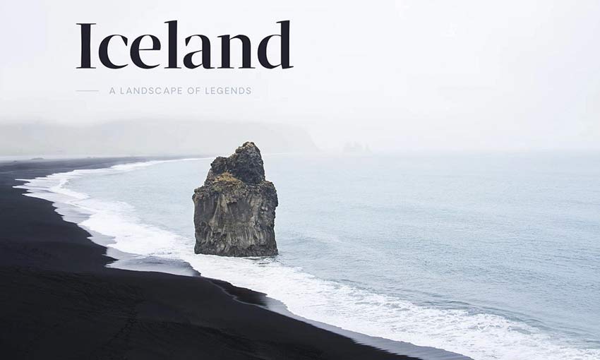
This hero image transitions from white to black, which seamlessly spills down into the rest of the page. The design is then broken up with beautiful, bright photography that stands out against the darkness. It’s a great concept for a landing page, and very inspiring.

Kayaking Trip Site

Example of Kayaking Trip Site

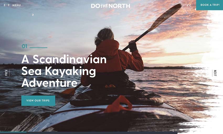
Pretty and functional, this is a great project to study if you’re making a business website. Calls to action are everywhere, but it never gets in the way of the landscape and portrait shots.

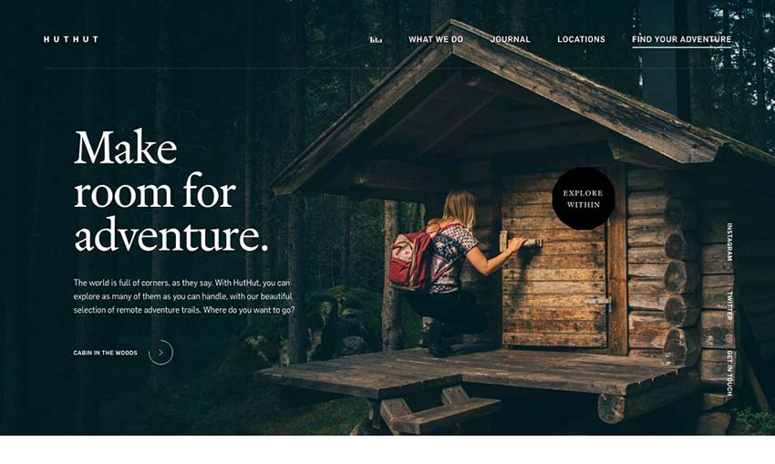
HutHut Adventures #1 – Landing

Example of HutHut Adventures #1 - Landing

Here’s an example of nice composition. The hero image and footer utilize photography, while the content area is the middle is light and spacious. Large images offer breathing room between text.

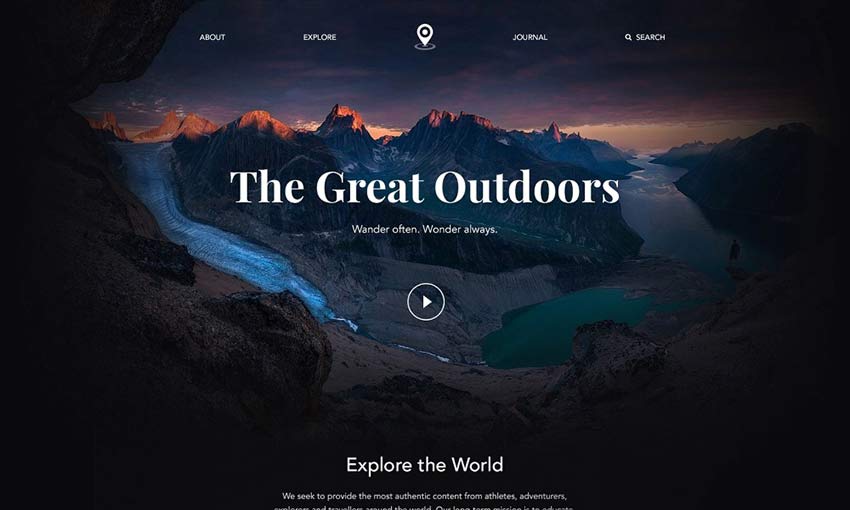
The Great Outdoors

Example of The Great Outdoors

Short, sweet, and simple, this landing page gets its point across quickly and stylishly. The photo header smoothly fades out to give way to image links and blog posts, before fading back in to the footer.

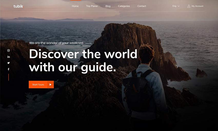
Travel Landing Page

Example of Travel Landing Page

A good homepage is crucial for success, and here’s a great example. Notice the focus on orange hues; they appear everywhere from UI to the photography. Strong usage of color can create a beautiful effect.

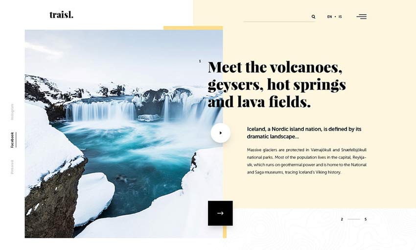
Traisl.

Example of Traisl.

Many travel sites tend to go for contrast between the photos and background, but this contrasts dark UI against snowy photography. It gives a greater focus to the text content.

Gorgeous Travel Sites

Travel websites are especially beautiful. They utilize jaw-dropping photography and videos to draw you in and get you excited to explore. Knowing how to incorporate these into a great user interface is key to creating an amazing travel design.

There’s something about seeing gorgeous natural imagery that draws people in. Use this to your advantage as you design a website that captures people with its beauty.

An Introduction to Color Fonts + 16 Beautiful Examples

Are you ready to add some color to your website? Color fonts are revolutionizing web and graphic design spaces by bringing in effects that before required advanced editing to achieve.

Traditional fonts tend to be vectors; they sit on one layer and are made up of simple strokes and shapes. You can resize them, and add effects like colors and drop shadows using HTML or CSS, but that’s all. Bitmap fonts work similarly, except they can’t be resized.

Color fonts, also known as chromatic or OpenType-SVG fonts, are breaking those barriers. These fonts can contain shading, textures, bitmap images, and of course colors – even more than one color!

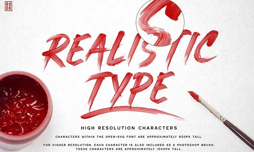
The results are a wide diversity of new typefaces, ranging from highly-detailed brush stroke fonts to multi-colored or gradient text to fonts that look metallic and shiny.

What’s the Big Deal?

Adding effects to text is nothing new for designers. Overlaying textures, images, or adding shading can be done in Photoshop. But what if you could just download a color font, type, and all those effects were right there in the first place?

The problem with simply adding effects to text in Photoshop is that the result must be displayed as an image online. That means that it can’t be highlighted, searched for, or indexed by search engines.

With OpenType-SVG fonts, it looks as fancy as anything you can make in an image editor, but it’s actual text on the page – not a PNG image. It can be resized if it’s a vector font, interacted with, and edited with HTML and CSS. This has huge implications for web designers and developers.

It also saves time. Instead of taking a normal font and adding effects to it, you can just find a color font that fits your needs.

While support for color fonts is currently spotty, most of these typefaces do come with fallback fonts. These are black and white versions of the font that will work on almost any browser or program.

Currently, color fonts are supported on Edge, Safari, and Firefox with Windows-only support for Opera and Internet Explorer. They’re also supported by most major image editors and design tools, except for Adobe XD, Premiere Pro, and After Effects.

The lack of Chrome support might make you wary, but it should be safe to use color fonts with fallbacks on your website.

Color Font Examples

Ready to add some color to your sites or graphic designs? We’ve compiled sixteen gorgeous color fonts here for you. All of these make full use of OpenType-SVG technology to create artistic type. See for yourself!

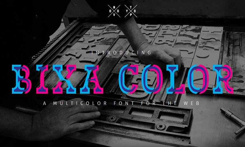
Bixa Color

Example of Bixa Color

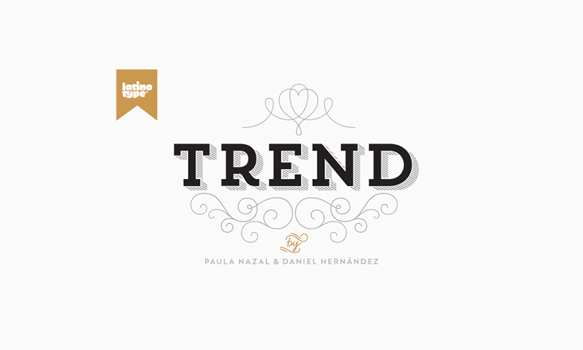
Trend by Latinotype

Example of Trend by Latinotype

Pure Heart by Greg Nicholls

Example of Pure Heart by Greg Nicholls

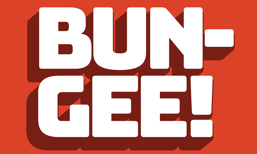
Bungee

Example of Bungee

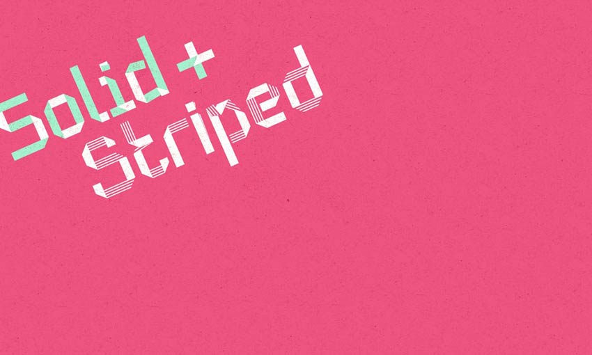
Dog Eared by Andy Babb

Example of Dog Eared by Andy Babb

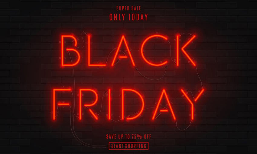
Night Neon by Andrey Yaroslavtsev

Example of Night Neon by Andrey Yaroslavtsev

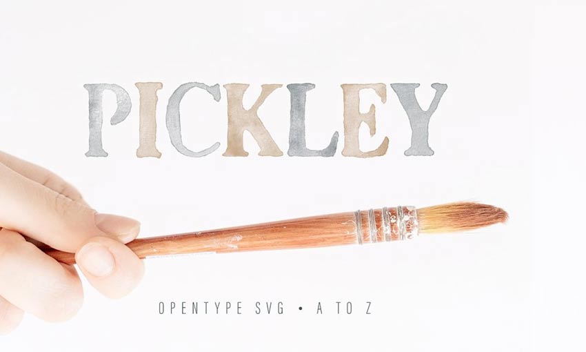
Pickley by Lef

Example of Pickley by Lef

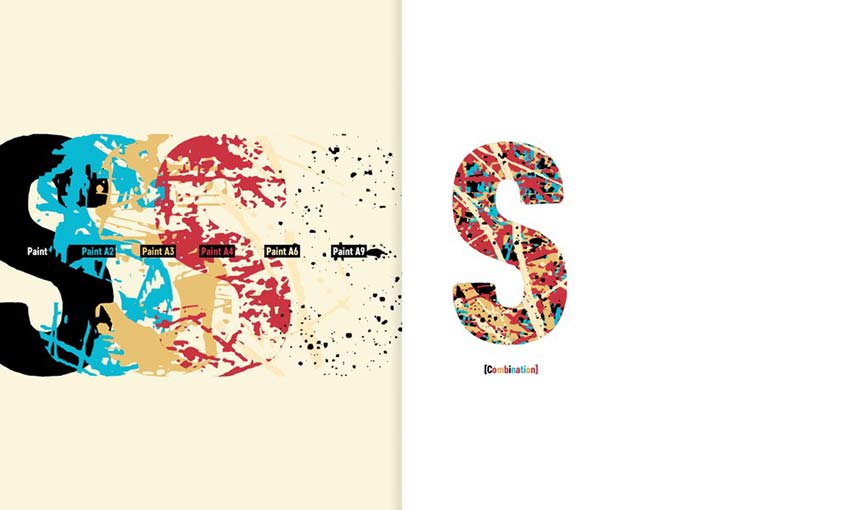
Core Paint by S-Core

Example of Core Paint by S-Core

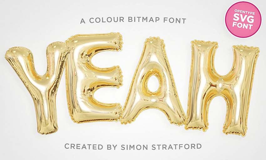
Yeah by Simon Stratford

Example of Yeah by Simon Stratford

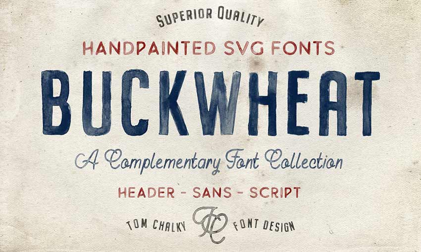
Buckwheat

Example of Buckwheat

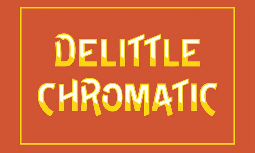
DeLittle Chromatic by Wood Type Revival

Example of DeLittle Chromatic by Wood Type Revival

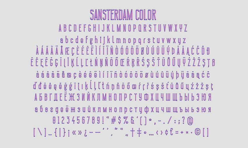
Sansterdam Color Font by NREY

Example of Sansterdam Color Font by NREY

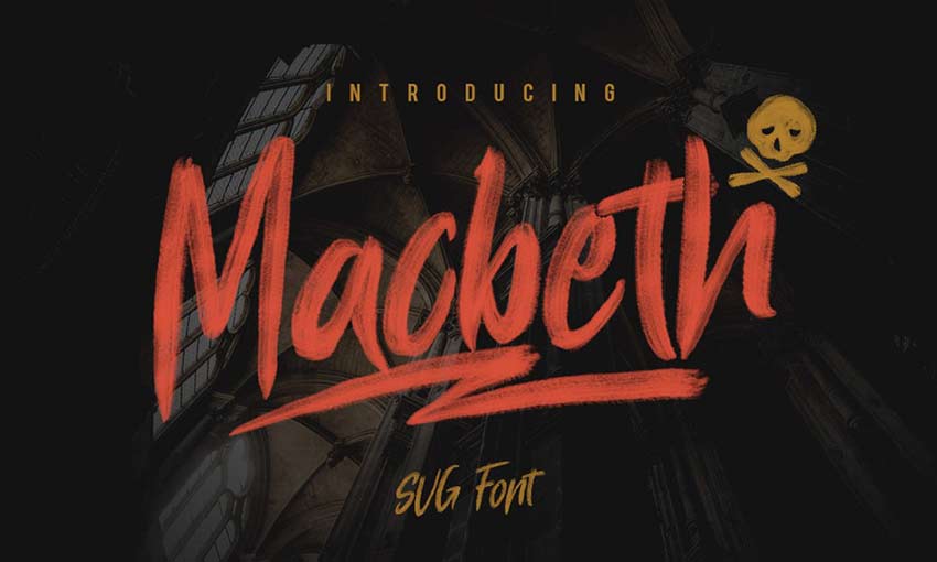
Macbeth by Pixel Surplus and Oghie Novianto

Example of Macbeth by Pixel Surplus and Oghie Novianto

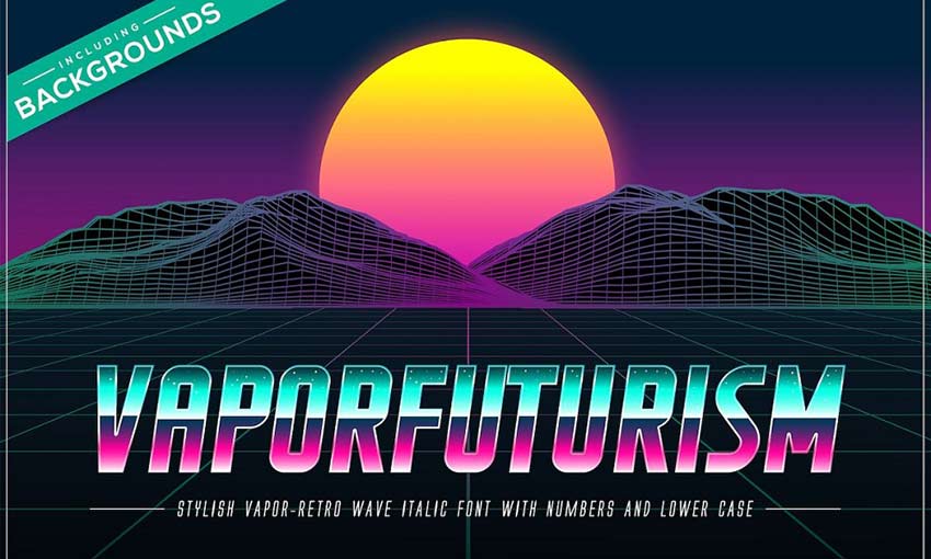
Vaporfuturism by Ckybe’s Corner

Example of Vaporfuturism by Ckybe's Corner

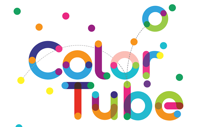
Colortube by Neogrey

Example of Colortube by Neogrey

Timber Wolf by Greg Nicholls

Example of Timber Wolf by Greg Nicholls

Beautify Your Projects with Colorful Fonts

Technology is always bringing us forward. Now, you can do things and add features to a website that, a few years ago, seemed impossible.

All of these fonts look like they’ve been heavily edited in Photoshop, but in reality, you can type them out onto the screen and they’ll look just like they do in the preview. Not long ago, designers may never have thought directly adding effects and shading to fonts like this could be possible.

And now, font designers are revolutionizing the online world and showing off the full extent of their design skills with awesome color fonts. Though chromatic text remains unsupported in some places, with its recent popularity, the day shouldn’t be long off when all major browsers finally support color fonts.

UNLIMITED DOWNLOADS: 400,000+ Fonts & Design Assets


Web Design Color Trends for 2019

When designing a website, many people think very little of the color scheme. Some people just randomly pick their colors or simply choose their favorite colors whether they go together or not. Some people may think, “How important could the color scheme of my website really be?” This is the wrong mindset.

Truthfully, this is one of the most important aspects of your website. The color will be the first thing the viewer notices and, in that short time, they will make a judgement right then and there about you without any real information. So, take time to think over your color scheme because it is the first thing visitors to your website will see and use to experience your brand.

Having a strong color scheme will make it easier for people to recognize your brand. For example, what are some favorite companies you think of when you think of red and white? If you guessed Coca-Cola or Netflix then you would be like most folks. Neither Coca-Cola nor Netflix own the colors red and white, but when you see those colors together, they are usually the first two brands to pop into your mind.

Gray pencils sitting on a yellow background.

Why Color Matters

A clever and thoughtful color scheme can give your website a unique and modern feel. A poorly chosen color scheme can make your website feel dated and old school. The impact of a good color scheme cannot be stressed enough. 90% of judgements made when viewing a product in the first few seconds are based solely on color. The color is important because it can impact the user’s ability to read your content and possibly lead to eye strain.

These are very important factors, because you want users to easily be able to view the information you present to them. Eye strain affects how long a user will be able to stay on your website – something that is often overlooked. Bombarding your visitors with a lot of bright colors and visuals may look interesting and cool, but will ultimately impact the amount of time a user spends on your site.

According to HubSpot, 46% of people will judge the authenticity and credibility of your website based on the design and colors. This means that choosing the design’s color scheme should be in the forefront of your mind. Another 40% of people will respond better to visual information rather than plain text. One of the objectives of your website should be to present information that is easily digestible for the reader. A strong color scheme will help you accomplish that.

There are only seven base colors in the world. But once you factor in different shades and combinations, that number reaches well into the millions. You definitely have tons of options at your disposal – which can be overwhelming. But don’t worry, it’s not that hard.

If you are building a new website from scratch and trying to find the right color scheme or you’re trying to give your old website a makeover, then you’ve come to the right place. This article will help you find a color scheme that will both keep up with the trends and give your website the unique look you want it to have.

Hot Reds

A red building.

Red is a very dominant color that has many different meanings. It can represent things such as anger, love, fire, and passion. With all the meanings this color can convey, the possibilities are endless when using red within your website.

This color will surely draw attention to important elements, but be careful not to overdo it. A little of this hot red can go a long way. Make sure that this color goes with the tone you are trying to convey.

Contrasts

Painted fruit.

Highly-contrasting colors are a dangerous area when it comes to web design. When done poorly, these designs are an eyesore and will make people look away and perhaps never come back. However, when done correctly you get something so visually striking that people can’t help but look.

The result is a beautiful webpage that draws users in and encourages them to explore. Contrast can be achieved by combining different colors, but also different patterns, which is not as common. In 2019, look to see web designers pushing the creative limit using contrasts to create beautiful web designs.

Earth Tones

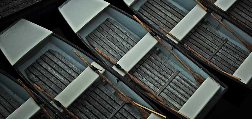
Boats parked in a dock.

Earth tones remind us of the natural world. They offer a modern look to web design when used correctly. They are often muted colors that are best used sparingly, so as to not overwhelm users.

Shades of browns, yellows, tans, blues, greens and many more are great for giving your website that Earthy feel. All of those tones are often found out in nature or within our homes. This helps to give your website a warm and friendly feel to it.

Be sure to keep an eye out for this trend in 2019, as it has already been becoming more popular in website design.

Black on Black

Black tech accessories.

Black is a very timeless color that never goes out of style. It often gives off a very sleek and elegant look. In the fashion world, black is often used to display elegance and luxury. This same principle can be taken into web design.

Using black on black to display your site is a great way to attract people and make it feel as if they are partaking something extravagant. Using different shades on your website is a surefire way to attract attention to it. This look has been trendy forever, and that will surely continue this year.

Make Your Statement

There’s no better way to make a statement than with color. Whether bold and bright, or soft and muted, the colors you choose to display will say a lot about your brand. Take these trends into account and choose wisely!

Insights from Recent Web Developer Surveys

Surveys offer a wealth of extremely valuable information. For the web developing world, this can have huge implications. Have you ever wondered where the people in your field are working, what tools they’re using, and how long they’ve been in the business? What’s your competition and where should you be devoting your time?

Thanks to numerous web developer surveys, all of these questions can be answered. Let’s see what insight can be gleaned from these thousands of responses.

The State of Javascript

The State of Javascript

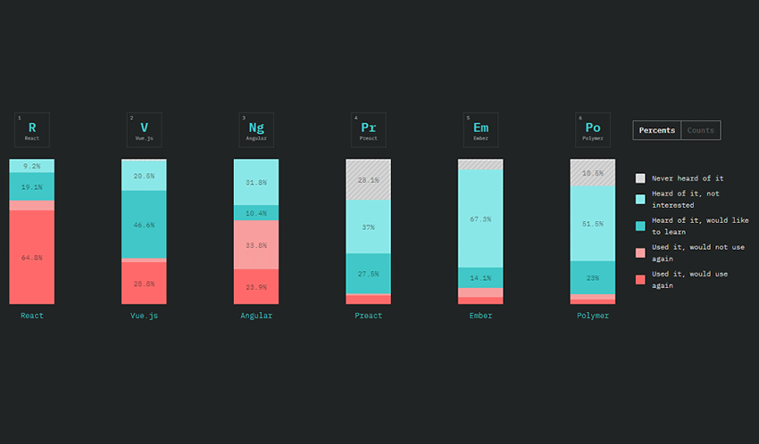
JavaScript has a huge range of libraries, and it can get overwhelming. Over 20k JS developers helped shine some light on the situation.

If you’re searching for a small, but potentially profitable niche to break into, Reason, ClojureScript, and Elm look like the best candidates for JavaScript flavors. Vue is also a steadily growing front-end framework worth looking at. There’s much more data for back-end frameworks, data layers, testing frameworks and more.

The State of CSS

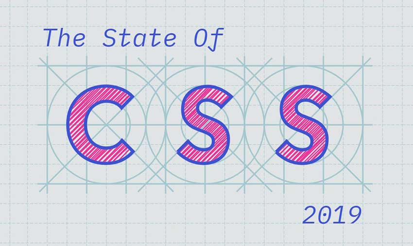
The State of CSS

This survey hasn’t yet been released, but with 10k respondents, it’s sure to be enlightening. Keep an eye out or enter your email so you can know where this constantly-evolving language is going.

Stack Overflow Developer Survey

Stack Overflow Developer Survey

Stack Overflow is a gigantic hub of developer knowledge, so it’s the best place to run a long survey.

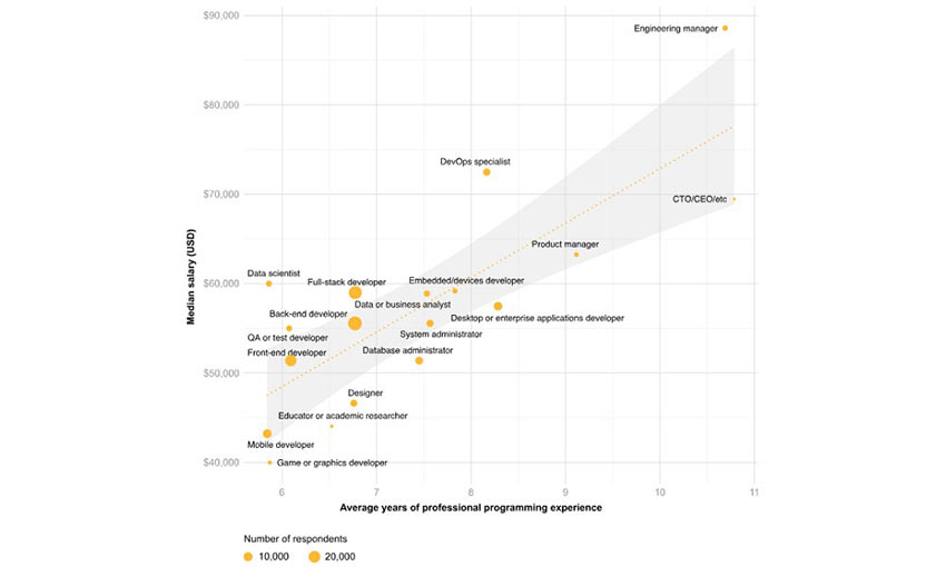
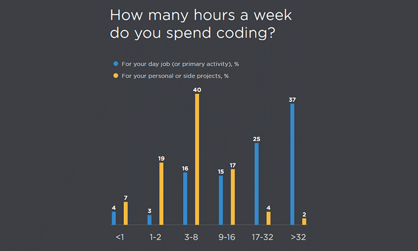
Almost 60% of developers are back-end, and near 50% full stack. 20% work in mobile, which explains the steadily growing market. Python has surpassed C# in popularity, so if you’re thinking of trying it, get on the bandwagon now.

Engineering managers, DevOps specialists, and data scientists/analysts have the highest salaries among developers – mobile and game devs the lowest.

Front-End Tooling Survey

Front-End Tooling Survey

5k front-end developers answered this toolkit survey, which was compared to one done in 2016.

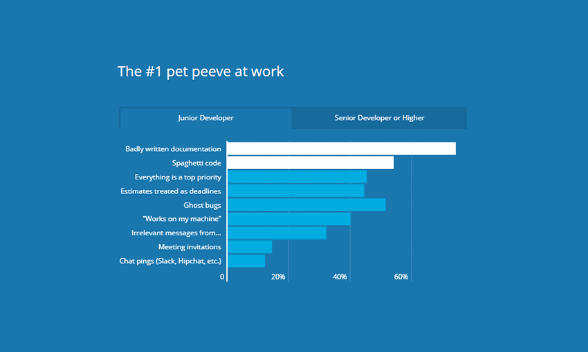
A decent portion of CSS developers prefer using no pre-processor or framework at all, but popular tools include Sass, Bootstrap and Autoprefixer. Overall, CSS users seem to be moving towards cleaner code with usage and knowledge of methodologies, linting, and naming schemes increasing.

CSS and JavaScript experience often go together, especially with jQuery and React. If you’re a beginner, plan to learn both.

2019 Developer Skills Report

2019 Developer Skills Report

This 71k respondent survey is all about skills, and it’s really interesting. JavaScript surpassed Java with 73% knowing JS. React is growing fast, and by 2020 it might just dominate Angular. More employers want React too, so now’s the time to learn.

Internet of Things and Deep Learning are considered realistic technologies to pursue. And beginners, note that nearly 10% of developers have wiped a database or shut down a production server, so take this as a warning to double-check your code.

The State of Developer Ecosystem

The State of Developer Ecosystem

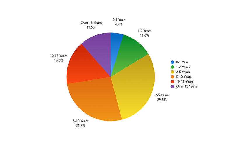
Where’s the developer ecosystem going? The data says everyone wants to learn Go, Python, and Kotlin, while JavaScript, Java, and HTML/CSS are already well-known.

In the absence of local or private database hosting, Amazon Web Services is the most popular candidate. And open source devs remain a minority, though it’s steadily gaining traction.

Node.js User Survey

Node.js User Survey

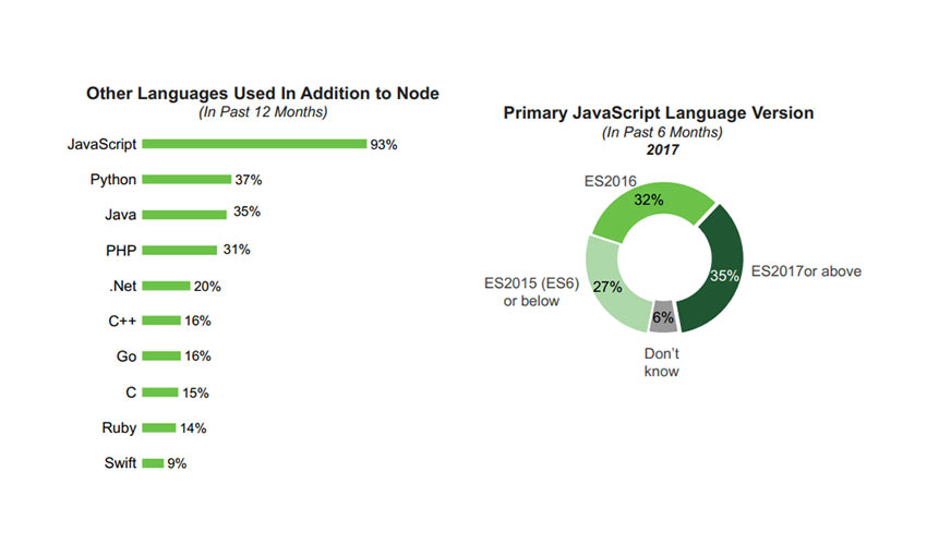
Node.js is very popular, and this user survey garnered nearly 2k responses. Back-end and full stack developers are the ones who use it, and they use it frequently in over half of development. These projects tend to be web apps.

A vast majority of Node developers also use databases, front-end libraries, and Node frameworks, with Express being the most popular. Over half use load balancing and containers.

One more interesting fact: Node users tend to know over three languages. Python is by far the top contender.

Ionic Framework Developer Survey

Ionic Framework Developer Survey

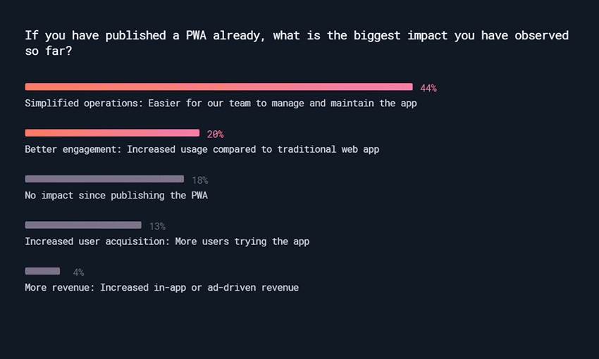
Ionic Framework’s huge community shared its insights in this 10k survey. Angular is the most popular framework among Ionic users, but React and Vue compatibility is in the works.

Consumer-focused apps made up the majority of projects, and 32% of Ionic devs work on a startup team. Nearly 30% are self-employed with the other big chunk working in a small company of 1-10.

Progressive Web Apps were the favored project, with 61% saying they had built one or plan to this year. They’re easy to manage, efficiently cross-platform, and get more user engagement.

Powerful Information

It’s a good idea to follow the changing online world, and what your fellow developers are up to. Knowing what the popular frameworks and libraries are can get you an edge on the competition. We hope this collection of surveys offered some insight into the modern development trends, and maybe gave you some direction towards what to pursue next!

12 Inspirational Examples of Minimal Web Design

Considering that the current philosophy of UI design is “less is more,” the expected rise in popularity of minimalism has reached an all-time high amongst web designers, especially in the last couple of years. But, perhaps unknowingly, its appeal to users has also grown.

The principles of minimalism in web design are that a website (and other mediums as well) should be stripped down to their bare bones, while carefully making use of whitespace and improving readability with clearer typography. When implemented correctly, the result will allow users to focus on what’s truly important without being distracted by non-essential elements.

Your Web Designer Toolbox
Unlimited Downloads: 500,000+ Web Templates, Icon Sets, Themes & Design Assets


While this may sound easy, it can be difficult deciding what the truly important elements are and what’s little more than decoration. It can also be risky. Accidentally removing a seemingly innocuous element could be deemed critical by the user and could result in the wrong message (or worse, no message at all) being delivered to your target audience.

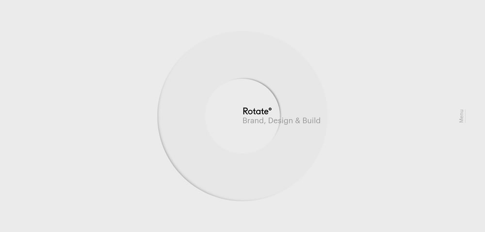
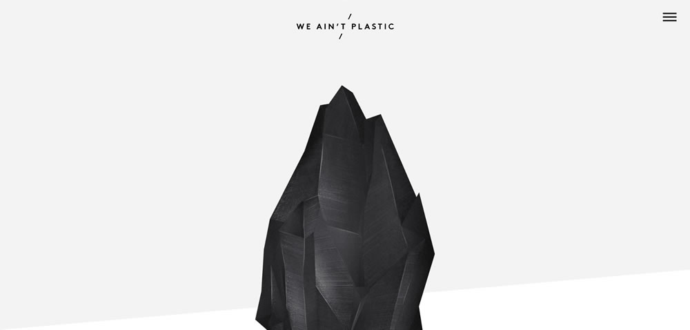
minimal web design Rotate

Source: Rotate°

If you think about the logistics, it makes sense that minimalism appeals to users: the less fluff on the site, the less you have to think about. When there are just a few links or blocks of text, and the point of interest is directly in front of you, you can let your mind rest for a bit – relax, and the website will spoon feed you just what you need.

This collection features fifteen websites that have been designed using the minimalistic principles mentioned above. Some of the sites have also been influenced by many of the popular web design trends we have seen over that past year or so, like flat design, yet still retain a look and feel that can only be described as minimal. Here are the beautifully designed sites:

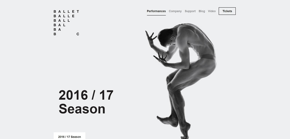
minimal web design Ballet BC

Source: Ballet BC

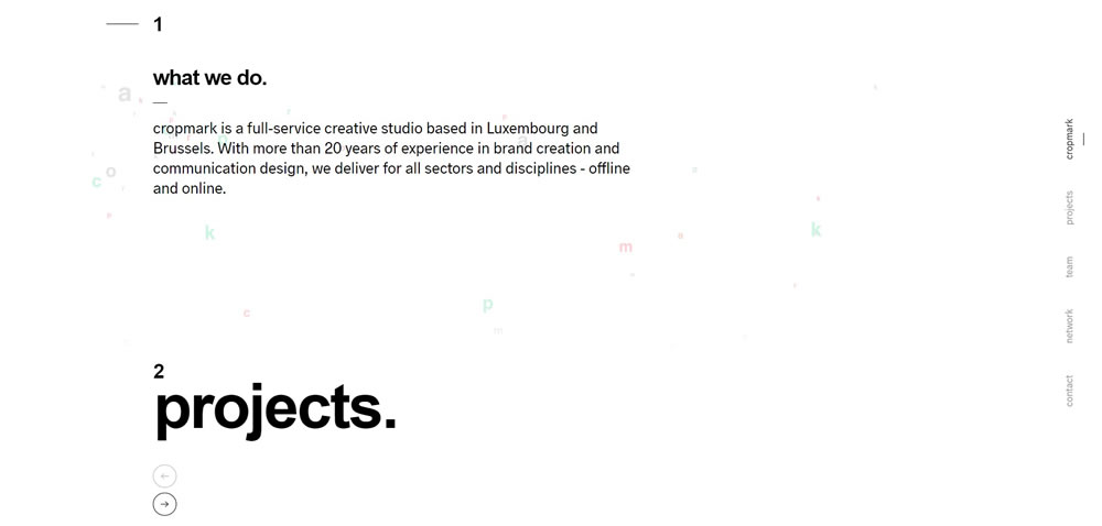
minimal web design Cropmark

Source: Cropmark

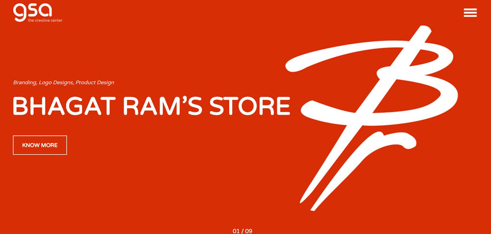
minimal web design GSArora

Source: GSArora

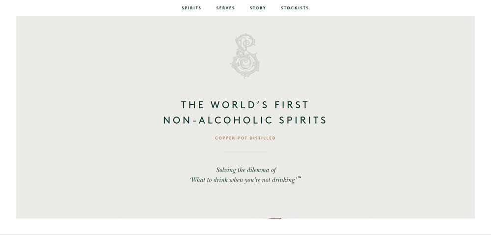
minimal web design Seedlip

Source: Seedlip

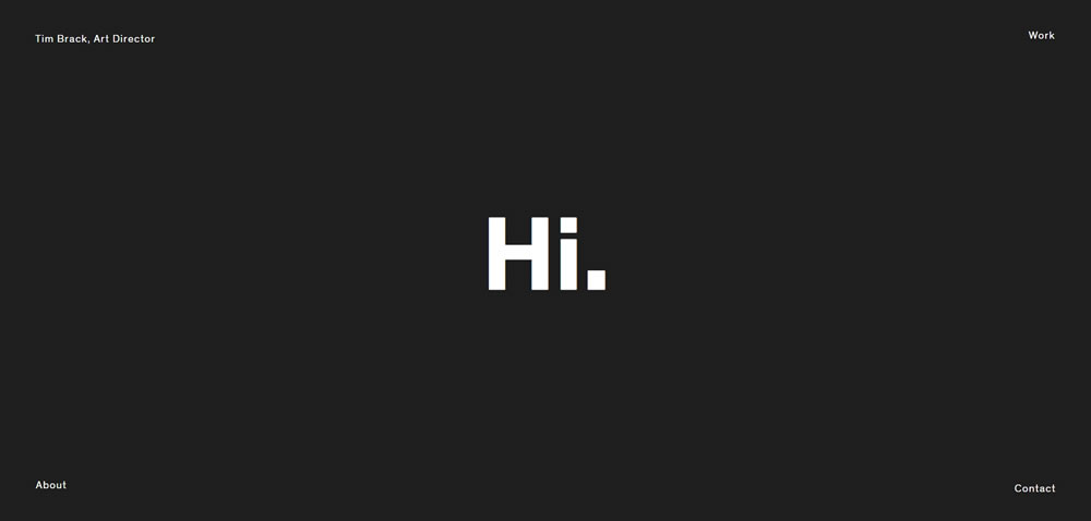
minimal web design Tim Brack

Source: Tim Brack

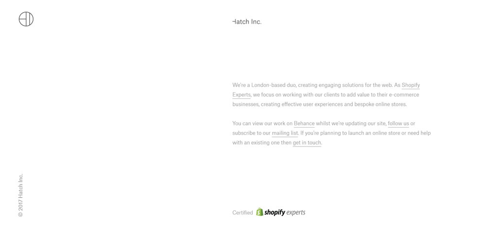
minimal web design Hatch Inc

Source: Hatch Inc.

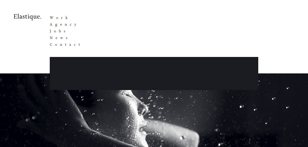
minimal web design Elastique

Source: Elastique

Finshed

Minimalism isn’t the miracle solution that you can slap on every single project. There’s a time and place for everything; the time is now, but you need to carefully decide the place.

10 Inspirational Examples of Graphs & Charts in Web Design

Graphs and charts are some of the most visually complex and difficult elements for designers to execute to a high standard. The range of different elements and requirement for cohesiveness make it all the more impressive when a great example is included in website design.

Some of the best examples incorporate plenty of color for visual differentiation, clean connecting lines and shapes, and easy-to-understand axis. When designed to a high standard, the results can have a dramatic impact on the overall visual design and user experience of the website.

Your Web Designer Toolbox
Unlimited Downloads: 500,000+ Web Templates, Icon Sets, Themes & Design Assets


Lab Board

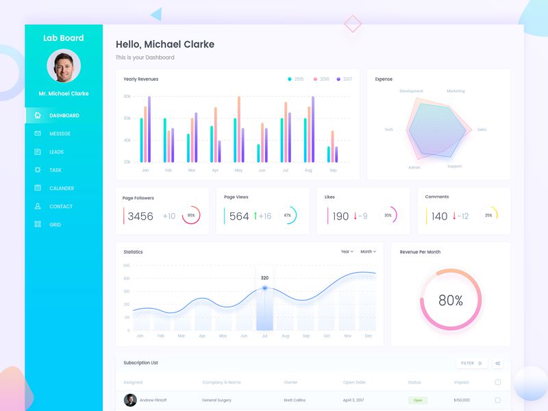
Lab Board uses a beautiful consistent selection of colors, subtle gradients, and large drop shadows in their dashboard design.

Lab Board

SE Ranking

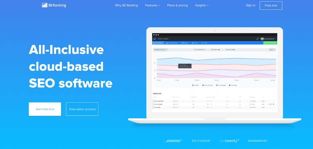
SE Ranking shows off their graphical user interface dashboard via the homepage. The graphs are simple and easy to understand, using a selection of light colors which complement each other perfectly.

SE Ranking

Dropbox Transparency

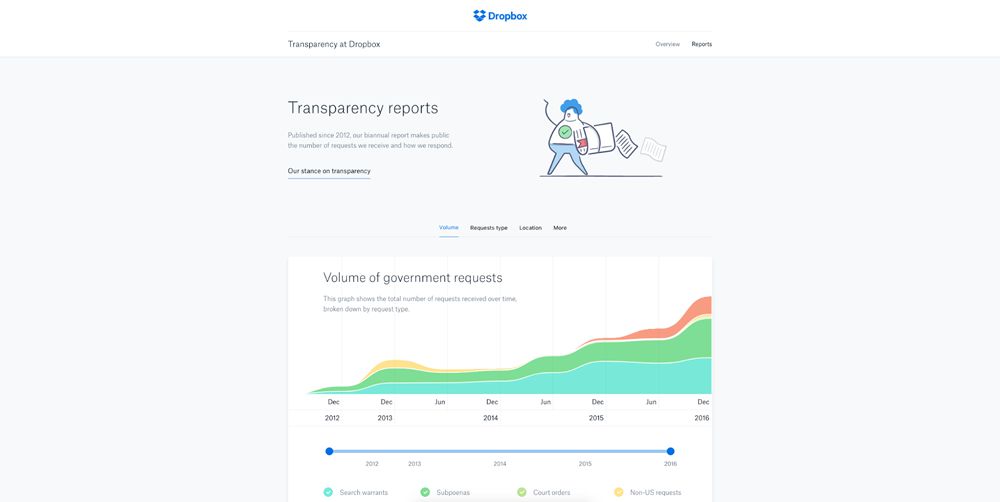
Dropbox’s Transparency web page highlights some interesting data on how many government requests they receive. The graph is designed beautifully with great color selection and separation, and a clearly defined key to match.

Dropbox Transparency

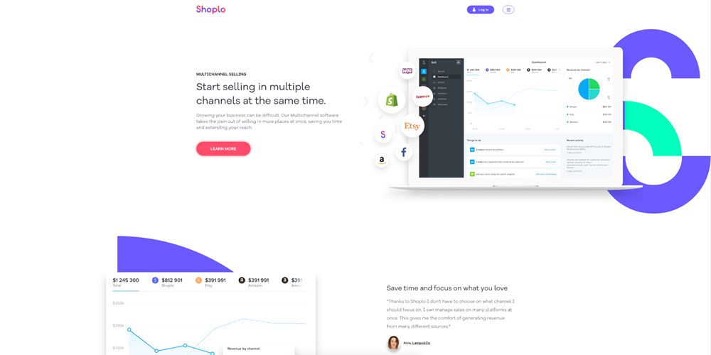
Shoplo

Shoplo’s website is impressive in its unique use of background elements and bright multitude of color throughout. The graphs used in their dashboard follow this trend using subtle gradients and strokes to outline data trends to the user.

Shoplo

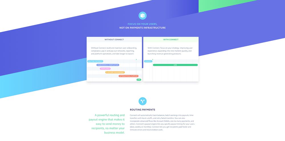
Stripe Connect

Stripe Connect uses Gantt charts to illustrate how their platform can speed up several aspects of payment processing. The design is much simplified and uses a selection of brand colors to differentiate each aspect within the chart.

Stripe Connect

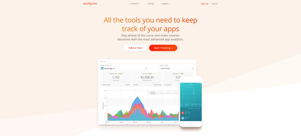
Appfigures

Appfigures’ tools present many challenges in the fact they have to often display an enormous quantity of data at once. They have solved this issue beautifully by incorporating transparency into the vibrant graph background colors.

Appfigures

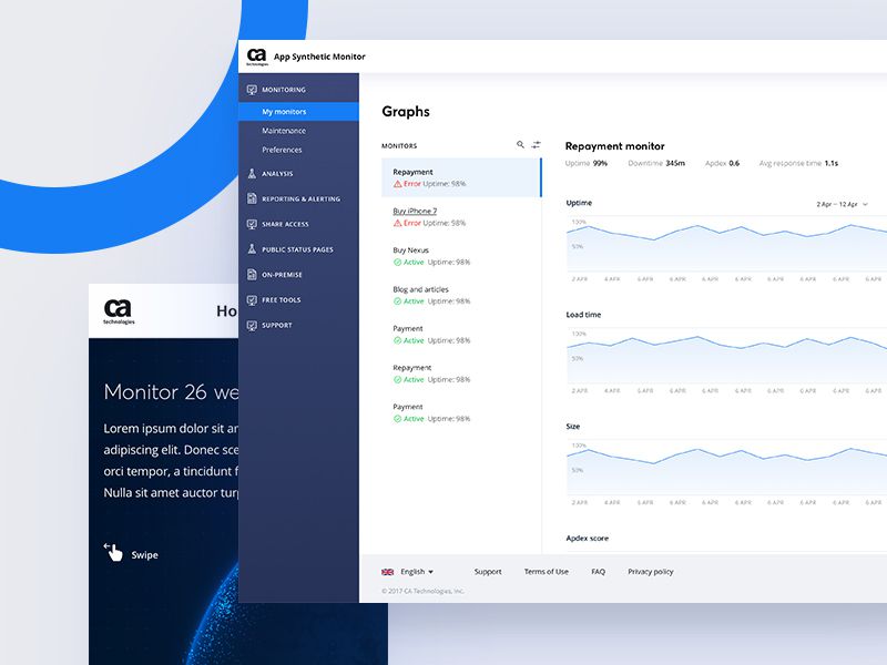
CA Technologies

CA Technologies keeps it simple for the graphs within their website. It uses a blue stroke with an underlying gradient which fades out to the x-axis. The simplicity makes it extremely easy to understand and fits perfectly with their brand direction and user interface colors.

CA Technologies

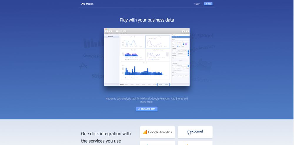
Median for Mac

Median for Mac’s website focuses on a screenshot of their Mac application with is almost entirely graph and chart based. The graph and chart designs are simple and keep the colors within those of the Median brand.

Median for Mac

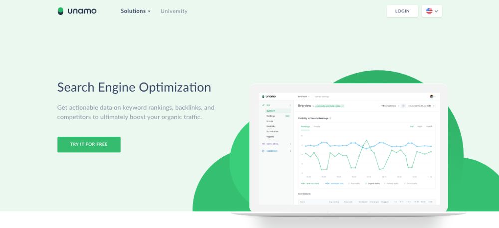
Unamo

Unamo uses line graphs within their search engine optimisation software. The lines are plotted with circular strokes and use a beautiful on-brand, three-tone color system of green, purple and blue.

Unamo

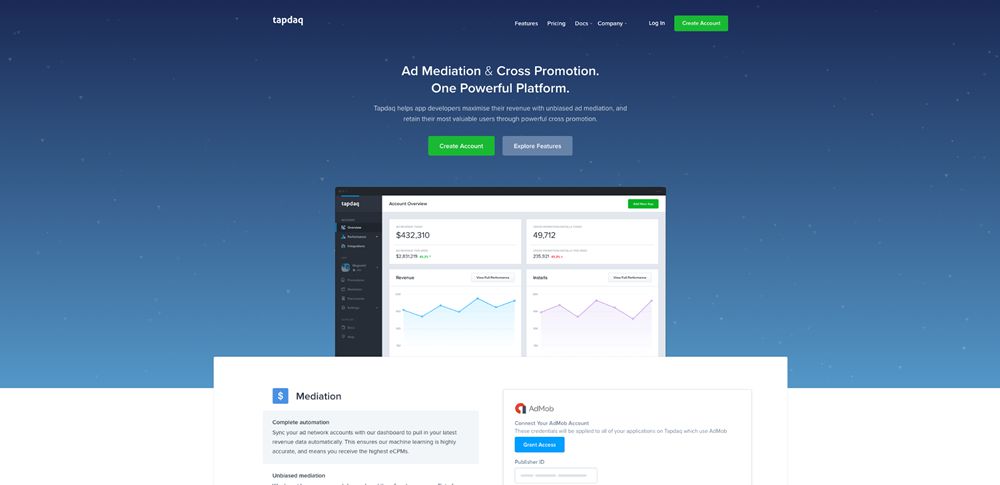
Tapdaq

Tapdaq’s homepage also uses line graphs within the dashboard preview. The blue and purple line strokes compliment each other beautifully, while the fade-out gradient brings attention to the axis and overall volume of data.

Tapdaq

Simple Hero Web Design Examples in Landing Pages

The hero is the section of a landing page which has the utmost importance.

It is contained within the fold of a website and therefore is the first area that communicates with the visitor. This means the message needs to be put across simply and concisely to convey the product or service effectively. It is also the area where the company can create high visual impact and interest, and lead the visitor on into the key content sections.

In this article we are going to look at some excellent hero design examples in landing pages to discover what makes them so efficient.

All the Landing Page Templates You Could Ask For


2M+ items from the worlds largest marketplace for Landing Page Templates, Themes & Design Assets. All of it can be found at Envato Market.

Headway

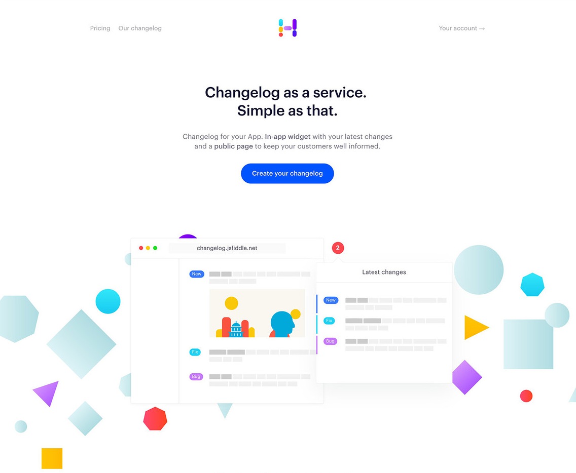
Headway maintains a beautifully clean hero section, while delivering a concise product description and clear call to action. The navigation options are simple and easy to understand and cast the primary focus on the hero message.

The colorful illustrations serve as a content break, and carry the brand through the design, while visually representing the product at the same time.

hero design web example landing page Headway

Rezi

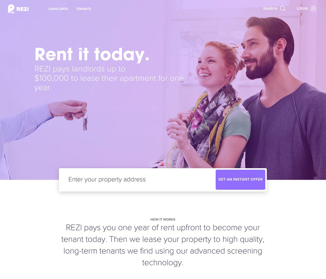
Rezi’s hero section sparks a tangible sense of emotion. It tempts the visitor with the emotion attached to receiving the property keys and moving home.

The message is short, large, and quickly gets across the use of the site as a tool to rent or let property. The imagery has a subtle purple hue to continuate the branding through the design. A clear call to action accompanies the hero section, allowing the site to capture the user’s initial interest and learn more about the service – in this case, getting an instant property offer.

hero design web example landing page Rezi

Bonsai

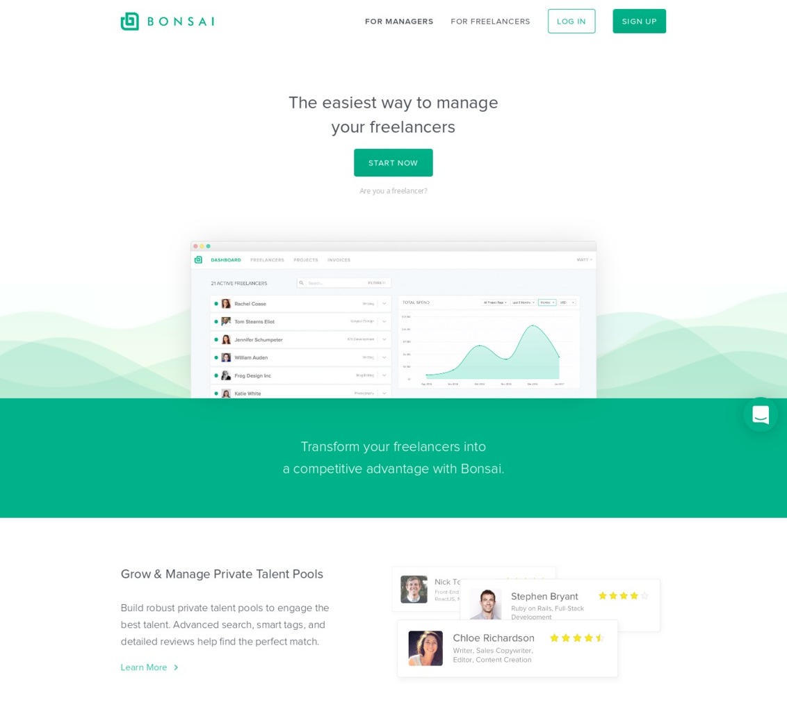
Bonsai has executed their hero section with precision and simplicity. They have not even opted to include a description, going simply with a large title which quickly explains the product at hand.

The title is accompanied by a clear call to action and a product screenshot which reinforces the concept of the product further.

This user interface also allows them to sell their product through its clean and simple design. The waves behind serve to create visual interest, carrying through both the brand as well as the graphs which are so integral to the product and its underlying concept.

hero design web example landing page Bonsai

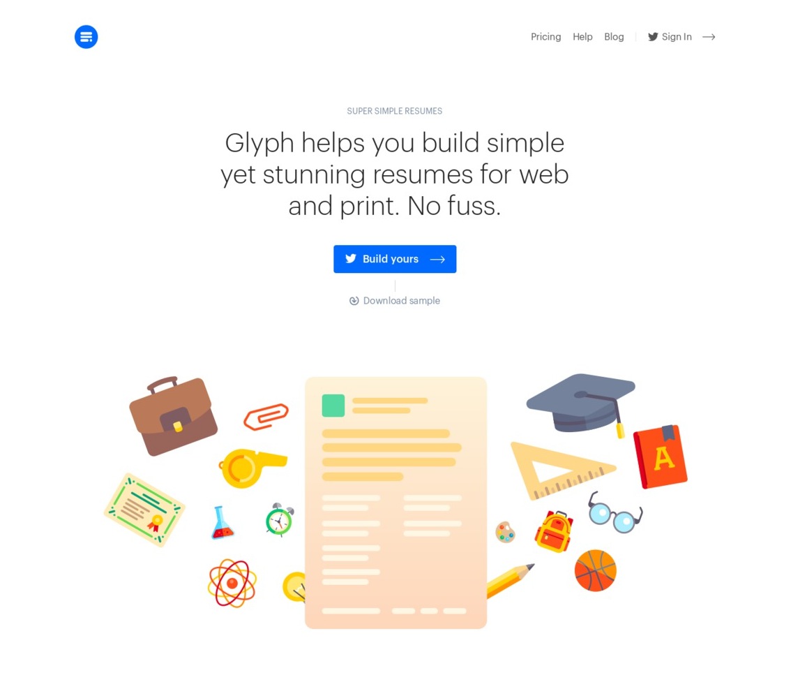
Glyph

Glyph is one of the more simple approaches to hero design in landing pages. There is very little noise, distraction, or hard-selling. It’s as simple as a description of what Glyph does, and an accompanying call to action which stands out clearly against the minimal design.

The illustrative section is situated below the main hero section to keep the important information and call to action as high into the fold as possible. The section also serves as a break between written content, as not to overload the user with information.

hero design web example landing page Glyph

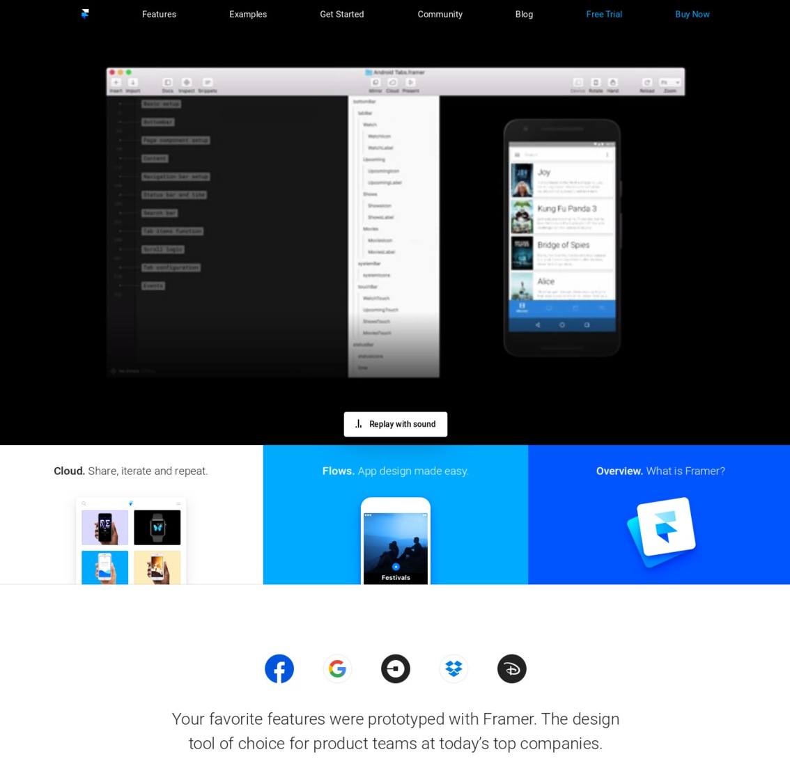
Framer

Framer is probably the most polished and structured of all the examples. It uses a clear grid system with plenty of differentiation through color and spacing. The main hero area uses an effective video to quickly convey what would otherwise be a difficult product to describe to the everyday visitor.

The design is focused less on producing a hard-sell, and more on educating the user about the product, hence the positioning of the primary call to actions in the top right of the navigation. The use of color is clear, sharp and effective, cleverly using the brand colors throughout. The three cards provide a useful visual separator from the main written content.

hero design web example landing page Framer

Which are your favorite hero design examples in landing pages? Share them below in the comments section!

10 Beautifully Designed Examples of Split Screen Layouts in Web Design

Split screen layouts break the oldest and most critical UI design rule of all by giving equal importance to two primary areas of a site. It’s common practice to give each element of a site a priority level in relation to the structure of the design, yet split screen layouts completely ignore those rules.

And strangely, it works.

With a split-screen, you can give prominence to both elements and enable the user to choose between them. You can quickly convey dual importance. For example, if you want to communicate to your visitors that your core strengths are both your digital products as well as your talented staff, you can place one on the left side, and the other on the right side.

Your Web Designer Toolbox
Unlimited Downloads: 500,000+ Web Templates, Icon Sets, Themes & Design Assets


On your portfolio website you can position the identity of your brand on the left, and a list of the sites you have built on the right. If you are designing a restaurant or coffee shop website, you can use one side to feature some company or contact information while showcasing photos of customers enjoying the locales on the other side.

Split screens provide lots of ease to users, especially if they are potential customers. Thanks to the reduced clutter and the more streamlined appearance of split screen layouts, users will spend less time trying to find the information they are looking for.

Below you will find a selection of beautifully designed websites that have successfully implemented split screen layouts.

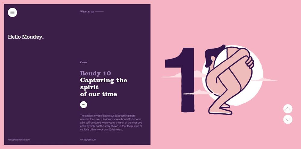
Hello Monday

Hello Monday split screen web design layout

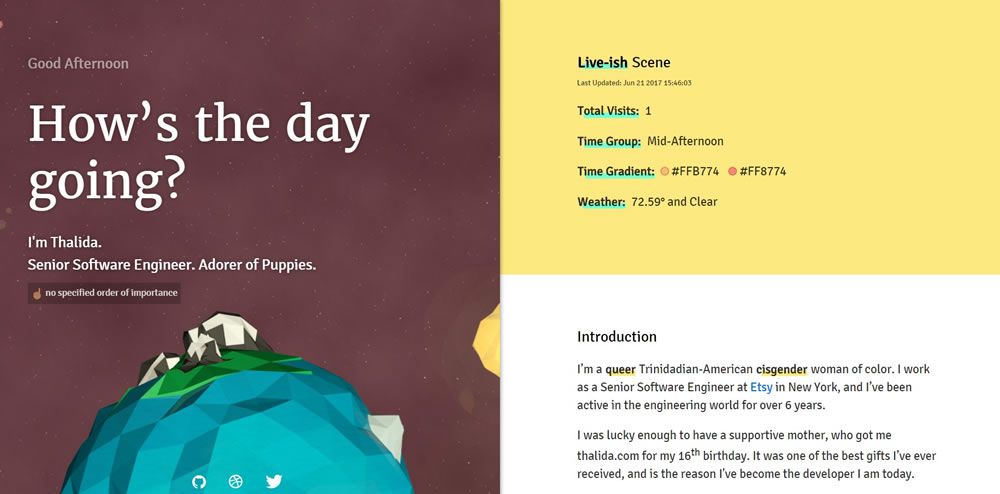
Thalida

Thalida split screen web design layout

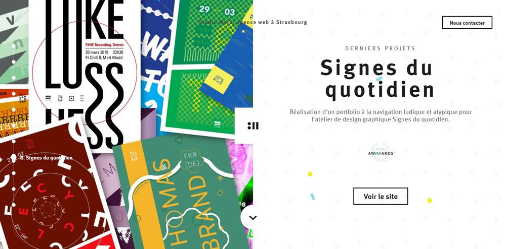
Studio Meta

Studio Meta split screen web design layout

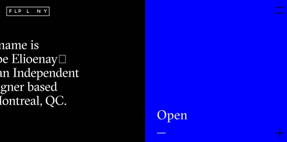
F L P L N Y

F L P L N Y split screen web design layout

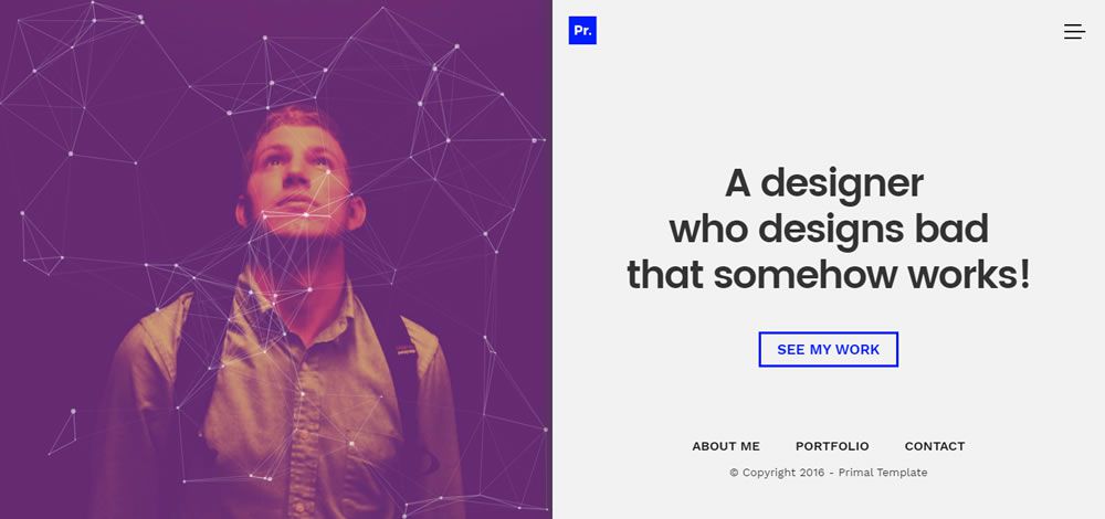
Primal

Primal split screen web design layout

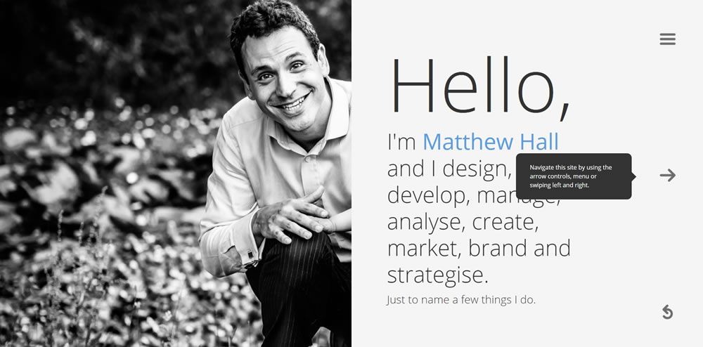
Matthew Hall

Matthew Hall split screen web design layout

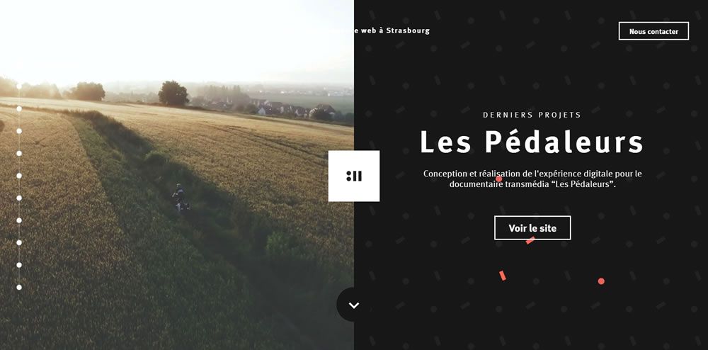
Studio Meta

Studio Meta split screen web design layout

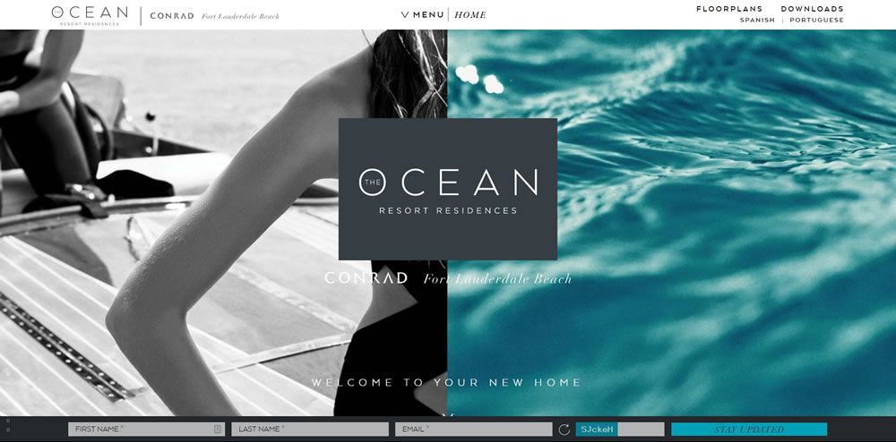
Ocean Resort Residences

Ocean Resort Residences split screen web design layout

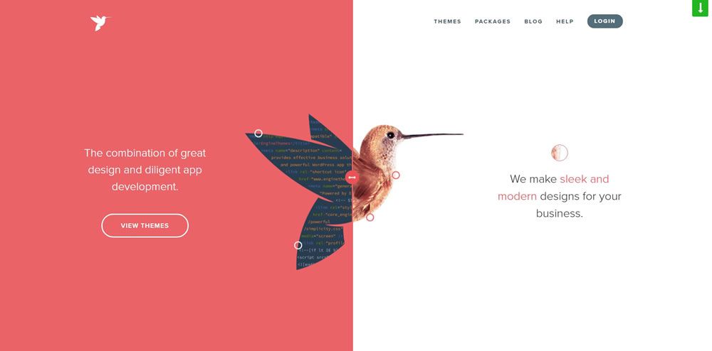
EngineThemes

EngineThemes split screen web design layout

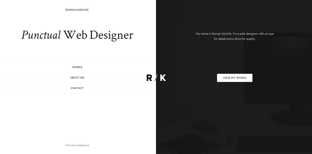
Roman Kirichik

Roman Kirichik split screen web design layout

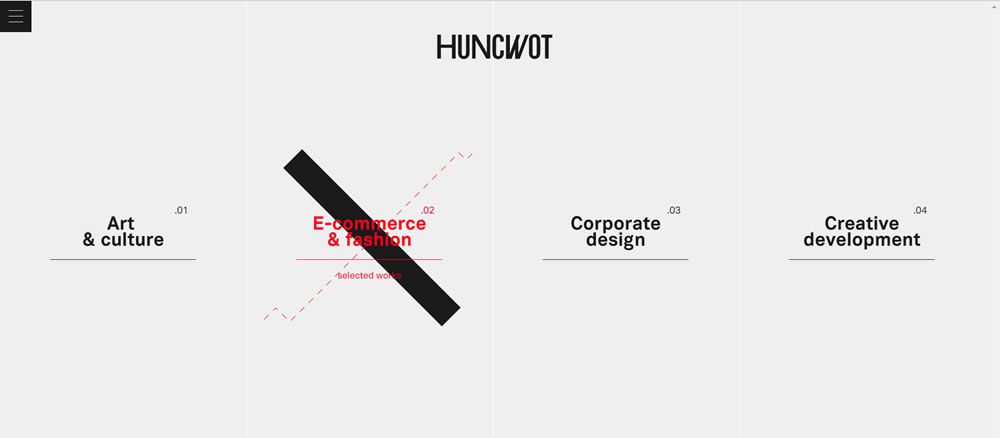
Huncwot

Huncwot split screen web design layout

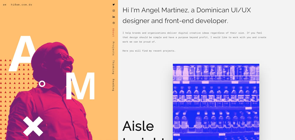
Angel Martínez

Finished!

In contrast to many other layout types, a split-screen layout design gives a website an edgy look – big and bold, yet oozing with simplicity and power.

However, you have to exercise lots of caution when working on a split screen website. If you are not careful, your overall design may look like a cheesy before and after photo, and nobody wants that.