Paper documents were the original metaphor for the web. […]
The page you’re reading this on still mimics paper. We still call it a page or an HTML document. It follows the same typographic rules and conventions – black text on white backgrounds and a top-to-bottom / left-to-right heirarchical structure.
Over in the ShopTalk Discord, the idea of CSS custom properties named --ink and --paper came up the other day as abstractions for color and background-color and I kinda like it. There’s something more clear about the meanings of those terms to me.
But Maggie gets into some of the downsides of the paper-based metaphors, pointing out Ted Nelson’s critiques. This is interesting:
We treat the page as the smallest unit of linkable information, instead of the sentence or paragraph.
Will the main metaphor of the web as paper change in time? I’d say it’s highly likely. The interactivity and behavior we expect on the web today is a million miles different than we expected in the past and that’s going to keep happening. These updates accelerate the change. Perhaps someday the metaphors will have shifted to “alternate neighborhood,” “second brain,” or “dedicated assistant.”
Jumpstart new projects and website redesigns with a few of the hottest elements in design for 2021. These trending styles are sure to help you create in a way that’ modern, fresh and perfect for the new year. Here’s the …
There are tons of smokin’ hot websites out there, with an equal or greater number of talented designers and developers who make them. The web is awesome like that and encourages that sort of creativity.
Even so, it amazes me that certain traits find their way into things. I mean, it makes sense. Many of us use the same UI frameworks and take cues from sites we admire. But every once in a while, my eye starts catching wind of the zeitgeist and commonalities that come with it.
The latest one? Blobby shapes. It’s a fun flourish that adds a little panache, especially for flat designs that need a splash of color or an interesting focal point that leads the eye from one place to anther. I’m sure you’ve seen it. I spent one week collecting screenshots of websites I came across that use it. I certainly wan’t looking for examples; they just sort of popped up in my normal browsing.
I’m sorry if it seems like I’m calling out people because that’s not my intention. I actually love the concept — so much, in fact, that I’m considering it on a project! Some of the examples in that gallery are flat-out gorgeous.
After spotting these blobby shapes a number of times, I’ve started to notice some considerations to take into account when use them. Things like:
Watch for contrast when text sits on top of a blob. There are plenty of cases where the document background is white and the blob is dark. If text runs through them, it’s going to be tough to find a font color that satisfies WCAG’s 2.1 AA standard for legibility.
Tread lightly when mixing and matching colors. One hot pink blob behind a card component ain’t a big deal, but throw in yellow, orange, and other bright colors that sit alongside it… the design starts to distract from the content. Plus, a vibrant rainbow of blobby shapes can raise accessibility concerns. A flourish is just that: a nice touch that’s subtle but impactful.
Blobs are good for more than color. Some of the most interesting instances I’ve seen cut images into interesting shapes. It’s cool that we can embed an image directly in SVG and then mask it with a path.
Blobs are also good for more than backgrounds. Did you catch that screenshot from Topcoder’s site? They’re using it for tabs which is super funky and cool.
All of this has me thinking about how the websites of today will be looked at by the developers of tomorrow. Remember way back, like 15 years ago, when many sites adopted Apple’s use of reflective imagery? I probably still have some Photoshop muscle memory from replicating that effect so many times.
Notice the skeuomorphic icons — that was popular too!
Skeuomorphism, bevels, animated GIF backgrounds, long shadows, heroes, gradients, bokeh backgrounds… all of these and many other visual treatments have had their day in the sun. Perhaps blobs will join that club at some point. Perhaps they’ll come back in style after that. Who knows! I just find it interesting to reflect on the things that have inspired us over the last three decades and imagine how the things we do today will be seen through the long lens of time.
It’d be awesome to see other instances of blobby shapes — share ’em if you’ve got ’em!
In the past few years, we’ve seen a lot of change and diversion in regard to web technologies. In 2020, I foresee us as a web community heading toward two major trends/goals: extensibility and interoperability. Let’s break those down.
Extensibility
Extensibility describes how much someone can take a particular technology and extend it to their own needs. We’ve built a component-based web over the last few years in terms of both development (React components! Vue components! Svelte components! Web components!) and design (Design systems!). Interesting how form follows function, isn’t it?
Now we’re trying to make that component system look and feel more unique. Extensibility on the web allows us to tailor the platform to our own needs, and experiment with outcomes.
CSS itself is becoming much more extensible…
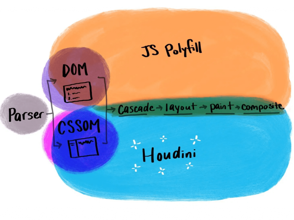
CSS Houdini
With CSS Houdini, developers will be able to extend what’s currently possible in the CSS Object Model and teach the browser how they want it to read and render their CSS.
That means that things that weren’t previously possible on the web, like angled corners or round layout, now become possible.
If you’re not yet familiar with Houdini, it’s an umbrella term that describes a few different browser APIs, intended to improve browser performance. It makes styling more extensible and lets users dictate their own CSS features. Houdini’s current APIs include:
With these APIs, users can tap into meaningful semantic CSS (thanks to the Typed Object Model), and even apply semantics to their CSS variables (Properties and Values). With the Paint API, you can draw a canvas and have it applied as a border image (hello, gradient borders), or create animated sparkles (link) that accept dynamic arguments and are implemented with a single line of CSS.
.sparkles {
  background: paint(sparkles)
}
You can build round menus without placing the items manually through margins (via the Layout API), and you can integrate your own interactions that live off of the main thread (using the Animation Worklet).
Houdini is definitely one to watch in the new year, and now is a great time to start experimenting with it if you haven’t yet.
Variable fonts
Another technology that falls in line with the goal of making websites more performant while offering more user extensibility is variable fonts. With so many new variable fonts popping up — and Google Fonts’ recent beta launch — variable fonts are now more available and easy to use than ever.
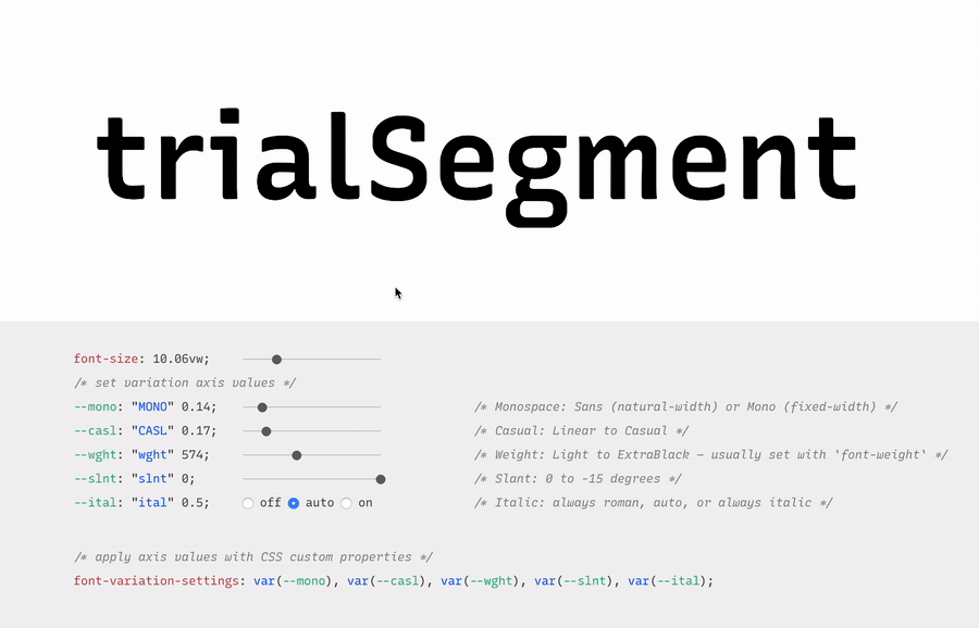
Variable fonts are vector-based and allow for a broad range of values to be set for various font axes, like weight and slant. The interpolation of these axes allows fonts to transition smoothly between points.
Here’s an example:
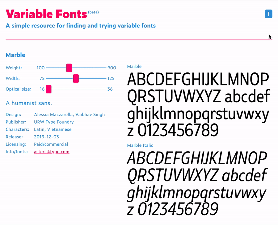
Variable fonts also allow for new axes to help designers and developers be even more creative with their work. Here’s an example of some of those from an excellent resource called v-fonts:
Variable fonts are relatively well supported, with 87% of modern browsers supporting the required font format.
Custom Properties
Custom properties, like variable fonts, are also well supported. While they’re not new, we’re still discovering all of the things we can do with custom properties.
Custom properties allow for truly dynamic CSS variables, meaning we can adjust them in JavaScript, separating logic and style. A great example of this comes from David Khourshid, who shows us how to create reactive animations and sync up the styling without sweating it.
We’re also starting to experiment with more logic in our stylesheets. I recently published a blog post that explains how to create dynamic color themes using the native CSS calc() function, along with custom properties.
This eliminates the need for additional tools to process our CSS, and ensures that this technique for theming works across any technology stack — which brings me to my next 2020 vision: interoperability.
Interoperability
Interoperability, by my definition in this post, means the ability to work between technologies and human needs. From a technical perspective, with the fragmented web, a lot of companies have migrated stacks in the recent past, or have multiple internal stacks, and are now likely interested in safeguarding their technology stack against future changes to maintain some semblance of uniformity.
Web components
Web components try to solve this problem by attacking the problem of component-based architecture from a web-standards perspective. The vision is to introduce a standard format that can be used with or without a library, benefiting the developer experience and establishing uniformity between components.
Each web component is encapsulated and works in modern browsers without dependencies. This technology is still evolving and I think we’ll see a lot of growth in 2020.
Logical properties
Logical properties challenge us to adjust our mental model of how we apply layout sizing on a page in order for us to make our pages more friendly across languages and reading modes. They allow for our layouts to be interoperable with user experiences.
In English, and other left-to-right languages, we think of the layout world in terms of height and width, and use a compass-type expression for margins, border, and padding (top, left, bottom, right). However if we style this way and then adjust the language to a right-to-left language, like Arabic, the padding-left of our paragraphs no longer means padding from the beginning of where we would read. This breaks the layout.
If you were to write padding-inline-start instead of padding-left, the padding would correctly swap to the other side of the page (the start of where one would be reading) when switching to the right-to-left language, maintaining layout integrity.
Preference media queries
Preference media queries are also on the rise, with more capability coming in 2020. They allow us to tailor our sites to work with people who prefer high contrast or dark mode, as well as people who prefer a less animation-heavy experience.
In this video, I go over how to create a preference media query for dark mode, using custom properties for styling:
Runner up: Speed
Speed is also a topic I see as a big focus of the web world in 2020. Several of the technologies I mentioned above have the benefit of improving web performance, even if it isn’t the main focus (e.g. how variable fonts may reduce the total weight of fonts downloaded). Performance becomes increasingly important when we think about the next billion users coming online in areas where network speeds may be lacking.
In addition, Web Assembly, which is a wrapper that lets users write closer to the browser metal, is gaining popularity. I also foresee a lot more work with WebGL in the coming year, which uses similar techniques for advanced and speedy graphics rendering. Writing lower-level code allows for speedier experiences, and in some cases of WebGL, may be required to prevent advanced visualization from crashing our browsers. I think we’ll see these two technologies grow and see more WebGL demos in 2020.
The web is constantly evolving and that's what makes it so exciting to be a part of. What do you see as a goal or technology to watch in 2020? Tell us in the comments!
New year, new web design trends. We are already starting to see some design elements that will be hot in 2020 (and maybe beyond). Most of these trending web design themes are continuations of things that have been building in …
I noted Trey Huffine’s 2018 version of this article in The Great Divide.
To put a point on this divide a bit more, consider this article by Trey Huffine, "A Recap of Frontend Development in 2018." It's very well done! It points to big moments this year, shows interesting data, and makes predictions about what we might see next year. But it's entirely based around the JavaScript ecosystem.
My point was (and still is) that front-end development is more than the JavaScript ecosystem. However, I certainly admit the movings-and-shakings of the JavaScript world is a big deal and probably generally more interesting to watch for most devs.
HTML is evolving at an even slower pace. Occasionally, something will feel new. I got excited about <dialog> this year, even though it first appeared in 2014, but the experts are saying we probably shouldn't use it. Elements like <details> are getting more exciting as Edge-goes-Chromium because they'll be getting more cross-browser support, but it's no picnic. There's just not much exciting to talk about in HTML, at least to me, aside from sort of philosophical approaches to it, like JAMstack.
Here’s a wonderful reminder from Charlie Owen that everyone in the web design industry isn’t using the latest and greatest technology. And that’s okay! Charlie writes:
Most web developers are working on very "boring" teams. They're producing workhorse products that serve the organisation needs. They aren't trying to innovate. They aren't trying to impress the next recruiter with their CV. They simply want to get paid, produce a solution that works, and go home.
Yet they are told, mostly implicitly, sometimes directly, that if they're not innovating and using the latest tools that they are somehow a failure. This feeling of failure for not implementing the latest tech permeates our industry.
This feeling needs to end.
I feel that this is a big problem for our community because there are a small number of folks on the bleeding edge that happen to be quite loud about their work (even here at CSS-Tricks) – and that’s great! We all need to learn from folks that are doing this work. However, we need to remind ourselves that this is a very small number of folks and not every project has to be a technical marvel to be a success.
Take Michelle Barker's personal site, for example. It's slick but is also dependency-free so she could focus on writing the languages she loves: HTML and CSS. Not a bad goal, nor a bad outcome.
There are more developers these days working on in-house teams or agencies with big-ticket clients. That is, more and more developers on large-scope, long-scale, highly-complex jobs. So that's where their minds are at. Big complicated problems with big complicated solutions. That's what gets talked about. That's what gets blogged about. That's what gets argued about. That's the topic at a lot of conferences I've been to.
While you certainly can make a soup-of-the-day website with an index.html file and FTP, blog posts about that are fewer and farther between and don't get as many claps.
It's not so much that we need cheers to validate our work; it's merely recognizing that not everything has to be on the bleeding edge of technology. There's something to be said about "simple and boring" projects.
Perhaps the real thing to fear is less about what we're sharing and more about what we're not sharing.
Every designer wants to be successful. But success is a subjective measure. For many designers, success means that they are proud of the work they do, but for top designers, this is not enough – top designers want to become …
Product teams from AirBnb and New York Times to Shopify and Artsy (among many others) are converging on a new set of best practices and technologies for building the web apps that their businesses depend on. This trend reflects core principles and solve underlying problems that we may share, so it is worth digging deeper.
Internal consistency: Created with static typing tools like TypeScript.
Data manipulation: These work with GraphQL-speaking clients like Apollo.
Data representation: Displayed with a library for reusable components and behaviors, like React.
Naming things is hard, and our industry has struggled to name this new generation of tooling for web apps. The inimitable Orta Theroux calls it an Omakase; I slimmed it down and opted for a simpler backronym pulled from letters in the tooling outlined above: STAR (Design Systems, TypeScript, Apollo, and React).
New year, new time to think about web design trends. The start of the year is a great time to look back on the previous year and your successes and look ahead to things that you want to improve and …