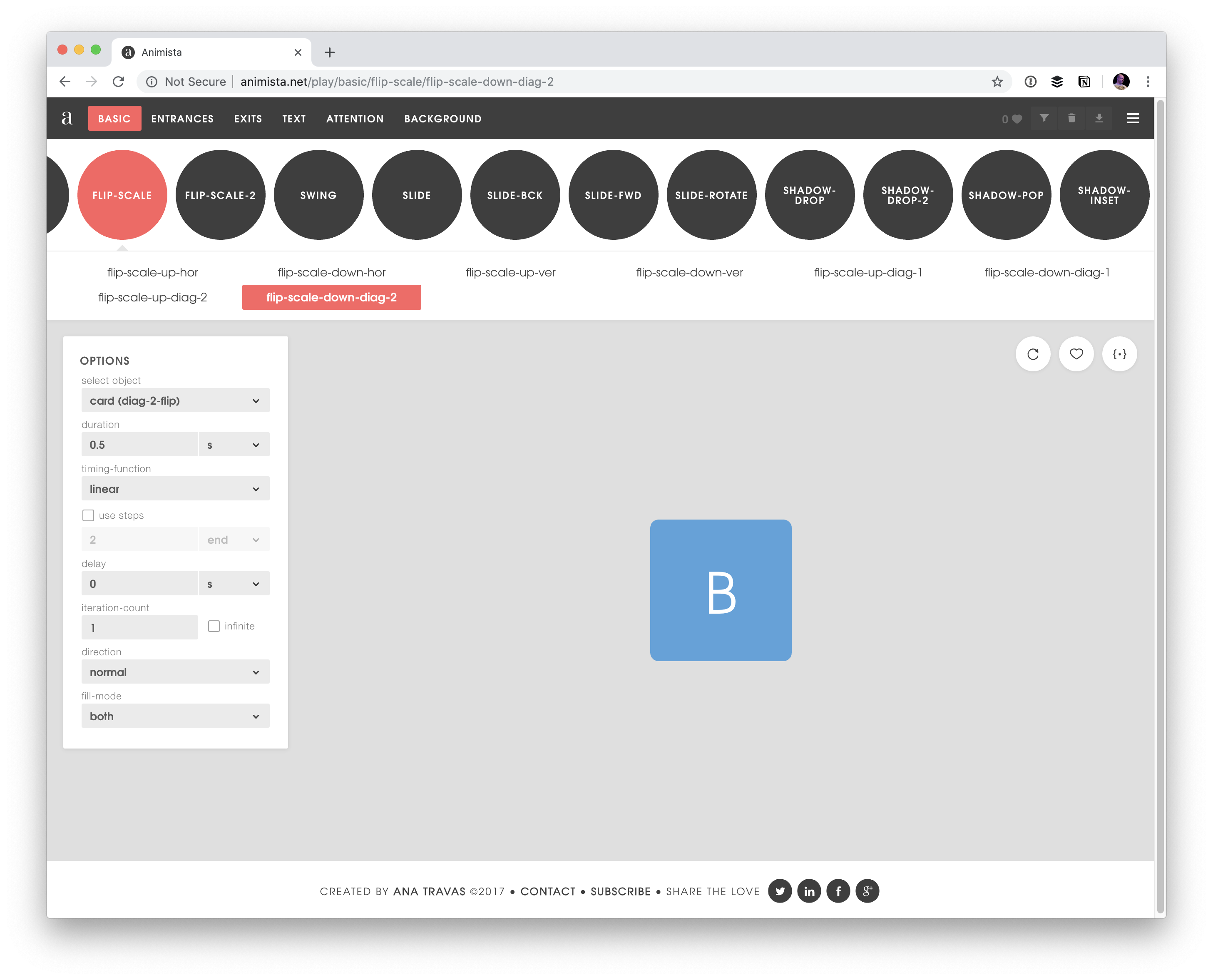
I know this is something Chris has wanted forever, so it’s no surprise he’s already got a fantastic write-up just a day after the news broke. In fact, I first learned about it from his post and was unable to dredge up any sort of announcement. So, I thought I’d jot some notes down because it feels like a significant development.
The news: transitioning to auto is now a thing! Well, it’s going to be a thing. Chrome Canary recently shipped support for it and that’s the only place you’ll find it for now. And even then, we just don’t know if the Chrome Canary implementation will find its way to the syntax when the feature becomes official.
The problem
Here’s the situation. You have an element. You’ve marked it up, plopped in contents, and applied a bunch of styles to it. Do you know how tall it is? Of course not! Sure, we can ask JavaScript to evaluate the element for us, but as far as CSS is concerned, the element’s computed dimensions are unknown.
That makes it difficult to, say, animate that element from height: 0 to height: whatever. We need to know what “whatever” is and we can only do that by setting a fixed height on the element. That way, we have numbers to transition from zero height to that specific height.
But what happens if that element changes over time? Maybe the font changes, we add padding, more content is inserted… anything that changes the dimensions. We likely need to update that height: 300px to whatever new fixed height works best. This is why we often see JavaScript used to toggle things that expand and contract in size, among other workarounds.
I say this is about the height property, but we’re also talking about the logical equivalent, block-size, as well as width and inline-size. Or any direction for that matter!
Transitioning to auto
That’s the goal, right? We tend to reach for height: auto when the height dimension is unknown. From there, we let JavaScript calculate what that evaluates to and take things from there.
The current Chrome implementation uses CSS calc() to do the heavy lifting. It recognizes the auto keyword and, true to its name, calculates that number. In other words, we can do this instead of the fixed-height approach:
That’s really it! Of course, calc() is capable of more complex expressions but the fact that we can supply it with just a vague keyword about an element’s height is darn impressive. It’s what allows us to go from a fixed value to the element’s intrinsic size and back.
I had to give it a try. I’m sure there are a ton of use cases here, but I went with a floating button in a calendar component that indicates a certain number of pending calendar invites. Click the button, and a panel expands above the calendar and reveals the invites. Click it again and the panel goes back to where it came from. JavaScript is handling the click interaction, triggering a class change that transitions the height in CSS.
A video in case you don’t feel like opening Canary:
The transition property in CSS lets the browser know that we plan on changing the height property at some point, and to make it smooth. And, as with any transition or animation, it’s a good idea to account for motion sensitivities by slowing down or removing the motion with prefers-reduced-motion.
What about display: none?
This is one of the first questions that popped into my head when I read Chris’s post and he gets into that as well. Transitioning from an element from display: none to its intrinsic size is sort of like going from height: 0. It might seem like a non-displayed element has zero height, but it actually does have a computed height or auto unless a specific height is declared on it.
So, there’s extra work to do if we want to transition from display: none in CSS. I’ll simply plop in the code Chris shared because it nicely demonstrates the key parts:
The element starts with both display: none and height: 0.
There’s an .open class that sets the element’s height to calc(auto).
Those are the two dots we need to connect and we do it by first setting transition-behavior: allow-discrete on the element. This is new to me, but the spec says that transition-behavior “specifies whether transitions will be started or not for discrete properties.” And when we declare allow-discrete, “transitions will be started for discrete properties as well as interpolable properties.”
Well, DevTools showed us right there that height: auto is a discrete property! Notice the @starting-style declaration, though. If you’re unfamiliar with it, you’re not alone. The idea is that it lets us set a style for a transition to “start” with. And since our element’s discrete height is auto, we need to tell the transition to start at height: 0 instead:
The CSS Working Group gave that a thumbs-up a couple weeks ago. The super-duper conceptual proposal being that we can animate or transition from, say, display: block to display: none.
It’s a bit of a brain-twister to reason about because setting display: none on an element cancels animations. And adding it restarts animations. Per the spec:
Setting the display property to none will terminate any running animation applied to the element and its descendants. If an element has a display of none, updating display to a value other than none will start all animations applied to the element by the animation-nameproperty, as well as all animations applied to descendants with display other than none.
That circular behavior is what makes the concept seemingly dead on arrival. But if@keyframes supported any display value other thannone, then there’s no way for none to cancel or restart things. That gives non-none values priority, allowing none to do its thing only after the animation or transition has completed.
Miriam’s toot (this is what we’re really calling these, right?) explains how this might work:
We’re not exactly interpolating between, say, block and none, but allowing block to stay intact until the time things stop moving and it’s safe to apply none. These are keywords, so there are no explicit values between the two. As such, this remains a discrete animation. We’re toggling between two values once that animation is complete.
This is a helpful example because it shows how the first frame sets the element to display: block, which is given priority over the underlying display: none as a non-none value. That allows the animation to run and finish without none cancelling or resetting it in the process since it only resolves after the animation.
This is the example Miriam referenced on Mastodon:
We’re dealing with a transition this time. The underlying display value is set to none before anything happens, so it’s completely out of the document flow. Now, if we were to transition this on hover, maybe like this:
.hide:hover {
  display: block;
  opacity: 1;
}
…then the element should theoretically fade in at 200ms. Again, we’re toggling between display values, but block is given priority so the transition isn’t cancelled up front and is actually applied after opacity finishes its transition.
At least that’s how my mind is reading into it. I’m glad there are super smart people thinking these things through because I imagine there’s a ton to sort out. Like, what happens if multiple animations are assigned to an element — will none reset or cancel any of those? I’m sure everything from infinite animations, reversed directions, and all sorts of other things will be addressed in time.
How often to do you reach for the CSS background-size property? If you’re like me — and probably lots of other front-end folks — then it’s usually when you background-size: cover an image to fill the space of an entire element.
Well, I was presented with an interesting challenge that required more advanced background sizing: background stripes that transition on hover. Check this out and hover it with your cursor:
There’s a lot more going on there than the size of the background, but that was the trick I needed to get the stripes to transition. I thought I’d show you how I arrived there, not only because I think it’s a really nice visual effect, but because it required me to get creative with gradients and blend modes that I think you might enjoy.
Let’s start with a very basic setup to keep things simple. I’m talking about a single <div> in the HTML that’s styled as a green square:
<div></div>
div {
  width: 500px;
  height: 500px;
  background: palegreen;
}
Setting up the background stripes
If your mind went straight to a CSS linear gradient when you saw those stripes, then we’re already on the same page. We can’t exactly do a repeating gradient in this case since we want the stripes to occupy uneven amounts of space and transition them, but we can create five stripes by chaining five backgrounds on top of our existing background color and placing them to the top-right of the container:
div {
  width: 500px;
  height: 500px;
  background:
    linear-gradient(black, black) top right,
    linear-gradient(black, black) top 100px right,
    linear-gradient(black, black) top 200px right,
    linear-gradient(black, black) top 300px right,
    linear-gradient(black, black) top 400px right,
    palegreen;
}
I made horizontal stripes, but we could also go vertical with the approach we’re covering here. And we can simplify this quite a bit with custom properties:
div {
  --gt: linear-gradient(black, black);
  --n: 100px;

  width: 500px;
  height: 500px;
  background:
    var(--gt) top right,
    var(--gt) top var(--n) right,
    var(--gt) top calc(var(--n) * 2) right,
    var(--gt) top calc(var(--n) * 3) right,
    var(--gt) top calc(var(--n) * 4) right,
    palegreen;
}
So, the --gt value is the gradient and --n is a constant we’re using to nudge the stripes downward so they are offset vertically. And you may have noticed that I haven’t set a true gradient, but rather solid black stripes in the linear-gradient() function — that’s intentional and we’ll get to why I did that in a bit.
One more thing we ought to do before moving on is prevent our backgrounds from repeating; otherwise, they’ll tile and fill the entire space:
div {
  --gt: linear-gradient(black, black);
  --n: 100px;

  width: 500px;
  height: 500px;
  background:
    var(--gt) top right,
    var(--gt) top var(--n) right,
    var(--gt) top calc(var(--n) * 2) right,
    var(--gt) top calc(var(--n) * 3) right,
    var(--gt) top calc(var(--n) * 4) right,
    palegreen;
  background-repeat: no-repeat;
}
We could have set background-repeat in the background shorthand, but I decided to break it out here to keep things easy to read.
Offsetting the stripes
We technically have stripes, but it’s pretty tough to tell because there’s no spacing between them and they cover the entire container. It’s more like we have a solid black square.
This is where we get to use the background-size property. We want to set both the height and the width of the stripes and the property supports a two-value syntax that allows us to do exactly that. And, we can chain those sizes by comma separating them the same way we did on background.
Let’s start simple by setting the widths first. Using the single-value syntax for background-size sets the width and defaults the height to auto. I’m using totally arbitrary values here, so set the values to what works best for your design:
div {
  --gt: linear-gradient(black, black);
  --n: 100px;

  width: 500px;
  height: 500px;
  background:
    var(--gt) top right,
    var(--gt) top var(--n) right,
    var(--gt) top calc(var(--n) * 2) right,
    var(--gt) top calc(var(--n) * 3) right,
    var(--gt) top calc(var(--n) * 4) right,
    palegreen;
  background-repeat: no-repeat;
  background-size: 60%, 90%, 70%, 40%, 10%;
}
If you’re using the same values that I am, you’ll get this:
Doesn’t exactly look like we set the width for all the stripes, does it? That’s because of the auto height behavior of the single-value syntax. The second stripe is wider than the others below it, and it is covering them. We ought to set the heights so we can see our work. They should all be the same height and we can actually re-use our --n variable, again, to keep things simple:
div {
  --gt: linear-gradient(black, black);
  --n: 100px;

  width: 500px;
  height: 500px;
  background:
    var(--gt) top right,
    var(--gt) top var(--n) right,
    var(--gt) top calc(var(--n) * 2) right,
    var(--gt) top calc(var(--n) * 3) right,
    var(--gt) top calc(var(--n) * 4) right,
    palegreen;
    background-repeat: no-repeat;
    background-size: 60% var(--n), 90% var(--n), 70% var(--n), 40% var(--n), 10% var(--n); // HIGHLIGHT 15
}
Ah, much better!
Adding gaps between the stripes
This is a totally optional step if your design doesn’t require gaps between the stripes, but mine did and it’s not overly complicated. We change the height of each stripe’s background-size a smidge, decreasing the value so they fall short of filling the full vertical space.
We can continue to use our --n variable, but subtract a small amount, say 5px, using calc() to get what we want.
Now let’s swap the palegreen background color we’ve been using for visual purposes up to this point for white.
div {
  /* etc. */
  background:
    var(--gt) top right,
    var(--gt) top var(--n) right,
    var(--gt) top calc(var(--n) * 2) right,
    var(--gt) top calc(var(--n) * 3) right,
    var(--gt) top calc(var(--n) * 4) right,
    #fff;
  /* etc. */
}
A black and white pattern like this is perfect for masking and blending. To do that, we’re first going to wrap our <div> in a new parent container and introduce a second <div> under it:
<section>
  <div></div>
  <div></div>
</section>
We’re going to do a little CSS re-factoring here. Now that we have a new parent container, we can pass the fixed width and height properties we were using on our <div> over there:
section {
  width: 500px;
  height: 500px;
}
I’m also going to use CSS Grid to position the two <div> elements on top of one another. This is the same trick Temani Afif uses to create his super cool image galleries. The idea is that we place both divs over the full container using the grid-area property and align everything toward the center:
Now, check this out. The reason I used a solid gradient that goes from black to black earlier is to set us up for masking and blending the two <div> layers. This isn’t true masking in the sense that we’re calling the mask property, but the contrast between the layers controls what colors are visible. The area covered by white will remain white, and the area covered by black leaks through. MDN’s documentation on blend modes has a nice explanation of how this works.
To get that working, I’ll apply the real gradient we want to see on the first <div> while applying the style rules from our initial <div> on the new one, using the :nth-child() pseudo-selector:
If we stop here, we actually won’t see any visual difference from what we had before. That’s because we haven’t done the actual blending yet. So, let’s do that now using the screen blend mode:
div:nth-child(2)  {
  /* etc. */
  mix-blend-mode: screen;
}
I used a beige background color in the demo I showed at the beginning of this article. That slightly darker sort of off-white coloring allows a little color to bleed through the rest of the background:
The hover effect
The last piece of this puzzle is the hover effect that widens the stripes to full width. First, let’s write out our selector for it. We want this to happen when the parent container (<section> in our case) is hovered. When it’s hovered, we’ll change the background size of the stripes contained in the second <div>:
/* When <section> is hovered, change the second div's styles */
section:hover > div:nth-child(2){
  /* styles go here */
}
We’ll want to change the background-size of the stripes to the full width of the container while maintaining the same height:
I only added text in there to show what it might look like to use this in a different context. If you do the same, then it’s worth making sure there’s enough contrast between the text color and the colors used in the gradient to comply with WCAG guidelines. And while we’re touching briefly on accessibility, it’s worth considering user preferences for reduced motion when it comes to the hover effect.
That’s a wrap!
Pretty neat, right? I certainly think so. What I like about this, too, is that it’s pretty maintainable and customizable. For example, we can alter the height, colors, and direction of the stripes by changing a few values. You might even variablize a few more things in there — like the colors and widths — to make it even more configurable.
I’m really interested if you would have approached this a different way. If so, please share in the comments! It’d be neat to see how many variations we can collect.
We’ve spent the last two articles in this three-part series playing with gradients to make really neat image decorations using nothing but the <img> element. In this third and final piece, we are going to explore more techniques using the CSS outline property. That might sound odd because we generally use outline to draw a simple line around an element — sorta like border but it can only draw all four sides at once and is not part of the Box Model.
We can do more with it, though, and that’s what I want to experiment with in this article.
Let’s start with our first example — an overlay that disappears on hover with a cool animation:
We could accomplish this by adding an extra element over the image, but that’s what we’re challenging ourselves not to do in this series. Instead, we can reach for the CSS outline property and leverage that it can have a negative offset and is able to overlap its element.
img {
  --s: 250px; /* the size of the image */
  --b: 8px;   /* the border thickness*/
  --g: 14px;  /* the gap */
  --c: #4ECDC4;

  width: var(--s);
  aspect-ratio: 1;
  outline: calc(var(--s) / 2) solid #0009;
  outline-offset: calc(var(--s) / -2);
  cursor: pointer;
  transition: 0.3s;
}
img:hover {
  outline: var(--b) solid var(--c);
  outline-offset: var(--g);
}
The trick is to create an outline that’s as thick as half the image size, then offset it by half the image size with a negative value. Add in some semi-transparency with the color and we have our overlay!
The rest is what happens on :hover. We update the outline and the transition between both outlines creates the cool hover effect. The same technique can also be used to create a fading effect where we don’t move the outline but make it transparent.
Instead of using half the image size in this one, I am using a very big outline thickness value (100vmax) while applying a CSS mask. With this, there’s no longer a need to know the image size — it trick works at all sizes!
You may face issues using 100vmax as a big value in Safari. If it’s the case, consider the previous trick where you replace the 100vmax with half the image size.
We can take things even further! For example, instead of simply clipping the extra outline, we can create shapes and apply a fancy reveal animation.
Cool right? The outline is what creates the yellow overlay. The clip-path clips the extra outline to get the star shape. Then, on hover, we make the color transparent.
Oh, you want hearts instead? We can certainly do that!
Imagine all the possible combinations we can create. All we have to do is to draw a shape with a CSS mask and/or clip-path and combine it with the outline trick. One solution, infinite possibilities!
And, yes, we can definitely animate this as well. Let’s not forget that clip-path is animatable and mask relies on gradients — something we covered in super great detail in the first two articles of this series.
I know, the animation is a bit glitchy. This is more of a demo to illustrate the idea rather than the “final product” to be used in a production site. We’d wanna optimize things for a more natural transition.
Here is a demo that uses mask instead. It’s the one I teased you with at the end of the last article:
Did you know that the outline property was capable of so much awesomeness? Add it to your toolbox for fancy image decorations!
Combine all the things!
Now that we have learned many tricks using gradients, masks, clipping, and outline, it’s time for the grand finale. Let’s cap off this series by combine all that we have learned the past few weeks to showcase not only the techniques, but demonstrate just how flexible and modular these approaches are.
If you were seeing these demos for the first time, you might assume that there’s a bunch of extra divs wrappers and pseudo-elements being used to pull them off. But everything is happening directly on the <img> element. It’s the only selector we need to get these advanced shapes and effects!
Wrapping up
Well, geez, thanks for hanging out with me in this three-part series the past few weeks. We explored a slew of different techniques that turn simple images into something eye-catching and interactive. Will you use everything we covered? Certainly not! But my hope is that this has been a good exercise for you to dig into advanced uses of CSS features, like gradients, mask, clip-path, and outline.
And we did everything with just one <img> element! No extra div wrappers and pseudo-elements. Sure, it’s a constraint we put on ourselves, but it also pushed us to explore CSS and try to find innovative solutions to common use cases. So, before pumping extra markup into your HTML, think about whether CSS is already capable of handling the task.
Svelte contains some inbuilt transitions that are useful to create an easy animation. Let’s learn about transitions in Svelte by creating an image carousel component.
Image Carousel is a series of images that are moved one after another either automatically with a timer or manually using some buttons.
Animating elements with CSS can either be quite easy or quite difficult depending on what you are trying to do. Changing the background color of a button when you hover over it? Easy. Animating the position and size of an element in a performant way that also affects the position of other elements? Tricky! That’s exactly what we’ll get into here in this article.
A common example is removing an item from a stack of items. The items stacked on top need to fall downwards to account for the space of an item removed from the bottom of the stack. That is how things behave in real life, and users may expect this kind of life-like motion on a website. When it doesn’t happen, it’s possible the user is confused or momentarily disorientated. You expect something to behave one way based on life experience and get something completely different, and users may need extra time to process the unrealistic movement.
Here is a demonstration of a UI for adding items (click the button) or removing items (click the item).
You could paper over the poor UI slightly by adding a “fade out” animation or something, but the result won’t be that great, as the list will will abruptly collapse and cause those same cognitive issues.
Applying CSS-only animations to a dynamic DOM event (adding brand new elements and fully removing elements) is extremely tricky work. We’re going to face this problem head-on and go over three very different types of animations that handle this, all accomplishing the same goal of helping users understand changes to a list of items. By the time we’re done, you’ll be armed to use these animations, or build your own based on the concepts.
We will also touch upon accessibility and how elaborate HTML layouts can still retain some compatibility with accessibility devices with the help of ARIA attributes.
The Slide-Down Opacity Animation
A very modern approach (and my personal favorite) is when newly-added elements fade-and-float into position vertically depending on where they are going to end up. This also means the list needs to “open up” a spot (also animated) to make room for it. If an element is leaving the list, the spot it took up needs to contract.
Because we have so many different things going on at the same time, we need to change our DOM structure to wrap each .list-item in a container class appropriately titled .list-container. This is absolutely essential in order to get our animation to work.
Now, the styling for this is unorthodox because, in order to get our animation effect to work later on, we need to style our list in a very specific way that gets the job done at the expense of sacrificing some customary CSS practices.
First, we’re using margin-top to create vertical space between the elements in the stack. There’s no margin on the bottom so that the other list items can fill the gap created by removing a list item. That way, it still has margin on the bottom even though we have set the container height to zero. That extra space is created between the list item that used to be directly below the deleted list item. And that same list item should move up in reaction to the deleted list item’s container having zero height. And because this extra space expands the vertical gap between the list items further then we want it to. So that’s why we use margin-top — to prevent that from happening.
But we only do this if the item container in question isn’t the first one in the list. That’s we used :not(:first-child) — it targets all of the containers except the very first one (an enabling selector). We do this because we don’t want the very first list item to be pushed down from the top edge of the list. We only want this to happen to every subsequent item thereafter instead because they are positioned directly below another list item whereas the first one isn’t.
Now, this is unlikely to make complete sense because we are not setting any elements to zero height at the moment. But we will later on, and in order to get the vertical spacing between the list elements correct, we need to set the margin like we do.
A note about positioning
Something else that is worth pointing out is the fact that the .list-item elements nested inside of the parent .list-container elements are set to have a position of absolute, meaning that they are positioned outside of the DOM and in relation to their relatively-positioned .list-container elements. We do this so that we can get the .list-item element to float upwards when removed, and at the same time, get the other .list-item elements to move and fill the gap that removing this .list-item element has left. When this happens, the .list-container element, which isn’t positioned absolute and is therefore affected by the DOM, collapses its height allowing the other .list-container elements to fill its place, and the .list-item element — which is positioned with absolute — floats upwards, but doesn’t affect the structure of the list as it isn’t affected by the DOM.
Handling height
Unfortunately, we haven’t yet done enough to get a proper list where the individual list-items are stacked one by one on top of each other. Instead, all we will be able to see at the moment is just a single .list-item that represents all of the list items piled on top of each other in the exact same place. That’s because, although the .list-item elements may have some height via their padding property, their parent elements do not, but have a height of zero instead. This means that we don’t have anything in the DOM that is actually separating these elements out from each other because in order to do that, we would need our .list-item containers to have some height because, unlike their child element, they are affected by the DOM.
To get the height of our list containers to perfectly match the height of their child elements, we need to use JavaScript. So, we store all of our list items within a variable. Then, we create a function that is called immediately as soon as the script is loaded.
This becomes the function that handles the height of the list container elements:
const listItems = document.querySelectorAll('.list-item');

function calculateHeightOfListContainer(){
};

calculateHeightOfListContainer();
The first thing that we do is extract the very first .list-item element from the list. We can do this because they are all the same size, so it doesn’t matter which one we use. Once we have access to it, we store its height, in pixels, via the element’s clientHeight property. After this, we create a new <style> element that is prepended to the document’s body immediately after so that we can directly create a CSS class that incorporates the height value we just extracted. And with this <style> element safely in the DOM, we write a new .list-container class with styles that automatically have priority over the styles declared in the external stylesheet since these styles come from an actual <style> tag. That gives the .list-container classes the same height as their .list-item children.
Right now, our list looks a little drab — the same as the what we saw in the first example, just without any of the addition or removal logic, and styled in a completely different way to the list constructed from <ul> and <li> tags list that were used in that opening example.
We’re going to do something now that may seem inexplicable at the moment and modify our .list-container and .list-item classes. We’re also creating extra styling for both of these classes that will only be added to them if a new class, .show, is used in conjunction with both of these classes separately.
The purpose we’re doing this is to create two states for both the .list-container and the .list-item elements. One state is without the .show classes on both of these elements, and this state represents the elements as they are animated out from the list. The other state contains the .show class added to both of these elements. It represents the specified .list-item as firmly instantiated and visible in the list.
In just a bit, we will switch between these two states by adding/removing the .show class from both the parent and the container of a specific .list-item. We’ll combined that with a CSS transition between these two states.
Notice that combining the .list-item class with the .show class introduces some extra styles to things. Specifically, we’re introducing the animation that we are creating where the list item fades downwards and into visibility when it is added to the list — the opposite happens when it is removed. Since the most performant way to animate elements positions is with the transform property, that is what we will use here, applying opacity along the way to handle the visibility part. Because we already applied a transition property on both the .list-item and the .list-container elements, a transition automatically takes place whenever we add or remove the .show class to both of these elements due to the extra properties that the .show class brings, causing a transition whenever we either add or remove these new properties.
In response to the .show class, we are going back to our JavaScript file and changing our only function so that the .list-container element are only given a height property if the element in question also has a .show class on it as well, Plus, we are applying a transition property to our standard .list-container elements, and we will do it in a setTimeout function. If we didn’t, then our containers would animate on the initial page load when the script is loaded, and the heights are applied the first time, which isn’t something we want to happen.
Now, if we go back and view the markup in DevTools, then we should be able to see that the list has disappeared and all that is left is the button. The list hasn’t disappeared because these elements have been removed from the DOM; it has disappeared because of the .show class which is now a required class that must be added to both the .list-item and the .list-container elements in order for us to be able to view them.
The way to get the list back is very simple. We add the .show class to all of our .list-container elements as well as the .list-item elements contained inside. And once this is done we should be able to see our pre-created list items back in their usual place.
We won’t be able to interact with anything yet though because to do that — we need to add more to our JavaScript file.
The first thing that we will do after our initial function is declare references to both the button that we click to add a new list item, and the .list element itself, which is the element that wraps around every single .list-item and its container. Then we select every single .list-container element nested inside of the parent .list element and loop through them all with the forEach method. We assign a method in this callback, removeListItem, to the onclick event handler of each .list-container. By the end of the loop, every single .list-container instantiated to the DOM on a new page load calls this same method whenever they are clicked.
Once this is done, we assign a method to the onclick event handler for addBtn so that we can activate code when we click on it. But obviously, we won’t create that code just yet. For now, we are merely logging something to the console for testing.
Starting work on the onclick event handler for addBtn, the first thing that we want to do is create two new elements: container and listItem. Both elements represent the .list-item element and their respective .list-container element, which is why we assign those exact classes to them as soon as we create the them.
Once these two elements are prepared, we use the append method on the container to insert the listItem inside of it as a child, the same as how these elements that are already in the list are formatted. With the listItem successfully appended as a child to the container, we can move the container element along with its child listItem element to the DOM with the insertBefore method. We do this because we want new items to appear at the bottom of the list but before the addBtn, which needs to stay at the very bottom of the list. So, by using the parentNode attribute of addBtn to target its parent, list, we are saying that we want to insert the element as a child of list, and the child that we are inserting (container) will be inserted before the child that is already on the DOM and that we have targeted with the second argument of the insertBefore method, addBtn.
Finally, with the .list-item and its container successfully added to the DOM, we can set the container’s onclick event handler to match the same method as every other .list-item already on the DOM by default.
If we try this out, then we won’t be able to see any changes to our list no matter how many times we click the addBtn. This isn’t an error with the click event handler. Things are working exactly how they should be. The .list-item elements (and their containers) are added to the list in the correct place, it is just that they are getting added without the .show class. As a result, they don’t have any height to them, which is why we can’t see them and is why it looks like nothing is happening to the list.
To get each newly added .list-item to animate into the list whenever we click on the addBtn, we need to apply the .show class to both the .list-item and its container, just as we had to do to view the list items already hard-coded into the DOM.
The problem is that we cannot just add the .show class to these elements instantly. If we did, the new .list-item statically pops into existence at the bottom of the list without any animation. We need to register a few styles before the animation additional styles that override those initial styles for an element to know what transition to make. Meaning, that if we just apply the .show class to are already in place — so no transition.
The solution is to apply the .show classes in a setTimeout callback, delaying the activation of the callback by 15 milliseconds, or 1.5/100th of a second. This imperceptible delay is long enough to create a transition from the proviso state to the new state that is created by adding the .show class. But that delay is also short enough that we will never know that there was a delay in the first place.
Success! It is now time to handle how we remove list items when they are clicked.
Removing list items shouldn’t be too hard now because we have already gone through the difficult task of adding them. First, we need to make sure that the element we are dealing with is the .list-container element instead of the .list-item element. Due to event propagation, it is likely that the target that triggered this click event was the .list-item element.
Since we want to deal with the associated .list-container element instead of the actual .list-item element that triggered the event, we’re using a while-loop to loop one ancestor upwards until the element held in container is the .list-container element. We know it works when container gets the .list-container class, which is something that we can discover by using the contains method on the classList property of the container element.
Once we have access to the container, we promptly remove the .show class from both the container and its .list-item once we have access to that as well.
function removeListItem(e) {
  let container = e.target;
  while (!container.classList.contains('list-container')) {
    container = container.parentElement;
  }
  container.classList.remove('show');
  const listItem = container.querySelector('.list-item');
  listItem.classList.remove('show');
}
And here is the finished result:
Accessibility & Performance
Now you may be tempted to just leave the project here because both list additions and removals should now be working. But it is important to keep in mind that this functionality is only surface level and there are definitely some touch ups that need to be made in order to make this a complete package.
First of all, just because the removed elements have faded upwards and out of existence and the list has contracted to fill the gap that it has left behind does not mean that the removed element has been removed from the DOM. In fact, it hasn’t. Which is a performance liability because it means that we have elements in the DOM that serve no purpose other than to just accumulate in the background and slow down our application.
To solve this, we use the ontransitionend method on the container element to remove it from the DOM but only when the transition caused by us removing the .show class has finished so that its removal couldn’t possibly interrupt our transition.
function removeListItem(e) {
  let container = e.target;
  while (!container.classList.contains('list-container')) {
    container = container.parentElement;
  }
  container.classList.remove('show');
  const listItem = container.querySelector('.list-item');
  listItem.classList.remove('show');
  container.ontransitionend = function(){
    container.remove();
  }
}
We shouldn’t be able to see any difference at this point because allwe did was improve the performance — no styling updates.
The other difference is also unnoticeable, but super important: compatibility. Because we have used the correct <ul> and <li> tags, devices should have no problem with correctly interpreting what we have created as an unordered list.
Other considerations for this technique
A problem that we do have however, is that devices may have a problem with the dynamic nature of our list, like how the list can change its size and the number of items that it holds. A new list item will be completely ignored and removed list items will be read as if they still exist.
So, in order to get devices to re-interpret our list whenever the size of it changes, we need to use ARIA attributes. They help get our nonstandard HTML list to be recognized as such by compatibility devices. That said, they are not a guaranteed solution here because they are never as good for compatibility as a native tag. Take the <ul> tag as an example — no need to worry about that because we were able to use the native unordered list element.
We can use the aria-live attribute to the .list element. Everything nested inside of a section of the DOM marked with aria-live becomes responsive. In other words, changes made to an element with aria-live is recognized, allowing them to issue an updated response. In our case, we want things highly reactive and we do that be setting the aria live attribute to assertive. That way, whenever a change is detected, it will do so, interrupting whatever task it was currently doing at the time to immediately comment on the change that was made.
This is a more subtle animation where, instead of list items floating either up or down while changing opacity, elements instead just collapse or expand outwards as they gradually fade in or out; meanwhile, the rest of the list repositions itself to the transition taking place.
The cool thing about the list (and perhaps some remission for the verbose DOM structure we created), would be the fact that we can change the animation very easily without interfering with the main effect.
So, to achieve this effect, we start of by hiding overflow on our .list-container. We do this so that when the .list-container collapses in on itself, it does so without the child .list-item flowing beyond the list container’s boundaries as it shrinks. Apart from that, the only other thing that we need to do is remove the transform property from the .list-item with the .show class since we don’t want the .list-item to float upwards anymore.
This last animation technique is strikingly different fromithe others in that the container animation and the .list-item animation are actually out of sync. The .list-item is sliding to the right when it is removed from the list, and sliding in from the right when it is added to the list. There needs to be enough vertical room in the list to make way for a new .list-item before it even begins animating into the list, and vice versa for the removal.
As for the styling, it’s very much like the Slide Down Opacity animation, only thing that the transition for the .list-item should be on the x-axis now instead of the y-axis.
As for the onclick event handler of the addBtn in our JavaScript, we’re using a nested setTimeout method to delay the beginning of the listItem animation by 350 milliseconds after its container element has already started transitioning.
In the removeListItem function, we remove the list item’s .show class first so it can begin transitioning immediately. The parent container element then loses its .show class, but only 350 milliseconds after the initial listItem transition has already started. Then, 600 milliseconds after the container element starts to transition (or 950 milliseconds after the listItem transition), we remove the container element from the DOM because, by this point, both the listItem and the container transitions should have come to an end.
There you have it, three different methods for animating items that are added and removed from a stack. I hope that with these examples you are now confident to work in a situation where the DOM structure settles into a new position in reaction to an element that has either been added or removed from the DOM.
As you can see, there’s a lot of moving parts and things to consider. We started with that we expect from this type of movement in the real world and considered what happens to a group of elements when one of them is updated. It took a little balancing to transition between the showing and hiding states and which elements get them at specific times, but we got there. We even went so far as to make sure our list is both performant and accessible, things that we’d definitely need to handle on a real project.
Anyway, I wish you all the best in your future projects. And that’s all from me. Over and out.
I recently illustrated how we can achieve complex CSS animations using cubic-bezier() and how to do the same when it comes to CSS transitions. I was able to create complex hover effect without resorting to keyframes. In this article, I will show you how to create even more complex CSS transitions.
This time, let’s use the @property feature. It’s only supported on Chrome-based browsers for now but we can still play with it and demonstrate how it, too, and can be used to build complex animations.
I highly recommend reading my previous article because I will be referring to a few concepts I explained in detail there. Also, please note that the demos in this article are best viewed in Chromium-based browsers while @property support is still limited.
Let’s start with a demo:
Click on the button (more than once) and see the “magic” curve we get. It may look trivial at first glance because we can achieve such effect using some complex keyframes. But the trick is that there is no keyframe in there! That animation is done using only a transition.
Awesome right? And this is only the beginning, so let’s dig in!
The main idea
The trick in the previous example relies on this code:
We’re defining two custom properties, --d1 and --d2. Then, we declare the top property on a .box element using the sum of both those properties. Nothing overly complex yet—just calc() applied to two variables.
The two properties are defined as <number> and I multiply those values by 1% to convert them into a percentage. We could define these as <percentage> right away to avoid the multiplication. But I’ve chosen numbers instead in favor of more flexibility for more complex operations later.
Notice that we apply a different transition to each variable—more precisely, a different timing-function with the same duration. It’s actually a different sinusoidal curve for both variables which is something I get deep into in my previous article.
From there, the property values change when the .box is hovered, triggering the animation. But why do we get the result we see in the demo?
It’s all about math. We are adding two functions to create a third one. For --d1, we have a function (let’s call it F1); for --d2 , we have another one (let’s call it F2). That means the value of top is F1 + F2.
An example to better illustrate:
The first two transitions illustrate each variable individually. The third one is the sum of them. Imagine that at in each step of the animation we take the value of both variables and we add them together to get each point along the final curve.
Let’s try another example:
This time, we combine two parabolic curve to get a… well, I don’t know its name it but it’s another complex curve!
This trick is not only limited to the parabolic and sinusoidal curve. It can work with any kind of timing function even if the result won’t always be a complex curve.
This time:
--d1 goes from 0 to 30 with an ease-in timing function
--d2 goes from 0 to -20 with an ease-out timing function
The result? The top value goes from 0 to 10 (30-20) with a custom timing function (the sum of ease-in and ease-out).
We are not getting a complex transition in this case—it’s more to illustrate the fact that it’s a generic idea not only limited to cubic-bezier().
I think it’s time for an interactive demo.
All you have to do is to adjust a few variables to build your own complex transition. I know cubic-bezier() may be tricky, so consider using this online curve generator and also refer to my previous article.
Here are some examples I made:
As you can see, we can combine two different timing functions (created using cubic-bezier() ) to create a third one, complex enough to achieve a fancy transition. The combinations (and possibilities) are unlimited!
In that last example, I wanted to demonstrate how adding two opposite functions lead to the logical result of a constant function (no transition). Hence, the flat line.
Let’s add more variables!
You thought we’d stop at only two variables? Certainly not! We can extend the logic to N variables. There is no restriction—we define each one with a timing function and sum them up.
An example with three variables:
In most cases, two variables are plenty to create a fancy curve, but it’s neat to know that the trick can be extended to more variables.
Can we subract, multiply and divide variables?
Of course! We can also extend the same idea to consider more operations. We can add, subtract, multiply, divide—and even perform a complex formula between variables.
Here, we’re multiplying values:
We can also use one variable and multiply it by itself to get a quadratic function!
Let’s add more fun in there by introducing min()/max() to simulate an abs() function:
Notice that in the second box we will never get higher than the center point on the y-axis because top is always a positive value. (I added a margin-top to make the center of box the reference for 0.)
I won’t get into all the math, but you can imagine the possibilities we have to create any kind of timing function. All we have to do is to find the right formula either using one variable or combining multiple variables.
Our initial code can be generalized:
@property --d1 { /* we do the same for d2 .. dn */
  syntax: '<number>';
  inherits: false;
  initial-value: i1; /* the initial value can be different for each variable */
}

.box {
  --duration: 1s; /* the same duration for all */
  property: calc(f(var(--d1),var(--d2), .. ,var(--dn))*[1UNIT]);
  transition:
    --d1 var(--duration) cubic-bezier( ... ),
    --d2 var(--duration) cubic-bezier( ... ),
    /* .. */
    --dn var(--duration) cubic-bezier( ... );
}
.box:hover {
  --d1:f1;
  --d2:f2;
  /* .. */
  --dn:f3;
}
This is pseudo-code to illustrate the logic:
We use @property to define numeric custom properties, each with an initial value.
Each variable has its own timing function but the same duration.
We define an f function that is the formula used between the variables. The function provides a number that we use to multiply the relevant unit. All this runs in calc() applied to the property.
We update the value of each variable on hover (or toggle, or whatever).
Given this, the property transitions from f(i1,i2,…,in) to f(f1,f2,..,fn) with a custom timing function.
Chaining timing functions
We’ve reached the point where we were able to create a complex timing function by combining basic ones. Let’s try another idea that allow us to have more complex timing function: chaining timing functions together.
The trick is to run the transitions sequentially using the transition-delay property. Let’s look back at the interactive demo and apply a delay to one of the variables:
We are chaining timing functions instead of adding them together for yet another way to create more complex timing functions! Mathematically, it’s still a sum, but since the transitions do not run at the same time, we will be summing a function with a constant, and that simulates the chaining.
Now imagine the case with N variables that we are incrementally delayed. Not only can we create complex transitions this way, but we have enough flexibility to build complex timelines.
Here is a funny hover effect I built using that technique:
You will find no keyframes there. A small action scene is made entirely using one element and a CSS transition.
Here is a realistic pendulum animation using the same idea:
Or, how about a ball that bounces naturally:
Or maybe a ball rolling along a curve:
See that? We just created complex animations without a single keyframe in the code!
That’s a wrap!
I hope you took three key points away from this article and the previous one:
We can get parabolic and sinusoidal curves using cubic-bezier() that allow us to create complex transitions without keyframes.
We can create more curves by combining different timing functions using custom properties and calc().
We can chain the curves using the transition-delay to build a complex timeline.
Thanks to these three features, we have no limits when it comes to creating complex animations.
We’re going to create an impressive transition effect between images that’s, dare I say, very simple to implement and apply to any site. We’ll be using the kampos library because it’s very good at doing exactly what we need. We’ll also explore a few possible ways to tweak the result so that you can make it unique for your needs and adjust it to the experience and impression you’re creating.
Take one look at the Awwwards Transitions collection and you’ll get a sense of how popular it is to do immersive effects, like turning one media item into another. Many of those examples use WebGL for the job. Another thing they have in common is the use of texture mapping for either a displacement or dissolve effect (or both).
To make these effects, you need the two media sources you want to transition from and to, plus one more that is the map, or a grid of values for each pixel, that determines when and how much the media flips from one image to the next. That map can be a ready-made image, or a <canvas> that’s drawn upon, say, noise. Using a dissolve transition effect by applying a noise as a map is definitely one of those things that can boost that immersive web experience. That’s what we’re after.
Setting up the scene
Before we can get to the heavy machinery, we need a simple DOM scene. Two images (or videos, if you prefer), and the minimum amount of JavaScript to make sure they’re loaded and ready for manipulation.
This will give us some minimal DOM to work with and display our scene. The stage is ready; now let’s invite in our main actors, the two images:
// Notify when our images are ready
function loadImage (src) {
  return new Promise(resolve => {
    const img = new Image();
    img.onload = function () {
      resolve(this);
    };
    img.src = src;
  });
}
// Get the image URLs
const imageFromSrc = document.querySelector('#source-from').src;
const imageToSrc = document.querySelector('#source-to').dataset.src;
// Load images  and keep their promises so we know when to start
const promisedImages = [
  loadImage(imageFromSrc),
  loadImage(imageToSrc)
];
Creating the dissolve map
The scene is set, the images are fetched — let’s make some magic! We’ll start by creating the effects we need. First, we create the dissolve map by creating some noise. We’ll use a Classic Perlin noise inside a turbulence effect which kind of stacks noise in different scales, one on top of the other, and renders it onto a <canvas> in grayscale:
Second, we set the initial parameters of the turbulence effect. These can be tweaked later for getting the specific desired visuals we might need per case:
// Depending of course on the size of the target canvas
const WIDTH = 854;
const HEIGHT = 480;
const CELL_FACTOR = 2;
const AMPLITUDE = CELL_FACTOR / WIDTH;

turbulence.frequency = {x: AMPLITUDE, y: AMPLITUDE};
turbulence.octaves = 1;
turbulence.isFractal = true;
This code gives us a nice liquid-like, or blobby, noise texture. The resulting transition looks like the first image is sinking into the second image. The CELL_FACTOR value can be increased to create a more dense texture with smaller blobs, while the octaves=1 is what’s keeping the noise blobby. Notice we also normalize the amplitude to at least the larger side of the media, so that texture is stretched nicely across our image.
Next we render the dissolve map. In order to be able to see what we got, we’ll use the canvas that’s already in the DOM, just for now:
We are going to pause here and examine how changing the parameters above affects the visual results. Now, let’s tweak some of the noise configurations to get something that’s more smoke-like, rather than liquid-like, say:
const CELL_FACTOR = 4; // instead of 2
And also this:
turbulence.octaves = 8; // instead of 1
Now we have a more a dense pattern with eight levels (instead of one) superimposed, giving much more detail:
Fantastic! Now back to the original values, and onto our main feature…
Notice the above value for high? This is important for getting that liquid-like results. The transition uses a step function to determine whether to show the first or second media. During that step, the transition is done smoothly so that we get soft edges rather than jagged ones. However, we keep the low edge of the step at 0.0 (the default). You can imagine a transition from 0.0 to 0.03 is very abrupt, resulting in a rapid change from one media to the next. Think of it as clipping.
On the other hand, if the range was 0.0 to 0.5, we’d get a wider range of “transparency,” or a mix of the two images — like we would get with partial opacity — and we’ll get a smoke-like or “cloudy” effect. We’ll try that one in just a moment.
Before we continue, we must remember to replace the canvas we got from the document with a new one we create off the DOM, like so:
And finally, get the images and play the transition:
Promise.all(promisedImages).then(([fromImage, toImage]) => {
  hippo.setSource({media: fromImage, width, height});
  dissolve.to = toImage;
  hippo.play(time => {
    // a sin() to play in a loop
    dissolve.progress = Math.abs(Math.sin(time * 4e-4)); // multiply time by a factor to slow it down a bit
  });
});
Sweet!
Special effects
OK, we got that blobby goodness. We can try playing a bit with the parameters to get a whole different result. For example, maybe something more smoke-like:
const CELL_FACTOR = 4;
turbulence.octaves = 8;
And for a smoother transition, we’ll raise the high edge of the transition’s step function:
dissolve.high = 0.3;
Now we have this:
Extra special effects
And, for our last plot twist, let’s also animate the noise itself! First, we need to make sure kampos will update the dissolve map texture on every frame, which is something it doesn’t do by default:
dissolve.textures[1].update = true;
Then, on each frame, we want to advance the turbulence time property, and redraw it. We’ll also slow down the transition so we can see the noise changing while the transition takes place:
hippo.play(time => {
  turbulence.time = time * 2;
  dissolveMap.draw();
  // Notice that the time factor is smaller here
  dissolve.progress = Math.abs(Math.sin(time * 2e-4));
});
And we get this:
That’s it!
Exit… stage right
This is just one example of what we can do with kampos for media transitions. It’s up to you now to mix the ingredients to get the most mileage out of it. Here are some ideas to get you going:
Transition between site/section backgrounds
Transition between backgrounds in an image carousel
Change background in reaction to either a click or hover
Remove a custom poster image from a video when it starts playing
Whatever you do, be sure to give us a shout about it in the comments.
A wonderful post by Josh that both introduces CSS transitions and covers the nuances for using them effectively. I like the advice about transitioning the position of an element, leaving the original space it occupied alone so it doesn’t result in what he calls “doom flicker.” Six hundred and fifty years ago I created CSS Jitter Man to attempt to explain that idea.
The interactive stuff is really neat and helps explain the concepts. I’m a little jealous that Josh writes in MDX — meaning he’s got Markdown and JSX at his disposal. That means these demos can be little one-off React components. Here’s a thread that Josh did showing off how valuable that can be.
Before we delve into making a realistic motion blur in CSS, it’s worth doing a quick dive into what motion blur is, so we can have a better idea of what we’re trying to reproduce.
Have you ever taken a photo of something moving quickly, especially under low light, and it turned into a blurry streak? Or maybe the whole camera shook and the whole shot became a series of streaks? This is motion blur, and it’s a byproduct of how a camera works.
Motion Blur 101
Imagine a camera. It’s got a shutter, a door that opens to let light in, and then closes to stop the light from coming in. From the time it opens, to when it closes, is a single photograph, or a single frame of a moving image.
Real motion blur in action (Photo: Kevin Erdvig, Unsplash)
If the subject of the frame is moving during the time the shutter is open, we end up taking a photo of an object moving through the frame. On film, this shows up as being a steady smear, with the subject being in an infinite number of places between its starting point to its end. The moving object also ends up being semi-transparent, with parts of the background visible behind it.
What computers do to fake this is model several subframes, and then composite them together at a fraction of the opacity. Putting lots of copies of the same object in slightly different places along the path of motion creates a pretty convincing facsimile of a motion blur.
Video compositing apps tend to have settings for how many subdivisions their motion blur should have. If you set this value really low, you can see exactly how the technique works, like this, a frame of an animation of a simple white dot at four samples per frame:
Four samples per frame.Here is 12 samples per frame.And by the time we’re at 32 samples per frame, it’s pretty close to fully real, especially when seen at multiple frames per second.
The number of samples it takes to make a convincing motion blur is entirely relative to the content. Something small with sharp edges that’s moving super fast will need a lot of subframes; but something blurry moving slowly might need only a few. In general, using more will create a more convincing effect.
Doing this in CSS
In order to approximate this effect in CSS, we need to create a ton of identical elements, make them semi-transparent, and offset their animations by a tiny fraction of a second.
First, we’ll set up the base with the animation we want using a CSS transition. We’ll go with a simple black dot, and assign it a transform on hover (or tap, if you’re on mobile). We’ll also animate the border radius and color to show the flexibility of this approach.
Here is the base animation without motion blur:
Now, let’s make 20 identical copies of the black dot, all placed in the exact same place with absolute positioning. Each copy has an opacity of 10%, which is a little more than might be mathematically correct, but I find we need to make them more opaque to look solid enough.
The next step is where the magic happens. We add a slightly-increasing transition-delay value for each clone of our dot object. They’ll all run the exact same animation, but they’ll each be offset by three milliseconds.
The beauty of this approach is that it creates a pseudo-motion blur effect that works for a ton of different animations. We can throw color changes on there, scaling transitions, odd timings, and the motion blur effect still works.
Using 20 object clones will work for plenty of fast and slow animations, but fewer can still produce a reasonable sense of motion blur. You may need to tweak the number of cloned objects, their opacity, and the amount of transition delay to work with your particular animation. The demo we just looked at has the blur effect slightly overclocked to make it more prominent.
Eventually, with the progress of computer power, I expect that some of the major browsers might start offering this effect natively. Then we can do away with the ridiculousness of having 20 identical objects. In the meantime, this is a reasonable way to approximate a realistic motion blur.
We’ve done some crazy polygon transitions, and before that some WebGL Image Transitions. But a lot of people have been asking how to translate those techniques into the video world. And I agree, one cannot underestimate the importance of video on the web. So let’s do this!
For today’s demos we’ll be using curtains.js, a really great WebGL tool for animating images and videos. It was created by Martin Laxenaire and the new version is packed with great features. Go check out the docs if you didn’t know about it yet!
Just press play, and check out this slick video transition
What library?
Three.js is the industry standard for creating WebGL effects, but we already had a lot of demos using it. And there are a lot of other awesome WebGL libraries out there. All with a different kind of focus and purpose. So let’s dive into one of them!
Curtains.js
This library was made by Martin Laxenaire. It was just recently updated with a lot of cool stuff, and so I decided to use it for this demo.
The focus of this library is (from the homepage):
A lot of very good JavaScript libraries already handle WebGL but with most of them it’s kind of a headache to position your meshes relative to the DOM elements of your web page. Curtains.js was created with just that issue in mind.
Yes, exactly, connecting the DOM with WebGL! That’s pretty straightforward with curtains.js; one of the demos showcased is this:
So the titles are in HTML, and the videos are distorted with WebGL. Isn’t that cool?
And that’s not it! We also have a postprocessing, FBOs, and full control over all of it with our custom shaders!
Our demos
So, yeah, curtains.js is pretty cool and I really recommend you to try it. But let’s get back to our idea of animating videos in WebGL.
Turns out it’s ridiculously easy with curtains.js. Here is the HTML we will be using:
<div id="canvas"></div>
<div class="wrapper">
    <div class="plane">
        <video src="1.mp4" data-sampler="first"></video>
        <video src="2.mp4" data-sampler="second"></video>
    </div>
</div>
<!-- and some custom shaders, because we will be using them -->
<script id="vertexShader">...</script>
<script id="fragmentShader">...</script>
But, HTML has never been exciting in WebGL demos, so lets look at what JavaScript you need now to get the video in WebGL:
const curtains = new Curtains({
    container: "canvas",
    pixelRatio: Math.min(1.5, window.devicePixelRatio),
});
const params = {
    vertexShaderID: "vertexShader",
    fragmentShaderID: "fragmentShader",
    uniforms: {
        transition: {
        name: "uTransition",
        type: "1f",
        value: 0,
        },
    },
};

const multiTexturesPlane = new Plane(
    curtains,
    [...document.getElementsByClassName("plane")], // could be many Planes
    params
);
Well, that’s it! Because the focus of this library is shaders connected to the DOM, we don’t have any Camera or Scene concepts here. And the setup becomes pretty straightforward. That hooked me up immediately and I decided to share that with you guys, by using it in this demo.
Of course this is not the whole code. Because it’s a video we need some kind of user action to play it. And then, we also need some animation for the transition between the videos. But that part is pretty common to all those kind of effects. In curtain.js events are used for that:
multiTexturesPlane
.onReady(() => {
  // navigation click events
  // play button
})
.onRender(() => {
  // updating time or anything
});
And with that kind code you are ready to do any shader transitions like this one:
Can you guess where this transition is from?
All the magic is happening in shaders, and just to show you that images and videos are the same in WebGL, I used one of the effects from my previous demo. If you want to learn shaders, I advise you to read the amazing Book Of Shaders.
I hope you liked this short tutorial on getting videos into WebGL. Go get the source and play with the code!
Once you want to show more than one image, you can’t help making a transition between them. Or is it just me?
Jokes aside, image transitions are all over the web. They can be powered by CSS, SVG or WebGL. But of course, the most efficient way to work with graphics in the browser is using the Graphics Processor, or GPU. And the the best way to do this is with WebGL, specifically with shaders written in GLSL.
Today we want to show you some interesting image transition experiments that reveal the boundless possibilities of WebGL. These effects were inspired by the countless incredible design examples and effects seen on websites like The Avener and Oversize Studio.
Setup
I will be using the Three.js framework for my transitions. It doesn’t really matter what library you use, it could have also been the amazing Pixi.js library, or simply (but not so straightforward) native WebGL. I’ve used native WebGL in my previous experiment, so this time I’m going to use Three.js. It also seems most beginner friendly to me.
Three.js uses concepts like Camera, Scene and Objects. We will create a simple Plane object, add it to Scene and put it in front of the Camera, so that it is the only thing that you can see. There is a template for that kind of object, PlaneBufferGeometry:
To cover the whole screen with a plane you need a little bit of geometry. The Camera has a fov (field of view), and the plane has a size. So with some calculations you can get it to fill your whole screen:
Looks complicated, but it’s just getting the angle(fov), knowing all the distances here:
That is actually the end of the 3D part, everything else will be happening in 2D.
GLSL
In case you are not yet familiar with this language, I highly advise you to check out the wonderful Book Of Shaders.
So, we have a plane and we have a fragment shader attached to it that calculates each pixels color. How do we make a transition? The simplest one done with a shader looks like this:
Where progress is a number between 0 and 1, indicating the progress of the animation.
With that kind of code you will get a simple fade transition between images. But that’s not that cool, right?
Cool transitions
Usually all transitions are based on changing so called UVs, or the way texture is wrapped on the plane. So for instance, multiplying UV scales the image, adding a number just shifts the image on the plane.
UVs are nothing magical. Think of them as a coordinate system for pixels on a plane:
Let’s start with some basic code:
gl_FragColor = texture2D(texture,uv);
This just shows an image on the screen. Now let’s adjust that code a bit:
gl_FragColor = texture2D(texture,fract(uv + uv));
By taking the fractional part, we make sure that all the values stay between 0 and 1. And if UV was from 0 to 1, doubling it means it will be from 0 to 2, so we should see the fractional part changing from 0 to 1, and from 0 to 1 again!
And that’s what you get: a repeated image. Now let’s try something different: subtracting UV and using the progress for the animation:
First, we make sure that we are only changing one axis of UV, by multiplying it with vec2(1.,0). So, when the progress is 0, it should be the default image. Let’s see:
Now we can stretch the image! Let’s combine those two effects into one.
So basically, we do the stretching and repeat it 5 times. We could use any other number as well.
Much better! Next, if we add another image, we get the effect that you can see in demo 7.
Cool isn’t it? Just two simple arithmetic operations, and you get an interesting transition effect.
That’s just one way of changing UVs. Check out all the other demos, and try to guess what’s the math behind them! Try to come up with your own unique animation and share it with me!
Say you have page that has a bunch of transitions and animations on all sorts of elements. Some of them get triggered when the window is resized because they have to do with size of the page or position or padding or something. It doesn't really matter what it is, the fact that the transition or animation runs may contribute to a feeling of jankiness as you resize the window. If those transitions or animations don't deliver any benefit in those scenarios, you can turn them off!
The trick is to apply a class that universally shuts off all the transitions and animations:
Now we have a resize-animation-stopper class on the <body> that can force disable any transition or animation while the window is being resized, and goes away after the timeout clears.
There is probably some more performant way of doing this than setTimeout, but that's the concept. I use this right here on this very site (v17) after noticing some significant resizing jank. It hasn't entirely eliminated the jank but it's noticeably better.
I've recently noticed an interesting change on CodePen: on hovering the pens on the homepage, there's a rectangle with rounded corners expanding in the back.
Expanding box effect on the CodePen homepage.
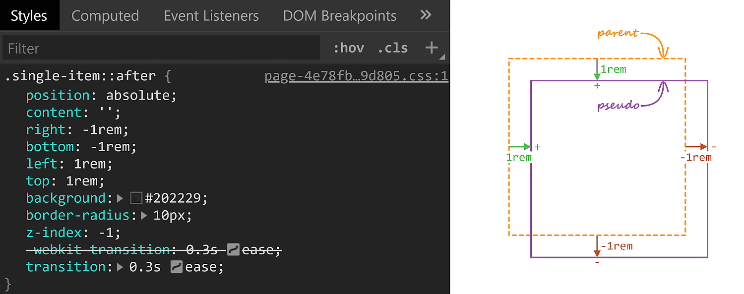
Being the curious creature that I am, I had to check how this works! Turns out, the rectangle in the back is an absolutely positioned ::after pseudo-element.
Initial ::after styles. A positive offset goes inwards from the parent's padding limit, while a negative one goes outwards.
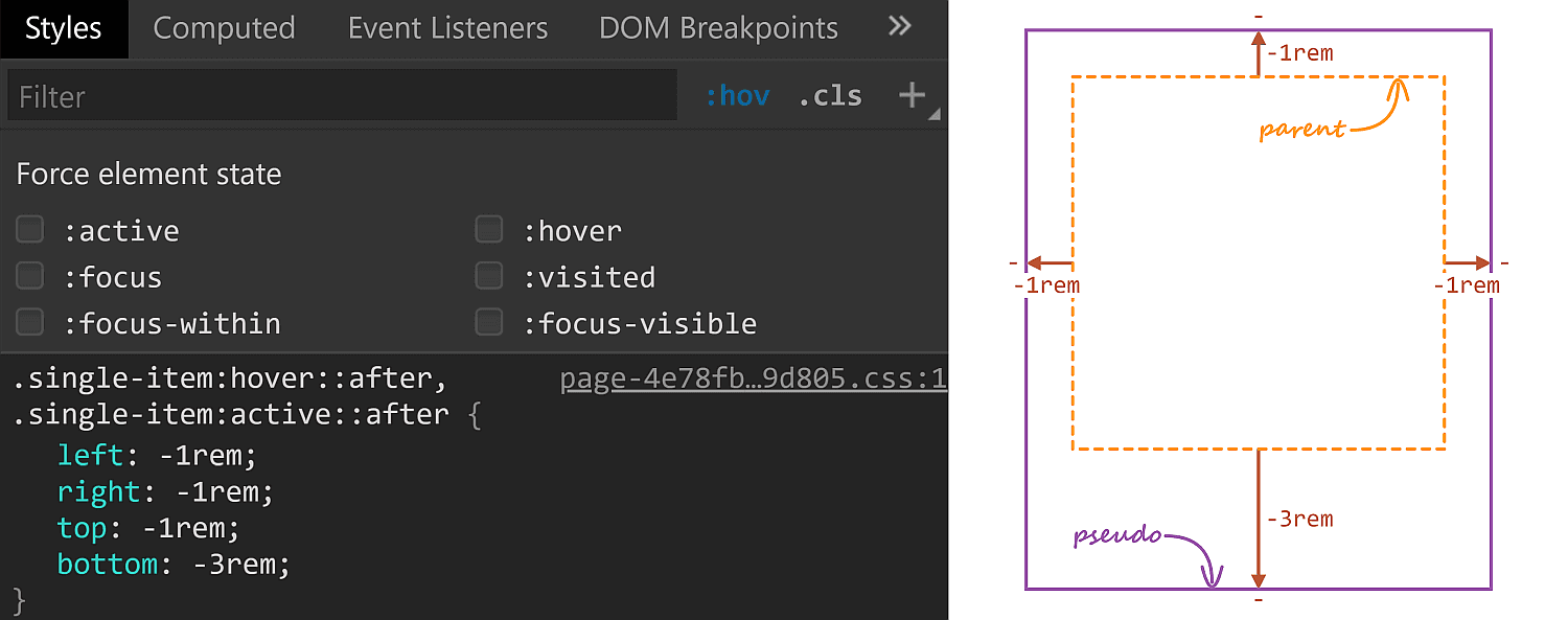
On :hover, its offsets are overridden and, combined with the transition, we get the expanding box effect.
The ::after styles on :hover.
The right property has the same value (-1rem) in both the initial and the :hover rule sets, so it's unnecessary to override it, but all the other offsets move by 2rem outwards (from 1rem to -1rem for the top and left offsets and from -1rem to -3rem for the bottom offset)
One thing to notice here is that the ::after pseudo-element has a border-radius of 10px which gets preserved as it expands. Which got me to think about what methods we have for expanding/shrinking (pseudo-) elements while preserving their border-radius. How many can you think of? Let me know if you have ideas that haven't been included below, where we take a look at a bunch of options and see which is best suited for what situation.
Changing offsets
This is the method used on CodePen and it works really well in this particular situation for a bunch of reasons. First off, it has great support. It also works when the expanding (pseudo-) element is responsive, with no fixed dimensions and, at the same time, the amount by which it expands is fixed (a rem value). It also works for expanding in more than two directions (top, bottom and left in this particular case).
There are however a couple of caveats we need to be aware of.
First, our expanding element cannot have position: static. This is not a problem in the context of the CodePen use case since the ::after pseudo-element needs to be absolutely positioned anyway in order to be placed underneath the rest of this parent's content.
Second, going overboard with offset animations (as well as, in general, animating any property that affects layout with box properties the way offsets, margins, border widths, paddings or dimensions do) can negatively impact performance. Again, this is not something of concern here, we only have a little transition on :hover, no big deal.
Changing dimensions
Instead of changing offsets, we could change dimensions instead. However, this is a method that works if we want our (pseudo-) element to expand in, at most, two directions. Otherwise, we need to change offsets as well. In order to better understand this, let's consider the CodePen situation where we want our ::after pseudo-elements to expand in three directions (top, bottom and left).
The relevant initial sizing info is the following:
Since opposing offsets (the top-bottom and left-right pairs) cancel each other (1rem - 1rem = 0), it results that the pseudo-element's dimensions are equal to those of its parent (or 100% of the parent's dimensions).
...is not enough, as this makes the height increase the downward direction by 4rem instead of increasing it by 2rem up and 2rem down. The following demo illustrates this (put :focus on or hover over the items to see how the ::after pseudo-element expands):
But, to be honest, this feels less desirable than changing offsets alone.
However, changing dimensions is a good solution in a different kind of situation, like when we want to have some bars with rounded corners that expand/shrink in a single direction.
Note that, if we didn't have rounded corners to preserve, the better solution would be to use directional scaling via the transform property.
Changing padding/border-width
Similar to changing the dimensions, we can change the padding or border-width (for a border that's transparent). Note that, just like with changing the dimensions, we need to also update offsets if expanding the box in more than two dimensions:
In the demo above, the pinkish box represents the content-box of the ::after pseudo-element and you can see it stays the same size, which is important for this approach.
In order to understand why it is important, consider this other limitation: we also need to have the box dimensions defined by two offsets plus the width and the height instead of using all four offsets. This is because the padding/ border-width would only grow inwards if we were to use four offsets rather than two plus the width and the height.
In spite of these limitations, this method can come in handy if our expanding (pseudo-) element has text content we don't want to see moving around on :hover as illustrated by the Pen below, where the first two examples change offsets/ dimensions, while the last two change paddings/ border widths:
This is another approach that works great for the CodePen situation, though I cannot really think of other use cases. Also note that, just like changing offsets or dimensions, this method affects the size of the content-box, so any text content we may have gets moved and rearranged.
Changing font size
This is probably the trickiest one of all and has lots of limitations, the most important of which being we cannot have text content on the actual (pseudo-) element that expands/shrinks — but it's another method that would work well in the CodePen case.
Also, font-size on its own doesn't really do anything to make a box expand or shrink. We need to combine it with one of the previously discussed properties.
For example, we can set the font-size on ::after to be equal to 1rem, set the offsets to the expanded case and set em margins that would correspond to the difference between the expanded and the initial state.
If you've read pieces on animation performance, then you've probably read it's better to animate transforms instead of properties that impact layout, like offsets, margins, borders, paddings, dimensions — pretty much what we've used so far!
The first issue that stands out here is that scaling an element also scales its corner rounding, as illustrated below:
We can get around this by also scaling the border-radius the other way.
Let's say we scale an element by a factor $fx along the x axis and by a factor $fy along the y axis and we want to keep its border-radius at a constant value $r.
This means we also need to divide $r by the corresponding scaling factor along each axis.
However, note that with this method, we need to use scaling factors, not amounts by which we expand our (pseudo-) element in this or that direction. Getting the scaling factors from the dimensions and expansion amounts is possible, but only if they're expressed in units that have a certain fixed relation between them. While preprocessors can mix units like in or px due to the fact that 1in is always 96px, they cannot resolve how much 1em or 1% or 1vmin or 1ch is in px as they lack context. And calc() is not a solution either, as it doesn't allow us to divide a length value by another length value to get a unitless scale factor.
This is why scaling is not a solution in the CodePen case, where the ::after boxes have dimensions that depend on the viewport and, at the same time, expand by fixed rem amounts.
But if our scale amount is given or we can easily compute it, this is an option to consider, especially since making the scaling factors custom properties we then animate with a bit of Houdini magic can greatly simplify our code.
This is a method I really like, even though it cuts out pre-Chromium Edge and Internet Explorer support.
Pretty much every usage example of clip-path out there has either a polygon() value or an SVG reference value. However, if you've seen some of my previous articles, then you probably know there are other basic shapes we can use, like inset(), which works as illustrated below:
So, in order to reproduce the CodePen effect with this method, we set the ::after offsets to the expanded state values and then cut out what we don't want to see with the help of clip-path:
Furthermore, it doesn't really break anything in non-supporting browsers, it just always stays in the expanded state.
However, while this is method that works great for a lot of situations — including the CodePen use case — it doesn't work when our expanding/shrinking elements have descendants that go outside their clipped parent's border-box, as it is the case for the last example given with the previously discussed scaling method.
There are an awful lot of libraries that want to help you animate things on the web. These aren't really libraries that help you with the syntax or the technology of animations, but rather are grab-and-use as-is libraries. Want to apply a class like "animate-flip-up" and watch an element, uhhh, flip up? These are the kind of libraries to look at.
I wholeheartedly think you should both 1) learn how to animate things in CSS by learning the syntax yourself and 2) customize animations to tailor the feel to your site. Still, poking around libraries like this helps foster ideas, gets you started with code examples, and might form a foundation for your own projects.
Let's take a look at the landscape of them. Some libraries have different approaches: only take what you need classes, Sass mixins, light JavaScript libraries for adding/removing classes, etc. But they are all essentially "CSS animation libraries." (Some of them are kinda funny having "CSS3" in the title, which kinda dates them. People just don't say that anymore.)
While animations can both be fun and create useful interactions, it's worth remembering that not all users want them when browsing the web. See Eric Bailey's "Revisiting prefers-reduced-motion, the reduced motion media query" for information on how to accommodate users who prefer little or no motion.
You pick an animation you like and it gives you a class name you can use that calls a keyframe animation (you copy and paste both). The point is you just take what you need.
Tachyons itself is an atomic CSS library with a ton of utility classes for essentially designing anything by adding classes to what you need. tachyons-animate extends those by adding "Single purpose classes to help you orchestrate CSS animations." It can be used alone, but even the docs suggest it can be used in combination with other animation libraries since helper classes are generically useful.
A collection of CSS3 powered hover effects to be applied to links, buttons, logos, SVG, featured images and so on. Easily apply to your own elements, modify or just use for inspiration. Available in CSS, Sass, and LESS.
This tutorial is going to demonstrate how to create a smooth WebGL transition on scroll using Phenomenon (based on three.js).
Attention: This tutorial assumes you already have some understanding of how three.js works.
If you are not familiar, I highly recommend checking out the official documentation and examples .
Let’s get started
Interactive elements on websites can enhance the user experience a lot. In the demo, a mix of WebGL and regular UI elements will transition based on the scroll position.
The following libraries are used for this demo:
Three.js: Provides the structure for everything in the WebGL environment.
THREE.Phenomenon: Makes it easy to create an instanced mesh that can be transitioned smoothly.
updateOnScroll: Observes scroll position changes based on percentage values.
About Phenomenon
Phenomenon is a small wrapper around three.js built for high-performance WebGL experiences. It started out as a no-dependency library that I created to learn more about WebGL and was later made compatible with the powerful features of three.js.
With Phenomenon it’s possible to transition thousands of objects in 3D space in a smooth way. This is done by combining all the separate objects as one. The objects will share the same logic but can move or scale or look different based on unique attributes. To make the experience as smooth as possible it’s important to make it run almost entirely on the GPU. This technique will be explained further below.
Animate an instance
To create the animated instances in the demo there are a few steps we need to go through.
const material = new THREE.MeshPhongMaterial({
  color: '#448aff',
  emissive: '#448aff',
  specular: '#efefef',
  shininess: 20,
  flatShading: true,
});
Here we only define the behavior for a single instance. To add to this experience you can add more objects, add lights and shadow or even post processing. Have a look at the Three.js documentation for more information.
Build the transition
The transition of the instance is a little more complex as we will write a vertex shader that will later be combined with our base properties. For this example, we’ll start by moving the objects from point A to point B.
We can define these points through attributes which are stored directly on the GPU (for every object) and can be accessed from our program. In Phenomenon these attributes are defined with a name so we can use it in our shader and a data function which can provide a unique value for every object.
The code below will define a start- and end position between -10 and 10 for every instance randomly.
After all of the objects have a unique start and end position we’ll need a progress value to transition between them. This variable is a uniform that is updated at any time from our main script (for example based on scroll or time).
const uniforms = {
  progress: {
    value: 0,
  },
};
Once this is in place the only thing left for us is writing the vertex shader, which isn’t our familiar Javascript syntax, but instead GLSL. We’ll keep it simple for the example to explain the concept, but if you’re interested you can check out the more complex source.
In the vertex shader a `gl_Position` should be set that will define where every point in our 3d space is located. Based on these positions we can also move, rotate, ease or scale every object separately.
Below we define our two position attributes, the progress uniform, and the required main function. In this case, we mix the positions together with the progress which will let the instances move around.
The position value is defined in the core of three.js and is based on the selected geometry.
Transition on scroll
When we put all the above code together and give each instance a slight offset (so they move after each other) we can start updating our progress based on the scroll position.
With the updateOnScroll library we can easily observe the scroll position based on percentage values. In the example below a value of 0 to 1 is returned between 0% and 50% of the total scroll height. By setting the progress uniform to that value our interaction will be connected to the transition in WebGL!
Public transit data was one of the first data sets in what’s known today as “smart cities” or the “Internet of Things” (IoT). The simple reason was that publishing a transit schedule in machine-readable format, or providing real-time tracking over a cellular data connection, is pretty cheap, relative to the cost of a subway train or bus.
Transit quickly became one of the best examples of open data. Civic leaders at transit agencies, like Portland’s TriMet, found that if they packaged data in a standard format, developers could use it to make better user experiences than transit agencies could offer. The GTFS (General Transit Feed Specification) standard for transit schedules was originally created by TriMet and Google to solve the problem of sharing data between agencies and developers. Now, many agencies worldwide use the same data standard.