Shadows are a common design feature that can help elements, like icons, stand out. They could be persistent, or applied in different states (e.g. :hover, :focus, or :active) to indicate interaction to users.
Shadows happen in real life, so they can be used on screens to breathe some life into your elements and add a touch of realism to a design.
Since we’re making lists, there are two primary ways we can apply shadows to an SVG:
Yes, both involve filters! And, yes, both CSS and SVG have their own types of filters. But there is some crossover between these as well. For example, a CSS filter can refer to an SVG <filter>; that is, if we’re working with an inline SVG instead of, say, an SVG used as a background image in CSS.
What you can’t use: the CSS box-shadow property. This is commonly used for shadows, but it follows the rectangular outside edge of elements, not the edges of the SVG elements like we want. Here’s Michelle Barker with a clear explanation:
If you’re using an SVG icon font, though, there is always text-shadow. That will indeed work. But let’s focus on those first two as they’re in line with a majority of use cases.
Shadows with CSS filters
The trick to applying a shadow directly to SVG via CSS filters is the drop-shadow() function :
We can use a CSS filter to call that SVG filter by ID instead of values we saw earlier:
svg {
  filter: url(#shadow);
}
Now that filter is taken from the HTML and referenced in the CSS, which applies it.
Using SVG filter primitives
You might be wondering how we got that SVG <filter> to work. To make a drop shadow with an SVG filter, we make use of a filter primitive. A filter primitive in SVG is an element that takes some sort of image or graphic as an input, then outputs that image or graphic it when it’s called. They sort of work like filters in a graphic editing application, but in code and can only be used inside an SVG <filter> element.
There are lots of different filter primitives in SVG. The one we’re reaching for is <feDropShadow>. I’ll let you guess what to does just by looking at the name.
So, similar to how we had something like this did this with a CSS filter:
…we can accomplish the same with the <feDropShadow> SVG filter primitive. There are three key attributes worth calling out as they help define the appearance of the drop shadow:
dx — This shifts the position of the shadow along the x-axis.
dy — This shifts the position of the shadow along the y-axis.
stdDeviation — This defines the standard deviation for the drop shadow’s blur operation. There are other attributes we can use, such as the flood-color for setting the drop shadow color, and flood-opacity for setting the drop shadow’s opacity.
That example includes three <filter> elements, each with their own <feDropShadow> filter primitives.
Using SVG filters
SVG filters are very powerful. We just looked at <feDropShadow>, which is very useful of course, but there is so much more they can do (including Photoshop-like effects) and the subset of stuff we get just for shadows is extensive. Let’s look at some, like colored shadows and inset shadows.
Let’s take the SVG markup for the Twitter logo as an example :
We’re going to need a <filter> element to do these effects. This needs to be within an <svg> element in the HTML. A <filter> element is never rendered directly in the browser — it is only used as something that can be referenced via the filter attribute in SVG, or the url() function in CSS.
Here is the syntax showing an SVG filter and applying it to a source image :
<svg width="300" height="300" viewBox="0 0 300 300">

  <filter id="myfilters">
    <!-- All filter effects/primitives go in here -->
  </filter>

  <g filter="url(#myfilters)">
    <!-- Filter applies to everything in this group -->
    <path fill="..." d="..." ></path>
  </g>

</svg>
The filter element is meant to hold filter primitives as children. It is a container to a series of filter operations that are combined to create a filter effects.
These filter primitive perform a single fundamental graphical operation (e.g. blurring, moving, filling, combining, or distorting) on one or more inputs. They are like building blocks where each SVG filter can be used to in conjunction with others to create an effect. <feGaussianBlur> is a popular filter primitive used to add a blur effect.
Let’s say we define the following SVG filter with <feGaussianBlur>:
When applied on an element, this filter creates a Gaussian blur that blurs the element on a 1px radius on the x-axis, but no blurring on the y-axis. Here’s the result, with and without the effect:
It is possible to use multiple primitives inside a single filter. This will create interesting effects, however, you need to make the different primitives aware of each other. Bence Szabó has a crazy cool set of patterns he created this way.
When combining multiple filter primitives, the first primitive uses the original graphic (SourceGraphic) as its graphic input. Any subsequent primitive uses the result of the filter effect before it as its input. And so on. But we can get some flexibility on that with using the in, in2 and result attributes on primitive elements. Steven Bradley has an excellent write-up on filter primitives that dates back to 2016, but still hold true today.
There are 17 primitives we can use today:
<feGaussianBlur>
<feDropShadow>
<feMorphology>
<feDisplacementMap>
<feBlend>
<feColorMatrix>
<feConvolveMatrix>
<feComponentTransfer>
<feSpecularLighting>
<feDiffuseLighting>
<feFlood>
<feTurbulence>
<feImage>
<feTile>
<feOffset>
<feComposite>
<feMerge>
Notice the fe prefix on all of them. That stands for filter effect. Understanding SVG filters is challenging. An effect like an inset shadow requires a verbose syntax that is difficult to grasp without a thorough understanding of math and color theory. (Rob O’Leary’s “Getting Deep Into Shadows” is a good place to start.)
Rather than running down the rabbit hole of all that, we’re going to work with some pre-made filters. Fortunately, there are a lot of ready-to-use SVG filters around.
Inset shadows
To use filter effect on the Twitter logo, we need to declare it in our “SVG source document” with a unique ID for referencing in our <filter> tag.
<filter id='inset-shadow'>
  <!-- Shadow offset -->
  <feOffset
    dx='0'
    dy='0'
  />

  <!-- Shadow blur -->
  <feGaussianBlur
    stdDeviation='1'
    result='offset-blur'
  />

  <!-- Invert drop shadow to make an inset shadow -->
  <feComposite
    operator='out'
    in='SourceGraphic'
    in2='offset-blur'
    result='inverse'
  />

  <!-- Cut color inside shadow -->
  <feFlood
    flood-color='black'
    flood-opacity='.95'
    result='color'
  />
  <feComposite
    operator='in'
    in='color'
    in2='inverse'
    result='shadow'
  />

  <!-- Placing shadow over element -->
  <feComposite
    operator='over'
    in='shadow'
    in2='SourceGraphic'
  />
</filter>
There are four different primitives in there and each one performs a different function. But, taken together, they achieving an inset shadow.
Now that we’ve created this inset shadow filter, we can apply it to our SVG. We’ve already seen how to apply it via CSS. Something like:
.filtered {
  filter: url(#myfilters);
}

/* Or apply only in certain states, like: */
svg:hover, svg:focus {
  filter: url(#myfilters);
}
We can also apply an SVG <filter> directly within the SVG syntax with the filter attribute. That’s like:
<svg>

  <!-- Apply a single filter -->
  <path d="..." filter="url(#myfilters)" />

  <!-- Or apply to a whole group of elements -->
  <g filter="url(#myfilters)">
    <path d="..." />
    <path d="..." />
  </g>
</svg>
More examples
Here are some more shadow examples from Oleg Solomka:
Note that the basic shadows here are probably a bit more complicated than they need to be. For example, a colored shadow can still be done with <feDropShadow> like:
On the first line there, that’s saying: this SVG shouldn’t render at all — it’s just stuff that we intend to use later. The <defs> tag says something similar: we’re just defining these things to use later. That way, we don’t have to repeat ourselves by writing things out over and again. We’ll reference the filter by ID, and the symbols as well, perhaps like:
<svg>
  <use xlink:href="#my-icon" />
</svg>
SVG filters have wide support (even in Internet Explorer and Edge!) with very fast performance.
This browser support data is from Caniuse, which has more detail. A number indicates that browser supports the feature at that version and up.
Desktop
Chrome
Firefox
IE
Edge
Safari
8
3
10
12
6
Mobile / Tablet
Android Chrome
Android Firefox
Android
iOS Safari
91
89
4.4
6.0-6.1
Wrapping things up
A final comparison:
CSS filters are easier to use, but are much more limited. I don’t think it’s possible to add an inset shadow with the drop-shadow() function, for example.
SVG filters are much more robust, but much more complicated as well, and require having the <filter> somewhere in the HTML.
They both have great browser support and perform well on all modern browsers, though SVG filters have (surprisingly) the deepest browser support.
In this article, we have seen why and how to apply shadow to SVG icons with examples on each. Have you done this, but did it a different way than anything we looked at? Have you tried to do a shadow effect that you found impossible to pull off? Please share!
For years, my pain has been not being able to create a somewhat natural-looking pattern in CSS. I mean, sometimes all I need is a wood texture. The only production-friendly solution I knew of was to use an external image, but external images are an additional dependency and they introduce a new complexity.
I know now that a good portion of these problems could be solved with a few lines of SVG.
There is a Filter Primitive in SVG called <feTurbulence>. It’s special in the sense that it doesn’t need any input image — the filter primitive itself generates an image. It produces so-called Perlin noise which is a type of noise gradient. Perlin noise is heavily used in computer generated graphics for creating all sorts of textures. <feTurbulence> comes with options to create multiple types of noise textures and millions of variations per type.
All of these are generated with <feTurbulence>.
“So what?” you might ask. These textures are certainly noisy, but they also contain hidden patterns which we can uncover by pairing them with other filters! That’s what we’re about to jump into.
Creating SVG filters
A custom filter typically consists of multiple filter primitives chained together to achieve a desired outcome. In SVG, we can describe these in a declarative way with the <filter> element and a number of <fe{PrimitiveName}> elements. A declared filter can then be applied on a renderable element — like <rect>, <circle>, <path>, <text>, etc. — by referencing the filter’s id. The following snippet shows an empty filter identified as coolEffect, and applied on a full width and height <rect>.
<svg xmlns="http://www.w3.org/2000/svg">
  <filter id="coolEffect">
    <!-- Filter primitives will be written here -->
  </filter>
  <rect width="100%" height="100%" filter="url(#coolEffect)"/>
</svg>
SVG offers more than a dozen different filter primitives but let’s start with a relatively easy one, <feFlood> . It does exactly what it says: it floods a target area. (This also doesn’t need an input image.) The target area is technically the filter primitive’s sub-region within the <filter> region.
Both the filter region and the filter primitive’s sub-region can be customized. However, we will use the defaults throughout this article, which is practically the full area of our rectangle. The following snippet makes our rectangle red and semi-transparent by setting the flood-color (red) and flood-opacity (0.5) attributes.
A semi-transparent red rectangle looks light red on a white background and dark red on a black background because the opacity is set to 0.5.
Now let’s look at the <feBlend> primitive. It’s used for blending multiple inputs. One of our inputs can be SourceGraphic, a keyword that represents the original graphic on which the filter is applied.
Our original graphic is a black rectangle — that’s because we haven’t specified the fill on the <rect> and the default fill color is black. Our other input is the result of the <feFlood> primitive. As you can see below we’ve added the result attribute to <feFlood> to name its output. We are referencing this output in <feBlend> with the in attribute, and the SourceGraphic with the in2 attribute.
The default blend mode is normal and the input order matters. I would describe our blending operation as putting the semi-transparent red rectangle on top of the black rectangle.
Now, our rectangle is dark red, no matter what color the background is behind it. That’s because we stacked our semi-transparent red <feFlood> on top of the black <rect> and blended the two together with <feBlend>, we chained the result of <feFlood> to <feBlend>.
Chaining filter primitives is a pretty frequent operation and, luckily, it has useful defaults that have been standardized. In our example above, we could have omitted the result attribute in <feFlood> as well as the in attribute in <feBlend>, because any subsequent filter will use the result of the previous filter as its input. We will use this shortcut quite often throughout this article.
Generating random patterns with feTurbulence
<feTurbulence> has a few attributes that determine the noise pattern it produces. Let’s walk through these, one by one.
baseFrequency
This is the most important attribute because it is required in order to create a pattern. It accepts one or two numeric values. Specifying two numbers defines the frequency along the x- and y-axis, respectively. If only one number is provided, then it defines the frequency along both axes. A reasonable interval for the values is between 0.001 and 1, where a low value results in large “features” and a high value results in smaller “features.” The greater the difference between the x and y frequencies, the more “stretched” the pattern becomes.
The baseFrequency values in the top row, from left to right: 0.01, 0.1, 1. Bottom row: 0.01 0.1, 0.1 0.01, 0.001 1.
type
The type attribute takes one of two values: turbulence (the default) or fractalNoise, which is what I typically use. fractalNoise produces the same kind of pattern across the red, green, blue and alpha (RGBA) channels, whereas turbulence in the alpha channel is different from those in RGB. I find it tough to describe the difference, but it’s much easier to see when comparing the visual results.
The turbulence type (left) compared to the fractalNoise type (right)
numOctaves
The concept of octaves might be familiar to you from music or physics. A high octave doubles the frequency. And, for <feTurbulence> in SVG, the numOctaves attribute defines the number of octaves to render over the baseFrequency.
The default numOctaves value is 1, which means it renders noise at the base frequency. Any additional octave doubles the frequency and halves the amplitude. The higher this number goes, the less visible its effect will be. Also, more octaves mean more calculation, possibly hurting performance. I typically use values between 1-5 and only use it to refine a pattern.
numOctaves values compared: 1 (left), 2 (center), and 5 (right)
seed
The seed attribute creates different instances of noise, and serves as the the starting number for the noise generator, which produces pseudo-random numbers under the hood. If the seed value is defined, a different instance of noise will appear, but with the same qualities. Its default value is 0 and positive integers are interpreted (although 0 and 1 are considered to be the same seed). Floats are truncated.
This attribute is best for adding a unique touch to a pattern. For example, a random seed can be generated on a visit to a page so that every visitor will get a slightly different pattern. A practical interval for generating random seeds is from 0 to 9999999 due to some technical details and single precision floats. But still, that’s 10 million different instances, which hopefully covers most cases.
seed values compared: 1 (left), 2 (center), and 7329663 (right)
stitchTiles
We can tile a pattern the same sort of way we can use background-repeat: repeat in CSS! All we need is the stitchTiles attribute, which accepts one of two keyword values: noStitch and stitch, where noStitch is the default value. stitch repeats the pattern seamlessly along both axes.
Comparing noStitch (top) to stitch (bottom)
Note that <feTurbulence> also produces noise in the Alpha channel, meaning the images are semi-transparent, rather than fully opaque.
Patterns Gallery
Let’s look at a bunch of awesome patterns made with SVG filters and figure out how they work!
Starry Sky
This pattern consists of two chained filter effects on a full width and height rectangle. <feTurbulence> is the first filter, responsible for generating noise. <feColorMatrix> is the second filter effect, and it alters the input image, pixel by pixel. We can tell specifically what each output channel value should be based on a constant and all the input channel values within a pixel. The formula per channel looks like this:
is the output channel value
are the input channel values
are the weights
So, for example, we can write a formula for the Red channel that only considers the Green channel by setting to 1, and setting the other weights to 0. We can write similar formulas for the Green and Blue channels that only consider the Blue and Red channels, respectively. For the Alpha channel, we can set (the constant) to 1 and the other weights to 0 to create a fully opaque image. These four formulas perform a hue rotation.
The formulas can also be written as matrix multiplication, which is the origin of the name <feColorMatrix>. Though <feColorMatrix> can be used without understanding matrix operations, we need to keep in mind that our 4×5 matrix are the 4×5 weights of the four formulas.
is the weight of Red channel’s contribution to the Red channel.
is the weight of Red channel’s contribution to the Green channel.
is the weight of Green channel’s contribution to the Red channel.
is the weight of Green channel’s contribution to the Green channel.
The description of the remaining 16 weights are omitted for the sake ofbrevity
The hue rotation mentioned above is written like this:
It’s important to note that the RGBA values are floats ranging from 0 to 1, inclusive (rather than integers ranging from 0 to 255 as you might expect). The weights can be any float, although at the end of the calculations any result below 0 is clamped to 0, and anything above 1 is clamped to 1. The starry sky pattern relies on this clamping, since it’s matrix is this:
The transfer function described by <feColorMatrix> for the R, G, and B channels. The input is always Alpha.
We are using the same formula for the RGB channels which means we are producing a grayscale image. The formula is multiplying the value from the Alpha channel by nine, then removing four from it. Remember, even Alpha values vary in the output of <feTurbulence>. Most resulting values will not be within the 0 to 1 range; thus they will be clamped. So, our image is mostly either black or white — black being the sky, and white being the brightest stars; the remaining few in-between values are dim stars. We are setting the Alpha channel to a constant of 1 in the fourth row, meaning the image is fully opaque.
Pine Wood
This code is not much different from what we just saw in Starry Sky. It’s really just some noise generation and color matrix transformation. A typical wooden pattern has features that are longer in one dimension than the other. To mimic this effect, we are creating “stretched” noise with <feTurbulence> by setting baseFrequency="0.1 0.01". Furthermore, we are setting type="fractalNoise".
With <feColorMatrix>, we are simply recoloring our longer pattern. And, once again, the Alpha channel is used as an input for variance. This time, however, we are offsetting the RGB channels by constant weights that are greater than the weights applied on the Alpha input. This ensures that all the pixels of the image remain within a certain color range. Finding the best color range requires a little bit of playing around with the values.
Mapping Alpha values to colors with <feColorMatrix> While it’s extremely subtle, the second bar is a gradient.
It’s essential to understand that the matrix operates in the linearized RGB color space by default. The color purple (#800080), for example, is represented by values , , and . It might look odd at first, but there’s a good reason for using linearized RGB for some transformations. This article provides a good answer for the why, and this article is great for diving into the how.
At the end of the day, all it means is that we need to convert our usual #RRGGBB values to the linearized RGB space. I used this color space tool to do that. Input the RGB values in the first line then use the values from the third line. In the case of our purple example, we would input , , in the first line and hit the sRGB8 button to get the linearized values in the third line.
If we pick our values right and perform the conversions correctly, we end up with something that resembles the colors of pine wood.
Dalmatian Spots
This example spices things up a bit by introducing <feComponentTransfer> filter. This effect allows us to define custom transfer functions per color channel (also known as color component). We’re only defining one custom transfer function in this demo for the Alpha channel and leave the other channels undefined (which means identity function will be applied). We use the discrete type to set a step function. The steps are described by space-separated numeric values in the tableValues attribute. tableValues control the number of steps and the height of each step.
Let’s consider examples where we play around with the tableValues value. Our goal is to create a “spotty” pattern out of the noise. Here’s what we know:
tableValues="1" transfers each value to 1.
tableValues="0" transfers each value to 0.
tableValues="0 1" transfers values below 0.5 to 0 and values from 0.5 to 1.
tableValues="1 0" transfers values below 0.5 to 1 and values from 0.5 to 0.
Three simple step functions. The third (right) shows what is used in Dalmatian Spots.
It’s worth playing around with this attribute to better understand its capabilities and the quality of our noise. After some experimenting we arrive at tableValues="0 1 0" which translates mid-range values to 1 and others to 0.
The last filter effect in this example is <feColorMatrix> which is used to recolor the pattern. Specifically, it makes the transparent parts (Alpha = 0) black and the opaque parts (Alpha = 1) white.
Finally, we fine-tune the pattern with <feTurbulence>. Setting numOctaves="2" helps make the spots a little more “jagged” and reduces elongated spots. The baseFrequency="0.06" basically sets a zoom level which I think is best for this pattern.
ERDL Camouflage
The ERDL pattern was developed for disguising of military personnel, equipment, and installation. In recent decades, it found its way into clothing. The pattern consists of four colors: a darker green for the backdrop, brown for the shapes shapes, a yellowish-green for patches, and black sprinkled in as little blobs.
Similarly to the Dalmatian Spots example we looked at, we are chaining <feComponentTransfer> to the noise — although this time the discrete functions are defined for the RGB channels.
Imagine that the RGBA channels are four layers of the image. We create blobs in three layers by defining single-step functions. The step starts at different positions for each function, producing a different number of blobs on each layer. The cuts for Red, Green and Blue are 66.67%, 60% and 50%, respectively..
At this point, the blobs on each layers overlap in some places, resulting colors we don’t want. These other colors make it more difficult to transform our pattern into an ERDL camouflage, so let’s eliminate them:
For Red, we define the identity function.
For Green, our starting point is the identity function but we subtract the Red from it.
For Blue, our starting point is the identity function as well, but we subtract the Red and Green from it.
These rules mean Red remains where Red and Green and/or Blue once overlapped; Green remains where Green and Blue overlapped. The resulting image contains four types of pixels: Red, Green, Blue, or Black.
The second chained <feColorMatrix> recolors everything:
The black parts are made dark green with the constant weights.
The red parts are made black by negating the constant weights.
The green parts are made that yellow-green color by the additional weights from the Green channel.
The blue parts are made brown by the additional weights from the Blue channel.
Island Group
This example is basically a heightmap. It’s pretty easy to produce a realistic looking heightmap with <feTurbulence> — we only need to focus on one color channel and we already have it. Let’s focus on the Red channel. With the help of a <feColorMatrix>, we turn the colorful noise into a grayscale heightmap by overwriting the Green and Blue channels with the value of the Red channel.
Now we can rely on the same value for each color channel per pixel. This makes it easy to recolor our image level-by-level with the help of <feComponentTransfer>, although, this time, we use a table type of function. table is similar to discrete, but each step is a ramp to the next step. This allows for a much smoother transition between levels.
The RGB transfer functions defined in <feComponentTransfer>
The number of tableValues determine how many ramps are in the transfer function. We have to consider two things to find the optimal number of ramps. One is the distribution of intensity in the image. The different intensities are unevenly distributed, although the ramp widths are always equal. The other thing to consider is the number of levels we would like to see. And, of course, we also need to remember that we are in linearized RGB space. We could get into the maths of all these, but it’s much easier to just play around and feel out the right values.
Mapping grayscale to colors with <feComponentTransfer>
We use deep blue and aqua color values from the lowest intensities to somewhere in the middle to represent the water. Then, we use a few flavors of yellow for the sandy parts. Finally, green and dark green at the highest intensities create the forest.
We haven’t seen the seed attribute in any these examples, but I invite you to try it out by adding it in there. Think of a random number between 1 and 10 million, then use that number as the seed attribute value in <feTurbulence>, like <feTurbulence seed="3761593"... >
Now you have your own variation of the pattern!
Production use
So far, what we’ve done is look at a bunch of cool SVG patterns and how they’re made. A lot of what we’ve seen is great proof-of-concept, but the real benefit is being able to use the patterns in production in a responsible way.
The way I see it, there are three fundamental paths to choose from.
Method 1: Using an inline data URI in CSS or HTML
My favorite way to use SVGs is to inline them, provided they are small enough. For me, “small enough” means a few kilobytes or less, but it really depends on the particular use case. The upside of inlining is that the image is guaranteed to be there in your CSS or HTML file, meaning there is no need to wait until it is downloaded.
The downside is having to encode the markup. Fortunately, there are some great tools made just for this purpose. Yoksel’s URL-encoder for SVG is one such tool that provides a copy-paste way UI to generate the code. If you’re looking for a programmatic approach — like as part of a build process — I suggest looking into mini-svg-data-uri. I haven’t used it personally, but it seems quite popular.
Regardless of the approach, the encoded data URI goes right in your CSS or HTML (or even JavaScript). CSS is better because of its reusability, but HTML has minimal delivery time. If you are using some sort of server-side rendering technique, you can also slip a randomized seed value in <feTurbulence> within the data URI to show a unique variation for each user.
Here’s the Starry Sky example used as a background image with its inline data URI in CSS:
It’s a super simple approach, but carries a huge drawback — especially with the examples we’ve seen.
That drawback? ID collision.
Notice that the SVG markup uses a #filter ID. Imagine adding the other examples in the same HTML file. If they also use a #filter ID, then that would cause the IDs to collide where the first instance overrides the others.
Personally, I would only use this technique in hand-crafted pages where the scope is small enough to be aware of all the included SVGs and their IDs. There’s the option of generating unique IDs during a build, but that’s a whole other story.
Method 3: Using a standalone SVG
This is the “classic” way to do SVG. In fact, it’s just like using any other image file. Drop the SVG file on a server, then use the URL in an HTML <img> tag, or somewhere in CSS like a background image.
So, going back to the Starry Sky example. Here’s the contents of the SVG file again, but this time the file itself goes on the server.
Considering today’s HTTP2 support and how relatively small SVG files are compared to raster images, this isn’t a bad solution at all. Alternatively, the file can be placed on a CDN for even better delivery. The benefit of having SVGs as separate files is that they can be cached in multiple layers.
Caveats
While I really enjoy crafting these little patterns, I also have to acknowledge some of their imperfections.
The most important imperfection is that they can pretty quickly create a computationally heavy “monster” filter chain. The individual filter effects are very similar to one-off operations in photo editing software. We are basically “photoshopping” with code, and every time the browser displays this sort of SVG, it has to render each operation. So, if you end up having a long filter chain, you might be better off capturing and serving your result as a JPEG or PNG to save users CPU time. Taylor Hunt’s “Improving SVG Runtime Performance” has a lot of other great tips for getting the most performance out of SVG.
Secondly, we’ve got to talk about browser support. Generally speaking, SVG is well-supported, especially in modern browsers. However, I came across one issue with Safari when working with these patterns. I tried creating a repeating circular pattern using <radialGradient> with spreadMethod="repeat". It worked well in Chrome and Firefox, but Safari wasn’t happy with it. Safari displays the radial gradient as if its spreadMethod was set to pad. You can verify it right in MDN’s documentation.
You may get different browsers rendering the same SVG differently. Considering all the complexities of rendering SVG, it’s pretty hard to achieve perfect consistency. That said, I have only found one difference between the browsers that’s worth mentioning and it’s when switching to “full screen” view. When Firefox goes full screen, it doesn’t render the SVG in the extended part of the viewport. Chrome and Safari are good though. You can verify it by opening this pen in your browser of choice, then going into full screen mode. It’s a rare edge-case that could probably be worked around with some JavaScript and the Fullscreen API.
Thanks!
Phew, that’s a wrap! We not only got to look at some cool patterns, but we learned a ton about <feTurbulence> in SVG, including the various filters it takes and how to manipulate them in interesting ways.
Like most things on the web, there are downsides and potential drawbacks to the concepts we covered together, but hopefully you now have a sense of what’s possible and what to watch for. You have the power to create some awesome patterns in SVG!
Blobs are the smooth, random, jelly-like shapes that have a whimsical quality and are just plain fun. They can be used as illustration elements and background effects on the web.
So, how are they made? Just crack open an illustration app and go for it, right? Sure, that’s cool. But we’re in a post here on CSS-Tricks, and it would be much more fun to look at the possibilities we have to do this with CSS and SVG — two of our favorite ingredients!
We actually have a few ways to go about blobs. Let’s check them out.
Drawing circles in SVG
Let’s start easy. We can draw SVG in something like Illustrator, Sketch, Figma or whatever, but we’re going to draw in SVG code instead.
SVG makes it pretty trivial to draw a circle, thanks to the appropriately named <circle> element:
<circle cx="100" cy="100" r="40" fill="red" />
Those funky attributes? They make sense once you break them down:
cx defines the x-coordinate of center of circle.
cy defines the y-coordinate.
r is the radius.
fill is used to fill the shape with color.
That snippet creates a circle with a 40px radius with its center at 100px on the x-axis and 100px on the y-axis. The coordinates start from the upper-left corner of the parent container.
Let’s create multiple overlapping circles like this:
<svg> acts as the art board where all the different shapes and figures are drawn. So, its height and width indicates the size in which the whole drawing needs to be enclosed. If some part of figure is out of bounds of the SVG’s size, then that part will be truncated.
But blobs aren’t always so perfectly… round. We can mix things up by using <ellipse> instead of <circle>:
This is nearly identical to the circle except the change in tag name and two radii values to define the horizontal (rx) and vertical (ry) radii separately. The funny thing is that we can still get a perfect circle if we want if the radii values are the same. So, in a sense, <ellipse> is a little more versatile.
And, if all you need is a circle, we could probably lean on CSS without SVG at all. Any box element can become a circle or ellipse with border-radius.
Thanks to SVG’s <path> tag, we can create any kind of shape. It is like drawing with a pencil or pen. You start from a point and draw lines, curves, shapes and close the loop.
There are many data parameters in path for different tasks like:
M – Moving to the point
L – Drawing line
C – Drawing a curve
Q – Bézier curve
Z – Closing the path
Chris has a super thorough guide that explains these parameters in great detail.
We just need the curve (C) parameter for the actual drawing. But we’ll also be moving the starting point and closing the path, so we’ll reach for the M and Z parameters as well.
This is a random blobby shape I put together using SVG’s <path> element.
Ready to break this down? Coordinates play a big role in <path> so what we’re about to look at will look like Google Maps data barfed inside our code. But it makes a lot more sense when we know what they’re doing.
Here, the d attribute stores the path data. It holds information containing where the drawing starts, what direction it moves, what shape it follows, and where it ends. For example:
It shows that our path starts from coordinates 10 10, indicated by the M that precedes them. Then, it establishes a Cubic Bézier curve (C) with two control points. Bézier curves are like handles on the both ends of a path that control the curviness between them. We have two Bézier “handles”: one for starting position (20 20) of the curve and another for ending position (40 20).
Let’s use this knowledge to design our blob. The blob I drew is actually a bit complex, with a number of curves and control points. It doesn’t help that many of the coordinates aren’t full integers. But, still, now that we know what the <path> ‘s d parameter does and the attributes it uses to draw points along the path, it doesn’t look quite as scary.
SVG path is complex. Right? What if I present you a way to convert many custom shapes (which you can create through divs) into gooey blobs? Here’s the idea. We’re going to create two rectangles that intersect. They’re the same color, but have a little transparency to darken where they intersect.
Then we’re going to leverage SVG’s blurring features to smudge the rectangles, creating an extra gooey blob with softer edges. The two intersecting rectangles will turn into this –
Let’s first understand how filters work in SVG. They are declared using <filter> on HTML elements or other SVG elements, like circle.
circle {
  filter: url("#id_of_filter");
}
<filter> is basically a wrapper for the actual filter effects, that include:
Our blob is blurred and colored, so that’s why we’re going to put <feGaussianBlur> and <feColorMatrix> to use.
<feGaussianBlur> takes multiple attributes, but we are only interested in two of them: how much blur we want and where we want it. The standard deviation (stdDeviation) and in properties align with those needs, respectively.
in accepts one of two values:
SourceGraphic – Blurs the entire shape
SourceAlpha – Blurs the alpha value, and is used to create shadow effects
After playing around a bit, here’s where I landed on the <feGaussianBlur> effect:
This isn’t done just yet. The blur is scattered and the element’s shape lost its boundary and color. We need a bulging effect with blur on the boundaries and a solid color to fill the shape. This is where our next SVG filter, <feColorMatrix>, comes into play.
There are two <feColorMatrix> attributes we want:
in – Indicates where the effect is applied, just like <feGaussianBlur>.
values – A matrix of four rows and five columns.
The values attribute bears a little more nuance. It holds a matrix that gets multiplied with the color and alpha values of each pixel and generates a new color value for that pixel. Mathematically speaking:
new pixel color value = ( values matrix ) × ( current pixel color value )
Let’s get a little numbers nerdy here. In that equation, values matrix is equal to:
Here, F-red means a fraction of red in pixels, with a value ranging from 0 to 1. F-constant is some constant value to add (or subtract) from color value.
Breaking this down further… We have a color pixel with an RGBA value of rgba(214, 232, 250, 1). To convert it into a new color, we will multiply it with our values matrix.
The pixel value didn’t change because we multiplied it by the identity matrix, but if you change the values of the matrix, then its pixel value will change too. Learn more about values matrix from MDN documentation.
In our case, these values seem to work pretty well:
I’ve added few more styles in the blob to stretch it from the corner.
Try to use these filter values in other shapes and let me know how they work out for you in the comments.
Using CSS border-radius
We teased this earlier, but now let’s get to the CSS border-radius property. It can also create blob-like shape, thanks to it’s ability to smooth out the corners of an element. This is possible because each corner radius is divided into two radii, one for each edge. That’s why we can have more shapes apart from circle and ellipse.
You might be used to using border-radius as a shorthand for all four corners of an element:
.rounded {
  border-radius: 25%;
}
That’s a nice way to get uniformity for all of the corners. But blobs aren’t so uniform. We want some corners to be rounder than others to get some that looks gooey. That’s why we go for the constituent properties of border-radius, like:
And see how each properties takes two values? That’s one for each edge of the corner, giving us a lot of flexibility to curve an element into interesting shapes. Then we can drop in a background color, fill it up with a gradient, or even set a box-shadow on it to get a neat effect.
Scott Turner, who has an entire blog "Exploring procedural generation and display of fantasy maps", gets into why vector graphics seems on these surface why it would be bad for the look of a pencil stroke:
Something like this pencil stroke would require many tens of thousands of different elements. Basically each little blob of gray in that image would be separately defined.
I’m in love with SVG. Sure, the code can look dense and difficult at first, but you’ll see the beauty in the results when you get to know it. The bonus is that those results are in code, so it can be hooked up to a CMS. Your designers can rest easy knowing they don't have to reproduce an effect for every article or product on your site.
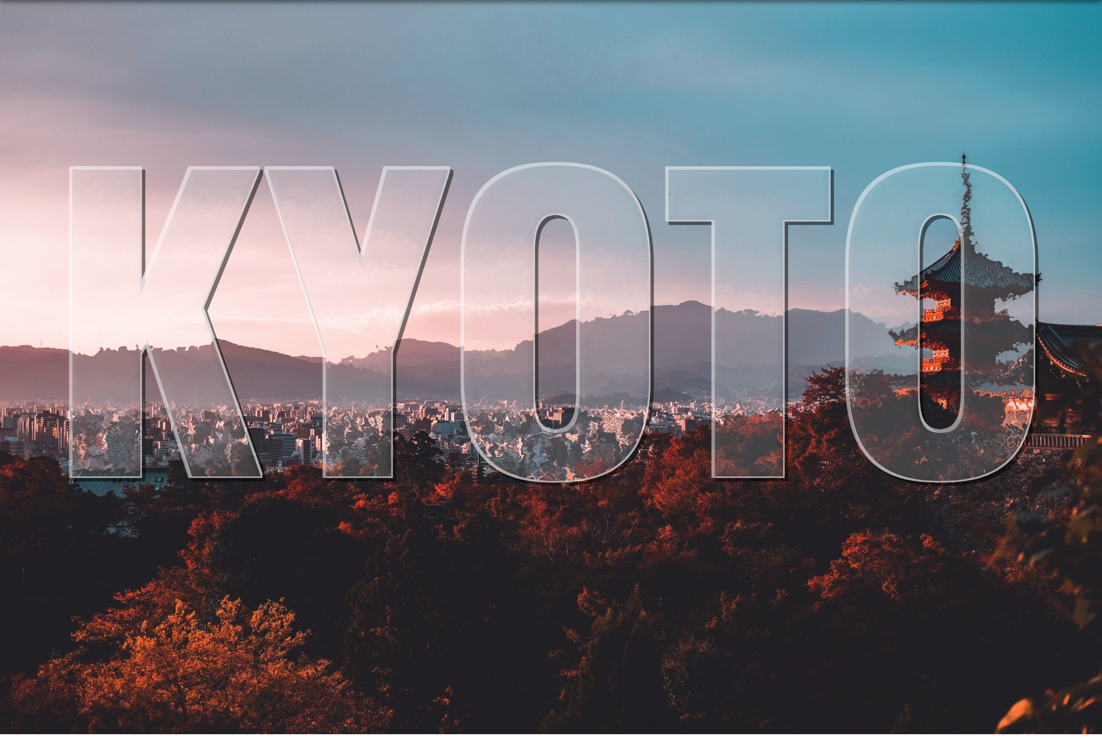
Today I would like to show you how I came up with this glass text effect.
Step 0: Patience and space
SVG can be a lot to take on, especially when you’re just starting to learn it (and if you are, Chris’ book is a good place to start). It’s practically a whole new language and, especially for people who lack design chops, there are lots of new techniques and considerations to know about. Like HTML, though, you’ll find there are a handful of tools that we can reach for to help make SVG much easier to grasp., so be patient and keep trying!
Also, give yourself space. Literally. SVG code is dense so I like to use two or three new lines to space things out. It makes the code easier to read and helps me see how different pieces are separated with less visual distraction. Oh, and use comments to mark where you are in the document, too. That can help organize your thoughts and document your findings.
I’ve made demos for each step we’re going to cover in the process of learning this glass effect as a way to help solidify the things we’re covering as we go.
OK, now that we’re mentally prepared, let’s get into the meat of it!
Step 1: Get the basic image in place
First things first: we need an image as the backdrop for our glass effect. Here we have an <svg> element and an <image> within it. This is similar to adding an <img> in HTML. You’ll notice the dimensions of the viewBox attribute and <image> element in the SVG element are the same. This ensures that the <image> is exactly the same size as the actual picture we’re linking to.
That’s a key distinction to note: we’re linking to an image. The SVG file itself does not draw a raster image, but we can reference one in the SVG code and make sure that asset is in the location we point to. If you’ve worked with Adobe InDesign before, it’s a lot like linking to an image asset in a layout — the image is in the InDesign layout, but the asset itself actually lives somewhere else.
Straightforward so far, but this is where things get complicated because we’re going to add a filter to the image we just inserted. This filter is going to distort the image. If you look closely at the difference between the demo in the last step and the one in this step, you’ll see that the edges of objects in the image are a little rough and wavy. That’s the filter at work!
First, we create another <svg> to hold filter. This means that if we ever want to reuse our filter — for example on multiple elements on the page — then we totally can!
Our first filter (#displacement) is going to distort our image. We’re going to use feTurbulence and feDisplacementMap, each explained by Sara Soueidan much better than I can in this post. Beau Jackson also wrote up a nice piece that shows how they can be used to make a cloud effect. Suffice to say, these two filters tend to go together and I like to think of them as when something needs to appear "wobbly."
With our filter container in place, we just need to apply that filter to our image with a filter attribute on the <image>, magic!
We don’t want the entire image to be distorted though. We’re going to clip the shape of our distorted <image> to the shape of some text. This will essentially be the portion of the picture seen "through" the glass.
To do this, we need to add a <text> element in a <clip-path> and give it an id. Calling this id in the clip-path of our <image> now restricts its shape to that of our <text>. Wonderful!
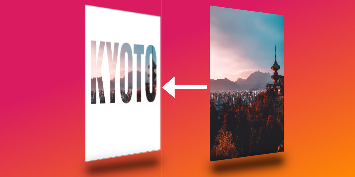
OK, so it’s bueno that we have the distorted <image> clipped to the <text>, but now the rest of the image is gone. No bueno.
We can counteract this by adding a copy of the same <image> but without the clip-path or filter attributes before our existing <image>. This is where I like to add some nice comments to keep things neat. The idea is like placing a transparent layer over what we have so far.
I know, I know, this isn’t very neat, and we’re repeating ourselves. Ideally, we would set our filter straight on the <text> element and use the in="BackgroundImage property for feDisplacementMap to warp what’s behind the text, without the need for extra elements. Unfortunately, this has poor browser support, so we’re going to go with multiple images.
Next, we’re going to duplicate our text just as we did for the image in the last step. Unfortunately, because the text is in a clip-path, it’s now not available for rendering. This is the last time we’re going to duplicate content like this, I promise!
Now we should have something that looks like a normal image with black text over it. If the distortion filter on the <image> we’ve already made is what we can see "through" the glass, then our new <text> is going to be the glass itself.
<svg>

  <!-- more stuff -->

  <!-- TEXT - clipped -->
  <clipPath id="clip">
    <text x="50%" y ="50%" dominant-baseline="middle" text-anchor="middle">KYOTO</text>
  </clipPath>

  <!-- TEXT - visible -->
  <text x="50%" y ="50%" dominant-baseline="middle" text-anchor="middle">KYOTO</text>

<!-- more stuff -->

</svg>
This is where things start to get exciting, at least for me! 🤓
We want to create a dark edge along the text element which, when paired with a light edge (we’ll look at that next), will add depth to the appearance of the text against the image.
We want a new filter for our <text>, so let’s create one in our filter's SVG element and give it an id="textFilter and link it to the filter attribute of the <text> element.
SVG works from the background to the foreground, so the first thing we’re going put in our filter is the shadow that the glass would have, as that is furthest back. I’m gonna level with you, this one is pretty complex, but we’re going to go through it one step at a time.
For this effect, we’re using four filter primitives: feMorphology, feOffset, feFlood and feComposite.
feMorphology is first. We’re using this to make the text fatter. In the demo below, comment out the next three primitives ( feOffset, feFlood, feComposite ) and play with it. I have the value radius="4" to achieve the glass effect, but see what happens if you set it to 1... or 100!
feOffset is used to move all the "pixels" in the previous primitive ( feMorphology ) across the x- or y-axis. The values dx="5" and dy="5" move the "pixels" right on the x-axis and y-axis, respectively. The higher the number, the further they move. Put in negative numbers for dx and the "pixels" will move left. Negative dy and they’ll move up! Again, the is the sort of thing you start to learn as you play around with them.
The reason I have quotes around "pixels" is because they’re not screen pixels like you might expect in CSS. Rather, they refer to the dimensions we set on the parent <svg>. I think of them as percentages. We have used these settings viewBox="0 0 1890 1260" in our example. This means our <svg> is 1890 "pixels" wide. If we set dx="189" it means we’ll move our element 10% of the way across the SVG (1890 divided by 189).
feFlood is great. If you want to fill the screen with color, this is the primitive you need! You might wonder why we can’t read our text now when we apply it. That’s because you can only see the result of the last filter primitive that was created. The result of each of the previous primitives was related to our <text> element. The result of feFlood is just like its name: a flood of color. It doesn't know what you did before and it doesn't care — it’s merely going to fill an area with color.
This is where some people start getting frustrated with SVG. It’s hard to work on something when you can’t see it! Trust me, as you work with SVG more you’ll get used to this. In fact, the next few steps will need us to rely on this and trust that everything is still in place.
feComposite is going to solve this issue for us. What does it do? MDN describes it as:
The SVG filter primitive performs the combination of two input images pixel-wise in image space using one of the Porter-Duff compositing operations: over, in, atop, out, xor, and lighter.
That to me is jibba-jabba. I think of it as affecting the alpha layer of in with the color/alpha of in2.
With this in place we can once again see our text spelled out and, because the color we used is slightly transparent, we can even see the distorted "glass" effect coming through. Great!
This is essentially the same as what we literally just did, but we’re going to shift the shape up and to the left using negative dx/dy values. We’re also setting a slightly white color this time. We’re aiming for a nice depth effect.
We’re again in a position where what we can see is the most recent result from a filter primitive, but we can’t see our dark edge! feComposite isn't what we want to use to bring them together because we don't want the alpha of the dark edge colored by the light edge… we want to see both! Which leads us to…
feMerge! It’s a hero. It lets us take any number of primitive results and merge them, making a new image. Woohoo, we can now see both dark and light edges together!
However, we do want them to be edges rather than both filling up the entire text, so we need to remove the space that the original <text> takes up. What we need next is another feComposite to chop out the original SourceGraphic. Because we used feMorphology to fatten the letters for our edges, we can now chop the original letter shapes out of the result of our feMerge.
Now we’re starting to look like glass, with just one piece missing.
Step 9: Yes, a bevel
We have a pretty good 3D-looking glass effect. However, the letters look flat. Let’s add one more effect and make them look more rounded.
To achieve this we’re going to create a bevelled effect.
First we’re going to use feGaussianBlur. This will blur our existing filters slightly. We’re going to use this blurred result as basis to add some feSpecularLighting. As usual, feel free to play with the numbers here and see what effects you can get! The main one you might want to change is the lighting-color attribute. The image that we’re using here is slightly dark, so we’re using a bright lighting-color. If your image was very bright, this would make the letters hard to read, so you might use a darker lighting-color in that case.
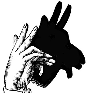
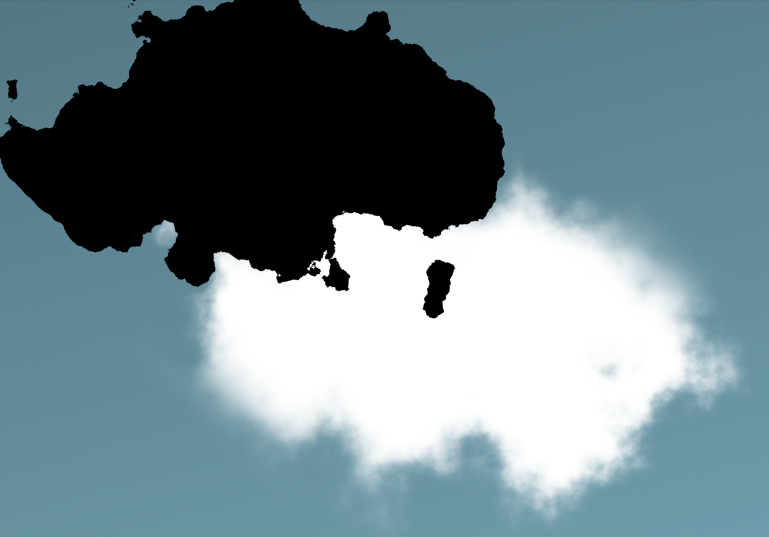
Greek mythology tells the story of Zeus creating the cloud nymph, Nephele. Like other Greek myths, this tale gets pretty bizarre and X-rated. Here’s a very abridged, polite version.
Nephele, we are told, was created by Zeus in the image of his own beautiful wife. A mortal meets Nephele, falls in love with her and, together, they take an adult nap™. Finally, in a strange twist, the cloud gives birth to half-human half-horse Centaur babies.
Weird, right? Personally, I can’t make heads or tails of it. Thankfully, the process for creating clouds in the browser is much more straightforward and far less risqué.
Recently, I discovered that developer Yuan Chuan has realized code-generated, photorealistic clouds. For me, this notion in the browser had long been the stuff of myth.
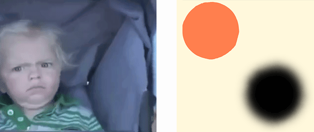
With one glance at the code in this pen we can imagine that convincing individual clouds are achievable through the use of CSS box-shadow with a <filter> element containing two SVG filters as its complement.
The photorealism we want is achieved with a delicate mix of feTurbulence and feDisplacementMap. These SVG filters are powerful, complex and offer very exciting features (including an Oscar winning algorithm)! However, under the hood, their complexity can be a bit intimidating.
For this article, we will focus on learning to use these SVG filters to get spectacular results. We don’t need to delve too deeply into what is happening behind the scenes algorithmically, much in the way an artist isn’t required know the molecular structure of paint to render a stunning landscape.
Instead, let's pay close attention to small handful of SVG attributes that are essential for drawing convincing clouds in the browser. Their use will enable us to bend these powerful filters to our will and learn how to customize them with precision in our own projects.
Let’s start with some basics
The CSS box-shadow property has five values that deserve close attention:
In the same way that a hand changes shape to alter the shadow, a "source shape" in the our HTML can move and morph to move and alter the shape of a shadow rendered in the browser. box-shadow duplicates the "morphing" features on the original size and border-radius. SVG filters get applied to both the element and its shadow.
This is the markup for our SVG so far. It won’t render because we haven’t defined anything visual (not to mention the zero width and height). It’s sole purpose is to hold a filter that we feed our SourceGraphic (aka our <div>). Our source <div>and its shadow are both being distorted independently by the filter.
We’ll add the essential CSS rule linking the HTML element (`#cloud-circle`) to the SVG filter using its ID:
No worries! We have only just scratched the surface and have a lot more good stuff to look at.
Experimenting with the feDisplacementMap scale attribute
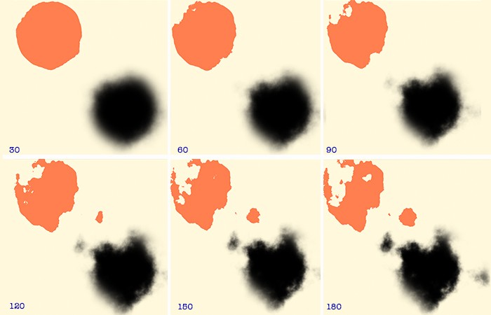
A few un-scientific experiments with this one attribute can yield dramatic results. For the moment, let’s keep the all values in feTurbulence constant and simply adjust the scale attribute of DisplacementMap.
As scale increases (by increments of 30) our source <div> becomes distorted and casts a shadow to mirror the stochastic form in which clouds appear in the sky.
Great, now the source element is getting in the way. 😫
Wait! We’ve widened the source element and now it’s in the way of our of the white shadow we’re calling a cloud. Let’s "re-cast" the shadow at a greater distance so that our cloud is no longer obscured by the source image. (Think of this as moving your hand away further from the wall so it doesn’t block the view of your shadow puppet.)
This is nicely achieved with a bit of CSS positioning. The <body> is the parent element for our cloud, which is statically positioned by default. Let’s "tuck" our source <div> up and out of the way with some absolute positioning. Initially, that will reposition our shadow as well, so we’ll also need to increase the distance of the shadow from the element and nudge the element a bit more.
#cloud-circle {
  width: 500px;
  height: 275px;
  background: #000;
  border-radius: 50%;
  filter: url(#filter);
  box-shadow: 400px 400px 60px 0px #fff; /* Increase shadow offset */
  position: absolute; /* Take the parent out of the document flow */
  top: -320px; /* Move a little down */
  left: -320px; /* Move a little right */
}
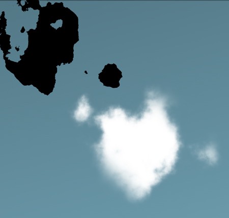
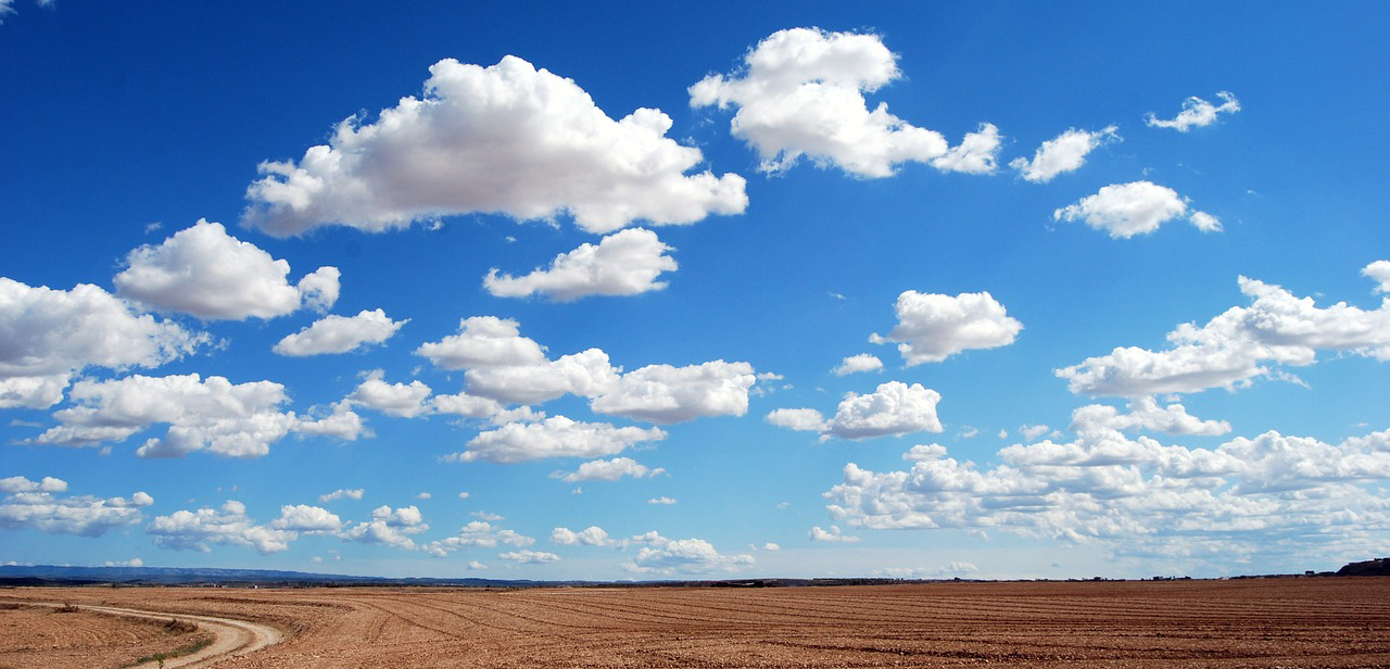
What is painted to the browser is a pretty decent depiction of a cloud–But, I’m not sure…does this cloud really do justice the cloud nymph, Nephele? I'm sure we can do better!
From the look of the depth, texture and richness of the clouds in this photograph, one thing is clear: Zeus went to art school. At the very least, he must have read the The Universal Principles of Design which illustrates a powerful–yet, deceptively ordinary–concept:
[...] lighting bias plays a significant role in the interpretation of depth and naturalness, and can be manipulated in a variety of ways by designers...Use the level of contrast between light and dark areas to vary the appearance of depth.
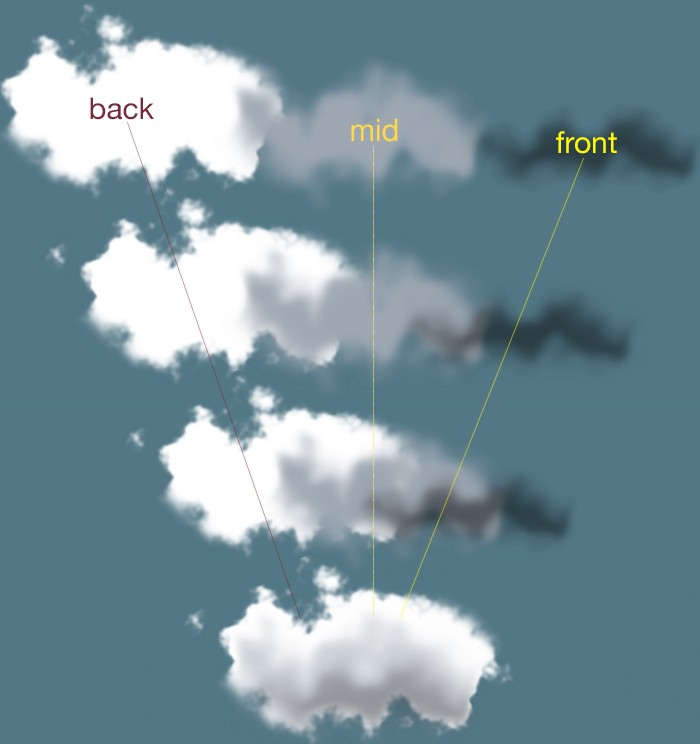
This passage provides for us a hint as to how to we can vastly improve our own code-generated cloud. We can render our cloud with a good deal of fidelity to the clouds in our reference image by stacking layers of differing form, size and color on top of each other. All that takes is calling our filter as many times as we want layers.
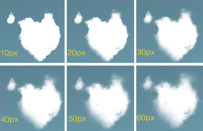
Applying our layers will afford us an opportunity to explore feTurbulence and realize its versatility. We’ll choose the smoother type available to us: fractalNoise with numOctaves cranked up to 6.
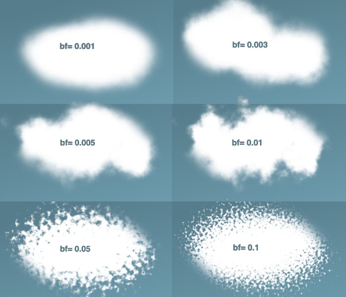
What does all that mean? For now, let’s focus specifically on the baseFrequency attribute. Here’s what we get as we increase the value of n:
The lower the value, the rounder and fuzzier we get. The higher the value, the rounder and more rigid we get.
Words like turbulence, noise, frequency, and octave may seem odd and even confusing. But fear not! It’s actually perfectly accurate to analogize this filter’s effects to sound waves. We may equate a low frequency (baseFrequency=0.001) with a low, muffled noise and a rising frequency (baseFrequency=0.1) with a higher, crisper pitch.
We can see that our sweet spot for a cumulus-like effect may lie comfortably around the ~0.005 and ~0.01 range for the baseFrequency.
Adding detail with numOctaves
Incrementing numOctaves allows us to render our image in extremely granular detail. This requires a great deal of calculation, so be warned: high values are a significant performance hit. Try to resist the temptation to pump up this value unless your browser is wearing a helmet and knee-pads.
The higher the value we put into numOctaves the more granular detail give to our cloud.
The good news is that we don’t have to crank this value too high in order to produce detail and delicacy. As the array of images above shows, we can satisfy ourselves with a numOctavesvalue of 4 or 5.
There is much to say about the seed attribute as it offers a hint into the magic happening behind the scenes. But, for our purposes, the utility of seed can be reduced to four words: "different value, different shape."
The Perlin Noise function (mentioned earlier) uses this value as the starting point for its random number generator. Choosing not to include this attribute will default seed to zero. When included, however, whatever value we give seed, we don’t need to worry about a performance hit.
Different seed values produce different shapes.
The GIF above represents some of what seed has to offer. Keep in mind that each of those clouds is a layered, composite cloud. (While I have tweaked attributes for each layer, I have kept their respective seed values uniform.)
Here, with a close look at the reference image, I've layered 3 cloud-<div>s (of differing in opacity) onto a single base div. Through trial and error and punching in arbitrary seed values, I eventually arrived at a shape resembling the shape of the cloud in the photograph.
Of course, it would be hubris to think that the <div>s that we paint to the browser could be superior to Zeus’s, Nephele.
However, the more mystery we are able to tease out of CSS and SVG filters, the more we are empowered create something visually stunning with a high degree of fidelity to the Thunder God’s original creation. We can, then, can go on experiment further!
I hope this gets you excited about creating a bit of photorealism on the web. I developed a little tool to help put them all to use and experiment a bit. Any questions, suggestions or advice? Ping me in the twitterverse drop a comment here.
There are a lot of different ways to use SVG. Depending on which way, the tactic for recoloring that SVG in different states or conditions — :hover, :active, :focus, class name change, etc. — is different.
If you're used to working with icon fonts, one thing you might enjoy about them is how easy it is to change the color. You're largely limited to a single color with icon fonts in a way that SVG isn't, but still, it is appealingly easy to change that single color with color. Using inline SVG allows you to set the fill, which cascades to all the elements within the SVG, or you can fill each element separately if needed.
SVG Symbol / Use
There is such thing as an SVG sprite, which is a group of SVGs turned into <symbol> elements such that any given icon can be referenced easily with a <use> element.
You can still set the fill color from outside CSS rather easily this way, but there are caveats.
The internal SVG elements (like the <path>) can have no fill themselves. This allows the fill set from the parent SVG to cascade into the Shadow DOM created by <use>. As soon as you have something like <path fill="blue" ... /> in the <symbol>, you've lost outside CSS control.
Likewise, the fill of individual elements cannot be controlled within the SVG like you could with inline SVG. This means you're pretty firmly in single-color territory. That covers most use cases anyway, but still, a limitation nonetheless.
SVG background images
SVG can be set as a background image just like PNG, JPG, or whatever other graphics format. At this point, you've sort of given up on being able to change the fill. One possibility, which I'd argue isn't a particularly good one, is to have two versions of every icon, in the respective colors, and swap between them:
Trying to finagle the right filters to get the color right is tricky stuff. Fortunately, Barrett Sonntag made a tool to calculate the filters for you! Turning black to red ends up a whacky combination like this: invert(27%) sepia(51%) saturate(2878%) hue-rotate(346deg) brightness(104%) contrast(97%);.
SVG also has object, which is kinda neat in that it had a built-in fallback back in the day — although browser support is so good these days, I honestly have never used it. But if you're using it, you would probably have to use this filter technique to swap color on hover.
This way, the SVG is still in charge of essentially drawing the shape, but the color comes from the background-color (or image! or gradient!) behind it rather than the SVG itself.
This doesn't change that much from above, but it does open up one interesting possibility: Using a variable for the internal fills. Here that is with Sass keeping the URLs as variables:
SVG is a great format for icons. Vector formats look crisp and razor sharp, no matter the size or device — and we get tons of design control when using them inline.
SVG also gives us another powerful feature: the ability to manipulate their properties with CSS. As a result, we can make quick and simple interactions where it used to take crafty CSS tricks or swapping out entire image files.
Those interactions include changing color on hover states. It sounds like such a straightforward thing here in 2019, but there are actually a few totally valid ways to go about it — which only demonstrates the awesome powers of SVG more.
First off, let’s begin with a little abbreviated SVG markup:
<svg class="icon">
  <path .../>
</svg>
Target the .icon class in CSS and set the SVG fill property on the hover state to swap colors.
.icon:hover {
  fill: #DA4567;
}
This is by far the easiest way to apply a colored hover state to an SVG. Three lines of code!
SVGs can also be referenced using an <img> tag or as a background image. This allows the images to be cached and we can avoid bloating your HTML with chunks of SVG code. But the downside is a big one: we no longer have the ability to manipulate those properties using CSS. Whenever I come across non-inline icons, my first port of call is to inline them, but sometimes that's not an option.
I was recently working on a project where the social icons were a component in a pattern library that everyone was happy with. In this case, the icons were being referenced from an <img> element. I was tasked with applying colored :focus and :hover styles, without adjusting the markup.
So, how do you go about adding a colored hover effect to an icon if it's not an inline SVG?
CSS Filters
CSS filters allow us to apply a whole bunch of cool, Photoshop-esque effects right in the browser. Filters are applied to the element after the browser renders layout and initial paint, which means they fall back gracefully. They apply to the whole element, including children. Think of a filter as a lens laid over the top of the element it's applied to.
These are the CSS filters available to us:
brightness(<number-percentage>);
contrast(<number-percentage>);
grayscale(<number-percentage>);
invert(<number-percentage>);
opacity(<number-percentage>);
saturate(<number-percentage>);
sepia(<number-percentage>);
hue-rotate(<angle>);
blur(<length>);
drop-shadow(<length><color>);
All filters take a value which can be changed to adjust the effect. In most cases, this value can be expressed in either a decimal or percent units (e.g. brightness(0.5) or brightness(50%)).
Straight out of the box, there's no CSS filter that allows us to add our own specific color.
We have hue-rotate(), but that only adjusts an existing color; it doesn't add a color, which is no good since we're starting with a monochromatic icon.
The game-changing bit about CSS filters is that we don't have to use them in isolation. Multiple filters can be applied to an element by space-separating the filter functions like this:
If one of the filter functions doesn't exist, or has an incorrect value, the whole list is ignored and no filter will be applied to the element.
When applying multiple filter functions to an element, their order is important and will affect the final output. Each filter function will be applied to the result of the previous operation.
So, in order to colorize our icons, we have to find the right combination.
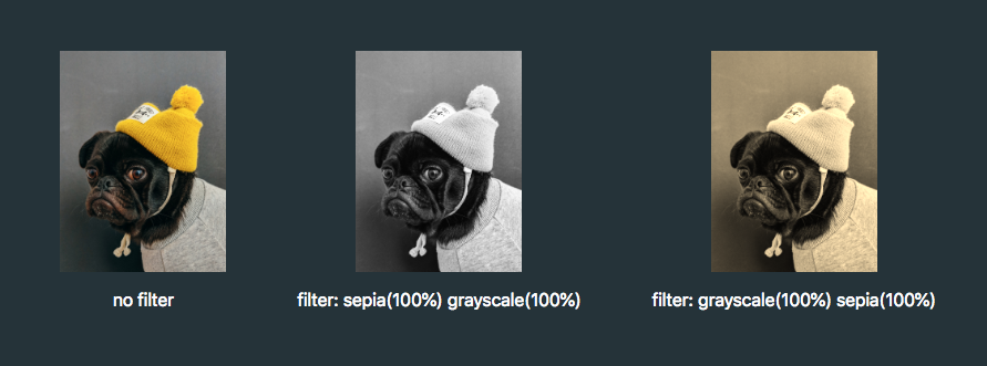
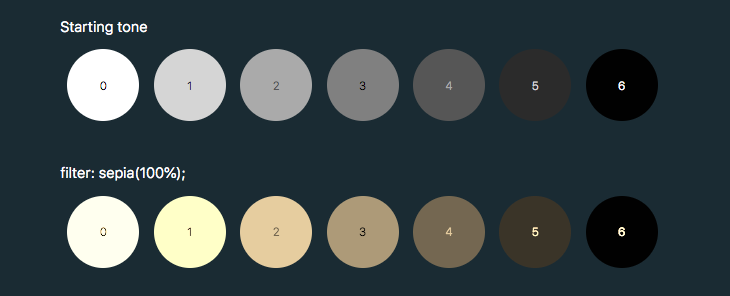
To make use of hue-rotate(), we need to start off with a colored icon. The sepia() filter is the only filter function that allows us to add a color, giving the filtered element a yellow-brown-y tinge, like an old photo.
The output color is dependent on the starting tonal value:
In order to add enough color with sepia(), we first need to use invert() to convert our icon to a medium grey:
.icon:hover {
  filter: invert(0.5)
}
We can then add the yellow/brown tone with sepia():
Filters are defined by a <filter> element, which goes inside the <defs> section of an SVG.
SVG filters can be applied to SVG content within the same SVG document. Or, the filter can be referenced and applied to HTML content elsewhere.
To apply an SVG filter to HTML content, we reference it the same way as a CSS filter: by using the url() filter function. The URL points to the ID of the SVG filter.
The SVG filter can be placed inline in the document or the filter function can reference an external SVG. I prefer the latter route as it allows me to keep my SVG filters tidied away in an assets folder.
Right now, this filter is empty and won't do anything as we haven't defined a filter primitive. Filter primitives are what create the filter effects. There are a number of filter primitives available to us, including:
[<feBlend>]
[<feColorMatrix>]
[<feComponentTransfer>]
[<feComposite>]
[<feConvolveMatrix>]
[<feDiffuseLighting>]
[<feDisplacementMap>]
[<feDropShadow>]
[<feFlood>]
[<feGaussianBlur>]
[<feImage>]
[<feMerge>]
[<feMorphology>]
[<feOffset>]
[<feSpecularLighting>]
[<feTile>]
[<feTurbulence>]
Just like with CSS filters, we can use them on their own or include multiple filter primitives in the <filter> tag for more interesting effects. If more than one filter primitive is used, then each operation will build on top of the previous one.
For our purposes we're just going to use feColorMatrix, but if you want to know more about SVG filters, you can check out the specs on MDN or this (in progress, at the time of this writing) article series that Sara Soueidan has kicked off.
feColourMatrix allows us to change color values on a per-channel basis, much like channel mixing in Photoshop.
The color-interpolation-filters attribute specifies our color space. The default color space for filter effects is linearRGB, whereas in CSS, RGB colors are specified in the sRGB color space. It's important that we set the value to sRGB in order for our colors to match up.
Let’s have a closer look at the color matrix values.
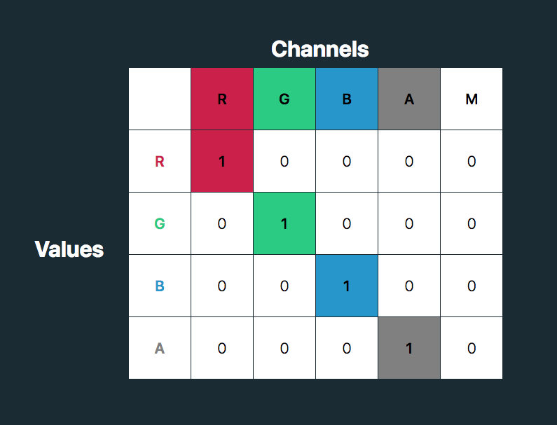
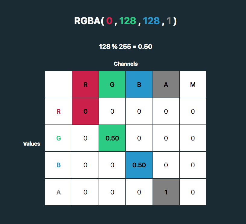
The first four columns represent the red, green and blue channels of color and the alpha (opacity) value. The rows contain the red, green, blue and alpha values in those channels.
The M column is a multiplier — we don’t need to change any of these values for our purposes here. The values for each color channel are represented as floating point numbers in the range 0 to 1.
We could write these values as a CSS RGBA color declaration like this:
The values for each color channel (red, green and blue) are stored as integers in the range 0 to 255. In computers, this is the range that one 8-bit byte can offer.
By dividing these color channel values by 255, the values can be represented as a floating point number which we can use in the feColorMatrix.
And, by doing this, we can create a color filter for any color with an RGB value!
This SVG filter will only impart color to icons with a white fill, so If we have an icon with a black fill, we can use invert() to convert it to white before applying the SVG filter.
If we just have a hex code, the math is a little trickier, although there are plenty of hex-to-RGBA converters out there. To help out, I've made a HEX to feColorMatrix converter.


 is the output channel value
 are the input channel values
 are the weights
 to
to  (the constant) to
 is the weight of Red channel’s contribution to the Red channel.
 is the weight of Red channel’s contribution to the Green channel.
 is the weight of Green channel’s contribution to the Red channel.
 is the weight of Green channel’s contribution to the Green channel.


 ,
,  , and
, and  . It might look odd at first, but there’s a good reason for using linearized RGB for some transformations.
  ,
,  in the first line and hit the


