Achieving Vertical Alignment (Thanks, Subgrid!)

Our tools for vertical alignment have gotten a lot better as of late. My early days as a website designer involved laying out 960px wide homepage designs and aligning things horizontally across a page using a 12-column grid. Media queries came along which required a serious mental shift. It solved some big problems, of course, but introduced new ones, like dealing with alignment when elements wrap or are otherwise moved around in the layout. 

Let’s take a look at just one particular scenario: a “bar” with some buttons in it. There are two groups of these buttons, each contained within a <fieldset> with a <legend>

On a large screen, we’re all set:

Two groups of two bright pink buttons set on a dark background.

And here’s a very basic CSS method that accomplishes that layout, and also breaks down onto two “rows” at a mobile breakpoint:

.accessibility-tools fieldset {
  width: 48%;
  float: left;
  margin-right: 1%;
}


/* Mobile */
@media only screen and (max-width: 480px) {
  .accessibility-tools fieldset {
    width: 100%;
  }
}

On a small screen, we end up with this:

The same two groups of two pink buttons, with one group of buttons stacked on top of the other, showing the buttons are uneven in width.

This is the problem: lack of vertical alignment. Let’s say we want to align those buttons into a more pleasing arrangement where the button edges align with each other nicely.

To begin, we could go for fixed-width, pixel-based CSS solutions to force elements to line up nicely at various breakpoints, using magic numbers like this:

/* Mobile */
@media only screen and (max-width: 480px) {
  legend {
    width: 160px;
  }
  button {
    width: 130px;
  }
}
the same two groups of pink buttons but where the buttons all have the same consistent width and line up evenly.

That does the trick.

But… this is not exactly a flexible solution to the problem. Aside from the magic numbers (fixed-pixel values based on specific content), it also relied on the use of media queries which I am trying to move away from when I can. I discussed this in a post called “Stepping away from Sass” on my blog.

As I moved towards some of the more modern features of CSS the need to target specific screen sizes with unique code was removed.

What I need is each button and label to respond to:

  1. the space available
  2. their content 

and!

  1. Other elements around them

Available space

The problem with using media queries is that they don’t take into account the space around the elements that are being realigned — a point perfectly demonstrated in this image from “The Flexbox holy albatross” by Heydon Pickering:

Three browsers side-by-side. The first shows three black rectangles in a single row, the second shows three black rectangles stacked vertically, and the third shows three black rectangles set to the right hand of the screen.

What I really want is for the second <fieldset> to wrap under the first only when they can no longer fit neatly on one row.

Can we get this done with flexbox?

A key selling point for flexbox is its ability to create elements that respond to the space around them. Components can “flex” to fill additional space and shrink to fit into smaller spaces. 

For this situation, the flex-wrap property is set to wrap. This means as soon as both <fieldset> elements no longer fit on one line, they will wrap onto a second line.

.wrapper--accessibility-tools {
  display: flex;
  flex-wrap: wrap;
} 

The flex-wrap property has three available values. The default value is nowrap, leaving items on one line. The wrap value allows elements to flow onto multiple lines. Then there’s wrap-reverse, which allows items to wrap but — wait for it — in reverse (it is weird to see: when elements wrap, they go above the previous row in left-to-right situations).

Using flexbox stops the layout from being quite as rigid, but a min-width value is still needed to remove the vertical alignment problem. So: close but no cigar.

Can grid help us? 

CSS Grid is the very first CSS module created specifically to solve the ongoing layout problems faced by web designers and developers. It is not a direct replacement for flexbox; rather the two modules usually work pretty well together.

Like flexbox, grid can be used to allow each <fieldset> to occupy as much or as little space as they need. Getting right to it, we can leverage the auto-fill and auto-fit keywords (within a repeat() function) to allow grid items to flow onto multiple lines without the need for media queries. The difference is a bit subtle, but well-explained in “Auto-Sizing Columns in CSS Grid: auto-fill vs auto-fit” by Sara Soueidan. Let’s use auto-fit:

.wrapper--accessibility-tools {
  display: grid;
  grid-template-columns: repeat(auto-fit, 450px);
  grid-gap: 10px;
}

Like the flexbox example, I still need to set an absolute value for the width of the label to align the <fieldset> elements as they stack.

Another approach with grid

CSS Grid also allows elements to respond based on their content using flexible grid tracks. In addition to other length values like percentages, relative units, or pixels, CSS Grid accepts a Fractional Unit (fr), where 1fr will take up one part of the available space, 2fr will take up two parts of the available space, and so on. Let’s set up two equal columns here:

.wrapper--accessibility-tools {
  display: grid;
  grid-template-columns: 1fr 1fr;
  grid-gap: 10px;
}

There’s also a minmax() function which creates grid tracks that flex to the available space, but also don’t shrink narrower than a specified size.

.wrapper--accessibility-tools {
  display: grid;
  grid-template-columns: minmax(auto, max-content) minmax(auto, max-content);
  grid-gap: 10px;
}

Both of these demos work, and are free from any absolute values or device specific CSS. The results are far from ideal though, each grid now responds at different points. Maybe not a huge problem, but certainly not great.

This happens because when adding display: grid to a container, only the direct children of that container become grid items. This means the intrinsic sizing units we used only relate to elements in the same grid. 
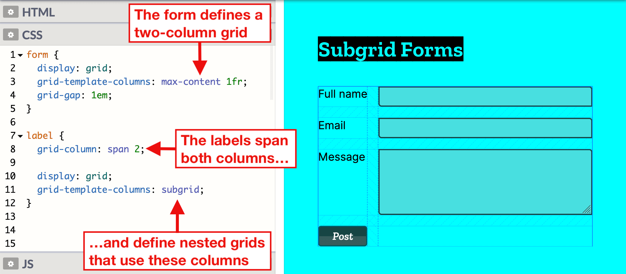
Using subgrid

To really achieve my goal, I need the buttons and labels to react to elements in sibling grid containers. CSS Grid Level 2 includes the subgrid feature. Although we have always been able to nest grids, the elements within each grid container have been independent. With subgrid, we get to set up nested (child) grids that use parent grids tracks.

This makes a number patterns that were previously difficult much easier, in particular the “card” pattern which seems to be the most popular example to show the benefits of subgrid. Without subgrid, each card is defined as an independent grid, meaning track sizing in the first card cannot respond to a change of height in the second. Pulling from an example Rachel Andrew used, here’s a simple group of cards:

Showing three columns of cards where each card has a headers with a dark blue background and white text, content with a white background, and a footer with a dark blue background. The cards are uneven because some of them have more content that others.
Credit: Rachel Andrew

Subgrid allows the cards to use the rows defined in the parent grid, meaning they can react to content in surrounding cards.

The same three columns of cards, but with each card perfectly aligned with the others.
Credit: Rachel Andrew

Each card in this example still spans three row tracks, but those rows are now defined on the parent grid, allowing each card to occupy the same amount of vertical space.

For the example we’ve been working with, we do not need to use rows. Instead, we need to size columns based on content from sibling grids. First, let’s set the parent grid to contain the two <fieldset> elements. This is similar to the code we previously look at in the auto-fit demo.

.wrapper--accessibility-tools {
  display: grid;
  grid-template-columns: repeat(auto-fill, minmax(150px, 1fr));
  grid-gap: 10px;
}

Then we position each subgrid onto the parent grid.

.sub-grid {
  display: grid;
  grid-column: span 3;
  grid-template-columns: subgrid;
  align-items: center;
}
Showing the two groups of bright pink buttons with both groups on the same row and all the buttons have a consistent width.

All of the labels and buttons are now aligned to the tracks of their parent grid, keeping them consistent. They will each have an equal width based on the space that is available. If there is not enough space for each nested grid on one line, the second will wrap onto a new line.

The two groups of buttons vertically stacked and the buttons are all consistently aligned with the same width.

This time, the two nested grid items align perfectly. The grid is also flexible if we introduce a longer title on a one of the buttons, the other elements will respond accordingly.

Browser compatibility

Support for subgrid is not great at the time of writing. It is only supported in Firefox 71+, although there are positive signals from other browsers. CSS feature queries can be used to provide alternative styling to Chrome and Edge.

This browser support data is from Caniuse, which has more detail. A number indicates that browser supports the feature at that version and up.

Desktop

ChromeFirefoxIEEdgeSafari
No71NoNoNo

Mobile / Tablet

Android ChromeAndroid FirefoxAndroidiOS Safari
No79NoNo

Note that I am using an extra wrapper around the fieldsets in these demos. This is to combat a bug with form elements and grid and flexbox.

<fieldset class="accessibility-tools__colour-theme">
  <div class="wrapper"></div>
</fieldset>

The layout CSS is applied to the wrapper with the fieldset being set to display: contents.

.accessibility-tools fieldset {
  display: contents;
  border: 0;
} 

Other writing on the subject


The post Achieving Vertical Alignment (Thanks, Subgrid!) appeared first on CSS-Tricks.

You can support CSS-Tricks by being an MVP Supporter.

Just another +1 for subgrid

I’d say 85% of my grid usage is in one of these two categories…

  1. I just need some pretty basic (probably equal width) columns that ends up being something like like grid-template-columns: repeat(3, minmax(0, 1fr)); to be safe.
  2. Actually doing some real layout where five minutes in I realize I’d really like subgrid.

Subgrid? It’s a nice intuitive way to have a child element on the grid inherit relevant grid lines from the parent grid.

Here’s a great recent video from Rachel Andrew covering it. Last year, we linked up her talk on the same! It’s such a clutch feature and I wish we could rely on it cross-browser. Right now, Firefox is the only one that has it. (Chrome issue, Safari issue)

In my recent video, right about at 20 minutes, I realize subgrid would make even a fairly simple layout much nicer, like removing the need for variables or resorting to magic numbers.

The post Just another +1 for subgrid appeared first on CSS-Tricks.

Firefox 71: First Out of the Gate With Subgrid

A great release from Firefox this week! See the whole roundup post from Chris Mills. I'm personally stoked to see clip-path: path(); go live, which we've been tracking as it's so clearly useful. We also get column-span: all; which is nice in case you're one of the few taking advantages of CSS columns.

But there are two other things I think are a very big deal:

  1. If you have fluid images (most sites do) via flexible-width containers and img { max-width: 100%; }, you're subject to somewhat janky loading as those images load in because the browser doesn't know how tall the space to reserve needs to be until it knows the dimensions of the image. But now, if you put width/height attributes (e.g. <img width="500" height="250" src="...">), Firefox (and Chrome) will calculate the aspect ratio from those and reserve the correct amount of space. It seems like a small thing, but it really isn't. It will improve the perceived loading for a zillion sites.
  2. Now we've got subgrid! Remember Eric Meyer called them essential years ago. They allow you to have an element share the grid lines of parent elements instead of needing to establish new ones. The result might be less markup flattening and cleaner designs. A grid of "cards" is a great example here, which Miriam covers in this video showing how you can get much more logical space distribution. It must be in the water, as Anton Ball covers the same concept in this post. I'm a fan of how this is progressive-enhancement friendly. You can still set grid columns/rows on an element for browsers that don't support subgrid, but then display: subgrid; to have them inherit lines instead in supporting browsers.

Direct Link to ArticlePermalink

Weekly Platform News: Web Apps in Galaxy Store, Tappable Stories, CSS Subgrid

In this week's roundup: Firefox gains locksmith-like powers, Samsung's Galaxy Store starts supporting Progressive Web Apps, CSS Subgrid is shipping in Firefox 70, and a new study confirms that users prefer to tap into content rather than scroll through it.

Let's get into the news.

Securely generated passwords in Firefox

Firefox now suggests a securely generated password when the user focuses an <input> element that has the autocomplete="new-password" attribute value. This option is also available via the context menu on any password field.


(via The Firefox Frontier)

Web apps in Samsung’s app store

Samsung has started adding Progressive Web Apps (PWA) to its app store, Samsung Galaxy Store, which is available on Samsung devices. The new “Web apps” category is visible initially only in the United States. If you own a PWA, you can send its URL to pwasupport@samsung.com, and Samsung will help you get onboarded into Galaxy Store.

(via Ada Rose Cannon)

Tappable stories on the mobile web

According to a study commissioned by Google, the majority of people prefer tappable stories over scrolling articles when consuming content on the mobile web. Google is using this study to promote AMP Stories, which is a format for tappable stories on the mobile web.

Both studies had participants interact with real-world examples of tappable stories on the mobile web as well as scrolling article equivalents. Forrester found that 64% of respondents preferred the tappable mobile web story format over its scrolling article equivalent.

(via Alex Durán)

The grid form use-case for CSS Subgrid

CSS Subgrid is shipping in Firefox next month. This new feature enables grid items of nested grids to be put onto the outer grid, which is useful in situations where the wanted grid items are not direct children of the grid container.

(via Šime Vidas)

The post Weekly Platform News: Web Apps in Galaxy Store, Tappable Stories, CSS Subgrid appeared first on CSS-Tricks.

Hello Subgrid!

Rachel Andrew’s talk at CSSconf is wonderful because it digs into one of the most exciting changes that’s coming soon to a browser near you: subgrid! That’s a change to the CSS Grid spec that allows for much greater flexibility for our visual designs. Subgrid allows us to set one grid on an entire page and let child elements use that very same grid tracks.

The reason why I’m very excited is because this solves one of the most annoying visual layout issues that I’ve come across since becoming a web developer, and if that sounds bonkers and/or wonderful to you, then make sure to check out Rachel’s talk because she does a much better job of describing this than I possibly could:

Direct Link to ArticlePermalink

The post Hello Subgrid! appeared first on CSS-Tricks.

Weekly Platform News: Favicon Guidelines, Accessibility Testing, Web Almanac

Šime posts regular content for web developers on webplatform.news.

Google posts guidelines for defining favicons

Jamie Leach: Google Search now displays favicons in search results on mobile. Your favicon should be a multiple of 48×48 (Google will re-scale it to 16×16 for use in search results). If a website doesn’t have a favicon or Google deems the favicon inappropriate, a generic globe icon will be displayed instead.

Your favicon should be a visual representation of your website’s brand, in order to help users quickly identify your site when they scan through search results.

Top websites are surprisingly inconsistent in the way they declare icons (via <link> elements in the page’s head). Twitter and Pinterest, two relatively modern progressive web apps, provide icons in two sizes.

<!-- example -->
<link rel="icon" href="/icon-32x32.png">
<link rel="apple-touch-icon" href="/icon-192x192.png">

The Paciello Group releases ARC Toolkit

The Paciello Group: ARC Toolkit, our professional-level accessibility testing tool, is now available as a Chrome DevTools extension. This tool detects issues related to the WCAG 2.1 guidelines. You can run the test on the entire page or just the node selected in the DevTools Elements panel.

Remember, automated accessibility tools are only able to find some accessibility issues, and manual testing is necessary to ensure full accessibility. Lighthouse (via the Audits panel) suggests manual checks after performing an accessibility audit.

Other news

  • Jeff Jaffe: W3C and WHATWG have reached an agreement to collaborate on the development of HTML. "W3C shall encourage the community ... to contribute directly to the WHATWG HTML and DOM repositories; raising issues, proposing solutions, commenting on proposed solutions, and indicating support or otherwise for proposals."
  • Paul Calvano: "There is a significant gap in the first- vs. third-party resource age of CSS and web fonts. 95% of first-party fonts are older than one week compared to 50% of third-party fonts ... This makes a strong case for self-hosting web fonts!"
  • Rachel Andrew: The CSS subgrid value is a relatively straightforward addition to grid layout. For example, if you have nested grids, and you apply grid-template-rows: subgrid to the child grid, then this grid will use the row tracks of the parent grid instead of creating its own row tracks. That’s all there is to it. (This feature is currently only supported in Firefox Nightly.)
  • GitHub Blog: GitHub can now generate automated security fixes for your dependencies with known security vulnerabilities. On GitHub’s website, check your repository’s Security tab for security alerts. If you open an alert and press the "Create automated security fix" button, GitHub will create an automated pull request that fixes the security vulnerability.
  • Rick Viscomi: HTTP Archive plans to release the first annual Web Almanac in November, a report of the state of the web with interesting insights written by different experts. About 50 volunteers from the web community are currently working on it, and they are looking for more contributors.

The post Weekly Platform News: Favicon Guidelines, Accessibility Testing, Web Almanac appeared first on CSS-Tricks.

Why we need CSS subgrid

I’m a huge fan of CSS Grid and I use it on pretty much every project these days. However, there’s one part of it that makes things much more complicated than they really ought to be: the lack of subgrids. And in this post on the matter, Ken Bellows explains why they’d be so gosh darn useful:

But one thing still missing from the Level 1 spec is the ability to create a subgrid, a grid-item with its own grid that aligns in one or both dimensions with the parent grid. It was originally planned to be in Level 1, but the working group decided they needed more time to work out the details, so it was removed, and it will ship in CSS Grid Layout Module Level 2, which seems to be nearing completion.

There has been a lot of discussion over the last 2 years about the use cases for subgrid, how it should be implemented, and even some debate over whether you even need it. A lot of that discussion was centered around two other approaches that can handle many of the same problems as subgrid: nested grids and display: contents

I remember one of the very first websites I worked on was much like the demo that Ken uses as an example, but this was way back in 2012 and grid didn’t exist yet. Sadly, I had to write a lot more CSS than I felt was necessary to get elements in one div to line up with elements in another. Anyway, this article kinda riffs off of Rachel Andrew’s post about subgrid and what problems it would help solve which is definitely worth checking out, too.

Direct Link to ArticlePermalink

The post Why we need CSS subgrid appeared first on CSS-Tricks.