Joshua Comeau digs into how styled-components works by re-building the basics. A fun and useful journey.
styled-components seems like the biggest player in the CSS-in-React market. Despite being in that world, I haven’t yet been fully compelled by it. I’m a big fan of the basics: scoped styles by way of unique class names. I also like that it works with hot module reloading as it all happens in JavaScript. But I get those through css-modules, and I like the file-separation and Sass support I get through css-modules. There are a few things I’m starting to come around on though (a little):
Even with css-modules, you still have to think of names. Even if it’s just like .root or whatever. With styled-components you attach the styles right to the component and don’t really name anything.
With css-modules, you’re applying the styles directly to an HTML element only. With styled-components you can apply the styles to custom components and it will slap the styles on by way of spreading props later.
Because the styles are literally in the JavaScript files, you get JavaScript stuff you can use—ternaries, prop access, fancy math, etc.
I recently had a project with a requirement to support theming on the website. It was a bit of a strange requirement, as the application is mostly used by a handful of administrators. An even bigger surprise was that they wanted not only to choose between pre-created themes, but build their own themes. I guess the people want what they want!
Let’s distill that into a complete list of more detailed requirements, then get it done!
Define a theme (i.e. background color, font color, buttons, links, etc.)
Create and save multiple themes
Select and apply a theme
Switch themes
Customize a theme
We delivered exactly that to our client, and the last I heard, they were using it happily!
Let’s set up a project with React and styled-components. To do that, we will be using the create-react-app. It gives us the environment we need to develop and test React applications quickly.
Open a command prompt and use this command to create the project:
npx create-react-app theme-builder
The last argument, theme-builder, is just the name of the project (and thus, the folder name). You can use anything you like.
It may take a while. When done, navigate it to it in the command line with cd theme-builder. Open the file src/App.js file and replace the content with the following:
import React from 'react';

function App() {
  return (
    <h1>Theme Builder</h1>
  );
}

export default App;
This is a basic React component that we will modify soon. Run the following command from the project root folder to start the app:
# Or, npm run start
yarn start
You can now access the app using the URL http://localhost:3000.
create-react-app comes with the test file for the App component. As we will not be writing any tests for the components as part of this article, you can choose to delete that file.
We have to install a few dependencies for our app. So let’s install those while we’re at it:
# Or, npm i ...
yarn add styled-components webfontloader lodash
Here’s what we get:
styled-components: A flexible way to style React components with CSS. It provides out-of-the-box theming support using a wrapper component called, <ThemeProvider>. This component is responsible for providing the theme to all other React components that are wrapped within it. We will see this in action in a minute.
Web Font Loader: The Web Font Loader helps load fonts from various sources, like Google Fonts, Adobe Fonts, etc. We will use this library to load fonts when a theme is applied.
This is the first of our requirements. A theme should have a certain structure to define appearance, including colors, fonts, etc. For our application, we will define each theme with these properties:
unique identifier
theme name
color definitions
fonts
A theme is a structured group of properties that we’ll use in the application.
You may have more properties and/or different ways to structure it, but these are the things we’re going to use for our example.
Create and save multiple themes
So, we just saw how to define a theme. Now let’s create multiple themes by adding a folder in the project at src/theme and a file in it called, schema.json. Here’s what we can drop in that file to establish “light” and “sea wave” themes:
The content of the schema.json file can be saved to a database so we can persist all the themes along with the theme selection. For now, we will simply store it in the browser’s localStorage. To do that, we’ll create another folder at src/utils with a new file in it called, storage.js. We only need a few lines of code in there to set up localStorage:
These are simple utility functions to store data to the browser’s localStorage and to retrieve from there. Now we will load the themes into the browser’s localStorage when the app comes up for the first time. To do that, open the index.js file and replace the content with the following,
import React from 'react';
import ReactDOM from 'react-dom';
import App from './App';

import * as themes from './theme/schema.json';
import { setToLS } from './utils/storage';

const Index = () => {
  setToLS('all-themes', themes.default);
  return(
    <App />
  )
}

ReactDOM.render(
  <Index />
  document.getElementById('root')
);
Here, we are getting the theme information from the schema.json file and adding it to the localStorage using the key all-themes. If you have stopped the app running, please start it again and access the UI. You can use DevTools in the browser to see the themes are loaded into localStorage.
All of the theme props are properly stored in the browser’s localStorage, as seen in DevTools, under Application → Local Storage.
Select and apply a theme
We can now use the theme structure and supply the theme object to the <ThemeProvider> wrapper.
First, we will create a custom React hook. This will manage the selected theme, knowing if a theme is loaded correctly or has any issues. Let’s start with a new useTheme.js file inside the src/theme folder with this in it:
This custom React hook returns the selected theme from localStorage and a boolean to indicate if the theme is loaded correctly from storage. It also exposes a function, setMode, to apply a theme programmatically. We will come back to that in a bit. With this, we also get a list of fonts that we can load later using a web font loader.
It would be a good idea to use global styles to control things, like the site’s background color, font, button, etc. styled-components provides a component called, createGlobalStyle that establishes theme-aware global components. Let’s set those up in a file called, GlobalStyles.js in the src/theme folder with the following code:
Just some CSS for the <body>, links and buttons, right? We can use these in the App.js file to see the theme in action by replace the content in it with this:
// 1: Import
import React, { useState, useEffect } from 'react';
import styled, { ThemeProvider } from "styled-components";
import WebFont from 'webfontloader';
import { GlobalStyles } from './theme/GlobalStyles';
import {useTheme} from './theme/useTheme';

// 2: Create a cotainer
const Container = styled.div`
  margin: 5px auto 5px auto;
`;

function App() {
  // 3: Get the selected theme, font list, etc.
  const {theme, themeLoaded, getFonts} = useTheme();
  const [selectedTheme, setSelectedTheme] = useState(theme);

  useEffect(() => {
    setSelectedTheme(theme);
   }, [themeLoaded]);

  // 4: Load all the fonts
  useEffect(() => {
    WebFont.load({
      google: {
        families: getFonts()
      }
    });
  });

  // 5: Render if the theme is loaded.
  return (
    <>
    {
      themeLoaded && <ThemeProvider theme={ selectedTheme }>
        <GlobalStyles/>
        <Container style={{fontFamily: selectedTheme.font}}>
          <h1>Theme Builder</h1>
          <p>
            This is a theming system with a Theme Switcher and Theme Builder.
            Do you want to see the source code? <a href="https://github.com/atapas/theme-builder" target="_blank">Click here.</a>
          </p>
        </Container>
      </ThemeProvider>
    }
    </>
  );
}

export default App;
A few things are happening here:
We import the useState and useEffect React hooks which will help us to keep track of any of the state variables and their changes due to any side effects. We import ThemeProvider and styled from styled-components. The WebFont is also imported to load fonts. We also import the custom theme, useTheme, and the global style component, GlobalStyles.
We create a Container component using the CSS styles and styled component.
We declare the state variables and look out for the changes.
We load all the fonts that are required by the app.
We render a bunch of text and a link. But notice that we are wrapping the entire content with the <ThemeProvider> wrapper which takes the selected theme as a prop. We also pass in the <GlobalStyles/> component.
Refresh the app and we should see the default “light” theme enabled.
Hey, look at that clean, stark design!
We should probably see if switching themes works. So, let’s open the useTheme.js file and change this line:
Refresh the app again and hopefully we see the “sea wave” theme in action.
Now we’re riding the waves of this blue-dominant theme.
Switch themes
Great! We are able to correctly apply themes. How about creating a way to switch themes just with the click of a button? Of course we can do that! We can also provide some sort of theme preview as well.
A preview of each theme is provided in the list of options.
Let’s call each of these boxes a ThemeCard, and set them up in a way they can take its theme definition as a prop. We’ll go over all the themes, loop through them, and populate each one as a ThemeCard component.
Now let’s turn to the markup for a ThemeCard. Yours may look different, but notice how we extract its own color and font properties, then apply them:
const ThemeCard = props => {
  return(
    <Wrapper
      style={{backgroundColor: `${data[_.camelCase(props.theme.name)].colors.body}`, color: `${data[_.camelCase(props.theme.name)].colors.text}`, fontFamily: `${data[_.camelCase(props.theme.name)].font}`}}>
      <span>Click on the button to set this theme</span>
      <ThemedButton
        onClick={ (theme) => themeSwitcher(props.theme) }
        style={{backgroundColor: `${data[_.camelCase(props.theme.name)].colors.button.background}`, color: `${data[_.camelCase(props.theme.name)].colors.button.text}`, fontFamily: `${data[_.camelCase(props.theme.name)].font}`}}>
        {props.theme.name}
      </ThemedButton>
    </Wrapper>
  )
}
Next up, let’s create a file called ThemeSelector.js in our the src folder. Copy the content from here and drop it into the file to establish our theme switcher, which we need to import in App.js:
import ThemeSelector from './ThemeSelector';
Now we can use it inside the Container component:
<Container style={{fontFamily: selectedTheme.font}}>
  // same as before
  <ThemeSelector setter={ setSelectedTheme } />
</Container>
Let’s refresh the browser now and see how switching themes works.
The fun part is, you can add as many as themes in the schema.json file to load them in the UI and switch. Check out this schema.json file for some more themes. Please note, we are also saving the applied theme information in localStorage, so the selection will be retained when you reopen the app next time.
Customize a theme
Maybe your users like some aspects of one theme and some aspects of another. Why make them choose between them when they can give them the ability to define the theme props themselves! We can create a simple user interface that allows users to select the appearance options they want, and even save their preferences.
We will not cover the theme creation code explanation in details but, it should be easy by following the code in the GitHub Repo. The main source file is CreateThemeContent.js and it is used by App.js. We create the new theme object by gathering the value from each input element change event and add the object to the collection of theme objects. That’s all.
Before we end…
Thank you for reading! I hope you find what we covered here useful for something you’re working on. Theming systems are fun! In fact, CSS custom properties are making that more and more a thing. For example, check out this approach for color from Dieter Raber and this roundup from Chris. There’s also this setup from Michelle Barker that relies on custom properties used with Tailwind CSS. Here’s yet another way from Andrés Galente.
Where all of these are great example for creating themes, I hope this article helps take that concept to the next level by storing properties, easily switching between themes, giving users a way to customize a theme, and saving those preferences.
Let’s connect! You can DM me on Twitter with comments, or feel free to follow.
I like working with styled-components. They allow you write CSS in your JavaScript, keeping your CSS in very close proximity to your JavaScript for a single component. As a front-end developer who loves to dissect a web page and break it down into reusable components, the idea of styled-components brings me joy. The approach is clean and modular and I don’t have to go digging in some gigantic CSS file to see if a class I need already exists. I also don’t have to add a class to that never-ending CSS file and feel guilty for making that already gigantic file even bigger.
However, as I continue down the path of using styled-components, I have started to realize that, while it is great to separate out CSS styles to be specific to singular components, I am starting to repeat myself a lot for the sake of organizing my styles on a per component basis. I’ve been creating new CSS declarations, and thus, new styled-components, for every component, and am seeing a great deal of duplication in my CSS. No, the styled-components aren’t always exactly the same, but two of the three lines of CSS would match two of the three lines of CSS in another component. Do I really need to repeat this code every place I need these styles?
Take flexbox, for example. Flexbox is great for responsive layouts. It will align items a certain way, and with minimal changes, can be tweaked to look good across different screen sizes. So, more often than not, I find myself writing:
display: flex;
flex-direction: row; /* the default; in react native, column is the default */
Almost as often, I found myself writing:
display: flex;
flex-direction: column;
The two code snippets above are fairly common: the first takes all of the child elements and positions them next to each other — from left to right — in a row. The second takes all of the child elements and positions them above and below each other — from top to bottom -— in a column. Each of these code snippets can be made more specific; however, we can add different properties to further specify how we want the child elements laid out on the page. If we want the elements spaced evenly across the available screen width, for example, we can add the following line to each code snippet:
justify-content: space-evenly;
Additionally, there are other properties, like align-items that we can add to further customize the layout of these elements. So, if we have three different components that all require a flexbox layout, but have additional differing properties, how can we use styled-components in a non-repetitive way?
Initially, it makes sense to create three sets of styles for each component, like this:
The styles listed above will do the job. All three components have child elements laid out in a row — positioned from left to right — with different spacing between each child element. However, having the same two lines of code repeated three times adds CSS bloat.
To avoid repeating ourselves, we can extend a base component to each of the other components and then add the additional styes we need to those components:
That feels much better. Not only does this version — where we extend off of the <ExampleFlex /> component — remove repetitive code, but it also keeps the code related to displaying items in a row in one spot. If we needed to update that code related to the direction of the items to a column, we can do that in one spot instead of three.
Important note: When you’re extending styles off of another component, the styles that inherit from that base component need to be listed after the base component like in the example above. Placing <ComponentOne /> above <ExampleFlex /> would cause an error that reads: Uncaught ReferenceError: Cannot access ‘ExampleFlex’ before initialization.
To take this idea one step further, the following demo shows a situation where you might need similar styles on two different UI elements on the page, but those elements each have their slight differences.
As you can see, both the navigation that lives at the top of the page and the footer that lives at the bottom of the page need to be laid out in a row direction on larger screens and then shift to a column layout on mobile devices. The two elements differ, however, in that the navigation at the top of the page needs to be aligned to the left to leave room for the logo on the right while the footer links need to be aligned right. Because of these differences, it makes sense to create two different styled components for each of these elements; the <Navigation /> element for the top navigation and the <Footer /> component for the bottom of the page navigation.
The only difference in those two elements? The justify-content property. Additionally, the <LeftSideNav /> component uses display: flex with the same media query.
Outside of these three components sharing a lot of the same CSS, the <NavItem /> component and <FooterNavItem /> are very similar link components with slight differences. So how do we DRY this up?
Looking at the example below you’ll see that CSS that is reused across multiple components can be pulled out into its own component that we extend off of to make the specific changes we might need for more specific components.
With the changes put in place, our JavaScript file that holds all of the styled-components is 10 lines shorter than the previous version. While that may seem like a small difference, as applications grow, these changes could help minimize the CSS that is shipped with an application as styles continue to be added.
There’s also the “as” polymorphic prop!
In addition to extending styles from one component into another, styled-components also gives us a polymorphic prop called “as” that applies styles from a given component to another element as long as that new element is specified. This is helpful in situations where the user interface for two elements might look the same, but the underlying HTML functionality behind those two elements is different.
Take buttons and links styled as buttons as an example. While they seem to have similar functionality at first glance — they both can be clicked to trigger an action — the two serve functionally different purposes. A button is great for submitting a form or changing the layout of the the current page you’re on, but a link will take you to a resource.
I’ve created a Pen below that illustrates this. At first glance, the two buttons look the same. However, the one on the right, is actually an <a> element styled like a button, while the one on the left is an actual <button> element. These two buttons could be part of a site navigation down the line, with one needing to link to an external site. At a first attempt in building out these two elements, it makes sense to see code for each component like in the first example we looked at.
If we know that these two elements will have the exact same styles, we can style each one as a <Button />, grouping the styled-component with the JavaScript that goes along for the button we are creating. Then we apply those same exact styles to a <Link /> component that we specify:
Looking at the pen above, you can see that we have removed all duplicate CSS related to the styling of these two elements. Rather than repeat the CSS for the button to use on the link component, we can apply pass in a value to the as prop like so:
<Button as="a" href="#" ... >I am a Link!</Button>
This gives us the ability to change the element to an HTML tag while keeping the styles that we have already defined for the Button.
Extending baseline styles — and perhaps even keeping some them together in a single globalStyles.js file — is an effective way to DRY our styled-components code, making it much more manageable. Keeping CSS to a minimum not only enhances the performance of a website, but it can also save developers from having to dig through lines of CSS in the future.
We all know what a hamburger menu is, right? When the pattern started making its way into web designs, it was both mocked and applauded for its minimalism that allows main menus to be tucked off screen, particularly on mobile where every pixel of space counts.
CSS-Tricks is all about double the meat.
Love ‘em or hate ‘em, hamburger menus are here and likely will be for some time to come. The problem is how to implement them. Sure, they look simple and straightforward, but they can be anything but. For example, should they be paired with a label? Are they more effective on the left or right side of the screen? How do we tackle closing those menus, whether by click or touch? Should the icon be an SVG, font, Unicode character, or pure CSS? What about a meatless option?
I wanted to build one of those but failed to find a simple solution. Most solutions are based on libraries, like reactjs-popup or react-burger-menu. They are great, but for more complex solutions. What about the core use case of a three-line menu that simply slides a panel out from the side of the screen when it’s clicked, then slides the panel back in when it’s clicked again?
I decided to build my own simple hamburger with sidebar. No pickles, onions or ketchup. Just meat, bun, and a side of menu items.
We’re building use React for this tutorial because it seems like a good use case for it: we get a reusable component and a set of hooks we can extend to handle the click functionality.
npx create-react-app your-project-name
cd your-project-name
yarn add styled-components
Add basic styles
Open the newly created project in your favorite code editor and start adding basic styles using styled-components. In your src directory, create a file called global.js. It will contain styles for the whole app. You can write your own or just copy what I ended up doing:
This is only a part of global styles, the rest of it you can find here.
The CreateGlobalStyle function is generally used for creating global styles that are exposed to the whole app. We’ll import it so we have access to these styles as we go.
The next step is to add a theme file that holds all our variables. Create a theme.js file in the src directory and add following:
Go to your App.js file. We’re going to wipe everything out of there and create the main template for our app. Here’s what I did. You can certainly create your own.
// App.js
import React from 'react';
import { ThemeProvider } from 'styled-components';
import { GlobalStyles } from './global';
import { theme } from './theme';
function App() {
return (
<ThemeProvider theme={theme}>
<>
<GlobalStyles />
<div>
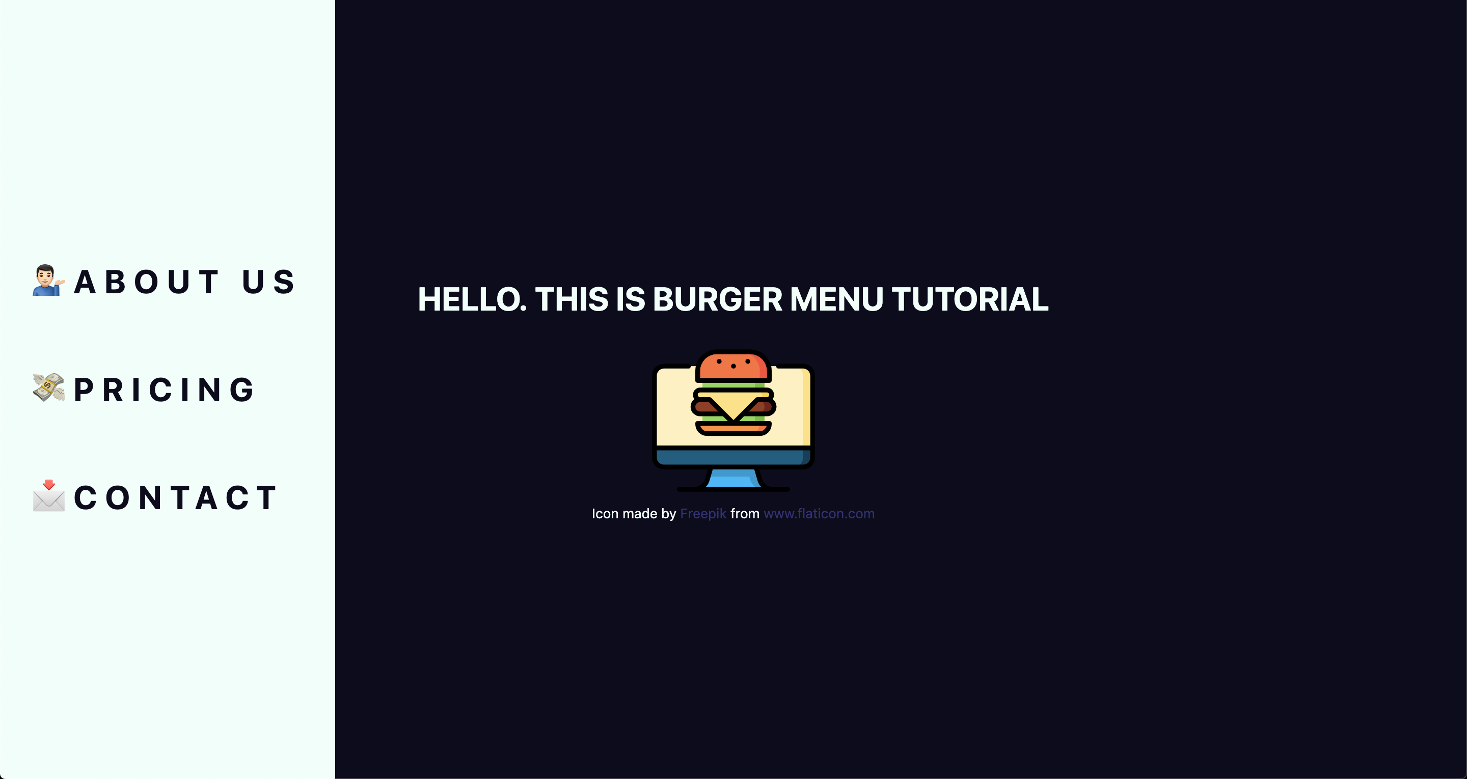
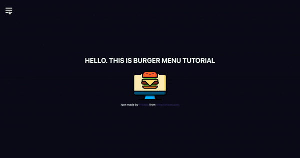
<h1>Hello. This is burger menu tutorial</h1>
<img src="https://image.flaticon.com/icons/svg/2016/2016012.svg" alt="burger icon" />
<small>Icon made by Freepik from www.flaticon.com</small>
</div>
</>
</ThemeProvider>
);
}
export default App;
Don’t forget to add the line with the small tag. That’s how we credit flaticon.comhttp://flaticon.com) authors for the provided icon.
Here’s what we’ve got up to this point:
Let me explain a little bit. We imported ThemeProvider, which is a wrapper component that uses the Context API behind the scenes to make our theme variables available to the whole component tree.
We also imported our GlobalStyles and passed them as a component to our app, which means that our application now has access to all global styles. As you can see, our GlobalStyles component is inside ThemeProvider which means we can already make some minor changes in it.
Go to global.js and change the background and color properties to use our defined variables. This helps us implement a theme rather than using fixed values that are difficult to change.
We destructure our theme from props. So, instead of writing props.theme each time, we’re using a bunch of brackets instead. I’ll repeat myself: the theme is available because we’ve wrapped our global styles with ThemeProvider.
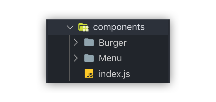
Create Burger and Menu components
Create a components folder inside the src directory and add two folders in there: Menu and Burger, plus an index.js file.
index.js will be used for one purpose: allow us to import components from one file, which is very handy, especially when you have a lot of them.
Now let’s create our components. Each folder will contain three files.
What’s up with all the files? You’ll see the benefit of a scalable structure soon enough. It worked well for me in a couple of projects, but here is good advice how to create scalable structure.
Go to the Burger folder and create Burger.js for our layout. Then add Burger.styled.js, which will contain styles, and index.js. which will exporting the file.
// index.js
export { default } from './Burger';
Feel free to style burger toggle in a way you want, or just paste these styles:
Next, let’s add the layout for the menu items that are revealed when clicking on our burger:
// Menu.js
import React from 'react';
import { StyledMenu } from './Menu.styled';
const Menu = () => {
return (
<StyledMenu>
<a href="/">
<span role="img" aria-label="about us">💁🏻‍♂️</span>
About us
</a>
<a href="/">
<span role="img" aria-label="price">💸</span>
Pricing
</a>
<a href="/">
<span role="img" aria-label="contact">📩</span>
Contact
</a>
</StyledMenu>
)
}
export default Menu;
We’ve got nice emojis here, and best practice is to make them accessible by wrapping each one in a span and adding a couple of properties: role="img" and aria-label="your label". You can read more about it here.
Time to import our new components into our App.js file:
// App.js
import React from 'react';
import { ThemeProvider } from 'styled-components';
import { GlobalStyles } from './global';
import { theme } from './theme';
import { Burger, Menu } from './components';

// ...
Let’s see, what we’ve got:
Take a look at this nice navigation bar! But we’ve got one issue here: it’s opened, and we want it initially to be closed. We only need to add one line to Menu.styled.js fix it:
// Menu.styled.js
transform: 'translateX(-100%)';
We are well on our way to calling this burger cooked! But first…
Adding open and close functionality
We want to open the sidebar when clicking the hamburger icon, so let’s get to it. Open App.js and add some state to it. We will use the useState hook for it.
// App.js
import React, { useState } from 'react';
After you import it, let’s use it inside the App component.
We set the initial state to false, because our menu should be hidden when the application is rendered.
We need both our toggle and sidebar menu to know about the state, so pass it down as a prop to each component. Now your App.js should look something like this:
// App.js
import React, { useState } from 'react';
import { ThemeProvider } from 'styled-components';
import { GlobalStyles } from './global';
import { theme } from './theme';
import { Burger, Menu } from './components';

function App() {
  const [open, setOpen] = useState(false);
  return (
    <ThemeProvider theme={theme}>
      <>
        <GlobalStyles />
        <div>
          <h1>Hello. This is burger menu tutorial</h1>
          <img src="https://media.giphy.com/media/xTiTnwj1LUAw0RAfiU/giphy.gif" alt="animated burger" />
        </div>
        <div>
          <Burger open={open} setOpen={setOpen} />
          <Menu open={open} setOpen={setOpen} />
        </div>
      </>
    </ThemeProvider>
  );
}
export default App;
Notice that we’re wrapping our components in a div. This will be helpful later when we add functionality that closes the menu when clicking anywhere on the screen.
Handle props in the components
Our Burger and Menu know about the state, so all we need to do is to handle it inside and add styles accordingly. Go to Burger.js and handle the props that were passed down:
We destructure the open and setOpen props and pass them to our StyledBurger to add styles for each prop, respectively. Also, we add the onClick handler to call our setOpen function and toggle open prop. At the end of the file, we add type checking, which is considered a best practice for aligning arguments with expected data.
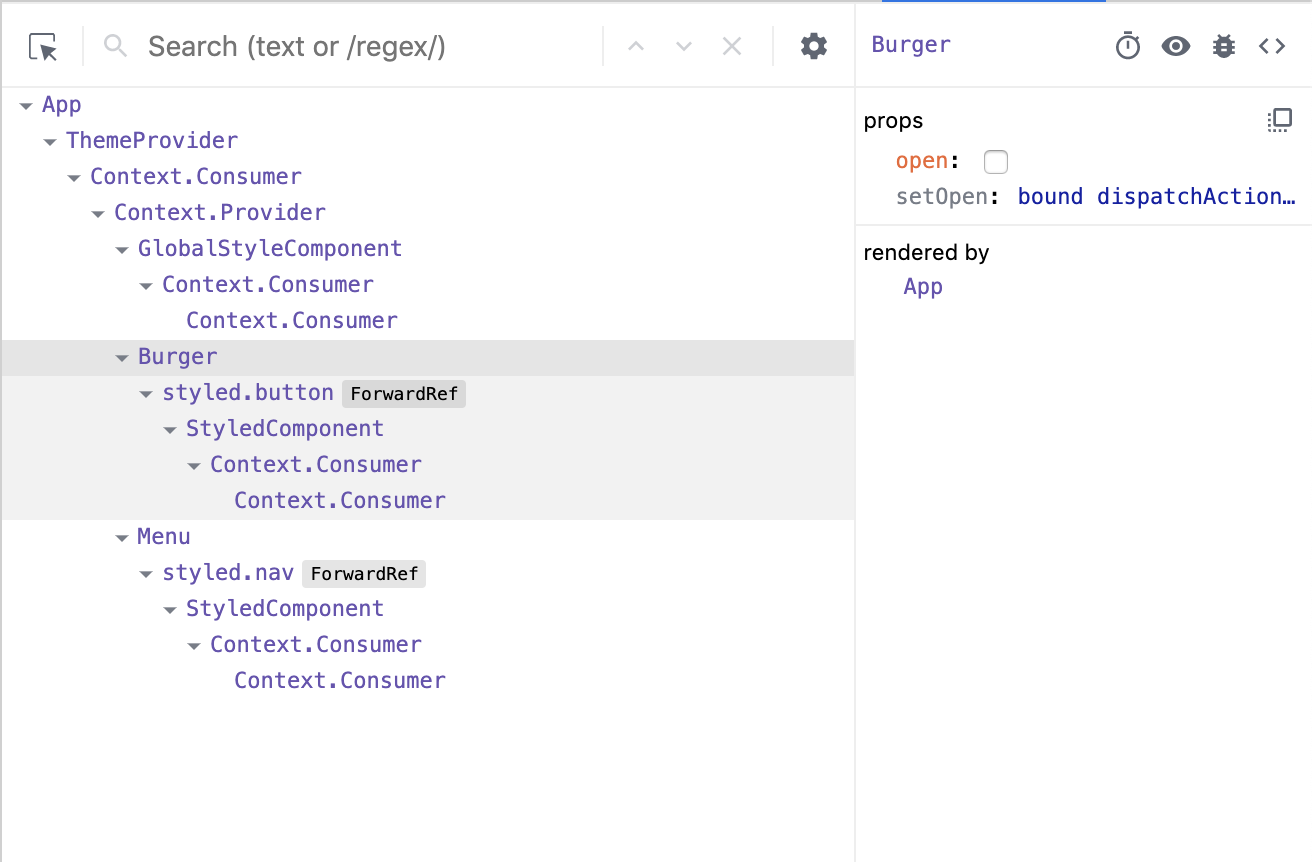
You can check whether it works or not by going to your react-dev-tools. Go to Components tab in your Chrome DevTools and click on Burger tab.
Now, when you click on your Burger component, (don’t mix it up with the tab), you should see, that your open checkbox is changing its state.
Go to Menu.js and do almost the same, although, here we pass only the open prop:
// Menu.js
import React from 'react';
import { bool } from 'prop-types';
import { StyledMenu } from './Menu.styled';
const Menu = ({ open }) => {
return (
<StyledMenu open={open}>
<a href="/">
<span role="img" aria-label="about us">💁🏻‍♂️</span>
About us
</a>
<a href="/">
<span role="img" aria-label="price">💸</span>
Pricing
</a>
<a href="/">
<span role="img" aria-label="contact">📩</span>
Contact
</a>
</StyledMenu>
)
}
Menu.propTypes = {
open: bool.isRequired,
}
export default Menu;
Next step is to pass open prop down to our styled component so we could apply the transition. Open Menu.styled.js and add the following to our transform property:
transform: ${({ open }) => open ? 'translateX(0)' : 'translateX(-100%)'};
This is checking if our styled component open prop is true, and if so, it adds translateX(0) to move our navigation back on the screen. You can already test it out locally!
Wait, wait, wait!
Did you notice something wrong when checking things out? Our Burger has the same color as the background color of our Menu, which make them blend together. Let’s change that and also animate the icon a bit to make it more interesting. We’ve got the open prop passed to it, so we can use that to apply the changes.
Open Burger.styled.js and write the following:
// Burger.styled.js
import styled from 'styled-components';
export const StyledBurger = styled.button`
  position: absolute;
  top: 5%;
  left: 2rem;
  display: flex;
  flex-direction: column;
  justify-content: space-around;
  width: 2rem;
  height: 2rem;
  background: transparent;
  border: none;
  cursor: pointer;
  padding: 0;
  z-index: 10;

  &:focus {
    outline: none;
  }

  div {
    width: 2rem;
    height: 0.25rem;
    background: ${({ theme, open }) => open ? theme.primaryDark : theme.primaryLight};
    border-radius: 10px;
    transition: all 0.3s linear;
    position: relative;
    transform-origin: 1px;

    :first-child {
      transform: ${({ open }) => open ? 'rotate(45deg)' : 'rotate(0)'};
    }

    :nth-child(2) {
      opacity: ${({ open }) => open ? '0' : '1'};
      transform: ${({ open }) => open ? 'translateX(20px)' : 'translateX(0)'};
    }

    :nth-child(3) {
      transform: ${({ open }) => open ? 'rotate(-45deg)' : 'rotate(0)'};
    }
  }
`;
This is a big chunk of CSS, but it makes the animation magic happen. We check if the open prop is true and change styles accordingly. We rotate, translate, then hide the menu icon’s lines while changing color. Beautiful, isn’t it?
Okay, folks! By now, you should know how to create a simple hamburger icon and menu, that incorporates responsiveness and smooth animation. Congratulations!
But there’s one last thing we ought to account for...
Close the menu by clicking outside of it
This part seems like a small bonus, but it’s a big UX win because it allows the user to close the menu by clicking anywhere else on the page. This helps the user avoid having to re-locate the menu icon and clicking exactly on it.
We’re going to put more React hooks to use to make this happen! Create a file in the src directory, called hooks.js and open it. For this one, we’re gonna turn to the useEffect hook, which was introduced in React 18.
// hooks.js
import { useEffect } from 'react';
Before we write the code, let’s think about the logic behind this hook. When we click somewhere on the page, we need to check whether the clicked element is our current element (in our case, that is the Menu component) or if the clicked element contains the current element (for instance, our div that wraps our menu and hamburger icon). If so, we don’t do anything, otherwise, we call a function, that we’ll name handler.
We are going to use ref to check the clicked element, and we will do so every time someone clicks on the page.
Don’t forget to return the function from useEffect. That’s so-called "clean up" and, basically, it stands for removing an event listener when the component unmounts. It is the replacement of componentWillUnmount lifecycle.
Now let’s hook up the hook
We’ve got our hook ready, so it’s time to add it to the app. Go to the App.js file, and import two hooks: the newly created useOnClickOutside and also useRef. We’ll need the latter to get a reference to the element.
// App.js
import React, { useState, useRef } from 'react';
import { useOnClickOutside } from './hooks';
To get access these in the current element, we need to get access to the DOM node. That’s where we use useRef, also, the name node perfectly reflects the point of this variable.
From there, we pass the node as a first argument. We’ll pass the function that closes our menu as a second argument.
In a perfect world, our projects would have unlimited resources and time. Our teams would begin coding with well thought out and highly refined UX designs. There would be consensus among developers about the best way to approach styling. There’d be one or more CSS gurus on the team who could ensure that functionality and style could roll out simultaneously without it turning into a train-wreck.
I’ve actually seen this happen in large enterprise environments. It’s a beautiful thing. This article is not for those people.
On the flip side of the coin is the tiny startup that has zero funding, one or two front-end developers, and a very short timeline to demonstrate some functionality. It doesn’t have to look perfect, but it should at least render reasonably well on desktop, tablet, and mobile. This gets them to a point where it can be shown to advisors and early users; maybe even potential investors who’ve expressed an interest in the concept. Once they get some cashflow from sales and/or investment, they can get a dedicated UX designer and polish the interface.
What follows is for this latter group.
Project Kickoff Meeting
Let’s invent a company to get the ball rolling.
Solar Excursions is a small travel agency aiming to serve the near-future’s burgeoning space tourism industry.
Our tiny development team has agreed that React will be used for the UI. One of our front-end developers is big on Sass, and the other is enamored with CSS in JavaScript. But they’ll be hard pressed to knock out their initial sprint goals; there’s certainly no time for arguing about the best possible styling approach. Both coders agree the choice doesn’t matter much in the long run, as long as its consistently executed. They’re certain that implementing the styling from scratch under the gun now will incur technical debt that will have to be cleaned up later.
After some discussion, the team opts to plan for one or more "styling refactor" sprints. For now, we’ll just focus on getting something up on the screen using React-Bootstrap. That way we’ll be able to quickly build working desktop and mobile layouts without much fuss.
The less time spent on front-end styling the better, because we’ll also need the UI to hook up to the services our backend developer will be cranking out. And, as our application architecture begins to take shape, both front-enders agree it’s important that it be unit tested. They have a lot on their plate.
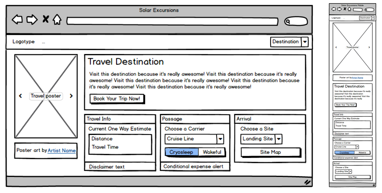
Based on my discussions with the Powers That Be, as a dedicated project manager, I slaved over Balsamiq for at least ten minutes to provide the team with mockups for the booking page on desktop and mobile. I assume they’ll make tablet meet in the middle and look reasonable.
Initial mockups for the Solar Excursions Trip Booking Page on desktop (left) and mobile (right).
Sprint Zero: Review Meeting
Pizza all around! The team worked really hard to hit its goals, and we now have a booking page with a layout that approximates the mockups. The infrastructure for services is coming together, but there’s quite a way to go before we can connect the UI to it. In the interim, the front-enders are using a hardcoded mock data structure.
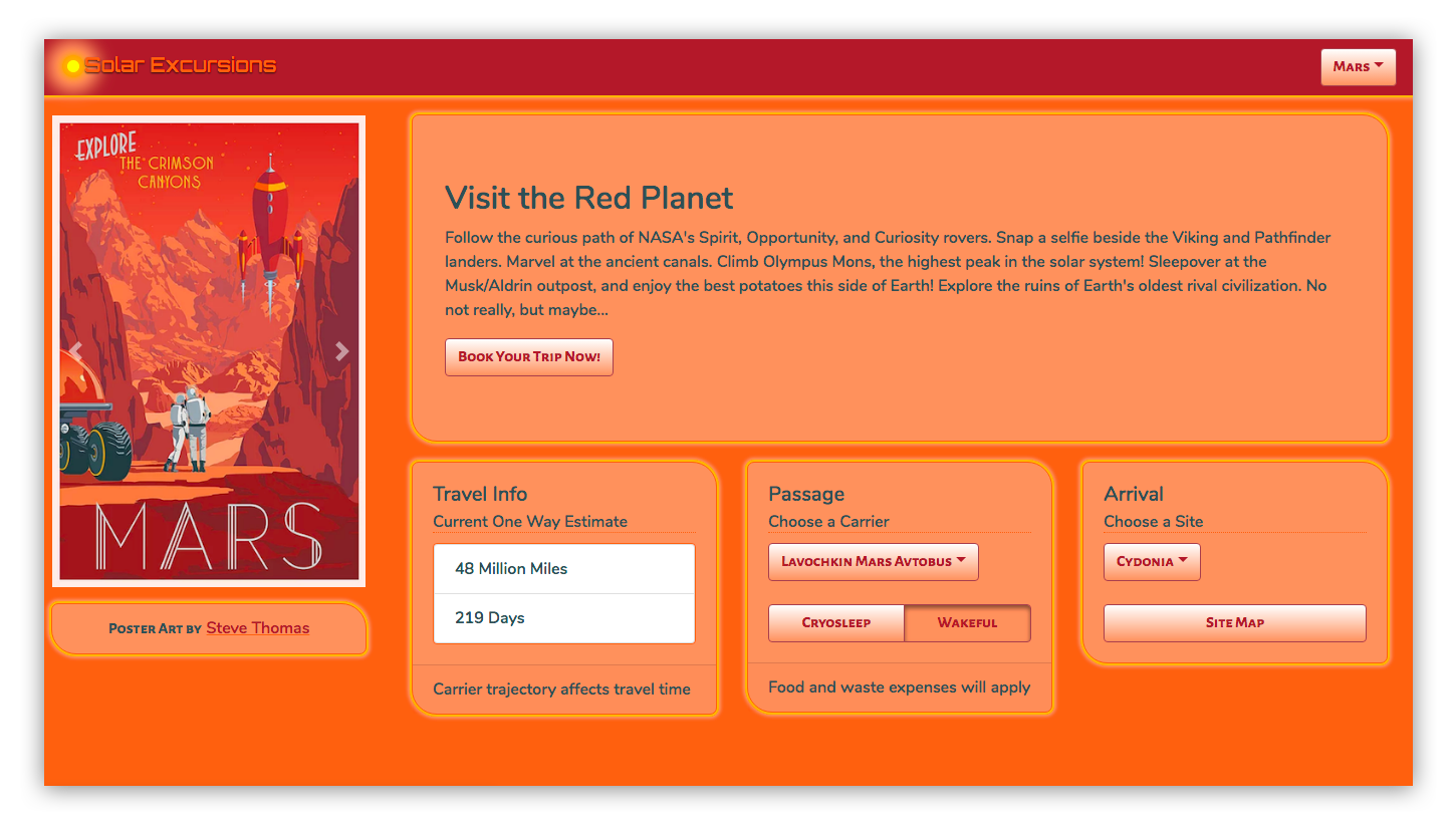
The first iteration of the page in code using react-bootstrap.
Here’s a look at our UI code so far:
This is all straightforward React. We’re using some of that Hooks hotness, but it’s probably passé to most of you by now.
The key takeaway to notice here is how four of our five application components import and use components from react-bootstrap. Only the main App component is unaffected. That’s because it just composes the top level view with our custom components.
// App.js imports
import React, { useState } from "react";
import Navigation from "./Navigation";
import Page from "./Page";

// Navigation.js imports
import React from "react";
import { Navbar, Dropdown, Nav } from "react-bootstrap";

// Page.js imports
import React from "react";
import PosterCarousel from "./PosterCarousel";
import DestinationLayout from "./DestinationLayout";
import { Container, Row, Col } from "react-bootstrap";

// PosterCarousel.js imports
import React from "react";
import { Alert, Carousel, Image } from "react-bootstrap";

// DestinationLayout.js imports
import React, { useState, useEffect } from "react";
import {
  Button,
  Card,
  Col,
  Container,
  Dropdown,
  Jumbotron,
  ListGroup,
  Row,
  ToggleButtonGroup,
  ToggleButton
} from "react-bootstrap";
The decision to move fast with Bootstrap has allowed us to hit our sprint goals, but we’re already accumulating technical debt. This is just four affected components, but as the application grows, it’s clear the "styling refactor" sprints that we planned for are going to become exponentially harder. And we haven’t even customized these components much. Once we have tens of components, all using Bootstrap with lots of inline styling to pretty them up, refactoring them to remove react-bootstrap dependencies will be a scary proposition indeed.
Rather than building more of the booking pipeline pages, the team decides that we’ll spend the next sprint working to isolate the react-bootstrap usage in a custom component kit since our services are still under construction. Application components will only use components from this kit. That way, when it comes time to ween ourselves from react-bootstrap, the process will be much easier. We won’t have to refactor thirty usages of the react-bootstrap Button throughout the app, we’ll just rewrite the internals of our KitButton component.
Sprint One: Review Meeting
Well, that was easy. High-fives. No change to the visual appearance of the UI, but we now have a "kit" folder that’s sibling to "components" in our React source. It has a bunch of files like KitButton.js, which basically export renamed react-bootstrap components.
An example component from our kit looks like this:
We wrap those all kit components up into a module like this:
// kit/index.js
import { KitCard } from "./KitCard";
import { KitHero } from "./KitHero";
import { KitList } from "./KitList";
import { KitImage } from "./KitImage";
import { KitCarousel } from "./KitCarousel";
import { KitDropdown } from "./KitDropdown";
import { KitAttribution } from "./KitAttribution";
import { KitNavbar, KitNav } from "./KitNavbar";
import { KitContainer, KitRow, KitCol } from "./KitContainer";
import { KitButton, KitToggleButton, KitToggleButtonGroup } from "./KitButton";
export {
  KitCard,
  KitHero,
  KitList,
  KitImage,
  KitCarousel,
  KitDropdown,
  KitAttribution,
  KitButton,
  KitToggleButton,
  KitToggleButtonGroup,
  KitContainer,
  KitRow,
  KitCol,
  KitNavbar,
  KitNav
};
And now our application components are completely free of react-bootstrap. Here are the imports for the affected components:
// Navigation.js imports
import React from "react";
import { KitNavbar, KitNav, KitDropdown } from "../kit";


// Page.js imports
import React from "react";
import PosterCarousel from "./PosterCarousel";
import DestinationLayout from "./DestinationLayout";
import { KitContainer, KitRow, KitCol } from "../kit";


// PosterCarousel.js imports
import React from "react";
import { KitAttribution, KitImage, KitCarousel } from "../kit";


// DestinationLayout.js imports
import React, { useState, useEffect } from "react";
import {
  KitCard,
  KitHero,
  KitList,
  KitButton,
  KitToggleButton,
  KitToggleButtonGroup,
  KitDropdown,
  KitContainer,
  KitRow,
  KitCol
} from "../kit";
Here’s the front-end codebase now:
Although we’ve corralled all of the react imports into our kit components, our application components still rely a bit on the react-bootstrap implementation because the attributes we place on our kit component instances are the same as those of react-bootstrap. That constrains us when it comes to re-implementing the kit components, because we need to adhere to the same API. For instance:
// From Navigation.js
<KitNavbar bg="dark" variant="dark" fixed="top">
Ideally, we wouldn’t have to add those react-bootstrap specific attributes when we instantiate our KitNavbar.
The front-enders promise to refactor those out as we go, now that we’ve identified them as problematic. And any new references to react-bootstrap components will go into our kit instead of directly into the application components.
Meanwhile, we’ve shared our mock data with the server engineer, who is working hard to build separate server environments, implement the database schema, and expose some services to us.
That gives us time to add some gloss to our UI in the next sprint — which is good because the Powers That Be would like to see separate themes for each destination. As the user browses destinations, we need to have the UI color scheme change to match the displayed travel poster. Also, we want to try and spiff up those components a bit to begin evolving our own look and feel. Once we have some money coming in, we’ll get a designer to do a complete overhaul, but hopefully we can reach a happy medium for our early users.
Sprint Two: Review Meeting
Wow! The team really pulled out all the stops this sprint. We got per-destination themes, customized components, and a lot of the lingering react-bootstrap API implementations removed from the application components.
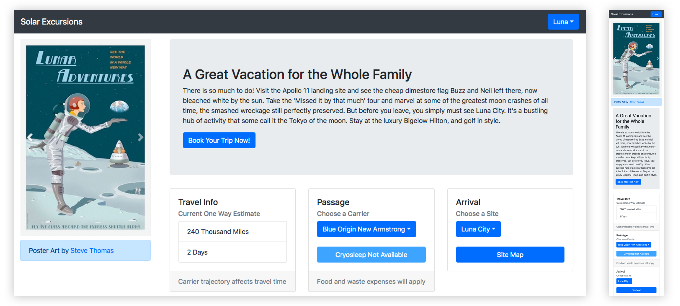
Here’s what the desktop looks like now:
Check out the solarized theme for the red planet!
In order to pull this off, the front-enders brought in the Styled Components library. It made styling the individual kit components a breeze, as well as adding support for multiple themes.
Let’s look at a few highlights of their changes for this sprint.
First, for global things like pulling in fonts and setting the page body styles, we have a new kit component called KitGlobal.
It uses the createGlobalStyle helper to define the CSS for the body element. That imports our desired web fonts from Google, sets the background color to whatever the current theme’s "foreground" value is, and turns off overflow in the x-direction to eliminate a pesky horizontal scrollbar. We use that KitGlobal component in the render method of our App component.
Also in the App component, we import ThemeProvider from styled-components, and something called "themes" from ../theme. We use React’s useState to set the initial theme to themes.luna and React’s useEffect to call setTheme whenever the "destination" changes. The returned component is now wrapped in ThemeProvider, which is passed "theme" as a prop. Here’s the App component in its entirety.
KitGlobal is rendering like any other component. Nothing special there, only that the body tag is affected. ThemeProvider is using the React Context API to pass theme down to whatever components need it (which is all of them). In order to fully understand that, we also need to take a look at what a theme actually is.
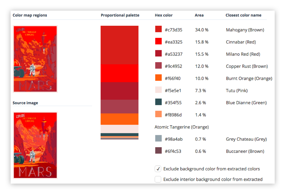
To create a theme, one of our front-enders took all the travel posters and created palettes for each by extracting the prominent colors. That was fairly simple.
Obviously, we weren’t going to use all the colors. The approach was mainly to dub the most used two colors foreground and background. Then we took three more colors, generally ordered from lightest to darkest as accent1, accent2, and accent3. Finally, we picked two contrasting colors to call text1 and text2. For the above destination, that looked like:
Once we have a theme for each destination, and it is being passed into all the components (including the kit components that our application components are now built from), we need to use styled-components to apply those theme colors as well as our custom visual styling, like the panel corners and "border glow."
This is a simple example where we made our KitHero component apply the theme and custom styles to the Bootstrap Jumbotron:
Then there are more complex cases where we want to preset some attributes on the react-bootstrap component. For instance, the KitNavbar component which we identified earlier as having a bunch of react-bootstrap attributes that we’d rather not pass from the application’s declaration of the component.
First, we create a component called StyledBootstrapNavbar using styled-components. We were able to handle some of the attributes with the CSS we passed to styled-components. But in order to continue leveraging (for now) the reliable stickiness of the component to the top of the screen while everything else is scrolled, our front-enders elected to continue using react-bootstrap’s fixed attribute. In order to do that, we had to create a KitNavbar component that rendered an instance of StyledBootstrapNavbar with the fixed=top attribute. We also passed through all the props, which includes its children.
We only have to create a separate class that renders styled-component’s work and passes props through to it if we want to explicitly set some attributes in our kit component by default. In most cases, we can just name and return styled-component’s output and use it as we did with KitHero above.
Now, when we render the KitNavbar in our application’s Navigation component, it looks like this:
Finally, we took our first stabs at refactoring our kit components away from react-bootstrap. The KitAttribution component is a Bootstrap Alert which, for our purposes, is little more than an ordinary div. We were able to easily refactor to remove its dependency on react-bootstrap.
This is the component as it emerged from the previous sprint:
After three sprints, our team is well on its way to having a scalable component architecture in place for the UI.
We are moving quickly thanks to react-bootstrap, but are no longer piling up loads of technical debt as a result of it.
Thanks to styled-components, we were able to implement multiple themes (like how almost every app on the Internet these days sports dark and light modes). We also don’t look like an out-of-the-box Bootstrap app anymore.
By implementing a custom component kit that contains all references to react-bootstrap, we can refactor away from it as time permits.
Such a fragmented ecosystem was far from appealing. Which one should you pick, (if any)?
Contributing to Javascript fatigue — you need at most one. Also feel free to not learn any.
GitHub stars are one useful metric:
However, GitHub stars say nothing about a project’s trajectory — perhaps they were accumulated long ago and the repo has since fallen out of favor or is no longer maintained. Glamor has plenty of open issues, and hasn’t seen a commit in over a year. Its author advises:
...it mostly works, I'm not going to do any major changes… if you need something more modern, I'd recommend emotion, it mostly matches glamor's api, and is actively maintained.
The similarly named Glamorous was recently deprecated with its author also recommending users switch to Emotion:
At the time, Emotion had some features that Styled Components didn’t. Since then, Styled Components has made some big announcements.
Styled Components sells itself as the CSS-in-JS library for people that *like* CSS. Styled Components gained popularity by utilizing tagged template literals — allowing developers to *just write CSS* in the same syntax they already know, but inside JavaScript files. While this has proven popular, some developers prefer to [write styles as JavaScript objects. Emotion offered flexibility — developers could choose how to write their styles. Styled Components eventually followed suit.
styled-components v3.3.0 is out with first-class object support! 😍
Lots of people have been asking for this, your wishes have been heard! Shoutout to @probablyup for taking care of this release.
The rival CSS-in-JS libraries have stolen from each other until landing upon the same feature set and the same syntax — Emotion and Styled Components have an almost identical API. What once felt like a total mess of competing methodologies and libraries now feels somewhat stable. Even if CSS-in-JS hasn’t standardized on a dependency, it now has standardized a way of doing things — they’re just implemented differently:
Internally, quite a bit. SC has a lot of complexity around organizing style tag order. Re css prop: SC requires Babel plugin and uses the entire SC custom component creation. Emotion will skip the custom component if it can and just renders the element with the className directly
Styled Components is by far the most popular CSS-in-JS library, but Emotion has seen a rapid increase in usage.
Both are used by some major companies. Styled Components are utilized by plenty of large companies, including Bloomberg, Atlassian, Reddit, Target, BBC News, The Huffington Post, Coinbase, Patreon, Vogue, Ticketmaster, Lego, InVision and Autodesk just to name a few.
Emotion boasts fewer recognizable names, but has been recently adopted by the New York Times.
Great article about the launch of our new Story designs on the NYT today. It mentions our Shared Components initiative - would have been impossible without Emotion / CSS-in-JS. Absolute game-changer. Living in the future. https://t.co/pZLDJjsbEr
While these libraries certainly do seem to be most popular amongst React users, they can be used with other frameworks. While they seem to have converged on the same features at last, it’s difficult to say whether this is the end point of CSS-in-JS, or whether we’ll see a continued evolution from here.