In Praise of Shadows

Our dear friend Robin has a new essay called In Praise of Shadows. Now, before you hop over there looking for nuggets on CSS box shadows, text shadows, and shadow filters… this is not that. It’s an essay on photography and what Robin has learned about handing shadows with a camera.

So, why share this? Because it’s cool as heck that he made an article directed page dedicated to one essay. And you’ll learn a lot about CSS if you crack open DevTools on it:

  • Centering techniques. Notice how CSS Grid is used on the <body> simply to center the pamphlet. Then Robin reaches for it again on each .frame of the essay to do the same thing with the content.
  • “Faux” background images. Robin could have made a lot of work for himself by creating a CSS class for each .frame to get the background images. Instead, he uses object-fit: cover on inlined HTML <img>s to maintain the aspect ratio while filling the .frame container. (He’s actually written about this before.) That sure saves a lot of CSS’ing, but it also allows him to use alt text if needed. I sorta wonder if a <figure>/<figcaption> structure could’ve worked here instead but I doubt it would provide much additional benefit for what’s going on.
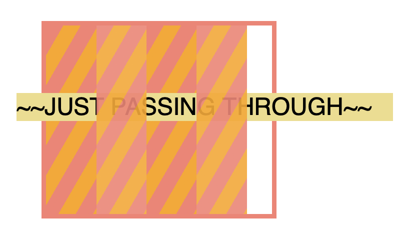
  • Stacking contexts. Another perk of those faux background images? They use absolute positioning which creates a stacking context, allowing Robin to set a z-index: 0 on the images. That way, the text stacks directly on top with z-index: 1. Again, CSS Grid is handling all the centering so things are nicely aligned.
  • Scroll snapping. I always love it when I see CSS scroll snapping in the wild. Robin made a nice choice to use it here, as it really lends to the whole page-turning experience while scrolling through frames. Horizontal scrolling can be maddening, but also extremely elegant when executed well as it is here in how it enhances the narrow-column design. If you want a nice explanation of how it all works, Robin has also written about horizontal scroll snapping.

If nothing else, Robin is an excellent writer and it’s worth reading anything he publishes, CSS and beyond.

To Shared LinkPermalink on CSS-Tricks


In Praise of Shadows originally published on CSS-Tricks. You should get the newsletter.

It’s always the stacking context.

In “What the heck, z-index??,” Josh Comeau makes the analogy of layer groups in design software like Photoshop or Figma to stacking contexts in CSS. If you’ve got an element in a layer group A in Photoshop that is below layer group B, there is nothing you can do to push a child of A on top of anything in B, aside from moving the whole layer group A above B, or getting rid of the groupings.

Nothing is going to put that moustache on top of the dog unless you get it out of that stacking context or move the whole stacking context.

Here’s a reduced case:

There is no z-index value that is going to get “Big Thing” on top of the tan <main> element there. But as Josh notes in the article, there are a variety of solutions, such as preventing a stacking context from triggering unnecessarily, or doing a little DOM shuffling to make things work. Like in the example above, “Big Thing” doesn’t need to be a child of the header — and if it wasn’t, the stacking context wouldn’t be as relevant.

If you’re a fan of your tools helping you diagnose this kind of thing, read to the bottom of Josh’s article for a few interesting ones.

Direct Link to ArticlePermalink


The post It’s always the stacking context. appeared first on CSS-Tricks.

You can support CSS-Tricks by being an MVP Supporter.

CSS Painting Order

Usually, when I see terms like “painting order” or “stacking context” my brain will start to shut off and my eyes will gloss over. Not that my brain doesn’t normally shut off more often than not, but that’s another topic for another time.

Martin Robinson over at Igalia touches on these concepts using an example that’s pretty easy to grok, even for me. He starts with two boxes that overlap with negative margins.

Then he introduces a third box that’s a child of the green box. The green box is given a z-index of -1. As you might expect, both the green and yellow boxes stack below the blue box.

Here’s where my brain started melting. If the z-index of the green box stays the same at -1 but we give it’s child a massive value, say 1,000, things look… exactly the same.

I’m sure many of you can already guess (or simply flat out know) why the blue box stays on top, even though changing the yellow box’s z-index implies it should be on top instead, but I sure didn’t. Martin found the technical answer in the CSS2 specification buried deep down in Appendix E, which he graciously linked up — otherwise, I’m sure I’d never have found it.

We learn from the Appendix E that a stacking context is an atomically painted collection of page items. What does this mean? To put it simply, it means that things inside a stacking context are painted together, as a unit, and that items outside the stacking content will never be painted between them. Having an active z-index is one of the situations in CSS which triggers the creation of a stacking context. Is there a way we can adjust our example above so that the third element belongs to the same stacking context as the first two elements? The answer is that we must remove it from the stacking context created by the second element.

So, yeah. As long as the yellow box is a child of the green box, the two form a stacking context that the blue box has no part of. Getting yellow above blue requires removing it from blue’s stacking context.

That’s the crux of Martin’s post, but he takes it even further and it’s worth heading over there. If you do, you’ll see how stacking order leads to some bonafide CSS tricks.

It’s not the first time we’ve linked up proof that z-index is not a level playing field so I’m going to try to commit this to memory the next (and inevitable) time I wrestle with stacking elements.

Direct Link to ArticlePermalink


The post CSS Painting Order appeared first on CSS-Tricks.

You can support CSS-Tricks by being an MVP Supporter.