But let’s talk boxes instead of text. Say we have two simple divs:
<div>Twiddle Dee</div>
<div>Twiddle Dum</div>
Those are block-level so they’re already on different lines. We can reach for margin again. Or we could create the impression of space with padding. I suppose we could translate those suckers in either direction:
Then we do a head fake and insert a hard transparent color stop between the two colors:
As long as we’re fakin’ bacon here, might as well toss in the ol’ “transparent” border trick:
Let’s go back to text for a moment. Maybe we’re floating an element and want text to wrap around it… in the shape of the floated element while leaving some space between the two. We have shape-margin for that:
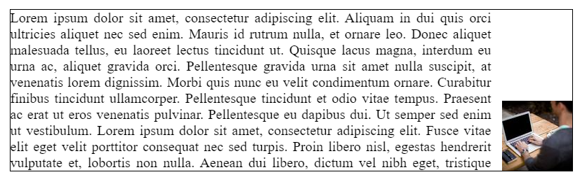
Need to lay out an element to the right or the left, such that text wraps around it? That’s an easy task for the float property. But what about if you also want to push that element (let’s call it an image) to one of the bottom corners while we’re at it? Sounds a bit tricky, right? We probably need JavaScript?
Nope, few lines of (tricky) CSS can do it! Here’s the CSS-only solution that will make your image to stick to the bottom corner, regardless of the size and content.
Resize the wrapper element and see the magic at work:
Let’s dissect the code.
Markup and layout
We’ll need a wrapper element to contain everything, and we’ll be using flexbox on it. Flexbox allows us to rely on the default stretch alignment to be able to later use height: 100%.
The .box within the .wrapper is our flex item. We don’t need any particular CSS applied to the box. It defines the height of the wrapper and, at the same time, is stretched to the same height. This behavior will give us a “reference height” that can be used by the child elements.
If the flex item has align-self: stretch, redo layout for its contents, treating this used size as its definite cross size so that percentage-sized children can be resolved.
The keyword is the definite which allows us to safely use a percentage (%) height inside the box element.
Now for the floated element
Our .float element will take theentireheight next to the text content, thanks to the height calculation we detailed above. Inside this element we push the image to the bottom using flexbox alignment.
The image is floated to the right but the free space above it prevents the content from wrapping around it.
The shape-outside CSS property defines a shape—which may be non-rectangular—around which adjacent inline content should wrap. By default, inline content wraps around its margin box; shape-outside provides a way to customize this wrapping, making it possible to wrap text around complex objects rather than simple boxes.
In other words, shape-outside sets the way content flows around an element’s bounding box.
It takes a number of values. One of those is the inset() function which, again, according to MDN:
Defines an inset rectangle. When all of the first four arguments are supplied they represent the top, right, bottom and left offsets from the reference box inward that define the positions of the edges of the inset rectangle.
So, with shape-outside: inset(calc(100% - X) 0 0) we can create an inset rectangle that starts exactly at the top of the image. And the top is equal to 100% - X, where X is the image height and 100% is the height of the .float element. This allows the text to wrap within the free space on the top of the image. This is responsive, plus we can easily switch between left and right (by adjusting the float property)
That’s it! The only major caveat is that you need to know the image height.
Want more?
We can extend this concept a little further to account for fancier situations. For example, we can float the image to the right, but pin it to the middle of the box with justify-content: center: and also adjust our inset rectangle to the middle by changing the shape-outside from inset(calc(100% - X) 0 0) to inset(calc(50% - X/2) 0 0)
We can also float two images at both bottom corners:
Nothing complex here. I am simply using the same floating element twice, once on the right, and again on the left. And why stop at two corners when we can place images at all four corners:
The same basic idea is at play here, but we’re are also relying on the common float feature for the top images. However, you’ll notice that this is where the concept starts to break down a bit, and we get some unwanted overflow depending on the size of the containing box. We can make the height of the .float element greater than 100% and apply somewhat “magic numbers” that smooth things out by adjusting the padding and margin of the images.
Did you know that shape-outside accepts radial-gradient() as a value? We can use that to place rounded images like below:
The transparent part of the gradient is the free space where the text can go. You may have noticed that we applied a border-radius to the image as well. The shape-outside property will simply affect the .float element and we need to manually adjust the shape of the image to follow the shape defined by shape-outside.
While we’re at it, let’s combine this with our earlier example that pins the image to the vertical center of the box using justify-content: center:
Another radial-gradient() and also another border-radius configuration.
We could have used a linear-gradient() instead to make a triangular shape for the wrapping area:
This is the same idea that we used for the radial-gradient(). The big difference is that we’re using clip-path instead of border-radius to cut our image.
And, since we did it for the others, let’s use the justify-content: center idea to pin the image to the vertical center of the box’s right edge:
We used a conic-gradient() in the above demo with shape-outside to define the triangular shape and clip-path to get a similar shape on the image
All of these examples can still be optimized using less of code in the case that the image is decorative (when it’s not needed inside the HTML for SEO purposes). Let’s replace the .float element with a pseudo-element and apply the image as background instead:
We’re using mask to show just the portion of the image that we need and, guess what, it uses the same value as shape-outside! So, all we had to do is define one value for the shape.
That’s it!
There are a lot of possibilities here to place not just rectangles in corners, but any kind of shape at any position, using largely the same code structure. We only need to:
Adjust the shape-outside property to define the shape
Apply some styling to the image to follow the previously defined shape or apply the same value to mask in case we are using the pseudo element version
Then everything holds it place, even in responsive designs.
You want to set some text inside the shape of a circle with HTML and CSS? That’s crazy talk, right?
Not really! Thanks to shape-outside and some pure CSS trickery it is possible to do exactly that.
However, this can be a fiddly layout option. We have to take lots of different things into consideration, like character count, word count, typeface variations, font sizing, font formatting, and responsive requirements to name a few. One size, does not fit all here. But hey, let’s do it anyway.
Here’s the goal: we want to display a <blockquote> and an author citation inside a circle shape. We also want to make the layout as flexible as we can. This layout won’t require any additional files and keeps the HTML markup squeaky clean.
This is what we’re striving for:
The shape-outside feature is not supported in Internet Explorer or Microsoft Edge 18 and below at the time of this writing.
First up, the HTML
We’re going to end up needing a wrapper element to pull this off, so let’s use the semantic <blockquote> as the inner element. The outside wrapper can be a div:
<div class="quote-wrapper">
  <blockquote class="text" cite="http://www.inspireux.com/category/quotes/jesse-james-garrett/">
    <p>Experience design is the design of anything, independent of medium, or across media, with human experience as an explicit outcome, and human engagement as an explicit goal.</p>
    <footer>– Jesse James Garrett</footer>
  </blockquote>
</div>
If you’re interested in a deep-dive on the HTML of quotes, you’re in luck. We’re going to set the quote itself in a <p> and the name of the author inside a <footer>. We’ve got class names for the CSS styling hooks we’ll need.
Next, some baseline CSS
Let’s start with the div wrapper. First, we’ll set the minimum (responsive) square size at 300px so it fits on smaller screens. then, we’ll add relative positioning (because we will need it later).
Now we’ll make the blockquote fill the whole wrapper and fake a circle shape with a radial gradient background. (That’s right, we are not using border-radius in this example).
One thing to note is that 70% displays a much rougher edge. I manually added very small percentage increments and found that 70.3% looks the smoothest.
Notice the edge on the right is much smoother than the edge on the left.
Now we have our base circle in place. Add these additional style rules to .text.
Let’s use the blockquote’s ::before pseudo-element to create our shaping. This is where the shape-outside property comes into play. We plot out the polygon() coordinates and float it to the left so the text wraps inside the shape.
Let’s change the radial background color to red. The path editor polygon points and connecting lines are also blue. We are changing this color temporarily for greater contrast with the editor tool.
I like Firefox’s developer tools because it has super handy features like a shape-outsidepath editor. Click on the polygon shape in the inspector to see the active shape in the browser window. Big thumbs up to the Mozilla dev team for creating a very cool interface!
Those points along the shape are from Firefox’s editing tool.
We can do the same sort of thing for the paragraph’s ::before pseudo-element. We use the shape-outside to make the same polygon, in reverse, then float it to the right.
Looking good, but where did the footer go? It overflowed the <blockquote> (where the circular colored background is), so we’re unable to see that white text on a white background.
Styling the footer
Now we can style the <footer> and give it an absolute position to bring it back on top of the circle.
Again, feel free to change the background color to suit your needs.
This is where the fiddly part comes in. The text itself needs to be styled in such a way that the number of words and characters work inside the shape. I used these CSS rules to help make it fit nicely:
font-size
shape-margin (we have two exclusion areas to adjust)
line-height
letter-spacing
font-weight
font-style
min-width and min-height (to size of the .quote-wrapper container)
Adding the quote mark for some flourish
Did you see the giant quotation mark in the original demo? That’s what we want to make next.
We’ll take advantage of the ::before pseudo-element for .quote-wrapper. Yet again, this will take a fair amount of fiddling to make it look right. I found line-height has a huge effect on the mark’s vertical position.
There’s actually a difference between curly (“smart”) quote marks and straight (dumb) ones. I’d suggest using curly quote marks for dialogue and straight quote marks for coding.
Handling responsive styles
We should probably make our quote bigger on larger screens. I’m setting a breakpoint at 850px, but you may want to use something different.
We set HTML text inside a circular shape using a combination of old and new CSS techniques to make an appealing <blockquote> that commands attention. And we achieved our display goal without any additional dependencies, while still keeping the HTML markup clean and semantic.
I hope this article encourages you to explore new layout possibilities with shape-outside. Stay tuned for shape-inside.
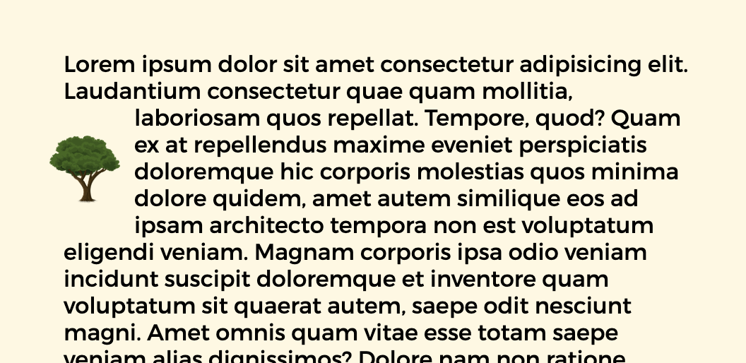
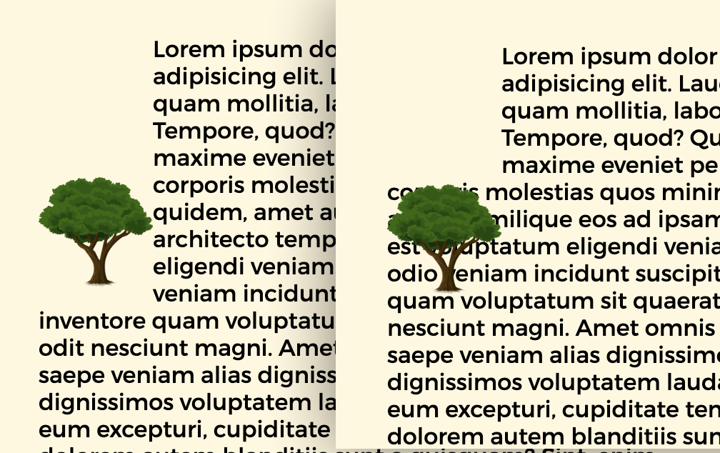
Say you want to have an image (or any other element) visually float left into a paragraph of text. But like... in the middle of the paragraph, not right at the top. It's doable, but it's certainly in the realm of CSS trickery!
One thing you can do is slap the image right in the middle of the paragraph:
<p>
  Lorem ipsum dolor sit amet consectetur, adipisicing
  <img src="tree.jpg" alt="An oak tree." />
  elit. Similique quibusdam aliquam provident suscipit
  corporis minima? Voluptatem temporibus nulla
</p>
But that's mega awkward. Note the alt text. We can't have random alt text in the middle of a sentence. It's semantically blech and literally confusing for people using assistive technology.
So what we have to do is put the image before the paragraph.
<img src="tree.jpg" alt="An oak tree." />

<p>
  Lorem ipsum dolor sit amet consectetur, adipisicing
  elit. Similique quibusdam aliquam provident suscipit
  corporis minima? Voluptatem temporibus nulla
</p>
But when we do that, we aren't exactly floating the image in the middle of the paragraph anymore. It's right at the top. No margin-top or vertical translate or anything is going to save us here. margin will just extend the height of the floated area and translate will push the image into the text.
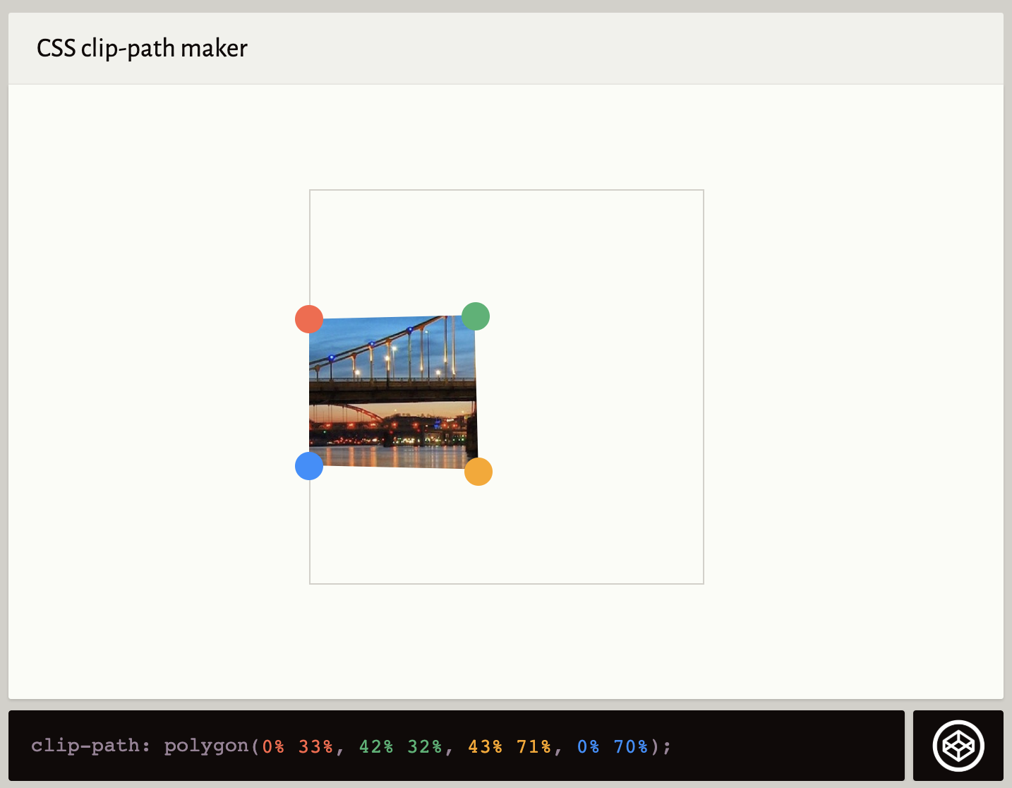
The trick, at least one I've found, is to leverage shape-outside and a polygon() to re-shape the floated area around where you want it. You can skip the top-left part. Using Clippy is a great way to get a start to the polygon:
But instead of the clip-path Clippy gives you by default, you apply that value to shape-outside.
That should be enough if you are just placing a box in that place. But if it's literally an image or needs a background color, you might also need to apply clip-path and perhaps transform things into place. This is where I ended up with some fiddling.
It sometimes takes a quick 35 seconds for a concept to really sink in. Mikael Ainalem delivers that here, in the case that you haven't quite grokked the concepts behind path-based CSS properties like clip-path and shape-outside.
Here are two of my favorites. The first demonstrates animating text into view using a polygon as a clip.
The second shows how the editor can help morph one shape into another.
Codrops has a very nice article on CSS Shapes from Tania Rascia. You might know shape-outside is for redefining the area by which text is floated around that element, allowing for some interesting design opportunities. But there are a couple of genuine CSS tricks in here:
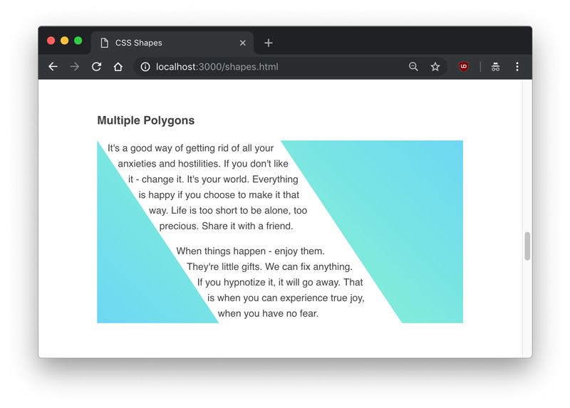
Float shape-outside elements both right and left to get text to flow between them.
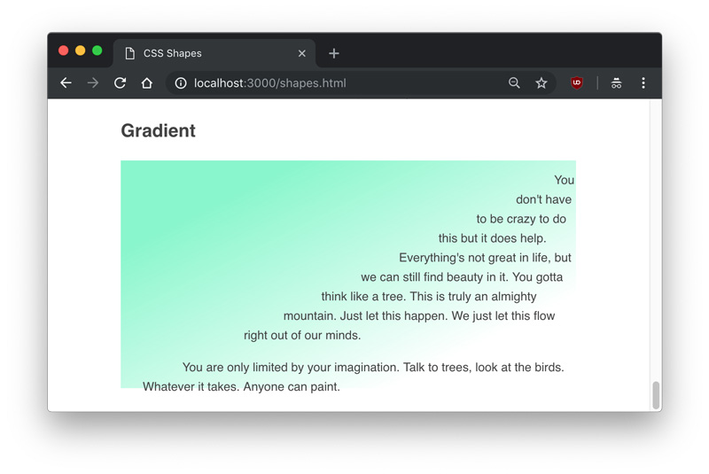
You can set shape-outside to take an image and use shape-image-threshold to adjust where the text flows, meaning you could even use a gradient!
Shapes are in the water recently, as Heydon Pickering recently published a short video on using them. He also covers things like clip-path and canvas and such:
When we talk about CSS shapes, it's almost like we're talking about values moreso than properties. What I mean is that the value functions like polygon(), circle(), ellipse(), offset(), path(), etc. are more representative of "CSS shapes" than the properties they are applied to. Multiple properties take them, like shape-outside, clip-path, and offset-path.