Rough Pixels Releases Empt Lite, a Block-Supported Freemium WordPress Theme

Single blog post view when using the Empt Lite WordPress theme.
Single post view.

Empt Lite, the latest theme by Rough Pixels, landed in the WordPress theme directory today. Like most of the company’s prior work, the design is on par with the best free themes currently available.

I have come to disregard that icky feeling whenever I see “Lite” attached to a theme name, at least when it falls under the Rough Pixels brand. The company does not deal in the stripped-down lite themes I wrote about a couple of weeks ago. Empt Lite is one of those rare themes that does not downgrade the experience with the free version. Most additional features in the pro version seem to be value-adds for users who need something extra. There is almost an honesty to it. Users can get a feel for the theme quality before deciding to hand over money for the commercial version.

Some pro features probably do not make sense as an upsell in the long run. WordPress’s upcoming Full Site Editing (FSE) could make them obsolete. For example, an option for customizing archive titles will be easy to accomplish in the site editor. An “about me” widget will not be a great upsell a year from now. However, custom patterns for an “about me” section might make more sense.

This is assuming the theme developer goes down the block-based theme path in the months to come. Looking at theme releases in 2021 needs to be done with an eye toward how they might function in an FSE world. This includes what freemium-based theme companies are upselling. Some will likely need to change tactics in time.

The one missing feature that I would like to see Rough Pixels include in this theme and others is custom block patterns. They are already covering all of their bases with block editor styles. Now that patterns have been in WordPress since version 5.5, it is time to keep building on the work already in place. This is also an opportunity to transition toward selling design-based upgrades. Put together some custom pattern packages and see what type of feedback customers provide.

Theme Features

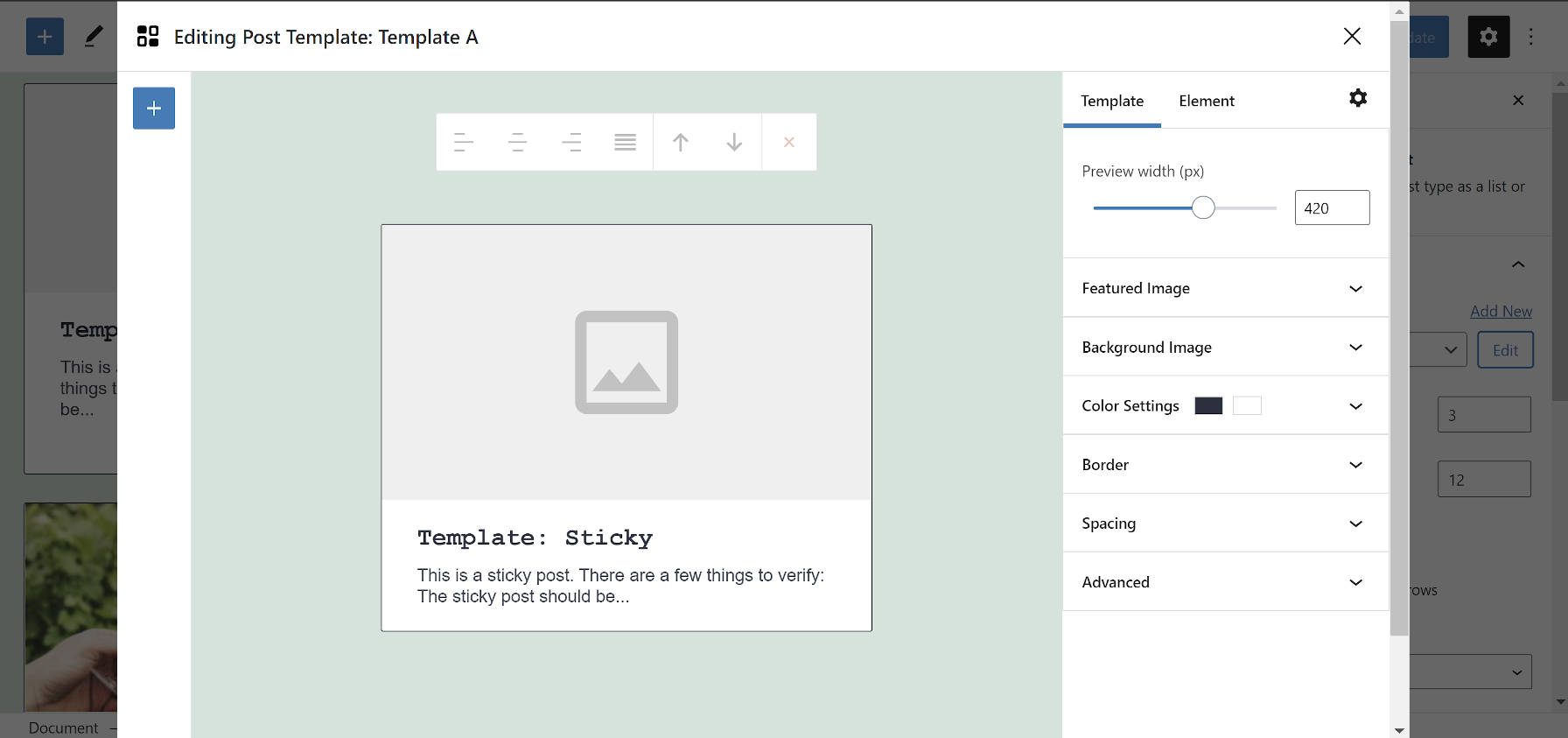
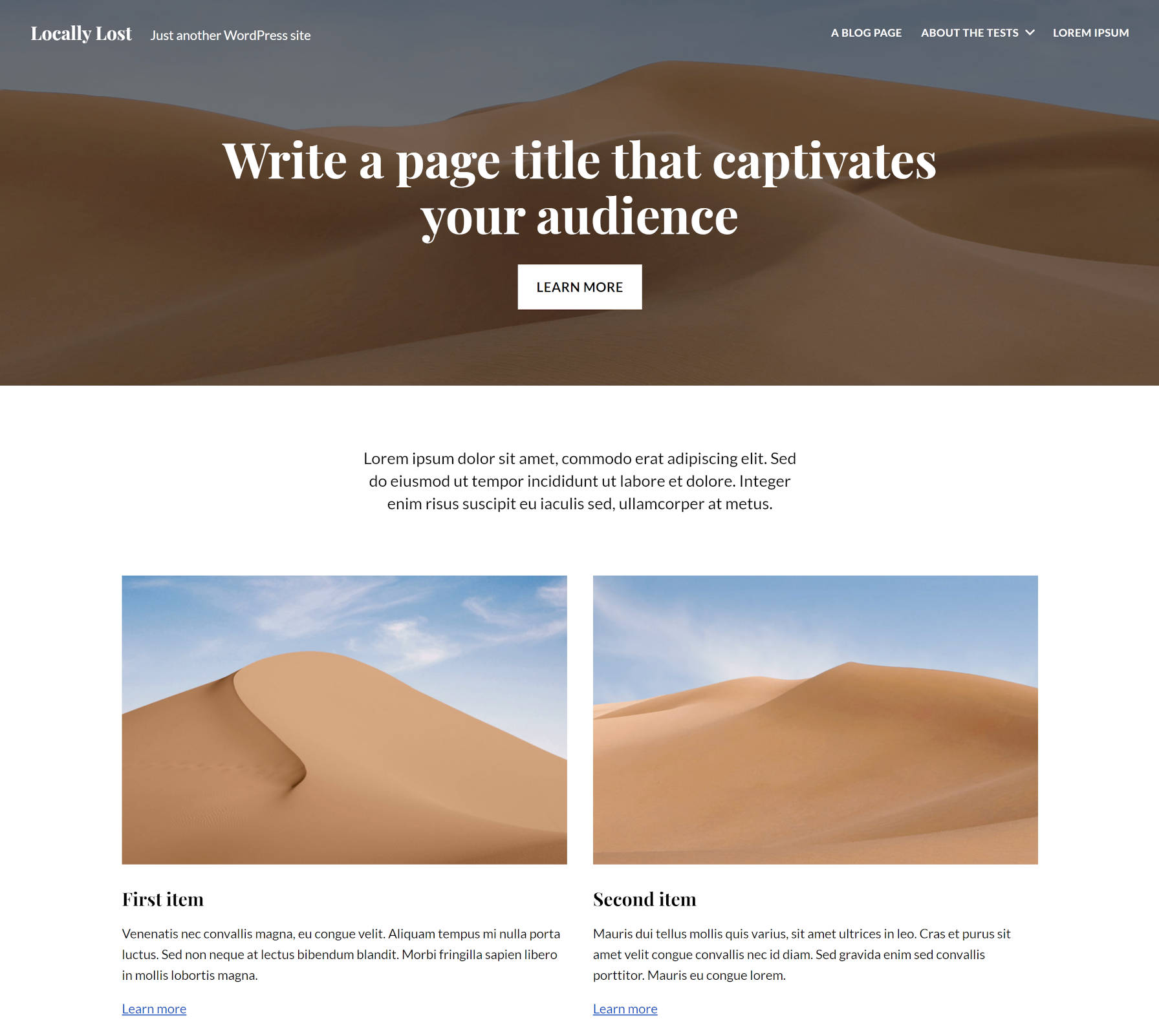
In essence, Empt Lite is mostly a standard blogging theme. Where it shines is its support of the block editor.

Cover block output on the front end by the Empt Lite WordPress theme.
Wide-aligned Cover block.

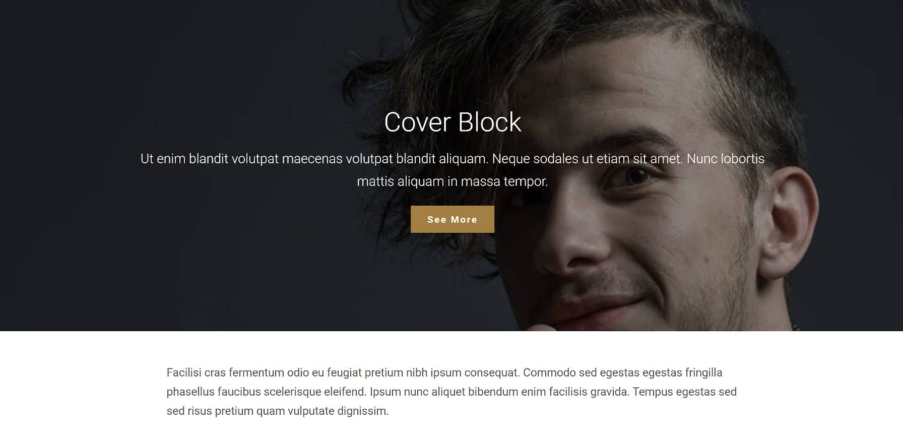
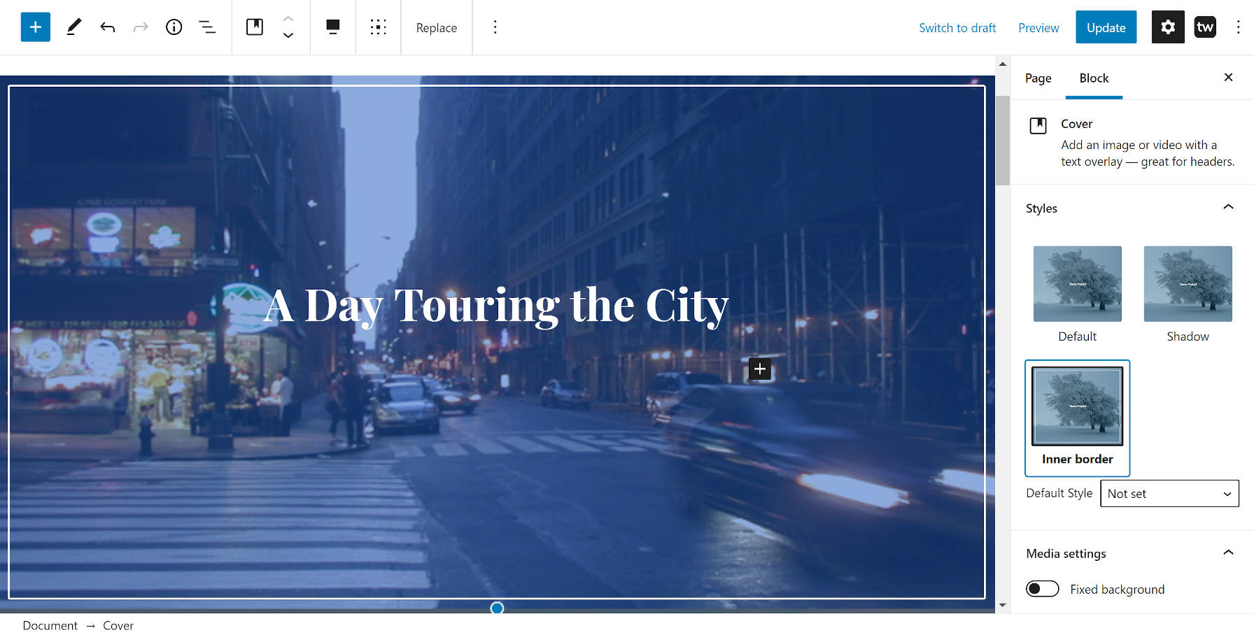
One of the surest signs of a theme author doing their due diligence with block styles is to test a full-aligned Cover block with text afterward. If the text butts against the Cover, the theme probably has numerous other issues. If there is spacing between the two, the theme author likely took the time to test almost all WordPress blocks in various scenarios. I promise you this test works 90% of the time. Empt Lite passed this test and my entire block-testing suite with ease.

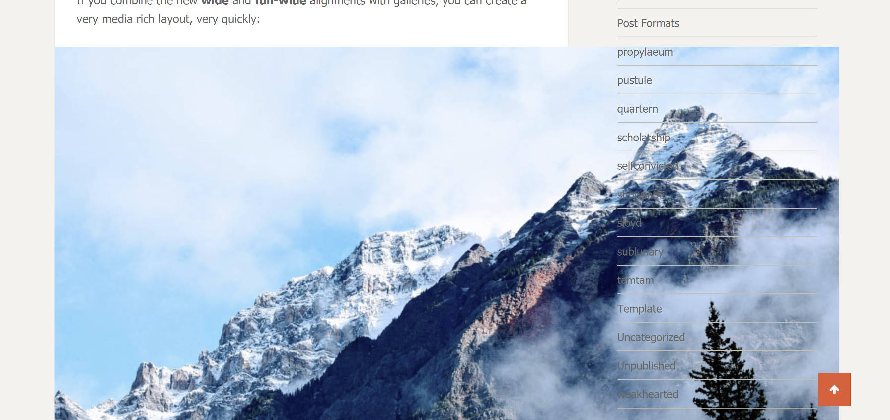
The feature that immediately caught my eye was the gallery-style blog layout. Rather than the typical top-aligned or masonry-type grids, the theme employs an offset style reminiscent of the Twenty Twenty-One theme’s image and gallery patterns. The effect is achieved by using varying featured image orientations, which the theme aligns to the middle. It is a break from the monotony of typical layouts.

Gallery-style blog layout for the Empt Lite theme.
Offset, gallery-style layout.

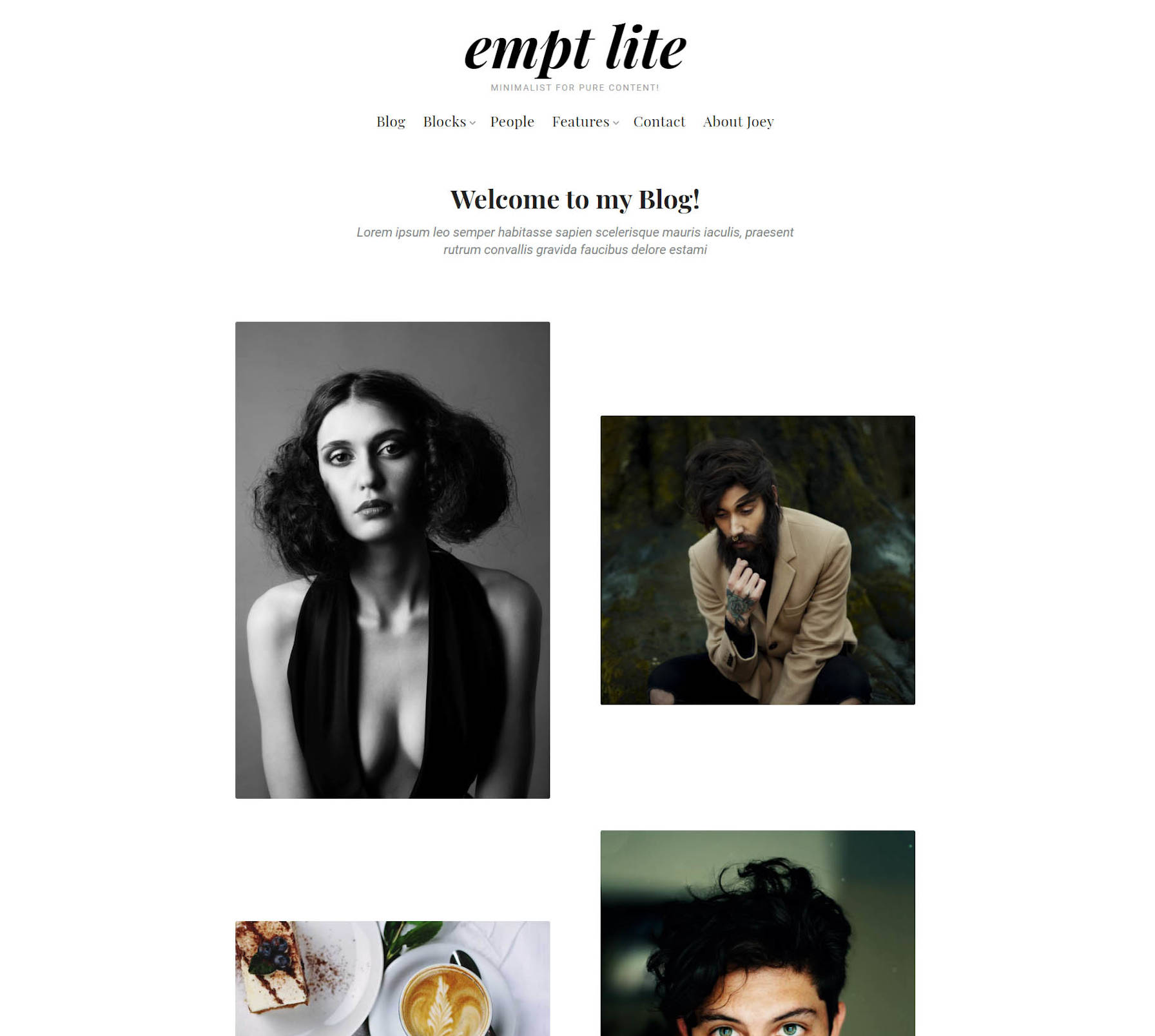
This gallery style does require that every post have a featured image. Posts without them simply disappear from the blog and archive pages, but not completely. These posts leave empty gaps, throwing off the layout. Their titles appear when hovering over seemingly-random spots on the page. There is also an empty <figure> tag in the source code. These are obviously bugs. If the theme author wants to support posts without featured images, the easiest solution would be to add a fallback.

Users who love to customize their theme and make it their own will find enough theme options to whet their appetites. Whether it is colors and typography or post meta and the nine sidebars, the theme has settings to cover it. Outside of the gallery blog layout, none of the customizer options seemed groundbreaking.

If anything, I look forward to the day when theme authors do not have to build all of these options and relegate them to the site editor. Rough Pixels and others put so much custom code behind the customizer that it feels like a waste of development hours in the long term. FSE cannot get here soon enough.

The theme has a few noticeable issues, but they are relatively trivial.

The mouse cursor is set to “pointer” when hovering a post featured image, even when that image is not linked. Yes, I unsuccessfully attempted to click a featured image multiple times, wondering why it was doing nothing.

The wide-layout for single posts provides plenty of breathing room for custom layouts. However, the default font-size, set to 17px, is too small for comfortable long-form reading. There is an option to customize the size, but it applies to the text across the entire site and not just the post content on single views. Making it larger creates the opposite problem on non-single pages. When a project is billed as a blog theme, words-per-line matter. Nailing the typography is a must, even when it is on an alternative layout option. Outside of this one case, the theme gets the defaults right.

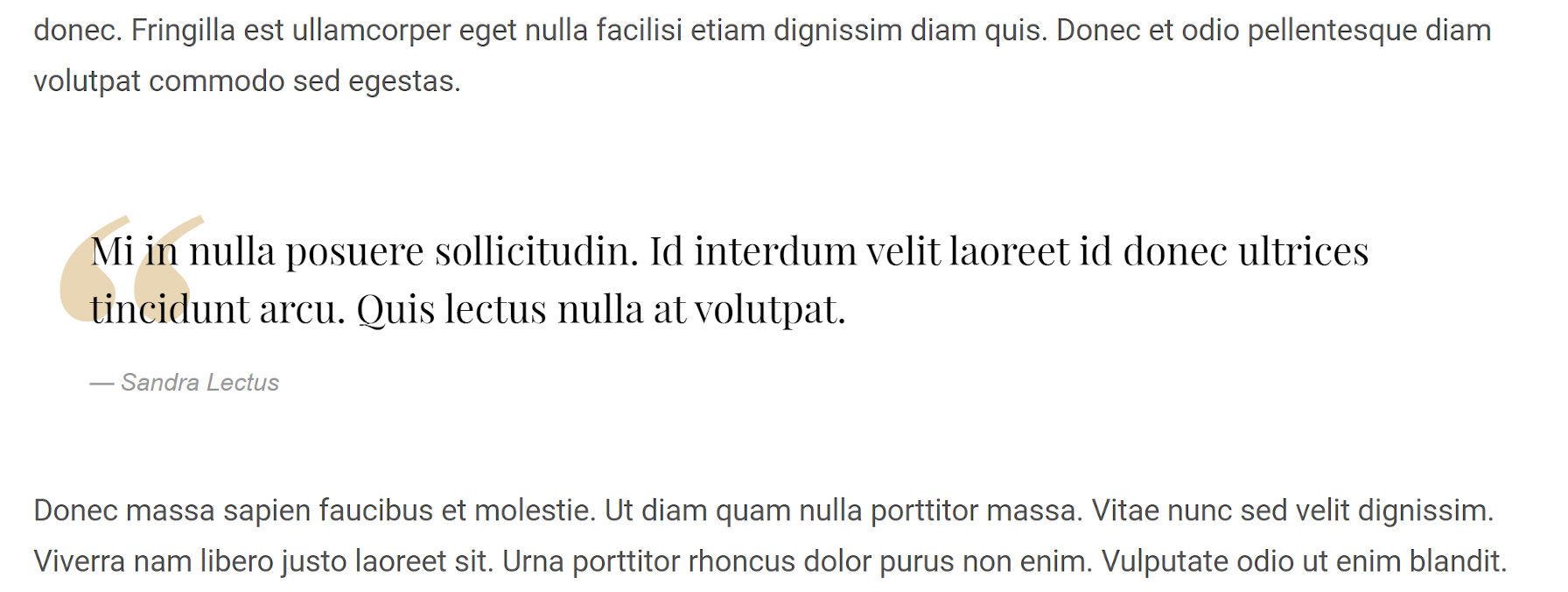
The default quote style can make the text tough to read. The quote icon in the background bleeds too much into the foreground. I love the style; the color just needs to be dialed back while letting the text take center stage. The theme provides an option for changing the blockquote icon’s color. I suggest tinkering with it.

Empt Lite WordPress theme's blockquote output style.
Blockquote style.

Overall, this is one of the better themes to land in the WordPress theme directory in the past few months. Recreating the theme’s demo requires almost no fuss. The typography is on-point for a blogging theme, and it works well with the block editor.

Custom Layouts Plugin Creates a Posts Display System for Both the Classic and Block Editors

Ross Morsali, via his brand Code Amp, released the Custom Layouts plugin last week. The plugin’s goal is to provide a visual post layout builder for users of both the block and classic editors.

For end-users, this is yet another choice between the multitude of plugins for displaying posts. After years of new plugins launching in this space, it would seem that there would be a clear front-runner, but developers are still trying to tame this wild and complex feature. The Custom Layouts plugin has its own approach, and it is worth giving it a quick spin to see if it suits you.

I have written extensively about the upcoming Query block and its role in the future of WordPress. However, it is necessary to look at alternative solutions for displaying posts via the block editor. The Gutenberg development team should take note of the things that work and those that do not.

For developers, the plugin is a noteworthy experiment that uses the block editor component system outside of the actual editor. Custom Layouts uses these various components on its custom Layout and Template Editor screens.

The plugin is a product of Morsali learning React and the block system in the last year and a half. “Working with Gutenberg and the Block Editor as a developer is a far superior experience to the old paradigm (the classic editor) — the learning curve is definitely greater, but once you get over the hump it seems the future is bright,” he wrote in the plugin’s announcement post. “I also love the fact that we don’t actually need to be using the Block Editor to use Gutenberg components — that means we can still build what we want and how we want it (providing we’re using React), whilst keeping the UI in tune with the rest of WordPress.”

How the Plugin Works

Template-editing screen from the Custom Layouts WordPress plugin.
Template editor screen.

Custom Layouts takes a different route than similar plugins, splitting its components into different screens. The terminology can be confusing to the uninitiated. The plugin introduces two parts that serve as the foundation of its system:

  • Templates: Handles the design of individual posts.
  • Layouts: Controls queried posts and their layout.

I have had a beta version of the plugin since late December. This has given me three weeks to decide whether I like the approach. On the one hand, the plugin caters to two different user bases. One set can implement their layouts via the Custom Layouts block. Those on the classic editor can use the Layout Editor screen. Both share the Template Editor.

Custom Layouts block in the WordPress editor.
Creating a three-column grid layout.

The plugin’s system is a good option for users of the classic editor. It comes with a visual interface they would otherwise not have. It also provides a shortcode for easy copying/pasting into the post editor.

For users of the block editor, having a separate screen for the template builder will likely feel unnatural. Because the block editor is a visual interface itself, the multiple screens create a disjointed atmosphere that never feels right.

However, there is a solution for that in the plugin. I recommend users skip the Template Editor and Layout Editor screens altogether. The Custom Layouts block serves as an alternative layout builder in the block editor. Plus, users can edit existing templates via a popup overlay or even create new ones without ever leaving the post-editing screen.

Popup overlay for editing templates in the WordPress block editor.
Overlay for editing a template.

Building everything from the post editor feels like it should feel. Users get more of that instant feedback that they are accustomed to through the block editor.

There are benefits to the multi-component system. Separating the template builder means that users can build and reuse a specific design from a single source. They can also update individual templates, which will subsequently apply to all uses of those templates across the site.

The other benefit is that end-users are not overloaded with choices. Building a query-related block, widget, shortcode, or similar component is fraught with complexity. This is because there are three pieces of laying out a list of posts: the query to load them, the overall layout, and the design of the individual posts. Putting options for each of these pieces into the block inspector, for example, means creating a balance between sacrificing some choices and providing every possible setting to the user. This balancing act is what drove Morsali toward separating the components of the plugin.

On the whole, Custom Layouts is a solid plugin. The downside is that there is a little bit of a learning curve because it serves two audiences. Users will need to figure out which workflow best suits them first. Once they figure that out, the plugin is pretty nice to work with.

Show and Hide Content via the Block Visibility WordPress Plugin

Nick Diego’s Block Visibility is not the only plugin to take on the challenge of controlling when blocks are visible on the front end. Other plugins like EditorsKit do a fine job of it. However, Block Visibility is a solution users should not overlook, even if they have already begun testing other options.

Diego first released the plugin in August 2020. Since then, he has added routine updates that have added value without shifting its focus.

One of the biggest reasons to use this plugin is that it is a standalone project. It is purely about doing one thing and doing it well. Its settings are all about giving users complete control over how they want to manage block visibility. From my experience with it, the plugin does its job better than alternatives.

It may not have a large number of installs, but if its five-star rating on WordPress.org is any indication, it at least has a happy user base.

Diego does have plans for a pro add-on. The tentative release date is set for Spring 2021. He seems to be moving forward with that launch after adding some foundational code in the recent version 1.4 release.

“As Block Visibility grows, there will be advanced and/or niche functionality that will be useful for certain users,” wrote Diego in the 1.4 release announcement. “Think integrations with other third-party plugins. There will always be a free version of the plugin but some of these additional features will ultimately be provided by a premium (paid) add-on called Block Visibility Pro.”

In my previous job, one of my primary products focused on membership solutions. There is a seemingly endless number of possibilities that users dream up to control content visibility. I have little doubt that a pro add-on is necessary for catching all of the edge cases.

How the Plugin Works

Block Visibility is easy to use. End-users click a toggle switch, select from a date-picker, or tick a radio box. Their blocks are shown or hidden on the front end based on their selections. It does not get much simpler than that.

The plugin adds a new “Visibility” tab for each block, which displays the visibility controls. The exception to this is for inner blocks. For example, the Columns block has controls, but the inner Column blocks do not. However, this can be enabled for inner blocks via the “Full Control Mode” on the plugin’s settings screen.

There are three primary types of options:

  • Hide the block from everyone.
  • Time-based start and stop dates for displaying.
  • Visibility by user role.
Block Visibility plugin controls in the WordPress block editor.
Block Visibility’s controls in the inspector.

Hiding the block from everyone might be useful for users who are testing on a page or for blocks that are a work in progress. Start and stop dates create the potential for drip or trial content on membership-based sites, especially when combined with the role-based visibility options.

These basic options will cover the majority of scenarios that the average user will need them for.

One of the nicer features of the plugin is that it adds a transparent gray overlay, dashed border, and icon to each block that has visibility options set. This is shown when the block is not selected in the editor. It is one of those small touches that make the plugin useful.

Block Visibility plugin gray overlay when a block is not selected.
Overlay for blocks with visibility options.

There is one confusing piece of the UI. There are two instances where there is a “public” option. That label immediately makes me think that the block should be visible to everyone. However, reading the description is necessary. These options are for showing content to logged-out users only. I would rather see these two options renamed to “logged out” for clarity.

A Promising Future

While Block Visibility is a solid plugin right now, we are barely scratching the surface of what will be possible in the long run. In version 1.4, released two weeks ago, Diego added preliminary compatibility with Full Site Editing. This means visibility options will no longer be confined to the post or page content.

“Once every piece of content on a website is a ‘block,’ you will be able to easily control the visibility of practically anything on a WordPress website,” wrote Diego in the version 1.4 announcement post. “From dynamic navigation menus to user specific headers and footers, the possibilities are endless!”

Gutenberg’s site editor is a beta feature right now, but the plugin’s integration seems to already work well. I ran a quick test to show a custom nav menu to shop customers only. I had no problems on my end.

Using the Block Visibility plugin with the Gutenberg site editor.
Setting visibility options for a menu in Gutenberg’s site editor.

Users will not be limited to such basic needs in the future. Imagine showing ads in a sidebar to logged-out users. Imagine adding a time-sensitive holiday sale banner in the header. Imagine designing a homepage template that displays different content to subscribers vs. visitors.

There are ways to do all of this today by piecing various plugins together, using custom shortcodes, or writing code. However, when an entire site is made of blocks, you only need one method to control anything’s visibility. Literally.

Record and Track Past Events With the LifePress Calendar Plugin

Two weeks ago, Ashan Jay released LifePress to the WordPress plugin directory. It is an interactive, front-end calendar for tracking past events — a journal of sorts. For a version 1.0 launch, it has enough features with just the right touch of simplicity to show promise.

This is not Jay’s first rodeo when it comes to calendar-based plugins. He is also the creator of EventON, a virtual event calendar for WordPress.

The goal of the plugin is simple. As its description reads, “LifePress is a calendar based journal recorder that will allow you to track back progress and review past events to learn from the past and make positive progress in the future.”

Watch an introduction video to the plugin:

Digging Into the Plugin

Call me a fan. The ease of use of this plugin is spot-on. LifePress creates a page called “LifePress Dashboard” upon activation, which allows individual users of the site to see and manage life events on the front end on a per-user basis. It feels much like Google Calendar, except in WordPress.

And that is the plugin’s main selling point — it allows end-users to store all of their data in their own database instead of on a third-party server.

On the front end, users are presented with a weekly calendar view by default. However, there is a button for switching between weekly and monthly views.

Monthly calendar view of the LifePress Dashboard on the front end.
Monthly calendar view.

A simple “+” button lets users create new calendar entries. After clicking it, an overlay appears for adding a date, title, optional description, and tag. Most users should pick up the system quickly and without documentation.

Adding a new calendar entry with the LifePress WordPress plugin.
Creating a new calendar entry.

The tag system allows users to group different types of entries with custom colored backgrounds. Colored dots for each tag adorn the left sidebar, allowing users to toggle specific entry types on and off, which is one of my favorite features of the plugin. It is a simple thing, but it adds to the overall user experience.

The design is, for the most part, great. The interface is uncluttered and simple to use. However, the plugin is not without some flaws, which is to be expected with a version 1.0. The plugin’s various overlays, such as from the new-entry popup, butt against the top of the page. Some spacing at the top would help with the layout.

Backend management could use a little work. There is no way to edit a tag’s color after it has been created. This feature also does not appear to be available on the front end.

The monthly-calendar view was consistently off by one day of the week when I first installed LifePress in my testing environment. For example, today is Tuesday, December 15, 2020. However, the plugin had the 15th listed under Monday. I managed to track this issue down to the “week starts on” setting in WordPress. The plugin will only work if this option is set to Sunday (the WordPress default sets this to Monday). Every other day of the week pushes the calendar back another day.

This is a non-issue with the default, weekly calendar view. However, it should be addressed by the plugin author for the monthly layout.

Features Requests

While LifePress is geared toward being a journal and tracking calendar, it would be nice if it could pull double-duty and behave like a simple event calendar too. The plugin already allows end-users to add items to future dates, so the core of scheduling events is already in place. To extend this already-existing feature, the plugin could have a notification system. Users should be able to at least get custom emails as a reminder for upcoming events on the schedule. This could make it worthwhile enough for some users to ditch Google Calendar, depending on their use case.

If the plugin wants to continue focusing on being a great journal and tracking calendar, it should have a progress-tracking mechanism built in. It is great to see that I put in my daily 30-minute jog on the calendar, for example. However, it would be even better if I could see that I am hitting my exercise goals on a weekly, monthly, or yearly basis.

That sort of application is not just relevant to personal exercise regimens. It can be applied to other facets of life or used in business environments.

Overall, it is a good first outing for the plugin. However, there is a lot of potential for more features in the future.

Diving Into the Book Review Block Plugin

Created by Donna Peplinskie, a Product Wrangler at Automattic, the Book Review Block plugin is nearly three years old. However, it only came to my attention during a recent excursion to find interesting block plugins.

The plugin does pretty much what it says on the cover. It is designed to review books. It generally has all the fields users might need to add to their reviews, such as a title, author, image, rating, and more. The interesting thing is that it can automatically fill in those details with a simple ISBN value. Plus, it supports Schema markup, which may help with SEO.

Rain or shine, sick or well, I read every day. I am currently a month and a half shy of a two-year reading streak. When the mood strikes, I even venture to write a book review. As much as I want to share interesting WordPress projects with the community, I sometimes have personal motives for testing and writing about plugins like Book Review Block. Anything that might help me or other avid readers share our thoughts on the world of literature with others is of interest.

Admittedly, I was excited as I plugged in the ISBN for Rhthym of War, the upcoming fourth book of my favorite fantasy series of all time, The Stormlight Archive. I merely needed to click the “Get Book Details” button.

Success! The plugin worked its magic and pulled in the necessary information. It had my favorite author’s name, the publisher, the upcoming release date, and the page count. It even had a long description, which I could trim down in the editor.

Using the Book Review Block in the WordPress editor.
Default output of the Book Review block.

There was a little work to make this happen before the success. To automatically pull in the book details, end-users must have an API Key from Google. It took me around a minute to set that up and enter it into the field available in the block options sidebar. The great thing about the plugin is that it saves this key so that users do not have to enter each time they want to review a book.

Book Review Block a good starting point. It is straightforward and simple to use. It is not yet at a point where I would call it a great plugin. However, it could be.

Falling Short

The plugin’s Book Review block should be taking its cues from the core Media & Text block. When you get right down to it, the two are essentially doing the same thing visually. Both are blocks with an image and some content sitting next to each other.

The following is a list of items where it should be following core’s lead:

  • No way to edit alt text (book title is automatically used).
  • The image is always aligned left and the content to the right with no way to flip them.
  • The media and content are not stackable on mobile views.
  • Cannot adjust the size of the image or content columns.
  • While inline rich-text controls are supported, users cannot add Heading, List, or Paragraph blocks to the content area and use their associated block options.

That is the shortlist that could offer some quick improvements to the user experience. Ultimately, the problems with the plugin essentially come down to not offering a way to customize the output.

One of the other consistent problems is that the book image the plugin loads is always a bit small. This seems to be more of an issue from the Google Books API than the plugin. Each time I tested a book, I opted to add a larger image — the plugin does allow you to replace the default.

The color settings are limited. The block only offers a background color option with no way to adjust the text color. A better option for plugin users is to wrap it in a Group block and adjust the background and text colors there.

Wrapping the Book Review block inside of a Group block in the WordPress editor.
Book Review block wrapped inside a Group block.

It would also be nice to have wide and full-alignment options, which is an often-overlooked featured from many block plugin authors.

Using the Media & Text Block to Recreate the Book Review Block

The Book Review Block plugin has a lot of potential, and I want to see it evolve by providing more flexibility to end-users. Because the Media & Text block is the closest core block to what the plugin offers, I decided to recreate a more visually-appealing design with it.

Creating a book review section with the Media & Text block in the editor.
Book review section created with the Media & Text block.

I made some adjustments on the content side of things. I used the Heading block for the book title, a List block for the book metadata, and a Paragraph block for the description.

The Media & Text block also provided me the freedom to adjust the alignment, stack the image and content on mobile views, and tinker with the size of the image. Plus, it has that all-important field for customizing the image alt attribute.

The Media & Text block gave me much more design mileage.

However, there are limitations to the core block. It does not fully capture some of the features available via the Book Review block. The most obvious are the automatic book details via an ISBN and the Schema markup. Less obvious, there is no easy way to recreate the star rating — I used emoji stars — and long description text does not wrap under the image. To recreate that, you would have to opt to use a left-aligned image followed by content.

Overall, the Media & Text block gives me the ability to better style the output, which is what I am more interested in as a user. I want to put my unique spin on things. That is where the Book Review Plugin misfires. It is also the sort of thing that the plugin author can iterate on, offering more flexibility in the future.

This is where many block plugins go wrong, particularly when there is more than one or two bits of data users should enter. Blocks represent freedom in many ways. However, when plugin developers stick to a rigid structure, users can sometimes lose that sense of freedom that they would otherwise have with building their pages.

One of the best blocks, hands down, that preserves that freedom is from the Recipe Block plugin. It has structured inputs and fields. However, it allows freeform content for end-users to make it their own.

When block authors push beyond this rigidness, users win.

Supercharge the Default WordPress Theme With Twentig, a Toolbox for Twenty Twenty

Page layout from the Twentig WordPress plugin.
Custom page pattern from the Twentig plugin.

I am often on the hunt for those hidden gems when it comes to block-related plugins. I like to see the interesting places that plugin authors venture. That is why it came as a surprise when someone recommended I check out the Twentig plugin a few days ago. Somehow, it has flown under my radar for months. And, it has managed to do this while being one of the more interesting plugins for WordPress I have seen in the past year.

Twentig is a plugin that essentially gives superpowers to the default Twenty Twenty theme.

While I have been generally a fan of Twenty Twenty since it was first bundled in core, it was almost a bit of a letdown in some ways. It was supposed to be the theme that truly showcased what the block editor could do — and it does a fine job of styling the default blocks — but there was a lot of potential left on the table. The Twentig plugin turns Twenty Twenty into something worthier of a showcase for the block editor. It is that missing piece, that extra mile in which WordPress should be marching its default themes.

While the new Twenty Twenty-One default theme is just around the corner, Twentig is breathing new life into the past year’s theme. The developers behind the plugin are still fixing bugs and bringing new features users.

Of its 34 reviews on WordPress.org, Twentig has earned a solid five-star rating. That is a nice score for a plugin with only 4,000 active installations. As I said, it has flown under the radar a bit, but the users who have found it have obviously discovered something that adds those extra touches to their sites they need.

What Does Twentig Do?

It is a toolbox for Twenty Twenty. The headline feature is its block editor features, such as custom patterns and page layouts. It also offers a slew of customizer options that allow end-users to put their own design spin on the default theme. However, my interest is primarily in how it extends the block editor.

Let’s get this out of the way up front. Twentig’s one downside is that it adds a significant amount of additional CSS on top of the already-heavy Twenty Twenty and block editor styles. I will blame the current lack of a full design system from WordPress on most of this. Styling for the block editor can easily bloat a stylesheet. Adding an extra 100+ kb per page load might be a blocker for some who would like to try the plugin. Users will need to weigh the trade-offs between the additional features and the added page size.

The thing that makes Twentig special is its extensive patterns and pages library, which offers one-click access to hundreds of layouts specifically catered to the Twenty Twenty theme.

Custom hero pattern from the Twentig WordPress plugin in the block editor.
Inserting one of the hero patterns.

It took me a few minutes to figure out how to access the patterns — mainly because I did not read the manual. I expected to find them mixed in with the core patterns inserter. However, the plugin adds a new sidebar panel to the editor, which users can access by clicking the “tw” icon. After seeing the list of options, I can understand why they probably would not fit into WordPress’s limited block and patterns inserter UI.

It would be easier to list what the plugin does not have than to go through each of the custom patterns and pages.

The one thing that truly sets this plugin apart from the dozens of other block-library types of plugins is that there are no hiccups with the design. Almost every similar plugin or tool I have tested has had CSS conflicts with themes because they are trying to be a tool for every user. Twentig specifically targets the Twenty Twenty theme, which means it does not have to worry about whether it looks good with the other thousands of themes out there. It has one job, which is to extend its preferred theme, and it does it with well-designed block output.

The other aspect of this is that it does not introduce new blocks. Every pattern and page layout option uses the core WordPress blocks, which includes everything from hero sections to testimonials to pricing tables to event listings. And more.

Twentig does not stop adding features to the block editor with custom patterns. The useful and sometimes fun bits are on the individual block level, and I have yet to explore everything. I continue to discover new settings each time I open my editor.

Whether it is custom pullquote styles, a photo image frame, or an inner border tweak to the Cover block (shown below), the plugin adds little extras that push what users can do with their content.

Custom inner border style from the Twentig WordPress plugin on the Cover block.
Inner border style for the Cover block.

Each block also gets some basic top and bottom margin options, which comes in handy when laying out a page. At this point, I am simply looking forward to discovering features I have yet to find.

Areas Themes Should Explore

One of the things I dislike about many of these features being within the Twentig plugin is that I would like to see them within the Twenty Twenty theme instead. Obviously not every feature belongs in the theme — some features firmly land in plugin territory. The default WordPress themes should also leave some room for plugin authors to explore. But, shipping some of the more prominent patterns and styles with Twenty Twenty would make a more robust experience for the average end-user looking to get the most out of blocks.

Block patterns were not a core WordPress feature when Twenty Twenty landed. However, for the upcoming Twenty Twenty-One theme, which is expected to bundle some unique patterns, the design team should explore what the Twentig plugin has brought to the current default. That is the direction that theme development should be heading, and theme developers can learn a lot by stealing borrowing from this plugin.

Easy Email Marketing with weMail for WordPress

Easy Email Marketing with weMail for WordPressIf you want to grow a successful business, you should definitely spend some time thinking about your email marketing strategy. After all, growing and nurturing an email list with an engaged audience is crucial when it comes to selling your services or products. While there is no shortage of email marketing providers out there, the […]

The post Easy Email Marketing with weMail for WordPress appeared first on WPExplorer.

SPanel for WordPress Quick Guide & Review

SPanel for WordPress Quick Guide & Review
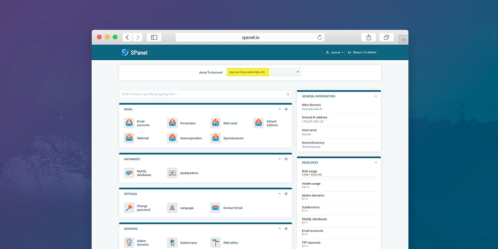
Today we’ll be looking at SPanel – a self titled all-in-one hosting platform. It’s a newer alternative to cPanel or Plesk which you may have seen before, and it’s an equally powerful server management portal to consider. Created by Scala Hosting, SPanel pretty much has all the features that cPanel offers. SPanel also offers a dedicated […]

The post SPanel for WordPress Quick Guide & Review appeared first on WPExplorer.

Eye-Catching Typography and Personality: Blossom Themes Launches Sarada Lite

Screenshot of the Sarada Lite theme homepage.
Sarada Lite homepage.

Blossom Themes launched Sarada Lite, its 25th theme, on the WordPress theme directory today. The theme is billed as a “feminine blog theme” specifically for professional bloggers. However, it would work well in a variety of contexts. While it is targeted at fashion, travel, and lifestyle bloggers, it is well-rounded enough for anyone who wants a touch of personality as part of their blogging experience.

I nearly passed over this theme. It had no mention of the block editor or Gutenberg in its description. It was not tagged in the directory as having editor styles (technically, it doesn’t have them). There are few themes that I give much attention to if they do not style the latest features and blocks in WordPress. It has to be truly eye-catching otherwise. Sarada Lite is a breathtaking design, so it drew me in. It is the sort of theme that inspires me to write. Plus, its light color scheme along with the author’s choice of images in the demo fit perfectly into the summer season. It simply makes me want to sit on the beach with a mojito and my laptop ready to spin up some great content.

What makes this theme stand out is its typography. The status quo with most free themes in the WordPress theme directory is to simply not give any attention to things like font size, characters per line, line height, or vertical rhythm. Long-form content is practically unreadable with such themes. However, long-winded writers need not be fearful of the reader losing interest because of the design. Sarada Lite creates an inviting atmosphere that beckons the visitor to actually read.

The theme supports several plugins, most of which are a part of the Blossom Themes collection. They are unnecessary for a solid blogging experience with this theme. Users should shy away from taking advantage of every bell and whistle the theme or its add-ons provide. The default setup is mostly where the theme shines.

Users who need a shop can also enjoy WooCommerce integration. The theme does not add much in the way of shop-related features, opting to style the default output of the eCommerce plugin instead.

Design Elements Worth Noting

Single post example from the Sarada Lite theme.
Single post view.

When testing and reviewing themes, it is often easy to get lost in the features. However, with Sarada Lite, it’s not the theme features that are important. They may even be a detriment to the theme (more on that later). The thing that makes this theme special is the small design elements. The author puts a unique spin on things that give the theme a personality of its own. Designers who want to show off their design chops often go overboard, but Sarada Lite has just enough flair to draw attention to important elements without getting in the way of the content.

In particular, the theme’s use of the Caveat font gives secondary text just the right amount of pop. It is not a font that lends itself well to long-form content. However, the theme makes use of it for links, captions, quote citations, and a few other elements.

Sarada Lite theme's blockquote design.
Sarada Lite’s blockquote design.

The theme offers various layouts with and without a sidebar. For single posts, I recommend dropping the sidebar and choosing the full-width centered layout to make full use of the block editor’s capabilities. This gives enough breathing room for users who like to make liberal use of wide and full-width blocks. The theme has an option to change the layout globally and on a per-post basis.

Issues

One of the biggest issues with Sarada Lite is that users do not get a one-to-one match between the editor and the front end. The missing piece is the theme’s beautiful typography. It is nowhere to be found while writing a post. The theme’s admin-side CSS is bare-bones to the point where there is little use in loading the stylesheet. I hope this is merely something the theme author skipped for version 1.0 with a firm plan to add it in the next release. At worst, it is an extra couple of hours of work that offers a huge benefit to theme users.

The other major downside of Sarada Lite is that it tries to do too much. Its customizer options feel a bit overboard and disorganized. In too many cases, I was left wondering what a particular option was for or searching around for specific options in odd places.

I also found the Instagram feed (available via the Blossom Themes Social Feed add-on) in the header to be a horrendous addition, ruining what is an otherwise open and inviting design. Fortunately, this is an optional feature. Once again, the theme is doing too much here. I understand it is a bullet point on the ol’ marketing sheet, but it is an eyesore in practice. The Instagram feed works much better in the footer. My advice for theme users: avoid putting this in your header at all costs. Your site visitors should not need to skip over social media images just to get to your content.

As gracefully as the various sliders on the theme’s homepage are done, I am now and always anti-slider. They offer no real benefit to the reader and often hide away content that would have otherwise been seen. The theme’s slider sections, some of which are optional, are relatively low-key. I have seen far worse, but I would rather not see them at all.

Despite the theme’s issues, they are not so detrimental that I wouldn’t recommend the theme. Assuming the theme author adds in editor styles that match the front end, the other issues can mostly be avoided by user choice. The theme works well without tinkering with its options and adding extra plugins.

Sarada Lite is best without all the extras. What the user does with the theme will make or break the experience.

Ariele Lite Is a Fun and Refreshing Theme for WordPress Bloggers

Ariele Lite theme homepage.

Ariele Lite, the latest theme from Rough Pixels, went live in the WordPress theme directory today. In an ecosystem where designers are dubbing most themes as multipurpose, it is refreshing to see a well-designed theme that is unafraid to cater specifically to bloggers.

It is not often that I get the opportunity to test a brand new theme from the official WordPress theme directory that supports block editor styles. Or, at least it’s not often that I test one that lives up to the claim. Despite a couple of trivial issues, Ariele Lite is a theme that will appeal to a wide audience.

Whenever I see the word “lite” appended to the end of a theme name, it is immediately off-putting. Far too often, I have been burned when activating such themes. My already low expectations are generally met with unfulfilled promises, missing styles for basic features, and a metric ton of advertising for the real product (i.e., the non-lite version that I can buy). However, I was pleasantly surprised by the work that went into Ariele Lite. It was a complete and fully-functioning theme and did not feel like crippleware. Plus, most of the upsell features in the commercial version were not that appealing to me. I can find most of them in plugin form. However, they could be nice additions for the user who wants integrated features that will look and feel like they are a part of the theme without the hassle of hunting down the perfect plugin.

What makes Ariele Lite a great theme is that it has an opinionated style, even if it is merely some subtle flavoring, for nearly every element or block. It never goes overboard into lavishness, which means it doesn’t break readability. It is a theme that has fun with its design while being well-groomed enough for professional bloggers.

Even if Ariele Lite is not to your taste, Rough Pixels has a history of releasing clean, well-designed themes. There is a little something for almost anyone. The company is also one of the few theme-makers with multiple themes that support the block editor in the free directory.

Theme Design and Features

Ariele Lite WordPress theme customizer options.
Ariele Lite customizer options.

Ariele Lite is not stock full of custom features, but it has enough flexibility to satisfy most people who want to do some customization. More than anything, my favorite thing about the theme is that it does not take much cajoling to achieve the look of the demo the theme author has put together. There should be a WordPress theme directory filter tag titled “what you see in the demo is what you get.”

The theme comes with a reasonable number of theme design options. Users can change nearly every aspect of their front end. The theme has options for all its colors, several labels, and other theme-specific elements. It stops short of adding font settings, which is likely a good thing given the theme’s attention to detail with typography.

The one particular design element that caught my eye was the theme’s blockquote style. Some bloggers may want something a bit less pronounced in design, depending on how they want to present quotes. However, I am a sucker for beautiful quote designs, and Ariele Lite did not disappoint.

Ariele Lite theme blockquote style.
Ariele Lite’s blockquote style.

The quote design is representative of the attention that Rough Pixels has given to other elements in the theme. From the bold headings to the caption design that overlays the featured image, the team has left few stones unturned.

For bloggers, the most important element is the typography. It is one of those elements that too many theme authors overlook, but it is paramount when catering a theme to bloggers. This is one area the theme excels at. However, if selecting the sidebar-less layout option, there are too many characters per line for comfortable reading. Stick with either the left or right sidebar option to stay on point.

The theme comes with Jetpack infinite scrolling support, a custom posts widget with thumbnails, and enough sidebars to put widgets anywhere you might want. I like the default setup well enough, so these features are less important to me. However, they are likely welcome additions for many users.

Not Without Issues

I have been building this theme up thus far in the review. Now, it is time to take it down a notch or two. Ariele Lite is by no means perfect. No software is. I hit a few snags.

The biggest issue I ran into was the theme did not handle full-aligned blocks well. Instead of capping them to the width of the content container, they would break out into the sidebar. Even when selecting a layout with no sidebar, the same issue persists.

Broken full-aligned image in the Ariele Lite theme.
Full-width image creates a design issue.

This would be an absolute deal-breaker for me as a user. As a developer, I know that it is simply an oversight and can be corrected. The theme author can correct it with a single line of CSS. Users should simply be aware of the problem, at least until the theme author has a chance to address it.

Outside of that, nested lists in sidebars need a little TLC. The spacing is off. It is also missing support for pagination via the <!--nextpage--> quick tag on single post views.

These few items are relatively trivial issues to address. They are worth noting for the 1.0.4 version of the theme and will likely be fixed in future iterations.

Final Thoughts

Ariele Lite does not break much new ground. It is simply a solid blogging theme that supports the block editor. Nearly two years in, such themes are still few and far between. It is ideally suited for people who love to write, and it has enough options to keep those who want to do a bit of tweaking happy.

If the theme’s development team is proactive about addressing the few minor issues, I would recommend it to anyone who wants a good theme that fully supports the latest version of WordPress.

Swarmify SmartVideo: Blazing Fast Videos for WordPress

Swarmify SmartVideo: Blazing Fast Videos for WordPress
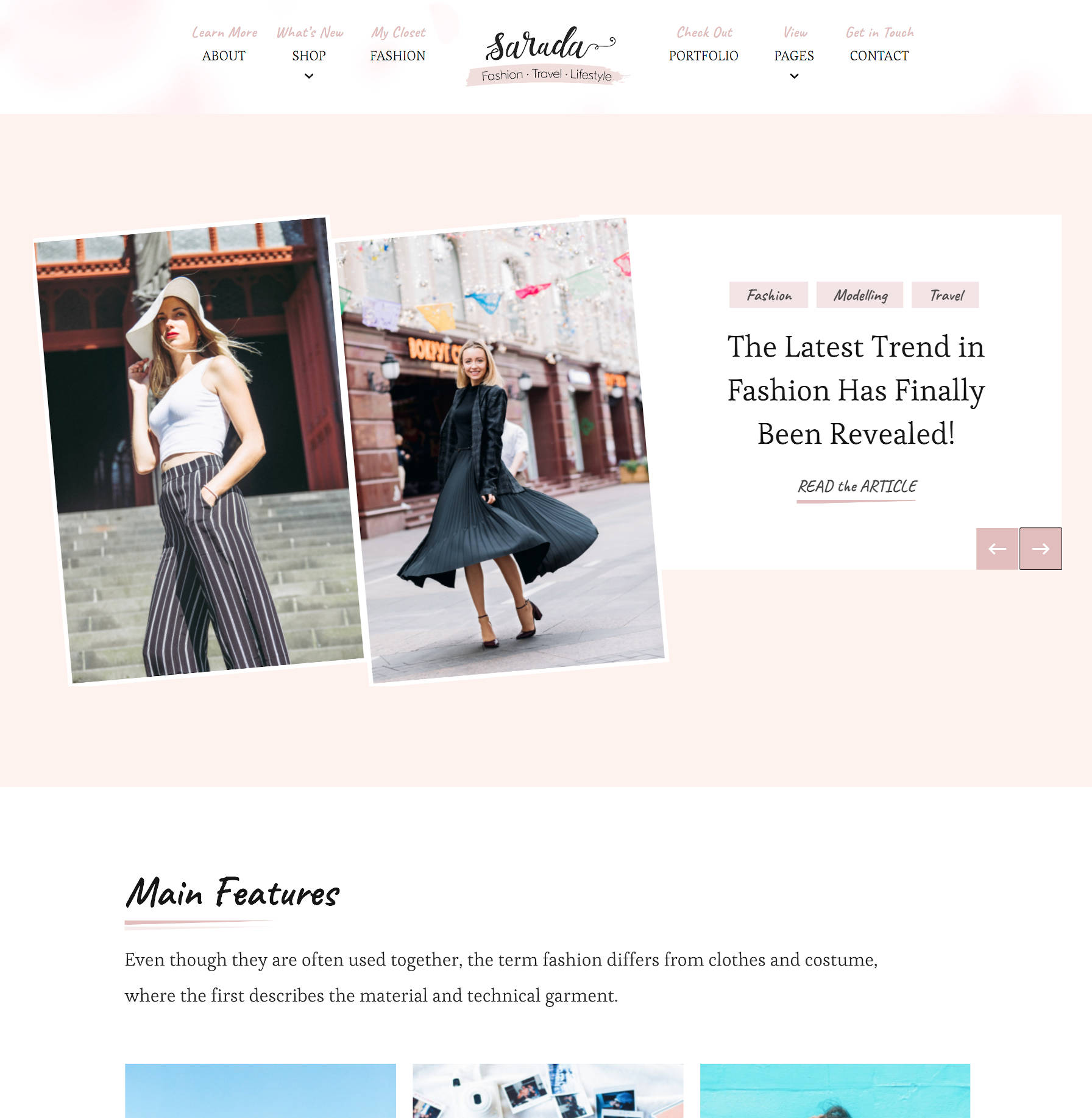
Video is increasingly becoming a pivotal part of digital marketing. That is mainly because over 90% of users say videos greatly help them make a purchase decision, a fact that’s not hidden from any smart marketer. Yet adding videos to WordPress sites continues to be a nasty experience for most site owners. Why? Here are […]

The post Swarmify SmartVideo: Blazing Fast Videos for WordPress appeared first on WPExplorer.

Add Per-Block Notes and Create Draft Blocks With the Wholesome Publishing Plugin

Matt Watson, through his Wholesome Code brand, released a plugin called Wholesome Publishing on the WordPress plugin directory on Tuesday. Version 1.0 of the plugin adds a couple of simple but useful editing features that should help teams of writers or content designers. The plugin allows users to add nested comments on a per-block basis and mark individual blocks as drafts.

At this point, the plugin is not a fully-fledged pro editing plugin. However, its basic features go a long way toward improving collaborative publishing. It is a good first showing for a version 1.0. I hope that it continues to grow and bring new editing features to the block editor.

The plugin works with both core WordPress and third-party blocks. Overall, it performed well in my tests, but I did find a few minor issues that could be easily addressed in a future update. If you are looking for such a plugin, it is well worth a test run to see if it fits into your publishing workflow. I am seriously considering it for use here on WP Tavern, if that provides an indication of its potential.

Nested Block Comments

Adding per-block nested comments in the block editor via the Wholesome Publishing plugin.
Adding nested comments to a Cover block.

The primary feature that drew me to this plugin was the ability to leave simple notes via the block editor. Even here on the Tavern, we have an old editorial notes system, but it is no longer a user-friendly option with the block editor. Notes are tucked away at the bottom of the editing screen along with other old-school meta boxes. A new system, particularly one that allowed comments on a per-block basis, was definitely worth exploring.

Block comments — not to be confused with post comments on the front end — are simple to add. On the post editing screen, users merely need to click the comment button in the toolbar, which will open a comments sidebar panel. The panel will show a text box to add a new comment for the currently-selected block.

Comments belong to individual blocks. However, it is not clear in the comments sidebar panel which block a comment is for when there are multiple comments. Clicking on a single comment selects the block in question, which helps, but the user experience would be better with two additions:

  • The selected block’s comments should be highlighted while unrelated comments fade out.
  • There should be an indicator in the comments sidebar that points out the block each comment is assigned to.

Unfortunately, it is not possible to see or leave a comment unless you are an administrator. I am unsure if this is intentional or a bug. It is at least a user experience issue because the comments sidebar panel still appears, regardless of whether the user can read the block comments.

Despite the need for a bit of polishing to improve the experience, this feature was reasonably easy to pick up and use right away.

The plugin does clean up after itself. If a user deletes a block, its comments are also deleted.

I do have one big feature request for the plugin author. An opt-in setting for enabling an email system would be a nice touch. The post author and anyone who leaves a comment on the post should be notified when a new comment is made.

Create Draft Blocks

Marking a block as a draft in the editor via the Wholesome Publishing plugin.
Setting a Gallery block to draft status.

The second plugin feature goes hand in hand with the first. Wholesome Publishing allows end-users to mark any block in the post as a draft, which means the block will not appear on the front end of the site. The reason it works well with the comments feature is that users can explain why the block was marked as a draft. This could be particularly useful on teams of multiple writers.

In the block options panel, users should see a new tab titled “Publishing.” The tab will have a single on/off switch for setting the given block as a draft. Unlike the block comments system, any user can put an individual user into draft mode as long as they have access to edit the post.

I did run into one issue with draft blocks. When clicking the on/off toggle, all of the block options tabs would reset to the default open or closed state. It is a trivial issue that might become irritating for some. Outside of that, the feature worked well.

Control Block Design via the EditorPlus WordPress Plugin

Last week, as I was making the final edits on a review of his Gutenberg Forms project, Munir Kamal was prepping for the launch of another kind of WordPress plugin for the block editor. This one was called EditorPlus, and it would create a design system for blocks. Kamal and his team quietly put the finishing touches on version 1.0 and released the plugin in the WordPress plugin repository a few days later.

Unlike many other plugins that create custom blocks to achieve specific design results, EditorPlus provides users with the flexibility to customize their pages with what they have on hand. It adds a slew of design options to each of WordPress’s existing blocks. On the front end, it leaves a light footprint by outputting only the CSS necessary for that page on the fly.

Perhaps the best thing about this plugin right now is that it lays the groundwork for many design-related features that will likely find a permanent home in Gutenberg and eventually core WordPress. The Gutenberg team can borrow ideas, iterate, and improve upon them. We have already seen the experimental padding control land in Gutenberg 8.3. It would make sense that the development team follows through with additional design controls down the road. The good thing about these controls rolling out in third-party plugins first is that the team can see how users react to them and get a sense of whether they would work directly in Gutenberg before committing to anything.

EditorPlus has no shortage of goodies for those who like to have a lot of design freedom without touching code. Essentially, the plugin is a CSS editor without the need to know CSS. It provides end-users with options for the most-needed CSS features via block options. It is a playground for those who like to tinker with design and powerful enough to create unique layouts without bloating the site on the front end.

How EditorPlus Works

Editing the Gallery block's background and padding via the EditorPlus plugin.
Editing a Gallery block’s background and padding.

After activating the EditorPlus plugin, end-users can start using its options right away by heading over to the post or page editor. After inserting a block, the plugin makes the following eight tabs available under the block options panel (each is preceded by a + symbol):

  • Border
  • Box Shadow
  • Sizing
  • Background
  • Margin
  • Padding
  • Border Radius
  • Extras

These tabs will appear only for the core WordPress blocks and not third-party plugin blocks at this time. Aside from the Extras tab, each tab corresponds to its CSS counterparts. The Extras tab provides a more advanced “Display” option, which allows users to change the block wrapping element’s display value in CSS. This option is best left to more advanced users. It also provides a transition option that would work well with hover styles.

Each of the block options tabs also has mysterious “R” and “H” buttons. The “R” button allows users to enable responsive options, which means they can change block styles based on desktop, tablet, and mobile screens. The “H” button lets users change the design based on mouse hover state.

Editing a Pullquote block's design options via the EditorPlus plugin.
Adding a shadow to a Pullquote block on hover.

The plugin packs a lot of options in a little bit of space. All of the new design tabs can feel a little overwhelming at first. However, with a little use, it is easy to gain some muscle memory and quickly blast out custom layouts.

Each of the plugin’s options is fairly straightforward. And, when they are not, you get the benefit of instant feedback via the block editor.

There are a few areas that could prove problematic for some users, depending on how their theme styles certain blocks. For example, width settings under the Sizing tab may not always work. Some themes will add a maximum width to blocks, which will constrain the overall width no matter the size. It is possible to overrule this via the plugin, but Kamal has chosen not to do this in version 1.0.

Be careful with margins. Depending on the theme design, it may use left and right margins to place content. Even when setting just a top or bottom margin, the plugin will automatically output 0 for the left and right margins. This could break the content layout for some themes.

One problem I encountered with the plugin was my active theme’s styles overruling the plugin’s styles in general. For example, the default Twenty Twenty theme targets p.has-background in its CSS to add custom padding. Therefore, it overrules the EditorPlus plugin’s CSS with higher specificity. This problem was expected, and the plugin developer added a solution for it in the form of an “important” checkbox for each design option. If a user ticks this box, it adds !important to the style rule on output, which will allow it to overrule the theme styles. It is not a 100% fool-proof solution. Your mileage may vary, depending on the theme, but it should work for the majority of use cases.

I don’t like the idea of an important checkbox in the UI. It is not something a user should have to worry about. However, it is the reality of a world where themes and plugins have no real way to communicate which design rules are more important than others. Despite not wanting this in the UI, it was a smart decision to include it. Otherwise, far too many themes’ style rules would have overwritten the plugin’s CSS.

Final Thoughts

For a version 1.0 release, EditorPlus is off to a solid start. In my tests, I found few flaws. Any problems for the average user will likely come in the form of theme conflicts, and those conflicts will most likely be around themes using high specificity or !important in their CSS.

Kamal makes it clear on the plugin’s webpage that there is more to come from this plugin. I am unsure what features he has in mind, but I look forward to seeing them. I would like to see a text-shadow option for text-related blocks such as Heading and Paragraph. It would also be nice to see some design options for the images within the Gallery block rather than just the wrapping element.

Whether you should use EditorPlus will depend on whether you need additional design controls. EditorPlus is geared toward people who need something more akin to a lightweight page builder but want to stick to native WordPress. This plugin is a nice showcase of what’s possible and is a good indicator of potential design options that may one day land in WordPress.

Build Forms via the Block Editor With Gutenberg Forms

The quest for the perfect form plugin is nearly as old as WordPress. Projects have come and gone. There are some great form plugins out there, but far too often the choices are between massive builders that do things their own way and solutions so simple that they do not quite live up to expectations. Munir Kamal has put his hat into the ring with his take on this saturated market with Gutenberg Forms, a plugin designed for exclusively building forms within the block editor.

The plugin is by no means perfect. It has numerous quirks. It does a lot of things right. It fails at times with features that could be game-changing. It has the potential to be one of the best form-building plugins for WordPress.

As of version 1.4.0, the latest update, Gutenberg Forms is a mixed bag of success and frustration. I am excited about it.

I am excited because we are still in the early part of this plugin’s lifespan. I am excited because Kamal has built some successful Gutenberg-related projects in a short amount of time, including Gutenberg Hub and ACF Blocks. I am excited because I believe it will improve over time.

Form plugins are not easy. Despite its current issues, which we’ll get to, Gutenberg Forms is a useful plugin that ticks many of the boxes that I want to see in a form builder going forward. The ideas needed for block-based forms are in place. The execution just needs some refinement.

Gutenberg Forms was recreated in February this year. Kamal originally released the plugin in 2018, but it sat in limbo for a year and a half before he updated it with the latest APIs. Since then, he has been on a tear, releasing frequent updates and improving how the plugin works. I first tested it months ago and was not happy with the result. However, the latest iteration shows much more promise.

With only 200+ current users, the biggest thing the plugin needs is more feedback from more users.

Building Forms

Creating a standard form with the Gutenberg Forms plugin.
Creating a standard form.

Gutenberg Forms makes form building simple. There are two ways to build forms in the plugin. The first method is a custom “Forms” screen in the admin. It is a custom post type that works just like a post or page. The difference is that users are limited to adding form fields provided by the plugin. Using this method of building forms is ideal because the form is saved in a single place and can be used anywhere on the site.

The second method is building a form directly from the post or page editor. All of the plugin’s custom blocks are available for creating a custom form. For one-off forms, this may be the method to use, but I recommend building from the Forms screen instead.

After building a form via the Forms screen, users can later use the Gutenberg Forms block to insert a saved form. What actually happens when inserting this block is that, when choosing a saved form, the plugin inserts a shortcode into the editor. This is one of those quirks with the plugin. One of the ideas of building blocks is for developers to move away from utilizing the shortcode system. There is no need to mix in a shortcode here from a technical perspective. It should simply be a server-side block. I do not imagine this matters much to end-users. It works. It is simply an oddity that I hope evolves in the long run.

Inserting a saved form into a page with the Gutenberg Forms plugin.
Inserting a saved form into a page.

The plugin provides most of the common form fields that end-users would expect to see in a form plugin. The following are the form-field blocks currently available:

  • Calculation
  • Checkbox
  • Date Picker
  • Email
  • File
  • Form Button
  • Message
  • Name
  • Number
  • Phone
  • Radio
  • Select
  • Text
  • Website
  • Yes / No

Gutenberg Forms also includes other blocks that are not for outputting fields. The Form Columns block allows end-users to create columnized fields. This works great for fields that need to be lined up horizontally, such as city, state, and ZIP code fields. The Form Group block allows users to group multiple blocks. It also has several design options, including custom colors and padding. The Form Step block is useful for adding steps in multi-step forms.

The biggest but least polished feature is the pre-designed templates library that Gutenberg Forms makes available. Currently, the plugin has around three dozen custom templates. Given Kamal’s work with templates at Gutenberg Hub, I am guessing that we will see even more templates in the future.

Inserting a form template into a page with the Gutenberg Forms WordPress plugin.
Inserting a form template into a page.

The problem? The form template inserter does not always work.

Testing the plugin against both the latest WordPress and Gutenberg plugin, I was not able to insert any form template via the new form screen. There were JavaScript errors that prevented it from being inserted. One of the most exciting features of the plugin failing to work, at least in my test environment, was a bit of a letdown.

While inserting a template did not work on the form-building screen, it did work when building one-off forms on the page-editing screen. However, I did receive the dreaded “this block contains unexpected or invalid content” message for some of the blocks after insertion.

This issue is not insurmountable. The Gutenberg project is in a constant state of flux. I am forgiving of these types of issues right now because things are so unsettled, and I also know they can be addressed in an update. However, I do want to point them out for users who may need something a bit more polished in their production environments. You can build forms easily without the template feature.

Final Thoughts

Yes, Gutenberg Forms is a bit rough around the edges. It is not at the point where it can be competitive with some of the other major players in the forms marketplace. However, six months or a year from now, assuming continued improvement, it should be in a position to start slicing its own piece of the pie.

There are some other nitpicks with the plugin. For example, the “Inline” block style available with some blocks cannot be reset to the default. The “C” in the Checkbox block name is lowercase while all other block names begin with an uppercase letter. These minor things make the plugin seem less polished than it is.

Even with the issues I have outlined, I would recommend people in the market for a block-based form builder to give this plugin a test run. Its simplicity will make it an easy choice for many. For the most part, it works well. At the end of the day, it lets you build forms and stores the submissions for those forms directly in the database, and that is what truly matters.

I am a firm believer that we are at the beginning of something special. It will just take a bit of time before we get there. Even if Gutenberg Forms does not take over the form-builder market, other plugin developers should start taking cues from what this plugin is doing.

Slider Revolution WordPress Plugin Review & How To Guide

Slider Revolution WordPress Plugin Review & How To Guide
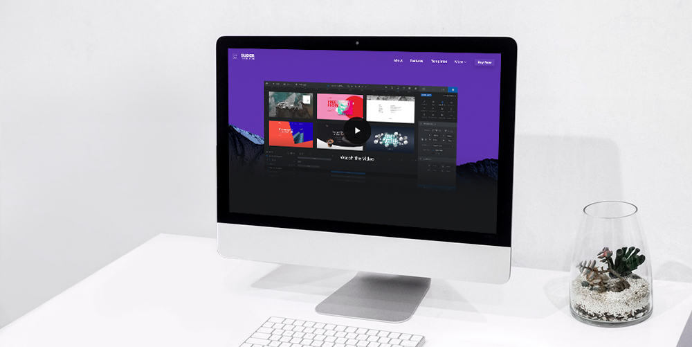
Slider Revolution is a premium slider available as a WordPress plugin and Magento extension. It’s gained huge popularity in the WordPress community due to it’s wide range of features and ease of use. In this overview we’re going to cover the main features of the Slider Revolution WordPress Plugin, and then we’ll show you just […]

The post Slider Revolution WordPress Plugin Review & How To Guide appeared first on WPExplorer.

Image SEO Optimizer: Optimize Images for Search Engines

Image SEO Optimizer: Optimize Images for Search EnginesImages play a lot of vital roles in WordPress websites. For starters, they help you to split long blocks of text, which improves readability, hence user experience. Second, beautiful images add color and life to dull posts making your content more intriguing. And, they add meaning to your textual content, but only if you use […]

The post Image SEO Optimizer: Optimize Images for Search Engines appeared first on WPExplorer.