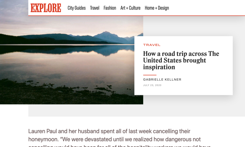
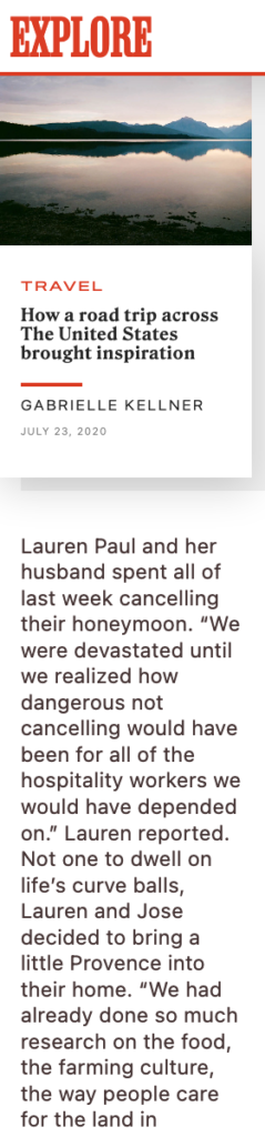
Maintaining the aspect ratio of a div is a common requirement when creating responsive web designs. In this article, we’ll explore how to use CSS to maintain the aspect ratio of a div as the window’s width changes.
To achieve this, we’ll use the padding hack. The padding hack is a technique that uses a percentage value for padding-top or padding-bottom to maintain the aspect ratio of an element. The percentage value is calculated based on the width of the parent element. As the width of the parent element changes, the padding value will adjust to maintain the aspect ratio of the child element.
Your Web Designer Toolbox Unlimited Downloads: 500,000+ Web Templates, Icon Sets, Themes & Design Assets
Let’s start by creating a div element with a background color.
To maintain the aspect ratio of this div, we’ll set its padding-top to a percentage value. The percentage value will be calculated based on the desired aspect ratio of the div. For example, if we want the aspect ratio to be 16:9, we’ll set the padding-top to 56.25% (9/16 * 100).
In this example, we are again using the padding hack, and we’re also using a pseudo-element (:before) to create the padding. We’re setting the position of the parent element to relative and the position of the child element to absolute to position the child element inside the parent element. We’re also setting the width and height of the child element to 100% to fill the parent element.
In conclusion, the padding hack is a simple and effective technique for maintaining the aspect ratio of a div as the window’s width changes. By using a percentage value for padding-top or padding-bottom, we can calculate the padding value based on the desired aspect ratio of the div. This technique is widely used in responsive web design and can be used to create a variety of layouts and designs. Be sure to check out our library of CSS articles and tutorials while you’re here!
We rely on CSS Media Queries for selecting and styling elements based on a targeted condition. That condition can be all kinds of things but typically fall into two camps: (1) the type of media that’s being used, and (2) a specific feature of the browser, device, or even the user’s environment.
So, say we want to apply certain CSS styling to a printed document:
@media print {
  .element {
    /* Style away! */
  }
}
The fact that we can apply styles at a certain viewport width has made CSS Media Queries a core ingredient of responsive web design since Ethan Marcotte coined the term. If the browser’s viewport width is a certain size, then apply a set of style rules, which allows us to design elements that respond to the size of the browser.
/* When the viewport width is at least 30em... */
@media screen and (min-width: 30em) {
  .element {
    /* Style away! */
  }
}
Notice the and in there? That’s an operator that allows us to combine statements. In that example, we combined a condition that the media type is a screen and that it’s min-width feature is set to 30em (or above). We can do the same thing to target a range of viewport sizes:
/* When the viewport width is between 30em - 80em */
@media screen and (min-width: 30em) and (max-width: 80em) {
  .element {
    /* Style away! */
  }
}
Now those styles apply to an explicit range of viewport widths rather than a single width!
But the Media Queries Level 4 specification has introduced a new syntax for targeting a range of viewport widths using common mathematical comparison operators — things like <, >, and = — that make more sense syntactically while writing less code.
Let’s dig into how that works.
New comparison operators
That last example is a good illustration of how we’ve sort of “faked” ranges by combining conditions using the and operator. The big change in the Media Queries Level 4 specification is that we have new operators that compare values rather than combining them:
< evaluates if a value is less than another value
> evaluates if a value is greater than another value
= evaluates if a value is equal to another value
<= evaluates if a value is less than or equal to another value
>= evaluates if a value is greater than or equal to another value
Here’s how we might’ve written a media query that applies styles if the browser is 600px wide or greater:
Often when we write CSS Media Queries, we’re creating what’s called a breakpoint — a condition where the design “breaks” and a set of styles are applied to fix it. A design can have a bunch of breakpoints! And they’re usually based on the viewport being between two widths: where the breakpoint starts and where the breakpoint ends.
Here’s how we’ve done that using the and operator to combine the two breakpoint values:
/* When the browser is between 400px - 1000px */
@media (min-width: 400px) and (max-width: 1000px) {
  /* etc. */
}
You start to get a good sense of how much shorter and easier it is to write a media query when we ditch the Boolean and operator in favor of the new range comparison syntax:
@media (400px <= width <= 1000px) {
  /* etc. */
}
Much easier, right? And it’s clear exactly what this media query is doing.
Browser support
This improved media query syntax is still in its early days at the time of this writing and not as widely supported at the moment as the approach that combines min-width and max-width. We’re getting close, though! Safari is the only major holdout at this point, but there is an open ticket for it that you can follow.
This browser support data is from Caniuse, which has more detail. A number indicates that browser supports the feature at that version and up.
Desktop
Chrome
Firefox
IE
Edge
Safari
104
63
No
104
No
Mobile / Tablet
Android Chrome
Android Firefox
Android
iOS Safari
107
106
107
No
Let’s look at an example
Here’s a layout for that’s nicely suited for larger screens, like a desktop:
This layout has base styles that are common to all breakpoints. But as the screen gets narrower, we start to apply styles that are conditionally applied at different smaller breakpoints that are ideally suited for tablets all the way down to mobile phones:
To see what’s happening, here’s a how the layout responds between the two smaller breakpoints. The hidden nav list getting displayed as well as title in the main gets increased in font-size.
That change is triggered when the viewport’s changes go from matching one media’s conditions to another:
/* Base styles (any screen size) */
header {
  display: flex;
  justify-content: center;
}

header ul {
  display: none;
}

.title p {
  font-size: 3.75rem;
}

/* When the media type is a screen with a width greater or equal to 768px */
@media screen and (width >= 768px) {
  header {
    justify-content: space-between;
  }

  header ul {
    display: flex;
    justify-content: space-between;
    gap: 3rem;
  }

  .title p {
    font-size: 5.75rem;
  }
}
We’ve combined a few of the concepts we’ve covered! We’re targeting devices with a screen media type, evaluating whether the viewport width is greater than or equal to a specific value using the new media feature range syntax, and combining the two conditions with the and operator.
OK, so that’s great for mobile devices below 768px and for other devices equal to or greater than 768px. But what about that desktop layout… how do we get there?
As far as the layout goes:
The main element becomes a 12-column grid.
A button is displayed on the image.
The size of the .title element’s font increases and overlaps the image.
Assuming we’ve done our homework and determined exactly where those changes should take place, we can apply those styles when the viewport matches the width condition for that breakpoint. We’re going to say that breakpoint is at 1000px:
/* When the media type is a screen with a width greater or equal to 1000px  */
@media screen and (width >= 1000px) {
  /* Becomes a 12-column grid */
  main {
    display: grid;
    grid-template-columns: repeat(12, 1fr);
    grid-template-rows: auto 250px;
  }

  /* Places the .title on the grid */
  .title {
    grid-row: 1;
  }

  /* Bumps up the font-size */
  .title p {
    font-size: 7.75rem;
  }

  /* Places .images on the grid */
  .images {
    grid-row: 1 / span 2;
    align-self: end;
    position: relative;
  }

  /* Displays the button */
  .images .button {
    display: block;
    position: absolute;
    inset-block-end: 5rem;
    inset-inline-end: -1rem;
  }
}
Have a play with it:
Why the new syntax is easier to understand
The bottom line: it’s easier to distinguish a comparison operator (e.g. width >= 320px) than it is to tell the difference between min-width and max-width using the and operator. By removing the nuance between min- and max-, we have one single width parameter to work with and the operators tell us the rest.
Beyond the visual differences of those syntaxes, they are also doing slightly different things. Using min- and max- is equivalent to using mathematical comparison operators:
max-width is equivalent to the <= operator (e.g. (max-width: 320px) is the same as (width <= 320px)).
min-width is equivalent to the >= operator (e.g. (min-width: 320px) is the same as (width >= 320px)).
Notice that neither is the equivalent of the > or < operators.
Let’s pull an example straight from the Media Queries Level 4 specification where we define different styles based on a breakpoint at 320px in the viewport width using min-width and max-width:
Both media queries match a condition when the viewport width is equal to 320px. That’s not exactly what we want. We want either one of those conditions rather than both at the same time. To avoid that implicit changes, we might add a pixel to the query based on min-width:
While this ensures that the two sets of styles don’t apply simultaneously when the viewport width is 320px, any viewport width that fall between 320px and 321px will result in a super small zone where none of the styles in either query are applied — a weird “flash of unstyled content” situation.
One solution is to increase the second comparison scale value (numbers after the decimal point) to 320.01px:
Phew, we covered a lot of ground on the new syntax for targeting viewport width ranges in CSS Media Queries. Now that the Media Queries Level 4 specification has introduced the syntax and it’s been adopted in Firefox and Chromium browsers, we’re getting close to being able to use the new comparison operators and combining them with other range media features besides width, like height and aspect-ratio
When creating a component-based, front-end infrastructure, one of the biggest pain points I’ve personally encountered is making components that are both reusable and responsive when there are nested components within components.
Take the following “call to action” (<CTA />) component, for example:
On smaller devices we want it to look like this:
This is simple enough with basic media queries. If we’re using flexbox, a media query can change the flex direction and makes the button go the full width. But we run into a problem when we start nesting other components in there. For example, say we’re using a component for the button and it already has a prop that makes it full-width. We are actually duplicating the button’s styling when applying a media query to the parent component. The nested button is already capable of handling it!
This is a small example and it wouldn’t be that bad of a problem, but for other scenarios it could cause a lot of duplicated code to replicate the styling. What if in the future we wanted to change something about how full-width buttons are styled? We’d need to go through and change it in all these different places. We should be able to change it in the button component and have that update everywhere.
Wouldn’t it be nice if we could move away from media queries and have more control of the styling? We should be using a component’s existing props and be able to pass different values based on the screen width.
Well, I have a way to do that and will show you how I did it.
I am aware that container queries can solve a lot of these issues, but it’s still in early days and doesn’t solve the issue with passing a variety of props based on screen width.
Tracking the window width
First, we need to track the current width of the page and set a breakpoint. This can be done with any front-end framework, but I’m using a Vue composable here as to demonstrate the idea:
You can see now why we’re using a number to represent the current breakpoint — it’s so the correct mode can be applied to all breakpoints below or above a certain number.
We can then use this in the CTA component to style according to the mode passed through:
Already, we have removed the need for media queries! You can see this in action on a demo page I created.
Admittedly, this may seem like a lengthy process for something so simple. But when applied to multiple components, this approach can massively improve the consistency and stability of the UI while reducing the total amount of code we need to write. This way of using JavaScript and CSS classes to control the responsive styling also has another benefit…
Extensible functionality for nested components
There have been scenarios where I’ve needed to revert back to a previous breakpoint for a component. For example, if it takes up 50% of the screen, I want it displayed in the small mode. But at a certain screen size, it becomes full-width. In other words, the mode should change one way or the other when there’s a resize event.
I’ve also been in situations where the same component is used in different modes on different pages. This isn’t something that frameworks like Bootstrap and Tailwind can do, and using media queries to pull it off would be a nightmare. (You can still use those frameworks using this technique, just without the need for the responsive classes they provide.)
We could use a media query that only applies to middle sized screens, but this doesn’t solve the issue with varying props based on screen width. Thankfully, the approach we’re covering can solve that. We can modify the previous code to allow for a custom mode per breakpoint by passing it through an array, with the first item in the array being the smallest screen size.
This is taking the mode from the array based on the current breakpoint, and defaults to the displayMode if one isn’t found. Then we can use mode instead to style the component.
Extraction for reusability
Many of these methods can be extracted into additional composables and mixins that can be reuseD with other components.
Extracting computed mode
The logic for returning the correct mode can be extracted into a composable:
In Vue 2, we could repeat props was by using mixins, but there are noticeable drawbacks. Vue 3 allows us to merge these with other props using the same composable. There’s a small caveat with this, as IDEs seem unable to recognize props for autocompletion using this method. If this is too annoying, you can use a mixin instead.
Optionally, we can also pass custom validation to make sure we’re using the modes only available to each component, where the first value passed through to the validator is the default.
Creating a design system of reusable and responsive components is challenging and prone to inconsistencies. Plus, we saw how easy it is to wind up with a load of duplicated code. There’s a fine balance when it comes to creating components that not only work in many contexts, but play well with other components when they’re combined.
I’m sure you’ve come across this sort of situation in your own work. Using these methods can reduce the problem and hopefully make the UI more stable, reusable, maintainable, and easy to use.
Qi Theme is a free WordPress theme created by Qode Interactive – an award-winning studio. This theme perfectly combines top speed and performance with a beautiful design.
It comes with 100 demos, allowing you to easily set up any type of website, whether it’s an online store, an artist’s portfolio, or a simple blog. If you can think it up, this theme will help you build it – it will even grant you free access to premium stock photos.
Qi Theme is fully supported by video tutorials as well as an extensive knowledge base, so you’ll always have a place to look for help.
Una is calling it the new responsive. A nod to the era we were most certainly in, the era of responsive design. Where responsive design was fluid grids, flexible media, and media queries, the new responsive is those things too, but slotted into a wider scope: user preference queries, viewport and form factor, macro layouts, and container styles.
I like the thinking and grouping here and I kinda like the name. It eludes to an evolution and extension of responsive web design rather than a rejection and replacement.
This isn’t the first crack at identifying and naming a shift between eras. Back in 2018, Jen Simmons was doing a talked called “Everything You Know About Web Design Just Changed” where she identified that responsive design was a major shift in how we did layout on the web. And yet, it was firmly defined in an era where layout tools like flexbox and grid didn’t even exist. Now, they do exist, and with them a bevy of other new features that bring more capable graphic design to the web. She called itIntrinsic Design.
I almost like Intrinsic Design more now than I did in 2018, because now, if we attempt to lump in @container queries, the name makes more intuitive sense. We (hopefully will soon) make styling choices based on the intrinsic size of elements. We make styling choices based on the intrinsic nature of the individual users we serve. We make styling choices off the intrinsic qualities of the browser.
I wouldn’t say either of the terms have really caught on though. It’s hard to make a name stick. That little burst of ideating around CSS4 sure didn’t go anywhere.
The way we style text hasn’t changed much over the years. There have been numerous advancements to help make things more flexible, like layouts, but in terms of styling, most finite aspects of our designs, like text, remain relatively unchanged. This is especially true of text styling. We write code to style text explicitly for every portion of our layouts, and then, to make it responsive, we write more code to make it work at every breakpoint. This means that, as different areas of text compress and expand, the result is tension — palpable, experiential tension — just before the content breaks. At these places, content suffers from not being sized or spaced well, all the while being supported by overly complicated and brittle code.
Intrinsic typography shifts all this, clearing it away by starting at the code itself to affect the styling. Instead of writing explicit text styles, you define how those styles change in proportion to the text’s area. This enables you to use more flexible text components in more layout variations. It simplifies your code, increasing the opportunities for new layout possibilities. Intrinsic typography works so that text self-adjusts to the area in which it’s rendered. Instead of sizing and spacing text for each component at every breakpoint, the text is given instructions to respond to the areas it is placed in. As a result, intrinsic typography enables designs to be far more flexible, adapting to the area in which it is placed, with far less code.
Typographic superpowers beyond clamp()
The result of using intrinsic typography goes well beyond what is possible with tools like clamp(). Intrinsic typographic styling blends the component portability of element queries with the interpolation control of CSS animations, enabling seamless changes of any value across container widths. This technique enables things that aren’t possible with other CSS techniques, such as fluidly adjusting variable font settings, color, and unitless line-height as an element’s area changes. You also avoid the accessibility pitfalls of clamp() and locks where changing the browser’s default font size shifts your typography out of alignment with your breakpoints when using relative units.
How is this different from responsive typography?
Responsive typography references the viewport to transform text. It does this through media queries, clamp(), or CSS Locks. While these techniques enable granular control of typography across screen sizes, they lack the ability to control typography in different components. This means that, for a page with an array of differently sized content areas, a new headline style would need to be created for each of these areas with a responsive typography approach.
Intrinsic typography doesn’t need all that. With intrinsic typography, a single headline style can be used in all different content areas. Discrete headline styles can be consolidated into one intrinsic headline. This is a distinction similar to that of element queries versus media queries: with element queries it’s possible to bind all of the scaling information to a component, where media queries the styles always reference the viewport.
A series of entries scaling proportionally to the container they are rendered in. The font in this demo is Obviously by OHno Type Co.
The anatomy of an intrinsic style
If we were to take the intrinsic headline styles above and extrude out all the variations within them, it would look like the following:
An extrapolation of an intrinsic style along the Z-axis. As the width of an area of text changes, different cross sections of this extrapolation are used as the styles.
Within larger areas of the page, the text is typeset to be bigger, bolder, and wider. In smaller areas of the page the text is smaller, lighter, and narrower. The area in which a headline is rendered is measured, and then the appropriate slice is taken from this intrinsic headline style to be used for that specific headline.
You may notice a few things about the shape of this extruded headline style. The text goes from being smaller to larger, but the shape itself has curves. This control over how text scales from one point to another is particularly useful as screens get smaller to ensure optimal legibility. Below you can see the same set of styles being applied to two columns of text, one with a curved shape and one with a linear shape. In the curved intrinsic example the text is vastly more legible in more places, in comparison to the example using linear interpolation, where the text becomes too small too quickly.
Two panels of text that share the same start and end styles. However on the right, the styles are interpolated using a Bézier curve to optimize legibility at all sizes.
Through combining the ability to interpolate text styling across sizes and areas of a layout as well as shaping how those settings are interpolated, intrinsic typography gives designers an unprecedented amount of control over how text is rendered at any screen or component size.
Typeset intrinsically
Typetura developed a tool to add intrinsic typesetting functionality to CSS (I’m the creator.) This tool enables the necessary typographic styles to be written, injecting flexibility where previously there was none. Intrinsic styles are stored in CSS keyframes and change based on the width of a parent element. This enables interpolation of any animatable property across element widths. To reference back to our element queries example, think interpolated element queries.
To set up your keyframes, 0% is equal to a container width of 0px, and keyframe 100% is the maximum container width your styles will cover. This value is 1600px by default. Containers can be defined by adding the class typetura to an element, with the root element as the default container. Child elements will be styled based on the parent context’s width, unless a new context is defined.
To shape how these styles scale, use the custom property --tt-ease. This property accepts CSS easing functions and keywords. This enables you to rapidly bring up your base font size or taper off headline scaling and spacing. Additionally, we can constrain the range these styles cover with --tt-max to better fit the constraints of your layouts and what the text is used for.
The following example shows how flexible your page can be when all the text on it is driven by intrinsic typographic styles; from the root of the document and up. The text can seamlessly transition from a monitor serving a conference room all the way down to the size of a watch — all without media queries. Text styles can also be shared in different modules; for example, the headline at the top of the page and headlines in the next-click area are all driven by the same style. While efficiencies appear immediately at any size of website, they quickly compound: the larger site you have, the more these efficiencies build.
Check out this Pen. In it, I’ve added an intrinsic style inspector so you can click on each headline and see what the rendered size is. Within the inspector you can also manipulate the shape of the intrinsic style, and the upper boundary. This allows you to begin to see the typographic styling possibilities for enabled by Typetura.
Intrinsic Typography is the future of styling on the web
Baking these design rules into your content is the practice of intrinsic design, and baking these rules into your text is the practice of intrinsic typography. Intrinsic web design, coined by Jen Simmons, is a concept where common design mutations are baked into the very fabric of our components. Instead of explicitly stating the style of each individual piece of content, intrinsic layouts are given design constraints and our content responds to its environment, as opposed to explicitly defining styles. This approach both simplifies your codebase and enhances the flexibility of your designs, as components have instructions that help them respond to more than just the viewport.
Typetura brings this philosophy into text styling. With text components being our most foundational design material, a material that is reused in almost every component, intrinsic typography has significant advantages over other methodologies. Advantages of design resilience, scalability, and simplification of code exist deeper in your project and extend its lifespan. Scale down to the size of a watch or up to the size of a TV, and where text once limited how far your layout could reach, it now supports your ambitions.
Spark SEO offers search engine Optimisation services to small and medium local businesses. We are a remote team of absolute subject matter experts, and we are ready to help your local business grow
Normally I’d just set a max-width there, but as Andy says:
This becomes a slight issue in mid-sized viewports, such as tablets in portrait mode, in long-form content, such as this article because contextually, the line-lengths feel very long.
So, on super large screens, you’ll get capped at 70rem (or whatever you think a good maximum is), and on small screens you’ll get full width, which is fine. But it’s those in-betweens that aren’t so great. I made a little demo to get a feel for it. This video makes it clear I think:
When building components for a website, you don’t always know how that component will be used. Maybe it will be render as wide as the browser window is. Maybe two of them will sit side by side. Maybe it will be in some narrow column. The width of it doesn’t always correlate with the width of the browser window.
It’s common to reach a point where having container based queries for the CSS of the component would be super handy. If you search around the web for solution to this, you’ll probably find several JavaScript-based solutions. But those come at a price: extra dependencies, styling that requires JavaScript, and polluted application logic and design logic.
I am a strong believer in separation of concerns, and layout is a CSS concern. For example, as nice of an API as IntersectionObserver is, I want things like :in-viewport in CSS! So I continued searching for a CSS-only solution and I came across Heydon Pickering’s The Flexbox Holy Albatross. It is a nice solution for columns, but I wanted more. There are some refinements of the original albatross (like The Unholy Albatross), but still, they are a little hacky and all that is happening is a rows-to-columns switch.
I still want more! I want to get closer to actual container queries! So, what does CSS have offer that I could tap into? I have a mathematical background, so functions like calc(), min(), max() and clamp() are things I like and understand.
Next step: build a container-query-like solution with them.
Want to see what is possible before reading on? Here is a CodePen collection showing off what can be done with the ideas discussed in this article.
Why “Raven”?
This work is inspired by Heydon’s albatross, but the technique can do more tricks, so I picked a raven, since ravens are very clever birds.
Recap: Math functions in CSS
The calc() function allows mathematical operations in CSS. As a bonus, one can combine units, so things like calc(100vw - 300px) are possible.
The min() and max() functions take two or more arguments and return the smallest or biggest argument (respectively).
The clamp() function is like a combination of min() and max() in a very useful way. The function clamp(a, x, b) will return:
a if x is smaller than a
b if x is bigger than b and
x if x is in between a and b
So it’s a bit like clamp(smallest, relative, largest). One may think of it as a shorthand for min(max(a,x),b). Here’s more info on all that if you’d like to read more.
We’re also going to use another CSS tool pretty heavily in this article: CSS custom properties. Those are the things like --color: red; or --distance: 20px. Variables, essentially. We’ll be using them to keep the CSS cleaner, like not repeating ourselves too much.
Let’s get started with this Raven Technique.
Step 1: Create configuration variables
Let’s create some CSS custom properties to set things up.
What is the base size we want our queries to be based on? Since we’re shooting for container query behavior, this would be 100% — using 100vw would make this behave like a media query, because that’s the width of the browser window, not the container!
--base_size: 100%;
Now we think about the breakpoints. Literally container widths where we want a break in order to apply new styles.
--breakpoint_wide: 1500px;
/* Wider than 1500px will be considered wide */
--breakpoint_medium: 800px;
/* From 801px to 1500px will be considered medium */
/* Smaller than or exact 800px will be small */
In the running example, we will use three intervals, but there is no limit with this technique.
Now let’s define some (CSS length) values we would like to be returned for the intervals defined by the breakpoints. These are literal values:
--length_4_small: calc((100% / 1) - 10px); /* Change to your needs */
--length_4_medium: calc((100% / 2) - 10px); /* Change to your needs */
--length_4_wide: calc((100% / 3) - 10px); /* Change to your needs */
This is the config. Let’s use it!
Step 2: Create indicator variables
We will create some indicator variables for the intervals. They act a bit like boolean values, but with a length unit (0px and 1px). If we clamp those lengths as minimum and maximum values, then they serve as a sort of “true” and “false” indicator.
So, if, and only if --base_size is bigger than --breakpoint_wide, we want a variable that’s 1px. Otherwise, we want 0px. This can be done with clamp():
If var(--base_size) - var(--breakpoint_wide) is negative, then --base_size is smaller than --breakpoint_wide, so clamp() will return 0px in this case.
Conversely, if --base_size is bigger than --breakpoint_wide, the calculation will give a positive length, which is bigger than or equal to 1px. That means clamp() will return 1px.
Bingo! We got an indicator variable for “wide.”
Let’s do this for the “medium” interval:
--is_medium: clamp(0px,
  var(--base_size) - var(--breakpoint_medium),
  1px
); /*  DO NOT USE, SEE BELOW! */
This will give us 0px for the small interval, but 1px for the medium and the wide interval. What we want, however, is 0px for the wide interval and 1px for the medium interval exclusively.
We can solve this by subtracting --is_wide value. In the wide interval, 1px - 1px is 0px; in the medium interval 1px - 0px is 1px; and for the small interval 0px - 0px gives 0px. Perfect.
See the idea? To calculate an indicator variable, use clamp() with 0px and 1px as borders and the difference of --base_width and --breakpoint_whatever as the clamped value. Then subtract the sum of all indicators for bigger intervals. This logic produces the following for the smallest interval indicator:
We can skip the clamp here because the breakpoint for small is 0px and --base_size is positive, so --base_size - 0px is alway bigger than 1px and clamp() will always return 1px. Therefore, the calculation of --is_small can be simplified to:
Step 3: Use indicator variables to select interval values
Now we need to go from these “indicator variables” to something useful. Let’s assume we’re working with a pixel-based layout. Don’t panic, we will handle other units later.
Here’s a question. What does this return?
calc(var(--is_small) * 100);
If --is_small is 1px, it will return 100px and if --is_small is 0px, it will return 0px.
This will return 100px + 0px = 100px in the small interval (where --is_small is 1px and --is_medium is 0px). In the medium interval (where --is_medium is 1px and --is_small is 0px), it will return 0px + 200px = 200px.
Do you get the idea? See Roman Komarov’s article for a deeper look at what is going on here because it can be complex to grasp.
You multiply a pixel value (without a unit) by the corresponding indicator variable and sum up all these terms. So, for a pixel based layout, something like this is sufficient:
But most of the time, we don’t want pixel-based values. We want concepts, like “full width” or “third width” or maybe even other units, like 2rem, 65ch, and the like. We’ll have to keep going here for those.
Step 4: Use min() and an absurdly large integer to select arbitrary-length values
In the first step, we defined something like this instead of a static pixel value:
--length_4_medium: calc((100% / 2) - 10px);
How can we use them then? The min() function to the rescue!
Let’s define one helper variable:
--very_big_int: 9999;
/* Pure, unitless number. Must be bigger than any length appearing elsewhere. */
Multiplying this value by an indicator variable gives either 0px or 9999px. How large this value should be depends on your browser. Chrome will take 999999, but Firefox will not accept that high of a number, so 9999 is a value that will work in both. There are very few viewports larger than 9999px around, so we should be OK.
What happens, then, when we min() this with any value smaller than 9999px but bigger than 0px?
If, and only if --is_small is 0px, it will return 0px. If --is_small is 1px, the multiplication will return 9999px (which is bigger than --length_4_small), and min will return: --length_4_small.
This is how we can select any length (that is, smaller than 9999px but bigger than 0px) based on indicator variables.
If you deal with viewports larger than 9999px, then you’ll need to adjust the --very_big_int variable. This is a bit ugly, but we can fix this the moment pure CSS can drop the unit on a value in order to get rid of the units at our indicator variables (and directly multiply it with any length). For now, this works.
We will now combine all the parts and make the Raven fly!
Step 5: Bringing it all together
We can now calculate our dynamic container-width-based, breakpoint-driven value like this:
Each line is a min() from Step 4. All lines are added up like in Step 3, the indicator variables are from Step 2 and all is based on the configuration we did in Step 1 — they work all together in one big formula!
Want to try it out? Here is a is a Pen to play with (see the notes in the CSS).
This Pen uses no flexbox, no grid, no floats. Just some divs. This is to show that helpers are unnecessary in this kind of layout. But feel free to use the Raven with these layouts too as it will help you do more complex layouts.
Anything else?
So far, we’ve used fixed pixel values as our breakpoints, but maybe we want to change layout if the container is bigger or smaller than half of the viewport, minus 10px? No problem:
--breakpoint_wide: calc(50vw - 10px);
That just works! Other formulas work as well. To avoid strange behavior, we want to use something like:
…to set a second breakpoint at 500px width. The calculations in Step 2 depend on the fact that --breakpoint_wide is not smaller than --breakpoint_medium. Just keep your breakpoints in the right order: min() and/or max() are very useful here!
What about heights?
The evaluations of all the calculations are done lazily. That is, when assigning --dyn_length to any property, the calculation will be based on whatever --base_size evaluates to in this place. So setting a height will base the breakpoints on 100% height, if --base_size is 100%.
I have not (yet) found a way to set a height based on the width of a container. So, you can use padding-top since 100% evaluates to the width for padding.
What about showing and hiding things?
The simplest way to show and hide things the Raven way is to set the width to 100px (or any other suitable width) at the appropriate indicator variable:
…or some other way to hide things within a box of width: 0px. Completely hiding the box requires setting additional box model properties, including margin, padding and border-width, to 0px . The Raven can do this for some properties, but it’s just as effective to fix them to 0px.
Another alternative is to use position: absolute; and draw the element off-screen via left: calc(var(--is_???) * 9999);.
Takeaways
We might not need JavaScript at all, even for container query behavior! Certainly, we’d hope that if we actually get container queries in the CSS syntax, it will be a lot easier to use and understand — but it’s also very cool that things are possible in CSS today.
While working on this, I developed some opinions about other things CSS could use:
Container based units like cw and ch to set heights based on width. These units could be based on the root element of the current stacking context.
Some sort of “evaluate to value” function, to overcome problems with lazy evaluation. This would work great with a “strip unit” function that works at render time.
If we had that second one, it would allow us to set colors (in a clean way), borders, box-shadow, flex-grow, background-position, z-index, scale(), and other things with the Raven.
Together with component-based units, setting child dimensions to the same aspect-ratio as the parent would even be possible. Dividing by a value with unit is not possible; otherwise --indicator / 1px would work as “strip unit” for the Raven.
Bonus: Boolean logic
Indicator variables look like boolean values, right? The only difference is they have a “px” unit. What about the logical combination of those? Imagine things like “container is wider than half the screen” and “layout is in two-column mode.” CSS functions to the rescue again!
For the OR operator, we can max() over all of the indicators:
If (and only if) both indicators have the same value, both differences are 0px, and max() will return this. If the indicators have different values, one term will give -1px, the other will give 1px. max() returns 1px in this case.
If anyone is interested in the case where two indicators are equal, use this:
And yes, this is NOT(a XOR b). I was unable to find a “nicer” solution to this.
Equality may be interesting for CSS length variables in general, rather than just being used for indicator variables. By using clamp() once again, this might help:
Remove the px units to get general equality for unit-less variables (integers).
I think this is enough boolean logic for most layouts!
Bonus 2: Set the number of columns in a grid layout
Since the Raven is limited to return CSS length values, it is unable to directly choose the number of columns for a grid (since this is a value without a unit). But there is a way to make it work (assuming we declared the indicator variables like above):
Define the number of columns we want for each interval (lines 1, 2, 3)
Calculate the perfect width of the columns for each interval (lines 5, 6, 7).
What is happening here?
First, we calculate the available space for our columns. This is 100%, minus the place the gaps will take. For n columns, there are (n-1) gaps. This space is then divided by the number of columns we want.
Use the Raven to calculate the right column’s width for the actual --base_size.
…then chooses the number of columns to fit the value the Raven provided (which will result in our --number_of_cols_4_??? variables from above).
The Raven may not be able give the number of columns directly, but it can give a length to make repeat and autofit calculate the number we want for us.
But auto-fit with minmax() does the same thing, right? No! The solution above will never give three columns (or five) and the number of columns does not need to increase with the width of the container. Try to set the following values in this Pen to see the Raven take full flight:
Bonus 3: Change the background-color with a linear-gradient()
This one is a little more mind-bending. The Raven is all about length values, so how can we get a color out of these? Well, linear gradients deal with both. They define colors in certain areas defined by length values. Let’s go through that concept in more detail before getting to the code.
To work around the actual gradient part, it is a well known technique to double up a color stop, effectively making the gradient part happen within 0px. Look at this code to see how this is done:
background-image:linear-gradient(
  to right,
  red 0%,
  red 50%,
  blue 50%,
  blue 100%
);
This will color your background red on the left half, blue on the right. Note the first argument “to right.” This implies that percentage values are evaluated horizontally, from left to right.
Controlling the values of 50% via Raven variables allows for shifting the color stop at will. And we can add more color stops. In the running example, we need three colors, resulting in two (doubled) inner color stops.
Adding some variables for color and color stops, this is what we get:
But how do we calculate the values for --first_lgbreak_value and --second_lgbreak_value? Let’s see.
The first value controls where --color_small is visible. On the small interval, it should be 100%, and 0px in the other intervals. We’ve seen how to do this with the raven. The second variable controls the visibility of --color_medium. It should be 100% for the small interval, 100% for the medium interval, but 0px for the wide interval. The corresponding indicator must be 1px if the container width is in the small or the medium interval.
Since we can do boolean logic on indicators, it is:
Putting things together results in this CSS code to change the background-color based on the width (the interval indicators are calculated like shown above):
--first_lgbreak_value: min(
var(--is_small) * var(--very_big_int), 100%);
--second_lgbreak_value: min(
max(var(--is_small), var(--is_medium)) * var(--very_big_int), 100%);
--color_wide: red;/* change to your needs*/
--color_medium: green;/* change to your needs*/
--color_small: lightblue;/* change to your needs*/
background-image: linear-gradient(
  to right,
  var(--color_small) 0px,
  var(--color_small) var(--first_lgbreak_value),
  var(--color_medium) var(--first_lgbreak_value),
  var(--color_medium) var(--second_lgbreak_value),
  var(--color_wide) var(--second_lgbreak_value),
  var(--color_wide) 100%
);
While working with the Raven, I came across a strange problem: There is a limit on the number of nested variables that can be used in calc(). This can cause some problems when using too many breakpoints. As far as I understand, this limit is in place to prevent page blocking while calculating the styles and allow for faster circle-reference checks.
In my opinion, something like evaluate to value would be a great way to overcome this. Nevertheless, this limit can give you a headache when pushing the limits of CSS. Hopefully this problem will be tackled in the future.
There is a way to calculate the indicator variables for the Raven without the need of (deeply) nested variables. Let’s look at the original calculation for the --is_medium value:
The problem occurs with the subtraction of --is_wide . This causes the CSS parser to paste in the definition of the complete formula of --is_wide. The calculation of --is_small has even more of these types of references. (The definition for --is_wide will even be pasted twice since it is hidden within the definition of --is_medium and is also used directly.)
Fortunately, there is a way to calculate indicators without referencing indicators for bigger breakpoints.
The indicator is true if, and only if, --base_size is bigger than the lower breakpoint for the interval and smaller or equal than the higher breakpoint for the interval. This definition gives us the following code:
the first clamp() is “--base_size is bigger than --breakpoint_medium”
the second clamp() means “--base_size is smaller or equal than --breakpoint_wide.”
Adding 1px switches from “smaller than” to “smaller or equal than.” This works, because we are dealing with whole (pixel) numbers (a <= b means a < (b+1) for whole numbers).
The complete calculation of the indicator variables can be done this way:
The calculations for --is_wide and --is_small are simpler, because only one given breakpoint needs to be checked for each.
This works with all the things we’ve looked at so far. Here’s a Pen that combines examples.
Final thoughts
The Raven is not capable of all the things that a media query can do. But we don’t need it to do that, as we have media queries in CSS. It is fine to use them for the “big” design changes, like the position of a sidebar or a reconfiguration of a menu. Those things happen within the context of the full viewport (the size of the browser window).
But for components, media queries are kind of wrong, since we never know how components will be sized.
Heydon Pickering demonstrated this problem with this image:
I hope that the Raven helps you to overcome the problems of creating responsive layouts for components and pushes the limits of “what can be done with CSS” a little bit further.
By showing what is possible today, maybe “real” container queries can be done by adding some syntax sugar and some very small new functions (like cw, ch, “strip-unit” or “evaluate-to-pixels”). If there was a function in CSS that allows to rewrite “1px” to a whitespace, and “0px” to “initial“, the Raven could be combined with the Custom Property Toggle Trick and change every CSS property, not just length values.
By avoiding JavaScript for this, your layouts will render faster because it’s not dependent on JavaScript downloading or running. It doesn’t even matter if JavaScript is disabled. These calculations will not block your main thread and your application logic isn’t cluttered with design logic.
MapSVG is a WordPress map plugin that helps you create custom content (people, real estate, events, or anything else) and show it on a vector, image, or Google Maps – with filters and search.
In 2019, 80% of users used a mobile device to search the internet. How your website displays to mobile users can make or break your brand. With the number of users who rely on mobile devices, it’s a no brainer …
From the continuous desire to innovate and from the maniacal care about every detail comes the range of Luchetti family products. Objects of the highest manufacture & essential design
When designing a new website, there’s a long list of specifications and requirements you have to fulfill. It’s just the nature of web design these days. And at the top of that list sits responsive web design.
Thankfully, high-quality WordPress themes like BeTheme make it insanely easy to check off all the technical requirements you’re expected to meet — including responsive design. But why does it matter so much?
Well, for starters, more than half of all website traffic takes place on mobile according to data from StatCounter.
While desktop has put up a good fight for a couple years, mobile has prevailed as the winner. It will continue to do so, too, considering how much more convenient it is to access the web from the palm of one’s hand.
Plus, Google has made it clear that it rewards responsive web designs and mobile-friendly websites with better search rankings, so there’s no hiding from it now.
Responsive web design is a must.
Just keep in mind that following the rules for good mobile design doesn’t mean you ignore desktop users. By prioritizing the mobile experience, you can design more beautiful and efficient websites for all users.
Let’s look at some examples that demonstrate how to do this well.
Responsive web designs that encourage leaner desktop experiences
Just because you have more space to work with when designing for desktop users doesn’t mean you need to make the most of every pixel.
In fact, as Internet-enabled devices have grown smaller in size, it’s encouraged many designers to create leaner and more efficient experiences on desktop.
Take the website for designer/developer Rob Grabowski, for example.
This is how his website appears on a mobile screen:
With minimized logo and navigation out of the way, this allows the focus to remain on his photo and welcome message. Desktop visitors encounter the same thing:
This consistency in design is great because it enables visitors to seamlessly transition from viewing a website on one device to another (which happens often).
Mobile web designs that improve the decision-making process
Consumers today struggle with an overabundance of choice. It might be easier to find that thing or service they’re looking for, but that doesn’t make choosing between similar options any easier.
One of the benefits of responsive design is that it forces web designers to create websites in a modular fashion so that, as the screen size shrinks, each section falls in line beneath the others.
In turn, this makes it easier for customers to review options one-by-one. BeRepair, one of the 500+ pre-built sites from BeTheme, demonstrates this point really well:
This is one of the services offered. Notice how the responsive layout allows the visitor to really focus on the details before them and not get distracted by too much information.
This works well for other types of websites. Take, for instance, the BeRestaurant pre-built desktop site:
It’s a great-looking restaurant website. The mobile counterpart looks just as great, but minimizes the distractions so the core elements can really shine:
Rather than try to fit the menu to the right of the food images, the responsive website maintains the integrity of the original design by tucking it into the hamburger menu icon in the top-right.
Again, this is all about giving your visitors the ability to pause and really focus on the key actions you’re asking them to take. A navigation bar in full view would only distract from that.
Responsive designs that cut out the excess
Think about the last time you went to an art gallery or museum and the kinds of paintings you encountered:
The landscape murals that have a central focus but beautiful details surrounding it.
The portraits with a singular focus that’s chock-full of intimate details.
What’s cool about responsive websites is that they allow us to display the same web page in both formats.
Desktop screens thereby display landscape murals and mobile screens display portraits. But it’s important to know where the excess is in the desktop view so you can trim it back enough to make the mobile experience worthwhile.
For instance, this is the desktop site for BeITService:
This is a great looking hero banner on the home page. It’s well-balanced, the colors are carefully chosen, and the message is crystal-clear.
This is a good example of how smart designers have become when it comes to choosing responsive images for websites.
Here’s that same image and banner from above, but now displayed on mobile:
The image may not appear in full, but there’s nothing lost in this translation from desktop to mobile. What’s more, the message remains front and center.
On desktop, it shows an elaborate background graphic that enhances the overall design. On mobile, however, it turns into this:
Even with the image now reduced and placed at the bottom, it’s still a striking design that allows the message to really shine through.
Another great example is BeTutor. This is how the desktop version looks like:
Here we have the main title and some more info using smaller text. In order not to cramp the mobile view, the design omits the extra content and focuses on the primary message:
The mobile view stays uncluttered without loosing any of the important subject matter that reveals the type of service offered.
Responsive websites that leverage their space
While a small screen requires reducing content in most of the cases, some responsive web designs leverage the space and use the different ratio to their advantage.
While the desktop version focuses on their main tagline, the mobile version makes use of the vertical space and shows more content, giving the mobile visitor an option to learn more about the company right away:
So a mobile design don’t necessarily have to show less content in order to work well.
The mobile screen ratio allows for making use of the vertical space, like it’s shown in this example of BeCosmetics. Check out the desktop view:
The mobile view has more vertical space so the introductory content can be shown along with the button that invites the user to explore all products:
Once again, these examples demonstrate that less space doesn’t need to mean less useful content for the mobile website user.
Responsive websites that enhance readability
When laying out text on a desktop website, you have to be careful about how much you show to a reader at once. Put too many words on a line or not include enough spacing between letters, and your visitors might skip reading it altogether.
It’s a tricky balance to maintain and usually requires visual elements to balance out the text. Take, for example, the BeDanceSchool site:
Thanks to the funky designs and eye-catching graphics around the text, it’s easy for visitors to focus on the content and read it all the way through.
This won’t work on mobile though, which is why it’s important to understand the strengths of each screen size. Here you can see how that same text from above should be handled on mobile:
The design is paired back immensely so that all the visitor can see is the content. But that’s okay because the text is still beautifully styled which helps keep attention.
That said, text presented to mobile visitors doesn’t always have to be so heavily styled. If you select the right font size and type, you can create something that’s readable and engaging just as Base Coat does:
Just be mindful of the vertical length of text on mobile. While it might be easy to see where it ends on desktop, it can seem daunting on mobile if it appears to go on and on.
Mobile sites that put a spotlight on visual content
Responsive web designs aren’t just useful for websites with lots of text. Because of the way content responds to smaller screen sizes, visual storytelling elements look great on mobile, too.
Here’s what visitors see on the BeBand website on desktop:
Mobile screens don’t have the ability to play with balance as in the example above, but they do have the ability to shine a spotlight on the images you’ve chosen:
Websites that contain eye-catching images like this one would certainly benefit from responsive web design.
It’s not just static images that this works with either. The Scott Resort, for example, invites first-time visitors to watch a video:
Regardless of what kind of device the visitor is on, the video automatically conforms to the width of the screen.
This is the video on desktop:
And this is the video on mobile:
With a mobile responsive design, you really allow your content to adapt to the device and experience your users want.
Mobile responsive sites that collect more leads
Although more website traffic comes from mobile devices, it’s still quite difficult to get mobile users to convert as much as they do on desktop. That’ll come with time, but we’re not there just yet.
In the meantime, your responsive site needs to be prepared to capture leads whenever it can to improve those conversion rates.
This “Newsletter” section stands out beautifully on the homepage. And because it’s so convenient (e.g. it’s light on text and requires only one field be filled out), it’s likely to get a ton of subscribers.
This is how that same subscriber form appears on mobile:
Again, it’s really well done — and the smaller, dedicated space on mobile might be an even more effective way to catch the attention of potential subscribers.
So, if you can design your responsive site to collect visitors’ email addresses, you’ll empower them to reconnect with your website from their preferred device. As a result, you can increase the number of conversions it gets.
Responsive web designs for the win
When WordPress users go looking for a theme to design their website with, they look for qualities like:
Ease of use
Cost efficiency
Features
Customizability
Overall design quality
It’s easy to take responsive web designs for granted because we see them everywhere, but, the truth is, not every WordPress theme is built with the mobile user in mind.
BeTheme is different. Each of its 500+ pre-built sites comes with mobile responsiveness baked in.
So, when you use BeTheme, you can spend less time stressing over how to make your website look like the responsive designs above and more time getting your new website online and in front of consumers.
Hongo is a creative and responsive, search engine optimised and fast loading, highly flexible and powerful, feature-rich and easy to use WooCommerce WordPress theme which comes with all necessary settings and tools which will help you to create a great professional looking and highly conversion optimised eCommerce website.