We are very pleased to have rolled out a new homepage experience for our community last week. You may notice the visual differences straight away, but there has been a lot of work on our data management and infrastructure that made this redesign possible.
This version of the homepage is just one part of our ongoing plan to continue to make CodePen the best place to find front-end code and content you are interested in, as well as share your own work with a huge community of other people into front end. Special thanks to the beta testers who provided valuable feedback as we worked on this.
In the last few years, our community has grown rapidly, as has the volume of amazing content being created daily. Well done, team! We hope you’re having fun and that you know that everything you make helps everyone that follows in your footsteps.
Technology-wise, the relational database set up from years prior was struggling under the weight of that data, making it hard for us to surface the content that people want to see via SQL query alone. We also knew we needed to improve “discoverability” on CodePen. Our primary way of getting content in front of our community’s eyes has always been Picking, where someone from the CodePen Team or a guest Picker finds a Pen and manually chooses for that Pen to land on the homepage. This was a reasonable way to handle the curation and promotion of content when we had 500K users, it hasn’t scaled well to handle the content generated by the 4.7 million users signed up to CodePen today.
For these reasons, we incorporated a content feed service called Stream into our infrastructure. First, we used feeds to improve your Activity feed, then to make following creators on CodePen more valuable. With those changes, we saw a huge increase in the number of people following other people on CodePen! That’s been a wonderful thing to watch, and we plan to do more to make following an even more fun thing to do on CodePen.
With those releases in place, it was time to tackle a redesign of the homepage, the final piece of this long journey. By the way, it’s been rewarding to split up huge jobs like this into smaller parts, releasing each piece as we went.
We had years of feedback about the homepage and what people wished they could find there. We knew that people were either:
wanting to see the freshest Picks and popular content on the site.
wanting to catch up on specific content and creators they were interested in.
wanting to search for something on the site.
wanting to go straight to the content they are working on.
For this reason, the new homepage is more like three new homepages, with our trusty Site Search bar in the header as before. The new homepage has three tabs:
Following – where you can get all the most recent or most popular content from the creators you follow, as well as catch up on content they have been digging themselves.
Trending – Picks are not going anywhere! They are here but they are also mixed with content that is popular with our community right now – think the previous homepage and popular page combined into one cool feed.
Your Work – This is the Dashboard renamed and given a lick of paint. This tab stores your most recent ‘view’ for the next time you return, so if you are someone who wants to just get straight to your most recent Pens whenever you visit CodePen (there are a few of you ) we’re sure you’ll feel at home in this tab. All the filters/searches are bookmarkable too, should you have favorites you absolutely need to jump back to quickly.
You’ll notice the Homepage will remember which tab you were on last when you navigate back to codepen.io, this was by design as we’ve gathered people have preferences as to what they want to see on their homepage. If you want to switch things up it just a quick tab click away.
It’s a bit rare in design and development to be able to please everyone. Sometimes hard decisions about direction have to be made. We were happy that in this project we were able to accommodate so many different types of user preferences.
We hope that this homepage redesign will make CodePen more fun and easier to use for you, whether you’re more of a private user, very into the community aspects, or just here to find what you need and go.
Even though this as a last-step in many ways for us, it’s also a first-step for the logged-in homepage in particular. We are continuing to work on making our feeds and the overall website more interesting and personalized for you, whether you are into Vue demos, CSS animations, WebGL effects, or Nintendo fan art. Stay tuned!
We’ve been on a bit of a redesign tear these last few months. I’m happy to unveil the latest one: a complete redesign of CodePen Settings!
Settings is one of the last remnants of Old School CodePen. While I’ll miss the 2011 nostalgia, the new Settings page is a thing of beauty. Beyond the UI and UX we also ripped out another huge chunk of our Ruby on Rails stack and modernized to reusable React Components, expanded our GraphQL API, and refined our component library. The Settings codebase is a joy to work with!
Perhaps a redesign of the settings area of CodePen isn’t particularly exciting to you, dear user. Fair enough. But we really do hope that when you need to change settings, this new experience is much more snappy and clear. We revisited literally every single page and redesigned it for clarity and responsiveness. We’re particularly happy with how the billing information is presented. You should be able to easily see your current account status and billing history.
Before & After
Now some fun! I love nothing more than before and after design unveilings, so buckle up y’all.
Content Organization
We flipped the tabbed navigation vertically. Which is the experience you’ll recognize from the rest of CodePen. We streamlined content where we could (For example, Customize is now within Profile, where it makes sense) but the tab names are almost exactly the same as before. It’s just far easier to absorb the beautifully laid out content from top to bottom. The permanent sidebar also makes it easier to remember where you are.
Before: Tabs on Top
After: Tabs on Left
Auto Save
Before, you’d have to click that pesky Save button for your updates to take affect. No more! Thanks to elegantly laid out React Hooks, your changes automatically save. After a short grace period, of course.
You’re also given immediate feedback on bad inputs.
Billing
An area that’s near and dear to my heart (only slightly kidding), we spent lots of time figuring out an improved UX for our entire billing system. We’ve got a few more phases of billing releases to go but this is a great start. For example, you no longer have to switch context to view your team’s billing information. We’ve got your personal billing tab up top with the rest of your personal settings. We created a new “Teams” section below to house your team billing tab alongside other team settings.
Before: You had to switch contexts to manage team billing separately from personal billing.After: Because I’m the owner of Team ChimeOn, I can see both my personal billing history and the Team billing history.
Team Account & Members
So many amazing changes, it’s hard to pick a favorite. But the team roster is high up there. If you’re the Team Owner, you’ll see a simple form below the roster for inviting new members by email.
Editor Preferences
I’ve saved possibly the best for last: editor settings. I know many of you will be using this settings pane the most, and hopefully its a delightful experience.
A Team Effort
This was a massive effort from everybody on Team CodePen. It involved a ton of design, client and server side work and support desk emails. So it feels especially good to finally have new Settings on production, giving all y’all out there an improved CodePen. I promise, you don’t want to know how many support tickets were caused by confusion in the Settings area. Don’t mind us as we self-high-five.
Lynn Fisher walks us step-by-step through the redesign process of her latest outstanding personal website. In this design, increasing the width of the browser window will cause the illustrations on the page crack to open and reveal more within them:
This case study reminded me that Lynn also has an archive of every case study and project that she’s made over the years and that it's most certainly worth checking out.
In the world of design, there are a few unwritten rules. For a logo, a few of those rules are don’t make it over the top, don’t make it overly and unnecessarily colorful, and make it match the brand.
One thing that we haven’t considered (at least some of us) is taking that list of rules and sending them to the opposite side of the spectrum. Is there such a thing as a logo that is so boring that it goes against those unwritten laws?
Let’s look at what Visa has done with their newest logo and talk about it.
The old Visa logo
This of course, is the old Visa logo. There’s nothing special about it. In fact, if it didn’t say Visa, you could easily mistake it for -insert any generic massive corporation here-. But what it does represent is the brand. It’s a calming dark blue, and it boasts a small golden-yellow accent atop the V that really draws your focus to the start of the logo.
Pretty simple, right? It’s not the Mona Lisa, but it certainly has some aspect of design. Not even that much can be said about the new logo.
The new logo
Yep. That’s it. Believe it or not, there are some changes at play here. But, as we were discussing before, they are so far from being unique that they might put you to sleep.
For starters, they completely dropped the golden-yellow highlight. In a sense, it does unify the logo a little bit better, so maybe that wasn’t the worst choice.
The next thing you’ll notice is the color change. Visa went from a kind of playful blue to a dark, more serious blue, and added in a slight color gradient.
The reason, according to Visa, that they dropped the original color scheme actually dates back to the creation of credit cards. Way back in 1958, Bank of America sent out what they referred to as Bank of Americards.
Back then, Bank of America was based in California. The colors of those cards back then (again, the first ever credit card) was gold and blue. The blue represented the clear california sky, and the gold was taken from the color of the rolling golden hills. These colors represented the luxury of having a credit card simply because they represented the first credit cards created.
Now, what does that have to do with anything? Visa decided to cut these colors out because they wanted the logo to represent everyone and everywhere. In fact, there tagline is “Everywhere you want to be.”
So, it makes sense that they’d want to cut colors that represent a single state. But, they certainly did not have to be so boring about it.
And that’s pretty much all they changed. All we’re left with is a bland and easily ignorable sans serif. It’s quite boring and unnecessary. Most of the time, brands change their logo to signify change. This logo is far from changed. It is un-unique in every sense of the word, and lacks everything that makes a company stand out.
What to take away from this
Listen, I get that nobody should really expect much design-wise from a company that provides financial services. What I am saying is that they could have tried much harder.
When most people open up their wallet or purse, this logo is one of the first things that greet them. Every single time you pay for something, you and everyone around you will see this logo. Granted, it is quite small in this case, and in reality nobody will see it, but still.
You would expect a massive corporation to at least put a little more thought into the words that define their existence.
As of right now, Visa seems pretty happy about their new change. On the other hand, it’s left many designers world-wide questioning their use of blue completely. Only time will tell if Visa keeps the change, or continues to charge full-steam ahead confidently.
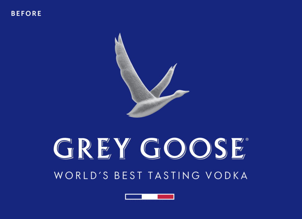
Grey Goose has revamped their visual identity and we love it. The redesign was done by London, UK-based Ragged Edge.
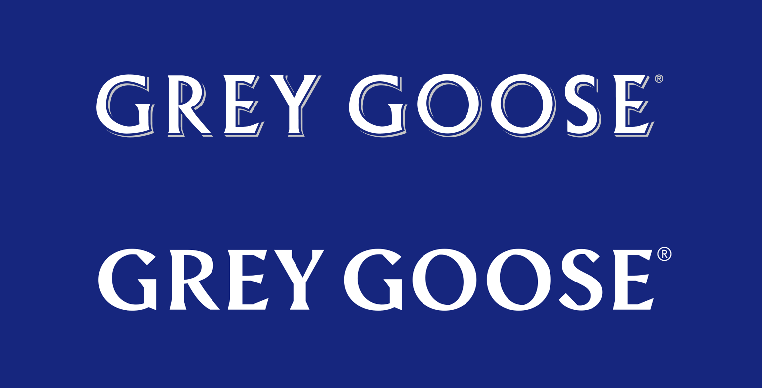
“We needed a bold statement. So we started by redrawing the logotype from scratch – the biggest change to the brand’s identity since its launch in 1997. [The] bespoke type is more contemporary, with just a hint of swagger. The perfect complement to the iconic lone goose symbol.”
When it comes to the goose logo, I have some reservations regarding just how distinctive the goose will actually be.
Although I love the movement towards a more minimalistic icon, the 3D texturing that the logo previously had gave it character and a more luxurious identity.
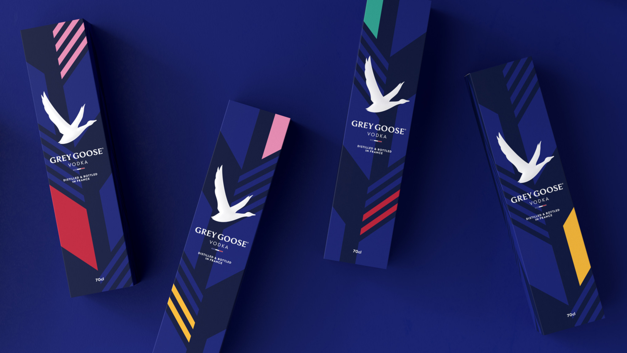
Ragged Edge has successfully made the brand feel more accessible in their attempt to, as they said it, “build a flexible identity full of optimism”
From a marketing perspective, the shorter tagline that spells just “Vodka” now instead of “World’s best tasting Vodka” makes a lot of sense. Most people shop for alcohol based on the label. In recent years, more and more consumers will go for a more minimal tag. This is a trend we’ve seen in wine bottles as well.
However, having a splash of color on your label does help a lot as this study proves. This is why the new Grey Goose packaging will definitely draw your attention in a duty free store. The new subtle patters and their dynamic with the other visuals are definitely my favorite part of the redesign.
Now back to you. What do you think about the Grey Goose Vodka redesign? What do you like and what do you dislike about it?
Let us know in the comments bellow.
After it was announced that Google is pushing a new redesign, we should definitely take a look to see the differences between Gmail 8 version and the new one (Gmail version 9.x). The important thing is that both Android and …
We rolled out a new site design on January 1! This is the 17th version of CSS-Tricks if you can believe that. The versions tend to evolve a decent amount beyond the initial launch, but we archive screenshots on this design history page. Like I said in our 2018 thank you post:
This is easily the most time, effort, and money that's gone into a redesign since the big v10 design. There are a lot of aesthetic changes, but there was also quite a bit of UX work, business goal orientation, workflow tweaking, and backend development work that went along with it.
This is a big one! The reception so far has been pretty great, but please know that we'll be refining it and squishing a lot of bugs here in the early days.
Here are some notes about who was involved, how it happened, and things to notice.
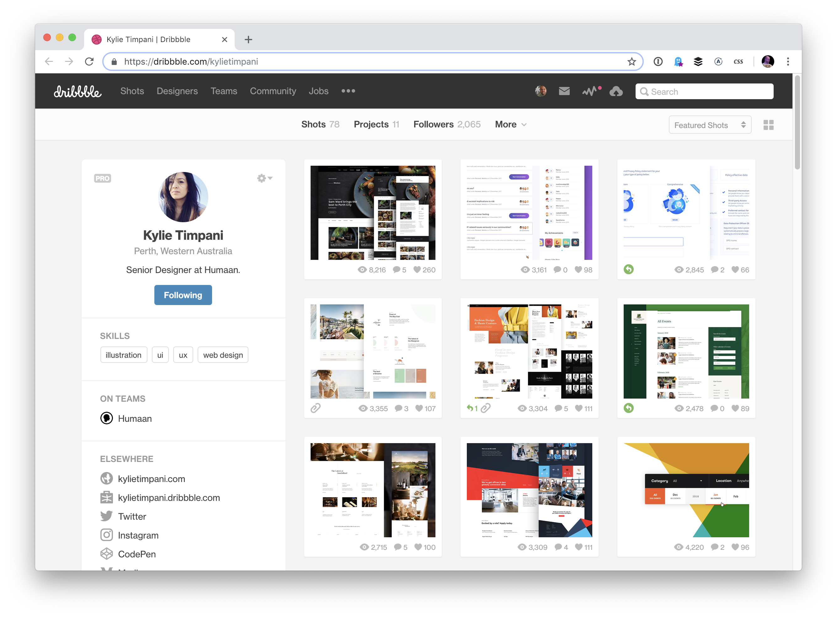
Kylie led this project
Kylie Timpani was the lead designer and really whole project lead on this.
I first reached out to her in April 2017, we chatted in May, and kicked off the work in June. From my perspective, this was a pretty casual process, as I had no particular deadlines and fairly loose goals. Let's make an attractive site that does better in all ways than we do them now.
Kylie was super organized and had a very thoughtful process around every aspect of this. Just in the first block of time that Kylie allocated for this project she:
Took a complete content inventory
Dug into analytic data to understand users, traffic, and usage at a high level
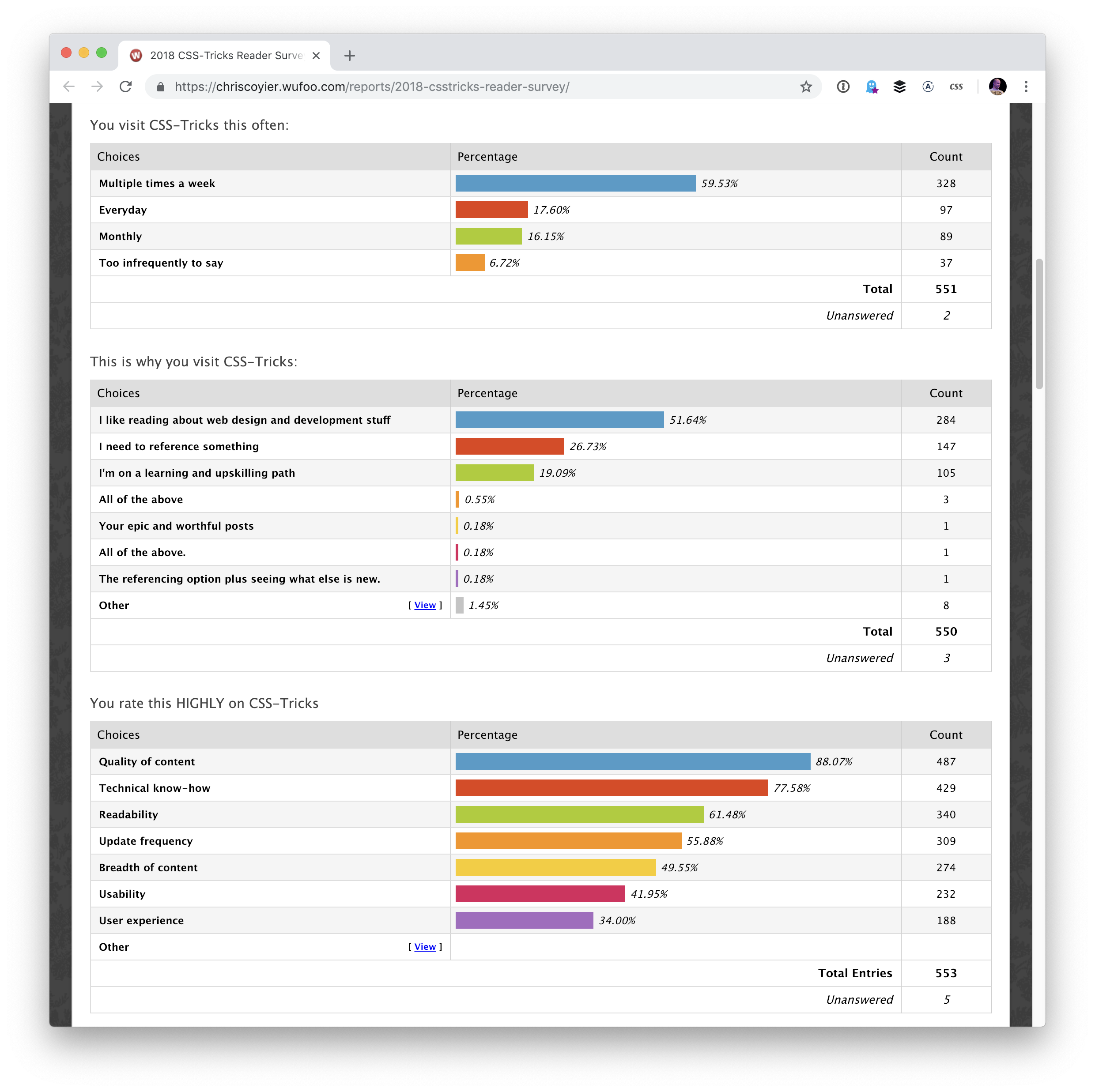
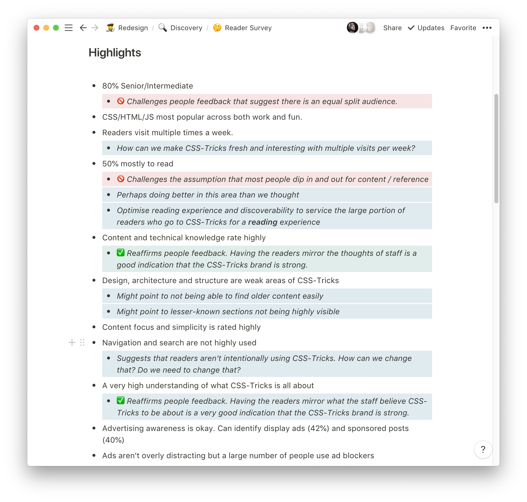
Created, distributed, and analyzed a reader survey to understand readers better and answer specific questions she had for them
Chatted with all the staff members of CSS-Tricks to understand their roles, workflows, and ideas
Kylie's obviously not the kind of the designer that just whips open a design tool and starts noodling around. As great of a visual designer as she is, the work was highly informed. She went on to speak with our advertising agency, clearly identify the site's current strengths and weaknesses, and do light wireframing.
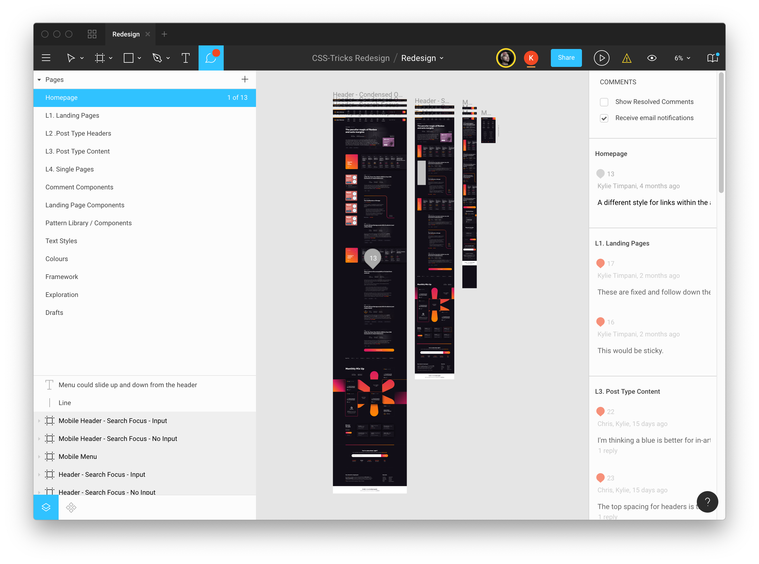
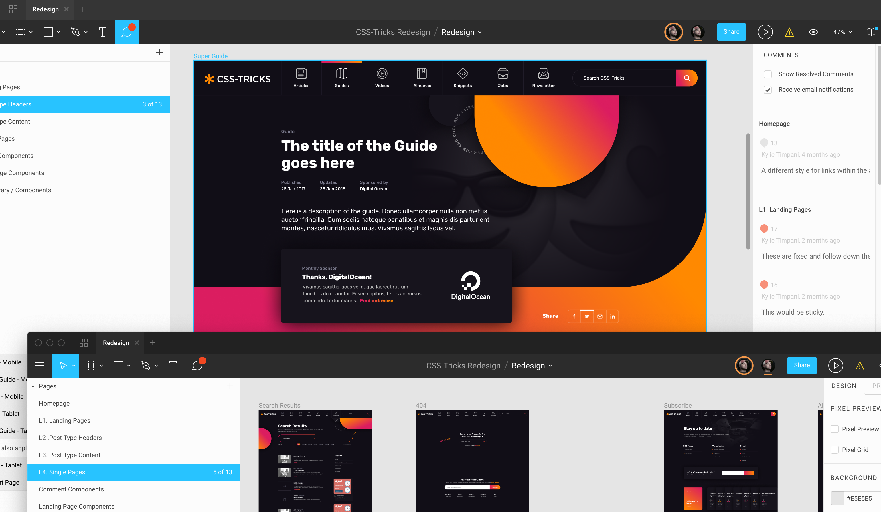
I've been using Figma for visual design stuff, and Kylie was happy to use that as the design tool. That was nice since we both have Team level access and were able to use it collaboratively. For me, it was mostly useful for being able to see and reference everything, and make notes on the designs.
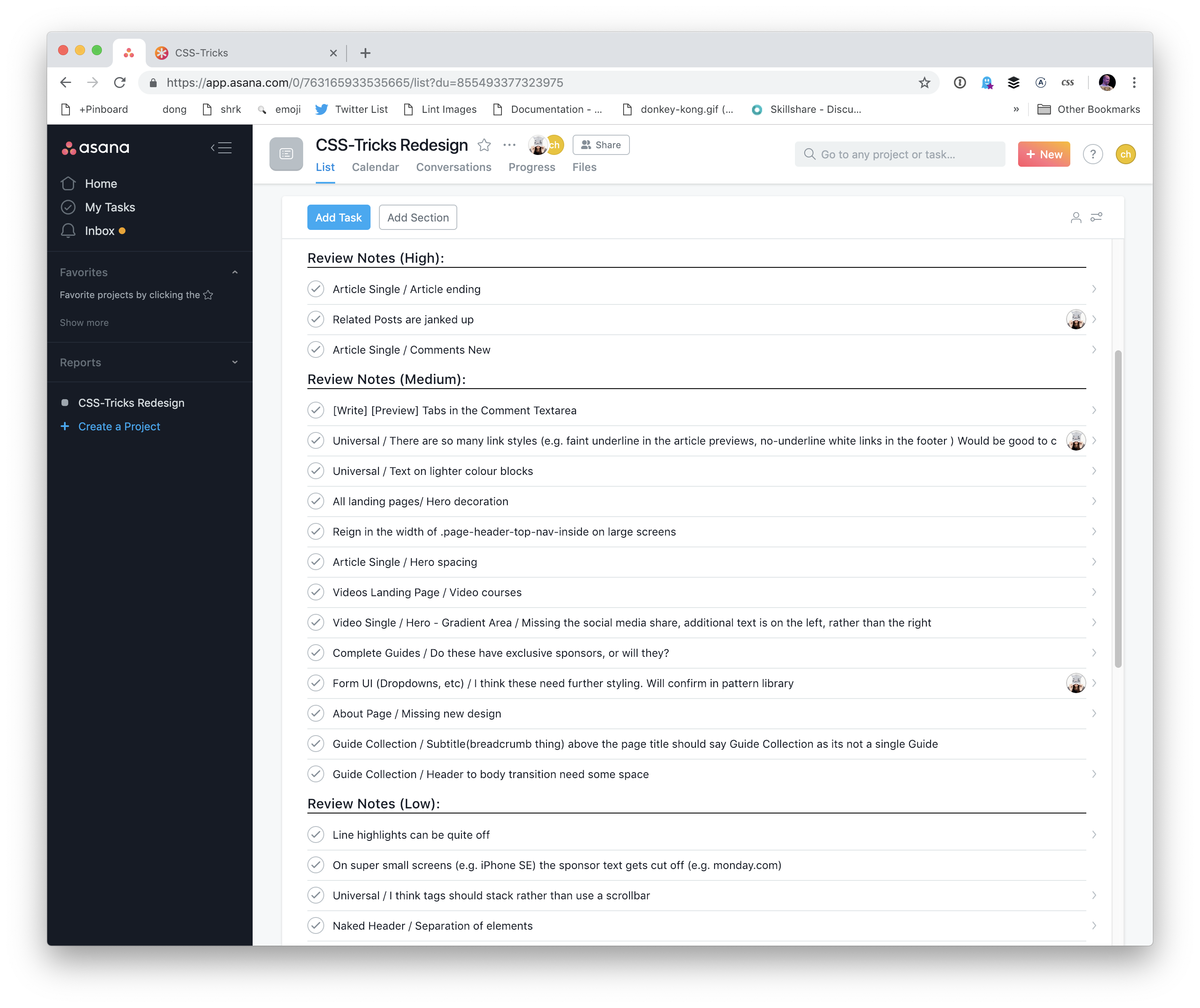
We also used Asana to track what was being worked on and ultimately as a place to track bugs and places where the design implementation needed attention.
Thanks so much, Kylie for all your excellent work on this project! If anything is a bit off or buggy about the site, it's my poor implementation. And good luck! ⤵️
⚡️ So! Speaking of big life changing news... in just a couple of weeks I'll be moving to San Francisco! I'm so SO excited to be joining @nrrrdcore and her truly incredible team over at Apple! 👩🏻💻✨
I'll let y'all explore the design for yourself to find all the little touches we put in, but I'll give a shout out to a few of them where there is a technical detail you might enjoy.
Orange-to-pink
Clearly, we went all dark mode on this design. It's nothing to do with the new media query, although that reminds me we might consider alternations for those who specifically set prefers-color-scheme: light;.
The brand/accent/action colors are orange and pink, which looks quite striking against the darkness but works on light backgrounds as well.
I made a quickie little Sass @mixin that allowed me to use those colors (with variations, if needed) at different angles as backgrounds:
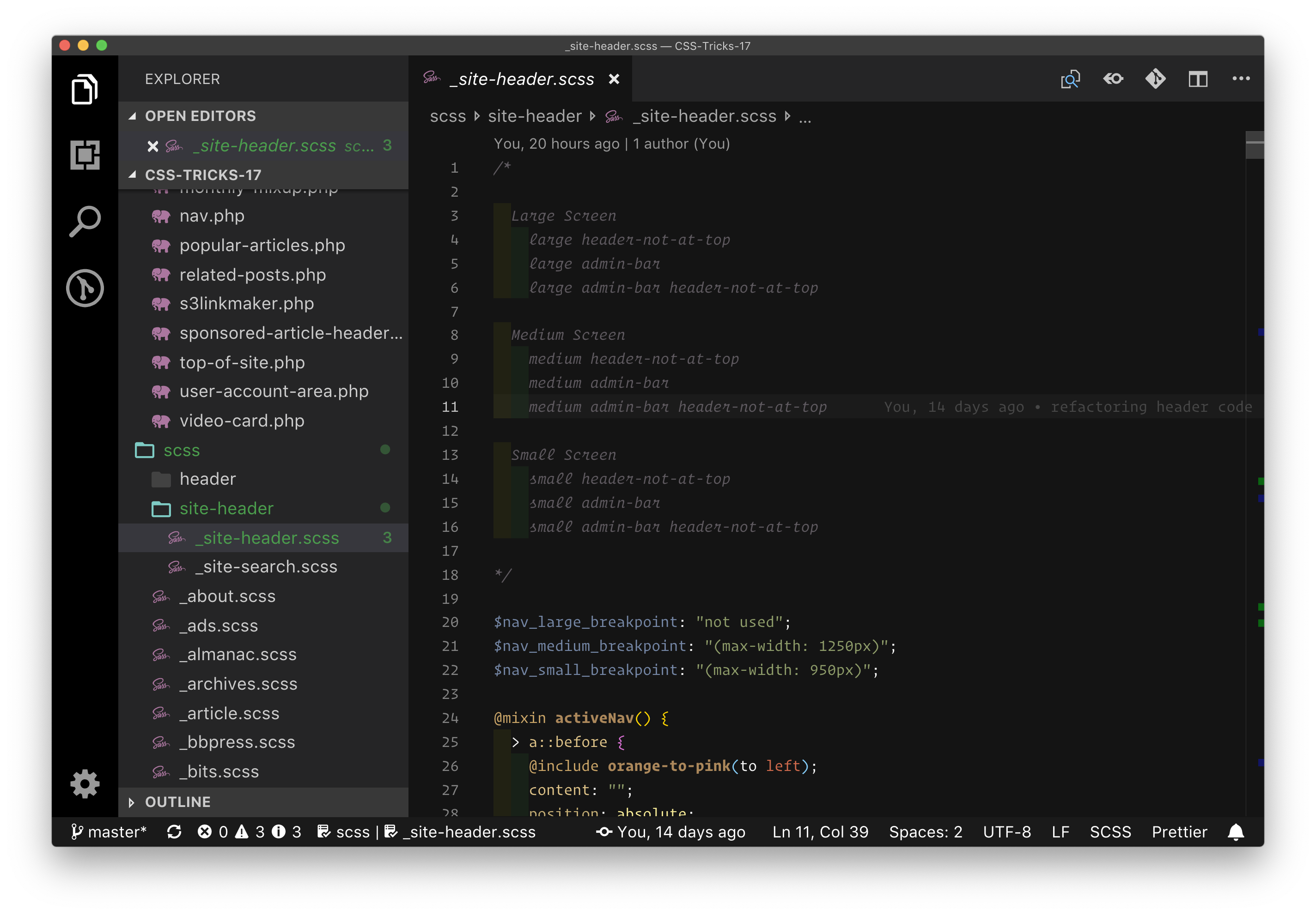
There is something about headers that always bring out more complexity than you might expect. I recently went through this with the new CodePen header/sidebar and it as complicated for this site. Part of what complicated this one was:
It has its own set of unique breakpoints. The header is pretty full, so the breakpoints are pretty specific and unique to it.
We wanted a fixed-position (but minified) header that showed up as you scroll down.
When you're logged in, there is a WordPress admin bar also fixed to the top of the page. I wanted to accommodate for that.
At one point, it was getting pretty messy and I wound up deleting all the CSS for the entire thing and re-wrote it, taking all the states into consideration, and writing media queries that used logic to clearly specify styles in each of those states.
The idea of a not-always-fixed-position header is interesting in and of itself. It means that:
You need to determine when to apply the fixed position
You need to make sure the shift from not-fixed to fixed (and back) doesn't cause layout shifting
I was dead nervous about attaching an onscroll listener and doing math and such to determine when to do the switch. I'm sure it can be done responsibly, but I haven't had great luck with that. Instead, I placed a tiny one-pixel element to the screen and attached an IntersectionObserver to it and reacted to that. That gave me the power to adjust where that is in CSS, which was a nice little touch.
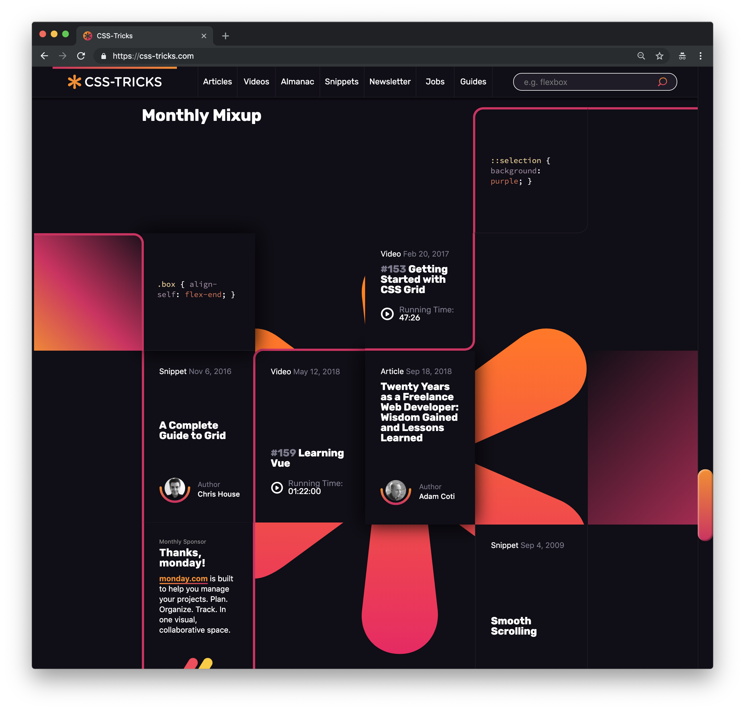
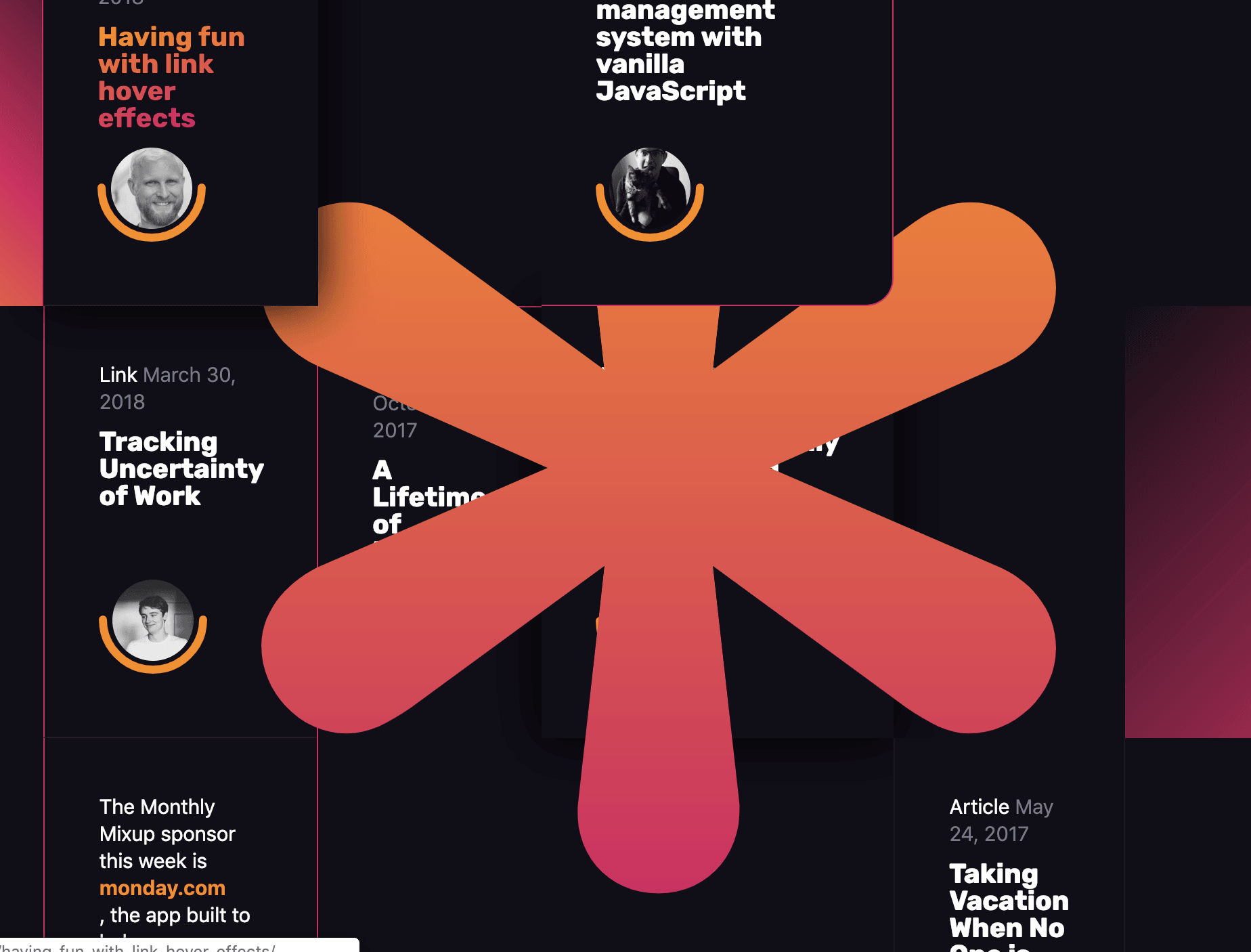
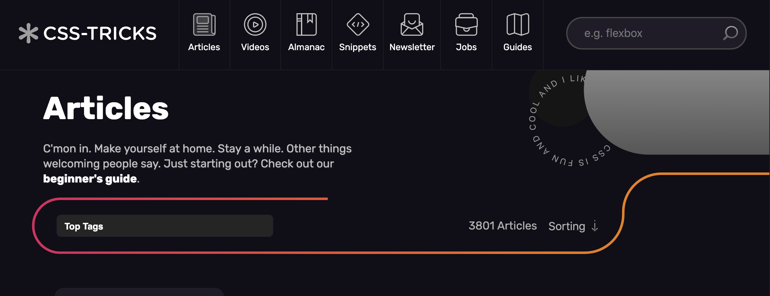
One very cool feature of this design is the Mixup area on the homepage. It was one of Kylie's ideas to show and remind people of the variety and depth of content that is here on CSS-Tricks.
The line that goes through it needs to depend on the height of the HTML content in each of those boxes. The boxes are set on a CSS grid, but they can and should still expand as needed for titles and such. Rather than try to SVG this somehow, the line is essentially stitched together though border and border-radius on individual boxes. To make it line up, I occasionally had to nudge them around with transform.
There was some z-index involved too. It was fun making mistakes along the way:
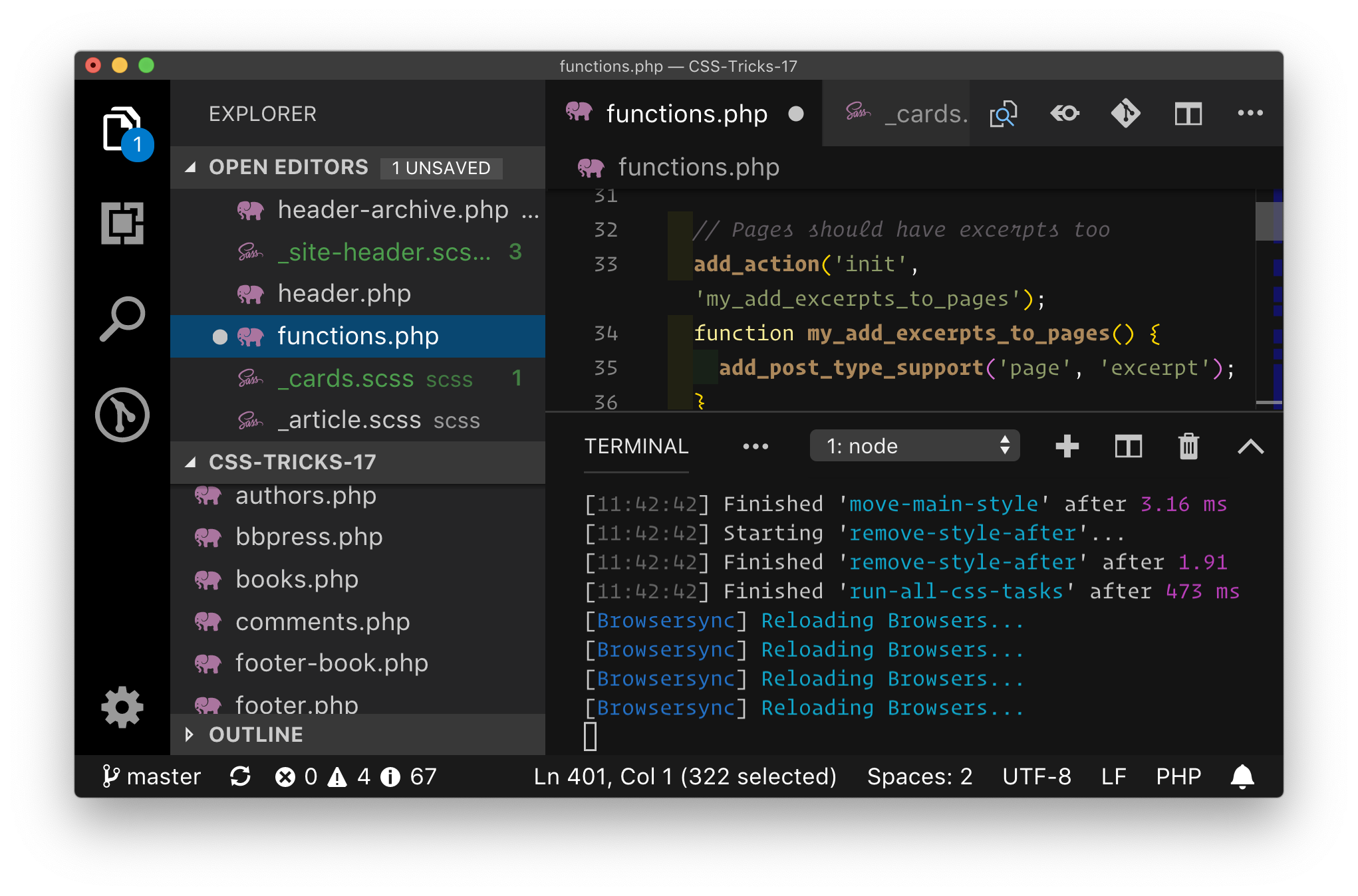
Cards
I'm kinda in love with native scroll snapping. The cards kinda have a fun animation on desktop, revealing the entire card on hover/focus, and then on mobile you can see the whole card, but are easy to thumb through:
Thanks, Amelia!
The design called for these curved line separators:
I have a small degree of confidence with the SVG path syntax, so I took the first crack at it. I was able to design it in a way that it could draw that line OK and keep the stroke at the desired width, but it didn't scale quite right.
I brought in SVG expert Amelia Bellamy-Royds to help me get it right. Feel free to inspect the site to see how it was done. It involves masking and nested SVGs and rectangles and transforms and all sorts of fun stuff. Amelia actually created four variations of the code and carefully noted all the pros and cons of each one. Ultimately, we went with this:
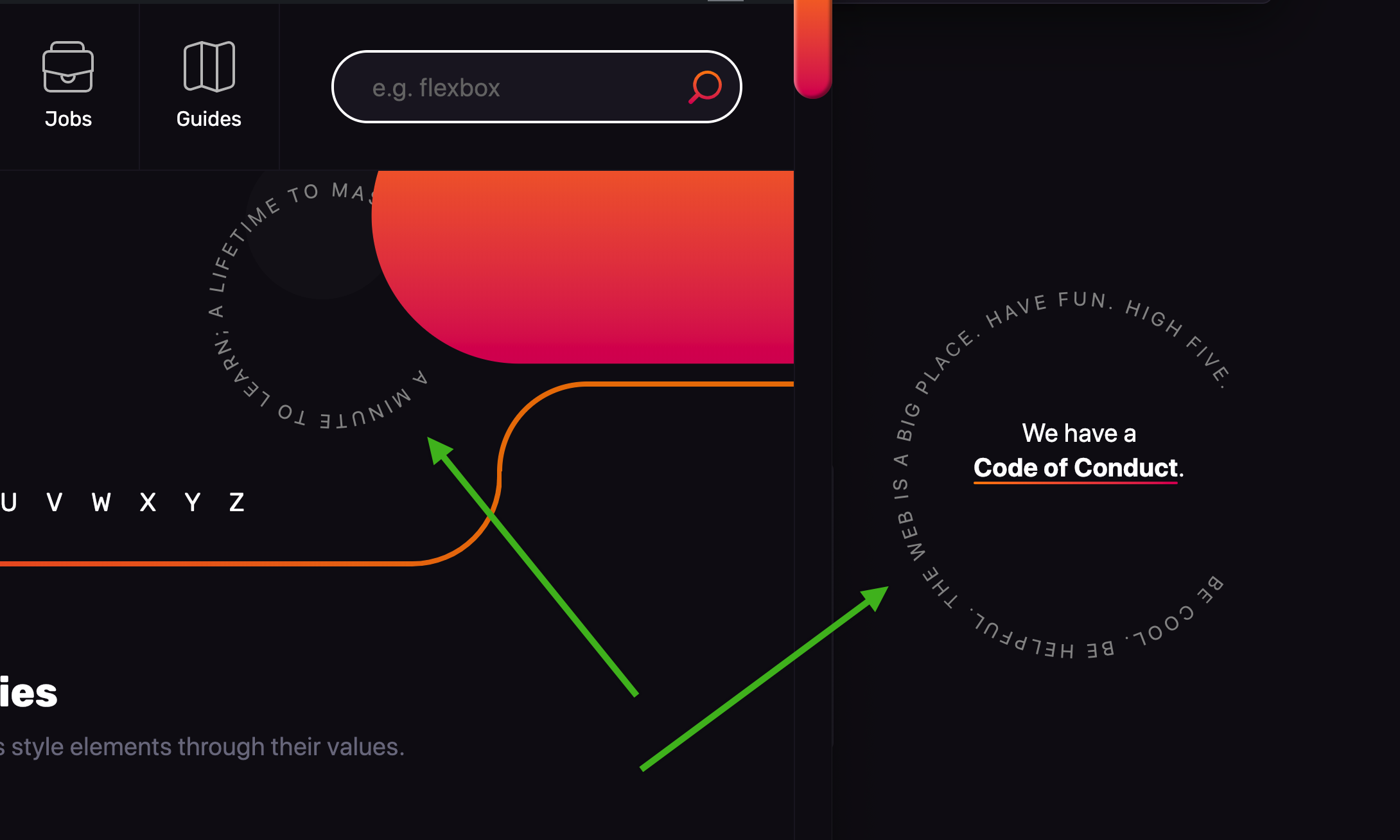
Another thing Amelia helped with was the "circle of text" design element. Kylie had these instances mocked out and I thought they were so cool and I definitely wanted to pull it off. There is a really elaborate way to do it by splitting the characters in to spans and transforming them, but that's a bit messy compared to SVG's <textPath>. I knew I wanted to go the SVG route, but perhaps abstract it away into a reusable component so that it wasn't a heaping pile of code every time I want to use one.
It occurred to me that a web component might be the best way to go here because I can kind of invent the API myself. What I wanted a circle-of-text component to do:
Pass in the text to set on the circle
Declare the radius of the circle
Rotate the circle so I can start the text at any point along the circle
That makes perfect sense as a web component:
<circle-text r="3em" rotate="-90deg">
  CSS is super fun & cool & I like CSS!!!
</circle-text>
My expertise with web components is limited, so I reached out to Amelia again who is great both with web components and SVG—a perfect match! This is what she was able to do, which I easily integrated easily into this design.
Thanks, Ana!
Another design thing that Kylie cooked up that I was a bit perplexed by was this line:
I thought maybe SVG again, but I really wanted to nestle regular HTML content in there nicely. I was hoping to pull it over with borders or something CSS-y. I reached out to Ana Tudor who is fantastic at tricky design situations and solving them with native browser tech. Ana was able to whip up a good solution here using multiple gradient backgrounds in the main area and a border for the top right bit that flies off.
Fonts are a unique part of the loading experience of websites in that their presence (or lack of), how they appear, and how they change all play major roles in the perceived performance of the page.
I've had the good fortune of being able to chat with Zach Leatherman about font loading before, but I still don't feel entirely comfortable with what the best practices are in any given situation. For this design of CSS-Tricks, I made the call to use the system font stack for most of the body copy. That has the major benefit of being instantly available to render and aesthetically seems to work well on a technical site, not to mention generally pairing well with Rubik, our header font.
But we still needed to deal with Rubik. There will be an upcoming article from Zach going into this in more details, but the gist is:
Create a minimal subsetted version of Rubik that handles the majority of usage
<link rel="preload" ... > it
Use it with @font-face using font-display
Load a more robust version in an async second stage
Nice job everyone that worked on the @css relaunch!
Look at those web fonts showing up on that 2.09s Fast 3G first render 🎉
The Forums is such a complicated area of the site to design and maintain, what I've done is just loaded the default bbPress styling for them, instead of trying to override things or start from scratch. I think that'll be the best route going forward.
There is a Gallery section of this site, but I'm not even linking to it anymore as we didn't really keep it up to date very well nor did it get used much. The URL's still work though. Maybe it can make a return someday, but for now, I'm enjoying the reduction of some technical and content debt.
Tech stack
It's somewhat boring. It's about the same thing I've done forever. It's a stock install of WordPress with a custom theme, a dozen or so plugins, and a bit of custom-coded functionality, like having the images powered by Cloudinary. It's running on a custom Media Temple-built box so it can have PHP 7 and MySQL 5.6, plus a firewall that also acts as a CDN. It's nice to have a pretty snappy foundation, so it's on me as a front-end dev to keep it that way.
I used SVG for the icons, Sass for the styling, and Babel to write jQuery-based functionality in ES6. I wrote up a Gulp file to do all that processing and run the local BrowserSync dev server. Local WordPress via Local by Flywheel.
I'm actually pretty happy with the stack as it felt quick and productive to me. But I admit, part of me wishes I dug a little harder into new tech, like building webpack-based processing or trying to go all-in on a server-rendered and React-powered headless WordPress via GraphQL kinda thing. The reason I didn't is because boring has served me so well and time is a major factor since I'm developing alone (my budget doesn't exactly make available a whole development team). My guess is a major front-end infastructure overhaul would have tripled the dev time for questionable benefits. It still sounds like fun and might open up future doors, but hey, another time.
My last regret is that I wish I had spun up a real pattern library system from the start. I think I did OK in breaking things up into reusable parts, but the site isn't truly componentized. As I approached the finish line, I started to see how this could have gone a bit smoother for me should I have worked with true components that accepted data and had variations and such. Native PHP isn't great for that, so it would have forced me into some kind of templating system, and I probably wouldn't have regretted it. If I stay in PHP next time, maybe I'd use something like Timber and Twig for all the components, and then Fractal for the pattern library since it supports Twig. I kind of dig the way Timber abstracts the data stuff from the views.
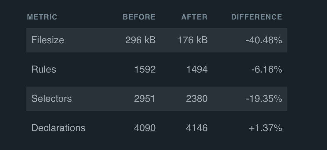
I hadn't heard of this app until now, but check out Project Wallace:
Project Wallace is a project aimed at gaining insights in your CSS over a longer period of time. It started a couple of years ago as a frustration with existing CSS analyzers that only do a one-time only analysis. As time went by, more and more features were added and now Wallace is place to go for developers who want to know if their complexicity has increased or for a designer who wants to know if all the correct colors and fonts are being used.
Bart Veneman set it up to watch CSS-Tricks, and you can see a before/after comparison and charts over time. Bart blogged about the numbers for us as well. Thanks Bart!
The true usefulness of CodePen Embed Themes came out here. The whole point of an embed theme is that you can use them to match the design of where the Pens will be embedded, and if you need to change that design, you can change them all in one fell swoop. There are probably thousands of embedded Pens on this site, and they all got updated at once with one theme change.
There are a few special things that I've done with CodePen embeds on this site:
The are resizable from the bottom right corner. Used jQuery. Like this.
They have a placeholder height. When you embed a Pen, you can choose how tall you want it to be. That's how tall the <iframe> will come in as. But I've adjust it so that the <p> that is there before the iframe comes in will be that same height, so there is no reflow jank.
We're gonna bring that feature to CodePen itself real soon. Notice in that RegEx above I'm also forcing the theme id. That way, all embedded Pens definitely have the correct theme, even if we forget.
Achievement unlocked: The custom scrollbar is the new feature that everyone either loves or hates
If there has been one constant in every CSS-Tricks design, it's that there's at least one feature people either love or hate. This time, I'm happy to announce it's the custom scrollbar. In a sense, it's for myself. I manually use scrollbars quite a bit and it feels both fun and highly usable to grab onto this big beefy chunk of pink love.
It's also a little inspired by VS Code, which features a pretty beefy scrollbar itself:
There are general usability considerations about custom scrollbars for sure, but I don't feel like they've been breached too heavily here, if at all. I've heard some "don't mess with my browsers UI" feedback, which I sorta get, but does that mean we shouldn't style any form controls, or even use CSS at all? (LOL.) And don't scrollbars come from the system, not the browser?
Anyway, I'm not faking them or anything. I'm just using ::-webkit-scrollbar and friends. There is official scrollbar styling stuff on the way, per the CSS specs. I didn't use any of that stuff/ I think I'll wait for at least one browser to support it.
We have plenty of bug fixing and polishing to do still on this design. If you've emailed or tweeted or communicated with us in some way about it, I've probably seen it and have been log it all to make sure it's all addressed the best we can. Plus stay tuned for some fun new features!
Changes in the digital world are happening rapidly and every industry is affected. That is why great companies keep up with trends, so they don’t become part of the past. Microsoft revealed new, modern Office App Icons. But did they …
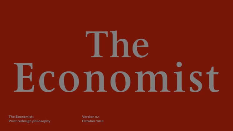
It’s been decades since one of the oldest news magazines in the world has looked different. That all changed in October when The Economist launched a redesign that freshens up the look of the news and makes it easier to …


 ) we’re sure you’ll feel at home in this tab. All the filters/searches are bookmarkable too, should you have favorites you absolutely need to jump back to quickly.
 . While I’ll miss the 2011 nostalgia, the new Settings page is a thing of beauty. Beyond the UI and UX we also ripped out another huge chunk of our Ruby on Rails stack and modernized to reusable React Components, expanded our GraphQL API, and refined our component library. The Settings codebase is a joy to work with!


