Single-page application technology has become the de facto standard for creating modern web applications today due to the numerous benefits related to loading times and user experience. Industry giants of the digital space that have already adopted this approach to web development include Facebook, Gmail, Google Maps, LinkedIn, and Netflix.
But is a single-page application framework the right one for your upcoming web project? In this blog post, I’ll set out what a single-page application is, its benefits, and when you should use it.
What Is a Single-page Application?
A single-page application (SPA) is a JavaScript framework for distributing application functionality over the web. The three most popular SPA tools are:
In this week's roundup: Firefox gains locksmith-like powers, Samsung's Galaxy Store starts supporting Progressive Web Apps, CSS Subgrid is shipping in Firefox 70, and a new study confirms that users prefer to tap into content rather than scroll through it.
Let's get into the news.
Securely generated passwords in Firefox
Firefox now suggests a securely generated password when the user focuses an <input> element that has the autocomplete="new-password" attribute value. This option is also available via the context menu on any password field.
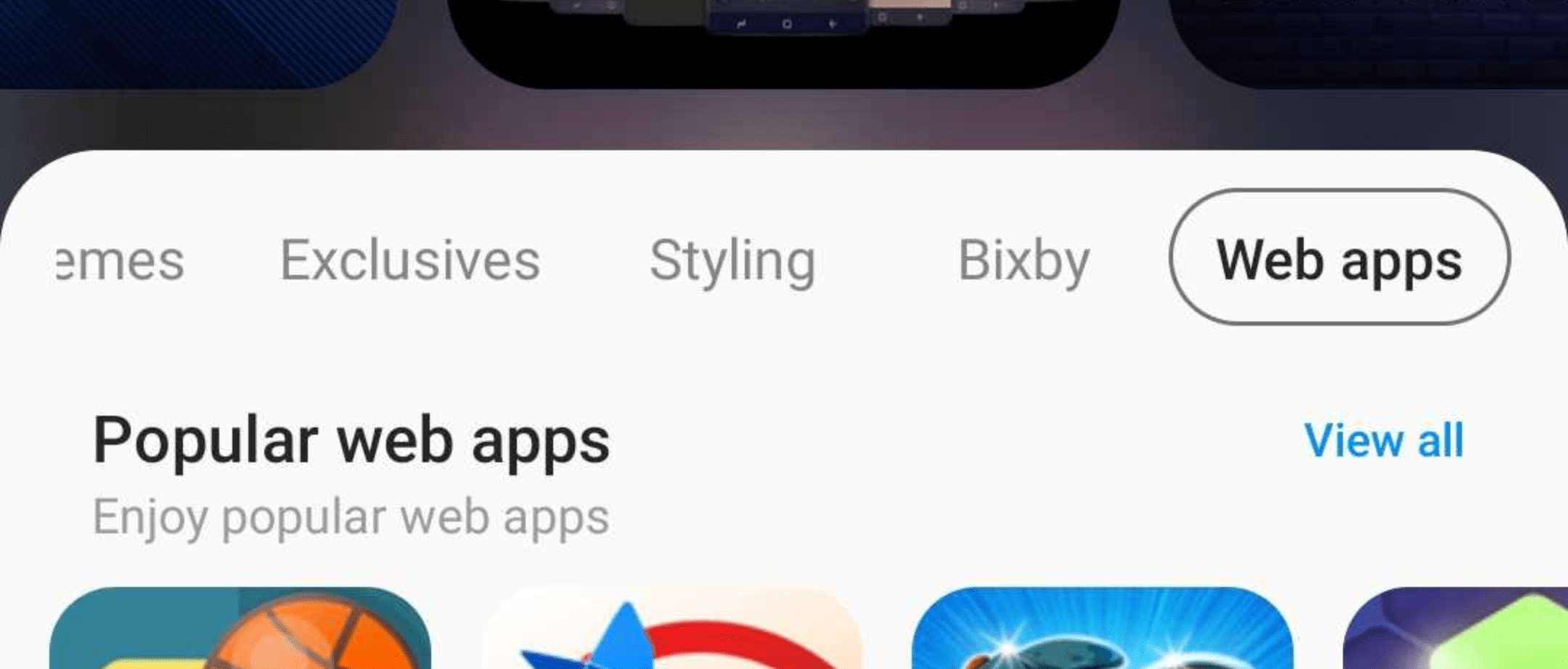
Samsung has started adding Progressive Web Apps (PWA) to its app store, Samsung Galaxy Store, which is available on Samsung devices. The new “Web apps” category is visible initially only in the United States. If you own a PWA, you can send its URL to pwasupport@samsung.com, and Samsung will help you get onboarded into Galaxy Store.
According to a study commissioned by Google, the majority of people prefer tappable stories over scrolling articles when consuming content on the mobile web. Google is using this study to promote AMP Stories, which is a format for tappable stories on the mobile web.
Both studies had participants interact with real-world examples of tappable stories on the mobile web as well as scrolling article equivalents. Forrester found that 64% of respondents preferred the tappable mobile web story format over its scrolling article equivalent.
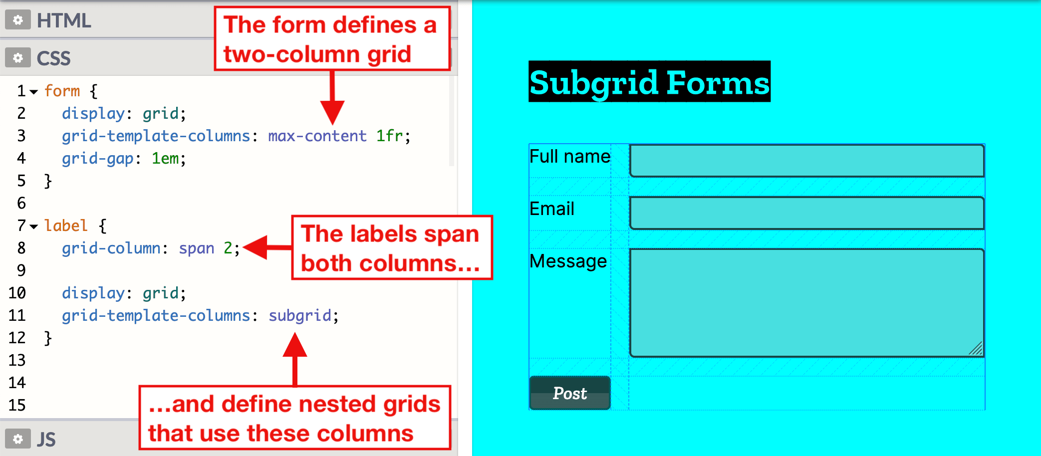
CSS Subgrid is shipping in Firefox next month. This new feature enables grid items of nested grids to be put onto the outer grid, which is useful in situations where the wanted grid items are not direct children of the grid container.
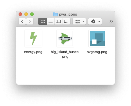
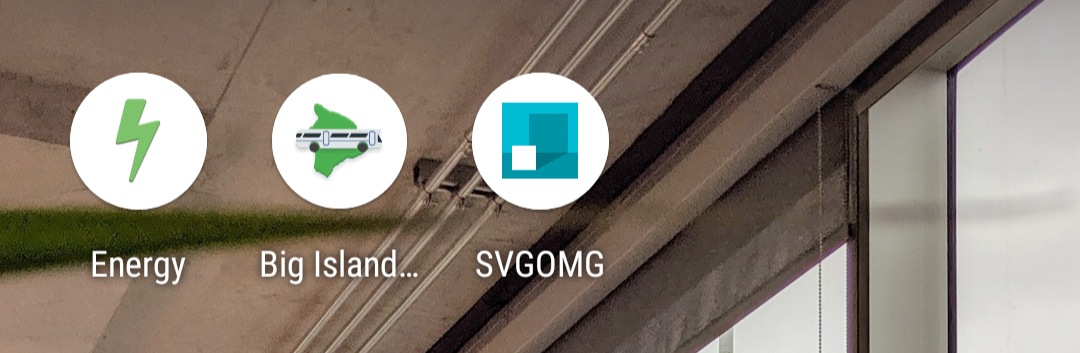
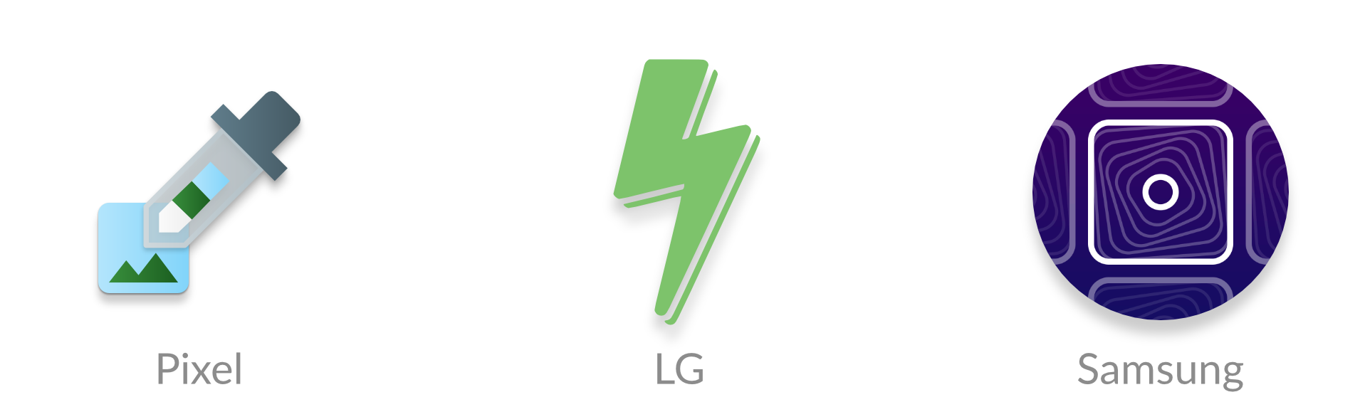
You’ve created a Progressive Web App (PWA), designed an icon to represent it, and now you’re installing it to your Android home screen.
But, if you have a recent Android phone, your icons will show up like this:
What happened? Well, Android Oreo introduced adaptive icons, a new icon format that enforces the same shape for all icons on the home screen. Icons that don’t follow the new format are given a white background.
However, there is a new web feature called maskable icons that is coming soon to Firefox Preview and other web browsers. This new icon format will let your PWAs have their own adaptive icons on Android.
I work at Mozilla and have implemented support for maskable icons in Firefox Preview. I’ll show you how to add them to your own PWAs for Android.
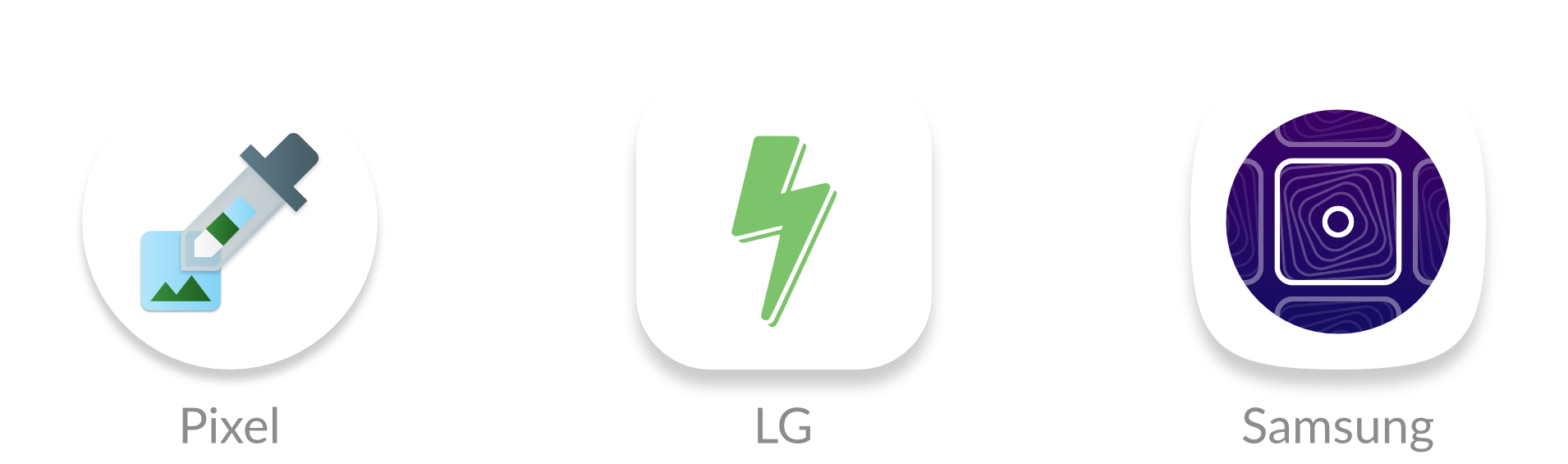
What are maskable and adaptive icons?
Until a few years ago, Android app icons were freeform and could be any shape. This meant that web apps could also reuse the same transparent icon when pinned to the home screen.
However, manufacturers, like Samsung, wanted to make all icons on a device the same shape to keep things consistent. Some manufacturers even wanted different shapes. To deal with the variety of requirements from manufacturers and devices, Android introduced “adaptive icons.” You supply an image with extra space around the edges, and Android will crop it to the correct shape.
But web apps are designed to work on any platform, so they don’t have APIs to create these special Android icons. Instead, icons would get squished into white boxes like this:
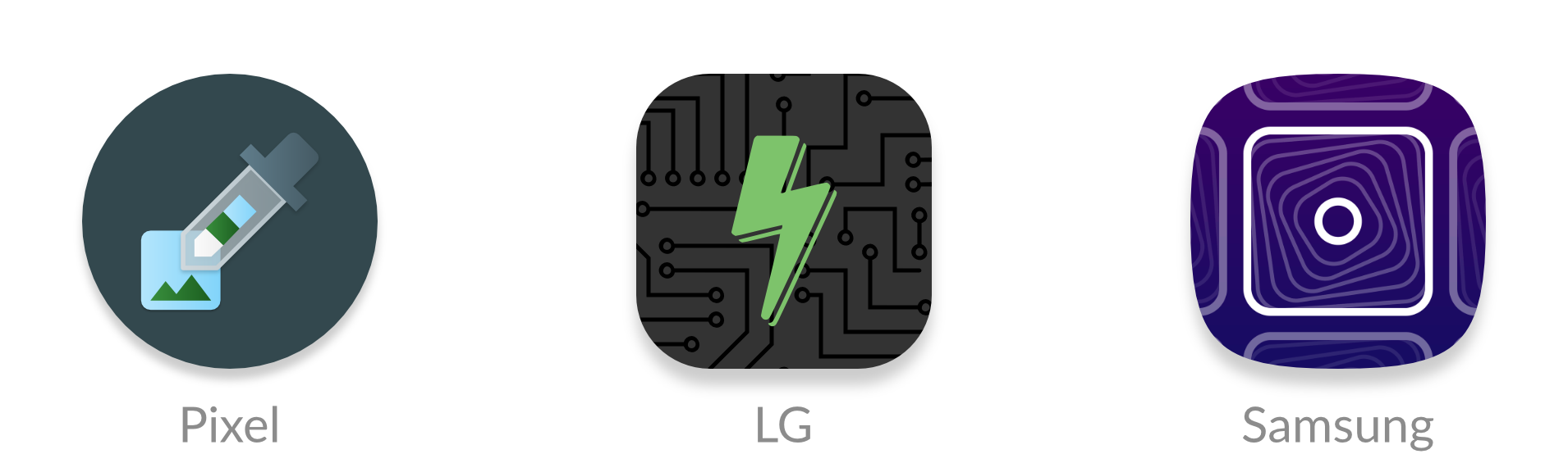
Lo and behold, last September a brand new API descended upon us and was added to the W3C spec. Maskable icons allow web developers to specify a full-bleed icon that will be cropped. It’s platform agnostic, so Windows could use them for tiles or iOS could use them for icons.
How to create maskable icons
Since the maskable icon format is designed work with any platform, the size and ratios are different from the size and ratios of Android’s adaptive icons. This means you can’t reuse the same asset.
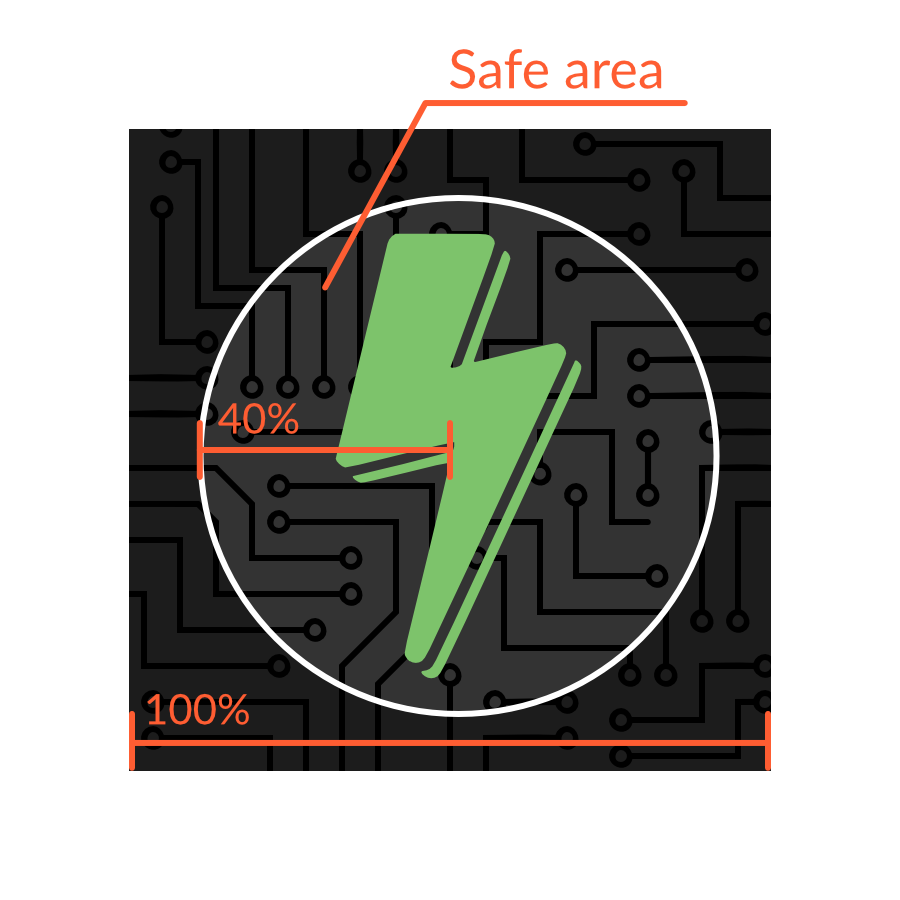
Maskable icons can be any size, and you can continue to use the same sizes that you’d use for normal transparent icons. But when designing the icon, ensure that important information is within a “safe zone” circle with a radius equal to 40% of the image’s size.
The safe zone
All pixels within this zone are guaranteed to be visible. Pixels outside the zone may be cropped off depending on the icon shape and the platform.
Warning: If you already have an Android app, avoid copying and pasting the icon from your Android app to your web app. The ratios are different, so your icons would look too small.
Adding the icon to your Web App Manifest
Once the icons are created, you can add an entry to your Web App Manifest similar to other icon assets. The Web App Manifest provides information about your web app in a JSON file, and includes an "icons" array.
Maskable icons use a special new key, "purpose", to indicate that they are meant to be used with icon masks. Icons with transparent backgrounds have a default "purpose" of "any", and icons can be used for multiple purposes by separating each option with a space.
"purpose": "maskable any"
Preview your icons
Do you want to see what your own maskable icons will look like? I’ve created a tool, Maskable.app, to help you evaluate how the icon appears in different shapes.
The app lets you preview your icon in various shapes that can be found on Android devices. I hope this tool helps you create unique icons for your Progressive Web Apps.
Once you’re satisfied with the results, you can start testing your app with Mozilla’s Reference Browser. This special browser is a testing ground for features before they reach Firefox Preview, and you can use it to check out how your PWA looks. Chrome is working on maskable icon support too.
Tools like PWACompat also have support for maskable icons. You can automatically generate icons for iOS and other devices based on your new maskable icons!
Time to build your own icons
If you want to more control over how your PWA icons are displayed on Android, maskable icons is the way to go. With maskable icons you can customize how your icon is displayed from edge-to-edge. Hopefully this article can get you started on creating your first maskable icon.
I recently drew up a wireframe for a code beautifier. The next day, I decided to turn it into a real tool. The whole project took less than two days to complete.
I'd been thinking about building a new code beautifier for a while. The idea isn't unique, but every time I use someone else's tool, I find myself reapplying the same settings and dodging advertisements every single time. 🤦🏻
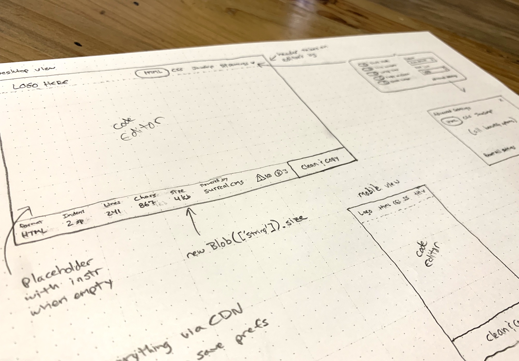
I wanted a simple tool that worked well without the hassle, so last week I grabbed some paper and started sketching one out. I'm a huge fan of wireframing by hand. There's just something about pencil and paper that makes the design part of my brain work better than staring at a screen.
I kicked off the design process by hand-drawing wireframes for the app.
I was immediately inspired after drawing the wireframe. The next day, I took a break from my usual routine to turn it into a something real. 👨🏻💻
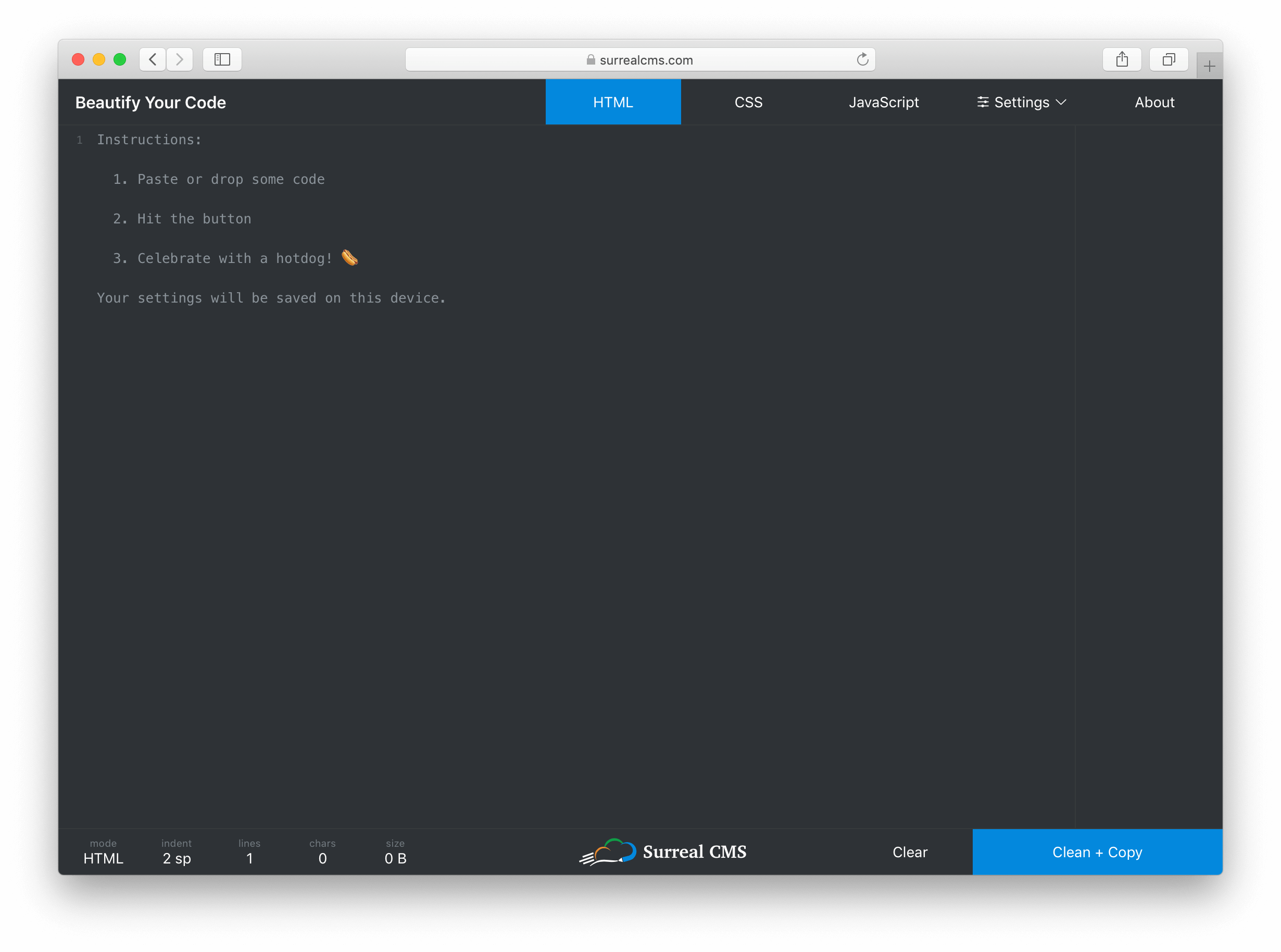
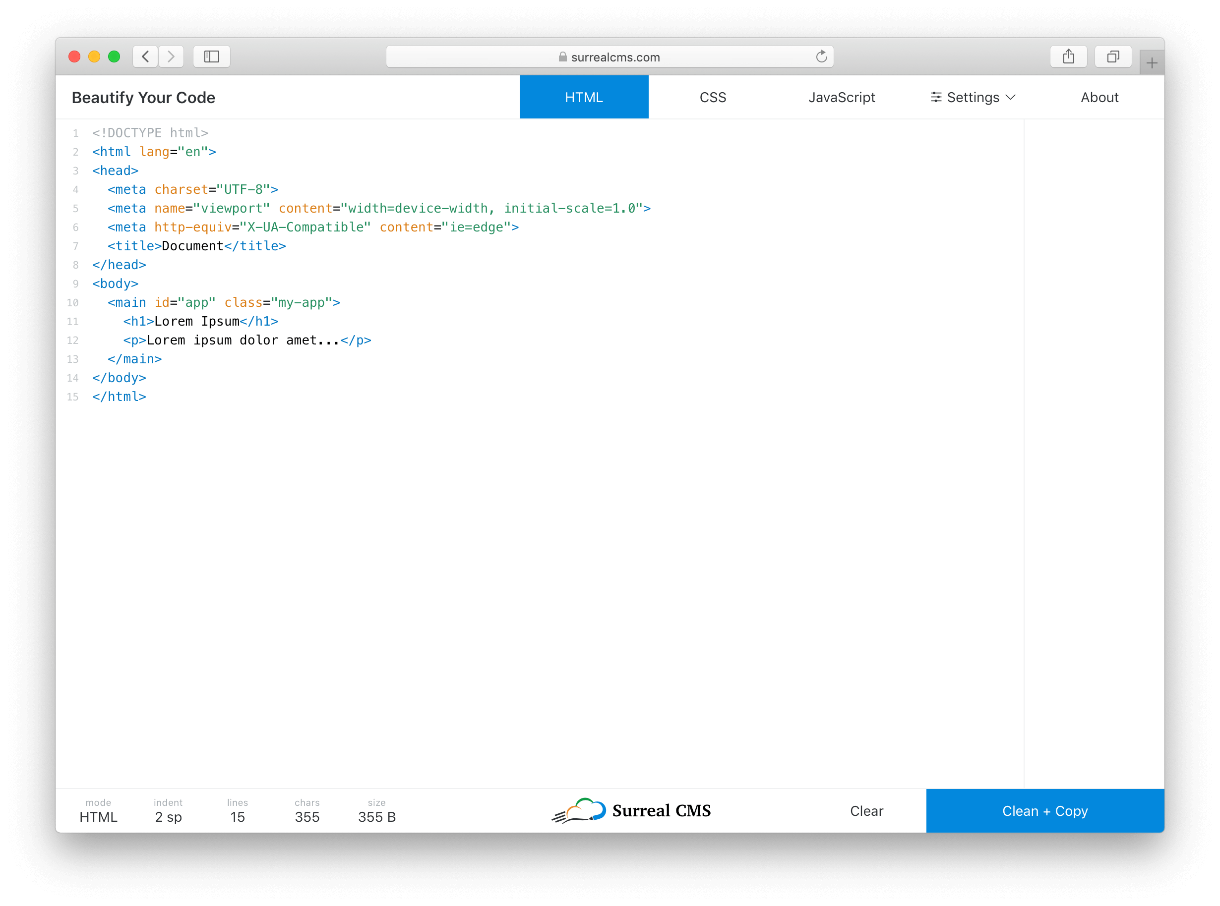
I knew I wanted the code editor to be the main focus of the tool, so I created a thin menu bar at the top that controls the mode (i.e. HTML, CSS, JavaScript) and settings. I eventually added an About button too.
The editor itself takes up most of the screen, but it blends in so you don't really notice it. Instead of wasting space with instructions, I used a placeholder that disappears when you start typing.
The Dark Mode UI is based on a toggle that updates the styles.
At the bottom, I created a status bar that shows live stats about the code including the current mode, indentation settings, number of lines, number of characters, and document size in bytes. The right side of the status bar has a "Clear" and "Clean + Copy" button. The center has a logo shamelessly plugging my own service.
I don't think many developers really code on phones, but I wanted this to work on mobile devices anyway. Aside from the usual responsive techniques, I had to watch the window size and adjust the tab position when the screen becomes too narrow.
I'm using flexbox and viewport units for vertical sizing. This was actually pretty easy to do with the exception of a little iOS quirk. Here’s a pen showing the basic wireframe. Notice how the textarea stretches to fill the unused space between the header and footer.
If you look at the JavaScript tab, you’ll see the iOS quirk and the workaround. I’m not sure how to feature detect something like this, so for now it’s just a simple device check.
Handling settings
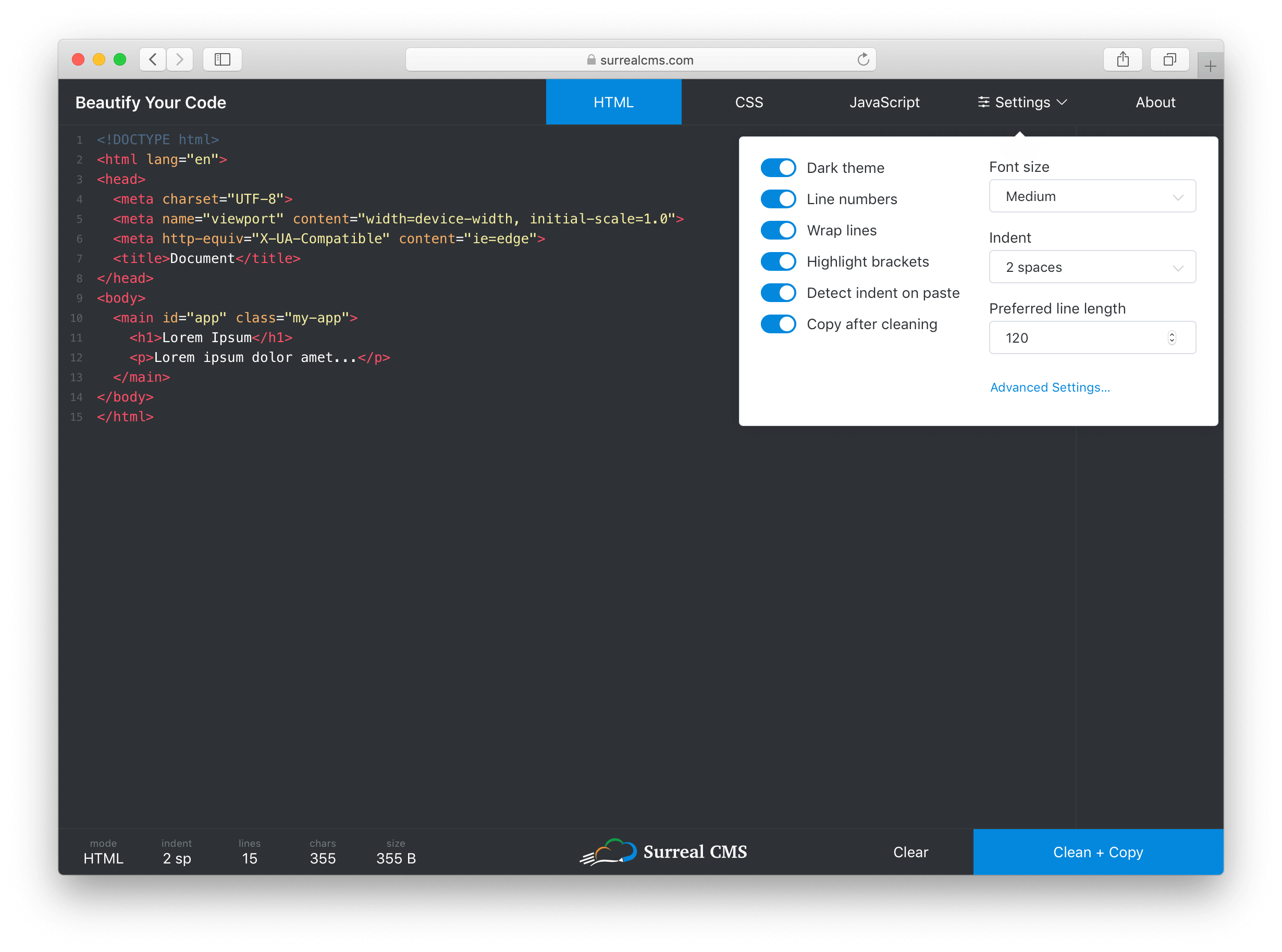
I wanted to keep the most commonly used settings easy to access, but also expose advanced settings for each mode. To do this, I made the settings button a popover with a link to more advanced settings inside. When a setting is changed, the UI updates immediately and the settings are persisted to localStorage.
The most common settings are contained in a small panel that provides quick access to them, while advanced settings are still accessible via a link in the panel.
I took advantage of Vue.js here. Each setting gets mapped to a data property, and when one of them changes, the UI updates (if required) and I call saveSettings(). It works something like this.
function saveSettings() {
  const settings = {};

  // settingsToStore is an array of property names that will be persisted
  // and "this" is referencing the current Vue model
  settingsToStore.map(key => settings[key] = this[key]);
  localStorage.setItem('settings', JSON.stringify(settings);
}
Every setting is a data property that gets synced to localStorage. This is a rather primitive way to store state, so I might update the app to use a state management library such as Vuex later on.
To restore settings, I have a restoreSettings() function that runs when the app starts up.
function restoreSettings() {
  const json = localStorage.getItem('settings');

  if (json) {
    try {
      const settings = JSON.parse(json);

      Object.keys(settings).forEach(key => {
        if (settingsToStore.includes(key)) {
          this[key] = settings[key];
        }
      });
    } catch (err) {
      window.alert('There was an error loading your previous settings');
    }
  }
}
The function fetches settings from localStorage, then applies them one by one ensuring only valid settings in settingsToStore get imported.
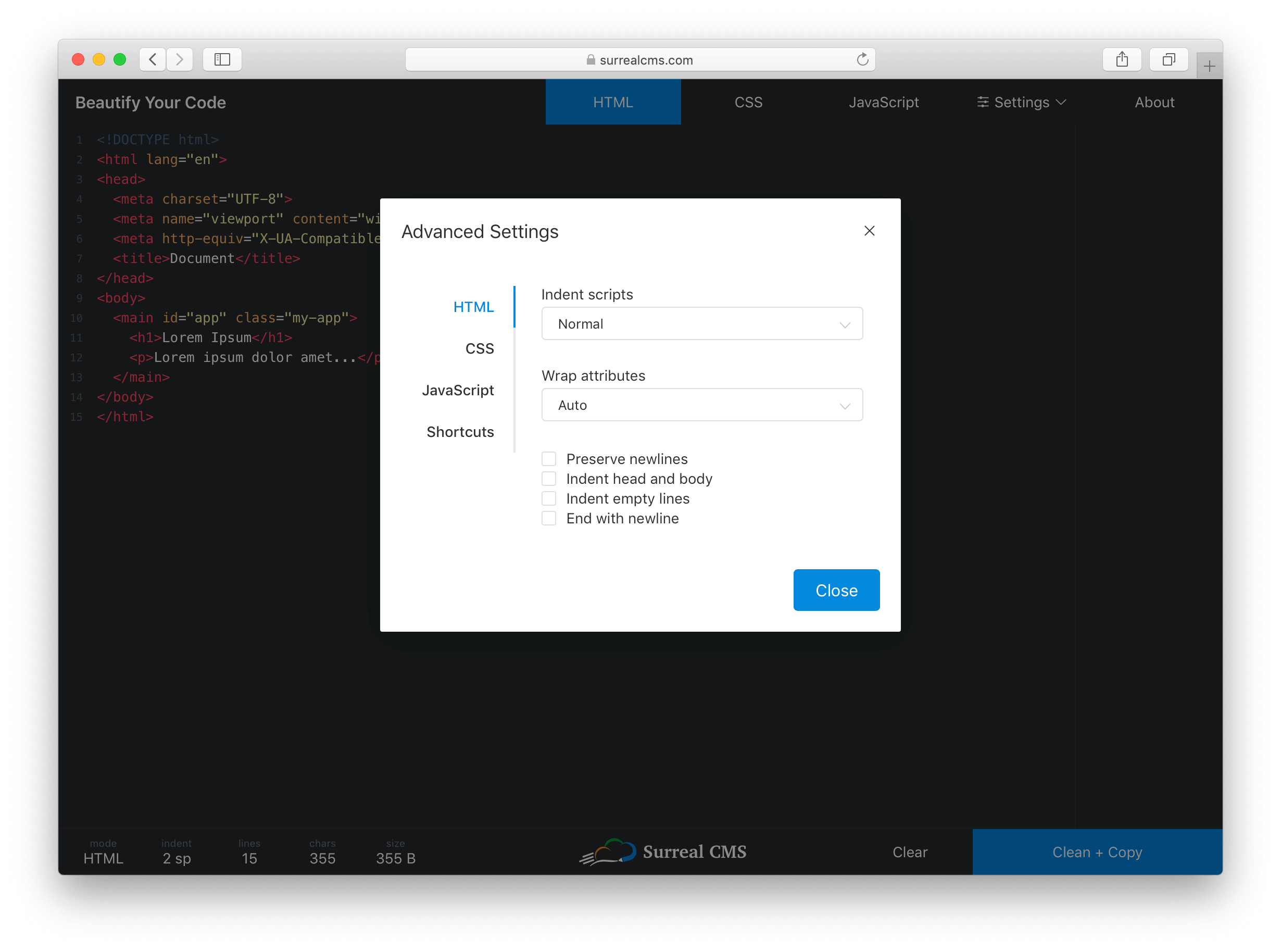
The Advanced Settings link opens a dialog with tabs for each mode. Despite having over 30 settings total, everything is organized and easy to access so users won't feel overwhelmed.
Clicking the "Advanced Settings" link opens up language-specific preferences and shortcuts.
Applying themes
Dark mode is all the rage these days, so it's enabled by default. There's also a light theme for those who prefer it. The entire UI changes, except for popovers and dialogs.
I considered using prefers-color-scheme, which coincidentally landed in Firefox 67 recently, but I decided a toggle would probably be better. Browser support for the color theme preference query isn't that great yet, plus developers are weird. (For example, I use macOS with the light theme, but my text editor is dark.)
The app with Light Mode UI enabled.
Defining features
Coming up with feature ideas is fairly easy. It’s limiting features for an initial release that’s hard. Here are the most relevant features I shipped right away:
Beautifies HTML, CSS, and JavaScript code
Syntax highlighting with tag/bracket matching
Paste or drop files to load code
Auto-detects indentation preference based on pasted code or dropped file
Light and dark themes
Clean and copy in one click
Keyboard shortcuts
Most JS Beautify options are configurable
Settings get stored indefinitely in localStorage
Minimal UI without ads (just an unobtrusive plug to my own service) 🙈
I also threw in a few easter eggs for fun. Try refreshing the page, exploring shortcuts, and sharing it on Facebook or Twitter to find them. 😉
The tools and libraries I used
I'm a big fan of Vue.js. It's probably overkill for this project, but the Vue CLI let me start building with all the latest tooling via one simple command.
vue create beautify-code
I didn't have to waste any time scaffolding, which helped me build this out quickly. Plus, Vue came in handy for things like live stats, changing themes, toggling settings, etc. I used various Element UI components for things like buttons, form elements, popovers, and dialogs.
The editor is powered by CodeMirror using custom styles. It’s a well-supported and fantastic project that I can’t recommend enough for in-browser code editing.
The library that does all the beautifying is called JS Beautify, which handles JavaScript, HTML, and CSS. JS Beautify runs on the client-side, so there’s really no backend to this app — your browser does all the work!
JS Beautify is incredibly easy to use. Install it with npm install js-beautify and run your code through the appropriate function.
import beautify from 'js-beautify';

const code = 'Your code here';
const settings = {
  // Your settings here
};

// HTML
const html = beautify.html(code, settings)

// CSS
const css = beautify.css(code, settings)

// JavaScript
const js = beautify.js(code, settings)
Each function returns a string containing the beautified code. You can change how each language is output by passing in your own settings.
I’ve been asked a few times about Prettier, which is a comparable tool, so it’s worth mentioning that I chose JS Beautify because it’s less opinionated and more configurable. If there’s enough demand, I’ll consider adding an option to toggle between JS Beautify and Prettier.
I've used all of these libraries before, so integration was actually pretty easy. 😅
This project was made possible by my app, Surreal CMS. If you’re looking for a great CMS for static websites, check it out — it’s free for personal, educational, and non-profit websites!
Oh, and if you’re wondering what editor I used... it’s Visual Studio Code. 👨🏻💻
We’ve looked at React Hooks before, around here at CSS-Tricks. I have an article that introduces them as well that illustrates how to use them to create components through functions. Both articles are good high-level overviews about the way they work, but they open up a lot of possibilities, too.
So, that’s what we’re going to do in this article. We’re going to see how hooks make our development process easier and faster by building a chat application.
Specifically, we are building a chat application using Create React App. While doing so, we will be using a selection of React Hooks to simplify the development process and to remove a lot of boilerplate code that’s unnecessary for the work.
There are several open source Reacts hooks available and we’ll be putting those to use as well. These hooks can be directly consumed to build features that otherwise would have taken more of code to create. They also generally follow well-recognized standards for any functionality. In effect, this increases the efficiency of writing code and provides secure functionalities.
Let’s look at the requirements
The chat application we are going to build will have the following features:
Get a list of past messages sent from the server
Connect to a room for group chatting
Get updates when people disconnect from or connect to a room
Send and receive messages
We’re working with a few assumptions as we dive in:
We’ll consider the server we are going to use as a blackbox. Don't worry about it working perfectly as we're going to communicate with it using simple sockets.
All the styles are contained in a single CSS file, can be copied to the src directory. All the styles used within the app are linked in the repository.
Getting set up for work
OK, we’re going to want to get our development environment ready to start writing code. First off, React requires both Node and npm. You can set them up here.
Let’s spin up a new project from the Terminal:
npx create-react-app socket-client
cd socket-client
npm start
Now we should be able to navigate to http://localhost:3000 in the browser and get the default welcome page for the project.
From here, we’re going to break the work down by the hooks we’re using. This should help us understand the hooks as we put them into practical use.
Using the setState hook
The first hook we're going to use is useState. It allows us to maintain state within our component as opposed to, say, having to write and initialize a class using this.state. Data that remains constant, such as username, is stored in useState variables. This ensures the data remains easily available while requiring a lot less code to write.
The main advantage of useState is that it's automatically reflected in the rendered component whenever we update the state of the app. If we were to use regular variables, they wouldn’t be considered as the state of the component and would have to be passed as props to re-render the component. So, again, we’re cutting out a lot of work and streamlining things in the process.
The hook is built right into React, so we can import it with a single line:
import React, { useState } from 'react';
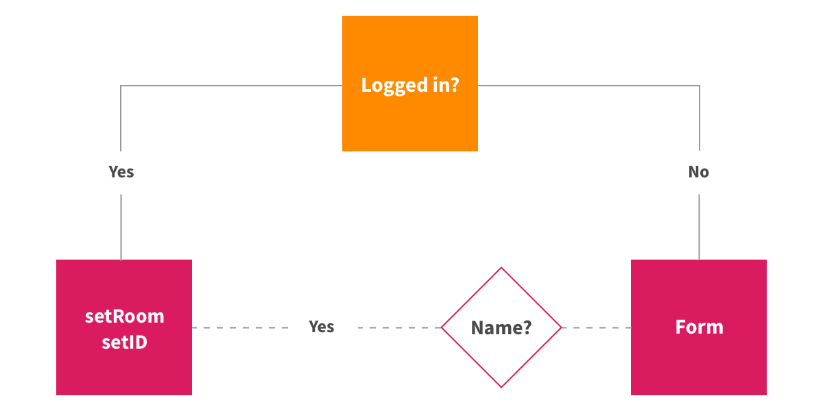
We are going to create a simple component that returns "Hello" if the user is already logged in or a login form if the user is logged out. We check the id variable for that.
Our form submissions will be handled by a function we’re creating called handleSubmit. It will check if the Name form field is completed. If it is, we will set the id and room values for that user. Otherwise, we’ll throw in a message reminding the user that the Name field is required in order to proceed.
// App.js

import React, { useState } from 'react';
import './index.css';

export default () => {
  const [room, setRoom] = useState('');
  const [id, setId] = useState('');

  const handleSubmit = e => {
    e.preventDefault();
    const name = document.querySelector('#name').value.trim();
    const room_value = document.querySelector('#room').value.trim();
    if (!name) {
      return alert("Name can't be empty");
    }
    setId(name);
    setRoom(document.querySelector('#room').value.trim());
  };

  return id !== '' ? (
    <div>Hello</div>
  ) : (
    <div style={{ textAlign: 'center', margin: '30vh auto', width: '70%' }}>
      <form onSubmit={event => handleSubmit(event)}>
        <input id="name" required placeholder="What is your name .." /><br />
        <input id="room" placeholder="What is your room .." /><br />
        <button type="submit">Submit</button>
      </form>
    </div>
  );
};
That’s how we’re using the useState hook in our chat application. Again, we’re importing the hook from React, constructing values for the user’s ID and chat room location, setting those values if the user’s state is logged in, and returning a login form if the user is logged out.
Using the useSocket hook
We're going to use an open source hook called useSocket to maintain a connection to our server. Unlike useState, this hook is not baked into React, so we’re going to have to add it to our project before importing it into the app.
npm add use-socket.io-client
The server connection is maintained by using the React Hooks version of the socket.io library, which is an easier way of maintaining websocket connections with a server. We are using it for sending and receiving real-time messages as well as maintaining events, like connecting to a room.
The default socket.io client library has global declarations, i.e., the socket variable we define can be used by any component. However, our data can be manipulated from anywhere and we won't know where those changes are happening. Socket hooks counter this by constraining hook definitions at the component level, meaning each component is responsible for its own data transfer.
The basic usage for useSocket looks like this:
const [socket] = useSocket('socket-url')
We’re going to be using a few socket APIs as we move ahead. For the sake of reference, all of them are outlined in the socket.io documentation. But for now, let’s import the hook since we’ve already installed it.
import useSocket from 'use-socket.io-client';
Next, we’ve got to initialize the hook by connecting to our server. Then we’ll log the socket in the console to check if it is properly connected.
Open the browser console and the URL in that snippet should be logged.
Using the useImmer hook
Our chat app will make use of the useImmer hook to manage state of arrays and objects without mutating the original state. It combines useState and Immer to give immutable state management. This will be handy for managing lists of people who are online and messages that need to be displayed.
Using Immer with useState allows us to change an array or object by creating a new state from the current state while preventing mutations directly on the current state. This offers us more safety as far as leaving the current state intact while being able to manipulate state based on different conditions.
Again, we’re working with a hook that’s not built into React, so let’s import it into the project:
npm add use-immer
The basic usage is pretty straightforward. The first value in the constructor is the current state and the second value is the function that updates that state. The useImmer hook then takes the starting values for the current state.
const [data, setData] = useImmer(default_value)
Using the setData hook
Notice the setData hook in that last example? We’re using that to make a draft copy of the current data we can use to manipulate the data safely and use it as the next state when changes become immutable. Thus, our original data is preserved until we’re done running our functions and we’re absolutely clear to update the current data.
setData(draftState => {
  draftState.operation();
});

// ...or

setData(draft => newState);

// Here, draftState is a copy of the current data
Using the useEffect hook
Alright, we’re back to a hook that’s built right into React. We’re going to use the useEffect hook to run a piece of code only when the application loads. This ensures that our code only runs once rather than every time the component re-renders with new data, which is good for performance.
All we need to do to start using the hook is to import it — no installation needed!
import React, { useState, useEffect } from 'react';
We will need a component that renders a message or an update based on the presence or absence of a sende ID in the array. Being the creative people we are, let’s call that component Messages.
Let’s put our socket logic inside useEffect so that we don't duplicate the same set of messages repeatedly when a component re-renders. We will define our message hook in the component, connect to the socket, then set up listeners for new messages and updates in the useEffect hook itself. We will also set up update functions inside the listeners.
Another touch we’ll throw in for good measure is a "join" message if the username and room name are correct. This triggers the rest of the event listeners and we can receive past messages sent in that room along with any updates required.
We only have a few more tweaks to wrap up our chat app. Specifically, we still need:
A component to display people who are online
A useImmer hook for it with a socket listener
A message submission handler with appropriate sockets
All of this builds off of what we’ve already covered so far. I’m going to drop in the full code for the App.js file to show how everything fits together.
That's it! We built a fully functional group chat application together! How cool is that? The complete code for the project can be found here on GitHub.
What we’ve covered in this article is merely a glimpse of how React Hooks can boost your productivity and help you build powerful applications with powerful front-end tooling. I have built a more robust chat application in this comprehensive tutorial. Follow along if you want to level up further with React Hooks.
Now that you have hands-on experience with React Hooks, use your newly gained knowledge to get even more practice! Here are a few ideas of what you can build from here:
A blogging platform
Your own version of Instagram
A clone of Reddit
Have questions along the way? Leave a comment and let’s make awesome things together.