It's cool to see progressive enhancement being done even while using the fanciest of the fancy front-end technologies.
This is a button in a JSX React component that has a click handler applied directly to it that fires a data mutation Ajax request through Apollo GraphQL. That is about the least friendly environment for progressive enhancement I can imagine.
Hugo Giraudel writes that they do server-side rendering already, so the next tricky part is the click handler. Without JavaScript, the only mechanism we have for posting data is a <form>, so that's what they do. It submits to the /graphql endpoint with the data it needs to perform the mutation via hidden inputs, plus additional data on where to redirect upon success or failure.
One of the most empowering things you can learn as a new front-end developer who is starting to learn JavaScript is to change classes. If you can change classes, you can use your CSS skills to control a lot on a page. Toggle a class to one thing, style it this way, toggle to another class (or remove it) and style it another way.
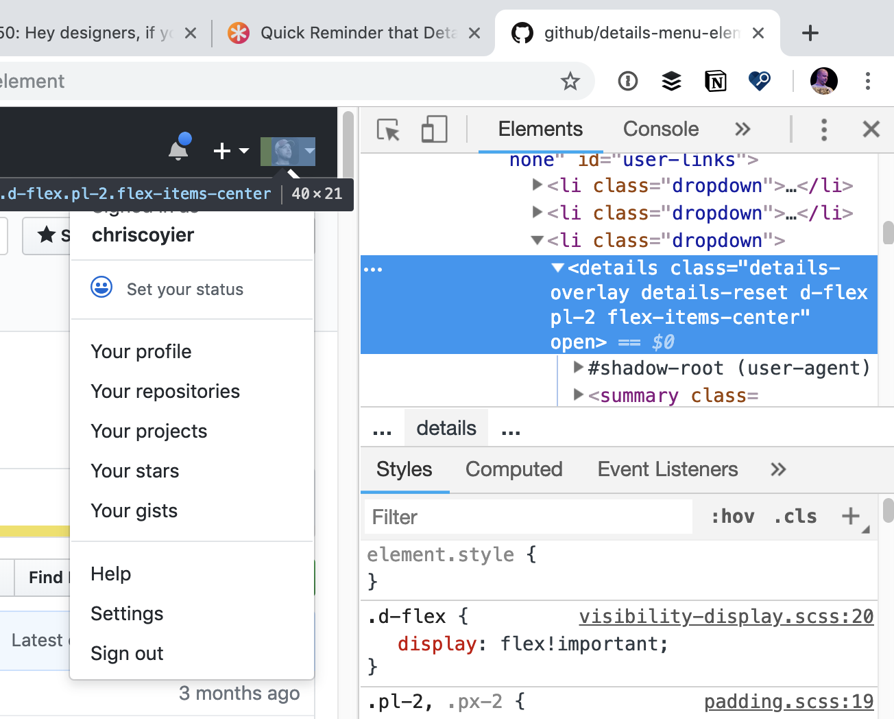
Extending that toggle-based thinking, what is a user menu if not for a single accordion? Same with modals. If we went that route, we could make JavaScript optional on those dynamic things. That's exactly what GitHub did with their menu.
Inside the <details> element, GitHub uses some Web Components (that do require JavaScript) to do some bonus stuff, but they aren't required for basic menu functionality. That means the menu is resilient and instantly interactive when the page is rendered.
We went all in on details to turn a lot of things interactive without JS. There is also https://t.co/SFXtkNzIbZ, and here is a talk I gave on leveraging the power of details, which mentions the CSS trick :) https://t.co/DmX8opvi4z
The worst strike on <details> is its browser support in Edge, but I guess we won't have to worry about that soon, as Edge will be using Chromium... soon? Does anyone know?
CSS has a neat feature that allows us to test if the browser supports a particular property or property:value combination before applying a block of styles — like how a @media query matches when, say, the width of the browser window is narrower than some specified size and then the CSS within it takes effect. In the same spirit, the CSS inside this feature will take effect when the property:value pair being tested is supported in the current browser. That feature is called @supports and it looks like this:
Why? Well, that's a bit tricky. Personally, I find don't need it all that regularly. CSS has natural fallback mechanisms such that if the browser doesn't understand a property:value combination, then it will ignore it and use something declared before it if there is anything, thanks to the cascade. Sometimes that can be used to deal with fallbacks and the end result is a bit less verbose. I'm certainly not a it's-gotta-be-the-same-in-every-browser kinda guy, but I'm also not a write-elaborate-fallbacks-to-get-close kinda guy either. I generally prefer a situation where a natural failure of a property:value doesn't do anything drastic to destroy functionality.
That said, @supports certainly has use cases! And as I found out while putting this post together, plenty of people use it for plenty of interesting situations.
A classic use case
The example I used in the intro is a classic one that you'll see used in lots of writing about this topic. Here it is a bit more fleshed out:
/* We're gonna write a fallback up here in a minute */

@supports (display: grid) {
  .photo-layout {
    display: grid;
    grid-template-columns: repeat(auto-fill, minmax(200px, 1fr));
    grid-gap: 2rem;
  }
}
Nice grid! Repeating and auto-filling columns is a sweet feature of CSS grid. But, of course, there are browsers that don't support grid, or don't support all the specific features of it that I'm using above there.
For example, iOS shipped support for CSS grid in version 10.2, but iOS has had flexbox support since version 7. That's a decent gap of people with older iOS devices that do support flexbox but not grid. I'm sure there are more example gaps like that, but you probably get the idea.
I was running on an older version of mobile safari and many many many many many sites were flat out broken that used grid
I’m waiting another year or so before messing about with it
It may be acceptable to let the fallback for this be nothing, depending on the requirements. For example, vertically stacked block-level elements rather than a multi-column grid layout. That's often fine with me. But let's say it's not fine, like a photo gallery or something that absolutely needs to have some basic grid-like structure. In that case, starting with flexbox as the default and using @supports to apply grid features where they're supported may work better...
The "fallback" is the code outside of the @supports block (the properties above the block in the example above), and the grid code is either inside or after. The @supports block doesn't change any specificity, so we need the source order to help make sure the overrides work.
Notice I had to reset the margin on the divs inside the @supports block. That's the kind of thing I find a bit annoying. There is just enough crossover between the two scenarios that it requires being super aware of how they impact each other.
Doesn't that make you wish it could be entirely logically separated...
There is "not" logic in @supports blocks, but that doesn't mean it should always be used
/* Considered a BAD PRACTICE, at least if you're supporting IE 11 and iOS 8 and older */
@supports not (display: grid) {
   /* Isolated code for non-support of grid */
}
@supports (display: grid) {
   /* Isolated code for support of grid */
}
Notice the not operator in the first block. That's checking for browsers that do not support grid in order to apply certain styles to those browsers. The reason this approach is considered bad practice is that the browser support for @supports itself has to be considered!. That's what makes this so dang tricky.
It's very appealing to write code in logically separated @supports blocks like that because then it's starting from scratch each time and doesn't need to be overriding previous values and dealing with those logical mind-benders. But let's go back to the same iOS situation we considered before... @supports shipped in iOS in version 9 (right between when flexbox shipped in iOS 7 and grid shipped in iOS 10.2). That means any flexbox fallback code in a @supports block using the not operator to check for (display: grid) {} support wouldn't work in either iOS 7 or 8, meaning the fallback now needs a fallback from working in browsers it otherwise would have. Phew!
The big reason to reach for @supports is to account for very different implementations of something depending on feature support where it becomes easier to reason and distinguish between those implementations if the blocks of code are separated.
We'll probably get to a point where we can use mutually-exclusive blocks like that without worry. Speaking of which...
@supports is likely to be more useful over time.
Once @supports is supported in all browsers you need to support, then it's good to start using it more aggressively and without having to factor in the complication of considering whether @supports itself is supported. Here's the support grid on that:
This browser support data is from Caniuse, which has more detail. A number indicates that browser supports the feature at that version and up.
Desktop
Chrome
Opera
Firefox
IE
Edge
Safari
28
12.1
22
No
12
9
Mobile / Tablet
iOS Safari
Opera Mobile
Opera Mini
Android
Android Chrome
Android Firefox
9.0-9.2
46
all
4.4
71
64
Basically, IE 11 and any iOS device stuck on iOS 8 are the pain points. If your requirements are already past those, then you're good to use @supports more freely.
The irony is that there hasn't been a ton of CSS features shipping that have big clear @supports use cases — but there are some! Apparently, it's possible to test new fancy stuff like Houdini:
Using it on my wedding website to check for Houdini support 🎩🐰
On some level, that makes perfect logical sense. If transforms are supported, use them. But it's unnecessary if nothing different is happening in a non-support scenario. In this case, the transform can fail without the @supports block and the result is the same.
They are both centered around the idea that we can write @supports blocks in CSS and then toggle them on and off as if we're looking at a rendering of the code in a browser that does or doesn't support that feature.
Here's a video of Keith's tool applied to the scenario using grid with a flexbox fallback:
This is fun to play with and is very neat tech. But in this exact scenario, if I was able to pull off the layout identically with flexbox, then I'd probably just do that and save that little bit of technical debt.
Ire's tool, which she wrote about in the article Creating The Feature Queries Manager DevTools Extension, has a slightly different approach in that it shows the feature queries that you actually wrote in your CSS and provides toggles to flip them on and off. I don't think it works through iframes though, so I popped open Debug Mode to use it on CodePen.
@supports (transform: rotate(1turn)) and (opacity: 0) {
  /* all the styling for Erik's custom checkboxes and radio buttons */
}
Here are several more I've come across:
Joe Wright and Tiago Nunes mentioned using it for position: sticky;. I'd love to see a demo here! As in, where you go for position: sticky;, but then have to do something different besides let it fail for a non-supporting browser.
Keith Grant and Matthias Ott mention using it for object-fit: contain;. Matthias has a demo where positioning trickery is used to make an image sort of fill a container, which is then made easier and better through that property when it's available.
Ryan Filler mentions using it for mix-blend-mode. His example sets more opacity on an element, but if mix-blend-mode is supported, it uses a bit less and that property which can have the effect of seeing through an element on its own.
Rik Schennink mentioned the backdrop-filter property. He says, "when it's supported the opacity of the background color often needs some fine tuning."
Nour Saud mentioned it can be used to detect Edge through a specific vendor-prefixed property: @supports (-ms-ime-align:auto) { }.
Amber Weinberg mentioned using it for clip-path because adjusting the sizing or padding of an element will accommodate when clipping is unavailable.
Ralph Holzmann mentioned using it to test for that "notch" stuff (environment variables).
Stacy Kvernmo mentioned using it for the variety of properties needed for drop capping characters. Jen Simmons mentions this use case in her article as well. There is an initial-letter CSS property that's pretty fantastic for drop caps, but is used in conjunction with other properties that you may not want to apply at all if initial-letter isn't supported (or if there's a totally different fallback scenario).
Here's a bonus one from Nick Colley that's not @supports, but @media instead! The spirit is the same. It can prevent that "stuck" hover state on touch devices like this:
@supports (initial-letter: 4) and (transform: scale(2)) {

}
Or:
@supports (initial-letter: 4) or (-webkit-initial-letter: 4) {

}
Combos:
@supports ((display: -webkit-flex) or
          (display: -moz-flex) or
          (display: flex)) and (-webkit-appearance: caret) {

}
JavaScript Variant
JavaScript has an API for this. To test if it exists...
if (window.CSS && window.CSS.supports) {
  // Apparently old Opera had a weird implementation, so you could also do:
  // !!((window.CSS && window.CSS.supports) || window.supportsCSS || false)
}
To use it, either pass the property to it in one param and the value in another:
At the time of this writing, only Firefox supports this sort of testing (behind an experimental flag), but there is a way to test the support of selectors with @supports. MDN's demo:
@supports selector(A > B) {
}
You?
Of course, we'd love to see Pens of @supports use cases in the comments. So share 'em!
I'm very excited this feature is ready for y'all. You can take any <pre> block of HTML, CSS, and JavaScript (or any combination of them) and enhance it into an embed, meaning you can see the rendered output. Very progressive enhancement friendly! It also lets you pass in stuff like external resources, making it a great choice for, say, documentation sites or the like.