Design Studio & Agency Website Inspiration

If you’re taking on the huge task of designing a studio or agency’s website, it’s important that you get everything just right. Professionalism and ease of navigation needs to balanced perfectly against beautiful design and modern trends.

If you need a little inspiration for this undertaking, we’ve got a few amazing websites to show you. These agency sites are exceedingly well made, so see what you can learn from these impeccable designs.

Dogstudio

Image from Dogstudio

Dogstudio nails its branding by designing a website around its wolf-like character. Everywhere you explore, the beautifully animated dog follows you, changing color, rotating, and moving around the screen. It’s an amazing display of interactivity and 3D web animation.

Everest

Image from Everest

Design studios have lots of content to show off, so it’s important to have good navigation. Everest does it right with a beautiful and functional homepage that takes you through the company’s work. Click something you’re interested in and it smoothly transitions to a whole new area to explore.

Rally

Image from Rally

If you’re not sure where to start with a design, try using consistency. This studio’s homepage is made up of a spiral that changes color as you scroll through each project. The colorful ribbon remains on other pages and stretches as you navigate between them.

Okalpha

Image from Okalpha

Websites for agencies are often dark and serious. But that doesn’t mean you can’t have fun with your design! Okalpha’s site is bright and colorful, with a flat look and cartoonish hues. It’s the perfect fit for an upbeat animation studio.

Canvas United

Image from Canvas United

This site is all about clean and interesting UI. There’s plenty of elegant hover and transition animations – even the loading screen includes a beautiful animated logo! The flawless UI design leaves a lasting impression of quality and grace.

Feral

Image from Feral

Many websites opt for digital icons or photography rather than illustrations, but Feral’s website proves that they have a place in web design. Lively sketches are scattered absolutely everywhere, and it makes the site seem unique and personalized.

UIX

Image from UIX

Studios need a good portfolio, and UIX does it perfectly. Widescreen images allow you to get a good look at their work, with quick animations keeping you interested in the content. Short paragraphs and impactful blurbs are broken up with more visual examples. It allows you to get an in-depth look at their design choices and see if the company is the right fit for you.

Prokhorov Design

Image from Prokhorov Design

For portfolio sites, a simple but strong design often works best. This site uses a background of particles that shift into different shapes, while also leaving a comfortable amount of space. Click on a project and the site becomes much more compact as it takes you through the creative process of designing an app.

Visual Soldiers

Image from Visual Soldiers

Content-packed boxes make up this website’s design with links and articles appearing inside them. Click one to explore this colorful site as you navigate through portfolio pieces, articles, and videos.

Hoffman

Image from Hoffman

Nothing hooks people more than a charming intro video, and there’s plenty of interesting photos and videos to be found on this website. Explore to learn more about a company’s branding campaign, and be stunned at the perfectly synergistic design.

Rise

Image from Rise

Though many brands’ websites go over the top with flashy elements and animations, clean and simple design shouldn’t be forgotten! Rise uses space and simplicity to create a breathable website that uses contrast to call attention to important areas. It’s a solid look that gives a sense of reliability.

RFTB Creative Digital Agency

Image from RFTB Creative Digital Agency

If one site inspires you, it should definitely be this one. The building music and slowly scrolling video background create a sense of wonder and curiosity. Follow that up with other great background videos, leading you to plenty of interesting excerpts and you’re already hooked.

Creating Gorgeous and Professional Websites

When you’re creating a site for a professional studio, your main goal is to hook potential customers – and a website that’s beautiful and inspiring is more likely to charm visitors and get them interested in the company.

These twelve great website examples gracefully capture their agency’s vision, all while creating a site that’s easy to navigate and fun to explore. There’s a lot to learn from these designers.

HighMark SEO Digital

HighMark SEO Digital is a leading digital marketing agency with a focus on Search Engine Optimization (SEO), Facebook Marketing, and Google Ads (PPC). We work closely with businesses to drive targeted traffic with the goal of increasing their sales.

The post HighMark SEO Digital appeared first on WeLoveWP.

Devine Solutions Group

Devine Solutions Group provides transformational web design, graphic design, and digital marketing services to small to mid-sized business owners so they can realize the purpose of their mission through like minded clients while creating the financial independence they deserve.

The post Devine Solutions Group appeared first on WeLoveWP.

Believer Magazine

Believer Magazine is an award winning literary magazine, celebrating over ten years of publishing. Their exceptional content, celebrated writers and evocative illustrations have made it one of the most well known publications in the literary community. Before engaging with CMYK their online platform was a static HTML website where all content was hard coded. We built them a custom online editorial platform for them to showcase their entire archive of content to a much wider audience.

In order to achieve this we built a custom import structure that crawled through over 5,000 pieces of HTML content in order to migrate it into the new CMS. The streamlined and automated process was able to standardize the article structure, without the heavy lifting of editing each piece of content individually. Additionally, we build a robust custom content library to allow the editorial team to create dynamic and visually compelling content. The challenge was to create a design that embraced the physical form of the print magazine. We took a lot of design cues from the magazine’s layout to create a reading experience that felt special. We also gave the team the ability to change the entire color scheme of the website with the release of each new issue. By doing this, the site always matches the newest publications cover art and changes the overall aesthetic with the click of a button.

The post Believer Magazine appeared first on WeLoveWP.

Grow With Studio

Grow With Studio is Design and Marketing agency focused solely on helping ecommerce stores grow sales. They’ve helped businesses increase their revenue on average by 90% in their first year with them!

The post Grow With Studio appeared first on WeLoveWP.

Themeisle

Themeisle is our main site for our WordPress themes, plugins, and blogging business. We recently rebuilt the site from scratch with Neve, Elementor, and Gutenberg. The site is a gateway to both a store page for theme/plugin purchases and a blog. It was important to balance our fun-loving approach with our business goals. We think we did it!

The post Themeisle appeared first on WeLoveWP.

Studio 313

We have finally had the chance to finish off our new website after having to put it aside for what seems to have been forever.

This is our new WordPress studio portfolio website and we love it. Bright, informal with a little bit of animation

The post Studio 313 appeared first on WeLoveWP.

Free One-Page Portfolio Website Builders

In the growing world of designers, developers and other online service providers, having a great portfolio is essential to getting hired. You won’t get work if you don’t put yourself out there, and what better way than with a portfolio? These one-page website builders are free, easy to use, and simple to set up, so you can get your portfolio online fast.

Carrd

Carrd

Carrd is a one-page site maker that uses a super straightforward interface to help you set up your portfolio. If you’re looking to create something elegant and minimalistic, you’ll love this. Many builders can be overwhelming before you get used to them, but Carrd is easy to use right from the get-go. Just pick a theme and click one button to add elements.

There’s a really cheap Pro version, which offers various forms, custom domain compatibility, and custom code + third party widgets. At $9 a year, this is about as affordable as it gets. However, all the core features are free, so feel free to test it out and even publish your website.

Mobirise

Mobirise

An offline web builder solution for Mac and Windows, Mobirise allows you to easily create mobile-friendly websites. It was specifically designed to be as easy to use as possible for non-programmers and visual thinkers. If you’re new to this, try it out.

Once you’ve finished putting together your website in this block-based builder, publish it for free wherever you want. No domain? Mobirise can publish to Github Pages at no cost to you.

About.me

About.me

Simple and professional, creating an about.me website is a great way to introduce yourself. Just type in some info about yourself, pick from one of three clean themes, and you have a mini portfolio! From there you can customize the website further, changing text and adding links. There’s also a nifty email signature feature, which adds your about.me as an email signature.

The Pro version has various other features, testimonials, image and video embeds, messages, appointment scheduling and newsletter building. With the free version, you can still build a professional biography.

WordPress

WordPress

If you’d rather do it yourself than use a simple website builder, but don’t have the technical know-how to create a website from scratch, WordPress is probably the solution. Choosing a one-page WordPress template still gives you something to work off of, but you’ll be more in control of your website’s appearance. And there’s hundreds of thousands of themes – no website builder can boast that.

Customizing and making it your own may require HTML and CSS knowledge, and you’ll also need to handle hosting, domain and WordPress installation. WordPress itself is free and open source, but these aspects will probably cost money.

Diving blindly into WordPress is not for the faint of heart, but if you’re up for a challenge, this might be the solution for you.

Wix

Wix

Wix is considered by many to be similar to WordPress, but much easier to use. Its interface is intuitive enough, and setting up and publishing a website is super easy. There’s a ton of functionality in this builder if you’re willing to learn it.

The free version of Wix allows you to create and publish your site under a Wix domain. Premium plans let you get a custom domain, remove Wix ads from the site, or add apps, but it isn’t necessary to make your portfolio public.

Persona

Persona

Persona does absolutely no beating around the bush. Just click to get started, pick a theme, and start editing. The WYSIWYG editor is super powerful. It takes some adjusting to, but once you have the hang of it, you can create basically whatever you want.

However, note that you can only create a private Persona without upgrading. If you want to publish your portfolio, it will cost a relatively cheap $24/year or $4/month. Trying before you buy will at least let you know if this is the right tool for you.

Building a Simple One-Page Portfolio

Never underestimate the power of a one-page portfolio. A site that’s too complex can drive away potential clients, especially if you can’t hold their interest long enough to direct them to the contact page. But a well-crafted one-page website is concise and gets the point across quickly, while still showing off your skills to visitors.

11 Easy Tips A Beginner Should Know When Creating An Online Portfolio

Needless to say, comparing to other online projects, creating a portfolio is a fast process. However, it doesn’t mean that you can do it hastily and carelessly! The modern audience always feels such things. When working on your online portfolio, keep in mind that any detail matters. All in all, a properly designed online portfolio Read More →

The post 11 Easy Tips A Beginner Should Know When Creating An Online Portfolio appeared first on WPArena.

Inspiring One-Page Portfolio Websites

If you’re looking for a great way to show off your skills, have you considered a one-page portfolio? They’re concise and to the point, which is good for potential employers who may be short on time.

And in a smaller sandbox, you have more reign to creatively show off your design expertise. One-page portfolios tend to have some of the most interesting and well-made layouts in web design. With a single page, you can make your site less like a static webpage and more like an experience sure to thrill anyone who comes across it.

Looking to create your own one-page portfolio? Here’s a bit of inspiration from some of the best designers and developers online!

Owltastic

Owltastic

With a charming duotone palette and beautiful starry space theme, this is one fantastic example of a one-page site. There’s plenty of links to case studies, past projects, and the designer’s social media accounts. Frequent use of a call to action leading to the contact form means that clients won’t ever have to scroll far to send a message.

Gordils & Willis

Gordils & Willis

This portfolio wastes no time at all in diving into the project showcase. As you scroll, you’ll get to see various pages, logos, and parts of the UI that were designed for each website or app. If you’ve seen enough, just use the menu to snap to the bottom, or click the hovering email button that’s always on the left.

BRNDMKRS

BRNDMKRS

Big ideas need a big website, and this full width page features huge typography, large videos, and full screen images. There are even a few interactive elements, like a service checklist that lets you see an estimated cost for what you want.

Ollie

Ollie

Bold and dark design are what this portfolio is all about. The black background makes the more colorful images pop, and the custom cursor is a nice touch. This one is a good example of an image-focused portfolio without too much text.

Aristide Benoist

Aristide Benoist

Gigantic text is certainly one way to grab attention. Once you’re interested and start scrolling down, you’re immediately introduced to the developer and his work. Hover the image and you’ll get a taste of this dev’s experience in interactive design.

Portfolio of Oliver Gareis

Portfolio of Oliver Gareis

Oliver Gareis’ portfolio opens with a brief about and awards section before getting right into the portfolio. Each project includes a brief description of what the designer was going for, showing off his expertise. There’s quite a bit of content, but you can use the sticky header to scroll right to the contact info at any time.

Kevin Dunbar

Kevin Dunbar

One of the best parts of this portfolio is the bright white design, accentuated by a single splash of color that strategically highlights certain areas. The red draws attention to banners, links, and contact info against the white and gray background. Meanwhile, the portfolio section uses animations to the same effect.

Unlikely

Unlikely

The moment you enter this site, you’re plunged into a page of striking animations that are impossible to ignore. Text flies dramatically to your cursor, loading screens shake, and project videos play in the background. Unlikely makes a bold statement from the very beginning.

Green Chameleon

Green Chameleon

On sites like this, it’s easy to forget you’re on a webpage. Animations play and hovering images ripple and distort as you scroll. It’s more like exploring an art gallery than visiting a website.

Amazing One-Page Designs

A one-page website is a bit like a business card. You need to explain who you are, what you do, and why an employer should choose you, all in a small amount of space.

It takes a lot of skill and design expertise to build something that gets the point across while leaving room for inspiring design, but these people pulled it off perfectly. Now it’s your turn to create your own inspiring one-page portfolio.

What Do Potential Clients Want to See in Your Portfolio?

A design portfolio can be a tricky thing. On one hand, it’s very much a necessity for showing the world the great work you’re doing. At the same time, not everyone is going to pour over every bit of your work with a microscope. In fact, this isn’t a one-size-fits-all proposition.

So, what impact should this have on how you build out your portfolio? It can actually depend a good bit on the types of projects you’re looking for.

With that in mind, let’s take a look at some considerations for targeting your portfolio towards the intended audience.

Detailed or Not?

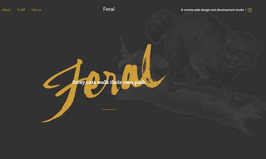
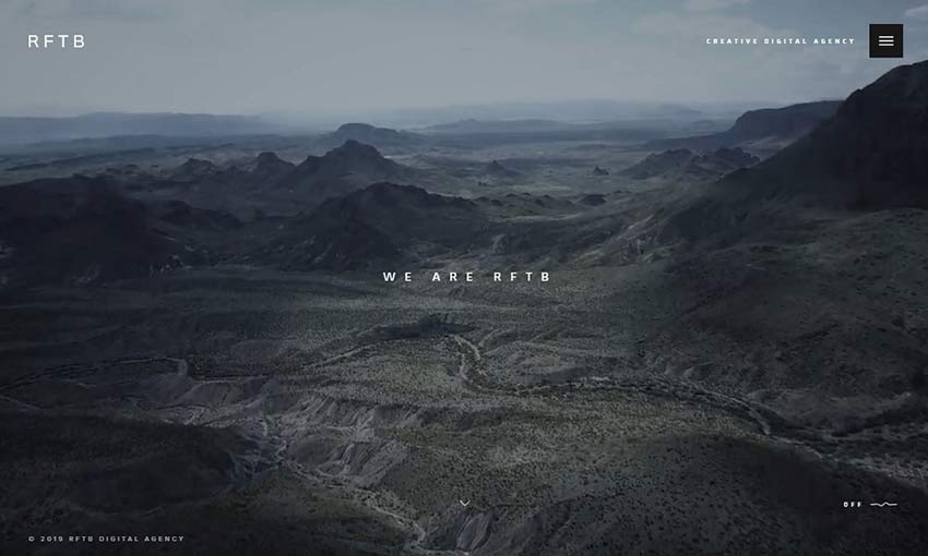
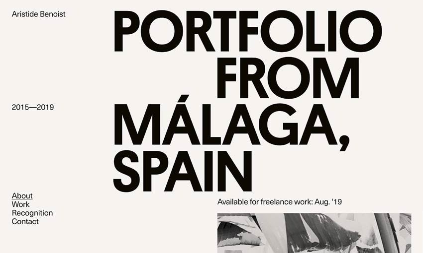
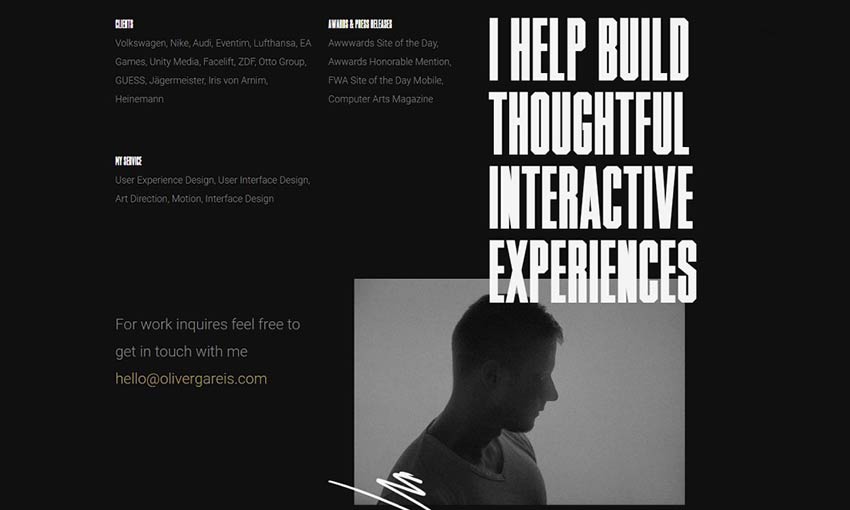
If you check out the portfolios of other designers around the web, you’ll find a wide variety of styles and levels of detail. Some offer in-depth case studies of the process of taking a website from concept to finished product. Others are sparse and let the work speak for itself.

Is one approach better than the other? Again, this is where your intended audience comes into play.

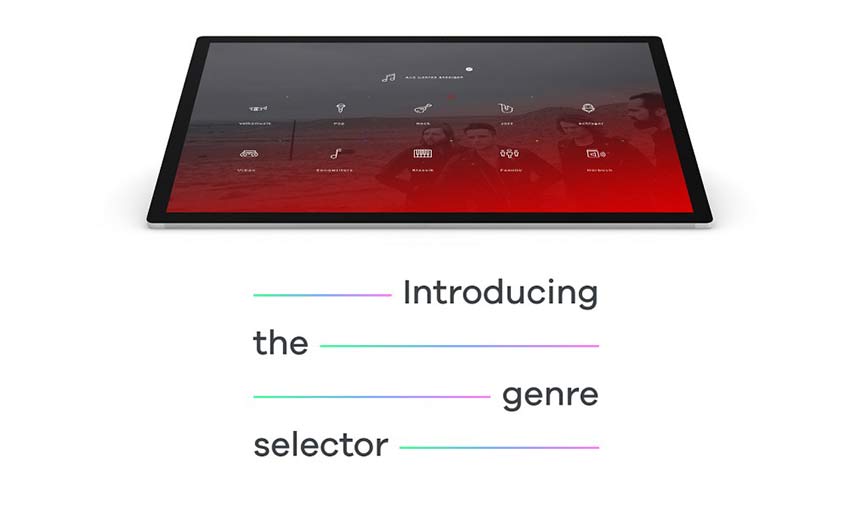
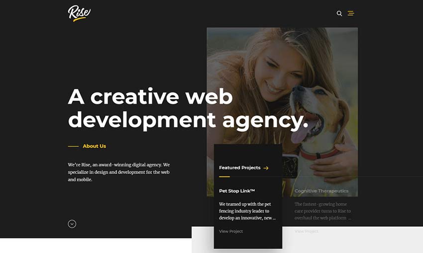
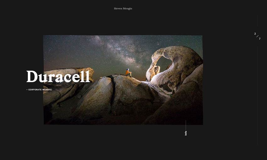
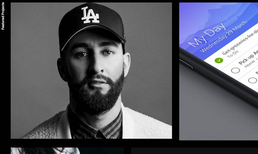
If you’re looking to book large, high-paying projects where you want to demonstrate the full spectrum of what you offer, a more detailed portfolio may make the most sense. This could be especially important if you do a lot of custom development. Potential clients will be looking to see how you get things done and will want to have a more complete picture of what’s involved.

This is also a scenario where case studies or project profiles can be a big help. If you go this route, try to write them all in a similar format and point out any specific challenges you helped solve. This offers some solid proof that you’re an expert in your field.

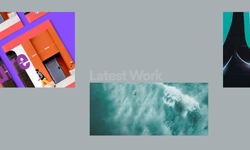
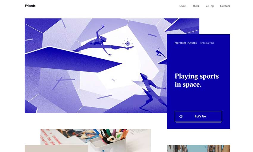
Alternatively, many feel that a simple listing (text or gallery-style) of projects is enough. If your goal is to show off your great design skills, a strong visual may be all you need to get people’s attention.

Man creating a flow chart on a whiteboard.

Projects to Include (and Leave Out)

Whatever approach you’ve chosen, all portfolios require a selection of projects. That’s right – a selection. We often think that, just because we’ve completed a project, it belongs in our portfolio. But this may not be the most effective way to go about it.

For instance, if you’ve been in the web design business for a number of years, you will probably have some projects that haven’t been touched in just as long. You need to ask yourself: Is this really relevant to what I’m doing now?

Not only will some of these older projects utilize outdated technologies, they will also send the wrong idea regarding what you do. If you’ve moved on from static HTML to working with a CMS such as WordPress, then it’s probably not worth posting sites built via other means.

Keep in mind that portfolios are not just about the past. Prospective clients view them to get a sense of what you can do for them in the future, as well. Knowing this, it’s worthwhile to consider which of your projects will help you with regards to gaining new clients down the road.

This doesn’t mean that all projects that reach a certain age are irrelevant. If you’ve done work for a major brand or did something that you consider groundbreaking, it’s okay to leave it in. The idea is to weed out anything that doesn’t fit with the narrative you’re trying to establish.

Crumpled paper on a notebook.

Other Essentials

We’ve established that the projects we list should be relevant to where we’re at in terms of our business. But it’s also important to think about other items that are of interest to potential clients:

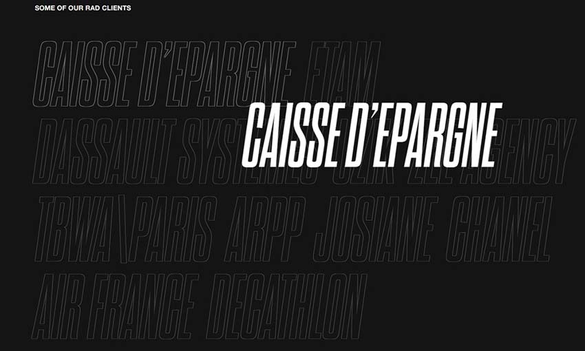
Industries You Service

Many times, people will want to see that you’ve worked on projects that are in their industry. If your business tends to work with a variety of different types of businesses, you’ll want to reflect this in your portfolio. For those who have a large project list, the ability to filter by category is also a nice touch.

Likewise, you may specialize in a niche that only covers a specific industry or two. Again, showcase your best examples here and leave out anything that doesn’t apply.

Mobile Friendliness

Responsive design is pretty much the default these days. But it’s still important to emphasize that you’re skilled in this area. How you do so is really a personal preference.

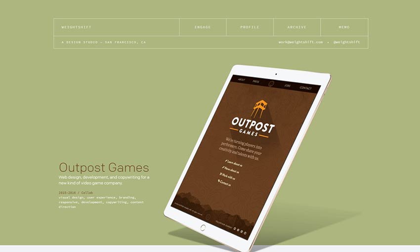
Some designers will provide the obligatory mobile device mockup, which is great for demonstrating how a site would look for mobile users. Another approach (and perhaps even more important) is to ensure that your portfolio itself looks great on mobile devices.

As we know, there’s no guarantee that visitors will view our work for the first time from large desktop screens. In that case, it’s good to put your best foot forward – regardless of screen size.

Person sketching a mobile wireframe.

Showcasing the Best of What You Do

Above all, your portfolio should be used as an up-to-the-minute reflection of who you are and what you do. That means keeping it both current and relevant to your business. It’s something that should change with you over time.

While style is important, content is an even greater consideration. Whether you currently have a portfolio or not, take some time to consider what will paint you in the best possible light and help you get the types of projects you’re after.

irixlens

Irix design pays particular attention to detail to create lenses that combine classical design with maximum functionality. Irixlens have used the latest technology to ensure exceptional precision

The post irixlens appeared first on WeLoveWP.

11 Inspirational Designer Portfolios For 2019

For web and graphic designers, it’s important to nail that portfolio, instantly convincing anyone who visits that you’re the one for the job. With the new year rolling around, it might just be time for a fresh redesign.

There are so many amazing portfolios out there to draw inspiration from. If you’d like to explore and learn from the work of your fellow designers, you’re going to love this list. These are the portfolios that get it right!

We Ain’t Plastic

We Ain't Plastic

We Ain’t Plastic definitely leaves its mark. Its subtle effects, animations and images all come together to create a website that was obviously crafted with love. It also gets right to the point, careful not to overload you with too much information.

Melanie Daveid

Melanie Daveid

This beautiful one-page portfolio proves that simple-but-strong design is often the best way to go. The perfectly elegant animations are the most memorable part of this website, alongside the dynamic layout.

Steve Mengin

Steve Mengin

Stylish and well put together, navigating this portfolio is no less than delightful. Every animation looks great, and though many navigation elements are fairly unique, getting around is very intuitive thanks to fantastic UI design.

Gal Shir

Gal Shir

Fun animations and colorful images quickly bring this site to life. You won’t be able to stop scrolling, stopping to see each animated image. And a pretty parallax effect brings the site to a satisfying end.

Portfolio of Nathan Riley

Portfolio of Nathan Riley

This dark, modern website is filled with all sorts of fun little details, animations and browser interactions. Discovering them all is a joy. You know this is a designer who loves his job. Click to see the projects and you’ll get some interesting behind-the-scenes info on design choices, too!

Jack Jeznach

Jack Jeznach

Everything about this website indicates excellency at both style and skill. There’s so much attention to detail that it’s astounding. As you navigate the well laid-out portfolio you’ll be constantly driven to keep exploring and learning more about the developer.

Weightshift

Weightshift

What’s better than a collection of case studies so nicely presented? Scroll through the clean, brightly colored website and check out the examples to see a short demonstration of the company’s past work!

Timothy Achumba

Timothy Achumba

This portfolio uses a pleasant block-based layout that’s easy to navigate on any device. Images are the focal point, taking up a majority of the screen. What text there is tells you exactly what you need to know.

Friends

Friends

Here’s one reminiscent of a business card: Sophisticated, beautiful and simply but carefully designed. There are plenty of case studies to learn more about the company and its methods. Nothing is better than understanding your designer’s goals and processes.

Baptiste Ringot

Baptiste Ringot

This is a portfolio made with readability and ease of navigation in mind. There’s a lot of content and past work, but text is frequently broken up by interesting images of past design projects. It’s simple to navigate the sections. And the slight change of background color as you scroll is a nice touch.

Youandigraphics

Youandigraphics

A beautiful palette, unique layout, and cute art and animations certainly make this a standout website. Looking at this portfolio, you know the designer truly has an artist’s eye.

Amazing Portfolios by Designers

There’s nothing more inspiring than a skilled web designer’s portfolio. Experts and innovators are always pushing the limits of what a website should be capable of, with portfolios that skillfully display their mastery in design.

Which portfolio was your favorite? There’re just too many awesome ones to choose from!

Wave Digital

Wave Digital is a Melbourne-based app development company. The website redesign was completed by the Wave team following the company’s rebranding. The redesign reflects the focus on a people-led approach to designing and developing apps that improve lives, along with the company’s interest in the health industry.

The post Wave Digital appeared first on WeLoveWP.

Matcha

Great content has been off limits to lean marketing teams for too long! End the content drought, enable smart distribution, and measure content performance.

The post Matcha appeared first on WeLoveWP.