Case Study: Oscar Pico Portfolio — 2024

An exploration of the collaborative creative process between Oscar Pico and Nam Hai during the design and development phases.

Tips, Expertise, Articles and Advice from the Pro's for Your Website or Blog to Succeed
Do you want to automatically add a watermark to your images in WordPress?
You can use watermarks to increase brand awareness and prevent image theft and misuse. If you are a photographer, then adding a watermark to images can also create a sense of professionalism.
In this article, we will show you how to easily add watermarks to images in WordPress.

A watermark is a semi-transparent logo, text, or pattern that is overlaid on top of your images. It is designed in a noticeable but subtle way so that users can view your photos without being distracted, but they won’t be able to download and use the files without buying them.
If you have a photography website or are creating a visual portfolio, then we recommend adding a watermark to your images.

This can prevent image theft by making it difficult for someone to use your images without permission.
Additionally, you can use your website’s logo, URL, or tagline as a watermark to enhance brand awareness and make it more likely for users to remember where they saw the image.
Similarly, if you sell photos online, then you can use a watermark for all the images that are downloaded for free. This means that if a user wants to use your image without a watermark, then they will have to buy it.
Having said that, let’s see how to automatically add a watermark to your images in WordPress. We will cover different methods, and you can use the quick links below to jump to the one you want to use:
Envira Gallery is the best WordPress gallery plugin on the market that comes with a watermarking addon.
It allows you to create beautiful and mobile-friendly image galleries on your WordPress site and offers a drag-and-drop builder, gallery templates, tags, audio, social sharing, and a lightbox effect.
First, you need to install and activate the Envira Gallery plugin. For more details, see our step-by-step guide on how to install a WordPress plugin.
Note: Envira Gallery also has a free plan. However, you will need the premium version of the plugin to unlock the Watermarking addon.
Upon activation, visit the Envira Gallery » Settings page from the WordPress dashboard to enter the license key.
You can find this information in your account on the Envira Gallery website.

Once you do that, head to the Envira Gallery » Addons page from the WordPress admin sidebar.
Here, scroll down to locate the Watermarking Addon, and then click the ‘Install’ button next to it.

You are now ready to add your images to responsive galleries with a watermark.
To do this, visit the Envira Gallery » Add New page from the WordPress dashboard and type a name for your gallery.
Once you do that, you need to scroll down to the ‘Currently in your Gallery’ section and switch to the ‘Watermarking’ tab from the left column. After that, check the box next to the ‘Enable Watermarking?’ option.
You can now click the ‘Choose Watermark’ button. This will open the media library, where you can choose an image that you want to use as a watermark.
We recommend adding an image of about 150 x 150, as it is the ideal size for a watermark. After that, you can also select the position and margin for your image.

Once you have done that, scroll to the top of the page and click the ‘Select Files from Your Computer’ button to upload images. If you want to add images from the media library, then you can click the ‘Select Files from Other Sources’ button.
However, keep in mind that you can only upload one image from the media library at a time.

Next, you can configure the lightbox settings, add alt text to images, make your gallery mobile responsive, and customize the gallery according to your liking.
For detailed instructions, see our guide on how to easily create responsive WordPress image galleries with Envira.
Once you are satisfied, just click the ‘Publish’ button at the top to store your settings.

Now, it is time for you to add this image gallery to a WordPress post or page.
To do this, simply open a post or page and click the ‘+’ add block button in the top left corner. This will open the block menu, where you must click on the Envira Gallery block.
Once you do that, select the image gallery that you just created from the dropdown menu within the block.

Finally, click the ‘Update’ or ‘Publish’ button to store your settings.
You can now visit your WordPress website to view the image gallery with watermarks.
If you are looking for a free solution to add watermarks, then this method is for you.
First, you need to install and activate the Easy Watermark plugin. For more details, see our step-by-step guide on how to install a WordPress plugin.
Upon activation, visit the Tools » Easy Watermark page from the WordPress dashboard and switch to the ‘Watermarks’ tab.
Then, you need to click the ‘Add New Watermark’ button.

This will take you to another screen where you can start by adding a name for the watermark. After that, select your watermark type as image or text. For this tutorial, we will be adding text as a watermark.
Next, simply type a phrase that you want to use under the ‘Watermark’ option.

Then, scroll down to the ‘Text Options’ section, where you can select the font size, color, angle, and opacity.
After that, you can go to the ‘Alignment’ section and choose the place where you want to display your watermark.

Next, you can head to the ‘Applying Rules’ section to select the WordPress image sizes where the watermark will be applied.
For example, if you want to enable watermarks for all the thumbnails on your site, then you can check that option.

After that, check the ‘Auto Watermark’ option to automatically add watermarks to images upon upload.
You can then also choose the image and post types where the watermark is applicable.
For example, if you only want to add watermarks to the images uploaded to your posts, then you can uncheck the ‘Pages’ and ‘Unattached Images’ options in the ‘Post Types’ section.

Finally, click the ‘Save’ button at the top to store your changes. Now, all the new images that you upload will automatically be watermarked.
However, if you also want to watermark the already uploaded images, then you must visit the Tools » Easy Watermark page again and switch to the ‘Tools’ tab.
Note: Once your images are all watermarked, you cannot remove the watermark for each image automatically. That is why we recommend creating a backup of your WordPress site, particularly your media uploads directory.
Then, you must select the watermark you just saved from the dropdown menu in the ‘Bulk Watermark’ section. Once you do that, click the ‘Start’ button.

All the images on your website will now be automatically watermarked.
You can visit your WordPress blog to view them.

If you want to restore the images, then you can do that by visiting the Tools » Easy Watermark page from the WordPress dashboard and switching to the ‘Tools’ tab.
From here, click the ‘Restore’ button to remove watermarks from all images that have them.

If you don’t want to automatically add a watermark to all uploaded images, then Easy Watermark gives you the manual option as well.
First, you will have to switch to the ‘Watermark’ tab and click the ‘Edit’ link under the watermark that you just created.

Once you are on the Edit screen, scroll down to the ‘Auto Watermark’ section and uncheck the ‘Automatically apply this watermark during image upload’ option.
After that, click the ‘Save’ button at the top to store your settings.

Next, visit the Media » Library page and select the images where you want to add the watermark.
Once you do that, select the ‘Watermark’ option from the dropdown menu in the top left corner of the screen.

Next, choose the watermark that you created from the dropdown menu that will appear on the left.
Finally, click the ‘Apply’ button to store your settings. Now, the watermark will only be added to the images that you selected.

Apart from watermarking, you can also disable right-clicking on your images to prevent users from saving and using them on their websites.
Even if you have a simple WordPress blog, some users can still scrape your blog content and use your personal photos as part of online scams like fake ads or reviews.
Adding no right-click to your images can help with copyright protection and reduce image theft on your website.
To do this, you will need to install and activate the No Right Click Images plugin. For detailed instructions, see our beginner’s guide on how to install a WordPress plugin.
Upon activation, the plugin will automatically disable right-clicking for your images. However, to configure further settings, you can visit the Settings » No Right Click Images page from the WordPress dashboard.

Here, you will be able to disable dragging images, touch events, gesture events, and any other loophole that people might use to get around the no right-click protection.
For detailed instructions, see our tutorial on how to add no right-click on WordPress images.
We hope this article helped you learn how to automatically add a watermark to images in WordPress. You may also want to see our tutorial on how to add a gallery in WordPress with the lightbox effect and our top picks for the best WordPress image compression plugins.
If you liked this article, then please subscribe to our YouTube Channel for WordPress video tutorials. You can also find us on Twitter and Facebook.
The post How to Automatically Add Watermark to Images in WordPress first appeared on WPBeginner.

This is my personal stylish-looking blog built with WordPress, where I got a perfect 100 performance score from Google on both mobile & desktop.
Like many developers, I’ve decided to redo my portfolio in the summer of 2021. I wanted to do everything from scratch, including the design and development, because I liked the idea of:
I know that I wanted to do something simple but efficient. I’ve tried many times to do another portfolio but I’ve always felt stuck at some point and wanted to wipe everything clean by remaking the design or the entire development. I talked to many developers about this and I think that we all know this feeling of getting tired of a project because of how long it is taking to finish. For the first time, I’ve managed to never get this feeling simply by designing this entire project in one afternoon and developing it in two weeks.
Without going further, I want to point out that prior to that I’ve studied @lhbizarro’s course on how to create an immersive website from scratch and I would not have been able to create my portfolio this fast without. It is a true wealth of knowledge that I now use on a regular basis.
One of the best tips that I can give to any developer in order to not get tired of doing their portfolio is to go as fast as possible. If you know that you get tired easily with a project, I highly suggest doing it when you have the time and then rush it like crazy. This goes for the coding and for the design part.
Get inspired by websites that you like, find colours that match your vibe, fonts that you like, use your favourite design tool and don’t overthink it.
Things can always get better but if you don’t stick to what you’re doing you will never be able to finish it.
I’m really proud and happy about my portfolio but I know that it isn’t that creative and that crazy compared to stuff that you can see online. I’ve set the bar at a level that I knew I could reach and I think that this is a good way of being sure that you’ll have a new website that will make you progress and feel good about yourself.
For the different text animations I’ve chose to do something that I’ve been doing a long time, which is animating lines for paragraphs and letters or words for titles with the help of the Intersection Observer API.
Using it is the most efficient and optimal way to do such animations as it only triggers once in your browser and allows you to have many spans translating without making your user’s machine launch like a rocket.
You have to know that, the more elements there are to animate, the harder it will be to have a smooth experience on every device, which is why I used the least amount of spans to do my animations.
To split my text I always use GSAP’s SplitText because it spoon-feeds you the least fun part of the work. It’s really easy to use and never disappoints.
There is multiple ways of animating your divs or spans and I’ve decided to show you two ways of doing it:
Controlling an animation entirely with JavaScript allows you to have code that’s easier to read and understand because everything will be in the same file. But it could a bit less optimal because you’ll be using JavaScript animation libraries.
Open the following example to see the code:
With CSS your code can get a bit out of hand if you are not organised. There’s a lot more classes to take care of. It’s up to you what you prefer to use but I feel like it’s important to talk about both options because each can have their advantages and disadvantages depending on your needs.
The next example shows how to do it with CSS + JS (open the Codesandbox):
I’d like to show you the HTML and CSS part of the infinite slider on my portfolio. If you’d like to understand the WebGL part, I can recommend the following tutorial: Creating an Infinite Circular Gallery using WebGL with OGL and GLSL Shaders
The main idea of an infinite slider is to duplicate the actual content so that you can never see the end of it.
You can see the example here (open the Codesandbox for a better scroll experience):
Basically, you wrap everything in a big division that contains the doubled content and when you’ve translated the equivalent of 50% of the big wrapper, you put everything back to its initial position. It’s more like an illusion and it will make more sense when you look at this schematic drawing:


At this very moment the big wrapper snaps back to its initial position to mimic the effect of an infinite slider.

Although I won’t explain the WebGL part because Luis already explains it in his tutorial, I do want to talk about the post-processing part with OGL because I love this process and it provides a very powerful way of adding interactions to your website.
To do the post-processing, all you need is the following:
this.post = new Post(this.gl);
this.pass = this.post.addPass({
  fragment,
  uniforms: {
    uResolution: {
      value: new Vec2(1, window.innerHeight / window.innerWidth)
    },
    uMouse: {
      value: new Vec2()
    },
    uVelo: {
      value: 0
    },
    uAmount: {
      value: 0
    }
  }
});
We pass the mouse position, velocity and the time to the uniform. It will allow us to create a grain effect, and an RGB distortion based on the mouse position. You can find many shaders like this and I find it really cool to have it. And it’s not that hard to implement.
float circle(vec2 uv, vec2 disc_center, float disc_radius, float border_size) {
  uv -= disc_center;
  uv*= uResolution;
  float dist = sqrt(dot(uv, uv));
  return smoothstep(disc_radius+border_size, disc_radius-border_size, dist);
}

float random( vec2 p )
{
  vec2 K1 = vec2(
    23.14069263277926,
    2.665144142690225
  );
  return fract( cos( dot(p,K1) ) * 12345.6789 );
}

void main() {
  vec2 newUV = vUv;

  float c = circle(newUV, uMouse, 0.0, 0.6);

  float r = texture2D(tMap, newUV.xy += c * (uVelo * .9)).x;
	float g = texture2D(tMap, newUV.xy += c * (uVelo * .925)).y;
	float b = texture2D(tMap, newUV.xy += c * (uVelo * .95)).z;

  vec4 newColor = vec4(r, g, b, 1.);

  newUV.y *= random(vec2(newUV.y, uAmount));
  newColor.rgb += random(newUV)* 0.10;

  gl_FragColor = newColor;
}
You can find the complete implementation here:
I hoped that you liked this case study and learned a few tips and tricks! If you have any questions you can hit me up @anatoletouvron 
The post Case Study: Anatole Touvron’s Portfolio appeared first on Codrops.
After spending months studying front-end development (HTML, CSS, JavaScript, React, and Git), and weeks building my portfolio (well, actually two portfolios, because I didn’t like how it ended up looking the first one), I managed to land my first job in the web development industry less than a week after I started looking for one.
It all happened very fast:

If you want to share your create talents with the world having a portfolio website gives you the most effective way to do so.
If you don’t have the time or the wherewithal to build one from scratch and you don’t want to spend a fortune to putting one together, your best approach will be to find an affordable website-building tool that will do the heavy lifting for you.
If you look for a cheap and easy solution your portfolio website could come up short in terms of quality or performance or might lack a feature you really want it to have.
Your creations can speak for themselves. They are impressive. Your portfolio website needs to be equally impressive to gain your visitors and potential clients or customers attention and trust.
There are certain features to look for in your search for a fast and affordable website builder. We’ll use the Portfoliobox portfolio-builder solutions to demonstrate what some of these features are and how you can best take advantage of them.
5 Portfolio Website Building Features that are Time Savers and Performance Boosters
A portfolio website should serve to impress its visitors and boost your business and/or reputation. A poorly built one can do just the opposite. It can be a detriment.
That is why it is so important to find a portfolio builder you can put your trust in. Here are 5 time-saving and quality-enhancing features you should look for to ensure the finished product will meet your objectives.
Let’s start with:
A theme-based website builder can be a real time saver but only if you can find a theme that can easily be customized to give you the layout and look and feel want. If it cannot, you could end up spending time doing a ton of customizing or deciding to start from scratch.
You want your portfolio website to reflect your unique creative abilities – at a minimum. The most promising way to do this is to look for a website builder (preferably a portfolio website builder) that allows you to mix and match templates to achieve what you want.
By doing so, you won’t have to worry about
Take Portfoliobox for example. You start with a black slate (not the same as starting from scratch) and build your site’s pages a section at a time.

Since there’s plenty of variety as to what each section template will look like, you should easily find examples that align well with what you expect your portfolio, testimonial, contact, and other pages to look like.
Filling in details can be faster that customizing and is usually more satisfying.
When you’re in a hurry to create a website quickly and you come across a website builder that claims you can use if for “free”, or offers an “affordable” plan, life seems good.
Or maybe it doesn’t.
When it gets down to incorporating all the features you want and need, you suddenly discover that they are only available if you sign up for an upgrade. Even then, you may not get everything you need.
That’s not the case with every portfolio website builder, but to be certain you’ll get the features you need you should look for transparent upfront pricing.
That’s the best way to avoid an unpleasant surprise. Portfoliobox provides an excellent example of transparent upfront pricing.
Portfoliobox offers three pricing plans, Light, Pro, and Pro Plus (Pro is free for students). You can also select monthly pricing if it will work best for you.
The features of each of these plans are broken out, so you can see what’s included and what’s not:
You obviously want to use a website builder that enables you to create an impressive online portfolio. But if you plan to offer products or services your site also needs to do an impressive job of streamlining your business dealings.
Your website builder should feature such things as:
Right-click disabling – if you want to protect your online work from theft. With Portfoliobox, this is done by toggling the Disable Right-Click feature as shown below.

Private client galleries – which will give you a fast and secure way to send artwork, photos, web designs, or whatever you are selling to your clients or customers.
There are other tools to create private client galleries, but why take the time and trouble to set up and coordinate with another platform when you can create one within Portfoliobox.

In addition to only having to upload and transfer your work once, this Portfoliobox feature also lets you manage your portfolio and your client/customer collaboration from a single platform.
Image watermarking – protects your work from thieves. It also streamlines your business dealings with your clients in that it enables you to make sure that clients have approved and paid for your products before they can put them to use.

Portfoliobox makes image watermarking easy and you can apply the feature to any client gallery.
Third-party integration – is another time-saving tool to look for.

With the third-party integration feature your portfolio builder can pull files into your website from a image or video editing platform.
This is another example of the benefits of having your portfolio folder and being able to conduct business on the same platform. There are more than a few website builder solutions that feature eCommerce integration, but most place an emphasis on product pages as opposed to creating outstanding client portfolio galleries.
The Portfoliobox solution also avoid having to configure separate eCommerce settings since eCommerce is built right into the platform.

There are no add-ons needed either. It’s as easy as adding the store as a new page, choosing the template you want, and uploading your products.
A few website builders provide users with an FAQ page, most supply decent user documentation, and a some give you detailed documentation along with tutorial videos. Still, when you find yourself having to troubleshoot a website issue, wouldn’t you rather have a real person giving you expert advice when you most need it?
Attempting to troubleshoot a website problem on your own could take time, and the downtime you’re experiencing could cost potential business. The Portfoliobox platform offers the support you need when you need it.

When you’re on one of Portfoliobox’s Pro plans, you can go to the chat widget at the bottom of the screen to access instant customer support 24/7.
Building an impressive creative portfolio website the fast, affordable, and intuitive way
While there is no shortage of website builders out there that feature portfolio-building tools, Portfoliobox was built specifically for creatives who need a tool for building a website whose main attraction is an attention-getting portfolio and doing so quickly.
Portfoliobox just happens to be one of the best website builders for creatives out there. Website builders that have all the features outlined in this post are rare, and that is especially true for the business oriented features.
Portfolio is fast and easy to use, and its affordable pricing plans are transparent, so you know you’re getting what you need to get your portfolio website up and running in no time at all.
Read More at How to Make a Portfolio Website Quickly? Read in This Article


Qi Theme is a free WordPress theme created by Qode Interactive – an award-winning studio. This theme perfectly combines top speed and performance with a beautiful design.
It comes with 100 demos, allowing you to easily set up any type of website, whether it’s an online store, an artist’s portfolio, or a simple blog. If you can think it up, this theme will help you build it – it will even grant you free access to premium stock photos.
Qi Theme is fully supported by video tutorials as well as an extensive knowledge base, so you’ll always have a place to look for help.

Creative front end / web developer, professionally connected with the web development industry and IT for many years.
Interested in the entire frontend spectrum and working on ambitious projects with positive people.
The post Jacek Jeznach appeared first on WeLoveWP.
Today I have a little layout for you. The idea is to show a menu with a nice background grid of images and when choosing to explore a project, an animation happens where the images of the background grid fly away and an inner page shows.
This kind of layout is interesting for a photography portfolio or some other project presentation.
I hope you like this little layout and find it useful!
The post Menu to Inner Page Animation with Image Grid Background appeared first on Codrops.
Your developer portfolio site needs to impress prospects and show them what you’re capable of. But if you build a site that only reflects your personal tastes or showcases the more cutting edge things you can do with code, prospects might have a hard time seeing themselves in what you do.
This is one of the reasons why you niche down in the first place. Focusing on specific industries, locations, or other demographics enables you to make more money, have better client relationships, and be more successful because you become a specialist instead of just a Jack of all trades.
That’s why you should also consider designing a niche portfolio site for your business.
You actually leave a lot of money on the table if you don’t market to a specific kind of client or build your site to directly appeal to them. Let me explain:
In Scenario #1:
In Scenario #2:
This might sound like it requires extra time and money to build, but you’d be surprised.
Niche portfolio sites aren’t that difficult to create with solutions like BeTheme, each pre-built website carefully designed for a specific niche. All you have to do is customize the content and images for your business and add portfolio examples to it.
Let’s look at some real-world examples of web developers and studios that have taken this approach as well as some BeTheme pre-built sites you can use to style your niche-looking site.
Websites for beauty businesses — like hair and nail salons as well as spas — need to accomplish a couple things. First, they need to put customers at ease so they begin to trust that the people behind the site will deliver their services professionally. Second, they need to convey a certain type of luxury. Even if the services aren’t pricey, customers want to feel pampered.
The website for Salon Web Studio takes these qualities and uses them to create an attractive, welcoming, and professional homepage. And, as a bonus, the design studio includes relevant images that beauty professionals can relate to:

To recreate something like this for your own site, you could use BeHairdresser and customize the vibe for your own business:

Websites for health and wellness providers are all about building trust. Whether it’s for the office of a psychiatrist or for a wellness clinic and retreat, the overall mood needs to be calm and professional while giving enough space to former clients/participants to speak to the experience. It’s the best way to convince someone to pay for a high-end service such as these (the same could be said for web development services).
The niche portfolio website for Modern Wellness Design is styled similarly to these kinds of websites. Notice how effectively they’ve designed their client testimonials, too:

If you want to infuse your site with a sense of calm and start building trust with health and wellness business prospects, use the BeClinic pre-built site to do this:

Websites for trainers and coaches are all about power and strength. That’s why you often see big, all-capped lettering as well as inspiring images of people in motion, be they trainers working out or coaches delivering high-profile speeches. With these websites, there can be no doubt who is in charge, which means you have to be okay with showing your face, too.
Digital agency Startup Active is a beautiful example of this, blending the necessary elements of a developer’s portfolio site with the style of a trainer or coach:

Building something like this for your own site isn’t too difficult with the assistance of the BePersonalTrainer pre-built site:

Websites for nonprofits and charities put the focus on the people and communities they serve. They use their content to bring attention to important matters, often using simple copy and striking imagery to quickly convey what’s happening. Strongly designed CTAs also point donors, volunteers, and other humanitarians quickly and clearly to points of the site where they can participate or sign up.
As a WordPress developer, you’ll want your niche portfolio sites for nonprofits and charities to take a similar approach. You can see an example of this on the Elevation agency website:

And you can build your own using the BeCharity pre-built site:

Financial services websites were once very buttoned-up in terms of design and content. But recently the industry has begun to shift towards fintech solutions as opposed to just in-person financial services. As a result, these niche sites often go with a tech-centric look to reflect the solution itself.
AdvisorWebsites has taken a fintech-like approach with this illustrative portfolio site:

Whether you want your own developer portfolio to be illustrated or to contain photos of real people, BeLoans can help you accomplish whatever you need:

Websites for those in the fashion and retail space have a number of options depending on what they’re ultimately “selling”. Fashion websites, for instance, will likely shine a light on how their styles look on real people. Retailers, on the other hand, may prefer to show off the products. Ultimately, it boils down to what the consumers will be the most attracted to.
Diffusion Digital actually uses both of these kinds of imagery on the homepage of its site. The slide you see below shows off handcrafted jewelry, but the next slide depicts models walking on a catwalk. This enables the agency to portray its multi-niche focus nicely:

With BeStore, you can design a niche portfolio site that caters to one or both of these types of audiences:

Many business owners decide it’s worthwhile to serve only their local community. And for places that have strong visual identities (like the cities of New York or Miami), it’s not uncommon to find local business websites that reflect this local pride, be it through a color palette or imagery.
Bushwick Design, for instance, pays homage to its Brooklyn, New York location with various shots of the city scattered throughout the site:

Realistically, you could use any Be site that has a strong location component, but I think that BeCityHall would be the easiest to start with if you want it to establish a similar sense of place as Bushwick Design:

Most of the examples above show you how to create niche portfolio sites for just one niche. But if you have more than one specialty, remember that you can easily build out multiple portfolio pages or sites with BeTheme alone.
Remember: This is about attracting and impressing prospects to the point where they want to reach out and take the next step with you. By designing something that they feel comfortable with and would want for their own site, you can more effectively do that.
The post Why Developers should Design Niche Portfolio Sites for Themselves appeared first on Codrops.
The other day I was doom-scrolling twitter, and I saw a delightful article titled “The Case for Fussy Breakfasts.” I love food and especially breakfast, and since the pandemic hit I’ve been using my breaks in between meetings (or sometimes on meetings, shh) to make a full bacon, poached egg, vegetable plate, so I really got into the article. This small joy of creating a bit of space for myself for the most important meal of the day has been meaningful to me — while everything else feels out of control, indulging in some ceremony has done a tiny part to offset the intensity of our collective situation.
It caused me to think of this “fussiness” as applied to other inconsequential joys. A walk. A bath. What about programming?
While we’re all laser-focused on shipping the newest feature with the hottest software and the best Lighthouse scores, I’ve been missing a bit of the joy on the web. Apps are currently conveying little care for UX, guidance, richness, and — well, for humans trying to communicate through a computer, we’re certainly bending a lot to… the computer.
I’m getting a little tired of the web being seen as a mere document reader, and though I do love me a healthy lighthouse score, some of these point matrixes seem to live and die more by our developer ego in this gamification than actually considering what we can do without incurring much weight. SVGs can be very small while still being impactful. Some effects are tiny bits of CSS. JS animations can be lazy-loaded. You can even dazzle with words, color, and layout if you’re willing to be a bit adventurous, no weight at all!
A few of my favorite developer sites lately have been Josh Comeau, Johnson Ogwuru and Cassie Evans. The small delights and touches, the little a-ha moments, make me STAY. I wander around the site, exploring, learning, feeling actually more connected to each of these humans rather than as if I’m glancing at a PDF of their resume. They flex their muscles, show me the pride they have in building things, and it intrigues me! These small bits are more than the fluff that many portray any “excess” as: they do the job that the web is intending. We are communicating using this tool- the computer- as an extension of ourselves.
Nuance can be challenging. It’s easy as programmers to get stuck in absolutes, and one of these of late has been that if you’re having any bit of fun, any bit of style, that must mean it’s “not useful.” Honestly, I’d make the case that the opposite is true. Emotions attach to the limbic system, making memories easier to recall. If your site is a flat bit of text, how will anyone remember it?
Don’t you want to build the site that teams in companies the world over remember and cite as an inspiration? I’ve been at four different companies where people have mentioned Stripe as a site they would aspire to be like. Stripe took chances. Stripe told stories. Stripe engaged the imagination of developers, spoke directly to us.

I’m sad acknowledging the irony that after thinking about how spot on Stripe was, most of those companies ignored much of what they learned while exploring it. Any creativity, risk, and intention was slowly, piece by piece, chipped away by the drumbeat of “usefulness,” missing the forest for the trees.
When a site is done with care and excitement you can tell. You feel it as you visit, the hum of intention. The craft, the cohesiveness, the attention to detail is obvious. And in turn, you meet them halfway. These are the sites with the low bounce rates, the best engagement metrics, the ones where they get questions like “can I contribute?” No gimmicks needed.
What if you don’t have the time? Of course, we all have to get things over the line. Perhaps a challenge: what small thing can you incorporate that someone might notice? Can you start with a single detail? I didn’t start with a poached egg in my breakfast, one day I made a goofy scrambled one. It went on from there. Can you challenge yourself to learn one small new technique? Can you outsource one graphic? Can you introduce a tiny easter egg? Say something just a little differently from the typical corporate lingo?
If something is meaningful to you, the audience you’ll gather will likely be the folks that find it meaningful, too.
The post In Defense of a Fussy Website appeared first on CSS-Tricks.

I’m a web designer & developer based in Belgrade, Serbia specialized in building exceptional, high quality websites based on WordPress.
The post Maria Radovanovic appeared first on WeLoveWP.

Manon is a true game-changer in the WordPress sphere. This unparalleled portfolio & agency theme lets you create a wonderfully fluid website that will surely stand out in the crowd.
It comes completely decked-out with powerful features and a collection of 12 terrific homepages. Impressively designed, adorned with jaw-dropping animation effects and stunning elements, Manon’s portfolio lists and singles are just what you need to exhibit your skillset in a fresh and exciting way. With more than 30 different portfolio elements, you can showcase your creative genius in virtually any way imaginable. Each layout can be easily customized to your liking and adapted to your unique style.
It’s pretty clear that the authors of Manon understand what all creatives need, and they’ve tailored the theme exactly to fit those needs.
The post Manon – Portfolio & Agency Theme appeared first on WeLoveWP.
Bruno Arizio, Designer — @brunoarizio
Since I first became aware of the energy in this community, I felt the urge to be more engaged in this ‘digital avant-garde landscape’ that is being cultivated by the amazing people behind Codrops, Awwwards, CSSDA, The FWA, Webby Awards, etc. That energy has propelled me to set up this new portfolio, which acted as a way of putting my feet into the water and getting used to the temperature.
I see this community being responsible for pushing the limits of what is possible on the web, fostering the right discussions and empowering the role of creative developers and creative designers across the world.
With this in mind, it’s difficult not to think of the great art movements of the past and their role in mediating change. You can easily draw a parallel between this digital community and the Impressionists artists in the last century, or as well the Bauhaus movement leading our society into modernism a few decades ago. What these periods have in common is that they’re pushing the boundaries of what is possible, of what is the new standard, doing so through relentless experimentation. The result of that is the world we live in, the products we interact with, and the buildings we inhabit.
The websites that are awarded today, are so because they are innovating in some aspects, and those innovations eventually become a new standard. We can see that in the apps used by millions of people, in consumer websites, and so on. That is the impact that we make.
I’m not saying that a new interaction featured on a new portfolio launched last week is going to be in the hands of millions of people across the globe in the following week, although constantly pushing these interactions to its limits will scale it and eventually make these things adopted as new standards. This is the kind of responsibility that is in our hands.
We decided to be transparent and take a step forward in making this entire project open source so people can learn how to make the things we created. We are both interested in supporting the community, so feel free to ask us questions on Twitter or Instagram (@brunoarizio and @lhbzr), we welcome you to do so!
The repository is available on GitHub.
With the portfolio, we took a meticulous approach to motion and collaborated to devise deliberate interactions that have a ‘realness’ to it, especially on the main page.
The mix of the bending animation with the distortion effect was central to making the website ‘tactile’. It is meant to feel good when you shuffle through the projects, and since it was published we received a lot of messages from people saying how addictive the navigation is.
A lot of my new ideas come from experimenting with shaders and filters in After Effects, and just after I find what I’m looking for — the ‘soul’ of the project — I start to add the ‘grid layer’ and begin to structure the typography and other elements.
In this project, before jumping to Sketch, I started working with a variety of motion concepts in AE, and that’s when the version with the convection bending came in and we decided to take it forward. So we can pretty much say that the project was born from motion, not from a layout in this matter. After the main idea was solid enough, I took it to Sketch, designed a simple grid and applied the typography.
Working in collaboration with Luis was so productive. This is the second (of many to come) projects working together and I can safely say that we had a strong connection from start to finish, and that was absolutely important for the final results. It wasn’t a case in which the designer creates the layouts and hands them over to a developer and period. This was a nuanced relationship of constant feedback. We collaborated daily from idea to production, and it was fantastic how dev and design had this keen eye for perfectionism.
From layout to code we were constantly fine-tuning every aspect: from the cursor kinetics to making overhaul layout changes and finding the right tone for the easing curves and the noise mapping on the main page.
When you design a portfolio, especially your own, it feels daunting since you are free to do whatever you want. But the consequence is that this will dictate how people will see your work, and what work you will be doing shortly after. So making the right decisions deliberately and predicting its impact is mandatory for success.
Luis Henrique Bizarro, Creative Developer — @lhbzr
This was the video of the motion reference that Bruno shared with me when he introduced me his ideas for his portfolio. I think one of the most important things when starting a project like this with the idea of implementing a lot of different animations, is to create a little prototype in After Effects to drive the developer to achieve similar results using code.
The portfolio was developed using:
That’s my favorite stack to work with right now; it gives me a lot of freedom to focus on animations and interactions instead of having to follow guidelines of a specific framework.
In this particular project, most of the code was written from scratch using ECMAScript 2015+ features like Classes, Modules, and Promises to handle the route transitions and other things in the application.
In this case study, we’ll be focusing on the WebGL implementation, since it’s the core animation of the website and the most interesting thing to talk about.
This specific subject was already covered in other articles of Codrops, but in case you’ve never heard of it before, when you’re working with Three.js, you’ll need to make some calculations in order to have values that represent the correct sizes of the viewport of your browser.
In my last projects, I’ve been using this Gist by Florian Morel, which is basically a calculation that uses your camera field-of-view to return the values for the height and width of the Three.js environment.
// createCamera()
const fov = THREEMath.degToRad(this.camera.fov);
const height = 2 * Math.tan(fov / 2) * this.camera.position.z;
const width = height * this.camera.aspect;

this.environment = {
  height,
  width
};

// createPlane()
const { height, width } = this.environment;

this.plane = new PlaneBufferGeometry(width * 0.75, height * 0.75, 100, 50);
I usually store these two variables in the wrapper class of my applications, this way we just need to pass it to the constructor of other elements that will use it.
In the embed below, you have a very simple implementation of a PlaneBufferGeometry that covers 75% of the height and width of your viewport using this solution.
In order to avoid the textures to be processed in runtime while the user is navigating through the website, I consider a very good practice to upload all images to the GPU immediately when they’re ready. On Bruno’s portfolio, this process happens during the preloading of the website. (Kudos to Fabio Azevedo for introducing me this concept a long time ago in previous projects.)
Another two good additions, in case you don’t want Three.js to resize and process the images you’re going to use as textures, are disabling mipmaps and change how the texture is sampled by changing the generateMipmaps and minFilter attributes.
this.loader = new TextureLoader();

this.loader.load(image, texture => {
  texture.generateMipmaps = false;
  texture.minFilter = LinearFilter;
  texture.needsUpdate = true;

  this.renderer.initTexture(texture, 0);
});
The method .initTexture() was introduced back in the newest versions of Three.js in the WebGLRenderer class, so make sure to update to the latest version of the library to be able to use this feature.
But my texture is looking stretched! The default behavior of Three.js map attribute from MeshBasicMaterial is to make your image fit into the PlaneBufferGeometry. This happens because of the way the library handles 3D models. But in order to keep the original aspect ratio of your image, you’ll need to do some calculations as well.
There’s a lot of different solutions out there that don’t use GLSL shaders, but in our case we’ll also need them to implement our animations. So let’s implement the aspect ratio calculations in our fragment shader that will be created for the ShaderMaterial class.
So, all you need to do is pass your Texture to your ShaderMaterial via the uniforms attribute. In the fragment shader, you’ll be able to use all variables passed via the uniforms attribute.
In Three.js Uniform documentation you have a good reference of what happens internally when you pass the values. For example, if you pass a Vector2, you’ll be able to use a vec2 inside your shaders.
We need two vec2 variables to do the aspect ratio calculations: the image resolution and the resolution of the renderer. After passing them to the fragment shader, we just need to implement our calculations.
this.material = new ShaderMaterial({
  uniforms: {
    image: {
      value: texture
    },
    imageResolution: {
      value: new Vector2(texture.image.width, texture.image.height)
    },
    resolution: {
      type: "v2",
      value: new Vector2(window.innerWidth, window.innerHeight)
    }
  },
  fragmentShader: `
    uniform sampler2D image;
    uniform vec2 imageResolution;
    uniform vec2 resolution;

    varying vec2 vUv;

    void main() {
        vec2 ratio = vec2(
          min((resolution.x / resolution.y) / (imageResolution.x / imageResolution.y), 1.0),
          min((resolution.y / resolution.x) / (imageResolution.y / imageResolution.x), 1.0)
        );

        vec2 uv = vec2(
          vUv.x * ratio.x + (1.0 - ratio.x) * 0.5,
          vUv.y * ratio.y + (1.0 - ratio.y) * 0.5
        );

        gl_FragColor = vec4(texture2D(image, uv).xyz, 1.0);
    }
  `,
  vertexShader: `
    varying vec2 vUv;

    void main() {
        vUv = uv;

        vec3 newPosition = position;

        gl_Position = projectionMatrix * modelViewMatrix * vec4(newPosition, 1.0);
    }
  `
});
In this snippet we’re using template strings to represent the code of our shaders only to keep it simple when using CodeSandbox, but I highly recommend using glslify to split your shaders into multiple files to keep your code more organized in a more robust development environment.
We’re all good now with the images! Our images are preserving their original aspect ratio and we also have control over how much space they’ll use in our viewport.
Infinite scrolling can be something very challenging, but in a Three.js environment the implementation is smoother than it’d be without WebGL by using CSS transforms and HTML elements, because you don’t need to worry about storing the original position of the elements and calculate their distance to avoid browser repaints.
Overall, a simple logic for the infinite scrolling should follow these two basic rules:
Sounds reasonable right? So, first we need to detect in which direction the user is scrolling.
this.position.current += (this.scroll.values.target - this.position.current) * 0.1;

if (this.position.current < this.position.previous) {
  this.direction = "up";
} else if (this.position.current > this.position.previous) {
  this.direction = "down";
} else {
  this.direction = "none";
}

this.position.previous = this.position.current;
The variable this.scroll.values.target is responsible for defining to which scroll position the user wants to go. Then the variable this.position.current represents the current position of your scroll, it goes smoothly to the value of the target with the * 0.1 multiplication.
After detecting the direction the user is scrolling towards, we just store the current position to the this.position.previous variable, this way we’ll also have the right direction value inside the requestAnimationFrame.
Now we need to implement the checking method to make our items have the expected behavior based on the direction of the scroll and their position. In order to do so, you need to implement a method like this one below:
check() {
  const { height } = this.environment;
  const heightTotal = height * this.covers.length;

  if (this.position.current < this.position.previous) {
    this.direction = "up";
  } else if (this.position.current > this.position.previous) {
    this.direction = "down";
  } else {
    this.direction = "none";
  }

  this.projects.forEach(child =>; {
    child.isAbove = child.position.y > height;
    child.isBelow = child.position.y < -height;

    if (this.direction === "down" && child.isAbove) {
      const position = child.location - heightTotal;

      child.isAbove = false;
      child.isBelow = true;

      child.location = position;
    }

    if (this.direction === "up" && child.isBelow) {
      const position = child.location + heightTotal;

      child.isAbove = true;
      child.isBelow = false;

      child.location = position;
    }

    child.update(this.position.current);
  });
}
Now our logic for the infinite scroll is finally finished! Drag and drop the embed below to see it working.
You can also view the fullscreen demo here.
The website motion reference has four different animations happening while the user is scrolling:
My approach to implementing the animations was to use a calculation of the element position divided by the viewport height, giving me a percentage number between -1 and 1. This way I’ll be able to map this percentage into other values inside the ShaderMaterial instance.
-1 represents the bottom of the viewport. 0 represents the middle of the viewport. 1 represents the top of the viewport. const percent = this.position.y / this.environment.height;
const percentAbsolute = Math.abs(percent);The implementation of the z-axis animation is pretty simple, because it can be done directly with JavaScript using this.position.z from Mesh, so the code for this animation looks like this:
this.position.z = map(percentAbsolute, 0, 1, 0, -50);The implementation of the bending animation is slightly more complex, we need to use the vertex shaders to bend our PlaneBufferGeometry. I’ve choose distortion as the value to control this animation inside the shaders. Then we also pass two other parameters distortionX and distortionY which controls the amount of distortion of the x and y axis.
this.material.uniforms.distortion.value = map(percentAbsolute, 0, 1, 0, 5);uniform float distortion;
uniform float distortionX;
uniform float distortionY;
varying vec2 vUv;
void main() {
vUv = uv;
vec3 newPosition = position;
// 50 is the number of x-axis vertices we have in our PlaneBufferGeometry.
float distanceX = length(position.x) / 50.0;
float distanceY = length(position.y) / 50.0;
float distanceXPow = pow(distortionX, distanceX);
float distanceYPow = pow(distortionY, distanceY);
newPosition.z -= distortion * max(distanceXPow + distanceYPow, 2.2);
gl_Position = projectionMatrix * modelViewMatrix * vec4(newPosition, 1.0);
}The implementation of image scaling was made with a single function inside the fragment shader:
this.material.uniforms.scale.value = map(percent, 0, 1, 0, 0.5);vec2 zoom(vec2 uv, float amount) {
return 0.5 + ((uv - 0.5) * (1.0 - amount));
}
void main() {
// ...
uv = zoom(uv, scale);
// ...
}The implementation of distortion was made with glsl-noise and a simple calculation displacing the texture on the x and y axis based on user gestures:
onTouchStart() {
  TweenMax.to(this.material.uniforms.displacementY, 0.4, {
    value: 0.1
  });
}

onTouchEnd() {
  TweenMax.killTweensOf(this.material.uniforms.displacementY);

  TweenMax.to(this.material.uniforms.displacementY, 0.4, {
    value: 0
  });
}
#pragma glslify: cnoise = require(glsl-noise/classic/3d)
void main() {
// ...
float noise = cnoise(vec3(uv, cos(time * 0.1)) * 10.0 + time * 0.5);
uv.x += noise * displacementX;
uv.y += noise * displacementY;
// ...
}And that’s our final code of the fragment shader merging all the three animations together.
#pragma glslify: cnoise = require(glsl-noise/classic/3d)

uniform float alpha;
uniform float displacementX;
uniform float displacementY;
uniform sampler2D image;
uniform vec2 imageResolution;
uniform vec2 resolution;
uniform float scale;
uniform float time;

varying vec2 vUv;

vec2 zoom(vec2 uv, float amount) {
  return 0.5 + ((uv - 0.5) * (1.0 - amount));
}

void main() {
  vec2 ratio = vec2(
    min((resolution.x / resolution.y) / (imageResolution.x / imageResolution.y), 1.0),
    min((resolution.y / resolution.x) / (imageResolution.y / imageResolution.x), 1.0)
  );

  vec2 uv = vec2(
    vUv.x * ratio.x + (1.0 - ratio.x) * 0.5,
    vUv.y * ratio.y + (1.0 - ratio.y) * 0.5
  );

  float noise = cnoise(vec3(uv, cos(time * 0.1)) * 10.0 + time * 0.5);

  uv.x += noise * displacementX;
  uv.y += noise * displacementY;

  uv = zoom(uv, scale);

  gl_FragColor = vec4(texture2D(image, uv).xyz, alpha);
}
You can also view the fullscreen demo here.
Photos used in examples of the article were taken by Willian Justen and Azamat Zhanisov.
We hope you liked the Case Study we’ve written together, if you have any questions, feel free to ask us on Twitter or Instagram (@brunoarizio and @lhbzr), we would be very happy to receive your feedback.
Case Study: Portfolio of Bruno Arizio was written by Bruno Arizio and published on Codrops.
Recently, I rehauled my personal website in 3D using Three.js. In this post, I’ll run through my design process and outline how I achieved some of the effects. Additionally, I will explain how to achieve the wavy distortion effect that I use on a menu.
The goal was to highlight my work in a logical way that was also creative enough to stand as a portfolio piece itself. I started coding the site in 2D, deriving concepts from its previous version. Around the time however, I was also starting my first Three.js project under UCLA’s Creative Labs while passively admiring 3D projects during my time at Use All Five. So several months later, after I already finished the bulk of the 2D work, I decided to make the leap to 3D.
The site in 2D, then the first iteration in 3D
3D animations were not exactly easy to prototype. Coupled with my own inexperience in 3D programming, the biggest challenge was finding a middle ground between what I wanted and what I was capable of making i.e. being ambitious but also realistic.
I also discovered that my creative process was very ad-hoc and collage-like; whenever I came across something I fancied, I tried to incorporate that into the website. What resulted was a jumble of different interactions that I needed to somehow unify.
The last challenge was a matter of wanting to depart from my previous style of design but also to stay minimalistic and clean.
Vincent Tavano’s portfolio heavily inspired me in the way that it unified a series of very disjointed projects. I applied the same concept by making each project page a unique experience, unified by a common description section. This way, I was able to experiment and add different interactions to each page while maintaining a thematic portfolio.
Project pages with a common header and varying interactive content
Another pivotal change was consolidating two components on the homepage. Originally, I had a vertical carousel as well as a vertical menu that both displayed the same links. I decided to cut this redundancy out and combine them into one component that transforms from a carousel to a menu and vice versa.
My solution to creating experimental yet minimalistic UI was to utilize contrast and distortion. I was able to keep the clean look of sharp planes but also achieve experimental looks by applying distortion effects on hover. The contrast of sharp, rigid planes to wavy, flowy planes, sans-serif to serif types, straight arrows to circular loading spinners and white text to negative colored text also helped me distinguish this version from the homogeneously designed previous site.
Rectangular planes on the home and about pages that distort on mouse events to add an experimental feel
Using blend modes to add contrast in color in an otherwise monochromatic site
Now I will go over how I achieved the wavy distortion effect on my planes. For the sake of simplicity, we will use just one plane for the example instead of a carousel of planes. I am also assuming basic knowledge of the Three.js library and GLSL shader language so I will skip over commonly used code like scene initialization.
To begin with, we need to be comfortable converting between pixels and 3D space dimensions. There is a simple way to calculate the viewport size at a given z-depth for a scene using PerspectiveCamera:
const getVisibleDimensionsAtZDepth = (depth, camera) => {
  const cameraOffset = camera.position.z;

  if (depth < cameraOffset) depth -= cameraOffset;
  else depth += cameraOffset;

  const vFOV = (camera.fov * Math.PI) / 180; // vertical fov in radians

  // Math.abs to ensure the result is always positive
  const visibleHeight = 2 * Math.tan(vFOV / 2) * Math.abs(depth);
  const visibleWidth = visibleHeight * camera.aspect;

  return {
    visibleHeight,
    visibleWidth
  };
};
Our scene is a fullscreen canvas so the pixel dimensions would be window.innerWidth × window.innerHeight. We place our plane at z = 0 and the 3D dimensions can be calculated by getVisibleDimensionsAtZDepth(0, camera). From here, we can get the visibleWidthPerPixel by calculating window.innerWidth / visibleWidth, and likewise for the height. Now if we wanted to make our plane appear 300 pixels wide in the 3D space, we would initialize its width to 300 × visibleWidthPerPixel.
For the wavy distortion effects, we need to apply transformations to the plane’s vertices. This means when we initialize the plane, we need to use THREE.ShaderMaterial to allow for shader programs and THREE.PlaneBufferGeometry to subdivide the plane into segments. We will also use the standard THREE.TextureLoader to load an image to map to our plane.
One more thing to note is preserving the aspect ratio of our image. When you initialize a plane and texture it, the texture will stretch or shrink accordingly depending on the dimensions. To achieve a CSS background-size: cover like effect in 3D, we can pass in a ratio uniform that is calculated like so:
const ratio = new Vector2(
  Math.min(planeWidth / planeHeight / (textureWidth / textureHeight), 1.0),
  Math.min(planeHeight / planeWidth / (textureHeight / textureWidth), 1.0)
);
Then inside the fragment shader we will have:
uniform sampler2D texture;
uniform vec2 ratio;
varying vec2 vUv;

void main(){
  vec2 uv = vec2(
    vUv.x * ratio.x + (1.0 - ratio.x) * 0.5,
    vUv.y * ratio.y + (1.0 - ratio.y) * 0.5
  );

  gl_FragColor = texture2D(texture, uv);
}
I recommend setting a fixed aspect ratio and dynamic plane width to make the scene responsive. In this example I am setting planeWidth to half the visibleWidth and then calculating the height by multiplying that by my fixed aspect ratio of 9/16. Also note that when we initialize the PlaneBufferGeometry, we are passing in whole numbers that are proportional to the plane dimensions for the 3rd and 4th argument. These arguments specify the horizontal and vertical segments respectively; we want the number to be large enough to allow the plane to bend smoothly but not too large that it will impact performance – I am using 30 horizontal segments.
We have the fragment shader all set up now but there are several more uniforms we will need to pass to the vertex shader:
As linked above, the THREE.js Raycaster docs give us a good outline of how to handle mouse events. We will add an additional function, updateIntersected, in the mousemove event listener with logic to start our wave effect and small micro animations like scaling and translating the plane.
Again, we are using the GreenSock library to tween values, specifically the TweenMax object which tweens one object and the TimelineMax object which can chain multiple tweens
The Raycaster intersectObject function returns an array of intersects, and in our case, we just have one plane to check so as long as the array is non-empty then we know we are hovering over our plane. Our logic then has two parts:
The wave effect consists of two things going on in the shader:
1. Applying a sine wave to the z coordinates of the plane’s vertices. We can incorporate the classic sine wave function y = A sin(B(x + C)) + D into our own shader like so:
float _wave = hover * A * sin(B * (position.x + position.y + time));A is the wave’s amplitude and B is a speed factor that increases the frequency. By multiplying the speed by position.x + position.y + time, we make the sine wave dependent on the x & y texture coordinates and the constantly changing time uniform, creating a very dynamic effect. We also multiply everything by our hover uniform so that when we tween the value, the wave effect eases in. The final result is a transformation that we can apply to our plane’s z position.
2. Restricting the wave effect to a certain radius around the mouse
Since we already pass in the mouse location as the intersect uniform, we can calculate whether the mouse is in a given hoverRadius by doing:
float _dist = length(uv - intersect);
float _inCircle = 1. - (clamp(_dist, 0., hoverRadius) / hoverRadius);
float _distort = _inCircle * _wave;
The inCircle variable ranges from 0 to 1, where 1 means the current pixel is at the center of the mouse. We multiply this by our final effect variable so we get a nice tapering of the wavyness at the edge of the radius.
Experiment with different values for amplitude, speed and radius to see how they affect the hover effect.
Case Study: Chang Liu Portfolio V4 was written by Chang Liu and published on Codrops.
Showcasing your professional work, your products, or yourself, is far easier than it used to be. Appearing in person with a sheaf of papers for a prospective client, customer, or employer to sift through can get you poor results. Instead of that you can get far better results by using a website builder to create your personal portfolio website. It’s also far easier to create and present a portfolio this way.
Building an online portfolio is easy. Building the one that showcases your creativity is easy as well, especially if you’re a creative person to begin with.
There are plenty of platforms to choose from to build an award-winning portfolio site. To get top results you’ll be wise to select one of the top tools for the job. Below are described the top 6 tools, most of which you can use or try out for free.
Having said that, let’s get started.
Portfoliobox is especially well-suited for use by photographers, designers, artists, and other creative types – and for entrepreneurs as well. Portfoliobox is almost ridiculously easy to use, and as it isn’t theme-based it’s super flexible as well. You don’t have to worry about coding either. It’s simply not necessary.
As this tool’s name implies, it’s primarily designed to enable its users to create portfolio websites that range from highly-professional to out-of-this-world awesome. Just what you need to gain fistfuls of clients or make sales. Better yet, you can accomplish this in as little as a few hours if you have your content handy.
Portfoliobox offers a free plan and a pro plan. The free plan is recommended since it offers a great insight into what you can accomplish and has sufficient features to put a small to medium-size portfolio in place. The pro plan includes web hosting for a much larger number of pages, blog posts, products, and images. The Portfoliobox user base currently exceeds 1 million. A new version, Portfoliobox 4, is in the works.

Wix is a versatile tool that can be used with great effect to promote a business or create an online shop. It’s greatest strength however is what it brings to the table as an online portfolio builder. Wix is strictly drag and drop supported by the tools and features you need to customize any of the 500+ designer-made templates to your satisfaction.
If you can visualize a truly awesome and unique online portfolio, Wix enables you to build it; without coding. You’re not restricted to presenting one static image after another either. Scroll effects, animations, video backgrounds, and more can be used to make your portfolio come to life and keep viewers engaged and looking for more.
If you want the total freedom you feel is necessary to create an award-winning, crowd-pleasing portfolio website, Wix is for you.
A common feature of many of the top website-building tools is ease of use; which is important if you would like to get something up and running in a relatively short time. With Weebly, you can plan your portfolio-building project over your morning cup of coffee and have the website up and running before dinner.
It’s actually that easy when you have a great selection of customizable webpage designs to work with plus a host of custom fonts, video backgrounds, and other special effects and useful tools to work with. Best of all, the Weebly website builder is free.
When you’ve built your website, you can host it for free. You can purchase a domain from Weebly, but if you already have one you can simply transfer it.
If your portfolio will display a line of products, Weebly offers professional quality photos if you ship the products to them. Whatever your needs, the tools and services are there.
With a tool like Mobirise at your fingertips you don’t have to be satisfied with yesterday’s idea of a professional portfolio. This offline builder gives you an easy way to build a portfolio that you can take pride in, and one that will encourage others to spread the word.
For starters, Mobirise features 2000+ modern website templates and blocks and a whole host of icons, Google fonts, images, and more.
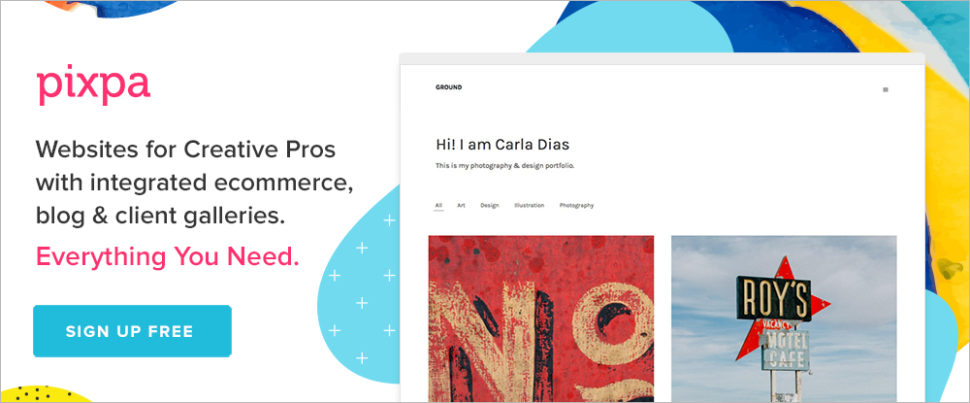
Pixpa’s website-building feature set, its 24/7 support, and its cost-effective pricing plans make it a great choice for creatives and small businesses in need of an attention-getting online portfolio. You can build the website you want without requiring any coding knowledge.
It’s simply a matter of starting with any of Pixpa’s templates and customizing them to your satisfaction via drag and drop. Pixpa offers a 15-day free trial.

8b is brand new, futuristic in its design and performance, and super-simple to work with. You can build a portfolio website from your desktop, from a mobile device, or both; and, thanks to Google AMP, your finished project will be lightning-fast and 100% mobile friendly.
8b’s collection of 18 slick starter themes and more than 250 website sections are all you need to get your portfolio-building project off to a lightning start.
You don’t have a portfolio website, and what you’ve been using seems to be getting the job done, so why go digital (even though everyone else seems to be doing so)?
At a minimum, your portfolio website should feature a logo and a tagline, a sampling of your very best work, and contact information. You could also include testimonials and case studies, a blog, and anything else that you believe might gain visitor interest. It will look like a special project you have in mind or are currently working on.
Your online portfolio is like a shop window. It features a display that compels passersby to enter to see what you have of interest in terms of products, services, or creative works of art. In this case those “passing by” consist of clients or potential clients and future customers.
Your portfolio should:
There are also several side benefits to creating an online portfolio.
It’s win-win for you and your customers/clients.
An online portfolio is a valuable asset. When it is done right, it can help any business to grow and any vocation or career to advance – including a tech industry career. This valuable asset doesn’t require a ton of study or effort to put in place either. When you can put a top-notch portfolio website in place in a day’s time, the ROI can be huge.
That’s where online builders like those presented here come into play. They are easy to use, produce excellent results, and are either free or offer free trials.
Read More at Top portfolio builders to build cool websites with

UltraViolette is a contemporary portfolio theme with a minimalistic design style & smooth custom made animation effects. It features a beautiful collection of templates and elements designed with care, streamlined for designers & creative agencies – it’s ideal for showcasing creative output.
The post UltraViolette – Design Portfolio Theme appeared first on WeLoveWP.