Weekly Platform News: Reduced Motion, CORS, WhiteHouse.gov, popups, and 100vw

In this week’s roundup, we highlight a proposal for a new <popup> element, check the use of prefers-reduced-motion on award-winning sites, learn how to opt into cross-origin isolation, see how WhiteHouse.gov approaches accessibility, and warn the dangers of 100vh.

Let’s get into the news!

The new HTML <popup> element is in development

On January 21, Melanie Richards from the Microsoft Edge web platform team posted an explainer for a proposed HTML <popup> element (the name is not final). A few hours later, Mason Freed from Google announced an intent to prototype this element in the Blink browser engine. Work on the implementation is taking place in Chromium issue #1168738.

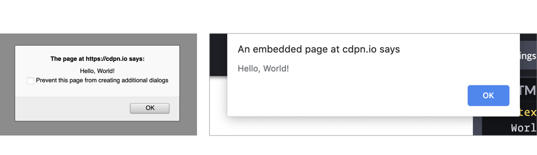
A popup is a temporary (transient) and “light-dismissable” UI element that is displayed on the the “top layer” of all other elements. The goal for the <popup> element is to be fully stylable and accessible by default. A <popup> can be anchored to an activating element, such as a button, but it can also be a standalone element that is displayed on page load (e.g., a teaching UI).

Two use cases showing a white action menu with four gray menu links below a blue menu button, and another example of a blog button with a large dark blue tooltip beneath it with two paragraphs of text in white.

A <popup> is automatically hidden when the user presses the Esc key or moves focus to a different element (this is called a light dismissal). Unlike the <dialog> element, only one <popup> can be shown at a time, and unlike the deprecated <menu> element, a <popup> can contain arbitrary content, including interactive elements:

We imagine <popup> as being useful for various different types of popover UI. We’ve chosen to use an action menu as a primary example, but folks use popup-esque patterns for many different types of content.

Award-winning websites should honor the “reduce motion” preference

Earlier this week, AWWWARDS announced the winners of their annual awards for the best websites of 2020. The following websites were awarded:

All these websites are highly dynamic and show full-screen motion on load and during scroll. Unfortunately, such animations can cause dizziness and nausea in people with vestibular disorders. Websites are therefore advised to reduce or turn off non-essential animations via the prefers-reduced-motion media query, which evaluates to true for people who have expressed their preference for reduced motion (e.g., the “Reduce motion” option on Apple’s platforms). None of the winning websites do this.

/* (code from animal-crossing.com) */
@media (prefers-reduced-motion: reduce) {
  .main-header__scene {
    animation: none;
  }
}

An example of a website that does this correctly is the official site of last year’s Animal Crossing game. Not only does the website honor the user’s preference via prefers-reduced-motion, but it also provides its own “Reduce motion” toggle button at the very top of the page.

Screenshot of the animal crossing game website that is bright with a solid green header above a gold ribbon that displays menu items. Below is the main banner showing a still of the animated game with a wooden welcome to Animal Crossing sign in the foreground.

(via Eric Bailey)

Websites can now opt into cross-origin isolation

Cross-origin isolation is part of a “long-term security improvement.” Websites can opt into cross-origin isolation by adding the following two HTTP response headers, which are already supported in Chrome and Firefox:

Cross-Origin-Embedder-Policy: require-corp
Cross-Origin-Opener-Policy: same-origin

A cross-origin-isolated page relinquishes its ability to load content from other origins without their explicit opt-in (via CORS headers), and in return, the page gains access to some powerful APIs, such as SharedArrayBuffer.

if (crossOriginIsolated) {
  // post SharedArrayBuffer
} else {
  // do something else
}

The White House recommits to accessibility

The new WhiteHouse.gov website of the Biden administration was built from scratch in just six weeks with accessibility as a top priority (“accessibility was top of mind”). Microsoft’s chief accessibility officer reviewed the site and gave it the thumbs up.

The website’s accessibility statement (linked from the site’s footer) declares a “commitment to accessibility” and directly references the latest version of the Web Content Accessibility Guidelines, WCAG 2.1 (2018). This is notable because federal agencies in the USA are only required to comply with WCAG 2.0 (2008).

The Web Content Accessibility Guidelines are the most widely accepted standards for internet accessibility. … By referencing WCAG 2.1 (the latest version of the guidelines), the Biden administration may be indicating a broader acceptance of the WCAG model.

The CSS 100vw value can cause a useless horizontal scrollbar

On Windows, when a web page has a vertical scrollbar, that scrollbar consumes space and reduces the width of the page’s <html> element; this is called a classic scrollbar. The same is not the case on macOS, which uses overlay scrollbars instead of classic scrollbars; a vertical overlay scrollbar does not affect the width of the <html> element.

macOS users can switch from overlay scrollbars to classic scrollbars by setting “Show scroll bars” to ”Always” in System preferences > General.

The CSS length value 100vw is equal to the width of the <html> element. However, if a classic vertical scrollbar is added to the page, the <html> element becomes narrower (as explained above), but 100vw stays the same. In other words, 100vw is wider than the page when a classic vertical scrollbar is present.

This can be a problem for web developers on macOS who use 100vw but are unaware of its peculiarity. For example, a website might set width: 100vw on its article header to make it full-width, but this will cause a useless horizontal scrollbar on Windows that some of the site’s visitors may find annoying.

Screenshot of an article on a white background with a large black post title, post date and red tag links above a paragraph of black text. A scrollbar is displayed on the right with two large red arrows illustrating the page width, which is larger than the 100 viewport width unit.

Web developers on macOS can switch to classic scrollbars to make sure that overflow bugs caused by 100vw don’t slip under their radar. In the meantime, I have asked the CSS Working Group for comment.


The post Weekly Platform News: Reduced Motion, CORS, WhiteHouse.gov, popups, and 100vw appeared first on CSS-Tricks.

You can support CSS-Tricks by being an MVP Supporter.

Comparing the Different Types of Native JavaScript Popups

JavaScript has a variety of built-in popup APIs that display special UI for user interaction. Famously:

alert("Hello, World!");

The UI for this varies from browser to browser, but generally you’ll see a little window pop up front and center in a very show-stopping way that contains the message you just passed. Here’s Firefox and Chrome:

Native popups in Firefox (left) and Chrome (right). Note the additional UI preventing additional dialogs in Firefox from triggering it more than once. You can also see how Chrome is pinned to the top of the window.

There is one big problem you should know about up front

JavaScript popups are blocking.

The entire page essentially stops when a popup is open. You can’t interact with anything on the page while one is open — that’s kind of the point of a “modal” but it’s still a UX consideration you should be keenly aware of. And crucially, no other main-thread JavaScript is running while the popup is open, which could (and probably is) unnecessarily preventing your site from doing things it needs to do.

Nine times out of ten, you’d be better off architecting things so that you don’t have to use such heavy-handed stop-everything behavior. Native JavaScript alerts are also implemented by browsers in such a way that you have zero design control. You can’t control *where* they appear on the page or what they look like when they get there. Unless you absolutely need the complete blocking nature of them, it’s almost always better to use a custom user interface that you can design to tailor the experience for the user.

With that out of the way, let’s look at each one of the native popups.

window.alert();

window.alert("Hello World");

<button onclick="alert('Hello, World!');">Show Message</button>

const button = document.querySelectorAll("button");
button.addEventListener("click", () => {
  alert("Text of button: " + button.innerText);
});

See the Pen
alert("Example");
by Elliot KG (@ElliotKG)
on CodePen.

What it’s for: Displaying a simple message or debugging the value of a variable.

How it works: This function takes a string and presents it to the user in a popup with a button with an “OK” label. You can only change the message and not any other aspect, like what the button says.

The Alternative: Like the other alerts, if you have to present a message to the user, it’s probably better to do it in a way that’s tailor-made for what you’re trying to do.

If you’re trying to debug the value of a variable, consider console.log(<code>"`Value of variable:"`, variable); and looking in the console.

window.confirm();

window.confirm("Are you sure?");

<button onclick="confirm('Would you like to play a game?');">Ask Question</button>

let answer = window.confirm("Do you like cats?");
if (answer) {
  // User clicked OK
} else {
  // User clicked Cancel
}

See the Pen
confirm("Example");
by Elliot KG (@ElliotKG)
on CodePen.

What it’s for: “Are you sure?”-style messages to see if the user really wants to complete the action they’ve initiated.

How it works: You can provide a custom message and popup will give you the option of “OK” or “Cancel,” a value you can then use to see what was returned.

The Alternative: This is a very intrusive way to prompt the user. As Aza Raskin puts it:

...maybe you don’t want to use a warning at all.”

There are any number of ways to ask a user to confirm something. Probably a clear UI with a <button>Confirm</button> wired up to do what you need it to do.

window.prompt();

window.prompt("What’s your name?"); 

let answer = window.prompt("What is your favorite color?");
// answer is what the user typed in, if anything

See the Pen
prompt("Example?", "Default Example");
by Elliot KG (@ElliotKG)
on CodePen.

What it’s for: Prompting the user for an input. You provide a string (probably formatted like a question) and the user sees a popup with that string, an input they can type into, and “OK” and “Cancel” buttons.

How it works: If the user clicks OK, you’ll get what they entered into the input. If they enter nothing and click OK, you’ll get an empty string. If they choose Cancel, the return value will be null.

The Alternative: Like all of the other native JavaScript alerts, this doesn’t allow you to style or position the alert box. It’s probably better to use a <form> to get information from the user. That way you can provide more context and purposeful design.

window.onbeforeunload();

window.addEventListener("beforeunload", () => {
  // Standard requires the default to be cancelled.
  event.preventDefault();
  // Chrome requires returnValue to be set (via MDN)
  event.returnValue = '';
});

See the Pen
Example of beforeunload event
by Chris Coyier (@chriscoyier)
on CodePen.

What it’s for: Warn the user before they leave the page. That sounds like it could be very obnoxious, but it isn’t often used obnoxiously. It’s used on sites where you can be doing work and need to explicitly save it. If the user hasn’t saved their work and is about to navigate away, you can use this to warn them. If they *have* saved their work, you should remove it.

How it works: If you’ve attached the beforeunload event to the window (and done the extra things as shown in the snippet above), users will see a popup asking them to confirm if they would like to “Leave” or “Cancel” when attempting to leave the page. Leaving the site may be because the user clicked a link, but it could also be the result of clicking the browser’s refresh or back buttons. You cannot customize the message.

MDN warns that some browsers require the page to be interacted with for it to work at all:

To combat unwanted pop-ups, some browsers don't display prompts created in beforeunload event handlers unless the page has been interacted with. Moreover, some don't display them at all.

The Alternative: Nothing that comes to mind. If this is a matter of a user losing work or not, you kinda have to use this. And if they choose to stay, you should be clear about what they should to to make sure it’s safe to leave.

Accessibility

Native JavaScript alerts used to be frowned upon in the accessibility world, but it seems that screen readers have since become smarter in how they deal with them. According to Penn State Accessibility:

The use of an alert box was once discouraged, but they are actually accessible in modern screen readers.

It’s important to take accessibility into account when making your own modals, but there are some great resources like this post by Ire Aderinokun to point you in the right direction.

General alternatives

There are a number of alternatives to native JavaScript popups such as writing your own, using modal window libraries, and using alert libraries. Keep in mind that nothing we’ve covered can fully block JavaScript execution and user interaction, but some can come close by greying out the background and forcing the user to interact with the modal before moving forward.

You may want to look at HTML’s native <dialog> element. Chris recently took a hands-on look) at it. It’s compelling, but apparently suffers from some significant accessibility issues. I’m not entirely sure if building your own would end up better or worse, since handling modals is an extremely non-trivial interactive element to dabble in. Some UI libraries, like Bootstrap, offer modals but the accessibility is still largely in your hands. You might to peek at projects like a11y-dialog.

Wrapping up

Using built-in APIs of the web platform can seem like you’re doing the right thing — instead of shipping buckets of JavaScript to replicate things, you’re using what we already have built-in. But there are serious limitations, UX concerns, and performance considerations at play here, none of which land particularly in favor of using the native JavaScript popups. It’s important to know what they are and how they can be used, but you probably won’t need them a heck of a lot in production web sites.

The post Comparing the Different Types of Native JavaScript Popups appeared first on CSS-Tricks.