GIFs Without the .gif: The Most Performant Image and Video Options Right Now

So you want an auto-playing looping video without sound? In popular vernacular this is the very meaning of the word GIF. The word has stuck around but the image format itself is ancient and obsolete. Twitter, for example, has a “GIF” button that actually inserts a <video> element with an MP4 file into your tweet — no .gif in sight. There are a beguiling amount of ways to achieve the same outcome but one thing is clear: there’s really no good reason to use the bulky .gif file format anymore.

Use a HTML <video> element

It’s easy to recreate the behavior of a GIF using the HTML video element.

<video autoplay loop muted playsinline src="cats.mp4"></video>

With this code the video will play automatically in a continuous loop with no audio. playsinline means that mobile browsers will play the video where it is on the page rather than opening in fullscreen.

While the HTML video element itself has been supported for many years, the same can’t be said for the wide variety of video formats.

Videos are made up of two parts: the container and the video codec. (If your video contains audio then it is made up of three parts, the third being the audio codec.) Containers can store video, audio, subtitles and meta information. The two most common containers for video on the web are MP4 and WebM. The container is the same as the file type — if a file ends with a .mp4 extension, that means it’s using an MP4 container. The file extension doesn’t tell you the codec though. Examples of video codecs commonly used on the web include VP8, VP9, H.264 and HEVC (H.265). For your video to play online, the browser needs to support both the video container and the codec.

Browser support for video is a labyrinthine mess, which is part of the reason YouTube embeds are ubiquitous, but that doesn’t work for our use case. Let’s look at the video formats that are worth considering.

Containers

  • MP4 was originally released in 2001. It is supported by all web browsers and has been for quite some time.
  • WebM was released in 2010. It works in all browsers except for iOS Safari.

Codecs

  • The H.264 codec works in all browsers.
  • HEVC/H.265, the successor of H.264, is supported by Safari, Edge, and Chrome (as of version 105).
  • VP9 is the successor to the VP8 codec. VP9 is supported by all the browsers that support WebM.
  • The AV1 codec has been supported in Chrome since 2018 and Firefox since 2019. It has not yet shipped in Edge or Safari.

An MP4 file using the H.264 codec will work everywhere, but it doesn’t deliver the best quality or the smallest file size.

AV1 doesn’t have cross-browser support yet but, released in 2018, it’s the most modern codec around. It’s already being used, at least for some videos and platforms, by Netflix, YouTube and Vimeo. AV1 is a royalty-free video codec designed specifically for the internet. AV1 was created by the Alliance for Open Media (AOM), a group founded by Google, Mozilla, Cisco, Microsoft, Netflix, Amazon, and Intel. Apple is now also a member, so it’s safe to assume all browsers will support AV1 eventually. Edge is “still evaluating options to support AVIF and AV1.”

The recently redesigned website from development consultancy Evil Martians is a testament to the file-size reduction that AV1 is capable of.

If you want to use newer video formats with fallbacks for older browsers, you can use multiple <source> elements. The order of the source elements matter. Specify the ideal source at the top, and the fallback after.

<video autoplay loop muted playsinline>
  <source src="cats.webm" type="video/webm"> <!-- ideal -->
  <source src="cats.mp4" type="video/mp4"> <!-- fallhack -->
</video>

Given the above code, cats.webm will be used unless the browser does not support that format, in which case the MP4 will be displayed instead.

What if you want to include multiple MP4 files, but with each using a different codec? When specifying the type you can include a codecs parameter. The syntax is horrifically complicated for anybody who isn’t some kind of hardcore codec nerd, but it looks something like this:

<video autoplay loop muted playsinline>
  <source src="cats.mp4" type="video/mp4; codecs=av01.0.05M.08" >
  <source src="cats.mp4" type="video/mp4" >
</video>

Using the above code the browser will select AV1 if it can play that format and fallback to the universally-supported H.264 if not. For AV1, the codecs parameter always starts with av01. The next number is either 0 (for main profile), 1 (for high profile) or 2 (for professional profile). Next comes a two-digit level number. This is followed either by the letter M (for main tier) or H (for high tier). It’s difficult to understand what any those things mean, so you could provide your AV1 video in a WebM container and avoid specifying the codec entirely.

Most video editing software does not allow you to export as AV1, or even as WebM. If you want to use one of those formats you’ll need to export your video as something else, like a .mov, and then convert it using the command-line tool FFmpeg:

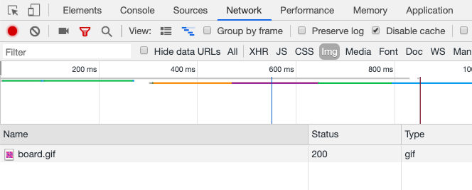
ffmpeg -i yourSourceFile.mov -map_metadata -1 -c:a libopus -c:v librav1e -qp 80 -tile-columns 2 -tile-rows 2 -pix_fmt yuv420p -movflags +faststart -vf &quot;scale=trunc(iw/2)*2:trunc(ih/2)*2&quot; videoTitle.mp4

You should use the most high-resolution source file you can. Obviously, once image quality is lost you can’t improve it through conversion to a superior format. Using a .gif as a source file isn’t ideal because the visual quality of .gif isn’t great, but you’ll still get the benefit of a large reduction in file size:

ffmpeg -i cats.gif -map_metadata -1 -an opus -c:v librav1e -qp 80 -tile-columns 2 -tile-rows 2 -pix_fmt yuv420p -movflags +faststart -vf &quot;scale=trunc(iw/2)*2:trunc(ih/2)*2&quot; cats.mp4

On Mac, you can download FFmpeg using Homebrew:

brew install ffmpeg

Here’s a nice example of video in web design on the masterfully designed Oxide website:

If you want to use the video as a background and place other elements on top of it, working with <video> is slightly more challenging than a CSS background-image, and requires code that goes something like this:

.video-parent {
  position: relative;
  width: 100vw;
  height: 100vh;
} 

.video-parent video {
  object-fit: cover;
  position: absolute;
  inset: 0;
  z-index: -1;
  width: 100%;
  height: 100%;
}

The <video> element is a perfectly okay option for replacing GIFs but it does have one unfortunate side-effect: it prevents a user’s screen from going to sleep, as explained in this post from an ex- product manager on the Microsoft Edge browser.

The benefits of using an image

Whether it’s an animated WebP or animated AVIF file, using images rather than video comes with some benefits.

I’m not sure how many people actually want to art-direct their GIFs, but using the <picture> element does open up some possibilities that couldn’t easily be achieved with <video>. You could specify different animations for light and dark mode, for example:

<picture>
  <source srcset="dark-animation.avifs" media="(prefers-color-scheme: dark)">
  <img src="light-animation.avif" alt="">
</picture>

We might want a video on mobile to be a different aspect ratio than on desktop. We could just crop parts of the image with CSS, but that seems like a waste of bytes and somewhat haphazard. Using a media query we can display a different animated image file based on the screen size or orientation:

<picture>
  <source type="image/avif" srcset="typeloop-landscape.avifs" media="(orientation: landscape)"">
  <img src="typeloop-portrait.avif" alt="">
</picture>

All of this is possible with video — you can use matchMedia to do any media queries in JavaScript and programmatically change the src of a <video> element:

const mediaQuery = window.matchMedia("(prefers-color-scheme: dark)");
if (mediaQuery.matches) {
  document.querySelector("video").src = "dark-animation.mp4";
}

I believe that whenever there’s a way to do something with markup it should be preferred over doing it JavaScript.

You can use raster images inside of an SVG using the <image> element. This includes animated image formats. There’s not much you can do with an image inside an SVG that you couldn’t already do with CSS, but if you group an image with vector elements inside an SVG, then you do get the benefit that the different elements move and scale together.

The <img> element has the benefit of native lazy-loading:

<img loading="lazy" src="cats.avif" alt="cats">

If you want a background video that takes up the entire screen, it’s slightly easier to position a background-image than a HTML <video> element:

.background-video {
  background-image: url("coolbackground.webp");
  background-repeat: no-repeat;
  background-size: cover;
  height: 100vh;
  width: 100vh;
} 

If you want to support older browsers you could use the <picture> element with a fallback of either an animated WebP or, just for Safari, an img with a video src, or if you care about ancient browsers, maybe an APNG (animated PNG) or a GIF. Using multiple image formats this way might be impractical if you’re optimizing images manually; but it is relatively trivial if you’re using a service like Cloudinary.

<picture>
  <source type="image/avif" srcset="cats.avif">
  <img src="cats.webp">
</picture>

There’s still no well-supported way to specify fallback images for CSS backgrounds. image-set is an equivalent of the <picture> element, [but for background-image. Unfortunately, only Firefox currently supports the type attribute of image-set.

.box {
  background-image: image-set(
    url("cats.avif") type("image/avif"),
    url("cats.webp") type("image/webp"));
}

This browser support data is from Caniuse, which has more detail. A number indicates that browser supports the feature at that version and up.

Desktop

ChromeFirefoxIEEdgeSafari
109*89No105*TP

Mobile / Tablet

Android ChromeAndroid FirefoxAndroidiOS Safari
105*104105*16.1

Use animated WebP

The WebP image format was introduced by Google in 2010. WebP, including animated WebP, has broad browser support.

A cat flying through space leaving a rainbow trail
<img src="nyancat.webp" alt="A cat flying through space leaving a rainbow trail">

This browser support data is from Caniuse, which has more detail. A number indicates that browser supports the feature at that version and up.

Desktop

ChromeFirefoxIEEdgeSafari
3265No1816.0

Mobile / Tablet

Android ChromeAndroid FirefoxAndroidiOS Safari
1051044.2-4.314.0-14.4

Use animated AVIF

WebP is now twelve years old. The more modern AV1 Image File Format (AVIF), released in 2019, is the best image format for most use cases on the web. Converting a .gif file to AVIF can reduce bytes by over 90%.

<img src="nyancat.avif" alt="A cat flying through space leaving a rainbow trail">

As its name suggests, AVIF is based on the the AV1 video codec. Like WebP, AVIF can be used for both still images and animation. There’s not much difference between an animated AVIF file and an AV1 video in an MP4 container.

You can put a shadow on AVIF animation, e.g.:

filter: drop-shadow(2px 4px 6px black);

AVIF is already supported by Safari, Firefox, Samsung Internet, and Chrome. Firefox only shipped support for still images, not animated AVIF. Safari supports animation as of version 16.1. Unfortunately, because Firefox does support AVIF, just not animated AVIF, it’s impossible to successfully use the <picture> element to display AVIF only to browsers that support animation. Given the following code, Firefox would display the AVIF, but as a static image, rather than showing the animated WebP version:

<picture>
  <source srcset="https://fonts.gstatic.com/s/e/notoemoji/latest/1f4a9/512.avif" type="image/avif">
  <img src="https://fonts.gstatic.com/s/e/notoemoji/latest/1f4a9/512.webp" alt="💩" width="32" height="32">
</picture>

Tooling for AVIF is still improving. Video editing software does not enable you to export footage as animated AVIF or animated WebP. You’ll need to export it in some other format and then convert it. On the website ezgif.com you can upload a video file or a .gif and convert it to AVIF or WebP. You could also use FFmpeg. Using Cloudinary you can upload a video file or an old .gif and convert it to pretty much any format you want — including animated WebP and animated AVIF. As of time of writing, Squoosh, an image conversion app, doesn’t support animated AVIF.

Adoption remains lacking in design software. When viewing a prototype, Figma will play any animated GIFs included in the design. For AVIF, by contrast, you can’t even import or export a still image.

An error in Figma that says files failed to import.

Use a video with an <img> element

In 2018, Safari 11.1 gave developers the ability to use a video file as the source of the HTML <img> element. This works in Safari:

<img src="cat.mp4" alt="A Siamese cat walking in a circle">

All the same codecs that Safari supports for <video> are supported by <img>. This means you can use MP4, H.264, and HEVC.

In Safari, video files will also work anyplace in CSS where you could use an image, like background-image or border-image:

.video-border {  
  border: 40px solid transparent;
  border-image: url(abstract_bg_animation.mp4) 100 round;
}

One strange consequence of this feature in Safari is that the poster image of a <video> element can also be a video. The poster will autoplay even if you have blocked video’s from auto-playing. Safari claimed this feature came with performance benefits, not just over using .gif files but also over using the <video> element. According to Apple:

By placing your videos in <img> elements, the content loads faster, uses less battery power, and gets better performance.

Colin Bendell, co-author of O‘Reilly’s High Performance Images, wrote about the shortcomings of the <video> tag for our use case:

Unlike <img> tags, browsers do not preload <video> content. Generally preloaders only preload JavaScript, CSS, and image resources because they are critical for the page layout. Since <video> content can be any length – from micro-form to long-form – <video> tags are skipped until the main thread is ready to parse its content. This delays the loading of <video> content by many hundreds of milliseconds.

[…]

Worse yet, many browsers assume that <video> tags contain long-form content. Instead of downloading the whole video file at once, which would waste your cell data plan in cases where you do not end up watching the whole video, the browser will first perform a 1-byte request to test if the server supports HTTP Range Requests. Then it will follow with multiple range requests in various chunk sizes to ensure that the video is adequately (but not over-) buffered. The consequence is multiple TCP round trips before the browser can even start to decode the content and significant delays before the user sees anything. On high-latency cellular connections, these round trips can set video loads back by hundreds or thousands of milliseconds.

Chrome has marked this as “WontFix” — meaning they don’t intend to ever support this feature, for various reasons. There is, however, an open issue on GitHub to add it to the HTML spec, which would force Google’s hand.

Respecting user preferences

Video has the benefit of automatically respecting a users preferences. Firefox and Safari allow users to block videos from automatically playing, even if they don’t have any audio. Here are the settings in Firefox, for example:

firefox autoplay settings open in a modal.

The user can still decide to watch a certain video by right-clicking and pressing play in the menu, or enable autoplay for all videos on a specific website.

Contextual menu for a video.

For users who haven’t disabled autoplay, it’s nice to have the option to pause an animation if you happen to find it annoying or distracting (a user can still right-click to bring up the pause option in a menu when video controls aren’t shown). Success Criterion 2.2.2 Pause, Stop, Hide of the WCAG accessibility guidelines states:

For any moving, blinking or scrolling information that (1) starts automatically, (2) lasts more than five seconds, and (3) is presented in parallel with other content, there is a mechanism for the user to pause, stop, or hide it unless the movement, blinking, or scrolling is part of an activity where it is essential.

With the <video> element, you’ll achieve that criterion without any additional development.

There’s also a “reduce motion” user setting that developers can respect by reducing or removing CSS and JavaScript web animations.

macOS settings window for display accessibility with rediced motion checked.

You can also use it to display a still image instead of an animation. This takes extra code to implement — and you need to host a still image in additional to your animated image.

<picture>
  <source
    srcset="nyancat.avifs"
    type="image/avif"
    media="(prefers-reduced-motion: no-preference)"
  />
  <img src="nyancat.png" alt="Nyan cat" width="250" height="250" />
</picture>

There’s another downside. When using the <picture> element in this way if the user has checked “reduce motion”there’s no way for them to see the animation. Just because a user prefers less animation, doesn’t mean they never want any — they might still want to be able to opt-in and watch one every now and then. Unlike the <video> element, displaying a still image takes away that choice.

Checking for progressive enhancement

If you want to check that your <picture> code is properly working and fallback images are being displayed, you can use the Rendering tab in Chrome DevTools to turn off support for AVIF and WebP image formats. Seeing as all browsers now support WebP, this is a pretty handy feature.

Chrome DevTools with Rendering panel open optons for disabling AVIF and WebP images.

While it’s usually the best option to create animations with CSS, JavaScript, DOM elements, canvas and SVG, as new image and video formats offer smaller files than what was previously possible, they become a useful option for UI animation (rather than just nyancat loops). For one-off animations, an AVIF file is probably going to be more performant than importing an entire animation library.

Circular badge that reads Match Accepted with an animated blue progress highlight going around it.
Here’s a fun example of using video for UI from all the way back in 2017 for the League of Legends website.

Lottie

After Effects is a popular animation tool from Adobe. Using an extension called Bodymovin, you can export animation data from After Effects as a JSON file.

Then there’s Lottie, an open-source animation library from Airbnb that can take that JSON file and render it as an animation on different platforms. The library is available for native iOS, Android, and React Native applications, as well as for the web. You can see examples from Google Home, Target, and Walgreens, among others.

Once you’ve included the dependency you need to write a small amount of JavaScript code to get the animation to run:

<div id="lottie"></div>
const animation = bodymovin.loadAnimation({
  container: document.getElementById('lottie'),
  path: 'myAnimation.json',
  renderer: 'svg',
  loop: true,
  autoplay: true,
})

You can optionally change those settings to only play after an event:

const lottieContainer = document.getElementById('lottie');
const animation = bodymovin.loadAnimation({
  container: lottieContainer, 
  path: 'myAnimation.json',
  renderer: 'svg',
  loop: true,
  autoplay: false,
  })
// Play the animation on hover
lottieContainer.addEventListener('mouseover', () => {
  animation.play();
});
// Stop the animation after playing once
animation.addEventListener('loopComplete', function() {
  animation.stop();
});

Here’s a cute example of a cat typing on a keyboard I took from Lottiefiles.com (the website is a useful website for previewing your own Lottie JSON file animations, rather than needing to install After Effects, as well finding animations from other creatives):

You can also programmatically play an animation backwards and change the playback rate.

If you do choose to use Lottie, there’s a Figma plugin for Lottie but all it does is convert JSON files to .gif so that they can be previewed in prototyping mode.

Abd what about Lottie’s performance? There’s size of the library — 254.6KB (63.8 gzipped) — and the size of the JSON file to consider. There’s also the amount of DOM elements that get created for the SVG parts. If you run into this issue, Lottie has the option to render to a HTML <canvas>, but you’ll need to use a different version of the JavaScript library.

const animation = bodymovin.loadAnimation({
  container: document.getElementById('lottie'), 
  path: 'myAnimation.json',
  renderer: 'canvas',
})

Lottie isn’t a full replacement for gifs. While After Effects itself is often used with video clips, and Lottie can render to a HTML <canvas>, and a canvas can play video clips, you wouldn’t use a Lottie file for that purpose. Lottie is for advanced 2D animations, not so much for video. There are other tools for creating complex web animations with a GUI like SVGator and Rive, but I haven’t tried them myself. 🤷‍♂️


I wish there was a TL;DR for this article. For now, at least, there’s no clear winner…


GIFs Without the .gif: The Most Performant Image and Video Options Right Now originally published on CSS-Tricks, which is part of the DigitalOcean family. You should get the newsletter.

Using Performant Next-Gen Images in CSS with image-set

The CSS image-set() function has been supported in Chromium-based browsers since 2012 and in Safari since version 6. Support recently landed in Firefox 88. Let’s dive in and see what we can and can’t do today with image-set().

Multiple resolutions of the same image

Here’s what the CSS spec has to say about image-set():

Delivering the most appropriate image resolution for a user’s device can be a difficult task. Ideally, images should be in the same resolution as the device they’re being viewed in, which can vary between users. However, other factors can factor into the decision of which image to send; for example, if the user is on a slow mobile connection, they may prefer to receive lower-res images rather than waiting for a large proper-res image to load.

It’s basically a CSS background equivalent to the HTML srcset attribute for img tags. By using image-set we can provide multiple resolutions of an image and trust the browser to make the best decision about which one to use. This can be used to specify a value for three different CSS properties: content, cursor, and most useful of all, background-image.

.hero {
  background-image: image-set("platypus.png" 1x, "platypus-2x.png" 2x);
}

1x is used to identify the low-res image, while 2x is used to define the high-res image. x is an alias of dppx, which stands for dots per pixel unit.

Chrome/Edge/Opera/Samsung Internet currently require a -webkit- prefix. If you’re using Autoprefixer, this will be handled automatically. Safari no longer requires the prefix but uses an older syntax that requires a url() function to specify the image path. We could also include a regular old background-image: url() to support any browsers that don’t support image-set.

.hero {
  /* Fallback */
  background-image: url("platypus.png");

  /* Chrome/Edge/Opera/Samsung, Safari will fallback to this as well */
  background-image: -webkit-image-set(url("platypus.png") 1x, url("platypus-2x.png") 2x);

  /* Standard use */
  background-image: image-set("platypus.png" 1x, "platypus-2x.png" 2x);
}

Now users on expensive fancy devices will see a super sharp image. Performance will be improved for users on slow connections or with cheaper screens as their browser will automatically request the lower-res image. If you wanted to be sure that the high-res image was used on high-res devices, even on slow connections, you could make use of the min-resolution media query instead of image-set. For more on serving sharp images to high density screens, check out Jake Archibald’s recent post over on his blog.

That’s pretty cool, but what I really want is to be able to adopt the latest image formats in CSS while still catering for older browsers…

New image formats

Safari 14 shipped support for WebP. It was the final modern browser to do so which means the image format is now supported everywhere (except Internet Explorer). WebP is useful in that it can make images that are often smaller than (but of the same quality as) JPG, PNG, or GIF.

There’s also a whole bunch of even newer image formats cropping up. AVIF images are shockingly tiny. Chrome, Opera and Samsung Internet have already shipped support for AVIF. It’s already in Firefox behind a flag. This image format isn’t supported by many design tools yet but you can convert images to AVIF using the Squoosh app built by the Chrome team at Google. WebP 2, HEIF and JPEG XL might also make it into browsers eventually. This is all rather exciting, but we want browsers that don’t support these newer formats to get some images. Fortunately image-set() has a syntax for that.

Using new image formats by specifying a type

Browser support note: The feature of image-set that I’m about to talk about currently has pretty terrible browser support. Currently it’s only supported in Firefox 89.

HTML has supported the <picture> element for years now.

<picture>
  <source srcset="./kitten.avif" type="image/avif">
  <img src="./kitten.jpg" alt="a small kitten"> 
</picture>

image-set provides the CSS equivalent, allowing for the use of next-gen image formats by specifying the image’s MIME type:

.div1 {
  background-image: image-set(
    "kitten.avif" type("image/avif"),
    "kitten.jpg" type("image/jpeg")
  );
}

The next-gen image goes first while the fallback image for older browsers goes second. Only one image will be downloaded. If the browser doesn’t support AVIF it will ignore it and only download the second image you specify. If AVIF is supported, the fallback image is ignored.

In the above example we used an AVIF image and provided a JPEG as a fallback, but the fallback could be any widely supported image format. Here’s an example using a PNG.

.div2 {
  background-image: image-set(
    "puppy.webp" type("image/webp"),
    "puppy.png" type("image/png")
  );
}

In Chromium and Safari, specifying the type is not supported yet. That means you can use image-set today only to specify different resolutions of widely-supported image formats but not to add backwards-compatibility when using WebP or AVIF in those browsers. It should be possible to provide both multiple resolutions and multiple image formats, if you are so inclined:

.div2 {
  background-image: image-set( 
    "puppy.webp" type("image/webp") 1x,
    "puppy2x.webp" type("image/webp") 2x,
    "puppy.png" type("image/png") 1x,
    "puppy2x.png" type("image/png") 2x
  );
}

Hopefully browser support will improve soon.

Using <picture> for backgrounds instead

Maybe you don’t need background-image at all. If you want to use modern image formats, you might be able to use the <picture> element, which has better browser support. If you set the image to position: absolute it’s easy to display other elements on top of it.

As an alternative approach to using position: absolute, CSS grid is another easy way to overlap HTML elements.


The post Using Performant Next-Gen Images in CSS with image-set appeared first on CSS-Tricks. You can support CSS-Tricks by being an MVP Supporter.

GIFS and prefers-reduced-motion

The <picture> element has a trick it can do where it shows different image formats in different situations. If all you are interested in is formats for the sake of performance, maybe you’d do:

<picture>
  <source srcset="img/waterfall.avif" type="image/avif">
  <source srcset="img/waterfall.webp" type="image/webp"> 
  <img src="img/waterfall.jpg" alt="A bottom-up shot of a huge waterfall in Iceland with green moss on either side.">
</picture>

But notice those <source> elements there… they can take a media attribute as well! In other words, they can be used for responsive images in the sense that you can swap out the image for a different one, perhaps even one with a different aspect ratio (e.g. a wide-crop rectangle shape on a large screen vs. close-crop square shape on a small screen).

The media attribute doesn’t have to be screen-size related though. Brad Frost documented this trick a while back:

<picture>
  <source srcset="no-motion.jpg" media="(prefers-reduced-motion: reduce)"></source> 
  <img srcset="animated.gif" alt="brick wall">
</picture>

That is using a prefers-reduced-motion media query to swap a GIF for a static image when less movement is preferred (a system-level choice). Clever! I saw Manuel’s tweet about it get some love the other day:


Remember our little rif on Steve Faulkner’s idea from a little while ago? Rather than entirely stopping the GIF, you can put animated and non-animated images on top of each other (inside a <details> element) and allow them to be “played” on demand. We could alter that a smidge again and have it respect this media query by using a smidge of JavaScript:


The post GIFS and prefers-reduced-motion appeared first on CSS-Tricks.

You can support CSS-Tricks by being an MVP Supporter.

Beyond Media Queries: Using Newer HTML & CSS Features for Responsive Designs

Beyond using media queries and modern CSS layouts, like flexbox and grid, to create responsive websites, there are certain overlooked things we can do well to make responsive sites. In this article, we’ll dig into a number tools (revolving around HTML and CSS) we have at the ready, from responsive images to relatively new CSS functions that work naturally whether we use media queries or not.

In fact, media queries become more of a complement when used with these features rather than the full approach. Let’s see how that works.

Truly responsive images

Remember when we could just chuck width: 100% on images and call it a day? That still works, of course, and does make images squishy, but there are a number of downsides that come with it, the most notable of which include:

  • The image might squish to the extent that it loses its focal point.
  • Smaller devices still wind up downloading the full size image.

When using images on the web, we have to make sure they’re optimized in terms of their resolution and size. The reason is to ensure that we have the right image resolution to fit the right device, so we don’t end up downloading really large and heavy images for smaller screens which could end up reducing the performance of a site. 

In simple terms, we’re making sure that larger, high-resolution images are sent to larger screens, while smaller, low-resolution variations are sent to smaller screens, improving both performance and user experience.

HTML offers the <picture> element that allows us specify the exact image resource that will be rendered based on the media query we add. As described earlier, instead of having one image (usually a large, high-resolution version) sent to all screen sizes and scaling it to the viewport width, we specify a set of images to serve in specific situations.

<picture>
  <source media="(max-width:1000px)" srcset="picture-lg.png">
  <source media="(max-width:600px)" srcset="picture-mid.png">
  <source media="(max-width:400px)" srcset="picture-sm.png">
  <img src="picture.png" alt="picture"">
</picture>

In this example, picture.png is the full-size image. From there, we define the next-largest version of the image, picture-lg.png, and the size reduces in descending order until the smallest version, picture-sm.png. Note that we’re still using media queries in this approach, but it’s the <picture> element itself that is driving the responsive behavior rather than defining breakpoints in the CSS.

The media queries are added appropriately to scale with the sizes of the picture:

  • Viewports that are 1000px and above get picture.png.
  • Viewports that are between 601px and 999px get picture-lg.png.
  • Viewports that are between 401px and 600px get picture-sm.png.
  • Any thing smaller than 400px gets picture-sm.png.

Interestingly, we can also label each image by image density —  1x, 2x, 3x and so forth — after the URL. This works if we have made the different images in proportion to each other (which we did). This allows the browser to determine which version to download based on the screen’s pixel density in addition to the viewport size. But note how many images we wind up defining:

<picture>
  <source media="(max-width:1000px)" srcset="picture-lg_1x.png 1x, picture-lg_2x.png 2x, picture-lg_3x.png 3x">
  <source media="(max-width:600px)" srcset="picture-mid_1x.png 1x, picture-mid_2x.png 2x, picture-mid_3x.png 3x">
  <source media="(max-width:400px)" srcset="picture-small_1x.png 1x, picture-small_2x.png 2x, picture-small_1x.png 3x">
  <img src="picture.png" alt="picture"">
</picture>

Let’s look specifically at the two tags nested inside the <picture> element: <source> and <img>.

The browser will look for the first <source> element where the media query matches the current viewport width, and then it will display the proper image (specified in the srcset attribute). The <img> element is required as the last child of the <picture> element, as a fallback option if none of the initial source tags matches.

We can also use image density to handle responsive images with just the <img> element using the srcset attribute:

<img
 srcset="
  flower4x.png 4x,
  flower3x.png 3x,
  flower2x.png 2x,
  flower1x.png 1x
 "
 src="flower-fallback.jpg"
>

Another thing we can do is write media queries in the CSS based on the screen resolution (usually measured in dots per inch, or dpi) of the device itself and not just the device viewport. What this means is that instead of:

@media only screen and (max-width: 600px) {
  /* Style stuff */
}

We now have:

@media only screen and (min-resolution: 192dpi) {
  /* Style stuff */
}

This approach lets us dictate what image to render based the screen resolution of the device itself, which could be helpful when dealing with high resolution images. Basically, that means we can display high quality pictures for screens that support higher resolutions and smaller versions at lower resolutions. It’s worth noting that, although mobile devices have small screens, they’re usually high resolution. That means it’s probably not the best idea rely on resolution alone when determining which image to render. It could result in serving large, high-resolution images to really small screens, which may not be the version we really want to display at such a small screen size.

body {
  background-image : picture-md.png; /* the default image */
}


@media only screen and (min-resolution: 192dpi) {
  body {
    background-image : picture-lg.png; /* higher resolution */
  }
}

What <picture> gives us is basically the ability to art direct images. And, in keeping with this idea, we can leverage CSS features, like the object-fit property which, when used with object-position, allows us to crop images for better focal points while maintaining the image’s aspect ratio.

So, to change the focal point of an image:

@media only screen and (min-resolution: 192dpi) {
  body {
    background-image : picture-lg.png;
    object-fit: cover;
    object-position: 100% 150%; /* moves focus toward the middle-right */
  }
}

Setting minimum and maximum values in CSS

The min() function specifies the absolute smallest size that an element can shrink to. This function proves really useful in terms of helping text sizes to properly scale across different screen sizes, like never letting fluid type to drop below a legible font size:

html {
  font-size: min(1rem, 22px); /* Stays between 16px and 22px */
}

min() accepts two values, and they can be relative, percentage, or fixed units. In this example, we’re telling the browser to never let an element with class .box go below 45% width or 600px, whichever is smallest based on the viewport width:

.box {
  width : min(45%, 600px)
}

If 45% computes to a value smaller than 600px, the browser uses 45% as the width. Conversely, if  45% computes to a value greater than 600px, then 600px will be used for the element’s width.

The same sort of thing goes for the max() function. It also accepts two values, but rather than specifying the smallest size for an element, we’re defining the largest it can get.

.box {
  width : max(60%, 600px)
}

If 60% computes to a value greater than 600px, the browser uses 60% as the width. On the flip side, if 60% computes to a value smaller than 600px, then 600px will be used as the element’s width.

And, hey, we can even set a minimum and maximum range instead using the minmax() function:

.box {
  width : minmax( 600px, 50% ); /* at least 600px, but never more than 50% */
}

Clamping values

Many of us have been clamoring for clamp() for some time now, and we actually have broad support across all modern browsers (sorry, Internet Explorer). clamp() is the combination of the min() and max() functions, accepting three parameters:

  1. the minimum value,
  2. the preferred value, and
  3. the maximum value

For example:

.box {
  font-size : clamp(1rem, 40px, 4rem)
}

The browser will set the font at 1rem until the computed value of 1rem is larger than 40px. And when the computed value is above 40px? Yep, the browser will stop increasing the size after it hits 4rem. You can see how clamp() can be used to make elements fluid without reaching for media queries.

Working with responsive units

Have you ever built a page with a large heading or sub-heading and admired how great it looked on a desktop screen, only to check it on a mobile device and find out that’s it’s too large? I have definitely been in this situation and in this section I’ll be explaining how to handle such problems.

In CSS, you can determine sizes or lengths of elements using various units of measurements, and the most used units of measurements includes: px, em, rem, %, vw, and vh. Although, there are several more units that aren’t used as frequently. What’s of interest to us is that px can be considered an absolute unit, while the rest are considered relative units.

Absolute units

A pixel (px) is considered an absolute unit mainly because it’s fixed and does not change based on the measurement of any other element. It can be considered as the base, or root, unit that some other relative units use. Trying to use pixels for responsive behavior can bump into issues because it’s fixed, but they’re great if you have elements that should not be resized at all.

Relative units

Relative units, like %, em, and rem, are better suited to responsive design mainly because of their ability to scale across different screen sizes.

vw: Relative to the viewport’s width
vh: Relative to the viewport’s height
rem: Relative to the root (<html>) element (default font-size is usually 16px )
em: Relative to the parent element
%: Relative to the parent element

Again, the default font size for most browsers is 16px and and that’s what rem units use to generate their computed values. So, if a user adjusts the font size on the browser, everything on the page scales properly depending on the root size. For example, when dealing a root set at 16px, the number you specify will multiply that number times the default size. For example:

.8rem = 12.8px (.8 * 16)
1rem = 16px (1 * 16)
2rem = 32px (2 * 16)

What if either you or the user changes the default size? As we said already, these are relative units and the final size values will be based off of the new base size. This proves useful within media queries, where you just change the font size and the entire page scales up or down accordingly.

For example, if you changed the font-size to 10px within the CSS, then the calculated sizes would end up being:

html {
  font-size : 10px;
}
1rem = 10px (1 * 10)
2rem = 20px (2 * 10)
.5rem = 5px (.5 * 10)

Note: This also applies to percentage %. For instance:

100% = 16px;
200% = 32px; 
50% = 8px;

And what’s the difference between rem and em units? It’s what the unit uses as its base element. rem calculates values using the font size of the root (<html>) element, whereas an element declaring em values references the font size of the parent element that contains it. If the size of specified parent element is different from the root element (e.g. the parent elements is 18px but the root element is 16px) then em and rem will resolve to different computed values. This gives us more fine-grained control of how our elements respond in different responsive contexts.

vh is an acronym for viewport height, or the viewable screen’s height. 100vh represent 100% of the viewport’s height (depending on the device). In the same vein, vw stands for viewport width, meaning the viewable screen’s width of the device, and 100vw literally represents 100% of the viewport’s width.

Moving beyond media queries

See that? We just looked at a number of really powerful and relatively new HTML and CSS features that give us additional (and possible more effective) ways to build for responsiveness. It’s not that these new-fangled techniques replace what we’ve been doing all along. They are merely more tools in our developer tool belt that give us greater control to determine how elements behave in different contexts. Whether it’s working with font sizes, resolutions, widths, focal points, or any number of things, we have more fine-grain control of the user experience than ever before.

So, next time you find yourself working on a project where you wish you had more control over the exact look and feel of the design on specific devices, check out what native HTML and CSS can do to help — it’s incredible how far things have come along.


The post Beyond Media Queries: Using Newer HTML & CSS Features for Responsive Designs appeared first on CSS-Tricks.

You can support CSS-Tricks by being an MVP Supporter.

Weekly Platform News: Preventing Image Loads with the Picture Element, the Web We Want, Svg Styles Are Not Scoped

In this week's week roundup of browser news, a trick for loading images conditionally using the picture element, your chance to tell bowser vendors about the web you want, and the styles applied to inline SVG elements are, well, not scoped only to that SVG.

Let's turn to the headlines...

Preventing image loads with the picture element

You can use the <picture> element to prevent an image from loading if a specific media query matches the user’s environment (e.g., if the viewport width is larger or smaller than a certain length value). [Try out the demo:

See the Pen
voZENR
by Šime Vidas (@simevidas)
on CodePen.

<picture>
  <!-- show 1⨯1 transparent image if viewport width ≤ 40em -->
  <source
    media="(max-width: 40em)"
    srcset="data:image/gif;base64,R0lGODlhAQABAIAAAAAAAP///yH5BAEAAAAALAAAAAABAAEAAAIBRAA7"
  />

  <!-- load only image if viewport width > 40em -->
  <img src="product-large-screen.png" />
</picture>

(via Scott Jehl)

The Web We Want

The Web We Want (webwewant.fyi) is a new collaboration between browser vendors that aims to collect feedback from web developers about the current state of the web. You can submit a feature request on the website ("What do you want?"") and get a chance to present it at an event (An Event Apart, Smashing Conference, etc.).

(via Aaron Gustafson)

In other news

  • Firefox supports a non-standard Boolean parameter for the location.reload method that can be used to hard-reload the page (bypassing the browser’s HTTP cache) [via Wilson Page]
  • If you use inline <svg> elements that itself have inline CSS code (in <style> elements), be aware that those styles are not scoped to the SVG element but global, so they affect other SVG elements as well [via Sara Soueidan]
  • XSS Auditor, a Chrome feature that detects cross-site scripting vulnerabilities, has been deemed ineffective and will be removed from Chrome in a future version. You may still want to set the HTTP X-Xss-Protection: 1; mode=block header for legacy browsers [via Scott Helme]

Read more news in my new, weekly Sunday issue. Visit webplatform.news for more information.

The post Weekly Platform News: Preventing Image Loads with the Picture Element, the Web We Want, Svg Styles Are Not Scoped appeared first on CSS-Tricks.

Reduced Motion Picture Technique, Take Two

Did you see that neat technique for using the <picture> element with <source media=""> to serve an animated image (or not) based on a prefers-reduced-motion media query?

After we shared that in our newsletter, we got an interesting reply from Michael Gale:

What about folks who love their animated GIFs, but just didn’t want the UI to be zooming all over the place? Are they now forced to make a choice between content and UI?

I thought that was a pretty interesting question.

Also, whenever I see <img src="gif.gif"> these days, my brain is triggered into WELL WHAT ABOUT MP4?! territory, as I've been properly convinced that videos are better-in-all-ways on the web than GIFs. Turns out, some browsers support videos right within the <img> element and, believe it or not, you can write fallbacks for that, with — drumroll, please — for the <picture> element as well!

Let's take a crack at combining all this stuff.

Adding an MP4 source

The easy one is adding an additional <source> with the video. That means we'll need three source media files:

  1. A fallback non-animated graphic when prefers-reduced-motion is reduce.
  2. An animated GIF as the default.
  3. An MP4 video to replace the GIF, if the fallback is supported.

For example:

<picture>
  <source srcset="static.png" media="(prefers-reduced-motion: reduce)"></source>
  <source srcset="animated.mp4" type="video/mp4">
  <img srcset="animated.gif" alt="animated image" />
</picture>

Under default conditions in Chrome, only the GIF is downloaded and shown:

Chrome DevTools showing only gif downloaded

Under default conditions in Safari, only the MP4 is downloaded and shown:

Safari DevTools showing only mp4 downloaded

If you've activated prefers-reduced-motion: reduce in either Chrome or Safari (on my Mac, I go to System PreferencesAccessibilityDisplayReduce Motion), both browsers only download the static PNG file.

Chrome DevTools showing png downloaded

I tested Firefox and it doesn't seem to work, instead continuing to download the GIF version. Firefox seems to support prefers-reduced-motion, but perhaps it's just not supported on <source> elements yet? I'm not sure what's up there.

Wouldn't it be kinda cool to provide a single animated source and have a tool generate the others from it? I bet you could wire that up with something like Cloudinary.

Adding a toggle to show the animated version

Like Michael Gale mentioned, it seems a pity that you're entirely locked out from seeing the animated version just because you've flipped on a reduced motion toggle.

It should be easy enough to have a <button> that would use JavaScript to yank out the media query and force the browser to show the animated version.

I'm fairly sure there is no practical way to do this declaratively in HTML. We also can't put this button within the <picture> tag. Even though <picture> isn't a replaced element, the browser still gets confused and doesn't like it. Instead, it doesn't render it at all. No big deal, we can use a wrapper.

<div class="picture-wrap">
  
  <picture>
     <!-- sources  -->
  </picture>

  <button class="animate-button">Animate</button>

</div>

We can position the button on top of the image somewhere. This is just an arbitrary choice — you could put it wherever you want, or even have the entire image be tappable as long as you think you could explain that to users. Remember to only show the button when the same media query matches:

.picture-wrap .animate-button {
  display: none;
}

@media (prefers-reduced-motion: reduce) {
  .picture-wrap .animate-button {
     display: block;
  }
}

When the button is clicked (or tapped), we need to remove the media query to start the animation by downloading an animated source.

let button = document.querySelector(".animate-button");

button.addEventListener("click", () => {
  const parent = button.closest(".picture-wrap");
  const picture = parent.querySelector("picture");
  picture.querySelector("source[media]").remove();
});

Here's that in action:

See the Pen
Prefers Reduction Motion Technique PLUS!
by Chris Coyier (@chriscoyier)
on CodePen.

Maybe this is a good component?

We could automatically include the button, the button styling, and the button functionality with a web component. Hey, why not?

See the Pen
Prefers Reduction Motion Technique as Web Component
by Chris Coyier (@chriscoyier)
on CodePen.

The post Reduced Motion Picture Technique, Take Two appeared first on CSS-Tricks.