Today I’d like to share another thumbnail to full view animation with you. This time we have an initial grid with thumbnails that move with the mouse in 3D and have a magnetic effect including a little tooltip on hover. Once clicked, all items animate out, giving way to a content preview with more details.
The grid interaction looks as follows:
Here’s how the grid to content animation looks like:
I really hope you find this useful! Thanks for visiting!
You know, Porky Pig coming out of those red rings announcing the end of a Looney Tunes cartoon. We’ll get there, but first we need to cover some CSS concepts.
Everything in CSS is a box, or rectangle. Rectangles stack, and can be displayed on top of, or below, other rectangles. Rectangles can contain other rectangles and you can style them such that the inner rectangle is visible outside the outer rectangle (so they overflow) or that they’re clipped by the outer rectangle (using overflow: hidden). So far, so good.
What if you want a rectangle to be visible outside its surrounding rectangle, but only on one side. That’s not possible, right?
Perhaps, when you look at the image above, the wheels start turning: What if I copy the inner rectangle and clip half of it and then position it exactly?. But when it comes down to it, you can’t choose to have an element overflow at the top but clip at the bottom.
Or can you?
3D transforms
Using 3D transforms you can rotate, transform, and translate elements in 3D space. Here’s a group of practical examples I gathered showcasing some possibilities.
For 3D transforms to do their thing, you need two CSS properties:
perspective, using a value in pixels, to determine how pronounced the 3D effect is
transform-style: preserve-3d, to tell the browser to keep elements positioned in 3D space.
Even with the good support that 3D transforms have, you don’t see 3D transforms ‘in the wild’ all that much, sadly. Websites are still a “2D” thing, a flat page that scrolls. But as I started playing around with 3D transforms and scouting examples, I found one that was by far the most interesting as far as 3D transforms go:
The image clearly shows three planes but this effect is achieved using a single <div>. The two other planes are the ::before and ::after pseudo-elements that are moved up and down respectively, using translate(), to stack on top of each other in 3D space. What is noticeable here is how the ::after element, that normally would be positioned on top of an element, is behind that element. The creator was able to achieve this by adding transform: translateZ(-1px);.
Even though this was one of many 3D transforms I had seen at this point, it was the first one that made me realize that I was actually positioning elements in 3D space. And if I can do that, I can also make elements intersect:
I couldn’t think of how this sort of thing would be useful, but then I saw the Porky Pig cartoon animation. He emerges from behind the bottom frame, but his face overlaps and stacks on top of the top edge of the same frame — the exact same sort of clipping situation we saw earlier. That’s when my wheels started turning. Could I replicate that effect using just CSS? And for extra credit, could I replicate it using a single <div>?
I started playing around and relatively quickly had this to show for it:
Here we have a single <div> with its ::before and an ::after pseudo-elements. The div itself is transparent, the ::before has a blue border and the ::after has been rotated along the x-axis. Because the div has perspective, everything is positioned in 3D and, because of that, the ::after pseudo-element is above the border at the top edge of the frame and behind the border at the bottom edge of the frame.
With perspective, we can determine how far a viewer is from “z=0” which we can consider to be the “horizon” of our CSS 3D space. The larger the perspective, the less pronounced the 3D effect, and vice versa. For most 3D scenes, a perspective value between 500 and 1,000 pixels works best, though you can play around with it to get the exact effect you want. You can compare this with perspective drawing: If you draw two horizon points close together, you get a very strong perspective; but if they’re far apart, then things appear flatter.
From rectangles to cartoons
Rectangles are fun, but what I really wanted to build was something like this:
I couldn‘t find or create a nicely cut-out version of Porky Pig from that image, but the Wikipedia page contains a nice alternative, so we’ll use that.
First, we need to split the image up into three parts:
<div>: the blue background behind Porky
::after: all the red circles that form a sort of tunnel
::before: Porky Pig himself in all his glory, set as a background image
We’ll start with the <div>. That will be the background as well as the base for the rest of the elements. It’ll also contain the perspective and transform-style properties I called out earlier, along with some sizes and the background color:
Alright, next up, we‘ll move to the red circles. The element itself has to be transparent because that’s the opening where Porky emerges. So how shall we go about it? We can use a border just like the example earlier in this article, but we only have one border and that can have a solid color. We need a bunch of circles that can accept gradients. We can use box-shadow instead, chaining multiple shadows in the property values. This gets us all of the circles we need, and by using a blur radius value of 0 with a large spread radius, we can create the appearance of multiple “borders.”
We‘ll use a border-radius that‘s as large as the <div> itself, making the ::before a circle. Then we’ll add the shadows. When we add a few red circles with a large spread and add blurry white, we get an effect that looks very similar to the Porky’s tunnel.
Here, we’re adding five circles, where each is 30px wide. Each circle has a solid red background. And, by using white shadows with a blur radius of 20px on top of that, we create the gradient effect.
With the background and the circles sorted, we’re now going to add Porky. Let’s start with adding him at the spot we want him to end up, for now above the circles.
You might have noticed that slash in “center/contain” for the background. That’s the syntax to set both the position (center) and size (contain) in the background shorthand CSS property. The slash syntax is also used in the font shorthand CSS property where it’s used to set the font-size and line-height like so: <font-size>/<line-height>.
The slash syntax will be used more in future versions of CSS. For example, the updated rgb() and hsl() color syntax can take a slash followed by a number to indicate the opacity, like so: rgb(0 0 0 / 0.5). That way, there’s not need to switch between rgb() and rgba(). This already works in all browsers, except Internet Explorer 11.
Both the size and positioning here is a little arbitrary, so play around with that as you see fit. We’re a lot closer to what we want, but now need to get it so the bottom portion of Porky is behind the red circles and his top half remains visible.
The trick
We need to transpose both the circles as well as Porky in 3D space. If we want to rotate Porky, there are a few requirements we need to meet:
He should not clip through the background.
We should not rotate him so far that the image distorts.
His lower body should be below the red circles and his upper body should be above them.
To make sure Porky doesn‘t clip through the background, we first move the circles in the Z direction to make them appear closer to the viewer. Because preserve-3d is applied it means they also zoom in a bit, but if we only move them a smidge, the zoom effect isn’t noticeable and we end up with enough space between the background and the circles:
transform: translateZ(20px);
Now Porky. We’re going to rotate him around the X-axis, causing his upper body to move closer to us, and the lower part to move away. We can do this with:
transform: rotateX(-10deg);
This looks pretty bad at first. Porky is partially hidden behind the blue background, and he’s also clipping through the circles in a weird way.
We can solve this by moving Porky “closer” to us (like we did with the circles) using translateZ(), but a better solution is to change the position of our rotation point. Right now it happens from the center of the image, causing the lower half of the image to rotate away from us.
If we move the starting point of the rotation toward the bottom of the image, or even a little bit below that, then the entirety of the image rotates toward us. And because we already moved the circles closer to us, everything ends up looking as it should:
transform: rotateX(-10deg);
transform-origin: center 120%;
To get an idea of how everything works in 3D, click “show debug” in the following Pen:
Animation
If we keep things as they are — a static image — then we wouldn’t have needed to go through all this trouble. But when we animate things, we can reveal the layering and enhance the effect.
Here‘s the animation I’m going for: Porky starts out small at the bottom behind the circles, then zooms in, emerging from the blue background over the red circles. He stays there for a bit, then moves back out again.
We’ll use transform for the animation to get the best performance. And because we’re doing that, we need to make sure we keep the rotateX in there as well.
Soon, we’ll be able to directly set different transforms, as browsers have started implementing them as individual CSS properties. That means that repeating that rotateX(-10deg) will eventually be unnecessary; but for now, we have a little bit of duplication.
We zoom in and out using the scale() function and, because we’ve already set a transform-origin, scaling happens from the center-bottom of the image, which is precisely the effect we want! We’re animating the scale up to 60% of Porky’s actual size, we have the little break at the largest point, where he fully pops out of the circle frame.
The animation goes on the ::before pseudo-element. To make the animation look a little more natural, we’re using an ease-in-out timing function, which slows down the animation at the start and end.
Glad you asked! For people who are sensitive to animations and prefer reduced or no motion, we can reach for the prefers-reduced-motion media query. Instead of removing the full animation, we’ll target those who prefer reduced motion and use a more subtle fade effect rather than the full-blown animation.
By overwriting the @keyframes inside a media query, the browser will automatically pick it up. This way, we still accentuate the effect of Porky emerging from the circles. And by setting animation-iteration-count to 1, we still let people see the effect, but then stop to prevent continued motion.
Finishing touches
Two more things we can do to make this a bit more fun:
We can create more depth in the image by adding a shadow behind Porky that grows as he emerges and appears to zoom in closer to the view.
We can turn Porky as he moves, to embellish the pop-out effect even further.
That second part we can implement using rotateZ() in the same animation. Easy breezy.
But the first part requires an additional trick. Because we use an image for Porky, we can’t use box-shadow because that creates a shadow around the box of the ::before pseudo-element instead of around the shape of Porky Pig.
That’s where filter: drop-shadow()comes to the rescue. It looks at the opaque parts of the element and adds a shadow to that instead of around the box.
My path to learning CSS was a little unorthodox. I didn’t start as a front-end developer. I was a Java developer. In fact, my earliest recollections of CSS were picking colors for things in Visual Studio.
It wasn’t until later that I got to tackle and find my love for the front end. And exploring CSS came later. When it did, it was around the time CSS3 was taking off. 3D and animation were the cool kids on the block. They almost shaped my learning of CSS. They drew me in and shaped (pun intended) my understanding of CSS more than other things, like layout, color, etc.
What I’m getting at is I’ve been doing the whole 3D CSS thing a minute. And as with anything you spend a lot of time with, you end up refining your process over the years as you hone that skill. This article is a look at how I’m currently approaching 3D CSS and goes over some tips and tricks that might help you!
Everything’s a cuboid
For most things, we can use a cuboid. We can create more complex shapes, for sure but they usually take a little more consideration. Curves are particularly hard and there are some tricks for handling them (but more on that later).
We aren’t going to walk through how to make a cuboid in CSS. We can reference Ana Tudor’s post for that, or check out this screencast of me making one:
At its core, we use one element to wrap our cuboid and then transform six elements within. Each element acts as a side to our cuboid. It’s important that we apply transform-style: preserve-3d. And it’s not a bad idea to apply it everywhere. It’s likely we’ll deal with nested cuboids when things get more complex. Trying to debug a missing transform-style while hopping between browsers can be painful.
* { transform-style: preserve-3d; }
For your 3D creations that are more than a few faces, try and imagine the whole scene built from cuboids. For a real example, consider this demo of a 3D book. It’s four cuboids. One for each cover, one for the spine, and one for the pages. The use of background-image does the rest for us.
Setting a scene
We’re going to use cuboids like LEGO pieces. But, we can make our lives a little easier by setting a scene and creating a plane. That plane is where our creation will sit and makes it easier for us to rotate and move the whole creation.
For me, when I create a scene, I like to rotate it on the X and Y axis first. Then I lay it flat with rotateX(90deg). That way, when I want to add a new cuboid to the scene, I add it inside the plane element. Another thing I will do here is to set position: absolute on all cuboids.
Creating cuboids of various sizes and across a plane makes for a lot of repetition for each creation. For this reason, I use Pug to create my cuboids via a mixin. If you’re not familiar with Pug, I wrote a 5-minute intro.
A typical scene looks like this:
//- Front
//- Back
//- Right
//- Left
//- Top
//- Bottom
mixin cuboid(className)
  .cuboid(class=className)
    - let s = 0
    while s < 6
      .cuboid__side
      - s++
.scene
  //- Plane that all the 3D stuff sits on
  .plane
    +cuboid('first-cuboid')
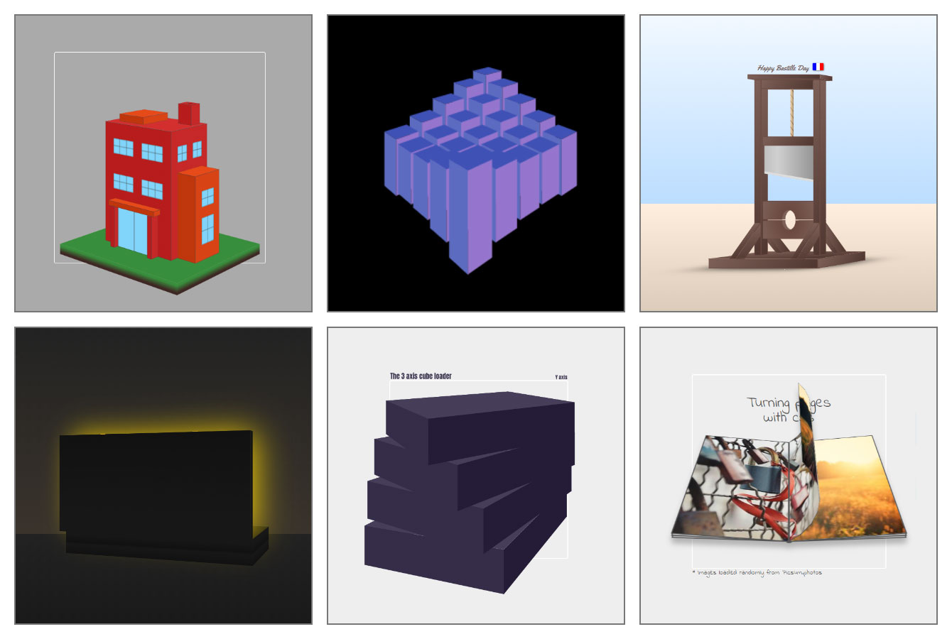
As for the CSS. My cuboid class is currently looking like this:
You may have noticed a fair few CSS variables (aka custom properties) in there. This is a big time-saver. I’m powering my cuboids with CSS variables.
--width: The width of a cuboid on the plane
--height: The height of a cuboid on the plane
--depth: The depth of a cuboid on the plane
--x: The X position on the plane
--y: The Y position on the plane
I use vmin mostly as my sizing unit to keep everything responsive. If I’m creating something to scale, I might create a responsive unit. We mentioned this technique in a previous article. Again, I lay the plane down flat. Now I can refer to my cuboids as having height, width, and depth. This demo shows how we can move a cuboid around the plane changing its dimensions.
Debugging with dat.GUI
You might have noticed that little panel in the top right for some of the demos we’ve covered. That’s dat.GUI. It’s a lightweight controller library for JavaScript that super useful for debugging 3D CSS. With not much code, we can set up a panel that allows us to change CSS variables at runtime. One thing I like to do is use the panel to rotate the plane on the X and Y-axis. That way, it’s possible to see how things are lining up or work on a part that you might not see at first.
That dat.GUI code is a little repetitive. We can create functions that will take a configuration and generate the controller. It takes a little tinkering to cater to your needs. I started playing with dynamically generated controllers in this demo.
Centering
You may have noticed that by default each cuboid is half under and half above the plane. That’s intentional. It’s also something I only recently started to do. Why? Because we want to use the containing element of our cuboids as the center of the cuboid. This makes animation easier. Especially, if we’re considering rotating around the Z-axis. I found this out when creating “CSS is Cake”. After making the cake, I then decided I wanted each slice to be interactive. I then had to go back and change my implementation to fix the rotation center of the flipping slice.
Here I’ve broken that demo down to show the centers and how having an offset center would affect the demo.
Positioning
If we are working with a scene that’s more complex, we may split it up into different sections. This is where the concept of sub-planes comes in handy. Consider this demo where I’ve recreated my personal workspace.
There’s quite a bit going on here and it’s hard to keep track of all the cuboids. For that, we can introduce sub-planes. Let’s break down that demo. The chair has its own sub-plane. This makes it easier to move it around the scene and rotate it — among other things — without affecting anything else. In fact, we can even spin the top without moving the feet!
Aesthetics
Once we’ve got a structure, it’s time to work on the aesthetics. This all depends on what you’re making. But you can get some quick wins from using certain techniques. I tend to start by making things “ugly” then go back and make CSS variables for all the colors and apply them. Three shades for a certain thing allows us to differentiate the sides of a cuboid visually. Consider this toaster example. Three shades cover the sides of the toaster:
https://codepen.io/jh3y/pen/KKVjLrx
Our Pug mixin from earlier allows us to define class names for a cuboid. Applying color to a side usually looks something like this:
It’s a little tricky to include extra elements with our Pug mixin. But let’s not forget, every side to our cuboid offers two pseudo-elements. We can use these for various details. For example, the toaster slot and the slot for the handle on the side are pseudo-elements.
Another trick is to use background-image for adding details. For example, consider the 3D workspace. We can use background layers to create shading. We can use actual images to create textured surfaces. The flooring and the rug are a repeating background-image. In fact, using a pseudo-element for textures is great because then we can transform them if needed, like rotating a tiled image. I’ve also found that I get flickering in some cases working directly with a cuboid side.
One issue with using an image for texture is how we create different shades. We need shades to differentiate the different sides. That’s where the filter property can help. Applying a brightness``() filter to the different sides of a cuboid can lighten or darken them. Consider this CSS flipping table. All the surfaces are using a texture image. But to differentiate the sides, brightness filters are applied.
Smoke and mirrors perspective
How about shapes — or features we want to create that seem impossible — using a finite set of elements? Sometimes we can trick the eye with a little smoke and mirrors. We can provide a “faux” like sense of 3D. The Zdoglibrary does this well and is a good example of this.
Consider this bundle of balloons. The strings holding them use the correct perspective and each has its own rotation, tilt, etc. But the balloons themselves are flat. If we rotate the plane, the balloons maintain the counter plane rotation. And this gives that “faux” 3D impression. Try out the demo and switch off the countering.
Sometimes it takes a little out-of-the-box thinking. I had a house plant suggested to me as I built the 3D workspace. I have a few in the room. My initial thought was, “No, I can make a square pot, and how would I make all the leaves?” Well actually, we can use some eye tricks on this one too. Grab a stock image of some leaves or a plant. Remove the background with a tool like remove.bg. Then position many images in the same spot but rotate them each a certain amount. Now, when they’re rotated, we get the impression of a 3D plant.
Tackling awkward shapes
Awkward shapes are tough to cover in a generic way. Every creation has its own hurdles. But, there is a couple of examples that could help give you ideas for tackling things. I recently read an article about the UX of LEGO interface panels. In fact, approaching 3D CSS work like it’s a LEGO set isn’t a bad idea. But the LEGO interface panel is a shape we could make with CSS (minus the studs — I only recently learned this is what they are called). It’s a cuboid to start with. Then we can clip the top face, make the end face transparent, and rotate a pseudo-element to join it up. We can use the pseudo-element for adding the details with some background layers. Try turning the wireframe on and off in the demo below. If we want the exact heights and angles for the faces, we can use some math to workout the hypoteneuse etc.
Another awkward thing to cover is curves. Spherical shapes are not in the CSS wheelhouse. We have various options at this point. One option is to embrace that fact and create polygons with a finite number of sides. Another is to create rounded shapes and use the rotation method we mentioned with the plant. Each of these options could work. But again, it’s on a use case basis. Each has pros and cons. With the polygon, we surrender the curves or use so many elements that we get an almost curve. The latter could result in performance issues. With the perspective trick, we may also end up with performance issues depending. We also surrender being able to style the “sides” of the shape as there aren’t any.
Z fighting
Last, but not least, it’s worth mentioning “Z-fighting.” This is where certain elements on a plane may overlap or cause an undesirable flicker. It’s hard to give good examples of this. There’s not a generic solution for it. It’s something to tackle on a case-by-case basis. The main strategy is to order things in the DOM as appropriate. But sometimes that’s not the only issue.
Being accurate can sometimes cause issues. Let’s refer to the 3D workspace again. Consider the canvas on the wall. The shadow is a pseudo-element. If we place the canvas exactly against the wall, we are going to hit issues. If we do that, the shadow and the wall are going to fight for the front position. To combat this, we can translate things by a slight amount. That will solve the issue and declare what should sit in front.
Try resizing this demo with the “Canvas offset” on and off. Notice how the shadow flickers when there is no offset? That’s because the shadow and the wall are fighting for view. The offset sets the --x to a fraction of 1vmin that we’ve named --cm. That’s a responsive unit being used for that creation.
That’s “it”!
Take your CSS to another dimension. Use some of my tips, create your own, share them, and share your 3D creations! Yes, making 3D things in CSS can be tough and is definitely a process that we can refine as we go along. Different approaches work for different people and patience is a required ingredient. I’m interested to see where you take your approach!
As someone who loves creating CSS animations, one of the more powerful tools I use is perspective. While the perspective property is not capable of 3D effects all by itself (since basic shapes can’t have depth), you can use the transform property to move and rotate objects in a 3D space (with the X, Y, and Z axes), then use perspective to control depth.
In this article, I’ll try to explain the concept of perspective, starting with the very basics, as we work up to a fully animated 3D cube.
The basics of perspective
We’ll start with a simple green square and and we’ll move it on all three axes.
While moving the object on the X and Y axes is pretty straightforward, if we’ll move it on the Z axis, it will look like the square stays exactly the same, and that’s because when the object is moving on the Z axis, the animation moves it closer to us and then further from us, but the size (and location) of the square remains the same. That’s where the CSS perspective property comes into play.
While perspective has no influence on the object when it’s moving on the X or Y axes, when the object is moving on the Z axis, perspective makes the square look bigger when it moves closer to us, and smaller when it moves further away. Yes, just like in “real” life.
The same effect occurs when we’re rotating the object:
Rotating the square on the Z axis looks like the regular rotation we all know and love, but when we rotate the square on the X or Y axes (without using perspective), it only looks like the square is getting smaller (or narrower) rather than rotating. But when we add perspective, we can see that when the square is rotating, the closer side of the square seems bigger, and the further side looks smaller, and the rotation looks as expected.
Note that when the rotation of the object on the X or Y axes is at 90° (or 270°, 450°, 630°, and so on) it will “disappear” from view. Again, this is happening because we can’t add depth to an object, and at this position the square’s width (or height) will actually be 0.
The perspective value
We need to set the perspective property with a value. This value sets the distance from the object’s plane, or in other words, the perspective’s strength. The bigger the value, the further you are from the object; the smaller the value, the more noticeable the perspective will be.
The perspective origin
The perspective-origin property determines the position from which you are “looking” at an object. If the origin is centered (which is the default) and the object is moved to the right, it will seem like you are looking at it from the left (and vice versa).
Alternatively, you can leave the object centered and move the perspective-origin. When the origin is set to the side, it’s like you are “looking” at the object from that side. The bigger the value, the further aside it will look.
The transformation
While perspective and perspective-origin are both set on an element’s parent container and determine the position of the vanishing point (i.e. the distance from the object’s plane from the position from which you are “looking” at the object), the object’s position and rotation is set using the transform property, which is declared on the object itself.
If you take a look at the code of the previous example, where I moved the square from one side to the other, you’ll see that I used the translateX() function — which makes sense since I wanted it to move along the X axis. But notice that it’s assigned to the transform property. The function is a type of transformation that is applied directly to the element we want to transform, but that behaves according to the perspective rules assigned to the parent element.
We can “chain” multiple functions to the transform property. But when using multiple transforms, there three very important things to consider:
When rotating an object, its coordinate system is transformed along with the object.
When translating an object, it moves relative to its own coordinate system (rather than its parent’s coordinates).
The order in which these values are written can (and will) change the end result.
In order to get the effect I was looking for in the previous demo, I first needed to translate the square on the X axis. Only then I could rotate it. If this had been done the other way around (rotate first, then translate), then the result would have been completely different.
To underscore how important the order of values is to the transform property, let’s take a look at a couple of quick examples. First, a simple two-dimensional (2D) transformation of two squares that both have the same transform values, but declared in a different order:
It’s the same deal even if we’re rotating the squares on the Y axis:
It should be noted that while the order of values is important, we could simply change the values themselves to get the desired result instead of changing the order of the values. For example…
That’s because in the first line we moved the object on the X axis before rotating it, but in the second line we rotated the object, changed its coordinates, then moved it on the Z axis. Same result, different values.
Let’s look at something more interesting
Sure, squares are a good way to explain the general concept of perspective, but we really start to see how perspective works when we break into three-dimensional (3D) shapes.
Let’s use everything we’ve covered so far to build a 3D cube.
The HTML
We’ll create a .container element that wraps around a .cube element that, in turn, consists of six elements that represent the sides of the cube.
First, we’ll add some perspective to the parent .container element. Then we’ll sure the .cube element has 200px sides and respects 3D transformations. I’m adding a few presentational styles here, but the key properties are highlighted.
/* The parent container, with perspective */
.container {
  width: 400px;
  height: 400px;
  border: 2px solid white;
  border-radius: 4px;
  display: flex;
  justify-content: center;
  align-items: center;
  perspective: 800px;
  perspective-origin: top right;
}

/* The child element, with 3D tranforms preserved */
.cube {
  position: relative;
  width: 200px;
  height: 200px;
  transform-style: preserve-3d;
}

/* The sides of the cube, absolutely positioned */
.side {
  position: absolute;
  width: 100%;
  height: 100%;
  opacity: 0.9;
  border: 2px solid white;
}

/* Background colors for the cube's sides to help visualize the work */
.front { background-color: #d50000; }
.back { background-color: #aa00ff; }

.left { background-color: #304ffe; }
.right { background-color: #0091ea; }

.top { background-color: #00bfa5; }
.bottom { background-color: #64dd17; }
Transforming the sides
The front side is the easiest. We’ll move it forward by 100px:
We can move the back side of the cube backwards by adding translateZ(-100px). Another way to do it is by rotating the side 180deg then move it forward:
The top and bottom are a little different. Instead of rotating them on the Y axis, we need to rotate them on the X axis. Again, it can be done in a couple of different ways:
Feel free to play around with the different options for perspective and perspective-origin to see how they affect the cube.
Let’s talk about transform-style
We’re going to add some fancy animation to our cube, but let’s first talk about the transform-style property. I added it earlier in the general CSS, but didn’t really explain what it is or what it does.
The transform-style property has two values:
flat (default)
preserve-3d
When we set the property to preserve-3d, it does two important things:
It tells the sides of the cube (the child elements) to be positioned in the same 3D space as the cube. If it is not set to preserve-3d, the default value is set to flat , and the sides are flattened in the cube’s plane. preserve-3d “copies” the cube perspective to its children (the sides) and allows us to rotate just the cube, so we don’t need to animate each side separately.
It displays the child elements according to their position in the 3D space, regardless of their place in the DOM.
There are three squares in this example — green, red, and blue. The green square has a translateZ value of 100px, meaning it’s in front of the other squares. The blue square has a translateZ of -100px, meaning is behind the other squares.
But in the DOM, the order of the squares is: green, red, blue. Therefore, when transform-style is set to flat (or not set at all), the blue square will appear on top, and the green square will be in the back, because that is the order of the DOM. But if we set the transform-style to preserve-3d, it will render according to its position in the 3D space. As a result, the green square will be in front, and the blue square will be in the back.
Animation
Now, let’s animate the cube! And to make things more interesting, we’ll add the animation to all three axes. First, we’ll add the animation property to the .cube. It won’t do anything yet since we haven’t defined the animation keyframes, but it’s in place for when we do.
animation: cubeRotate 10s linear infinite;
Now the keyframes. We’re basically going to rotate the cube along each axis so that it appears to be rolling in space.
@keyframes cubeRotate {
  from { transform: rotateY(0deg) rotateX(720deg) rotateZ(0deg); }
  to { transform: rotateY(360deg) rotateX(0deg) rotateZ(360deg); }
}
The perspective property is really what gives the animation that depth, like we’re seeing the cube roll left and right, as well as forward and backward.
But before now, the value of the perspective property had been constant, and so was the perspective-origin. Let’s see how changing these values affects the appearance of the cube.
I’ve added three sliders to this example to help see how different values affect the cube’s perspective:
The left slider sets the value of the perspective property. Remember, this value sets the distance from the object’s plane, so the smaller the value is, the more noticeable the perspective effect will be.
The other two sliders refer to the perspective-origin property. The right slider sets the origin on the vertical axis, from top to bottom, and the bottom slider sets the origin on the horizontal axis, from right to left.
Note that while the animation is running, these changes may be less noticeable as the cube itself rotates, but you can easily turn off the animation by clicking the “Run animation” button.
Play around with these values and find out how they affect the appearance of the cube. There is no one “right” value, and these values vary from project to project, since they’re dependent on the animation, the size of the object, and the effect you want to achieve.
So what’s next?
Now that you’ve mastered the basics of the perspective property in CSS, you can use your imagination and creativity to create 3D objects in your own projects, adding depth and interest to your buttons, menus, inputs, and anything else you want to “bring to life.”
In the meanwhile, you can practice and enhance your skills by trying to create some complex structures and perspective-based animations like this, this, this, or even this.
I hope you enjoyed reading this article and learned something new in the process! Feel free to leave a comment to let me know what you think or drop me a line on Twitter if you have any questions about perspective or any other topic in this article.
Today we’re going to take a look at a cool, small technique to bend and fold HTML elements. This technique is not new by any means, it was explored in some previous works and one great example is Romain’s portfolio. It can be used to create interesting and diverse layouts, but please keep in mind that this is very experimental.
To start the article I’m going to come clean: this effect is all smoke and mirrors. HTML elements can’t actually bend, sorry if that breaks your heart.
This illusion is created by lining up multiple elements together to give the impression that it is a single piece. Then, rotating the elements on the edges making it look like the single piece is bending. Let’s see how that looks in code.
Creating the great fold illusion!
To begin, we’ll add a container with perspective so that we see the rotations happening in 3D. We’ll also create children “folds” with fixed dimensions and overflow hidden. The top and bottom folds are going to be placed absolutely on their respective sides of the middle fold.
Giving the folds fixed dimensions is not necessary; you can even give each fold different sizes if you are up to the challenge! But having fixed dimensions simplifies a lot of the alignment math.
The overflow:hidden is necessary, and it’s what makes the effect work. Because that’s what makes it seem like it’s a single unit even when the folds have different rotations.
.wrapper-3d {
  position: relative;
    /* Based on screen with so the perspective doesn't break on small sizes*/
  perspective: 20vw;
  transform-style: preserve-3d;
}

.fold {
  overflow: hidden;
  width: 100vw;
  height: 80vh;
}

.fold-after {
  background: #dadada;
  position: absolute;
  transform-origin: top center;
  right: 0;
  left: 0;
  top: 100%;
}

.fold-before {
  background: #dadada;
  position: absolute;
  transform-origin: bottom center;
  left: 0;
  right: 0;
  bottom: 100%;
}
Note: In this case, were using the bottom and top attributes to position our extra folds. If you wanted to add more than two you would need to stack transforms. You could for example use a SCSS function that generates the code for all the folds to be in place.
Now let’s add a little bit of content inside the folds and see how that looks like. We’ll insert them inside a new .fold-content division. Each fold needs to have the same copy of the content for it to be seamless.
For now, the content is going to be a bunch of squares and headers. But you can add any HTML elements.
<div class="wrapper-3d">
	<div class="fold fold-top">
		<div class="fold-content">
			<div class="square green"></div>
			<h1>This is my content</h1>
			<div class="square blue"></div>
			<h1>This is my content</h1>
			<div class="square red"></div>
		</div>
	</div>
	<div class="fold fold-center" id="center-fold">
		<div class="fold-content" id="center-content">
			<div class="square green"></div>
			<h1>This is my content</h1>
			<div class="square blue"></div>
			<h1>This is my content</h1>
			<div class="square red"></div>
		</div>
	</div>
	<div class="fold fold-bottom">
		<div class="fold-content">
			<div class="square green"></div>
			<h1>This is my content</h1>
			<div class="square blue"></div>
			<h1>This is my content</h1>
			<div class="square red"></div>
		</div>
	</div>
</div>
Right now the content is out of place because each fold has its content at the top. Well, that’s how HTML works. We want it to be a single unit and be all aligned. So we’ll add an extra .fold-align between the content and the fold.
Each fold is going to have its unique alignment. We’ll position their content to start at the top of the middle fold.
Because our folds have overflow: hidden there isn’t a default way to scroll through them. Not to mention that they also need to scroll in sync. So, we need to manage that ourselves!
To make our scroll simple to manage, we’ll take advantage of the regular scroll wheel.
First, we’ll set the body’s height to how big we want the scroll to be. And then we’ll sync our elements to the scroll created by the browser. The height of the body is going to be the screen’s height plus the content overflowing the center fold. This will guarantee that we are only able to scroll if the content overflows its fold height.
let centerContent = document.getElementById('center-content');
let centerFold = document.getElementById('center-fold');

let overflowHeight =  centerContent.clientHeight - centerFold.clientHeight

document.body.style.height = overflowHeight + window.innerHeight + "px";
After we create the scroll, we’ll update the position of the folds’ content to make them scroll with the page.
let foldsContent = Array.from(document.getElementsByClassName('fold-content'))
let tick = () => {
    let scroll = -(
        document.documentElement.scrollTop || document.body.scrollTop
    );
    foldsContent.forEach((content) => {
        content.style.transform = `translateY(${scroll}px)`;
    })
    requestAnimationFrame(tick);
}
tick();
And that’s it! To make it more enjoyable, we’ll remove the background color of the folds. And add a some lerp to make the scrolling experience smoother!
Conclusion
Over this short tutorial, we went over the basic illusion of folding HTML elements. But there’s so much more we can do with this! Each of the demos uses different variations (and styles) of the basic technique we just learned!
With one variation you can use non-fixed size elements. With another variation, you can animate them while sticking some folds to the sides of the screen.
Each demo variation has its benefits and caveats. I encourage you to dig into the code and see how the small changes between demos allow for different results!
Also, it’s good to note that in some browsers this technique has some tiny line gaps between folds. We minimized this by scaling up the parent and down-scaling the child elements. It’s not a perfect solution but it reduced it slightly and did the trick for most cases! If you know how to remove them for good let us know!
If you have any questions or want to share something lets us know in the comments or reach out to me on Twitter @anemolito!
Texture projection is a way of mapping a texture onto a 3D object and making it look like it was projected from a single point. Think of it as the batman symbol projected onto the clouds, with the clouds being our object and the batman symbol being our texture. It’s used both in games and visual effects, and more parts of the creative world. Here is a talk by Yi-Wen Lin which contains some other cool examples.
Looks neat, huh? Let’s achieve this in Three.js!
Minimum viable example
First, let’s set up our scene. The setup code is the same in every Three.js project, so I won’t go into details here. You can go to the official guide and get familiar with it if you haven’t done that before. I personally use some utils from threejs-modern-app, so I don’t need to worry about the boilerplate code.
So, first we need a camera from which to project the texture from.
const camera = new THREE.PerspectiveCamera(45, 1, 0.01, 3)
camera.position.set(-1, 1.2, 1.5)
camera.lookAt(0, 0, 0)
Then, we need our object on which we will project the texture. To do projection mapping, we will write some custom shader code, so let’s create a new ShaderMaterial:
// create the mesh with the projected material
const geometry = new THREE.BoxGeometry(1, 1, 1)
const material = new THREE.ShaderMaterial({
  uniforms: {
    texture: { value: assets.get(textureKey) },
  },
  vertexShader: '',
  fragShader: '',
})
const box = new THREE.Mesh(geometry, material)
However, since we may need to use our projected material multiple times, we can put it in a component by itself and use it like this:
class ProjectedMaterial extends THREE.ShaderMaterial {
  constructor({ camera, texture }) {
    // ...
  }
}

const material = new ProjectedMaterial({
  camera,
  texture: assets.get(textureKey),
})
Let’s write some shaders!
In the shader code we’ll basically sample the texture as if it was projected from the camera. Unfortunately, this involves some matrix multiplication. But don’t be scared! I’ll explain it in a simple, easy to understand way. If you want to dive deeper into the subject, here is a really good article about it.
In the vertex shader, we have to treat each vertex as if it’s being viewed from the projection camera, so we just use the projection camera’s projectionMatrix and viewMatrix instead of the ones from the scene camera. We pass this transformed position into the fragment shader using a varying variable.
In the fragment shader, we have to transform the position from world space into clip space. We do this by dividing the vector by its .w component. The GLSL built-in function texture2DProj (or the newer textureProj) does this internally also.
In the same line, we also transform from clip space range, which is [-1, 1], to the uv lookup range, which is [0, 1]. We use this variable to later sample from the texture.
Notice that we wrote some code to project the texture only on the faces of the cube that are facing the camera. By default, every face gets the texture projected onto, so we check if the face is actually facing the camera by looking at the dot product of the normal and the camera direction. This technique is really common in lighting, here is an article if you want to read more about this topic.
// this makes sure we don't render the texture also on the back of the object
vec3 projectorDirection = normalize(projPosition - vWorldPosition.xyz);
float dotProduct = dot(vNormal, projectorDirection);
if (dotProduct < 0.0) {
  outColor = vec4(color, 1.0);
}
First part down, we now want to make it look like the texture is actually sticked on the object.
We do this simply by saving the object’s position at the beginning, and then we use it instead of the updated object position to do the calculations of the projection, so that if the object moves afterwards, the projection doesn’t change.
We can store the object initial model matrix in the uniform savedModelMatrix, and so our calculations become:
We can expose a project() function which sets the savedModelMatrix with the object’s current modelMatrix.
export function project(mesh) {
  // make sure the matrix is updated
  mesh.updateMatrixWorld()

  // we save the object model matrix so it's projected relative
  // to that position, like a snapshot
  mesh.material.uniforms.savedModelMatrix.value.copy(mesh.matrixWorld)
}
And here is our final result:
That’s it! Now the cube looks like it has a texture slapped onto it! This can scale up and work with any kind of 3D model, so let’s make a more interesting example.
More appealing example
For the previous example we created a new camera from which to project, but what if we would use the same camera that renders the scene to project? This way we would see exactly the 2D image! This is because the point of projection coincides with the view point.
Also, let’s try projecting onto multiple objects:
That looks interesting! However, as you can see from the example, the image looks kinda warped, this is because the texture is stretched to fill the camera frustum. But what if we would like to retain the image’s original proportion and dimensions?
Also we didn’t take lighting into consideration at all. There needs to be some code in the fragment shader which tells how the surface is lighted regarding the lights we put in the scene.
Furthermore, what if we would like to project onto a much bigger number of objects? The performance would quickly drop. That’s where GPU instancing comes to aid! Instancing moves the the heavy work onto the GPU, and Three.js recently implemented an easy-to-use API for it. The only requirement is that all of the instanced objects must have the same geometry and material. Luckily, this is our case! All of the objects have the same geometry and material, the only difference is the savedModelMatrix, since each object had a different position when it was projected on. But we can pass that as a uniform to every instance like in this Three.js example.
Things starts to get complicated, but don’t worry! I already coded this stuff and put it in a library, so it’s easier to use and you don’t have to rewrite the same things each time! It’s called three-projected-material, go check it out if you’re interested in how I overcame the remaining challenges.
We’re gonna use the library from this point on.
Useful example
Now that we can project onto and animate a lot of objects, let’s try making something actually useful out of it.
For example, let’s try integrating this into a slideshow, where the images are projected onto a ton of 3D objects, and then the objects are animated in an interesting way.
For the first example, the inspiration comes from Refik Anadol. He does some pretty rad stuff. However, we can’t do full-fledged simulations with velocities and forces like him, we need to have control over the object’s movement; we need it to arrive in the right place at the right time.
We achieve this by putting the object on some trails: we define a path the object has to follow, and we animate the object on that path. Here is a Stack Overflow answer that explains how to do it.
Tip: you can access this mode by putting ?debug at the end of the URL of each demo.
To do the projection, we
Move the elements to the middle point
Do the texture projection calling project()
Put the elements back to the start
This happens synchronously, so the user won’t see anything.
Now we have the freedom to model these paths any way we want!
But first, we have to make sure that at the middle point, the elements will cover the image’s area properly. To do this I used the poisson-disk sampling algorithm, which distributes the points more evenly on a surface rather than random positioning them.
this.points = poissonSampling([this.width, this.height], 7.73, 9.66) // innerradius and outerradius

// here is what this.points looks like,
// the z component is 0 for every one of them
// [
//   [
//     2.4135735314978937, --> x
//     0.18438944023363374 --> y
//   ],
//   [
//     2.4783704056100464,
//     0.24572635574719284
//   ],
//   ...
Now let’s take a look at how the paths are generated in the first demo. In this demo, there is a heavy of use of perlin noise (or rather its open source counterpart, open simplex noise). Notice also the mapRange() function (map() in processing) which basically maps a number from one interval to another. Another library that does this is d3-scale with its d3.scaleLinear(). Some easing functions are also used.
const segments = 51 // must be odds so we have the middle frame
const halfIndex = (segments - 1) / 2
for (let i = 0; i < segments; i++) {
  const offsetX = mapRange(i, 0, segments - 1, startX, endX)

  const noiseAmount = mapRangeTriple(i, 0, halfIndex, segments - 1, 1, 0, 1)
  const frequency = 0.25
  const noiseAmplitude = 0.6
  const noiseY = noise(offsetX * frequency) * noiseAmplitude * eases.quartOut(noiseAmount)
  const scaleY = mapRange(eases.quartIn(1 - noiseAmount), 0, 1, 0.2, 1)

  const offsetZ = mapRangeTriple(i, 0, halfIndex, segments - 1, startZ, 0, endZ)

  // offsetX goes from left to right
  // scaleY shrinks the y before and after the center
  // noiseY is some perlin noise on the y axis
  // offsetZ makes them enter from behind a little bit
  points.push(new THREE.Vector3(x + offsetX, y * scaleY + noiseY, z + offsetZ))
}
Another thing we can work on is the delay with which each element arrives. We also use Perlin noise here, which makes it look like they arrive in “clusters”.
const frequency = 0.5
const delay = (noise(x * frequency, y * frequency) * 0.5 + 0.5) * delayFactor
We use perlin noise also in the waving effect, which modifies each point of the curve giving it a “flag waving” effect.
const { frequency, speed, amplitude } = this.webgl.controls.turbulence
const z = noise(x * frequency - time * speed, y * frequency) * amplitude
point.z = targetPoint.z + z
For the mouse interaction instead, we check if the point of the path is closer than a certain radius, if so, we calculate a vector which goes from the mouse point to the path point. We then move the path point a little bit along that vector’s direction. We use the lerp() function for this, which returns the interpolated value in the range specified, at one specific percentage. For example 0.2 means at 20%.
// displace the curve points
if (point.distanceTo(this.mousePoint) < displacement) {
  const direction = point.clone().sub(this.mousePoint)
  const displacementAmount = displacement - direction.length()
  direction.setLength(displacementAmount)
  direction.add(point)

  point.lerp(direction, 0.2) // magic number
}

// and move them back to their original position
if (point.distanceTo(targetPoint) > 0.01) {
  point.lerp(targetPoint, 0.27) // magic number
}
The remaining code handles the slideshow style animation, go check out the source code if you’re interested!
In the other two demos I used some different functions to shape the paths the elements move on, but overall the code is pretty similar.
Final words
I hope this article was easy to understand and simple enough to give you some insight into texture projection techniques. Make sure to check out the code on GitHub and download it! I made sure to write the code in an easy to understand manner with plenty of comments.
Let me know if something is still unclear and feel free to reach out to me on Twitter @marco_fugaro!
Hope this was fun to read and that you learned something along the way! Cheers!
When you think of common programming techniques and processes, what comes to mind first? Perhaps it's test-driven development, writing an automated test to start your development cycle and putting testing at the forefront instead of the typical afterthought. Or maybe you thought of behavior-driven development with stakeholders collaborating and defining the software behavior upfront, thus mitigating the ambiguities from some requirements.
But what if I told you that while testing and behavior are important, accessibility should be one of the first development considerations?