Design patterns provide a fundamental foundation to building maintainable and scalable software. Understanding how the patterns work, why they provide a benefit, and when to use them helps to ensure that software is built from reusable object-oriented components. In this Refcard, we will dive into the concepts that underpin design patterns, look at the 23 Gang of Four (GoF) patterns that brought about the proliferation of design patterns, and review some common patterns that have evolved since the GoF patterns were published.
Separate out analysis to preserve commit stage processing time
The entry point of a Continuous Delivery pipeline is its Commit Stage, and as such manages the compilation, unit testing, analysis, and packaging of source code whenever a change is committed to version control. As the commit stage is responsible for identifying defective code it represents a vital feedback loop for developers, and for that reason Dave Farley and Jez Humble recommend a commit stage that is “ideally less than five minutes and no more than ten” – if the build process is too slow or non-deterministic, the pace of development can soon grind to a halt.
On one hand, creating simple checkered backgrounds with CSS is easy. On the other hand, though, unless we are one of the CSS-gradient-ninjas, we are kind of stuck with basic patterns.
At least that’s what I thought while staring at the checkered background on my screen and trying to round those corners of the squares just a little…until I remembered my favorite bullet point glyph — ✦ — and figured that if only I could place it over every intersection in the pattern, I’ll surely get the design I want.
Turns out it’s possible! Here’s the proof.
Let’s start with the basic pattern:
<div></div>
div {
 background:
  repeating-linear-gradient(
    to right, transparent,
    transparent 50px,
    white 50px,
    white 55px
  ),
  repeating-linear-gradient(
    to bottom, transparent,
    transparent 50px,
    white 50px,
    white 55px
  ),
  linear-gradient(45deg, pink, skyblue);
  /* more styles */
}
What that gives us is a repeating background of squares that go from pink to blue with 5px white gaps between them. Each square is fifty pixels wide and transparent. This is created using repeating-linear-gradient, which creates a linear gradient image where the gradient repeats throughout the containing area.
In other words, the first gradient in that sequence creates white horizontal stripes and the second gradient creates white vertical stripes. Layered together, they form the checkered pattern, and the third gradient fills in the rest of the space.
Now we add the star glyph I mentioned earlier, on top of the background pattern. We can do that by including it on the same background property as the gradients while using an encoded SVG for the shape:
div {
  background:
    repeat left -17px top -22px/55px 55px
    url("data:image/svg+xml,
    <svg xmlns='http://www.w3.org/2000/svg' viewBox='0 0 35px 35px'>
      <foreignObject width='35px' height='35px'>
        <div xmlns='http://www.w3.org/1999/xhtml' style='color: white; font-size: 35px'>✦</div>
      </foreignObject>
    </svg>"
    ),
    repeating-linear-gradient(
      to right, transparent,
      transparent 50px,
      white 50px,
      white 55px
    ),
    repeating-linear-gradient(
      to bottom, transparent,
      transparent 50px,
      white 50px,
      white 55px
    ),
    linear-gradient(45deg, pink, skyblue);
  /* more style */
}
Let’s break that down. The first keyword, repeat, denotes that this is a repeating background image. Followed by that is the position and size of each repeating unit, respectively (left -17px top -22px/55px 55px). This offset position is based on the glyph and pattern’s size. You’ll see below how the glyph size is given. The offset is added to re-position the repeating glyph exactly over each intersection in the checkered pattern.
The SVG has an HTML <div> carrying the glyph. Notice that I declared a font-size on it. That ultimately determines the border radius of the squares in the checkerboard pattern — the bigger the glyph, the more rounded the squares. The unrolled SVG from the data URL looks like this:
Now that a CSS pattern is established, let’s add a :hover effect where the glyph is removed and the white lines are made slightly translucent by using rgb() color values with alpha transparency.
There we go! Now, not only do we have our rounded corners, but we also have more control control over the pattern for effects like this:
Again, this whole exercise was an attempt to get a grid of squares in a checkerboard pattern that supports rounded corners, a background gradient that serves as an overlay across the pattern, and interactive styles. I think this accomplishes the task quite well, but I’m also interested in how you might’ve approached it. Let me know in the comments!
You can use the stroke-dasharray property in CSS to make dashes:
line {
  stroke-dasharray: 5;
}
That 5 value is a relative unit based on the size of the SVG’s viewBox. We could use any CSS length, really. But what it does is make a pattern of dashes that are 5 units long with 5 unit gaps between them.
So far, so good. We can use two values where the second value individually sets the gap length:
Now we have dashes that are 5 units and gaps that are 10. Let’s try a third value:
See how we’re forming a pattern here? It goes:
Dash: 5 units
Gap: 10 units
Dash: 15 units
You’d think it repeats after that in the exact same cadence. But no! It if did, we’d have dashes bumping into one another:
Dash: 5 units
Gap: 10 units
Dash: 15 units
Dash: 5 units
Gap: 10 units
Dash: 15 units
…and so on.
Instead, stroke-dasharray gets all smart and duplicates the pattern if there are an odd number of values So…
stroke-dasharray: 5 10 15;

/* is the same as */
stroke-dasharray: 5 10 15 5 10 15;
That’s actually why a single value works! Earlier, we declared a single 5 value. That’s really the same as saying stroke-dasharray: 5 5. Without the second value, stroke-dasharray implicitly duplicates the first value to get a repeatable pattern. Otherwise, it’d just be a solid line of dashes that are 5 units long, but no gaps between them!
The pattern also depends on the size of the shape itself. Our SVG line is 500 units. Let’s set larger stroke-dasharray values and add them up:
stroke-dasharray: 10 20 30 40 50; /* 150 units */
If the pattern runs four times (150 units ⨉ 4 iterations), we’re dealing with 600 total units. That additional 100 units is lopped off to prevent the pattern from overflowing itself.
Last month WPZOOM released a free plugin called Block Patterns for Food Bloggers that I finally got the chance to test. Food blogs commonly have a strong focus on category and tag-driven grid layouts with big featured images and multiple sections showcasing different types of recipes. Prior to the block editor, customizing these types of layouts would be beyond reach for most WordPress users. They would have to rely on the theme to provide the right layout or enough user-friendly options to change it.
This plugin offers 19 beautifully designed patterns that are fully customizable, making it easy for food bloggers to create complex layouts. Once installed, users will find a little icon at the top of the editor, which launches the patterns in a modal.
The modal displays a grid view of the patterns, a list view with larger images, and allows users to preview the patterns with a mobile, tablet, and desktop view.
Patterns look exactly like the preview when you select and insert them. They include all the images and text so users don’t have to guess how it all fits together. Most patterns simply require replacing the content with your own but can also be used as a starting point for additional customizations. For example, users can drop in this set of featured categories and edit the links to their own categories.
Some of the patterns, such as the different post grids, will require users to make some edits to the block settings for the Query Loop to get it to display the specific categories, author, post type, etc.
The plugin also includes two different “About Me” style Hero sections for introducing the food blogger, as well as an Instagram profile pattern with a small grid of images, and a book feature. There are patterns for a newsletter signup design, and a search form design with a browse section and quick search categories.
Check out the demo on WPZOOM to see all the food blogger patterns in action and an example homepage created with only the patterns in the plugin.
Block Patterns for Food Bloggers is a fun plugin to play with because all the patterns are harmonious to each other, so it doesn’t look like they were all mixed and matched from different plugins. They should drop seamlessly into any WordPress theme or can be used on a blank canvas style theme without an issue.
If you are food blogger who is eager to build your own website but have not found a theme that works for you, this plugin could be all you need to make your own layouts. It covers everything from recipe index pages to featured sections that you would find on any food blogger’s homepage.
WPZOOM published a few helpful tips on the plugin page for customizing the patterns:
Use the Group block to control spacing and color for more than one block at a time.
Use the Cover block to control your pattern’s height, including min-height and full-viewport designs.
If your pattern contains numerous root-level blocks it can be helpful to Group them all together. This makes it easier to move your pattern around once inserted.
Although these patterns are presented with food pictures and placeholder text, they could easily be used for any other type of website. If you have a custom post type for movies, books, portfolios, team members, or any other kind of content, these patterns may be just as relevant.
Although some might contend all these patterns should be uploaded to WordPress’ official pattern directory, I can see the value of offering them as a unified collection in a plugin. Patterns mashed together from the Patterns Directory do not always have a unified design. There are already a few plugins that offer general pattern collections but it would be great to see more niche pattern collections like this one with a unified focus and design. It makes page building much easier than simply relying on core blocks and block collections.
Block Patterns for Food Bloggers is available for free from the WordPress Plugin Directory. It works just as advertised and does not include annoying upgrade advertising in the admin.
Apache Kafka offers the operational simplicity of data engineers' dreams. A message broker that allows clients to publish and read streams of data — Kafka has an ecosystem of open-source components that, when combined together, help store, process, and integrate data streams with other parts of your system in a secure, reliable, and scalable manner.
This Refcard dives into select patterns and anti-patterns spanning across Kafka Client APIs, Kafka Connect, and Kafka Streams, covering topics such as reliable messaging, scalability, error handling, and more.
When developing apps with C# in the .NET framework, you have a choice between two single, shared class instances. Whether you decide to use a static keyword or a singleton design pattern depends on several factors, which are outlined in the article below.
Key Differences Between Static Classes and Singleton Patterns
Put simply, a singleton is a pattern while a static class is a keyword. This means you can create one, persistent instance across an application’s entire lifespan with a singleton. The nifty thing about singletons is that a single instance can be used as a parameter for other methods. On the other hand, static classes only permit static methods and can’t be passed as parameters.
Gutenberg lead architect Matías Ventura has identified refinements to experiences introduced in 5.9 and 6.0 as the main goal for the upcoming 6.1 release. He published the roadmap for 6.1 ahead of the closing session at WordCamp Europe in Porto, where he was scheduled to join Matt Mullenweg and Josepha Haden Chomphosy for a demo. Ventura wasn’t able to make it but he tweeted a thread with video demos of some exciting interface updates that Gutenberg contributors are working on.
One of the main thrusts is making site navigation a smoother experience through a new “browse mode” that will allow site editors to zoom in and out while working.
Patterns are another major focus that Ventura has identified as “a central piece of the creative experience.” Contributors are working on making it easier to build with patterns, with plans to improve the discovery and insertion process. WordPress 6.1 will bring better support for pattern usage in custom post types, block types, and a more intuitive experience locking patterns and managing saved patterns.
Contributors are also exploring a new aerial view and other ideas for making it easier to interact with patterns as sections of a page, as Ventura demonstrated in his thread.
Patterns were a big focus at the conference in Porto and with 6.1 we'll be trying ti elevate them further. A new aerial view is being explored to allow focusing on the top level sections of a page or template. pic.twitter.com/7JSeQQANt7
Ventura said another goal for WordPress 6.1 is to improve the global styles interface with better support for restrictions, privileges, and curated presets. Design tools will also be updated to support responsive typography and allow managing webfonts.
“The tune of the release will be to refine the experiences introduced in 5.9 and 6.0, weave the various flows into more coherent and fulfilling experiences for users, maintainers, and extenders, and close some gaps in functionality as we start to look towards Phase 3 of the Gutenberg roadmap,” Ventura said.
Beyond WordPress 6.1: Collaboration Phase 3 Will Precede Multilingual Phase 4 to Establish Core Architecture
Matt Mullenweg and Josepha Haden Chomphosy addressed several questions regarding WordPress’ long term roadmap during their Q&A session at WordCamp Europe. (The video from the livestream is embedded below.)
WordPress core contributors plan to close out the Customization phase before beginning on the Collaboration phase in 2023. During the Q&A session, one of the polyglot contributors asked why WordPress is waiting until Phase 4 to begin working on multilingual features in core.
“Part of the reason we don’t want to set data now and then work on the feature later is that we have learned every time that it’s hard to create the architecture for something without creating the user experience,” Mullwenweg said. “When we try to do one without the other, for example with the REST API we got into the REST API before we were fully using it ourselves. As we started to do first-party usage of the REST API with Gutenberg, we found a bunch of gaps. I would feel particularly bad if those gaps meant plugins had been building on the wrong architecture for a few years.”
Mullenweg also explained why he believes it’s important to prioritize Phase 3, which he referred to as “workflow,” before the multilingual features:
Phase 3 is Workflow. This is basically where we’re going to take real-time co-editing into WordPress, much like Google docs or something else. When you log in to edit a page or your sites or a template or something, if someone else is in there at the same time, you’ll be able to see them moving around. Of course, we want to make sure we have version control built in like we do for posts and pages, into as many parts of WP as possible, so if someone makes a mistake or an edit to the site, you will be able to roll it back easily, which I think is really key for giving people confidence.
He emphasized the importance of establishing the collaboration architecture before introducing multilingual support into core.
“I think that the workflows around multilingual are important,” Mullenweg said. “So where is the content being canonically created, how do changes flow from one language to another, maybe even bi-directionally, depending on the people editing the site, and how that affects the rest of the templates – things that are outside the post and page content.”
He also noted the many third-party multilingual solutions that already exist will have a transition period as core integrates these features.
“I expect that much like has happened with page builders, once there’s something in core, they will either have a data migration path or integrate with whatever foundation we put into core,” Mullenweg said. “But I would like to set expectations that it’s probably more of a 2024 or 2025 initiative for WordPress. And we want to get these other phases done really well first. Why do we have to go in order? We can only do so much at once.”
When the person who had asked the question pressed for a reason why a contingency work group could not begin now, Mullenweg encouraged any eager contributors to put their work into a plugin. He referenced Gutenberg, which began as a plugin and was tested for years before bringing it into core.
I would say when we look at phase 4, the first thing we’re going to look at is how all the plugins are doing it. Perhaps one of those plugins could even become the basis for what comes into core. It’s OK if the plugins take different architectural approaches, because we want to see pluses and minuses of those. Remember people use WordPress with millions and millions of posts and pages, sometimes tens of millions. We want this to scale, we want this to be performant, we want it to be accessible. Take all the things people know and trust about WordPress. and bring it to this functionality.
Mullenweg said he thinks multilingual is “probably going to be one of the most complex things we bring into core, even more so than blocks.” The reason behind this is because blocks took what WordPress did before and gave it a new interface on top of HTML.
“Multilingual is taking every single thing inside of WordPress – tags, categories, pages, templates, and making it multi-factorial so it’s like a factorial amount of complexity on top of what right now is more of a one-to-one relationship,” he said. “If you have some ideas for how to do it, get involved with one of the existing plugins or start your own.”
The browser has long been a medium for art and design. From Lynn Fisher’s joyful A Single Div creations to Diana Smith’s staggeringly detailed CSS paintings, wildly creative, highly skilled developers have — over the years — continuously pushed web technologies to their limits and crafted innovative, inspiring visuals.
CSS, however, has never really had an API dedicated to… well, just drawing stuff! As demonstrated by the talented folks above, it certainly can render most things, but it’s not always easy, and it’s not always practical for production sites/applications.
Recently, though, CSS was gifted an exciting new set of APIs known as Houdini, and one of them — the Paint API — is specifically designed for rendering 2D graphics. For us web folk, this is incredibly exciting. For the first time, we have a section of CSS that exists for the sole purpose of programmatically creating images. The doors to a mystical new world are well and truly open!
In this tutorial, we will be using the Paint API to create three (hopefully!) beautiful, generative patterns that could be used to add a delicious spoonful of character to a range of websites/applications.
Spellbooks/text editors at the ready, friends, let’s do some magic!
Intended audience
This tutorial is perfect for folks who are comfortable writing HTML, CSS, and JavaScript. A little familiarity with generative art and some knowledge of the Paint API/HTML canvas will be handy but not essential. We will do a quick overview before we get started. Speaking of which…
Before we start
For a comprehensive introduction to both the Paint API and generative art/design, I recommend popping over to the first entry in this series. If you are new to either subject, this will be a great place to start. If you don’t feel like navigating another article, however, here are a couple of key concepts to be familiar with before moving on.
If you are already familiar with the CSS Paint API and generative art/design, feel free to skip ahead to the next section.
What is generative art/design?
Generative art/design is any work created with an element of chance. We define some rules and allow a source of randomness to guide us to an outcome. For example, a rule could be “if a random number is greater than 50, render a red square, if it is less than 50, render a blue square*,”* and, in the browser, a source of randomness could be Math.random().
By taking a generative approach to creating patterns, we can generate near-infinite variations of a single idea — this is both an inspiring addition to the creative process and a fantastic opportunity to delight our users. Instead of showing people the same imagery every time they visit a page, we can display something special and unique for them!
What is the CSS Paint API?
The Paint API gives us low-level access to CSS rendering. Through “paint worklets” (JavaScript classes with a special paint() function), it allows us to dynamically create images using a syntax almost identical to HTML canvas. Worklets can render an image wherever CSS expects one. For example:
Paint API worklets are fast, responsive, and play ever so well with existing CSS-based design systems. In short, they are the coolest thing ever. The only thing they are lacking right now is widespread browser support. Here’s a table:
This browser support data is from Caniuse, which has more detail. A number indicates that browser supports the feature at that version and up.
Desktop
Chrome
Firefox
IE
Edge
Safari
65
No
No
79
No
Mobile / Tablet
Android Chrome
Android Firefox
Android
iOS Safari
96
No
96
No
A little thin on the ground! That’s OK, though. As the Paint API is almost inherently decorative, we can use it as a progressive enhancement if it’s available and provide a simple, dependable fallback if not.
What we are making
In this tutorial, we will be learning how to create three unique generative patterns. These patterns are quite simple, but will act as a wonderful springboard for further experimentation. Here they are in all their glory!
The demos in this tutorial currently only work in Chrome and Edge.
“Tiny Specks”
“Bauhaus”
“Voronoi Arcs”
Before moving on, take a moment to explore the examples above. Try changing the custom properties and resizing the browser window — watch how the patterns react. Can you guess how they might work without peeking at the JavaScript?
Getting set up
To save time and eliminate the need for any custom build processes, we will be working entirely in CodePen throughout this tutorial. I have even created a “starter Pen” that we can use as a base for each pattern!
I know, it’s not much to look at… yet.
In the starter Pen, we are using the JavaScript section to write the worklet itself. Then, in the HTML section, we load the JavaScript directly using an internal <script> tag. As Paint API worklets are special workers (code that runs on a separate browser thread), their origin must1 exist in a standalone .js file.
I like to think of a worklet’s paint() function as a callback. When the worklet’s target element updates (changes dimensions, modifies custom properties), it re-runs. A worklet’s paint() function automatically has a few parameters passed when it executes. In this tutorial, we are interested in the first three:
ctx — a 2D drawing context very similar to that of HTML canvas
geometry — an object containing the width/height dimensions of the worklet’s target element
props — an array of CSS custom properties that we can “watch” for changes and re-render when they do. These are a great way of passing values to paint worklets.
Our starter worklet renders a black square that covers the entire width/height of its target element. We will completely rewrite this paint() function for each example, but it’s nice to have something defined to check things are working.
Registering the worklet
Once a worklet class is defined, it needs to be registered before we can use it. To do so, we call registerPaint in the worklet file itself:
if (typeof registerPaint !== "undefined") {
  registerPaint("workletName", Worklet);
}
Followed by CSS.paintWorklet.addModule() in our “main” JavaScript/HTML:
<script id="register-worklet">
  if (CSS.paintWorklet) {
    CSS.paintWorklet.addModule('https://codepen.io/georgedoescode/pen/bGrMXxm.js');
  }
</script>
We are checking registerPaint is defined before running it here, as our pen’s JavaScript will always run once on the main browser thread — registerPaint only becomes available once the JavaScript file is loaded into a worklet using CSS.paintWorklet.addModule(...).
Applying the worklet
Once registered, we can use our worklet to generate an image for any CSS property that expects one. In this tutorial, we will focus on background-image:
You may notice a couple of package imports dangling at the top of the starter pen’s worklet file:
import random from "https://cdn.skypack.dev/random";
import seedrandom from "https://cdn.skypack.dev/seedrandom";
Can you guess what they are?
Random number generators!
All three of the patterns we are creating in this tutorial rely heavily on randomness. Paint API worklets should, however, (almost) always be deterministic. Given the same input properties and dimensions, a worklet’s paint() function should always render the same thing.
Why?
The Paint API may want to use a cached version of a worklet’s paint() output for better performance. Introducing an unpredictable element to a worklet renders this impossible!
A worklet’s paint() function re-runs whenever the element it applies to changes dimensions. When coupled with “pure” randomness, this can result in significant flashes of content — a potential accessibility issue for some folks.
For us, all this renders Math.random() a little useless, as it is entirely unpredictable. As an alternative, we are pulling in random (an excellent library for working with random numbers) and seedrandom (a pseudo-random number generator to use as its base algorithm).
As a quick example, here’s a “random circles” worklet using a pseudo-random number generator:
And here’s a similar worklet using Math.random(). Warning: Resizing the element results in flashing imagery.
There’s a little resize handle in the bottom-right of both of the above patterns. Try resizing both elements. Notice the difference?
Setting up each pattern
Before beginning each of the following patterns, navigate to the starter Pen and click the “Fork” button in the footer. Forking a Pen creates a copy of the original the moment you click the button. From this point, it is yours to do whatever you like.
Once you have forked the starter Pen, there is a critical extra step to complete. The URL passed to CSS.paintWorklet.addModule must be updated to point to the new fork’s JavaScript file. To find the path for your fork’s JavaScript, take a peek at the URL shown in your browser. You want to grab your fork’s URL with all query parameters removed, and append .js — something like this:
Lovely. That’s the ticket! Once you have the URL for your JavaScript, make sure you update it here:
<script id="register-worklet">
  if (CSS.paintWorklet) {
    // ⚠️ hey friend! update the URL below each time you fork this pen! ⚠️
    CSS.paintWorklet.addModule('https://codepen.io/georgedoescode/pen/QWMVdPG.js');
  }
</script>
When working with this setup, you may occasionally need to manually refresh the Pen in order to see your changes. To do so, hit CMD/CTRL + Shift + 7.
Pattern #1 (Tiny Specks)
OK, we are ready to make our first pattern. Fork the starter Pen, update the .js file reference, and settle in for some generative fun!
As a quick reminder, here’s the finished pattern:
Updating the worklet’s name
Once again, first things first: Let’s update the starter worklet’s name and relevant references:
class TinySpecksPattern {
  // ...
}
if (typeof registerPaint !== "undefined") {
  registerPaint("tinySpecksPattern", TinySpecksPattern);
}
We are using the Properties and Values API here (another member of the Houdini family) to define our custom properties. Doing so affords us two valuable benefits. First, we can define sensible defaults for the input properties our worklet expects. A tasty sprinkle of developer experience! Second, by including a syntax definition for each custom property, our worklet can interpret them intelligently.
For example, we define the syntax <color># for --pattern-colors. In turn, this allows us to pass an array of comma-separated colors to the worklet in any valid CSS color format. When our worklet receives these values, they have been converted to RGB and placed in a neat little array. Without a syntax definition, worklets interpret all props as simple strings.
Awesome! Here’s the fun bit. We have created our “Tiny Speck” worklet class, registered it, and defined what input properties it can expect to receive. Now, let’s make it do something!
As a first step, let’s clear out the starter Pen’s paint() function, keeping only the width and height definitions:
Next, we should initialize our pseudo-random number generator:
random.use(seedrandom(seed));
Ahhh, predictable randomness! We are re-seeding seedrandom with the same seed value every time paint() runs, resulting in a consistent stream of random numbers across renders.
Finally, let’s paint our specks!
First off, we create a for-loop that iterates count times. In every iteration of this loop, we are creating one individual speck:
for (let i = 0; i < count; i++) {
}
As the first action in our for-loop, we define an x and y position for the speck. Somewhere between 0 and the width/height of the worklet’s target element is perfect:
const x = random.float(0, width);
const y = random.float(0, height);
Next, we choose a random size (for the radius):
const radius = random.float(minSize, maxSize);
So, we have a position and a size defined for the speck. Let’s choose a random color from our colors to fill it with:
Alright. We are all set. Let’s use ctx to render something!
The first thing we need to do at this point is save() the state of our drawing context. Why? We want to rotate each speck, but when working with a 2D drawing context like this, we cannot rotate individual items. To rotate an object, we have to spin the entire drawing space. If we don’t save() and restore() the context, the rotation/translation in every iteration will stack, leaving us with a very messy (or empty) canvas!
ctx.save();
Now that we have saved the drawing context’s state, we can translate to the speck’s center point (defined by our x/y variables) and apply a rotation. Translating to the center point of an object before rotating ensures the object rotates around its center axis:
From here, try changing the colors, shapes, and distribution of the specks. There are hundreds of directions you could take this pattern! Here’s an example using little triangles rather than ellipses:
Onwards!
Pattern #2 (Bauhaus)
Nice work! That’s one pattern down. Onto the next one. Once again, fork the starter Pen and update the worklet’s JavaScript reference to get started.
As a quick refresher, here’s the finished pattern we are working toward:
Updating the worklet’s name
Just like we did last time, let’s kick things off by updating the worklet’s name and relevant references:
class BauhausPattern {
  // ...
}

if (typeof registerPaint !== "undefined") {
  registerPaint("bauhausPattern", BauhausPattern);
}
Now, we can seed our pseudo-random number generator just like before:
random.use(seedrandom(seed));
Awesome! As you might have noticed, the setup for Paint API worklets is always somewhat similar. It’s not the most exciting process, but it’s an excellent opportunity to reflect on the architecture of your worklet and how other developers may use it.
So, with this worklet, we create a fixed-dimension square pattern filled with shapes. This fixed-dimension pattern is then scaled up or down to cover the worklet’s target element. Think of this behavior a bit like background-size: cover in CSS!
Here’s a diagram:
To achieve this behavior in our code, let’s add a scaleContext function to our worklet class:
Now, we can work to a set of fixed dimensions and have our worklet’s drawing context automatically scale everything for us — a handy function for lots of use cases.
Next up, we are going to create a 2D grid of cells. To do so, we define a cellSize variable (the size of the pattern area divided by the number of columns/rows we would like):
const cellSize = patternSize / patternDetail;
Then, we can use the cellSize variable to “step-through” the grid, creating equally-spaced, equally-sized cells to add random shapes to:
for (let x = 0; x < patternSize; x += cellSize) {
  for (let y = 0; y < patternSize; y += cellSize) {
  }
}
Within the second nested loop, we can begin to render stuff!
First off, let’s choose a random color for the current shape:
const color = colors[random.int(0, colors.length - 1)];

ctx.fillStyle = color;
Next, let’s store a reference to the current cell’s center x and y position:
const cx = x + cellSize / 2;
const cy = y + cellSize / 2;
In this worklet, we are positioning all of our shapes relative to their center point. While we are here, let’s add some utility functions to our worklet file to help us quickly render center-aligned shape objects. These can live outside of the Worklet class:
I won’t go into too much detail here, but here’s a diagram visualizing how each of these functions work:
If you get stuck on the graphics rendering part of any of the worklets in this tutorial, look at the MDN docs on HTML canvas. The syntax/usage is almost identical to the 2D graphics context available in Paint API worklets.
Cool! Let’s head back over to our paint() function’s nested loop. The next thing we need to do is choose what shape to render. To do so, we can pick a random string from an array of possibilities:
Now we can render the shape itself! Let’s pass our shapeChoice variable to a switch statement and use it to decide which shape rendering function to run:
switch (shapeChoice) {
  case "circle":
    circle(ctx, cx, cy, cellSize / 2);
    break;
  case "arc":
    arc(ctx, cx, cy, cellSize / 2);
    break;
  case "rectangle":
    rectangle(ctx, cx, cy, cellSize);
    break;
  case "triangle":
    triangle(ctx, cx, cy, cellSize);
    break;
}

ctx.fill();
Finally, all we need to do is restore() our drawing context ready for the next shape:
ctx.restore();
With that, our Bauhaus Grids worklet is complete!
Next steps
There are so many directions you could take this worklet. How could you parameterize it further? Could you add a “bias” for specific shapes/colors? Could you add more shape types?
Always experiment — following along with the examples we are creating together is an excellent start, but the best way to learn is to make your own stuff! If you are stuck for inspiration, take a peek at some patterns on Dribbble, look to your favorite artists, the architecture around you, nature, you name it!
As a simple example, here’s the same worklet, in an entirely different color scheme:
Pattern #3 (Voronoi Arcs)
So far, we have created both a chaotic pattern and one that aligns strictly to a grid. For our last example, let’s build one that sits somewhere between the two.
As one last reminder, here’s the finished pattern:
Before we jump in and write any code, let’s take a look at how this worklet… works.
A brief introduction to Voronoi tessellations
As suggested by the name, this worklet uses something called a Voronoi tessellation to calculate its layout. A Voronoi tessellation (or diagram) is, in short, a way to partition a space into non-overlapping polygons.
We add a collection of points to a 2D space. Then for each point, calculate a polygon that contains only it and no other points. Once calculated, the polygons can be used as a kind of “grid” to position anything.
Here’s an animated example:
The fascinating thing about Voronoi-based layouts is that they are responsive in a rather unusual way. As the points in a Voronoi tessellation move around, the polygons automatically re-arrange themselves to fill the space!
Try resizing the element below and watch what happens!
Cool, right?
If you would like to learn more about all things Voronoi, I have an article that goes in-depth. For now, though, this is all we need.
Updating the worklet’s name
Alright, folks, we know the deal here. Let’s fork the starter Pen, update the JavaScript import, and change the worklet’s name and references:
class VoronoiPattern {
  // ...
}

if (typeof registerPaint !== "undefined") {
  registerPaint("voronoiPattern", VoronoiPattern);
}
Nice! We are all set. Overalls on, friends — let us paint.
The paint() function
First, let’s clear out the starter worklet’s paint() function, retaining only the width and height definitions. We can then create some variables using our input properties, and seed our pseudo-random number generator, too. Just like in our previous examples:
Next, let’s import a helper function that will allow us to quickly cook up a Voronoi tessellation:
import { createVoronoiTessellation } from "https://cdn.skypack.dev/@georgedoescode/generative-utils";
This function is essentially a wrapper around d3-delaunay and is part of my generative-utils repository. You can view the source code on GitHub. With “classic” data structures/algorithms such as Voronoi tessellations, there is no need to reinvent the wheel — unless you want to, of course!
Now that we have our createVoronoiTessellation function available, let’s add it to paint():
Our createVoronoiTessellation function attaches a special innerCircleRadius to each cell — this is the largest possible circle that can fit at its center without touching any edges. Think of it as a handy guide for scaling objects to the bounds of a cell. In the snippet above, we are using innerCircleRadius to determine the size of our arcs.
Here’s a simple pen highlighting what’s happening here:
Now that we have added a “primary” arc to each cell, let’s add another one, 25% of the time. This time, however, we can set the arc’s fill color to our worklets background color. Doing so gives us the effect of a little hole in the middle of some of the shapes!
Great! All we need to do now is restore the drawing context:
ctx.restore();
And, that’s it!
Next steps
The beautiful thing about Voronoi tessellations is that you can use them to position anything at all. In our example, we used arcs, but you could render rectangles, lines, triangles, whatever! Perhaps you could even render the outlines of the cells themselves?
Here’s a version of our VoronoiPattern worklet that renders lots of small lines, rather than circles and semicircles:
Randomizing patterns
You may have noticed that up until this point, all of our patterns have received a static --pattern-seed value. This is fine, but what if we would like our patterns to be random each time they display? Well, lucky for us, all we need to do is set the --pattern-seed variable when the page loads to be a random number. Something like this:
We touched on this briefly earlier, but this is a lovely way to make sure a webpage is a tiny bit different for everyone that sees it.
Until next time
Well, friends, what a trip!
We have created three beautiful patterns together, learned lots of handy Paint API tricks, and (hopefully!) had some fun, too. From here, I hope you feel inspired to make some more generative art/design with CSS Houdini! I’m not sure about you, but I feel like my portfolio site needs a new coat of paint…
Until next time, fellow CSS magicians!
Oh! Before you go, I have a challenge for you. There is a generative Paint API worklet running on this very page! Can you spot it?
There are certainly ways around this rule, but they can be complex and not entirely suitable for this tutorial. ⮑
WordPress’ Reusable blocks may soon be getting re-named, as the feature’s distinct capabilities are less recognizable from its name following the introduction of patterns.
When the Gutenberg project first took off, nobody had any idea how important patterns would become in the page building experience, or that they would be getting their own directory on WordPress.org. During a demo at WordCamp Europe 2021, Gutenberg lead architect Matías Ventura commented on how transformative patterns have been for making page design approachable for users.
“Perhaps it was a smaller part of the roadmap initially but it’s becoming a centerpiece – especially because it allows…world class designers to provide a starting point for users and users get to learn design as they are interacting with themes,” Ventura said.
A year later, patterns have made their way to the forefront of theme design and development with an excitement that rivals the introduction of widgets in WordPress’ earlier days. WordPress 5.9 will feature pattern insertion directly from the Pattern Directory so users will be able to change their patterns as often as they like, without having to switch themes. Coming in Gutenberg 11.8, the pattern inserter will highlight featured patterns from the directory in the initial view, instead of displaying the first alphabetical category. Contributors are also considering a path for allowing themes to surface specific patterns from the directory instead of bundling them.
In light of all this activity around Patterns, Reusable blocks are in need of a renaming that is more descriptive.
“In the end, patterns are also reusable pieces of design,” Ventura said.
“Given the nature of these [Reusable] blocks is to have content in sync wherever it’s displayed — edit once; update everywhere — I propose we change the name in the UI to ‘Synced Blocks’ and adjust the block description a little bit to clarify that.”
The UI for Reusable Blocks is confusing because it is built on top of assumptions that users know the intricacies of how they work. WordPress developer Lee Hodson summarized the problem and how the current UI leads to reusable blocks being accidentally edited:
The save reusable blocks dialog is nice but how many creators actually understand what this save dialog means? On the surface it looks as though everyone should understand the save/not save option but it’s meaning is only obvious when you understand that reusable blocks are (currently) meant to either (a) not be edited or (b) edits to them are meant to affect all instances of the same block and (c) that reusable blocks can be converted to editable blocks (and not everyone immediately understands the difference) when edits to reusable blocks are meant to be independent of the block’s template.
I feel that a nice idea (reusable blocks) has been very badly implemented and many creators are blissfully unaware of its pitfalls until they realize their ‘template blocks’ have been overwritten.
Several contributors participating in the renaming discussion concurred that “Synced Blocks” would be a better name for the feature. This suggestion is the frontrunner so far. The conversation is still open and consideration of this proposal has been added to the Reusable Blocks Improvements tracking issue.
Welcome to day 6 of freebie week on Designrfix. Today we have assembled a stunning collection of high quality free Photoshop patterns and textures. So if you are in search of some really cool patterns and textures for your latest project, this post is not to be missed. Feel free to download and use them...
One of the additions in the upcoming Zato 3.2 release is an extension to its publish/subscribe mechanism that lets services publish messages directly to other services. Let’s check how to use it and how it compares to other means of invoking one’s API services.
How Does It Work?
In your Zato service, you can publish a message to any other services as below. Simply point self.pubsub.publish to the target service by the latter’s name and it will receive your message.
In the Global Software Architecture Summit we were discussing software architecture patterns a lot and I decided to write an article about it, highlighting leading software architects' insights.
First of All, What Are Software Architecture Patterns?
Architectural patterns are ways of capturing proven good design structures, so that they can be reused. Software architects have been looking for ways to capture and reuse the architectural knowledge that have proven successful in the past.
You can create stripes in CSS. That’s all I thought about in terms of CSS background patterns for a long time. There’s nothing wrong with stripes; stripes are cool. They can be customized into wide and narrow bands, criss-crossed into a checked pattern, and played with in other ways using the idea of hard stops. But stripes can be boring, too. Too conventional, out of fashion, and sometimes even unpleasant.
Thankfully, we can conjure up far more background patterns than you can even imagine with CSS, with code that is similar in spirit to stripes.
Background patterns are images repeated across a background. They can be done by referencing an external image, like a PNG file, or can be drawn with CSS, which is traditionally done using CSS gradients.
Linear gradients (and repeating linear gradients) for instance, are typically used for stripes. But there are other ways to create cool background patterns. Let’s see how we can use gradients in other ways and toss in other things, like CSS shapes and emoji, to spice things up.
Gradient patterns
There are three types of CSS gradients.
Linear (left), radial (center) and conic (right) gradients
linear-gradient(): Colors flow from left-to-right, top-to-bottom, or at any angle you choose in a single direction.
radial-gradient(): Colors start at a single point and emanate outward
conic-gradient(): Similar in concept to radial gradients, but the color stops are placed around the circle rather than emanating from the center point.
Let’s look at radial gradients first because they give us very useful things: circles and ellipses. Both can be used for patterns that are very interesting and might unlock some ideas for you!
background: radial-gradient(<gradient values>)
Here’s a pattern of repeating watermelons using this technique:
background:
	radial-gradient(circle at 25px 9px, black 2px, transparent 2px),
	radial-gradient(circle at 49px 28px, black 2px, transparent 2px),
	radial-gradient(circle at 38px 1px, black 2px, transparent 2px),
	radial-gradient(circle at 20px 4px, black 2px, transparent 2px),
	radial-gradient(circle at 80px 4px, black 2px, transparent 2px),
	radial-gradient(circle at 50px 10px, black 2px, transparent 2px),
	radial-gradient(circle at 60px 16px, black 2px, transparent 2px),
	radial-gradient(circle at 70px 16px, black 2px, transparent 2px),
	radial-gradient(ellipse at 50px 0, red 33px, lime 33px, lime 38px, transparent 38px)
	white;
background-size: 100px 50px;
We start by providing a background size on the element then stack up the gradients inside it. An ellipse forms the green and red parts. Black circles are scattered across to represent the watermelon seeds.
The first two parameters for a radial gradient function determine whether the gradient shape is a circle or an ellipse and the starting position of the gradient. That’s followed by the gradient color values along with the start and ending positions within the gradient.
Conic gradient patterns
Conic gradients create ray-like shapes. Like linear and radial gradients, conic gradients can be used to create geometric patterns.
background: conic-gradient(<gradient values>)
background:
  conic-gradient(yellow 40deg, blue 40deg, blue 45deg, transparent 45deg),
  conic-gradient(transparent 135deg, blue 135deg, blue 140deg, transparent 140deg) ;
background-size: 60px 60px;
background-color: white;
The rub with conic gradient is that it’s not supported in Firefox, at least at the time of writing. It’s always worth keeping an eye out for deeper support.
This browser support data is from Caniuse, which has more detail. A number indicates that browser supports the feature at that version and up.
Desktop
Chrome
Firefox
IE
Edge
Safari
69
No
No
79
12.1
Mobile / Tablet
Android Chrome
Android Firefox
Android
iOS Safari
81
No
81
12.2-12.4
Emoji icon patterns
This is where things begin to get interesting. Rather than just using geometric patterns (as in gradients), we now use the organic shapes of emojis to create background patterns. 🎉
It starts with emoji icons.
Solid-color emoji patterns
We can create emoji icons by giving emojis a transparent color and text shadow.
color: transparent;
text-shadow: 0 0 black;
Those icons can then be turned into an image that can be used as a background, using SVG.
<svg>
  <foreignObject>
    <!-- The HTML code with emoji -->
  </foreignObject>
</svg>
The SVG can then be referred by the background property using data URL.
Other than emojis, it’s also possible to draw CSS shapes and use them as patterns. Emojis are less work, though. Just saying.
Gradient-colored emoji patterns
Instead of using plain emoji icons, we can use gradient emoji icons. To do that, skip the text shadow on the emojis. Add a gradient background behind them and use background-clip to trim the gradient background to the shape of the emojis.
Then, just as before, use the combination of SVG and data URL to create the background pattern.
Translucent-colored emoji patterns
This is same as using block colored emoji icons. This time, however, we take away the opaqueness of the colors by using rgba() or hsla() values for the text shadow.
We’ve already looked at all the working methods I could think of to create background patterns, but I feel like I should also mention this other technique I tried, which is not as widely supported as I’d hoped.
I tried placing the emoji in an SVG <text> element instead of the HTML added using <foreignObject>. But I wasn’t able to create a solid shadow behind it in all the browsers.
Just in case, I tried using CSS and SVG filters for the shadow as well, thinking that might work. It didn’t. I also tried using the stroke attribute, to at least create an outline for the emoji, but that didn’t work, either.
CSS element() patterns
I didn’t think of SVG when I first thought of converting emoji icons or CSS shapes into background images. I tried CSS element(). It’s a function that directly converts an HTML element into an image that can be referenced and used. I really like this approach, but browser support is a huge caveat, which is why I’m mentioning it here at the end.
Basically, we can drop an element in the HTML like this:
<div id=snake >🐍</div>
…then pass it into the element() function to use like an image on other elements, like this:
background:
  -moz-element(#snake), /* Firefox only */
  linear-gradient(45deg, transparent 20px, blue 20px, blue 30px, transparent 30px)
  white;
background-size: 60px 60px;
background-color: white;
Now that snake emoji is technically an image that we get to include in the pattern.
Again, browser support is spotty, making this approach super experimental.
This browser support data is from Caniuse, which has more detail. A number indicates that browser supports the feature at that version and up.
Desktop
Chrome
Firefox
IE
Edge
Safari
No
4*
No
No
No
Mobile / Tablet
Android Chrome
Android Firefox
Android
iOS Safari
No
68*
No
No
In this method, the original emoji (or any CSS shape for that matter) used for the background pattern needs to render on screen for it to appear in the background pattern as well. To hide that original emoji, I used mix-blend-mode — it sort of masks out the original emoji in the HTML so it doesn’t show up on the page.
I hope you find the methods in this post useful in one way or another and learned something new in the process! Give them a try. Experiment with different emojis and CSS shapes because gradients, while cool and all, aren’t the only way to make patterns.. The background property takes multiple values, allowing us to think of creative ways to stack things.
The path travelled by the software industry since its inception and the accomplishments in scale and scope are simply astonishing: from creating a network the size of the planet, indexing the world’s information, connecting billions of people, to driving a car or flying an aircraft, or even an application such as Excel which enables 500M people to program a computer… Turing would be amazed at what can be done with computers today and how many people use one every day, if not every minute.
In this context, innovations in software engineering have been running amok, from operating systems, runtimes, programming languages, frameworks, to methodologies, infrastructure, and operations.
For those who have missed the big news, Firefox now supports conic gradients!
Starting with Firefox 75, released on the April 7, we can go to about:config, look for the layout.css.conic-gradient.enabled flag and set its value to true (it’s false by default and all it takes to switch is double-clicking it).
Enabling conic gradients in Firefox 75+
With that enabled, now we can test our CSS including conic gradients in Firefox as well.
While some of the demos in this article work just fine when using a polyfill, some use CSS variables inside the conic gradient and therefore require native support for this feature.
One thing I particularly like about conic gradients is just how much they can simplify background patterns. So let’s take a few linear-gradient() patterns from the gallery created by Lea Verou about a decade ago and see how we can now simplify them with conic-gradient!
That’s quite a bit of CSS and perhaps even a bit intimidating. It’s not easy to just look at this and understand how it all adds up to give us the pyramid pattern. I certainly couldn’t do it. It took me a while to get it, even though gradients are one of the CSS features I’m most comfortable with. So don’t worry if you don’t understand how those gradients manage to create the pyramid pattern because, one, it is complicated and, two, you don’t even need to understand that!
Using conic-gradient(), we can now get the same result in a much simpler manner, with a single background layer instead of four!
What I like to do when coding repeating patterns is draw equidistant vertical and horizontal lines delimiting the rectangular boxes defined by the background-size. In this case, it’s pretty obvious we have square boxes and where their limits are, but it’s a really useful technique for more complex patterns.
Highlighting the pattern’s cells
By default, conic gradients start from 12 o’clock and go clockwise. However, in our case, we want to offset the start of the gradient by 45° in the clockwise direction and afterwards make every one of the four shades occupy a quarter (25%) of the available space around the midpoint of our square box.
A pattern cell with a conic gradient’s hard stops at every 25% starting from 45° w.r.t. the vertical axis (live).
Not only does the code look simpler, but we’ve also gone from 260 bytes to 103 bytes, reducing the code needed to get this pattern by more than half.
We’re using the double position syntax as that’s also well supported these days.
We can see it in action in the Pen below:
Checkerboard
The checkerboard pattern
This pattern above is created with two linear gradients:
background-color: #eee;
background-image:
  linear-gradient(45deg, black 25%, transparent 25%,
    transparent 75%, black 75%, black),
  linear-gradient(45deg, black 25%, transparent 25%,
    transparent 75%, black 75%, black);
background-size: 60px 60px;
background-position: 0 0, 30px 30px;
Let’s see how we can simplify this CSS when replacing these linear gradients with a conic one!
Just like in the previous case, we draw vertical and horizontal lines in order to better see the rectangles defined by the background-size.
Highlighting the pattern’s cells
Looking at the square highlighted in deeppink in the illustration above, we see that, in this case, our conic gradient starts from the default position at 12 o’clock. A quarter of it is black, the next quarter is dirty white and then we have repetition (the same black and then dirty white quarter slices once more).
A pattern cell with a conic gradient’s hard stops at every 25%, starting from the default at 12 o’clock and repeating after 50% (demo).
This repetition in the second half of the [0%, 100%] interval means we can use a repeating-conic-gradient(), which gives us the following code (bringing the compiled CSS from 263 bytes down to only 73 bytes – that’s reducing it by over 70%):
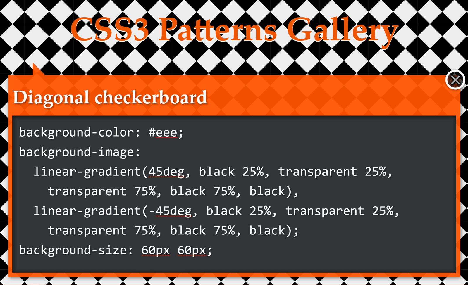
Again, we have a pattern created with two linear gradients:
background-color: #eee;
background-image:
  linear-gradient(45deg, black 25%, transparent 25%,
    transparent 75%, black 75%, black),
  linear-gradient(-45deg, black 25%, transparent 25%,
    transparent 75%, black 75%, black);
background-size: 60px 60px;
We draw horizontal and vertical lines to split this pattern into identical rectangles:
Highlighting the pattern’s cells
What we now have is pretty much the same checkerbox pattern as before, with the sole difference that we don’t start from the default position at 12 o’clock, but from 45° in the clockwise direction.
If you’re having trouble visualising how simply changing the start angle can make us go from the previous pattern to this one, you can play with it in the interactive demo below:
Note that this demo does not work in browsers that have no native support for conic gradients.
Again, not only is the code simpler to understand, but we’ve also gone from 229 bytes to only 83 bytes in the compiled CSS, reducing it by almost two-thirds!
Half-Rombes
The half-rombes pattern
This pattern was created with four linear gradients:
Just like in the previous cases, we draw equidistant vertical and horizontal lines in order to better see the repeating unit:
Highlighting the pattern’s cells.
What we have here is a pattern that’s made up of congruent isosceles triangles (the angled edges are equal and the dark blue triangles are a reflection of the light blue ones) formed by the intersection of equidistant parallel lines that are either horizontal, angled clockwise, or the other way. Each of these three types of parallel lines is highlighted in the illustration below:
Parallel guides
Every pattern cell contains a full triangle and two adjacent triangle halves in the upper part, then a reflection of this upper part in the lower part. This means we can identify a bunch of congruent right triangles that will help us get the angles we need for our conic-gradient():
A pattern cell with a conic gradient’s hard stops such that they’re either horizontal or go through the cell corners, all starting from β w.r.t. the vertical axis (demo)
This illustration shows us that the gradient starts from an angle, β, away from the default conic gradient start point at 12 o’clock. The first conic slice (the top right half triangle) goes up to α, the second one (the bottom right dark triangle) up to 2·α, and the third one (the bottom light triangle) goes halfway around the circle from the start (that’s 180°, or 50%). The fourth one (the bottom left dark triangle) goes to 180° + α and the fifth one (the top left light triangle) goes to 180° + 2·α, while the sixth one covers the rest.
This means going from 343 bytes to only 157 bytes in the compiled CSS. The result can be seen below:
You can tweak the pattern width ($w) and height ($h) in the Sass code in order to see how the pattern gets squished and stretched for different aspect ratios.
In the particular case where the angle between 2*$a and 50% (or 180deg) is also $a, it results that $a is 60deg, our isosceles triangles are equilateral, and our gradient can be reduced to a repeating one (and under 100 bytes in the compiled CSS):
While these are not repeating patterns, they’re examples of a situation where a single conic gradient achieves an effect that would have previously needed a bunch of linear ones.
What we have here is a conic-gradient() created starting from two straight lines intersecting within the rectangular box where we set the background.
The gradient goes around the point of coordinates, x,y, where the two straight lines intersect. It starts from an angle, β, which is the angle of the line segment that’s closest to the top-right corner, then has hard stops at α, 50% (or 180°) and 180° + α.
If we want to have multiple elements with similar such patterns created with the help of different intersecting lines and different palettes, we have the perfect use case for CSS variables:
All we have to do is set the position (--xy), the start angle (--b), the first angle (--a) and the palette (--c0 through --c3).
.panel {
  /* same as before */

  &:nth-child(1) {
    --xy: 80% 65%;
    --b: 31deg;
    --a: 121deg;
    --c0: #be5128;
    --c1: #ce9248;
    --c2: #e4c060;
    --c3: #db9c4e
  }

  /* similarly for the other panels */
}
Instead of hardcoding, we could also generate these values randomly or extract them from a data object with the help of a CSS or HTML preprocessor. In this second case, we’d set these custom properties inline, which is precisely what I did in the Pen below:
Since we’re using custom properties inside the conic gradients, this demo does not work in browsers that don’t support them natively.
Well, that’s it! I hope you’ve enjoyed this article and that it gives you some ideas about how conic gradients can make your life easier.
As digital transformation becomes crucial for all businesses, the pace of cloud adoption continues to accelerate. Higher flexibility, scalability, reliability, and affordability are some of the key factors that contribute to the drastic increase in cloud computing trends. Cloud technology not only enables businesses to scale their computing needs as they grow, but also ensure operational success and satisfy evolving customer demands.
According to the stats published by Cisco, 94 percent of workloads and compute instances will be processed in cloud data centers by 2021. Whether you have decided to move your business operations to the cloud or not, it is imperative to conduct detailed research. Having a brief understanding of what you can do and what you should avoid will help in taking an informed decision.