Preparing for technical interviews takes a lot of preparation, and it’s highly probable that you might have to create Python pattern programs there. That’s why we’ve sorted a list of multiple ideas for pattern printing in Python to start your preparations.
We have multiple kinds of Python pattern programs in this list, so choose your expertise and experience. Make sure that you understand what part of code does what before you move onto the next pattern. Without a proper understanding of how the system works, you would face a lot of difficulty in explaining its working.
The fan-out/fan-in pattern is a staple of more advanced API integrations. Let's check out in practice how, with Zato, it can simplify asynchronous communication across applications that do not always exhibit the same kind of availability or performance characteristics.
For those who have missed the big news, Firefox now supports conic gradients!
Starting with Firefox 75, released on the April 7, we can go to about:config, look for the layout.css.conic-gradient.enabled flag and set its value to true (it’s false by default and all it takes to switch is double-clicking it).
Enabling conic gradients in Firefox 75+
With that enabled, now we can test our CSS including conic gradients in Firefox as well.
While some of the demos in this article work just fine when using a polyfill, some use CSS variables inside the conic gradient and therefore require native support for this feature.
One thing I particularly like about conic gradients is just how much they can simplify background patterns. So let’s take a few linear-gradient() patterns from the gallery created by Lea Verou about a decade ago and see how we can now simplify them with conic-gradient!
That’s quite a bit of CSS and perhaps even a bit intimidating. It’s not easy to just look at this and understand how it all adds up to give us the pyramid pattern. I certainly couldn’t do it. It took me a while to get it, even though gradients are one of the CSS features I’m most comfortable with. So don’t worry if you don’t understand how those gradients manage to create the pyramid pattern because, one, it is complicated and, two, you don’t even need to understand that!
Using conic-gradient(), we can now get the same result in a much simpler manner, with a single background layer instead of four!
What I like to do when coding repeating patterns is draw equidistant vertical and horizontal lines delimiting the rectangular boxes defined by the background-size. In this case, it’s pretty obvious we have square boxes and where their limits are, but it’s a really useful technique for more complex patterns.
Highlighting the pattern’s cells
By default, conic gradients start from 12 o’clock and go clockwise. However, in our case, we want to offset the start of the gradient by 45° in the clockwise direction and afterwards make every one of the four shades occupy a quarter (25%) of the available space around the midpoint of our square box.
A pattern cell with a conic gradient’s hard stops at every 25% starting from 45° w.r.t. the vertical axis (live).
Not only does the code look simpler, but we’ve also gone from 260 bytes to 103 bytes, reducing the code needed to get this pattern by more than half.
We’re using the double position syntax as that’s also well supported these days.
We can see it in action in the Pen below:
Checkerboard
The checkerboard pattern
This pattern above is created with two linear gradients:
background-color: #eee;
background-image:
  linear-gradient(45deg, black 25%, transparent 25%,
    transparent 75%, black 75%, black),
  linear-gradient(45deg, black 25%, transparent 25%,
    transparent 75%, black 75%, black);
background-size: 60px 60px;
background-position: 0 0, 30px 30px;
Let’s see how we can simplify this CSS when replacing these linear gradients with a conic one!
Just like in the previous case, we draw vertical and horizontal lines in order to better see the rectangles defined by the background-size.
Highlighting the pattern’s cells
Looking at the square highlighted in deeppink in the illustration above, we see that, in this case, our conic gradient starts from the default position at 12 o’clock. A quarter of it is black, the next quarter is dirty white and then we have repetition (the same black and then dirty white quarter slices once more).
A pattern cell with a conic gradient’s hard stops at every 25%, starting from the default at 12 o’clock and repeating after 50% (demo).
This repetition in the second half of the [0%, 100%] interval means we can use a repeating-conic-gradient(), which gives us the following code (bringing the compiled CSS from 263 bytes down to only 73 bytes – that’s reducing it by over 70%):
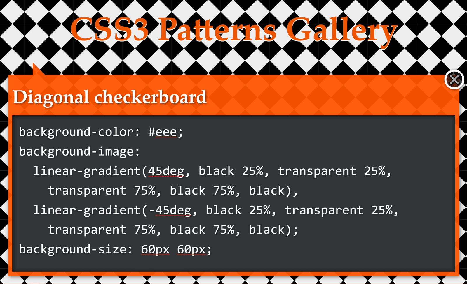
Again, we have a pattern created with two linear gradients:
background-color: #eee;
background-image:
  linear-gradient(45deg, black 25%, transparent 25%,
    transparent 75%, black 75%, black),
  linear-gradient(-45deg, black 25%, transparent 25%,
    transparent 75%, black 75%, black);
background-size: 60px 60px;
We draw horizontal and vertical lines to split this pattern into identical rectangles:
Highlighting the pattern’s cells
What we now have is pretty much the same checkerbox pattern as before, with the sole difference that we don’t start from the default position at 12 o’clock, but from 45° in the clockwise direction.
If you’re having trouble visualising how simply changing the start angle can make us go from the previous pattern to this one, you can play with it in the interactive demo below:
Note that this demo does not work in browsers that have no native support for conic gradients.
Again, not only is the code simpler to understand, but we’ve also gone from 229 bytes to only 83 bytes in the compiled CSS, reducing it by almost two-thirds!
Half-Rombes
The half-rombes pattern
This pattern was created with four linear gradients:
Just like in the previous cases, we draw equidistant vertical and horizontal lines in order to better see the repeating unit:
Highlighting the pattern’s cells.
What we have here is a pattern that’s made up of congruent isosceles triangles (the angled edges are equal and the dark blue triangles are a reflection of the light blue ones) formed by the intersection of equidistant parallel lines that are either horizontal, angled clockwise, or the other way. Each of these three types of parallel lines is highlighted in the illustration below:
Parallel guides
Every pattern cell contains a full triangle and two adjacent triangle halves in the upper part, then a reflection of this upper part in the lower part. This means we can identify a bunch of congruent right triangles that will help us get the angles we need for our conic-gradient():
A pattern cell with a conic gradient’s hard stops such that they’re either horizontal or go through the cell corners, all starting from β w.r.t. the vertical axis (demo)
This illustration shows us that the gradient starts from an angle, β, away from the default conic gradient start point at 12 o’clock. The first conic slice (the top right half triangle) goes up to α, the second one (the bottom right dark triangle) up to 2·α, and the third one (the bottom light triangle) goes halfway around the circle from the start (that’s 180°, or 50%). The fourth one (the bottom left dark triangle) goes to 180° + α and the fifth one (the top left light triangle) goes to 180° + 2·α, while the sixth one covers the rest.
This means going from 343 bytes to only 157 bytes in the compiled CSS. The result can be seen below:
You can tweak the pattern width ($w) and height ($h) in the Sass code in order to see how the pattern gets squished and stretched for different aspect ratios.
In the particular case where the angle between 2*$a and 50% (or 180deg) is also $a, it results that $a is 60deg, our isosceles triangles are equilateral, and our gradient can be reduced to a repeating one (and under 100 bytes in the compiled CSS):
While these are not repeating patterns, they’re examples of a situation where a single conic gradient achieves an effect that would have previously needed a bunch of linear ones.
What we have here is a conic-gradient() created starting from two straight lines intersecting within the rectangular box where we set the background.
The gradient goes around the point of coordinates, x,y, where the two straight lines intersect. It starts from an angle, β, which is the angle of the line segment that’s closest to the top-right corner, then has hard stops at α, 50% (or 180°) and 180° + α.
If we want to have multiple elements with similar such patterns created with the help of different intersecting lines and different palettes, we have the perfect use case for CSS variables:
All we have to do is set the position (--xy), the start angle (--b), the first angle (--a) and the palette (--c0 through --c3).
.panel {
  /* same as before */

  &:nth-child(1) {
    --xy: 80% 65%;
    --b: 31deg;
    --a: 121deg;
    --c0: #be5128;
    --c1: #ce9248;
    --c2: #e4c060;
    --c3: #db9c4e
  }

  /* similarly for the other panels */
}
Instead of hardcoding, we could also generate these values randomly or extract them from a data object with the help of a CSS or HTML preprocessor. In this second case, we’d set these custom properties inline, which is precisely what I did in the Pen below:
Since we’re using custom properties inside the conic gradients, this demo does not work in browsers that don’t support them natively.
Well, that’s it! I hope you’ve enjoyed this article and that it gives you some ideas about how conic gradients can make your life easier.
Tartan is a patterned cloth that’s typically associated with Scotland, particularly their fashionable kilts. On tartanify.com, we gathered over 5,000 tartan patterns (as SVG and PNG files), taking care to filter out any that have explicit usage restrictions.
The idea was cooked up by Sylvain Guizard during our summer holidays in Scotland. At the very beginning, we were thinking of building the pattern library manually in some graphics software, like Adobe Illustrator or Sketch. But that was before we discovered that the number of tartan patterns comes in thousands. We felt overwhelmed and gave up… until I found out that tartans have a specific anatomy and are referenced by simple strings composed of the numbers of threads and color codes.
Tartan anatomy and SVG
Tartan is made with alternating bands of colored threads woven at right angles that are parallel to each other. The vertical and horizontal bands follow the same pattern of colors and widths. The rectangular areas where the horizontal and vertical bands cross give the appearance of new colors by blending the original ones. Moreover, tartans are woven with a specific technique called twill, which results in visible diagonal lines. I tried to recreate the technique with SVG rectangles as threads here:
The horizontalStripes group creates a 280x280 square with horizontal stripes. The verticalStripes group creates the same square, but rotated by 90 degrees. Both squares start at (0,0) coordinates. That means the horizontalStripes are completely covered by the verticalStripes; that is, unless we apply a mask on the upper one.
The mask SVG element defines an alpha mask. By default, the coordinate system used for its x, y, width, and height attributes is the objectBoundingBox. Setting width and height to 1 (or 100%) means that the mask covers the verticalStripes resulting in just the white parts within the mask being full visible.
Can we fill our mask with a pattern? Yes, we can! Let’s reflect the tartan weaving technique using a pattern tile, like this:
In the pattern definition we change the patternUnits from the default objectBoundingBox to userSpaceOnUse so that now, width and height are defined in pixels.
I won’t cover how to convert this string representation into the stripes array but, if you are interested, you can find my method in this Gist.
The SvgTile component takes the tartan array as props and returns an SVG structure.
const SvgTile = ({ tartan }) => {

  // We need to calculate the starting position of each stripe and the total size of the tile
  const cumulativeSizes = tartan
    .map(el => el.size)
    .reduce(function(r, a) {
      if (r.length > 0) a += r[r.length - 1]
      r.push(a)
      return r
    }, [])

  // The tile size
  const size = cumulativeSizes[cumulativeSizes.length - 1]

  return (
    <svg
      viewBox={`0 0 ${size} ${size}`}
      width={size}
      height={size}
      x="0"
      y="0"
      xmlns="http://www.w3.org/2000/svg"
    >
      <SvgDefs />
      <g id="horizontalStripes">
        {tartan.map((el, index) => {
          return (
            <rect
              fill={el.fill}
              width="100%"
              height={el.size}
              x="0"
              y={cumulativeSizes[index - 1] || 0}
            />
          )
        })}
      </g>
      <g id="verticalStripes" mask="url(#grating)">
        {tartan.map((el, index) => {
          return (
            <rect
              fill={el.fill}
              width={el.size}
              height="100%"
              x={cumulativeSizes[index - 1] || 0}
              y="0"
            />
          )
        })}
      </g>
    </svg>
  )
}
Using a tartan SVG tile as a background image
On tartanify.com, each individual tartan is used as a background image on a full-screen element. This requires some extra manipulation since we don’t have our tartan pattern tile as an SVG image. We're also unable to use an inline SVG directly in the background-image property.
Fortunately, encoding the SVG as a background image does work:
Let’s now create an SvgBg component. It takes the tartan array as props and returns a full-screen div with the tartan pattern as background.
We need to convert the SvgTile React object into a string. The ReactDOMServer object allows us to render components to static markup. Its method renderToStaticMarkup is available both in the browser and on the Node server. The latter is important since later we will server render the tartan pages with Gatsby.
Our SVG string contains hex color codes starting with the # symbol. At the same time, # starts a fragment identifier in a URL. It means our code will break unless we escape all of those instances. That’s where the built-in JavaScript encodeURIComponent function comes in handy.
The SvgDownloadLink component takes svgData (the already encoded SVG string) and fileName as props and creates an anchor (<a>) element. The download attribute prompts the user to save the linked URL instead of navigating to it. When used with a value, it suggests the name of the destination file.
Converting an SVG tartan tile to a high-res PNG image file
What about users that prefer the PNG image format over SVG? Can we provide them with high resolution PNGs?
The PngDownloadLink component, just like SvgDownloadLink, creates an anchor tag and has the tartanData and fileName as props. In this case however, we also need to provide the tartan tile size since we need to set the canvas dimensions.
In the browser, once the component is ready, we draw the SVG tile on a <canvas> element. We’ll use the canvas toDataUrl() method that returns the image as a data URI. Finally, we set the date URI as the href attribute of our anchor tag.
Notice that we use double dimensions for the canvas and double scale the ctx. This way, we will output a PNG that’s double the size, which is great for high-resolution usage.
For that demo, I could have skipped React's useEffect hook and the code would worked fine. Nevertheless, our code is executed both on the server and in the browser, thanks to Gatsby. Before we start creating the canvas, we need to be sure that we are in a browser. We should also make sure the anchor element is ”ready” before we modify its attribute.
Making a static website out of CSV with Gatsby
If you haven’t already heard of Gatsby, it’s a free and open source framework that allows you to pull data from almost anywhere and generate static websites that are powered by React.
Tartanify.com is a Gatsby website coded by myself and designed by Sylvain. At the beginning of the project, all we had was a huge CSV file (seriously, 5,495 rows), a method to convert the palette and threadcount strings into the tartan SVG structure, and an objective to give Gatsby a try.
In order to use a CSV file as the data source, we need two Gatsby plugins: gatsby-transformer-csv and gatsby-source-filesystem. Under the hood, the source plugin reads the files in the /src/data folder (which is where we put the tartans.csv file), then the transformer plugin parses the CSV file into JSON arrays.
Now, let’s see what happens in the gatsby-node.js file. The file is run during the site-building process. That’s where we can use two Gatsby Node APIs: createPages and onCreateNode. onCreateNode is called when a new node is created. We will add two additional fields to a tartan node: its unique slug and a unique name. It is necessary since the CSV file contains a number of tartan variants that are stored under the same name.
// gatsby-node.js
// We add slugs here and use this array to check if a slug is already in use
let slugs = []
// Then, if needed, we append a number
let i = 1

exports.onCreateNode = ({ node, actions }) => {
  if (node.internal.type === 'TartansCsv') {
    // This transforms any string into slug
    let slug = slugify(node.Name)
    let uniqueName = node.Name
    // If the slug is already in use, we will attach a number to it and the uniqueName
    if (slugs.indexOf(slug) !== -1) {
      slug += `-${i}`
      uniqueName += ` ${i}`
      i++
    } else {
      i = 1
    }
    slugs.push(slug)

    // Adding fields to the node happen here
    actions.createNodeField({
      name: 'slug',
      node,
      value: slug,
    })
    actions.createNodeField({
      name: 'Unique_Name',
      node,
      value: uniqueName,
    })
  }
}
Next, we create pages for each individual tartan. We want to have access to its siblings so that we can navigate easily. We will query the previous and next edges and add the result to the tartan page context.
We decided to index tartans by letters and create paginated letter pages. These pages list tartans with links to their individual pages. We display a maximum of 60 tartans per page, and the number of pages per letter varies. For example, the letter “a” will have have four pages: tartans/a, tartans/a/2, tartans/a/3 and tartans/a/4. The highest number of pages (15) belongs to “m” due to a high number of traditional names starting with “Mac.”
The tartans/a/4 page should point to tartans/b as its next page and tartans/b should point to tartans/a/4 as its previous page.
We will run a for of loop through the letters array ["a", "b", ... , "z"] and query all tartans that start with a given letter. This can be done with filter and regex operator:
The previousLetterLastIndex variable will be updated at the end of each loop and store the number of pages per letter. The /tartans/b page need to know the number of a pages (4) since its previous link should be tartans/a/4.
The paginateNode function returns an array where initial elements are grouped by pageLength.
const paginateNodes = (array, pageLength) => {
  const result = Array()
  for (let i = 0; i < Math.ceil(array.length / pageLength); i++) {
    result.push(array.slice(i * pageLength, (i + 1) * pageLength))
  }
  return result
}
Now let’s look into the tartan template. Since Gatsby is a React application, we can use the components that we were building in the first part of this article.
The TartansNavigation component adds next-previous navigation between the index pages.
// ./src/components/tartansnavigation.js
import React from "react"
import {Link} from "gatsby"

const letters = "abcdefghijklmnopqrstuvwxyz".split("")
const TartansNavigation = ({
  className,
  letter,
  index,
  last,
  previousLetterLastIndex,
}) => {
  const first = index === 0
  const letterIndex = letters.indexOf(letter)
  const previousLetter = letterIndex > 0 ? letters[letterIndex - 1] : ""
  const nextLetter =
    letterIndex < letters.length - 1 ? letters[letterIndex + 1] : ""

  let previousUrl = null, nextUrl = null

  // Check if previousUrl exists and create it
  if (index === 0 && previousLetter) {
    // First page of each new letter except "a"
    // If the previous letter had more than one page we need to attach the number
    const linkFragment =
      previousLetterLastIndex === 1 ? "" : `/${previousLetterLastIndex}`
    previousUrl = `/tartans/${previousLetter}${linkFragment}`
  } else if (index === 1) {
    // The second page for a letter
    previousUrl = `/tartans/${letter}`
  } else if (index > 1) {
    // Third and beyond
    previousUrl = `/tartans/${letter}/${index}`
  }

  // Check if `nextUrl` exists and create it
  if (last && nextLetter) {
    // Last page of any letter except "z"
    nextUrl = `/tartans/${nextLetter}`
  } else if (!last) {
    nextUrl = `/tartans/${letter}/${(index + 2).toString()}`
  }

  return (
    <nav>
      {previousUrl && (
        <Link to={previousUrl} aria-label="Go to Previous Page" />
      )}
      {nextUrl && (
        <Link to={nextUrl} aria-label="Go to Next Page" />
      )}
    </nav>
  )
}
export default TartansNavigation
Final thoughts
Let’s stop here. I tried to cover all of the key aspects of this project. You can find all the tartanify.com code on GitHub. The structure of this article reflects my personal journey — understanding the specificity of tartans, translating them into SVG, automating the process, generating image versions, and discovering Gatsby to build a user-friendly website. It was maybe not as fun as our Scottish journey itself 😉, but I truly enjoyed it. Once again, a side project proved to be the best way to dig into new technology.