SVG Overlay and Infinite Menu Background Animation

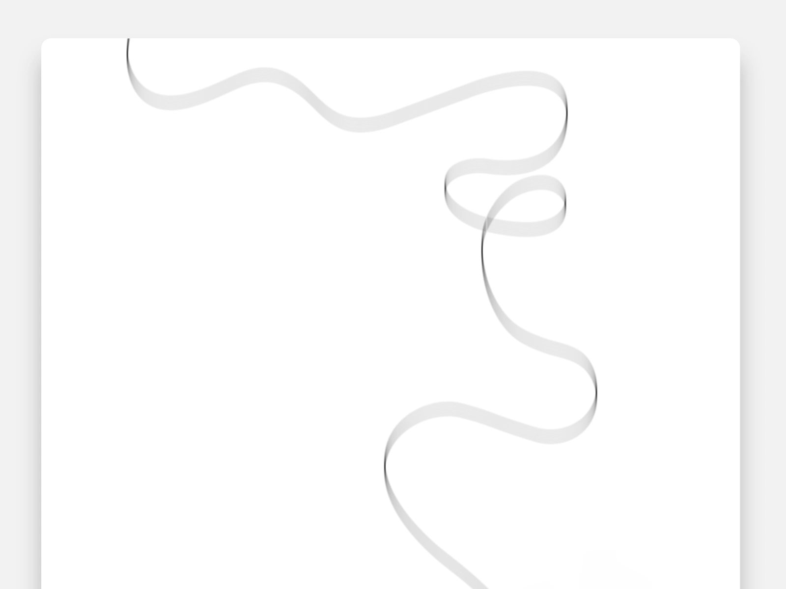
Today I’d like to share a little menu effect with you. It is composed of two things which is an SVG path overlay animation when it opens (or closes) and an infinite CSS powered background animation of an image grid.

Nothing special really, but I enjoyed putting it together and hopefully it is somehow useful to you!

The SVG path animation for the overlay is based on this demo by Sebastien Gilbert which is a good starter for a nice motion. If you need to adjust paths, I can recommend this fantastic path editor tool by Yann Armelin.

The infinite background animation of the menu is made with a CSS animation. The trick is to have a repeated set of images and once we translate to the visually equal part, we restart the animation.

.tiles {
	position: absolute;
	left: 50%;
	top: 50%;
	height: 150vh;
	display: flex;
	opacity: 0.5;
	flex-direction: column;
	justify-content: center;
	transform: translate3d(-50%,-50%, 0) rotate(22.5deg);
}

.tiles__line {
	display: flex;
	transform: translateX(25%);
	animation: runner 10s linear infinite;
}

.tiles__line:nth-child(2) {
	animation-duration: 16s;
}

.tiles__line:nth-child(3) {
	animation-duration: 22s;
}

@keyframes runner {
	to {
		transform: translateX(-25%);
	}
}

Check out the CSS-Only Marquee Effect, if you’d like to understand the details of this.

And this is how it all comes together:

Hope you enjoy this and find it useful!

The post SVG Overlay and Infinite Menu Background Animation appeared first on Codrops.

Animating SVG Text on a Path

Animating SVG text on a path on scroll has been explained really well in this great video tutorial by the keyframers. The basic idea is to couple the startOffset value of a textPath element with the scroll position, allowing the text to move along its path while scrolling.

We wanted to take this a step further and integrate it in a real website example with some more features.

In our experiment, we made the animation smoother and used SVG filters, while also using different paths. Additionally, we worked with the Intersection Observer API for animating only the texts that are in the viewport. The intensity of the SVG filters depends on the scroll speed.

If you want to learn more about SVG filters and how to use them to create interesting effects, have a look at our dedicated series written by Sara Soueidan:

Please be aware that animating SVG filters in Firefox has dreadful performance. This has been like that for years, unfortunately. There are a number of bugs filed regarding animating SVG filters and even rendering SVG filters:

Sadly, the outlook on solving these issues in Firefox don’t look too good as these have all been marked with priority P3, which means:

“This isn’t a bad idea, and maybe we’ll want to implement it at some point in the future, but it’s not near-term roadmap material. Some core Bugzilla developer may work on it.”

So it’s a good idea to keep in mind that if you are working with SVG filters and plan to animate them, it’s probably best if you leave Firefox out of the equation. This is exactly what we did in our example, so you won’t see the fancy filter magic if you open the demo in Firefox. However, if you do want to try it out, you can do so with smaller areas, i.e. smaller texts. Although it won’t be as smooth as in Chrome, it will work better than with larger texts.

We hope you enjoy our examples and find them useful!

References & Credits

Animating SVG Text on a Path was written by Mary Lou and published on Codrops.

A Trick That Makes Drawing SVG Lines Way Easier

When drawing lines with SVG, you often have a <path> element with a stroke. You set a stroke-dasharray that is as long as the path itself, as well as a stroke-offset that extends so far that you that it's initially hidden. Then you animate the stroke-offset back to 0 so you can watch it "draw" the shape.

Figuring out the length of the path is the trick, which fortunately you can do in JavaScript by selecting the path and doing pathEl.getTotalLength(). It'll probably be some weird decimal. A smidge unfortunate we can't get that in CSS, but c'est la vie.

Here's the trick!

You don't have to measure the length of the path, because you can set it.

So you do like:

<path d="M66.039,133.545 ... " pathLength="1" />

That doesn't do anything by itself (as far as I know). It's not like that only draws part of the path — it still draws the whole thing like as if you did nothing, only now the "math" of the path length is based on a value of 1.

Now we can set the stroke-dasharray to 1, and animate the offset in CSS!

.path {
  stroke-dasharray: 1;
  stroke-dashoffset: 1;
  animation: dash 5s linear alternate infinite;
}

@keyframes dash {
  from {
    stroke-dashoffset: 1;
  }
  to {
    stroke-dashoffset: 0;
  }
}

Which works:

See the Pen
Basic Example of SVG Line Drawing, Backward and Forward
by Chris Coyier (@chriscoyier)
on CodePen.

High five to Adam Haskell who emailed me about this a few months back.


Hey, speaking of SVG line drawing: Lemonade made a landing page for their 2019 charity that uses scroll-triggered SVG line drawing up and down the entire page. They did a behind-the-scenes look at it, which I always appreciate.

animated GIF of line drawing on Lemonade page - as page scrolls down a teddy bear shape is drawn

The post A Trick That Makes Drawing SVG Lines Way Easier appeared first on CSS-Tricks.

An Initial Implementation of clip-path: path();

One thing that has long surprised (and saddened) me is that the clip-path property, as awesome as it is, only takes a few values. The circle() and ellipse() functions are nice, but hiding overflows and rounding with border-radius generally helps there already. Perhaps the most useful value is polygon() because it allows us to draw a shape out of straight lines at arbitrary points.

Here's a demo of each value:

See the Pen clip-path examples by Chris Coyier (@chriscoyier) on CodePen.

The sad part comes in when you find out that clip-path doesn't accept path(). C'mon it's got path in the name! The path syntax, which comes from SVG, is the ultimate syntax. It allows us to draw literally any shape.

More confusingly, there already is a path() function, which is what properties like offset-path take.

I was once so flabbergasted by all this that I turned it into a full conference talk.

The talk goes into the shape-outside property and how it can't use path(). It also goes into the fact that we can change the d property of a literal <path>.

I don't really blame anyone, though. This is weird stuff and it's being implemented by different teams, which inevitably results in different outcomes. Even the fact that SVG uses unit-less values in the <path> syntax is a little weird and an anomaly in CSS-land. How that behaves, how values with units behave, what comma-syntax is allowed and disallowed, and what the DOM returns when asked is plenty to make your head spin.

Anyway! Along comes Firefox with an implementation!

Here's that flag in Firefox (layout.css.clip-path-path.enabled):

And here's a demo... you'll see a square in unsupported browsers and a heart in the ones that support clip-path: path(); — which is only Firefox Nightly with the flag turned on at the time of this writing.

See the Pen clip-path: path()! by Chris Coyier (@chriscoyier) on CodePen.

A screenshot of clip-path: path() working in Firefox Nightly

Now, all we need is:

  • clip-path to be able to point to the URL of a <clipPath> in SVG, like url("#clip-path");
  • shape-outside to be able to use path()
  • shape-outside to be able to use a <clipPath>
  • offset-path to take all the other shape functions
  • Probably a bunch of specs to make sure this is all handled cleanly (Good luck, team!)
  • Browsers to implement it all

😉

The post An Initial Implementation of clip-path: path(); appeared first on CSS-Tricks.